Interview With Niklas Lundberg


Here is another must read interview with an extremely talented designer by the name of Niklas Lundberg. Only 22 years old and already a part of the Depth Core Collective creating, some astounding art. In our interview we discuss why he chose to become a designer and the trouble he had at first with achieving that goal. Niklas also shares a lot of interesting tips and info for the readers about the practice of creating art.


Q Welcome to Psdtuts+, please introduce yourself. Could you tell us where you’re from and how you got started in the field?

My name is Niklas, I am 22-years old and I was born in Umeå, Sweden where I also currently live and work as a freelance graphic designer and illustrator. My passion for digital art started in 2002. As everyone else at that time I started out at the famous DeviantArt community. At this time it was just a hobby, something I did after school just for fun. Later, I applied for a high school with a media program which was a completely new school so it wasn’t easy to determine if it would be good or not. Unfortunately it left me with little satisfaction. I applied because I thought there would be other people with the same interests as me but most of the students only applied because they got a free laptop.

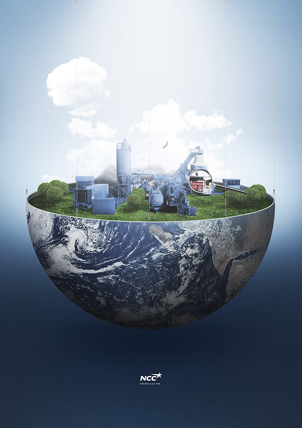
I got bored and tired of school after 2 years and I felt like applying for something else but I looked around and I managed to find an internship at a local agency/printer which I worked at for around 8 months or so. In the meantime I was building my portfolio and I was determined I could manage without school, since I had so many bad experiences from it, it was the only option for me. So after my internship, I managed to get a small position at a construction/road company called NCC, where my dad works. I was still building my portfolio during this time and I set a new goal, to become independent. My own boss.

After 2 years I finally managed to take this step. Peter over at Ars Thanea contacted me about a possible job for Nissan and asked me what I would be doing for the next month. I was so happy, I got my first big freelance gig. Since I worked under my dad there was no problem to quit immediately because he was very supportive and understood that this was my real goal and we had already been talking about it 6 months prior to that. Just a month after I finished the job for Ars Thanea I felt confident that this is what I would be doing. Instead of working from home I wanted it to feel more like a job so I looked around for office spaces. In the meantime I was also looking for possible client work and at an interview with a local agency called Racer, I also told them I was looking for a place to sit and they told me that maybe I could rent from them and it felt like a brilliant idea. So I have been renting from them ever since. I love the separation of home and work it gives me more motivation and satisfaction.

Q If you had to place your specific design style in a certain genre what would it be and why? What has mainly influenced you to create the type of art you make?

The funny thing is that I can’t really put my work into a genre, I don’t even get inspired by the same kind of work that I do myself, I find it nice to look at for sure but it’s not my main source of inspiration. I am mostly influenced by photography, architecture and fashion and most importantly music. I think once you reach a certain point with your work that your style can count as your own it’s important to maintain consistency with your own style. I always look at my style to be the composition itself, it leaves room to play with new elements and new techniques, but its how I put it together that makes it mine.

Q When working on a design are you strictly using Photoshop? Or do you draw a rough draft of your design before hand?

I threw away my mouse out the window some time ago and completely replaced it with a Wacom. It was the best thing I have ever done, it takes a few weeks to get used to but if you don’t unplug your mouse you won’t get used to it as fast because you will always move your hand to the mouse every time the Wacom feels awkward. So I often use my Wacom to make rough drafts of what I want to produce, it’s just faster and I can add several layers and colors with ease. Of course at times paper and pen is the way to go as well, it all depends on the situation.

Q What is the first step you take after an idea hits you? After that walk us through your normal workflow for an illustration.

I am a heavy user of an application called “Things” where I write everything down with the combination of fast sketches. Things is also available on the iPhone so I can put all my thoughts in there wherever I am then just sync them via wifi when I get to my computer. I try to put all the key elements in there so I know somewhat what I want to achieve. After I know what I want to achieve, I usually start in Photoshop and mock up a few fast compositions and play around with color, I think it’s very important even though in the beginning to get a nice feel to it so you know what you want to aim for. I usually work with Photoshop and Illustrator simultaneously. I draw shapes in Illustrator which I then import into Photoshop as vector smart objects. From there on everything else just comes naturally.

Q “A final release” is an extraordinarily unique illustration you made for Depthcore’s latest exhibition. Please walk us through the creation of the piece and also talk a little about how you used cardboard cutouts in it.

I always try to find new ideas for every piece that I make. I wanted to create something by hand and then bring it in and digitalize it. I got the idea of folding black cardboard after making a few sketches that ended up looking like folded paper. After I had the shapes down I photographed different angles of it and imported it into Photoshop. After that it was pure magic, I blacked out for 4 months, then I woke up and the piece was finished. Joke aside, the piece really took about 4 months though, I was never really able to finish it because I never really knew what to do with the shapes. I had the shapes finished in February and got it finished after a hard working weekend in June.

Q You have been commissioned to create artwork for several high profile clients, what would you say is the key to landing jobs as a freelance designer?

Probably a lot of you already know that the key is contacts. The real question is how do you go about to get these contacts. A lot of my commissions have gone through agencies, which has allowed me to work with different clients that they already have in their contact roster. Like everyone else I always try to promote myself by e-mailing, giving out business cards and I have learned that it is always best do go straight to the agencies. If you go straight to the client (depending on the client of course) it can be difficult to establish a connection since the probably already have an agency that does all their work. If you know a client that you want to work for why not find out which agency they use and call them up or email them your portfolio. I think it’s the best way to proceed. You can always get an agent to do this promotion for you, that being said I am currently looking for any international agents that are willing to represent my work, so if you are reading this get in touch with me!

Q Not too long ago you updated your portfolio Diftype with some new art, do you have any upcoming projects you would like to share with us?

That’s right. I think it was long time overdue but I am always such a perfectionist when it comes to my own portfolio, I want to be 100% satisfied with it. I have a few new works to be released I am just waiting on client confirmation on some of them. So stay tuned.

Q Thanks again for providing Psdtuts+ with this opportunity to interview you. Any final thoughts for our readers?

Thanks for giving me this opportunity to be interviewed. A big thanks to everyone who follows me and my work. I want to let you know that I will open up a small web-shop soon where I will sell prints. For more information you can follow me on twitter.

Where to find Niklas on the Web

Read More

Create a Fallen, Rain-Soaked, Angel Composition in Photoshop


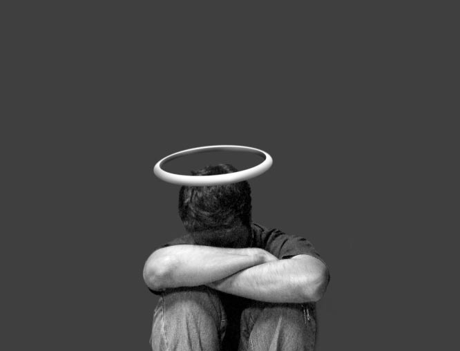
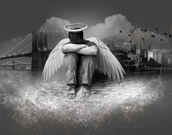
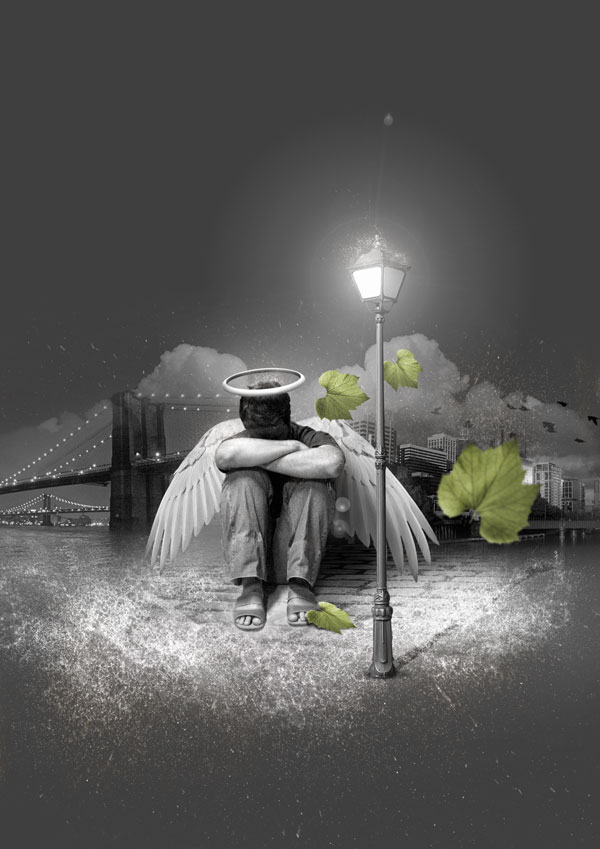
In today’s tutorial we will demonstrate how to create a lonely, fallen, rain-soaked, angel composition in Photoshop using photo manipulation techniques. Let’s get started!


Tutorial Assets

The following assets were used during the production of this tutorial.


Step 1

Start by creating a file in Photoshop at the size of an A4 (210mm x 297mm) at 300 dpi. Once created, fill the background with a dark gray (# 424242)


Step 2

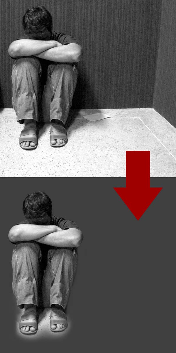
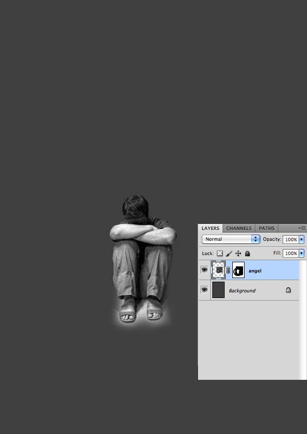
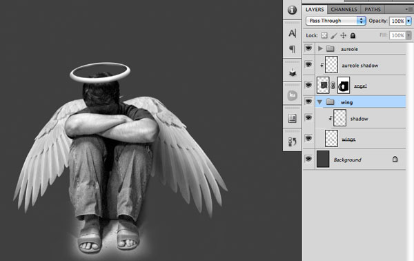
After creating the background, the first thing to do is extract the boy by using your favorite tool. I made a selection using the Polygonal Lasso Tool (L) and then applied a mask. No need to be very precise on this selection, because the boy will merge with the rest of the image. In the area of the feet you can leave some details such as the shadow between her legs, and remove the excess using a soft brush (B).


Step 3

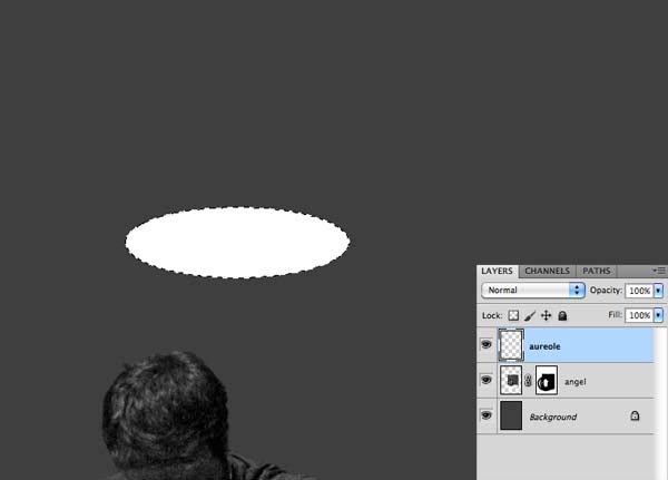
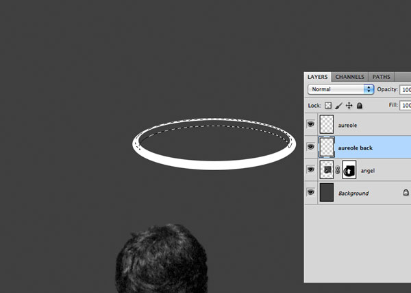
Now let’s create an aureole for the angel. Create a layer called aureole and with the Elliptical Marquee Tool (M) make an oval selection and fill with white.

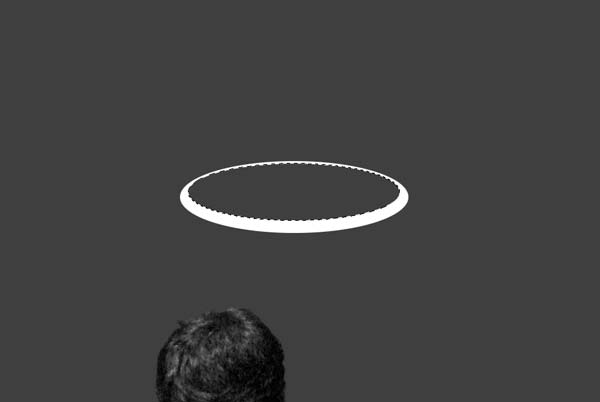
Make another selection within the aureole and delete the selection. This way you will get something like that.

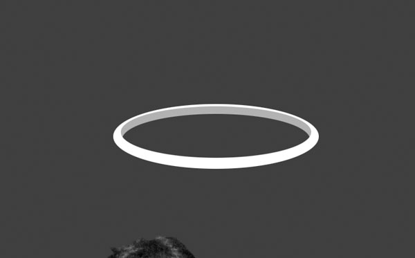
Now we need to create the inner of the aureole. Create a new layer, place it below the aureole layer and name it "aureole back. Make an oval selection and fill with a light gray (# b0b0b0).

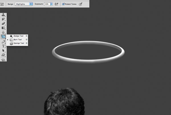
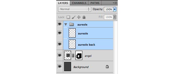
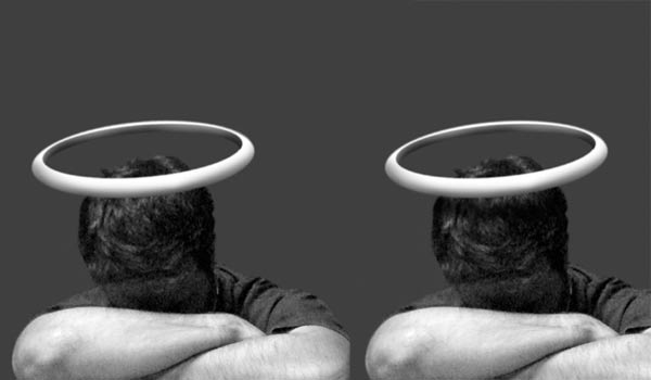
Use the Burn Tool (O) in Highlights mode to create the lights and shadows of the halo. In the end you should have something like the image below. After that, group the two layers of the aureole to keep your file organized.

Position the halo over his head.

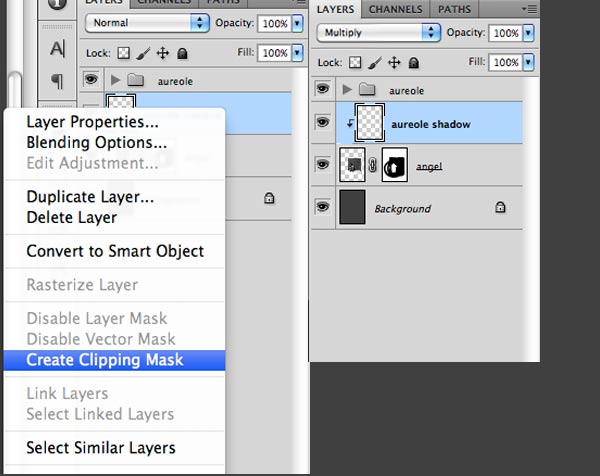
Now we need to make the shadow of the halo. Create a layer and position it above the layer "angel." Right click on the layer and create a "Clipping Mask." Set the blend mode "Multiply" and with a Soft Brush (B) paint the angel’s head trying to simulate a shadow.


Step 4

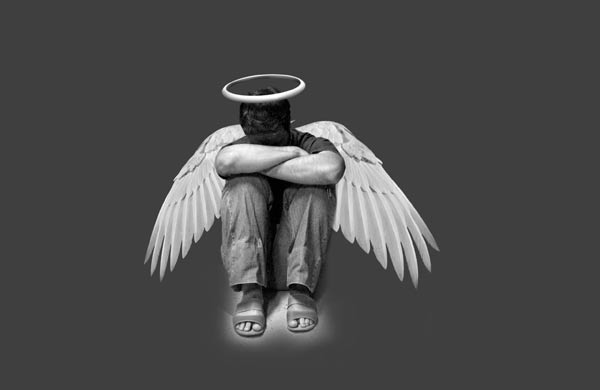
Open the image of the wing, cut and place them behind the angel.

Create a New Layer, set it to "Multiply" and then create a "Clipping Mask". Use a Soft Brush (B) with Black and paint over the wing to create the shadow of the boy. Don’t forget to group the "Wings" layer and the "Shadow" layer.


Step 5

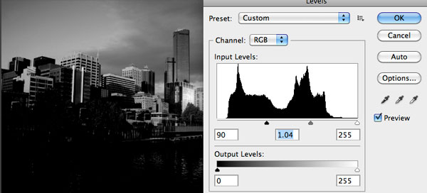
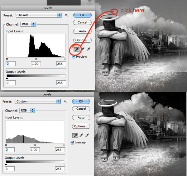
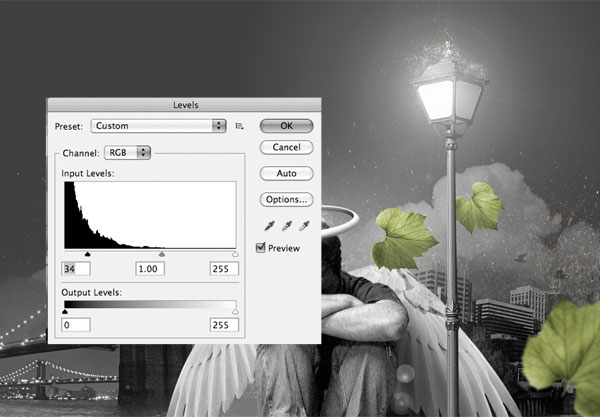
Open the city file, desaturate it using Command/Ctrl + Shift + U. Then go to Image > Adjustments > Levels to darken the image.

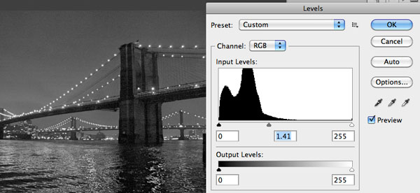
Now open the bridge file, then go to Image > Adjustments > Levels to brighten the image.

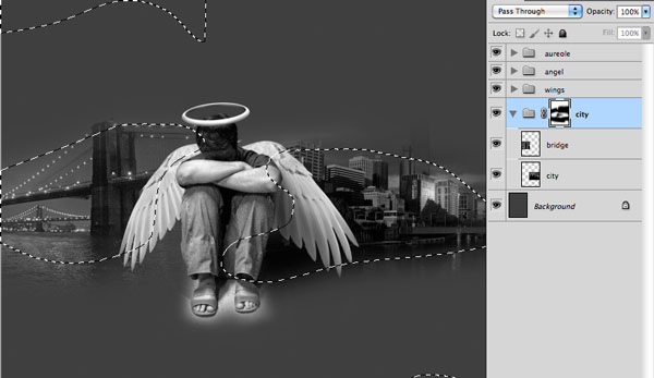
After that, position the bridge behind the angel and the city like the image below. Group the two layers and create a mask to hide in the image edges.


Step 6

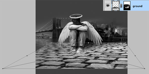
Now it’s time to set the ground. Take the image ground and desaturate it. Place the ground like the image below and use a layer mask to hide the edges.

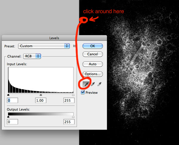
Open the Spatter image and desaturate it using Command/Ctrl + Shift + U. Invert the image color with Command/Ctrl + I. Then go to Image > Adjustments > Levels. At the levels window click at the black eyedropper and click in the black area as shown in the image.

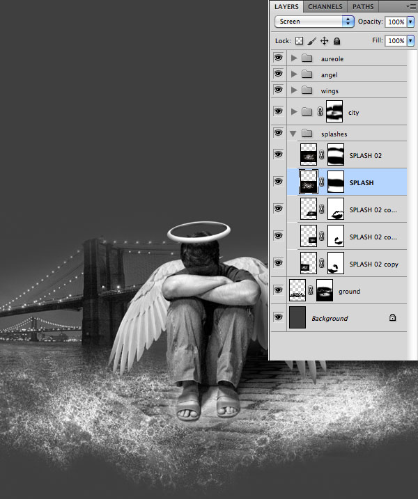
After that, copy and paste the spatter in your main file. Set the blend mode to "Screen" so the black will become invisible. Then hide the borders using a Mask or the Eraser Tool (E). Make other copies of the Spatter layer and position them to get the result below.


Step 7

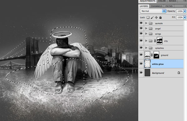
Now let’s put more details in the Background. Create a New Layer on the top of the Background and use a Soft Brush (B) to make a soft white glow.

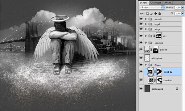
Place the Clouds on top of the Background layer, then desaturate it using the Command/Ctrl + Shift + U. Go to Image > Adjustments > Levels and use the Black Eyedropper to set the black point in the image as shown below. After that set the Blend Mode to Screen.

Duplicate the Cloud Layer and Flip it Horizontally and then place it like in the next image. Group the Clouds Layers and set the Opacity to 50%.


Step 8

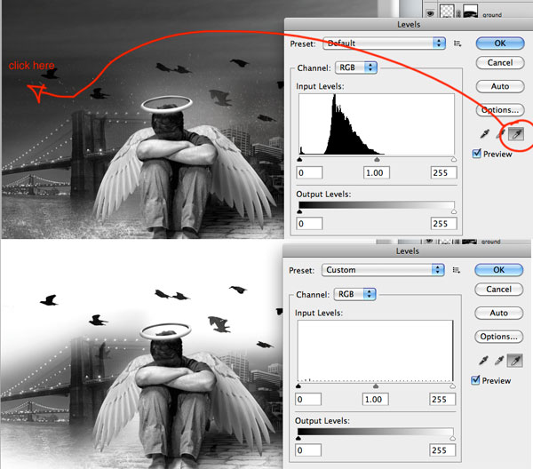
Place the Birds image. Desaturate it using the same technique as shown previously in this tutorial. Then go to Image > Adjustments > Levels and use the White Eyedropper to set the White Point of the image.

Set the Blend Mode to Multiply and position the image like in the next image.


Step 9

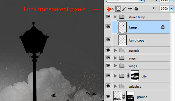
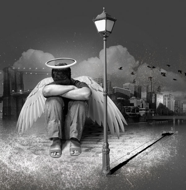
Open the Street Lamp image and extract it from the background. Place it into your main file on top of all layers. Now we are going to make the shadow. Duplicate the lamp, set your foreground color to black and fill the lamp copy locking transparent pixels.

Use the Free Transform – Command/Ctrl + T – to create the shadow of the lamp. Set the Blend Mode to Overlay, opacity of 50% and put it behind the lamp.

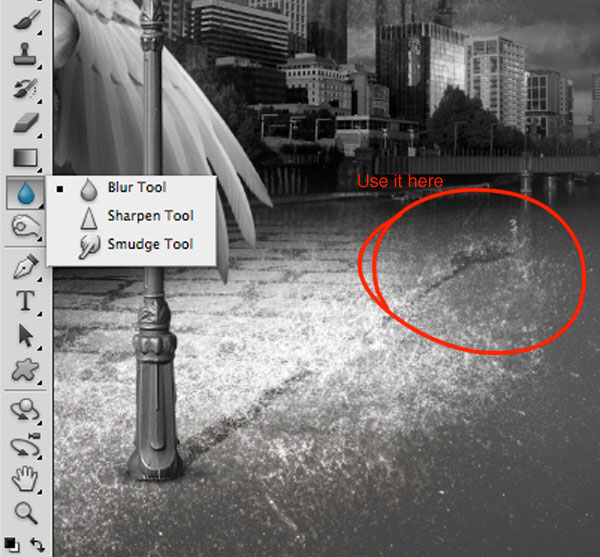
Uncheck the "Lock transparent pixels" of the shadow layer and use the "Blur Tool" at the end of the shadow.

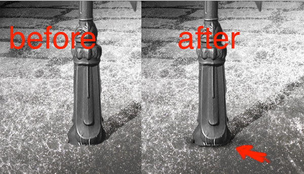
Create a new layer and use a soft brush to make a small shadow underneath the lamp.


Step 10

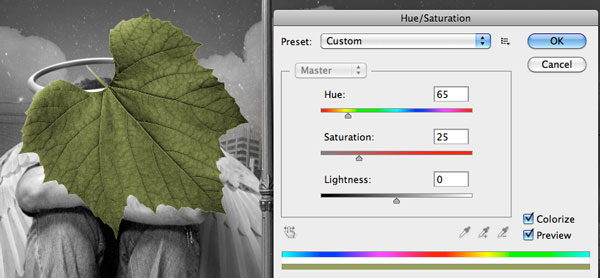
Now we have to add the "flying" leaves to the composition. Open the Leaf image, extract it from the white background (I used Color Range) and then go to Image > Adjustments > Hue/Saturation and use the configuration below.

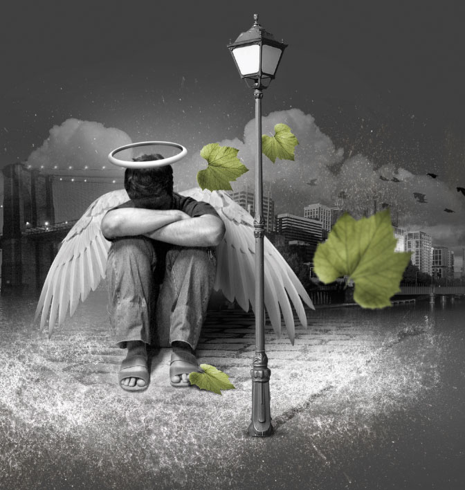
Duplicate the layer 3 times and place the other leaves around the scene. Use the Dodge Tool (O) to make some areas of the leaves a little brighter. Don’t forget the shadow of the leaf on the foot. To do that, use the same process of the lamp shadow. After that, select the biggest leaf and go to Filter > Blur > Gaussian Blur and use something around 3.5 pixels. You’ll get the following result.

Step 11

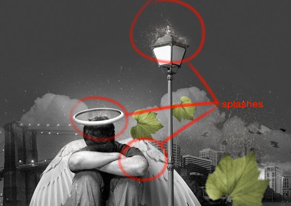
Take the same splashes we’ve used on the ground and place them on the top of the head and the lamp. In the future we will create a storm, so they should look like water splashing from the rain that is falling.


Step 12

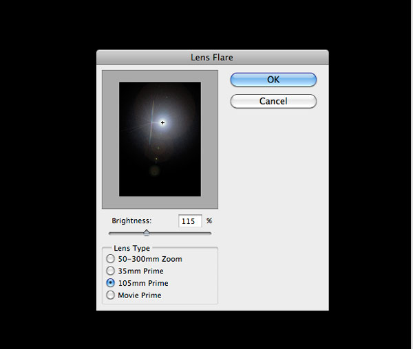
Now we are going to add the lens flare effect to the lamp. Create a new layer and fill it with black. Go to Filter > Render > Lens Flare and use the following configuration.

Desaturate it and set the blend mode to Screen and opacity to 70%. Then use the levels to darken it a little bit.


Step 13

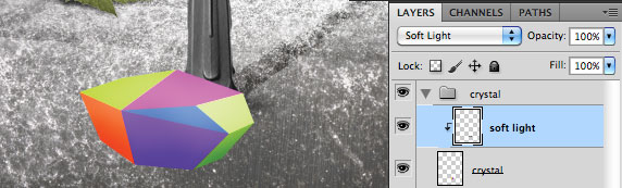
Open Illustrator and create the colored crystal. After you’ve created it, copy and paste into Photoshop. Create a new layer and set the blending mode to Soft Light and click with the right button to create a Clipping Mask. Use a Soft Brush (B) with Black (to darken) or White (to brighten) in some areas of the crystal. This technique is very useful if you do not like to use the Dodge and Burn, because this way you can correct mistakes whenever you want. It gives you much more flexibility.

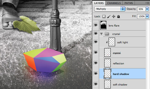
Duplicate the crystal layer to make the reflection and put it under the original crystal. Set the blending mode to Linear Dodge, change the opacity to 50%, apply Filter > Blur > Gaussian Blur and use a radius of 35 pixels. After that create a Hard Shadow (Multiply and opacity of 30%) and a Soft Shadow (Multiply and opacity of 80%) under the crystal.


Step 14

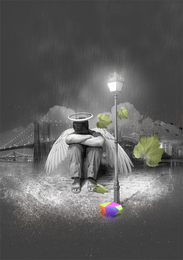
To create the rain, take a look at Step 13 of this tutorial. You should get a result similar to below.


Step 15

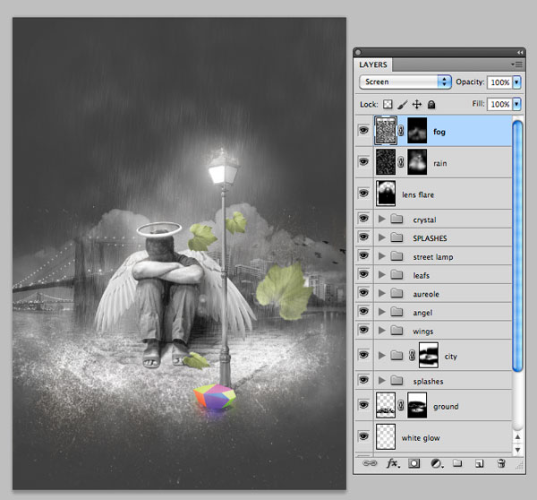
Create a new layer and fill it with black. Go to Filter > Render > Difference Clouds. Set the blend mode to screen and use a mask to hide some areas of the fog we’ve just created. You can add more fog if you want, this is up to you.


Step 16

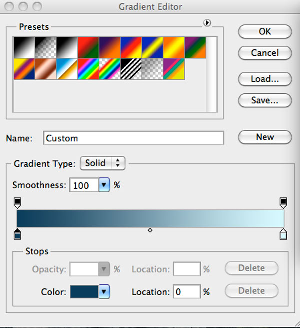
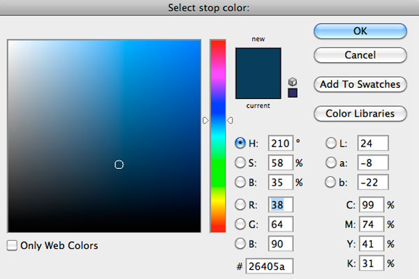
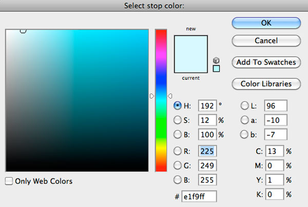
Here we’ll add the final details. First create an Adjustment Layer (Layer > New Adjustment Layer > Gradient Map.). Use the following configurations and set its blending mode to Soft Light.

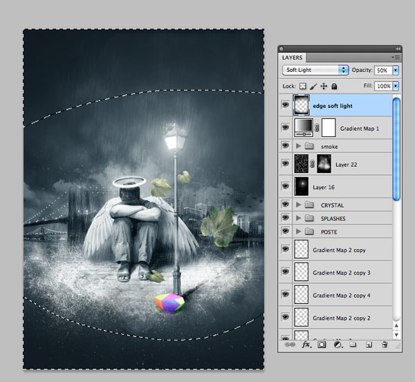
Now create a new layer, set the blending mode to Soft Light, the opacity to 50% and paint with a large Soft Brush around the edges.

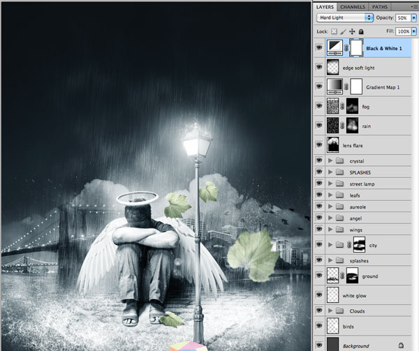
Add a new Black & White Adjustment Layer (Layer > New Adjustment Layer > Black & White) and set its blending mode to Hard Light and the opacity to 50%.

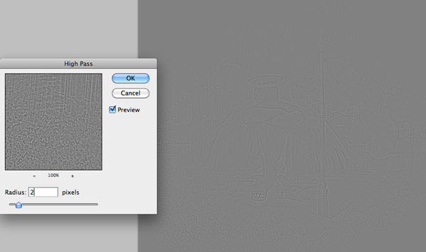
Create a new merged copy of your image using Command/Ctrl + Shift + A, Command/Ctrl + C and Command/Ctrl +V. Go to Filter > Others > High Pass and use the configuration below. After that set the blending mode to Hard Light. This effect will sharpen the image. Now you’re done!


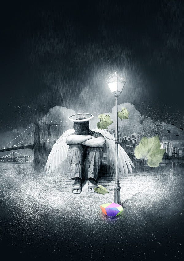
Final Image

Here is the final result. Hope you have enjoyed the tutorial and learned something new.

Read More

Paint a Professional Caricature Portrait in Photoshop – Psd Premium Tutorial


Having a caricature painted of yourself can be a fun and exciting experience. That’s because just about everyone has wondered, at some point, what they would look like as a cartoon or as an illustration on the cover of a magazine. In this Psd Premium tutorial, veteran illustrator, Jason Seiler will demonstrate how to create a professional caricature portrait using Psdtuts Editor, Grant Friedman as an example. Jason Seiler’s illustrations have been featured as covers and interior pieces for TIME, Business Week, The New York Times, The Wall Street Journal, The Weekly Standard, MAD magazine, and many others. Jason has also worked as a character designer on Tim Burton’s Alice In Wonderland, helping to create such characters as the Red Queen, the Tweedles, the Bandersnatch and more. So what are you waiting for? If you are looking to take your character illustration skills to the next level then Log in or Join Now to get started!


Professional and Detailed Instructions Inside

Premium members can Log in and Download! Otherwise, Join Now! Below are some sample images from this tutorial.


Psd Premium Membership

As you know, we run a premium membership system here that costs $9 a month (or $22 for 3 months!) which gives members access to the Source files for tutorials as well as periodic extra tutorials, like this one! You’ll also get access to Net Premium and Vector Premium, too. If you’re a Premium member, you can Log in and Download the Tutorial. If you’re not a member, you can of course Join Today!

Read More

Typography, the Art of Text – Basix


Are you new to Photoshop? Have you been trying to teach yourself the basics of Photoshop but have found the amount of educational material available on the net a bit overwhelming? As the world’s #1 Photoshop site, we’ve published a lot of tutorials. So many, in fact, that we understand how overwhelming our site may be to those of you who may be brand new to Photoshop. This tutorial is part of a 25-part video series demonstrating everything you will need to know to start working in Photoshop.

Photoshop Basix, by Adobe Certified Expert and Instructor, Martin Perhiniak includes 25 short video tutorials, around 5 – 10 minutes in length that will teach you all the fundamentals of working with Photoshop. Today’s tutorial, Part 11: Typography, the Art of Text will explain working with type layers, kerning, keyboard shortcuts, and resousse. Let’s get started!


Read More

Article Rewriting @1.2 500 Words Needed ASAP by wilyjose

I need some articles rewritten ASAP. The articles are 500 words. I will provide the articles. Payment will be 1.2 USD per article. All articles must be atleast 89% uniques. Please start bidding NOW I will award project in a short time… (Budget: $30-$250 USD, Jobs: Article Rewriting, Articles, Blog, Copywriting, Ghostwriting)


3D Flash Animation website by jamesopare

This project entails a lot of 3d flash animations so please bid on this project if you have 3d work to show in flash. The concept is simple and requires animating an existing logo in flash and once the logo has been pieced together in the intro it allows entry to the website… (Budget: $250-$750 USD, Jobs: Flash, Graphic Design, HTML, Photoshop, Website Design)


build a similar website like themeforest.net by django by wilson98

I want to build a website which sells virtual products (website templates, themes, photos, etc), it will like a mixture of themeforest.net and istockphoto.com, the selected platform is django on python… (Budget: $3000-$5000 USD, Jobs: Django, Graphic Design, HTML, Python, Website Design)