I have seen similar topic with answers about size in % or vh, but its a bit different.
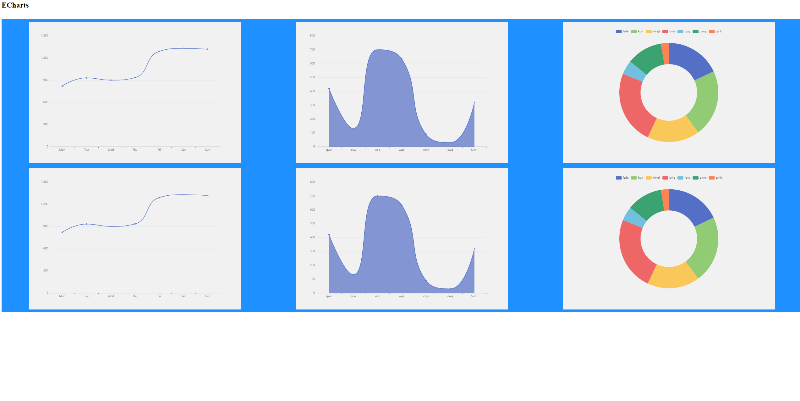
I have a set of different plots with sizes 900×600 by default using this CSS:
.chartbox {
    display: flex;
    flex-wrap: wrap;
    background-color: DodgerBlue;
    justify-content: space-around;
}
.chart {
    background-color: #f1f1f1;
    width: 900px;
    height: 600px;
    margin: 10px;
    position: center;
}
And I want them to resize automaticly when the window is resizing (or there is a small screen)
Im using charts from ECharts, with js code smth like:
var myChart = echarts.init(document.getElementById('main'));

var option = {
    xAxis: {
        type: 'category',
        data: ['Mon', 'Tue', 'Wed', 'Thu', 'Fri', 'Sat', 'Sun']
    },
    yAxis: {
        type: 'value'
    },
    series: [
    {
      data: [820, 932, 901, 934, 1290, 1330, 1320],
      type: 'line',
      smooth: true
    }
    ]
};

myChart.setOption(option)
I tried to use % and vh to .chart height and width, but they conflict with default size.
I tried to use max-width and max-height without width and height, but charts do not appear (mb its a ECharts feature).
I expect the following:
- if 3 charts 900×600 can fit the screen then place them
- else if 3 charts 600×400 can fit the screen then place them
- else if 2 charts 900×600 can fit the screen then place them
- else if 2 charts 600×400 can fit the screen then place them
- else if 1 charts 900×600 can fit the screen then place it
- else if 1 charts 600×400 can fit the screen then place it
- else resize as it possible