I’m currently facing an issue with a React application I’m working on. I’ve built a website using React where I have a component called CartMenu which is used within another component called Products.
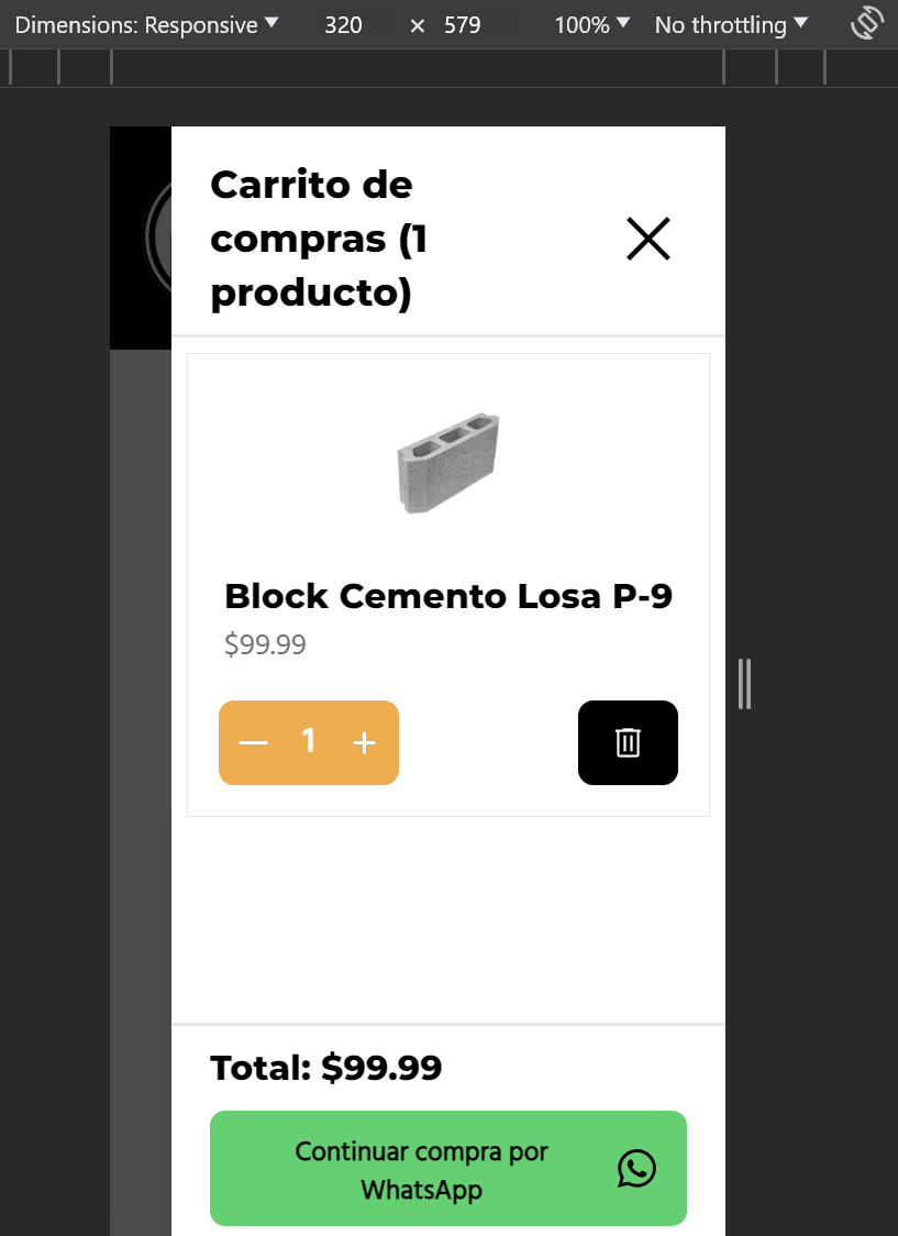
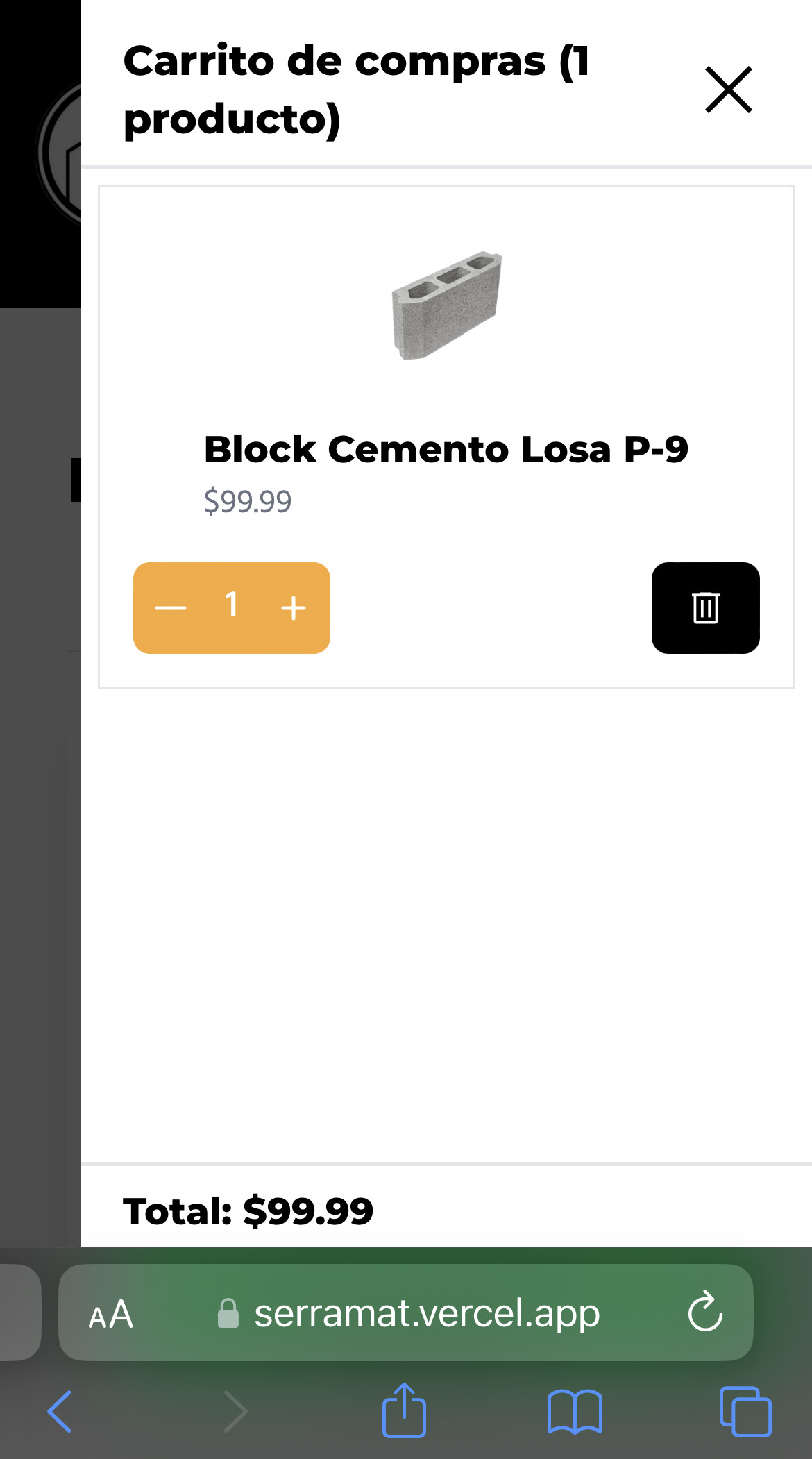
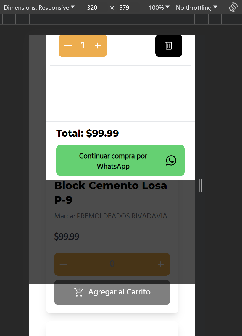
The problem arises when using the developer tools in my browser and selecting a screen with ‘Dimensions: responsive’. I can see a button in the page (https://i.stack.imgur.com/OGlta.png), but when I use the resolution of devices like iPhone, Samsung, or iPad, the bottom part of the screen is not visible (https://i.stack.imgur.com/a25gg.jpg).
  return (
    <div className=''>
        <div className={`absolute ${!props.isCartDisplayed ? "hidden" : "flex flex-col"} bg-black bg-opacity-70 w-full top-0 left-0 bottom-[-200px] z-9`}
             onClick={props.toggleCart}
        >
        </div>
        <div className={`absolute ${!props.isCartDisplayed ? "hidden" : "flex flex-col"} flex justify-between h-[100vh] bg-white w-[90%] sm:w-[70%] top-0 right-0 bottom-0 z-10 overflow-hidden`}>
  <div className="border-b-2">
    <div className="flex justify-between items-center mb-2 mt-4">
      <div>
        {props.totalCartProducts > 0 ? (
          <h2 className="text-xl font-bold mx-5">
            Carrito de compras ({props.totalCartProducts}{" "}
            {props.totalCartProducts > 1 ? "productos" : "producto"})
          </h2>
        ) : (
          <h2 className="text-xl font-bold mx-5">Carrito de compras</h2>
        )}
      </div>
      <div className="flex justify-end">
        <img
          src={close}
          onClick={props.toggleCart}
          className="w-10 h-10 mx-5 object-contain cursor-pointer"
          alt="Close"
        />
      </div>
    </div>
  </div>
  <div className="flex flex-col flex-grow overflow-y-auto">
    {cartProductElements}
  </div>
  <div className={`${props.totalCartProducts ? "" : "hidden"} border-t-2 mb-auto`}>
    <div className="flex flex-col sm:flex-row gap-2 sm:gap-0 sm:items-center px-5 my-2 justify-between">
      <h3 className="text-lg font-semibold">Total: ${total.toFixed(2)}</h3>
      <button className="flex justify-center items-center gap-2 px-4 pt-3 pb-2 bg-[#25D366] font-semibold rounded-lg text-sm hover:bg-[#128C7E]" onClick={checkout}>
        Continuar compra por WhatsApp
        <img src={whatsapp} alt='whatsappLogo' className='h-5 w-5 mb-1'></img>
      </button>
    </div>
  </div>
</div>

    </div>
  )
This code is the return statement of the CartMenu component, which is utilized by the Products component. The latter component, when the CartMenu is displayed, makes the page fixed because I don’t want it to be scrollable below the shopping cart menu (https://i.stack.imgur.com/OjLKm.png).
However, on mobile devices, when the page is fixed, the browser takes up more space than it does on a scrollable page. As a result, this part of the browser UI covers the button at the bottom of the screen. I’ve tried adjusting various CSS properties and using media queries, but I’m still encountering this issue.
Could anyone please provide some guidance on how to resolve this problem? Any help or suggestions would be greatly appreciated.
Thank you!