50 Amazing 3D Text Tutorials for Photoshop and Illustrator (Beginner to Advanced)

Master text effects with these 50 amazing tutorials. Check out this list for inspiration.

50 3D Text Tutorials for Photoshop and Illustrator

Type communicates so much more than just words. And when creatives join forces with type, they create magical text effects using programs like Adobe Photoshop and Illustrator.

Want to get in on the fun? Study typography just like your favorite type artists with this list of 50 incredible 3D text design tutorials.

Whether you’re new to these programs or a seasoned vet, these helpful tutorials will inspire you to take type with a whole new perspective.

Video: How to Make a 3D Text Effect

New to text effects? Try one out with this exclusive video tutorial.

In this video, artist Monika Zagrobelna breaks down how to make a beautiful, cream-colored text effect using Adobe Photoshop. Learn how to adjust its shape, light sources, and text details for a stunning result.

Check out the video below!

Beginner 3D Text Effect Photoshop Tutorials

You don’t have to be a Photoshop mastermind to try out these text effects. Get your feet wet with this list of beginner-friendly 3D text tutorials.

Advanced 3D Text Effect Photoshop Tutorials

Ready to take it up a notch? Tackle incredible, hyper-realistic 3D text effects featuring fun and imaginative themes. Here are a few of our favorites below.

Beginner 3D Text Effect Illustrator Tutorials

New to Adobe Illustrator? Try out a brilliant text effect tutorial with simple, easy-to-follow steps. Dive into this list of inspiration below.

Advanced 3D Text Effect Illustrator Tutorials

With a few more details, your text effects can look even better in Adobe Illustrator. Learn how to make typography for the latest trends and special effects with these tutorials. 

10 Premium 3D Text Actions & Layer Styles

Text design isn’t just for designers.

Now entrepreneurs, small business owners, and creatives of all types use premium text templates from Envato Market and Envato Elements to speed up their workflows. Use amazing pro resources like these to create awesome text effects fast.

3D Text Effects for Photoshop

Always on the go? Make sure to grab up this next awesome 3D text pack for more cool shapes and styles. You’ll get ten 3D text effect styles that you can easily update using Adobe Photoshop. A detailed tutorial is also included for more help. Check it out!

3D Text Effects for Photoshop

Cinematic 3D Text Effect

Bring your story to life with a cinematic text effect. This next 3D pack of movie mockups gives you eight fully layered Photoshop files with editable text and more. The epic background designs are also included, as well as links to free fonts.

Cinematic 3D Text Effect

Chrome & Fire Photoshop Layer Styles

Create a fiery text design in mere moments. Photoshop layers styles like this pack can set you up with extraordinary chrome and fire effects for games, intros, and movie posters. Easily import them into Photoshop, and create eye-catching effects fast!

Chrome  Fire Photoshop Layer Styles

Game Style Text Effect for Illustrator

Design your video game title with a 3D typographic logo. This set of game style text effects was made especially for Adobe Illustrator. You’ll get ten ready-to-use Adobe Illustrator styles as well as ten complementing backgrounds. Mix and match elements for more effects.

Game Style Text Effect for Illustrator

3D Text Effect

Develop
your 3D logo in seconds. This fantastic 3D text effect is a high-quality, fully layered Photoshop template that’s perfect for beginners. Jump
into the layers to access additional settings for the colors, shadows, and lighting. The original font works great, but you can also use it
with your preferred typefaces.

3D Text Effect

3D Stylized Modern Text Effect

Many modern text styles play with bright neon color effects inspired by the 80s. Want to try it yourself? Check out this vibrant pack of modern text effects for Adobe Illustrator. Enjoy 11 different styles with various 3D angles and details to choose from. Great for posters too!

3D Stylized Modern Text Effect

Foil Balloon – 3D Lettering

Ready to shine? If your next event is a cause for celebration then you’ll definitely love this download. This set includes mind-blowing 3D foil lettering inspired by the fun party balloons you see at events. Make impressive titles and posts for Instagram, Twitter, or Facebook.

Foil Balloon - 3D Lettering

Vintage Text Effects for Illustrator

Love the nostalgic feel of vintage design? Replicate the signage from your favorite movies, teams and more with this pack of vintage Illustrator text effects. Simple and easy to use, all the text effects are fully editable and are the right fit for any badge design. Check them out!

Vintage Text Effects for Illustrator

Marquee Light Bulbs 3D Text Effect

Write your name in lights with this brilliant download. Featuring a full set of letters, numbers, and special characters, this text effects package creates modern 3D text inspired by retro design. Use this set to design your logos for posters, websites, and more.

Marquee Light Bulbs 3D Text Effect

Glossy Plastic – 3D Lettering Text Effect

Get glossy! Dazzle your audience with shiny plastic text effects that are completely digital. Two unique color options are available, but you could always play with the Hue and Saturation adjustments in Photoshop. Download it today to get hi-res, glossy letters.

Glossy Plastic  3D Lettering Text Effect

More 3D Text Effect Inspiration

Many designers use creative text designs to transform their type. So learn the essentials while having fun with these incredible tutorials. Remember to post your results in the comments, and you might just see your work featured in our monthly community challenge!

For more text effect inspiration, check out these links:

{excerpt}
Read More

Build A PWA With Webpack And Workbox

A Progressive Web App (PWA) is a site that uses modern technology to deliver app-like experiences on the web. It’s an umbrella term for new technologies such as the ‘web app manifest’, ‘service worker’, and more. When joined together, these technologies allow you to deliver fast and engaging user experiences with your website.

This article is a step-by-step tutorial for adding a service worker to an existing one-page website. The service worker will allow you to make your website work offline while also notifying your users of updates to your site. Please note that this is based on a small project that is bundled with Webpack, so we’ll be using the Workbox Webpack plugin (Workbox v4).

Using a tool to generate your service worker is the recommended approach as it lets you manage your cache efficiently. We will be using Workbox — a set of libraries that make it easy to generate your service worker code — to generate our service worker in this tutorial.

Depending on your project, you can use Workbox in three different ways:

  1. A command-line interface is available which lets you integrate workbox into any application you have;
  2. A Node.js module is available which lets you integrate workbox into any Node build tool such as gulp or grunt;
  3. A webpack plugin is available which lets you easily integrate with a project that is built with Webpack.

Webpack is a module bundler. To simplify, you can think of it as a tool that manages your JavaScript dependencies. It allows you to import JavaScript code from libraries and bundles your JavaScript together into one or many files.

To get started, clone the following repository on your computer:

git clone [email protected]:jadjoubran/workbox-tutorial-v4.git
cd workbox-tutorial-v4
npm install
npm run dev

Next, navigate to http://localhost:8080/. You should be able to see the currency app we’ll be using throughout this tutorial:

Screenshot of the currency app we're building in this article.

‘Currencies’ is a PWA that lists conversion fees of currencies against the Euro (€) currency. (Large preview)

Start With An App Shell

The application shell (or ‘app shell’) is a pattern inspired from Native Apps. It will help give your app a more native look. It simply provides the app with a layout and structure without any data — a transitional screen that is aimed to improve the loading experience of your web app.

Here are some examples of app shells from native apps:

Google Inbox App Shell

Google Inbox App Shell: A few milliseconds before the emails load into the app shell. (Large preview)

Twitter native App Shell

Twitter’s native app on Android: App shell showing navbar, tabs, and loader. (Large preview)

And here are examples of app shells from PWAs:

App Shell of Twitter's PWA

The app shell of Twitter’s PWA (Large preview)

App Shell of Flipkart's PWA

The app shell of Flipkart’s PWA (Large preview)

Users like the loading experience of app shells because they despise blank screens. A blank screen makes the user feel that the website is not loading. It makes them feel as if the website were stuck.

App shells attempt to paint the navigational structure of the app as soon as possible, such as the navbar, the tab bar as well as a loader signifying that the content you’ve requested is being loaded.

So How Do You Build An App Shell?

The app shell pattern prioritizes the loading of the HTML, CSS and JavaScript that will render first. This means that we need to give those resources full priority, hence you have to inline those assets. So to build an app shell, you simply have to inline the HTML, CSS and JavaScript that are responsible for the app shell. Of course, you should not inline everything but rather stay within a limit of around 30 to 40KB total.

You can see the inlined app shell in the index.html. You can inspect the source code by checking out the index.html file, and you can preview it in the browser by deleting the

element in dev tools:

Currencies PWA App Shell with navbar & loader

The App Shell that we’re building in this article. (Large preview)

Does It Work Offline?

Let’s simulate going offline! Open DevTools, navigate to the network tab and tick the ‘Offline’ checkbox. When you reload the page, you will see that we will get the browser’s offline page.

Browser's offline error page

The request to the homepage failed so we obviously see this as a result. (Large preview)

That’s because the initial request to / (which will load the index.html file) will fail because the Internet is offline. The only way for us to recover from that request failure is by having a service worker.

Let’s visualize the request without a service worker:

Network request goes from the browser to the Internet and back. (Icons from flaticon.com) (Large preview)

A service worker is a programmable network proxy, which means it sits in between your web page and the Internet. This lets you control incoming and outgoing network requests.

Network request gets intercepted by the service worker. (Icons from flaticon.com) (Large preview)

This is beneficial because we can now re-route this failed request to the cache (assuming we have the content in the cache).

Animation of a network request interecepted by the service worker and redirected to the cache.
Network request gets redirected to the cache when it already exists in the cache. (Icons from flaticon.com) (Large preview)

A service worker is also a type of Web Worker, meaning that it runs separately from your main page and doesn’t have access to either the window or document object.

Precache The App Shell

In order to make our app work offline, we’re going to start by precaching the app shell.

So let’s start by installing the Webpack Workbox plugin:

npm install --save-dev workbox-webpack-plugin

Then we’re going to open our index.js file and register the service worker:

if ("serviceWorker" in navigator){
window.addEventListener("load", () => {
navigator.serviceWorker.register("/sw.js");
})
}

Next, open the webpack.config.js file and let’s configure the Workbox webpack plugin:

//add at the top
const WorkboxWebpackPlugin = require("workbox-webpack-plugin");

//add inside the plugins array:
plugins: [
…
, new WorkboxWebpackPlugin.InjectManifest({
  swSrc: "./src/src-sw.js",
  swDest: "sw.js"
})
]

This will instruct Workbox to use our ./src/src-sw.js file as a base. The generated file will be called sw.js and will be in the dist folder.

Then create a ./src/src-sw.js file at the root level and write the following inside of it:

workbox.precaching.precacheAndRoute(self.__precacheManifest);

Note: The self.__precacheManifest variable will be imported from a file that will be dynamically generated by workbox.

Now you’re ready to build your code with npm run build and Workbox will generate two files inside the dist folder:

  • precache-manifest.66cf63077c7e4a70ba741ee9e6a8da29.js
  • sw.js

The sw.js imports workbox from CDN as well as the precache-manifest.[chunkhash].js.

//precache-manifest.[chunkhash].js file
self.__precacheManifest = (self.__precacheManifest || []).concat([
  
    "revision": "ba8f7488757693a5a5b1e712ac29cc28",
    "url": "index.html"
  },
  
    "url": "main.49467c51ac5e0cb2b58e.js"
  
]);

The precache manifest lists the names of the files that were processed by webpack and that end up in your dist folder. We will use these files to precache them in the browser. This means that when your website loads the first time and registers the service worker, it will cache these assets so that they can be used the next time.

You can also notice that some entries have a ‘revision’ whereas others don’t. That’s because the revision can sometimes be inferred from the chunkhash from the file name. For example, let’s take a closer look at the file name main.49467c51ac5e0cb2b58e.js. It has a revision is in the filename, which is the chunkhash 49467c51ac5e0cb2b58e.

This allows Workbox to understand when your files change so that it only cleans up or updates the files that were changed, rather than dumping all the cache every time you publish a new version of your service worker.

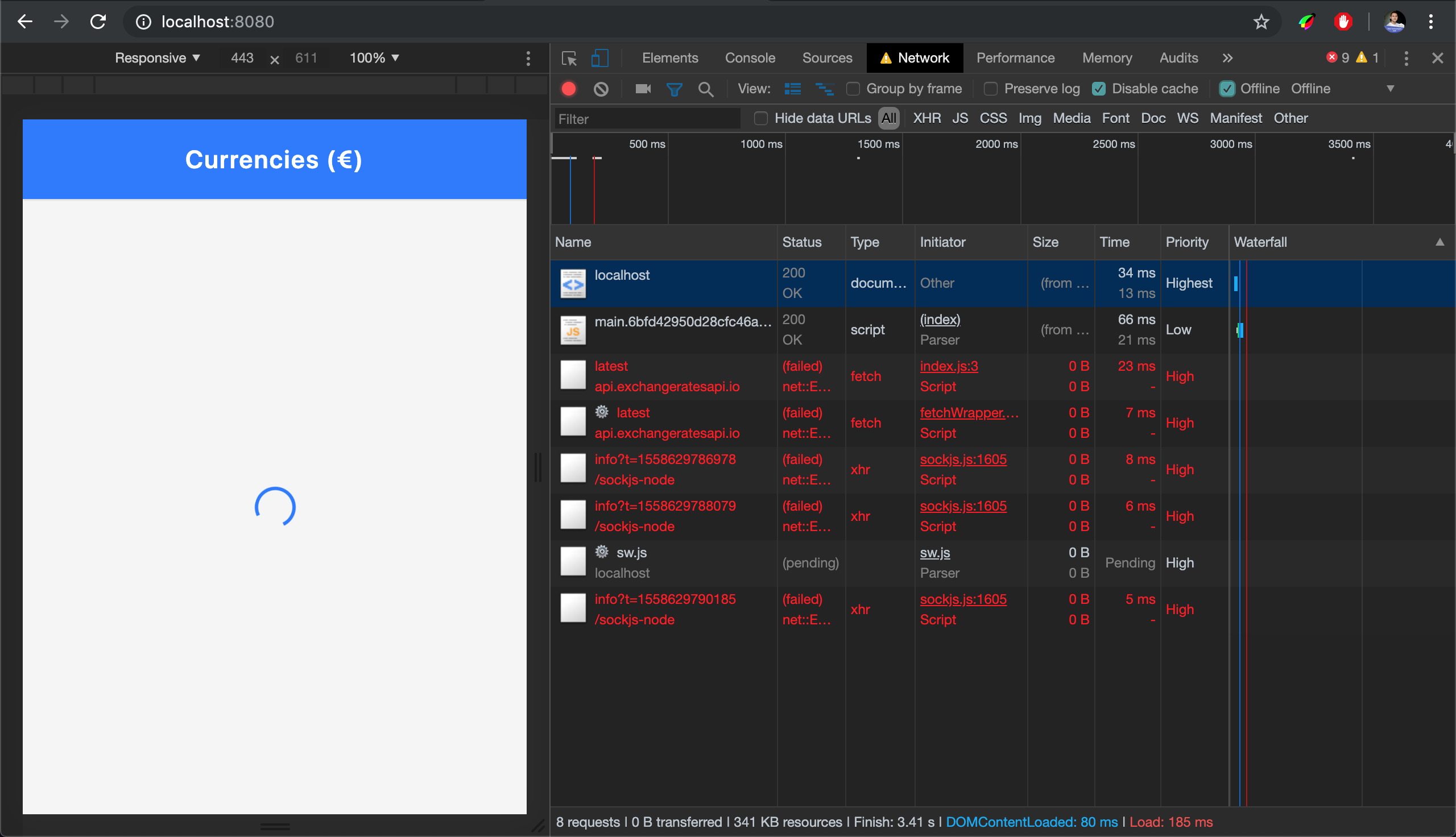
The first time you load the page, the service worker will install. You can see that in DevTools. First, the sw.js file is requested which then requests all the other files. They are clearly marked with the gear icon.

Screenshot of DevTools Network tab when the service worker gets installed.

Requests marked with the ? icon are requests initiated by the service worker. (Large preview)

So Workbox will initialize and it will precache all the files that are in the precache-manifest. It is important to double check that you don’t have any unnecessary files in the precache-manifest file such as .map files or files that are not part of the app shell.

In the network tab, we can see the requests coming from the service worker. And now if you try to go offline, the app shell is already precached so it works even if we’re offline!

Screenshot of Dev Tools Network tab showing API calls failing.

API calls fail when we go offline. (Large preview)

Cache Dynamic Routes

Did you notice that when we went offline, the app shell works but not our data? That’s because these API calls are not part of the precached app shell. When there’s no Internet connection, these requests will fail and the user won’t be able to see the currency information.

However, these requests cannot be precached because their value comes from an API. Moreover, when you start having multiple pages, you don’t want to cache all API request in one go. Instead, you want to cache them when the user visits that page.

We call these ‘dynamic data’. They often include API calls as well as images and other assets that are requested when a user does a certain action on your website (e.g. when they browse to a new page).

You can cache these using Workbox’s routing module. Here’s how:

//add in src/src-sw.js
workbox.routing.registerRoute(
  /https://api.exchangeratesapi.io/latest/,
  new workbox.strategies.NetworkFirst({
    cacheName: "currencies",
    plugins: [
      new workbox.expiration.Plugin({
        maxAgeSeconds: 10 * 60 // 10 minutes
      })
    
  })
);

This will set up dynamic caching for any request URL that matches the URL https://api.exchangeratesapi.io/latest.

The caching strategy that we used here is called NetworkFirst; there are two other ones that are often used:

  1. CacheFirst
  2. StaleWhileRevalidate

CacheFirst will look for it in the cache first. If it’s not found, then it will get it from the network. StaleWhileRevalidate will go to the network and the cache at the same time. Return the cache’s response to the page (while in the background) it will use the new network response to update the cache for the next time it’s used.

For our use case, we had to go with NetworkFirst because we’re dealing with currency rates that change very often. However, when the user goes offline, we can at least show them the rates as they were 10 minutes ago — that’s why we used the expiration plugin with the maxAgeSeconds set to 10 * 60 seconds.

Manage App Updates

Everytime a user loads your page, the browser will run the navigator.serviceWorker.register code even though the service worker is already installed and running. This allows the browser to detect if there’s a new version of the service worker. When the browser notices that the file has not changed, it just skips the registration call. Once that file changes, the browser understands that there’s a new version of the service worker, thus it installs the new service worker parallel to the currently running service worker.

However, it pauses at the installed/waiting phase because only one service worker can be activated at the same time.

The life cycle of a service worker: Parsed, Installed/Waiting, Activated & Redundant

A simplified life cycle of a service worker (Large preview)

Only when all the browser windows controlled by the previous service worker are installed, then it becomes safe for the new service worker to activate.

You can also manually control that by calling skipWaiting() (or self.skipWaiting() since self is the global execution context in the service worker). However, most of the time you should only do that after asking the user if they want to get the latest update.

Thankfully, workbox-window helps us achieve this. It’s a new window library introduced in Workbox v4 that aims at simplifying common tasks on the window’s side.

Let’s start by installing it with the following:

npm install workbox-window

Next, import Workbox at the top of the file index.js:

import { Workbox } from "workbox-window";

Then we’ll replace our registration code with the below:

if ("serviceWorker" in navigator) {
  window.addEventListener("load", () => {
      const wb = new Workbox("/sw.js");
    
wb.register();
  });

}

We’ll then find the update button which has the ID app-update and listen for the workbox-waiting event:

//add before the wb.register()
const updateButton = document.querySelector("#app-update");
// Fires when the registered service worker has installed but is waiting to activate.
wb.addEventListener("waiting", event => {
    updateButton.classList.add("show");
    updateButton.addEventListener("click", () => {
    // Set up a listener that will reload the page as soon as the previously waiting service worker has taken control.
    wb.addEventListener("controlling", event => {
        window.location.reload();
    });

    // Send a message telling the service worker to skip waiting.
    // This will trigger the `controlling` event handler above.
    wb.messageSW({ type: "SKIP_WAITING" });
    });
});

This code will show the update button when there’s a new update (so when the service worker is in a waiting state) and will send a SKIP_WAITING message to the service worker.

We’ll need update the service worker file and handle the SKIP_WAITING event such that it calls the skipWaiting:

//add in src-sw.js
addEventListener("message", event => {
  if (event.data && event.data.type === "SKIP_WAITING") {
    skipWaiting();
  
});

Now run npm run dev then reload the page. Go into your code and update the navbar title to “Navbar v2”. Reload the page again, and you should be able to see the update icon.

Wrapping Up

Our website now works offline and is able to tell the user about new updates. Please keep in mind though, that the most important factor when building a PWA is the user experience. Always focus on building experiences that are easy to use by your users. We, as developers, tend to get too excited about technology and often end up forgetting about our users.

Source:: smashingmagazine

The post Build A PWA With Webpack And Workbox appeared first on Hidden Pixels.

Better Search UX Through Microcopy

It’s hard to overstate the importance of web search. Searching is as old as the Internet itself, and by some measures, even older. A well-designed search benefits both you and your users; it increases conversions, reduces bounce rates, and improves the user experience.

Search is especially important on large scale sites and e-commerce experiences, where the majority of revenue comes from search-driven sessions. Studies show that up to 50% of users go straight to the internal search bar of a website, and that 15% outright prefer using the search function to browsing the hierarchical menu. This means that for all the love and care that goes into determining the information architecture of a site, just as much has to go into designing the search experience.

Complicating the problem is the fact that users’ search skills are flimsy at best, and incompetent at worst. Getting good results from a search engine often requires multiple attempts and reformulations, which users rarely do. And as search technology improves over time, users are increasingly likely to accept the results of a search as the answer to their question, even if their query was flawed. Users who favor searches tend to move quickly, scanning the page for that familiar-looking rectangle, and bouncing quickly when they don’t find what they’re looking for.

Communicating with those users “at speed” is a tricky job that requires a specialized tool: microcopy. The name ‘microcopy’ belies its own importance. It may be small, but big successes often hinge on it. It’s a place where voice can shine through, where good impressions are made, and where utility and branding intersect. With that in mind, let’s dive into the many ways that microcopy and contextualization can vastly improve a search experience.

Placing And Labeling Your Search

In accordance with Jakob’s Law, your first instinct when designing a search bar should be to put a rectangular box in the upper right or upper left corner. You should add a label or A11y-friendly placeholder text, and include a submit button that says “Search.”

Hiding the search bar behind a link, forgoing placeholder text, or opting for magnifying glass icon CTA instead of plain text are all valid design decisions in the right context. Just make sure you’re not abstracting the function of the search bar unnecessarily because searching already has a higher interaction cost than browsing.

Every barrier, however inconsequential you may find it as a designer, risks negatively affecting the UX and your bottom line. If there’s a risk your users may confuse the magnifying glass icon for a “zoom” button, you should mitigate that.

Placeholder Text

Placeholder text is a great place to enhance the experience. It can be informational, it can be a place for brand expression, and it can nudge wavering users in the right direction. Anytime I see a search bar that just says “Search,” I see a missed opportunity.

So what’s a better approach? It varies from site to site. First, familiarize yourself with your business goals, your brand, and your users’ existing habits. Then, consider how you can be the most helpful.

Nudge The User

A suggestive approach can reduce the user’s anxiety. Clue your users into the fact that they can search in multiple ways, especially if they may not be familiar with your full range of products or services. ASOS suggests searching for inspiration in addition to products and brands:

The search bar on the ASOS website

(Image source: ASOS) (Large preview)

Be Informative

Tell the user exactly what they’ll be getting when they hit submit. On Shutterstock, a site wholly devoted to the search of a massive photo archive, this placeholder text cleverly doubles as a tagline when paired with the logo:

The search bar on the Shutterstock website

(Image source: Shutterstock) (Large preview)

Reinforce The Brand

Home Depot’s search bar doesn’t lead the user, but instead presents a helpful, personal tone which I’m sure is in line with their brand voice guidelines. This is probably the best approach considering the size of their product catalog:

Home Depot's search bar

(Image source: The Home Depot) (Large preview)

Using Search Logs To Your Advantage

If you’re not sure the best way to optimize your placeholder text, a good place to start is your search log database. Learning how to break down these results can be incredibly valuable when formulating helpful content design. You’ll be able to see first-hand the vocabulary people use to search your site, and more importantly, the gaps between what you offer and what your users are looking for.

Suggested, Related, And Recent Searches

During the search process, your copy should offer as much help along the way as possible without being overbearing. That includes everything from an obvious “Cancel” or “Clear” button to logging each user’s recent searches for surfacing later. When choosing the right microcopy to accompany these features, add a dash of brown sauce.

Autosuggestions

Users who use the search bar are doing so because they’re looking for something specific, which makes autosuggestions a valuable (and increasingly expected) tool. Specificity, in this case, may be as focused as “Women’s gray shoe size 9M” or as open-ended as “Sandwich shops near me.”

Autosuggestions also reduce the risk of returning bad results, alleviate the mental effort on the user, and present an opportunity to surface your most popular products.

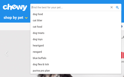
Chewy

(Image source: Chewy) (Large preview)

Often these don’t require additional context or copy at all, but can just be listed below the search bar as the user types, as shown in the example above.

Related Searches

Showing related searches on the results page is another way to help guide users without getting in the way. A common pattern is providing a few clickable keywords related to the original query above the results. A little copy that states “Other users searched for” is a good way to incorporate social proof into the search experience.

Recent Searches

If your technology allows it, saving and resurfacing recent searches is another way to helpfully reduce the memory load on the user. Make sure you add context with copy, but it can be as straightforward as this:

The search bar on the Macy's website

(Image source: Macy’s) (Large preview)

Handling Results

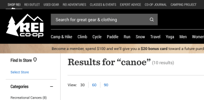
There are a two pieces of copy that I’d consider required when displaying search results:

  1. The query itself.
    If the search bar is highly visible, it can be displayed here. You can also create an H1 that states “Results for {{terms}}.”
  2. The number of results.
    If the results are paginated, you might also include the number of pages.

The search bar on the REI Co-op website

(Image source: REI Co-op) (Large preview)

No Results

Whether through their own error not, users will inevitably encounter a “no results” page at some point. Luckily, there are ways to handle this gracefully; in fact, with the right approach, this dead end can actually be a great opportunity for content discovery.

First of all, don’t expect your users to refine their search if they get no results — at least not without a UI that encourages it. Users are reluctant to reformulate their query and have trouble when trying to. They’re more likely to engage with whatever information they’re presented with and take it from there, or abandon the task entirely. (When was the last time you clicked through to the second page of Google search results?)

That said, it’s easy to see how a little copywriting and contextualization can improve the experience. Nielsen Norman Group has a comprehensive guide on how to handle No Results SERPs, with the gist being:

  • Make it obvious there are no results.
    It’s easy to get cute and accidentally bury the lede. It’s also tempting to intentionally hide the “no results” messaging to obfuscate the error entirely. Either way, don’t trick the user.
  • Offer paths forward.
    Suggest ways to refine the search query (such as checking your spelling), and also provide links to popular content or products that have the highest likelihood of connecting with the user.
  • Strike the right tone.
    Use your brand voice, but don’t run the risk of exacerbating the situation with humor that might be ill-received by a frustrated user.

Also, bear in mind that empty SERPs may arise because a user mistakenly submitted without entering any query at all. You should have a content plan for this scenario as well rather than returning all items in the database, for example.

Wrapping Up

Writing a good search experience comes down to thoughtfulness. As designers, we’ve probably used and created hundreds of different web search experiences, so we breeze through the process. But when we consider every small step of the process (every microinteraction and every edge case), the minor changes we make can have a major impact on the experience. Next time you find yourself reaching for a visual solution to a search problem, consider using your words instead.

Source:: smashingmagazine

The post Better Search UX Through Microcopy appeared first on Hidden Pixels.

10 Top Tips for Creative Brochure Design

Final product image
What You’ll Be Creating

Designing a relevant and highly effective brochure can contribute to a company’s success. A well-designed brochure can educate your readers, increase credibility, attract a target audience, and ultimately lead consumers to take action.

Creating a quality brochure can be a challenge, so today, we bring you ten tips for creative brochure design. A brochure is commonly seen on racks providing information about a company, product, event, or service. Brochures can come in a variety of formats and sizes, so knowing which one you need can become a challenge of its own. 

In this article, we’ll walk you through everything from preparing copy and images to the final edit of your brochure, providing examples of templates and tutorials along the way. You’re sure to take away some great tips. 

In a hurry? We’ve got amazing brochure templates and InDesign portfolio book templates over at Envato Elements and GraphicRiver. Go check them out! 

1. Prepare Copy and Images

Before you start working directly in the software, it is essential to know how long your copy is and what kind of images you’ll be working with. This will help you decide about layout, brochure format, length, and font size. As designers, we know that getting attached to one solution is a no-no. So be prepared to make changes and be flexible along the way.

Keep in mind that big blocks of text can be overwhelming for readers. People tend to scan pages quickly, so shoot for just the ideal amount of information. Use headlines and sub-headlines to structure the content. Bullet points are useful to make short, quick statements that can get your message across.

If you are designing for a specific brand, make sure the colors and feel are in line with the branding. Are there any specific colors and fonts that should be used? Ask for the brand guidelines, which can help you make some of the decisions. This will create a brochure design that belongs to a specific company rather than a random marketing element. 

Gather the images and make sure you can use them as big you need, especially if you want the brochure to look expensive. People nowadays notice when pixelation occurs. Find a way to tell a cohesive story with your images. 

If you have doubts, try to keep the brochure design clean and simple. For best results, try to do a round of edits to see what elements are absolutely necessary to include. Envato Elements offers high-quality images, and with an ever-growing library, you are sure to find what you need. 

Envato Elements
Envato Elements

2. Know Your Folds

With just over a dozen types of brochure, knowing which type you need is crucial. Think about how users will interact with the piece. 

For a bifold brochure, they will look at the cover and open it to reveal the inside. Then they’ll close it to reveal the back. 

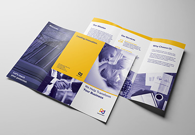
For a trifold brochure, which has three panels, users will unfold each panel separately. Here, you can add some kind of surprise as the brochure unfolds to create an interesting piece. While each panel is seen as a boundary, take advantage of it and span images or text across two panels.

A trifold brochure is the most popular piece used by businesses. This is great if you want to display general information about a company and its services. Take this trifold business brochure as an example. Use imagery and quotes to reinforce your message. Break up the text with graphic elements and white space. Take advantage of using icons and symbols to simplify the message. 

Trifold Brochure
Trifold Brochure

For more extensive brochures, you might want to go for a multi-page document like a booklet or portfolio. Apply careful thought as you’ll want this to be cost-effective. With more pages, you’d need to treat this brochure slightly differently. Pay attention to the pace of each page, making sure you are not overwhelming the reader with information. After all, you want them to get to know you just enough that they can set up a meeting to get to know your business better. 

This architecture portfolio template in InDesign is a multipage document. It’s designed with clean and simple details, allowing the images to shine on their own.

architecture portfolio brochure
Architecture Portfolio Brochure

If you’d like to learn more about brochure formats and dimensions, we’ve got a handy article on that. It includes specific measurements, types of folds, and the uses for each brochure. 

3. Choose Legible and Limited Fonts

If you are designing a business brochure for a specific company, ask what fonts they are using on their logo and brand in general. It is our job as designers to deliver cohesiveness throughout a brand. Typically in a brochure design you’d need a headline, sub-headline, and copy. Stick to using no more than two fonts and take advantage of using the font’s families to highlight certain copy (regular, bold, italic, etc.).

Both brochure ideas below use a serif and a sans serif font. Nowadays, there aren’t really any rules as to what fonts to use for copy. Traditionalists might opt to use serif fonts for a lengthy amount of body copy and sans serif for display copy. Use italics to highlight text or bold sans serif to add quotes on a panel. If you are layering type over a dark background, run a test print to make sure the copy is legible. 

Lumina trifold brochure
LUMINA Trifold Brochure

This proposal brochure template comes with files editable in Adobe InDesign and Word. The clear typographic hierarchy can help guide readers and create a good flow throughout the design.

Proposal brochure design
Proposal Brochure Design

If you are looking for some high-quality fonts, check out Envato Elements. Browse the fonts section to find suitable families for your next marketing brochure.

Envato Elements Fonts

4. Design a User-Friendly Flow

Pacing is something I personally think is important when designing a printed piece. If the piece is interesting enough, users can decide to either read it or put it down. Think about how readers would want to receive the information.

Balance the amount of text and visuals on each business brochure panel. These two elements are meant to work together and support each other for a striking finished product. Opt for a bite-size amount of copy in each panel—large chunks of text can be tiring to read and can appear visually heavy. Use color to create hierarchy within the copy. Highlight the headlines and use dark colors for copy, as in the pamphlet design below. 

Marketing Agency Brochure Trifold

Most cultures read from left to right and top to bottom. Arrange the information in a logical flow so it complements the way a marketing brochure unfolds. If you are not able to use high-quality imagery, use graphics to create movement and depth. Check out this clean template using the minimal amount of images. It is carefully balanced by the amount of graphics and text displayed in each panel.

Maskot business and corporate brochure trifold
Maskot Business and Corporate Brochure Trifold

5. Create an Effective Cover

A cover is prime real estate that will call for your reader’s attention if designed successfully. To design a compelling cover, include only concise information, so that it’s easy and fast to read at a distance, especially if your brochure is placed on a rack. Avoid cluttered covers, and instead use simple and impactful imagery that represents your company/client. Images are sometimes more intuitive than words. 

Check out this minimalist fashion portfolio template. The most important elements—title and image—are placed on the right side of the cover. This makes helps the reader make a connection between the two while keeping the less important information on the opposite side.

Fashion Brochure
Fashion Brochure

This clean booklet design lays a rectangle over the image. This creates a sense of depth while hinting at the kind of company we are about to see. The title and company name are highly visible and free of any visual disturbances.

Corporate Brochure
Corporate Brochure

This medical brochure template tutorial includes a simple but successful cover. Include a big image at the top and concentrate the copy at the bottom, so readers will get the information they need right away.

6. Use High-Quality Imagery

The importance of using high quality images is usually underrated. Consumers can tell how much care you’ve put into creating a brochure design by simply looking at the images used. Use imagery that reflects your intent and communicates your message. 

Once you’ve picked out the right imagery, check the resolution. Make sure the images can be printed to avoid pixelated prints. This can bring down the quality level of your design. Check for color tones and color correction. If you’ve acquired images with different tones, try adding a visual treatment like an overlay. This will give all the images an even look across the board. 

This product brochure template includes an interior design theme. All the images are crisp white and clean, with a consistent yellow color making an appearance. This is another great way to create cohesiveness throughout the design.

Brochure
Brochure

Check out this brochure template tutorial. Using profile pictures of the pets is a great idea! Even better is the consistent use of white background in each photo—it really makes it look as if the designer has put in the effort to arrange for a photo shoot. 

The presentation template is also an awesome example to achieve a cohesive brochure design layout. Add an overlay to all your images and you are set for success. 

7. Embrace Negative Space

If you are choosing to use a multi-panel brochure, try adding elements of surprise for your readership. Alternating panels between a light and a dark color can enhance the look of the brochure. It avoids making the brochure seem monotone and adds visual weight. Use this negative space to highlight certain information you want to add more attention to. Add a quote, or use a call to action over a dark background to communicate a message much more clearly. 

Brochure
Brochure

In addition to highlighting information, try alternating panels between a light and dark background. Treat each panel as if they were separate pages of a book. While the panels need to have a consistent layout (font and type hierarchy), it is a great idea to add something special to each design. Treat them as if they were cousins, not siblings.

Brochure
Brochure

Take a look at this trifold pamphlet template tutorial. This is a great example of how to include colors to make your design pop.

8. Include a Clear Call to Action

Every marketing brochure design out there has a common goal, for the reader to take action. A call to action (CTA) needs to be transparent and stated in a big way. Give your readers a reason to contact you by avoiding having the CTA part of a long paragraph. Instead, make the statement bold and hard to miss, as in the brochure template below. 

Short sentences like “get in touch” or “contact us now” can do the trick. Urge the reader to act right away. Other common offers can include discounts for specific specials, giveaways with limited quantities, or a free gift.

Corporate trifold brochure
Corporate Trifold Brochure

You can also try using other short incentives that communicate achievement. Check out this trifold pamphlet tutorial that very positively states, “Let’s reach your potential.”

9. Make It Easy to Respond

Include vital contact information in the brochure. Readers might not be able to find the information, even if you’ve included all they need. Therefore, place it somewhere highly visible like the back panel or even the cover. 

If you are showing multiple personnel profiles, add contact information for each person. Include a website, email, social media accounts, phone number, and address. QR codes are also popular. With a quick scan, they can take people to a specific website. 

This template has all the necessary information laid out on the back panel. It is clean and clear so readers won’t have a hard time finding it.

trifold brochure
Trifold Brochure

Unlike the example above, this bifold brochure has the contact information on the cover. This is great if there’s ample space that allows you to include everything you need.

Business brochure
Business Brochure

10. Design a Brochure Worth Keeping

Compared to other pieces of printed design, brochures tend to have a short life. They aren’t often seen as something to be kept for a long time and usually end in the trash right after they are delivered to users. Designing not only an eye-catching brochure but one that can double its use can help users wonder, “What else can I use this for?”

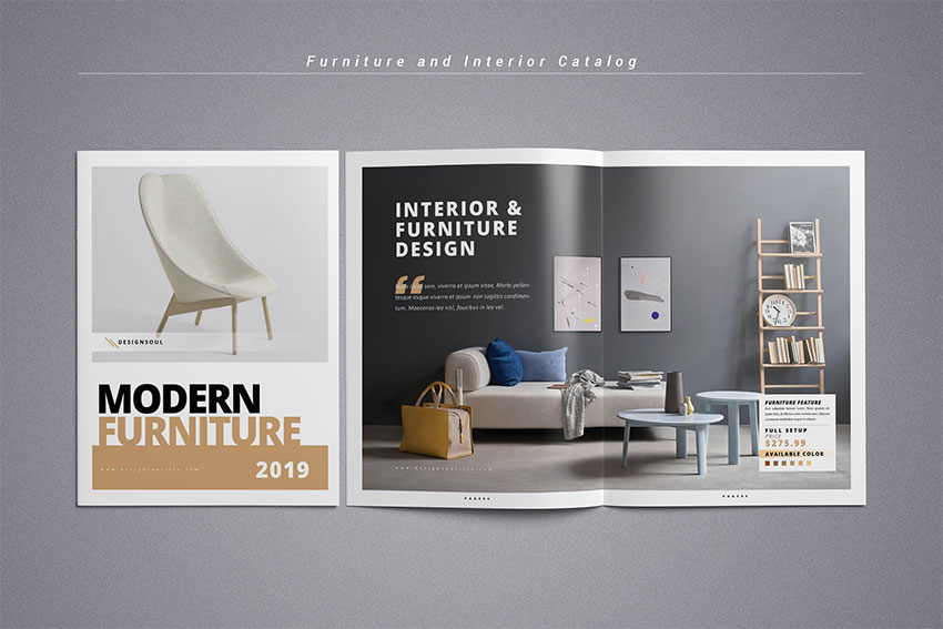
Photography portfolios and fashion and furniture brochures have a higher chance of being kept. Readers usually want to go back and take a look at the latest artistic and fashion trends. Furniture catalogues are great inspiration for most users on how to decorate, so consider adding tips along with the content. 

Furniture and interior catalog
Furniture and Interior Catalog

Check out this tutorial on how to make a stylish Adobe InDesign portfolio template. Art and beautiful imagery are a great way to entice readers to keep your brochures, so why not give it a try! 

Designers tend to be collectors, and most people keep things that feel expensive to the touch. It isn’t always necessary to spend more money to design something worth keeping. To add value to a brochure, include useful information that serves a purpose to the user, such as a city guide, a calendar, or emergency numbers.

If the budget allows, try investing in a different paper weight, high-end finishes, and special processes. It might not seem like much, but the way a printed piece feels on the hands can dictate what your users think of the company. Talk to your printer to see what options are available, and they might be able to help you raise the bar on your next marketing brochure design.

Check out this tutorial on how to create a fold-out city guide—it’s a clever idea! 

Now It’s Your Turn! 

Once your brochure is designed, take your time to look at the final product. A round of edits is helpful to see if you can lose some elements that aren’t helping in the design. Make sure there’s a second pair of eyes reading the copy—here you really want to avoid typos and mistakes. Finally, ask yourself the following questions:

  • Does the brochure grab attention?
  • Is the message communicated clearly?
  • Is the call to action clear?
  • Does the brochure represent the brand?

Brochure designs are fun, but there are many considerations to keep in mind. Aim for a long-lasting design, and when in doubt, keep it simple. If you are new to design, pre-designed templates can make your job much easier. Layouts and fonts are figured out for you, and if necessary, you can customise the colors. 

Most of them are easy to edit—simply add your content and images, and you are good to go. If you want to explore InDesign portfolio templates or fashion portfolio templates right away, head over to Envato Elements and GraphicRiver. We’ve got many options!

If you are an experienced designer and are looking to create mockups of your brochure designs, head over to Placeit. The website provides you with a wide selection of images in which you can apply our own design to quickly mock up projects. 

We’ve gathered some of our favorite tutorials below. If you want to dive into creating your own designs, this is a great place to start:

{excerpt}
Read More