
Category: Tutorials
Tutorials,freelance,projects,joomla,php,mysql,wordpress,blancer.com
Amazon previews Prime Day deals before the shopping frenzy

NVIDIA RTX 2060 Super and 2070 Super review

Harvard’s camera can show you the world through the eyes of a shrimp

20 Best Professional Business Brochure Design Templates for 2019
With the explosion of digital media, are professional brochures dead? You might think that for a second, but brochures are far from over. You’ve probably just been handed out one last week.
Brochures are essential marketing for a lot of businesses, and especially brick and mortar stores. They contain information about your company and the products or services that you sell, which potential customers can readily read without the need to go online.
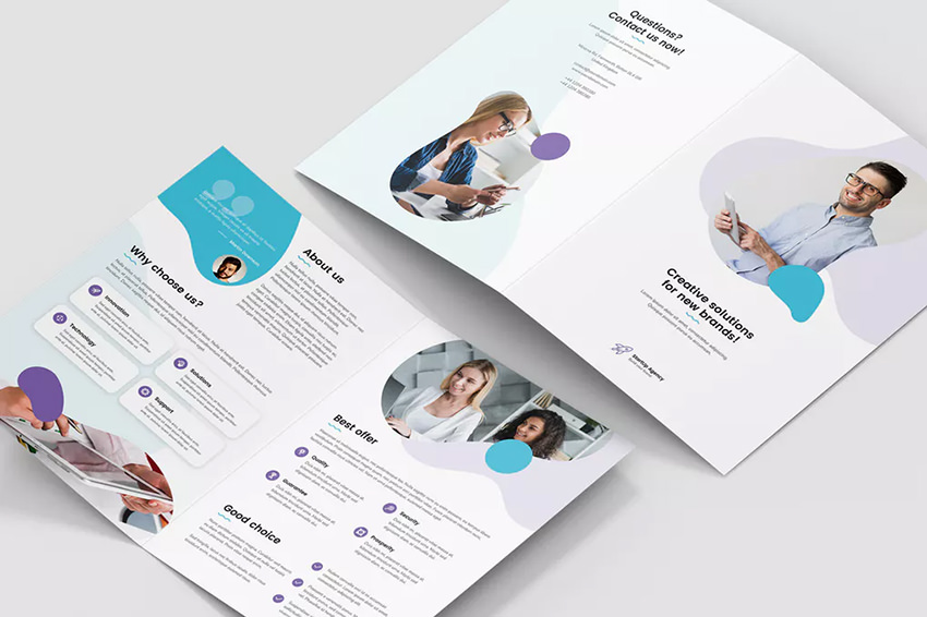
Say, you’ve got a newly launched spa in your town. Handing out brochures is a great way to introduce your spa services. It’s a simple yet surefire way to build a buzz around your business. A visually stunning business brochure design is a must to catch your audience’s attention and get your desired impact.
An impactful business brochure design must have the perfect layout, content structure, readable fonts, and remarkable graphics. Feeling overwhelmed? There’s no shame in that. Why not use business brochure templates to make sure your business brochure looks good?
A professional booklet template can help sell your products or services and land you more customers without the added pressure of designing the right pamphlet designs. Professionally-designed business brochures save you time and effort.
Best Business Brochure Templates on Envato Elements (With Unlimited Use)

With just one subscription, you get access to the best brochure design templates on Envato Elements with unlimited downloads! Plus, you’ll also be free to use hundreds of thousands of digital assets too.
How amazing is that? These business brochure templates can be customized to suit your business branding requirements. You can brand them with your own logo, desired colors, and required fonts instantly.

Here are some of the 2019 latest brochure design templates from Envato Elements that’ll help you promote your business using clean and modern-looking professional business brochures:
1. Geometric Brochure

Geometrical shapes are always in season. In fact, they’re trending again this year. What makes them appealing is their flexibility. They work well with any type of industry.
This professional business brochure template showcases triangles and even forms hexagons as graphics. It includes 24 pages that are readily available for reuse. Its sleek and modern-looking finish is customizable and adaptable in InDesign.
2. Minimalist Business Brochure Bi-Fold

Because of its clean and elegant quality, minimalism is a favorite design trend among graphic artists. You can use this design trend in your brochures too!
One of the best professional brochure design templates is this clean brochure design. The use of a minimal amount of design elements makes it a lot easier for you to convey your brand message. It allows you to put emphasis more on your contents because of the less distraction on the graphics.
3. Multipurpose Square Brochure

This multipurpose business brochure template stands out because of the blend of simplicity and modern look.
Impress your potential customers and close your deals easier with this clean and sophisticated brochure template. It’s got strong typography that’ll make your catalog look more professional and compelling.
4. Fashion and Photography Trifold Brochure

This is a perfect template for those businesses in the fashion industry. But this can also be used by photographers, designers, and other retailers with a huge product catalog.
With many layouts allotted for images, you can showcase your most popular products. With short descriptions and titles, you can be brief and concise in explaining the benefits and features of your offerings.
5. Colorful Pattern Brochure

Your professional brochure doesn’t have to be bland. You can use bold and vibrant colors while still looking clean and professional.
With 26 custom pages and compatibility with InDesign, this easy to customize business brochure template is guaranteed with bold colors and visual structure.
15 Brochure Design Templates on GraphicRiver (Trending in 2019)
While Envato Elements is a great option for people actively using digital assets, it may not be needed if you’re looking for just a single brochure template.
If you prefer to buy new PowerPoint templates one at a time (instead of getting unlimited access to thousands of templates and design assets), check out the selection from our GraphicRiver marketplace below:

Alternatively, you can promote your business by adding a professional and modern twist to your traditional looking brochures with GraphicRiver’s collection of ready-made professional business brochure design templates.
Here are the best brochure design templates specifically tailored for different industries. They all contain visually stunning graphics, modern typography, and amazing photography.
1. Square Events Brochure/Programme

Highly creative brochure with placements for stunning images. This can be used to promote events such as conferences, workshops, summits, school programs, and music fests.
2. Educational Tri-Fold Brochure

Specially designed for graduations, commencement programs, and school yearbooks. This adds dignified and professional looking touches to this brochure design template.
3. Annual Report Brochure

Perfectly made for annual reports, this professional business brochure design template will surely keep your shareholders, creditors, and other regulatory bodies engaged and focused.
4. Content Marketing Brochure

This template is highly recommended for digital marketing companies that want a consistent and modern looking branding.
5. The Minimal Portfolio

Recommended for product designers, graphic artists, service or product catalogs, and agency-based projects.
6. Medical HealthCare Brochure

This pamphlet is one of the best brochure design templates that’ll immediately exude trust and professionalism. Perfect for healthcare, medical, and related industries.
7. Real Estate Brochure – Aroura

Showcase amazing houses, interiors, and a lot more with this professional brochure. Ideal for real estate agencies, home designs, interior designers, etc.
8. Charity Volunteer Donation Brochure

This ready-to-use template for companies like charity support, volunteer, non-profit organizations, etc. The minimalistic design and professional look are a great combo to focus on getting your message across to charitable donors.
9. Banking and Financial Service Trifold Brochure

This tri-fold brochure is perfectly suitable for banking and financial industry. Use this brochure design template to amp up your brochure style with a modern look without sacrificing your professional branding.
10. Fashion Brochure Template

Promote your future fashion empire with this one of the best brochure templates for fashion stores. Advertise your products effectively with this tri-fold brochure so you can showcase your clothes, shoes, glasses, bags, and other fashion products.
11. Chocolate Bi-Fold Brochure

Have a bakery or restaurant? This bi-fold brochure design template is perfect for stores with chocolate menu items. Boost your sales with this creative template with chocolate graphics and backdrops.
12. Company Profile Brochure

This professional booklet template is designed exclusively for corporate catalog, agency brochure, business updates, company profile, and other business use. It’s fully editable, images can be quickly added or changed in smart objects too.
13. Restaurant Business Tri-fold Brochure

Have a newly opened restaurant? This beautiful and creative tri-fold brochure template can help you showcase your menu items. Add photos of your food and include a relevant description to entice your future customers with your sumptuous dishes.
14. Spa Brochure Square Trifold

Make your spa and wellness center the customer’s number choice with this professional business brochure design template. This can also be used by beauty salons, nail services, and other grooming services.
15. E-Commerce Business Brochure

A fully customizable brochure template with an unlimited color facility, this is specifically created for online stores that want to showcase their offerings more visually appealing.
5 Quick Design Tips: To Make Your Business Brochure More Professional
An effective business brochure is aimed to educate its readers. While the content should be the main selling point, your brochure design can make your message even more persuasive.
Here are five design tips and tricks that you’ve got to keep in mind to create visually compelling and professional looking brochures instantly:
1. Select a Layout for Your Brochure
Gather your contents and try to visualize how you want them to appear. This will help you identify which type of layout works best for you. The standard letter size (8 ½” × 11″) is a good starting point for you to help envision your brochure.
There are many types of brochure layouts to accommodate your needs. Here are some of the most common ones:
- half-fold
- trifold
- z-fold
- 4-panel accordion fold
- 3-panel gate fold
- double gate fold
- roll fold
- double parallel fold
- vertical half fold
- quarter fold
- map fold
Most of the fold types are self-explanatory. (A z-fold is also known as a 3-panel accordion fold.)
The most popular choice is a classic tri-fold brochure. Because they’re common, they’re able to fit in standard envelopes.
2. Use a Full Bleed Technique
Because most printers can’t print right up to the edge of the paper, sometimes there’s a white border around your brochure. To avoid this what border, make sure that your design extends all the way to the paper’s edge. This technique is called full bleed.
The full bleed printing technique enables the printed document to be trimmed without leaving white. This gives you the desired visual layout, removing the obtrusive white border. If you’re printing at home, test-print one brochure to ensure the bleed is what you expected. If you use professional printers, contact your vendor and ask about the best way to use a full bleed with your design.

3. Choose a Beautiful Color Scheme
The colors you use helps you evoke the right emotion. In color psychology, color holds a certain personality and feeling. For instance, warm colors such as red and orange are often associated with enthusiasm and happiness. On the other hand, cold colors like blue are preferred by tech companies because they denote professionalism.
Certain colors reflect a certain personality. In marketing, colors are used to evoke a certain emotion. For example, blue is the preferred color for tech companies like IBM and HP because it signifies professionalism.
It’s recommended to follow your branding colors in your brochure. This ensures that you’ve got a consistent branding identity. Also, avoid the brand colors your competitors use. You don’t want to have the same color scheme and confuse your potential customers.

4. Get the Right Imagery and Graphics
People are visual creatures, so make sure to add some compelling photos and graphics to your brochure. If you’ve got physical products, make the product images are the focal point of your brochure. Avoid adding too many other non-product images that’ll distract the audience from your products.
When adding graphics, ensure that they complement your contents. They should only be added to make your visual storytelling more impactful. Also, make sure that your graphics match your brand personality and the overall tone of your brochure.

5. Get the Fonts Perfectly
When it comes to choosing the perfect fonts, simplicity is always the best course. You want to keep it to one or two fonts only. As much as you want to be creative, the legibility of your fonts is the most important consideration. Use easy-to-read typefaces to better communicate your message.
You should also establish a typographic hierarchy to organize your content better. Have various font sizes and font family rules for headings, subheadings, body copy, etc. If you want to highlight an important message, make the font size bigger or try different colors.

Why Not Create Your Best Business Brochure Now?
Brochures have truly transformed in the digital era. You can’t disregard the immediate impact of a physical advertisement that potential customers can readily read. They won’t have to go online and research more about you. It’s a perfect marketing strategy to get your brand and products in front of your target audience.
If you want to create a visually compelling brochure, using business brochure templates will help you achieve that. The best brochure design templates on Envato Elements will compel your potential customers to read all about what you’re doing and how your products or services can satisfy their needs and wants.
Plus, get more design inspiration and brochure ideas from best brochure design templates on GraphicRiver. Each professional brochure template has unique and creative graphics that convey your message with more impact.

{excerpt}
Read More
SpaceX’s Starhopper will undergo hover test next week

Vonnen’s hybrid power makes this Porsche 911 even quicker

A Porsche 911 is, by design, a pure sports car. Since 1963, the automaker hasn't deviated from building exciting two-door sportscar rockets. But not all of the 911 community is satisfied with what comes out of the factory in Stuttgart, Germany.
Amazon is reportedly working on a better-sounding Echo

‘Fire Emblem: Three Houses’ is a slice of epic life
This article contains no story details, beyond those revealed in the game's official trailers. There is discussion of some mechanics and procedural details yet to be shown by Nintendo.
Fire Emblem: Three Houses is the game Fates should have been….
How to Make a Poster In PowerPoint Quickly (With PPT Templates)
You’ve probably opened PowerPoint to build presentations many times. But, did you ever consider that it can be used for so much more?
When you need to create a printed, finished design like a poster, PowerPoint might not be the first app you think to use.

It’s a mistake to think that PowerPoint is simply a tool for making presentations. You can use it as a simple drag-and-drop tool to design all types of printed products, including posters.
In this tutorial, I’ll teach you how to make a poster in PowerPoint using design components from Envato Elements and GraphicRiver. You’ll see the best PowerPoint poster design tips and tricks to ensure that you create a poster that stops your audience in their tracks to hear what you’ve got to say.
How to Make a Poster in PowerPoint
There are many types of posters that you can create. You might be promoting a film, showing your academic findings, or advertising an upcoming event. The critical part is understanding that you can create all of these printed designs in PowerPoint.
In this section, we’ll cover the most essential tips to make sure that your PowerPoint poster is a success. You’ll see that you can use PowerPoint to create a poster that works perfectly as a printed product.
1. Set the Dimensions (PowerPoint Poster Size)
When you’re learning how to make a poster in PowerPoint, it’s crucial that you set the dimensions correctly from the beginning. If you don’t set the dimensions correctly, you might have to re-arrange all of the objects or cut off content when you’re ready to print.
Many posters, particularly in academics, follow typical sizes. When you’re creating a poster in PowerPoint, make sure your template conforms to the event requirements. Academic poster templates in PowerPoint should follow those so that your poster doesn’t stick out like a sore thumb (or are even disqualified!)
To set the dimensions for your PowerPoint poster presentation, go to the Design > Slide Size > Custom Slide Size menu option. Use the Width and Height boxes to key in your dimensions (in inches) for the finished poster.

Always check the specifics for your poster, but when you’re creating a poster in PowerPoint from scratch, here are the most popular dimensions:
- Academic poster templates. 36×48 inches
-
Movie posters. 24×36 inches
- Average sized poster. 18×24 inches
Choosing the right template size comes down to two simple questions:
- Is there a requirement for the event at which you’re presenting? If so, ensure that your PowerPoint poster size will comply with the standard format.
- Have you checked with the printer? If you’ve already selected a print shop that’ll print the finished product, ensure that their printers accommodate your size.
Also, consider using a PowerPoint poster template like one in the round-up below to use a starting point with all of the PowerPoint poster sizes already set. These sites have templates that you can use for practically any type of poster:

Perhaps the most essential key to creating a poster in PowerPoint that prints properly is setting the dimensions. Make sure you know your format and set it accordingly before you start designing.
2. Add Your PowerPoint Poster Content
After you’ve selected some visual elements and infographics, it’s time to start adding content to your PowerPoint poster design. Making poster presentations with PowerPoint should focus primarily on explaining your information in a way that engages the viewer.
Let’s take a look at tips and tutorials to help you make posters that are sure to catch your audience’s eye!
1. Become a Master of Typography
Let’s face it: most posters are going to be dominated by text elements. The format of a poster is different than a presentation. While presentations should focus on having less text and should support the speaker, a poster can be a standalone display of its own.
-
Use font sizing carefully and consistently. It’s crucial that not every text box on the poster is the same size. Use larger text for the header elements that deserve the most attention. Study a few of your favorite posters from the design niche that you’re creating (academic, movie, scientific) and notice how poster font sizes vary depending on the emphasis.
- Less text, more information. The best posters are information dense. Even though a poster features more text than a typical PowerPoint presentation, you should still try to avoid overly wordy text.
- Keep text scannable. On academic poster templates, your viewer is likely scanning the display to see what’s important. A bulleted list breaks up your content so that it’s easier to read, for example. Consider re-writing any paragraph form text into a format that’s easier to read.
- Consider custom fonts. Particularly for eye-catching posters like movie showcases, make sure and use fonts that your viewer may never have seen.
There are still important choices to make when you’re building a PowerPoint poster. Use the tutorial below to become a master of text in PowerPoint:
2. Use Images Effectively
Most posters will include imagery to break up text-heavy panels. When you balance text with images, it creates a natural rhythm on the slide and caters to the “visual learners” that may see your poster.
Images are crucial for keeping a poster exciting. Consider the following tips for framing your pictures nicely on a slide:
- Captions. Images are a must to include and are better when you add captions that narrate the image. Use text boxes below the image to explain them thoroughly.
- Borders. Most posters have plenty of text, so you’ll need a way to separate the images and make them stand out. Borders help you do just that.
- Crop. Trim your images down to size and include only the details that add to your poster by cropping.
Use the guide below to learn how to make a poster in PowerPoint complete with the best imagery:

3. Leave Room for Space
Make sure that you leave space at the edges of your poster design. Leaving margins on the edge will ensure that no content is cut off. Make sure that you leave at least a quarter of an inch between the sides of your PowerPoint design so that content isn’t accidentally trimmed.
Margins are important, but they aren’t the only type of space that matters. Using whitespace creates visual rhythm. That means leaving space between your content blocks so that it’s easier to read than a jampacked design. You don’t want to load the poster so heavily with text and visual elements so that a viewer is overwhelmed.
3. Use a PowerPoint Poster Template for Infographic Visuals
PowerPoint takes time to use. You might find yourself drawing box after box onto the poster design, making space for all of the content that your poster needs. This process takes a ton of time and you may soon find yourself running out of time to actually prepare to present.
But what if you didn’t have to design every part of your PowerPoint poster design from scratch? The alternative to creating everything from the beginning is to use templates with elements that you can mix and match to create your best poster ever.
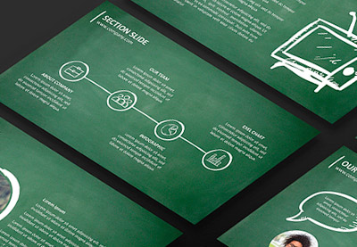
A great example of this is using advanced PowerPoint templates to add infographics. If you want to explain a process or series of steps, an infographic is usually superior to just explaining it with a wall of text. An audience is naturally drawn to posters that have easy-to-follow information shown in infographics.

Many academic PowerPoint poster templates describe a process. The text boxes will describe the steps taken by a researcher or academic to reach a conclusion. An infographic is a great way to show those steps instead of verbose explanations.

One of the best places to source infographics is from the PowerPoint template library on Envato Elements. For a single, flat-rate subscription, you’ll unlock thousands of templates with objects that you can paste right into your final poster design.
The flexibility of the all-you-can-download model means that you can choose templates and cut and paste the parts that you need—with no extra cost for each additional template.

If you need only a single template to build your presentation, also consider the pay-as-you-go marketplace, GraphicRiver. The PowerPoint templates are just as polished and impactful, but you’ll pay only for the individual templates you choose.
Check out the tutorial below to see the best templates that include exciting infographics that work perfectly for PowerPoint posters:

The educational world also features some of the best PowerPoint poster elements. Check out the round-up below to see more slides with perfect objects to add to your poster:
4. Print the Finished Poster
Finally, it’s time to finish your PowerPoint poster. All that’s left is to render the finished presentation and take it to a print shop of choice that can bring your poster to life.
Not every print shop will have PowerPoint installed. That’s why it helps to render the presentation out as a finished PDF file. Doing so will ensure compatibility when they print your PowerPoint presentation so that it appears the same as it did on your screen.
Check out the tutorial below to quickly learn how to save your presentation as a PDF:

If you happen to have access to a large format printer, it also helps to know more about printing directly from PowerPoint. Use the tutorial below to master printing so that you use less ink and paper while printing your PowerPoint poster template:

Learn More About How to Use PowerPoint
The tips above are specific advice on how to create PowerPoint posters easily. Follow these steps and you’re well on your way to creating a great poster that prints perfectly the first time.
But there’s always more to learn when it comes to PowerPoint. The goal is always to spend less time thinking about how to use an app so that you can focus on the content. The more that you know about the app, the easier it’ll be to put together your poster!
That’s why we’ve created the resource How to Use PowerPoint (Ultimate Tutorial Guide.) This single, comprehensive collection of tutorials includes everything you need to master Microsoft’s leading presentation app. Check out the three beginner tutorials below to start learning how to make a poster in PowerPoint:
 Microsoft PowerPointPowerPoint 101: Everything You Need to Make a Basic PresentationBob Flisser
 Microsoft PowerPointWhat Is Microsoft PowerPoint? +How to Start Using It For Presentations (Now)Andrew Childress
 Microsoft PowerPointHow to Make PPT Slide Layouts in Microsoft PowerPointAndrew Childress
Go Design a PowerPoint Poster Today
In this tutorial, you’ve seen that creating a poster in PowerPoint is totally possible. It’s even easier when you use a PowerPoint poster template that already has all of the dimensions and content placeholders built-in.
Remember that every PowerPoint poster design is more natural when you use the help of a pre-designed template like those from Envato Elements and GraphicRiver. Creating a poster in PowerPoint takes less time when you can source the best infographics and design elements to add to your poster.
The next time that you need to create a poster consider PowerPoint as the right tool for the job. This simple drag-and-drop graphic design tool is easy to use and has everything you need.

{excerpt}
Read More
Ford confirms it will build a car using VW’s EV architecture

Hulu launches new live TV guide and reintroduces 4K streaming

12 Top Templates for Videos With Islamic Themes, Art and Design
{excerpt}
Read More
How to Create a Church Newsletter Template in InDesign

In this tutorial, you’ll learn how to create a four-page newsletter template. We’ll put this template together in no time, and you’ll be able to reuse it for your future projects.
Newsletter templates are great to communicate with your community and update them of the latest events. This clean, high-quality, professional newsletter will make the process much easier.
In this tutorial, you’ll learn how to create a newsletter template that will make it easier for you and any user to edit. You’ll be able to change anything from colors to fonts and images. We’ll create an asymmetrical layout for each page, which will set you apart from other normal newsletter templates. We’ll take a look at essential tools you need to know in InDesign that will help you in the future.
In a hurry? We’ve got amazing InDesign newsletter templates and church newsletter template over at Envato Elements and GraphicRiver. Go check them out!
What You Will Need for Your Church Newsletter Template
You’ll need access to Adobe InDesign. If you don’t have the software, you can download a trial from the Adobe website. You’ll also need these assets:
- People reading in a circle
- Black middle aged man carrying his son
- Man during a religious pilgrimage
- African American male hands resting on an open Bible
- Sentral
Download the assets and make sure the font is installed on your system before starting. When you are ready, we can dive in!
1. Setting Up Your Church Newsletter Template File
Step 1
In InDesign, go to File > New. In the New Document window, select the Print tab. Choose A4 from the Blank Document Presets. Name the document Church Newsletter Template. Customize the newsletter format with the following options:
- Width to 21 cm
- Height to 29.7 cm
- Orientation to Portrait
- Units to Centimeters
- Pages to 4
- Check Facing Pages
- Columns to 6
- Column Gutter to 0.5 cm
- Margins: set the Top margin to 2 cm. Set the Bottom, Outside and Inside margin to 1 cm.
- Bleeds to 0.3 cm (it’s best to seek your professional printer’s preference)
Click Create.

Step 2
For this church newsletter template, we will work with three Layers. Organizing layers is an important practice when designing a newsletter template as they will make it easier for users to edit.
Bring up the Layers panel by going to Window > Layers. Double-click on Layer 1 and rename it Background.
On the Layers panel main menu, select New Layer. Name it Images. Click OK.
Additionally, create a new layer named Copy. Click OK.

Step 3
Let’s add some color swatches to our newsletter design. Head over to Window > Color > Swatches to expand the Swatches panel. Choose New Color Swatch from the main menu. Set the Swatch Name and values to the following:
- Sand: C=4 M=3 Y=4 K=0
- Orange: C=0 M=75 Y=75 K=0
- Purple: C=100 M=100 Y=20 K=15
Click Add and OK after you input each color value.

Step 4
For this newsletter tutorial, we’ll create a drop cap at the beginning of an article. Drop caps help emphasize the beginning of a story and let the reader know when they are starting a new article.
Head over to Window > Styles > Character Styles. On the Character Styles panel, add a new style and double-click to open the options window. In the Character Styles Options window, set the Style Name to Drop Cap. Use the following settings:
- Font Family: Sentral
- Font Style: Bold
- Size: 9 pt
Select the Character Color option from the menu on the left side. Select the orange color. Click OK.

Step 5
For this newsletter design tutorial, we will create a list of Paragraph Styles that we will use to format the portfolio design template.
Head over to Window > Styles > Paragraph Styles to open the Paragraph Styles panel. On the main menu, select New Paragraph Style, setting the Style Name to Folio. Select the Basic Character Formats option from the left side menu. Use the following settings:
- Font Family: Sentral
- Font Style: Bold
- Size: 8 pt
- Tracking: 100
Click OK.

Create a New Paragraph Style, setting the Style Name to Drop Cap. Here, we’ll set the values for the copy as the drop cap style also covers the contents in the first paragraph. Set the Basic Character Formats option to the following:
- Font Family: Sentral
- Font Style: Regular
- Size: 9 pt
Select the Indents and Spacing option from the menu on the left side. Set the Align to Grid option to All Lines (this will help keep each line of text at the same level).
Select Drop Caps and Nested Styles from the menu on the left side. Under Drop Caps, use the following settings:
- Lines number to 4
- Characters to 1
On the Character Style dropdown menu, select Drop Cap. Click OK.
Create a New Paragraph Style, setting the Style Name to Copy. Set the Basic Character Formats option to the following:
- Font Family: Sentral
- Font Style: Regular
- Size: 9 pt
Select the Indents and Spacing option from the menu on the left side. Use the following settings:
- Alignment to Left Justify
- First Line Indent to 0.5
- Align to Grid: All Lines (this will help keep each line of text at the same level)
Click OK.
Create a New Paragraph Style, setting the Style Name to Intro. Set the Basic Character Formats option to the following:
- Font Family: Sentral
- Font Style: Medium
- Size: 15 pt
- Leading: 17 pt
- Tracking: -20
Select the Character Color option from the left side menu. Set the color to the orange swatch. Click OK.
Create a New Paragraph Style, setting the Style Name to Headline. Set the Basic Character Formats option to the following:
- Font Family: Sentral
- Font Style: ExtraBold
- Size: 39 pt
- Leading: 40 pt
- Tracking: -20
Select the Character Color option from the left side menu. Set the color to the purple swatch. Click OK.
Create a New Paragraph Style, setting the Style Name to Caption. Set the Basic Character Formats option to the following:
- Font Family: Sentral
- Font Style: Medium
- Size: 8 pt
- Leading: Auto
- Tracking: -20
Select the Character Color option from the left side menu. Set the color to the orange swatch. Click OK.

Step 6
We’ll alter the baseline grids to fit our newsletter layout. Open the Preferences window by going to Indesign CC > Preferences > Grids. Under Baseline Grid, set the Start of the grid to 0 cm, and set the Relative to option to Top Margin and the Increment to 10.8 pt. Click OK.
To Show and Hide the baseline grid, press Option-Command-‘.

2. Setting Up Master Pages for Your Church Newsletter Template
Step 1
On the Layers panel, select the Copy layer.
Using the Text Tool (T), create a text frame in the top left corner of the left hand side newsletter design. Aim to start at 1 cm on the x-axis, using the Control panel to guide you.
To add a page number, right-click while in the text frame and select Insert Special Character > Markers > Current Page Number. The A symbolizes the page number. Add a space and bullet point by right-clicking on the frame and selecting Insert Special Character > Symbols > Bullet Character. In all caps, add the name of your company or church, followed by a bullet point and a section name.

Step 2
Using the Paragraph Styles, set the text frame to the Folio style.
Select the A and set the Font Style to Extra Bold. Change the color of Section on the Swatches panel to orange. This will help emphasize it.

Step 3
Using the Line Tool (/), create a horizontal line under the folio that goes from margin to margin on the newsletter layout.
On the Stroke panel (Window > Stroke), set the Weight to 0.5 pt.

Step 4
Select both items, the folio and the stroke. To Duplicate the items, press Option-Shift and drag towards the right page of the newsletter layout. By pressing Shift, you should be able to keep the x-axis alignment across the page.
Set the text frame to Align Right on the Control panel. We want this folio to mirror the one on the left side of the newsletter layout. The page number should be on the outside of the page. Swap the position of the page number with the section.

Step 5
On the Pages panel, drag the A-Master pages over pages 2-4 of the newsletter design. This will Apply this Master to those pages. Apply [None] to page 1.

3. Designing the Cover for Your Church Newsletter Template
Step 1
On the Layers panel, select the Background layer.
Using the Rectangle Tool (M), create a rectangle that measures 21.6 cm in Width and 6.5 cm in Height.
Using the Swatches panel, set the color to the Sand swatch.
Place the rectangle at the very top of the cover of the newsletter design.

Step 2
On the Layers panel, lock the Background layer and select the Copy layer.
Using the Text Tool (T), create a text box at the top of the page and add “Newsletter” as the content. With the Text Tool selected, head over to the Control panel and set the text to Align Center. Use the following settings:
- Font Family: Sentral
- Font Style: Extra Bold
- Size: 75 pt
- Tracking: -25
On the Swatches panel, set the color of the content to Purple.

Step 3
Using the Text Tool (T), create a second text frame under the title. Here, add the name of the church or company followed by a bullet point to make a clear separation. Add a date or issue number for the newsletter template.
With the Text Tool selected, head over to the Control panel and set the text to Align Center. Use the following settings:
- Font Family: Sentral
- Font Style: Extra Bold
- Size: 12 pt
- Tracking: 60
On the Swatches panel, set the color of the content to Orange.

Step 4
Using the Line Tool (/), create two strokes that extend from margin to margin. Place one stroke under “Newsletter” and the second stroke under the issue number.
Using the Stroke panel (Windows > Stroke), set the first stroke to 0.5 pt and the second stroke to 2 pt.

Step 5
Using the Text Tool (T), create a text frame under the last stroke. Press Command-B to open the Text Frame Options window. Here, set the Number of Columns to 5 and the Gutter to 0.5 cm. Click OK.

This text frame is a great opportunity to create a small table of contents. Add the number of the page, the section, and the title of the story so it is easy to find. While selecting the Text Tool (T), head over to the Control panel and use the following settings:
- Font Family: Sentral
- Font Style: Bold
- Size: 8 pt
Feel free to use different font styles to create a hierarchy between the section titles and story titles inside the newsletter design. Using the Swatches panel, set the color of the page number and the section title to Orange. Use [Black] for the headlines.

Step 6
Using the Line Tool (/), create a vertical stroke between each column of the small table of contents. Use the gutter between each column on the newsletter layout as a guide to place the stroke.
On the Stroke panel, set the Weight to 0.75 pt and the Type to Dotted.

Step 7
To Place an image on the newsletter design, press Command-D. Navigate to the People reading in a circle and click Open.
Draw the image frame under the title and cover the width of the page.

Step 8
Using the Text Tool (T), create a text frame under the image. Use the columns we created at the beginning of the tutorial and extend the text frame to the fourth column.
Add a headline and use the Headline style from the Paragraph Styles panel to style the frame.

Open the Text Wrap panel (Window > Text Wrap) and select the text frame. Select the Wrap Around Bounding Box button and set the bottom Offset to 1 cm.

Step 9
Create a second text frame with the Text Tool (T). This time, make the width extend to the second column. Add an intro paragraph and use the Intro style from the Paragraph Styles panel to style the frame.
Place this frame at the bottom left of the cover page of the newsletter design.

Step 10
Create a text frame that covers the last four columns of the newsletter template cover. This frame is for the copy, and the headline won’t interfere as we used the Text Wrap panel to make room for it.
Add copy and set the first paragraph to the Drop Cap style from the Paragraph Style panel. Set the rest of the copy to the Copy style.

Step 11
To create a neat newsletter layout, add two strokes between the intro and text frames. Use the Line Tool (/) and set the Weight to 0.25 pt.

4. Designing the Interior of Your Church Newsletter Template
Step 1
Override the folio frame by pressing Shift-Command and clicking on the frame. Here, feel free to change the section name to fit the content on the page.
For this page, we’ll play with the six columns we created at the beginning of this tutorial. We’ll use multiple column widths to create asymmetrical layouts.
Using the Text Tool (T), create two text frames for the headline and intro. Use the Paragraph Styles panel to style both to the Headline and Intro styles.

Step 2
Place the Black middle aged man carrying his son image by pressing Command-D and clicking Open. Place it under the intro but aligned to the right margin. Use about four columns for the width of the image.

Step 3
While selecting the image, head over to the Text Wrap panel. Select the Wrap Around Bounding Box and set the Offset on all sides to 0.3 cm.

Step 4
Create a text frame under the intro. Extend the width to the third column and the length to the bottom of the page.
Create another text frame under the image. This time, leave a column between the two text frames and cover only the last two columns in width.
Add content and use the Paragraph Styles panel to style it. Use the Drop Cap and Copy styles.

Step 5
Using the Text Tool (T), add a text frame in the single column we left between the two copy text frames. Here, you’ll add a caption. Use the Paragraph Styles panel and select the Caption style.
Add two strokes between the columns with the Line Tool (/) to create a separation and polish the layout. Set the Weight of the strokes to 0.25 pt.

Step 6
Override the folio frame by pressing Shift-Command and clicking on the frame. Here, feel free to change the section name to fit the content on the page.
Using the Text Tool (T), create a text frame for the headline. Use the Paragraph Styles panel to style both to the Headline style. We’ll add an intro later.
Place the Man during a religious pilgrimage by pressing Command-D and clicking Open. Place the image under the headline, aligned to the left margin.
Make the image frame smaller than the actual image. For this, head over to the Control panel and set the Width to 10.8 cm and the Height to 9.3 cm.
While selecting the image, head over to the Text Wrap panel. Select the Wrap Around Bounding Box and set the Offset on all sides to 0.3 cm.

Step 7
Create a text frame that starts on the second column and extends to the right edge of the image. Here, add intro content and use the Intro style from the Paragraph Styles panel.
While selecting the frame, head over to the Text Wrap panel. Select the Wrap Around Bounding Box and set the Bottom Offset to 1 cm.

Step 8
Using the Text Tool (T), create a single text frame that starts on the second column and extends to the last column. As far as height goes, start under the headline and extend to the bottom margin.
While selecting the frame, press Command-B to open the Text Frame Options window. There, set the Number of Columns to 2 and the Gutter to 0.5 cm.
Add copy and use the Paragraph Styles panel to style the frame. Use the Drop Cap and Copy styles.

Step 9
Using the Text Tool (T), add a text frame in the single empty column on the very left side of the page. Here, you’ll add a caption. Use the Paragraph Styles panel and select the Caption style.

Add two strokes between the columns with the Line Tool (/) to create a separation and polish the layout. Set the Weight of the strokes to 0.25 pt.

5. Designing the Back Cover of Your InDesign Portfolio Template
Step 1
Using the Rectangle Tool (M), create a background on the whole page. Select the Sand swatch from the Swatches panel.
Override the folio frame by pressing Shift-Command and clicking on the frame. Here, feel free to change the section name to fit the content on the page.
Using the Text Tool (T), create two text frames for the headline and intro. This time, use only the first four columns for both frames. Use the Paragraph Styles panel to style both to the Headline and Intro styles.

Step 2
Place the African American male hands resting on an open bible image by pressing Command-D and clicking Open. Drag the image frame to take up the width of three columns. Place the image on the right side of the page and towards the bottom of the page, as shown in the image below.
While selecting the image, head over to the Text Wrap panel. Select the Wrap Around Bounding Box and set the Offset on all sides to 0.3 cm.

Step 3
Using the Text Tool (T), create a single text frame on the first three columns. Start the text frame at the same level as the image and extend to the bottom of the page.
Leave a column between this and create another text frame. This time, start the frame at the very top of the page and extend it to the bottom.
Add copy and use the Paragraph Styles panel to style the frame. Use the Drop Cap and Copy styles.

Step 4
Using the Text Tool (T), add a text frame in the single column we left on the very left side of the page. Here, you’ll add a caption. Use the Paragraph Styles panel and select the Caption style.

Add two strokes between the columns with the Line Tool (/) to create a separation and polish the layout. Set the Weight of the strokes to 0.25 pt.

6. How to Export a File for Printing
Before exporting a file for printing, it is useful to take a look around all the edges to make sure all the images and vectors bleeding out are touching the bleeds.
Step 1
To export the file, go to File > Export. Name the file Church Newsletter template and choose Adobe PDF (Print) from the Format dropdown menu. Click Save.

Step 2
In the Export Adobe PDF window, set the Adobe PDF Preset to Press Quality.

On the left side of the panel, select Marks and Bleeds. Check All Printer’s Marks and Use Document Bleed Settings. Click Export. You will have a ready-to-print PDF file.

Great Job! You’ve Finished This Tutorial!
In this tutorial, you learned how to create a newsletter template. The essential tools you learned today will help you properly set up all your future InDesign templates. Today, you learned to:
- set up a ready-to-print InDesign file
- add Layers to keep your file organized
- create Color Swatches that you can easily change
- set up Paragraph Styles to help you format the template
- use the Text Wrap panel to offset text
- design an asymmetrical newsletter layout
If you are new to InDesign and need an InDesign newsletter template or newsletter template ideas, head over to Envato Elements and GraphicRiver. We’ve got many options to explore!

If you liked this tutorial, you might like these:
 Newsletter TemplatesHow to Create a One-Page Newsletter Template in InDesignGrace Fussell
 Newsletter TemplatesHow to Create a Monthly Newsletter Template in InDesignLaura Keung
 Newsletter Templates28 Best Company Newsletter Templates (New for 2019)Melody Nieves
 Adobe InDesignHow to Create a Real Estate Newsletter Template in InDesignGrace Fussell
 Print DesignHow to Create a School Newsletter Template in InDesignLaura Keung

{excerpt}
Read More
50 Game Show Sound Effects and Music: Ultimate Collection
The lights are flashing. The crowd is going wild. The timer is counting down. And you have to answer the final question. This is a highly exciting scenario in a game show. Still, it wouldn’t be able to live up to its hype if it didn’t have the right music and sound effects to go along with it.
Give game show visuals the perfect auditory companions with the royalty-free options I’ve rounded-up in this post. You can find all of them, and more, on AudioJungle.
.jpg)
1. Stylish Upbeat Energetic Rock
To start this list, there’s this energetic rock song. It’s perfect to introduce or end game shows.
2. Documentary Logo
With this royalty-free music track, you can build up the tension in a game show.
3. Access
This option is a more relaxing tune, which would fit perfectly at the end of a game show.
4. American Jackpot Last Round
If you want a game show to be intense, here’s the right music track for it.
5. American Jackpot Tension Bed 2
It’s time for the contenders to give their final answer. Add drama to the scene with this song.
6. American Jackpot Tension Bed 1
Like the previous song, this one could fit in nicely when you need to increase the tension.
7. American Jackpot Standby
Listen to this song and imagine the camera showing the participants’ nervous faces.
8. Slow Quiz Show Countdown
Even though this song is calmer, it can still make the audience feel the stress in the show.
9. Fast Clock Ticking 02
Few things are as nerve-wracking as a fast ticking clock. Use this royalty-free game show sound effect.
10. Quiz Thinking
Employ this song to liven up the portion of the show where the contestants are thinking.
11. An Epic Countdown
Countdowns can be epic. Give your game show an epic countdown with this music track.
12. Downtempo Beat Loop
With ‘Downtempo Beat Loop’ give the illusion of the passing of time in a show.
13. Game Show Loser
Game shows have winners and losers. To evidence that someone has made a blunder, use this effect.
14. Epic Countdown Logo
If you need your countdown to sound incredibly intense and powerful, this is the song to use.
15. Game Show Buzzer Wrong Answer
This royalty-free game show sound effect gives you another option for when someone answers incorrectly.
16. Game Show Buzzer Wrong Answer 2
Likewise, this track provides an alternative to the ‘wrong answer buzzer’ sound effect but with a higher pitch.
17. Powerful 80s Motivational Rock
Get your audience, your contestants, and everybody involved hyped up with this rock song.
18. Clock Ticking
Time is of the essence in game shows. The incessant ticking of the clock makes everyone nervous.
19. Question Logo
This sound effect gives game shows a lighter and more relaxed vibe to them.
20. Answer to the Question Ident
For a short musical transition that can fill in the silence in certain parts of the show, try this one.
21. Minimal Bells Ring Tone Loop
Let’s say that during the show, a contestant gets bonus points or a bonus question. This could be the sound for it.
22. Minimal Bells Ring Tone Loop 2
Alternative, you could employ this royalty-free sound effect to notify the public or contestants.
23. Right Answer
Just as there are those who answer wrong, others answer right. And this is the sound effect they’ll hear.
24. Happy Bells Bonus Level Up Pack
This pack presents a variety of ‘happy bells’ to be used to vitalise game show projects.
25. Alarm Buzz
If you need an obnoxiously loud alarm buzz going off, this is the sound effect you need.
26. Game Show Waiting Timer
For a classic approach to a waiting timer song, listen to this royalty-free game show music track.
27. Slow Quiz Show Timer
Make the passing of time more evident in a show with a tune such as ‘Slow Quiz Show Timer’.
28. Game Show Brass Logo
To create a vigorous and intense statement in your multimedia projects, try with this sound effect.
29. Casino Slot Machine
The sound effect of a casino slot machine is handy for a game show project.
30. Happy Ding 4
A happy ding, like the one in this effect, can be a positive signal to the contestants in your game show.
31. Game On
If you’re searching for an energetic, upbeat song to start your show, look no further than this one.
32. Show Opener
If brass instruments, funk, and high-energy is more your style, listen to this royalty-free music track.
33. News Countdown
Have the audience and contestants biting their nails with the ‘News Countdown’ music track.
34. Quiz Show Thinking
This music track has an ominous tone that elevates the stress levels in a game show.
35. Correct
The sweet ding of a bell will allow the contenders in the game show know when they’re right.
36. Tension Bed Loop 1
Increase the tension and excitement in the game show with this royalty-free music track.
37. Dramatic Game Show Theme 1
This track’s title lets you know everything you need to know about it: it’s a dramatic game show theme.
38. Great Idea
If one of the competitors is on the right track, the ‘Great Idea’ sound effect could tell them that.
39. Comedy Show Theme Walk on Music
A game show that doesn’t take itself as seriously as others, will benefit greatly from this track.
40. Ukulele Reggae Song
Once the show has ended and the tension has diminished, this song sees the audience out.
41. Tension Bed Loop 3
Make contestants and audience feel nervous and uneasy with this tension-inducing song.
42. Buzz
The sound effect of a buzzer sound is a must for game show projects.
43. Casino Slot Machine
If you need a different slot machine sound effect, listen to this one. It’s more modern than the previous one.
44. Marimba Game Start Countdown
For a classic countdown sound played by a marimba, employ this game show sound effect.
45. Funny Games
Give a game show a sillier and lighter vibe with this royalty-free music track.
46. A Game of Questions
Give a game show a fun twist with this musical element. It’s upbeat, funky and full of brass instruments.
47. Ringtone 3
Announce or notify contestants of a situation in the game show with the ‘Ringtone 3’ sound effect.
48. Game Show Crowd Reactions
What’s a game show without crowd reactions? Have an audience clap and cheer with this pack.
49. Game Show Quiz Clock
A slower, calmer royalty-free music track can help you build the tension in your game show.
50. Kids Playtime
To finish off this list, there’s ‘Kids Playtime’ which can add a playful element to your game show project.
Conclusion
Don’t let crickets fill in the silence in your game shows! Use the different royalty-free game show music tracks and sound effects in this post to give projects the excitement and hype they need.
If you didn’t find the perfect match here, you can browse AudioJungle‘s huge library until you come across with the auditory companion your audiovisuals require.

{excerpt}
Read More