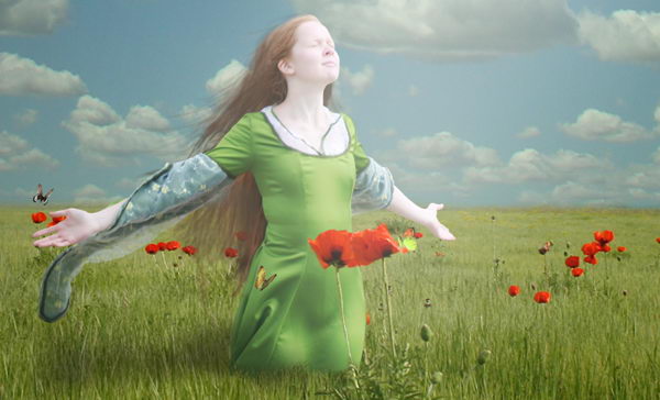
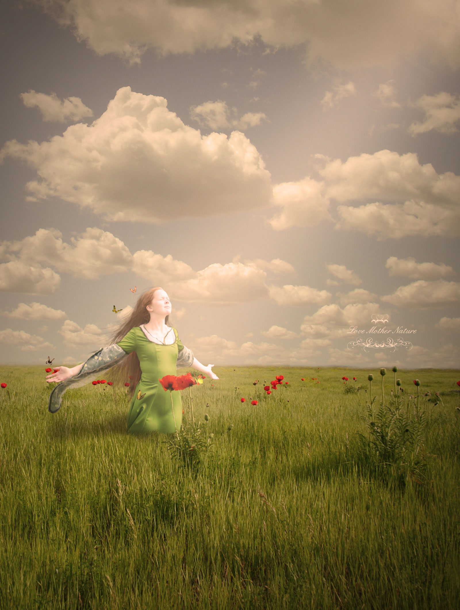
Today we will learn a number of techniques to help you add drama to a photo manipulation. We will to do this by learning how to combine two pictures to create a picturesque background, how to draw long hair manually using Photoshop brushes, as well as how to add some adjustment layers to add dramatic effects to the final image. Let’s get started!
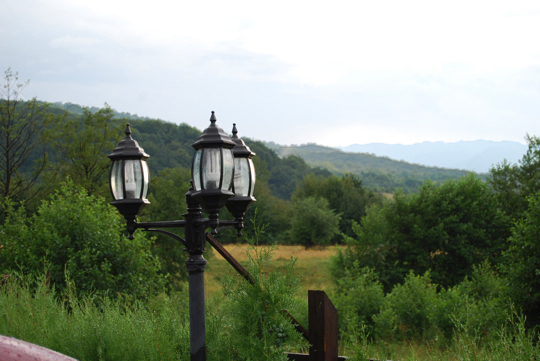
Resources
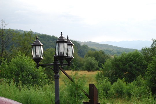
Step 1
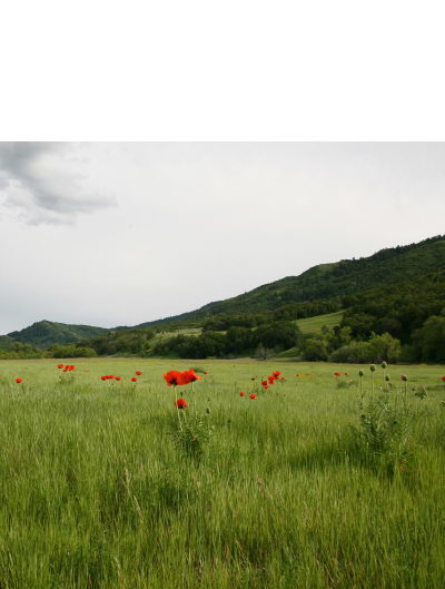
Create a new file, size 1600 px wide and 2122 px high at a resolution of 300 pixels/inch. Paste field to new file.
Step 2
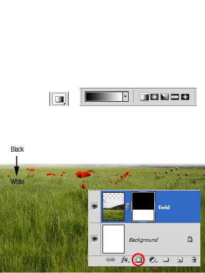
Add layer mask. Activate gradient tool. Draw linear gradient from black to white.
Step 3
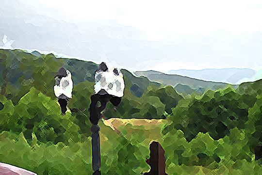
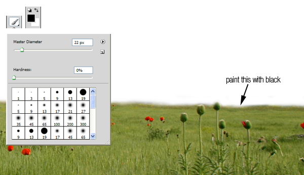
Zoom in until you can see all the details. Paint unneeded background with black to remove it.
Step 4
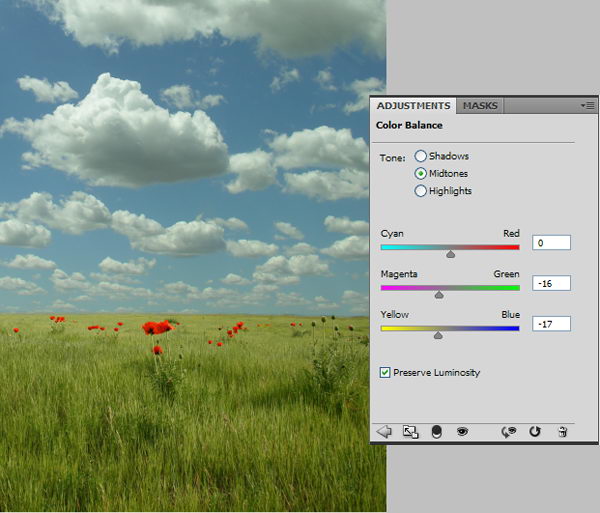
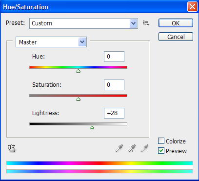
Paste sky underneath field layer. The colors will not match the field so we will have to fix it. From the adjustments panel click Color Balance with setting shown below.
Step 5
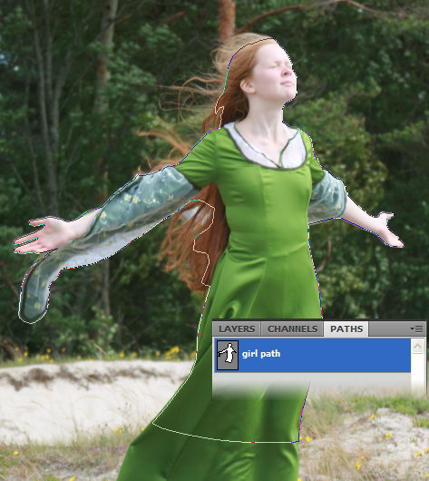
Download the girl picture. Create new path and with pen tool draw path around her. Avoid selecting her hair. We’ll just recreate it in a few steps.
Step 6
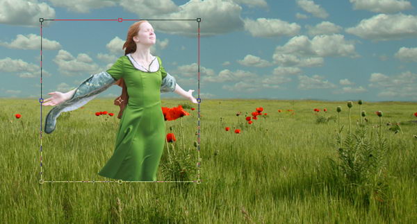
Hit Cmd+Enter to convert path into a selection. Copy the girl and paste it into the new background. Press Cmd+T for transformation and while holding shift drag its corner until she is the appropriate size.
Step 7
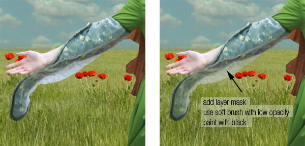
Before we proceed with this tutorial, we will need to fix some small details. She has transparent sleeve and it has to reveal some background behind her. To do this, add layer mask, select soft brush with low opacity (10-20%), then paint it with black.
Step 8
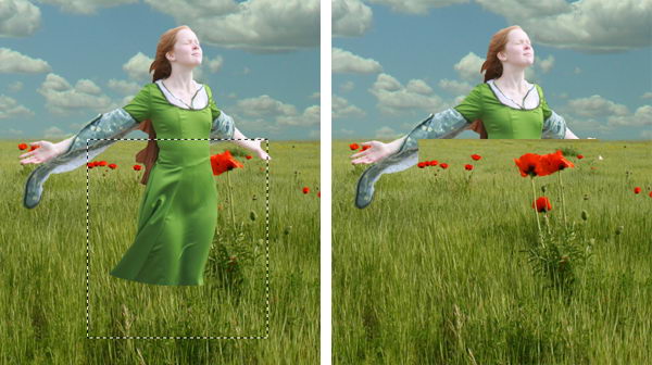
Activate field layer. Select some field behind her. Hit Cmd+J to duplicate it to a new layer. Then hit Cmd+shift+] to move it to the top layer.
Step 9
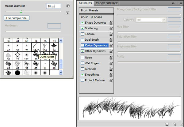
Add a layer mask to the new field. For masking grass, Photoshop has a very useful brush in its default set, named Dune Grass. So, right click and select it. Remove the check mark in front of Color Dynamics.
Next, make sure your foreground color is set to black and layer mask is selected. Start painting until the girl looks like standing in the middle of the field.
Step 10
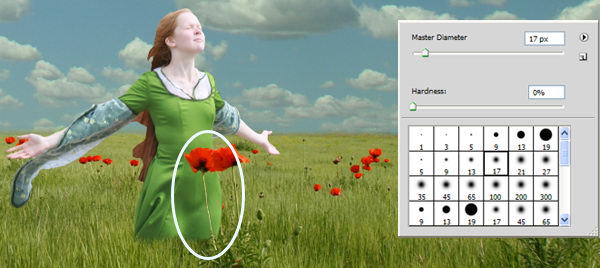
To strengthen the illusion that the girl is standing inside the field, it’s a good idea to have something in front of her. Change our brush to standard round brush, paint some flowers with white to reveal it.
Step 11
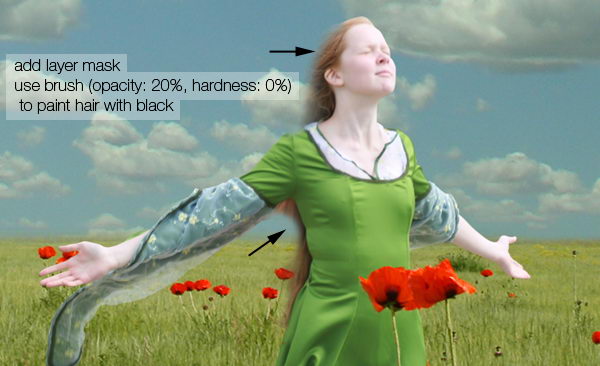
Now let’s draw her hair. But before doing that, make sure the layer mask is active. Paint her hair with black using a soft, low opacity brush until it is transparent.
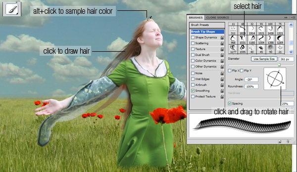
Step 12
Load the hair brush set. This set consisted of some long premade hairs. Using the brush tool, Cmd+click her hair to sample its color. Open brush panel (F5), click and drag the inside preview box to rotate brush tip. Once you’ve found perfect size and position click to draw an instant long hair. To get a natural color, be sure to sample various color from the hair.
Repeat this step until you have enough hair.
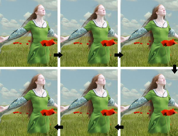
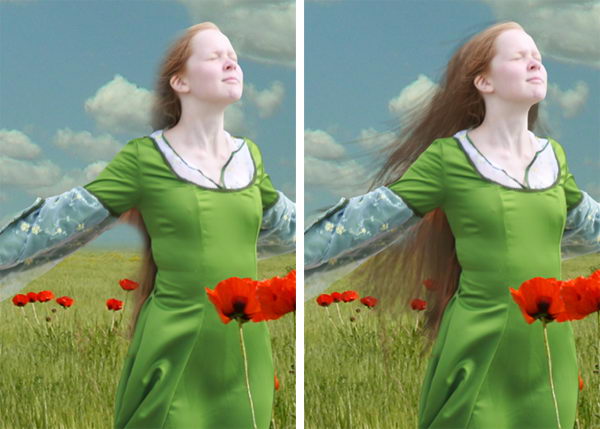
Step 13
After step 12 you may find that the result isn’t entirely realistic. If you look closely you may find that there are repeating objects in her hair. This is a common problem when using premade brushes. The best way to avoid this is by drawing some hairs manually.
Grab the hair brushes set from here. Lower your brush opacity to 15-25%. If you use a tablet, then that’s a good thing. You can activate its Pen Pressure from the Brush Panels.
Manual painting is not easy. It may help to work with a lot of layers. That way you can always delete layers that you don’t like. Below are the steps I took while creating the hair.
Step 14
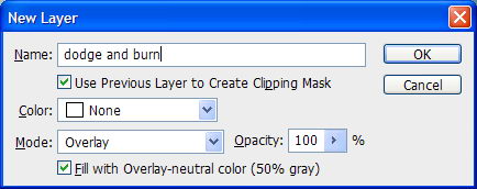
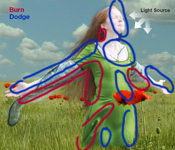
Now, we need to add some lighting to the girl. To do this we’ll use non-destructive dodging and burning. Hold cmd and click New Layer icon. Choose Use Previous, Mode: Overlay, and Fill with.
Activate burn tool, set opacity to 20% and start painting to make her darker. Do the same with the dodge tool for opposite effects. Remember, if you hold alt while dodge tool selected, then you’ll have burn tool. Same thing happen to burn tool.
Step 15
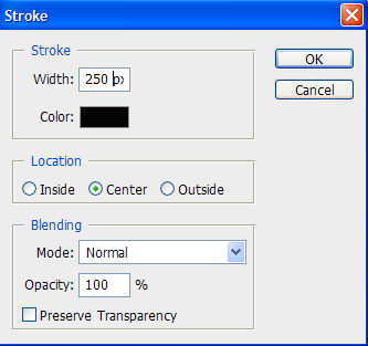
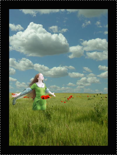
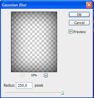
Now, I’ll add dark border around the image. Hit ctrl+A to select all. Click Edit > Stroke. Use very large width and click OK. Soften the border using Gaussian Blur with a very big radius.
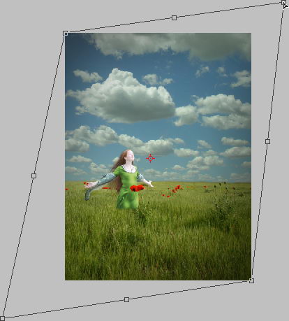
Step 16
Hit ctrl+T. Hold ctrl and drag its corner until you find nice lighting.
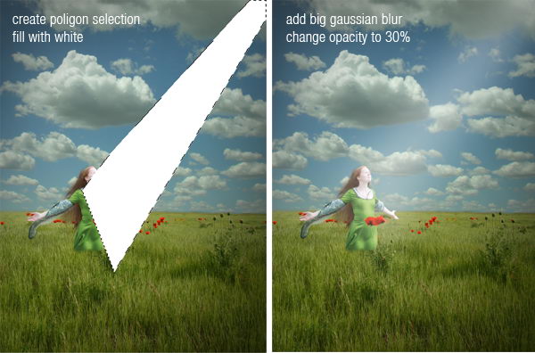
Step 17
To add fake light draw a poligonal selection and fill it with white. Add very big Gaussian Blur and lower down layer’s opacity to 30%.
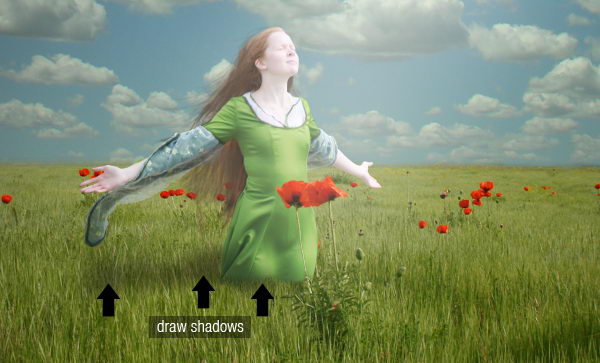
Step 18
Draw the girl’s shadow on the field.
Step 19
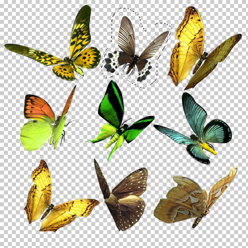
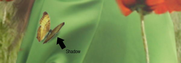
Grab the butterfly set. The butterflies are already in a transparent png file, so you just need to select it and drag it to the image. Resize it to match its proportion. Don’t forget to add shadows for a realistic look.
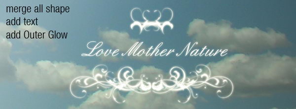
Step 20
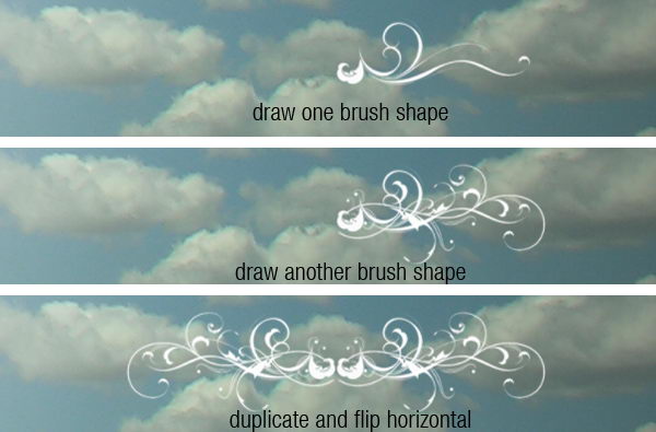
Load the floral brushes. Try to experiment with the brush shape. Combine them to get a unique shape like I did here, then add some text in the English font found from dafont.
Step 21
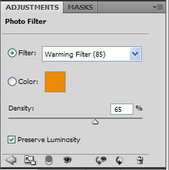
For final adjustment, select the sky layer and use Brightness/Contrast to raise its Lightness. I also added an adjustment layer Photo Filter with a warming filter on top of the image.
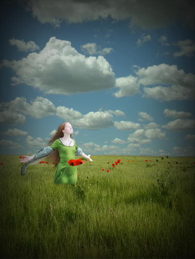
Conclusion
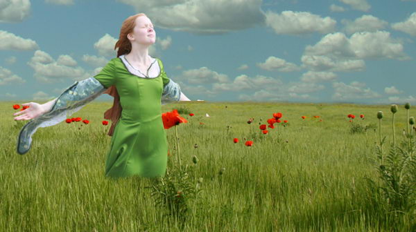
I hope you have enjoyed this tutorial and learned something new. You can view the final image below or view a larger version here.