How to Create a Drop-down Nav Menu with HTML5, CSS3 and jQuery


In this tutorial, we’ll take a look and see what we can achieve with HTML5 and CSS3 when it comes to the staple of current web sites: the humble drop-down navigation menu. We’ll also use jQuery to handle the effects and add the finishing touches for us.

HTML5 brings to the spec a dedicated <nav> element that should be used as the container for any major navigation structure, such as the main vertical or horizontal site navigation menus, or an in-page table of contents for example. IE unfortunately doesn’t support this new element yet, but there is a simple fix we can use, of which I’m sure you’re all aware.

Using CSS3 we can do away with what would have required the use of several background images and possibly an additional wrapping container or two and rely (almost) purely on some of the new style properties, such as rounded corners and drop-shadows for example, that are available to supporting browsers. Again, not all browsers (cough, IE!) support these new rules, but we can very easily provide fall-back solutions for the browsers that can’t handle our styles.


Getting Started

We’ll need a copy of the latest release of jQuery, version 1.4.2 at the time of writing, as well as a copy of the current version (1.1) of the excellent Modernizr library, which we’ll use to target supporting browsers with the CSS3 we use.

Create a project folder for the files we’ll create somewhere on your machine and call it nav, inside this folder create three new folders; one called js, one called css and one called fallback. Make sure copies of both jQuery and Modernizr are saved in the js folder.


The Underlying Page

Begin the coding by creating the following page in your favourite code editor:

<!DOCTYPE html>
<html lang="en">
	<head>
		<meta charset="utf-8">
		<title>HTML5, CSS3 and jQuery Navigation menu</title>
		<link rel="stylesheet" href="css/nav.css">
		<!--[if IE]>
			<script src="http://html5shiv.googlecode.com/svn/trunk/html5.js"></script>
		<![endif]-->
	</head>
	<body class="no-js">
		<nav id="topNav">
	        	<ul>
       		     	<li><a href="#" title="Nav Link 1">Nav Link 1</a></li>
				<li>
                	<a href="#" title="Nav Link 1">Nav Link 2
					<ul>
                    	<li><a href="#" title="Sub Nav Link 1">Sub Nav Link 1</a></li>
						<li><a href="#" title="Sub Nav Link 2">Sub Nav Link 2</a></li>
						<li><a href="#" title="Sub Nav Link 3">Sub Nav Link 3</a></li>
						<li><a href="#" title="Sub Nav Link 4">Sub Nav Link 4</a></li>
						<li class="last"><a href="#" title="Sub Nav Link 5">Sub Nav Link 5</a></li>
                    </ul>
				</li>
				<li><a href="#" title="Nav Link 1">Nav Link 3</a></li>
				<li><a href="#" title="Nav Link 1">Nav Link 4</a></li>
				<li><a href="#" title="Nav Link 1">Nav Link 5</a></li>
			</ul>
		</nav>
		<script src="js/jquery.js"></script>
		<script src="js/modernizr.js"></script>
	</body>
</html>

Save this as nav.html in the nav folder. We start out with the minimal HTML5 doctype, which allows us to specify the type of document in a quarter of the code we used to use. We also specify the default language and the character encoding; although the document will still validate without these two things, it’s good practice to include them and the page will trigger validator warnings if the default language isn’t specified. We then link to a style sheet (we’ll create this next) and use a conditional comment that targets IE to load Remy Sharp’s excellent html5.js script if required.

In the body of the page we have the <nav> element as the container for a traditional list of links, and we’ve thrown in a sub-menu for good measure too. The element doesn’t magically create a navigation menu for us, and it doesn’t include any new menuitem elements or anything like that so an unordered list is still an appropriate choice. The <nav> element is just a semantic container for our menu, which describes its function within the document, to replace the generic &div> element which states nothing inherently about its purpose on the page.

At the end of the body we link to our script files jQuery and Modernizr. We’ll use jQuery a little later on when we come to add the behaviour for the menu, but Modernizr will do its thing straight away, detecting the capabilities of the browser in use and adding a series of class names to the HTML element, which we can use to add our CSS3 so that it is only applied to browsers that can make use of them. We’ve also added the class name no-js to the <body> of the page; we’ll remove it later if JavaScript is enabled so we can also use it to add styles that should only be applied when JavaScript is disabled.


Some Basic Styling

Now let’s add some basic styling; create the following style-sheet:

/* JS disabled styles */
.no-js nav li:hover ul { display:block; }

/* base nav styles */
nav { display:block; margin:0 auto 20px; border:1px solid #222; position:relative; background-color:#6a6a6a; font:16px Tahoma, Sans-serif; }
nav ul { padding:0; margin:0; }
nav li { position:relative; float:left; list-style-type:none; }
nav ul:after { content:"."; display:block; height:0; clear:both; visibility:hidden; }
nav li a { display:block; padding:10px 20px; border-left:1px solid #999; border-right:1px solid #222; color:#eee; text-decoration:none; }
nav li a:focus { outline:none; text-decoration:underline; }
nav li:first-child a { border-left:none; }
nav li.last a { border-right:none; }
nav a span { display:block; float:right; margin-left:5px; }
nav ul ul { display:none; width:100%; position:absolute; left:0; background:#6a6a6a; }
nav ul ul li { float:none; }
nav ul ul a { padding:5px 10px; border-left:none; border-right:none; font-size:14px; }
nav ul ul a:hover { background-color:#555; }
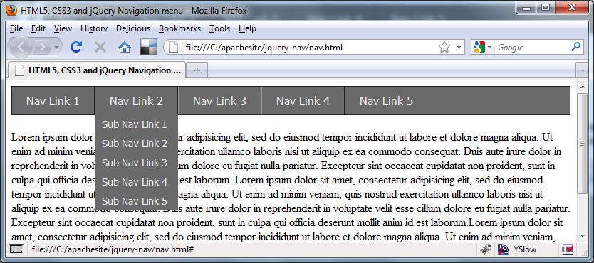
Save this file in the css directory as nav.css. The first rule is purely for when JavaScript is disabled, and allows the hidden submenu to be displayed on hover purely with CSS. The rest of the code defines a set of base styles that format the <nav> menu in the way that we want without adding anything too decorative. Note that we’re using the :after pseudo-selector to clear the floated list items; normally this would be added using a class name to that it could be applied to the containers of any floated elements on the page. At this point our page should look like this:

CSS3

Next we can add our CSS3:

/* CSS3 */
.borderradius nav { -moz-border-radius:4px; -webkit-border-radius:4px; border-radius:4px; }
.cssgradients nav { background-image:-moz-linear-gradient(0% 22px 90deg, #222, #999); background-image:-webkit-gradient(linear, 0% 0%, 0% 70%, from(#999), to(#222)); }
.boxshadow.rgba nav { -moz-box-shadow:2px 2px 2px rgba(0,0,0,.75); -webkit-box-shadow:2px 2px 2px rgba(0,0,0,.75); box-shadow:2px 2px 2px rgba(0,0,0,.75); }
.cssgradients nav li:hover { background-image:-moz-linear-gradient(0% 100px 90deg, #999, #222); background-image:-webkit-gradient(linear, 0% 0%, 0% 100%, from(#222), to(#555)); }
.borderradius nav ul ul { -moz-border-radius-bottomleft:4px; -moz-border-radius-bottomright:4px; -webkit-border-bottom-left-radius:4px; -webkit-border-bottom-right-radius:4px; border-bottom-left-radius:4px; border-bottom-right-radius:4px; }
.boxshadow.rgba nav ul ul { background-color:rgba(0,0,0,0.8); -moz-box-shadow:2px 2px 2px rgba(0,0,0,.8); -webkit-box-shadow:2px 2px 2px rgba(0,0,0,.8); box-shadow:2px 2px 2px rgba(0,0,0,.8); }
.rgba nav ul ul li { border-left:1px solid rgba(0,0,0,0.1); border-right:1px solid rgba(0,0,0,0.1); }
.rgba nav ul ul a:hover { background-color:rgba(85,85,85,.9); }
.borderradius.rgba nav ul ul li.last { border-left:1px solid rgba(0,0,0,0.1); border-bottom:1px solid rgba(0,0,0,0.1); -moz-border-radius-bottomleft:4px; -moz-border-radius-bottomright:4px; -webkit-border-bottom-left-radius:4px; -webkit-border-bottom-right-radius:4px; border-bottom-left-radius:4px; border-bottom-right-radius:4px; }
.csstransforms ul a span { -moz-transform:rotate(-180deg);-webkit-transform:rotate(-180deg); }

Using the classes added to the <html> element by Modernizr we can easily and safely add the CSS3 styles that we want. We use the border-radius style to give the <nav> element rounded corners; We need to give Mozilla and Webkit prefixed style declarations as well as the standard border-radius styles for browsers that support them, such as Opera. We need to do this with most of our CSS3 styles.

As well as corner-rounding of the <nav> we also give it a gradient and a drop shadow. The gradient styles are fairly complex and are different for Mozilla and Webkit based browsers, which are the only browsers currently implementing them. Both browsers use the background-image property. In Firefox we use -moz-linear-gradient to add a linear gradient. It requires values which correspond to the starting point of the gradient (0%), the point at which the first color blends into the second color (22px), the angle of the gradient axis (90deg), the first color (#999) and the second color (#222).

We can get the same gradient in Safari or Chrome using -webkit-gradient and the syntax is subtly different; we specify that it should be a linear gradient and then provide two points which tell the browser where the gradient should start and end. The values in the example correspond to left, top and right values of 0% and 70% for the bottom, which gives us the same style as that used in Firefox. Lastly we specify the colors of the gradient.

When we apply the drop-shadow we combine it with the Modernizr class for RGBA as well as boxshadow so that our shadow can be transparent. The properties for Mozilla and webkit are the same, and we also supply the actual box-shadow property for supporting browsers. The values we specify for this rule are the left offset (2px), the top offset (2px), the amount of blurring (2px) and lastly the color of the shadow (0,0,0). The color is where we use RGBA, which allows us to set the opacity to 75% (.75).

Another interesting style we use is transform to rotate some text 180 degrees; when we write the script in a moment, you’ll see that we add a sub menu indicator in the form of a caret sign to any list items that contain a submenu – this style will rotate the character to that it is pointing down, which means that in supporting browsers we don’t even need to use an image for this feature.

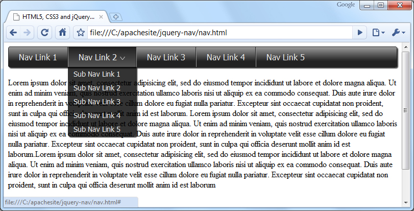
The remaining rules set different gradients, rounded edges, opacity with RGBA and drop shadows on other elements in the <nav> menu, such as nice bottom rounded corners and a drop shadow on the submenu, as well inverting the gradient for an attractive hover state. Now our navigation menu should look like this in a supporting browser:

In supporting browsers we can make our elements look pretty hot without using a single image, which means our pages will load much quicker with far fewer HTTP requests. However, not all browsers will support the CSS3 styling, notably any version of IE, so we still need to define our fallback styles. Add the following code to the style sheet:

/* fallbacks */
.no-cssgradients nav, .no-js nav { padding-bottom:4px; border:none; background:url(../fallback/navBG.gif) repeat-x 0 0; }
.no-borderradius nav ul, .no-js nav ul { background:url(../fallback/navRight.gif) no-repeat 100% 0; }
.no-borderradius nav ul ul, .no-js nav ul ul { background:none; }
.no-borderradius nav li, .no-js nav li { height:44px; }
.no-cssgradients nav li:hover, .no-js nav li:hover { background:url(../fallback/navOverBG.gif) repeat-x 0 0; }
.no-borderradius nav li li, .no-js nav li li { height:auto; width:98%; left:-2px; }
.no-borderradius nav li:first-child, .no-js nav li:first-child { background:url(../fallback/navLeft.gif) no-repeat 0 0; }
.no-borderradius nav li:first-child:hover, .no-js nav li:first-child:hover { background:url(../fallback/navOverLeft.gif) no-repeat 0 0; }
.no-borderradius nav li li:first-child, .no-js nav li li:first-child { background:none; }
.no-rgba nav ul ul, .no-js nav ul ul { left:1px; padding-left:2px; background:url(../fallback/subnavBG.png) no-repeat 100% 100%; }
.no-rgba nav ul ul a, .no-js nav ul ul a { left:3px; }
.no-rgba nav ul ul a:hover { background:url(../fallback/subOverBG.png) repeat 0 0; }
.no-csstransforms ul a span { height:7px; width:12px; margin-top:8px; text-indent:-5000px; overflow:hidden; background:url(../fallback/indicator.png) no-repeat 0 0; }
.no-borderradius ul ul li.last { margin-bottom:10px; }
.no-cssgradients.boxshadow nav { box-shadow:none; }

Modernizr will also add class names showing which CSS3 features are not available to the browser, so we can easily supply alternative rules, which make use of image-based fallbacks where features are not supported as well as any styles we may need as a result of using the images.

You’ll notice that we also use selectors that target our no-js class here too; this is because when JavaScript is disabled, Modernizr will not run and will not add the class names we need to the document, so our non-CSS3 fallbacks also become our non-js fallbacks as well.


Adding the Script

Now let’s add some script. The first thing we need to do is remove the no-js class from the body of the page when JavaScript is not disabled. We want to do this as soon in the page rendering process as possible to avoid a flicker when the styles are changed. Directly after the opening body tag add the following code:

<script>
	var el = document.getElementsByTagName("body")[0];
	el.className = "";
</script>

All we do is get the <body> element by tag name and set its className property to an empty string. Normally we would use jQuery to do that for us, but because jQuery won’t have loaded when this script is executed we can’t use it. We could load jQuery before this of course, but we’d then take a massive performance hit. Our script is only 2 lines of code so it won’t cause a significant delay, and because it will be executed before the browser has even processed the mark-up for the <nav> element, there will be no flash of unstyled content.

Now that the class has been removed from the body our CSS submenus will no longer work so we can add this behaviour back in with jQuery and enhance it a little at the same time. At the end of the document, directly after the script reference for Modernizr add the following code:

<script>
	(function($){

		//cache nav
		var nav = $("#topNav");

		//add indicators and hovers to submenu parents
		nav.find("li").each(function() {
			if ($(this).find("ul").length > 0) {

				$("<span>").text("^").appendTo($(this).children(":first"));

				//show subnav on hover
				$(this).mouseenter(function() {
					$(this).find("ul").stop(true, true).slideDown();
				});

				//hide submenus on exit
				$(this).mouseleave(function() {
					$(this).find("ul").stop(true, true).slideUp();
				});
			}
		});
	})(jQuery);
</script>

The script is relatively straight-forward; we wrap our code within a closure and pass in the jQuery object safely name-spaced to the dollar sign, just in case another library is in use when the code is put into production. We then cache a reference to the <nav> element so that we can refer to it without selecting it from the document repeatedly. We then process each list item within the menu.

For each matching element we check it to see if it contains any nested <ul> elements and if it does we add a new <span> element to the list item. This will become our submenu indicator. When a submenu is found we also attach mouseenter() and mouseleave() event helpers to the list item that contains the menu. All these helpers do is show and hide the submenu by sliding it down or up respectively. Note the use of the stop() method which helps to prevent the opening and closing animations queuing up if the mouse pointer is repeatedly moved onto and off of the target list items.

At this point we should be in quite a nice place with regard to most situations; in any browser that supports HTML5 our menu should look relatively similar regardless of whether CSS3 is supported or not, and whether scripting is enabled or not. However, IE presents us with a problem; when JS is enabled, the htmlshiv.js script makes IE understand the <nav> element and our non-css3 styles are picked up and implemented – all very well and good (we still have some issues with IE7, as among other things our auto-clearing :after rules are not understood or applied, but we’ll come to the in a little while).

However, the problems start when IE is used with scripting disabled – in this situation, the html5shiv.js script is not executed and IE doesn’t understand the <nav> element. None of our selectors that include nav in them will be implemented! It’s not the end of the world though; we can provide an alternative style sheet that is only used when the browser has JS disabled and is IE. Directly after the script that removes the no-js class from the <body> element add the following:

<noscript>
<!--[if IE]>
	<link rel="stylesheet" href="css/ie.css">
<![endif]-->
</noscript>

A simple solution indeed. We now need to create the new styles sheet; add the following rules to a new document in your code editor:

/* ie styles for when js disabled */
ul { display:block; padding:0; margin:0; background:url(../fallback/navRightIE.gif) no-repeat 100% 0; font:16px Tahoma, Sans-serif; }
ul:after { content:"."; display:block; height:0; clear:both; visibility:hidden; }
li { height:44px; position:relative; float:left; list-style-type:none; background:url(../fallback/navBG.gif) repeat-x 0 0; }
li.last a { border-right:none; }
li:hover { background:url(../fallback/navOverBG.gif) repeat-x 0 0; }
li:first-child { background:url(../fallback/navLeftIE.gif) no-repeat 0 0; }
li:first-child a { border-left:none; }
li:first-child:hover { background:url(../fallback/navOverLeft.gif) no-repeat 0 0; }
li a { display:block; padding:10px 20px; border-left:1px solid #999; border-right:1px solid #222; color:#eee; text-decoration:none; }
li li { width:auto; clear:left; }
li li:first-child { background:none; }
li li:hover { background-image:none; }
ul li li a:hover { border-right:none; }
ul ul { display:none; padding-left:2px; position:absolute; left:2px; background:url(../fallback/subnavBG.png) no-repeat 100% 100%; }
ul li:hover ul { display:block; }
li li { height:auto; width:98%; left:-2px; }
ul ul a:hover { background:url(../fallback/subOverBG.png) repeat 0 0; }
ul a span { height:7px; width:12px; margin-top:8px; text-indent:-5000px; overflow:hidden; background:url(../fallback/indicator.png) no-repeat 0 0; }
ul ul li { background:none; }
ul ul li.last { margin-bottom:10px; }
ul ul li a { padding:5px 10px; border-left:0; left:3px; font-size:14px; white-space:pre; }

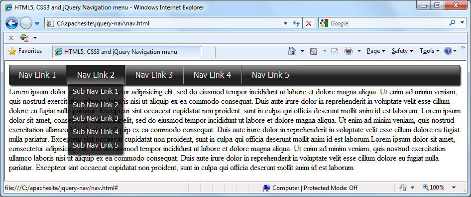
Save this in the css folder as ie.css. As you can see, we aren’t targeting the <nav element at all in this style sheet; some of the styles we gave to the <nav> element earlier have been added to the <ul> element instead, and there are a few new styles that need to be included specifically for this scenario. Essentially though, the style sheet creates the same effect as before, so IE8 with JS disabled should still appear like this:

We’ve had to make use of a couple more images for this scenario because we no longer have the <nav element to hang the background-repeat on for the main gradient. So that’s all modern browsers, with JS enabled and disabled, working as expected – using CS3 where possible and image fallbacks where not.

IE7 will still create problems for us, even with scripting enabled, but we can fix that easily enough using another conditional comment to target IE7 specifically, and supplying a new style sheet just for IE7 which fixes the layout problems; something like this is all we need:

* styles to fix IE7 */
ul { display:inline-block; }
ul li a span { position:absolute; right:5px; top:10px; }
ul ul li a { border-right:none; padding:5px 10px; }
.content { clear:both; }

Save this in the css folder as ie7.css and add a new conditional comment to the <head of the page:

<!--[if IE 7]>
	<link rel="stylesheet" href="css/ie.css">
 	<link rel="stylesheet" href="css/ie7.css">
<![endif]-->

There we go; a navigation menu built and styled with the latest elements and styles with fallbacks and fixes for older browsers.

The Complete Guided Tour of Camera Systems

For those of us passionate about photography, our cameras are like our roommates. We spend a lot of time with them. And no one wants to get stuck with a roommate you don’t like. In this tutorial, I hope to offer advice on buying a camera so you get exactly what you want, for the price you’re happy to spend. Consider this your chance to interview some potential roommates!


Digital vs. Film

The first thing you need to decide is whether you want to shoot digital or film. This may seem like an easy decision. Digital cameras are widely available. They are simple to use, allow you to review and erase images and make it easy to share your photos over the web.

But if you’re looking to get a serious camera for not a lot of money, you can’t beat a used film camera. The money you save when purchasing the camera will buy you a lot of film, too. There are extra costs in the long run for processing, but more and more people are returning to film for the retro appeal and quality of equipment.


The SLR

When most people decide to invest in a serious camera, they buy an SLR. SLR stands for single lens reflex. All of the major camera producers make SLR cameras and lenses for this cameras. They have been used by professionals for decades.

They are available in both film and digital versions, and some companies have used the same lens mounts for both, allowing the newest camera to still use very old lenses and vise versa.

They are also available to fit almost any budget. To use the company Canon as an example, a brand new digital Rebel can cost as little as $480 USD, but their digital EOS-1Ds Mark III costs almost $6,300 USD. Both of these cameras, and all SLRs, possess some great features that make them so desirable.

Interchangeable Lenses

SLRs have interchangeable lenses, meaning that they are easy to upgrade and customize to your style of shooting and budget. If you want to shoot nature photography, you can buy a telephoto lens. If you want to shoot landscapes, you can buy wide angle lens. If you want to shoot both, you can buy both lenses without having to buy two cameras.

If you choose to, you can also purchase very high quality lenses with wide apertures for shooting in low light without a flash.

Seeing Through The Lens

SLRs also use a prism and mirror to allow the photographer to see exactly the same image that the camera will see. This means that when you change lenses, the view through your camera will change. You will see the zoom.

Point-and-shoot cameras often use a viewfinder that only approximates what the camera is seeing, or they rely on a screen to show the image. Screens are usually not good enough to verify if something is really in focus and they are hard to use in bright light. The SLR doesn’t have any of these problems.

Other Typical Characteristics

There are some other things that you’ll notice if you purchase an SLR. They typically have little or no shutter lag. Shutter lag is a term used to describe the slight delay you experience between pressing the shutter release button and the shutter actually firing. Point-and-shoot cameras some time have a very long delay that can cause you to miss an important moment.

Another option available on SLR cameras is continuous shooting or, on film cameras, a motor drive. This means you can hold down the shutter button and the camera will keep taking photos, sometimes as fast as 8-10 frames a second. This is extremely helpful when shooting sports and other fast moving action.


The Rangefinder

I’ll only talk about rangefinder camera briefly because as far as I know there are only 2 or 3 digital rangefinder cameras available. The M8 and M9 made by Leica, and the Epson RD-1. Film rangefinders are much more common and competed well with film SLR cameras.

The main difference between rangefinder and SLR cameras is the way that you frame and focus your image. Unlike the SLR, the rangefinder uses a viewfinder window and determines focus by using a triangulation method. When you look through the viewfinder of a rangefinder, you’ll see a patch in the middle that shows the image you’re looking at a sort of ghost image of the same view. You match up the two images to determine focus.

Advantages and Disadvantages

The biggest disadvantage of rangefinder camera is not having the ability to see exactly what the photo is going to look like. Many rangefinders have interchangeable lenses, but the viewfinders may not switch to telephoto or wide angle (although so do). The viewfinder and the lens are also in different positions, so the scene you see is not exactly the same as the scene your lens will see.

But rangefinders are usually more compact and quiet than SLRs, as well as being much easier to focus in dark situations. Also when you trip the shutter of an SLR, there is a moment of blackout due to the mirror flipping up. This doesn’t occur with a rangefinder.


The Point-and-Shoot

The digital age seem littered with point-and-shoot cameras. Point-and-shoot cameras are small and easy to use. They often have zoom lenses to allow you to choose from a variety of focal lengths, but they usually don’t have interchangeable lenses.

In the ever-evolving world of photography, there are some cameras that are blurring the lines between point-and-shoot and professional (but I’ll get to that later). Because of the huge variety and price of the point-and-shoots available. I want to talk about some features you’ll want to look for when selecting any camera, but especially a point-and-shoot.

Widest Aperture

Some of the specifications that I’m going to ask you to look for may require some online research or a glance at the owner’s manual, but this one will be easy. Simply look at the front of the lens. There will be a code there. It may say 1:2.8 or 1:3.5 or 1:3.5-5.6 or something like that. These numbers indictate the widest aperture of the lens.

The wider the aperture, the more light the lens can let in, which will allow you to shoot in darker situations at better ISO settings. The numbers after the “1:” are what you need to pay attention to. 2.8 is great, 3.5 is alright, 5.6 or higher isn’t very good.

When it has two numbers, like 3.5-5.6, that is showing you that when you are zoomed all the way out, the aperture is 3.5, and when you’re zoom all the way in, it is 5.6. For a zoom lens, 5.6 is fine for the higher number. This logic also applies to purchasing lenses for an SLR or rangefinder.

Image Sensor Size

If you’re buying a film point-and-shoot, this doesn’t apply. But if you’re buying digital, you’ll want to know how big the sensor is. The bigger, the better. What is called a Four Thirds sensor is great for a point-and-shoot, also anything termed APS-C is a great size for a sensor.

Digital SLRs have more standard sized sensors termed DX and FX (or full frame). Don’t confuse image sensor size with megapixels. The megapixels of an sensor more or less relate to the size of image and, in some ways, the detail that can be captured in the image. The sensor size relates more to the quality of the image and the performance of the camera in low-light situations.

Other Considerations

You may have noticed that I didn’t mention megapixels here. Most new digital cameras have more than enough megapixels. A six megapixel camera can easily print an 11×14 inch image, and most point-and-shoot buyers don’t ever print that big. Considering that many point-and-shoots are over 8 megapixels now, I think we can move beyond it.

On the other hand, manual controls are something you should definitely consider. If photography is a serious hobby for you and your budget is keeping you in the point-and-shoot range, you can still purchase a camera that allows for manual control of aperture and shutter speed.


Modern Camera Configurations

As I mentioned earlier, there are cameras that are coming out now that don’t easily fit into one category. The Four Thirds camera system and Micro Four Thirds system are something I really get excited about. I feel that they are symbolize the next real stage of development for cameras.

I think that more systems like this will be developed. Once the big professional camera companies (i.e. Nikon and Canon) jump on board with a system resembling this, photographers will be in for a big treat.


The Four Thirds Model

Four Thirds is more than a camera system, it’s a business model. Originally Kodak and Olympus joined forces to create a standard lens mount for the DSLR market. Using an open source business model similar to many internet companies, Four Thirds lenses and cameras are now produced by Fuji, Leica, Kodak, Olympus, Panasonic, Sanyo and Sigma. In theory, all of these cameras and lenses are compatible.

Technical Specifications

The Four Thirds system uses a sensor that is half the size of the 35mm film. That means a 50mm lens mounted on a Four Thirds camera would have the same field of view as a 100mm lens on a 35mm camera.

The smaller sensor means that the cameras do have a little more noise at high ISO settings than their bigger DSLR brothers. But they are extremely compact and many sport a real SLR viewfinder with the mirror and pentaprism configuration.

But the main advantage of this open source system is the huge variety of lenses and bodies, some more focused for the consumer, some more appropriate for the professional. It’s all very democratic.


The Micro Four Thirds System

The Micro Four Thirds cameras are even smaller. They can use Four Thirds lenses with an adapter, but Micro Four Thirds lenses cannot be used on Four Thirds cameras. The main difference between the two systems is that the traditional SLR mirror and prism have been eliminated.

Some Micro cameras have a digital viewfinder and some rely exclusively on a screen on the back. Unlike the Four Thirds system, the Micro system is not really open source, and is used exclusively by Panasonic and Olympus.


In Conclusion

The world of cameras is constantly changing. In a couple of years, someone will have to come back and update a lot of this information!

Buying a camera can also be a big investment, but remember that there is a camera out there for every budget. A used film system can often be had for less than 100 bucks, and the top end cameras with a full run of lenses can cost more than most cars.

There are also a lot of additional bells and whistles that can distract the consumer from what they are really buying. I think if you read this, it should help you decide what type of camera is most appropriate for your style of shooting. In addition to that, you’ll know how to best maximize your dollar by concentrating on the features of the camera system that are most important.

Just remember that the camera doesn’t make the photos, the photographer does. Your skill and dedication are far more important than your camera. But you might as well own one you can love.

Personal Portfolio Flash Template – Active Premium

It’s time for some more Active Premium goodies, exclusively available to Premium members. This time, an XML-based Flash Personal Portfolio template is waiting for you to download; read on to check out the demo and find out more about subscribing to Active Premium!


You’ll Love This Premium Template

The Personal Portfolio Flash template is fully-featured and easy to tailor. Customize it with your own logo, contact details, personal information and portfolio samples, all via XML. I’ve also included thorough PDF documentation to help you on your way.

What could be simpler? Support ActiveTuts+ by signing up to Premium today!


Professional and Detailed Instructions Inside

Premium members can Log in and Download! Otherwise, Join Now! Below are some sample images from the template.


Active Premium Membership

We run a Premium membership system which costs $9 a month (or $22 for 3 months!) which periodically gives members access to extra tutorials, like this one! You’ll also get access to Psd Premium, Vector Premium, Audio Premium, Net Premium, Ae Premium and Cg Premium too. If you’re a Premium member, you can log in and download the tutorial. If you’re not a member, you can of course join today!

Also, don’t forget to follow @activetuts on twitter and grab the Activetuts+ RSS Feed to stay up to date with the latest tutorials and articles.

How to Best Utilize Your Personal Assistant

Many managers, particularly those new to management do not make the most of having a personal assistant.  A well organised, reliable assistant can provide significant value to a manager transitioning into a new division or company.  The practical tips below will have a new manager and their assistant performing as a well oiled machine in no time.

Organize an initial meeting

Schedule a one hour preferably uninterrupted meeting to discuss how you will work together.  The purpose of this meeting is to clarify the expectations of both parties.

Determine your assistant’s level of involvement

Do you want to be reminded of pending deadlines and meetings you have to attend?  Be advised of an urgent email requiring a response?  These are standard practices for a personal assistant.  Relying on your assistant to keep you on track will allow you to focus on the other responsibilities of your new role.  Delegation for new managers can sometimes be an issue.  A good place to start learning effective delegation is with your own assistant.

Clarify day to day responsibilities

To be blunt, you no longer have time to reschedule meetings in your calendar. Meetings frequently change or get moved.  Juggling meetings in a busy calendar can be time consuming, particularly when meetings with time challenged Senior Management are involved.  Leave this action to your assistant.

Your assistant can also set aside specific blocks of time in your calendar to prepare for regular ongoing deadlines, plan time for you to respond to emails, schedule lunch breaks (which  you may or may not actually take) and work around as many back to back blocks of meetings as possible, though unfortunately sometimes these cannot be avoided.

Be clear on your position involving deadlines

While we all like to think we meet our deadlines, in truth we all know people who are NOT good at getting work in on time.  If missing deadlines has been an issue in the past, you will need help from your assistant to ensure deadlines are met.  Being upfront about your requirements will save you grief later.  Your ability to meet deadlines while producing high quality work will be a defining factor in your success as a manager.

Communicate whether you are a detail oriented or “big picture” person

Some people have a highly tuned attention to detail.  Many need this level of attention to perform their jobs successfully.  If you have a high attention to detail, make this clear to your assistant.  To achieve the best results as a team, your assistant will need to perform on a similar level.

Big picture thinkers may require their assistant and team members to do some of the more detailed work for them where possible.

Have a daily morning meeting

“Not another meeting,” I hear you grumble.

Think of this more as a quick daily catch up.  A ten minute conversation on the day’s priorities should do the trick.  This meeting ensures that your priorities and your assistant’s priorities are aligned.   If your assistant is working for multiple managers, this meeting takes on an even greater importance.

These catch ups can also serve as a time to get paperwork signed or bought to your attention.

Practice regular and open communication

A situation to avoid when you first start working together is a lack of communication.
For example, keep each other up to date on meeting changes.  Having your assistant spend 40 minutes preparing documents for a meeting that you forgot to mention was canceled is a waste of time.

Another common problem to avoid is duplication.  Watch that you are not doing the same tasks as your assistant. This can be easy to do if you are used to fending for yourself.

“Underutilizing” your assistant

Within a short amount of time working together, an experienced personal assistant will generally know whether you have worked with an assistant in the past.  How? They are being underutilized.

Don’t assume that you know what your assistant is capable of simply by skimming his or her resume.  Your assistant may be a whiz with Excel or have experience managing projects.  Ask them about their previous experience.  “Underutilizing” your assistant may result in them yearning to be challenged or feeling they are not adding value to the partnership.

Overworking your assistant

It goes without saying that most employees have overflowing to do lists.  Watch your assistant is not overworked.  If the team is working on a large project where overtime is required to meet the deadline, working extra hours is reasonable.
If no equivalent project exists, yet your assistant is working late every night, coming into the office on weekends and starting to show obvious signs of stress, there is most likely a problem brewing.

Sit down and discuss any workload issues.   Perhaps some less important tasks can be put on hold or another member of the team who is not as busy could assist in lightening the load.

Limit time spent on personal errands

In a manager/assistant role there is often some level of personal work involved.  Asking your assistant to grab you a bite to eat since you have back to back meetings is one thing.  Having them spend hours shopping for your partner’s birthday present would be seen as inappropriate.
It is important to clarify expectations and boundaries early in your working relationship.  Work demands constantly change, so maintain an open and honest line of communication and discuss challenges as they arise.

Working well as a team is the key to a fulfilling and productive manager/assistant relationship.

Model and Texture an Accurate Looking Pool Table in 3ds Max – Day 1

In this tutorial you will learn a work flow on how to create a pool table using real scale values to give a realistic impression.

You will see how to use the Symmetry modifier to speed up your work, as well as the Bend modifier coupled with some basic commands like Insetting and Bridging to create a very unique design in matter of minutes. You will also learn how to save rendering time by choosing Standard materials over the Arch&Design ones, while still achieving the same impressive results by ‘reverse-engineering’ the Pro Materials in matter of minutes.

This tutorial is Day 1 in a series – Go to Day 2.


Video 1

Download

Note: click the ‘Monitor’ icon to view tutorial in full-screen HD.

Video 2

Download

Note: click the ‘Monitor’ icon to view tutorial in full-screen HD.

Video 3

Download

Note: click the ‘Monitor’ icon to view tutorial in full-screen HD.

Video 4

Download

Note: click the ‘Monitor’ icon to view tutorial in full-screen HD.


This tutorial is Day 1 in a series – Go to Day 2.


Don’t miss more CG tutorials and guides, published daily – subscribe to Cgtuts+ by RSS.

Inspiration: Hot Vector Vehicles


They say that any self-respecting illustrator should be able to draw a realistic person, flower and car. Why? Because all these things have something in common, they have to be drawn perfectly in order to be believable. Today I will present to you a collection of vector vehicle designs, including cars, trucks, and motorcycles. As you will see, mastering the art of vehicle illustration takes many hours of practice and discipline. If you’re up for the challenge, we have included some super charged tutorials to get you started.

Continue reading “Inspiration: Hot Vector Vehicles”

Quick Tip – How To Make Grunge Text Using a Digital Tablet


Sometimes you have to break out of the design box and go crazy! In this vector quick tip you will learn how to create a grungy text effect without ending up with a complete mess. Using a digital tablet and the blob brush you can create images that have energy and chaos all held together with a few design tips.

Continue reading “Quick Tip – How To Make Grunge Text Using a Digital Tablet”

Quick Tip: Arranging Folders in Logic Pro

When you’re composing a song, it’s not always easy to just pull up a timeline and drop on each part. Sometimes, for instance, you have a verse and a chorus but nothing else. Or, just to make matters more confusing, you have a collection of sections but no idea of how they should be arranged. Perhaps you’ve already got a song mapped out but you’re not completely happy with how it sounds – you like all the parts, they kind of work, but something is missing. Maybe you should try putting the second verse first or use the mid section as an intro? Maybe, maybe, maybe. But you know what, that’s going to take ages to cut up what you’ve already done and shuffle them around. Wrong! We have a solution that will save time and – hopefully -increase the creativity!

Read on…

Step 1


We’re going to assume that you have a number of sections recorded and ready to be moved around.
Hit <command + A> (Select all regions)


Step 2

Now we’re going to pack everything in the arrange page into one folder. This is something that is often used when you’ve multiple tracks on the arrange and you need it cleaning up – copious amounts of takes etc – but in this case, we want to take control of the whole lot.

Choose (from the selection bar at the top of the arrange page): Region > Folder > Pack Folder

Step 3

Next is to create an appropriate, non-destructive, place to experiment with different arrangements.

Create 3 new stereo tracks. <option + command + N>, then choose 3 stereo tracks.


Step 4

To make it easy to differentiate between the sections, create markers and mark out each one – Verse / Chorus / Mid section etc.

To do this, put the play head at the start of a section and hit <control + K>. Then, either double click on the section or hit <command + Return> to name each one.

Step 5

Colour-coding is your friend! Colour each section accordingly. It makes sense to make all the verses one colour and follow suit with each section. Or, perhaps use slightly different shades to exhibit the difference between verse 1 and 2, perhaps.

To do this:
Pull up the colour palette <option + C)
Click on the section you’d like to colour
Click on the colour.

Step 6

Now that they’re prepared and ready to me moved around, create duplicates of the folder track and place them on the new stereo tracks you created earlier.

Step 7

They are now ready to be moved and abused! Solo one of the stereo tracks and start cutting it up – like you would do with a normal region.

When you find the arrangement you like you can simply delete the others and unpack your favourite. The session will now have all the tracks separated out again and ready to be mixed.

Get experimental, go crazy. Be creative!!


Quick Tip: Create Sparkling, Animated Text in Photoshop


In today’s quick tip tutorial we will demonstrate how to create a sparkling text animation in Photoshop with just a few easy steps. Let’s get started!


Step 1

Open a new document. Select the Gradient Tool and fill the backgroundwith #911169 to #5b1569.


Step 2

Choose a font and type out a word or a phrase. I chose the word star and used the Bauhaus 93 font. Fill it with #e76dbf.

Cmd + J the layer two times. You should now have three identical layers.

Next select the star’s layer and go to Filter > Noise > Add Noise and add a different amount of noise to each layer. I chose 20, 21, and 22.


Step 3

Download these star brushes. Create a new layer on top of each of the text layers. Select the brush tool and place some stars on top of your text. Be sure to create a different pattern for each text layer.


Step 4

Go to Window > Animation and create three frames.

The first word layer and the first sparkle layer should be active on the first frame. See the image below to see which layer should be selected on which frame. Frame delay time should be 0.2 sec. Now press play.


Step 5

The last step is to save our animation so go to File > Save for Web and Devices and save it as a gif file.


Final Image

That’s it! We’re finished! You can see some additional examples below.


Additional Examples

An In-Depth Look Into the Graphic Tee – Part 1


In the past few years, we have seen a real resurgence of the Graphic tee with both fashion labels, and renegade designers offering their art for sale on this ever-popular medium. We’ve also seen the rise of online competition/communities such as Threadless, Design by Humans and La Fraise. These have been made popular not only by the popularization of the graphic tee itself but by the accessibility of the hardware and software required to create them. Today, we would like to discuss the popularization of the graphic tee in some detail; first, with a brief history lesson, then a quick round up of some popular t-shirt designers, and finally with an interview of Dirty Velvet.


A Little History

It was the 1950’s that first gave birth to the printed tee – or as much as I can figure out anyway – with straight-forward character licenses (Disney etc) and holiday resort names. Both have now gone full-circle and are often parodied from well thought out, cynical or vitriolic explosions to the more run-of-the-mill that you’ll see on a Chunk or Local Celebrity shirt.

The invention of Plastisol – still the most commonly used ink for screen-printing onto fabric – at the end of the 50’s meant that designers could get more creative with their prints. This in turn with the emerging social freedoms that 60’s revolutionaries brought meant an upturn in not only the printed t-shirt, but also the variety of designs being committed to cotton. The trend at this time was all about the bands, political ideals and attitudes towards sex and drugs which defined the era.

pack
pack

It still surprises me that the Marxist hired-gun, Guevera, a mercenary and terrorist happy to start a war for the highest bidder (Bolivia anyone?) is still venerated by t-shirt wearing consumers the world over.

pack

The 70’s and 80’s saw large Fashion houses vomiting their logos all over shirts and, well, pretty much everything. The 90’s saw this trend expand to small, independent labels and anybody with enough money to get a few shirts printed up. In short, the t-shirt was the perfect medium for any person to express themselves through art, slogans, popular-culture references, or swear allegiance to any brand in an inexpensive way.

Now that the supporting technology is cheaper – namely computers and software – the process of designing a shirt has become accessible to any Dick or Jane with a home PC and a copy of Illustrator/Photoshop. With tastes becoming more diverse and not catered for by the mainstream labels, we’ve seen the rise of independent labels and online communities. These, being driven by artists, designers, illustrators and generally anyone with an idea and the means to get it down, are responsible for a plethora of designs available today. I’ve taken a look at a fair cross-section of the industry from pioneers to the pretenders, mainstays to fly-by-nights, giants to minnows to bring you some of the more interesting labels out there. And if you want more you beautiful, yet demanding people, I’ve even thrown in a mini-tut and an interview with great up and coming UK label Dirty Velvet.


Labels Worthy of Your Attention

Obviously this is just a small cross-section and one man’s opinion so feel free to agree, disagree or expand on any of this. I feel all the following brands are worthy of inclusion, some of you may have heard of.

Dirty Velvet – Art With a Message, Usually

Underground UK label finally emerging into the mainstream, sort of. Well thought out designs tackling political, social and environmental themes. Pioneered the fake film poster design idea.

pack
pack

The Quiet Life – Colour and Form

A small art label from Los Angeles run by Girl Skateboards designer Andy Mueller. Largely influenced by skateboarding, music and photography, The Quiet Life embraces colour and a sense of fun.

pack

Obey – Street Art With a Political Bent

Shepard Fairey, respected underground artist, has transferred his work beautifully to the t-shirt. Built around the ever-present Andre the Giant logo, his label has grown into a worldwide phenomena.

pack

Volcom – Anarcho Skate-Punks Turned Mainstream

I’ve long been a fan of Volcom, embracing their punk rock aesthetic and patronage/promotion of underground artists. They do bow down to commercial norms offering a plethora of reworkings of their company emblem which, I’m less a fan of, but if you can weed through the crap there is gold to be had.

pack

Rockwell – Shirt Nouveau

The Rockwell collection is entirely made from great Art Nouveau inspired art by Parra. Bold colours and large prints are the order of the day.

pack

Sixpack France – Vive la Shirt

A French label that collaborates with some fine jobbing artists to produce a rich and varied array of art based tees. Shirts bearing both the Sixpack label and packing awesome art from the likes of: French t-shirt artist Christopher Dombres, American designer Cody Hudson AKA Struggle inc., Belgian street art collective Hello Monsters, the rather awesome Morning Breath and cult cartoonist Robert Crumb.

pack

Threadless – Community and Competition

Online community that rates user submissions. These are then selected by the staff based on user ratings and some other criteria. Something for most people here. I’ve had one printed over the years, it is below.

pack
pack

Final Thoughts

There’s not enough space to list them all but if you are a shirtophile and want to track down some sweet prints then try The Hundreds, 410 BC, Upper Playground, Beautiful Decay, 2K by Gingham. A t-shirt is a great canvas that shouldn’t be used to simply advertise brands, it should be used for art, ideas and expression. Go. Wear.


Interview Dirty Velvet

To gain a bit more insight into what it takes to be a successful graphic tee designer we decided to interview the guys behind Dirty Velvet. You can view the entire interview below.


Q Welcome to Psdtuts, please introduce your brand. What’s your brand manifesto?

Dirty Velvet prides itself on creative originality, offering freethinking men an alternative to the mainstream. Our t-shirt designs reflect our slightly twisted perspective of the world and are aimed at guys wishing to make a statement. Our aim is to produce designs with substance and originality, rather than the re-branded nostalgia, overused iconic figures or recycled cartoon & film characters that dominate the mainstream t-shirt market.

pack

Q So what do you consider mainstream? And what’s bad about it?

Generic designs, regurgitated brand names and logos that have no real substance, wasting what is a good canvas for people to express something about themselves. Designs that use imagery borrowed from pop culture without any original application. Rehashing well-worn themes or imagery mean these designs tend to offer nothing new in terms of ideas or interesting commentary about the world.

pack

Q In Dirty Velvets terms, what makes a successful t-shirt?

The balance between an interesting message or subject matter, expressed through an aesthetically pleasing design. Some originality in its style and construction. Something that engages the consumer on a deeper level than you might expect yet another meaningless logo embellishment.

Q What are the main tools in the creation of your designs?

In terms of inspiration – News, current affairs, war, politics, money, celebrity, the environment, music, vanity, death, religion, the media, violence, the state. Anything we feel passionate about. Once an idea has been discussed we begin by researching assets, sourcing or shooting photographs, sketching ideas etc. These are then drawn in Illustrator or composited and manipulated in Photoshop. So the main tools would be a Nikon D40, the trusty G5 Power Mac, Wacom Tablet and a good scanner is vital.

Q Your catalogue shows a variety of themes, how do you go from blank shirt to finished product in terms of ideas and design?

One of us pitches an idea to the other two (sometimes a near finished concept, sometimes just a subject matter that they want to explore) and we throw ideas around to see if we can get the right angle on the subject. Sometimes the idea finds a design concept very quickly, other times it’s more difficult to find the right way to express an idea using the t-shirt medium. Following this we gather the assets – be they sketch, photo or other – required to put the idea together. Then we create mood boards (if we’re struggling) or rough mock-ups before moving onto the drafting stage. Then our designer works some Photoshop magic, bringing the design to its conclusion. Pending reviews and amendments of course.

Q Can we have a sneak preview of any future designs? And a few words about it?

These are from our Autumn/Winter 2010 range. They are being sold now to retailers now ready to hit shelves later this year.

TV Made Me Kill

A sideways look at how images shown on TV can influence people. In particular, looking at the notion that a person repeatedly exposed to violence – both casual and extreme – watching it glamorized, will eventually become de-sensitized to it.

pack

Animal Protest

This one is an Exclusive for Urban Outfitters across Europe. Pretty self-explanatory subjective matter given the Dirty Velvet treatment.

pack

Q Can you give a few words to anyone looking to design t-shirts?

It seems every man and his job with a cracked copy of CS2 on his home PC is starting a t-shirt label these days. In business terms, the cold reality is that unless you’re shipping a LOT of units, your profit margins will be negligible. Manufacturers and retailers will fight over pounds of your flesh until your bank manager urges you to stop.
But if you have genuine talent, vision and a commercially viable style then the world is your Oyster. You can cut your teeth on one of the myriad online competitions (Design By Humans, La Fraise, Threadless etc), gaining confidence and real-time market feedback. If you want to set up your own store then Deck Peck would be a good place to start. Good luck.


Part 2: Create Your Own Graphic Tee in Photoshop

Check back soon for Part 2: Create Your Own Graphic Tee in Photoshop…

To Thrive or Survive – Working Under Pressure

Have you ever heard someone say that they “work best under pressure”? It sounds like such a positive thing to say about your work habits. But, what if instead of “working best under pressure” they mean that they work only when under pressure, or that they even require pressure to get any work done at all?

Suddenly, it doesn’t sound like such a great way to describe yourself. Do you want people to get the impression that they need to pressure you in order to get you to increase your productivity? If so, get ready for an unnecessarily stressful work experience.

Instead of claiming to “work best under pressure”, consider the opposite: Present yourself as a “self-starter” who needs no pressure, prodding, babysitting, or queuing of any kind to get their work done. The term “self-starter” is just as clichéd, but at least it’s not suggesting to your peers that they have to nag you nonstop to get your best efforts.

Now if you truly do thrive under pressure, then by all means seek it out. But if not, do yourself a favor and find a tactful way to say, “I can handle pressure, but I don’t require it to excel.”

Take the Tuts+ Survey, Win a $250 Amazon Gift Voucher


In three years Tuts+ has grown from one site to nine and continues to offer some of the best tutorials on the web.

Now we want to know how we can make it better. It will take less than three minutes but will give us the information we need to make Tuts+ more awesome!

Take the Survey!

By filling out the Survey you go into the draw to win a $250 Amazon Gift Voucher.

Amazon Gift Voucher

Competition Rules

  1. People who submit more than once will be disqualified.
  2. The winner will be picked randomly and contacted by email.
  3. All submissions must be in by Midnight June 8th EDT.

Breaking Bad Habits

Habits aren’t always bad, but the word just seems to conjure up thoughts of things that aren’t particularly good for us.  There are “challenges” all over the web that try to help you break these habits but there are also those that try to instill good ones.  These challenges can come with weekly or monthly timelines (such as 30 Days of Creativity or the Jerry Seinfeld-inspired Don’t Break The Chain), and even make you accountable to not just yourself but others as well (The Power of Less Challenge would be an example of this).

What bad habit would you like to break?  What good habit would you like to begin?  Let us know in the comments.

3 Tips to Better Notetaking

As your day progresses, you need to stay on top of new things that come your way while keeping yourself focused on working through the stuff already on your plate.  That’s where good notetaking skills come into play.  (If you’re not already taking notes, you need to start.  Seems obvious, but some people just don’t take notes at all – and their productivity suffers as a result.)

Here’s 3 ways to get you taking – and making – better notes:

  1. Use shorthand that you understand.  The art of shorthand is somewhat lost thanks to digital voice recorders and email, but when you do use a pen and paper to jot stuff down, don’t be too articulate or long-winded.  You’re using these as reference points, not handing them in as-is.  Speed up the process by using shorthand that you understand so you can expand upon them when you’re got the time to do so.
  2. Use software.  There’s a wide range of software solutions for this.  Some sync with your computer and mobile device, some take your voice and turn it directly to text.  It’s nice to have a central place where all of your notes can be in case you ever need to refer to them as well.  While it may not be your primary notetaking method, it’s not a bad idea to have it handy regardless.
  3. Transfer them to your productivity system regularly.  Notes on their own are not enough.  You need to categorize them and integrate them with the items already built into your productivity system of choice.  Otherwise they’re just going to end up out of your mind and, ultimately, out of your control.

Taking notes at all is the first step.  Better notetaking comes from wanting to give them more value when it comes to your path to being more productive.

Quick Tip: Using JSLint


It’s nothing to be ashamed of: you probably don’t write perfect JavaScript the first time. While debugging JavaScript is usually done manually, today’s quick tip will teach you how to use JSLint, a tool for catching JavaScript bugs. Think of it as spell-check for JavaScript.


Screencast


What is JSLint?

Here’s Wikipedia’s definition of a Lint program:

In computer programming, lint was the name originally given to a particular program that flagged some suspicious and non-portable constructs (likely to be bugs) in C language source code. The term is now applied generically to tools that flag suspicious usage in software written in any computer language.

JSLint is one such program for JavaScript, written by Douglas Crockford (of course). You hand it your JavaScript and it let’s you know what to fix.


How do you use it?

After you head over the JSLint Website, the first step is to choose the practices you want to enforce; you can choose the Crockford-recommend settings by clicking the “Good Parts” button.

Then, paste in your JavaScript and hit the JSLint button. If you’re code is less than perfect, you’ll get a list of errors to fix.


Before JSLint

(function () {

	var anObject = {};
	var anElem = document.getElementById("wrap");
	var aString = "This is a string"

	if (aString === "This is a string") {
		anotherString = aString;
	}

	function person(name, age) {
		this.name = name;
		this.age  = age;
	}

	var aPerson = new person("John", 25);

}());

After JSLint

/*jslint white: true, browser: true, onevar: true, undef: true, nomen: true, eqeqeq: true, plusplus: true, bitwise: true, regexp: true, newcap: true, immed: true, strict: true */
"use strict";
(function () {

	var anObject = {}, aPerson, anotherString,
		anElem = document.getElementById("wrap"),
		aString = "This is a string";

	if (aString === "This is a string") {
		anotherString = aString;
	}

	function Person(name, age) {
		this.name = name;
		this.age  = age;
	}

	aPerson = new Person("John", 25);

}());

Where can I learn more about JSLint?

This page explains in depth the concepts behind JSLint. Thanks for reading and watching!