Friday Photo Critique #35

Friday Photo Critique is our weekly community project, where we publish a photograph submitted by one of our wonderful readers, then ask you all to offer constructive feedback on the image. It’s a great way to learn more about photography, express your viewpoint, and have your own image critiqued!


Quick Ground Rules

  1. Play nice! We’ve deliberately chosen photographs that aren’t perfect, so please be constructive with any criticism.
  2. Feel free to offer any type of advice – composition, lighting, post-processing etc.
  3. You can also link to photographs that you feel offer a great example of this type of image shot exceptionally well.

Without further ado, here is this week’s candidate for Friday Photo Critique!


The Photograph

Photo Critique

Photographer: Bryan Giardinelli

Please let us know what you think in the comments – how would you have approached the scene or taken the photo differently? A massive thank you to everyone who commented last week.

The most constructive and helpful comments will be featured on the site, and you’ll also be given priority to feature your own work in a future Friday Photo Critique!.

How to Work Like a Dog

Whether you’re the “alpha dog” in your office or a lone wolf slaving away at your terminal, there are a few lessons that you can learn from your dog that might help you get through the day without running away with your tail between your legs.  No animals were hurt in the making of this post, but be warned – many, many plays on this idiom to follow.

Keep yourself clean and presentable

Don’t spend your whole day grooming, but take a bit of time to make sure you look presentable.  Have some pride in your appearance and others will too.  How you dress can really impact your career path.  Even if you are working from home, try to make the effort to at least shower and get dressed before you head to the desk.  You’ll feel better, and this will show in your work.

Don’t show fear to those that try to intimidate you

Stand up for yourself when it’s appropriate.  Don’t let anyone disrespect you or denigrate your position in the company.  Every position on the team is important – and ultimately an office bully can affect the workplace as a whole, not just you. This doesn’t mean you need to bare your teeth, or lunge and snap when you’re confronted.  Just calmly mention to them that it’s not acceptable, and move on with your day.  Sitting in the corner licking your wounds isn’t going to get your work done, so speak your piece and move on.  Dogs live in “the now”, and so should you.

Don’t be aggressive to those you want to play with

If you choose to berate the people you work with, you can’t expect them to be your buddies after the work day has ended.  Treat them with respect, and they’ll return the favour.  Many of us spend more time with the people we work with than with our own family, so it’s a good practise to get along.

Run when you can

If you are given the opportunity to go in the direction that you want to go – take it.  Take the chance to explore the areas that you find interesting, but make sure you pay attention to the cues from whoever usually holds your leash.  Sometimes they’ve got a better perspective from their higher position, but they want you to grow, which is why they let you off your leash.  This works the other way too, if it’s a safe environment for you to let someone off their leash, give them the chance, and help them learn to make the right decisions.

Nap when you can

If you have to rest, rest.  You’re no good to your team if you are physically and mentally exhausted, so if you need a quick break, take it.  A quick rest will allow you to get focused, get recharged, and get moving.

Enjoy every bite of everything

Take the time to savour the flavour of whatever you’re enjoying.  Whether it’s a coffee and a doughnut or an especially great blog post on WorkAwesome (!) – enjoy it, finish it, and then get back to work.  Treats are usually few and far between, so when one comes your way, make the most of it.

Hide a bone

Create your own rewards for achieving your goals.  Push yourself to complete the task, and then reward yourself with a sweet treat or perhaps a quick stroll around the office.  You set the goals, so you decide on the reward.  Make it worth it and you’ll be amazed at how productive you are.

Be loyal to those that deserve it

If someone goes out of their way to treat you well, make sure you return the favour.  This doesn’t mean constantly kissing butt; just be gracious to those that you enjoy working with, and show gratitude to those that make your job easier.

Enjoy a good scratch

When someone recognizes you for doing a good job, enjoy the moment.  Accept the praise when it comes, and get back to work when it stops.  You’ve probably heard the saying, “you get what you measure” so figure out what you earned the praise for, and then do it again.

Trust your instinct

If you get a feeling about something, good or bad, listen to your gut.  Your experience and education are powerful influences on you, so if something triggers an emotional response in you, pay attention.

Know your place, but don’t be afraid to challenge authority

We all have our job to do, so try to focus on that instead of taking part in the office politics or drama of the week.  But, if you know something is wrong, speak up.  No one wants to hear “I knew it was a bad idea at the time – but no one wanted to listen to me!”  You are an expert in your role, so present your case logically, and discuss the situation.

Don’t, er… you know, where you eat

If you aren’t happy with your current situation, don’t waste your time wimping and whining about it.  Trash-talking your job, your boss, or your role in the company is a sure fire way to lose the respect of those around you. If you don’t like where you are in life, you have to change – remember that old dogs can learn new tricks.

A solid work ethic is just one of the reasons why dogs are a man’s best friend, and we can learn a lot from them.

Heck, if it weren’t for the whole “getting fixed” aspect of it, it’d be a pretty great gig.

Effect Chain Order

No guitar setup is complete without some toys… you know, effects! When you listen to bands like The Mars Volta, Sonic Youth, or maybe Radiohead, perhaps you say, “Wow, awesome sound. It must require a lot of effects to make a sound like that!” You probably ask yourself, “How can I get a guitar sound like that?”

Sometimes it’s not a lot of money you need, but a knowledge of the effects. Here is the info to get started.

d

Guitar effects are an interesting phenomenon when playing guitar. No matter how much you spend for guitar effects, you’ll get a good sound when you learn how to chain these guitar effects to work together. And how you set up your effects can help you achieve your dream tone. In this tutorial I will explain more about effect chain order.


Step 1: Basic Effects Chain Order

e

Guitar —> Pre gain effects —> Gain related effects —> Post gain effects —> Amplifiers.

Perhaps you confused when look at the picture above, “what these pictures mean?”

This is the map of basic effects chain order. In next step I will explain more about “how these chain works”. And a little explaination starting from each category until each effects. Sound samples included :)

Continue reading “Effect Chain Order”

Quick Tip: Playing With Time

In this quick tip, we are going to look at a few ways of playing with the timing of drum patterns to give the illusion that a standard drum ostinato is speeding up or slowing down in time.


Rushing the Snare

The first and easiest way of creating this illusion is to slightly rush or delay a certain drum element. Here, I have set up a basic ostinoto with a standard four to the floor rock/dance pattern.

Download audio file (ostinato.mp3)

Now, if I nudge the second snare hit forward by a 192 division, it gives the portion of the bar between the first and second snare hits a subtly faster and more energetic feel. It may be difficult to hear, especially against a full band, yet it is an effective trick that many drummers use when they want to intensify certain areas of a song. This also helps to give a more humanistic feel to your programming, while giving the snare a more swung and accented feel.

Download audio file (nudge.mp3)

Here, I have added a bass to help emphasize the snare’s timing against the rest of the loop.


Hi-Hat Displacement

One drastic trick that many jazz drummers use is to displace the constant hi-hat pattern to the 2 of the beat rather than the 3 for certain sections. This gives the hi-hat a feeling of working against the music and serves as a good way to break up sections of a song. You’ll notice in the example below that the hi-hat sounds polyrhythmic and as if it were moving backwards in time against the song even though all that is happening is a 16th note displacement.

Download audio file (offset.mp3)

The pattern with one bar of the displaced hi-hat.


The Fabric of Time

Another subtle way of playing with time is to take an element or group of elements and offset their timing so that they rush and delay uniformly but at different rates. For this particular example, I’ve taken the constant hi-hat pattern and left the first hi-hat perfectly quantized, set the second one back 192nd, set the third back twice as far (96th), set the third back 192nd and the fourth perfectly quantized.

In this way, the hi-hat begins to drift off time until it is off by a 96th and then it drifts back to create a slight swing while progressing at consistent increments. This is another technique implemented by drummers to help the groove expand and compress (however slightly or dramatically) to give the music and groove and new feeling.

Here, I have rushed as described above in the first measure and then delayed it in the same way for the second measure. I then repeated it to create a four bar loop of contract/expand/contract/expand.

Download audio file (fabric.mp3)

A good way of thinking about this concept is to think of music as a piece of fabric. When you stretch the fabric, the threads offset more or less uniformly with the largest stretch occurring in the center and the sides gradually moving back to equilibrium. The exact same thing is occurring here, except we are replacing the threads with musical events to make time seem as if time is stretching and contracting.

These concepts are used by professional drummers all the time, and although you may be behind a monitor rather than a drum set, there is no reason not to implement these ideas to make your music swing and have a more ‘real world’ feel. In my next quick tip, we’ll look at some interesting ways to divide the bar to create some off time and polyrhythmic feels without departing from common note divisions.


Quick Tip: Create a Complex Pattern by Nudging Smart Objects


The offset filter is a great tool to use to create a repeating pattern for a website background. Unfortunately, for us, the offset filter only works for a flat, one layer image and doesn’t work under all situations. In today’s tutorial we will demonstrate how to create a repeating pattern using smart objects and the nudging technique with your arrow keys.


Resources Used

The following resources were used during the production of this tutorial:


Basic Principles of Pattern Design

Before we begin, let’s start with some basic principles of pattern design.

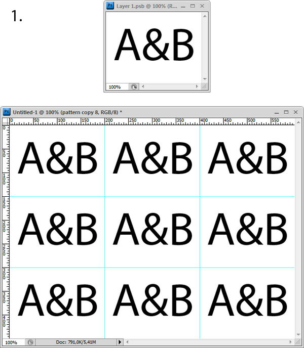
  1. Anything that is placed in the center will repeat easily. You don’t have to do anything with it (1).

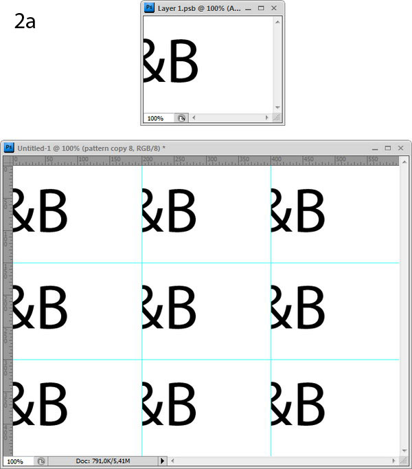
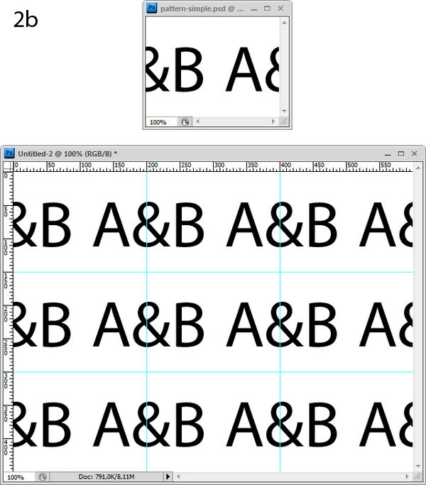
  2. Objects placed on the edge will be cut off (2a). You need to add it to the opposite side (2b).

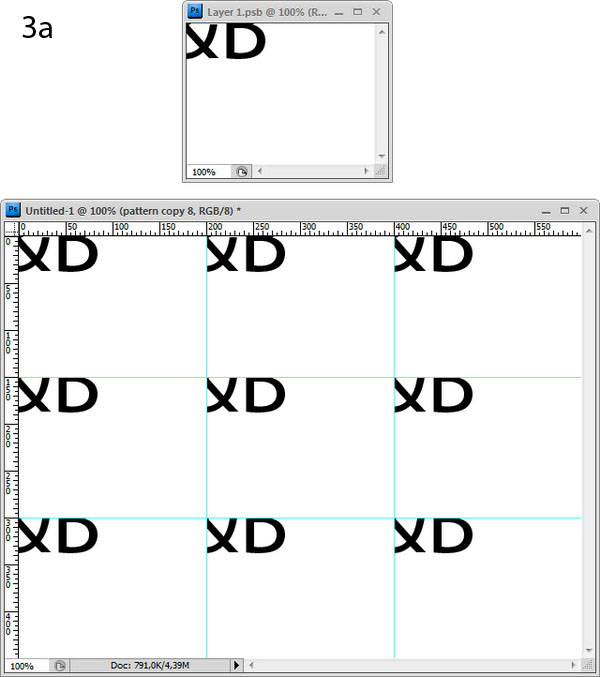
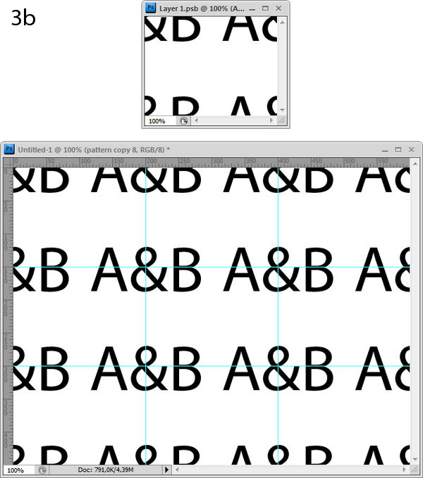
  3. Objects that are placed on the corner will be cut off (3a). You will need to add it to every other corner (3b).

create complex pattern using smart object and nudging

Step 1

Download Floral Ornaments and open it in Illustrator. Select one of the objects and press Cmd + C to copy.

create complex pattern using smart object and nudging

Step 2

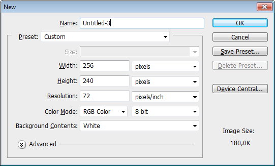
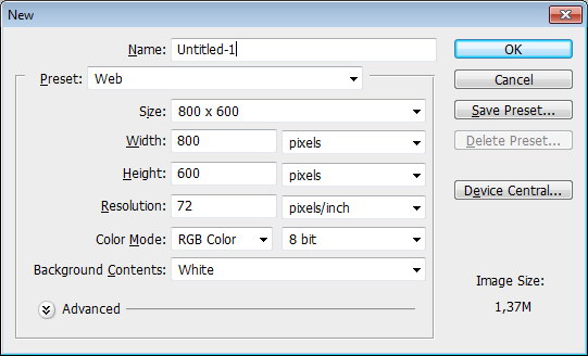
Create a new file. We are going to create a 256 x 240 px pattern.

create complex pattern using smart object and nudging

Step 3

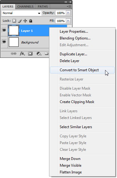
Create a new layer. Fill it with any color, right click and choose Convert to Smart Object. This smart object will become our pattern.

create complex pattern using smart object and nudging

Step 4

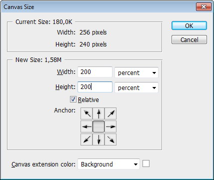
Click Image > Canvas Size. Activate Relative and set Width and Height to 200%. This will increase the canvas size to 3 times larger than our pattern will be.

create complex pattern using smart object and nudging

Step 5

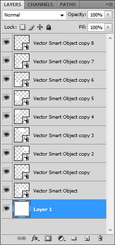
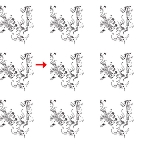
Duplicate the smart object pattern by pressing Cmd + J then fill the canvas with the pattern. At this point, you will have 9 smart objects on your canvas. These 9 smart objects were created from same parent, editing one of them will change the other 8. This means we will be able to see the edits we make to our pattern change in real time.

create complex pattern using smart object and nudging

Step 6

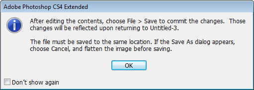
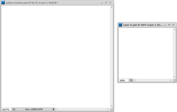
Double click one of the smart object thumbnail layers to edit its content. If you find this dialog box just click OK. The smart object will be opened as a new file in a new tab. This is the file that we will put the objects for our pattern.

Click Window > Arrange > Float All in Windows to see both files at the same time.

create complex pattern using smart object and nudging

Step 7

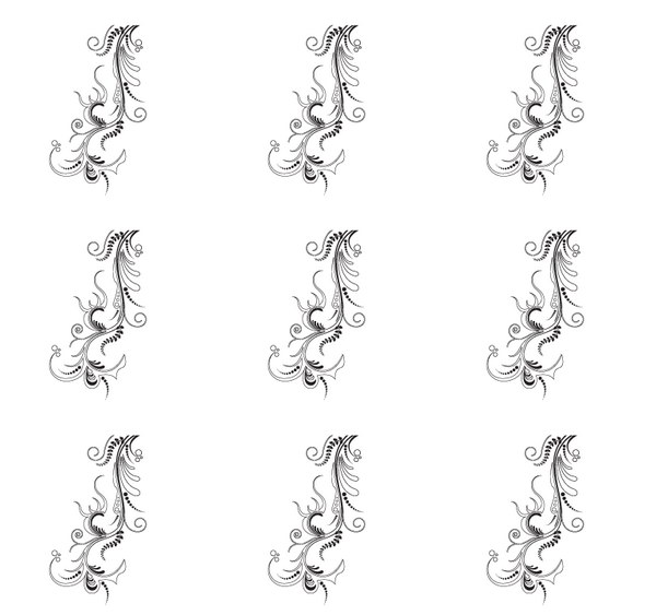
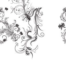
In the pattern file, paste (Cmd + V) the vector shape from Illustrator. Place it in the middle of the image. Save pattern file (Cmd + S) and automatically the big file will be updated. Because the object is in the middle, pattern looks fine (Principles #1).

create complex pattern using smart object and nudging

Step 8

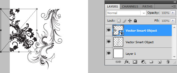
Return to Illustrator, copy another shape. In Photoshop paste the object and put it on left edge. Save file and you can see in the big file some part of the object is missing.

create complex pattern using smart object and nudging

Step 9

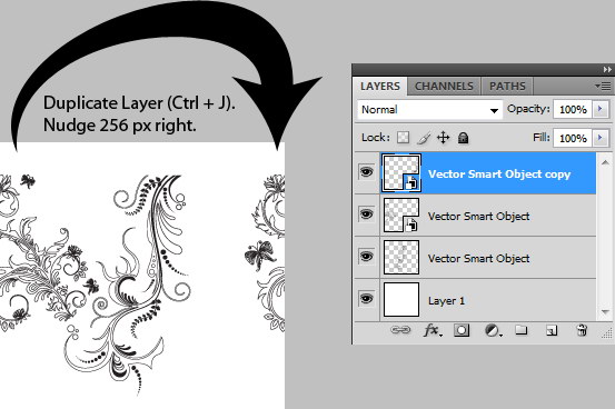
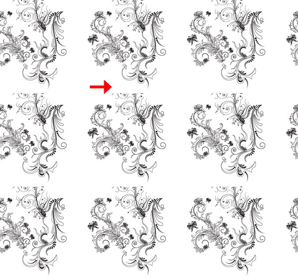
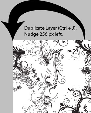
Duplicate layer (Cmd + J). We need to put this on the opposite side, right (Principles #2). Remember that the pattern width is 256 px. Nudge this layer 256 px to right. Every time you press arrow key, you nudge object 1 px. If you press Shift + Arrow you nudge 10 px. So, press Shift + Right Arrow 25 times then Right Arrow 6 times. Press Cmd + S to save pattern and see how the pattern changes.

create complex pattern using smart object and nudging

Step 10

Grab another shape from Illustrator. This time put it on the top edge. Save the file and you’ll see that lower part of the pattern is missing.

create complex pattern using smart object and nudging

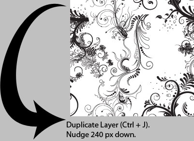
Step 11

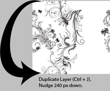
We still use Principle #2. Duplicate layer (Cmd + J). Nudge it 240 px down, that means press the arrow key 24 times. Save file and see the pattern working.

create complex pattern using smart object and nudging

Step 12

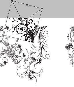
Grab another shape from Illustrator. Put it in right bottom corner. Save file and you’ll see that there’s missing piece in some areas.

create complex pattern using smart object and nudging


create complex pattern using smart object and nudging

Step 13

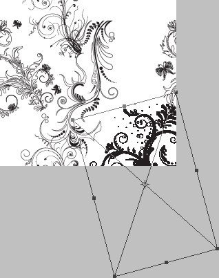
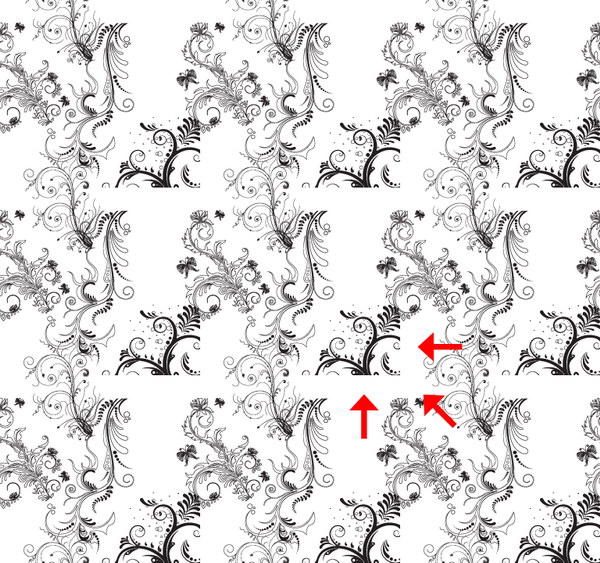
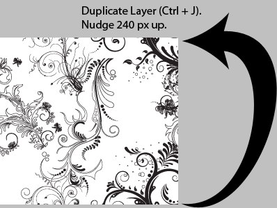
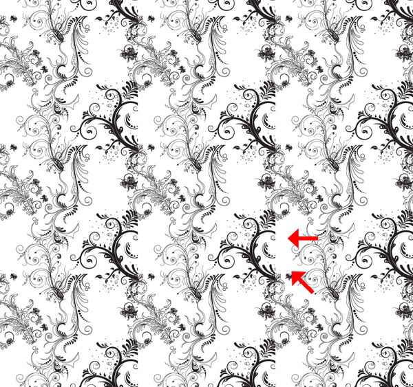
For object in corner, we need to put its pair in every other corner (Principle #3). Duplicate layer and nudge it 240 px up. Save file to see the result.

create complex pattern using smart object and nudging

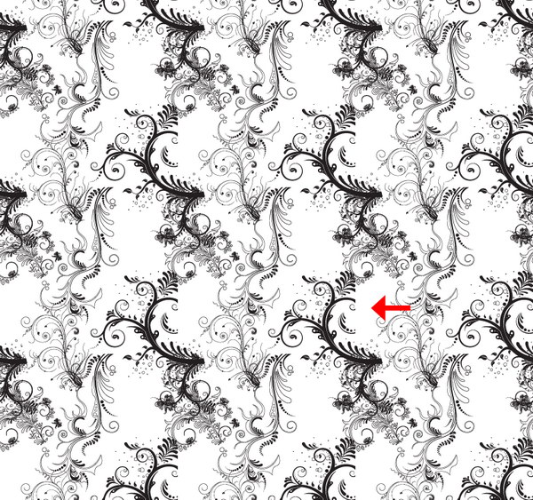
Step 14

Duplicate layer and nudge it 256 px left. Save file to see the result.

create complex pattern using smart object and nudging

Step 15

Now the last piece. Duplicate layer and nudge it 240 px down. Save to see the result.

create complex pattern using smart object and nudging

Step 16

Fill empty space with smaller shapes from Illustrator without touching the edge. Save to see the result.

create complex pattern using smart object and nudging

Step 17

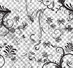
Delete background layer to make this pattern transparent.

create complex pattern using smart object and nudging

Step 18

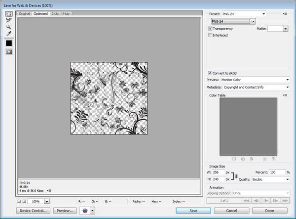
Click File > Save For Web & Devices. Choose Preset: PNG-24. Activate transparency.

create complex pattern using smart object and nudging

Step 19

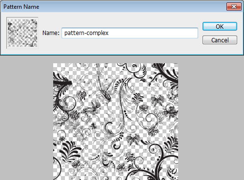
Open the PNG file we have just created. Click Edit > Define Pattern.

create complex pattern using smart object and nudging

Step 20

Create a new file.

create complex pattern using smart object and nudging

Step 21

Add a radial gradient from white to black in background.

create complex pattern using smart object and nudging

Step 22

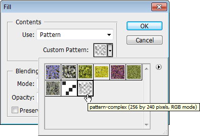
Create a new layer. Click Edit > Fill. Choose Use: Pattern and select pattern we have just created.

create complex pattern using smart object and nudging

Step 23

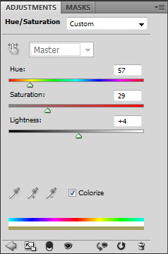
Add Adjustment Layer Hue/Saturation. Activate Colorize and move sliders to add a bit of color.

create complex pattern using smart object and nudging

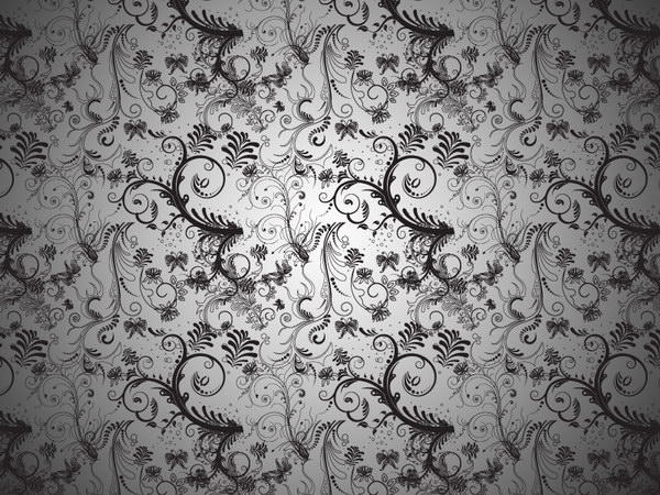
Final Image

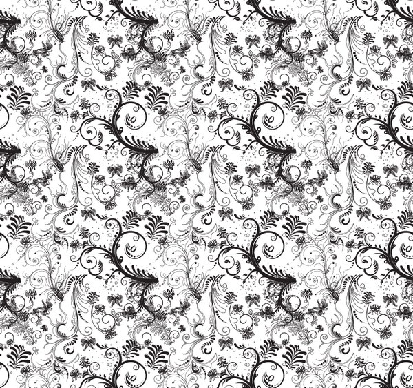
That’s it! We’re done. You can view the final image below. I hope you enjoyed this tutorial and learned something new. Try to use this technique with other shapes or lines. You’ll amaze yourself with the result.

Freebie Pack – 4 Free High Resolution Grunge Textures


Textures have a seemingly endless number of uses for graphic design. A nice texture can be used to add depth or a sense of realism to an otherwise flat design. They can be used in print design, web design, and even 3D graphics. Today, we have a really nice set of 4 free high resolution grunge textures from our friends at Texture Vault that you can download right now and use in your work.


4 Free High Resolution Grunge Textures

This pack includes 4 free high resolution grunge textures that you can use for personal and professional projects. See the download file for more information regarding licensing. Below is an example of the textures included in this pack.

This exclusive set of textures was created by Bjorgvin Gudmundsson of Texture Vault. We are excited to partner up with him on the release of this set.

Producteev Two is a Sequel Worth Checking Out

Yesterday was the launch of latest offering in web-based productivity software solutions, Producteev Two.  The system takes all of your (and, if applicable, you team’s) tasks and puts them into one place where they can managed and tracked accordingly.  I’ve had some time to play around with the beta release of the product and am quite impressed with the look, feel and ease of use of this pretty powerful tool.  Oh, and you can do pretty much everything without even going to their website.

Get out of your inbox

The primary goal of email is to be used as a means of communication, not as a place to manage your day from.  You end up getting bogged down, lose track or just forget what needs to be done and when.  Producteev Two allows you to forward emails that come your way to the system via an email address that sends it right to your system.  You can tag the email with due dates, etc. in order to make sure it goes to the right place in your system as well.  Just send it and it’s there.  Plus, Producteev Two will send you an email to remind you about your task and then send you an email when the task is done (especially helpful if you’ve assigned the task to a team member).

Let’s not stop at email

The pretty amazing thing about Producteev Two is that while most of us use email as a communication tool, you can send tasks using any of your communication tools.  Services GTalk, SMS, IM and even Twitter and Facebook can be used to send and receive tasks – meaning you don’t have to change you communication habits to get stuff done.  There’s also a Gmail Gadget that lets you manipulate your tasks right in Gmail…and yes, even iGoogle works with Producteev Two.  Very impressive.  All of these tools are interconnected as well and your preferences can be set in the web application.

Would you like to play a game?

A unique aspect to Producteev Two is the Producteev Academy.  Users can earn badges and compete for top ranking in categories such as “Most Hot Tasks Completed” which adds an element to this service that I’ve not seen anywhere else.  It may serve teams well who need to brush up on their skills or simply competitive in nature – or it could be just turned off.  A nice add-on that sets the Producteev Two apart from its competitors.

In addition, there are reports that let you know where things stand on a daily, weekly or monthly basis.  Much like a digest it will let you keep tabs on how things are progressing.  A useful tool that may or may not be part of how you use the system.

Free your inbox…for free

Producteev Two is free for up to 3 individuals and the pricing structure beyond that is fair and balanced.  You get a few added features with the paid service, but as mentioned yesterday, the product is fully functional no matter which way you go.  Not stopping there, the team released their free iPhone app as well yesterday which works much like the web service.  It has push notification and works even when you’re offline.  It also syncs in the background so you can keep doing your thing while it is doing its thing.  There’s more on the horizon, such as a Mac desktop client.

Screencast Producteev Two from Producteev.com on Vimeo.

Final thoughts

Producteev Two has a clean interface, robust management system and enough versatility to be utilized by individuals and teams alike.  While some of the features are only available to paying subscribers (i.e. filters), the system is more than enough for most freelancers or partnerships to handle.  It pricing structure – especially the free accessibility for most users – is what will help this service out in what is a very crowded space.

In a marketplace that has some pretty impressive systems already in play (Nozbe, Action Method), Producteev Two sits right up there among the top performers in this category.

Inspiration: 35 Unique Examples of Vintage Design


In this collection of retro-themed websites, you’ll find some excellent designs that will leave you in awe. Vintage websites have been quite popular in the last year, and I hope that these examples will inspire you to create your own!


Edgepoint Church


Target Scope


Visit Cascadia


Radio


Efinterns


Prahba


Jeffrey Sarmiento


CottonSeedoil Tour


SottoCosto


Fisticuff Design


Dollar Dreadful


Level2d


AdaptD


Basmati Tree


Thunderfuel


Lana Landis


Hebatec


No Limit


Tnvacation


Mediaboom


Tennessee Vacation


DeVotchKa


The Archer Group


Macsbeer


Singularity Concepts

Liga RetrÙ


Mediaboom


Tricycle Terror


Big Rig Design


Lanikai


Miss Havisham’s Attic


Casino Lemonade


Sensi Soft


Custom Design


Sourcebits


Did we miss any cool vintage web designs? If so, please share them with us within the comment section.

25 Examples of Super Creative Resume Design

In today’s job market, it sometimes takes a little extra ingenuity to get noticed. We’ve heard of people printing their resume on florescent paper, sending baked goods along with a cover letter, even buying online ads or renting billboards to promote themselves. While we don’t always recommend such extreme approaches (read up on Aleksey Vayner’s “Nothing is Impossible” video resume to see why), we have to admire the creativity of these 25 resume designs:

  1. Film reel resume
  2. 3-D resume
  3. Flyer resume
  4. T-shirt resume
  5. Board game resume
  6. Photobooth resume
  7. Photo collage resume
  8. Folded mini resume
  9. Foldup resume
  10. Fabric resume
  11. Infographic resume
  12. Vinyl record-themed resume
  13. Office-inspired resume
  14. Magazine cover resume
  15. Comic resume
  16. Notebook page resume
  17. Passport resume
  18. Stacked graphic resume
  19. Newspaper classified resume
  20. Booklet resume
  21. Another booklet resume
  22. Pinwheel resume
  23. Life chart resume
  24. Mailer resume
  25. “Emergency” resume

Beginner’s Guide to Shooting High Key

Today we’re going to learn all about what high key photography is and how to create the effect. We’ll go over what kind of equipment you’ll need, how to set it up, as well as what camera settings you can expect to give you good results.


What is High Key Photography?

High key photography uses unnaturally bright lighting to blow out most or all harsh shadows in an image. High key methods were originally developed as a solution to screens that couldn’t properly display high contrast ratios, but has developed into more of a stylistic choice.

High key images usually convey a positive or upbeat tone. This method is perfect for a subject that is funny, lighthearted or beautiful.

You see high key used regularly for model photography, flowers and other subjects that are relatively feminine in nature. Another area perfect for high key is product photography. Practically speaking, the bright nature of the photo really highlights the product and can make for some great attention-grabbing contrast. Psychologically speaking, a product shown on white tends to suggest that it is high quality or upscale in nature.

The Nikon image above probably reminds you of a number of ads you’ve seen for premium products like the iPhone. Apple is fond of using high-key artwork and photography to show off their line of super-stylish electronic devices.

The opposite of high key is of course low key. Instead of eliminating shadows as in high key photography, low key photographers utilize dark scenes and heavy contrast to convey a sense of drama or foreboding.


Lighting Equipment

Effectively shooting indoors in high key is not easy if you don’t have the proper equipment (outdoors on a bright day can be easier and cheaper). If you want to achieve that studio, white background look, ideally you’ll have some studio lighting on hand.

Getting started with studio lighting can be quite expensive. Many starter kits are available from a range of manufacturers. Depending on the quality and amount of equipment you want, you can expect to spend anywhere from $200-$1700 and beyond.

Lighting conversations can quickly become complicated, but I’ll try to keep it simple here. Basically, you have two primary options: continuous lighting or flash. Within continuous lighting you can choose from either tungsten (hot lights) or fluorescent (cool lights.) Tungsten lights tend to run really hot and produce warmer looking light while fluorescent lights run fairly cool by comparison and produce something more comparable to daylight (source).

The problem with both of these is that they are fairly low-powered, which can make it difficult to pull off high key photography if your lights are good enough. Alternatively, flashes are more versatile and powerful and are therefore the only choice for many studio photographers.

Ultimately, it’s quite difficult to get a good feel for a lighting kit until you get your hands on it. The best you can do if you’re purchasing online is to do your research and read plenty of reviews. Below are a few lower-end affordable options to begin your search with.

CowboyStudio 330 Watt Three Light Kit: $290.99

  • 3 Monolight Studio Flash/Strobes
  • 3 Softboxes
  • 1 Boom Kit w/Sandbag
  • 1 24″ Photo Tent

Smith-Victor FL-130 3 Light Studio Flash Kit: $338.95

  • 3 Monolight Kits
  • 2 Black-Backed White Umbrellas Are Included
  • 3 Aluminum Stands
  • 1 Hard Carrying Case

Britek Flash Light Kit with Boom – total kit 576 wt: $534.99

  • 2 HS-600 Flash Lights 168 w/s
  • 2 PS-200 Flash Light s120w/s
  • 4 Modeling Lamps for HS,PS Series
  • 4 Reflectors
  • 4 Modeling Lamps for HS,PS Series
  • 2 32″ Silver Photo Umbrellas
  • a lot more…

Lighting Setup

Once you’ve got some decent lights, you’ll need to set up your studio environment. Don’t mistake the information below as the single right way to shoot high key photography. There are tons of places and ways to get a good high key shot, this is just to give you a good idea of one of the most popular methods of achieving the effect.

Ideally you’ll have at least three lights, four if you’ve got the equipment. You’ll also need a seamless white backdrop of some kind. Many professionals mount a 9 ft wide roll of paper high on stands, then roll it down across the background and onto the floor of the shot. If you’re on a budget or in a hurry you can try using a sheet (watch for wrinkles) or an empty wall.

Position your subject in the center of the backdrop and make sure to keep the shot’s frame within the bounds of the paper so no gaps are showing. Next setup a key light and a fill light. The key light is off to one side and is your main source of light on the subject. Make sure the lighting on the subject is fairly flat. As strange as that sounds, remember that you’re not going for contrast here but brightness throughout.

Having your key light to one side will likely produce harsh shadows on the opposite side of the subject. Here you setup a less bright fill light to smooth out some of those areas. Shooting with only these two lights will produce a gray, shadow-filled background. Since we’re going for solid white, you need to eliminate these shadows by using one or two lights angled and pointed at your backdrop.

The key here is experimentation. Don’t worry if you end up with a lot of bad shots at first, it can literally take hours to figure out a decent light setup if you’re new to studio flash photography.

One thing to watch out for is the light bouncing off your backdrop, which can cause strange halos around your subject. At the same time, you want to make sure you’re blowing out the backdrop enough to get a fairly solid white. Deborah Wolfe from Studio On a Shoestring recommends that you keep your background lights at least one f-stop over your subject lighting and meter the lighting for your subject to produce an overall setting of f/11.


Camera Settings

To evaluate camera settings for a given technique, I always like to take a look at a real example and inspect what the photographer did to achieve the effect.

This photo was taken with a Sony DSLR-A350, with an exposure of 0.2 sec (1/5), an aperture of f/5.6, an ISO of 100, and an exposure bias of +2 EV. Notice that all of these settings are aimed at letting in lots of light.

The 1/5 sec exposure is quite long and would normally produce a blurry photo if not for a couple of factors. First, the subject isn’t moving. Fortunately, flowers are fairly immobile and tend to stay pretty still while you’re shooting (barring any wind). Unfortunately, you don’t have the same luxury with people.

Secondly, the camera was probably mounted on a tripod. With such a long exposure you’ll want to use a tripod whenever possible to avoid camera shake. Finally, the flash actually serves to freeze the subject in place so that even if you’re shooting a person, handheld with a long exposure, it’s a fairly easy to get a crisp image.

The 5.6 aperture is neither really high nor really low. The shot looks like it would’ve been taken down below f/3 but because it’s so close the DOF looks fairly shallow even above 5.0, which allows for more light to be let in without sacrificing a nice blurry background.

Finally, the 100 ISO tells us there was already a lot of available light in the seen and the exposure bias is pumping up the brightness even further.

What you can learn from this is that you’re definitely going to want to shoot at 100-200 ISO in a bright environment with a f-stop that’s high enough to give you a really bright scene. Feel free to shoot way up at f/11 or higher if you’re not aiming for a blurry background and don’t have strong enough lights to fill the area well. You’ll also want to lengthen your exposure to brighten the scene as much as you can without blowing out the highlights or causing blur from camera shake or model movement.


Conclusion

To sum up, high key photography seeks to eliminate harsh shadows and create a bright environment. It is generally used to convey an upbeat, funny or beautiful subject but can be manipulated to communicate a number of moods and concepts.

If you want to shoot high key indoors, it’s best to have some studio lighting available, preferably 3-4 flashes: two on your subject, two on the backdrop. Also, make sure your camera’s settings are optimized to let in lots of light. Make sure there’s enough to brighten the scene considerably without blowing out the subject.

If you’ve got some nice high key shots to show off, be sure to leave a link in the comments and share your methods with us!

What Books Help You Be Productive?

There are numerous self-development and productivity titles out there to choose from.  Starting with works by David Allen (Getting Things Done, Making It All Work) to Stephen Covey (The 7 Habits of Highly Successful People, The 8th Habit) to Neil Fiore (The Now Habit), there are different viewpoints and models that you can refer to when looking to increase your  productivity.

Some books you may have read may just inspire you to be more productive or are particular to your passion (Twyla Tharp’s The Creative Habit would be an example).

What books have you read that helped you out?  What authors inspire you to improve?  What books would you like to read that could help you even more?  Let us know in the comments.

Create your own Calendar with Illustrator & InDesign – Vector Premium Tutorial


We have another great Vector Premium tutorial available exclusively for Premium members today. If you want to learn how to use Adobe Illustrator and InDesign to make an attractive type based calendar, then we have an awesome tutorial for you.

Continue reading “Create your own Calendar with Illustrator & InDesign – Vector Premium Tutorial”

Cast Your Zaxwerks Challenge Vote!

Well, I hope you took advantage of your chance to have Zaxwerks ProAnimator free for the month of May. We’ve collected all the Zaxwerks Challenge entries and now it’s your chance to vote. You can view the entries below and then vote… It’s all up to you from here on out! Voting will end Wednesday, June 9th at Midnight EST.


The Submissions

Eyad Studio

Brett Perry

Tony Rangel

Greg Back

Mohammed Ali 1

Mohammed Ali 2

Mohammed Ali 3

Agustinus Bambang Eko Mulyono

John Orban

Yasmani Ordonez

Muse Pte Ltd 1

Muse Pte Ltd 2

Muse Pte Ltd 3

Muse Pte Ltd 4

Muse Pte Ltd 5

Muse Pte Ltd 6

Birdy Ben

Ryan Snider

Steve Chiang 1

Steve Chiang 2

Steve Chiang 3


Vote Here!

Contest Details

To read all the details about this challenge CLICK HERE.


How to Create Custom Track Icons For Logic Pro

In this rather unmusical tutorial I’m going to show you how you can create some custom track icons for Logic Pro. There’s also a nice Logic Pro Icon giveaway too!!

Introduction

It’s scientifically proven that a cool track icon can improve audio quality by up to 67%. Ok, so I made that up, or did I? In this tutorial I’m going to show you three ways to create some rockin’ icons for your Logic Pro sessions. OK, so this may not have much to do with making music but sometimes (as you probably aware) it’s just all about image right! Plus they just look nice!

Logic has supported custom track icons for many, many years. It ships with a pretty cool set of pre made icons that can be assigned to and track or environment object. Here’s the default icon for an audio track.

To switch the icon for another one just click the ‘Icon’ picture in the Inspector. You’ll be presented with a list of available icons. Just pick the one you want and off you go.

intro-2

Here’s a nice Amplifier icon that ships with Logic.

intro-3

You’ll find that all native Logic objects and Software Instruments have their own icon assigned by default. But what about all your other third party Software Instruments? How do you get an icon for them? And what about Rewire Apps like Reason and Ableton Live! Maybe you want an icon for them too. We’ll here’s how you do it! First off let’s look at what an icon is.


Some Info On The Logic Icon Format

To make an icon for Logic Pro you need to follow a couple of rules. They are as follows:

Rule 1

Icons have to be saved in the .png (Portable Network Graphic) file format. The file needs to include an Alpha (transparency) channel.

Rule 2

The .png image can be no bigger than 128 x 128 pixels.

Rule 3

The file must be given a numerical name. An example would be ‘351.png’. All Logics icons have a number like this so you’ll need to find a number that isn’t taken. Logics icons stop at 325 so any number above that is safe. Not every number between 0 and 325 is taken though, they’ve left some gaps for you in case you’d like to place an icon in a certain place in the list.

Rule 4

Icons need to be placed in the following directory. Applications -> Logic Pro -> Contents -> Resources -> Images -> Icons. Now this might seem a bit confusing as ‘Logic Pro’ is an ‘Application’. So how do you get inside the application? Just navigate to your Applications folder, find Logic Pro. ‘Control’ click on the icon and choose ‘Show Package Contents’.

rule-4a

This will open a new window. Inside this window is a folder called ‘Contents’. Open this folder and open the ‘Resources’ folder. Inside this folder is the ‘Images’ folder. Open this and open the ‘Icons’ folder. This is where your new icons go.

rule-4b

A word of warning! When navigating inside Application package folders for Pete’s sake don’t delete or rename ANYTHING!!!!! Doing so could cause your program to break!!! You have been warned!!!


Method 1 – Application And File Icons

Every application and file type has an icon built in. These are the nice little pictures you see in your folders and Desktop etc. The beauty of these icons are they contain multiple sizes of the same image so the icon is scaleable on your desktop. One of these sizes will be 128 x 128. These images also contain the transparency (Alpha) channel so are perfect icon fodder! So how do you get to these files.

Step 1

Find the icon you like. In this case we’ll do Reason. ‘Control’ click on the app or file type and choose ‘Get Info’.

app-1


Step 2

In the Information window click on the icon at the top. You’ll see a blue glow around it.

app-2

Press ‘Control+C’ to copy the icon to the clipboard.


Step 3

Open Preview. Choose File -> New From Clipboard

app-3


Step 4

The icon will now be available to you in Preview. Some icons are quite big (512 x 512), scroll down in the sidebar and choose the 128 x 128 image.

app-4


Step 5

Go to File and choose ‘Save As’. Give the file a number that’s safe. Choose ‘PNG’ from the file type and make sure the ‘Alpha’ button is checked.

app-5

You can save the file where you like.


Step 6

You’ll see the image in Preview as the saved item.

app-6

Navigate to the Logic Pro ‘package’ folder and find the ‘Images’ folder. Copy the file into the Icons folder. When you start Logic the icon will be there waiting for you in the list.

app-7


Step 7

Choose a track and assign the beautiful new icon!!

app-8

You can use this technique to convert any icon on your Mac to a Logic Pro track icon.


Method 2 – Free Stock Icons

There are literally tens of thousands of icons out there in Internet land. Probably the definitive destination for Logic icons is the Logic Pro Files which has a large collection of downloadable goodies. You’ll need to register to download but it’s worth it. From every conceivable piece of audio hardware to some more obscure instruments (Alto Domra anyone?) this site has you covered!

stock-1

These could be handy for remembering that Mic you used!

Other sources for icons are stock icon websites. There’s quite a few out there. While these don’t cater for music all that much you can find the odd gem. One good site is Icon Archive. Here’s a nice turntable I found. You’ll see the icon is downloadable as a 128 x 128 PNG file. Just click the link, copy the image to the clipboard by ‘Control’ clicking it in your browser and choosing ‘Copy Image’.

stock-2

Just open Preview and do New From Clipboard.

stock-3

Save the file out with a number and copy to your Icons folder. If you can’t find the image in 128 x 128 it will more than likely exist in a larger size like 256 x 256. Just resize it in Preview using Tools -> Resize Image.


Method 3 – DIY Icons

You can of course make your own icons in image editors like Photoshop or Gimp (which is free). Whether you want to go this far is up to you I guess! If you want some tips on how to make your own graphics head over to Psdtuts+ which has many great tutorials on icon design.
diy-1

This can be a lengthly process which I’m not going to attempt to go into here. As there are probably a lot of Logic users who use Photoshop, try giving this a go.


Icon Giveaway!!!
I’m giving away some icons that I’ve made for all you lovely readers of Audiotuts+.

iconEx

Ohmboyz Bonus!!!!

Included in the download is a set of lovingly handcrafted Ohmforce “Ohmboyz” funky skin icons. I made these a while ago for myself (all 125 Photoshop layers!!). I’m pleased to say they have been approved by the actual ‘Ohmforce’ for download here at Audiotuts+!!!

icohms

Incidentally, it’s actually quite possible that Ohmforce plugins can improve audio by 67%!!! :) Enjoy!!!

Download the Play Pack for this tutorial (827 KB)

Contents

  • Custom icons
  • Ohmforce “Ohmboyz” funky skin icons


Workshop #78: Campus Credit by Hyp

At Audiotuts+ we irregularly put up a reader track for workshopping and critique (find out how to submit a track). This is how it works: you upload your song, and every week or so we’ll publish one here and step away from the podium. The floor is yours to talk about the track and how the artist can fix problems in and improve upon the mix and the song.

This track has been submitted for your friendly, constructive criticism. They have put their track (and their heart and soul) in your hands to learn and get useful feedback.

  • Do you enjoy the song or track itself? Does it have potential?
  • Can the arrangement be improved?
  • How did you find the mix? What would you do differently?
  • What do you enjoy about the rhythm track? What can be done to improve it?
  • Is the choice of instruments relevant and effective for the style/song?
  • Are the lyrics (if any) effective? Does the style, arrangement and genre of the song suit them?
  • Can you suggest any specific techniques that might improve the track?
  • Do you have any other constructive feedback?

Campus Credit by Hyp

Artist’s website: www.reverbnation.com/hyp

Description of the track:

This song, I believe, is a small step in making those who aren’t, aware about the ever-growing drug sub-culture in today’s college communities. The “credit” refers to how the college is immediately in debt once you give them your funds; it is now their responsibility to bring you success, money, and happiness. However, it does not include drugs, which, as many of us know, are a little piece of happiness that we can’t help but love.

I’m looking for general tips on how to make it sound better. Thank you.

Download audio file (campuscredfinal.mp3)

As you may have noticed in the comments, Hyp updated the track while waiting for the workshop to be published. The new track is below, with vocals recorded on a better mic, along with other minor tweaks.

Download audio file (Campus Credit.mp3)

Terms of Use: Users can stream the track for the purposes of giving feedback but cannot download or redistribute it.

Have a listen to the track and offer your constructive criticism for this Workshop in the comments section.


Submit Your Tracks for Workshopping

Need constructive criticism on your own tracks? Submit them using this form.