Dive Into A HUD Diver Mask Animation – Day 1

This 2 Part Tutorial aims to show various techniques used to create an imaginary hi-tech divers mask, as seen from the divers viewpoint.

In Day 1, I will show how to create the graphical elements that form the basis of all the in-visor display systems. These will be done in Adobe Illustrator, but the same techniques can be used in After Effects.

Then I’ll show how I created the glass warping effects used to simulate a 3d glass wraparound visor, and also put some water droplets onto the outside of the glass.


Tutorial

Download Tutorial .flv

File size 206MB


Quick Tip: Using and Sharing Files With the InDesign Library


In this Quick Tip tutorial you will learn how affective the InDesign Library palette can be for storing and reusing objects. Once a library has been established it is independent of InDesign documents and saved objects are stored in one place. Using a library is a convenient way of accessing these objects quickly for reference, using and sharing.

Continue reading “Quick Tip: Using and Sharing Files With the InDesign Library”

How to Illustrate Deliciously Realistic Grapes using Simple Techniques


In this tutorial we will learn how to illustrate a bunch of grapes using basic Adobe Illustrator tools. You will learn how to render multiple light sources and how to model a complex object using simple shapes and techniques. Let’s get started.

Continue reading “How to Illustrate Deliciously Realistic Grapes using Simple Techniques”

Essential Synthesis Part 2: Classic Synth Pads

If you followed the first part of this series then you’ll know that we are looking at a group of synth patches that represent the building blocks of subtractive synthesis. In the first instalment we looked out how to manipulate a simple noise oscillator.

In this instalment we’ll take a look at how to create a classic synth pad patch, an essential part of any synthesist’s armoury. The last tutorial was completed using Logic’s ES2 soft synth, this time around I’ll be using Steinberg’s Prologue. In fact I’ll be using a different instrument for each instalment, to show that these techniques are truly generic in nature.


Step 1: The Pad Patch

What is a pad? Well as the name suggests it’s a patch thats used to ‘pad’ a mix out. They are more often than not used at pretty low levels and supply a lush backdrop to our music. Most synth manufacturers supply a pretty decent selection of pads as standard with their synths but often these patches can present problems when used in the mix.

To many sound designers and synthesists the temptation to create complex pads that show off the instruments feature list is often to alluring. These complex pad patches can be great to play in isolation but in the mix they are often too busy and can end up clashing with existing elements as opposed to complimenting them.

Often the best pads are simple ones as they tend to sit more comfortably in the mix. In the following steps we’re going to take a look at how a basic but effective pad patch is put together and how these patches can be easily transformed into something more complex if required.


Step 2: Choosing Our Oscillators

As usual I have started with an initialised patch that consists of a single sawtooth waveform, an open low pass filter and very basic envelope settings. It’s always a good idea to start with a clean slate and very few modulations when creating your own patch.

The basic untreated saws

Download audio file (2.mp3)

The untreated saw wave and some very basic chords.

As our pad is going to be pretty heavily filtered the choice of oscillators in not as crucial as you may think. Of course your choice will effect the amount of harmonics created and a harsher brighter combination of oscillators will give you the ability to open the pads filter to reveal a more aggressive tone if needed.

To demonstrate this and show that we can create a smooth pad from even the harshest waveforms I have opted for two straight saw waves here. As there was already a saw wave present in our initial patch it was simply a case of adding a second.

These saw waves were then detuned to create an instant unison / chorus effect. This is great for creating depth and works perfectly for our pad. If you wanted to create a more complex, harmonically rich pads you could add a third oscillator of a different kind but to keep things simple here we’ll stick with two.

The detuned saws mixed

Download audio file (2b.mp3)

The same chords with the two detuned oscillators


Step 3: Envelopes and Dynamic Signatures

The core of a good pad sound is its dynamic signature. Simply put we need a long attack and long release, these two qualities combined automatically give us the traditional signature of a pad or string. With these set the patch plays like it should with a long, trippy feel. With this sort of envelope setting the timing of the patch is very forgiving and most sequences sound pretty good, perfect for adding extra parts to any track.

With these simple envelope values dialled in we are really starting to see the pad take shape but currently everything is just too bright and upfront. Let’s take a look at some filtering to sort this out.

The amplitude envelop in place

Download audio file (3.mp3)

The chords played with the new envelope


Step 4: Filters and Filter Envelope

To give our pad a traditional mellow feel we need to apply some pretty heavy filtering. We’ll be using a low pass, slightly resonant model to remove a large amount of high end from the sound. This will then be modulated by a dedicated envelope to add some dynamics.

The low pass filter used

So with out low pass filter chosen the cut off is decreased pretty drastically to remove all the ‘sharp’ edges and a healthy dose of resonance is added to introduce some warmth and harmonics. I have also utilised the ‘drive’ circuit that Prologue features, this adds further harmonics and some saturation. Other synths may not have this feature but there are plenty of saturation plug-ins out there that can achieve the same results.

The dedicated filter envelope somewhat matches the amp envelope

Download audio file (4.mp3)

The patch with the filter and envelope activated


Step 5: Some Light Modulation and Effects

Our patch is now resembling a classic pad sound and is pretty much usable in its current state. To finish it off and give it an extra edge and some dimension let’s add some light modulation and a few effects.

Our modulation is a simple slow-moving sine wave based LFO effecting the filter cutoff, this gives the sound an evolving feel and keeps it interesting over time. After this I added some built in delay and chorus from the synths effects sections for extra dimension. If your chosen soft synth has no effects section, get those plug-ins out!

The LFO used to modulate the filter

… and some dimensional effects

Download audio file (5.mp3)

The patch with modulation and effects


Step 6: Conclusion

As you can see going from only a simple single oscillator to a fully blow and usable pad sound is extremely easy. You should find now matter what synth you are using that you are only really a few moves away from creating this sort of patch.

The patch being played with a beat

Once this is mastered you have one of the essential building blocks of synthesis under you belt and from here you should be able to create much more complex and involving string and pad patches. Look out for more on this in future tuts!

Download audio file (6.mp3)

The patch being used at the start of a project


Incorporating Surrealism Concepts into Your Digital Artwork


Have you ever wanted to incorporate Surreal concepts into your artwork, but weren’t sure how to approach it? In this article, I share my personal pipeline for fusing Surrealist notions with my imagination to create fresh work. Learn to unleash your mind, capture your dreams, and fuse wild ideas into well crafted digital works of art through experimentation, planning, and execution.


Introduction

I am in no way a Surrealist technique master, nor am I a Surrealism scholar. I am not here to discuss what Surrealism is and how it’s done right – as there are no rights or wrongs. What I will share with you in this article is strictly my personal approach to creating Surreal digital artwork by incorporating the Surrealism approach with my own twists.

Below, you will find five sections, which roughly define my pipeline of how I approach creating Surreal artwork and basically any otherworldly work. They are formatted from early conceptual notions, to actual execution, things to look out for during creation, and final tips that may help you with the entire process.

Parade of the Dreamers,” by Jeff Huang, For Desktopography 2009

Unleash Your Mind

No, this is not relating to the Matrix, but it is an important matter to discuss. When it comes to creating your own artwork, you must remember that you aren’t trying to please anyone but yourself. You are not aiming to please a client, nor do you have to worry about revisions. Self-satisfaction should be your goal in creating personal artwork.

The biggest misunderstanding is that people often try to stress their imagination and try to force themselves to think of something extraordinary. You do not have to do that. As a matter of fact, it makes matters worse because you may force yourself too hard, be stuck, and end up getting frustrated. To avoid all of that, I believe one should just let go, relax, and let their imagination do the work. You’d be surprised how much better the imagination works when you aren’t forcefully trying to get it to work.

Remember not to get frustrated. You may find yourself stuck at times, but that’s alright! Move on to doing something else! Go take a walk, watch TV, buy some groceries, go have dinner with your loved ones. What I’ve learned is that I often come up with ideas when I least expect it. Life itself inspires, and if you just go about it daily, there are an infinite amounts of things that we see, hear, and feel that will spark our imagination.

Below is an example of something I’ve seen here in NYC that certainly inspires.

Alamo (The Cube),” is an outdoor sculpture by Bernard (Tony) Rosenthal, which is located on Astor Place, on the island of Manhattan in New York City.

Capturing Your Dreams

So you’ve come up with an idea and want to execute it. Here are a couple things to do in order to capture that idea before it fades away:

  1. Sketch It Out – You do NOT have to be an amazing draftsman to quickly sketch your concept out. All you need is either a piece of paper and pen/pencil or a tablet. It is up to your preference what tools you use – you could even use a chisel and hammer if you’re into that sort of thing…though I don’t personally recommend it. Nonetheless, draw your vision out roughly. Don’t finesse any details yet, but just lay out key points of your vision.

  2. Find Reference Images – Gathering reference images will help you greatly in realizing your new idea. Gather images that directly relate to what you have in mind. If you are looking to create a piece that revolves around a grass field, gather images of grass fields that suit your vision roughly, it doesn’t have to be exact.

    If you’re looking to create a certain style of art, gather certain pieces by the artist you like. Personally, whenever I work, I almost always create a folder of reference images and have it accessible on my secondary monitor, or at the very least have my browser open with one single image that strongly inspires me.

Below is a sketch of a potential upcoming piece and a few reference images that I possess. I imagine the structures floating to be rocky structures, thus I found references of strong rock textures, as well as relevant inspirational surrealist work.

Sketch of mine for a potential upcoming piece.

Reference images of rock textures and Surrealist work.

Mindset During Creation

Now that you are ready to start the piece, let’s go over some things you may come across during the creation process.

  1. “Does this look real?” – This is a weird question. I believe the real question should be, “Is this convincing?” In my own opinion, Surrealism is at its best when it’s convincing enough that it could be real, however we obviously know that the subject matter you are creating is nonexistent, thus is not real.

    A rule of thumb that I have for myself when creating Surreal work is to make sure the subjects are convincing enough to exist in the world which is my current canvas. This means, to match the lighting, shadows, and everything in between. Don’t get it twisted though, this does not mean it has to be super realistic.

  2. I imagined something rather epic, but I doubt I could make it happen! – Make it happen to the best of your ability. When I approach work which I feel would be incredibly challenging to realize, I just go about it the best I can. In the end, this is just a learning experience as an artist.

    When you try to approach something challenging, even if it doesn’t turn out the way you envisioned, you will learn the skills you may need for next time to make it work. The worst thing you can do is be afraid and back off from your idea, because you would never learn that way. You must remember that if you are making personal work, no one is there to be critical to you or to make fun of you. It’s a sort of self-meditation. Experiment and learn from it. Be brave, and have patience!

Below is an example of how something could be convincing but not hyper-realistic.

Meditative Rose,” by Salvador Dali

Realism Versus Surrealism

This goes back to the earlier question of, “Does this look real?” If you want to create a Surreal piece of art, I believe it’s important to know the difference between Realism and Surrealism. I will try to define what these two terms mean to me personally, not as written by the Dictionary. Remember, this is what the two terms mean to me, and I have no intension to start a mass debate on what they truly mean.

  • Realism – Takes subject matters of the ordinary and common world which we call "reality." It almost always takes a non-exotic and non-extraordinary subject matter and theme. There is no need to think outside of the box, as that is not "real."

  • Surrealism – A twist on Realism. It explores the subconscious mind, with subject matters concentrating on dream-images and often aims to distort the ordinary and what we call reality.

The point that I’m trying to make is that one can be free when creating Surrealist work. This goes back to unleashing the mind as mentioned earlier in the article. This is what I love about Surrealism and it is the reason why my artwork often exhibits a Surreal atmosphere.

I don’t need my work to be hyper-realistic, nor am I aiming to be in the future. I just love playing between the lines of the Real and Unreal. As an artist, I feel rather powerful to have the ability to control and deliver such notions to the audience based on my will. To me, Surrealism is the perfect movement for artists who enjoy letting their imagination go wild, which allows them to delivering their wild visual ideas in a believable atmosphere.

Tips and Recommendations

Here are some tips and recommendations that I have that may help you with your creative process and artistic vision:

  1. Keep a sketchbook – I personally enjoy drawing with a pen/pencil on paper, as it feels much more natural than a tablet’s texture. Keeping a sketchbook would not only improve your draftsmanship, but also allow you to quickly capture ideas that you may have come up with suddenly.

  2. Patience – There are no doubts about it that patience is a virtue. An important thing to have is patience, especially when it comes to creating personal artwork. Take your time, no one is rushing you to finish!

    If there is something important I’ve learned from creating work in a few hours and work that takes weeks…it’s that the ones that take weeks are much more refined and detailed. Be patient and it will improve your artwork.

  3. Buy books and observe – A great way to study a certain style, in this case Surrealism, is to buy books of artists whom you are interested in. I have a few great books of Salvador Dali’s work, one from his museum in Figueres, and it’s awesome.

    Nothing beats being able to read and observe these masters, because as you read and observe their work, you unconsciously absorb lots of visual knowledge that you will recall in new work without even noticing. It’s rather magical!

  4. Zoom out – I cannot stress how important it is to simply zoom out of your canvas to view the work in full. Unless you plan to display your work as chunks or full-res, the zoomed out image is what the audience will see in the end.

    That is not to say to detail the piece while zoomed out, definitely not! But it is very important to zoom out to see the piece as a whole – to ask yourself how convincing it looks. A lot of times artists focus so much on one area that they fail to notice that it looks off in conjunction to the piece as a whole.

  5. Experiment – Experiment with techniques and styles. Making work digitally is great in that you can always undo something. Play with Photoshop, go crazy, and often you’ll find yourself being able to take pieces of each experiment and incorporate them into one successful piece.

    I never took a Photoshop class before, and almost all my knowledge is from experimenting and learning over the past five years. When I did have to take a required Photoshop class in school, there was nothing I didn’t already know. You’d be surprised how much you could learn by yourself if you just jump in and play around! There is no harm in exploring!

A piece from my sketchbook, created 2007.

Conclusion

So there you have it, a peek into my mindset, a look into how I incorporate Surrealist concepts into my digital artwork. Surrealism is perfect for artists whom enjoy playing the fine lines of the real and unreal. Digital artists – remember that the software is just your canvas and basic tools. Your main tool is your imagination.

A lot of people ask what sort of software an artist uses to create their artwork because they believe it is the software that does the work…but this is totally wrong. Many people could use Photoshop, but it is how you use it in conjunction with your mind, your attention to detail, and overall aesthetics that makes you stand out above all.


Resources and Inspiration


Create a Textured Female Robot in Photoshop


Photoshop is great for creating resizable, realistic, characters. Thanks to its basic support of vector shapes, its amazing layer styles and the endless possibilities offered by textures we can create compelling vector characters with complex shading while keeping file size to a minimum and performance to a snappy level. In this tutorial we will create a female robot made of simple vector shapes, we will use layer styles to lay down convincing metal shades and a few textures to add a final layer of realism.


Resources

The following resources were used during the production of this tutorial:


Step 1

Create a new blank document, using the size you want. Activate Snap from the View menu with Shift + Command + ; and hit Command + ‘ to turn on the grid.

Using the Pen Tool (P) in Shape Layer mode draw the head (1a). Make sure all points snap to the grid and all lines lie on the pixels, not across them. This way we’ll avoid anti-aliasing. Using Color Overlay (1b) make the head light pink (1c).


Step 2

Add a Gradient Overlay style (2a, 2b) to simulate metallic reflections (2c).


Step 3

Add some Inner Glow (3a) to simulate ambient reflections and Inner Shadow (3b) to enhance the roundness of the surface. The character is mainly lit from above and ahead so the inner shadow around the top of the head effectively pushes back the outline (3c).


Step 4

Create the neck with a simple, gold rectangle. Again make sure you snap to the grid for perfectly crisp edges (4a). With a Gradient Overlay (4b, 4c) we add reflective highlights. An Inner Shadow (4d) simulates the shadow cast by the head (4e).


Step 5

On to the eyes. Draw a gold circle (5a). Add an Angle Gradient Overlay (5b, 5c) to create a different type of metallic reflection (5d).


Step 6

Using a Stroke set to Inside create the raised border (6a). With an Inner Shadow (6b) and a Drop Shadow (6c) we make the eye protrude from the head (6d).


Step 7

The pupil is a simple orange circle (7a). A Bevel and Emboss set to Down (7b) will make the pupil inset (7c). The Inner Glow set to Center (7d) will turn the eye on (7e).


Step 8

To finish off the pupil we have to add an Inner Shadow (8a) and a purple Outer Glow (8b). The eye is complete so we can duplicate it (8c). Here are the layers so far. It’s important to keep an organized layer structure. Use folders and colors, if you like (8d).


Step 9

Draw the shape for the lips (9a). Using a yellow-to-transparent Gradient Overlay (9b) we highlight the upper lip (9c). Add a Stroke, an Inner Shadow and a Drop Shadow or better yet copy them from the eye to complete the lips (9d).


Step 10

Create the center tooth as a dark brown rectangle (10a). Use Bevel and Emboss (10b) and Inner Shadow (10c) to inset the tooth. It is in fact a slit in the lips (10d). The rest of the teeth are created with copies of the center tooth, shortened vertically with the help of the grid (10e).


Step 11

The torso is a trapezoid (11a). The shading technique is the same as before. Gradient Overlay (11b, 11c), Inner Glow (11d), Inner Shadow (11e). The result is a metallic cone (11f).


Step 12

The skirt has a bell-like profile (12a). Yet another time use Gradient Overlay (12b, 12c), Inner Glow (12d) and Inner Shadow (12e) to shade it (12f).


Step 13

Draw the left arm as a thin metal rod that initially curves out and down from the shoulder and then ends in a straight line (13a). Using a dark Inner Glow (13b) we simulate a rounded surface (13c). With the same method create the hand (13d).

As you can see similar materials are created with the same layer styles. Of course you have to use your judgment and make minor adjustments to the settings to adapt the styles to different shapes and/or dimensions.


Step 14

The hand is attached to the arm via a round joint similar to the eye (14a). Apply a similar Angle Gradient Overlay (14b, 14c) and a slight dark stroke to enhance the edge (14d). The hand is finished (14e).


Step 15

To complete the arm we need to draw a wire that winds around the metal rod. Create a new layer. Draw the spiral with the Pen Tool (P) in Paths mode (15a). Hit B to activate the Brush Tool and then F5 to open the Brushes palette. Pick a hard-edged, round preset and set the Diameter to 2px (15b). Now in the Paths palette right-click on the spiral path and choose Stroke Path. The path will be stroked on the new layer (15c). Mask the spiral where it curves behind the arm (15d).


Step 16

Activate the Dodge Tool (O) and set it to Shadow mode. Paint on the spiral where it faces the view directly. These parts catch highlights and should be almost white (16a). The arm is finished so you can group all its layers. Duplicate the group and flip it horizontally to the other side of the body to create the second arm (16b).


Step 17

It’s time to add some detail to the body parts. The head, the neck, the torso and the skirt are made of metal plates soldered and riveted together.

Create a thin vertical rectangle down the middle of the torso, make it medium gray (17a). Now open the Brushes window (F5) and increase the spacing to about 600%. In the preview you will see the brush stroke change to a trail of dots (17b). Holding down Shift paint a vertical line of rivets along the rectangle (17c). Add a white Drop Shadow (17d) to make the rivets look inset. Duplicate the layer to create a second row of rivets (17e).


Step 18

Add a few more rows of rivets to the torso (18a), place one on the head and on the neck too (18b).

The skirt has no rivets, just horizontal lines carved in it. They have the same white drop shadow as the rivets (18c). Crop the lines with the vector mask from the skirt itself (18d, 18e).


Step 19

The torso is not complete without a big reflective highlight. Draw a white ellipse on top of it (19a) set it to Screen, 35% Opacity and crop it with the torso’s vector mask (19b).


Step 20

In lieu of ears the fembot has small antennas. First create the base of the left ear with a gold rectangle (20a) filled with a Gradient Overlay (20b, 20c). That’s shiny enough (20d).


Step 21

Use an Inner Shadow coming from the left (21a) to simulate the shadow cast by the head (21b). Add a thin rectangle filled with a single two-tone vertical gradient for the antenna to wrap around (21c).


Step 22

Draw a yellow circle at the end of the stick (22a) and use an Inner Glow to make it round (22b. 22c). Create two squashed ellipses, one dark brown and one bright yellow, to complete the ball (22d).


Step 23

Create the small antenna the same way you created the arm. Draw a path (23a), stroke it in white and mask it (23b). Apply an Outer Glow style set to Linear Dodge (23c) to create a very bright glow (23d). The left “ear” is finished so simply mirror the right one (23e).


Step 24

For the leg draw a small rectangle with rounded corners (24a). Fill it with a copper Gradient Overlay (24b, 24c), an Inner Glow (24d) and an Inner Shadow (24e). Duplicate this module several times to complete the leg (24f).


Step 25

The foot joins the leg by way of a small steel ring. You know how to create it by now (25a). Create the foot as a Shape Layer path (25b) and copy and paste the layer style from the leg module. Just modify the Contour of the Inner Shadow (25c) to alter the color variation (25d). The leg is finished so group everything and create the other one.


Step 26

The fembot is finished but it looks too polished. She needs some realistic textures to be really complete.

Place the Rust #1 texture in the document and resize it to fit the head (26a). Set its blending mode to Soft Light and crop it with the head’s vector mask (26b). For the neck use Rust #2 (26c) set to Overlay mode (26d).


Step 27

Place the Rust torso texture on the torso, of course. Set it to Soft Light (27a). The skirt gets both Skirt #1 and Skirt #2 placed on top of each other while the legs and feet get the same rust applied to the head (27b). The fembot looks much better now.


Step 28

No respectable robot has a bare chest, especially a female one. Let’s give her a control panel.

Draw an ellipse (28a) and apply an Angle Gradient Overlay to it (28b). Also add the usual Inner Glow (28c), Inner Shadow (28d) and Drop Shadow (28e).


Step 29

Complete the oval plate by texturing it with Copper (29a). The display is a smaller ellipse (29b) with a bunch of layer styles applied to it (29c).


Step 30

The blank screen (30a) can be filled with a warm “hello” and a couple of status icons (30b). Also add a reflection on the glass by drawing a white crescent set to Screen, 35% Opacity (30c).


Step 31

This step is optional. Open the Broken glass #1 image and go to Select > Color Range. Select Highlights (31a). Hit Command + J to create a new layer from the selection and drag this layer over the fembot’s glass screen. You can add a white Inner Shadow (31b) and a dark Drop Shadow (31c) to simulate depth and of course use Broken glass #2 the same way (31d).


Step 32

Just add a background and a floor of your liking and the fembot will finally be complete.


Conclusion

In this tutorial we used very simple vector shapes and well-thought layer style combinations to create a fun female robot made of metal parts. Since the result was too polished and plastic-looking we added a layer of realism by simply juxtaposing rusty, corroded and dirty textures. Not only do they add life to the materials, they also heighten the realism by providing subtle color changes, realistic surfaces and ambient reflections.

The beauty of this workflow is that the entire character is made of infinitely scalable vectors. For the most part the layer styles will scale with the body parts and the few elements that don’t, the textures, can be obtained in high resolution and require little effort to be applied again should you change the size of the document.

I hope you had fun creating the robot but especially I hope you learned a useful method for creating scalable characters in a raster-based application like Photoshop.

The 10 HTML Tags Beginners Aren’t Using


Let's go back to the basics for this one. Everyone reading this at least knows what HTML is. I believe that, no matter what experience level someone has, reviewing the foundation can help increase knowledge. It also helps to hone skills, especially with the constantly evolving technologies that drives the Internet.

There has also been a lot of talk of change with HTML 5. Every tag that I mention below is supported in both HTML 4.01 and HTML 5. While some of these tags are already widely used; I would like to challenge some of the ways that we use and think about them.


1. <!– –>

Any book you read about programming will tell you that it is good to explain what you are doing. Why are comments a good idea? For that exact reason. It helps those looking at your code know what is going on.

For HTML, commenting can seem like overkill; however, it can be used to define sections, and can help keep your code organized and structured. Labeling the beginning and end of a section really helps with the workflow.

<!-- Beginning of Nav -->
	<ul>
		<li>menu item 1</li>
		<li>menu item 2</li>
	</ul>
<!-- End of Nav -->
<!-- Beginning of Main Content -->
	<p>This is the main content.</p>
	...

2. Table Styles – <thead>, <tbody>, and <tfoot>

When I think back to the earlier days of web development, the first thing that comes to my mind is <table>. I abused this so much. When using <table> correctly, for tabular data only, it is possible to define styles for column headings, footer rows, and the body.

As boring as it is, it really does feel good to create a well-formatted spreadsheet. (This is speaking outside of web development.) Why should we not carry that simple task of formatting into great design? Each tag can then be easily styled within the site's stylesheet.

Just to clarify: these three tags all affect table rows.

Item Qty
Sum 7
#1 3
#2 4

<thead>

Wrap table rows with <thead></thead>.

<tfoot>

Wrap table rows with <tfoot></tfoot>. The <tfoot> rows must also be above <tbody>. This is so that the footer row is rendered before the remaining data rows.

<tbody>

Wrap table rows with <tbody></tbody>.

<table>
	<thead>
		<tr>
			<td>Item</td>
			<td>Qty</td>
		</tr>
	</thead>
	<tfoot>
		<tr>
			<td>Sum</td>
			<td>7</td>
		</tr>
	</tfoot>
	<tbody>
		<tr>
			<td>#1</td>
			<td>3</td>
		</tr>
		<tr>
			<td>#2</td>
			<td>4</td>
		</tr>
	</tbody>
</table>

3. <optgroup>

Dropdowns are a great way to present data to a user for selection. They not only are conscious of screen real estate, but are familiar and easy to use. The great thing is with <optgroup>, it is possible to create categories (or we could call them headings) for your options.

Detroit Tigers
Chicago Cubs

Detroit Lions
Chicago Bears

<select>
	<optgroup label="Baseball Teams">
		<option value="Detroit Tigers">Detroit Tigers</option>
		<option value="Chicago Cubs">Chicago Cubs</option>
	</optgroup>
	<optgroup label="Football Teams">
		<option value="Detroit Lions">Detroit Lions</option>
		<option value="Chicago Bears">Chicago Bears</option>
	</optgroup>
</select>

4. Headings – <h1>,<h2>,<h3>,<h4>,<h5>, and <h6>

I know everyone uses heading tags. But, to be honest, I do not remember when the last time was that I used <h3> or lower though. I have no good reasoning aside from I didn't think about it and used something less semantic, like styling text in a <div>.

My point here is: Don't create more work for yourself. Remember to use all of the heading tags.


5. <fieldset> and <legend>

I like sites that have easy to find information with logically separated elements. I think it looks sleek. <fieldset> groups together form elements by drawing a box around them. It is also possible to add a caption to the form by using <legend>.

Fieldset Example
<form>
	<fieldset>
		<legend>General Information: 

		<label>Name: <input type="text" size="30" /></label><br />
		<label>Email: <input type="text" size="30" /></label><br />
		<label>Date of birth: <input type="text" size="10" /></label><br />
	</fieldset>
</form>

6. <label>

This is possibly one of my favorite HTML tags. The label tag does not do anything for styling. It adds functionality.

<label> is used to define a label to an input element. So what's the big deal? When used, the label itself becomes clickable, making the corresponding input field active. This works for text boxes or radio buttons.


<form>
	<label>Name: <input type="text" size="30" /></label><br />
	<label>Male: <input type="radio" name="sex" /></label>
	<label>Female: <input type="radio" name="sex" /></label>
</form>

7. <blockquote>

If you are looking to create a dramatic effect to draw attention to a statement or sentence, you can use <blockquote>. White space is inserted before and after the element, by default. Margins are also added to offset the contained text from the other content.

This is also a great way to do things such as a traditional block quote. (I know that was horribly obvious.) Most times, when I write a tutorial, I take a direct excerpt from another site or source. I will use <blockquote> to set this apart.

This is what Nettuts+ uses for its blockquote styling.


8. <cite>

I don't want to say that <cite> is related to <blockquote>, but I know that I normally end up using them in conjunction.

Think of <cite> when you need to provide a citation for something. If you are fresh out of college, think of providing the list of your references at the end of your papers. Remember, in MLA format, book and periodical titles are to be italicized.

"We love beautiful typography, and we appreciate the efforts of designers who come up with great typographic techniques and tools or who just share their knowledge with fellow designers." – smashingmagazine.com

<blockquote>
	<p>"...this is some great quote." <cite>- someGreatPerson</cite>
</blockquote>

9. <dl>

Using lists is a great way to organize information. Everyone is aware of <ul>, but how often are <ol> and <dl> used? Perhaps the reference to “definition list” confuses some beginning coders into thinking that they can only be used when inserting terms and definitions – however, this is not really the case.

Types of Lists

  1. Unordered List (ul)
  2. Ordered List (ol)
  3. Definition List (dl)

What They Do

  • Unordered List (ul): A bulleted list
  • Ordered List (ol): A numbered list
  • Definition List (dl): A list with definitions to the elements

Reasons to Use Lists

  • Consistent styling
  • Easy to create
  • Very versatile

Each list type displays information in a valuable way. I don't think I need to explain <ul> and <ol>, but let's take a closer look at the structure of a definition list.

<dl>
	<dt>This is list item #1</dt>
		<dd>This is the definition of list item #1</dd>
	<dt>This is list item #2</dt>
		<dd>This is the definition of list item #2</dd>

Instead of only declaring a list type (<ul> or <ol>) and each list item (<li>), we use <dt> and <dd>. <dt> defines each list item and <dd> describes the above item.


10. &#39;(and other ASCII characters)

It is proper coding to use HTML ASCII codes when using any symbols. It’s a bit more work, but it will ensure that the characters are rendered properly, and are not confused by the browser as part of a string or other markup. Have you ever come across some text on a webpage that didn't look correct? Maybe something like this: "I didn#%%!t use HTML to render the apostrophe."

The above example is forced, but I think it conveys the idea.

The character-sets used in modern computers, HTML, and Internet are all based on ASCII. – w3schools.com

w3schools.com has a great HTML ASCII reference page for ASCII characters. I encourage everyone to check it out and memorize a few of the most commonly used characters, like the apostrophe, quotes, ampersand, and the "at sign."


Thanks so much for reading!

The Medium Format Advantage

This article will dive head-first into the world of medium format photography. We’ll take you through a basic introduction, then look at different cameras, film, scanners and processing techniques to give this type of photography a try!


Are You a Megapixel Junkie?

Do take advantage of affordable online printing to get poster-sized prints made of your dogs to hang over your mantle like a fine Rembrandt? Or maybe you just like to give great prints as gifts? Well then, I’ve got a surprise for you.

Digital photography is great, but when it comes to producing big, detailed images, nothing is better medium format film. Your camera may be 12, 15 or even 20 megapixels, but a medium format negative or slide can be 50 megapixels. In this tutorial, I’ll show you why this old format still reigns supreme and I’ll tell you how to get started inexpensively in the world of medium format.


Size Matters

In the world of film, size makes all the difference. Medium format film is over four times larger than 35mm film. There have a been dozens of film formats over the years. Remember APS, or Advantix, or 110? Well, that’s just the tip of the iceberg. Only two formats have really survived; 35mm and medium format.

Medium format includes two distinct types. 120 film has a paper backing and can take twelve 6cm x 6cm images per roll. 220 film does not have a paper backing and can take twenty four 6cm x 6cm images per roll. Not all medium format cameras accept 220 film. The following photo was made on 120 film.


The Math

I don’t have a chalk board, so try to stick with me here. Let’s say the average brand new DSLR is 12 megapixels. In a normal 3:2 format, that translates to almost 4,300 pixels on the widest side of the image.

My cheap film scanner will scan a 35mm negative so the wide side is 6,300 pixels. This means that, in theory, a 35mm negative is 26 megapixels. But if you take into account the grain of different film speeds, it’s really not that large.

My cheap film scanner will scan a 6cm x 6cm negative at over 10,000 pixels across one side. That’s over 50 megapixels. There are a few digital backs and medium format-style digital cameras that can shoot 50 megapixel images, but they cost over $20,000 USD. The image below is a 100% crop of the previous image. You can actually count how many windows were in room by using the reflection in her eye.


Cost Analysis

If you know cameras, you’re probably laughing right now. What about film costs, you say? What about processing costs? What about scanning costs? Not to mention, a Hasselblad body alone can cost $3,000 USD.

Don’t worry. Let me break it down for you. There are a variety of great, fully functional medium format cameras available, new and used. I got a great deal on mine. It cost me around $250 USD. My Epson 4490 scanner, which scans 35mm and medium format, cost less than $150 USD. So, I have got about $400 USD invested. The $19,600 USD that I saved will pay for a lot of film and processing. Below is a photo produced with the very affordable Bronica SQ-A.


Getting Started

I’ve already mentioned some of things that you need to get started with medium format. You’ll need a camera, of which there are a wide variety. You’ll need film. You may need a handheld light meter if your camera doesn’t have one.

Another important thing to consider is that you’re going to need to find a place to process your film. If you live in a big city, there may still be a lab that does it. If you aren’t that lucky, you can do some online research and find a mail order processor.

Finally, you’ll probably want a scanner to transfer your negatives or slides to your computer. Below you can see how medium format film compares to 35mm film.


Cameras

The camera will be the biggest chunk of your investment. The first thing to consider is whether to buy new or used. This will mostly depend on your budget. In terms of new cameras, Hasselblad, Rollei and Mamiya all still make high-end medium format cameras. When looking for lower end cameras, consider Seagull or Kiev.

For used cameras, look for all those brands plus Zeiss, Yashica, Bronica and Moskva. Of course, there are also the inexpensive Dianas and Holgas as well. KEH, B&H, Adorama and Lomography are all good places to start looking for both new and used cameras of all types. The camera pictured below is a Zeiss Nettar 515-2 folder. It created huge negatives and can be obtained quite cheaply.

The TLR

There are several different types of medium format cameras. The TLR (Twin Lens Reflex) camera has two lens. One for focusing and one for taking the picture. These are the cameras you look down through the top of to see. These are the cheapest kind of “professional” cameras.

The main disadvantage to these cameras is that they have a fixed lens, meaning you’re limited to the one focal length lens the camera comes with. Seagull (inexpensive) and Rollei (very expensive) still produce these cameras. Used Yashicas can be found easily for a good price, and Mamiya produced the only interchangeable lens TLR. Below is my Yashica 635, which has the ability to also shoot 35mm film with a special adapter.

The SLR

We all know what an SLR (Single Lens Reflex) cameras look like. They are the most prolific and common type of advanced camera available. But medium format SLRs can look a lot different. Depending on your budget, I would look at a Bronica or Hassleblad SLR. The Bronica is what I purchased.

When buying a kit, you’ll need to buy many pieces because the systems were designed to be highly customizable. My kit (lens, body, viewfinder and film back) was very affordable. Hassleblads on the other hand are infamous. They are highly sought after and expensive. They are also the only cameras that have ever been to the moon. Below, you can see my $250 USD Bronica SQ-A kit complete with an 80mm lens, waist level viewfinder and 120 film back.


Buying and Processing Film

Unlike 35mm film, bulk loading is pretty much out of the question. So you’ll be buying single rolls of film. The SLRs with interchangeable film backs make specific backs for 120 and 220 film, so make sure you get the right film for your back.

If you have a different kind of camera, then be sure to check the inside for film compatibility information. If there isn’t any information available assume that it uses 120. Most 35mm film types are also available in 120/220. So pick what you’re comfortable with. A 400 ISO color negative is usually a good place to start.

As I mentioned before, getting medium format film developed can be a challenge. If you’re shooting black and white film, I would suggest developing the film yourself. There’s a great tutorial on this site about developing Kodak T-Max film.

Developing color film can also be done at home, but the temperature tolerances need to be tighter. Most developing labs will be able to send out medium format film for you, but it will cost quite a bit. Sending the film yourself will save you quite a bit of money. So doing some online research will really pay off.


Scanning Film

In order to scan your film, I would highly suggest getting a flatbed scanner with a light in the lid. There are several models from several different manufacturers available. There are dedicated film scanners that accept medium format film, but they are really expensive.

The flatbed is a solid option and will yield wonderful results. The Epson 4490 that I own will allow you to scan film strips up to 12 cm long, meaning that it will accept negatives from some of the more interesting medium format cameras. Just look for flatbed scanners that are labeled “photo” or something similar. It should be pretty easy to determine whether it will scan film or not. The image below is an extra long 6cm x 9cm negative produced by the Zeiss camera pictured above.


Conclusion

In terms of value, it’s really hard to beat a good medium format film camera for clarity and resolution. Because the demand for film cameras has fallen so dramatically, used cameras can be obtained for a fraction of what they cost new.

And the fact that companies are still dedicating resources to produce new versions of some of these cameras is a testament to the quality and desirability of the images they produce. If you don’t mind the size, there is really no other way to get so much bang for your buck.

Create a Smooth Rolling Scroller with AS3

In this tutorial you will learn how to make a scrolling list activated by mouse up and down movements, with different speeds based on the position of the cursor. I’ll also cover preparing list data with PHP, loading XML data and a brief explanation of the algorithm I came up with. Enjoy!


Step 1: Introduction

The other day, when I was testing a smart phone, I saw one of these cool, neat list scroller tweening effects. So, I started thinking how I could accomplish such an effect in Flash, did some research on the web and honestly didn’t find exactly what I was looking for. So here is the result of my little assignment.


Step 2: Planning the Application

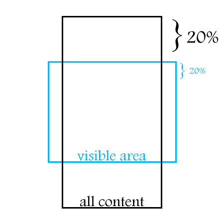
After some research I found a nice algorithm. It simply relates the mouse movement with the percentage of the visible area (later on, this will be identified as being the mask) that is actually being pointed. Thereafter, the container is moved in the same proportion.

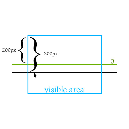
Let’s say, for instance, that the mouse is near the bottom of the blue curly bracket. In this scenario the container would move 20% towards the top.

As you can see this works pretty fine. When the mouse cursor reaches the top or the bottom of the visible area, we have the certainty that we’ve reached the beginning or the end of the list. This technique is quite straightforward because we don’t have to worry about the list reaching, for example, the beginning and continuing moving along.

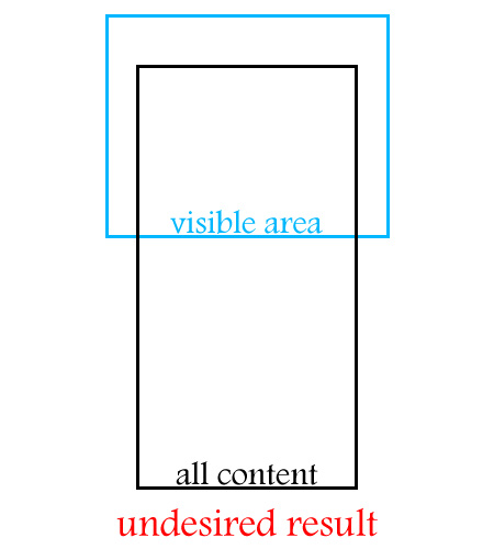
But… What if we have hundreds of list items? Now we have a problem. If our visible area (mask) has, let’s say, 500 pixels of height and we have a list of 100 items (all content area), each of them with a height of 20 pixels, moving the mouse 1/5 of the visible area (mask) would result in the transition of 20 items (400px / 20px) at the speed of light. So I guess this approach wouldn’t result very well.

So, I came up with this solution:

Basically, I’ve defined two zones – below and above the center. Each zone has a value associated. This value is calculated based on the distance between the mouse cursor and the center. So, if we actually associate this value with a variable we could change the speed based on the mouse position. The minus sign is just for deciding the direction of the movement.

Having said that, let’s get some real content.


Step 3: Grabbing the Data

We will be using an external xml file to feed the application because:

  • We will be able to add, remove, edit, delete data very easily
  • Actionscript 3 has a great API to work with xml

So, we need a big list of items… What about the list of countries around the world?

(This step is kind of an extra topic because I’ll be using other language to help me out with the xml file preparation. So if this isn’t of your interest don’t worry, this will be in the download files)

I’ve just Googled [list countries world] and in the first result I got this list:

  • 1 Afghanistan
  • 2 Akrotiri
  • (…)
  • 256 Zambia
  • 257 Zimbabwe

(source: http://www.listofcountriesoftheworld.com)

Copy everything to some text file and save it. I named it countries.txt.

The script below is written in PHP. You will need a web server to run it. I’m using wampserver, a nice bundle that installs PHP, MySQL, and Apache with a couple of clicks.

In order to use this script you will have to initialize the web server, and run the script in a subdirectory of your \www\ directory. One last note: the script and the countries.txt have to be in the same folder.

<?php
$lines = file("countries.txt");
$fp = fopen('data.xml', 'a');
fwrite($fp, '<?xml version="1.0" encoding="UTF-8"?>' . "\n");
fwrite($fp, '<items>' . "\n");
foreach($lines as $line) {
	$line = rtrim($line, "\r\n");
	$pattern = '/\d+\s*/';
	$replacement = '';
	$line =  preg_replace($pattern, $replacement, $line);
	$str = "\t" . '<item>' . $line . '</item>' . "\n";
	fwrite($fp, $str);
}
fwrite($fp, '</items>');
fclose($fp);
?>

The output of this script will be saved in a file with the name data.xml. If you don’t understand this step don’t worry because you can download it from here.


Step 4: Setting up the .fla File

If you watch the demo, you will notice that our application has an interface, buttons and so on. So let’s start putting all the graphics together.

Open your Adobe Flash and create a new ActionScript 3 file with the following settings:

  • Width: 450px
  • Height: 500px
  • frame rate: 63
  • Class: DocumentClass

Save the file. I’ve called mine scroll.fla.


Step 5: The Background Image

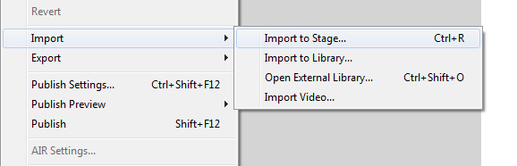
File > Import > Import to Stage and select the background.jpg image (all images are included in assets.zip, within the source download).

Now:

Window > align

This will open the Align Panel. Center the image on the stage, clicking on the buttons shown in the image below.

And now give your layer the name Background (don’t forget to lock it):


Step 6: The Scroller’s Background

Create a new layer and import the image pad.png. The process of importing is precisely the same as the previous step. Press F8 to convert it to a MovieClip and give it the name mcPad. Next click on the Export for ActionScript check box and, in the Class input field, type the name Pad.

Basically we are defining the pad MovieClip as a subclass of the MovieClip class itself. Therefore we are able to use it directly from our code and treat it as a normal MovieClip since it inherits from the MovieClip class. Pretty cool huh?

Now, delete this instance from the stage, but not from the library (because like I said we’ll be using it from the code).


Step 7: The Buttons

Import the image itemBackground.jpg, press F8 to convert it to a MovieClip. Give it the name mcItem. Once again export for ActionScript and name the class Item.

Now the process will be slightly different:

  • double-click the mcItem MovieClip for making some changes inside
  • rename the only layer there as Back and lock it
  • create a new layer and call it Over
  • import the image itemBackground-over.jpg to the Over layer
  • convert it to a MovieClip and give it a name mcItemOver
  • position the mcItemOver MovieClip at x = 0 and y = 0
  • give it an instance name of item_btn_over

Finally, lock the Over layer, get back to the main timeline, and delete the mcItem movie clip instance from the stage.


Step 8: The Font

For this application I’m using the Arial Rounded MT Bold Negrito font (it’s a free font, I’ve downloaded mine from here). Since it isn’t a system font we will have to import it too:

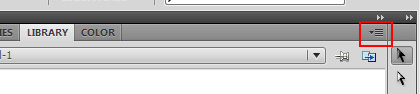
  • on the library separator click on the upper right button (the one with a little arrow)
  • select New Font
  • call it fontArialRounded, then select the font on the dropdown box below. Once again Export for ActionScript and in the class field give it the name ArialRounded

In the main timeline we only need the Background layer, so you can delete the remaining layers.

That’s it for the Flash Authoring tool. Let’s start coding.


Step 9: Adding the Application Background to the Stage

Create a new ActionScript file, save it as DocumentClass.as. Then, add this code:

package {
	import flash.display.MovieClip;
	public class DocumentClass extends MovieClip {

		private var _pad:MovieClip;

		public function DocumentClass() {
			_pad = new Pad();
			addChild(_pad);
			_pad.x = stage.stageWidth / 2 - _pad.width / 2;
			_pad.y = stage.stageHeight / 2 - _pad.height / 2;
		}
	}
}

(If you’re not sure what we’re doing here, check out this quick introduction to document classes.)

Remember the mdPad MovieClip? Recall that we have exported it for ActionScript. So whenever we want to instantiate this MovieClip we just have to type

new Pad();

This code basically creates an instance of the mcPad MovieClip and adds it to the stage using the addChild() method. So now, the _pad is on our DisplayList!

Then I’ve centered it on the stage (vertically and horizontally).

Test the application and you should see the background layout on the flash player.


Step 10: Container

Our application will use a container to hold all the items together. So, we are going to create a new MovieClip in the DocumentClass. Declare the property:

private var _container:MovieClip;

Inside the constructor, at the end:

_container = new MovieClip();
addChild(_container);

Step 11: Importing the XML Data

Add the following import statements:

import flash.events.Event;
import flash.net.URLRequest;
import flash.net.URLLoader;

Declare the following properties:

public var loader:URLLoader;
public var data:XML;
public var items:XMLList;

Then implement the following methods:

private function dataLoad():void {
	loader = new URLLoader();
	loader.addEventListener(Event.COMPLETE, dataLoaded);
	loader.load(new URLRequest("data.xml"));
}

private function dataLoaded(event:Event):void {
	trace("Data Loaded.");
}

Finally add this method call to the constructor:

dataLoad();

So far, we have:

package {

	import flash.display.MovieClip;
	import flash.events.Event;
	import flash.net.URLRequest;
	import flash.net.URLLoader;

	public class DocumentClass extends MovieClip {

		private var _pad:MovieClip;
		private var _container:MovieClip;
		public var loader:URLLoader;

		public function DocumentClass() {
			_pad = new Pad();
			addChild(_pad);
			_pad.x = stage.stageWidth / 2 - _pad.width / 2;
			_pad.y = stage.stageHeight / 2 - _pad.height / 2;

			_container = new MovieClip();
			addChild(_container);

			dataLoad();
		}

		private function dataLoad():void {
			loader = new URLLoader();
			loader.addEventListener(Event.COMPLETE, dataLoaded);
			loader.load(new URLRequest("data.xml"));
		}

		private function dataLoaded(event:Event):void {
			trace(new XML(event.target.data.toString()));
		}

	}
}

Test the application and you should see, in the console, all the xml data. Let’s move on.


Step 12: Building Each Button

Add the following import statements:

import flash.text.TextFormat;
import flash.text.TextField;
import flash.text.TextFieldAutoSize;
import flash.text.Font;

Add these new variables:

public var data:XML;
public var items:XMLList;
private var _item:Item;
private var _itemTextField:TextField;
private var _defaultFormat:TextFormat = new TextFormat();
private var _arialRounded:Font = new ArialRounded();
private var _textFieldXPosition:uint = 10;
private var _textFieldYPosition:uint = 13;
private var _textFieldWidth:uint = 240;
private var _textFieldHeight:uint = 25;
private var _itemPosition:uint = 49;

Update the dataLoaded method:

private function dataLoaded(event:Event):void {

	// this property holds the loaded xml data
	data = new XML(event.target.data);
	// the items property holds all the repeating item elements
	items = data.item;

	// this iterates over every item
	for (var i = 0; i < items.length(); i++) {
		// remember the mcItem? We are instantiating that MovieClip
		_item = new Item();
   		// sets the Over layer MovieClip's alpha to 0
		_item.item_btn_over.alpha = 0;
		// creates the Item textfield
		_itemTextField = new TextField();
			_itemTextField.x = _textFieldXPosition;
			_itemTextField.y = _textFieldYPosition;
			_itemTextField.selectable = false;
			_itemTextField.width = _textFieldWidth;
			_itemTextField.height = _textFieldHeight;
			_itemTextField.embedFonts = true;
			_defaultFormat.color = 0x111112;
			_defaultFormat.font = _arialRounded.fontName;
			_defaultFormat.size = 18;
			_itemTextField.defaultTextFormat = _defaultFormat;
			_itemTextField.text = items[i].toString();

		// adds the textfield to the item's display list
		_item.addChild(_itemTextField);
		// positions each item vertically based on the iteration value
		_item.y = i * _itemPosition;
			_item.buttonMode = true;
			_item.mouseChildren = false;
		// adds the item to the container display list
		_container.addChild(_item);
	}
}

Now we’ve created the 200+ buttons and put them on the screen. If you run the application you will notice that this list begins at postion (0, 0) and fills down the entire stage. That’s not what we want so let’s handle that in the next step.


Step 13: Masking the List

Let’s create a shape to mask the list so that we only see the visible area, as in the picture from before:

At the end we will center the mask and the container. So, add another import statement:

import flash.display.Shape;

Properties:

private var _mask:Shape;
private var _maskWidth:uint = 288;
private var _maskHeight:uint = 290;
private var _paddingTop:uint = 120;

And… In the dataLoaded method at the end, add the following code:

_mask = new Shape();
_mask.graphics.beginFill(0xFF0000);
_mask.graphics.drawRect(0, 0, _maskWidth, _maskHeight);
_mask.graphics.endFill();
// center the mask horizontally on the stage
_mask.x = stage.stageWidth / 2 - _container.width / 2;
// positions the mask vertically at 120px from the top
_mask.y = _paddingTop;
addChild(_mask);
// assigns the mask to the container
_container.mask = _mask;

// centers the container horizontally on the stage
_container.x = stage.stageWidth / 2 - _container.width / 2;
// positions the container vertically at a certain value
_container.y = _paddingTop;

Step 14: Adding a Background to the Container

Just a little improvement… Right now our container has a lot of holes because there’s a margin between each item. So let’s give it a background to avoid undesired results when listening for events.

Property:

private var _background:Shape;

Still in the dataLoaded method, below the existing code:

_background = new Shape();
_background.graphics.beginFill(0xFFFFFF);
_background.graphics.drawRect(0, 0, _container.width, _container.height);
_background.graphics.endFill();
_container.addChildAt(_background, 0);

Step 15: Adding the Event Listeners

As you probably know, listeners listen for events. Here we will use one for the MouseOver event and another one for the MouseOut event.

Add this at the end of the dataLoaded method:

_container.addEventListener(MouseEvent.MOUSE_OVER, movingOver);
_container.addEventListener(MouseEvent.MOUSE_OUT, movingOut);

Let’s now implement the movingOver and movingOut methods:

private function movingOver (event:MouseEvent):void {
	_container.removeEventListener(MouseEvent.MOUSE_OVER, movingOver);
}

private function movingOut (event:MouseEvent):void {
	_container.addEventListener(MouseEvent.MOUSE_OVER, movingOver);
}

Now we can listen for events, more specifically MOUSE_OVER and MOUSE_OUT. Events are like messages that notify any object waiting for that same event. The “message” just broadcasts that the event has occurred. In this case the _container object will be listening for MouseOver and MouseOut events. When they take place the _container has the ability to respond accordingly.

So, first we assign the event listeners to the _container object and then, later on, if the _container is hovered over the MouseOver listener is removed. On the contrary, when the mouse is out of the _container object the mouse over listener is assigned again to the _container.


Step 16: Event Flow

The event flow is a powerful mechanism that allows the programmer to handle several objects with just one event listener. So, as you probably imagine, _container.addEventListener will “listen” for events involving the container, the items and the background shape – that is, the container and everything inside it. You can confirm this by adding the following code in movingOver and movingOut methods:

trace(event.target);

This will trace the object that dispatched the event.


Step 17: OnEnterFrame

When listening for this event we can define a behavior that will take place every frame, in our case 63 times per second. That’s why the OnEnterFrame event is very useful for animations based on the fps. We will need this to move our scroll, so the movingOver and movingOut methods should look like this:

private function movingOver (event:MouseEvent):void {
	_container.removeEventListener(MouseEvent.MOUSE_OVER, movingOver);
	addEventListener(Event.ENTER_FRAME, enterFrame);
}

private function movingOut (event:MouseEvent):void {
	removeEventListener(Event.ENTER_FRAME, enterFrame);
	_container.addEventListener(MouseEvent.MOUSE_OVER, movingOver);
}

Step 18: The enterFrame Method

Add these properties:

private var _maxSpeed:uint = 15;
private var _speed:Number;

Add the following method at the end of the code (below the movingOut method) . This will be run every frame, thanks to the EnterFrame event listener we created earlier. I’ll explain what this code does below.

function enterFrame(event:Event):void {
	_speed = (_mask.height / 2 - _mask.mouseY) / (_mask.height / 2) * _maxSpeed;
	_container.y += _speed;
	if (_container.y >= _paddingTop) {
		removeEventListener(Event.ENTER_FRAME, enterFrame);
		_container.y = _paddingTop;
	}
	if (_container.y <= _mask.height - _container.height + _paddingTop) {
		removeEventListener(Event.ENTER_FRAME, enterFrame);
		_container.y = _mask.height - _container.height + _paddingTop;
	}
}

And here is the logic of the scroller:

_speed = (_mask.height / 2 - _mask.mouseY) / (_mask.height / 2) * _maxSpeed;

This line of code gets the speed by dividing half of the stage height with the mouse Y position.

Let’s say that half of the stage is 200px and the mouse cursor is at position 300px. Applying the formula we get:

(200 – 300) / 200 * 15 (_maxSpeed property) = -7.5 which is negative, so the list will give us a downward movement. That’s precisely what we are looking for. If the mouse cursor was above the center we would have a positive value and the list would move up.

Next, with this statement:

_container.y += _speed;

We are assigning the actual speed, every frame (63 times per second) to the _container.y position. Then we check with the if statements whether the container’s y position is where it’s supposed to be. Remember this picture:


Step 19: Animating the Item’s Button

I’m going to use greensock’s TweenMax Library (you can download it from here) to animate to each button on and off (when the mouse is hovering over or leaving the item).

Add this import statement:

import gs.*;

Update the movingOver and movingOut methods:

private function movingOver (event:MouseEvent):void {
_container.removeEventListener(MouseEvent.MOUSE_OVER, movingOver);
	addEventListener(Event.ENTER_FRAME, enterFrame);
	if (event.target is Item)
		TweenMax.to(Item(event.target).item_btn_over, .2, {alpha:1});
}

private function movingOut (event:MouseEvent):void {
	removeEventListener(Event.ENTER_FRAME, enterFrame);
	_container.addEventListener(MouseEvent.MOUSE_OVER, movingOver);
	if (event.target is Item)
		TweenMax.to(Item(event.target).item_btn_over, .2, {alpha:0});
}

Let’s analyze this code in detail. The event.target will reference the object that will dispatch the event, in this case MouseOver or MouseOut. This object could be an _item, the _background or the _container but we are only interested in Item objects so we specify:

if (event.target is Item)

Then, if so, we will animate whatever Item object dispatched the event by typing Item(event.target).item_btn_over. The item_btn_over is the instance name of the mcItemOver MovieClip that we created in Step 7. .2 is the animation’s time, and in the last parameter we specify which property we want to animate (alpha).


Step 20: Refactoring

Right now, our application works pretty fine. However, we have some code repeated and a very centralized application as well. Notice that the dataLoaded method is doing almost everything.

Actionscript has excellent support for Object Oriented Programming. We could use that to detach data loading from application logic etc.

There is a nice design pattern called Model View Controller that works really nicely with user interfaces. This pattern basically separates the application in three distinct layers. The Model deals with the business logic, data handling. The Controller deals with human interaction with the application. And finally the View deals with the visual interface of the application.

In this case our application is too small to implement this pattern. So, let’s adapt just the Model and a miscellaneous View/Controller to our application. First let’s just handle some repeated code.


Step 21: Common Tasks

Create a new ActionScript file and type the following code:

package com.tutsplus.active.util {

	import flash.display.*;

	public class Align {

		public static function centerInStage (stage:Stage, mc:DisplayObject):void {
			mc.x = stage.stageWidth / 2 - mc.width / 2;
			mc.y = stage.stageHeight / 2 - mc.height / 2;
		}

		public static function centerHorizontallyInStage (stage:Stage, mc:DisplayObject):void {
			mc.x = stage.stageWidth / 2 - mc.width / 2;
		}

		public static function centerVerticallyInStage (stage:Stage, mc:DisplayObject):void {
			mc.y = stage.stageHeight / 2 - mc.height / 2;
		}

	}

}

We have to perform this task several times. So I decided to make a class that aligns any display object to the stage whenever we call it. In order to make this work you have to make a directory structure like this:

\com\tutsplus\active\util\

in your production directory or inside your class path. Next, in the refactored DocumentClass you will see how to use this class.


Step 22: Model

The model manages the behavior and data of the application domain, responds to requests for information about its state (usually from the view) and responds to instructions to change state (usually from the controller)

source: MSDN.

Loading the data and storing it in data structures are nice operations for composing our Model. Create a new ActionScript File and call it ScrollModel.as:

package {

	import flash.events.Event;
	import flash.net.URLRequest;
	import flash.net.URLLoader;
	import flash.events.EventDispatcher;

	class ScrollModel extends EventDispatcher {

		public var loader:URLLoader;
		public var data:XML;
		public var items:XMLList;

		public static const MODEL_UPDATE:String = "modelChange";

		public function ScrollModel() {
			loader = new URLLoader();
			loader.addEventListener(Event.COMPLETE, dataLoaded);
		}

		public function load(req:URLRequest):void {
			loader.load(req);
		}

		private function dataLoaded(event:Event):void {
			data = new XML(event.target.data);
			items = data.item;
			dispatchEvent(new Event(ScrollModel.MODEL_UPDATE));
		}
	}
}

With this update, our dataLoaded method has only 3 lines of code now!

It’s almost the same code that we used in the DocumentClass for loading the data, with just one difference:

dispatchEvent(new Event(ScrollModel.MODEL_UPDATE));

After assigning our 200+ items to the XMLList property this line of code dispatches one event to whoever is listening. In practice we will need to know when this occurs to use these data in another class.


Step 23: The ScrollBox Class

Create a new Actionscript File and name it ScrollBox.as:

package {

	import flash.display.Sprite;
	import flash.display.Stage;
	import flash.events.Event;
	import flash.events.MouseEvent;
	import flash.display.Shape;
	import flash.text.TextFormat;
	import flash.text.TextField;
	import flash.text.TextFieldAutoSize;
	import flash.text.Font;
	import gs.*;
	import com.tutsplus.active.util.Align;

	public class ScrollBox extends Sprite {

		private var _container:Sprite;
		private var _item:Item;
		private var _itemTextField:TextField;
		private var _defaultFormat:TextFormat = new TextFormat();
		private var _arialRounded:Font = new ArialRounded();
		private var _textFieldXPosition:uint = 10;
		private var _textFieldYPosition:uint = 13;
		private var _textFieldWidth:uint = 240;
		private var _textFieldHeight:uint = 25;
		private var _itemPosition:uint = 49;
		private var _mask:Shape;
		private var _maskWidth:uint = 288;
		private var _maskHeight:uint = 290;
		private var _paddingTop:uint = 120;
		private var _background:Shape;
		private var _maxSpeed:uint = 15;
		private var _speed:Number;
		private var _items:XMLList;
		private var _stage:Stage;
		public var scrollModel:ScrollModel;

		public function ScrollBox (stage:Stage, m:ScrollModel) {
			this.scrollModel = m;
			this._stage = stage;
			scrollModel.addEventListener(ScrollModel.MODEL_UPDATE, createRollingScroller);
		}

		private function createRollingScroller(event:Event = null):void {
			_container = new Sprite();
			_stage.addChild(_container);

			_items = scrollModel.items;
			for (var i = 0; i < _items.length(); i++) {
				_item = new Item();
				_item.item_btn_over.alpha = 0;

				_itemTextField = new TextField();
				_itemTextField.x = _textFieldXPosition;
				_itemTextField.y = _textFieldYPosition;
				_itemTextField.selectable = false;
				_itemTextField.width = _textFieldWidth;
				_itemTextField.height = _textFieldHeight;
				_itemTextField.embedFonts = true;

				_defaultFormat.color = 0x111112;
				_defaultFormat.font = _arialRounded.fontName;
				_defaultFormat.size = 18;
				_itemTextField.defaultTextFormat = _defaultFormat;
				_itemTextField.text = _items[i].toString();

				_item.addChild(_itemTextField);
				_item.y = i * _itemPosition;
				_item.buttonMode = true;
				_item.mouseChildren = false;
				_container.addChild(_item);
			}

			_background = new Shape();
			_background.graphics.beginFill(0xFFFFFF);
			_background.graphics.drawRect(0, 0, _container.width, _container.height);
			_background.graphics.endFill();
			_container.addChildAt(_background, 0);

			_mask = new Shape();
			_mask.graphics.beginFill(0xFF0000);
			_mask.graphics.drawRect(0, 0, _maskWidth, _maskHeight);
			_mask.graphics.endFill();
			Align.centerHorizontallyInStage(_stage, _mask);
			_mask.y = _paddingTop;
			addChild(_mask);

			_container.mask = _mask;

			Align.centerHorizontallyInStage(_stage, _container);
			_container.y = _paddingTop;

			_container.addEventListener(MouseEvent.MOUSE_OVER, movingOver);
			_container.addEventListener(MouseEvent.MOUSE_OUT, movingOut);
		}

		private function movingOver (event:MouseEvent):void {
			_container.removeEventListener(MouseEvent.MOUSE_OVER, movingOver);
			addEventListener(Event.ENTER_FRAME, enterFrame);
			if (event.target is Item)
				TweenMax.to(Item(event.target).item_btn_over, .2, {alpha:1});
		}

		private function movingOut (event:MouseEvent):void {
			removeEventListener(Event.ENTER_FRAME, enterFrame);
			_container.addEventListener(MouseEvent.MOUSE_OVER, movingOver);
			if (event.target is Item)
				TweenMax.to(Item(event.target).item_btn_over, .2, {alpha:0});
		}

		function enterFrame(event:Event):void {
			_speed = (_mask.height / 2 - _mask.mouseY) / (_mask.height / 2) * _maxSpeed;
			_container.y += _speed;
			if (_container.y >= _paddingTop) {
				removeEventListener(Event.ENTER_FRAME, enterFrame);
				_container.y = _paddingTop;
			}
			if (_container.y <= _mask.height - _container.height + _paddingTop) {
				removeEventListener(Event.ENTER_FRAME, enterFrame);
				_container.y = _mask.height - _container.height + _paddingTop;
			}
		}

	}
}

Notice the Align class methods that we are using:

Align.centerHorizontallyInStage(_stage, _mask);
Align.centerHorizontallyInStage(_stage, _container);

Now we just have to use the method Align.centerHorizontallyInStage() to align any display object horizontally.

The createRollingScroller method will only start when we finish storing all the data in the items:XMLList property.


Step 24: Final DocumentClass

Change the DocumentClass:

package {

	import flash.display.MovieClip;
	import flash.display.Sprite;
	import flash.events.Event;
	import flash.net.URLRequest;
	import flash.net.URLLoader;
	import flash.events.*;
	import com.tutsplus.active.util.Align;

	public class DocumentClass extends MovieClip {

		private var _pad:MovieClip;
		public var scrollModel:ScrollModel;
		public var scrollBox:ScrollBox;

		public function DocumentClass() {
			config();
			scrollModel = new ScrollModel();
			scrollModel.load(new URLRequest("data.xml"));
			scrollBox = new ScrollBox(stage, scrollModel);
		}

		private function config():void {
			_pad = new Pad();
			addChild(_pad);
			Align.centerInStage(stage, _pad);
		}

	}
}

Once again, note how easy it is to center display objects on the stage with the Align.centerInStage() method:

Align.centerInStage(stage, _pad);

Conclusion

That’s it for now guys! I’ve covered some interesting Actionscript 3 topics and I hope you find this useful. Why not improve this application to a next level, recfactoring, adding functionalities, etc?

Thanks for following. Take care!

Making of the “leaKing” in 3Ds Max

In this intermediate level tutorial, we follow CG artist Cristian Pop through the process of creating an abstract paint leaking scene using 3Ds Max 2010 and Pwrapper, a great plug-in from 3D Aliens. After completing the 3D work, Cristian switches to 2D to perform some final color corrections in Photoshop.

Step 1

After unzipping “RefFiles.zip”, open the “leaKING.max” file. To make things easier, I have already created the King’s head for you.


Step 2

The first thing we’re going to do is model the hair, so create a box in the viewport and convert it to “Editable poly”. Then open the “Graphite Modeling Tools” and, in the “Freeform” section, choose “On: Surface”. Click the “Pick” button and then select our head object.


Step 3

Set the “Offset” value to ’2′, and, using the “Strips Tool”, start drawing the hair onto the head as shown.


Step 4

Once you’ve finished, select the original box element and delete it.


Step 5

We’re now going to move on to the king’s crown. First create a cylinder with the following parameters, then convert it to an “Editable poly” and delete the top and bottom faces.


Step 6

Now create a torus with the following parameters and align it to the cylinder as shown.


Step 7

Select the cylinder’s top vertices. In the “Soft Selection” rollout, enable “Use Soft Selection” and set the “Falloff” to 20.


Step 8

Making sure the vertices are selected, add a “Noise” modifier. Set the “Scale” to 40, the “Z Strength” value to 20 and turn on “Fractal”.


Step 9

Now switch to the top viewport. Select both the cylinder and the torus and scale them up on the ‘Y’ axis.


Step 10

With the main body of the crown complete, feel free to add some decorations! It’s important however that you leave some space between the crown body and any decorations you create, as shown in the image below.


Step 11

Using Max’s basic poly tools, create the following element. This will be used to create the multiple “paint splashes” that sit on top of the crown.


Step 12

We now need to place our splash element randomly around the top of the crown as shown.


Step 13

With our splashes in place, we can now group all of the objects that form the crown. Here I’ve added a “Taper” modifier to the group (with the “Amount” set to 0.2) to further refine the shape. When you’re happy with the result, position the crown on the king’s head.


Step 14

Select both the crown group and the head mesh. Now press the ‘A’ key on your keyboard to turn on “Angle Snaps”, and rotate all objects 5 degrees on the ‘Y’ axis.


Step 15

Now, just as we did earlier with the “splash elements”, create some “paint leaking elements” and randomly place them around the model. You can see my results in the following image.


Step 16

I’ve also added in some random drops above the crown.


Step 17

With that done, create a “Cylinder” with the following parameters and convert it to “Editable poly”. This will be the source of the leaking paint that is going to form the king.


Step 18

Select the bottom vertices, enable “Use Soft Selection” and set the “Falloff” to 215.


Step 19

In the Front Viewport, making sure the vertices are still selected, scale down the cylinder on the ‘Z’ axis.


Step 20

Now, add a “Twist” modifier to the whole object, and set the “Angle” to 180 to achieve the following result.


Step 21

With our stream of paint complete, we can now place it above the king’s head, as shown. Select all the objects in our scene, group them, and then change the group name to “King”.


Step 22

We now need to create the drips that have fallen to the ground. Create a “Cylinder” with the following parameters, convert it to an “Editable poly” and then delete the bottom and the side faces.


Step 23

Select the edge vertices and enable “Use Soft Selection”, setting the “Falloff” to 20.


Step 24

Making sure the vertices are still selected, add a “Noise” modifier. Set the “Scale” to 15 and both the “X Strength” and “Y Strength” to 20.


Step 25

With the main shape created, we can now collapse the noise modifier. Select the middle vertex and enable “Use Soft Selection”, setting the “Falloff” to 25.


Step 26

Again, making sure the vertices are selected, add a “Ripple” modifier. Set the “Amplitude 1″ and “Amplitude 2″ values to 2, and the “Wave Length” to 7 to achieve the effect shown.


Step 27

We’re now going to create a larger splash shooting up from the floor, however instead of creating it from scratch we’re going to clone the crown group, scale it down and use that! So select the crown group and clone it, delete some of the unnecessary splash elements, and place the group on the drip as shown below.


Step 28

Using the techniques described above, continue to add some smaller drips on the ground. Once you’re happy, group the newly created splash objects and rename the group to “Ground Drips”.


Step 29

We now need to cover all of our objects with particles, as the “Pwrapper” object we’ll be using needs a particle source from which to generate it’s mesh. So, create a standard “Particle Flow Source” near the head and set the “Viewport Quantity Multiplier” to 100%.


Step 30

In the “Particle View” window, select the following operators and delete them.


Step 31

In the “Birth” operator rollout, set the “Emit Stop” to 0. This will ensure that all of the particles will be generated on the very first frame. Now set the “Amount” value somewhere between 20000 and 45000; higher value will increase mesh-generation time. This particle system will be used to generate the first of two “Pwrapper” objects.


Step 32

Add a “Position Object” operator to “Event02″, and add the “King” group into the “Emitter Objects” dialog.


Step 33

Because the second “Pwrapper” object will be different from the first, we now need to create a second “Particle Flow” system. So, create a second “Particle Flow Source” and set the “Viewport Quantity Multiplier” to 100% as before. Now open the “Birth” operator rollout, and set the “Emit Stop” to 0 and the “Amount” to 10000. Finally add the “Ground Drips” group in the “Position Object” operator.


Step 34

In the “Create” panel, select “glu3D pouring system” from the drop down list and click the “Pwrapper” button to create a Pwrapper object in the viewport.


Step 35

In the “Modify” panel, set the “Parameters” values as shown here.


Step 36

Add in a “Cap holes” modifier and then add a “Relax” modifier, setting the “Iterations” value to 10 and disabling “Keep Boundary Pts Fixed”.


Step 37

Clone the “Pwrapper” object as a copy, and set the “Drop Size” on the copy to ’0.4′.


Step 38

It’s now time to create our first mesh! Select the first “Pwrapper” object, and add the first “PF Source” as shown. As soon as it’s added, the “Pwrapper” object starts generating the blobmesh that forms the king.


Step 39

With that done, it’s time to create the second mesh. So, just as above, select the second “Pwrapper” object, add the second “PF Source” and watch as the drips are created.


Step 40

Create a plane underneath the drips as shown.


Step 41

Now on to lighting. First create an “Omni” light in the top viewport and, as this will be our master light, turn “Ray Traced Shadows” on and set the shadow density to a smaller value, as shown.


Step 42

Here I’ve created a second “Omni” light, which I’m using to further illuminate the left side of the leaKING. I’ve made sure to disable shadows and turn down the intensity.


Step 43

Now let’s create the materials. Open the “Material Editor”, create a “Standard” material and rename it to ‘white paint’. Change the “Diffuse” color to ‘white’, set the “Specular Level” to approximately 138 and the “Glossiness” to approximately 71. Under the “Maps” rollout, add a “Falloff” map in the “Reflection” slot.


Step 44

Click on the “Falloff” map to access it’s properties. In the first slot add the included ‘env.hdr’ file and then change the color from the second slot to ‘black’. After that, change the “Falloff type” to “Towards/Away”. Assign our new paint material to both of the “Pwrapper” objects.


Step 45

Now we need a material for the floor plane, so create a new “Standard” material, change the “Diffuse” color to ‘black’ and add a “Flat Mirror” map to the “Diffuse” slot. Click the “Flat Mirror” map to access it’s properties, and ensure that blurry reflections are disabled.


Step 46

With all of the materials in place, we can now position the camera and adjust the render settings as required. For my scene I chose to render at 1000x1800px.


Step 47

Now that everything is setup as needed, render the scene using 3Ds max’s standard renderer, and save the image as a “jpeg” file.


Step 48

With all of the 3D work complete, we’re now going to add a few final color corrections in Photoshop. Open your render, right-click the “Background” layer and choose “Layer From Background”. In the “New Layer” dialog box, enter the name “leaking” and hit “OK”. Now double-click the layer to bring up the “Layer Style” dialog. Enable the “Color Overlay” effect and change the color to a light blue (in my case I’ve used 00d8ff,) then set the “Blend mode” to ‘Overlay’ and decrease the “Opacity” to 25%.


Step 49

Duplicate the “leaking” layer twice, using the “Ctrl+J” hotkey. Set the blending mode for the second duplicate (the very top layer) to “Color Burn”.


Step 50

Select the two copied layers and merge them using the “Ctrl+E” hotkey. Decrease the “Opacity” of this new merged layer to 35%, and with this done, right-click either of the layers and choose “Merge Visible”.


Step 51

We’re now going to add a subtle photographic grain to the image. First create a new layer and fill it with grey as shown.


Step 52

With the layer selected, go to Filter > Noise > Add Noise…


Step 53

In the “Add Noise” dialog box, set the “Noise Amount” to 400% and change the “Noise Type” to “Monochromatic”. With that done, hit “OK”.


Step 54

Now go to Filter > Blur > Gaussian Blur…


Step 55

In the “Gaussian Blur” dialog box, set the “Blur Radius” to 0.2 pixels and press “OK”.


Step 56

Set the blending mode of our noise layer to “Overlay” and the “Opacity” to 3% – we hardly want to be able to see it at all. With that done, the intensity of our photographic grain can now be adjusted by using the opacity slider.


Step 57

And with that, we’re done! Congratulations, you’ve made the king proud! My final result is shown below.


Don’t miss more CG tutorials and guides, published daily – subscribe to Cgtuts+ by RSS.

6 Tips for More Effective Email

We’ve covered tips for managing email overload, but the reality is that many of us are partially responsible for our own email insanity. If we sent fewer email messages and made sure that the ones we do send are clear and effective, then we’d have fewer incoming messages to read, filter, delete, forward, and so on. Here’s how to write more effective emails.

Use a descriptive subject line

One of my pet peeves is when someone sends an email titled “hey” or “greetings” or worse, without any subject line at all. How will I know if your email is time-sensitive or if it might impact the project I’m currently working on? I don’t. Including relevant details in your subject line saves time and often save you from having to answer questions from confused recipients. For instance, titling an email “Staff Retreat Scheduled for June 5, 10am-6pm” is more effective than “Staff Retreat” or something silly like “It’s that time again!!” In some cases, you can relay the entire message in your subject line and save the recipient from opening the message at all. In that case, it’s courteous to include EOM (for end of message) in the subject line so they’ll know not to open the email.

Add the recipient last

How many times have you accidentally hit send before you finished typing or attached the document you meant to send? I’m guessing it happens more often then you’d like to admit. If you add the email’s recipient(s) last, you’ll never have to send a follow-up message saying “gosh, I’m sorry, here’s the rest of that email.” When I’m composing a response to someone’s message, and I want to take my time crafting a response, I’ll sometimes alter their email address slightly (perhaps adding a “.” at the end) so that if I accidently press send, Gmail will prompt me to fix the address.

Keep it simple

Nobody likes a long, meandering email message, especially if they’re reading it on a smartphone. If you find yourself going off-topic, then hit the delete button and remove anything that detracts from your primary message. Also use short paragraphs or bullet points, since they’re easily scannable and force you to stay on topic. If you were typing on an iPhone or Blackberry, you wouldn’t write a lot of fluff or exposition, so pretend you’re using a mobile device (minus the abbreviations and potential typos – you don’t want to look sloppy or lazy).  When in doubt, remember that increased simplicity often equals increased productivity.

Make recommendations

You know that classic snippet of dialogue with the old married couple where one says, “What would you like to do today, honey?” And the other says, “I don’t know – what you like do today?” Sending emails like that only prolongs the decision-making process. Depending on the situation (for instance, if it’s a job interview, you’ll let the recruiter or HR person take the lead), you can suggest meeting times and places to get the ball rolling. For instance, “our team needs to meet so we can update each other on X project – please let me know if you’re available next Tuesday at 1oam” is more effective than “when are you guys around?” If the suggested time doesn’t work for people, ask them to propose other times when they are available.

Avoid snappy comebacks

Unlike phone calls or meetings, email doesn’t give you cues like tone of voice or body language, so it’s easy to misconstrue someone’s message and assume that they’re blaming you for something or that someone is mad. Never engage in flame wars, though. It’s too easy to type an angry retort or a juicy bit of gossip and accidently hit reply all when your message was intended for one specific person. I know people who have lost their jobs over ill-advised email messages landing in the wrong inbox.

Avoid spammy words/phrases.

This isn’t such a big issue when you’re emailing someone you already have an email relationship with, but when you’re contacting a potential client or submitting your resume and cover letter for a job opening, you’ll want to avoid words and phrases that could be mistaken for spam. Otherwise, your carefully crafted email could wind up in the recipient’s spam folder. The list is constantly changing as spammers get increasingly sophisticated, but Microsoft Outlook published a pretty thorough guide earlier this year.

What about you? What email strategies have you found to be effective?

understanding server load in CPanel

Understanding Server load – How does it impact Server Performance

Well, yes, basically the server load is a number. This number is usually under the x.xx format and can have values starting from 0.00. It expresses how may processes are waiting in the queue to access the processor(s). Of course, this is calculated for a certain period of time and of course, the smaller the number, the better. A high number is often associated with a decrease in the performance of the server.

You can usually find the server load value in the control panel associated with your web hosting account under “Server Status”. There you’ll find listed a server load value. If you refresh the page, you’ll notice that the value changes almost every time. That’s because it’s an instantly calculated value. However, one can notice over a period of time which are the usual values of the server load.

Knowing what the value of the server load is not very important though. Knowing how to interpret the value is what counts. Unfortunately, there’s a lot of debate on how to actually interpret it, even among web hosting company owners.

One thing is sure however: all of them consider a server load of 0.xx as safe. As long as most of the time the server load is under 1.00, you should not notice any problems like your website being slow (unless there are some networking related problems somewhere between your computer and the server).

The uncertainties come when the server load has values over 1.00. Most web hosting company owners apply the following rule: if the server has a single CPU (central processing unit), a server load higher than 1.00 is not good; if the server has two CPUs, a server load over 2.00 is not good and so on.

You have to understand that these are average server loads. All web servers get busy from time to time, either because of an user’s abuse of resources, or because the server makes some backups etc. Usually the tasks requiring lots of resources are programmed by the host to be run during weekends when the traffic is lower so they won’t affect the users much.

Things however are not as black and white as you might think by now. With the powerful processors of today even single processor servers might cope quite well with a server load of 2.00.

Also, remember the definition: the server load represents the number of processes waiting to access the CPU. But not all processes are the same! If the processes are low priority, when a new server request (page request) appears, it can still be handled almost instantly. That request will not be postponed at all, it will be dealt with immediately, while the lower priority processes will wait.

As usual, and as many people directly implicated in the hosting business say, it all comes down to real-life behavior. Are the pages loading fast? Does a process such as searching through a database take a reasonable time? Then you don’t really have a problem, whatever the server load is.

Not to mention that the server load is just one factor out of many others (memory usage, CPU usage, size of swap file) and it’s often influenced by them. I’ll give you an example. If the server has insufficient internal memory it will use a swap file. This means it will work intensely with the hard drive, which will increase CPU usage and in turn result in a higher server load which will make the server respond slowly to requests.

In such a case the solution is simple: more internal memory (RAM). That would lead to a lower swap file, lower CPU usage, lower server load, faster response speed. So the server was almost OK, all it needed was more internal memory.

So, the ultimate test is the way that the server behaves. If the server is fast, a number, even if it’s called “server load”, really doesn’t mean much. But then again, I love when I see it constantly at around 0.20.

Personally, if the server load is around 4.00 24/7 and we’re talking about a server with a single processor, I would suspect something is wrong: overselling or overloading. In that case, just to make sure I would never face serious problems, I would ask my host to do something about the server load or move my website to a server with a lower server load. If the response I get does not please me, I will consider looking for a new host.

I like to play it safe and that’s what I recommend you to do too: Play it safe

Scratching Your Niche Market


As opposed to discussing just the specific techniques used to target a precise niche market, I would like to start off with a few overarching thoughts. I will cover some basic, yet very useful principles to keep in mind for the bigger picture (Get it? ‘Bigger picture,’ like your career – hehe), and then supply a case study of how I have used them in my work.

Continue reading “Scratching Your Niche Market”

Quick Tip: How to Emulate a Theremin Sound in Ableton Live

In this Quick Tip we’re going to emulate a theremin sound using Ableton Live’s Operator (although the same principles apply to other synths as well).

The theremin (named after its Russian inventor, Professor Leon Theremin, who patented the device in 1928), often viewed to be the first electronic instrument, has two metal antennas which sense the position of the player’s hands (it is played without contact from the player), who can control oscillators for pitch (frequency) with one hand and volume (amplitude) with the other. A similar device is the Ondes Martenot, with the main addition of timbral controls, switchable loudspeakers, and a keyboard.

Many people just call it “that ghost thing sound you hear in old horror movies”. Although that is quite true, it has also been featured in classical music, modern film music, rock, etc.

The idea is pretty simple: sine oscillator, slow attack, one voice (monophonic), glide between notes, and vibrato.

So this is what we’re going for:

Download audio file (ther0.mp3)

Step 1: Synthesizing the Sound

Open a new instance of Operator and leave the Wave to “Sine”. Set the filter to “Band 24 dB” (perhaps the most suitable filter, but make your own choice if it doesn’t fit your taste), and lower the Frequency to about 350 Hz. Lower the “peak” value down to -inf dB, to get a slow, very smooth attack.

Click on the “Time-Tone-Volume” tab and select “Voices: 1″, since the theremin is a monophonic instrument.

Download audio file (ther1.mp3)

Let’s add some Vibrato. It’ll give us a more convincing theremin sound (some might say spookier). I like having the LFO at Sine, the Rate value at about 80 and the Mod value at about 15%. But experiment with different values until you have the one you like the most. After all we can connect those two knobs to some macro controls and tweak them as we wish (that’s what we’ll do later).

Enable “Glide” to have the notes connect slowly when played legato. Let’s set the time at about 70 ms.
Now let’s try something out with Operator’s Pitch options. By lowering the pitch envelope down to -100%, the “peak”, “sustain” and “end” values down to -12 steps and the “initial” value to +48 steps (slow attack at about 300 ms) we get a cool gliding effect when playing the first note:

Download audio file (ther2.mp3)

Step 2: Polishing the Sound

What I personally don’t like about that sound some times, is that it can get too intruding within a song’s mix. I like cutting some of the more “harsh” frequencies, depending on the song and music of course.

Ableton’s “Spectrum” plug-in can be quite helpful in this situation, making it easier to recognize the Hz values of the frequencies we want to reduce.

For those who don’t use Ableton Live, you can try out a freeware program called Blue Cat’s FreqAnalyst, available for both Windows and Mac users. I usually cut around 370 Hz (Low Shelf) and do a slight LowCut at about 100 Hz, using the EQ Eight plug-in, like this:

Try adding a slow Autopan plug-in with a 360 phase, making the vibrato effect a little more dramatic, and increase Operator’s Spread knob to 50% if you want it to sound more stereo and wide. We could “polish” the sound a little further by adding a subtle Delay effect, and a Compressor and Limiter to even out the volume levels.

Step 3: Performance and Expression

It sounds nice, except the fact that we haven’t really set any knobs and values to be controlled in real-time while playing. The attack values (change of volume with one hand) for example are usually altered all the time during a theremin performance, and the pitch can get quite crazy and unstable in purpose. By grouping the racks into an Instrument Rack, we are able to map some Macro Controls to knobs like Volume, LFO Rate and Mod, and Transpose.

Keep in mind that you can program the Min and Max values of the Macro Controls, by pressing on the “Map Mode” button and changing the values as you wish.

Download audio file (ther3.mp3)

If you program your melodies and don’t play them via keyboard, MIDI-automations are quite simple to program with your mouse.

Right click and select “Show Automation In New Lane”.

You can either draw the automations (Ctrl-B) or set and transpose points with your mouse.

And here it is used in the context of a mix.
Download audio file (ther4.mp3)

Conclusion

I hope you found this tutorial useful. Thanks a lot for reading! Don’t hesitate to leave a comment with any suggestions, questions or requests.

Happy music making!


How to Compose Song Demos in GarageBand, Wrap-up – Basix

Are you new to audio? Apple’s GarageBand is a great way to get into music production. Recently guitarist Glynn Davies gave us a series of tuts focussed on using GarageBand to record song demos with your guitar.

GarageBand is a digital audio workstation (or DAW) designed with beginners in mind. If you use a Mac, it is the best way to get your teeth into audio production. The program has streamlined the process, letting you worry less about the technical process, and jump straight into making music. It is also inexpensive, removing the large financial burden usually associated with audio production. It also probably came preinstalled on your Mac, but even if it didn’t, it is part of Apple’s inexpensive iLife package, costing around $65.

That’s all great news if you have a Mac. Unfortunately there isn’t really an equivalent in the Windows world, though I’d love to hear your suggestions for an entry-level Windows DAW in the comments. You might like to check out our article, 7 Free Digital Recording Apps for Windows.

Of course, the program has its limits, and depending on your goals you may run into them sooner rather than later. If you think that’s likely to happen to you, you might want to consider starting with a full-featured DAW like Logic Pro, Pro Tools or others. If you’d like to get to know many of the options when choosing a DAW, follow along with our Exploring DAWs series each weekend. If you have thoughts about whether it’s best for a beginner to start with a program like GarageBand or just jump straight into a full-featured DAW, I’d love to hear them in the comments too.

If you missed the series, you can find the previous tutorials here:


Part 1

Part 1 of the series takes you through how to set up your first project. It goes through what equipment you’ll need (taking the easiest and least expensive route), how to initally set up GarageBand, how to EQ your guitar and use GarageBand’s built-in effects pedals, and some basic ideas and concepts to get started with your recording.


Part 2

Part 2 introduces you to the world of loops. Glynn takes you through how to create a rhythm track for your masterpiece by using and arranging drum loops. Then he shows you how you can rehearse and later record your guitar part and backing track by playing along with your drum loops.


Part 3

Finally, in Part 3, we learn how to polish our demo track. Glynn covers how to trim and align tracks, add effects, set levels, add EQ, choose master track presets, and export to MP3 for others to enjoy.


Conclusion

If you follow these tutorials, you’ll end up with a finished demo track. What do you think of your masterpiece? It might take you a few goes before you create something you’re happy with.

If you’re fairly happy with your track and would like to get feedback from others, consider submitting your track for a workshop. We run workshops several times a week, uploading tracks for constructive feedback from the Audiotuts+ community. You can learn more about workshopping here, and you’ll find a link to the form for uploading your track at the bottom of the article.

Where do you go from here? Glynn finished the series with five suggestions which are worth repeating here:

  1. Keep it simple: Don’t go overboard with multiple parts and special effects. Think of this as the musical equivalent of a sketch on the back of a napkin: just put down what you need to communicate your idea.
  2. Get it down: Don’t spend too long tweaking. Get a basic “meat and potatoes” backing track down and record your parts over it. You can always expand and improve it later; don’t let the inspiration fade while you’re programming a tambourine part!
  3. Come back to it: When you’re done, leave it alone and do something else for a while. Come back to it later with fresh ears and see how it sounds.
  4. Don’t be too hard on yourself: Don’t worry that your demo doesn’t sound like a professional recording. Remember that a demo is only meant to communicate an idea, and many of your favourite songs will have started life in the same way.
  5. Experiment: If you don’t know what something does, use it. The more you play around with things, the more you’ll learn and the better your recordings skills will become.

Have fun, and let us know in the comments how you went with this tutorial series.