‘Faux’ Magazine Cover Design

With digital tools (such as, a combination of Poser and Photoshop) one can create ‘faux’ cover designs much like the surface effects of traditional painting techniques. Furthermore the speed, turn around, and cost benefits in work flow these tools provide might just put a much cherished form of illustration back at the magazine editors doorstep. Let’s review a case study on creating a “Faux Fantasy and Adventure Magazine” cover, with an authentic look and worn vintage feel from yesteryear.


Introduction

During the first half of the twentieth century painting and drawing was the preferred choice of editors for the covers of their magazines and story (Pulp) anthologies. Cover Art presold multiple titles visually on the street via the news stands that hundreds and thousands walked by each day, with both homely and lurid narrative images paraded to attract their attention.

Commercial Cover artists, armed with traditional techniques and tools, were expected to represent scenes dramatically, attract reader’s attention, and turn out work on time and without defect. Their originals were on canvas or board, photographed down to size for reproduction, and then usually discarded, unless the canvas could be painted over again. Ideas for covers, often negotiated with editors, would develop traditionally with the use of models (often the artists themselves), and objects, and lighting, for pictorial reference (usually Polaroid photographs); under-painting to secure the design and composition; and tonal and color principles applied in the final painting.

Photography eventually became the default choice for magazine covers and story (Pulp and Adventure) anthologies gave way to television. However, it is interesting how digital tools have not only sought to emulate the surface effects of traditional painting and drawing, but also can offer, in combination, something of the traditional cover artist’s working process.

First Ideas

Whether working to an editor’s brief of for one’s own ends there always has to be an idea. Here we see a ‘faux’ magazine/book cover design produced mainly as an exercise in celebration. Let’s review the process of creating this cover.

Peril200

Thumbnails

These days it’s as easy to sketch out designs and picture compositions in a program like Photoshop as it is with a pencil and paper. However, I often prefer to use a program like Poser (SmithMicro) or Daz Studio (Daz3D) to explore a possible number of options and indeed to discover options I cannot easily visualize.

Poser and Daz Studio provide a kind of virtual stage with actors, props, scenery, and lighting set-ups that you can stage and pose to various ends. It also allows you to change your viewpoint of scenes/scenarios using cameras (focal distances, etc).

Peril201

Pictorial Reference

Poser and Daz Studio also provide the means to produce image files of your scene/scenario for use either as reference or as finished pictures in themselves. I tend to utilize the low end of Poser’s toolset because my intended picture lies elsewhere on the continuum of representational imagery.

Peril202

Composition

Having organized the 3D figures, props, and scenery, and having adjusted the lighting and cameras in different ways, I have settled on a view/ composition that look promising.

Peril203

Under-Painting

I now refine or optimize each of these scenes so that they can function for Photoshop as ‘under-paintings’ do for traditional painting. This means adding relevant details to the scenes (period clothing and props, hairstyles, facial expressions, and gestures, textures and colors) and adjusting lighting.

Peril204

It then remains to render the scene as a TIFF image file with an appropriate resolution (approximately 280dpi) for working with in Photoshop.

With the image file in Photoshop (at RGB or CYMK) edits and corrections can be made to the Poser render. These are usually required because the base image for the final painting needs to have all the basic elements in place, especially if you choose to apply any ‘filter’ effects or ‘actions’ that will transform all aspects of the image.

Peril205

Painting

The next step or steps, or the ‘Painting’ as I call it, involves a fairly intuitive use of Photoshop’s basic tools and usually involves adjustments of color, tone, brightness and contrast, some use of masking, some blending using layer options, some use of filters (cut out, and dry brush mainly), smudging and painting with preferred brush types, and the usual standing back and squinting!

Peril206

In the case of this picture a stronger context was needed for the figure group, so a background image of figures (made from the same group multiplied in silhouette) and a ‘brooding’ sky was introduced using Photoshop’s masks, layers, and ‘clouds’ fill.

Peril207
Peril208
Peril209

Publication

The idea of then further manipulating the finished images as ‘faux’ publications just seemed like the best kind of ‘picture frame’ the original artwork could possibly have. It also meant extending the creative challenges to now include Cover Design and Typography. Furthermore the Cover Art and the Cover Design could also gain more authenticity if they were presented as real (scanned) objects, a subterfuge further strengthened by the apparent evidence of ‘wear and tear’ composited in Photoshop.

Peril210

The final cover is below.

Peril200

Google Voice: How it Can Change How You Use the Phone

Google announced yesterday that Google Voice is now open to everyone with a U.S. telephone number. Until now, you had to get an invite from someone who was invited to use it.

What is it? It’s a nifty Internet phone service that works with your existing phones and gives pretty good competition to Skype. Here’s what makes it so awesome:

  • You link your existing phone numbers (land line, cell phone, work phone) to the Google Voice number. When someone calls it, all those phones ring.
  • Google Voice stores your voicemail and can send you SMS and/or e-mails with transcripts of the message.

Not so awesome:

  • The transcription is far from perfect. But you can get enough info to identify the caller and listen to audio of the message.

You can also view a list of voicemail messages and delete unwanted ones. Yes, you can do that on an iPhone. But this allows you to do it from your computer or mobile device.

Speaking of mobile devices, you can use the Google Voice mobile app to send SMS messages without charges from your cellular carrier.

And all that is free. (You do pay to use it to call landlines and international numbers.)  If you’d like to see more about the service, you’ll be happy to know that Google’s put up some video demos of its key features.

Will you start using Google Voice?  Have you been using Google Voice and – if so – how does it work for you?

Introduction to Smoke Simulation in Blender 2.5 – Day 1

In this invaluable, in-depth series we’ll be taking a look at smoke and fire simulation techniques within Blender 2.5, and who better to take us through this process than the man behind the official documents himself, Gottfried Hofmann. Prepare to be amazed at just what Blender can do for free.

Introduction & Pitfalls

There are many tutorials out there that cover how to set up a basic smoke simulation in Blender 2.5, but things can be quite tricky and there are many pitfalls you might run into along the way. This first tutorial explains how to avoid many of the problems that might occur, saving you some valuable troubleshooting time.


Video 1

Download

Note: click the ‘Monitor’ icon to view tutorial in full-screen HD.


Don’t miss more CG tutorials and guides, published daily – subscribe to Cgtuts+ by RSS.

Burn Your Resume: Alternative Strategies to Get Your Dream Job

A dream job usually isn’t something conventional. Nor should your approach to getting hired. Have you ever thought of the whole resume process?  You spend many hours, and in some cases many dollars, creating – fabricating – a document for that your potential employer is going to probably dedicate less than 30 seconds to reading it.  Sure, there are going to be some occasions where they will read the whole resume because they are hoping to find that you have listed your hobbies, and you share a love of butterfly collecting.  But a happy coincident like that is a tad rare.

Does a resume truly reflect what you have accomplished in your previous jobs?  Are the skills listed on your resume a reflection of what you actually know, or are they just what you have heard of?

“Resume: a written exaggeration of only the good things a person has done in the past, as well as a wish list of the qualities a person would like to have.” – Bo Bennett

Maybe today is the day to burn your resume.

Okay…before you break out your matches, let’s just make sure you have a few things in place to achieve this goal.  You have many tools available to you that can help you present a better example of who you are, what you know how to do, and most importantly, why you are worth what you want to be paid.

LinkedIn

If you are a professional of any kind you should must have a LinkedIn profile (as we’ve mentioned here recently).  This profile is not the same as your Facebook or Twitter profile.  This is the place to show the professionalism, experience, and accomplishments that you have had in your past.  This is where you can keep in contact with others in your current industry, or the industry that you want to be in, to engage in relevant conversations, building networks, and making a name for yourself.

At a bare minimum, your LinkedIn profile needs to be completed fully.  Your profile should have accurate descriptions of your responsibilities, a few solid examples of projects that you were a part of, and a minimum of three professional references.

Online Portfolio

You don’t need to be an artist or a writer to have a portfolio.  If you work in an office, do a white paper on a few projects that you are proud to have worked on.  If you are self employed, get a few testimonials from your clients.  If you are in administration, provide some examples of how you have saved your company money through your own initiatives.  I bet you do at least one project a week that you are proud of.  Take a moment to find a way to share that with your future employers.

There are many ways to share your portfolio online.  If you already have a blog or website, add a page to host your portfolio.  You can create a WordPress.com account, and post them there.  Tumblr and Posterous are even easier ways.  Then go get a domain to point to your portfolio.  Which is more professional –”www.mybestportfolio.com” or “mybestportfolio.wordpress.com”?  For $12, it shouldn’t be a tough decision.

Online Community Sites

If you are serious about your profession, whether it’s the one that you are currently in, or the one that you want to be in, be an active member in the forums that are discussing it.  Make sure your profile has all of your current information, including how to contact you.  I’m amazed at how many people leave comments on WorkAwesome, but haven’t bothered to complete their profile.  This is a lost opportunity to attract visits to their website or portfolio.  If you are contributing positive information, in the form of posts or comments, chances are the other readers are going to have a look at your profile to see if you have other shared interests.  If an employer noticed that you are in the same city, and then clicked on your link to find examples from your portfolio, what do you think your chances of working with them might be?  And all because you were a contributing member in an online community.

Social Networking

If you don’t know anyone at the company you want to work for, you aren’t trying hard enough.  With a minimum of effort you can find out who the key players are in any industry, and you will probably find you are at most two degrees of separation from them.  Find some of the folks in the company and chat with them about what’s great, and not-so-great, about working there.  Find out what the expectations are from the team that you would actually be working with.  Are they the people that you want to spend more than 40 hours per week with?  Are you the type of person that they want to work with?

Employers

This list isn’t just for job hunters – it’s for employee hunters, too.  If you are looking to find good people, go where the good people are.   Stop asking for people to submit resumes.  Ask them for their portfolio.  Hold events like this summer schmooze to find the right person for the job – not just the best of the ones that applied.  Jason Fried, cofounder of 37signals, has some excellent thoughts on hiring procedures.

“I don’t expect to go hungry if I decide to leave the University.   Resume: Linux looks pretty good in many places.”                                                                                                                                                 – Linus Torvalds

Given the ability to research and dig into the background of potential employees, a bit of time should be spent making sure the positive information is what comes up first.  Followed by your spring break at Daytona Beach photos on Facebook. You wouldn’t want to blow your crack at the dream job for lack of due diligence. Continue reading “Burn Your Resume: Alternative Strategies to Get Your Dream Job”

Where Do You Work Best?

Some people need absolute, morgue-like silence to get real work done. Others are content to type away amidst chaos like chattering coworkers or screaming kids. As a work-at-home freelancer, I love being able to vary my work environment. It was tough when I had roommates who watched TV in my “office” (also a corner of the living room), but I managed to bang out dozens of articles, blog posts, and copywriting assignments.

Now I alternate between rocking out to show tunes in my home office (blissfully devoid of coworkers or kids) or heading to the library or a coffee shop to change things up and be among other people. I’ve even been known to type on the subway with my netbook, but that’s far from ideal for me.

What about you? What’s your ideal work environment? Does silence make you nervous? Do you need a little background noise? Or do you prefer peace and quiet?

Canon EOS 550D Review: Do The Specs Deliver?

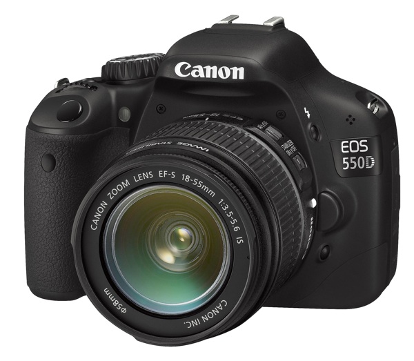
We’re taking another in-depth look at a new camera today, the Canon EOS 550D (the EOS Rebel T2i). This is Canon’s latest consumer Digital SLR offering, and the specifications certainly pack a punch. Can it live up to all the hype? Read on to find out.


The Best Yet?

The EOS 550D’s specifications certainly do appear to put it well ahead of its rivals. Canon’s 18-megapixel APS-C sensor has a 4-megapixel advantage over the best of the rest (Pentax, Samsung, Sony), while arch-rival Nikon is still using 12-megapixel sensors in its own APS-C format digital SLRs, giving away no fewer than 6 million pixels to the Canon.

Megapixels are no guarantee of image quality, of course, as is obvious from the compact digital camera market. In fact they’re a bit of a worry from the point of high ISO performance. The EOS 550D goes right up to ISO 6400 (expandable to ISO 12800), but how well will it perform? High resolutions and high ISOs don’t usually mix.

The EOS 550D’s other key selling point is its full HD movie mode. Other SLR makers are restricted to standard HD movies at a resolution of 1280 x 720 pixels, but the Canon can shoot full HD 1920 x 1080 movies, and at different frame rates of 30, 25 or 24fps (and even 50/60fps at 1280 x 720 pixels for shooting fast action). This choice of frame rates is particularly important for movies which are going to be converted into standard definition TV formats like PAL, which runs at 25fps rather than 30fps.

That’s not all. The EOS 550D also offers full manual exposure control for movies, which gives it huge creative potential for film-makers. You get a stereo external microphone socket (though the internal mic is mono), and a new Movie Crop function which creates smaller-format 640 x 480 movies using the central part of the sensor, though this is essentially a digital zoom function which gives you extended telephoto capability but at the expense of resolution.

Indeed, on paper the 550D looks very close to the much more expensive EOS 7D for features, but while that might be true for movies, the 7D still has many advantages for serious photographers. The 550D can only shoot at 3.7fps, while the 7D can shoot at 8fps, it has a lightweight plastic body rather than the rugged alloy chassis of the 7D, and it has just one control dial compared to the two on the 7D.


External Features

The EOS 550D’s basic shape goes right back to the EOS 350D launched in 2005. The body is small and light, and it can feel quite cramped if you’ve got big hands, but Canon continues to refine the layout of the controls and the result is an exceptionally well-designed camera.

The exterior controls are now bigger and more intuitive following customer feedback. They’re clearly labelled and brilliantly simple to use. You can change the ISO, EV compensation, white balance, autofocus mode, Picture Style or drive mode just by pressing the relevant button and then turning the control dial.

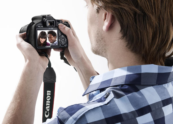
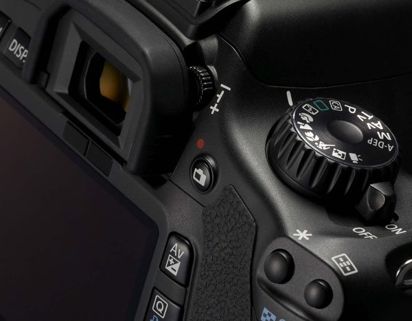
Alternatively, you can activate a new Quick Control screen where the camera settings are displayed on the LCD and you can use the navigation buttons and control dial to select and change the shooting options.

The 3-inch LCD display is very good. It has an unusually high resolution of 1,040,000 pixels, producing very clear menus, information displays and high-quality image playback. The menus are worth a special mention because they work so simply and so well. You use the left/right direction buttons to choose a menu tab and the up/down buttons to choose the menu option you want. The tabs are color-coded, too, for shooting, playback, settings and user-defined options.

The 550D retains an exposure mode seen on earlier EOS models that’s so useful it’s surprising other makers don’t do something similar. In the Canon’s A-DEP mode, it checks all 9 focus points for the nearest and farthest object in the scene, then automatically selects a lens aperture which will extend the depth of field to cover both of them.


Kit Lens Choices

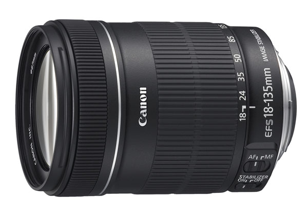
Canon’s entry-level digital SLRs usually ship with the company’s basic 18-55mm IS kit lens, but the 550D is also available with Canon’s longer-range 18-135mm IS lens. This might be more suitable for those planning to shoot movies, where longer zoom ranges are more commonplace. It does add to the price, though, and the picture quality isn’t necessarily a whole lot better. The 18-135mm lens is quite bulky, too, and while it’s not too bad a match for the EOS 550D body, it’s at the upper size limit for good everyday balance.

One advantage of the 18-135mm lens over the 18-55mm is that it has a non-rotating front element. This means you can use graduated filters and polarizers without having to reset the angle each time the camera focusses.

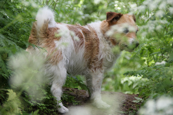
The disadvantage is that this is one of Canon’s few non-USM lenses, and it’s noticeably noisier as a result. It’s still quite fast, though, and managed to latch on to this frisky terrier in the instant before it darted off through the undergrowth.


Viewing and Focusing

The 550Ds viewfinder is clear, bright, and, like all modern D-SLRs, it has a live view mode too, so that you can compose shots on the LCD display instead if you prefer.

The live view button is just to the right of the viewfinder eyepiece, and when you press it the camera’s mirror flips up and the rear LCD now shows the view through the camera lens captured by the sensor.

To date, digital SLR makers don’t seem to be making a whole lot of progress with these modes, and hybrid cameras like Panasonic’s G-series Lumix models and Samsung’s NX10 focus much, much quicker than the Canon does.

It’s not clear why that should be. Live view modes rely on contrast-detection autofocus systems which use the image formed on the sensor to check focus rather than a separate sensor, but if Panasonic and Samsung can make these work fast, why can’t Canon? Canon’s not alone in this – other D-SLR makers struggle to produce good live view autofocus performance, which is one reason why hybrid cameras are proving such a tempting alternative.

The live view mode is all right for tripod-based shots with relatively static subjects that allow plenty of time for the Canon to find the right focus, but it’s not very practical for day-to-day shooting.

There are focusing limitations when shooting movies, too. In fact, the live view AF just isn’t fast enough for continuous autofocus and you have to choose a focus point before you start filming and plan your clips with this in mind. You can focus manually while filming, but unless the camera’s mounted securely on a tripod, you’re going to jiggle the picture. You can also attempt to autofocus during filming, by half-pressing the shutter button, but the focusing is so slow, jerky and noisy it does more harm than good.

Interestingly, you can shoot a full-resolution still image in the middle of shooting, though it does produce a 1-second pause in the clip, so the Canon can’t really do both at the same time.

You can’t argue with the movie quality, though, which is excellent. It’s not really a point-and-shoot camera, and you really need a tripod and a certain amount of planning to get the best from it, but this applies to professional movie-making in general.


Picture Quality

From the specifications, you might be tempted to expect the same level of quality from the EOS 550D’s still images, but this isn’t so straightforward. Yes, it does have a much higher megapixel count than its rivals, but it doesn’t necessarily translate into better definition. When you look at the pictures at 100 percent magnification on-screen, the fine detail just doesn’t seem to have a lot of ‘bite’, especially subtle, textural detail.

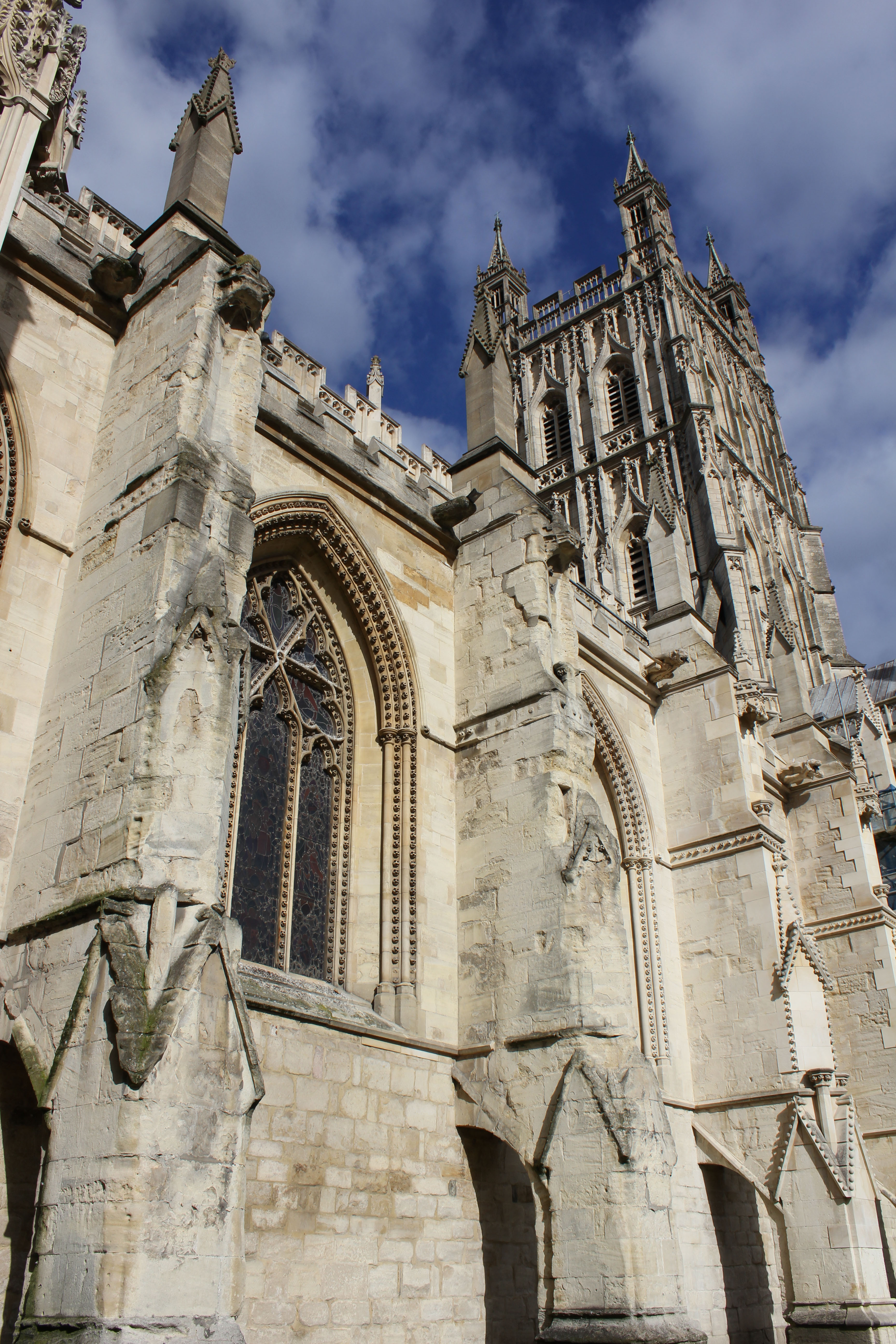
This picture, taken with Canon’s 18-55mm IS kit lens, looks great from normal viewing distances, and in the centre of the frame the detail is pretty crisp, helped by the strong, high-contrast lighting and clear outlines. There’s not a lot of textural detail in the stonework, though, and away from the centre of the frame the definition falls away quite noticeably.

True, examining images this closely is the kind of pixel peeping that’s given digital photography a bad name, but then if you do choose a camera because of its resolution, you’re going to want to be sure that it does actually offer a clear improvement. It’s difficult to make properly scientific comparisons with this kind of thing, but the detail the 550D resolves seems, in reality to be quite similar to any other APS-C format camera. The pictures are bigger, but they seem a bit softer too, which leaves you back where you started.

The choice of lenses doesn’t help. Canon’s 18-55mm kit lens has never enjoyed a particularly good reputation, but the 18-135mm doesn’t seem any better. It’s hard to understand why the detail in the picture shown here should have come out so soft, and a whole bunch of others taken on the same day were much the same. Maybe this particular lens was a bad example, but that in itself doesn’t inspire much confidence.

From the point of view of resolution, then, the EOS 550D’s advantage may be more theoretical than actual. Shooting RAW files helps (the RAW files do seem to hold more detail than the camera’s internal processing brings out), and Canon’s Digital Photo Professional RAW converter, bundled free with the camera, also offers automatic distortion and chromatic aberration correction, if you know where to look.

The 550D does repay a little effort. You can have some fun creating your own Picture Styles and using them in the Digital Photo Professional software or even transferring them to the camera. There’s an Auto Lighting Optimizer which lightens dark shadows (other cameras have similar systems) and, for photographers who perhaps don’t like their images messed around with quite so much, a Highlight Tone Priority option which compresses the brightest highlights in the image so that you get reduced blow-out in the highlights. It’s definitely worth using and you notice it especially in things like bright skies.


Exposure and ISO

Canon’s used its new and sophisticated iFCL exposure system in the 550D. It has a 63-zone dual-layer light sensor with a red-green sensitive layer on top and a blue-green sensitive layer below. According to Canon, meters are traditionally over-sensitive to red, and this new system is the solution. It also combines focus, color and luminance data (hence ‘FCL’) to work out the correct exposure.

The advantages aren’t that obvious, to be honest. Occasionally, the 550D produced some unexpected and quite excessive overexposure with heavily backlit subjects, but the rest of the time its performance seemed little different to any other camera’s.

Keen photographers are likely to want to override the camera’s exposure quite often, regardless of how sophisticated it might be, and Canon’s extended the 550D’s exposure compensation range to plus/minus 5EV and the auto-exposure bracketing range goes up to plus/minus 2EV.

The high ISO performance is impressive, though. This is one area where both Nikon and Canon seem to have taken a big step forward compared to the rest, and the 550D’s higher resolution isn’t a problem. At ISO 6400, heavy noise reduction produces a wishy-washy ‘watercolour’ effect, but at ISO 3200 the quality really is very good indeed. In this picture there’s surprisingly little noise and yet the fine detail is still very crisp.


So Just How Good is it?

Overall, the 550D is a very good camera, but its strengths aren’t necessarily those you might expect. The 18-megapixel sensor sounds like its strongest asset, yet it really doesn’t deliver the boost in definition the figures suggest. If you buy the 550D for this reason alone, you might well be disappointed.

The full HD movie mode, though, is every bit as good as it looks on paper. You need to take a fairly considered approach to filming and focusing, but that’s how professional films are shot anyway.

The 550D really does score, however, in areas which you can’t put in a list of bullet points. Its control layout is quite exceptional, and the only criticism you could make is that the body’s a bit small. But then this is a designed as a portable, easy-to-use, entry-level camera, and complaining that the body is small is like complaining that your bicycle only has two wheels.

But there’s still a lingering sense that this camera doesn’t achieve its proper potential, the feeling that 18 megapixels ought to deliver more than this, and that while Canon keeps pushing the numbers up, the picture quality itself really hasn’t moved on. Yes, the high ISO performance has taken a step forward, but the definition hasn’t.


Verdict

The EOS 550D is very nearly a great camera. The design, the control layout, the LCD display and the full HD movie mode are all excellent, and yet the quality of the stills – the one thing you might take for granted with that class-leading 18-megapixel resolution – is disappointing. It’s no worse than its rivals, perhaps, but no better either.

Pros

  1. Design and control layout
  2. Movie quality and controls
  3. Big, high resolution LCD
  4. Excellent high ISO performance

Cons

  1. Fine detail not that sharp
  2. Slow autofocus in live view
  3. Unimpressive kit lenses

Quick Tip: Top 5 Photojournalism News Sites

The internet has given newspapers new opportunities to display journalistic photos and a chance to portray stories in formats that go beyond the printed page. Good photojournalism should portray a story in a single image and I believe should instigate thoughts and reaction from the viewer. This is a short guide to some of the best photojournalism news sites on the web.


The BBC – In Pictures

The BBC In Pictures site has a vast array of journalistic photos as well as user generated content. The ‘Day In Pictures’ section displays around 10 high quality shots from the day’s events around the world.

There is also a great selection of more specific photo stories, slideshows and featured galleries, covering a wide selection of topics. In addition, you have the opportunity to submit your own photos based on a weekly topic.


Boston – Big Picture

The Boston.com Big Picture site is my favourite photo journalism site, gathering together shots from the world’s best news and photo networks such as Reuters and Getty.

Each collection of photos portrays one story, each comprising a considerable set of stunning images that give a comprehensive overview of the topic involved. The large format and quality of images make this a site that requires time to look through, for enjoyment and consideration.


New York Times

The New York Times are at the forefront of up-to-the-hour online news content. Their photo and multimedia section boasts a vast amount of slideshows portraying a wide selection of up-to-date news and sports stories.

The best feature of the site though, is their audio/visual content, breaking new ground in photojournalism, combining photographic slideshows with recorded audio and interviews from the subjects, which is considered to be a format that we will be seeing a lot more of in the future.


The Washington Post

The Washington Post offers selections of photos covering one story at a time, in a similar fashion to the Boston Big Picture. The quality of the shots are extremely high, but what attracts me to this site is the collections of shots regarding sports, fashion and celebrity, where as the other sites focus more on world news.


MSNBC

Finally, the MSNBC site doesn’t offer a comprehensive collection of photographs, but their ‘Week In Pictures’ feature displays a great array of shots from the week’s events in a simple slideshow format with the option to vote for your favourite.


Eyewitness

Also worth checking out is the Guardian Eyewitness website and iPad application. We reviewed this recently on Phototuts+, and found it to be a fantastic resource for daily photo inspiration!

Are there any other sites that you regularly use for amazing photos of current events? Be sure to let us know in the comments!

Bringing the Magazine to the Web


The rise of blogs on the web has brought a quick and easy way for anyone to publish their thoughts online without having to get down and dirty with HTML. Just write your content, hit ‘Publish,’ and your thoughts are instantly available for the masses to read.

For all the good that blogs have done, they’ve made the internet look predictable when compared to articles printed in a magazine which look completely unique, each with their own art style and layout. As Greg Storey pointed out in a blog post from 2006, “before there were blogs we had websites. Beautiful, random websites that felt more like a zine – one page looking nothing like the one before or after it”.

Most larger blogs may have a unique theme, but each blog post looks the same. Most posts we read everyday share the same common layout:

In breaking this trend, several bloggers have begun giving each post a unique layout, colour scheme and art style. Their posts look more akin to a magazine article than the typical blog post. The posts stand out from the crowd, like a zebra amongst a field of horses.

“Before there were blogs we had websites. Beautiful, random websites that felt more like a zine – one page looking nothing like the one before or after it” – Greg Storey

Below is a round-up of forty beautiful looking blog posts from fourteen sites which break out of the mentality that every page on a website should look the same.


1. Gregory Wood


2. Marcel’s Blogazine


3. Jason Santa Maria


4. PeepCode


5. Danny Garcia


6. Chris Coyier


7. Avoid Contact With Eyes


8. Paddy Donnelly


9. iamsteve


10. Jack Cheng


11. Dustin Curtis


12. Metalab Design


13. Smashing Magazine


14. Panic Blog

Realistic Vector Motorcycle Portraits


Every semester, in my Illustrator classes, my students always want to know how I create the Motorcycle Portraits I am known for. I often give them a brief explanation, but I have never really sat down and described the process in detail…until now. My approach to getting a “realistic” look in my work is a bit tedious, but I think you will agree that the end results are well worth it. Enjoy!

Continue reading “Realistic Vector Motorcycle Portraits”

Quick Tip: Use Puppet Warp in Photoshop CS5 to Tweak Your Images


Photoshop CS5′s new Puppet Warp feature can be extremely useful if you need to make minor adjustments to your photos. In today’s quick tip tutorial we will demonstrate how to correct a Photo with this new tool in minutes. Let’s get started!


Step 1

First, let’s load our image. I have selected this stock image.


Step 2

Create a selection around the object. The selection needs to be fairly accurate but we will use the refine edge tool to fix the selection just in case, later on. So using the Pen Tool (P) trace the path around the object as best as you can, making sure you finish where you started creating a single loop.


Step 3

With the pen tool still selected, right click the path and click "Make Selection". This will now load the path as a selection. Enter the value 0 for feather radius and select ok.


Step 4

With the selection still active, click on the Marquee Tool (M) and under the options for the tool, click the button for "Refine Edge". This tool allows us to refine and fix the selection as best as possible. Feel free to experiment with the settings to find the best selection for the object if needed. Once you have made your selection, change the output from "Selection" to "New Layer with Mask".


Step 5

We now have two separate layers, one with just the flower and the original. We now need to delete the flower from the original background image. To do this, load the original selection again (Cmd/Ctrl + Click Masked Layer icon) and use CS5′s new content aware fill to delete the area. For best results, expand the selection by going to Selection > Modify > Expand, Expand by 10px and click ok. Now press Delete on the original layer and select content Aware Fill.


Step 6

Sometimes Photoshop won’t get it right the first time and may leave some contrasting lines. To fix this, we can use the Spot Healing Brush Tool (J) using some content aware settings and simply paint over the lines to blend them in.


Step 7

We can now very easily apply the puppet warp tool without destroying or distorting the background. With our masked layer selected, go to Edit > Puppet Warp. This will open the tool and allow us to manipulate and warp the object. Placing points systematically around the displayed mesh will create bending/warping points. Place them on your object in the best arrangement to create joints to bend as shown below.


Step 8

Dragging or rotating these points (Alt + Click and move over point) will warp the object in the desired direction. Using this we can drag the stem of the flower to come from the side, while still allowing the flower to stay upright.


Final Image

And that’s how you use the Puppet Warp Tool. I hope you enjoyed this tutorial!


Additional Uses

Moving arms, or changing body stance.

Straighten lines, or correcting lens distortion.

More Than 620 Bokeh Background Textures


As I’m sure you already know, textures can come in very handy; whether you’re using them to subtly add interest to your work, or in full-blown, award-winning photo manipulations. Bokeh is the term used to explain the blur, or the aesthetic quality of the blur in photography, and is usually seen in good quality macro shots, in the areas that lay outside the depth of field.

As bokeh is more than often very pleasing to the eye, photographers tend to purposely produce bokeh in their images, and sometimes deliberately take out-of-focus shots to take images that show nothing other than bokeh. Designers have picked up on this, and over the years there has been a huge increase of bokeh being used in graphic, print, and web design. This round-up consists of a whopping 626 textures, both free (the majority) and premium, which you can use to spice up your photos, as backgrounds for your latest web design, and, as most of them are high resolution, even in your print design projects.


Free Bokeh Textures

Take a look at these incredible free bokeh textures available on the web.


Five Colourful Bokeh Textures (5 Textures)


Out of Focus: 30 Free Bokeh Textures (30 Textures)


Colored Grungy Bokeh Textures (5 Textures)


Raining Light Bokeh Pack (11 Textures)


Crazy Firework Bokeh Stock (1 Texture)


Heart Bokeh Textures (3 Textures)


Bokeh Collection (4 Textures)


Bokeh 2 (1 Texture)


Bokeh Textures Pack (10 Textures)


Bokeh Texture 3 (1 Texture)


High Resolution Bokeh Texture (5 Textures)


Bokeh Texture Pack 001 (20 Textures)


Rainy Night Street Light Bokeh (1 Texture)


Grungy Bokeh Pack (6 Textures)


Bokeh Collection II (5 Textures)


Bokeh Stock Images (11 Textures)


Glitter Bokeh Texture Pack (33 Textures)


Bokeh Texture Pack 002 (10 Textures)


Bokeh Pack 2 (27 Textures)


Regularjane’s Bokeh Textures (11 Textures)


Christmas Bokeh Stock Pack (15 Textures)


Bokeh Super Pack (14 Textures)


Bokeh Pack 5 (22 Textures)


Bokeh Texture Pack 003 (14 Textures)


Bokeh Pack 6 (30 Textures)


My First Bokeh (1 Texture)


Bokeh Texture Pack 004 (7 Textures)


Bokeh Pack 3 (39 Textures)


Royale Bokeh (4 Textures)


Lensbabie Bokeh Stock 2 (14 Textures)


Bokeh Texture (1 Texture)


Lensbabie Bokeh Madness Stock (13 Textures)


Bokeh Textures (5 Textures)


Bokeh Textures (10 Textures)


Freaky Distorted Bokeh (5 Textures)


Night Bokeh (4 Textures)


Color Bokeh Textures Pack (4 Textures)


Bokeh Pack 4 (20 Textures)


Bokeh Bubbles Icon Textures (24 Textures)


Grungy Abstract Bokeh Textures (3 Textures)


Heart Bokeh Pack (6 Textures)


Water Bokeh Stock (9 Textures)


Natural Bokeh (4 Textures)


Bokeh VII (3 Textures)


Premium Bokeh Textures

Take a look at these incredible premium bokeh textures available on the web.


Circle of Bokeh (1 Texture, PSD Included – $3)


Light Bokeh Abstract Background (14 Textures/Backgrounds, PSD Included – $4)


Bokeh Effect Background (10 Textures/Backgrounds, PSD Included – $3)


60 Bokeh Abstracts (60 Textures – $5)


7 Bokeh Textures (7 Textures – $6)


Bokeh Backgrounds (4 Textures – $3)


8 Bokeh Effect Backgrounds (8 Textures/Backgrounds, PSD Included – $4)


44+ Mosaic Bokeh with Pluses (44+ Textures/Backgrounds, PSD Included – $5)


8 Colorful Abstract Backgrounds (8 Textures/Backgrounds – $8)


You May Also Like…

Pass Values to a SWF with JavaScript and SWFObject – Basix

SWFObject provides a simple way to pass values to a SWF using only JavaScript: no server-side code required! In this tutorial, we’ll build a fundraiser meter that can easily be updated with the amount donated so far, without needing to recompile the SWF.


Final Result Preview

View the source of the demo and you’ll see that the target and current donation amounts are defined in JavaScript.


Section 1: What’s SWFObject? Why Use It?

Don’t like ads? Download the screencast.


Section 2: Set Up the Fundraiser SWF and Get to Grips with SWFObject

Don’t like ads? Download the screencast.


Section 3: Additional Functionality and Polish

Don’t like ads? Download the screencast.


Non-IDE: Relevant Code in Plain Text

If you’re not using the Flash IDE, here’s the relevant code in copy-and-pastable plain text:

if (root.loaderInfo.parameters["goal"] != null)
{
	goal = Number(root.loaderInfo.parameters["goal"]);
	actual= Number(root.loaderInfo.parameters["actual"]);
}
else
{
	// if can't access values in page
	goal = 100;
	actual = 50
}

The tutorial videos explain how to hook these up to a JavaScript object in the page.

Quick Tip: Creating Compound Curve Icons in Maya

In this quicktip tutorial, we’ll walk through one way to create complex NURBS-based icons in Maya. Useful control icons can make or break a good rig, and are essential when creating in-interface GUIs. Putting together simple, one-piece shapes are easy, but making compound icons can be much more difficult. One method for combining multiple curves is to parent them under a single transform node. We’ll first do this by hand, and then look at an easy MEL script that automates the process.

Step 1

Create a handful of Nurbs curves. For this example, I’ve used the Create > Text option box command, changed the text to Cgtuts+ and then selected the Curves type. With that done, hit Create to create this collection of Nurbs shapes:


Step 2

If you look in the Outliner (Window > Outliner), these curves are grouped by letters (in groups with the prefix “Char_”), and under a single “Text_” node, but each individual letter is selectable and moveable. When we hand over our final rig, we want the entire word to be the only thing that is selectable.


Step 3

To achieve this, we first start by selecting and un-parenting all the curves. The MEL code to do this is as follows:

parent -w;

So marquee select around all of your text elements, enter the above command into the command line at the bottom of your interface window, and hit Enter on your keyboard.


Step 4

With all of the curves still selected, freeze their transformations (Modify > Freeze Transformations).


Step 5

Next, open up the Hypergraph hierarchy.


Step 6

By default, only top-level transform nodes are visible in the hypergraph. To show the shape nodes, go to Options > Display > Shape nodes.


Step 7

First select all of the shape nodes for every curve except curve1. In this case I’ll have 7 shape nodes selected. Now hold down Shift and select the first curve’s transform node, in this case the curve1 node, to add it to your selection. It’s very important to select the transform node last. Your hypergraph should now look like this:


Step 8

The following MEL command parents the first selected items (in our case the shape nodes), under the last selected item (the transform node). So type the following code into your command line and hit Enter to parent the shapes under the transform node:

parent -r -s;

Step 9

Now you can click on any of the letters and Maya will automatically select the entire word. Your control-icon is now ready! Here’s a MEL script that automates the entire process. Just select all of the curves you want to group and run this script:

global proc groupUnderTransform(){
string $selCurves[] = `ls -sl`;
makeIdentity -apply true -t 1 -r 1 -s 1 -n 0;
select -deselect $selCurves[0];
pickWalk -d down;
select -add $selCurves[0];
parent -r -s;
select -r $selCurves[0];
}
groupUnderTransform;

The Value of Workmates: Do You Need a Work Buddy?

I came across this interesting article a few days back discussing how to get more done with a work buddy and how he or she can help you stay on track.

I agree with most of the points mentioned, especially the one about collaboration. I have found that when I collaborate with people on projects, I can get more work done in less time. While there can be some loss of time in communication (although solutions keep cropping up on the web, such as Google Wave), I have found it to be a productive exercise.

A work buddy can keep an eye on you when you procrastinate, help you solve problems and motivate you during difficult times.

So, what do you think? Do you need a work buddy?

Getting Down to Goalsetting: The Freelancer’s Bucket List

Having goals is an automatic tendency for everyone – and the goals will be wide in range and scope.  What might be something you find not really worthy of being pursued another may envision as an ultimate achievement.  It is the achieving them that is the challenging part – although I’d argue that even sitting down to set goals is a larger challenge.  It should serve to be an offshoot of your to-do list…and once you’ve put them down and have them in writing, they’re a lot tougher to ignore.

The Freelance Folder blog put together a great post that not only outlines a few of the author’s “bucket list” items, but challenges the reader to come up with their own.  It’s an inspiring read and will hopefully serveto get you thinking about what you really want to achieve to live your life to the fullest.

The Freelancer’s Bucket List