13 Steps for Creative Coastline Photography

This is our simple, thirteen step introduction to the world of beach and coastal photography, which can be an extremely varied and rewarding activity. Seasonal changes transform these natural locations from colourful postcard views to brooding winter scenes in a matter of months, but whatever the season, there’s always something to capture!


Step 1: Introduction

One of my favourite photographic locations is the beach. I’m not talking holiday snaps with the family – I’m thinking more creative landscapes and natural beauty. In the UK, we’re very lucky to have such vast and beautiful stretches of coastline only a short distance away and, even though I’ve visited many beaches with my camera, I always find something unique at each location.

Whether it’s the breathtaking skyline on a summer’s evening or an intricate rocky outcrop, there is never a shortage of things to capture.


Step 2: Finding Your Location

It’s always good to have a rough idea of what you’d like to shoot before heading out, you might even want to make a shot list. You’ll have to pick your location depending on what sort of coastline shots you’d like. There are many variables, large wide beaches, small quiet coves, private harbours, historic piers, chalky cliffs & rock pools filled with wildlife to name a few. Take a few minutes to browse online and you should be able to find the most suitable spot.

Original Image on Flickr


Step 3: Picking Your Moment

After choosing your location, you’ll need to consider carefully the time at which you’ll want to visit. A lot can vary between seasons and even between the time of day. Make sure you check the weather and tidal information, as both natural light and beach visibility will be dependant on these. The seasonal and light changes will have a dramatic affect on the shots you take.

Be prepared. Obviously on a warm summer’s day you’ll be wanting to enjoy the weather, but in the autumn/winter months you don’t put yourself in unnecessary danger and risk getting cut off by the tide or getting caught in a storm.

Original Image on Flickr


Step 4: Equipment

Travelling light is always a luxury, and for casual beach walks you could always just head out with your camera. But if you’re serious about getting your beautiful coastline shots you’ll need to carry a few bits of kit with you.

A tripod is always essential when working with water, whether you want to freeze it in motion, or want to smooth it out with a long exposure. With this in mind, it’s always good to have a few filters with you. A couple of Neutral Density filters make long exposure shots that much easier and, if you’re heading out to capture sunset, sunrise or a bright sky shot, a graduated filter will come in very useful.

It’s also very useful to have a zoom lens with you, as some areas of the coastline might be inaccessible or points of interest quite far away.


Step 5: Looking After Your Equipment

The last thing you want when you get home is a camera full of sand or sea water. Make sure you take a case or bag with you to store all your equipment – it’ll save you the headache of cleaning everything out when you get home.

Avoid putting anything down on the sand as you want to minimise the risk of sand scratching your lens. If you’ve got too much stuff to carry, take a friend or partner to help you out, but make sure you buy them an ice cream to say thanks!

It also goes without saying, but trying to change your camera lens with sand flying about on a windy beach is a recipe for disaster. Be super careful when changing lenses on the beach, and avoid it if at all possible.


Step 6: Sunrise/Sunset

If you’re aiming to capture a sunset or sunrise, make sure that you pick an appropriate beach. My particular favourite beaches are all west facing, which means the sun sets over the horizon, offering beautiful swathes of evening colour.

Obviously you’ll need to be facing east for a sunrise, which can often offer even more dramatic skylines than sunsets. You’ll just have to set your alarm a lot earlier than usual! As I mentioned earlier, a graduated filter will help to enhance the colours and drama of your sunrise and sunset shots.

Original Image on Flickr


Step 7: Seek the Sunshine

The sun is the our greatest light source, and on coastlines and beaches it can prove to be a particularly strong asset for a photographer. On bright days you can afford to select a quick shutter speed to capture movement or detail. Try facing in different directions – the angle you shoot at with regard to the light might mean that that extra bit of detail is revealed.

Shooting into the sun isn’t always recommended, but you might find interesting shadows are cast. You can also use the light creatively, as it reflects off the water or use it as a backdrop to create a silhouette.
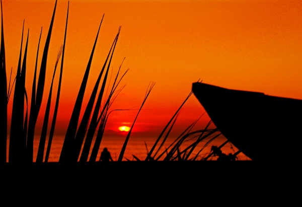

Step 8: Silhouettes

Some of my favourite coastal shots are of silhouetted objects on a bright sunny day. There is a multitude of subjects, such as rocky outcrops, family and friends, groyne posts and surfboards which can act as great shapes to cast into darkness in front of the bright shining sun.

Be careful not to overexpose the image by letting in too much light, and watch out when post processing that you don’t alter the light too dramatically as it can look really unnatural.
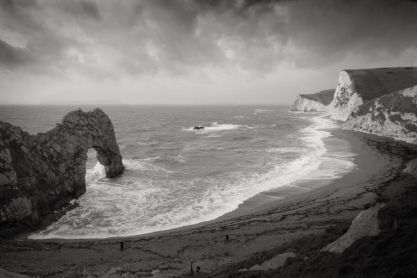
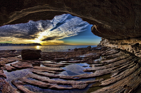
Original Image on Flickr


Step 9: Landscape

If you’ve decided to shoot a natural coastline, you can apply many of the same principals as you would with landscape photography. Take time to achieve the most dramatic composition. Can the rule of thirds be applied? Are there any strong diagonal lines? Is the horizon straight?

It’s also important, as mentioned earlier, to consider the light. Now, there’s not much you can do to change sunlight, but waiting that extra 15 minutes for those beams of sunlight to peak through the clouds may transform your seaside shot into a breathtaking coastal panorama.

Original Image on Flickr


Step 10: Foreground / Natural Objects

Within a large scale landscape shot, it may help to try to include something in the foreground to suggest scale. On a beach, that could be rocks, shells or an animal (or a person), which can really add to the depth of the image. You may, however, want to use these smaller points of interest as the focal point of your image.

It’s important to pay attention to detail. Look for interesting shapes and textures that you could highlight, think about the mix of colours and tones, as well as the possibilities of framing the object. Don’t just stick to the angle at which you first approached the object, have a walk around, are there any defining features to your subject that you can highlight?
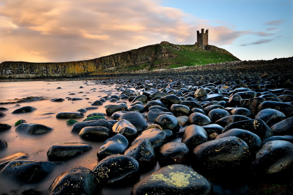
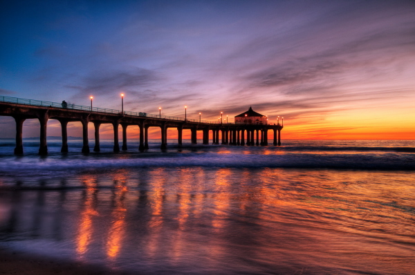
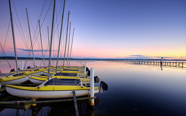
Original Image on Flickr


Step 11: Structures

More often than not, the most popular beaches are located near ports, docks or tourist spots, which should mean that there are plenty of structures such as a pier or harbour to capture. Once again, it’s important to think about composition – it’s likely that in this situation, you shot will be busier than a coastal landscape shot, so think about how you can simplify the composition to enhance the drama of the shot.

As the evening draws in, the street lamps and harbour lights will be turned on. These could be a hindrance, but think about the possibilities of using them to your advantage as they reflect in the water and bring a simple boat yard to life.
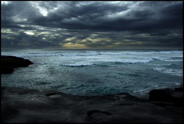
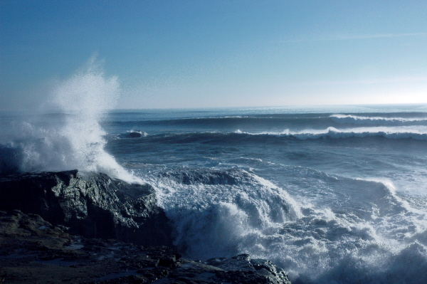
Original Image on Flickr


Step 12: Water

The sea is the reason that the coastline is so special, so it would be rude not to pay it some attention. If you feel like getting your feet (and tripod) wet, try standing in shallow water to capture the smooth lines of the horizon with the mixed tones of sea and sky without the intrusion of any land.

Alternatively, head up onto the shore and wait for the tide to come in to capture the waves crashing against the sea walls, use a quick shutter speed to capture the water flying up into the air. Maybe even select burst mode to ensure you get the shot you want, and make sure you keep an eye out for those extra large waves!

Original Image on Flickr


Step 13: Be Creative!

The most important thing is that you enjoy yourself. There are vast opportunities for capturing great coastline shots, whether you want a dramatic landscape or an evening harbour shot, make sure you travel prepared to avoid disappointment.

Don’t be afraid to be creative and try different techniques and angles, as you never know what you might find. It’s well worth visiting the same location a number of times as it will look very different at depending on the time of day and will vary through the seasons.

15 Wildly Convenient CSS Items from CodeCanyon


In addition to Premium WordPress Plugin, we, over at CodeCanyon, also recently launched a CSS category, specifically made for high quality, and super convenient items, such as three-level menus, CSS tabs, pricing grids, frameworks, etc. I’d like to show you a quick sampling of the best of what we have so far, after a couple weeks.


1. Griddler Pricing Grid I

Griddler Pricing Grid

“SaaS (Software as a Service) style HTML5 /CSS3 pricing grid that degrades well for unsupported browsers.”


2. CSS3 Buttons

CSS3 Buttons

“Create buttons by simply adding different classes to links, submits, and button elements.”


3. Droplink

Droplink

“Create a cool looking drop-down list of links. There are three examples included: one with text as main link, one with an image as main link, and one where each link has a small icon.”


4. Griddler Pricing Grid II

Griddler Pricing Grid II

“SaaS (Software as a Service) style HTML5 /CSS3 pricing grid that degrades well for unsupported browsers.”


5. CSS Pagination Pack

CSS Pagination Pack

“Spice up your pages with these fresh looking pagination menus. No images have been used; only CSS! Seven predefined colors are provided with hover and active states! More colors will be added in the near future. These bars have been tested to work in all major browsers.”


6. CSS3 Tabs

CSS3 Tabs

“You might normally think of tabbed content as involving JavaScript. These tabs are 100% CSS and behave largely like any other tabbed content area you have come across, including the ability to link to specific tabs through hash tags in the URL.

This item includes twelve variations including color variations (Autumn, Business, MossyGarden), style variations (Buttons, Centered, Shadowy), and placement variations (Bottom, Centered, Right).”


7. CSS Framework + Form Elements

CSS Framework + Form Elements

“Create a blog, corporate website with multiple columns easily without having to remember so many grid classes.”


8. Sleek Borders

Sleek Borders

“This is a pack of twelve stylish borders for your images. Six styles are included with a gloss variant of each. Full documentation is included. You can also remove the images and use the borders as stylish containers.”


9. Fresh Tooltips

Fresh Tooltips

“Precisely designed and coded Fresh Tooltips. Great for any kind of website, very practical. The top one is 100% transparent black, which looks very very cool. Also perfect for learning—I’ve made lots of cross-browser research before I’ve done these, you won’t find better tutorial with such an amazing design than personally going through my code.”


10. Stencil CSS Framework

Stencil CSS Framework

“Small lightweight CSS framework. Includes base styling (CSS reset & typography), plus plugins to add many other features.”


11. CSS3 Mega Menus

CSS3 Mega Menus

“This is a beautiful drop-down mega menu with five different colors scheme. (Blue, Red, Green, Orange, Purple)”


12. CSS3 Gallery

CSS3 Gallery

“CSS3 Gallery is created by purely using CSS – no images. It’s a different sort of web gallery, in which your images display in the screen of a computer LCD.”


13. Simple Admin

Simple Admin

“This is a simple CSS admin panel template with horizontal navigation tabs and a search field. This is an ideal template for smaller admin panels or scripts that do not require more feature rich templates.”


14. Fancy 2-Line CSS Buttons

Fancy 2-Line CSS Buttons

“These 100% CSS buttons are sure to make your site stand out from the crowd. Your visitors will love to click on them too, with 2 lines of information and text driven icons, they’ll know exactly where they are going.”


15. Fresh Forms

Fresh Forms

“Precisely designed and coded Fresh Forms. Great for any kind of website, very practical. The top one is 100% transparent so you can also place it on texture background. Also perfect for learning—I’ve made lots of cross-browser research before I’ve done these, you won’t find better tutorial with such an amazing design than personally going through my code.”


However, the category is still a baby, at barely two weeks old. As a manager, I can’t wait to see what kind of submissions we’ll be receiving to this category by the end of the year. If you’re not yet an Envato marketplace author yet (why not), you can refer here for the details of signing up to sell your works.

Flexible, Mobile-First Layouts with CSS3


Some experts are projecting mobile devices to become the dominant medium for web browsing within five years, overtaking browsing on desktop computers. Regardless of how accurate this projection turns out to be, it is clear that formatting websites for mobile-friendly viewing needs to become a staple of web design and development. There are many ways to accomplish this, of course. However, CSS3 provides a fairly rich toolset for mobile-friendly formatting, relying on the client’s browser capabilities instead of back-end templating.


Step 1. Think Ahead

There are a few issues that should be thought about before diving right into styling a layout.

Mobile Web Browsing

First, what should one keep in minds when designing for mobile browsers? Well, here are a few things…

  1. Limit HTTP requests: data transfer over 3G can be quite taxing. This includes limiting images where possible (from the CSS, for example).
  2. Varying screen sizes: Mobile devices tend to hover around the 320-480 pixel screen widths but can vary greatly depending on the device. So, predefining widths in the CSS is generally a bad idea for things like paragraphs and DIVs.
  3. Optimize for a subset: There are TONS of mobile devices, browsers, OS’s, etc. Try to focus your testing on what you assume to be the most important. For me, this includes iPhone, iPad, Blackberry, and Android. This list should also include Windows Mobile but I simply do not have access to a Windows Mobile device.
  4. Hover must die: Okay, that’s a little dramatic. However, touchscreens don’t tend to support hover. So, when building menus, don’t hide things behind hover events. Hover should only be used to enhance some effects (like color changes) not deliver important content (like drop-down menus).

“The overall point is to know ahead of time what your site is likely to look like in various browsers before seeing it.”

Browser Support (on Desktops)

Secondly, keep browser support in mind. The proverbial “elephant in the room” is IE, of course. Good news, though! As it turns out, websites don’t really need to look exactly the same in every browser. As long as it doesn’t interfere with the content of the website, generally a browser not capable of processing CSS3 will still provide a more-than-acceptable experience. The overall point is to know ahead of time what your site is likely to look like in various browsers before seeing it.


Step 2. The HTML

The Body

“Keep the markup simple and clean.”

Not only do we want to produce valid HTML, we also want to simplify it as much as possible. While it has always been a good idea to keep HTML streamlined and free of unnecessary DIVs, it is even more important now with the rise in mobile web browsing. Also, a lot of the effects that required 7 nested DIV tags can now be reproduced with a little CSS3.

Since this is not an HTML5 tutorial, I’m going to stick with XHTML strict. With that in mind, a lot of the markup here can be made even cleaner using some HTML5 elements. So, here’s some HTML for a typical layout. We’ve got a page containing a header, footer, content area, and sidebar.

<body>
  <div class='pg'>
    <div class='head'>
      <h1><a href='#'>My Blog</a></h1>
    </div>

    <div class='pg-main'>

      <div class='entries'>
        <h2><a href='#'>An Entry About Something</a></h2>
        <p class='preview'>Lorem ipsum dolor sit amet, consectetur adipiscing elit. Fusce lorem elit, suscipit tempus pretium eget, varius ut erat. Donec lobortis est sit amet felis pellentesque vel egestas sapien iaculis. Maecenas eget quam nisi. Class aptent taciti sociosqu ad litora torquent per conubia nostra, per inceptos himenaeos. </p>
        <p>Mauris nunc metus, pellentesque eget porta ut, facilisis ut metus. Etiam dignissim egestas semper. Aliquam tincidunt tortor non mi ultricies quis interdum quam scelerisque. Aenean risus libero, aliquam vel rhoncus sed, elementum eu leo. Pellentesque vitae ante urna, ut rhoncus sapien. In iaculis tristique lobortis. Nulla feugiat elit at odio dictum dignissim. Fusce tristique lacus nec justo porttitor egestas. Etiam vitae arcu risus, at interdum lacus. Ut dignissim, dui eu imperdiet accumsan, dui mauris hendrerit leo, vel fringilla mi ipsum vitae orci. Nulla libero quam, euismod eget rutrum sed, ullamcorper vitae felis. Mauris aliquam dignissim interdum. Sed sagittis blandit urna, sit amet pellentesque lorem egestas sed. Nam adipiscing, lorem non ornare volutpat, turpis ante sagittis elit, ac hendrerit arcu nunc ut est. Vivamus at arcu felis, eget porta odio.</p>
        <hr/>

        <h2><a href='#'>An Entry About Something Else</a></h2>
        <p class='preview'>Maecenas vitae metus ac est lobortis tincidunt laoreet et enim. Maecenas purus magna, condimentum at mattis vel, pellentesque sed nibh. Curabitur scelerisque pulvinar ante, quis pellentesque enim faucibus ac. Etiam suscipit fringilla mi, et tempor mauris convallis sit amet. Phasellus eros dolor, tempus at pulvinar ac, mollis sed eros. Morbi viverra pellentesque tellus, et tincidunt lectus fringilla non. Donec quis turpis in nunc venenatis rhoncus eget eget felis. Donec ut malesuada lorem. </p>
        <p>Vivamus placerat bibendum placerat. Nullam pretium, nisl vitae sodales rhoncus, ante massa ultricies purus, ac blandit ante felis sit amet erat. Nullam cursus ornare placerat. Sed accumsan malesuada iaculis. Proin suscipit ultrices mattis. Sed semper facilisis est in luctus. Etiam et quam a ligula laoreet iaculis vel quis leo. Etiam et purus a quam vehicula feugiat. Praesent ac ligula mi. Donec ut sapien in nunc sagittis interdum ac a tortor.</p>
        <hr/>

        <h2><a href='#'>A Third Entry</a></h2>
        <p class='preview'>Maecenas vitae metus ac est lobortis tincidunt laoreet et enim. Maecenas purus magna, condimentum at mattis vel, pellentesque sed nibh. Curabitur scelerisque pulvinar ante, quis pellentesque enim faucibus ac. Etiam suscipit fringilla mi, et tempor mauris convallis sit amet. Phasellus eros dolor, tempus at pulvinar ac, mollis sed eros. Morbi viverra pellentesque tellus, et tincidunt lectus fringilla non. Donec quis turpis in nunc venenatis rhoncus eget eget felis. Donec ut malesuada lorem. </p>
        <p>Vivamus placerat bibendum placerat. Nullam pretium, nisl vitae sodales rhoncus, ante massa ultricies purus, ac blandit ante felis sit amet erat. Nullam cursus ornare placerat. Sed accumsan malesuada iaculis. Proin suscipit ultrices mattis. Sed semper facilisis est in luctus. Etiam et quam a ligula laoreet iaculis vel quis leo. Etiam et purus a quam vehicula feugiat. Praesent ac ligula mi. Donec ut sapien in nunc sagittis interdum ac a tortor.</p>
      </div>

      <div class='sidebar'>
        <h2 class='not-there'>Blog Menu</h2>
        <h3 class='subscribe'>Subscribe</h3>
        <ul class='subscribe'>
          <li><a href='#'>RSS</a></li>
        </ul>
        <h3>Social</h3>
        <ul>
          <li><a href='#'>Facebook</a></li>
          <li><a href='#'>Twitter</a></li>
        </ul>
        <h3>Categories</h3>
        <ul>
          <li><a href='#'>Something</a></li>
          <li><a href='#'>Nothing</a></li>
          <li><a href='#'>All Things</a></li>
          <li><a href='#'>No Things</a></li>
        </ul>
        <h3>Archives</h3>
        <ul>
          <li><a href='#'>June 2010</a></li>
          <li><a href='#'>May 2010</a></li>
          <li><a href='#'>April 2010</a></li>
          <li><a href='#'>March 2010</a></li>
        </ul>
      </div>
    </div>

    <div class='foot'>
      <p>© No one in particular 2010</p>
    </div>

  </div>
</body>

As you can see, it’s a pretty simple and typical blog layout with a few article and some menu options in the sidebar.

Viewport Metadata

In our head element, we will put all the typical pieces like stylesheets, content type, title, etc. However, there is one extra piece that we will include to smooth out mobile browsers.

<meta name="viewport" content="width=device-width; initial-scale=1.0; maximum-scale=1.0; user-scalable=0;"/>

This is a little metadata tag, suggested by Apple, to help iPhones render a page. It essentially auto-fits the page to the viewport and prevents zooming. Several other mobile browsers support this too, including Blackberry’s native browser. In my testing, keeping this tag doesn’t harm desktop browsing whatsoever. So, let’s just stick it in the head and forget about it.

Thinking About the Layout

This particular tutorial will focus on taking the above HTML and styling it into two layouts. One layout will be targeted at mobile browsing and one at desktop browsing. In practice, it will probably be useful to break such a layout into several different “targets.” However, for the sake of this simplicity, this tutorial will only focus on those two.


Step 3. The Mobile Styling

Disclaimer

The purpose of this tutorial is not to talk about rich typography or brilliant graphical design. So, the presentation here is kept very simple. What is important is the thought process that drives the stylesheet.

The Approach

The main thrust of all of this is to think about designing a mobile layout first. The reason for this is that its likely that whatever you come up with for a mobile devices will also work on a desktop. Then, instead of ending up with a thrown-together mobile layout and a brilliant desktop layout, you’ll start with a brilliant mobile layout and enhance it for desktop. This will also make sure that your website doesn’t lose its audience as the world goes mobile.

The Inspiration

This approach is inspired by Luke Wroblewski who spoke at An Event Apart in Boston this year. His presentation was centered around thinking “Mobile First”.

While this tutorial does not capture his presentation in any sort of entirety, one piece of it hit home more than the rest (for me). The current trend is design is to work on the desktop version of a website first, then strip it down and throw together a mobile website if there is time. Instead, we should start to design for the mobile world first, then change that design as desired for the desktop. The rational is essentially one of progressive enhancement… if the design is useful on mobile, it will work on desktop also. The reverse, however, is not usually true.

Some CSS

So, let’s think about mobile browsing for a moment. Long scrolling screens are difficult to deal with. So, let’s take the blog menu list items and make them easier to deal with.

.sidebar ul{
  border-left:solid 1px #ccc;
  padding:0 0 0 5px;
}
.sidebar ul li{
  display:inline;
  padding:0 5px 0 0px;
  border-right:solid 1px #ccc;
}

That should give us a nice, clean-looking menu with some pipe-looking separators. You’ll notice that I didn’t choose to move the menu away from the bottom of the screen. Menus at the bottom can be useful in mobile browsing. If you think about scrolling through a webpage, when you get to the bottom you’d have to scroll all the way back up in order to go somewhere else. Depending on the device, scrolling can be somewhat burdensome. There are pros and cons to this method but in this case, I think it works well.

However, I would like to move the RSS to the top banner, so let’s do that too.

h3.subscribe{
  display:none;
}
.sidebar ul.subscribe{
  position:absolute;
  top:25px;
  right:10px;
  border:none;
  color:#fff;
}
.sidebar ul.subscribe li{
  border:none;
}

Aside from that, the rest is pretty much just some font-sizing of the heading elements and coloring of the anchors. For the purposes of this tutorial, I included a CSS-reset at the top of the sheet just for simplicity. The full CSS sheet can be found in the source code for this tutorial.

As you can see, there isn’t really anything special about the mobile styling when approaching design from a mobile-first angle. Instead of thinking, “what do I want this to look like on my screen,” you think “how can I use styling to make this most useful on a mobile device.”


Step 4. The Desktop Styling

Media Query

In case you haven’t guessed it, this whole thing is going to end up being driven by CSS3 media query. In case you aren’t familiar, media query is a way for the stylesheet to flip declarations on and off based on various conditions. One such condition, and the topic of this sheet, is screen dimensions.

Again, the full CSS can be found in the source attached to this tutorial but let’s examine this for a moment:

.pg{
  width:800px;
  margin:0 auto;
}

In this case, we don’t really want an 800px page width unless we are sure the user’s browser window is at least 800px wide. Otherwise, we will end up with one of those annoying horizontal scrollbars.

So, we’re going to wrap that declaration (along with several others) inside a media query.

@media all and (min-width:800px){
  .pg{
    width:800px;
    margin:0 auto;
  }
}

That reads pretty easily, right? The “all” refers to “use this style for all types of media.” There are other things that can go here, such as “print” for printer but there isn’t a lot of consistent support. Anyhow, “all” will work just fine for this.

“Override” Previous Styles

We will put a lot of other stuff inside this media query too but the important thing to remember is to essentially override previous styles and add some new ones to achieve the new layout. This will allow browsers that do not support media query to simply fall back on the original styling. Even though they are optimized for mobile, there’s nothing wrong with displaying that layout on a less-capable desktop browser.

For example, we’ll move that sidebar out of the bottom and make the lists look like lists again.

@media all and (min-width:800px){
  .sidebar ul{
    border:none;
    padding:0;
  }
  .sidebar ul li{
    display:block;
    padding:0;
    border:none;
  }
  h3.subscribe{
    display:block;
  }
  .sidebar ul.subscribe{
    position:static;
    top:auto;
    right:auto;
    border:inherit;
    color:inherit;
  }
  .sidebar ul.subscribe li{
    border:inherit;
  }
}

That will put the sidebar off to the left (combined with a couple other floats found in the stylesheet) and place the subscribe back where it belongs for people browsing the site in atleast 800px width.

So, if you open up the source in a browser and resize it horizontally, you’ll be able to watch the layout flip between the desktop format and the mobile-friendly format

You may be asking yourself, why 800px? Is there anything magical about an 800px width? No. In fact, I would argue that it is too wide. With the introduction of “snap” in Windows 7, I would argue that 600px should be the new target width for a desktop website. That way, the browser can be “snapped” to the right or left on a 1280px screen and still maintain its layout. However, this is really neither here nor there. Just be aware that 800px isn’t anything special.

Browser Support

Important: The website will be styled as the mobile version in IE8 and below. Is this okay? I think so. Also, I’ve done this before and so far no one has arrested me. Plus, media query support is promised in IE9.


Step 5. Alternative Methods

This isn’t the only way to accomplish this. However, the purpose of this tutorial was to show a very practical use for media query and present some ideas of mobile layouts based on CSS only.

That said, here’s a few other ways to put together a mobile layout…

  • Serve different templates: If you have access to the templates for the site, a themeing system can usually be put in place where the requesting browser is detected, then a different HTML template is served based on the type of browser (mobile or not). This is usually accompanied by a separate set of CSS as well.
  • Subdomains: m., mobile., and .mobi tend to be the standards here, where an entirely different website is served. That said, it’s usually the same as “serve different templates” to avoid content duplication.
  • Fluid layouts: One can also make their layout completely fluid such that no matter what size the browser window, the content adjusts itself. In fact, the “mobile” stylesheet in this tutorial is a fluid layout. The nice thing about using media queries is that you can reduce the background-images and produce fewer HTTP requests.

There are likely several other methods of handling mobile web browsing but often it will come down to a hybrid of some sort. However, whether it’s a fluid layout with certain “kick” points based on media query or a subdomain redirection serving different templates, the important thing is begin planning mobile layouts ahead of time, so that your websites don’t become increasingly less useful over the next 5 years.

Digital Illustration – Creative Session Wrap


It’s a wrap. This session has covered a mix of digital illustration articles on theory and in depth case studies. We’ve looked at various artist’s work and their workflows. We’ve taken a close look at the topic of style development, finding your market, and promoting your work. This session posted across numerous Tuts+ sites: Psdtuts+, Vectortuts+, and Cgtuts+. We’ll continue to expand each session as we cover new topics and integrate your feedback. Let us know what you think of this session’s material.

Continue reading “Digital Illustration – Creative Session Wrap”

How to Create a Rock Girl with "Beautiful Strokes" in Adobe Illustrator CS5 – Vector Premium Tutorial


We have another great Vector Premium tutorial available exclusively for Premium members today. If you want to learn how to use the new stroke settings in Illustrator CS5 to make a Rock Girl and Guitar with funky line art and bold colors, then we have an awesome tutorial for you.

Continue reading “How to Create a Rock Girl with "Beautiful Strokes" in Adobe Illustrator CS5 – Vector Premium Tutorial”

Getting the Most From Group and Return Channels

Using group channels and send/return configurations is pretty much an essential part of constructing your mix. Saying that I get a lot of students that are either slightly puzzled about the exact routing technique or when they should be using send/returns instead of inserts.

To the more experienced user the group channel is something that is second nature but perhaps they are missing out on a few creative techniques that utilise them. In this tutorial I’ll start of with a brief examination of group channels for the beginner and go on to suggest some slightly more advanced uses for them.

I have used various DAWs here but the techniques used can be applied in any application.


Step 1: The Vanilla Flavoured Group or Return Channel

If you are a new comer to the world of music production the use of group channels maybe news to you. Basically put a group is an independent channel we use to feed several audio streams to. Not only does this give us convenient control over a group of sounds in our mix but it also means we can apply processing to more than one element at once.

A good example of group mixing is treating all our drum sounds in a dedicated drum group. This allows us to apply compression and eq with one chain of processors, adding cohesion and impact to the overall sound. We can also change the level of the whole drum part whilst retaining the relative levels of each individual part.

Selecting a group channel in Logic Pro.

Another way of using these independent channels is as an effects return. Modern DAWs treat group and return channels as the same thing, the only real difference often lies in the way they are routed. Return channels are used to house effects plug-ins and signal is send to these specialised channels using a send control on of the mix channels. This allows to set up ‘global’ effects units that can be re used by any instrument in our mix.

Send/return configurations like this are perfect for delay or reverb effects, or any effect combination that produces an elongated ‘tail’.

You may find that different DAWs call group channels different things. They may be called ‘busses’, ‘auxiliaries’, or hopefully just ‘groups’. Whatever the manufacturer calls them it’s highly likely they all do the same thing. Always double check your manual to learn how your specific application handles different channel types.

A standard group channel in Ableton Live.


Step 2: The Parallel Buss/Group

So you’ve got the hang of creating simple group channels and you have already started using basic send and return set ups, let’s take a look at how you can step things up a notch and start to use groups in more interesting and creative ways.

First up I want to look at something called parallel bussing. As the name suggests this involves running a group in parallel to another. Essentially the same audio is fed through both busses and their levels can be changed independently of each other.

This routing is usually achieved by using the main outputs of each channel to select one group and the auxiliary sends to select another, here is a screenshot of parallel bussing occurring in Logic Pro 9…

A parallel compression buss in Logic Pro.

This configuration allows us to use one buss as a dry, untreated version of our group and the other a more effected or extreme take on events. The most common use for this set up is parallel compression and using this technique we can offset our dry audio against a more heavily compressed group. This is great for adding punch and density to groups of sounds but it’s by no means the only use for parallel bussing.

With a little creative thinking we can start to use parallel processing in conjunction with a number of effects. Experiment here by adding large amounts of distortion or maybe a phaser to your parallel group. The beauty of this technique is that you have really fine control over the amount of effected signal being introduced. You can also add further processing to the effected sound, such as low or high pass filters. This is a luxury that we lose when using traditional wet/dry effects mixes.

You can get more info on parallel compression, with audio examples here.


Step 3: Sub / Sub Groups

Another technique you may want to think about is using multiple sub groups. This can greatly increase the control you have over levels of cretin instruments and also create a more cohesive mix due to processing similar sounds in groups.

To give you an example of what I mean, let’s say your drum part is made up of ten different tracks. These ten tracks may represent carious different sounds that make up you rhythm track and would probably include things like a kick drum, some snares, high hats and various percussion.

One option is to send these to one group channel and treat the drum part as one, alternatively you may want to go one step further and create sub mixes for each type of sound in the drum part. I find this very useful for treating several high hat parts that may be programmed to sound like one pattern. These can be grouped, treated and then sent to the main drum group. This gives you quick access to their level and total control over their sound.

Sub groups and groups in Cubase 5.5.

Also try this when working with vocals, backing vocals and lead parts can be sent to sub groups and then to a main vocal group. I have even used the technique when mixing large numbers of synth or guitar parts. It’s all about control and cohesion, give it a go it may work for you.


Step 4: Dynamic Effect Returns

Although send/return set ups do differ from a straight forward group routing some DAWs use the same process to achieve both results. Logic Pro for example uses the same buss list for both and the only difference is how you feed them. i.e. either with an auxiliary send or channel output.

Other DAWs on the other hand have dedicated channel types for both returns and groups. Cubase 5 uses this system and in many ways it keep things a little more organised and in the long run is probably clearer for the beginner. Whichever system your DAW uses you should find it a pretty straight forward process creating a send/return routing.

If you have already experimented with reverbs and delays on your return channels and want to do something a little different you could try creating what I like to call a dynamic effects return. This involves placing a side chain capable compressor plug-in directly after your chosen return effect. The side chain for the compressor is then fed by any mix element you choose.

The result is an effect that breathes with an individual part of your mix. This can be extremely useful when dealing with top lines or vocal parts, as they can be clearly heard above another effected part. You can also feed the compressor with the part being effected, this results in the effects being drastically lowered when the core of the part is playing.

If this is a little hard to grasp you can hear audio examples and read more about the technique here.

A dynamic effects return in Record.


Step 5: Monitor and Headphone Mixes

One last way you can use your groups is to create alternative mixes to send to separate musicians in your session. This is as simple as creating a group and using sends to build a mix with new levels. The outputs of this new group can be sent to a separate output of your sound card or dedicated headphone out.

This technique can be great for sending bass players a louder drum mix, or lowering lead guitar parts for vocalists. Once you have mastered the technique multiple custom mixes can be sent to every member of a band, assuming you have enough outputs and pairs of headphones!


Digital Illustration – Creative Session Wrap


It’s a wrap. This session has covered a mix of digital illustration articles on theory and in depth case studies. We’ve looked at various artist’s work and their workflows. We’ve taken a close look at the topic of style development, finding your market, and promoting your work. This session posted across numerous Tuts+ sites: Psdtuts+, Vectortuts+, and Cgtuts+. We’ll continue to expand each session as we cover new topics and integrate your feedback. Let us know what you think of this session’s material.


Digital Illustration – CS Content

  • Basic Principles of Digital Matte Painting

    Digital Matte Painting is a huge creative field that can add wonder and excitement to static film shots. Learn about digital matte painting principles, like set extension, camera mapping, as well as professional tips that matte painters employ.

    Visit Article

  • Software Assisted Illustration in the Form of Information Visualization

    Thinking about illustration inevitably calls to mind images of pencils and sketchpads and an analog, old-school creative process. There’s a certain charm to hand-drawn images, an intimate bridge between artist and page. But the digital age has brought its own magnetism to the illustrative process, liberating artists to do more than they ever could before and offering an entirely new platform for self-expression.

    Visit Article

  • Developing a Diverse Range of Illustration Styles

    Making a living as an illustrator is a dream for many young artists – but it takes more than dreaming to impress potential clients. A successful illustrator needs flare, persistence and a strong portfolio. Over the years I’ve experimented with various mediums and techniques to establish a broad range of styles. In this article I’d like to share my thoughts and experiences with using multiple illustration styles, as opposed to fixating on just one.

    Visit Article

  • From A Childs View: 30+ Creative Children’s Book Covers

    This inspirational post is all about showing you a great selection of different ways the digital medium is put to use in the modern day world to create illustrations for children’s book covers: from toddlers’ short novels and picture books, to books about color for the youth, to older kids who have a keen interest in art and design – and of course everything in between.

    Visit Article

  • Eighteen Artists Share Their Opinions on Artistic Style – Part I

    Talk to some artists or take a look at an online conversation about artwork and there’s a mighty good chance you’ll hear or read a mention of artistic style at some point. But for as often as it’s mentioned, style seems under-appreciated and misunderstood. So what exactly is behind a style? How does an artist develop a style and what does style mean to an artist? To find out, I spoke with eighteen highly-talented artists and I’ve conveniently assembled their responses for your edification and entertainment.

    Visit Article

  • Eighteen Artists Share Their Opinions on Artistic Style – Part II

    Talk to some artists or take a look at an online conversation about artwork and there’s a mighty good chance you’ll hear or read a mention of artistic style at some point. So what exactly is behind a style? How does an artist develop a style and what does style mean to an artist? To find out, I spoke with eighteen highly-talented artists and I’ve conveniently assembled their responses for your edification and entertainment. This is the second part of a two-part series. What’s that? Missed the first part? Well check it out!

    Visit Article

  • Scratching Your Niche Market

    As opposed to discussing just the specific techniques used to target a precise niche market, I would like to start off with a few overarching thoughts. I will cover some basic, yet very useful principles to keep in mind for the bigger picture (Get it? ‘Bigger picture,’ like your career – hehe), and then supply a case study of how I have used them in my work.

    Visit Article

  • Incorporating Surrealism Concepts into Your Digital Artwork

    Have you ever wanted to incorporate Surreal concepts into your artwork, but weren’t sure how to approach it? In this article, I share my personal pipeline for fusing Surrealist notions with my imagination to create fresh work. Learn to unleash your mind, capture your dreams, and fuse wild ideas into well crafted digital works of art through experimentation, planning, and execution.

    Visit Article

  • Realistic Vector Motorcycle Portraits

    Every semester, in my Illustrator classes, my students always want to know how I create the Motorcycle Portraits I am known for. I often give them a brief explanation, but I have never really sat down and described the process in detail…until now. My approach to getting a realistic look in my work is a bit tedious, but I think you will agree that the end results are well worth it. Enjoy!

    Visit Article

  • ‘Faux’ Magazine Cover Design

    With digital tools (such as, a combination of Poser and Photoshop) one can create faux cover designs much like the surface effects of traditional painting techniques. Furthermore the speed, turn around, and cost benefits in work flow these tools provide might just put a much cherished form of illustration back at the magazine editors doorstep. Let’s review a case study on creating a “Faux Fantasy and Adventure Magazine” cover, with an authentic look and worn vintage feel from yesteryear.

    Visit Article

  • The Making of Lost – Part 1

    In this tutorial series, I will be covering the basic process of how I created my piece “lost.” The first part of this two part series covers the basics of creating 3D abstract pieces and how to incorporate them with photo manipulation; the second part will focus on the creation of effects in Photoshop and how to enhance and strengthen the final image.

    Visit Article

  • The Making of Lost – Part 2

    In this second tutorial of this two part series, we will add a background and enhance the image with Photoshop effects. Keep in mind that a key to succeed in following this tutorial series is to experiment. I will be teaching the basic techniques but in order to create a strong composition and attractive shapes, you will need to alter the settings, and experiment with other effects. Patience and determination are mandatory skills for any artist. So let’s finish this image!

    Visit Article

  • Selfless Self-Promotion: How to Promote Yourself Without Talking About Yourself

    Promoting yourself doesn’t have to mean talking about yourself. There are so many other ways to get your name out there and market your brand. This is something that is too often overlooked by creative professionals. Let’s look a few simple ways to promote yourself without talking about yourself.

    Visit Article


Your Thoughts on this Digital Illustration Session

We’d love to here your feedback and suggestions on how to improve Creative Sessions. We’re actively working to improve this project, by consistently adding more high quality material, and new intensive two week sessions releasing each month. We look forward to your comments.


Coming Soon, Interface Design – Creative Session

Our next session will be on interface design. In the next session we’ll cover a wide spectrum of interface design topics. We’ll dive deeper into the theory of user-centered design, creating mobile interfaces, GUI design, and more. We’ll also follow some interface designers through their working process. We have a great session lined up on interface design coming soon. Expect to see this next session post around the middle of July.

Badge

Create Black and White Floral Typography in Photoshop – Psd Premium Tutorial


Today, we have another Psd Premium tutorial exclusively available to Premium members. If you want to take your typography skills to the next level, then we have an awesome tutorial for you. Learn more after the jump!


This Premium Tutorial is Filled with Creative Tips

I am sure that you will agree that there is something mysterious about black and white photography. A while back I took some photos of some dry flowers and decided that I wanted to integrate them into an illustration. Today, I will use those photos to create some beautiful black and white floral typography. Let’s get started!


Professional and Detailed Instructions Inside

Premium members can Log in and Download! Otherwise, Join Now! Below are some sample images from this tutorial.


Psd Premium Membership

As you know, we run a premium membership system here that costs $9 a month (or $22 for 3 months!) which gives members access to the Source files for tutorials as well as periodic extra tutorials, like this one! You’ll also get access to Net Premium and Vector Premium, too. If you’re a Premium member, you can log in and download the tutorial. If you’re not a member, you can of course join today!

Quick Tip: How to Create a Dubstep Wobble Bass with Subtractor

When creating Dubstep music, one of the most important instruments is the bass. A lot of Dubstep songs have a wobble bass. This is basically a bass with a filter being modulated in a rhythmic sync with the tempo. Most often you will hear triplets and 8th notes being modulated by an LFO on the filter. In this tutorial, we will cover how to create a bass sound and add the ‘Wobble’ effect in the Subtractor device within Reason.


Step 1

First create a new project in Reason then add the following devices from the tool window:

  1. 1. MClass Mastering Suite Combinator
  2. 2. Mixer 14:2
  3. 3. Subtractor Analog Synthesizer

You can hide the Mastering Suite and Mixer, as we won’t need them, by clicking the arrow in the top left of each device. Now we need to initialize the patch. (This clears out the default sound) Right click anywhere on the Subtractor and choose: Initialize Patch.


Step 2

Now we can start to create our bass sound. First, choose waveform 8 on oscillator 1 and put the pitch up 10 cents. This will create a phase or beat when we turn the second oscillator on because of the difference in frequency. Next, turn on oscillator 2 and change the waveform to a sine wave, drop the octave to 3 and finally turn the FM up to 8.

It should sound like this:

Download audio file (bass1.mp3)


Step 3

The next step is to add the ‘wobble’ effect. We can now turn on our LFO 1 sync button and change our tempo in reason to 70 bpm. This will allow our wobble to sync to a rhythmic value (1/8th notes, 16th notes, etc.) rather than a hertz value. Then turn up the amount of the LFO 1 and change the destination to filter frequency. You can experiment with the different types of waveforms, but I usually just stick with the sine wave.


Step 4

Now we should hear a wobble sound, but we need to tweak the filter in order to make it shorter and more ‘whomping’. Put the filter frequency at 47 and the resonance at 24. We can leave it on LP 12, LP 24 is a more drastic filter change, 24db per octave and we don’t need that much. Finally put the FM on the velocity section up to 12.

Now it should sound nice and dirty, like Datsik.

Download audio file (bass2.mp3)


Step 5

Now we are going to use the sequencer to input some midi notes for our variation to express how the wobble effect is used. Start by selecting the pencil tool or just hit ‘W’ and draw in these notes: C2, F#1, C2, A#1, F#1. Dubstep usually incorporates either half steps, thirds, and tri-tones in this case or (#4). Lydian-type sound.


Step 6

The next step would be to add some automation on the rate of the LFO. You can draw in the automation but its much faster to just record it. Start by going back the subtractor and right clicking on the rate knob, under LFO 1. Choose ‘Edit Remote Override Mapping’. Now check the box that says ‘Learn From Control Surface Input’. Then move the knob you want to control it with and click ‘OK. (In my case, I’m using the modulation wheel on my keystation.)


Step 7

Now you are ready to record your live automation. Right click on the ‘rate’ knob again in the subtractor and choose ‘Edit Automation’, or just option or alt click on the knob. Now a green box should appear around it, this means you know have an automation lane for that knob. Lastly, hit record and modulate it any way you like. The movements will be recorded and you can play back what you’ve done.

Download audio file (final.mp3)


Planning Your App Fortune

Consider this scenario. You in wonderland. Your app among 200,000 other apps in one store. Plenty of customers: More than 3 billion downloads confirmed. A great new iPhone with brisk demand. An iPad that is breaking sales records and is already beyond what many analysts had predicted initially. Soon there may be 100 million customers that are directly connected to the App Store as their only resource for software. You may already be thinking about an early retirement. Think again.

Well, never say never. If you have a great app with mass market appeal becoming a millionaire with a few weeks is not out of the question. There are enough success stories out there. But, of course, there are enough apps out there that get hardly any downloads as well.

So, how exactly do you predict the sales of your future iPhone App? I mean, reasonably?

What should you expect?

Do you aim high or do you aim low?

Heck, what should you aim for at all?

Let’s ignore all those fairy tales of mega-sellers that create instant millionaires for as moment. Of course, it takes a great app, a lot of work, marketing and quite a bit of luck to strike it rich. And if you depend on a very successful app right now while you would be screwed otherwise, you may want to look elsewhere. As it turns out, if you aren’t already a big player, betting on a successful iPhone/iPad app may be a bit like gambling. Or like launching a website that promised gazillions of dollars of ad revenues.

On a reasonable level, there has been a recent article that has caught my attention. It takes a much more conservative look (a very conservative look, in fact) at what the average app earns. It could be a bit frustrating to read, but it may help to adjust some expectations.

The BSN article dives deep into publicly available numbers and draws conclusions by using numbers that may not be accurate, which is why we should take them with a grain of salt. The foundation for the calculated revenue is Apple’s publicly disclosed figures of currently $542 million of revenues in the first half of the year. The app average does not sound too bad, but this is, of course, a distorted view since, as so often, 5% of the paid apps are generally believed to account for 95% of the revenues. 200,000 apps and $542 million would mean that the average app author gets $2710 every six months, which is not that great, but then we know that the majority of downloads are free downloads (according to BSN about 85% of downloads are free, while they represent only 27% of the App Stores stock), but a few apps rake in millions while others just a few dollars.

BSN quotes market researchers who believe that the average price paid for an app is somewhere between $1.90 and $2. The average app gets less than 1000 downloads over a 2-year period and if we apply a median number of $1.95, then the media revenue would be about $1950 per app over two years, or $682 per year after Apple’s 30% cut. Building a business on that would be kinda foolish, of course.

But then, this is really a very conservative scenario. If you are enthusiastic about your app, and you have a powerful social network that can help you market your app, or have other resources to get you going, you may very well end up north of that median. BSN also noted that each iPhone/iPad is estimated to generate about 7 paid downloads and 40 free downloads per year. With 100 million outs in the market soon, that is a substantial opportunity. And it is up to you how you take advantage of this opportunity.

Discover Logic Pro

Sorry if I disappoint the Trekkies Google has sent this way, but this article isn’t about learning Vulcan philosophy – it’s about Logic Pro, a digital audio workstation which is part of Apple’s music production suite, Logic Studio. If you’re a Logic fan, let us know why in the comments.

This article was previously published on the AudioJungle blog, which has moved on to a new format in 2010. We’ll be bringing you an article from the AudioJungle archives each week.

Logic Pro costs around USD$500 and is currently at version 9. It only works on Macs, so if you’re a Windows user your interest may start to wane. If you’re a Mac user, though, this is definitely one to look at. Continue reading “Discover Logic Pro”

Selfless Self-Promotion: How to Promote Yourself Without Talking About Yourself


For many artists, the most challenging and intimidating aspects of running a creative business are marketing and promotion. The fact is, most of us are uncomfortable with the act of talking about ourselves from a sales perspective, and this is only reinforced by the vast amount of intrusive advertising that exists in the world. Something that I hear time and time again at Escape from Illustration Island is that nobody wants to be that typical annoying spammer who sends out unwanted email blasts or shouts from the rooftops about how great they are. The good news is that it doesn’t have to be that way.

Continue reading “Selfless Self-Promotion: How to Promote Yourself Without Talking About Yourself”

Interview with Agung Syaifudin


Agung Syaifudin, also known as "diekave", is a 23 year old freelance illustrator from Indonesia. He has studied visual communication and started working as a 2D animator for an e-card website. Agung finds inspiration and ideas for his illustrations from simple daily life and loves to draw relaxed, funny and fresh illustrations. Read more about him in this interview.

Continue reading “Interview with Agung Syaifudin”

2010?s 20 Most Popular Tuts – So Far

Well, we’re half way through the year, and so far it has been great – and very busy! We’ve had a site redesign, increased the number of tuts published each week, and launched our Basix program. Here are the 20 most popular tuts so far.


The 5 Most Read Tuts

Probably the best measure of a tut’s popularity and success is how many people read it. Here are the five tuts with the most reads.

  • 7 Free Digital Recording Apps for Windows

    1. 7 Free Digital Recording Apps for Windows

    Being a musician can be expensive. With musical instruments, equipment and software you normally get what you pay for, and we want to sound good! So we pay, and pay big. But it’s good to know you can get some things for free.

    Visit Article

  • Over 90 Free VST Effects Plugins

    2. Over 90 Free VST Effects Plugins

    VST plugins can add power and flexibility to your digital audio workstation. They can also be very expensive. Here is a collection of over ninety awesome effects plugins that have one thing in common: they’re free. Check the details for each plugin to see if it works on your system. If you’re strapped for cash after Christmas, this list is just what you need.

    Visit Article

  • Arrangement Tips and Tricks: Fills and Transitions

    3. Arrangement Tips and Tricks: Fills and Transitions

    Even the best track can be let down by bad arrangement. Let things slide in this area and you’re in danger of losing your listeners’ interest. Often getting things right in this area is down to lots of small touches. It really is all in the detail.

    Visit Article

  • 15 Youtube Videos that Will Improve Your Vocal Technique

    4. 15 Youtube Videos that Will Improve Your Vocal Technique

    The voice is the one instrument we take with us everywhere we go – even into the shower. Yet many of us spend less time working on vocal techniques than we do learning other instruments. Whether you are a lead vocalist, background vocalist, or just record your voice for “special effects”, these videos will teach you to warm up your voice, help you achieve a better vocal sound, and also protect your voice by teaching you to sing with a proper technique.

    Visit Article

  • 25 Tempting Music Apps for the iPad

    5. 25 Tempting Music Apps for the iPad

    What would it take to tempt you to grab an iPad? These 25 apps might just whet your appetite. And if you can’t afford to buy an iPad, read on for how you can win one in AudioJungle’s new competition.

    Visit Article


The 5 Most Commented Tuts

Tuts with a large number of comments have sparked your interest, raised questions, and inspired your imagination. Here are the five tuts with the most comments so far this year.

  • Will Apple’s iPad Revolutionise Music Production?

    1. Will Apple’s iPad Revolutionise Music Production?

    Apple’s tablet has been coming for quite some time now. The little device has inspired more dreams, guesses, mock-ups and rumors than just about any other toy in history. Other companies have been racing to get their own tablets out before Apple. And maybe you’ve been dreaming of the possibility of the perfect music production machine inside a small tablet. Can the Apple iPad possibly live up to all that hype?

    Visit Article

  • Monitor Speakers Roundup: Audiotuts Readers’ Favorites

    2. Monitor Speakers Roundup: Audiotuts Readers’ Favorites

    You can spend countless hours mixing and mastering, but if you’re not accurately hearing what your music actually sounds like, you’re wasting your time. There is no substitute for good monitor speakers. We recently asked you about which you use, and this article wraps up your answers. It summarizes the “hive mind” of Audiotuts+ readers on the best brands and models to use.

    Visit Article

  • Arrangement Tips and Tricks: Fills and Transitions

    3. Arrangement Tips and Tricks: Fills and Transitions

    Even the best track can be let down by bad arrangement. Let things slide in this area and you’re in danger of losing your listeners’ interest. Often getting things right in this area is down to lots of small touches. It really is all in the detail.

    Visit Article

  • How to Create Organic Ambient Instruments in Ableton Live

    4. How to Create Organic Ambient Instruments in Ableton Live

    In this tutorial we are going to use Ableton Live’s “Sampler” and some of its built-in audio effects to produce wide, organic, ambient textures and pads, originating from a single one-note instrument sample. It’s a great way to create MIDI-playable ambient pads with a warm and evolving character, and most of all to be able to use our own original and custom ambient sounds, without having to scroll through hundreds of synth presets to find the right one, which usually leads to losing patience and inspiration.

    Visit Article

  • How to Build Tracks So That Instruments Relate to Each Other

    5. How to Build Tracks So That Instruments Relate to Each Other

    Are your instruments fighting each other to get the main role of the track? This tutorial is about techniques for having instruments relate to each other in ways that will allow them to share time in the spotlight and work together.

    Visit Article


The 5 Tuts Most Clicked in Twitter

Twitter is a great way to keep up with the latest on Audiotuts+. You can follow us at @audiotuts. Here are the five tuts that most interested our Twitter followers.

  • Monitor Speakers Roundup: Audiotuts Readers’ Favorites

    1. Monitor Speakers Roundup: Audiotuts Readers’ Favorites

    You can spend countless hours mixing and mastering, but if you’re not accurately hearing what your music actually sounds like, you’re wasting your time. There is no substitute for good monitor speakers. We recently asked you about which you use, and this article wraps up your answers. It summarizes the “hive mind” of Audiotuts+ readers on the best brands and models to use.

    Visit Article

  • 15 Sites Where You Can Find Free Vocal Samples and Loops

    2. 15 Sites Where You Can Find Free Vocal Samples and Loops

    Vocals can add flavor and emotion to your tracks. This article lists 15 sites where you can find vocal samples and loops for free. If you don’t have your own choir or backing vocalists – or just can’t sing – this list might be just what you’re looking for.

    Visit Article

  • 15 Youtube Videos that Will Improve Your Vocal Technique

    3. 15 Youtube Videos that Will Improve Your Vocal Technique

    The voice is the one instrument we take with us everywhere we go – even into the shower. Yet many of us spend less time working on vocal techniques than we do learning other instruments. Whether you are a lead vocalist, background vocalist, or just record your voice for “special effects”, these videos will teach you to warm up your voice, help you achieve a better vocal sound, and also protect your voice by teaching you to sing with a proper technique.

    Visit Article

  • The Good Librarian

    4. The Good Librarian

    A good musician is a good librarian. A good composer is a good librarian. A good engineer, producer, DJ, or (fill in the blank) is a good librarian. This statement can be applied to nearly any creative endeavor, but most certainly is applicable to modern musicians, composers and engineers who are constantly switching between projects, applications, presets, and even platforms. This tutorial will give you an overview of what it means to be a good librarian – one who has a functional system for keeping track of everything from performance notes, to song lyrics, to presets and samples.

    Visit Article

  • Using Reason 4?s RPG-8 Arpeggiator

    5. Using Reason 4?s RPG-8 Arpeggiator

    Reason 4’s RPG-8 Arpeggiator device is a useful tool when you want to create any sort of arpeggiated melody from a chord progression or even lead line without hours of painful penciling. The RPG-8 was released with Reason 4 and was the first arpeggiator to come with the software; it’s not hard to use, but many users still approach it with some confusion.

    Visit Article


The 5 Open Mics With the Best Response

Each week we run an Open Mic where we ask for your comments and response to a specific issue. Here are the five Open Mics that inspired the most response. And it’s not to late to add something to the conversation.

  • Open Mic: Tell Us Where In the World You Are From

    1. Open Mic: Tell Us Where In the World You Are From

    Audiotuts has readers from all around the world. Where are you from?

    Visit Article

  • Open Mic: Tell Us About the Audio Interface You Use

    2. Open Mic: Tell Us About the Audio Interface You Use

    Do you use an audio interface for capturing sounds from the outside world? Which do you use?

    Visit Article

  • Open Mic: Tell Us Which Band You Prefer In Terms of Production

    3. Open Mic: Tell Us Which Band You Prefer In Terms of Production

    Different bands and music appeal to us for all sorts of reasons. Which band’s sound do you prefer in terms of production.

    Visit Article

  • Open Mic: Tell Us About the Tuts You’d Like to See on Audiotuts+

    4. Open Mic: Tell Us About the Tuts You’d Like to See on Audiotuts+

    In our recent survey most of you let us know you’re very happy with the site. Thanks! We’d like to keep it that way. What topics would you like covered in tuts in the future?

    Visit Article

  • Open Mic: Tell Us About the Free Plug-ins You Use

    5. Open Mic: Tell Us About the Free Plug-ins You Use

    Music software and plugins can be expensive. Have you discovered any amazing DAW plug-ins that can be got for free?

    Visit Article