Making the Beat: Rock Drums – Audio Premium

In this week’s Audio Premium content, Mike Elliott begins his in-depth series on creating drum beats, starting with Rock. The techniques he teaches work with any DAW, as long as you have a step sequencer or piano roll, and a well-rounded drum and cymbal sample library (or drum synth).

This series will continue monthly for some time, so one of your aims is to become a better drum programmer, sign up for Premium today. To learn more about what you get as part of Audio Premium, read this.

Welcome to the first in a series of drum based tutorials that will show you not just what the beats are, but how to make them sound good. In this tutorial we are going to cover most everything drums in the Rock genre. Rock music ranges from bombastic heavy hits to laid back straight ahead grooves. The drums are the undisputable backbone to most every genre and Rock is defiantly at the heart of that sentiment. Some of the most famous Rock songs start out with an equally famous drumbeat; Walk This Way, We Will Rock You, Hot for Teacher, and Rock n Roll just to name a few. Other times there are just as equally famous fills such the one in Phil Collins’ In the Air Tonight. No matter which way you cut it, the drums are the most important element and need to be done right. So with that in mind, lets rock!

Here’s the kind of music you’ll be able to create once you harness the knowledge inside:

Download audio file (example.mp3)

Table of Contents

  • Setting Up: What You Need
  • Setting Up: What to Use
  • Rock Bottom Basics
  • Rock Bottom Basics: Assembling the Basics
  • Rock Bottom Basics: Shifting and Adding By Eighths
  • Rock Bottom Basics: Cymbal Me This
  • Rock Bottom Basics: Review
  • Advance Your Beat
  • Advance Your Beat: Snare Expansion
  • Advance Your Beat: Open Your Hats, and Close Your Eyes
  • Advance Your Beat: Clap While You Ride
  • Advance Your Beat: Rock with Threes
  • Advance Your Beat: Review
  • Up and Down, Tone all Around
  • Up and Down, Tone all Around: The Kick
  • Up and Down, Tone all Around: The Snare
  • Up and Down, Tone all Around: The Cymbals
  • Up and Down, Tone all Around: Review (Plus Comments on Toms)
  • Fill Me In
  • Fill Me In: And Build Me Up
  • Fill Me In: And Lead Me In
  • Fill Me In: And Rock On
  • Fill Me In: Review
  • Rock Drums in Review

Existing Premium members can log-in and download. Not a Plus member? Join now.


Creative Sessions: Creative History


Did you know that the idea for Creative Sessions started way back in December 2008? We’ve added some of our best tutorials and articles ever to our Graphic Design and Web Design Sessions


New Creative Session – Web Design

The first Session seed planted on Tuts+ was Web Design, featuring 10 carefully crafted articles and tutorials by Envato CEO Collis Ta’eed. The techniques and principles in each lesson are just as relevant today as they were when first published in December 2008, so we’ve decided to give them a new lease on life as part of Creative Sessions.

Here’s a quick look at three items from our Web Design Session

  • How a Simple Layout Can Be Mixed ‘n’ Matched with Patterns, Photos and Backgrounds

    It’s pretty amazing how much colour and background can change the look and feel of a website. In this tutorial we’re going to put together a quick, simple but effective layout and then create variations using backgrounds, photos and patterns. We’ll also look at how to make seamless tiled backgrounds out of a photo, methods for ending a single photo and simple ways to create pixel patterns. In short it’s a jam packed tutorial!

    Continue Reading

  • 9 Information Design Tips to Make You a Better Web Designer

    It’s probably the least glamourous part of web design, but information design is by no means the least important. Locating and consuming information is the quintessential web task, far surpassing buying, playing and communicating, all of which include a good portion of information design themselves. How users find and then avail themselves of all that information is affected by how it is structured and presented. Thus every web designer should be equipped to make qualified and informed decisions on just how to do this.

    Continue Reading

  • Photoshop a Paper Texture from Scratch then Create a Grungy Web Design with it!

    This year has seen a big increase in grungey / textured / hand-drawn styled website designs. By nature I tend to design a cleaner look myself, but I thought I’d try my hand at grunge today and write up a tutorial on creating a simple paper texture from scratch in Photoshop then marrying it with a web layout to create a neat design.

    Continue Reading

In fact, the website designed in Photoshop a Paper Texture from Scratch then Create a Grungy Web Design with it! is for sale on ThemeForest as Manilla.

You can browse the complete overview at Creative Sessions


New Creative Session – Graphic Design

The second Session event on Tuts+ and the main precursor to the concept was Graphic Design Week, featuring an extraordinary 22 articles and tutorials, published in May 2009. A lot of these wouldn’t have been seen by readers new to the site so here’s some great items from Graphic Design Week

Here’s a quick look at three items from our Web Design Session

  • How to Create a Retro Boxing Poster in Photoshop

    As it’s Graphic Design Week here on Psdtuts+, let’s take a look at some basic Graphic Design principles and cast an eye over the Boxing Poster aesthetic from yesteryear.
    Creating a retrograde look is nothing new, but there are some things to keep an eye out for when mimicking Graphic Design from any decades past. We’ll be drawing inspiration from Poster Design from the 1960s, particularly Boxing Posters from that era. Let’s get started!

    Continue Reading

  • Spot UVs, Proofs, Roll Folds and Other Printing Terminology Explained

    The world of printing and all the techniques and terminology associated with it can be complicated. Often it can take a while to understand and learn these through years of graphic design experience.
    This article consists of a list of some of the most common printing terms with a brief explanation of each. To make it easier to understand I have divided the list into three areas: General printing, Bindings, and Finishings.

    Continue Reading

  • Communicating with Typography

    Type is always communicative, even if it wasn’t designed with that goal in mind, but there are some great ways to really make it shout. In this tutorial, we’ll explore some basic as well as some more clever ways to use type to communicate a feeling, message or idea.
    There are a variety of characteristics that can influence what type communicates, including but definitely not limited to: typeface & font, size, kerning, leading, capitalization, and color.

    Continue Reading

Of course, you can view the full Graphic Design Session any time you like! Be sure to check Creative Sessions regularly for new Sessions being run each month.

Enter The Matrix Using Particular 2

I was recently asked to create the Matrix “raining code” effect, but the only help I could find was a 40 minute tutorial which was not very helpful, because it was layer based and very time consuming. After thinking about it, I thought, “Why not do it in After Effects with Particular?”. I gave it a few tries, and voila, it worked. After that I created this tutorial. I hope you enjoy it, and will learn something.


Tutorial

Download Tutorial .flv

File size 75MB


Core Art Skills: Part 3, Life and Figure Drawing


The study of the figure is the corner stone of art skills, its disciplines trickle down into all areas of work. It’s also the area that takes the most effort to master. In part three of Core Art Skills, Ben Mounsey will show you how to confidently draw from life. You will learn about the key concepts of figure study and how to draw what you see.

Continue reading “Core Art Skills: Part 3, Life and Figure Drawing”

Seven Steps To Writing Memorable Melodies – Part 1

One of the most common questions I get asked by my students is ‘How do I come up with a really good melody?’ The answer, as with all million-dollar questions, can’t be given as a simple “You do it like this…” However, over the years, I’ve developed a series of techniques and tips which can be used to help beginner song writers and composers come up with stronger melody lines.

I’ve listened to a lot of songs in my time, many of which have been composed by amateur performers and music enthusiasts. I’m sorry to say that the a lot of the song writers seem to forget about the most important element (in my opinion) – the melody – and concentrate far too much on instrument selection, production effects, lyrics and so on. The melody simply becomes an almost random selection of notes at worst, or a very dull and ‘obvious’ melody line at best. Without a strong melody line, a song is rarely going to make it on to someones iTunes playlist!

So, how do we transform the oh-so-common, and dare I say ‘boring’ melody line, to be something that is pleasant to the ear, interesting, memorable, and capture the heart of the listener? In this short series of tutorials I’m going to offer you my seven steps to writing a memorable melody, where you’ll learn how to create a melody a little something like this…

Download audio file (audio-full-example.mp3)

The example audio above and those throughout this series of tutorials were played on piano, as unfortunately I haven’t been blessed with a singing voice that’s worth sharing ousite of my own car and bathroom. However, I’ve accented the melody notes (the highest notes) so that you will easily be able to pick them out from the backing chords and accompanyment. The example song is one I simply played within a couple of minutes of sitting at the piano, it could have turned out very differently depending on my mood, the day, the weather or whatever… but each version would all have one thing in common. They would all follow the basic steps outlined in this series of tutorials.

I shall give various examples during this tutorias. Each will show the musical score / notation, plus an audio file for those who don’t read music so well. Just be aware that the score is written in it’s simplest form with the accompanyment or backing being displayed as straight forward chords. Where as the audio breaks these chords out a little to provide a similar sound to that of the original example audio track that we’re building up toward.


Step 1: Understand The Interaction Between The Chord And Melody

This is arguably the most important of all the tips and thankfully is the simplest to achieve for any new song writer. The essential aim is to ensure that at various intervals during the song (such as the first beat of a bar, or the end of a musical phrase), the melody note ‘lands’ on one of the notes that is being played in the chord. What do I mean by this? Well, if the chord that is being played is C Major, then, the melody note to feature should either be C, E or G (the triad that makes up the C Major chord). If the chord being played was G Major, then the melody note to feature should be either G, B, or D.

Lets take the example of the following common chord sequence.

C -> G / B -> Am -> C / G -> F -> Em -> Dm -> G

(If you’re not familiar with this standard method of writing chords, then C means the C Major chord, Am means A Minor. G/B refers to a G Major chord, with a B as the bass note – instead of the normal G bass note. You can learn more about chord notation here http://en.wikipedia.org/wiki/Chord_notation).

If we were to write a melody to this chord sequence, using only the advice from Step 1 in this tutorial, we’d get something like this.

Download audio file (audio-1-1.mp3)

Here you can see, the first melody note is E, which is played with the C chord, because the C triad is C, E, G. I could have selected C or G and it would have sounded equally correct, but this time I decided to use E. In the second bar the chord is G and I have chosen melody note G (from the triad of G, B, and D). In the third bar, the chord is A minor (A, C, E), so I’ve selected melody note C.

Ok, having played this back, I realize that, purely by accident is already sounds like a rather famous melody from a classical piece of music (Pietro Mascagni: Cavalleria Rusticana – Intermezzo, about 1minute 40 into the piece). Despite this similarity to an already existing famous piece of music, what is clear is that it’s very easy to listen to and pleasant sounding. It doesn’t sound like someone picking random notes out from the chromatic scale, there’s some structure to it. That’s because each melody note sits within the basic chord being played at the time.

It doesn’t matter which of the notes in the chord we choose. Here’s another example where the melody still conforms to the guidelines in Step 1, but using a different melody note for the G chord in the second bar.

Download audio file (audio-1-2.mp3)

Again this works really well. (And, if you notice, this is also by complete accident similar to a very famous piece of music, Pachelbel’s Canon in D Major from about 20 seconds in). As long as you understand the notes of the chord being played at any one time, you can start to piece together the ‘main’ or ‘featured’ notes of your melody line.


Step 2: Making Use Of Other Notes In The Scale

Once we’ve found some of the chord notes (Step 1) to feature in our melody, it’s time to think about adding some melodic movement and interest to the melody line. But how do you choose which notes to add?

Well, the most obvious thing to do is work out what key signature your song is in, and then ensure you only use notes from that scale. This will ensure you don’t get any ‘clashing sounds’ that are unpleasant to the ear. (Of course there maybe times when a melody purposefully uses notes from outside of the songs key signature, but, for simplicity we’ll ignore such melodies for now.)

In the previous example, the song was in the key of C Major. Knowing your key signatures is a critical part of writing a good melody. If you don’t know your key signatures, then I suggest you learn them (there are numerous websites and books to help you do this). C Major has a key signature where there are no sharps or flats; on a piano keyboard, no black notes. As such, when composing a melody for a song in C Major, we should focus only on the ‘white notes’ of the piano to ensure we get a pleasant sound.

Ok, so now we’re going to use melody notes from the key signature C Major, either going up or down the scale, as we move around to each of the featured chord notes (as decided in step one).

I’ve used a fairly simple movement around the notes in this next audio example, using the tips from steps 1 and 2, to produce the melody line as follows.

Download audio file (audio-2-1.mp3)

Clearly adding the extra notes from the scale as we moved from the E in bar one to the G in bar 2 has added some more interest to the melody. Again, it didn’t matter which notes of the scale I played, I could have move down the scale instead, and it would still have sounded pleasant. Try it yourself and experiment a little. What is important is that I used only the notes that are in C Major (no sharps of flats) to get me from the featured melody note of E (in the first bar) to G (in the second bar).


Review Stage

Using steps one and two above will get you to what I termed in my introduction as an ‘obvious melody’. What I mean by this is the western ear is ‘trained’ to readily accept these kinds of melodies over the given chord sequence and they’re fairly simple in their structure. They don’t jump around much and have a fairly limited technical involvment.

In part two of this series, we’ll look at more techniques to add further interest to the melody line and develop it in to something a little more unique.


Workshop #94 Disco Siren by Bigibang

At Audiotuts+ we irregularly put up a reader track for workshopping and critique (find out how to submit a track). This is how it works: you upload your song, and every week or so we’ll publish one here and step away from the podium. The floor is yours to talk about the track and how the artist can fix problems in and improve upon the mix and the song.

This track has been submitted for your friendly, constructive criticism. They have put their track (and their heart and soul) in your hands to learn and get useful feedback.

  • Do you enjoy the song or track itself? Does it have potential?
  • Can the arrangement be improved?
  • How did you find the mix? What would you do differently?
  • What do you enjoy about the rhythm track? What can be done to improve it?
  • Is the choice of instruments relevant and effective for the style/song?
  • Are the lyrics (if any) effective? Does the style, arrangement and genre of the song suit them?
  • Can you suggest any specific techniques that might improve the track?
  • Do you have any other constructive feedback?

Disco Siren by Bigibang

Artist’s website: soundcloud.com/bigibang

Description of the track:

Adding some funk in this electro song. :)

Funky Sirens by Bigibang

Terms of Use: Download, stream or whatever. Just don’t make any money on it.

Have a listen to the track and offer your constructive criticism for this Workshop in the comments section.


Submit Your Tracks for Workshopping

Need constructive criticism on your own tracks? Submit them using this form.


Freebie: 12 Grungy Bokeh Textures


The word bokeh is derived from the Japanese word boke. It’s a term used to describe the deliberate and creative use of lens blur in photography. In design, bokeh photographs or textures have many uses. They can be used as background images or even to draw interest to a specific part of a design. Today, we are giving away several unique grungy bokeh textures for you to use in your work for free.


12 Free Grungy Bokeh Textures

This pack includes 12 grungy bokeh textures that were created by Nick Merritt from Thedigitalyardsale.com. Feel free to download these textures and use them in your work!

sample
sample
sample
sample
sample
sample
sample
sample
sample
sample
sample
sample

Create Abstract Landscape Art From a Photograph


Photographs are excellent tools to show you how something looks. Tracing photos to create artistic pieces however doesn’t teach you much about shape, volume, lighting, and color. Today, I would like to demonstrate an alternative way to create abstract artistic pieces using a photo merely as inspiration. We will start by choosing and simplifying its components and then proceed to apply a retro-futuristic look. Let’s get started!


Resources Used


Step 1

For this tutorial we need a photo of a landcsape that contains both natural and architectural elements. Any photo will do, really, provided the composition is potentially interesting. I say potentially because we are going to do a lot of interpretation and guesswork therefore we can improve on the initial composition if need be.

I chose a shot of a lake from the EUR neighborhood in Rome (1a). While the photo itself is nothing special, the composition has potential: the shoreline is interesting, there’s a curved bridge coming in from the left, a bunch of buildings in the middle, a couple of low rises on the left and trees on the right. When you analyze the photo, take notice of any element, not just the physical ones: there are triangular reflections on the water, we’ll definitely use those! (1b).


Step 2

Grab the Brush Tool (B) and start blocking out the shapes you see using random but contrasting colors (2a). This is the first phase of the simplification process: choosing what to preserve from the plate. Block out the low-rise buildings on the left (2b), the bridge and the tall buildings (2c), the shore and the hill leading up (2d). Eventually you’ll have the entire photo blocked out into shapes. Introduce some variation by crosshatching over the vegetation. Keep it simple and clean and you’ll be all right (2e).


Step 3

Now we can get rid of the photograph and put a black background behind the sketch (3a). Before analyzing the composition, though, we need to eliminate the colors because they might distract us. To do that, create a black layer above the sketch and set it to either Hue or Saturation mode (3b). Now the colors are gone and we can evaluate the composition better (3c).


Step 4

I’ve drawn arrows to show the ideal paths formed by our shapes. It’s a good idea to have the composition lead the eye towards the focus point, in this case the center buildings (4a). As you can see we have three groups of shapes that pull towards the tall buildings and these in turn point upwards. We need to add a contrasting direction: that’s what the background and the empty spot at the far right are for. We’ll probably create a background pattern made of slanted stripes and we’ll put irregular shapes next to the rigid buildings (4b).


Step 5

Start building shapes using paths, going directly over the sketch. For now keep the original colors (5a). When you’ve traced everything (5b) do all the tweaking you want, moving points, changing colors to group shapes chromatically and, most importantly, eliminating the smallest shapes that only add confusion to the composition (5c).


Step 6

Let’s examine the final composition: a couple of low buildings seen in perspective on the left; a curved bridge coming in from the bottom left corner; a couple of roofs and a ramp leading up to four tall buildings placed roughly in the middle, strongly pulling upwards; a hole at the far right of the image, to be filled with organic shapes. This abstract landscape is the result of interpreting a plain photograph (6a).

We will start shading the tall buildings. Apply a bunch of layer styles to the shape layers: everything is editable and scalable at any time. A gradient overlay to make the top of the buildings lighter (6b), an Inner Glow with noise to create texture (6c), Outer Glow (6d). Since these buildings are the focus of the image, it makes sense to give them a bright appearance (6e). Apply the same layer style to the other buildings, changing the colors appropriately (6f).


Step 7

For the roofs and the ramp we are going for a “neon and space dust” look. It’s just a matter of using layer styles in a slightly unorthodox manner to achieve interesting results. Take the first roof (7a) and turn down the Fill to 0%, effectively making it disappear: only the layer styles will be visible. Apply a Stroke and make it bright by choosing the Linear Dodge blending mode (7b). This is neon enough. The space dust effect is accomplished by turning on noise for both Outer Glow (7c) and Inner Shadow (7d). See? (7e).


Step 8

Apply this layer style to the other roofs and ramps, each time adjusting the colors to match those of the parent shape. Tweak values like the amount of noise and the size of the glows to add variation and to suggest perspective: farther objects have less noise.


Step 9

The green buildings on the left receive a strong blue glow from the adjacent building so add it with a noisy Inner Shadow (9a). Use the Size and Distance values to tweak the effect to your liking (9b). Since these are secondary elements I’ve decided to desaturate them from green to a pale water green (9c). Remember that everything you see on the screen is vector shapes and layer styles so you can change shapes, colors, effects and image size at any time without losing sharpness. There are pixel limits to layer styles, though, keep that in mind.


Step 10

To make the green buildings more recessed in space let’s erase them partially. To do that group the layers and add a blank mask to the group. Click on the mask and paint with black on the areas you want to hide, using a soft brush (10a). Make the buildings fade behind the high-rises (10b) and out of the left side of the image (10c). Layer masks are raster elements so they’re not scalable but it’s easy to paint them again if you have to scale the image up for printing.


Step 11

Hide the black background, leaving everything else visible. Hit Cmd/Ctrl + A (Select All), Cmd/Ctrl + Shift + C (Copy Merged) and Cmd/Ctrl + V (Paste) to flatten all the elements on a single layer. Turn the background back on. The image is pretty dense as it is so we won’t add any stripes to the background. Instead we will place the grungy paper texture in the document, resizing it appropriately (11a). Desaturate it (Cmd/Ctrl + Shift + U) and invert it (Cmd/Ctrl + I) (11b). Change the blending mode to Lighter Color and lower the Opacity to 25%. Now the texture is barely visible, giving a subtle variation to the boring flat blackness of space (11c).


Step 12

You can color the texture by adding an Adjustment Layer to it. Check the Colorize option and move the sliders around until you find a suitable hue (12a). I chose a faint red tint, taking a hint from the triangular shapes at the bottom of the image (12b). This might be a secondary space dust made of finer particles that reflect the glow form the light objects. Always have a story to go with your illustrations!


Step 13

We have to take care of the glaring hole on the right. Let’s put some slanted billows of smoke there. Select the Brush Tool (B) and enter the Brushes window (F5). Pick a textured preset (13a). Turn on both Size Jitter (13b) and Opacity Jitter (13c). You can control the values with a tablet (Pen Pressure setting) which I recommend. Tablets are not cheap but they are indispensable. Paint vertical lines in white on a new layer, varying their length, thickness and opacity (13d).


Step 14

Rotate the smoke layer 45 degrees, scale it down and place it next to the high-rises (14a). Erase the parts that overlap the other elements (14b) and smudge the ends with the Smudge Tool (14c).


Step 15

The final step is to color the smoke. Add a Color Overlay style to the layer (15a). Choose the color you want. I picked purple because it contrasts nicely with the bright yellow of the objects surrounding the smoke and it recalls the thin purple building in the main cluster (15b). You’re done!


Conclusion

In this tutorial I’ve shown you how you can use a photograph as inspiration and a base for an abstract landscape. By interpreting the elements we see in the picture we created a highly stylized version of it which we then transformed into a totally unrelated image. In particular we have created an abstract space scene entirely out of vector shapes and layer styles, thus making the landscape scalable and tweakable. Unorthodox settings for mundane layer styles gave us an interesting "space dust" look that blends well with popular light effects. I hope you had fun and learned a useful workflow. Now go flip through your vacation photos and turn them into unique landscapes!

Advanced 2D Cartoon Lip Sync Animation – AE Premium

In this tutorial we will be stepping through the process of animating an audio voice-over using mask-driven lip sync animation in After Effects. We will setup the project using phoneme mouth shape reference and various teeth and tongue layers. We will then animate the voice-over using a fluid, organic animation technique. Finally, we’ll look at how to take a master render of the animation into 3D and map it onto a 3D character, using various material techniques…


This is a Premium Tutorial. To view you must Join Premium.

Once you’ve joined, log-in to the Premium Dashboard with your username and password to immediately access your Premium Content. Navigate to AE Premium via ‘Premium Categories’ in the sidebar. You’ll be able to grab the tutorial videos, project files and assets in the members’ area.


Exclusive Freebie Pack – Shiny Vector Flowers


We have a new set of vector illustrations available exclusively from Vectortuts+ as a freebie for anyone to download. This pack is created Anastasiia Kucherenko. There are numerous beautiful flowers, which you could use to accompany a design or illustrate a lovely greeting card. Learn more at the jump!

Continue reading “Exclusive Freebie Pack – Shiny Vector Flowers”

The Harmonized Major Scale – Part 2

In Part 1 of this tutorial we looked at harmonizing the C Major scale with triad chords (chords that use 3 notes). In this second part of “Harmonizing the Major scale” we will look at how you can expand upon those triad chords to make use of extended chords (chords that use 4 or more notes) when harmonizing any Major scale.

If you play an instrument you’ve almost certainly played, or at least seen extended chords before even if you didn’t know that’s what they were or how they were formed. Chords like C7, Em7, AMaj9, Gm9 etc can sometimes seem a little daunting but these extended chords are usually only one or two notes more than the nice comfortable triads you’re already familiar with.

To form extended chords we take the same three notes as we would for a triad chord (R, 3, 5) and simply continue to count along the scale to include the necessary note(s) for the type of extended chord we are trying to find – 7th, 9th, 11th etc.

In taking these notes from the scale the chord originates from (if looking at a ‘D’ chord this would be the D Major scale) and seeing how they compare to the scale we are harmonizing we can see if any changes have occurred and form a formula for that chord enabling us to identify its type – Major, minor, dominant, diminished etc.

Let’s get stuck in and start harmonizing the C Major scale, this time with extended chords.


Step 1

For the purpose of continuity, we will continue using the C Major scale as our working example.

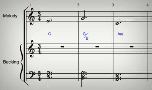
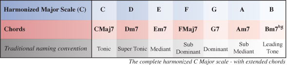
Below is the completed harmonized C Major scale using extended chords which is what we’ll be working towards in this part of the tutorial

Download audio file (Step 1-Harmonized C Major Scale 7th.mp3)

Just as we did in part 1, we first need to write out all the notes of the Major scale we are harmonizing by using the Major scale formula: T, T, S, T, T, T, S. If you aren’t already familiar with this check out part 1 of this tutorial.


Step 2

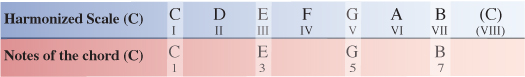
As mentioned earlier, extended chords are chords that are made of four or more notes. To work out chord I of the C Major scale we now need to find the 1st, 3rd, 5th and 7th note to form a particultar type of extended C chord.

Because we are finding the root chord (in this case, a C chord within the key of C) all of the notes appear in their natural form with no alterations, so we can formularize chord I as R(1), 3, 5, 7 which is the formula for a Major 7 chord.

Chord I of the harmonized C Major scale is CMaj7 (C Major 7).


Step 3

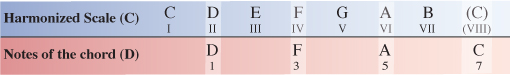
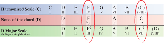
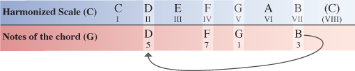
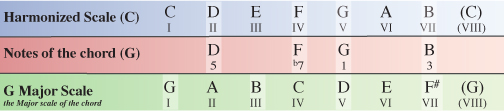
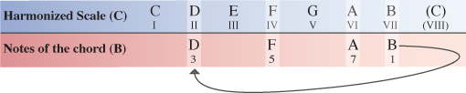
Next we need to work out chord II of our Major scale. This is similar to the process we followed to find chord I only this time we start on the 2nd note of the scale (D) and count along to find the 3rd, 5th and 7th note to complete the extended D chord.

In the table below, you can see chord II starts with D as it’s root note (1), F as the 3rd note, A as the 5th note and C as the 7th note.

Now that we have the notes for a type of extended D chord, we need to compare these notes to the Major scale the D chord originates from – D Major.

Comparing the notes of our D chord from within the harmonized C Major scale to the notes of the scale the chord originates or decends from you can see that two notes have been altered.

The 3rd note (F) and the 7th note (C) are both natural within C Major, whereas in the D Major scale they appear as F# and C#. Both notes have been flattened within the C Major scale and so we formularize our D chord as R(1), b3, 5, b7 which is the formula for a minor 7 chord.

Chord II of the harmonized C Major scale is Dm7 (D minor 7).

NOTELooking at the formula for each chord, you should already be able to see the difference between a Major7 and a minor7 chord. As we progress you’ll see some more chords and will eventually start to grasp the rules that apply to make each type of chord what it is ie Major7, minor7, Dominant7 etc


Step 4

Moving on, we now need to find out what chord III is.

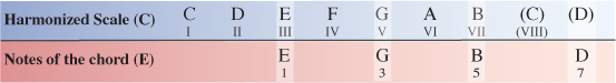
Starting on the III degree of the C Major scale our next extended chord will have the note E as it’s 1st note (root note). Counting along the scale from this point the 3rd note is G, the 5th note is B and the 7th note is D.


Step 5

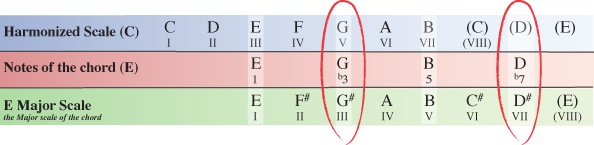
As we did in step 3 with the D chord, we now need to see how the notes of our E chord within the key of C Major compare to the same notes of the E Major scale which the chord originates from.

Our E chord from within the C Major scale has a G natural and a D natural, whereas the E Major scale which the chord originates from has a G# and D#. The 3rd and 7th notes of our E chord within C Major have been flattened, meaning we can formularize the extended E chord as 1, b3, 5, b7 which as we’ve already seen is the formula for any minor 7 chord.

Chord III of the harmonized C Major scale is Em7 (E minor 7).


Step 6

Next we’ll look at chord IV of the harmonized C Major scale.

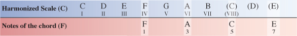
Starting on the IV degree of the C Major scale our next chord will have the note F as it’s root note. Counting along the scale from this point the 3rd note is A, the 5th note is C and the 7th note is E.


Step 7

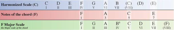
We now need to compare the notes of our extended F chord within the C Major scale to the same notes of the F Major scale which the chord originates from.

None of the notes of our F chord from within the C Major scale have been altered from how they appear in the F Major scale, so the F chord is simply formularized as 1, 3, 5, 7 which as we’ve already seen with chord I, is the formula for a Major 7 chord.

Chord IV of the harmonized C Major scale is FMaj7 (F Major 7).


Step 8

Next we’ll look at chord V of the harmonized C Major scale.

Starting on the V degree of the C Major scale our next chord will have the note G as it’s root note. Counting along the scale from this point the 3rd note is B, the 5th note is D and the 7th note is F.

As in Part one of this tutorial, to save space in the following diagrams, we simply make use of the existing notes by cycling through back to the beginning of the scale and continuing to count along from there.


Step 9

We now need to compare the notes of our extended G chord within the C Major scale to the same notes of the G Major scale which the chord originates from.

You’ll notice that only one of the notes within our G chord inside the C Major scale has been altered from how they appear in the G Major scale. We’ve already seen Major (natural) 3rds and minor (flattened) 7ths but not in the same chord. We can formularize our G (V) chord as R(1), 3, 5, b7 which is the formula for any Dominant 7 chord.

Chord V of the harmonized C Major scale is G7 (G Seven).


Step 10

Next up is chord VI of the harmonized C Major scale.

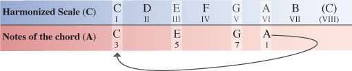
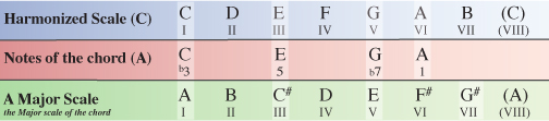
Starting on the VI degree of the C Major scale our next chord will have the note A as it’s root note. Counting along the scale from this point the 3rd note is C, the 5th note is E and the 7th note is G.


Step 11

We now need to compare the notes of our A chord within the C Major scale to the same notes of the A Major scale which the chord originates from.

Comparing the extended A chord from within the C Major scale to the notes of the A Major scale we can see that the 3rd note and 7th note have again been flattened. In this case the 3rd note of the A chord has been flattened from a C# to a C natural and the 7th note of the A chord has been flattened from a G# to a G natural. This means our chord is formulated as 1, b3, 5, b7…another minor 7 chord.

Chord VI of the harmonized C Major scale is Am7 (A minor 7)


Step 12

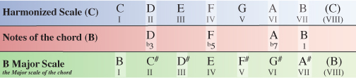
Last but not least is chord VII of the harmonized C Major scale.

Starting on the VII degree of the C Major scale our final chord will have the note B as it’s root note. Counting along the scale from this point the 3rd note is D, the 5th note is F and the 7th note is A.


Step 13

Again, we need to compare the notes of our B chord within the C Major scale to the same notes of the B Major scale which the chord originates from.

Once again, the VII degree of the harmonized Major scale is the odd ball. You can see that, with the exception of the root note, every note of the B chord within the C Major scale has been flattened from how it appears naturally in the B Major scale.

This means we formularize our B chord as R(1), b3, b5, b7. While you might think this is simply Bdiminished7, it is actually what’s known as a half-diminished chord which can also commonly be written as Bm7b5 (B minor 7, flat 5) or Bø.

The reason for calling this chord a half-diminished (or Bm7b5) is to make a clear distinction between a true diminished seventh chord which is a diminished triad plus a diminished 7th (R, b3, b5, bb7) and a diminished triad plus a minor 7th (R, b3, b5, b7).

Taking our B chord as the example, Bdim7 (B diminished 7th) would have the notes B, D, F, Ab while Bm7b5 or Bø has the notes B, D, F, A. The key difference is that a diminished 7th is a 7th note with two flat signs (double flat) which means we lower the note by 2 semi-tones as apposed to a minor 7th which is a 7th note with just one flat sign and therefore is only lowered by one semi-tone.

So finally, the extended chord VII of the harmonized C Major scale is Bm7b5 or .


Step 14

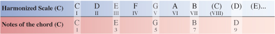
While we’ve only covered 7ths for the most part of our working example, the process to go even further to include 9, 11 or 13 chords is just the same only you are often dealing with more notes.

If for example I wanted to know what the 9 chords would be, I could continue to count along the notes of the C Major scale to find that extra note, bringing the 9 into my chord as well as the R(1), 3, 5 and 7.

To get you started, lets take a quick look at how we might do the first couple of chords

You can see here that for chord I of the C Major scale, I have all the same notes that were used in my CMaj7 chord earlier. The only difference is I have now gone one step further to include the 9 as well.

This time, the formula for chord I is R(1), 3, 5, 7, 9 which is the formula for a CMaj9 (C Major 9) chord.
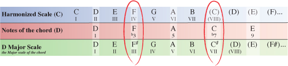

Step 15

Following the same process for chord II of the C Major scale our D chord will be formularized as R(1), b3, 5, b7, 9 which is the formula for a m9 (minor 9) chord.

So chord II of the harmonized C Major scale is Dm9 (D minor 9).

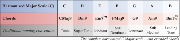
Below is the complete harmonized C Major scale using 9 chords.

Download audio file (Step 15-Harmonized C Major Scale 9th.mp3)


Conclusion

I hope this has helped you to feel much more confident with regards to what is going on within Major key signatures and how the chords from a given key are derived. Not only that but it also reveals how different types of chords are formed. For instance, a minor chord always has a b3 (minor 3rd/flattened 3rd), a 7 chord always has a b7 (minor 7th/flattened 7th) etc.

When you start looking at scales in this way you really start to understand what’s going on below the surface. You will notice some interresting relationships between different chords and will have a much deeper understanding of how to emphasize or even just imply chord tones by the notes you choose to use in your improvizing or when composing melodies.

For writing chord progressions you realize you’re no longer limited to plain Major or minor triad chords. You can exploit the much deeper, richer tonalities of extended chords from the safety of your newly discovered knowledge of the key you are using.

The key to really feeling comfortable with the ideas in this tutorial is regular exposure. Practice harmonizing different Major scales and try doing it with different types of chords ie triads, 7 chords, 9 chords, 11 chords etc.

Also, when you’re playing or writing your own music try to visualize the chord that is being played and which notes you could use either from that chord or notes you could play in addition to that chord thereby ‘implying’ the extended chord tones – 7th, 9th, 11th etc.


Quick Tip: Create a Set of Scattered Polaroids


Creating a set of scattered Polaroids in perspective might be easier than you think. Today, we will demonstrate the process in this quick tip tutorial. Let’s get started!


Resources Used

The following resources were used during the production of this tutorial.


Step 1

Create a new document, 2500 x 1850 px and paste the wood texture onto the canvas. If you decide to use another texture make sure that your canvas is the same size as your texture. Rename the texture layer "WoodBG."


Step 2

Create a new layer, using the rectangle marquee tool, draw a rectangle with the dimensions 400 x 480 px and fill it with white. Rename this layer "Polaroid.Bg."


Step 3

Double click “Polaroid.Bg” and apply the following layer styles:


Step 4

Using the Rectangle tool draw a black rectangle inside the white base as shown, rename this layer “Polaroid.Pic.”


Step 5

Now comes the fun part, put these layers into a folder and name it “P1” then duplicate the folder and move the new Polaroid around and rotate it (Cmd/Ctrl + T and hover over the corner and rotate). Try not to rescale the Polaroid as they are all the same size. Repeat this until you are happy and have a nice spread of Polaroid’s (I generally use about 6-7).


Step 6

Now that we have our Polaroid’s laid out, we need to import our image. This can be anything you want. For this example, I will be using a flower. Import the image into Photoshop and hide the layer. Here comes the tricky bit, we need to select all the black on the canvas (apart from the black in the picture which is why you hid it). Go to Select > Colour Range and click on the black part of one of your Polaroids. This will create a matte and select all the black on the canvas as seen below. Then press ok.


Step 7

Next, click on the Photo layer and press Cmd/Ctrl + Shift + I to invert your current selection and press delete followed by Cmd/Ctrl + D to deselect. Unhide the layer and now you should have something which looks like the following:


Step 8 (Optional)

To make the 3D effect select all your layers (Click on the top layer hold down shift and click on the bottom layer) then press Cmd/Ctrl + T and right click inside the canvas and press perspective, drag out the handles at the bottom like the following:


Step 9

To remove the band at the bottom simply scale up the image (Cmd/Ctrl + T), the final step is to hide all of your black box layers in the folders, simply go through each one and hide them.


Final Image

Amazing Clock-Stopping Photoshop Manipulations


Time is a concept of which we all are aware. It’s the past, present, and future. It is infinite, yet there never seems to be enough of it to go around. Time is a popular concept for artists because it is something that we can all relate to. Today we have a round up of some amazing clock-stopping photo manipulations for inspiration.


Stop Time III by Vimark


Take the Time by Prosthetics1


Tangles Of Time by Oli-86


Stop time IV – Warming by Vimark


Relentless Time Details by Manwathiell


Killing Time by Aquaguardian


Creation of Time by Vimark


Stop Time V by Vimark


Stop Time II by Vimark


Stop Time by Vimark


Dandelion Clock by Dictybloke


Parallel Dreamer II by Vimark


Parallel Dreamer by Vimark


Time Guardian by Fishbot1337


Time by Pixelnase


Ocean of Time by CyClotroniC


Time by Reije


Master Time by Emptyidentityentity


Take the Time by Danilo Gusmao Silveira


Time Gives Life by Judit Tondora


Time Gives, Time Takes by Judit Tondora


Time is Running Out by Luis Afonso


Crow Time by Tariq Yosef


Time by Ralph Kaeppely


Time by Ralph Kaeppely


Young Man Walking by Francisco Oliveira Bastos


Struggling With Time by Pawel Pechorzewsky


Matter of Time by Lone-Momo


The Time keeper by Sleax


Time is Gone by LostDZ


Evolution of Time by NenoMistique


Time Has Come by MelGama


Time by Misty2007


Time by Lighht-Style


Darkside of Time by Xantipa2-2D3DPhotoM


The Time Has Come by Hicky2


Just Killing Time by Drunkdonky


Time by Selinastina


An Adventure Through Time byPureverve


Judgement in Time by Husam-Elfaki


The Way for the Forgotten Time by Talline-Occrerou


Shift Time by Akagami707


Time: 2:55 by Velmont-Ramz


Time’s Running Out by FreakyBabe


Approach The Time by SquadGazZz

What Exactly Is The iPad?

That may sound like a rather silly question and you may answer that it is a tablet, of course. But, if you think about it, the iPad can be many things to many people, depending on why it is purposed. And given the fact that Apple needs to carve out a market for it, it is likely that many buyers are using the iPad to replace something else. And that is the core of the question: What is the iPad – and what is it to most people? If you know the answer, you may have a good idea what apps you should be developing to target iPad users.

So take a guess: Is it the Internet browsing device that was demonstrated by Steve Jobs? Or is it a gaming device?

It turns out that a market research firm, Resolve, has looked at exactly that question and has come up with some interesting numbers.

49% of people in the survey, and owners of an iPad, said that, because of the iPad, they would not buy an e-reader as a result. 38% said they would not buy another portable gaming device and 32% said they would not buy a netbook as a result. Conceivably, most people see in the iPad a great e-reader and portable gaming device. However, 60% said that the best mobile gaming device would be a “portable gaming device” and only 23% pointed to the iPad. 8% mentioned that a smartphone offers the most enjoyable mobile gaming experience. The implication seems to be clear: Despite the fact that Amazon’s Kindle is generally considered to be the better e-reader, the iPad is invading its turf and the Kindle may need to drop further in price.

Resolve also looked into the purchase decisions – and what made people buy the iPad. 56% of buyers are looking for entertainment and 42% simply think the iPad is “cool”. The iPad is generally see as an “expensive toy” and a “breakthrough technology” device. Reasons for not buying the iPad currently include its price and the fact that people simply do not know what to do with it. 37% of iPad buyers do not own any other Apple products, Resolve said. 49% own an iPod, 24% an iPhone and 16% a Macbook.

Books and games appear to be the biggest opportunities on the iPad, if Resolve is correct.

Apple’s Huge iAd Payout

So we have heard about Apple’s ginormous advertising deals for iAd, but it seems that Apple’s deals reach through to developers as well. One developer, Jason Ting, said that his LED flashlight app (LED Light for iPhone 4), which is offered as an ad-supported free version, turned in $1372.20 of advertising revenue in one day.

That revenue was based on 9000 downloads, 9300 ad impressions and a click-through rate of 11.8%. The eCPM rate came in at close to $150, which is about 100 times higher than what other mobile deals currently pay. And if you compare the deal against standard eCPM models, Apple’s pay is up to 300 times higher. Of course, Ting appears to be an extreme example, as we have heard other reports with much lower eCPM rates as well. And Ting’s revenue still includes Apple’s 40% cut.

Another developer, Kenneth Ballenegger, said that his eCPM was somewhere between $10 and $15. He also noted that iAd’s fill rate is at just 10% and the ad refresh rate is much lower than that of other ad networks and he, in fact, said that he expects iAd eCPM rates of just over $1 in the long run. In the end, the fill rate seems to be what is the biggest concern out there and it’s so low that, for many developers – those with extremely high ad views – it just does not replace Google yet. However, iAd just launched and like other networks it needs some time to ramp up. So let’s be patient.

We should be realistic about the eCPM rates. Of course, there’s a novelty to iAds and that certainly benefits developers right now. Eventually, the eCPM rate will fall, but we would expect the numbers to remain higher than on the desktop. You can run iAds and use other networks such as Google as a fallback option.