How To Be A Rockstar WordPress Designer: WordPress 3 Revision!


With the recent release of WordPress 3.0, Rockable Press has just released an updated version of How to be a Rockstar WordPress Designer by Collis Ta’eed and Harley Alexander.

The updated version is FREE for all those who have already purchased the first edition of the eBook. All they’ll need to do is use the email which provided them the link from when they first purchased the book, and follow the instructions included in the email on how to re-activate the link. Once that’s done they can then re-download their new version of the book.

If you don’t have a copy of the eBook yet don’t worry! Rockable is also offering a $10 Discount Voucher for all those who don’t have the book yet!

Rockable $10 Discount Code: WP3Launch – Expires Monday 26th July 2010

During the course of the book you’ll build THREE WordPress themes, a blog, a portfolio site and a general site with menus and submenus. Each theme demonstrates different aspects of WordPress theming and all three are packaged in with the book so you’ll have Photoshop, HTML, CSS and WordPress PHP files to refer to.

Join the Rockin’ List Today!

The Rockin’ List is our irregular mailout about new books and products, discounts and offers and Rockable news. Signing up to the mailing list will get you a free copy of the Rockstar Personal Branding minibook by Skellie

The Rockin’ Guarantee

Like all Rockable Books, this one comes with the 100% Moneyback Guarantee. If you’re not satisfied, we’re not satisfied.

Take Advantage of CSS3 to Achieve Subtle Design


I hear this CSS3 thing is all the rage. Resources are flying around the tutorial world and blogosphere providing brilliant examples of creative new ways to design using CSS3 modules. However, it’s easy to over-implement and lose the brilliant subtlety of great user interfaces. Here are three quick tips for using powerful CSS3 techniques in subtle ways.


Preface: It Doesn’t Take Much

People are able to perceive and distinguish very small changes.

The bottom line here is that people are able to perceive and distinguish very small changes that they may not consciously notice or be able to recall. I doubt that this is new information to anyone. It is one of the more well-known concepts put forth by sensation and perception studies. Sometimes, one thing may be pleasing over another. And sometimes, you don’t even know why.

However, keep in mind that web design is a conscious process. Subtle design can be difficult because it is easy to think “that just needs a little more.” Before you know it, the subtlety is lost.

With that in mind, I would like to present three CSS3 techniques that can be used to provide varying forms of subtlety for web design.


1. Transition

Transition is a powerful tool, providing a way for CSS to essentially animate from one endpoint to another. The syntax packs a fairly rich toolset: property, duration, and easing. Each of these pieces can be varied to provide different levels of subtlety. Often, it just takes playing – as effects often do. In other words, play with the values until it seems right. Just don’t drive yourself crazy. It’s easy to get lost tweaking even such a short list of variables.

Example: Color Transitions

It’s not uncommon for navigation items to change color when the mouse is hovering. Transition can make that color change a little smoother.

.nav li a{
	color:#282828;
	text-decoration:none;

	-webkit-transition:color .1s ease-in-out;
	-moz-transition:color .1s ease-in-out;
	-o-transition:color .1s ease-in-out;
	transition:color .1s ease-in-out;
}
.nav li a:hover{
	color:#808080;
}

The color change is not subtle here. It’s clearly noticeable. What is subtle is the smoothing of that color change.

The trick to keeping this subtle is the duration. If it’s too long, the effect will be far too noticeable. The navigation can quickly become burdensome to hover over and look amateurish.

View the demo.

Notes about the CSS

In case you haven’t delved into CSS3 just yet, it’s important to note the order in which the browser-specific declarations come. Actually, it’s just important to notice that the non-browser specific declaration comes last in the list. CSS takes the last declaration and makes it more important in the case of a conflict. Once an actual transition spec is released, presumably all browsers will implement the module without needing the proprietary prefix. Thus, your CSS becomes somewhat future-ready at no real cost to the current implementations.

Also, notice that the transitions are in the <a> element style, not its hover. This will provide the transition both on mouse-over and mouse-off.


2. nth-of-type (or nth-child)

The nth-of-type or nth-child selector allows patterns to be declared in a series of elements and apply styles accordingly. For example, in a table, nth-child could color every other row by using :nth-child(odd). Let’s look at an example that may not be quite as clear.

Example: Grouping

We’ll take a pretty standard navigation markup…

<ul class='nav'>
	<li><a href='#'>Home</a></li>
	<li><a href='#'>About</a></li>
	<li><a href='#'>Work</a></li>
	<li><a href='#'>Forum</a></li>
	<li><a href='#'>Blog</a></li>
</ul>

…and apply some styling.

.nav li:nth-of-type(odd){
	margin-top:5px;
}
.nav li:nth-of-type(even){
	margin-top:12px;
}
.nav li:nth-of-type(2n+2){
	margin-right:0;
}
.nav li:nth-of-type(2n+3){
	margin-left:8px;
	margin-right:25px;
}

This will create a staggered-looking menu with a few high items, a few low items, and a couple sets that look paired. The visual difference between this and an in-line menu is clear.

So what’s so subtle about it? The subtlety here is twofold.

  1. The higher items look more important. Perhaps this person wanted to showcase his or her portfolio and blog. Those, along with the Home link, have been pushed up to be slightly more prominent. People’s eyes will be drawn to those links first.
  2. Notice the grouping. About and Work have been grouped together, as have Forum and Blog. This styling groups similar pages in its navigation. Work and About are both viewable things pertaining to the person while forum and blog are more audience-driven and interactive.

So, perhaps a visitor first sees “Home”. That visitor will probably realize that he or she is already on the homepage. He or she may very well see “Work” next. *click*. After viewing some pieces of work, they may well have seen “Blog” next but perhaps the grouping ends up being stronger and their desire is pulled to “About”. The designer is now driving the visitor using a navigational layout. He or she has provided hints as to where visitors should go, sequentially.

Will this happen every time? Absolutely not. Will it happen sometimes? I would bet so.

That’s the point of subtlety. It doesn’t overwhelmingly influence the user, but it might provide some useful hints or motivations now and then.


3. Gradients

Here’s a simple way to introduce subtlety into a design. Ironically, it’s probably got the most complicated syntax out there. Not only that, but it also has significantly different syntaxes between browsers. Let’s take a look.

Example: Forms

Given a pretty simple contact form (email, message), here’s some styling:

form input[type=text],
form textarea{
	background-image:-webkit-gradient(
		linear,
		left bottom,
		left top,
		color-stop(0, rgb(255,255,255)),
		color-stop(1, rgb(248,248,248))
	);

	background-image:-moz-linear-gradient(
		center bottom,
		rgb(255,255,255) 0%,
		rgb(248,248,248) 100%
	);

	outline:none;
	border:solid 1px #ccc;
}

That’s quite a full declaration, isn’t it? And that only covers two browsers!

I’m not going to go into all of the syntax, because others have done that for me. Refer to “Understanding CSS Gradients” on Nettuts+ for a better understanding. When you’re finished, let’s talk about subtlety.

The gradient in these text areas is almost imperceiveable. However, if you play with the CSS and take out the border, I assure you it is there.

If you still can’t see it in that second image, take your head and move it to the side of your monitor, so that you are viewing the monitor at a pretty steep angle. See it now? If not, I refuse to be held accountable. I see it, so your monitor must be broken. :)

Anyhow, notice how close the rgb colors are in the css. The top of the text input and textarea are shaded ever-so-slightly. This is one example of very extreme subtlety. While filling out a form, it is unlikely anyone will ever notice this gradient. However, people may find your form just a little more appealing than others; even if they don’t know why.


Bonus: Browser Incompatibility

Well, we’ve almost made it through and entire CSS3 article without discussing browser issues. How did we manage that? For one thing, there wasn’t a lot of emphasis on code. More importantly, though, I was saving the best for last.

Subtle changes probably won’t be missed

If you take a look at the demo for this tutorial in a webkit browser, then compare that to a Firefox browser, you will notice some differences. If you step over to IE, you’ll notice even further differences. One nice thing about the use of subtlety is that if the subtle difference isn’t there, people probably won’t notice. In other words, the color change in the first example still works without the transition; it’s just a little less slick. If the only purpose of using nth-of-type was to group based on commonality, no visitor is going to care if that grouping isn’t there. The menu still works. And the gradient? Remember how hard you had to try to notice it even when being told exactly where it was?

That last demo example will definitely be noticed…

Make it an opportunity for creativity, instead of an insurmountable burden.

Probably the most rational opposition to the “different looks in different browsers” approach to web design is that many (perhaps most) clients will want the exact same website in any major browser. If there is no room for budging on this and you need to pay your electric bill, do whatever you need to in order to get that all-important rounded corner into all IE versions back to the dawn of time.

However, some clients can be educated and swayed as to some advantages of having one design in one place and another somewhere else. For example, accepting a slightly different appearance can dramatically cut down on HTTP requests and excess HTML elements, if a lot of images are being used to create borders and shadows and whatnot. Or, if you’re anything like me, you have some personal projects and enjoy a good challenge (like providing the same “experience” cross browser without always having the same layout). Or, maybe you have two different designs that you really like and can’t decide which one to implement. Here’s an opportunity to implement one in one browser and the other in another, driven out of a single stylesheet.

The overall point here is that browser incompatibility is a fact of the current web when trying to utilize CSS3. So, make it an opportunity for creativity, instead of an insurmountable burden.

But what is subtle about that last demo example?

The subtlety here isn’t exactly a design subtlety. Instead, it’s more of a designer subtlety. In my experience, most people only use one browser. Web professionals forget that sometimes, as we install three versions of five different browsers on every machine we come across.

So, if an IE-only user happens across your site and its content is clear and he or she enjoys the experience, you have succeeded in your design. If another user happens across your site in Chrome and enjoys their experience and the content is clear, you have succeeded in your design. And perhaps that visitor appreciated a few extra tid-bits. Kudos. Most importantly, though, if you ever get the opportunity to sit down and watch this happen simultaneously, you will have succeeded in having some subtle fun.

Web Dev Q&A #2 – PHP Sessions, HTML5 Doctypes, and Form Styling


We’re back with the second entry in the Nettuts+ Q&A series. Today, we discuss the difference between LESS and Sass, how to pass server-side values to your JavaScript, how to work with PHP and cookies, and the HTML5 doctype. Here we go!


1. LESS and Sass.

Hey Nettuts+. I’m confused. What’s the difference between LESS and Sass? Are they the same?

There are advantages to using both; however, the truth is: both will get the job done wonderfully. It mostly becomes a case of preference, when it comes to the syntax and such. In the past, many preferred LESS, because it had a more friendly CSS-like syntax, though, as of Sass 3, they have a new syntax, known as SCSS (Sassy CSS), which is simply a subset of CSS3′s syntax.

The Envato devs use Sass. Other popular developer prefer LESS. I’d equate it to comparing the 960 CSS framework to Blueprint. They’re both great; so make up your own mind. There are no wrong answers!

Want to learn more about LESS on Nettuts+?


2. Server-side to Client-side

I’ve been trying to figure out how to pass the value of a PHP variable to my JavaScript. How do I do this? Thanks!

The quickest and easiest solution is to echo your desired variable from within your JavaScript. For example, you could query your MySQL database with PHP, and then pass the returned value to your JavaScript by doing something along the lines of:

<?php $myvar = 'some value'; ?>
<!DOCTYPE html>

<html lang="en">
<head>
	<meta charset="utf-8">
	<title>Tut</title>
</head>
<body>

<script>
	var myvar = '<?php echo $myvar;?>';
	alert(myvar); // some value
</script>
</body>
</html>

3. Custom Stylesheets with PHP

How can I choose a color scheme stylesheet for my website dynamically?

So you want to, for instance, choose red.css, or blue.css, and that would load a different color scheme for your website. Is that what you mean? There are certainly several ways to accomplish this task, and the correct choice will depend on if you’re using a framework, a CMS, MVC, etc. Let’s keep things simple, and as bare-bones as possible. We can use PHP sessions. First, we need to add a select box, for the user to choose their desired color stylesheet.

<!DOCTYPE html>

<html lang="en">
<head>
	<meta charset="utf-8">
	<title>Tut</title>
</head>
<body>
<h2> Choose your Stylesheet </h2>
<form method="post" action="">
	<select name="colors">
		<option value="default">Default</option>
		<option value="red">Red</option>
		<option value="green">Green</option>
	</select>
	<input type="submit" name="submit" value="Go" />
</form>
</body>
</html>
Custom stylesheets with PHP

Next, with PHP, we’ll listen for if the page has posted back — or if the Submit button has been clicked. With a simple page like this, we can use the helpful $_SERVER['REQUEST_METHOD'].

The “Request Method” determines which request method was used to access the page: ‘GET’, ‘HEAD’, ‘POST’, ‘PUT’”

At the top of your page, add the following:

<?php

if ( $_SERVER['REQUEST_METHOD'] == "POST" ) {
  // page has posted back
}
else {
  // user hasn't submitted the form
}

?>
<!DOCTYPE html>

Since we can now confirm when the page has posted back, we can then create a session, and store the value of whatever the user chose from the select box.

<?php
session_start();
if ( $_SERVER['REQUEST_METHOD'] == "POST" ) {
	$_SESSION['color_scheme'] = $_POST['colors'];
}
else {
      $_SESSION['color_scheme'] = 'default';
}
?>

Here, we’re first creating a new PHP session, with session_start(). Next, we create a new key, with $_SESSION, called “color_scheme.” Feel free to name this how you wish. By default, we set this to “default” (see the “else” statement). This means that, if the user hasn’t selected a stylesheet, we’ll use the default one. However, if they did make a choice, we need to determine which option from the select element they chose, and store it in a Session key.

Returning to the mark-up, you’ll find that we applied a name of “colors” to the select element.

<select name="colors">
	<option value="default">Default</option>
	<option value="red">Red</option>
	<option value="green">Green</option>
</select>

When the page posts back, the selected value of this select element will be available to us, via $_POST['colors']. For example, if I choose the “green” option, $_POST['colors'] will then be equal to “green.”

Without sessions and cookies, there would be no way to “remember” this user-selected value. That’s why they’re essential in this case. Now that $_SESSION['color_scheme'] stores our desired value, we only need to load the appropriate stylesheet.

<head>
	<meta charset="utf-8">
	<title>Tut</title>
	<link rel="stylesheet" href="<?php echo $_SESSION['color_scheme'];?>.css" />
</head>

4. Rounded Form Elements

Hi Nettuts+! How do I create rounded form inputs with CSS for all browsers?

So you want stylized, rounded inputs in all browsers, including Internet Explorer? Okie dokie. Consider the following simple mark-up:

<form>
	<label for="name">Name: </label>
	<input type="text" name="name" />

	<input type="submit" value="Go" />
</form>
Base markup

Using some simple CSS3, we can create rounded corners for those inputs. Because some browsers got a headstart on the spec, we need to use the -moz and -webkit vendor prefixes, as well as the official version of the “border-radius” property.

<style>
	input {
		border: 1px solid #666;
		-moz-border-radius: 4px;
		-webkit-border-radius: 4px;
		border-radius: 4px;
	}

	input[type=submit] {
		-moz-border-radius: 25px;
		-webkit-border-radius: 25px;
		border-radius: 25px;
	}
</style>
  • -moz: Mozilla browsers (Firefox)
  • -webkit: Webkit browsers (Safari, Chrome)
Rounded corners

By specifying atype attribute of submit, that last snippet will only target submit buttons, and will style accordingly.

That Blasted IE

Unfortunately, as you probably guessed, Internet Explorer is a jerk. While the upcoming IE9 has support for border-radius (without a prefix), the older versions are still at a loss. At this point, you have two choices:

  1. Ignore it. The world won’t end if your readers see 90 degree angles.
  2. Image Fallback. You can target Internet Explorer specifically, and apply a rounded background image.

Modernizr

I’m assuming the asker of this question requires consistency; so we’ll go with the second option. Let’s assume that you’re going to be working heavily with CSS3 and HTML5 in your project. In that case, rather than using an IE-only stylesheet, why not have some fun, and use the helpful Modernizr library?

First, download Modernizr, and reference the modernizr.js file within your project.

<head>
	<meta charset="utf-8">
	<title>Tut</title>
	<script type="text/javascript" src="modernizr-1.5.min.js"></script>
</head>

Next, apply a class of no-js to the Html element on your page.

<html lang="en" class="no-js">

When you view your project in the browser, Modernizr will apply a long string of classes to the Html element, which specifies exactly what your browser is capable of. Note that, obviously, this list of classes will vary, depending upon the browser.

Modernizr

This is a huge help! Now we can use the “cascade” effect to only target the form elements that are children of the html element with a class of “no-borderradius,” and style accordingly.

If the browser does not support a particular feature, the word “no” will be prefixed to the rule.

/* Only targets browsers which don't support border-radius */
.no-borderradius input {
	background: url(path/to/rounded/background/image) no-repeat;
}

And then we relax and have cake.


5. Doctypes

I noticed that you always use the HTML5 doctype. Don’t you think that’s dangerous, when all browsers don’t yet support HTML5?

No, it’s not dangerous at all. For those unfamiliar with the wonderfully simple HTML5 doctype, it’s:

<!DOCTYPE html>

Seriously…that’s it. That’s all there is to it. No more multi-line spats of attributes; just a plain-ole DOCTYPE – as it should be. In older browsers, this doctype will trigger them into standards-mode. …And if you’re still worried, note that even Google uses it! Need more? John Resig was talking about this 2.5 years ago!

“What’s nice about this new DOCTYPE, especially, is that all current browsers (IE, FF, Opera, Safari) will look at it and switch the content into standards mode – even though they don’t implement HTML5. This means that you could start writing your web pages using HTML5 today and have them last for a very, very, long time.”
John Resig


Read Previous Q&A’s


Ask Nettuts+…

If you have a “not-too-complicated” web development question for us, you can:

  1. Email [email protected], and write “Web Dev Q&A” as the subject of the email.
  2. Tweet us @nettuts, and hash “#askNettuts”.
  3. Leave a comment under any “Web Dev Q&A” posting with your new question.

Thanks for reading and watching!

Interview with Timba Smits


Meet Timba Smits, an artist, designer, illustrator, publisher, curator and wannabe Olympic ping-pong player, who has the heart in him to share with us all some fantastic advice for all of you budding and upcoming world-class illustrators. Timba worked himself up from being turned away from design agencies, to becoming an extremely successful, world-known and award-winning creative, a founder of a superb magazine publication and a founder of a great brand known as Lyrics & Type. Read on to find out how he has gotten so far in life.

Continue reading “Interview with Timba Smits”

18 Reason Tutorials That Cover All the Bases

Reason is both a sequencer for creating music, and a sound source that can be rewired to other DAWs. Last week’s article explored Logic’s history and features. This week, we will learn how to use it.

Because there are several ways of using the program, there are an abundance of tutorials available on the Internet, including sites dedicated to Reason tutorials (for example, Reasontutorials.net and Reasonstation.net). Some deal with using Reason as a MIDI sequencer, others with programming Reason’s synthesizers, and still others with using the various sound source ReFills.

Here is a balance of tutorials covering the different aspects of Reason from Youtube and Audiotuts+.

1. Propellerheads Reason Song Tutorial – make a track in 20min!

“This is part one of my tutorial on how to use Reason to quickly create a full song in under 20 minutes. Featured is my Nintendo NES reason refill sound pack I have available on ChipCollection.com via paypal. In this video I give out all my tips related to song composition and even mastering the final product at the end (in part two).”

2. Propellerheads Reason Song Tutorial – Part 2

“This is part two of the Reason song tutorial where I show you how to make a track in less than 20 minutes.”

3. Reason Tutorial

“Reason Tutorial by Freakwncy from Illmuzik.com.”

4. Reason 4 Tutorial – Reverb Bass Effects

“In this Reason Tutorial we go through some cool ways to add more to a great Bass sound suitable for Dubstep, Electro, House, Tech, Bassline and other music Genres. Adding Reverb automation and Distortion wll provides some interesting results and effects!”

5. The Project Studio Episode 103 : Vocoders Tutorial Reason 4

“This a tutorial about vocoders.”

6. Making Beats in Reason 4 with JayG

7. Jack Beats- Drop The Pressure Remix (Reason Synth Tutorial)

“This video demonstrates how to create a similar synth to the lead in Project Bassline -Drop The Pressure (Jack Beats Remix) to create the wow effect from the song watch the next video.”

Instructions:

  • Initialize the patch.
  • First thing is throw some more portamento on there Id Say Around 54 or so.
  • Next change the range to 14.
  • Set oscillator Bs velocity to -4.
  • Set Osc A to Sweeping Saw.
  • Move the motion to -64, the octave to 2, the semi to 0, and the cent to -8.
  • Switch on Osc B and also set it to Sweeping Saw.
  • Set the motion to -64 and the octave to 4, the semi, to 7, and the cent to 8.
  • Set the release to 28.
  • Turn on the shaper and select clip set the amount to 127.
  • Select the button near the volume on Octave A.
  • On filter a turn the frequency all the way up.
  • Pump up the volume to about 100.

8. Create a Wobble/Wow/Fidget Effect In Reason!! (Tutorial)

  • 9. Your Guide to Getting Started with Synthesis in Reason

    Jan 29th in Reason, Sound Design by Eric Shafer

    A synthesizer is an electronic instrument that reproduces a variety of sounds by generating and combining signals of different frequencies and waveforms. Propellerhead’s Reason features various forms of synthesis, and it’s often difficult for the user to decide which synthesizer to use.

    In this tutorial, we’re going to explore the art and the science of synthesis, as well as discuss how Reason’s synthesizers can be used, and in which situations you should use them.

    Continue Reading

  • 10. Synthesizing Beats from Scratch in Reason

    Jul 21st in Reason, Sound Design by Bratu Sebastian

    In this tutorial we cover how to create synthetic drums perfect for a house/trance track. We’re going to create a drum loop with only the synths and effects included in Reason. No drums from the Reason Soundbank will be used: we will be creating these drums from scratch in Reason’s Subtractor. A couple of known artists use this technique, as you can create your own sound and reuse your signature kit in future tracks.

    Continue Reading

  • 11. Creating Thor Patches in Reason & Packaging a Refill

    Jul 14th in Reason, Sound Design by Eric Shafer

    In this tutorial, we’re going to work through a hands-on workshop and create several Thor synthesizer patches. Then we’ll take our new patches and combine them into a redistributable Reason refill using Reason Refill Packer.

    Continue Reading

  • 12. How to Set Up Creative Delays in Reason

    Jun 22nd in Mixing & Mastering, Reason by Gönenç Giray

    It’s always been fun to play around with devices in Reason. When it comes to creating a unique device, synth or effect, you have limitless possibilities. You could call it playing Lego with audio devices. In this tutorial I will continue building blocks and explain three different ways to set up DLL-1 devices within Combinator.

    Continue Reading

  • 13. Creating RUN Machines in Reason’s Combinator, Pt 1

    Apr 9th in Production, Reason by Gönenç Giray

    Some of Reason’s most-loved patches are the Combinator’s [RUN] patches. These patches are very useful as the Combinator plays along with your song, often inspiring as song starters or templates. However, it is scary to turn the rack around and see hundreds of cables go from this device to that device. It’s not that complex; once you’ve figured it out you can make great background patterns and drum machine templates for your songs.

    Continue Reading

  • 14. Creating RUN Machines in Reason’s Combinator, Pt 2

    Apr 23rd in Production, Reason by Gönenç Giray

    Reason’s Combinator is a powerful device that can be used as a machine for drums and background patterns. With some routing tricks and some unusual pattern settings a Combinator Machine can evolve throughout the song.

    In the Part 1 of this tutorial we created a drum pattern and two pads with Auto-Pan controls. In the second part we’ll incorporate more sounds, and with the use of “uneven” patterns we’ll create a Combinator patch which is not just a simple loop.

    Continue Reading

  • 15. Creating Sample & Hold Synth Effects in Reason

    Feb 20th in Production, Reason by Mo Volans

    Even if you are not familiar with the term ‘sample and hold’ it’s pretty likely you have heard one of these effects in action. If you know the classic track ‘Rez’ by Underworld then have most certainly come across the technique, as the entire track is based around a resonant synth line modulated by a sample and hold LFO.

    Continue Reading

  • 16. How to Audition Reason Combinator Blends with Your Keyboard

    Feb 16th in Arrangement, Reason by Eric Shafer

    Finding a set of sounds that work well together can be difficult. In Reason, it can be a laborious effort to create a combination of instruments, record some MIDI on each and then play them back. In this tutorial, we’ll look at a trick you can use in Reason to allow you to hear playback from multiple Combinators in real-time from your MIDI controller.

    Continue Reading

  • 17. 10 Ways to Enhance Performance In Reason

    Feb 5th in Reason, Recording by Eric Shafer

    In this article, we’re going to look at ten things you can do to help maximize the performance of Reason, fix various annoying issues, and avoid CPU strain during heaving automation and interaction with other DAWs.

    Continue Reading

  • 18. The Combinator—Reason’s Deadliest Weapon

    Jan 21st in Production, Reason by Eric Shafer

    Reason’s Combinator is a very interesting tool. It is all too tempting for new Reason users to use the Combinator as simply another instrument in which to load patches. In reality, the Combinator is far more than that, and has the ability to be the most powerful tool available to you in Reason. You may be a bit skeptical, but in this tutorial, I’m going to prove to you that the Combinator is truly Reason’s deadliest weapon.

    Continue Reading


Workshop #95: I’ve Given Up by Dave Chick

At Audiotuts+ we irregularly put up a reader track for workshopping and critique (find out how to submit a track). This is how it works: you upload your song, and every week or so we’ll publish one here and step away from the podium. The floor is yours to talk about the track and how the artist can fix problems in and improve upon the mix and the song.

This track has been submitted for your friendly, constructive criticism. They have put their track (and their heart and soul) in your hands to learn and get useful feedback.

  • Do you enjoy the song or track itself? Does it have potential?
  • Can the arrangement be improved?
  • How did you find the mix? What would you do differently?
  • What do you enjoy about the rhythm track? What can be done to improve it?
  • Is the choice of instruments relevant and effective for the style/song?
  • Are the lyrics (if any) effective? Does the style, arrangement and genre of the song suit them?
  • Can you suggest any specific techniques that might improve the track?
  • Do you have any other constructive feedback?

I’ve Given Up by Dave Chick

Artist’s website: www.gethatched.ca

Description of the track:

Originally inspired as a Ben Folds style, but took a different direction. Everything is synth/sampler except a shaker and tamborine track … and vocals. Mixed in Logic Pro 9.

Download audio file (davechickchckn8rivegivenup.mp3)

Terms of Use: Users can stream the track for the purposes of giving feedback but cannot download or redistribute it.

Have a listen to the track and offer your constructive criticism for this Workshop in the comments section.


Submit Your Tracks for Workshopping

Need constructive criticism on your own tracks? Submit them using this form.


Designing Realistic Interfaces – Part 2


Learning how to design interfaces can be an enduring journey if you have to do it alone. My name is Tim Silva, and I have been attempting to design these types of interfaces for over 5 years now, and I have lots of valuable information to share with you to speed up and ease the learning process. Here is what I have come to understand about designing detailed, realistic, and cool looking interfaces: You have to be great in many areas of Photoshop to be good at interface design. So along with the actual steps needed to create this particular interface, in this series I will also provide as many references to other tutorials, resources and concepts as possible. That way, you can have access to some of the tools that will allow you to create completely original interfaces utilizing the same methods I teach in collaboration with your own creativity. Let’s move on with Part 2 of this two part series.


Step 1

Let’s review and plan. We got this far. Next, we will start to fill out the screen area. Blue is the safest cool color to use. As an experienced interface designer, I am still completely in love with it.


Step 2

Hide the two inner screen areas. In Part 1, I labeled them “Inner” and “Inner_Screen.”

Repeating the method taught in Step 37 of Part 1, create a 2-3 pixel white reflection at the bottom of the base Layer. I used multiple layers to end up with a result that I was happy with. Use the Eraser Tool (E) with a Brush Size of 75px and a Hardness of 0% to clean up any pixelation you might run into.

From here, continue ahead to create 1-3 pixel black indents on the tops and sides of the shape. The left side should be thicker and more complex while the right side will be thinner and more simplistic due to the light source. None of the following effects were created using Layer Styles. Everything is from 1-3 pixel slivers that I moved, adjusted, and cleaned up manually. I used about 20 Layers worth of tiny details here. As I explained in Step 49 of Part 1, these types of details “aren’t hard to [create], they just take time.” Take your time with the details and match these results as closely as you can.


Step 3

Next we will add some dark shadows and gradients. Add a Drop Shadow outside and to the left of the shape’s base. Additionally, put some dark gradients at the bottom coming upwards.


Step 4

Like always, the brighter effects come after the darker effects. Utilizing the same methods as Step 3 (from Part 2), add some white gradients to the design. Repeat the 2nd, 3rd and 4th sentences of Step 46 from Part 1 to create highlights on the left side and the top of the shape.


Step 5

Now we can move onto the outer-most Inner screen. Unhide both of the inner base layers, and fill the inner most one with a temporarily flat blue color of #38a6de.


Step 6

Repeat Steps 2 through 4 again to create similar effects on the outer-most inner base Layer. Note the white gradient at the very bottom (outside of the shape), the dark gradients at the top and bottom of the base, and the brushing in the corners. The effects on this base shape will take the longest. I used almost 25 layers to create the details here. It requires lots of trial and error to get the corners to look smooth.

While the same effect can be achieved with the Blending Options alone, I prefer to use no Styles at all so that I have complete control over the pixels. There is never any step-by-step process I follow for these types of details. I just continue to add until I am satisfied with what I see. Go into pixel-pusher mode!


Step 7

Next add an Inner Glow Layer Style to the blue base. Create a duplicate of the blue screen’s Layer. Right-click on the Duplicated Layer and choose Clear Layer Style to get rid of the Inner Glow Blending Option. Go to Filter > Blur > Gaussian Blur. Type in 10 and press OK. This will create a blue glow effect outside of the screen. Make sure to move this blurred layer underneath the original, just to help keep everything clean later for on. Repeat this step several times with different Blur sizes and Blending Modes. Aim for a nice, strong, ambient glow.

Use the Eraser Tool (E) to go back and remove any parts that are too strong. Make sure you remove most of the blue glow from the right side, since the light source’s shine would weaken the blue glowing effect in that area.


Step 8

Next we will add an Inner Glow Layer Style to the blue base. Create a duplicate of the blue screen’s Layer. Right-click on the Duplicated Layer and choose “Clear Layer Style” to get rid of the Inner Glow Blending Option. Go to Filter > Blur > Gaussian Blur. Type in 10 and press OK. This will create a blue glow effect outside of the screen. Make sure to move this blurred layer underneath the original, just to help keep everything clean later for on.


Step 9

The safest way to add depth in a screen is to add a subtle dark gradient from the bottom up. Using the Gradient Tool (G), match my result as closely as possible. Note that I used a Linear Gradient that was perfectly vertical (because I held the shift key), not a Radial Gradient like before. Experiment with the Soft Light and Overlay Blending Modes. I also went back and made the Inner Glow for the main blue layer 200x stronger. Often times I go back and adjust Layer Style settings. In fact, most of the cleaning/revising process is made up of really small adjustments to the settings.


Step 10

The screen should still look flat. In the past, I would leave it here and try to make up for it with other details. Luckily, the interface community has enough members who care. I came across a new approach that has proven to be both effective and fruitful. Lance Thackeray, who I mentioned in Part 1, made several orbs and screens with this basic look. First, Fill a Circle on a New Layer in the middle of the screen that is about this size. You can fill it with any color, because you will be setting the Layer’s Fill to 0% anyways.


Step 11

Set the Layer’s Fill to 0%. Open of the Layer Styles and add an Inner Glow with the following settings.


Step 12

Duplicate the Layer and Transform the Layer horizontally (Command + T) to about 85% of the original width. Next, open up the Inner Glow options and fill in the following data.


Step 13

Next we need to create an inner ring. This adds to the illusion of depth because it adds a deep end of the screen that is slightly darker. First, we must create a strong, exaggerated ring. You can use the Brush Tool or the Elliptical Marquee Tool for this. First, create a basic shape, and then use the Blur Filter again to blur out the edges. Once you have a ring matching mine, lower the Opacity to about 10%. You want it to hardly even be there. That is when it is most effective. I also made the screen a little bit darker to bring out the richness of the colors and gradients.


Step 14

Now comes one of my favorite parts – the highlights. Using the method I taught for the side highlights on Step 46, create a strong highlight at the top of the blue screen. Also, add a 3-4 pixel reflection at the top by repeating the infamous Step 37 again. Make the top-most edge even stronger. Little gradients within these 4 vertical pixels can be very effective. I used 8 Layers to get my results.


Step 15

I like to add some tacky brushes to my interfaces. It really bring the look up to date. Zane Bien, aka z-design has compiled a massive collection of advanced tech brushes. Z-Design Tech Brush Sets: 1 | 2 | 3 | 4. Have a look through those and pick something that you like. I chose one from the second set and placed my personal logo inside the blank area in the middle for a stunning result.


Step 16

It would be fair to stop here since it is essentially completed. Now, I would like to take this the extra mile and enhance the core interface we have created up until now. Everything you have worked on should all be well organized within a Folder called “Interface.” I want you to Duplicate this Folder, and flatten (Command + E) the Duplicate.

NOTE: You should never, under any circumstances, ever delete or flatten your original folder.

To this day, I see people posting complaints like, “Oops, I lost that part of the design,” or “That part was flattened, I wish I could go back and change it.” Save yourself from this nightmare and save the original folder. Go one step further and create a duplicate source file before moving on to the next part. I duplicate my source files after every 2 hours or so of work. I add “_01″, “_02″, etc to my filenames so that I lessen my chances of loosing the most recent updates. I lost important source files on two of my largest projects ever. One because of a black out that corrupted my open source files, and another from a complete hard drive failure. Don’t risk it. Back your files up now. I mean it.

Rename your newly duplicated and flattened layer to “flat.” Place it into a New Folder called “Interface_80%.” Press Command + T to Transform it to 80% both vertically and horizontally. Press Enter when done.


Step 17

Duplicate this shrunken down layer, and go to Filter > Sharpen > Sharpen. This will make the interface much more crisp.


Step 18

Grab the Eraser Tool (E) and clean up any parts of the interface that are too crisp and that even appear pixelated. Use custom Eraser settings to clean up the parts you want to clean up. Take your time on this step, it could easily take up to 15 minutes of zooming in and erasing at a close up view.


Step 19

Flatten your sharpened and unsharpened layers into one. Add a Drop Shadow and an Inner Glow with the following settings.


Step 20

Use the Dodge and Burn Tools (O) to add brightness and darkness to parts of your interface that you feel need some touching up. Again, like with Step 18 [Part 2], take your time on this. I took about 15 minutes to work on this.


Step 21

Now lets give the screen some more attention. Load the inner screen’s base and in the menu, go to Select > Transform Selection. Type in 80% for both the height and the width, and save this new selection as “Inner_Screen_base_80%” so that you can grab it again later if needed. Create a New Layer and fill the “Inner_Screen_base_80%” selection with black. Set the Layer’s Fill to 0%, and add a 15 pixel black Inner Glow. Duplicate this layer, and change the new layer’s Inner Glow to Overlay. Experiment with different settings to achieve a clean result. Recreate the highlight if you have to by loading the selection and creating it manually. That highlight’s corners should stay crisp and visible.


Step 22

Using these lines that I have provided for your, fill in a grid over the screen that makes it look more technical and computerized. This is seen on calculators and other handheld devices, so I thought it would be a nice little touch. I used the Eraser Tool (E) to clean out the center of the grid where the logo was, and I also lower the Opacity of the Layer to about 10%. Use multiple Layers with multiple Blending Modes if necessary.


Step 23

Our interface is starting to develop character. We need more details. Add some micro bolts and nuts to the various surface shells. You can download a basic, transparent bolt here. Open the file in Photoshop, copy the contents of it, and paste it into your other document. Set the bolt layers to Overlay and/or Soft Light and alter the layer Opacities depending on what type of background they are sitting on. Starting with just the left side, duplicate and place bolts throughout the interface. Once you are happy with the left side, duplicate and flip them all for the right side. Also, throw a nice title or name on there with an appropriate font.


Step 24

Flatten everything up until this point in a duplicated Folder. Hide the original folder, and continue to work with this new one. Command-click on the flattened Layer’s icon to show its selection. At the bottom of the Layers Panel you will find a button labeled as “Create new fill or adjustment layer.” Click and hold this until a new list of options comes up. Move your mouse to “Vibrance” and release your click. A new dialog box will appear. Set the Vibrance to about 15 and the Saturation to 10 before closing the box. Your blue should appear even richer now.


Step 25

Once again, go through your interface with the Dodge and Burn Tools (O) on customized settings until you are happy with the contrast of your finished interface design.

I hope you found this tutorial to be useful. It was not an easy set of concepts to teach, and I hope that it gives you enough to at least be inspired to learn more about high tech, realistic interface design. There really aren’t too many of us out there, even though our genre is definitely expanding exponentially.

Additionally, I would like to clarify my opinion about the difference between art and design. Art is communication in any form, and it is without boundaries. Design has restrictions, and it is about how users interact and experience something.

An interface player with buttons that works as an actual skin is a design. However, if an interface doesn’t have buttons or interactive agents, and it only exists as a static image with no interactivity, it is a psuedo-design. When that line becomes blurred, it is really more likely to be art.

I am happy with the term “fantasy interface designs” because it is ambiguous enough to cover everything with one name. I have been trying to understand the differences between design and art for several years, and my current philosophy is very strong in my mind. If you have any thoughts, critiques or opinions about my tutorials, techniques, and ideas feel free the share them below with a comment.


Interview With Digital Painter Anthony Scime


Anthony Scime is an exceptional digital painter who creates very unique paintings. Anthony decided to start painting because he believed it was a medium to create anything a designer could think of. In our interview Anthony talks about his creation process, and also about one of his amazing paintings.


Q Welcome to Psdtuts+, please introduce yourself. Could you tell us where you’re from and how you got started in the field?

I’m Anthony Scime. I was born in Buffalo N.Y. but lived in south Florida for most of my life. I have always had in interest in the arts. Whether it be illustration and design, sculpting or photography. For as long as I can remember I have had the urge to constantly create. So getting started in the field was simple. In a sense I have always been in this field. But really I started to get involved professionally after graduating The Art Institute of Fort Lauderdale in 2008.

QWhat made you first start doing digital paintings? If you can recall what did your first digital painting look like, and what is the most important thing you have learned since then?

I first started doing digital paintings after really understanding the impact it has in the art world. It’s the Medium of a new generation of great artists. It gave me the ability to create pieces that were never possible for me in my original medium which was colored pencil. But my first digital painting was a simple apple. And it made me realize just how much more advanced I can become in my skills with this medium. I learned how important it was to study everything around me for inspiration, light, shadow, shape and texture.

QGive us a visual of your work area. What are your tools of the trade?

Well, I have a drafting table that was found on the edge of the road. I fixed it up and use it for sketching and layouts. And Tech wise, I have a desktop PC, A 19 inch screen which is really in need for a size upgrade and a Wacom Intuos 4 tablet.

QPlease walk us through the typical process of making one of your amazing digital paintings. Do you start out by sketching them? Or do you start directly in Photoshop?

Most of the time I start with a sketch then scan it and begin from there in Photoshop. I always pull some reference photos for lighting, architecture, things like that. I normally have a good view of what I want the piece to turn out like, but as always, things are changed and tweaked along the way. I also have a set of few brushes that I use for most of everything, and a second set for textures.

Q“Sadhu 2063″ is a brilliant digital painting with some unique realistic visuals. Please talk a little about the process of creating it and how you came up with this concept.

I started with the idea of combining a kind of world feel image, something maybe seen in a times or national geographic magazine, with elements of sci-fi. It’s a concept of showing what the Sadhu, the holy men of India, may look like in the future. Things like his eye piece and glowing shirt are so common in the future that they span across every region of our planet. So having them is as natural as a pair of glasses. I started of with a good deal of research, building up a small reference library. Sketched it out, scanned it in and started painting in Photoshop.

QWhat aspect of your digital paintings do you really focus on the most? Is it realism, colors, or something else? And why do you focus on this aspect more than anything?

To be honest I just focus on the painting, It‘s hard for me to say that I focus on one thing the most I guess. The realism, colors, composition, lighting, textures, nothing is singled out unless it’s called for. I think it’s important to see the piece as a whole and not in separate parts.

QEven the best designers practice frequently and learn new things, so where exactly do you go to read tutorials or articles that help you find inspiration for your paintings?

Not trying to sound like a suck-up but when I was first starting and really trying to learn some techniques in Photoshop I went to Psdtuts, and still do to see what’s going on and new in the design world. Another site that I stay pretty active in is CGSociety. Some great books of contemporary Digital illustrations are the series developed by Ballistic Publishing. And for inspiration, well It’s all over the place, on the Web and not.

Q Thanks again for providing Psdtuts+ with this opportunity to interview you. Any final thoughts for our readers?

I really should be the one thanking Psdtuts for this opportunity! It really means a lot. And for final thoughts, It’s a must to break away from the rest of the competition. It’s always important to research and discover what’s out there. Create what represents yourself and realize that what you learn in the beginning is only a guide, grow from it.


Where to find Anthony on the Web

29 Facebook Pages That You Should Already “Like”

    For a lot of us, Facebook, like Twitter, is a part of our every day lives. We should be keeping tabs on our favorite sites, organizations and tutorial creators right? Check out this roundup of a ton of fan pages that you should “like” if you aren’t already!


      AEtuts+

      CGtuts+

      Adobe After Effects

      Adobe TV

      VideoHive

      Video Copilot

      Greyscale Gorilla

      Motionworks

      Toolfarm

      Digital Juice

      Digital Anarchy

      MographTV

      VFX Haiku

      Pariah Studios

      Digital Hitchhiker

      Keyframe TV

      Digieffects

      Red Giant Software

      Amateur Media

      MaxAfter.com

      Creative Cow

      Trapcode

      Luxx

      Motionographer

      Maltaannon.com

      AEscripts

      ProLost

      VisualFXtuts.com

      Motion Graphics Exchange

      If you enjoyed this post, please give it a vote on Digg or a stumble to say thanks!


Premium Vector Pack – Colorful Butterflies


We have a new set of vector illustrations available exclusively for Vector Premium members. Crafted by the group over at Designious, there are numerous colorful butterfly vector illustrations in this set. You can use them in your next project that needs a touch of whimsy or spring. Learn more at the jump!

Continue reading “Premium Vector Pack – Colorful Butterflies”

117 Audio Apps for Apple Lovers – Appstorm Roundup

If you sit on the Apple side of the great debate, you’re probably already familiar with our sister sites Mac.Appstorm and iPhone.Appstorm. These sites bring you helpful reviews and summaries of fresh software to check out every day. And from time to time they cover some great apps for musicians, music producers and audiophiles.

Here are 117 of the best audio apps for Mac, iPhone and iPad from our Appstorm sites and previous Audiotuts articles. Whatever your needs and interests, you’ll find something here that fits the bill. Which apps do you use?

  • The Ultimate Mac Setup for Musicians

    The Ultimate Mac Setup for Musicians

    There’s no disputing the fact that OS X is a brilliant platform for musicians and music lovers. Apple has invested a huge amount into the music industry and, whether or not they’ve left a good impression, it has lead to an abundance of useful software on the Mac.

    Today we’ll be looking at a huge selection of software for musicians and music lovers alike. Whether you produce, record and mix music – or whether you just love listening to it – we’ll have something for you. Read on to learn about a few new applications that can fill your life with music!

    Apps reviewed: GarageBand, Ableton Live, Logic Studio, Pro Tools, Digital Performer, Cubase 5, Ardour, Tracktion, Finale, MuseScore, Sibelius, Tablatures, Audacity, Wave Editor, Reason, Native Instruments, Ivory, GrooveMaker, ReCycle, IK Multimedia, Battery, DrumThing, iDrum, Musing, Archibald, Katsura Tuners, Guitar Shed, Perfect Pitch, Cleartune, Guitar Toolkit, iTunes, Songbird, Spotify, Last.FM, VLC, Grooveshark, AudioFinder.

    Visit Article

  • The Big Collection of DJ Software for Mac

    The Big Collection of DJ Software for Mac

    If sitting in front of two turntables and a microphone is your idea of the perfect way to spend a Friday night, this roundup is for you.

    We’ve gathered 20 applications that allow both professional and wannabe disc jockeys to scratch, mix and loop their way into musical bliss. Whether you’re looking for fully loaded and professional or free and fun, there’s an below app that will suit your needs.

    Apps reviewed: djay, DJ-1800, AccuBeatMix, presetDj, DJ Mixer Professional, Virtual DJ, Traktor Pro, Mixxx, UltraMixer Professional, Torq, Beatler, Aria, MegaSeg, Scratch Live, MixMeister, Rapid Evolution, FutureDecks Pro, Alphabet Soup, Disco XT, Radiologik DJ.

    Visit Article

  • 7 Feature-Packed Audio Recording Apps for OS X

    7 Feature-Packed Audio Recording Apps for OS X

    Today we’re going to be taking a look at several audio recording applications for OS X. Although GarageBand has become the bundled application for sound recording, we’ll also be investigating a number of smaller and more specialised pieces of software.

    If you ever need to record audio – be it for a podcast, interview, radio broadcast, or for any other reason – some of these apps may be particularly interesting!

    Apps reviewed: WireTap Studio, Audio Hijack Pro, GarageBand, Twisted Wave, Audacity, Radioshift, Snowtape.

    Visit Article

  • 8 Powerful Mac Audio Tools

    8 Powerful Mac Audio Tools

    For many people, the audio functionality of their Mac is something that just works – there’s no need to mess with it, and no real requirement for anything more advanced. If you’re willing to spend a few minutes looking at what’s on offer, however, you may well stumble upon a few apps which can really enhance your experience of music and radio.

    This roundup will take a look at a variety of different tools allowing you to better record audio, try an alternative to iTunes, listen to satellite radio, have your Mac speak to you, or stream music around your house.

    Apps reviewed: LineIn, Audio Hijack Pro, Airfoil, Make Your Mac Speak, EasyWMA, Audacity, Pulsar, Songbird.

    Visit Article

  • 20 Amazing iPhone Apps for Music Enthusiasts

    20 Amazing iPhone Apps for Music Enthusiasts

    Music is an art which exists in different forms around the globe. It varies depending upon culture and society, but always has a distinct style and feeling. Today, it has become a huge industry and evolved with the development of technology.

    If you intend to learn any kind of music instrument, you don’t necessarily need to pay a tutor or buy that instrument at the outset; technology in the form of iPhone applications is there to instruct, guide, and assist you. Today we’ll be looking at a selection of different software for music enthusiasts – whatever instrument you specialise in!

    Apps reviewed: My Guitar, Touch Cords, ChordMaster LE, PocketGuitar, GuitarToolkit, Drum Kit Lite, easyBeats LE, 3D Drum Kit, theDrumDictionary, GrooveMaker, DJ Mixer Lite, I Am T-Pain, Finger Piano Lite, Amazing Piano Free, Cleartune – Chromatic Tuner, TuneORama, NLog Free Synth, miniSynth, Ocarina.

    Visit Article

  • 25 Tempting Music Apps for the iPad

    25 Tempting Music Apps for the iPad

    What would it take to tempt you to grab an iPad? These 25 apps might just whet your appetite. And if you can’t afford to buy an iPad, read on for how you can win one in AudioJungle’s new competition.

    When iPads were first announced, we asked whether they would revolutionize music production. We – and many of you – couldn’t see it becoming the hub of our musical world, but thought that it might be a good peripheral device or controller.

    Well, they’ve been out for a while now, and it’s time to round up a list of useful audio apps. How have they influenced your music making?

    Apps reviewed: Pianist Pro, Synth, Pro Keys, Magic Piano, Guitar Lab, iElectribe, Looptastic HD, Piano Accordio Pro, iBone, Easybeats LGR, SunVox, bleep!BOX, Bowls HD, StudioMini XL, TouchOSC, Drum Meister Grand, forScore, ProRemote, ELECTRIFY, AC-7 Pro Control Surface, StudioTrack, TabToolkit, Nota HD, iSequence, iRig.

    Visit Article

Well, that’s a massive list of 117 varied and useful apps for you (with some duplication). Did you discover an app here that you’ve been searching for? Which apps have you made part of your production workflow? Did we miss your favorite? Tell us about it in the comments!


Designing Realistic Interfaces – Part 1


Learning how to design interfaces can be an enduring journey if you have to do it alone. My name is Tim Silva, and I have been attempting to design these types of interfaces for over 5 years now, and I have lots of valuable information to share with you to speed up and ease the learning process. Here is what I have come to understand about designing detailed, realistic, and cool looking interfaces: You have to be great in many areas of Photoshop to be good at interface design. So along with the actual steps needed to create this particular interface, in this series I will also provide as many references to other tutorials, resources and concepts as possible. That way, you can have access to some of the tools that will allow you to create completely original interfaces utilizing the same methods I teach in collaboration with your own creativity. Let’s get started with Part 1 of this two part series.


Introduction

Earlier this year, we published an inspirational article featuring a large collection of fantasy interfaces created by myself and many of my peers at Encide, GUI.Station, Area01 and other related communities. While there was a mixed reception for the project, I received many emails asking about the community and interfaces in general. As a response to those requests, I am sharing this tutorial with anyone who is interested in getting started with interfaces or is wanting to improve their existing skills.

This tutorial will teach you a methodology and a way of thinking about pixels that will allow you to create anything in high quality. This tutorial will function a lot like an Algebra course. It builds on concepts and continues to use what you learned earlier on in the later steps. This also means that if you skip steps, you will probably miss important information.

Personally, I am not just an interface designer, I am skilled in web design, basic web development, video production, interactive design and other digital genres. Digital media is my passion, and I view the mastery of highly detailed interface design as the holy grail of education for new media. I see everything in pixels, and it relates to what I perceive in the real world as well. If you can master it well, everything else is much easier.

Much of what I will be covering in Part 1 will be Layer Style settings and usage of the Selection, Pen and Gradient Tools. The truth is, these tools can be a trap at first because of the “default” looking results they can produce. But after playing with all of the options, you can really move away from cheap computer graphics into creating objects that people initially believe to be a Photograph.

Part 2 of this tutorial will cover a combination of methods used to produce a futuristic looking screen as well as refining and polishing tips that will bring any interface from good to great.


Step 1

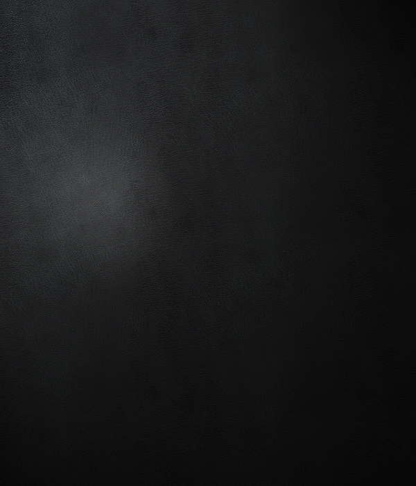
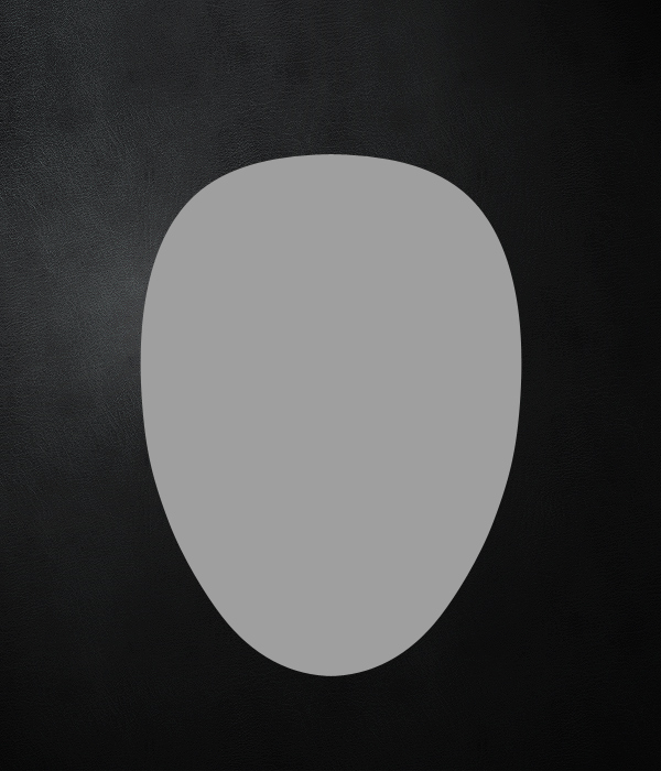
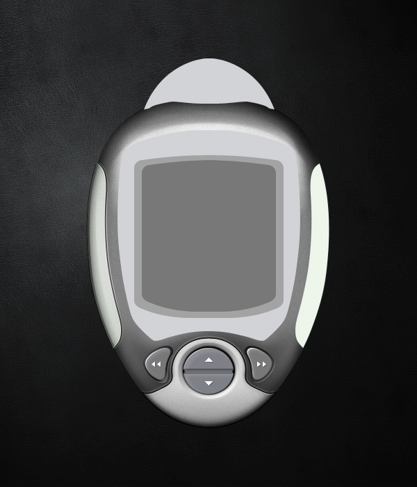
First, open a New Document with a Canvas Size of 900×700. Fill it with a dark, custom background, or the black leather image provided here. If you do choose to use a custom background, make sure that you select one with a similar light source so that it makes sense with the reflections on the interface later on. For this environment, we will have a light source coming from the top-left (130 Degrees).

Darker backgrounds and environments tend to be used more frequently with advanced fantasy interfaces. I do not know exactly why this is, but I have always speculated that people choose this because darker backgrounds actually serve a multitude of useful functions. It can hide pixelated edges more effectively, it draws more focus to the actual interface, and it makes exaggerated lighting effects pop out more due to the differences in contrast against the dark background. Not all interfaces have to exist in dark environments, but I just want you to understand that this approach does have advantages, especially for beginners.


Step 2

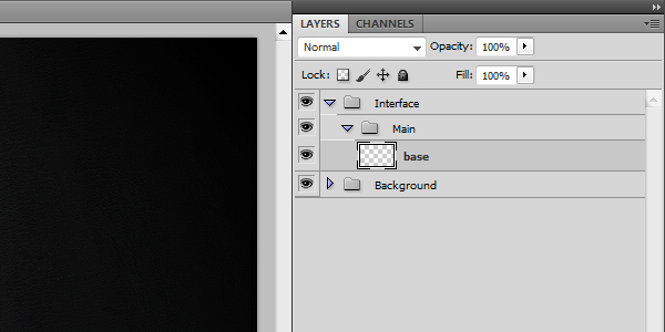
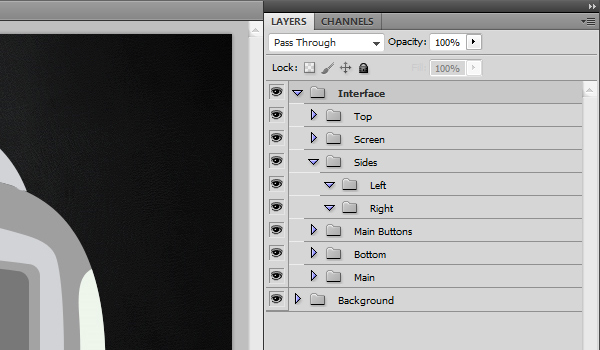
Organize your layers, you will regret it later if you don’t. Create a Folder called “Background,” and place everything related to the background inside of it. Collapse the folder so that it appears closed and it doesn’t take up any extra vertical space in your Layers Panel.

Create another New Folder at the top of the panel and call this “Interface.” Inside of this folder, create another New Folder called “Main” with a New Layer called “base” inside of it. For the rest of the project, get into the habit of naming similar items the same exact way. The extra time you spend now will save you lots of time later.

Each basic shape of this interface should have a “base” layer that contains the unaltered shape itself. Each button, plate, screen and shape should have its own properly named folder with a layer inside of it called "base." You may also shorthand these layers with something simple like “b” instead. This won’t make your file sizes much smaller, but your Layers panel will need less horizontal room.


Step 3

The next step is to actually create a main shape for our interface. At this stage, we will use nothing but the Pen Tool to create one half of the interface that we can then duplicate and flip in order to have a perfectly symmetrical shape to work with.

Before starting with this step, I highly advise that you educate yourself with The Comprehensive Guide To The Pen Tool. Once you are familiar with how to use the Pen Tool to create whatever shapes you’d like, then you can move on to the next step. Since this is an intermediate level tutorial, I will not explain how I made each of the following curves. If you know how to use the Pen Tool, this shape will be very easy to create.

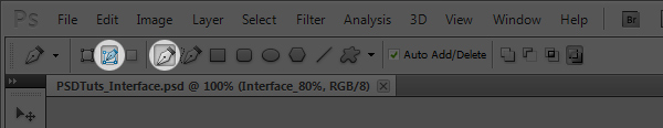
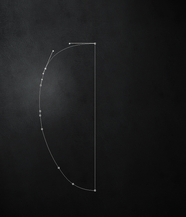
Select the “base” Layer, before using your Pen Tool. Always make sure the Layer you want to work on is highlighted/selected, understanding how Layers work is also important. Make sure “Paths” and “Pen Tool” are selected in the Options. Using the Pen Tool, create an oval-like shape with smooth edges and a perfectly horizontal top and bottom as shown below. Please note that we are only creating one half of the shape for now.


Step 4

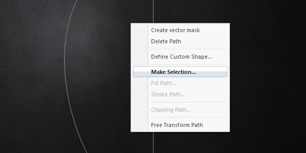
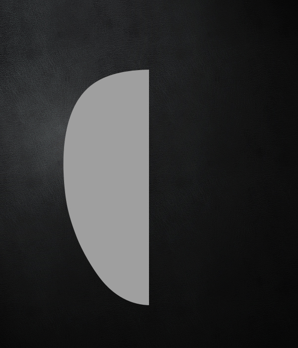
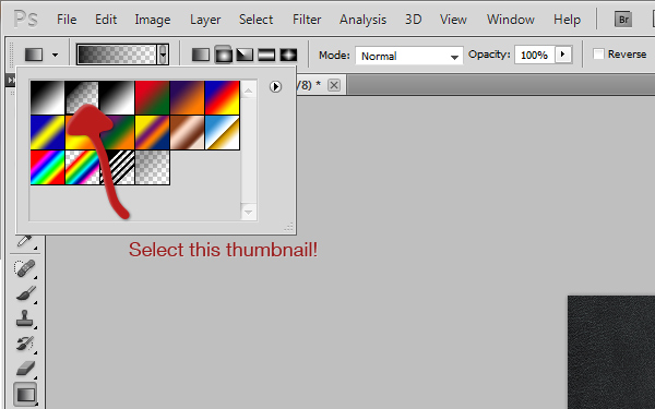
With the Pen Tool selected, right-click on your canvas and click Make Selection. With the Feather Radius set to 0 and the Anti-Alias box checked, press OK. Select a Foreground Color of #9f9f9f, and press Alt + Backspace to fill the selection. Press Command + D to Deselect the shape. Become familiar with this Shortcut if you aren’t already. We will be dealing with selections a lot in this tutorial and you should be proficient with them.


Step 5

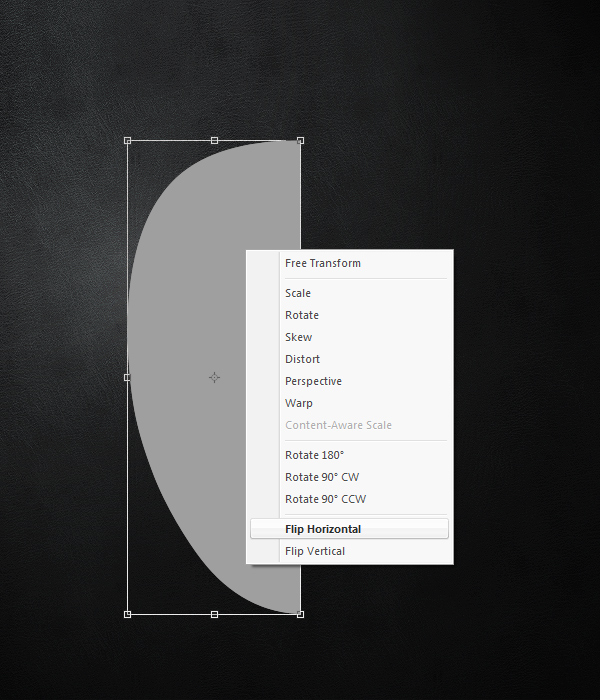
Duplicate the “base” layer. While the duplicated layer is selected, press Command + T to Transform the contents of the layer. Right-click on your canvas, and choose Flip Horizontally.


Step 6

Now you have to shift the horizontally flipped, duplicated layer over to the right so that the edges align. Select the Move Tool (V) and while holding down Shift, press the Right Arrow Key over and over again to shift the layer in segments of 10 pixels. Once you get close to making to edges match, released the Shift key, and continue to press the Right and Left Arrow Keys to move the layer 1 pixel at a time until the half edges match up perfectly.

You should see something like what I have below. If the flat part is too wide, trim the pixels off with the Selection Tool (M) and the Delete key. Try to avoid this by using the Pen Tool correctly in the first place though. Once the two halves are where you want them, you can flatten the layers into one. To do this, Command-click the two layers names once each and press Command + E. Now you should have the base shape all on one layer named “base.”


Step 7

Repeat steps 3 – 6 to create some more shapes on top of the main interface’s base. My shapes are inspired by a handheld device that I found in an old storage box. My brother said it was some toy device he won from school that was broken. I’m not sure what it is, or where it came from exactly, so it was a perfectly mysterious specimen to work with. I suggest looking towards hand held video games, controllers, phones, stop watches, mp3 players, stereos, clocks, and all other technological devices as sources of inspiration for shapes and general ideas.

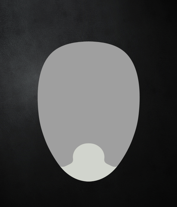
I will start off with a bottom plate that will contain a button later on it. Using the methods from Steps 3 – 6, create this new “base” layer and fill it with a lighter grey color (#d4d4d4). Now place it into a New Folder called “Bottom” to keep everything organized.


Step 8

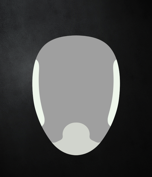
Now we are going to create the side plates. We want these to act as grips for the user’s hands. Repeat steps 3 – 6 again, only this time, you don’t want to flatten the layers like in the second part of step 6. Instead, place each half section into it’s own sub folder all within a folder called “Sides.” You may organize this however you’d like to, I am just explaining how I do it for efficiency.

An extra tip on the side shapes is to delete anything that goes outside of the main base. To do this, Command-click the layer icon on the “base” layer within the “Main” folder, and press Command + Shift + I to inverse the selection. With one of the side layers selected, press Delete on your keyboard. This will make it so that the edges of your side shapes will cut off where the main base does. You only have to do this once, since you can repeat step 5 again from here to have clean, matching side shapes.


Step 9

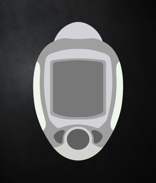
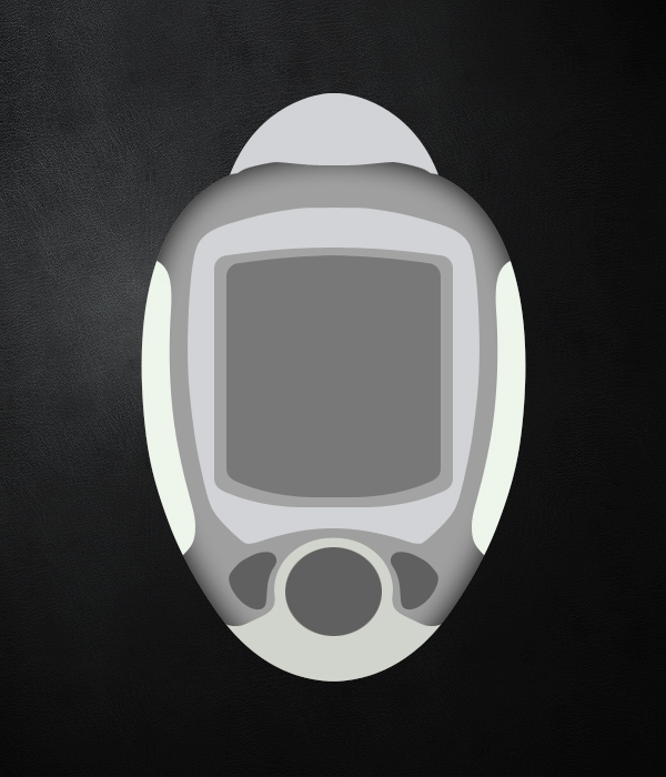
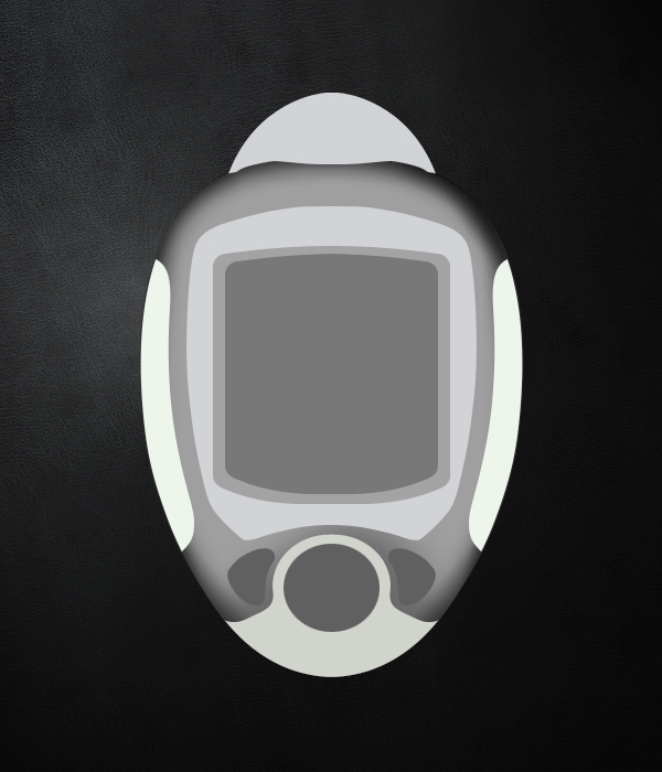
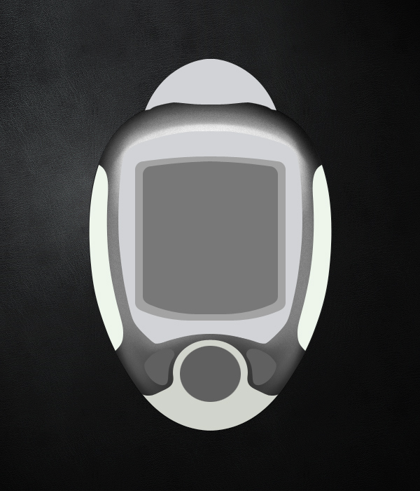
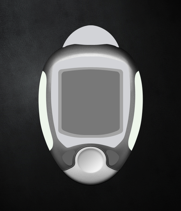
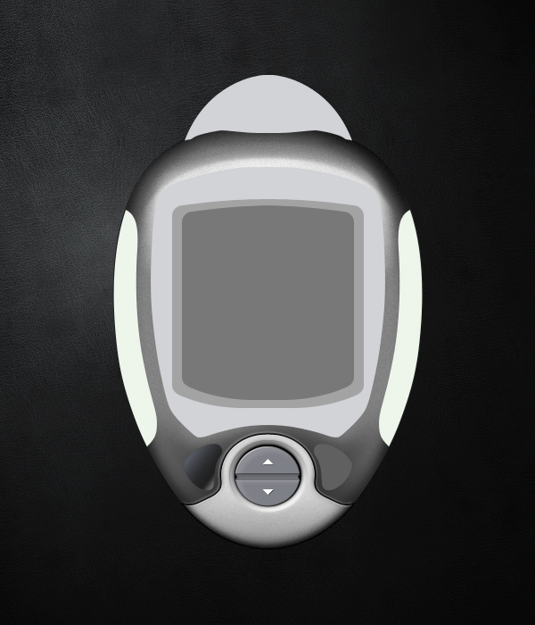
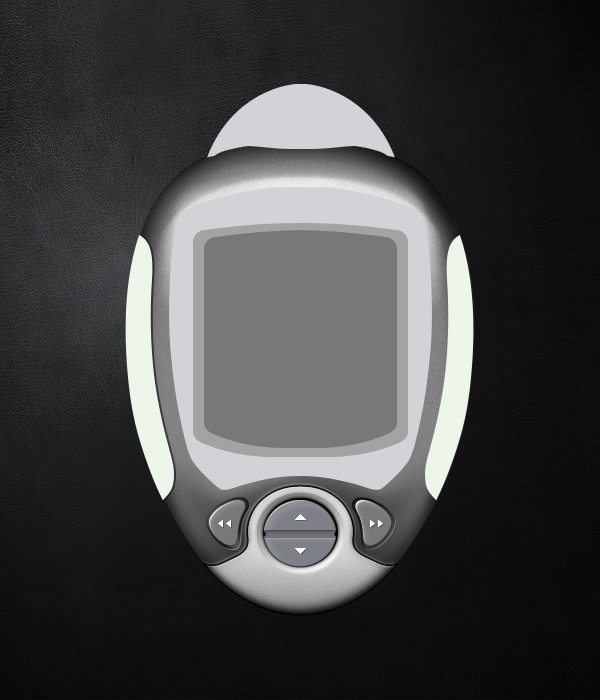
Using what we have learned up until this point, create a top piece, some button outlines, and 3 layers of screens which we can create the illusion of depth with later on. Here is what I came up with.

While these shapes look very simple, flat and boring right now, everything else that comes from this point on is what will really bring it to life. With that said, starting with good shapes is an essential step towards creating something amazing. My good friend Lance Thackeray from GUI Station released a package of 5 interface templates for people to experiment with. After completing this tutorial, feel free to read the usage terms and experiment with the beautiful shapes Lance has in that package. Once you are comfortable with the methods taught here, try to create your own shapes.


Step 10

Now that we have the shapes created, let’s make sure our layers are nicely organized. Here is what I have now with all of the shapes in place. Now you don’t have to follow this structure exactly, but make sure you are clean, careful, and organized. This will pay off later. From this point on, I won’t emphasize much with the layers since it will take up too much time. Make sure you pay attention to it on your own.


Step 11

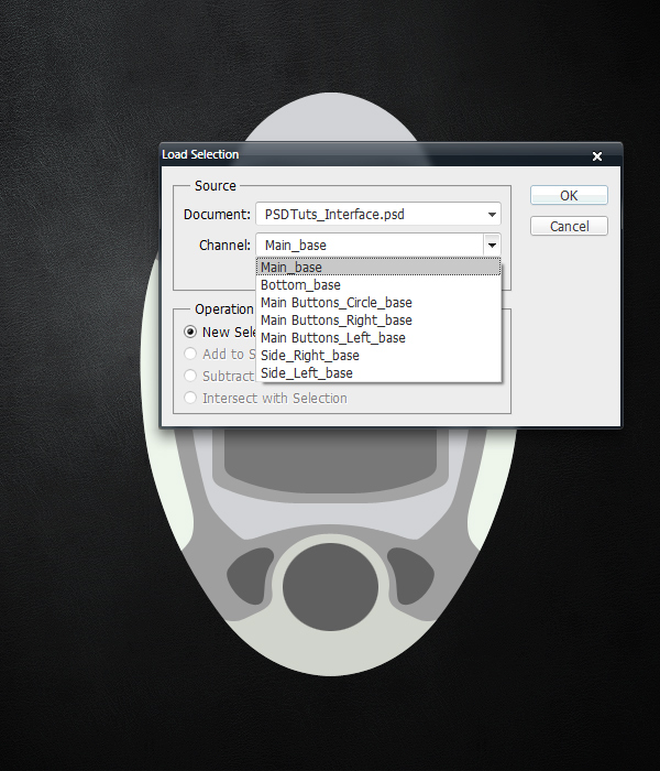
Also, this is a great opportunity for you to save all of your selections. In the coming steps we will add effects to each of these shapes. We will need to quickly load these selections. Photoshop offers a great selection memory system, which will save you time if you use it.

Command-click on the “base” layer’s Icon inside of the Main folder. The shape’s selection will appear selected. From the menu bar, click Select > Save Selection. Type in “Main_base” for the Name of the selection. After making sure the Channel is set to New, press OK. You have just successfully saved the selection.

Repeat this for each “base” layer. To retrieve the selections, simply to go Select > Load Selection. Choose the Channel Selection you want, and press OK. Below is a rough example of what you should see from the Load Selection interface. The list isn’t completed yet in the screenshot, there would be several more shapes if I did it for all of them. Notice the naming of the selections. It is very clean and organized which I always appreciate later on.


Step 12

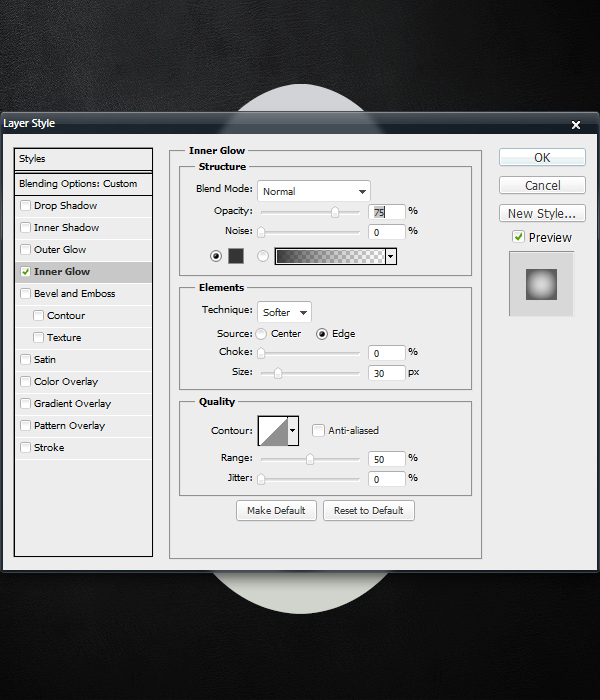
We will now create our first illusion of depth. Duplicate the the Main “base” layer and rename it to “innerGlowDark.” Open the Blending Options, and set the Fill Opacity to 0%. Click on the Inner Glow tab. Set the Blending Mode to Normal with the Opacity at 75%. Set the Color to #353535. Use a Size of 30px.


Step 13

Now we need to add some customized gradients from the edges inward. Load the “Main_base” selection. Press D to set the Foreground and Background colors to the default settings of Black and White. Select the Gradient Tool, and in the Options Panel, click on the Gradient Editor to open up the options for it. In the Presets area, click on the second icon. If you hover your mouse over it, a tool tip will pop up saying “Foreground to Transparent.” Once this is selected, start clicking and dragging from the outside of the interface and releasing when you have dragged it about 10-40 pixels into the interface. Do this multiple times from the top down, left in, right in, and bottom up. Make sure to keep these gradients on separate layers, and experiment with lowing and raising the Opacity of each layer to get a realistic looking effect for each gradient layer.

After you finish, grab the Eraser Tool with a Size of 35px and a Hardness of 20% and clean up any parts that are too dark and too messy. Again, experiment with those settings, and just make sure you give this step the time it deserves.

This step will require a lot of patience and experimenting. You must understand the basics of lighting, the Gradient Tool and the Eraser Tool to be successful here. One tip I can give you for now is to make sure that the right edge of your interface is darker than the left side, overall. This is generally because of where the light source is coming from (the top-left). Try to match my result (as seen below) as closely as you can. To give you a little perspective, I used about 15-20 gradient layers total to create all of those extra shadows. Once you are happy with your result, you can definitely Merge (Command + E) all of the layers together to minimize your PSD file size.


Step 14

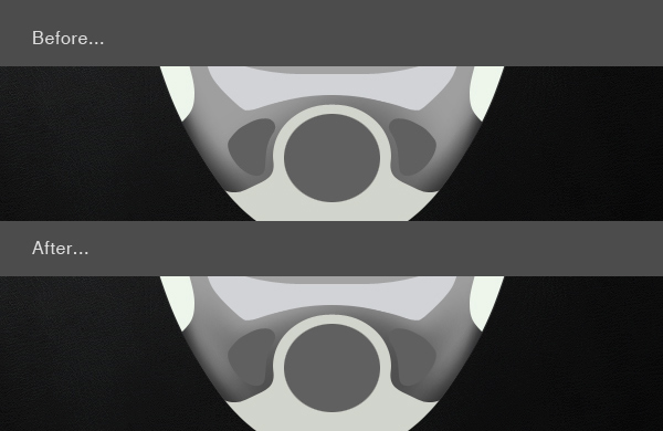
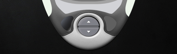
Now we need to add some lighter parts to contrast the darker parts. First, we will start with the bottom section, right next to the left and right button shapes. Using the Brush Tool, make both a darker and and a lighter area to the top left of the left button. Create something like what you see in the after image. Once you are happy with your result on the left side, repeat the basic ideas behind Steps 5 – 6 to duplicate the effect on the right side. To maintain realism, make the right side slightly darker than the left side to match the light source.

Please note that dark button shapes will be changed later on. It only looks odd because there are no insets around the edges of it, yet.


Step 15

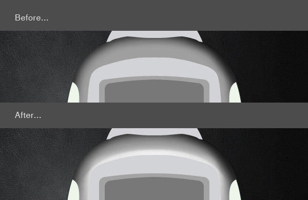
The interface is starting to look more 3D now, let’s continue by adding some white shines and highlights to the top of the Main shape. Using the Brush Tool, manually create the effect shown below. You may also use the Selection Tool to start off with. You can create the basic shape, and then use the Blur Tool and the Smudge Tool to fade the edges out. There are at least 10 ways I can think of to create the result I here. I would recommend using the Selection Tool, the Gradient Tool, and the Brush Tool all together. Here is a quick Before and After example for you to follow. Again, make sure to apply more of the effect to the left side of the interface.


Step 16

Now that we have some nice shading and highlights, we can start to see a metal/plastic effect developing. I prefer a glossy metal look for my interfaces. The most effective way to create this effect is to use the Noise Filter. First, collapse the “Main” folder that we have been working in this whole time. Create a Duplicate of this folder, and Flatten it by pressing Command + E. Move this flattened layer back inside the original “Main” folder, and move it to the top-most layer slot within the folder. Rename this layer to “Flat_Noise.” Load the “Main_base” selection, and go to Filter > Noise > Add Noise. Type in 5 for the amount, select Gaussian, check the Monochromatic box and then click OK. Lower the “Flat_Noise” Opacity to about 25%. You want the noise effect to be subtle, and not overpowering. If some parts are too strong or grainy, use the Eraser Tool with a low Opacity and Flow percentages to clean up the areas you don’t like.


Step 17

Let’s make the contrast even stronger by darkening the entire Main shape. Duplicate the original “base” layer. Fill the shape with solid black by pressing D, loading the “Main_base” selection, and pressing Alt + Backspace while the layer is selected. Once you have a solid black duplicate, move it to the very top of the folder, on top of the “Flat_Noise” layer. Rename this layer to “blkCover,” which is short for Black Cover. Using little abbreviations for your layer names will save you lots of time. Set the Blending Mode to Overlay, and lower the Layer Opacity to about 30%.


Step 18

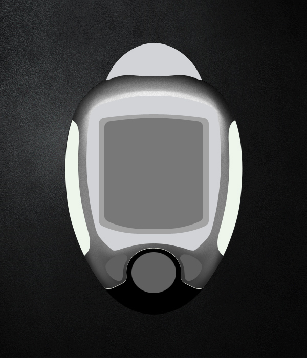
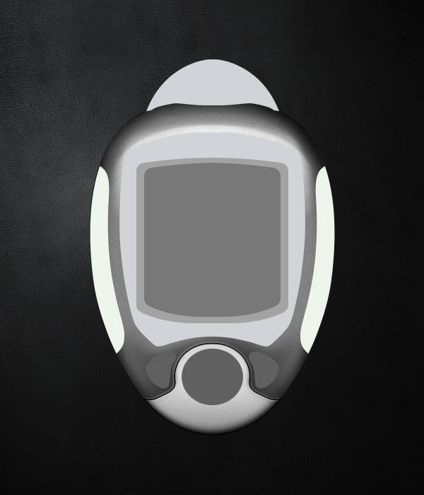
The main shape is now very well developed. Next, we will add effects to the bottom piece of the interface. As of now, this bottom part, the screens, the side chunks, and the top section are all flat. Once we add effects to these parts, the interface will start to look more realistic.

To begin, we will duplicate the “base” layer, fill it with solid black, and move it down 1 pixel by pressing the down arrow on the keyboard once.


Step 19

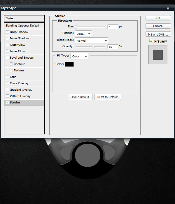
This effect resulted in some pixelation around the new black layer. To make this more smooth looking, we will add a Stroke to the Blend Options. Double Click on the Layer to open the Blending Options. Click on the Stroke Tab. Fill out the following settings to get a nice looking result as seen below. Press OK when ready.


Step 20

Repeat Step 18 again. This time, we will make the plate lighter.


Step 21

To avoid any pixelation, add some more white strokes and outlines around the base shape. Try using a 2 pixel, white stroke. Flatten the layer, load the “Main_base” selection. Also, let’s start adding some shading to the bottom part. Repeat the broad directions behind Steps 12 – 17, and be sure to experiment with different options and settings. You want the results to mirror my example.

Since the bottom part is light and not dark, calibrate for those differences. Keep the noise very subtle on this part, I used 10% for the Layer’s Opacity. In total, I used about 10 layers of what I showed you before to accomplish this next step. It is not hard to create these effects, it just takes some trial and error to make them look good. Time and experience will yield fewer mistakes and more minor refinements.
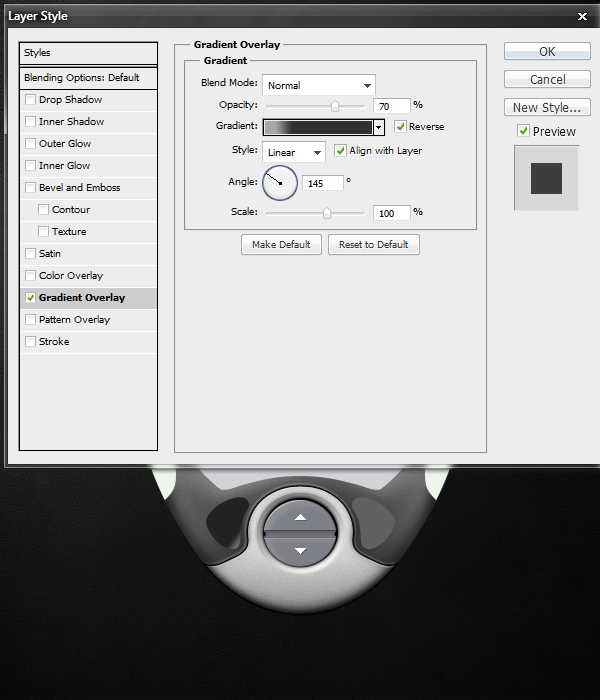
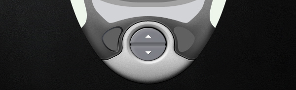

Step 22

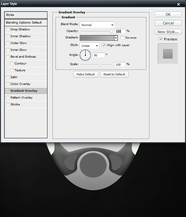
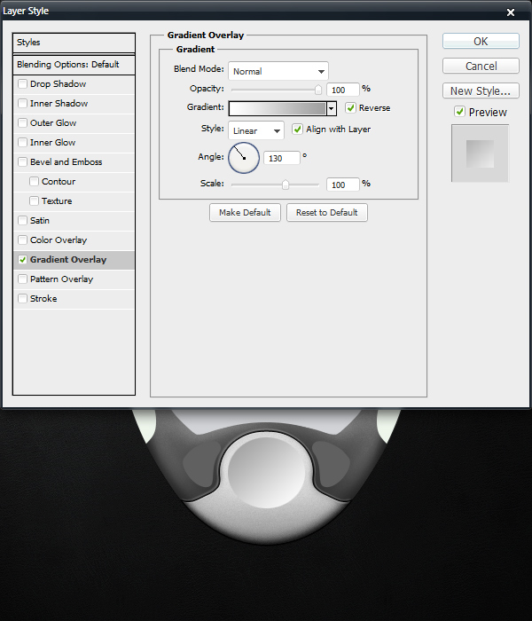
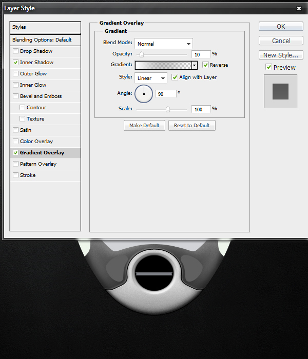
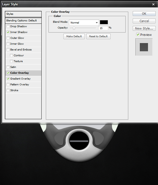
Next comes the center button that we will call “Circle.” Open the Blending Options for the circle’s “base” layer. Apply a Gradient Overlay with the following settings:
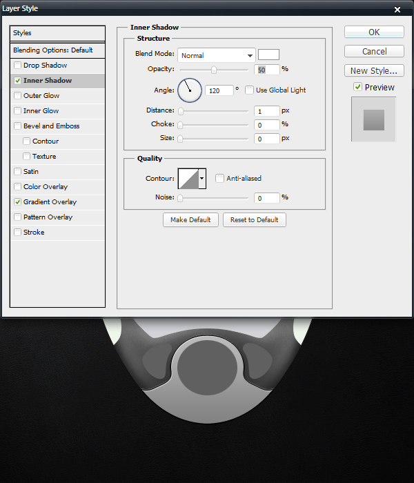
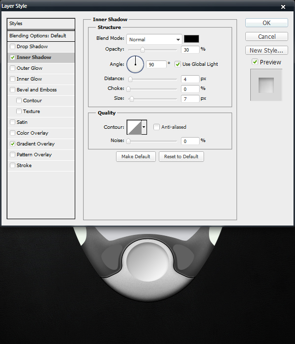
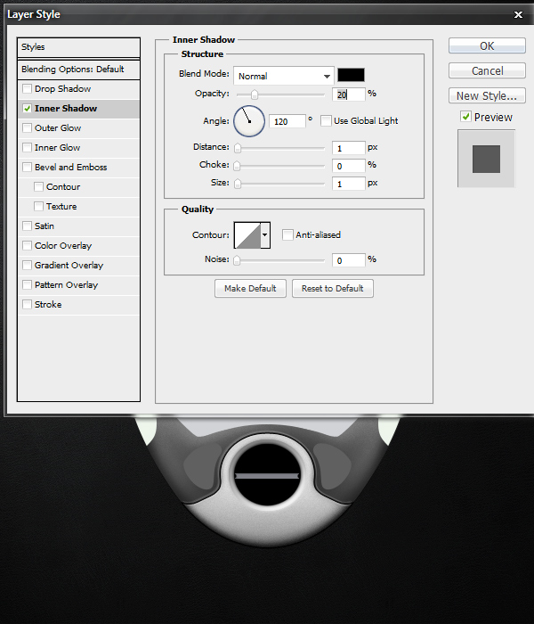
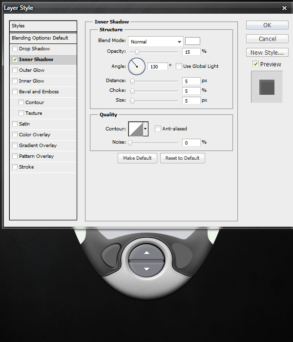

Step 23

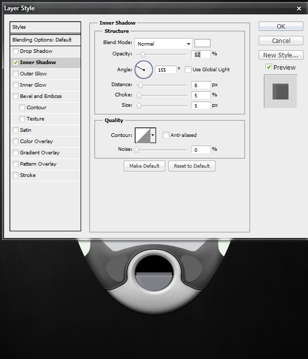
Additionally, we can add an Inner Shadow to make our button container look more realistic. Creating the illusion of depth is the key goal here.


Step 24

In order to make the depressed area realistic, we need to blur the edges around it slightly. Duplicate this layer. Create a new layer on top of it. Shift-click the layers to select both of them, and press Command + E to flatten them into one layer. The point of these last steps to retain the effects created by the Blending Options in a way that we can manipulate with Filters. With the new, flattened layer selected, go to Filter > Blur > Gaussian Blur. Type in 4.0, and press OK. Lower the Layer Opacity to 75%.


Step 25

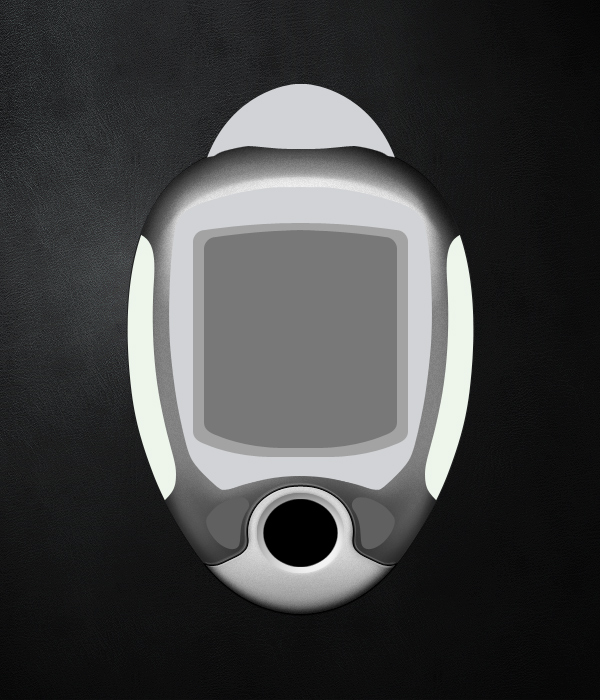
We must create the basic inner shape for our actual buttons. If you saved your selections as I advised in step 11, you can load your Circle’s base selection quickly. Create a new Layer, and fill it with black. Press Command + T, and in the Options Panel, choose a Width of 85% and a Height of 85%. Press Enter on your keyboard. You should have a result like mine. If your circle is slightly pixelated, you can recreate the shape manually with the Elliptical Marquee Tool. You want to have a smooth, round circle to work with.


Step 26

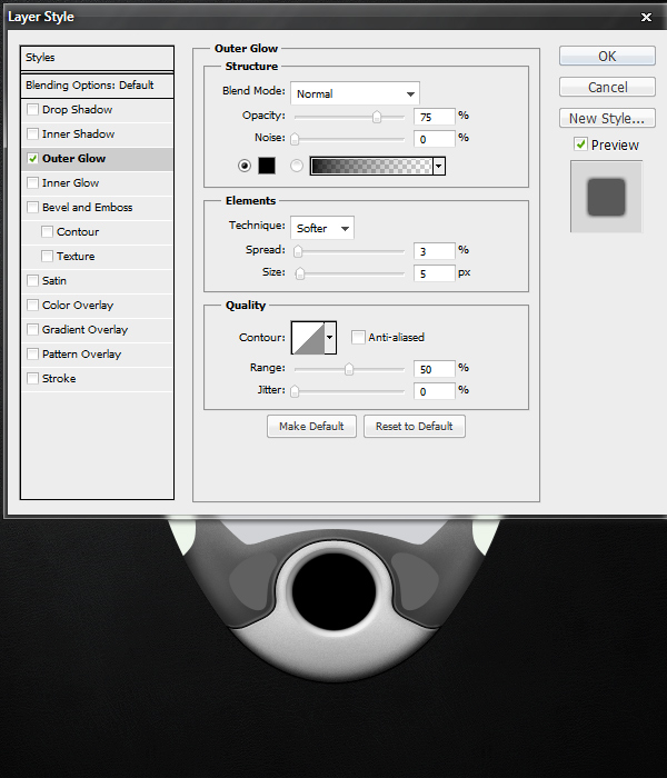
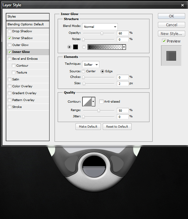
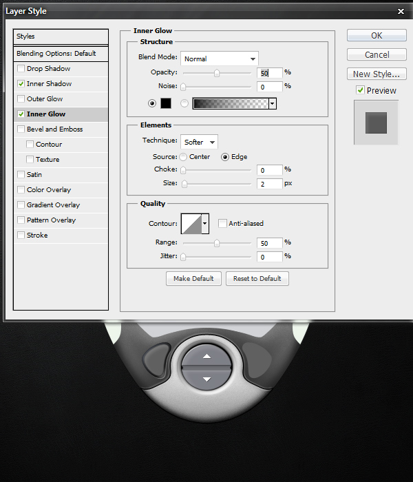
Open the Blending Options for this black circle’s Layer and add an Outer Glow with the following settings.


Step 27

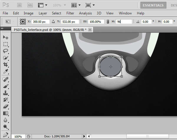
Now that we have our basic inner shape with an appearance of depth, we need to create the button outlines. Adding additional layers that do just what they need to do and no more is the key to efficient realism. Get the selection of the inner black circle, and fill it with this color: #7e8087. Next, press Command + T, and in the Options Panel type in 96% in the Height field. Press Enter to save the transformation changes.


Step 28

Since height transformations from the Options Panel centers the shape vertically, we need to shift the shape down several pixels so that there is a distinct black spacing at the top of the button container. For my source file, I had to move it down 2 pixels. Again, just like in Step 25, make sure you end up with a clean and smooth shape to work with. Recreate it with the Elliptical Marquee Tool if needed.

Creating smooth shapes can take a very long time to master, and it is completely worth your time if you are interested in design. I ended up with this result, try to match this as closely as possible.


Step 29

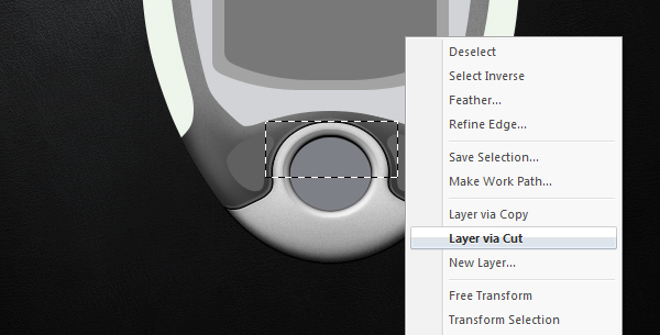
We will divide this button into three sections: the top, middle, and bottom. Using the Selection Tool (M), grab a little more than the top half of the circle. While the new circle layer is selected, right-click on the canvas, and choose “Layer via Cut.” This will essentially cut that selection out and place it onto a new layer while keeping the pixels in the exact same place.

Repeat this again with a selection that covers a little bit less than the top half of the circle. You should now have three layers that make up the same circle visually. Hide and unhide each layer to figure out which layer covers which part, and be sure to rename them to include “top,” “middle,” and “bottom” in their names. Also, try your best to make the top and bottom button equally sized.


Step 30

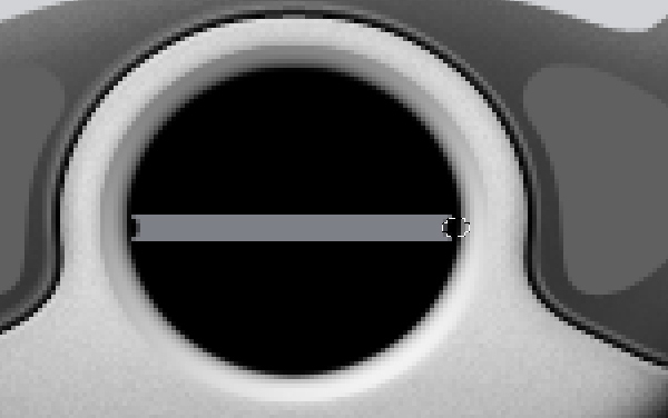
For this next step, hide the top and bottom parts of the circle. We will be creating little cutouts of the middle piece. This is easy enough to accomplish. You can use the Eraser Tool if you’d like, but I prefer the Elliptical Marquee Tool above all else because of how clean it is. Create a small circle that is slightly horizontally stretched. Move it over the left edge of the middle layer’s content, and press Delete on your keyboard. Move the selection over towards the right side and press Delete again. Make these cutouts perfectly symmetrical for cleanliness.


Step 31

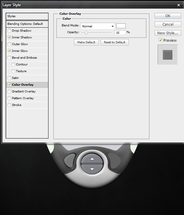
Add the following Layer Styles to the Blending Options of the middle layer.


Step 32

Unhide the bottom layer. Add the following Layer Styles to the Blending Options of the bottom layer.

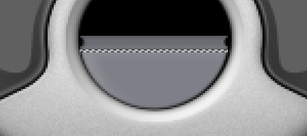
Here we are actually just creating a New Layer, and filling a 1 pixel tall selection with white. I lowered the New Layer’s Opacity to about 15%. This is to create a sharper edge to the top of the button.


Step 33

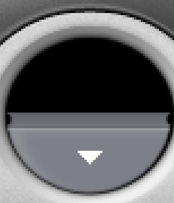
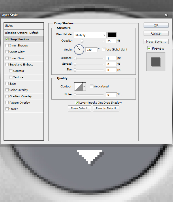
Next we will create a down arrow icon for the button. It is actually 11 pixels wide and 6 pixels tall. You can zoom in and create this one pixel at a time. Additionally, add a subtle Drop Shadow to the layer by applying the Layer Styles shown below.


Step 34

Unhide the top button. Repeat Steps 32 and 33 again but for the top part. Obviously, you must calibrate for it to make sense visually. Add a 1 pixel shine on the top-left corner to match the lighting, make the arrow point upwards, etc. If you have followed the steps up until this point and you understand the basics of Photoshop, it should be very clear how you can accomplish an outcome like mine.


Step 35

Next we will create the left button. Start off with the basic ideas behind Steps 18 through 21. I will go through each step just to be clear though.

First, open the Blending Options for the base layer of the left button’s shape. Apply a Gradient Overlay with the following settings.


Step 36

Now let’s add a blue Radial Gradient from the top left corner at an angle of about 130 degrees. First, load the left button’s selection to isolate the gradient’s outcome. Choose #6f7480 as your Foreground color, and select the Gradient Tool (G). In the options panel, set the Gradient Editor to “Foreground to Transparent” just like we did in Step 13. Also, make sure the Radial Gradient option is selected. Experiment with different outcomes and look to my result for guidance.


Step 37

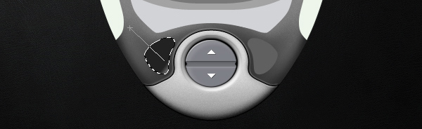
Next, add a 1 pixel reflection on the bottom left region of the shape. To do this, load the left button selection, create a New Layer, and fill the selection with white (#FFFFFF). Press Command + D to Deselect, and press V to select the Move Tool. On your keyboard, press Down once and Right once. Reload the left button selection, and with the Selection Tool (M) active, press Delete on your keyboard to trim the button area off. Lower the Layer’s Opacity to 40%. This will leave you with a clean, 1 pixel reflection at the bottom right corner of your left button’s container.


Step 38

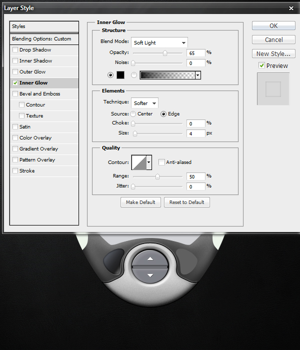
Duplicate the original base layer that you added the Gradient Overlay too, and move it on top of the 1 pixel reflection Layer. Set the Layer’s Fill to 0%, and add the following Inner Glow to the Blending Options.


Step 39

Next create the actual left button that will fit inside of our container. The lighting effects we have made will make more sense after we fill in this button. Load the left button’s selection again, and go to Select > Modify > Contract. Type in 3 and press OK. On a New Layer, fill in your selection with #606060.


Step 40

Apply the following Layer Styles to the base layer created in Step 39.


Step 41

Repeat Step 37 to create a reflection at the top left region of the button’s shape. With this reflection, I left the Layer’s Opacity at 100% rather than at 40% like we did in Step 37. Additionally, repeat step 33 to create the double arrows. These are 1 pixel size smaller, and are pointing to the left instead. Remember to add the subtle 1 pixel Drop Shadow as well.
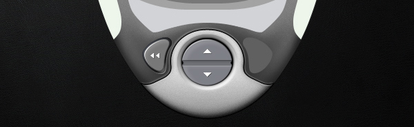

Step 42

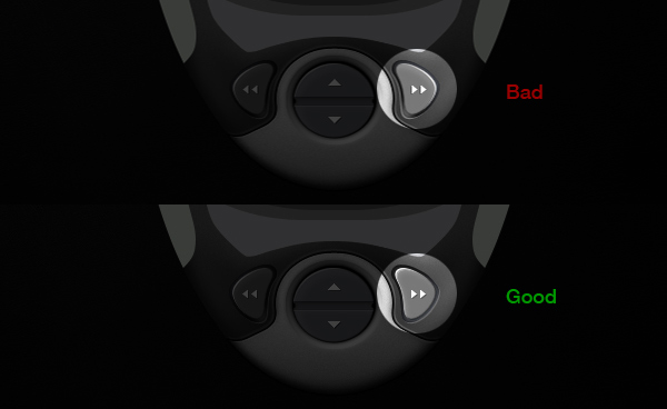
While respecting the lighting, reproduce a mirrored version of steps 35 through 41 for the right button. If you feel confident, you can duplicate the organized Folder that you kept your right button’s Layers in, and press Command + T > Right Click > Flip Horizontally. Then you can use the Move Tool (V) to shift the button into place. With this method, you will have to go back through your Folder and delete/edit most of the Layers to create lighting that matches the outcome shown below. The advantage is that you have all the original layers intact, so you can get away with just modifying some of them.

Don’t simply duplicate and flip it though, a pixel-perfect symmetry will ruin the realism of the interface. I learned this mistake by doing that for many years. If you haven’t learned this lesson yet, now is a great time. Take the time to make the realistic lighting effects, it brings your work to a whole new level of quality. Realistic lighting will yield non-symmetrical results, unless the source is coming from directly above. That is visually boring though.


Step 43

Now we will design the side grips. For the purpose of this tutorial, I will teach you the left side, and you can recreate the right side on your own as you did in the previous step. It is the same basic setup, just with different lighting effects and minor details that make a major influence on the final product’s ability to be perceived as a realistic interface.

First, we will add a 2 pixel indent to the right of the shape. To do this, create a New Layer under the original “base” Layer, load the left button’s selection, and fill it with black (#000000). Lower the Layer’s Opacity to 60%. Deselect your selection (if you haven’t already), and Move (V) the original “base” layer two pixels to the left so it is slightly hanging off the interface.


Step 44

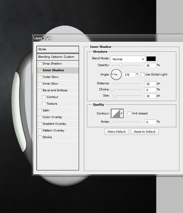
Open up the Layer Styles for the original “base” Layer, and add an Inner Shadow with the following settings.


Step 45

Create a New Layer, load the left side’s selection, and fill it with any color (it doesn’t matter, but I usually choose white or black). Set the Layer’s Fill to 0%, and open the Layer Styles. Apply another Inner Shadow, but this time with these finer settings.


Step 46

Next we must create a highlight, some additional dark edges, and a slight grain effect. Create a New Layer, Load the Selection, and fill it with white. Load the Main base’s Layer, Inverse the Selection, shift it 10 pixels to the right, and press Delete on your keyboard. Lower this Layer’s Opacity to 60%. Using the same method in Step 37, create a 3 pixel, black edge to the left of the screen’s shape. The black indent needs a 1 pixel white highlight to compliment it, using methods explain in Step 37, create a 1 pixel reflection again. Also, repeat Step 16′s basic method to add some noise/grain to these handles. I kept my Layer’s Opacity at 20%.

Since these handles are meant to be a rubber-like material, we will keep the grain to a minimum in comparison to the metal-like parts that we made before. Additionally, I darkened the entire grip slightly more by putting a black layer on top of everything with a Layer Opacity of about 10%. After all of these effects, you should see the something along these lines.


Step 47

Repeat Step 42. Pay attention to the lighting. Try to match these results.
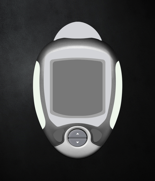

Step 48

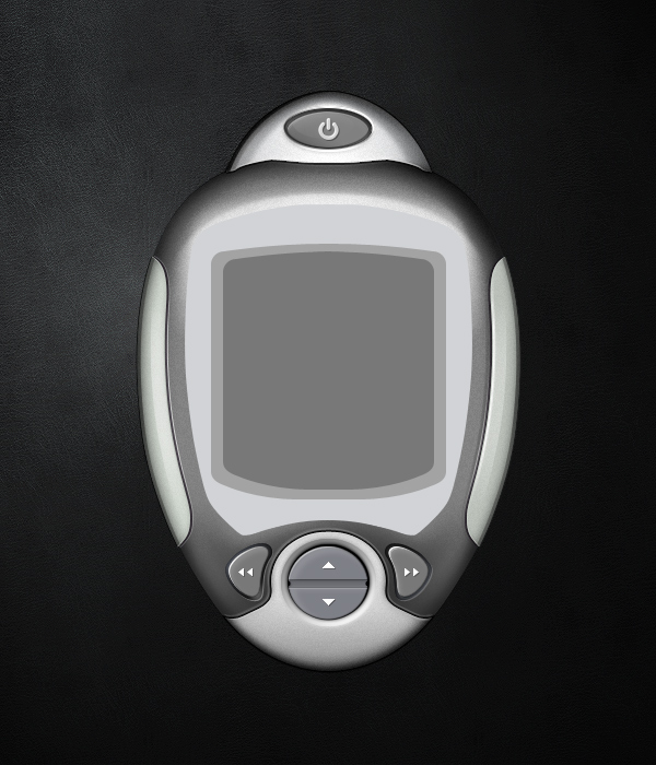
Now that we have the bottom parts and the sides taken care of, let’s move on to the egg-shaped attachment at the top. We will turn this into a power button for the device. Let’s change the color to #a7a9ab, which is slightly darker. We can also add a 2 pixel indent underneath the shape and add a soft black glow to that indent. This area will be much darker than the rest of the interface, so extra details are almost always safe.


Step 49

Repeat the methods behind Steps 12 through 16 to create depth, texture, and reflections. Be patient, and take your time with these steps. Again, they aren’t hard to complete, they just take time. You can see my progressive results below. First I added the dark shadows and edges, then I added the bright areas and highlights. I used about 20 Layers to accomplish this. Don’t be afraid to take breaks when working on highly detailed work. It can take a lot out of you at first, especially when you are still in new mental territory.


Step 50

Lastly, repeat Steps 35 through 41 to create a new button at the top. At this point, it would be overkill to explain each step, you have the tools and information you need to make it. I literally used the exact same methodology with no additional tricks to pull this button off. I found the power icon shape from a google search. Just take your time, create a button container, use appropriate lighting, add shadows, indents, highlights, reflections, and use the Add Noise Filter to create the metallic look.

This concludes Part 1 of this tutorial. I would honestly suggest taking a huge break before moving on to the next part. Many of these steps are repetitive, so you have to condition yourself into pushing through them quickly. Also, be sure to not sell yourself short for being able to create highly detailed designs like this afterwards. This is an incredibly valuable skill that can enhance and compliment your understanding of pixels and graphics in general.

In Part 2, you can expect detailed instructions about the creation of screens. Also, we will be doing some heavy refining to our interface. We will shrink it down, sharpen it, darken it, add contrast, and polish it up with some signature final touches and details that are easy and effective to do.


How to Paint a Fantasy Portrait From Scratch With Photoshop


For many of us, painting a portrait from scratch may seem like an impossible task. What you may not know however is that it may not be as tough as you think. In today’s tutorial we will demonstrate how to paint a fantasy portrait from scratch without any references. We will begin with a sketch then demonstrate how to paint in color, skin, texture, and shading. Let’s get started!


Step 1

Let’s begin by first sketching out our portrait. In my example, I sketched it directly into Photoshop using my tablet. If it is easier, feel free to sketch your portrait on a piece of paper and scan it into Photoshop. If sketching isn’t your strength, you can download my sketch here.

When painting skin, it is easier if you begin by making a quick palette of colors that you may potentially use. Create a palette on a different layer using the eye dropper tool (Cmd (Ctrl)+I ). I chose some beige colors from light to dark and some hues of pink. If you use more tones, the skin will look more dynamic.


Step 2

Tones will vary depending on the type of skin you are painting. When you paint skin, you will have a base tone, mid-tones, shadows, highlights and a warm zone (usually in the cheekbones). Begin by coloring with a neutral tone of beige (#dfbaa8) and cover all the skin. This will be the base. You can use the Paint Bucket Tool or a basic Brush with sharp edges.

Select a darker color from the palette and apply some shadows. Fill the lips with a soft pink base.

These are the areas were you need to apply the shadows and the highlights.


Step 3

In this step we will paint the eyebrows. This is very easy. The first thing to do is to cover up the areas of the eyebrows with the skin’s base tone.

Select a basic brush. Go to brush presets and select shape dynamics. Set the brush opacity to about 60-70 px and paint it strand by strand. The brush size has to be 2-4 px. This is very easy if you have a graphic tablet, because the pen pressure will do the job for you. If you don’t own one, than just use the smudge tool and smooth out the edges of the eyebrows.


Step 4

To paint the eyes, first you need to cover up the areas with base colors.

Remember that eyes are round so the corners will always be darker and the center, lighter.

The upper eyelid is going to be under a shadow. Do the same for the lower one, only with a lighter color. Paint some light on the iris. Irises are made of many tiny lines spread around the pupil. Draw them with a small brush (max 3px) Keep the brush set to shape dynamics. Make some lines darker, lighter or thicker to achieve this effect.

Add a bit of shadow under the lower eyelid and a bit of light in the interior corner of the eye. This will add a bit of depth.

Now let’s mark the pink flesh of the eye. After you paint a line select a whiter color and add some tiny lines in the corners and above the pink line. Create a new layer and add some eyelashes. Use a dark color and the same presets you did for the eyebrows. Look at the image below to see how the eyelashes should look, use a 50-60% opacity for the lower eyelashes.

Let’s improve the eyes a bit by adding some detail. Use the dodge and burn tools to add more depth to the iris and the pupil, and some soft colors to add more light.

Add a bit of eyeliner to the upper side of the eye. You can also change the color of the eyes by using Hue/Saturation on a clipping mask.


Step 5

Next, let’s paint the lips. This is very easy since we are going to use the same technique as we did on the eyes. Look at the image below to see the lighted areas.

Apply shadows to both edges of the lips. Now with a light pink, start adding some curved lines like you did for the iris. Make the center of the lips lighter than the sides. Change the tones and keep adding lines on the lips. It’s important that in the brush presets panel (F5) the shape dynamics should be checked leaving the default settings.

Create a clipping mask (by holding the ALT key) and go to Adjustment Layers > Levels and input the values shown in the image below. You have to change the brush settings in the presets panel for the texturing of the lips. Go to brush presets and check: Scattering (both axes 470%), Other Dynamics (0%) and Smoothing. Choose a light color and run the brush over the highlighted parts (the middle). This creates the impression that she is wearing lip-gloss.


Step 6

Add some more light near the upper lip.


Step 7

Go to Adjustment Layers > Levels. Use the values in the image below.


Step 8

Once you have the base laid down add some detail. Merge all visible layers into the active one (Cmd (Ctrl) + Alt + Shift + E) . Go to Filter > Noise > Add noise (about 7-9 px). Leave the noise on the skin and erase it from the other parts on a mask.


Step 9

In this step we will add some texture to the skin. First select the brush tool and select the appropriate presets: check the scattering box, scatter about 350%, control: pen pressure, count jitter: 12%. Now select 3 colors: a bright cream, a soft pink and a beige and start adding some freckles on her cheekbones and nose. Set the opacity to about 30 – 40%.

Create a new layer and make some new presets for the brush tool to add more texture. Make sure that the texture box is checked. Select a similar texture as shown below. Again, set the layer’s opacity to about 30%.


Step 10

Our last step is to create her hair. This is not very hard, just select the color you want the hair’s base to be and draw the shape of the hair. The color I’ve used is #d28c6a.

Create a new layer. You have to begin with the thicker hair strands and finish with the thinner ones. Make sure that shape dynamics is checked in the brush presets. This will make the edges more realistic.

On a new layer, add some more hair strands with different colors. Don’t be afraid to add some crazy colors in the hair, it will look great since this is a fantasy painting. I’ve chosen a soft yellow and set the brush opacity to about 70%.

Merge all visible hair layers into one and add some light with the dodge tool and some shadow with the burn tool.

Go to Adjustment Layers > Curves. Use this adjustment only on the hair.


Step 11

Now let’s add a background. Download a texture you like from here. Drag the background to a layer under the portrait.

Go to Adjustment Layers > Gradient Fill. Use the settings as shown below. This layer must be above the one with the background. It should not be visible on the portrait. Opacity to 40%.

Go to Adjustment Layers > Gradient Map. Use the color codes shown below. Set the opacity to 50%.


Step 12

Now, above all layers, go to Adjustment Layers > Gradient Map and apply the settings as shown. Opacity to 30%.


Step 13

Adjustment Layers > Hue/Saturation. Saturation to +25.


Step 14

Adjustment Layers > Levels. Use the settings as shown.


Step 15

The last part is to add some hair under the face. Select the pen tool and cut out a part of the hair, flip it horizontally and place it under the face on the right side. That’s it! We are done!


Additional Examples

Here are some additional examples; elf ears, a necklace or maybe some futuristic glasses can be added.


Download Wallpaper

You can download this tutorial as a wallpaper for your computer.

BMW First To Integrate iPod Out

BMW has been pretty quick to take advantage of iOS 4 and enable the new iPod Out new feature that was first described in April when developers noted an extended “iPod Accessory Protocol”.

BMW said it is using the software update to generate an iPod-like menu on the center dash display of BMWs and Minis. Users can control the playback of media from the car’s own controls rather than using a touchscreen. The update also integrates new in-car features such as custom playlists as well as Genius playlists.

There was no information which cars will be offering the new feature and when it could be available. BMW simply says that the feature will be coming to future cars. However, iPod Out will be a key feature of the Mini Connected system, which is expected to make its debut in next year.

A range of BMW models are due for a refresh. The new 3 series, 6 series and the refresh of the 7 series are more than likely to offer iPod Out right away.