Workshop #104: New Sunshine by Dj Van

At Audiotuts+ we irregularly put up a reader track for workshopping and critique (find out how to submit a track). This is how it works: you upload your song, and every week or so we’ll publish one here and step away from the podium. The floor is yours to talk about the track and how the artist can fix problems in and improve upon the mix and the song.

This track has been submitted for your friendly, constructive criticism. They have put their track (and their heart and soul) in your hands to learn and get useful feedback.

  • Do you enjoy the song or track itself? Does it have potential?
  • Can the arrangement be improved?
  • How did you find the mix? What would you do differently?
  • What do you enjoy about the rhythm track? What can be done to improve it?
  • Is the choice of instruments relevant and effective for the style/song?
  • Are the lyrics (if any) effective? Does the style, arrangement and genre of the song suit them?
  • Can you suggest any specific techniques that might improve the track?
  • Do you have any other constructive feedback?

New Sunshine by Dj Van

Artist’s website: www.doremusica.com/Sitio_web/Bienvenida

Description of the track:

This song is the first single for my electronic producer career. I’m the composer and the producer and the voice is from a friend and she performed it for my production. Thanks a lot. The text is based on the Bible 2 Corinthians 5:17.

Download audio file (NewSunshineFt.Angela2Co517.mp3)

Terms of Use: Users can stream the track for the purposes of giving feedback but cannot download or redistribute it.

Have a listen to the track and offer your constructive criticism for this Workshop in the comments section.


Submit Your Tracks for Workshopping

Need constructive criticism on your own tracks? Submit them using this form.


32 Individual Artist Demo Reels – Inspiration Galore!

Now, last week we had studio demo reels, and while that is all well and good, a lot of us can’t relate. They use Flame, Nuke, and a lot of other high end equipment and software. Well, here are 32 demo reels from guys and gals just like us, who are still finding ways to make awe-inspiring artwork!


Wendi Percival – Canned Muffins

Katie Nestor

Kneeon

Stijn Van Impe

Robert Mockler

Timothy Michael

Studio Smack

Thomas Vergara

Noah Rappaport

Matthew Butler

Tim Smiley

Daniel Britt

Jon Paul

Walter Parenton

Pablo Appiolazza

Federico Ponce

Lorenzo Miglietta

Eric Sanderson

Evan di Leo

Jr. Canest

Romain Loubersanes

Kyle Richtsfeld

Cedric Le Floch

Jimmy Weber

Danny Princz

Raul Alejandro Garzon

4NDO

Daniel Barros

Fabian Garzon

Wii Yatani

Dustin Bankord

Steffen Knoesgaard

If you enjoyed this post, please give it a vote on Digg or a stumble to say thanks!


Imitate Guitar Techniques With MIDI Part 1 – Glissando (2 Semitones)

An arranger often needs to create a guitar solo track. When there is no guitar (or guitarist) available, he needs to apply various VST instruments, samplers, and so on. His hardest task is imitating live guitar playing techniques with controllers. Especially the most unique and “tasty” guitar sounds – those made with string bending and glissando (sliding up and down the neck).

It is important to understand the difference between imitation of these two techniques. Usually, bending imitation is achieved while playing MIDI-keyboards using the pitch wheel in real time. Definite skills are required here, and we’ll discuss them in the upcoming tutorials. Imitation of the sliding technique with the pitch wheel, on the other hand, is rather difficult, as the pitch is not altered slowly, but quickly and unevenly (imitating the sliding finger as it comes into contact with each fret on the guitar neck).

The size of alteration is always the same – one semitone, no more and no less. It’s impossible to be this precise with a pitch wheel only. Working in MIDI Editors (like Cubase 5) makes it possible to achieve the correct pitch change only with help of Key Editor window (different programs call it Matrix Edit or Piano Roll window) by using a drawing instrument (Draw or Pencil Tool). Exact calculation is essential in achieving the most realistic result. That is exactly what we will learn in this tutorial.

I’ve created for you some examples of the described sliding imitation technique, combined with some other tricks – like string bending imitation. As you work through this series with me, you’ll learn to produce these sounds too.

Download audio file (example-1.mp3)
Download audio file (example-2.mp3)

Well, are you ready? Let’s start!

Note: This tutorial is good for any MIDI editor you use. I tried to make it as universal as possible, mentioning the commands, controllers, and window names of most programs – they may differ by name, but their functions are similar. I also explain the distinctions of programs with alternative system of numeric values. This makes the tutorial longer – but this way you can use it for your preferred MIDI editor. That is why you’ll sometimes find screenshots from several programs at one step. Enjoy!

In Part 1 we’ll discuss the small range of sliding – glissando for two semitones. The actions we take depend on the glissando range we need. This range – two semitones – is quite a popular one, so we’ll start with it first, moving to wider range of sliding in future tutorials.


Step 1

The first step lies in playing the music fragment as if sliding to every new fret the “guitarist’s” finger reaches is played as a new separate note (refer to the image below). The resulting sound is quite recognizable as a sliding sound, but it does not sound realistic at all, does it?

Download audio file (1-1.mp3)

Make a copy of this fragment or track or object (various programs use different terms), so that later (in Step 7) we can recover some event attributes – in particular, the time of the notes’ beginning (“Note On”). The thing is, we are about to make some changes, and later we will refer to altered numbers.


Step 2

In the main field of the Piano Roll window let’s change some notes included in every glissando. As we’re talking about glissando for two semitones, there are three notes included in this case: the source note (1st), middle note (2nd), and the last one (3rd) – the main (target) one, that is usually longer than others. The first source note is 2 semitones lower (or higher, depending on the sliding direction) than the target note, the second middle note – only one semitone lower or higher. Pitches of these notes must become equal with the main note.

We will return the initial pitch to these notes in the next steps, using a different approach.


Step 3

Now it is important to combine the notes with the altered pitch (from the previous step) with the main note using the Glue or Merge Tool. Otherwise, we’ll have separate plucking sounds – distinct notes. Our task is to imitate sliding on the guitar string, where there is only one pluck involved – when playing first note. The sounds of the other notes come not from the contact of finger and string, but from the intermittent changing of the length of the string.

Therefore, the other two notes do not need to have the specific features of the beginning of the sound (be it sampler or synthesizer). That is what we just made – only one sound is extracted, as we see on the image below.


Step 4

Make sure that on the VST Instrument or sampler you use the value of the Pitch Wheel range = 2, which means that maximum shift of the pitch wheel will result in changing note pitch to 2 semitones. Most (but, unfortunately, not all) instruments allow to adjust Pitch Wheel Range (look at the images below). Many VST Instruments (samplers) make the value we need (2) a default setting.

If for some reason you couldn’t find a way to change the Pitch Wheel Range for your instrument, you can try another method. Select the track where your guitar party will be and open List Editor window (Event List). At the beginning of track, enter three lines as in the image below (other columns – event time and MIDI channel number – may be different, of course).

There should be three controllers (not simultaneous, but one by one in small period of time) with these values: 100 (value = 0), 101 (value = 0), and number 6. The value of the last controller manages Pitch Wheel Range, in our case its value should be 2.

If you are lucky enough and your instrument supports specification General MIDI, it will recognize this message, “read” it, and the result will be our Pitch Wheel Range = 2. Of course, these messages should come before the notes to appear on the track. All these actions are possible for any pitch wheel range, for instance equaling 12 (an octave). However, the smaller the scale – the more precision for every graph. So, I recommend to choose pitch wheel range = 2.


Step 5

In the Piano Roll window, at the left part for graphic editing, select Pitchbend (Pitch Wheel) from the dropdown list. This is the controller we need to help us change the pitch of note. Here is how it looks in different MIDI editors.

This tool will allow us to “create” new notes when, actually, there are no new notes, while previous note is playing. Only changing its pitch bend value will lead to increasing or reducing the pitch, as if the finger moves to different fret.


Step 6

This is the most important step – “drawing” to assign the needed pitch to each fragment, putting the right points in the graphic editing section. For the vertical axis it is either maximum or minimum value of the pitch bend controller: it may be +8191 or -8192 (one tone up or down); ±4096 (half of maximum value, equaling one semitone up or down); or 0. For horizontal axis, the points must precisely match the beginning of three notes taking part in glissando.

So for the first note in our fragment draw a point before it corresponding value of -8192 vertically, because this note was initially one tone lower. This way we will give it its initial pitch that we changed in Step 2. Horizontally, the point must correspond the “Note On” event. If there are no other notes right before this one, the point on the graph can be placed even earlier on horizontal axis – just make sure it does not affect any other sounds.


Step 7

Let’s do the same for the middle note, but the pitch bend value in this case will be twice as small (-4096), equaling a semitone down. On the horizontal x-axis, the point must correspond the beginning of the second note from the initial fragment. To know the exact number, we’ll refer to saved copy of our first fragment (Step 1) and take precise timing value from it.

It is worth mentioning that some minor deviations of timing values are acceptable, as long as there is no extremely artificial sound. It will be strange to hear the guitarist stopping on one fret longer than others – why would he do it? Would he get stuck? So the timing intervals between points of changing pitch should be equal or almost equal (except for “long glissando”, which we’ll talk about later).


Step 8

The last step in the graphic part is drawing points with a zero pitch bend value, corresponding to the beginning of the main target note in our three-note glissando. This way we imitate the first fragment that includes sliding technique.


Step 9

While drawing points in the last three steps, you may have had no difficulty choosing the maximum or minimum values (Step 6) and zero controller value (Step 8). However, when you drew points for the semitone value in Step 7, you may have faced some problems.

If your monitor is too small, or your vision is not good enough (like mine, for instance – I wear glasses), or if you drank too much wine last night and your hands are shaking, you may find precise point positioning on vertical axis impossible. But don’t worry. When a real guitarist uses a glissando technique, additional increase or decrease in string tension is inevitable. It is caused by the effect of finger pressing a string, that slides a surface – not a perfectly smooth one, but sculptured surface with relief on frets. That is probably why there are no perfect semitones on a real guitar.

But, if you are a perfectionist and you like everything precise, you still can assign the absolutely exact numeric value – and there are two ways of doing so:

1. Every professional MIDI editor has so-called “MIDI Inspector”. Here the values of selected event parameters are shown, and you can edit them.

2. You can see all the events at once from the opened List Editor window (Event List). Before you open it, select the note you are working on now in the main arrangement window – for example, E3 in the 9th bar.

When you open List Editor window, you’ll see a selected line with a message “Note” – the one you just selected in Piano Roll window.

The next closest event is the pitch bend value. In the next line (of “pitch bend” type) you’ll find the value you entered. Try to assign this parameter the needed value (-4096). It’s not hard now to precisely enter it in needed field.

It is worth mentioning that pitch bend in the List Editor window of some MIDI ?ditors changes from -8192 to 0 in the lower part of graph, and from 0 to +8191 in the upper part. Others chose to show this value from 0 to 8192 in the lower graph part (and here the number 8192 corresponds a zero-shift of pitch), while the upper part changes from 8193 to 16383. In these cases the simple arithmetic comes in handy. For every value we spoke about just add 8192, and we’ll get the correct value for List Editor.


Step 10

What we need to do for now is repeat the four last steps for the rest of the fragments containing glissando (we have eight fragments in total in our example – five up and three down). The difference is simple: for sliding down you have to draw a point for first note with coordinate equaled +8192 rather than -8192, and for middle note it should be +4096 rather than -4096 – we just take positive numbers instead of negative.

Download audio file (1-2.mp3)

After listening to the result, it’s not hard to notice a significant difference between the initial and final audio files. Some further adjustments and corrections are possible – and oftentimes even necessary. This applies to both the pitch bend value, and moment of time when the pitch is changing (the new point horizontal coordinate). It is very simple to adjust this using List Editor window (Event List).

Conclusion

Well, that is all for today! We learned how to imitate a realistic guitar sliding technique with MIDI keyboards in any MIDI editor. I hope it gave you some useful tips and you’ve enjoyed it. Use it to create your own live guitar tracks with MIDI editor.

In the next tutorials we’ll be looking at imitating glissando for 3-4 semitones, and imitating glissando for an entire octave. See you then!


Create a Glossy High Resolution Box Art Icon with Photoshop


Software applications and stock art designs often need box designs to help with the marketing. We frequently use box designs on Psdtuts to promote our exclusive freebie or premium sets. There are several ways to create this sort of design. You can use software, actions, or even do this yourself. In today’s tutorial we will demonstrate how to do this by hand, in Photoshop. Let’s get started!


Step 1

Create a new page 4000 x 3000 px wide. Feel free to use smaller dimensions if necessary. Use the Pen Tool to create the shapes as shown below. Make sure each shape is on its own layer and name them as shown. Apply the following layer styles.


Step 2

Add the following layer style to ‘Base_up’.


Step 3

Cmd/Ctrl + Click on the ‘Base_front’ layer. Then, create a new layer and name it ‘Front_dark.’ Select #424242 and use a feathered brush with a 700 px radius to paint some shading as shown below. Then change the layer’s blending mode to soft light with an opacity of 31%.


Step 4

Create new layer, name it ‘Side_stroke_black’, Cmd/Ctrl + Click on the layer thumbnail of ‘Base_side’, go to Edit > Stroke, width: 2px, color: Black, Location: inside, hit ok. Go to Filter > Blur > Gaussian Blur, Radius: 2.3px. Press ok. Now press Cmd/Ctrl + D to deselect. Create a new layer named ‘Front_stroke_black’ & Cmd/Ctrl + Click on the layer thumbnail of ‘Base_front’ and repeat the step. Create two new layers named ‘Side_stroke_white’ and ‘Front_stroke_white’ and repeat previously used step with white.


Step 5

Grab the Pen tool; create two shapes as shown below. Make sure each new shape is on its own layer and name them as shown. Copy the layer style of ‘Base_up’ and paste it on the layer. Change the gradient angle for each of the new layers as shown.


Step 6

Cmd/Ctrl + Click on ‘Base_front_up’ to obtain its selection. Create a new layer and name it ‘front_draw_lines’. Use a hard black brush with a 50 px radius and paint as shown. Repeat step for ‘Base_up’ and ‘Base_side’.


Step 7

Create a new layer and name it ‘Base_top’. Draw the shape below with the Pen Tool. Hit Cmd/Ctrl + Enter to make a selection and fill it with any color. Apply the layer style below. Add a white stroke using the steps explained in Step 4 and then use the Steps explained in Step 6 to add some texture.


Step 8

Cmd/Ctrl + Click on ‘Base_front_up’ and create a new layer. Go to Edit > Stroke Width: 2px, Color: white, Location: Outside. Change the layer’s blending mode to soft light. Repeat this process with ‘Base_up’ and ‘Base_side’.


Step 9

Cmd/Ctrl + Click on ‘Base_up’ and then create a new layer and name it ‘Pattern_Draw_overlay_Front’. Take a hard 125 px brush and paint a pattern as shown below. Use different colors and sizes to achieve the effect. Do the same with ‘Base_side’ layer.


Step 10

Create a new layer and name it ‘Light_front’. Grab the Pen Tool, create a shape as shown below and fill it with white. Then, take the eraser tool and use a large soft brush to erase some areas as shown below. Repeat this process for the side of the box.


Step 11

Type out some text. Then skew it as shown below.


Step 12

Create a stage for the box using the same techniques as we outlined above.


Step 13

You can create a reflection on the stage using the Pen Tool to draw the various shapes. Fill it with white and then take the eraser tool to areas the appropriate areas with a feathered brush. Set blending mode to overlay.


Final Image


Alternate Variations

Flash for Android: Android’s Web Browser

To kick off the Flash for Android series I show off how FlashBum.com runs on two Android phones, the Nexus One with Flash Player 10.1 and the HTC EVO with Flash Player Lite 4. I’ll then walk through a couple of other sites, pointing out some of the things you should bear in mind whilst developing for mobile devices.


Section 1: Flashbum.com

Even though FlashBum.com was written in AS 2 almost 5 years ago it still works surprisingly well on the Nexus One. This video also introduces some of the issues that will arise with touch on sites not optimized to run on mobile phones.

Don’t like ads? Download the screencast, or subscribe to Activetuts+ screencasts via iTunes!


Section 2: Issues to Keep in Mind

In this second section I continue to go through sites that run with Flash Player 10.1 in the Android’s web browser. Some sites work, and others don’t. This video again illustrates some things to keep in mind when building Flash sites you anticipate being viewed on mobile devices. In this video I cover: boostup.org, thejohnnycashproject.com, youtube.com and wonderfl.net.

Don’t like ads? Download the screencast, or subscribe to Activetuts+ screencasts via iTunes!

Don’t forget you can tart up your desktop and mobile devices with the Flash for Android Wallpaper!

“Flash for Android” Screencast Series + Free Desktop Wallpaper

Welcome to a new series on Activetuts+ created solely to cover Flash on Android. During the coming weeks Jesse Freeman will be taking you through a massive collection of screencasts to get you and your Flash completely mobile. Read on to learn more about the series and pick up the free accompanying wallpaper!


A Word From the Author

My name is Jesse Freeman and I am very proud to help launch this initiative with the help of Powerflasher, the fine makers of FDT. Our goal is to create one of the best online resources about Flash on Android. To get things started I have shot 20 videos and will be writing a huge 2 part tutorial on making a Flash Game which will highlight all of the great things you can do on Android.

Now is a very exciting time to be a Flash developer! Adobe is dedicated to creating one of the best experiences Flash can offer on Android. The cool part is that Flash is incredibly easy to pick up and if you already know it, getting apps on Android mobile devices is incredibly easy. There is a huge push for what Adobe calls the “multi-screen” deployment and you can achieve some incredible web, desktop and mobile apps with the skills you are already using to make Flash content.

Starting today and continuing over the next few weeks Activetuts+ will be publishing the content I have been creating for you to quickly ramp up and learn about how Flash and AIR work on Android. This is only the beginning and as more and more authors contribute content I hope you will continue to find Activetuts+ one of the best Flash resources out there.


The Wallpaper

It’s fair to say we’ve been pretty excited about Jesse’s Flash for Android series and can’t wait to see what you all make of it! During the preparation I got a little carried away with the icons, screencast thumbnails etc. and thought the result was probably worth sharing. Here then, is a wallpaper version for you to take away and tart up your gadgets.

You’ll find it in a range of resolutions for your Desktop and Mobile devices. Enjoy!

Credit due to creativebubbles.net for the iMac graphic, zandog for the Nexus One graphic and gavinhall for the swish download button. Good work guys!

Introduction to Smoke/Fire Simulation in Blender 2.5 – Day 3

In this invaluable, in-depth series we’ll be taking a look at smoke and fire simulation techniques within Blender 2.5, and who better to take us through this process than the man behind the official documents himself, Gottfried Hofmann. In the 3rd part of the series we continue to prepare the hi-res setup, and we also look at tips on saving baking time and how to keep the simulation stable. Prepare to be amazed at just what Blender can do for free!

Techniques covered in this third video include :

  • Analyse the effects of additional hi-res divisions.
  • Save render time by creating a tight domain.
  • Keep your baked data safe.
  • How to Avoid problems related to the particle system.

So let’s get going!


Video 1

Download

Note: click the ‘Monitor’ icon to view tutorial in full-screen HD.

The Screencast Key Status Tool used in this tutorial is available here.


This tutorial is Day 3 in a series – Go to Day 1, and Day 2.


Don’t miss more CG tutorials and guides, published daily – subscribe to Cgtuts+ by RSS.

Creating 3D Intros with Papervision3D – Active Premium

This week’s addition to the ever-increasing stockpile of Active Premium tutorials features PaperVision3D and discusses some awesome, reusable classes. If you aren’t yet a subscriber, join today to get exclusive access to all Premium content!


This Premium Tutorial is Filled with Creative Tips

In this Tut, we will look into creating 3D Intros using Papervision3D. In the process, we will also look into using a real world implementation of the Singleton Pattern. We’ll also be pulling together a neat “CustomLoader” class which will allow you to preload and queue images and sounds, then set them all off at once.

All this culminates in a reusable and highly flexible system for creating 3D intros. Your resultant work won’t require any modification in the future, just the addition of further subclasses to alter what you’re aiming to achieve.


Professional and Detailed Instructions Inside

Premium members can Log in and Download! Otherwise, Join Now! Below are some sample images from this tutorial.


Active Premium Membership

We run a Premium membership system which costs $9 a month (or $22 for 3 months!) which periodically gives members access to extra tutorials, like this one! You’ll also get access to Psd Premium, Vector Premium, Audio Premium, Net Premium, Ae Premium and Cg Premium too. If you’re a Premium member, you can log in and download the tutorial. If you’re not a member, you can of course join today!

Also, don’t forget to follow @activetuts on twitter and grab the Activetuts+ RSS Feed to stay up to date with the latest tutorials and articles.

Aetuts+ Premium Tutorial: Composite A Super Stellar Jet Chase Shot

Our sister site Aetuts+ today posted an excellent Premium tutorial by David Scotland, on how to use the Max2AE plug-in to take various elements from 3Ds Max into After Effects. These elements include camera animation and helper objects, which will then be used as particle emitters. Contrail and exhaust particles are added along with 3D cloud layers to sell the realistic movement of the jet. Preview and link after the jump…


Aetuts+ Link : Composite A Super Stellar Jet Chase Shot


Want to Join Plus?

The Tuts+ network runs a membership service called Premium. For $9 per month, you gain access to exclusive high quality screencast tutorials, downloadable content packs, and freebies at CGtuts+, Psdtuts+, Vectortuts+, Audiotuts+, Nettuts+ and Aetuts+! For less than the price of a movie, you’ll learn from some of the best minds in the business all month long!!. Become a Premium member today!

Don’t miss more CG Premium tutorials and content packs, published weekly – subscribe to Cgtuts+ by RSS.

Modelling & Rendering an Interior Scene using 3Ds Max and Vray – Day 2

Our recent Stunning Interiors roundup got a lot of people talking about interior rendering tutorials, and today we’re happy to bring in Flavius Cristea to finish discussing his process when creating stunning interior renders using 3Ds Max. With the modelling mostly done, today’s tutorial looks at material creation and the final rendering process, and is a great insight into the art of Arch-Vis Interiors.

This tutorial is Day 2 in a series – Go to Day 1.


Step 1

Open your scene from the first part of this tutorial, we’ll carry on from there. As you notice in the final image above, I’ve added a candle and a coaster under the wine glass using very basic modeling as you can see in the image below. The techniques are the ones you’ve learnt from the previous part.


Step 2

Set V-ray as your main render engine. We are going to set some test render settings. Go to the V-ray tab and change the settings to those seen below, and then enable the V-ray Frame Buffer.

Info: The Adaptive DMC Image Sampler is what you’ll use 95% of the time if you’re a V-ray user. Here, we’ve also changed the Color Mapping type from Linear to Rheinhard which is actually a blend between Linear and HSV exponential. Now V-ray is hell of a renderer; it’s quite complex with a lot of options and I can’t explain every single of them here. While I will comment on some of the things I’ve changed, I can highly recommend this online V-ray Help site. It’s the best free source I know so far : http://www.spot3d.com/vray/help/150SP1/index.htm .?

Note: Just before we begin, make sure you know how to see the maps in the viewport, by toggling on the Show map in viewport option shown below.


Step 3

Go to the Indirect Illumination tab. Turn on GI</em and then set the Irradiance map and Light cache map values to those shown below.

Info: You can make your own presets with these values. A Very Low preset as shown here would be set with one purpose in mind: fast render times. Make sure you check Show calc.phase on, especially for the light cache, as you’ll get immediate results while this map is computing, and sometimes this is enough for you to adjust the ligtning or colors etc without having to wait for the final image to render.


Step 4 – The Walls

Because by now you should already have an idea of the color of the the walls, there is no point in making test renders with gray walls.? Select the walls and isolate them by hitting ALT +Q. Select the two polygons shown. In the Editable poly options for the object, scroll down until you find Polygon:Material ID’s. Where it says Set ID, input 2 and hit Enter. Press CTRL+I to invert the selection and select all the other polygons .In the Set ID, input 1 and hit Enter.

Info: You have assigned a group of polygons to a specific ID ( 1 and 2 ) . These ID’s work in conjunction with the Multi/Sub-Object material which we’ll use later.

?Tip: Isolate your object when assigning materials, so that you can easily rotate around them to see if everything is ok.


Step 5

Open the Material Editor (press M ). Pick the first color slot and click the Standard button. Choose Multi/Sub-Object. Set the number of materials to 2.?Click on the first material (it says White(VrayMtl) in the screenshot below and will say Standard in your editor) and select a Vray Material. Set the Diffuse color to an off white (RGB: 250;250;250). Click on Go to parent to go back to the Multi/Sub-Object Material. ?Click on the second material (it says 7 in the screenshot below), and again select a V-ray Material. Set the Diffuse to RGB 106;44;63, and when done, drag and drop the entire Multi/Sub-Object material onto the walls material (the material I’ve highlighted in cyan).


Step 6 – The Ceiling

Unhide the ceiling and drag the white material from our Multimaterial on it. Be very careful to drag the button as I show in the picture below. If you were to be inside the white material and drag it, it would not work correctly, and 3Ds Max would assign the entire Multi/Sub-object material to the ceiling- something you don’t want!

Tip: Remember this way of assigning independent materials from a Multi/Sub-object one because it’s a technique we’ll use quite often throughout this tutorial.


Step 7 – The Floor

Select the floor and isolate it. Add a UVW modifier, set it to Planar and check Real world map size. Assign a new VrayMtl to the floor. and set the Refl. glossiness to 0.78. Now put the wood-01_d wood texture in the diffuse Bitmap slot. Again, check Use Real-World Scale and set the Width and Height to 700 cm.

Info: You need to tell 3ds max how to put a texture( non procedural of course ) on an object. This is where UVW mapping comes in. Since real-world scale was being used, you had to also check that in the UVW settings. I know that in the real-world, my texture would be around 700 cm by 700 cm, so that’s why that value has been used.


Step 8

In the Reflection slot put a Fallof map. Inside the Front slot ( Map#8 in the screenshot below) put your reflection map (wood-01_r) and use the exact same UV Coordinate settings as for the diffuse map (700 cm by 700 cm and check Real world scale).? Now go back to the parent (once) and put the exact same map with the same settings in the Side slot, but in the Output tab click Invert. Now go back to the Fallof map settings and set the Side map Percentage (highlighted in pink in the screenshot) to 40. ?In the Bump map slot, add in your bump map and use exactly the same settings as with the other maps above. Set the Bump value from the default of 30 to 10.

Info: You could have just put the reflection map in the reflection slot but the results wouldn’t be overly realistic. Here you have used a falloff map instead, which changes the reflection based upon the two maps used. This is how it works: If you were to look straight down at the floor, only map#8 (the front one) would be active. The more you tilt your head however, the more the front map would blend with the side one. Finally, if you were to look almost parallel to the floor, only the side map would be active, and only at the percentage value set (in our case 40%) – the rest would be represented by black, meaning no reflection. To find these values I actually studied my own floor! Try it! Look at your floor and change your viewing angle to see how the refleciton changes. I should point out that pure white reflects 100% and pure black reflects 0% – the greys are in between. Finally the Glossiness was adjusted to 0.78 to blur the reflection.?

Note: The 0.78 value and the 40% value for the side slot map were obtained by trial and error after completing several test renders.

?


Step 9 – The Window

Make a new V-ray Mtl and name it Windows (I won’t say this every time, but it’s very useful to name your materials!) Change the Diffuse color to almost black (RGB:8,8,8) and the Reflection color to RGB:133,133,133. ?Check on Fresnel reflection and set the Refl.Glossiness to 0.94. Assign this material to the window frame. Now create another Vray Material with a Diffuse color of 0,0,0, and a Reflection and Refraction color of around 250,250,250. Turn on Fresnel reflections and set the Fog color to a very, very pale green – I used RGB :243,247,245. Set the Fog multiplier to 0.2 and check Affect shadows. Assign this material to the actual glass.

Info: The window frame material is as basic as it can get.The glass is also very simple, but be careful when using Fog color. Vray is, in my opinion, way too sensitive, and you have to use really, really pale colors and low multiplier values. Checking Affect Shadows is not so important in this scene, because there is no light coming from the outside. But if for instance you had sunlight in your scene, this would allow you to get more realistic, opaque shadows from the glass.


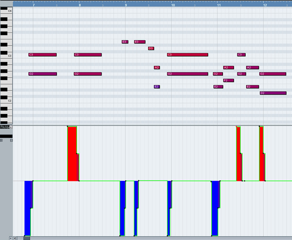
Step 10 – The Lights

Hide everything except the walls and the floor. Now place 3 V-ray area lights as you can see in the picture below. The 3rd Area light is at 100 cm above the ground. The second one almost touches the floor and the first one is at 232 cm on Z.


Step 11 – Light & Camera Settings

Set the settings for the Vray lights as shown in the screenshot below. The orange colour used for Light 1 and 2 is RGB 253,106,10 and the yellow color from the 3rd one is RGB. Use the settings in Vray cam for both of the V-ray physical cameras.

Info: A lot of things have been done here to set up the final lighting. The important thing is not really the settings themselves, but how I chose them. I must admit, I’ve only ended up with these values after spending a whole day test rendering, both with a completely empty room, and with the room full of furniture. The orange color was used to give the room a very cozy and warm feeling – it is a bedroom after all – and it matches the picture I had in mind (remember what I said about concept & interior design ideas in the introduction of this tutorial). ?We don’t need the light to affect the reflections in our scene (we’ll use something else for that), but placement is still very important.

If you take a look at the render below, (one of my initial test renders) you can probably spot many problems. First of all there is not enough lightning in the scene, and the room is way too dark (and quite boring!) There is no feeling of warmth and the image completely lacks emphasis – the big dark panel behind the bed didn’t particularly help me either.

?Info: The Vray camera settings work exactly as they would in the real world.The ISO was changed to 500 and f-number to 5.0 to let more light to pass into the camera. I also turned off vignetting, as it’s ten times easier to do this in Photoshop where you have full control over the look. I also left the white balance at neutral.


Step 12 – The First preview

First of all, make sure you unhide the ceiling before rendering! Now go into your Vray camera view, press F10 and hit enter to render out. You should get a result very similar to what you see below. Click on the two little buttons Use color curves correction and Use exposure correction. Set the slider indicated by the green arrow to around +0.50.

Info: The Vray frame buffer is a brilliant little thing. Your rendered image is in 32 bits color space (what we call a HDR image) so you can adjust the exposure without re-rendering by using the Exposure Correction (if you were to change the f-number or the iso however, you would have to re-render). The curves act exactly like the curves in Photoshop. My usual workflow is to try to get a decent render by changing the F-number and ISO values initially, and then make minor adjustments in the V-ray Frame Buffer. And yes, the image is a bit dark at the moment – the lighting isn’t quite finished just yet!


Step 13 – The Wall light

Create a thin box and place it in the inner extrusion you made inside the wall. Then create a new VrayLightMtl and set the Color Multiplier to 17.Assign this material to the box.

Info:VrayLightMtl is actually a self illuminated material. You had to use a multipler of 17 so that it looked the correct brightness to the V-ray Physical Camera. Make another test render and you should see the difference! The image now has much more contrast and emphasis in it. You can also see the bump mapping on the floor much more clearly.


Step 14 – The Curtains

Unhide the curtains. Apply a UVW Mapping modifier to each of the two curtain parts, but don’t check the Flip option just yet (wait until the next step!) Adjust the Reflection Glossines to 0.65 and the Reflection Color to around RGB:15,15,15.

Info: We are going for a silk-like material here, so we had to make it a little reflective and extremely blurry, which explains the 0.65 Glossiness value for reflection and the 0.95 for refraction.


Step 15

Inside the curtain material, scroll down until you find Maps. ?In the Diffuse slot put a Falloff map inside of which you should put the maps indicated in the picture below. ?In the Refraction slot, put the same falloff map, but with a clear side slot.

Info: If you look directly at a silk surface, you should notice that it looks lighter than if you look at it at an angle, which is why we use a lighter map in the front slot and a darker one in the side slot. The same principle applies to refraction but since we’ve only used a 15% multiplier the influence is minimal – but still observable to the trained eye! As you can see in the image below, the white parts of the curtains are closest to the window, so you’ll need to flip one of the UVW maps. Why bother? Interior design principle! It makes the overall image a bit more balanced and looks a little more composed. With that done, feel free to make another test render if you wish.


Step 16 – The Bed

Unhide the bed and isolate the selection for better workflow.? Create a new Vray Material. Add the wood_diff map in the Diffuse slot, the wood_refl in the Reflection slot, and the wood_b map in the Bump map slot. Set the Refl.Glossiness to 0.67 and check Fresnel Reflection.? Click the little L button to unlock the Fresnel IOR and set it from 1.6 to 1.8?. Now assign this material to one of the wooden bed pieces. ?Assign a UWV modifier to this piece and set it to Box. Select the gizmo for the modifier, and scale it until the size of the grain looks correct. Repeat this step for each individual piece of the bed.

Info: Be sure to apply the UVW map to each individual bed piece, so it will look like there are random wooden textures on all of the parts. Also, make sure you rotate the gizmo so that the wood fibres aren’t running in the same direction (look at the arrows from the below image to see the directions I used). We’ve unlocked the Fresnel IOR in order to put in a higher value, making the wood just a little bit more reflective.


Step 17 – The blanket and pillows

Select the blanket and each pillow and add a UVW map modifier to each object. Set it to Box, and click the Fit button. Now create a new Vray Material. Assign it to the blanket and to the small pillows. In the Diffuse slot, put the linii.jpg map (just something I quickly drew with the brush tool in illustrator). Put a Speckle Map in the Displacement slot using the values shown below, and a Multiplier value of about 1.5.

Info: The quality of this material is 95% down to the amazing V-ray displacement. If you want to draw your own lines map please feel free, just make sure that the ratio of the texture is the similar to the blanket’s one. Also feel free to adjust the tiling values as you wish. Finally adjust the Gizmos for the small pillow UVW maps in the same manner as you did with the wood bed texture to make sure that the don’t all look exactly the same! You can use the Show map in Viewport option to make this process easier.


Step 18

Make a copy of the blanket material and rename it to pillow. Clear the Diffuse slot, and assign this material to the larger pillows.


Step 19 – Chrome

Create a new VrayMtl and set the values as shown below. Then set the Refl.Glossiness to 0.6, and assign this material to the bedside legs.


Step 20 – Lamp

We don’t need to create any new materials for this one, as it just uses the wood from the bed and the VrayLightMaterial. Apply a UVW map to each wooden piece and adjust the gizmo until it looks correct.


Step 21 – The Soft Armchairs

You don’t even need a UVW map for this one, because the Speckle map is procedural. Apply the same material you have used for the large pillows.


Step 22 – The Decorative vase

Make a new Vray Material. Set the Diffuse color to a pale beige, the Reflection color to around RGB 133,133,133, and turn on Fresnel Reflections. Now set the Refl.Glossiness to 0.94, and assign this material to one of the vases.? Then make a copy of the material, rename it, set the diffuse color to just off black (eg. RGB 8,8,8) and assign it to the other vase.


Step 23 – The Small Table

Assign the existing materials as shown.


Step 24 – The Candle

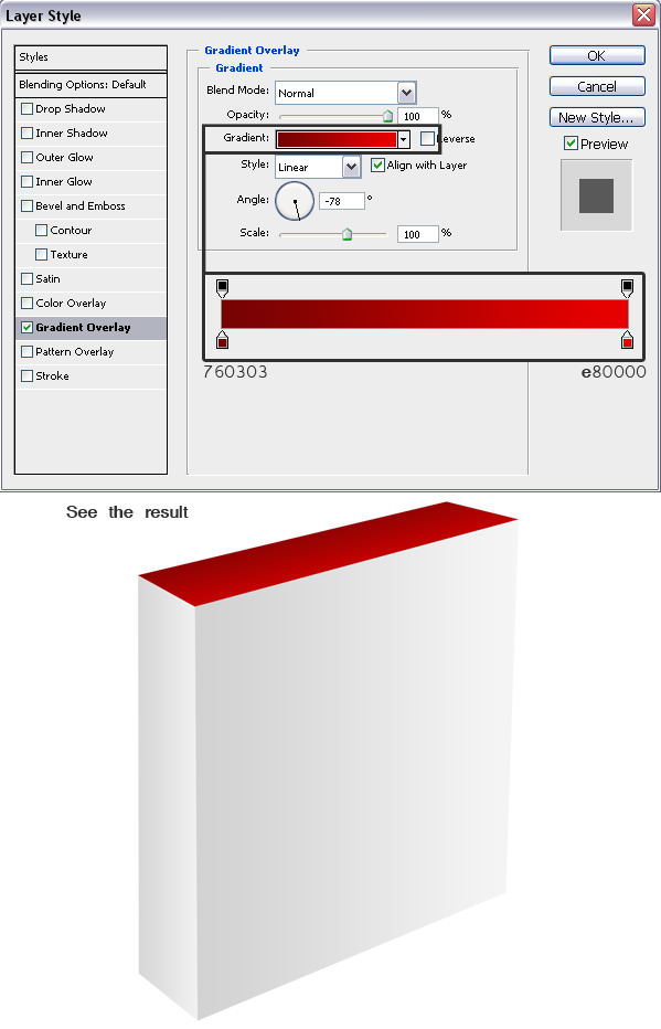
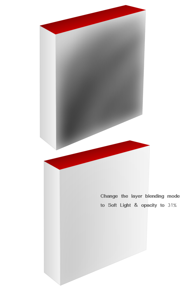
Make a new Vray Mtl. Set the Reflection color to RGB 10,10,10 and the Refl. Glossiness to around 0.85. In the Diffuse slot add a Gradient Ramp Map and use the RGB values indicated on the image below. Finally change the W Angle to -90 and apply to the candle object.


Step 25

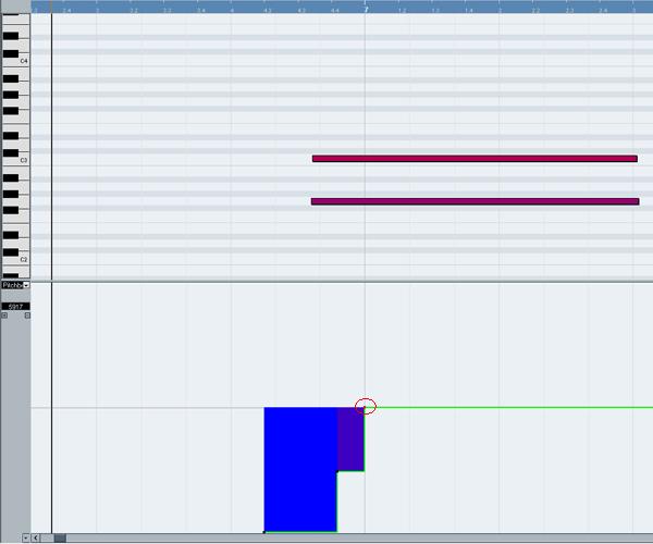
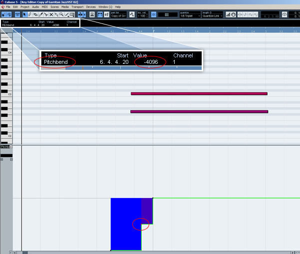
Create a Vray area light, set it to Spherical with a radius of approximately 3.8, and position it as you can see in the picture below.

Info: This Light will be used to simulate the candle flame. The Multiplier is set to 30, which is quite high and will completely blow-out the plane the candle flame object. This technique is not suitable for a close up shot, but works really well if you position the camera a few feet away! Make sure you check Affect Reflections this time.

?


Step 26 – The Wine Glass

Assign the existing glass material to the actual glass. For the liquid, make a new material, set the Diffuse color to black and the Reflection color to a pale grey.? Now turn on Fresnel reflections, and add a Falloff map with the values shown into the Refraction slot.? Set the IOR to 1.333, the Fog color to a strong red (approx RGB 196,0,0) and the Fog multiplier to around 0.05.

Tip: 1.333 is the index of refraction (IOR) of water. The falloff map here was used to make sure that the liquid is more opaque through the middle and more transparent on the sides nearer the glass.


Step 27 – The Coaster

A very basic material! Just a diffuse texture and a bump map (which is actually a desaturated version of the diffuse texture!) Since this is a small object, and really quite far away from the camera, I won’t spent much time on this material.

Tip: Don’t take this as being lazy! Being time efficient and using less RAM is very often as important as your ability to make things look great!


Step 28 – A Reflection trick

Make a box large box as shown, position it in the back of the room and assign the Vray Light material to it.

Info: In my test renders, I noticed that the decorative vases and the wine glass were too washed out, because there was nothing for them to reflect. My solution? Make a lightbox! You can make the box invisible to the camera and visible only to reflections if you’d like. The red lines on the image show exactly how the lightbox reflects in the vases.


Step 29 – The Carpet

Go into your top view and, using the line tool, make a shape similar to the one you see below. With that done, convert it to an Editable poly, Extrude the polygons with a value of approximately 2.5 cm, scale the top polygons in slightly, and finally add a Turbosmooth modifier with Iterations set to 2.

Info: This object will act as the base for our Vray Fur.


Step 30

Position the carpet object as seen below and then go to your Create panel and select Vray. Click on Vray Fur once.


Step 31

Select the VrayFur and the carpet object, and assign a new material to them both. Change the Diffuse color to approximately RGB:106,44,63, and adjust the VrayFur parameters as shown below.

Info: Make sure the Source object for the VrayFur is set to your carpet object. As always, I reached all of the values shown by isolating the carpet object and making many test renders!


Step 32 – The Final Render Settings.

?

Enter the Render Settings and make sure you have the Vray frame buffer enabled (under the Vray :: Frame buffer rollout). Now go to Render elements and add the passes shown. Finally choose a suitable image Resolution in the Common tab, select the Camera and render!

Info:If you think the reflections (on the floor especially) are a bit noisy, try increasing the Min. samples (surrounded with a black border in the bottom left of the image below) from 8, to 16 or 32.


Step 33 – Final Render (no post processing)

?

Hopefully your final render looks something similar to this! Now adjust the exposure correction to +0.53 and adjust the curves to your liking. Finally save both the main ‘beauty’ pass (shown here), and the alpha pass.


Step 34 – Ambient Occlusion Pass

?

Before setting up the scene for the Amb Occ pass, first save your scene, and then save an alternate version of it – with amboccpassor something similar in the name. We’re going to be deleting some of our work here, so it’s always a good idea to have backups!

First delete all of the Vray area lights, and the Vray Fur object. Then assign Mental Ray as the renderer, and set the Environment Color to white. ?Create a new Mental Ray material and put an Ambient/Reflective Occlusion map into the surface slot as shown.


Step 35

Inside the Ambient/Reflective Occlusion map settings, change the Samples to 128 and the Max Distance to 30 cm. Now go back to Mental Ray parent material and drag & drop it in the Material Override slot. This material will now be used for all of the objects in the scene.


Step 36

Render! This is how your ambient occlussion map should look. If you’re happy, save it out.


Step 37 – Post Processing

Open your beauty pass, alpha pass and ambient occlusion pass in Photoshop. Also look for an image you can place outside the window and import that too – I used a night shot of a city. Hit Ctrl-A, Ctrl-C to select all and copy that outside image, select your main beauty render, and hit Ctrl-P to paste it into a new layer. Then add a layer mask to it using the button shown.


Step 38

Now go to your Alpha map and select all/copy using the same technique. Back in the beauty pass, hold down Alt and click once on the thumbnail of the mask we just created. Our beauty pass should turn entirely white but don’t panic! We’re seeing the alpha channel and our beauty pass is only a click away. Now press Ctrl+V to paste our alpha pass into the alpha channel. ?Press Ctrl+I to invert the map, and then click on the Unlink the mask to the layer button once.

Info: We’ve unlinked the mask from the layer so that we can freely move the nightshot render around without moving the alpha map. The alpha map was inverted because we only need the window area to be affected (white).


Step 39

Press Ctrl+T to free transform the nightshot photo. Make it smaller until the size/proportion looks right (as shown below) and then move it into place outside the window. Change the layer blending mode to Soft Light which will make it slightly less intense. You will notice that the photo is not big enough to cover the entire window, so take a soft brush, and, making sure you have the colour layer selected and NOT the alpha layer, paint black above the city until it covers the entirety of the window.


Step 40

Copy the ambient occlussion pass into the main file using the same select all/copy technique as before. Set it’s blending mode to Multiply and set the Fill to 60%. Now take the brush tool (with size around 50 px and a hardness of 0% ) and paint the area indicated on the image below pure white.

Info: Why are we doing this? Well we have a huge area lamp in that portion of the image, so there would be no occlusion happening! Mental Ray calculated occlusion there as it cannot read Vray Light Materials.


Step 41

Now make a duplicate of your beauty pass (you can drag and drop the layer onto the new layer button to make a copy of it, as shown below). Move the newly duplicated image to the top of the layer stack, and desaturate it by hitting Ctrl+Shift+U.


Step 42

With the desaturated beauty pass still selected, press Ctrl+L to bring up the Levels command. Move the sliders as you can see below. This is to isolate the brightest parts of our image only. Hit Ok.


Step 43

Now set the layer blending mode to Linear Dodge. Apply a Gaussian Blur and experiment with different values to alter how far the glow from the light spreads – I used a value of 27 pixels. Press ok when you’re happy. Now you can adjust the Fill value to slightly tone down the glow! I used a value of 36% but feel free to experiment!


Step 44

Finally, add a Levels adjustment layer to the top of the stack and change it’s midpoint value to 0.81. This will give the image a little bit more contrast.


Final words

Finally, we’re done! I would like to point out one main thing, however : don’t take any the values above as a rule. Experiment! For example, I’ve blurred the desaturated image 27px to get the final glow effect. Maybe you could try it with 10 px of blur, or with 35 px just to see what it does. Don’t worry if you spend a whole evening adjusting one single material setting, it’s that attention to details that matters in the final render. When you’ve completed your image, study it and try to find 5 things you can improve. It’s the best way to learn!

I hope it’s been a helpful tutorial, and feel free to post comments here – I’ll do my best to reply. If you get stuck with any of the steps above, just yell and I’ll explain that specific step in more detail if necessary! ?Best of luck in all!

This tutorial is Day 2 in a series – Go to Day 1.


Don’t miss more CG tutorials and guides, published daily – subscribe to Cgtuts+ by RSS.

Texture Pack: 7 Hi-Res Concrete Textures

This week’s freebie content is brought to you by Jarlan Perez, a passionate texture and game design artist. Jarlan has put together 7 hi-res concrete images to share with the community, and we can’t wait to see how you use them!

Texture Pack Preview

Jarlan’s portfolio is available to view at http://www.jarlanperez.com and he’d love you to head on over and take a look!

Texture-Pack Download Link : JarlanPerez.com_ConcretePack.zip


If you’d like to produce freebie content for Cgtuts+, and have your portfolio/website address published for all to see, head on over to our ‘Write for Us’ section to see how you can submit. We’re always looking for great content to share with the community!

Don’t miss more CG tutorials and guides, published daily – subscribe to Cgtuts+ by RSS.

Aetuts+ : Convert Your Animations For Stereoscopic Viewing

Our sister site Aetuts+ today posted a new tutorial that covers the process of setting up your 3D animations for red/blue anaglyphic viewing! So if you have some stereoscopic glasses to hand and want to give it a try, why not head over and check it out! Preview and link after the jump…


Tutorial Link : http://ae.tutsplus.com/tutorials/workflow/convert-your-animations-for-stereoscopic-viewing/


Don’t miss more CG tutorials and guides, published daily – subscribe to Cgtuts+ by RSS.

5 Great Links for Speed Reading and Concentration

In an earlier article, I discussed the merits of teaching speed reading in schools.  While it doesn’t appear to be something on the immediate horizon, the web has a few optins owrth considering if you want to upgrade your speed reading skills:

Speed Reading Techniques

This is a quick guide from Indiana Wesleyan University.

How To Speed Read

BBC.com’s guide to students who want to learn speed reading.

Developing Better Concentration

Athletes have to concentrate if they’re to improve.  Here is a guide from a fitness professional that includes concentration techniques.

A Guide to Meditation for the Rest of Us

Concentration is key not only to speed reading but also to achieving goals.  Here’s a guide with suggested timers and music.

Building One Big Brain

New York Times columnist Robert Wright comments on author Nicholas Carr’s suspicion that the internet ‘is chipping away [his] capacity for concentration and contemplation.’

Do you have a particular method or tool at your disposal that helps you improve your speed reading skills?  Let us know in the comments.

Do You Prefer a Single or Dual Monitor Setup?

A dual monitor setup is something which I have considered for a long time. I am yet to go for it because, honestly, I think it could distract me instead of enhancing my productivity.

Having said that, a lot of people seem to work better with two monitors. Even with a laptop, some people prefer to add another screen on one side. This setup does have its advantages. For example, you could assign one monitor for native applications and the other for browsing and web research. That’s just one example – there are many other merits.

Some people prefer to go for a big 30 inch screen instead of dual monitors because it offers bigger screen real estate that eliminates the need to scroll down often.

So, what do you prefer? A single or dual monitor setup? Have you tried using two monitors? How has it affected your work?