Exclusive Brush Pack – 15 Wicked Wings


Photoshop brushes are a popular type of resource because they can be used to not only apply an effect to a graphic but also as clip art as well. Today, we are giving away a set of 15 Photoshop brushes that can be used to easily add wings to your designs. Download this set of brushes and use them in your next design for free!


Exclusive Brush Pack – 15 Wicked Wings

There are 15 High Resolution Photoshop Brushes in this pack. The license allows you to use these brushes in your commercial and personal projects. See the download file for details. Below is an example of what type of brushes are included in this set.

sample

This exclusive set of Photoshop Brushes was created by Nathan Brown. We are very excited to partner up with him on the release of this set of freebies.

pack

Mobile UI: How to Redesign the Spendometer iPhone App (Part 1)


This tutorial series will demonstrate all the steps necessary for redesigning an iPhone application with Photoshop. You will learn many of the unique considerations and design patterns used when creating stand-out app interfaces. This tutorial is presented in two parts in collaboration with Mobiletuts+, where you will be able to find an increasing amount of mobile design related tutorials in the future. Read the second part of this series and download the interface PSD on Mobiletuts+.


The Spendometer Application

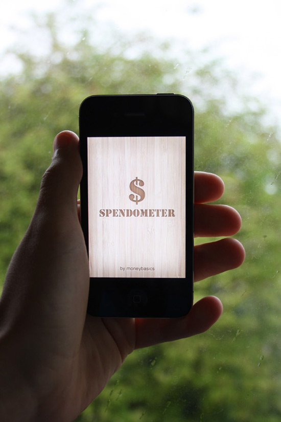
Welcome to the first part of our tutorial series on redesigning the Spendometer iPhone application! The application is a great little app that allows you to stick to a budget. As pulled from the Apple website, this is what the Spendometer does:

If you’re trying to stick to a budget, it’s a good idea to keep a record of everything you spend, but it’s hard work writing everything down in a notebook. The Moneybasics Spendometer is an application that makes day-to-day budgeting simple and practical. The Spendometer enables you to set yourself a budget, log your spending, and view your spending reports to see where, and how much, of your money has been spent so far in a given week or month, all whilst on the go. It also has a feature that helps you to keep track of your spending on a night out.

Every time you buy something, simply enter it into the Spendometer on your phone, and it will keep a record for you. You can set your own spending limits, and choose how your spending will be reported – weekly or monthly.

The Moneybasics Spendometer will provide you with the essential tool to ensure that you stay on top of your finances.

It really is a lovely little application that does fulfill its purpose well, but let’s all be honest, it could do with a little TLC from a design perspective. Below you can see the applications icon, and several screenshots of the application. The screenshots were taken using an iPhone 4 – as you can see, some areas are pixelated, meaning they have yet to update their application with high resolution graphics.


Icon Design


Launch Screen


Spendometer Screen


Reports Screen


Report Screen


Settings Screen


Set Budgets Screen


Some reading material before we start…

It is advisable to know a little about designing for the iPhone before we move along with this tutorial. Ideally, you should read the iPhone Human Interface Guidelines from Apple’s official developer site.


The Tutorial

As with all major designs, the first thing you should do is get a rough idea of what you want your design to look like. The best way to do this of course is by sketching. For big applications, many UI designers will draw pages and pages worth of ideas, annotations and brainstorms – as we already have a structure for the application we’re redesigning, we can move along with it pretty quickly.

Below are a few sketches I put together – these are very rough, and just general wireframe ideas I have in my head of what I want the design to resemble. Colors and styles can wait until we get to that stage later on!

The image I have in my head is a very simple to use, sleek, modern and textured interface. Something that will make people go “wow.” I also want it to be very minimal – the app is very simple, and therefore the design will be too. There is no need for unnecessary clutter.

Remember that you don’t need to follow this tutorial word for word – experiment with different things, and put your own creativity behind the techniques used. We’d love to see your results, so share your progress in the comments area.

One more thing before we start: I am writing this tutorial whilst designing, not after completing the design. I think it is important to show the creative process behind a design. Most tutorials are written after designs have been completed, and therefore you don’t see the designer’s mistakes, or how many attempts at something it took them to get something right. Every designer does this, just like any other job – people make mistakes, learn from those mistakes and only improve on things. So, if you see that you might be going back on yourselves while reading this tutorial, it’s because I’ve decided something needs changing! Let’s get started!


Step 1

The first step is to set up your document. We’re going to be designing for the iPhone 4′s new high-definition Retina display, which means designing at a much higher resolution than what we previously did with the iPhone 3GS.

Open up Photoshop, and go to File > New…. Name your new document something suitable, such as “Spendometer Redesign”. Enter your own dimensions (there is no pre-setting in Photoshop for the new display) for the iPhone 4 Retina display, we will be using 640×960 pixels, with a resolution of 326ppi (pixels per inch), which is the new standard. You can see my settings below.

Our next step is to place in some dummy shapes for the status bar (the bar with the phone info and time on), navigation bar (the bar beneath the status bar) and the toolbar (the bar at the bottom of the screen).

The best way to do this is to just insert a pre-existing screenshot of an application by going to File > Place.

You can now use the Rectangular Marquee Tool to select your different areas of the design and replace them with solid shapes. I’m just going to use black for now. Fill these in on new layers, and rename your layers to something suitable such as “Navigation Bar” and “Toolbar”. We’re going to create basic shapes, and add color and detail to them later on. You can also delete the majority of the screenshot we pasted in – the only bit I am keeping is the Status Bar as seen below.

We now have a blank iPhone canvas ready to begin designing. The next thing we want to do is make some new folders in our Layers window. We need several folders for several different screens:

  1. Launch Screen
  2. Spendometer Screen
  3. Reports Screen
  4. Report Screen
  5. Settings Screen
  6. Set Budgets Screen

The application itself does actually have a few more screens than this, but I feel a lot of them aren’t needed, so we will be reducing that dramatically, fitting more content onto the same screen. We’ll also be missing out a couple of screens that will pretty much replicate other screens – the only difference being titles!

Create a new layer folder in the Layers window for each one of the screens listed above. You can do it by clicking on the little folder icon in the layers window. We don’t need to place anything into these folders yet.


Step 2

I want to merge sleek and modern design with a little hint of texture. The texture of choice is going to be wood, this texture to be precise (well worth the $2-4). Once you have downloaded some textures, go ahead and place them into your document by going to File > Place…. Scale your texture down so it fits nicely into your UI design, and merge it with your background layer.

We want to brighten our texture up a little as we don’t want it to be quite so bold. Create a new layer directly above your wooden texture background, and fill it with white using the Paint Bucket Tool. Lower the opacity of the layer to 35% to add a white wash to your background, and then merge it down by hitting the Cmd+E (Ctrl+E) combination to apply the wash to our background.


Step 3

We’re also going to use a wood texture for our navigation bar and toolbar. From the same pack from GraphicRiver, select one of the other textures, and place it into your document. Resize it and place it over your navigation bar.

Once you’re happy with a certain position, click on your navigation bar layers thumbnail whilst holding the Cmd-Key to select your layers contents. Re-click onto your new wood texture layer, and go to Edit > Copy to copy your selection. Delete the texture layer, and then paste your selection on to a brand new layer.

It’s now time to add some styling to our navigation bar. Right-click on your new navigation bar layer and select Blending Options to open up the Layer Style window. We want to add a couple simple styles to our navigation bar that will dramatically increase the look of our bar.

First of all, let’s add a drop shadow. I have used a 90 degree angle with a 25% opacity – all the other options are set to default.

To give our navigation bar a little more depth, we’re going to apply a Bevel and Emboss style. This style has a very bad name for itself due to misuse, but really it is a great and very powerful tool saving you a lot of time. Apply a smooth inner bevel to your layer, using a depth of 100%, with a size of 196px and soften level of 16px. Reduce the highlight modes opacity to 20%, and the shadow modes opacity to 55%.

By applying these two simple styles, we are left with something that looks pretty smart!

Zoom right into your navigation bar, as it’s time to add a nice 1px stroke to the bottom side to increase the attention to detail levels. Create a new layer above your navigation bar, and then create a 1px width long selection using the Single Row Marquee Tool. Fill your selection with white.

Change the layers blending mode to Overlay, and lower the opacity to 70% to produce the following result.

For now that’s our navigation bar done – we’ll be coming back to it later to produce our headers typography styles.


Step 4

I’ve decided that having another wooden toolbar at the bottom of the app would be too “wood-heavy”, so instead we’re going to darken the bottom out a little, and just place our navigation icons there instead.

Select your toolbar layers content and then select the Eraser Tool. Select a soft eraser at 100px, and whilst holding the shift-key, erase the top area of your black toolbar. By holding the shift-key whilst doing this, you will be able to erase content in a straight line, rather than having full control over what you can erase.

Change your toolbar layers blending mode to overlay, and lower the opacity to 60%. This will give it a slightly burnt look giving us a nice background ready to place our icons on (once we design them). Now is about the right time to put our navigation bar and toolbar layers into their own separate layer folders.


Step 5

So we’re now ready to move on. We’re going to now get our launch screen designed, which will be the simplest screen in the application as it will not include any navigation or toolbars. Hide the navigation bar and toolbar layer folders, and create new (transparent) layer in your launch screen folder and call it “shadow”.

Fill your new layer with a dark solid color (I’m using #333333) using the Paint Bucket Tool. Select the contents of your status bar layer, and then click on your new launch screen layer and hit the delete-key to remove a small area of the grey layer to reveal the status bar.

Duplicate your layer so you have two of the same shape. On the new layer, go to Edit > Transform > Free Transform to bring up the transformation box on your new shape/layer. Whilst holding the alt and shift-key at the same time, scale your selection down. Holding the shift-key will keep the shape in proportion, where as the holding the alt-key will resize it equally around the edges. Make a selection of your new resized shape.

Delete your new shape (whilst still having the live selection) and then delete the selection from your original layer. You should end up with something looking like the following screenshot.

Go to Filter > Blur > Gaussian Blur and use a radius of around 50 pixels to give your shadow a smooth and smudged effect.

Using the same technique we used earlier, make a selection of the status bar, and remove any overlapping shadow from our shadow layer.

Duplicate our shadow layer once again. Change your bottom shadow layers blending mode to overlay, and its opacity percentage to 100%, and change your top shadow layers blending mode to normal, and its opacity percentage to 25%.

The next stage is to produce our typographic logo. We’re going to make it look as if the type has been engraved into the wood by using a handful of layer styles and techniques. Grab your type tool and layout some text. Make use of the type settings to align your text well.

Play around with some different typefaces until you feel it’s looking good. I’ve decided to use a combination of Stencil and Helvetica.

It’s now time to make our typography look like it has been engraved into our background. We will be making a lot of our typography look like this throughout the application design, specifically the icons and titles in the navigation bar.

This kind of effect calls for lots of layer styles. The first thing we must do however is change the color of our type. Using the Eyedropper Tool select a dark color from the background, and then apply that color to your typography.

Lower your type layers opacity to 50%, and then open up your text layers blending options. The first style we’re going to apply is an Inner Shadow, using the following settings:

The next style we’re going to apply is a very subtle drop shadow, using the following settings:

Finally, we’re going to add a stroke to our text, using the following settings (the color I have used is #E6D0B3).

Change your type layers blending mode to linear burn.

We’re going to make our inner shadow a little stronger/bolder. Duplicate your type layer, and change the blending mode to saturation – this will make it almost transparent, but allow any layer styles to still appear through. Open up the layer styles window, and completely remove the drop shadow and stroke styles. Click on your inner shadow tab, and change the settings to something similar to what you can see below.

Repeat the exact same step again, this time using the following settings:

As you can see, we have applied several more shadows to our typography, without effect the actual color due to simply changing the blending mode to saturation. The first additional shadow added a soft shadow around each of the edges equally, whereas the second additional shadow applied a strong and sharp shadow to just the top side of our type.

Our launch screen is looking pretty darn good, and it will look even better once scaled down on that high resolution retina display!


Step 6

Our next step is of course our Spendometer screen, which is the first screen to be displayed after seeing the launch screen. Using effects that we have just used in the previous step, set up your typography and apply a few nice layer styles to your Spendometer header in the navigation bar. It’s ideal here to make duplicates of your navigation bar; one for each screen. I have set the type layer to 90% opacity to let a little bit of the texture through, and have used the following layer styles. There is no need to create additional shadows for this type as it is much smaller.

I’ve decided that the navigation bar at the top of the design is looking a little too dark, either that or the typography is too light. To fix this, I’m going to lighten up the navigation bar a little. The easiest way to do this is by selecting your navigation bar layer, and then going to Image > Adjustments > Brightness/Contrast. Up your brightness to 60, and your contrast to 10.

Lower the opacity of our 1 pixel stroke beneath our navigation bar to make it fit in better with the new lighter navigation bar. I have lowered it to 40%.

To allow the texture of our navigation header text to show up a little clearer, I change the color of our type to a much lighter choice, and then set the layers blending mode to multiply – remember it’s all about experimentation – all blending modes react (very) differently depending on what color your base shape is.

Duplicate your text layer, and lower the opacity of it to 40%. This is to make our type a little darker, reverting it back to what it was like before but still allowing us to show more texture through without lowering the opacity.

You can now copy and paste your navigation tab layer folder into each of your different screen folders, and edit them to resemble the title of each screen, as seen below:

That is the header titles done for now – we may be visiting them again later. As you may have realised, designing for mobile devices has a lot to do with trial and error.


Step 7

Our next step involves setting up a white background ready to place more elements on top of it. This means we’re going to be covering up a lot of our wooden background, but in general viewing things on a white and non-textured background is usually a much more pleasant experience on the eyes.

Select the Rectangular Marquee Tool and choose a fixed size of 600x700px. Click any where one your canvas, and center your selection by using the arrow keys. It should be easy to arrange as there is exactly 20 pixels between the sides and the selection on each side (left, above and right).

Create a new layer in your spendometer folder, and call it something suitable such as “White Background”. Go to Select > Modify > Smooth and smooth your shapes using a radius of 5 pixels. Fill it with white.

Select the Elliptical Marquee Tool and drag out an equal selection. Position it over the bottom as seen below, and hit the delete key to remove a small selection of our white background.

Open up the layer styles window. We’re going to apply a number of effects to our white background. First of all, we’re going to add a stroke. I used the settings below, with the color #6C4C24:

Next we’re going to apply an inner shadow to add a little bit more depth to our background. The settings I have used can be seen below:

The final layer style we are going to apply is a drop shadow, using the below settings to make the white background stand out a little more from the whole application background:

Lower the opacity of the whole white background layer to around 75% to allow a tiny little bit of that wood grain to show through. Our final result (below) gives us a nice white canvas to place our applications elements onto, making it easy to read yet nice to look at.

We’re going to add a low opacity, 1 pixel black stroke to the bottom of main content layer. Duplicate your white background layer, and remove all the layer styles. Fill the shape with black and nudge it down one pixel using the cursor keys. Place it underneath your original white background layer. Make a selection of your original white background layer, and then click on your new duplicated layer and hit the delete-key. Lower the opacity to around 40%. You should end up with something similar to this:


That’s the end of part one, folks!

That’s the end of the first part of the tutorial. It is recommended that you export your file from time to time as a high resolution jpeg image and view it on your iPhones display to make sure it is looking good. This is how my launch screen is looking (we’ll test the other screens in the next tutorial!):

Part two of this tutorial is available on Mobiletuts+, and covers the rest of the application design. Hop on over to finish up the creation of the interface!


More Mobiletuts+ Design Content:


Want to Write For Mobiletuts+?

We are actively searching for designers to contribute their mobile design skills to our community. Contact us today if you are interested in writing paid content!

Quick Tip: Exploring the Flash CS5 Code Snippets Panel

In this Quick Tip I’ll show you how to use the brand new Flash CS5 Code Snippets Panel to easily add keyboard and mouse interaction to your projects, without necessarily needing to learn AS3. Let’s take a look!

Final Result Preview

Here is the final result we’re gonna achieve. With the help of the Code Snippets Panel we use Click Movie Clip as a button to start animation. Also, with keyboard arrows you can move “active.tutsplus.com” logo and if you click on it, it will take you to the site. These functions are carried out with the help of the Code Snippets Panel.


Step 1: Load Project

Download the Source zip file using the link above and extract it somewhere.

Open Adobe Flash Professional then click File > Open.


Step 2: Open Source File

Select the downloaded source file “Quick_Tip_Code_Snippets.fla”.


Step 3: Set Instance Name

Here at our disposal is a Flash Banner. In order to give it some functionality we’re gonna use the new Flash CS5 Code Snippets Panel. Let’s start with “Click” Movie Clip. Choose layer “Click” and then the Movie Clip itself with the Selection Tool (shortcut V). In the Properties window give it the Instance name “Click”.


Step 4: Open Code Snippets Panel

Now open your Code Snippets Panel (if you can’t see it, go to Window > Code Snippets). Select category Timeline Navigation > Click to Go to Frame and Play. Double-click it.

P.S. Remember that before opening Code Snippets Panel the “Click” Movie Clip should be selected.


Step 5: Alter the Auto-generated Code

After that the Action panel will be opened and you’ll see some code with instructions. Let’s follow the instructions and change number 5 in the brackets to number 2. This will cause our animation to play from frame 2 if we click our “Click” Movie Clip.

I’ve added some animations to the timeline from frame 2 onwards, so you will see them play once the button is clicked.


Step 6: ActiveTuts Movie Clip

The next thing we should do is to give some functions to our ActiveTuts Movie Clip. Select it on the stage and give it the instance name “ActiveTuts”.


Step 7: Movement with Keyboard

With the Movie Clip “ActiveTuts” selected go to Code Snippets Panel > Animation > Move with Keyboard Arrows. We won’t change the default parameters of the code as they serve well. This function will allow us to move our ActiveTuts Movie Clip with the keyboard arrows.


Step 8: Clickable Link

In addition, let’s make our ActiveTuts Movie Clip behave like a link. Again with it selected go to Code Snippets Panel > Actions > Click to Go to Web Page.

You should have the following code in your Actions Panel:


Step 9: URL

Our Actions Panel will be opened and there we’ll see some instructions on how to change the URL we need. In my case I’ll change it to “http://active.tutsplus.com”.

The last thing we need is to write a stop() function at the end of the code on frame 1. After this you can preview what we’ve achieved.

Conclusion

You now know how to use the new Code Snippets Panel! It’s useful both for people who know AS3 (saves some time) and for those who begin to dive into it. It gives an opportunity to add some actions to the objects without writing a single line of code!

I hope you liked this Quick Tip and that it will help you. Thanks for reading!

Editor: Just one last thing – don’t forget you can store and share all your code snippets at snipplr.com, the newest addition to the Envato network!

A Sneak Peek at Premium for Non-members + A Premium Giveaway!

You may have noticed that Cgtuts+ has been posting more Premium content over the last few months, but what exactly is Premium, how does it differ from normal content and, more importantly, how do you get your hands on it?! Well today I’m going to give you a behind the scenes look at the Tuts+ Premium system, and I’m sure you’ll love what you see!

What is Premium?

Premium content takes our regular tutorials to the next level…

Whilst we always aim to publish exciting, professional content 5 days a week here on Cgtuts+, occasionally we find a tutorial or a texture pack that simply blows us away. Whether it’s from an author well established in their specific field, or from an extremely competent artist, Premium content takes our regular tutorials to the next level, providing full scene files, references and footage; not to mention hours and hours of video training! It’s something we’re all very proud of at Tuts+ and today I’m going to show you why.

The Premium Content

Cgtuts+ is relatively new to the Premium system, but our Premium content library is growing every week, with 4 amazing Premium tutorials or files being posted every month. And we have some awesome content lined up for our Premium members!

But if you sign up today, what exactly will you find? Well Cgtuts+ has already published some AMAZING Premium content for you to view or download immediately, such as :

Ben Tate’s In-Depth Mac-10 Submachine-Gun Tutorial for 3Ds Max

Follow professional CG artist and Cgtuts+ regular, Ben Tate, as he demonstrates his entire process of modeling, UV mapping and texturing an extremely high quality Mac-10 submachine gun.


Madhan_2005′s Bugatti Veyron Modeling tutorial for Maya

Over the course of this extremely detailed 2 day tutorial series, Madhan_2005 walks us through how he modeled the Bugatti Veyron 16.4 in Maya. Not only does he cover the basic workflows involved in creating a hyper-realistic car from scratch, but he also takes a look at some of the more common mistakes that artists are prone to make when modelling extremely high-end photo-realistic cars. A very popular tutorial here on Premium!


Alvaro Castaneda’s ‘The Skateshop’ tutorial for PFTrack, After Effects & Maya

An unmissable tutorial for anyone looking to get into VFX, this detailed 3-day Premium tutorial series shows us one possible set-extention/integration workflow, moving from PFTrack for tracking, to Maya for modelling, texturing and rendering, and then finally to Maya Composite to put together the final result!


But it’s not just Cgtuts+! In addition to the awesome tutorials available as part of Cgtuts+ Premium, when you sign up you also get access to all of the premium tutorials from the rest of the Tuts+ sites! In total, that’s currently a staggering 374 tutorials and 841 source files – and that figure is rising every day!


So how much does all of this cost? You can sign up to Premium today for only $9 a month!

That’s just $9 to get instant access to all of the tutorials we have available! $9! That’s 374 tutorials, 841 source files and exclusive content for about the price of a single movie ticket! Or if you’d prefer, you could choose to pay just $22 for 3 months (saving $5), or $78 for an entire year (a saving of $30!) And if for any reason you decided it’s not for you, you’ll get a full refund if you let us know in your first month. We cannot say fairer than that!

Signing up for Premium allows you to show your support for both Cgtuts+ and the Tuts+ network

Need one more reason to sign up?

In a word, support. Signing up for Premium, even if only for a month, allows you to show your support for both Cgtuts+ and the Tuts+ network, which in turn allows us to spend a little more on making sure we can provide you with better and better tutorials. I have big plans for both the free and paid tutorials on Cgtuts+, and essentially, the more Premium subscribers we get, the easier it becomes for us to ensure it happens! Now don’t worry, there will always be incredible free tutorials, but if you can sign up, we think you’ll really love it!

So, why not give it a go!

A Sneak Peek and a Premium Giveaway!

Watch the following video to get a look inside the Premium system, and to get some details of an exciting Premium giveaway, with winners to be announced next week!

Like what you’ve seen? Want immediate access? Sign up here!

Don’t miss more CG tutorials and guides, published daily – subscribe to Cgtuts+ by RSS.

Data Backup and Sync Strategies #1: What Data Should You Back Up?

(Editor’s Note: This article is the first in a data backup and sync series here on WorkAwesome.)

Backing up your data. It’s common sense, right? You should backup your data as often as possible. Simple, isn’t it? Yet everyday we hear horror stories of people losing important information because their laptop was stolen, computer was hacked or a hard drive failed.

So, while you know that data should be backed up, it is important that you setup automated processes so that it is done behind the scenes every day. Keep in mind that losing data means a huge loss in productivity (apart from mental stress). You don’t want your hard work to go waste, right?

It is also important to keep your data synchronized across all the devices you use. This is the era of iPads and Androids. All these devices are capable of doing almost everything a computer can do. It is very likely that we have important information stored in them.

Keeping data in sync serves two purposes:

  1. It eliminates the dependency on one particular device for accessing data that matters.
  2. It adds a layer of safety to your data because now it’s present at multiple locations.

What Should You Backup

1. Files and Folders in Your Computer

To start with, we need to get the files and folders stored on the hard disk backed up to a different location. Just relying on the internal hard disk, which is vulnerable to crashes, isn’t prudent.

2. Bookmarks

Browser bookmarks ae important personal data too. Don’t forget that if your computer goes down, it takes all your browsers along with it. That would mean your bookmarks getting deleted too. So backing them up is important. Here are some bookmark sync methods we’ve already discussed at WorkAwesome.

3. Browser Preferences

Along with the bookmarks, browser preferences like extensions, passwords, customized options etc should also be backed up. In fact, if you have your browser data backed up and synchronized with an online service, you could quickly get them in a browser on another computer and then browse in your own, familiar environment.

4. Passwords

If you store the passwords of your online accounts in your browser then the points 2 and 3 apply. If you are using a password manager, make sure it’s a good one. I’d also recommend you remember some of the main passwords, like password of your Gmail account.

5. Credit Card & Account Numbers

What about the offline stuff like credit cards and bank accounts, for example? Isn’t it better to have a record of all those numbers stored somewhere safe ?

6. Emails

What’s the need to backup emails? Aren’t they already backed up by the email service providers?

Well, in cases like Gmail and Yahoo Mail they are. But still, it’s good to have a copy somewhere else, just in case your email acocunt is blocked or compromised. And for those who are on hosted email solutions which comes with a webhost, you’d want to back them up always.

7. Your Twitter & Facebook Data

If you’ve spent a significant part of your life updating your Twitter and Facebook statuses, then it might be wise to backup some of that data as well.

8. Business Data

Whether you own an offline or an online business, data backup should be a priority. Like, if you own a website like me, you should ensure that it’s backed up.

9. Cellphone Data

Your cellphone contacts, messages and other such stuff is important too. Back them as a safe measure in case you lose your phone.

Things to Keep In Mind Before Choosing a Tool

There are data backup solutions galore. All kinds of tools can be found that promise foolproof backup. So how do you choose? Here are some points to consider:

1. Does it Sync?

As I mentioned earlier, you should not just backup – you should sync as well. So, check out if the backup solution you want to go for has a sync option. If it does, survey how well it works.

2. Is Restoring Easy?

This is a fundamental problem with a huge number of backup services. While they make the backup process a cakewalk, restoring it in case your data is lost is a herculean task. Most of them make the restore process too complicated. Keep this factor in mind when narrowing down choices.

3. Is Support Available?

Finally, what if something goes wrong with the backup? What if the tool stops working? Is there a support option available in the form of email, chat or may be a forum where you can find people using the same tool? If it’s a paid tool, this option is usually there. For free tools, you’ll probably have to rely on tech forums.

Next time:  I’ll discuss the best tools available to get the backing up and syncing jobs done.

The Best of the Business Blogs, July 2010

At the start of every month, we’ll be rounding up the best posts from the business network of blogs and directing you to them. Here’s the best of business in July, including articles fromthe NetsetterFreelanceSwitch and right here at WorkAwesome.

The Netsetter

50 Netsetters You Should Know About

There are thousands of people operating many sorts of online businesses around the world, but we couldn’t tell you about them all. So we’ve narrowed it down to fifty.

How to Choose a Domain Name That Works

One of the first things you need to do when launching a new web business is choose a domain name for your website. Having your own domain name gives you the ability to brand your business website and will help create a long-lasting asset for your business. The process of coming up with a domain name is fun and creative, and is also the first step in announcing your business to the whole world.

Site Review: Create an Ecommerce Store in 15 Minutes with Vendr

Vendr promises that, using its tools, you can have a store added to your existing website in less than fifteen minutes. It offers a store that will work with an existing website, without requiring a knowledge of HTML or CSS. But does it deliver?

13 Ways to Better Monetize Your Blog Posts

Making money by blogging is difficult, but it isn’t impossible. If you do what successful bloggers did, work hard and give it the time it takes, there’s no reason why your blog shouldn’t make money. Here are the 13 keys to making money from your blog, according to me.

Why Outsource?

When it comes to owning a successful small business, one of the hardest things proprietors face is dealing with all work that comes with wearing all the hats. As a sole proprietor or even in a partnership, it can be very difficult for business owners to relinquish any control, especially to someone they have never met.

WorkAwesome

The Complete Guide to Going Paperless

There are a lot of reasons to go paperless – other than being able to label yourself as an “environmental crusader.” Abhijeet Mukherjee outlines not only why you should go paper-free, but what tools and tricks you’ll need to get there.

Managing Your Personal Brand Online

While putting your best foot forward in the real world is still a great thing to keep in practice, your online persona needs to be managed with the same kind of care and due diligence. This article by Georgiana Cohen is chock full of tips to make sure you’re as well-groomed online as you are offline.

4 Simple Steps for Letting Go of Stress

Sarah Nagel offers some helpful ideas on how to step back and relax during the hustle and bustle of our busy lives. With just 4 simple steps you can go from “ticking stress bomb” to “pure inner calm” in no time.

Music at Work: Necessity or Nuisance?

Music is a great motivator for some and a massive hindrance for others, while some can just take it or leave it. Sara Hodon explores the “ifs and whens” of the music-productivity partnership.

Inspirational Quotes for Work

There are plenty of ways to get motivated – or inspired – and while music is what does it for some, others find that words of wisdom and insight does the trick for them. Bob Bessette shares some of his favorite inspirational quotations and how each has impacted his life.

FreelanceSwitch

Permalancing: Full Time Freelancing

A growing trend for some companies is to hire freelancers for a full 40 hours (or occasionally more) per week. These freelancers have to show up to the office on time, handle whatever work is on the agenda, work on an indefinite basis and generally act like employees.

What is Your Ideal Client Profile?

The ideal client profile is simply a very clear description of the type of client you would love to have more of. It may be an exact replica of a client you’re working with today. Or it could be a combination of qualities you’ve seen in past and current clients.

The Swiss Cheese Method of Project Scheduling

One of the things that comes along with the freelance life, especially early in the game, is a “feast or famine” cycle, both in terms of revenue, and in terms of time. Sometimes you are scrambling to keep up with your work, pulling all-nighters to keep several projects on track. Two weeks later you have little to keep you busy.

6 Personal Productivity Tools Guaranteed to Up Your Game

We at FreelanceSwitch have offered many tips to increase your productivity, but these tips can only take you so far. Sometimes you just need a good tool or two to keep you on the right track. Here are some personal productivity tools guaranteed to enhance your performance.

You Know You’re a Freelancer When…

Here’s a celebration of all the ways we are uniquely freelancers… set apart from our cubicle counterparts, yet aware that we are perhaps still not so different. Or are we? Enjoy!

What’s Your Avatar?

Nowadays, with photos on Facebook, Twitter, LinkedIn, even individual blog comments, you’re often judged based on your avatar. That postcard-sized picture says a lot about you. Depending on the image you choose, you might come off as professional or playful, creative or cookie-cutter, silly or somber.

Due to privacy concerns, some people opt for a symbol (a typewriter for a writer, a gavel for a lawyer) instead of a photograph. Others choose a cartoon alter ego or some sort of artistic representation (for instance, a close-up of the just the eyes or a silhouette). Still others use an actual photo, whether it’s a professional headshot, a candid photo snapped by a friend, or a self-portrait courtesy of an iPhone.

I use a photo taken by a photographer friend. We staged a photo shoot at a local writer’s space to create a literary vibe, also incorporating props like my laptop and books plucked from the shelves to reflect my love of words.

How did you choose your online image? What sort of impression did you want to create?

Productive Kitchen Gadgets #1: The Microplane

In an earlier article, I touched upon fast cooking tips for increasing productivity in the kitchen. Kitchen gadgets have become increasingly prevalent in this day and age – and we all know how much productivity-types get into their gadgets!

The first kitchen gadget I would like to feature is the microplane.

A microplane is a serrated metal device with a handle. It is similar to something you probably grew up with in the kitchen; a grater. But the microplane is much longer and thinner than a typical grater and is much easier to handle.

A microplane allows the chef to easily grate garlic, ginger, hard cheeses, onions, or even chocolate for a dessert. It is also great for zesting which means grating the skin or outer peel of a citrus fruit such as a lemon, lime, orange, or grapefruit.

Using a microplane prevents you from having to use a knife to chop up the food and also gives you a uniform amount of shaving each time. Once you use one of these versatile gadgets you’ll wonder what you ever did without one.

Friday Photo Critique #45

Friday Photo Critique is our weekly community project, where we publish a photograph submitted by one of our wonderful readers, then ask you all to offer constructive feedback on the image. It’s a great way to learn more about photography, express your viewpoint, and have your own image critiqued!


Quick Ground Rules

  1. Play nice! We’ve deliberately chosen photographs that aren’t perfect, so please be constructive with any criticism.
  2. Feel free to offer any type of advice – composition, lighting, post-processing etc.
  3. You can also link to photographs that you feel offer a great example of this type of image shot exceptionally well.

Without further ado, here is this week’s candidate for Friday Photo Critique!


The Photograph

Photo Critique

Photographer: Juan Sebastian Silva

Please let us know what you think in the comments – how would you have approached the scene or taken the photo differently? A massive thank you to everyone who commented last week.

The most constructive and helpful comments will be featured on the site. Interested in submitting your own photo? You can do so here!

Subtle CSS3 Typography that you’d Swear was Made in Photoshop


Thanks to text shadows, outlines, transitions, and even text gradients, we can now create cool typography that you’d swear had to be made with a program like Photoshop. Nope, all CSS3 baby! Let’s take a look in this video quick tip.

<!DOCTYPE html>

<html lang="en">
<head>
	<meta charset="utf-8">
	<title>Subtle Typography</title>

	<style>
	body {
		background: #666;
		padding: 1em;
	}

	h1 {
		position: relative;
		font-size: 200px;
		margin-top: 0;
		font-family: 'Myriad Pro', 'Myriad', helvetica, arial, sans-serif;
		text-shadow: 2px 3px 3px #292929;
		letter-spacing: -7px;
		-webkit-text-stroke: 1px white;

	}

	h1 a {
		text-decoration: none;
		color: #ffffff;
		position: absolute;

		-webkit-mask-image: -webkit-gradient(linear, left top, left bottom, from(rgba(0,0,0,1)), color-stop(50%, rgba(0,0,0,0)), to(rgba(0,0,0,1)));
		text-shadow: 0 2px 0 #e9e9e9;
		-webkit-transition: all .3s;
		-moz-transition: all .3s;
		transition: all .3s;
	}

	h1 a:hover {
		color: #185a50;
	}

	h1:after {
		content : 'Hello Readers';
		color: #dbdbdb;
	}

	</style>
</head>
<body>
     <h1> <a href="#">Hello Readers </a> </h1>
</body>
</html>

The HTML5 Boilerplate


The talented Paul Irish and Divya Manian, just yesterday, released what they call the “HTML5 Boilerplate.” The product of years of experience, this is easily the most comprehensive starting template for every new project that I’ve ever seen.

HTML5 Boilerplate

According to Paul, himself:

Why it is Awesome?

  • Cross-browser compatible (IE6, yeah we got that.)
  • HTML5 ready. Use the new tags with certainty.
  • Optimal caching and compression rules for grade-A performance
  • Best practice site configuration defaults
  • Mobile browser optimizations
  • Progressive enhancement graceful degradation … yeah yeah we got that
  • IE specific classes for maximum cross-browser control
  • Handy .no-js and .js classes to style based on capability
  • Want to write unit tests but lazy? A full, hooked up test suite is waiting for you.

Why it is Awesome-er?

  • Javascript profiling…in IE6 and IE7? Sure, no problem.
  • Console.log nerfing so you won’t break anyone by mistake.
  • Never go wrong with your doctype or markup!
  • An optimal print stylesheet, performance optimized
  • iOS, Android, Opera Mobile-adaptable markup and CSS skeleton.
  • IE6 pngfix baked in.
  • .clearfix, .visuallyhidden classes to style things wisely and accessibly.
  • .htaccess file that allows proper use of HTML5 features and faster page load
  • CDN hosted jQuery with local fallback failsafe.
  • Think there’s too much? The HTML5 Boilerplate is delete-key friendly. :)

The HTML5 Boilerplate can be downloaded here.

Found Footage: Case-mate will freak you out with iPhone case commercials

Case-mate has decided to promote its new iPhone and iPad case-making site (one tip, Case-mate: Don’t create an iPhone case site that requires Flash) with some videos, and rather than put together images of how great the cases work or how good they look, the ad people decided to just jump right into the deep end of the insane pool.

As you can see above, the first concept involves some kind of mystical girl in the mountains who can create objects with her mind, and has six arms, and … well, just watch it for yourself. I already have a case on my iPhone (and it’s not a Case-mate, I just use the iSkin Revo), but honestly, I prefer some crazy ads like this to, say, the FaceTime commercials. I can only take that “Baby, it is so short” commercial so many times.

Case-mate tried to tell us that the second commercial they made wasn’t quite as nuts, but man, it’s even crazier. It’s also kind of not-safe-for-work, too (some mild gore and implied nudity), so I’ll just link to it by name: Living With Steel Wool Hands (How I Lost My Nipple). No, really. Watch if you dare. I don’t know what they’re putting in the water over in the marketing department, but maybe they should splurge for bottled.

TUAWFound Footage: Case-mate will freak you out with iPhone case commercials originally appeared on The Unofficial Apple Weblog (TUAW) on Fri, 13 Aug 2010 00:00:00 EST. Please see our terms for use of feeds.

Read | Permalink | Email this | Comments

Celebrate the launch of Cannon Cadets with XMG Studio and TUAW

When you’re tired of flinging birds at pigs, here’s a new way to have fun — an addictive game called Cannon Cadets (US$1.99) from XMG Studio.

I was fortunate enough to get a preview of Cannon Cadets a few weeks ago, and quickly jumped into the fun. The back story of Cannon Cadets is that there’s a very unhappy monkey by the name of Gordo who seeks to remove fun from the universe with his army of evil robots. Your mission is to use your cannon to launch your characters — RocketBoy, RocketGirl, Pop, Granati and Beats — at the robots, structures, and flying targets to try to knock out the robot army and finish a level. There are 80 levels on four different planets (not including hidden levels) to work your way through, all of which are challenging and fun to look at.

The game physics are a lot of fun — there are objects in higher levels that are more like Rube Goldberg devices than just knock ’em down structures, with spinning and swinging bits that are a delight to work with. The sound effects are musical and crazy (yes, those two adjectives do work together in this game), and the graphics really pop on the iPhone 4 Retina Display. You need to work your way through one level to unlock the next level, or if you’re impatient, you can spend $0.99 on an in-app purchase that will automatically unlock all levels.

What will delight some players and irritate others is that there is no scoring in Cannon Cadets. You basically work your way through the levels, and if you’re unsuccessful, you try again. There are some levels further on in the game that are just so much fun to defeat that you’ll find yourself playing them again just to watch the game in action. If you’d like to win a copy of the game or a specially-designed Cannon Cadets / TUAW skin for your iDevice, read on.

TUAWCelebrate the launch of Cannon Cadets with XMG Studio and TUAW originally appeared on The Unofficial Apple Weblog (TUAW) on Thu, 12 Aug 2010 15:00:00 EST. Please see our terms for use of feeds.

Read | Permalink | Email this | Comments

iPad and iPhone trade-in programs now available from PowerMax

Apple authorized reseller PowerMax has been in business for nearly 20 years, supplying Apple users with all sorts of goodies from new and used Macs to accessories. This week they’ve announced their iDevice trade-in program that will accept your older iPhone, iPad or iPod touch.

To take part, fill out the appropriate form for your iPad, iPhone or iPod touch. You’ll supply information like model, storage capacity, condition and any included accessories. Since PowerMax will pay participants in the form of store credit (which can be applied towards anything they sell), they can offer more than businesses dedicated to the resale of iDevices alone.

Once you’ve described your item, you’ll be given shipping instructions. Send it off and the PowerMax team will inspect it upon arrival and if everything is kosher, release your credit. PowerMax has been accepting Macs this way for years, and has a loyal following because of it.

Before you sell your iPhone, you might want to check out our guide for getting it ready and out the door properly. Good luck to PowerMax with their new service.

TUAWiPad and iPhone trade-in programs now available from PowerMax originally appeared on The Unofficial Apple Weblog (TUAW) on Thu, 12 Aug 2010 16:00:00 EST. Please see our terms for use of feeds.

Read | Permalink | Email this | Comments

Navigon has a half off sale on pretty much anything

Has it really been a year since we started reviewing true turn by turn GPS solutions? It’s a one year anniversary for Navigon in the App Store, and the company is celebrating the event with a half off sale on almost every nav app and upgrade offered.

Here’s a breakdown:

MobileNavigator North America (includes maps for Canada & US): US $39.99 instead of $79.99
MobileNavigator USA: $24.99 instead of $49.99
MobileNavigator Canada: $29.99 instead of $59.99
MobileNavigator US MyRegion East, Central or West: $14.99 instead of $29.99, additional regions $11.99 instead of $14.99.

In-App Purchases
Traffic Live lifetime subscription: $12.99 instead of $19.99
Panorama View 3D: $4.99 instead of $9.99

TUAWNavigon has a half off sale on pretty much anything originally appeared on The Unofficial Apple Weblog (TUAW) on Thu, 12 Aug 2010 16:30:00 EST. Please see our terms for use of feeds.

Read | Permalink | Email this | Comments