Model and Render a KEF Speaker using Modo – Day 1

In this 2 part tutorial, Justin Mitrache walks us through how to model and render a KEF speaker in Luxology Modo 401. Based on existing reference pictures, we begin by modelling the object itself, after which we set up standard studio lighting, assign textures and modify the shaders, before finally rendering out the final shot. Let’s start!

For this tutorial it is recommended that you have basic knowledge of Modo. I also utilise 9b Studios PAD Pack during the texturing stages.

Original design of the speaker by KEF.


Video 1

Download

Note: click the ‘Monitor’ icon to view tutorial in full-screen HD.


Video 2

Download

Note: click the ‘Monitor’ icon to view tutorial in full-screen HD.


Video 3

Download

Note: click the ‘Monitor’ icon to view tutorial in full-screen HD.


Video 4

Download

Note: click the ‘Monitor’ icon to view tutorial in full-screen HD.


Don’t miss more CG tutorials and guides, published daily – subscribe to Cgtuts+ by RSS.

The Art of Self-Assertion

If you ask, you shall receive. It sounds simplistic, but it works in all kinds of ways.

If you’d like to make a sale, ask your customer if they’re ready to buy.

If you’d like to work on a new project, ask if you can get involved.

If you want a raise, ask for one.

Asking for what you want is often the quickest way to get it. Self-assertion allows you to take control, be proactive and grow as a person. Instead of seeing a world of limits, you see a world of opportunities. Instead of living small, you live large.

Being assertive is a critical skill, but many people are hesitant to try. If this is something you struggle with, read on for some helpful tips.

Excuses Won’t Get You Anywhere

There are so many excuses that keep us from being assertive. Speaking up can be scary, especially if you are shy. You really don’t want to bother anyone. And you may assume you will just get no for an answer anyway. You would rather not even try. Or you may be so bogged down by the day-to-day grind that you lack the energy to even think about what you really want and how to ask for it.

For many people, it may be much more comfortable to take on the role of the martyr, working away diligently, never asking for more. As long as you keep your head down, work hard, and play nice, you will be showered with rewards from on high, right? Not exactly.

The truth is that other people are busy. They may like you a lot. They may even want to help you, but they can’t read your mind. They aren’t going to sit around brainstorming ways to help you advance your personal goals. If you want to get ahead, you have to make it happen. You have to give yourself a chance.

Be Solution-Oriented

By taking the initiative, you can make important changes in your work environment. Instead of putting up with problems, you offer solutions. You make your job work for you.

This is especially helpful for people who find their jobs to be increasingly boring or unfulfilling. You could get stuck in a rut, become resentful, and start daydreaming about finding a new career, or you could brainstorm ways to expand your current role. Is another department overwhelmed and in need of extra help? Is there a promotion opening up? Could you propose a new project?

It’s important to allow yourself to think outside the box and avoid self-imposed limits. You just might have the perfect answer.

Why It’s Worth It

Just asking for what you want can change your whole working experience. You could get an exciting project that breathes fresh life into your job. You could get a promotion or a raise. You could make new connections, strike up friendships or learn valuable skills.

The best part is that you get empowered in the process. You realize it’s not so scary, after-all. You gain more confidence. You realize that you can make a difference.

It’s Not All About Taking

People tend to confuse assertiveness with aggressiveness. But they aren’t the same thing. You don’t have to throw elbows, step on toes, or make a spectacle to get what you want.

It doesn’t have to be a gimmee-gimmee situation. It’s all in your approach. The key is to find a way to meet someone else’s needs at the same time.  Instead of pushing your own agenda, find a way to tie it to someone else’s. That way everyone benefits, and you give others a reason to say yes. With a little imagination, you can create a win-win situation and open the door to new opportunities – for yourself and others.

Get Over Your Fear of Rejection

If you are still hesitant, just start small. Find one thing that could make a real difference to you, and then ask for it. Becoming assertive is like working a muscle. The more you do it, the stronger you become.

If things don’t work out as you hoped, remember that failure is not a sign of weakness. It isn’t a sign that something is wrong with you. Failure just shows your pushing the boundaries.

Failure is not the end of the story. It is the beginning. When something is hard and you are really struggling with it, that is the point when you really begin to grow and learn. Stick with it. Have patience with yourself. Don’t give up.

Michael Jordan once said,

“I failed over and over in my life and that is why I succeed.”

Isn’t that the story of humanity right there? We are never going to be perfect, but if we have courage and determination and confidence, we can succeed.

Create a Web Banner in Microsoft Word

I’ve reviewed some of the things that can be done using Word 2007 – but it is not a web tool.  Well, it’s not necessarily a web tool.

What if you are stuck and need a simple web banner?  You can actually create web banner ads directly in Microsoft Word.  The following tutorial shows you how to do just that.

Step 1

Open up Word 2007.  You will automatically have a new blank document.  Go to the tab Page Layout, choose Size  and choose More Paper Sizes at the bottom.

Step 2

From the pop-up window Page Setup, choose Paper, Paper Size and then Custom Size.  There enter 7in by 2 in. This gives you approximately 195px by 680px. You can turn on showing pixels when shapes or boxes are inserted. Simply go to the Office button, choose Word Options and then click Advanced. There you have to scroll down until you see Display, then tick the Show Pixels for HTML features box.

Step 3

Next click on the Margin Tab and set all margins to zero.

Step 4

Then click on the Layout Tab and set the size for the header and footer to zero as well.

Step 5

Go back to the Page Layout Tab and set the Page Color to a blue.

Step 6

Now we want to add some visuals. Since the background is blue, let’s add some clouds. Go to the Insert Tab and select Shape and insert round shapes filled with white and no outline color.  Align those along the bottom of the banner.

Step 7

Let’s add an easy gradient to the background. Go back to the Page Color in the Page Layout  Tab and  select Fill Effects from the drop down.

Step 8

Choose your gradient from the pop up window. You have tons of choices here. I chose a horizontal blue to light gradient.

Step 9

Go back to the Insert Tab and insert a Simple Text Box.

Step 10

Add some text, give it a styling and make it stand out. Place it to the left, or wherever you think it would be noticed.

Step 11

Now you will notice that the text gets aligned to the top in the text box. To change the vertical alignment, right click on the text box and choose Format AutoShape.

Step 12

Now you can choose top, center or bottom alignment from the pop up window.

Step 13

I’ve added more shapes (e.g. a speech bubble – cloud shape) and added more text. You can also change the transparency of shapes and their fill color. To do so, repeat the previous step and  play with the transparency slider. It works kind of backwards in Word, meaning 0% is opaque and 100% is transparent.

Conclusion

The end result is your very own web banner. The only way to get a gif, jpg or png is to either export it as a PDF or hit the PrintScreen button on your keyboard and paste it into MS Paint. There you can crop and change it and save it as an image.

A 10 Step Introduction to Making Your First Photofilm

Many have turned to video to meet the demand for web-based media, but the increasingly popular medium of Photofilms provide a simple and highly effective way to display your work, without having to learn lots of new skills. Now being employed by various news agencies, this new multimedia format is gaining momentum in the world of online photojournalism and will be a valuable means for publishing your work. Today we’ll show you how to get started, and showcase a few brilliant examples!


Step 1

Photofilms are a means for presenting your photographic stills combined with audio in a multimedia format, suitable for web publication. In basic terms it’s a glorified slideshow, but when combined effectively with music, audio interviews from subjects and sound recordings from the setting, it’s an extremely dramatic way to portray a photographic story.

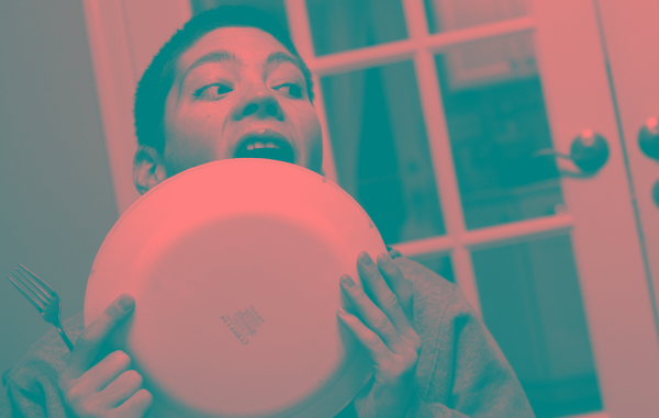
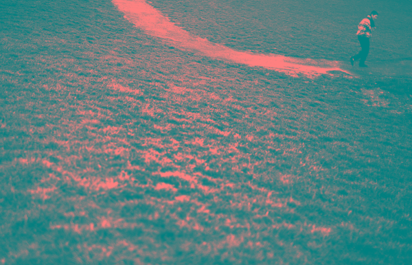
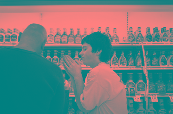
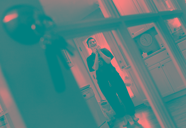
Below is an extremely well executed Photofilm by award winning photographer Maisie Crow titled ‘Hungry’.

Hungry: Living with Prader-Willi Syndrome – By Maisie Crow from liveBooks.


Step 2

As you will have seen from Maisie’s work, Photofilms are an extremely effective way to tell a story with your photos. The power of the still image really comes to light, the eye has time to explore the image as opposed to being directed by a moving image or video.

The simplicity of Maisie’s black and white shots portrays an authenticity of situation, which effectively accompanies the two voices of the subjects. The relatively short length of the film is important as well, as it would be difficult to sustain that level of quality and emotional connection with the viewer for a more extended period.

I remember coming away from viewing the film for the first time feeling highly informed about Prader-Willi symdrome and the day-to-day lives of those who live with it, yet on second reflection, there are very few facts within the film to actually educate you about the condition in a medical sense.

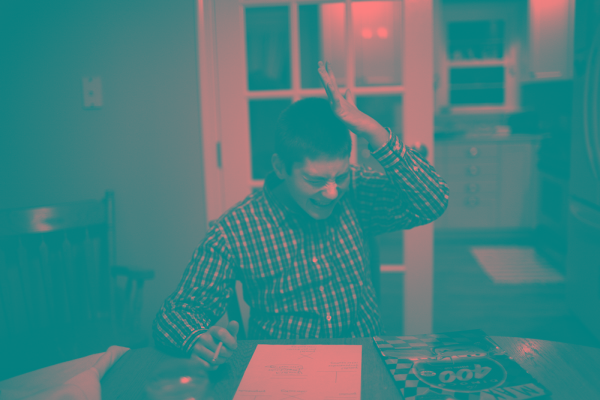
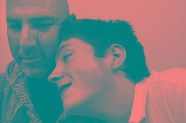
It is the depth of understanding that the film offers the viewer which is so impressive – a result of a very well crafted piece of work. Throughout the article I will include some stills from the film to demonstrate the style of images which make the piece so dramatic.


Step 3

So, you’ve seen a top quality example of a Photofilm and you want to make your own? These next few steps should equip you to start producing your very own films.

Like any photographic project, you’ll need a subject or location to shoot. It’s probably best to start with a topic that you’re familiar with or used to shooting, but you may have a particular story that you want to tell, know a group of people that you think might be interesting to capture or you may even have a collection of photos that you’ve already taken which you might be suitable.


Step 4

To create your Photofilm, it’s essential that you’re kitted out with all the right gear, but don’t worry, you only need a few pieces of kit to get started. You can use whichever camera you like, your DSLR, you’re favourite old 35mm or even your camera phone, as long as you can upload or scan the images onto your computer.

The other main piece of equipment that you’ll need is a handheld audio recording device. Something such as an Edirol R09 would be ideal, but there are some far cheaper dictaphone type products such as the Tascam DR07 which would be fine. Along with this you’ll need a good pair of closed headphones (not the in-ear ones) to listen whilst you’re recording.


Step 5

As photographers, I’m not expecting you to naturally understand the science of recording sound, but there are a few important tips to help with the recording process which should help to ensure you capture high quality audio.

Many devices have an option to record in MP3 format, please try and avoid this as it will compress your recordings, instead opt for 44.1Hz WAV for high quality audio. Think about where you’re pointing your recording device, particularly when interviewing a subject. Don’t hold it right in front of their face as this can be intimidating, instead aim to hold it at about chest height, think about the intimacy of the audio, and get up close.

Make sure your subject is comfortable and relaxed in their surroundings and if possible aim to sit side by side as opposed to facing each other directly, as this can make the situation awkward due to direct eye contact.

Be sure to think about the questions that you’re going to ask, don’t ‘umm’ and ‘ahh’ all over their answers and try to give lots of positive signs using body language such as nodding and smiling.

Remember that the person you’re interviewing may well be giving up their time for you and opening up to you as an interviewer, so ensure you respect that and leave time at the end to relax if you’ve been discussing a particularly emotional topic.


Step 6

Hopefully you’ll be far more clued up on the photographic element to your piece and it’s totally up to you what you shoot, but there are a few things to remember when shooting for a Photofilm.

Take plenty of shots, you’ll only use a small portion of the shots that you take and remember that no-one will see the shots that you don’t use! Ensure that you take a variety of shots, wide open establishing shots, lots of detail shots and everything in between.

The most important thing to remember is that you’re telling a story. There needs to be cohesion between your shots and they need to detail all that’s happening with your subject or location in order to tell the complete story.


Step 7

The only other thing you’ll need to create your Photofilm is some software to compile it. The first thing that you’ll need to do is edit your recorded audio, which can be done using free software such as Audacity.

Within Audacity you can upload all your recordings, cut them up, change the order and layer them up as you please. You’ll also need some software to combine the audio with the photos. You can download a free version of Soundslides online, which is a great tool for creating Photofilms and will present your work very nicely. The alternative if you’ve got a bit more money to spend would be Final Cut Pro or Elements.


Step 8

Now you’ve got your audio and your photos, it’s time to combine the two to create your Photofilm. It’s up to you which you organise first, but be sure to provide a solid narrative to the film, introduce the topics and subjects and don’t presume the viewer knows what it’s about before it starts.

Select your images carefully, don’t be precious about shots – you may really like particular shots, but if they don’t add to the film, then don’t be afraid to scrap them. You also need to consider the use of music, understanding the emotional portrayal of the story. Music can be a very manipulative emotional tool and needs to be used to enhance the film, but also not detract from it’s personal involvement.


Step 9

Try different orders of audio and films, different combinations, with music, without music and you’ll soon be able to gauge what does and doesn’t work. Remember though that this is all dependant on the material you’re using, just because something doesn’t work this time around it doesn’t mean it won’t work next time!

Once you’re happy with the final piece, it’s time to share it with the world, upload it to YouTube or Vimeo, show your friends and family and get some feedback.


Step 10

I’m sure you will have learned a great deal from going through the process of creating a photofilm for the first time, so now it’s time to get out there again and apply all that you’ve learnt to a different project or subject

Remember that you don’t have to be commissioned or asked to create, just get out there and capture whatever takes your interest.

Still photography will always exist because our brains are wired to ingest still images. The fact our brains are being rewired might change that equation down the evolutionary road, but for now still images continue to be powerful forms of communication and enlightenment. Mixing still imagery with moving imagery, audio, graphics, ambient sound, music and most importantly the voice of our subjects is exhilarating and has only enhanced our abilities as visual storytellers to tell our stories in new, dynamic ways that can reach broader audiences and break the space logjam that print media has always forced our work into.

Ed Kashi (recently announced as the latest member of VII Photo Agency)

I’ll leave you with another great example of a photofilm, this time created by Cathy Greenblat about people suffering with Alzheimer’s:

SEEING ALZHEIMER’S DIFFERENTLY from duckrabbit on Vimeo.

Create a Sticky Note Effect in 5 Easy Steps with CSS3 and HTML5


In this tutorial, you’ll learn how to transform an HTML list into a wall of “sticky notes” that look and work like the following…

The effect is built up gradually and works on the latest Webkit browsers (Safari, Chrome), Firefox and Opera. Other browsers simply get some yellow squares.


Step 1: The HTML and Basic Squares

Let’s start with the simplest version that works across all browsers. As we are using HTML5 for the effect, the basic HTML of our sticky notes is an unordered list with a link containing all the other elements in each list item:

<ul>
  <li>
    <a href="#">
      <h2>Title #1</h2>
      <p>Text Content #1</p>
    </a>
  </li>
  <li>
    <a href="#">
      <h2>Title #2</h2>
      <p>Text Content #2</p>
    </a>
  </li>
  […]
</ul>

Notice that each note is surrounded by a link which is always a good element to use as it automatically means that our notes become keyboard accessible. If we used the list item for the effect we’d need to set a tabindex property to get the same access.

The CSS to turn this into the yellow squares is simple:

*{
  margin:0;
  padding:0;
}
body{
  font-family:arial,sans-serif;
  font-size:100%;
  margin:3em;
  background:#666;
  color:#fff;
}
h2,p{
  font-size:100%;
  font-weight:normal;
}
ul,li{
  list-style:none;
}
ul{
  overflow:hidden;
  padding:3em;
}
ul li a{
  text-decoration:none;
  color:#000;
  background:#ffc;
  display:block;
  height:10em;
  width:10em;
  padding:1em;
}
ul li{
  margin:1em;
  float:left;
}

We reset things the browser normally gives us like margins and paddings and the list style to get rid of the bullets of the list.

We then give the UL element some padding and set its overflow property to hidden – this makes sure that when we float the list items later on they are contained in the list and the following elements in the document automatically clear the float.

We style the link as a yellow rectangle and float all of the list items to the left. The result is a series of yellow boxes for our list:

Step1: a series of yellow boxes

This works for every browser out there – including IE6. This is also where we end supporting this browser as we should not shoe-horn visual effects supported by modern technology into outdated one.


Step 2: Drop Shadows and Scribbly Font

Now it is time to add a drop shadow to the notes to make them stand out and to use a scribbly, hand-written font as the note font. For this we use the Google Fonts API and the font they provide us with, called “Reenie Beanie”. The easiest way to use this API is to play with the Google font previewer:

The Google font previewer allows you to play with the fonts API and get copy+paste CSS code

Using this, we get a simple line of HTML to include this new font into the page. This is supported by all modern browsers.

<link  href="http://fonts.googleapis.com/css?
family=Reenie+Beanie:regular"
rel="stylesheet"
type="text/css">

We then can set some padding to the headings in the sticky notes, and set the font of the paragraphs to the new font we included. Notice that Reenie Beanie needs to be big to be readable:

ul li h2{
  font-size:140%;
  font-weight:bold;
  padding-bottom:10px;
}
ul li p{
  font-family:"Reenie Beanie",arial,sans-serif;
  font-size:180%;
}

In order to give the sticky notes a shadow to make them stand out from the page, we need to apply a box-shadow. For this, we must add a line for each of the different browsers we want to support to the style of the links:

ul li a{
  text-decoration:none;
  color:#000;
  background:#ffc;
  display:block;
  height:10em;
  width:10em;
  padding:1em;
  /* Firefox */
  -moz-box-shadow:5px 5px 7px rgba(33,33,33,1);
  /* Safari+Chrome */
  -webkit-box-shadow: 5px 5px 7px rgba(33,33,33,.7);
  /* Opera */
  box-shadow: 5px 5px 7px rgba(33,33,33,.7);
}

The syntax is luckily the same for each: offset, spread and colour – in this case a dark grey with an opacity of 70%. Together with the new font our sticky notes now look like this:

Step2: adding new fonts and drop shadows

Step 3: Tilting the Notes

Disclaimer: Both the tilting of the notes and the zooming we’ll add in the next step were already explained in the past, in this article by Zurb, but lacked the support for other browsers, as they weren’t out at the time of writing. So big thanks to them for publishing this trick.

In order to tilt an element you use the transform:rotate property of CSS3, again adding the prefix for each of the browsers:

ul li a{
  -webkit-transform:rotate(-6deg);
  -o-transform:rotate(-6deg);
  -moz-transform:rotate(-6deg);
}

This tilts all the links by six degrees to the left. Now to make the sticky notes appear to be randomly tilted, we can use the nth-child property of CSS3:

ul li:nth-child(even) a{
  -o-transform:rotate(4deg);
  -webkit-transform:rotate(4deg);
  -moz-transform:rotate(4deg);
  position:relative;
  top:5px;
}
ul li:nth-child(3n) a{
  -o-transform:rotate(-3deg);
  -webkit-transform:rotate(-3deg);
  -moz-transform:rotate(-3deg);
  position:relative;
  top:-5px;
}
ul li:nth-child(5n) a{
  -o-transform:rotate(5deg);
  -webkit-transform:rotate(5deg);
  -moz-transform:rotate(5deg);
  position:relative;
  top:-10px;
}

This tilts every second link four degrees to the right, and offsets it a bit by five pixels from the top. Every third link gets tilted by three degrees to the left and pushed up five pixels. And every fifth link gets rotated five degrees to the right and offset ten pixels from the bottom. All in all this gives the impression of random sticky notes:

Step3: seemingly random sticky notes

Step 4: Zooming the Sticky Notes on Hover and Focus

To make a sticky note stand out we use a larger drop shadow and the scale transformation of CSS3. Again, we need to define these for each of the browsers:

ul li a:hover,ul li a:focus{
  -moz-box-shadow:10px 10px 7px rgba(0,0,0,.7);
  -webkit-box-shadow: 10px 10px 7px rgba(0,0,0,.7);
  box-shadow:10px 10px 7px rgba(0,0,0,.7);
  -webkit-transform: scale(1.25);
  -moz-transform: scale(1.25);
  -o-transform: scale(1.25);
  position:relative;
  z-index:5;
}

We also add a higher z-index to ensure that the enlarged sticky note covers the others. As we apply this on hover and focus,it means that moving the mouse over or tabbing to a link now makes it stand out:

Step4: Zooming the current sticky note

Step 5: Adding Smooth Transitions and Colors

The last step is to make the change from tilted to zoomed smooth and appealing rather than sudden. For this we use the CSS3 transition module in its different browser vendor implementations:

ul li a{
  text-decoration:none;
  color:#000;
  background:#ffc;
  display:block;
  height:10em;
  width:10em;
  padding:1em;
  -moz-box-shadow:5px 5px 7px rgba(33,33,33,1);
  -webkit-box-shadow: 5px 5px 7px rgba(33,33,33,.7);
  box-shadow: 5px 5px 7px rgba(33,33,33,.7);
  -moz-transition:-moz-transform .15s linear;
  -o-transition:-o-transform .15s linear;
  -webkit-transition:-webkit-transform .15s linear;
}

In essence this says: if something is to change to this element, do not just switch to that other definition but do it gradually during a quarter of a second. As another extra, let’s add some colour into the mix by making every second sticky note green and every third light blue:

ul li:nth-child(even) a{
  -o-transform:rotate(4deg);
  -webkit-transform:rotate(4deg);
  -moz-transform:rotate(4deg);
  position:relative;
  top:5px;
  background:#cfc;
}
ul li:nth-child(3n) a{
  -o-transform:rotate(-3deg);
  -webkit-transform:rotate(-3deg);
  -moz-transform:rotate(-3deg);
  position:relative;
  top:-5px;
  background:#ccf;
}

In order to see the difference to the last step, you’d need to try the last demo out in a browser.

Step 5:Coloured and smoothly zooming sticky notes

Summary and Download

There you have it – smoothly animating and tilted sticky notes without any use of images or JavaScript – supported by Firefox, Opera, Safari and Chrome and falling back to a set of yellow boxes in older browsers. By clever use of the nth-child selector and CSS transformations and transitions, we saved ourselves some scripting. Further, Google’s Web Font API made it easy to use a custom font. Using both hover and focus for the effect also means that keyboard users can observe the results as well.

Download the sticky notes example as a zip.


About the Author

Christian Heilmann is an international Developer Evangelist who works for the Yahoo Developer Network in the lovely town of London, England. He’s written two books: “Beginning JavaScript with DOM Scripting and AJAX“, and “Web Development Solutions.”

Australian ratings board looks ahead to App Store crackdown

It’s not a done deal by any means, but the Australian government’s Classification Board is taking a hard look at games for mobile devices, which up until now have skated by the country’s regulatory requirements that mandate a pass for content and age-appropriateness — at a cost to developers of hundreds or thousands of A$. By November, we should know for sure whether or not App Store developers will have to choose between paying to have their games rated or pulling them out of the Australian market.

This issue came up as long ago as October of last year, in response to the infamous BabyShaker app. Aussie devs Lloyd Kranzky and Nick Lowe have weighed in on their blogs, and raise some good points: although it’s not necessarily a level playing field between the iDevices and other phones, and the console and PC games (which have been complying with the classification rules, in some cases leading to indie or casual/free games avoiding the Australian market), it’s also not completely fair to lump mobile games in with the big boys when Flash games and other online content are completely free and clear of regulatory burden.

Another stat of note: back in 2007/08, the board reportedly classified under 1,000 video games — a pittance compared to the thousands of games streaming out of the App Store and Android Market. It’s unclear whether the regulatory infrastructure is even prepared to deal with the new order.

Here’s a question for Mac, PC and console game developers: do Australian rules affect your decision-making when it comes to game releases, vs. the US industry-driven ESRB ratings system? Pipe up in the comments.

Thanks to Jarrod for sending this in.

[hat tip to Kotaku]

TUAWAustralian ratings board looks ahead to App Store crackdown originally appeared on The Unofficial Apple Weblog (TUAW) on Thu, 19 Aug 2010 15:00:00 EST. Please see our terms for use of feeds.

Read | Permalink | Email this | Comments

"Compare Macs" option added to Apple Store

“Which Mac should I choose?” It’s a question I’ve asked myself and had posed to me countless times. It comes down to your needs and budget, but some customers still struggle. This week, Apple has added a new comparison feature to the online Apple Store meant to make the process a little easier.

The new service lets you choose up to three Macs to compare side-by-side, stat by stat. Users can scroll through the report with comparable statistics perfectly aligned, and even view environmental reports. It’s very handy and offers a clear picture of the differences both notable and minute.

Setting up a comparison is simple. Click the “Compare Macs” button and then select a machine for each of the three columns via a pop-up window. Kudos to Apple for developing and launching such a useful feature.

[Via The Loop]

TUAW“Compare Macs” option added to Apple Store originally appeared on The Unofficial Apple Weblog (TUAW) on Thu, 19 Aug 2010 16:00:00 EST. Please see our terms for use of feeds.

Read | Permalink | Email this | Comments

Foxconn hiring and relocating 400,000 workers

The recent issues at Foxconn haven’t actually slowed the company down, apparently — it has announced that it will be hiring 400,000 more workers at new plants in China, thanks to a 50 percent increase in revenue lately. The total number of people working at Foxconn will be estimated at 1.3 million. Just for comparison’s sake, GM employed about 244,500 last year. Foxconn is moving almost that many workers out of its Shenzhen plant — 170,000 of those workers will be sent to plants closer to their homes.

It’s crazy to think what the company must be like — not only are they handling ungodly amounts of people making ungodly amounts of electronic devices, but they’re doing it mostly for American companies like Apple, Dell, HP, and so on. This is the giant machine that’s pushing out all of those iPhones and Macs that Apple is breaking sales records with. Hopefully the new plants and relocations will help all of the issues that employees there have had in the past.

TUAWFoxconn hiring and relocating 400,000 workers originally appeared on The Unofficial Apple Weblog (TUAW) on Thu, 19 Aug 2010 17:00:00 EST. Please see our terms for use of feeds.

Read | Permalink | Email this | Comments

New Windows Home Server beta improves Mac support

How many TUAW readers have ever considered running a Windows server at home? I’m guessing not many. I’m hopefully going to convince you that’s a shame because they can offer many features not easily (or cheaply!) replicated with Apple’s own products.

Engadget reports that a new beta version of Microsoft’s Windows Home Server OS boasts considerably enhanced Mac support. Despite being a Unix-turned-Mac guy, I’ve had one of HP’s MediaSmart servers (pictured) in my house for almost a year now, and it’s neatly assimilated itself alongside my Macs thanks to HP’s secret sauce add-ons. I couldn’t be happier with it.

Read on for exactly how it’s all done.

TUAWNew Windows Home Server beta improves Mac support originally appeared on The Unofficial Apple Weblog (TUAW) on Thu, 19 Aug 2010 18:00:00 EST. Please see our terms for use of feeds.

Read | Permalink | Email this | Comments

Safari extension highlight: Awesome Screenshot

With the addition of the Safari Extensions Gallery to Apple’s website, TUAW will be highlighting extensions that we think are special, useful, or just plain fun.

Today’s featured extension is Awesome Screenshot which lets you capture, annotate and share screenshots to awesomescreenshot.com. The way it works is pretty neat. Once you’re at a webpage you’d like to share, simply click the extension’s button. A toolbar appears that lets you annotate the page in a variety of ways. You can draw freely or use boxes, circle or lines. There’s even a tool to blur out information that you’d rather keep hidden.

Once you’re done, you can save the image as a local file or get a url to share with coworkers or friends. It’s a useful tool that could make far-flung collaboration a little easier, all handled directly within the browser.

TUAWSafari extension highlight: Awesome Screenshot originally appeared on The Unofficial Apple Weblog (TUAW) on Thu, 19 Aug 2010 19:00:00 EST. Please see our terms for use of feeds.

Read | Permalink | Email this | Comments

Pro HDR gets an update for iPhone and leaps ahead of the pack

It must be the week for HDR app updates. Yesterday we reviewed a solid update of TrueHDR, and now we have another terrific update from Pro HDR.

Even if you’re not into HDR photography, this is one to check out. High Dynamic Range photography creates an image from multiple exposures that are combined to overcome the limitations of automatic exposure control in cameras. The technique can recover details that would be lost in shadows, and keep bright areas, like the sky from blowing out.

The update to Pro HDR, which has just been released, has a new fully automatic mode. Instead of taking two pictures with your iPhone, and manually pointing to the brightest and darkest areas, this new option analyzes the scene, sets the exposure accordingly, and then takes the two images without any user intervention. You can also use the manual mode if you prefer. The app also claims faster image capture and better alignment.

Gallery: Pro HDR examples

TUAWPro HDR gets an update for iPhone and leaps ahead of the pack originally appeared on The Unofficial Apple Weblog (TUAW) on Thu, 19 Aug 2010 20:00:00 EST. Please see our terms for use of feeds.

Read | Permalink | Email this | Comments

Asus is selling fewer netbooks because of the iPad

At an investor’s conference in Taipai this week, Asus CEO Jerry Shen announced reduced sales forcasts for the popular Eee PC line of netbooks. Why? Because people are buying iPads instead.

Digitimes reports that Eee sales fell from 1.6m units in Q1, to 1.5m in Q2, and are now expected to be 1.4m in Q3 . As the third quarter includes the lucrative back-to-school period, those numbers are moving very much the wrong way for Asus. Apple famously sold three million iPads in less than three months despite stock shortages, so whilst Asus is still outselling Apple, that’s likely to change soon.

Asus is planning to retaliate with its own own tablet computers running Windows Embedded Compact 7: Too Many Adjectives Edition, but Engadget’s writers weren’t impressed when they previewed it recently.

TUAWAsus is selling fewer netbooks because of the iPad originally appeared on The Unofficial Apple Weblog (TUAW) on Thu, 19 Aug 2010 21:30:00 EST. Please see our terms for use of feeds.

Read | Permalink | Email this | Comments

DashPad brings the Dashboard to the iPad, sort of…

DashPad (US$9.99) takes a unique approach to putting a Dashboard on your iPad. Instead of using an app, (which would never get approved by Apple), or jailbreaking, it uses Safari to serve an iPad specific page that contains eight widgets. More widgets will be coming, according to DashPad’s developer Pixlcreations.

Here’s how it works. First you’re taken to Paypal to tender your payment which triggers an email containing a username, password and a link to the site. After entering the information DashPad opens the Mobile Safari page where you’ll find eight widgets: Clock, Calendar, Calculator, Unit Converter, Sticky Note, Yellow Pages Search, Google Search, and Weather. This is presented just as you’d expect it, with the widgets on the bottom regardless of how you hold the iPad.

The rest of the screen is a white field. Just like Mac widgets, you tap on one to activate it and tap on it again to dismiss it. The widgets can all be moved around on the screen. A button shows or hides the widget bar. When you leave the app, it remembers the position of your widgets and the contents of the Sticky Note. It also allows you to put an icon on your iPad’s desktop for quick access, which of course you can do with any Safari page.

This is fine if you’ve become really accustomed to using widgets on your Mac and miss not having them on your iPad. It’s a really neat idea, but after using it, I found quite a number of limitations. You can’t install your own widgets, since they are a part of the Mobile Safari page, however when new ones come out, they will be there the next time DashPad is run.

After not using Dashpad for a day or so you will have to put in your username and password again. This, I’m told, is a security measure and they are working on a way to delay authentication longer. This alone kills the idea of a quick and easy way to get bits of information all at the same time and I would consider authentication at this frequency a deal-breaker.

You are only allowed one Sticky Note, which can be as long as you want and is scrollable. More will be coming, but one is what you get now. The Weather widget, which requires your zip code, doesn’t remember it upon re-launch. The Google Search isn’t useful since it does exactly the same thing as the search bar already showing in Safari. It brings up a new page. Of course hitting the usual icon brings up the screen showing your last six Safari pages and you can easily get back to DashPad, but this brings nothing to the table that you already don’t have.

It does have potential though and you might like it, but to find out you’ll have to pony up the $9.99. I consider paying first bad marketing, especially since it would be possible to let you try it out for a few days and if you didn’t pay up, the authentication would stop working. Personally, I don’t think it’s worth the price — but if you’re really enamored with your Dashboard, you might think differently.

TUAW is commonly provided with not-for-resale licenses or promo codes to permit product evaluations and reviews. For more details, see our policy page.

TUAWDashPad brings the Dashboard to the iPad, sort of… originally appeared on The Unofficial Apple Weblog (TUAW) on Thu, 19 Aug 2010 23:30:00 EST. Please see our terms for use of feeds.

Read | Permalink | Email this | Comments

Choose Your Own Adventure available for iPhone as U-Ventures

If you, like me, were a big scifi/fantasy reader at a young age, you probably remember the “Choose Your Own Adventure” series. It was a series of books in which, every chapter or so, you could make a choice that affected the story, and you were then prompted to turn to a certain page to continue the story after that choice. Edward Packard was the original author of that series, and he’s now teamed up with an iPhone app company to create U-Ventures, a throwback iPhone application that works as an interactive, e-book style Choose You Own Adventure. The first book is called “Return to the Cave of Time” (after the first book in the original series), and just like the old series, it offers up a set of second-person branching paths.

Unfortunately, at US$3.99, the app is pretty expensive. Reviews say that there are only about 15 minutes of content to go through here, and while the old books were short, there are a lot of other interactive storytelling options on the App Store in the form of games and other e-books. But as a retro return to the old form, it’s a nice taste of what’s possible. I’m hoping that Packard will update the idea a little bit and make it a little more iPhone-friendly next time.

Or, … you could just roll your own. Our own Victor Agreda wrote about iPod-friendly CYOA books a long time ago. Download some of those onto your iPod, and you could be right back in those old pre-video game days of interactive storytelling.

[via Slashdot]

TUAWChoose Your Own Adventure available for iPhone as U-Ventures originally appeared on The Unofficial Apple Weblog (TUAW) on Thu, 19 Aug 2010 11:00:00 EST. Please see our terms for use of feeds.

Read | Permalink | Email this | Comments

Koreans swamp servers as pre-orders begin

iPhone 4 pre-orders have begun in Korea, and distributor KT Corporation (KTC) is reporting huge sales. Specifically, 130,000 orders were placed within the first 13 hours of availability. By comparison, it took 5 days to sell 65,000 units of the 3GS.

KTC reportedly had to expand their server capacity during the frenzied day as the initial surge brought service down. Customers were trying to connect from multiple locations, like work and home, in an attempt to make a successful transaction.

Pyo Hyun-myong, chief of KTC’s mobile business, shared his gratitude and apologized for the downtime some customers experienced via Twitter. “I really appreciate this enormous support from our customers, and I also apologize for the discomfort caused by the ordering system. We will do our best for flawless delivery of the product.”

There’s no definite release date just yet, other than sometime in September. Sales-killing antenna issue? What sales-killing antenna issue?

TUAWKoreans swamp servers as pre-orders begin originally appeared on The Unofficial Apple Weblog (TUAW) on Thu, 19 Aug 2010 12:00:00 EST. Please see our terms for use of feeds.

Read | Permalink | Email this | Comments