Magic Launch: Take Back Control of File Associations

Apple made a controversial change in Snow Leopard. It’s a fairly system-level one, though, so perhaps the majority of users will not have had any issues with it – but it’s made some experienced Mac users pretty unhappy. What’s changed is the way in which files open when double-clicked.

It used to be that OS X embedded what’s known as a Creator Code in new files, so that the system knew to open files within the applications that made them. Rob Griffiths published a discussion of this behaviour, and the changes in Snow Leopard, in Macworld back in September last year. Have a read of that piece, and the lengthy comments that accompany it, if you want to understand the issue better.

I haven’t been impacted by this change to a great degree, but one of the applications that comes up in discussion of ways of fixing the change, and giving back more control over what applications open files, caught my eye. Michel Fortin’s Magic Launch is a Preference Pane that lets you manipulate file-opening in ways that allow you a great deal of flexibility.

It solves the problem of Creator Codes being removed, but it also adds some excellent functionality, and that means it’s well worth a look even if you’re untroubled by the main issue it addresses.

What It Is, What It Does

Let me begin by saying again that I’ve really not been affected by this change in Snow Leopard – I probably wouldn’t even have noticed it, had I not chanced on that Macworld article a while back. But I find that Magic Launch allows me to do some really useful things, and so I’m glad to have discovered it. It scratches an itch I didn’t even know I had.

For those bothered by the removal of Creator Codes, the problem is that Snow Leopard opens, say, HTML files created in TextMate, in the default browser, rather than in TextMate, which is a far more sensible editing environment. Magic Launch immediately fixes this, by interposing itself in the file-opening process.

Magic Launch is a tiny download, and installs as a Preference Pane under your System Preferences.

Magic Launch in Preferences

Magic Launch in Preferences

Open up the Pane, and you’ll see this – a simple setup screen:

Setup Screen

Setup Screen

Remember that the core function of Magic Launch is to be able to configure and control which applications open particular files. So if you have a file that you want to set up, you can simply drag-and-drop it into the main window, and Magic Launch will recognise the file extension, and if it can, identify any variants of that type of file. For instance, if you drop a plain text .txt file, Magic Launch knows to add to the list files with the .text extension.

And then you simply select from the Default Application pulldown menu which app you want to use to open files of this particular kind.

Selecting an Application

Selecting an Application

The next time you double-click on a file with that extension, regardless of what application you used to create it, it will open with the application you’ve selected here.

Another Use

Another use that immediately comes to mind is fixing things after you’ve installed a particularly aggressive application that claims all files of a particular kind. OpenOffice.org, for instance, the last time I installed it, set itself to open all Microsoft PowerPoint files, when I wanted them to be opened by Keynote. This is easily fixed by ctrl-clicking on the file and then selecting ‘Get Info’ (or selecting it and then hitting [cmd]+[i]) and then altering the ‘Open With’ setting:

Finder Application Choice

Finder Application Choice

But installing another application might again claim the file-type for itself. Whereas, if you have Magic Launch installed, you can set the groundrules here, and no amount of meddling from other apps will change your preference.

Clever Stuff

But what really interested me about Magic Launch is its ability to do some clever things, which I think could really help fine-tuning one’s workflow.

Here’s an example from my own setup: For the last year or so, I’ve done all my writing in TextMate, and that’s definitely the app I choose for any other work involving text files (and, for simplicity’s sake, I now keep most of my information in plain text). Recently I took another look at Writeroom, and I’m really enjoying using it as my main writing environment (got to love that typewriter scrolling!).

So when I’m working on a piece, I want the file to open in Writeroom, but once I’m done, I’m happy to hand it back to TextMate. All I needed to do was introduce a new convention: I now start working file titles with the word ‘draft’, and have set up a rule in Magic Launch that any text file that includes that word opens in Writeroom.

Creating Rules

Creating Rules

When I’m done with my editing, I remove the ‘draft’, and in future the file will open in TextMate, along with all the other text files on my system.

Now that’s a really simple implementation, but it meets my needs. Your situation may be far more complex, and you might be working with a much wider range of file-types through the day.

One example might be those who work with image files – you spend your time creating a high-resolution graphic, but when you want to take a look through a bunch of these, you don’t really want to have to fire up Photoshop.

You could create a rule in Magic Launch that does different things with files with different phrases in their titles, as above, or you could use different colour Labels – when you’re done with editing an image and move it into a store folder, you could set the label to red, and your Magic Launch rule would then open red-labelled files in Preview.

Image Previews

Image Previews

You could rope in Hazel to make this process even easier: just set a rule in Hazel that files dropped into a particular folder are labelled red, and you’re done.

In Conclusion

Using the familiar rule-setting logic in Magic Launch means that you can define and refine how files are treated by a wide range of criteria. I know, I know, I know that there are other ways of doing much of what this app can do, but I love that it makes the process so easy and straightforward.

You can set up your file-associations and rules, and then forget about Magic Launch: it’ll quietly, simply get on with its job, and after a while you’ll quite possibly forget that it’s there.

To my mind, that’s the best kind of tool: one that gives you power and granular control, and then gets out of the way so that I can get on with doing the things that are important to me.


Best of AppStorm in July

We’ve collected the top five reviews, roundups and how-to articles from across the AppStorm network in July. Whether you’re interested in Mac, iPhone, or Web apps, there’s bound to be something you didn’t spot over the course of the month.

Now would be a good time to explore a part of the AppStorm Network you’ve never seen before!

Best of iPhone.AppStorm

NotifyMe: Beautiful Push Notification Tasks and To Do’s

Task management has been one of the most explored categories in the App Store. There are tons of to-do list applications that all offer the same basic features and allow users to list and check off tasks as they are done. Taking a departure from this conventional way of thinking, PoweryBase has come up with a great way to manage tasks on the go.

NotifyMe is a simple reminder app for your iPhone. It’s touted as being “simple, yet so very powerful”. With a simple user interface, easy to understand graphics and a speedy experience, NotifyMe takes the task out of…well, creating tasks! Selling for $5.99, the app is a bit more pricy than the conventional to-do app, but it packs in the features to make it worthwhile.

40 More Pixel-Perfect iPhone App Interfaces

In the past, we took a look at some of the best iPhone app interface designs. Since then, more and more applications are coming out that continue to impress us. This certainly isn’t an end all list. There are plenty of gorgeous apps out there and no way to cover them all!

You may even seen some apps we’ve covered in the past, but with the App Store constantly growing and changing, software is constantly being updated and their interfaces improved. Here’s a look at some of the sexiest iPhone apps out there!

How to Listen to Any Radio Station with TuneIn

In the age of MP3s, Pandora, and Grooveshark, it’s easy to forget that the airwaves are still being endlessly pumped with great programming via old school AM/FM radio stations. The last device you would expect to cause you to listen to more radio is an iPhone, but the app below will do just that!

Today we’re going to take a look at TuneIn Radio, an app that is sure to help you reclaim your long lost love for good old fashioned radio.

Meet the TapBots: 3 Useful & Beautiful iPhone Apps

With over 225,000 applications available on the iTunes App Store, there is no shortage of apps that can do just about anything. Many of these pack in the features and over time, become more and more complex.

Enter Tapbots, a team of two guys who became interested in developing easy to use, focused and fun applications for the iPhone. Right now, Tapbots offers three unique apps (or robots, as they like to call them). Here’s a quick look at their fun and friendly robot family.

30 Essential iPad Apps for Designers and Creatives

A fancy new iPad is the perfect travel companion for any designer. The richness of the large multi-touch screen makes for some incredibly useful and fun apps that can really drive your creativity.

Below we’ll look at 30 different apps spanning several categories that can help designers and creatives out with everything from jotting down notes and wireframing to staying on task.

Best of Web.AppStorm

10 [More] Killer Dropbox Tips and Tricks

10 [More] Killer Dropbox Tips and Tricks

We recently rounded up 15 Awesome Dropbox Tips and Tricks, which was accompanied by a giveaway. Entries required a comment with your favorite Dropbox tip, trick or hack you use. From that massive collection of entries we bring you 10 [more] killer Dropbox tips and tricks to make the most of this amazing app.

10 Reasons I’m Switching from TweetDeck to HootSuite

10 Reasons I’m Switching from TweetDeck to HootSuite

TweetDeck is a fantastic app, don’t get me wrong. However, HootSuite offers the candy that’s more satisfying to my taste buds. My Twitter apps are what I call “always-on” because they’re one of the few apps I leave running and visible at all times. So, switching apps isn’t something I take lightly.

With that said, here’s ten reasons I’ve decided to switch from TweetDeck to HootSuite.

15 Web Alternatives to Popular Desktop Software

15 Web Alternatives to Popular Desktop Software

Desktop programs are great and all, but they don’t provide the same benefits as web apps that make use of cloud computing. With most web apps, you only need a browser and an internet connection to access all your data online. That beats having to install annoying programs any day. To give you a better sense of how useful web apps have become, I’ve compiled a list of web tools and apps that can very well replace some desktop programs. I hope you take the time to try them all out. You’ll be surprised how well they work.

35 of the Best Facebook Fan Pages

35 of the Best Facebook Fan Pages

Love it or hate it, Facebook is one great social network for individuals and businesses alike. With more active members (recently reaching 500 million) than the population of some countries, it’s easily one of the best places for marketers and fans.

After taking a look through tons of great Facebook fan pages we compiled 35 of our favorite and most inspiring. Have a look and share yours!

10 Great Sites to Take a Break and Have a Laugh

10 Great Sites to Take a Break and Have a Laugh

Personally, I consider this to be the golden era of hilarity online. Created by amateurs & professionals alike there is no dearth of funny content in every possible niche. After the jump we are featuring a wild mix of hilarious sites that are worth a visit.

Best of Mac.AppStorm

The Ultimate Collection of Productivity & Office Software for Mac

This post is for all you workaholics who use a Mac for your full-time career. From to-do lists and digital clutter organizers to word processors and time trackers, we’ve compiled a list of all the applications you’ll need to stay productive and efficient at work.

Below you’ll find over 100 free and premium applications that will either fit right into your current workflow or revolutionize the way you get things done. Let’s take a look!

Smoking Hot Mac Interface Design: 30 Stunning Apps

Mac applications are known for their superb design, and in the past few years UI designers have really embraced this trend by creating some really remarkable interfaces. They embrace realism, ooze texture, and generally make you stop and stare.

Today we’ll look at 30 pieces of Mac software that really push the limit of great interface design. First we’ll say what the app does, then provide a screenshot followed by a brief statement about what I really love about the interface.

iDefrag: Should You Defrag Your Mac’s Hard Drive?

When you own a PC, you need to pay attention to things like defragmenting your hard-drives, installing and updating antivirus, antivandal and firewall software. If you switch to a Mac, you need worry a lot less about such things. I’m not saying you should be complacent, but things generally just work much more easily and straightforwardly.

Today we’re taking a look at iDefrag, and deciding whether or not you really need to worry about defragging your Mac!

Add Magical Mouse Gestures to Your Mac with Quicksilver

Remember Quicksilver? OS X’s ultimate but long-dormant launcher has quietly been updated to work on OS 10.6 and above. I thought I’d take the opportunity to dredge up an old but useful trick to boost your productivity.

Below I’ll show you how to setup Abracdabra with Quicksilver and add magical mouse gestures to activate any standard QS action. It’s a relatively simple trick, but gives your mouse a power you’ve never known before!

30 Fantastic Geeky Tricks to Get The Most From Your Mac

If you’re one of those Mac users that loves to dig in and play with hidden features and settings, this post is for you.
Below you’ll find 30 tips and tricks to help both seasoned and beginner Mac users to get the most out of their OS X experience. We’ll cover everything from obscure Terminal commands to keyboard shortcuts that every Mac user should know and use. Let’s get started!

Share Your Ideas

Is there something in particular you’d like to see on the site next month? We’d absolutely love to hear your suggestions for articles, topics and giveaways – just let us know in the comments. Thanks for reading AppStorm!


Introduction To Writing Scripts For AE – Expressions Day 1

This series of tutorials will get you closer to the world of variables and case-by-case analysis. The introduction to Javascript will start with After Effects expressions and continue on to writing scripts that build an entire scene. Expressions and Scripts are used to automate values that would take a long time to keyframe or building scenes containing a lot of similar elements, with a few lines of code.


Tutorial

Download Tutorial .flv

File size 109MB

Additional Aetuts+ Resources


Quick Tip: Automatically Create and Print Documents with Changeable Text Fields using CorelDraw X3


While working on a specific designs there is often a need to print out the same design numerous times with different content. Here are some tips to help you cope with this problem.

Continue reading “Quick Tip: Automatically Create and Print Documents with Changeable Text Fields using CorelDraw X3”

Inspiration: 30 Appealing Illustrated Flyers


Flyers are not only advertising they’re often miniature works of art. The best flyers are ones that stand out from the the stacks thrown haphazardly on the counter of your favorite cafe, bar or music store. In this showcase we have collected 30 examples of fully illustrated flyers to catch your eye and inspire your work.

Continue reading “Inspiration: 30 Appealing Illustrated Flyers”

Making the Beat: Afro-Cuban Drums – Audio Premium

In this week’s Audio Premium content, Mike Elliott continues his in-depth series on creating drum beats. This week we explore how to create Afro-Cuban drum patterns in your DAW.

To learn more about what you get as part of Audio Premium, read this. To take a peek inside this tutorial, hit the jump!

Welcome to the second drum based tutorial in the series that will show you what the beats are and how to make them sound good. In this tutorial we are going to cover drums in the Afro-Cuban style.

Afro-Cuban music is one of the two main categorizations of Latin music; the other being Brazilian. The drums are one of the key components in this style of music and knowing which beat to insert is crucial.

If you ever wondered what the difference was between a rumba and son clave, or just want to add some Afro-Cuban flavor, this tutorial will enlighten you in all regards. Since our previous discussion involved how to construct various beats from smaller elements, this tutorial will do so as well; albeit in a slightly different way. So my friends, lets mambo!

Here’s the kind of music you’ll be able to create once you harness the knowledge inside:

Download audio file (example.mp3)

Table of Contents

  • 1. Setting Up
    • What You Need

    • What to Use
  • 2. Learn the Dance
    • What the Steps Mean

    • Pick a Clave any Clave
    • Review
  • 3. Bell Beat Baby
    • Palito and Cascara

    • Mambo
    • Songo
    • Review
  • 4. Add the Flair
    • Bombo

    • Toms
    • Reinstating the Clave
    • Review
  • 5. Sound Color
    • The Kick

    • The Snare
    • The Cymbals
    • Toms
    • Review
  • 6. Fills, Fills, Fills
    • The Accent

    • Lead In
    • Patchwork
    • Review
  • Afro-Cuban in Review

Existing Premium members can log-in and download. Not a Plus member? Join now.


Quick Tip: Tempo Control Automation in Session View in Ableton Live

Like all DAWs, Ableton Live allow users to automate the tempo and signature of a given set. Unlike other DAWs, Ableton Live incorporate the session view where tempo changes can be automated there as well by renaming the Scene names accordingly. We are going to examine various ways of achieving this and also another way of automating tempo between two values by using external software.


Automating Tempo by Renaming Scenes

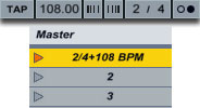
Till now, we know that by properly renaming Scenes in Ableton Live we can cause the tempo to jump to our desired value. Scenes can be renamed by clicking on a particular Scene in Session View, then hit CTRL(CMD for Mac)+R then type in the new name. Scene names can be both descriptive and functional; if Live detects a viable tempo and/or time signature as part of a scene name, the project will automatically adjust to these parameters when the scene is launched. To assign a tempo to a scene, select the scene and rename it with a viable tempo (e.g., “96 BPM”). Any tempo can be used, as long as it is within the range allowed by Live’s Tempo control (20-999 BPM).

To assign a time signature to a scene, rename the scene with a meter in the form of “x/y” (e.g., “4/4″). Any time signature can be used, provided it has a numerator between 1 and 99 and a denominator with a beat value of 1, 2, 4, 8 or 16. Tempo and time signature changes can coexist within a single scene name, and can appear in any position as long as they are separated from each other by at least one character. For example, “2/4+102 BPM”, “112 BPM;7/8″ and “110 BPM Verse 3/4″ are all scene names that will cause simultaneous meter and tempo changes.

The renamed Scene above, when launched, will cause the master TEMPO to jump to 108BPM with a signature change of 2/4.


Using Dummy Clips to Gradually Automate Tempo Control

The “problem” with this method is that the master tempo jumps to the required BPM. What if our live set incorporated a slow gradual tempo change? We know that we can easily achieve that in Arrangement View but there seems no way to do that in Session View.

We need to make use of dummy clips and external software. Dummy clips are essentially empty midi clips that contain modulation information for other parameters in our Live set. The extra software we are going to be using is a free software called MIDI YOKE. MIDI YOKE is a MIDI Patch Cable driver. It’s a Windows multimedia driver that allows you to connect the MIDI output from one program to the MIDI input of a different program. Mac users already have this functionality in the form of the IAC driver.

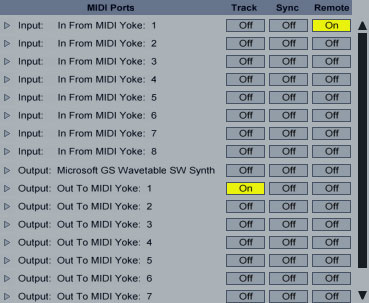
Once downloaded and installed head over to Live’s preferences in the Midi Sync tab. Under Midi Ports activate Remote for the Input In From MIDI Yoke: 1 port. Activate Track for the Output: Out to Midi Yoke: 1 port.

Exit Preferences. Create a midi track and set it’s output type to Out To MIDI Yoke: 1. Leave Output Channel to 1. Midi Yoke allows you to utilize all 16 midi channels if so desired.

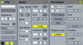
Double click on an empty clip slot to create a dummy clip. On the Clip View hit the E icon to show the Envelopes Box. Leave the Loop switch activated. From the Envelope Editor’s first drop down box(Device Chooser), select Midi Ctr and from the second(Control Chooser) select a parameter controller. In my case, I chose 50. Set the Loop Length to the bars, beats and sixteenths that you want your automation to last. In my case, I set it to 4 bars.

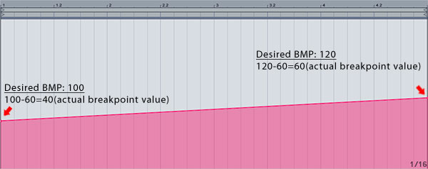
Now, please, pay attention as it may seem a little bit tricky. On the red line representing the envelope’s control automation, create two breakpoints one at the beginning and one at the end setting the first one to 0 and the second one to 127.

Launch the dummy clip by hitting the Clip Launch Button, then press SPACE bar to stop. Activate Midi Map Mode, click the tempo at the right of the TAP button(make sure to click the left side of the number where the Coarse value of the tempo is located) and click space bar again to launch the dummy clip. Hit the space bar once more to stop the clip. On the Midi Mapping at the left, you can see that the CC 50 controller number has been assigned to the master Song Tempo. Change the min and Max values to 60 and 187 values respectively or any other values whose difference is 127(for instance 100 and 187). Obviously the range you choose should cover the values you are planning to use to complete your automation. Exit Midi Map Mode.

The reason we set our range as such is that it will allow us to have whole number increments on the Master Tempo instead of decimal ones. As you know, the breakpoint envelope values range from 0 to 127 so setting a min and max Song Tempo values whose difference is 127 while on Midi Map Mode, allows us to work in single unit increments of the song tempo.

Now, let’s say we wanted to execute a gradual tempo from 100 to 120 BPM. All we needed to do is subtract the value of min value of 60 from both values and adjust our breakpoints accordingly.

Remember that you always subtract the min value you have set while on midi Map Mode, so if your range had a minimum value other than 60, this value should be used for subtraction.

Now you can deactivate the Loop switch for the dummy clip, launch it and see the song temp gradually increasing from 100 to 120 BPM in the duration of 4 bars! This way, whenever you want an automation change like that in your live set, you can create similar dummy clips and launch them either on their own or as part of a Scene launch.

Let me know if you have any questions and thanks for your time!


Twitter Background Design – Great Tips and Gorgeous Examples


We all know that gaining Twitter followers is down to how often you tweet and what you tweet about – or if you’re a website owner and use Twitter, a way to communicate with your readers. However, there are additional ways to increase the chances of new stumblers to follow you, one of them being by having an interesting background.

This isn’t a quick route to Twitter success, but it most certainly does help. By designing your own interesting Twitter background you can express your personality through images. One example is if you’re a creative person (which you probably are as you’re on Psdtuts+!) you would likely be able to put your skills to use and produce something beautiful that other creatives will appreciate. If they like your profile page, the chances are they’ll like your tweets, therefore following you!


A Quick Introduction To Twitter Backgrounds

Twitter doesn’t offer a whole lot of functionality when it comes to designing backgrounds, but there are a bunch of ways to work around this. You can change the color of the background, sidebar and links, and add background images – fixed or tiled. The biggest problem with Twitter backgrounds is the fact that the majority of your image will be hidden behind Twitter’s timeline and menu, leaving only the space between the edges of your browser and Twitter’s foreground, as seen below:

The above screenshot was taken on my 13″ MacBook Pro with a screen resolution of 1280×800 pixels. The amount of space for a background with this resolution is reasonably good, however with smaller screens or older laptops with a lower resolution the space can decrease dramatically and you will need to be able to work around this.

The obvious thing you need to do is to design your background around Twitter’s foreground content so that when you upload your image it won’t be hidden beneath the timeline.


Types of Backgrounds

There are a few different types of backgrounds in terms of image sizes:

  • The Big Image: This is just what the image suggests, a very large image! It can be used to cover the whole background of your Twitter profile. The bottom of them are often faded off into a solid color so that it merges into Twitters background (which of course you can choose the color of).
  • The Fading Image: This is often a much smaller image than the above option, often just a square or rectangle covering the top left corner or the complete right side of your profile. All of the edges are faded into a solid color so that they blend into Twitters background.
  • The Repeating Image: The repeating image option allows you to repeat an image throughout your background. A common use for this is patterned or textured backgrounds, such as my own which can be in the screenshot above. Text is not recommended for this kind of background as it will be repeated anywhere from several to several hundred times!

Chris Spooner has summed up these examples of Twitter backgrounds with a bunch of great examples, which can be seen along with a Twitter background tutorial: “Twitter Background Design How-To and Best Practices“.


The Good Stuff: Great Tips, Gorgeous Examples & Resources

After that quick introduction to Twitter backgrounds, we’re now going to look at a small selection of some lovely examples of backgrounds. We’re going to look at one design at time, and follow it up with a “Twitter Background Tip” that you can keep in mind when designing your own. We’ll also be outsourcing to some other articles and tutorials for a more in-depth look at particular subjects.

Please note that these tips may or may not be used together. Ideally only a few of these tips should be put into practice at any one time, as they don’t all work together.


Tip #1: Make your Twitter profile clearly match your websites image.

We all know about how important it is to have a clear and strong brand, whether you’re an individual, a freelancer or a full-blown company. Envato has made their Twitter profile represent their main website by using the same beautiful digital bokeh background and the strong green color scheme.


Bokeh Resources

If you like Envato’s bokeh background, check out some of the following resources!


Tip #2: Use plenty of interesting shapes and colors in your repeated backgrounds.

If you’re going to use a repeated/tiled image as your background, be sure to keep it interesting, or alternatively make it match your brand identity. Daniesq uses a lovely vector-style floral tiled image that fits together perfectly.


Pattern Resources

If you want to go for a repeating background, some of the following resources may come in handy!


Tip #3: Show your face to the world and stick it in your background.

After all everyone wants to know what you look like! Your profile picture is often to small to really represent yourself, or you may be using it to display your brands logo or another image. Although your profile picture can be enlarged, most people choose not to view larger versions of your pictures, therefore this is where your background profile can come in handy if you feel a picture of yourself is vital for your online identity. Chris Spooner for example uses a portrait of himself (which is important for his identity as he posts vlogs ) with some of his infamous vector shapes to give his Twitter profile a highly-personalised touch.


Portrait Photography Resources

There’s no point including a photo of yourself in your background. Even if it is “just Twitter” you need to keep your standards up at a professional level. The below resources should help you do that.


Tip #4: Make a big deal out of your logo and include it in your background image.

Including your logo in your Twitter background isn’t really necessary if you are already using your logo as your profile picture, but if not there isn’t really anything better you can do – it not only shows off your skills but also advertises your brands image! Vpieters uses a beautiful illustration (also used in the header of their blog) along with the Veerle logo in their Twitter background to make their website and Twitter profile fit together like two peas in a pod.


Logo Resources

If you don’t yet have a logo for yourself it is recommended even if you aren’t a freelancer as it helps to identify you as an individual, and it’s something else to show off! Here are a few good logo resources:


Tip #5: Make use of the infamous Twitter bird.

Twitter is very well known for its simple Twitter bird mascot (as you can see in the following post: “Splendid Twitter Accessories and Products“, the Twitter bird is very well known and pretty sweet!), so why not embed it into your own design mixed with any of the above or below features? KrisColvin uses the bird to her advantage to produce a stunning “big image” background.


Twitter Bird Resources

If you want to include a Twitter bird in your background, check out these resources.


Tip #6: Link your background in with your Twitter name and profile picture.

If you have a reasonably unique name that you use for your online identity, then why not expand on that and base your Twitter profile picture and background around that name? Mut1ey uses a rather cool picture of Muttley the dog from an old popular TV show as the profile picture, and expands on this by using a great illustrated piece of the character, along with an actual picture of the man behind the Twitter account and some contact information.


Brand Consistency Resources

It is important to keep the consistency of your brands image throughout your marketing material and social networking sites. Here are a couple of informative and helpful articles:


Tip #7: Use the space you have to share some information with your followers.

Your background space is a great way to share a little more information about yourself with your followers without being restricted by the character limit Twitter gives you in the primary biography area. Oridusartic embeds her blogs URL, email address and a list of her passions within a simple but stylish vector-based illustration that merges into a solid color. This helps new stumblers decide whether or not the user is going to be tweeting about things that are interesting to them.


Tip #8: Use a restricted color palette.

Using a restricted color palette (especially in tiled backgrounds) is a great way to show off your skill, as it requires patience and great compositions to make it look good. Willbryantplz uses a beautiful illustrated background merged with a grayscale texture to "wow" his followers and make the white Twitter foreground pop out from the screen. To really make this style work, the same colors should also be used as your font and sidebar colors.


Color Resources

If you’re going to use a limited color scheme, choose it wisely. Make it match your branding. Below are a few great color scheme websites well worth checking out!


Tip #9: Use your background to show off your personality, characteristics and interests.

Images are one of the best ways to share your personality and interests with people that somehow land on your Twitter page. Ericsteuten uses a wonderful illustration to represent his characteristics; clearly a happy, funny and imaginative guy.


Character Illustration Resources

Illustrated characters in your background are one of the best ways to show off your personality to your Twitter profile viewers; it shows off your skills too! Below are a few resources to help with character illustration.


Tip #10: Make the most of your own mascot.

If you have a mascot for your brand your Twitter profile is an excellent place to show him, her or it off! It’s not only fun and entertaining, but is a great way to link your Twitter profile with your brand. One superb example of this is MailChimp’s Twitter profile, who use their infamous MailChimp character to really jazz up their page.


Conclusion

By putting some of these Twitter background design tips into practice, you’ll be improving your design skills as you’ll learn how to work around design limitations which more than often do turn up in personal and client projects, as well as producing a great, attractive background that will appeal more people to hit the follow button when visiting your profile page!

Do you feel you have a good Twitter background? Share it with us in the comments section below!

Franci’s FITC San Francisco Diary: Day One

There’s been a sense of confusion in our industry lately. Standards are changing and there is a lot of discussion about where Flash fits in the future of the web. As a kind of therapy I decided to check out the FITC San Francisco and so far, I’ve found exactly what I was looking for..

In this diary I’ll try and get you up to date on what’s going on in some of the more interesting projects involving the Flash platform and even some insight into other technologies that might change the way we do our business.

fitc

The Many Faces Of Away 3D
Rob Baetman

Don’t like ads? Download the screencast, or subscribe to Activetuts+ screencasts via iTunes!

With 3D in Flash the main issue you’re likely to be dealing with is performance optimization.

Rob Baetman of Away3D has demonstrated some great innovation in enhancing performance of 3D Flash projects as well as new features of the Away3D engine. One of the more impressive features presented were the PixelBender materials and BSP Sorting which is still in development but allows you to create large scenes where small areas render independently, the idea for which being adopted from the old quake engine.

Also presented was the Away3D Lite engine, which performs extremely well with large numbers of faces, but reduces the amount of features added to the engine. The demonstration was performed with a 8000-face airplane model and PixelBender materials, and for the mobile Flash Player a 2000-face airplane model with generated landscape and the ability to fly and navigate the airplane over it with the use of accelerometers.

In the end there was a demonstration of a multiplayer FPS game done with BSP sorting and textures baked with Prefab3D which was working remarkably well.

Away3D is definitely worth checking out with all the innovation put into the engine. With the mobile Flash Player on the horizon, the Away3D Lite engine is particularly interesting for creating mobile 3D web experiences.


Recognize This! Seeing with Flash
Eugene Zatepyakin

Don’t like ads? Download the screencast, or subscribe to Activetuts+ screencasts via iTunes!

Eugene is crazy. And I mean that in the best way possible. What he’s working on has so many implications that it’s hard to focus on just one. The project he was presenting is ASSurf. It allows you to recognize patterns and mach images in real time without the use of premade markers.

What you need is an image in the database that has strong enough contrasts and ASSurf will do the rest to find it in the webcam captured area. It also gives you the ability to perform motion estimation. Owing to the speed limitations of ActionScript, Eugene opted for Alchemy to carry out the heavy calculations, and managed to get a decent framerate with a real time image recognition and a 3d model of a forest overlapping the area. The project is still in development and requires tweaking, but what the library can do right now is very impressive and goes to show what we can expect in the future.


The Adobe Keynote
Mark Anders And Kevin Lynch

fitc

Kevin Lynch and Mark Anders were discussing the future of Flash platform on mobile as well as desktop devices. Adobe is obviously working hard to get Flash 10.1 on as many mobile devices as possible and are working with most major mobile manufacturers to deliver as many as possible by the end of the year. Motorola is about to start a campaign that will focus on promoting the Flash Installed feature in their phones and will also roll out a big ad in Times Square with the Flash Installed, featured prominently, which shows their commitment to the platform.

AIR 2.5 mobile public/private beta is also out. You have to register to download it but that is it, so if you want to start developing or just testing it out you can do that at http://labs.adobe.com/technologies/air2/android/. More optimization tips for the AIR and Flash for Android will come in following parts of the diary.

We should also expect a major update for mobile Flash very soon. There has been a lot of work done on reducing memory consumption for AS3 VM, to the point where it has been reduced by about 50% for the 10.1 for mobile devices.

For anyone who plans to develop for mobile Flash or AIR, you’ll be happy to hear that the Device Central will feature a lot of cool tools for checking real world application use on a mobile device. These include use of accelerometers, ability to add reflective overlay over the screen to check the visibility of graphics with a custom reflecting background as in real world situation, the ability to throttle signal strength to check the performance of your application in simulated lower signal strength areas and check the battery consumption. The device manufacturers provide Adobe with a profile of their phones so that the simulations can be made as accurate as possible. Also, with the different number and kind of accelerometers in different devices, Adobe is working on providing a single range output for easier cross device development. All of this should make our lives a lot easier when it comes to developing for multiple devices.


Wrap Up

I hope you enjoyed this first glimpse at FITC San Fransisco 2010, look out for more diary entries coming soon!

Taking Advantage of Blender 2.5

Lifelike billowing smoke and flowing water are easy to create with expensive plugins, but monumental changes in the free, open-source software Blender 2.5 can enable you to replace the plugins whilst maintaining your software of choice. By changing your workflow you can save money (and replace some old particle effects with beautiful new volumetrics!) In this article, Matthew Groeling takes a look at a few things you could consider…

Whilst altering your workflow can take some getting used to, that flexibility is a tremendous skill for any 3D artist. The way the robust features below find their way into your workflow is ultimately up to you, but hopefully our recommendations will help you find a place for them!


Smoke

Smoke simulators are prime examples of a potentially expensive feature. Blender’s smoke simulator takes the first step into a domain exclusive to pricey add-ons and dedicated software suites – and even in its infant stage its already pouring out impressive results. Stunning fire, smoke and explosions are already possible, and before long you’ll be able to kiss goodbye to unrealistic particle effects.

The best place to work this feature in would be after modeling, texturing, and if you like, even animation. Importing the smoke simulation into other programs is a questionable tactic at best, chances are it probably won’t be supported.

Don’t worry though! If you don’t want to render using Blender, LuxRender should be your next stop. It’s unbiased rendering can easily produce breathtaking, lifelike results. Even better, a project called Small Lux GPU uses your graphics card to do all the hard work, getting those beautiful renders to you faster.

Cgtuts+ are currently running a tutorial series taking a look at the smoke/fire effects possible with Blender 2.5. Written by the man behind Blender 2.5′s smoke docs himself, Gottfried Hofmann, it’s a great place to start, and the preview is shown below. Check out the first part now by clicking here!


Fluids

From pouring a cup of water to wiping out New York with a tsunami, you’ll find that a good fluid simulator is practically your only option. Whilst commercial 3d software packages are beginning to bundle in simulators, learning how to use Blender’s and implementing it in your own workflow is still a great option!

There’s a lot of benefits to using Blender’s fluid simulator. For instance, you can be sure that the development will never stagnate for too long, even when your buddies using commercial software haven’t seen an update in months. Recently, Blender’s fluid sim has been getting some nice new features like subframing, which increases the stability and accuracy of your simulations.

Just like with the smoke simulator, feel free to import your textured scene into Blender to start setting up your fluid simulation. Then add your emitter, define your bounding box, and go!

For an example of what’s possible, check out Promotion Studio’s TV commercial, courtesy of BlenderNation


Compositing

Good compositing is currently something that very few plugins can deliver. In fact, for post processing video or still frame renders using commercial means, your best options lie in a separate software package. However, one of Blender’s hidden gems is it’s own built-in compositor! As you can see from the below image, the compositor is node based, meaning it’s non-linear and non-destructive.

If that terminology is new, and you’ve never worked with nodes before, the above image may be a little intimidating. When it comes down to it, though, working with a node based compositor can be as simple as plugging one box into another and watching your work start to come together!

Using compositing, you can mix live action with your CG, add some slight scratches or water droplets to your virtual camera lens, balance colors, and so much more. Compositing opens doors you didn’t even know existed, and you can use images and sequences in a variety of common formats. In fact the above node graph results in the image shown below :

If you find out you love the node based approach, with the Texture Nodes you can procedurally create textures and materials to use at other points in your workflow! They can be accessed through the Compositor window, but that doesn’t mean you have to wait until you render to use them.

For the ultimate look at just what the compositor is capable of, check out the following video from the making of Big Buck Bunny – in fact why not check out the entire short whilst you’re at it!

(c) copyright 2008, Blender Foundation / www.bigbuckbunny.org


Sequencer

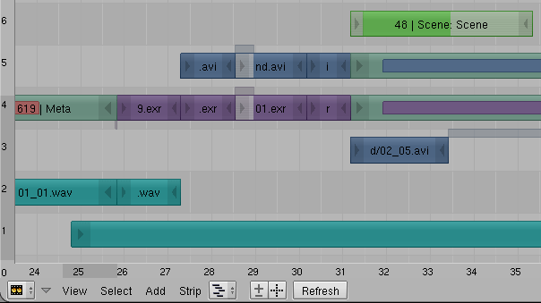
If you want a simple video editor with some extra advanced features, Blender’s sequencer will get the job done. Use it to edit together your rendered animations, sound, and other video clips from any application. While not as fully featured as the compositor, the sequencer is a good way to put together a edit quickly and easily. However be warned, the more complex features can take some time to learn, not to mention machine power!


Conclusion

If you ultimately decide to add Blender 2.5 to your workflow, you could end up saving a lot of money, but, more importantly, it will help to break you out of a box you may have been unknowingly sitting in.

Every software package has it’s unique strengths and weaknesses, but if you choose to live with these weaknesses you limit yourself. A simple export from one program to another can keep your wallet from loosing some serious weight, boost the quality of your project, and it helps to keep yourself open minded and flexible about your work.

If you like what you’ve seen above, why not check out the latest alpha release of Blender 2.5 from http://www.graphicall.org/


Don’t miss more CG tutorials and guides, published daily – subscribe to Cgtuts+ by RSS.

Would You Ever Go Postal at Your Workplace?

One of the most publicized incidents currently in the U.S. news is the case of the flight attendant, Steven Slater, who had a tirade at the end of his shift on board a JetBlue flight. This tirade came after an unruly passenger, at the end of the flight, decided to unload her baggage from the overhead compartment before the crew had given the OK for passengers to leave their seats. Slater asked the passenger to sit down but the passenger refused. At the same time, her luggage fell from the overhead compartment onto the head of Slater. Slater then requested an apology from the passenger who then cursed at him. Slater then used the plane’s public address system and declared, in rather colorful language, that he had enough after 28 years as a flight attendant and cursed the passenger who cursed at him. He then grabbed two beers and opened the rear exit and deployed the emergency exit slide and exited the plane via the slide. He was since arrested later at his home.

This is obviously an incident where a worker had enough of the conditions in his workplace and had a rather explosive reaction. It also brought to mind an incident I had in the past where I may not have acted as diplomatically as I could have in a work situation. It was the end of a long weekend where my group, the IT applications group, had just implemented a new software package. On Sunday, I was performing some last minute testing of the application and I discovered a major problem. As a result, I needed access to the application server and did not have the security to do so. So, I then called the Network Manager who never called me back. I was hoping that this issue could be resolved before the company started working on Monday since the Manufacturing floor needed to use this application to do their jobs.

When I caught up with the Network Manager on Monday morning, after stewing on this issue overnight, I screamed at him at the top of my lungs within earshot of any employee who happened to be in the area. The network manager, in not so many words, pretty much told me that there will never be 24X7 coverage so don’t expect it. To make a long story short, the issue was resolved that morning after the company pretty much came to a standstill for a couple of hours. That work stoppage could’ve certainly been avoided if I was able to contact the network manager on that previous day.

Could I have handled the situation with a calmer demeanor? Probably. Did I have justification to go off on the network manager that morning? I certainly thought so. So, I’m wondering, would you ever “go postal” at your workplace? If so, do you feel that your tirade would be justified? And what would be the consequences?

How to Beat Procrastination Permanently

It’s no surprise that we’ve touched on beating procrastination several times at WorkAwesome – it is productivity’s sworn enemy. On our path to progress, we’re constantly kicking procrastination to the curb, and often it just reappears a few steps farther along the road. Some of us fare better than others in the never-ending contest between procrastination and production, but few of us have taken the time to fully understand what procrastination is, where it comes from, and how to fight it effectively. In fact, most of us only know two things about procrastination; a basic, tip-of-the-iceberg definition, and not to do it.

Simply knowing “not to procrastinate” is inadequate. How can we learn how to beat procrastination if we don’t understand it? You wouldn’t go into any other battle without studying your opponent, maybe it’s time you got to “know your enemy.”

Which Tasks Do We Procrastinate?

We all know – in a very general, vague sense – when we tend to procrastinate, but a closer look at our least favorite tasks can show us exactly when we are prone to procrastination. Most of us follow certain behavioral patterns, delaying certain types of tasks with specific attributes. Psychologist Edwin Van Hooft theorizes that three task traits cause “task aversiveness,” the catalyst for procrastination:

  • Task difficulty. People tend to procrastinate when confronted with “difficult” tasks.
  • Task importance. People tend to procrastinate when they deem a task “unimportant.”
  • Task efficacy. When people don’t consider themselves “good at” the task at hand, they’re likely to procrastinate.

Structured Procrastination

Structured procrastination involves the reordering of tasks against their true importance. Faced with a particularly aversive (but important) task such as doing your taxes, you might discover less important things to do, like washing your car, finishing your laundry, or exercising. You might even invent tasks that border on the unnecessary, like disinfecting your desk or checking the air pressure on your car tires. It’s all about finding justifiable reasons to avoid the more important work.

It sounds harmless, even semi-productive, but structured procrastination is a serious problem. Your “to do” list is upside-down, reordering your tasks from least to most important. You’re putting off the critical tasks for trivialities that are barely worth your time. Your productivity may be up, but it’s only to hide from yourself the fact that your priorities are completely backwards.

Waiting For The “Spirit to Strike You”

Instead of springing into action like structured procrastinators, some people have the opposite reaction, becoming paralyzed by procrastination. Rather than avoiding the aversive work by turning to small, insignificant, less important tasks, they stay on target, facing the most important work first. However, that doesn’t necessarily mean they’re doing the work, and procrastinators often feel safe as long as they’re “in position,” even if they’re not actually making progress.

The classic example is the college student with a large paper due the next day. The student sits frozen at the keyboard. They aren’t writing, but they think that if they leave, they’ll miss a moment of perfect inspiration to write. The student feels comfortable and anxiety-free sitting at their desk. They’re not avoiding their work, in fact, they’re facing it… quite literally. But, they still aren’t actually doing it.

Perfectionism

Perfectionism is often portrayed as a positive quality to have, but it’s a frequent catalyst for procrastination. Work simply won’t get started unless the conditions are perfect, and it won’t ever be finished until the results are flawless. This is the kind of behavior that will stop a gym-goer from starting their workout unless they’re fully rested, perfectly hydrated and optimally fueled via a pre-workout diet. Similarly, an author might never finish their book until every word is glimmering with perfection.

How Do We Beat Procrastination?

Understand the flavors of motivation. Internal motivation is a product of your own values and goals. External motivation involves rewards – like a salary – for completing tasks and penalties – like a poor performance review – for failure. As much as we’d love our strongest motivation to come from within, we tend to put externally motivated tasks ahead of internally motivated ones. In other words, you may want very badly to spend the evening with your family, but you feel that you have to finish that externally-motivated project report by midnight.

Practice volitional skills. Psychologically speaking, “volitional skills” is just the scientific term for “willpower,” but there is an important distinction between the terms: People consider willpower to be innate, something you’re born with (or born without). It sounds like an easy avenue for excuses; whenever you want to procrastinate, you can shrug and proclaim “I just don’t have the willpower,” as if there’s no way to summon the initiative to get the job done.

The excuse just isn’t viable: “Willpower” is not a power given at birth. It’s a volitional skill; you can develop it, improve it or neglect it. Consider your volitional skills like muscles; you can strengthen them, but you can also exhaust them. They benefit from rest, so pick your willpower battles carefully.

Stop calling yourself a procrastinator. If you get too comfortable with procrastination, you’ll eventually find yourself neglecting your job, your family and your personal health. Instead of declaring yourself a procrastinator, declare your productive intentions and remind yourself of your goals. As David Campbell said:

“Discipline is remembering what you want”

80 Amazing Abstract Architecture Shots (And How to Shoot Your Own)

Architecture is an incredibly fascinating area of design. The seemingly impossible physics, the play of light, the masculine textures, it all comes together to create an incredible sense of fantasy and wonder.

The magic of great architecture is highlighted and even amplified significantly when presented by the right photographer. Today we’ll take a look at five quick tips to keep in mind to help you shoot better abstract architecture shots followed by eighty stunning examples.


5 Tips for Better Abstract Architecture

Tip 1: Find the Fantasy

When you approach a structure, try to find a crop that makes the reality of the building seem impossible. To illustrate, consider how the image above feels like an optical illusion. It’s as if Escher himself took a photo of one of the fantastical places that occupied his mind.

Also notice how the hard lines are positioned in such a way that it feels like the building is immense and could continue forever. For all we know the edges of the building are right outside the crop of the photo, but that illusion of infinite potential is strong.

Tip 2: Master Symmetry

The idea that symmetry is beautiful is an inescapable notion. When we see it in creatures, plants, art, architecture or anywhere else we are mysteriously drawn in and captivated. Whether it’s that our brains enjoy the fun of spotting repetition or that there’s just less information to process, we can’t help feel that symmetry is good and right.

When you’re shooting architecture, the simplest place to start is with the symmetrical aspects. Find something that repeats, stick two or more of them tightly in the frame and you’ll have the potential for a great shot.

Tip 3: Look Up

Some of my favorite architecture abstracts instill a dramatic sense of vertigo not by looking downward, but upward. Impossibly tall structures have a tendency to fascinate and terrify us at the same time and images like the one above bring that fear to the surface. If you stare long enough to really let yourself get taken in, you almost feel as if you’re going to fall into the sky.

Any time you’re up against a tall structure, whether it be man made or natural, try taking a shot looking straight up from the bottom. Make sure to adjust your ISO and aperture so that the sky detail isn’t blown out, it’s often the texture and drama in that vast cloudy background that really makes the photo.

Tip 4: Twist that Camera

When you’re shooting any sort of abstract, resist the tendency to level the camera as you would with a typical shot. Instead explore every angle and rotation to make the image that much more captivating.

The photo above uses an extreme rotation to add a lot of visual interest. It makes you want to twist your head to find the proper viewing angle, which isn’t always obvious and can leave you wondering.

Tip 5: Lighting is Everything

Whenever you have the opportunity, come back to an interesting building at different times of the day to watch as the sun plays across the surface and shadows envelop or escape the crevices.

Consider the lighting exactly like you would in high and low key portrait situations. Sometimes you’ll want strong prevalent shadows for a dramatic look while other times a bright, almost flat appearance will make a more powerful statement.


80 Amazing Abstract Architecture Shots

Abstracting Contemporary Architecture

Abstract Architecture

Concrete windows (Brussels)

Abstracted architecture 2009-02

The Prada Building Close Up

Sunday afternoon’s abstract

191430_067

Abstract Lights

New York Architecture

London building abstract

Abstract 3D Wave Design

Chicago Abstract

Roof abstract

Frank Gehry Architecture – Windows

Abstract white

Abstract – architectural detail

Pritzger Park Abstract

Retro 80′s office building architecture

Skyscraper abstract

Getty Museum #9

Architectural abstract

union station abstract

Big brother watching over your shopping

Milan, Italy, 24 may 2010

Otto Lilienthal Memorial in Anklam

Selfridges

Ceiling

perception is reality

By the Year 2000 All Our Food Will be in the Form of Tiny Pills

Abstract

Tubular Hive (after)

Curve 3

Skyscraper Abstract

Happy about homework

A Preview of Coming Attractions

Urban Wanganui

the point

L’Auditori Barcelona

vancouver 563

Corrosion of Conformity

Circles

pixies:down to the well

Warehouse

Abstract (Light beyond the grids)

FLW Unity21

Abstract

Abstract: Glass

ceiling abstraction #1

Alberta Sky

Cinémascope

Inmersión

Architecture / blackwhite

Spiral

Ronnie’s Tune

Guggenheim abstract #2

the eyes are its informers

Abstract (Staircase)

You were above me, but not today

iPhoneography: ‘Under the Roof’

Disney 1

Do not glue on, Neumarktstr., Wuppertal

Abstract (reflection in a pillar)

Bug Eye

Angled Architecture

Scripps Bridge, Remixed

Ascension

trying to explore this world underneath…

Stefan Georgi

Xerxes

Black and White Science Museum

SCAT

futuristic design

Mirror Image

Skylight

The Pressure’s On

Railings

Repeat the

Edinburgh Parliament

Heart of Darkness #2

The State Art Gallery


Show Off Your Work!

I hope the images above have inspired you to look at architecture in new ways and to think about how you can capture the beauty of the mundane structures you see every day.

As always, we want to see your examples. Leave a link below to a few of the abstract architecture shots that you’re most proud of capturing. Also let us in on any techniques or special insight you have for taking this type of photo.

Getting to Work with CSS3 Power Tools


CSS3 is one of the coolest new web technologies available to web developers right now. Using some of its many features, it is possible to reproduce the effects that you might have previously done in Photoshop, with CSS code that is more maintainable, faster to load, and hip with the latest trends. Read on to learn about the power tools available to you and how to combine them to produce the ultimate graphical effects.

CSS3 has many features, but some of them are imperative to learn if you are going to be reproducing Photoshop-like effects. I call these my “power tools.” They include the following:

  1. Border Radii
  2. Box Shadows
  3. Text Shadows
  4. Gradients
  5. Multiple Backgrounds

Each of these features can help replace some of the images that you might have created in Photostop in the past. By doing this, you are making your website more maintainable since you can change a property just by changing your CSS file rather than editing an image in Photoshop. You are also making your website load faster since images use a lot of bandwidth. Let’s explore these features one by one.


Power Tool #1: Border Radius

Browser Support:

  • Safari: 3.2+
  • Firefox: 3.0+
  • Chrome: 3.0+
  • Opera: 10.5+
  • Internet Explorer: 9.0+

By now, you’ve probably heard about border-radius a million times. It is super easy to use and is supported accross all modern browsers. If you don’t already know, border radius is a way to create rounded corners with CSS—no images necessary! Let’s take a look at the syntax.

-webkit-border-radius: size;
-moz-border-radius: size;
border-radius: size;

There are three syntaxes that you will need to use. The first is for Webkit-based browsers, like Safari and Chrome; the second is for Mozilla-based browsers, like Firefox; and the last is the un-prefixed version, for browsers that support it, including IE9, Opera, and Safari 5.

Applying a 10 pixel border radius to a div creates the following effect:

OK, easy! Let’s move on to the next power tool.


Power Tool #2: Box Shadows

Browser Support:

  • Safari: 3.2+
  • Firefox: 3.5+
  • Chrome: 3.0+
  • Opera: 10.5+
  • Internet Explorer: 9.0+

Box shadows are another well supported feature. Their syntax looks like this:

-webkit-box-shadow: offset_x offset_y blur_radius color;
-moz-box-shadow: offset_x offset_y blur_radius color;
box-shadow: offset_x offset_y blur_radius color;

Once again we have to use the vendor prefixes for Webkit and Mozilla. The first and second parameters of the box-shadow property are the offset positions from the left and top coordinates of the element. Setting a positive value to these properties moves the shadow to the right and down from the element, and setting a negative value moves the shadow to the left and up from the element. The blur_radius is the amount of blur you want to add to your shadow (how hard or fuzzy you want it). Finally, the last parameter is the color that you want the shadow to be. Adding a shadow to our previously used rounded div will create a nice looking effect.

-webkit-box-shadow: 5px 5px 10px #555;
-moz-box-shadow: 5px 5px 10px #555;
box-shadow: 5px 5px 10px #555;

Another neat feature of CSS box shadows is the inset keyword. When the inset keyword is present, the shadow is rendered inside the box rather than outside. This can create a nice depressed look especially for buttons. Here is what our div would look like with an inset shadow.

-webkit-box-shadow: 0 0 20px #333 inset;
-moz-box-shadow: 0 0 20px #333 inset;
box-shadow: 0 0 20px #333 inset;

The last feature of box shadows that is worth mentioning is the ability to have multiple shadows on the same element. This is very useful and can eliminate having extra markup in your HTML just to apply an additional shadow. All you have to do to create multiple shadows is separate them with commas. Here is an example:

-webkit-box-shadow: 0 0 20px #333 inset,
                    20px 15px 30px yellow,
                    -20px 15px 30px lime,
                    -20px -15px 30px blue,
                    20px -15px 30px red;

-moz-box-shadow: 0 0 20px #333 inset,
                 20px 15px 30px yellow,
                 -20px 15px 30px lime,
                 -20px -15px 30px blue,
                 20px -15px 30px red;

box-shadow: 0 0 20px #333 inset,
            20px 15px 30px yellow,
            -20px 15px 30px lime,
            -20px -15px 30px blue,
            20px -15px 30px red;

Power Tool #3: Text Shadows

Browser Support:

  • Safari: 3.2+
  • Firefox: 3.5+
  • Chrome: 3.0+
  • Opera: 10.1+
  • Internet Explorer: Hopefully coming soon!

Text shadows are like box shadows except that they are shadows for text rather than the whole element. Luckily, there is no vendor prefix necessary for text shadow.

text-shadow: offset_x offset_y blur_radius color;

The options for text shadow are the same as for box-shadow except that there is no inset text shadow support. Here is a demo that makes otherwise-invisible text pop off the page.

color: #fff /* text color to white */
text-shadow: 0 0 50px #333;

This creates the following effect:

As with box shadows, it is possible to have multiple text shadows just by separating them with commas. Here is an example that creates a flaming text effect.

text-shadow: 0 0 4px #ccc,
             0 -5px 4px #ff3,
             2px -10px 6px #fd3,
             -2px -15px 11px #f80,
             2px -18px 18px #f20;

Text shadows can create some awesome effects, and can complement other effects very nicely.


Power Tool #4: Gradients

Browser Support:

  • Safari: 4+
  • Firefox: 3.6+
  • Chrome: 5+
  • Opera: Hopefully coming soon!
  • Internet Explorer: Hopefully coming soon!

Gradients are one of the most powerful features available to you if you want to create these awesome effects. While full browser support is still not quite there, you can always provide fallback styling to browsers without support. Remember: Websites do not need to look the same in every browser. There are two types of gradients that you can create: linear gradients and radial gradients. As you might expect, linear gradients move along a straight line and radial gradients go around a circle. Gradients can be used anywhere you might have used an image in the past, such as for the background, border-image, or list bullets.

Unfortunately for web developers, there are two different syntaxes: one for Mozilla and another for Webkit.

Syntax for Webkit

Safari and Chrome both use the Webkit rendering engine, so they always use the same syntax. Their gradient syntax is pretty simple:

-webkit-gradient(<type>, <point> [, <radius>]?, <point> [, <radius>]? [, <stop>]*)

Webkit uses the same same syntax for both linear and radial gradients. Just change the type parameter to switch between them.

Syntax for Mozilla

Firefox uses separate syntaxes for linear and radial gradients, both of which are very different from their Webkit counterparts.

-moz-linear-gradient( [<point> || <angle>,]? <stop>, <stop> [, <stop>]*)
-moz-radial-gradient( [<position> || <angle>,]? [<shape> || <size>,]? <stop>, <stop>[, <stop>]*)

Let’s look at these syntaxes separately.

Linear Gradients

For simplicty, here is a Webkit’s syntax just for linear gradients.

-webkit-gradient(linear, start_x start_y, end_x end_y, stop, stop...)

Firefox’s syntax looks like this.

-moz-linear-gradient(angle start_x start_y, stop, stop...)

In the Webkit syntax start_x and start_y parameters specify the starting position of the gradient, and end_x and end_y specify the ending position of the gradient. You can use any of the standard CSS dimension values, including percentages, as well the keywords left, top, bottom, right, and center as values for these position parameters. Stops are a way for you to specify specific colors to be used at specific points along the gradient. You can have as many color stops as you want, but you must have at least two: a starting and ending color. For additional color stops, you can use the color-stop() function providing a position as a percentage or a decimal between 0 and 1 as well as a color. For example: color-stop(50%, black) would create a black color stop at exactly half way through the gradient. Rather than writing 0% and 100% for the starting and ending colors, the convenience functions from() and to() exist. All you have to provide to these is the color.

Firefox’s syntax is much less straight forward, and has many ways of accomplishing the same goal. The only thing that is static about the syntax are the color stops, which are just a color followed by a position as a percentage. For the starting and ending positions, you can leave off 0% and 100%, and if you leave the position off of any of the other color stops, they are distributed evenly throughout the gradient. Unlike the Webkit syntax, Firefox’s syntax does not have an ending position, only a starting position and an angle. The gradient will run out from the starting position at the specified angle. If you leave the angle out, it will run out perpendicularly from that point. If you leave out the starting point all together, the gradient will run from top to bottom. This syntax is kind of confusing and a bit less flexible than Webkit’s simple syntax, so it is best to learn by example.

Here is a simple example of CSS gradients in action. This gradient goes from the top left corner to the bottom left corner (in other words, from top to bottom) and from red to white.

-webkit-gradient(linear, left top, left bottom, from(red), to(white));
-moz-linear-gradient(red, white)

Setting this as the background property of a div, we get the following result:

By adding a color stop and changing the angle of the gradient, we can get a different effect.

-webkit-gradient(linear, left top, right bottom, from(red), color-stop(50%, white), to(red));
-moz-linear-gradient(left top, red, white, red);

Radial Gradients

Here is the syntax for radial gradients in Webkit.

-webkit-gradient(radial, inner_circle_center_x inner_circle_center_y, inner_circle_radius,
                         outer_circle_center_x outer_circle_center_y, outer_circle_radius,
                         stop, stop...)

Firefox’s syntax looks like this.

-moz-radial-gradient(center_x center_y, shape size, stop, stop...)

The Webkit syntax is a bit more complicated than the linear gradient syntax, but the same principles still apply. Radial gradients in Webkit have two circles: a starting circle and an ending circle. You specify the center X and Y positions for each of these circles along with their radii. Finally you specify the color stops the same way you did for linear gradients.

The Firefox syntax for radial gradients is similar to the syntax for linear gradients in that all of its parts except the color stops can be left out. You can specify the center X and Y positions of the gradient much like the inner circle’s coordinates in the Webkit syntax, but there is no outer circle in Firefox. Instead you can specify a shape and size of the gradient. The shape can be either a circle or an ellipse, the latter of which is not currently possible to create in Webkit. The size accepts many different keywords, but not a pixel size as you might have expected. You can read about what each of these constants do on the Mozilla Developer Center. For this tutorial, we will just use the defaults. Once again, if you leave the center X and Y positions out, they will be assumed to be the center of the object you are filling with a gradient. If you leave out the shape and size, the gradient will be assumed to be a circle that fills the entire box.

-webkit-gradient(radial, center center, 0, center center, 50, from(white), to(red));
-moz-radial-gradient(white, red)

If we apply this gradient to the background of a div, this is what we will get.


Power Tool #5: Multiple Backgrounds

Browser Support:

  • Safari: 3.2+
  • Firefox: 3.6+
  • Chrome: 3.0+
  • Opera: 10.5+
  • Internet Explorer: 9.0+

Multiple backgrounds make it easy to create complex effects in CSS without needing to create additional markup in your HTML. Having support for this means that elements can have multiple gradients and image backgrounds along with the standard background color. There is no difference in the syntax of multiple backgrounds from single backgrounds – just comma separate them and off you go!

Here is an example of a div with a gradient background and a nice textured effect using an image:

background: url(noise.png), -webkit-gradient(linear, left top, left bottom, from(#999), to(#333));
background: url(noise.png), -moz-linear-gradient(#999, #333);

We have to declare it twice since, as we’ve learned, there is a different gradient syntax for each browser. This creates the following effect:


Combining the Power: Building an Awesome CSS3 Button

Now that we have five great power tools at our disposal, let’s combine them to produce an even more awesome effect.

There are so many different types of buttons that you can choose to design. To be simple, let’s emulate something that already exists – the Mac OS X button style.

We will start off with our HTML code for this demo. It is really quite simple, just two DIVs and some text.

<div class="panel">
    <div class="button">Button</div>
</div>

Now we will start off with our basic CSS. First, let’s style the panel.

.panel {
    background: -webkit-gradient(linear, left top, left bottom, from(#bbbcbb), to(#959695));
    background: -moz-linear-gradient(#bbbcbb, #959695);
    background-color: #b7b9b7;
    width: 100px;
}

The panel is just a nice container for our button. It has a gradient going from top to bottom between two nice grey colors. For those browsers that don’t support gradients, a fallback background-color is given.

Now, let’s look at the CSS for the actual button.

.button {
    display: inline-block;
    margin: 20px;

    padding: 3px 6px;
    font-family: 'Lucida Grande', Arial, sans-serif;
    font-size: 13px;

    -webkit-border-radius: 3px;
    -moz-border-radius: 3px;
    border-radius: 3px;

    border: 1px solid rgba(0, 0, 0, 0.6);

    background: -webkit-gradient(linear, left top, left bottom, from(#fbfcfb), to(#9d9e9d));
    background: -moz-linear-gradient(#fbfcfb, #9d9e9d);
    background-color: #c0c2c0;

    text-shadow: rgba(255, 255, 255, 0.4) 0px 1px;

    -webkit-box-shadow: rgba(255, 255, 255, 0.4) 0 1px;
    -moz-box-shadow: rgba(255, 255, 255, 0.4) 0 1px;
    box-shadow: rgba(255, 255, 255, 0.4) 0 1px;

    -webkit-user-select: none;
    -moz-user-select: none;
    cursor: default;
}

There is a decent amount of code here, which uses all of the power tools that I described above, except for multiple backgrounds. There are several sections to this code, which we will take one by one. The first two lines are just some simple layout information. Setting the button to display: inline-block makes it automatically extend to fit the content, no matter how much text you put in the button. The next section gives some font information to the button. Finally, in the third section we get to use our first power tool: border radius. In the case of our lovely button, we give it a nice 3px radius. Next we give the button a border. Notice that we are using rgba as a color here. This allows us to make the color partially transparent as we do here, creating a nice grayish color. In the next section of code, we set up the background of the button. We give it a gradient background as well as a solid color for fallback in browsers that don’t support gradients yet. Next, we use text shadow to make the text look slightly engraved into the button. Once again we use rgba here to give a partially transparent white to the text shadow. The pen-ultimate section of code creates a box shadow. Now, this does not actually look like a shadow, it actually looks like a second border, but it gives a nice highlight to the bottom of the button to make it look engraved into the background and compliments the border color. This is a useful trick to know if you ever want something to look like it has multiple borders – I use it a lot. Finally, the last section of CSS code is a nice trick that prevents text selection in Webkit based browsers and Firefox, and sets the cursor to the default arrow rather than the text selection cursor.

So far, this code makes our button look like this:

OK, so not too bad yet! Let’s move on to the button’s depressed look.

.button:active {
    background: #B5B5B5;
    -webkit-box-shadow: rgba(255, 255, 255, 0.4) 0 1px,
                        black 0px 1px 3px inset,
                        rgba(0, 0, 0, 0.4) 0px -5px 12px inset;

    -moz-box-shadow: rgba(255, 255, 255, 0.4) 0 1px,
                     black 0px 1px 3px inset,
                     rgba(0, 0, 0, 0.4) 0px -5px 12px inset;

    box-shadow: rgba(255, 255, 255, 0.4) 0 1px,
                black 0px 1px 3px inset,
                rgba(0, 0, 0, 0.4) 0px -5px 12px inset;

    text-shadow: rgba(255, 255, 255, 0.3) 0px 1px;
}

When the button is pressed down, we change a number of things. First, we set the background to a plain color, removing the gradient that we had set eariler. This is because we will be creating the depressed look with a box shadow rather than a gradient. The next thing we do, is set that shadow—or rather multiple shadows. The first shadow in the list is the same one that we had in the normal state: the highlight on the bottom of the button. The second and third shadows are the ones that make our button look pressed. The first of these is a black inset shadow that is set down from the top 1 pixel and has 3 pixels of blur—a pretty dark looking shadow. The last shadow is also black but a slightly transparent black that is set up from the bottom 5 pixels with 12 pixels of blur. This creates the darkened look on the bottom of the button when it is pressed. The final thing that we need to do when this button is pressed down is just reduce the opacity of the text shadow by one notch so that it doesn’t stand out like a sore thumb.

That’s it! Our button is complete. Here is what the pressed down version looks like:


Conclusion

Replacing images with CSS3 has many benefits. It makes your job as a web developer easier since you don’t need to open Photoshop every time you need to make a change to your user interface. It makes your web site or web application load faster since it doesn’t need to download so many heavy images. And it allows you to create a more rich, interactive, and desireable experience for users such that they will keep coming back for more.

I will leave you with a bit of inspiration of things that you could do with CSS3. These aren’t necessarily the most real world examples, but they show what is possible with a bit of work.

iPhone Made With Pure CSS3

The first demo, created by Jeff Batterton, is an iPhone created with pure CSS3 – no images used. It is very impressive, utilizing CSS gradients, text shadows, box shadows, transitions and transforms. Unfortunately, it currently only looks correct in Webkit based browsers like Safari and Chrome. It can be your task to make the demo work in Firefox!

Pure CSS3 iOS Icons

Another demo, perhaps even more amazing was written by Louis Harboe. It is a recreation of some of the iOS icons in pure CSS, and very realistic recreations at that! This demo also only works in Webkit based browsers. If you want to learn about how some of these icons were reproduced, you can head over to Louis Harboe’s blog where he describes the process.

I hope you’ve enjoyed this article! Feel free to catch up with me on Twitter, or leave your thoughts in the comments!

iPad app dev sees 50% piracy rate

We’ve heard horror stories of piracy from iPhone developers before, but PocketGamer has news of an iPad developer also suffering from a surprising amount of customers who likely didn’t actually pay for their software. Qwiboo says that its iPad app, Aqua Globs HD, is seeing about 50% of its customers on the OpenFeint leaderboards have obtained the app illegally. Vladimir Roth says that the number of users who have actually submitted an OpenFeint score is double the number of legitimately sold apps so far.

Now, you can bring up the usual arguments against worrying about a number like this — that pirates likely wouldn’t have purchased the game anyway, or that many of them would pay if given the chance — but that’s a significant number, especially for a system that’s supposed to be as closed as the iPad. Roth also says that piracy has been higher for him on the iPad than on the iPhone, and that pricing plays a big part. iPad apps tend to be more expensive (he says that they often don’t provide extra functionality, though that obviously differs from app to app), and customers who prefer universal versions don’t like paying twice for the same app.

Still, the app in question is $1.99 — that’s hardly breaking the bank. It’s disappointing to see that even with all of the authentication and verification built in to a platform like the App Store, piracy is still a significant issue.

TUAWiPad app dev sees 50% piracy rate originally appeared on The Unofficial Apple Weblog (TUAW) on Tue, 24 Aug 2010 20:30:00 EST. Please see our terms for use of feeds.

Read | Permalink | Email this | Comments