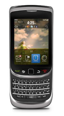
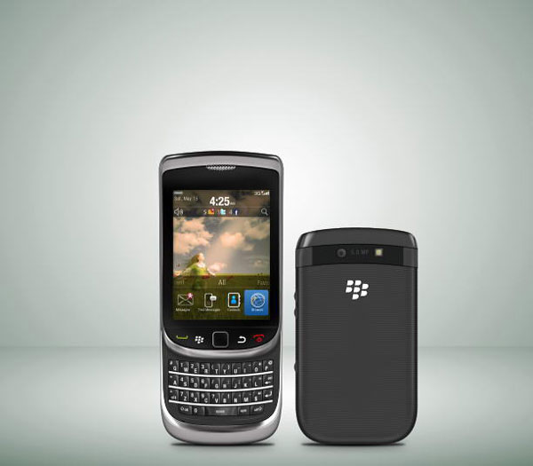
In this tutorial, we will draw a highly realistic blackberry torch using Photoshop and Illustrator. We’ll use Photoshop for basic shapes and shading and Illustrator for more complex shapes. Let’s get started!
Step 1: Draw Basic Shape
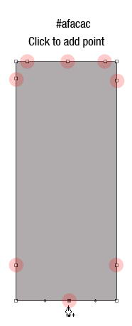
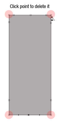
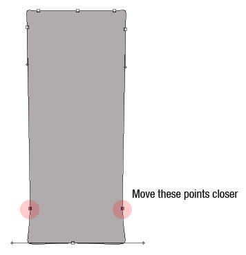
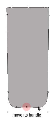
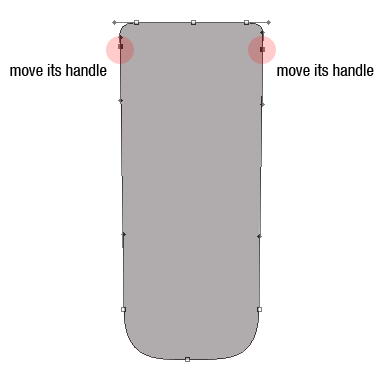
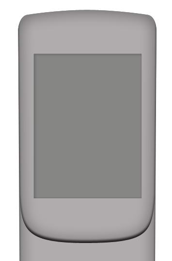
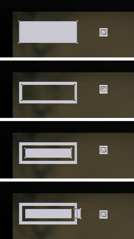
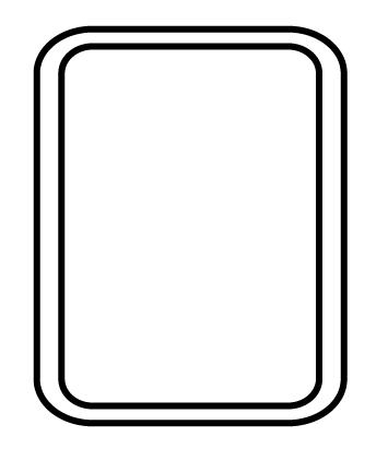
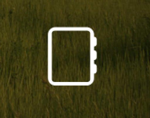
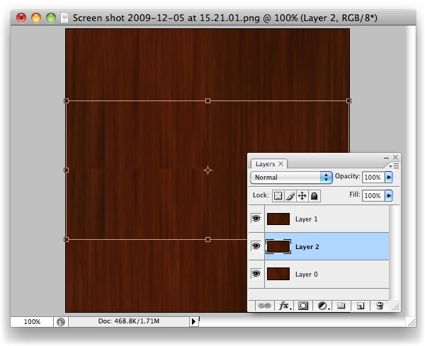
Let’s start by creating the basic shape of the phone. There are many methods to do this. I always find it easier to use a basic shape and modify it. In this case, I start by creating a rectangular shape with color #afacac then add some points, remove unneeded points, and modify its handle. See image below to see how I did it.
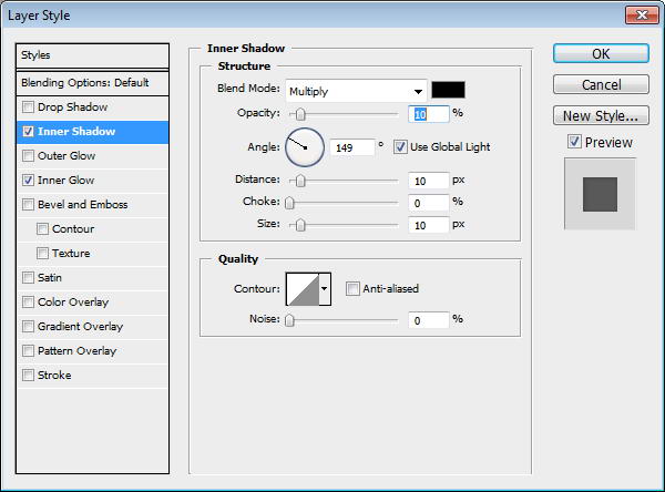
Step 2
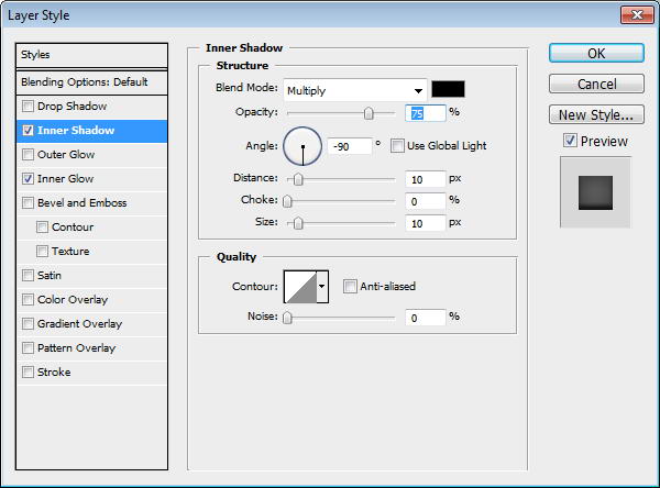
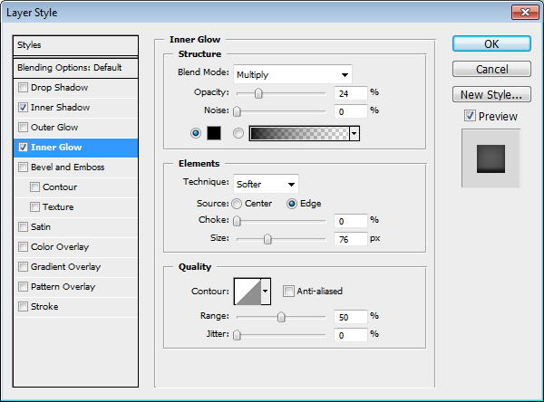
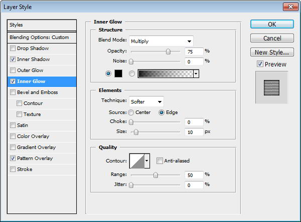
Add layer styles Inner Shadow and Inner Glow.
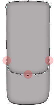
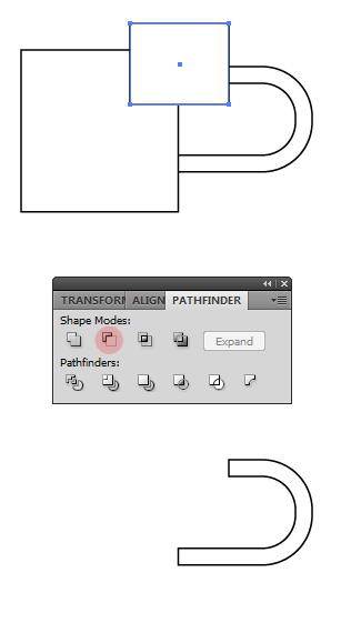
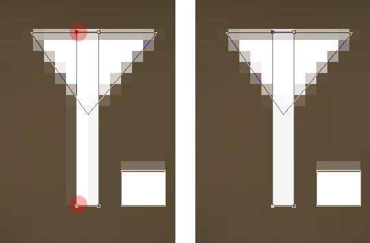
Step 3
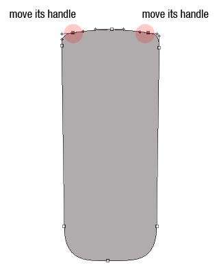
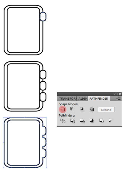
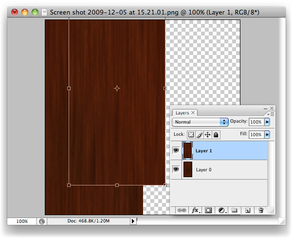
Duplicate shape by pressing Cmd/Ctrl + J. Use direct selection tool to select three points indicated below and move them upward. This is going to be phone’s front face.
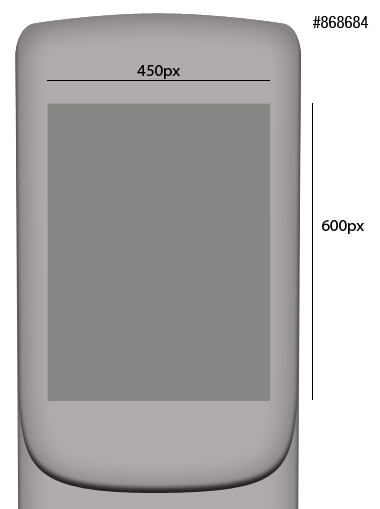
Step 4: Screen
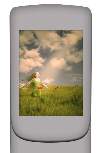
Create a 450×600 px rectangle on top of the shape. This will be screen area. Add Inner Shadow and Inner Glow to add depth into the screen.
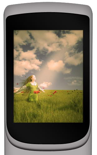
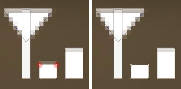
Step 5
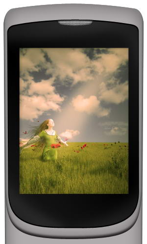
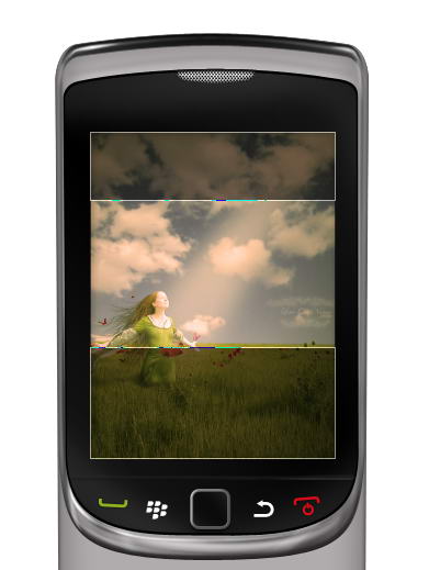
Add a picture and place it on top of the screen. Hit Cmd/Ctrl + Alt + G to convert it into clipping mask. The picture will automatically be placed inside the screen. You still can move or resize it if needed.
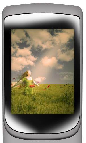
Step 6
Draw this black shape behind the screen.
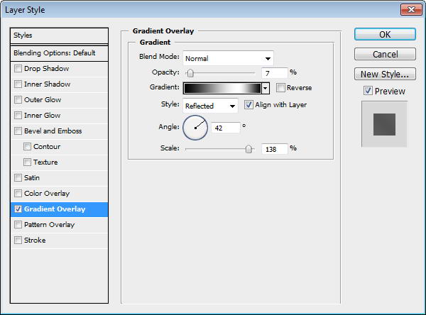
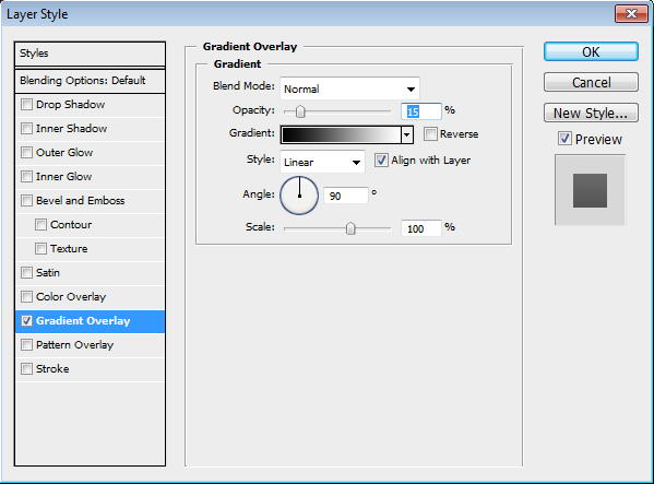
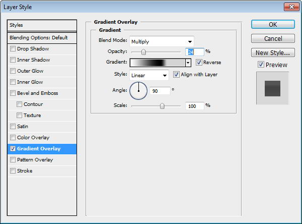
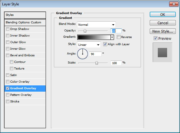
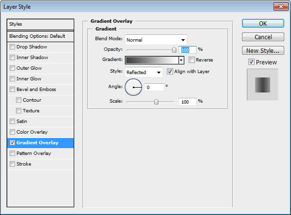
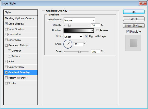
Step 7
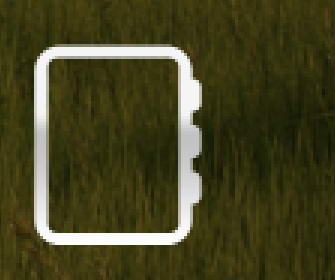
Duplicate shape and resize it to 99%. Add a subtle Gradient Overlay to the shape. I always add subtle gradients to add a natural look, since there is no perfect solid color in the real world.
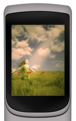
Step 8
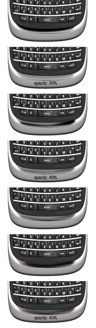
Create a new layer on top of the screen and convert it to Clipping Mask by pressing Cmd/Ctrl + ALt + G. Paint white using soft brush and reduce layer opacity to 10%.
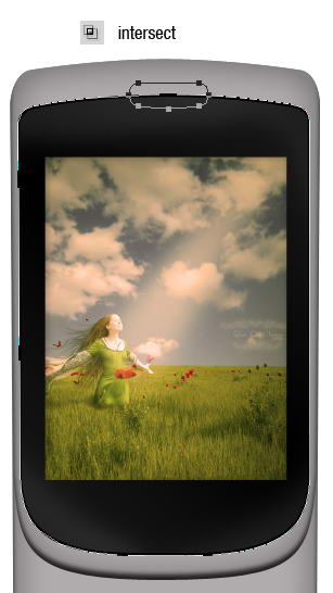
Step 9: Speaker
Duplicate screen shape, add rounded rectangle path on top of it and select intersect. Set Fill layer to 0%. This is going to be its speaker.
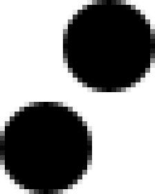
Step 10
Create a new file with size 32×40 px. Draw two circles, place them on opposite corners. Fill it with black.
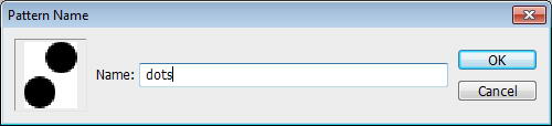
Step 11
Select all (Cmd/Ctrl + A) and save it as a pattern by clicking Edit > Define Pattern. You may close the file, we won’t need it anymore.
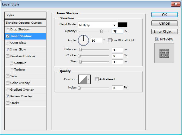
Step 12
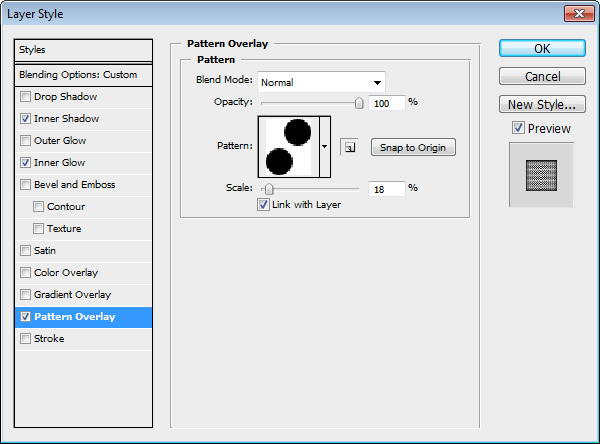
Return to speaker shape. Add Inner Shadow, Inner Glow, and Pattern Overlay. In Pattern Overlay, make sure to select previously created pattern.
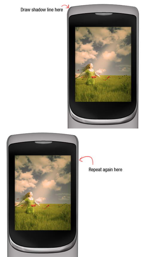
Step 13: Draw Highlight and Shadow
Cmd/Ctrl-Click phone’s front face shape. Create a new group layer and click Add Layer Mask icon. We are going to draw metallic reflections in this group.
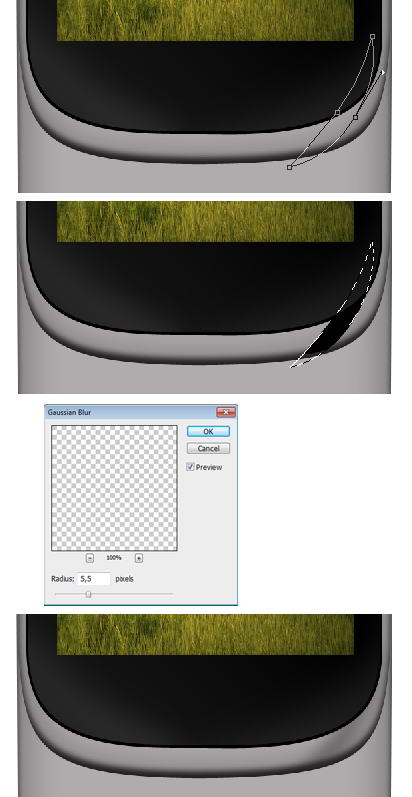
Step 14
The idea is simple. We just need to add lots of subtle shadows and highlights on the phone surface. Draw a path using pen tool, convert it to selection by pressing Cmd/Ctrl + Enter. Create new layer. Let’s start drawing shadow. Fill it with black. Add Gaussian Blur to soften the shape then reduce layer opacity to 30%.
Step 15
Use the same technique to draw highlights. Draw path, convert it to selection, fill it with white, add Gaussian Blur, reduce layer’s Opacity.
Step 16
Keep drawing highlights and shadows using technique I described above. Place all your drawings on different layers, this will help if you want to modify it. Make sure to use different opacities to give it random reflections.
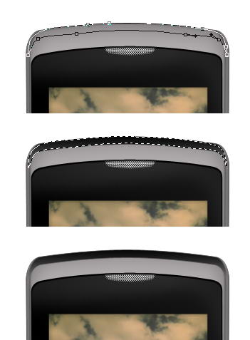
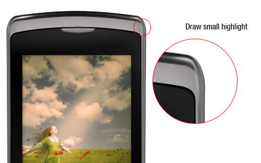
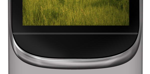
Step 17
Let’s draw a coarse highlight. Draw a thin path under the screen, convert it to selection, then fill it with white. No need to add Gaussian Blur or reduce its opacity.
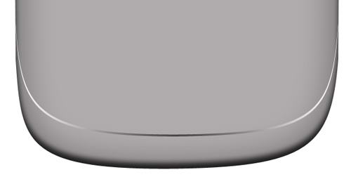
Step 18
Now let’s add another shadow on the side of the phone. See picture below for reference.
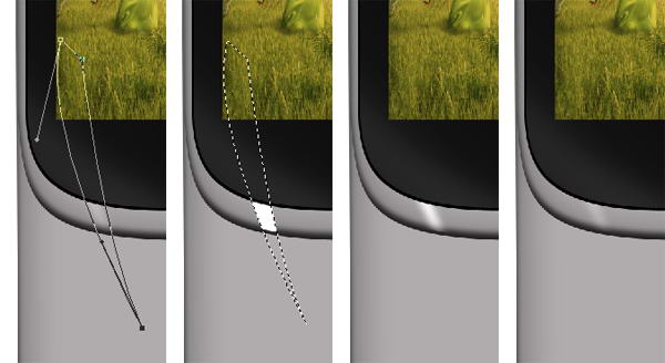
Step 19
It’s important to add some coarser highlights and shadows on one side of the phone to keep it realistic. Draw a shape on top of the phone, convert it to selection, and fill it with gradient from black to darker gray.
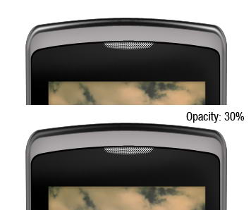
Step 20
Inside the shadow, draw a soft highlight. Reduce its opacity to 30%.
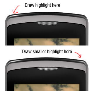
Step 21
On top of previous highlight, draw smaller highlight but with higher intensity. Don’t just copy paste the highlight. It’s not natural to have perfectly similar highlight on both sides.
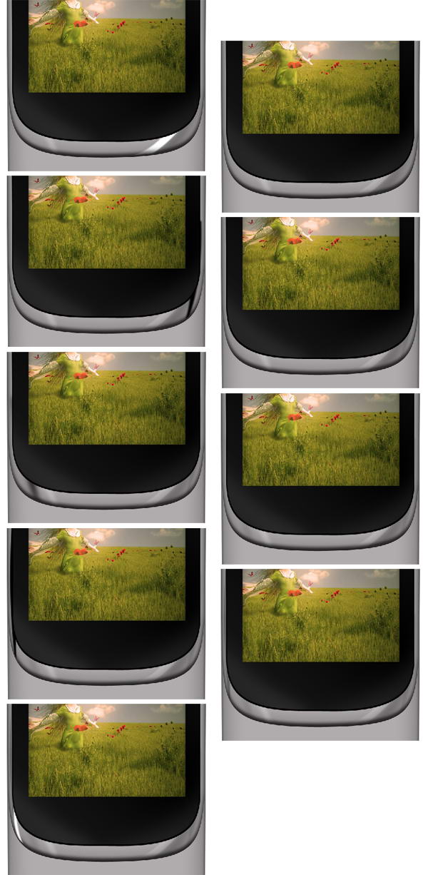
Step 22
As I said, it’s not natural to have same highlight on both side. I decided to add another highlight on right side of the phone. This creates imperfection and adds more realism to the phone.
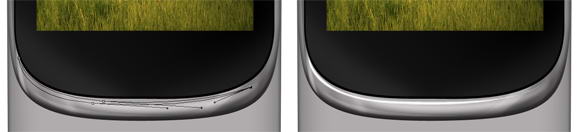
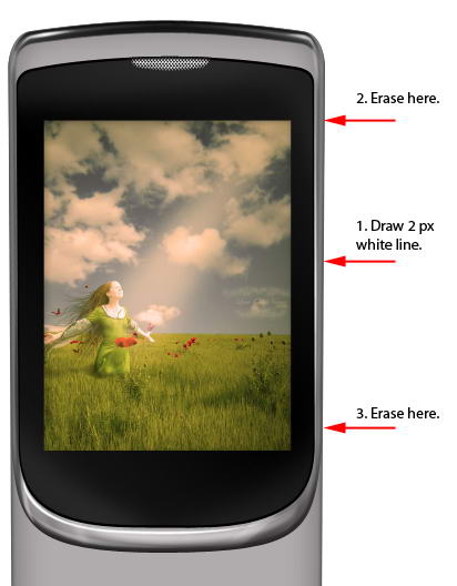
Step 23
Let’s draw another detail. Draw a 2px white line. To draw a straight line, hold shift while dragging. Erase top and bottom of the line using a big soft eraser.
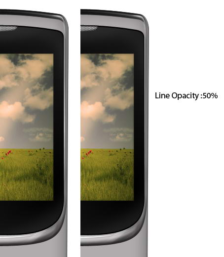
Step 24
Reduce its opacity to 50%.
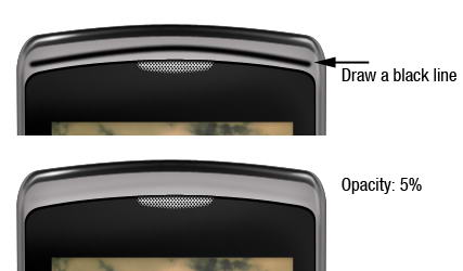
Step 25
Draw a black line on top of the phone and reduce its opacity to 5%. This subtle shadow adds a sense of depth to the phone.
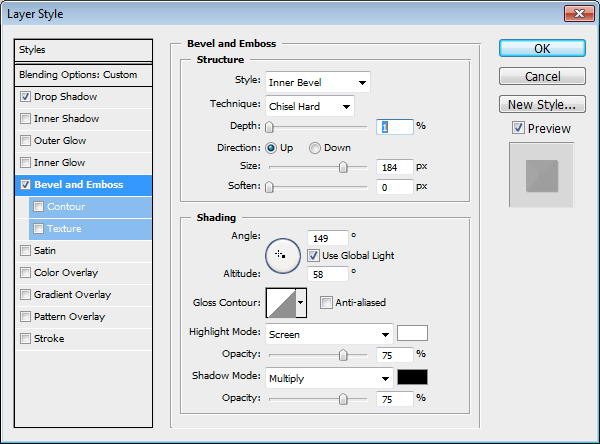
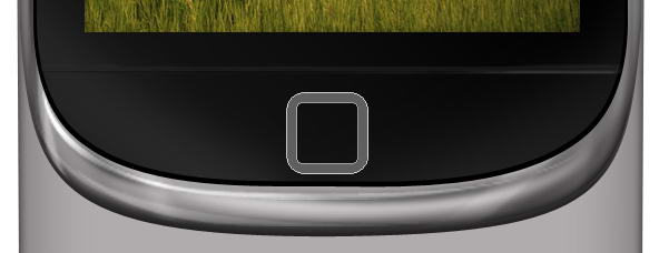
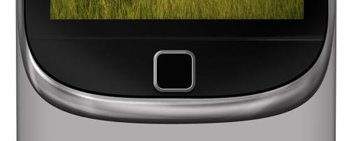
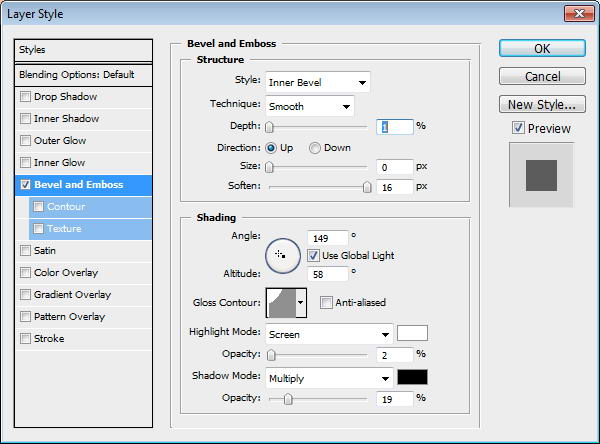
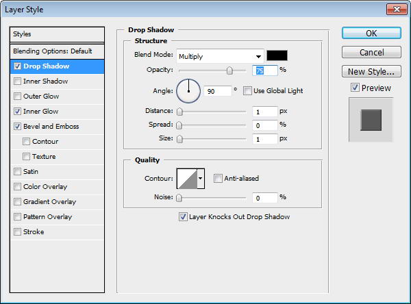
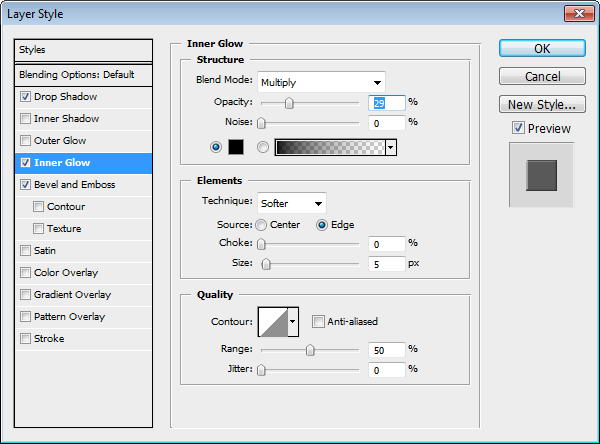
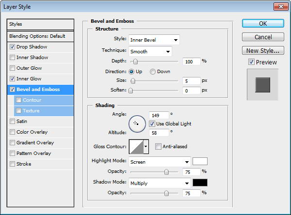
Step 26: Main Button
Draw a path to separate screen area and menu button. Change its Fill layer to 0%. Add layer styles drop shadow and Bevel and Emboss.
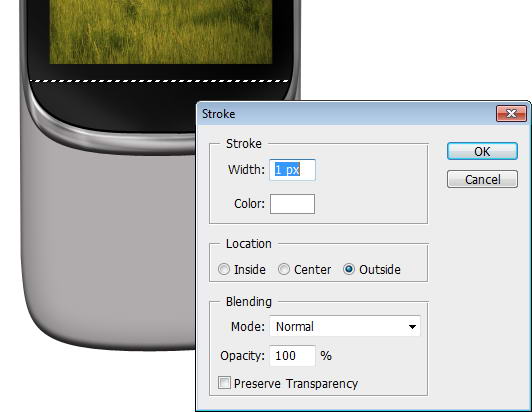
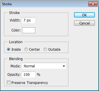
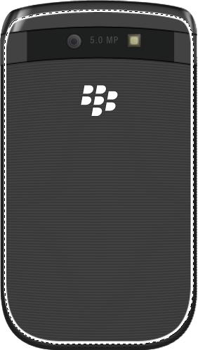
Step 27
Cmd/Ctrl-Click shape to convert it to selection. Create new layer. Click Edit > Stroke with 1px width and Color: White.
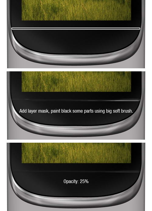
Step 28
Add a layer mask and paint some of the line. Reduce its opacity to 25%. This will add a subtle highlight on the separator.
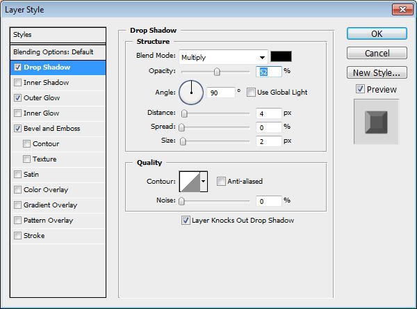
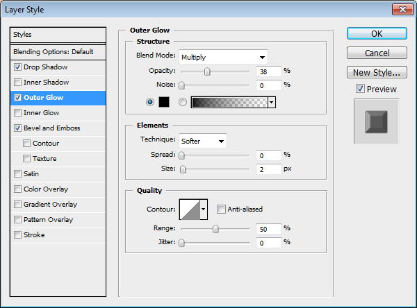
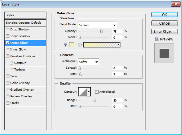
Step 29
Create a rounded rectangle and inside it draw smaller rounded rectangle. Select subtract to create hole. Add Drop Shadow, Outer Glow, and Bevel and Emboss.
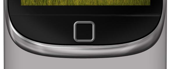
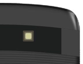
Step 30
On top of the shape draw a black rounded rectangle. Add a small Bevel and Emboss to add depth.
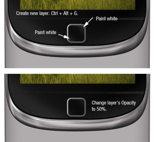
Step 31
Create a new layer and convert it to Clipping Mask by pressing Cmd/Ctrl + Alt + G. Paint white on its corner and reduce its opacity to 50%.
Step 32
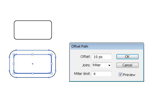
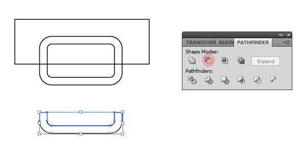
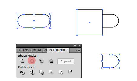
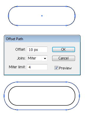
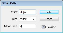
Now, open up Illustrator. Draw a rounded rectangle and click Object > Path > Offset Path. This command will convert path to a ring shape.
Step 33
Create a rectangle on top of it. Select both shapes and from the Pathfinder panel select Minus Front.
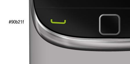
Step 34
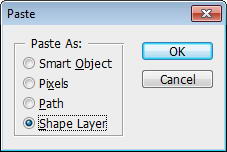
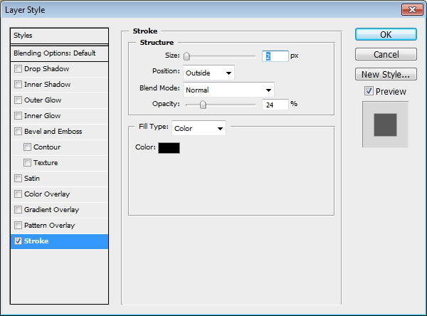
Copy shape from Illustrator and paste it to Photoshop. In Paste option choose Shape Layer. Set its color to green and rotate it a bit. Add thin stroke to add depth on to the shape.
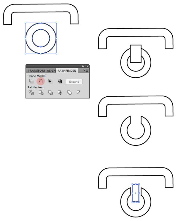
Step 35
Repeat previous shape to create a semi rounded rectangle ring. Under it, add a circle. Inside that circle create another smaller circle. Select both circles and choose Minus Front to create a donut shape.
On top of the donut, draw a rectangle, then Minus Front both of them. Finally, draw a small rectangle on the hole.
Step 36
Paste the shape to Photoshop as a layer shape and use red color. Rotate it a bit. Just like previous button, add a small stroke.
Step 37
For Blackberry logo, draw a rounded rectangle. On top of it draw a rectangle. Select both shapes and choose Minus Front.
Step 38
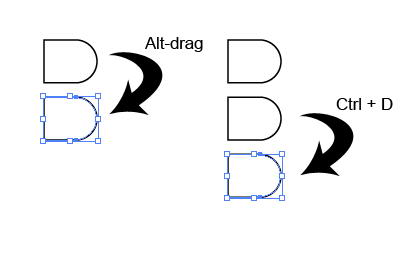
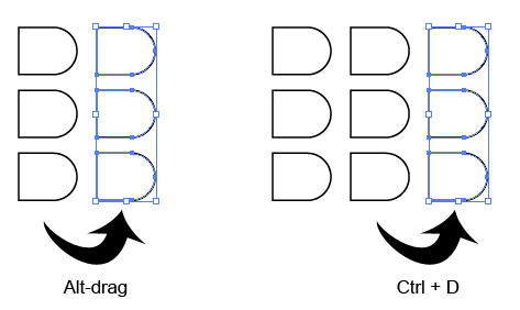
Using move tool Alt-drag to duplicate the shape. Repeat the duplication process by pressing Cmd/Ctrl + D.
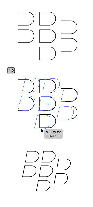
Step 39
Select all shapes. Use shear tool to transform them.
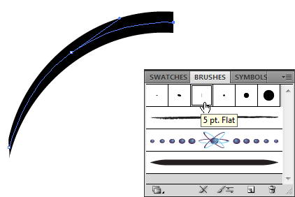
Step 40
Paste the logo into Photoshop. Use white for its color.
Step 41
Return to Illustrator, draw a rounded rectangle. Click Object > Path > Offset Path.
Step 42
Cover some of the shape with two rectangles. Select all shapes and hit Minus Front.
Step 43
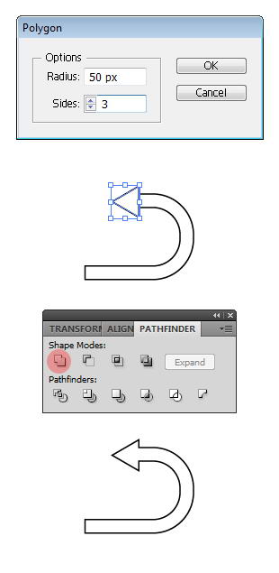
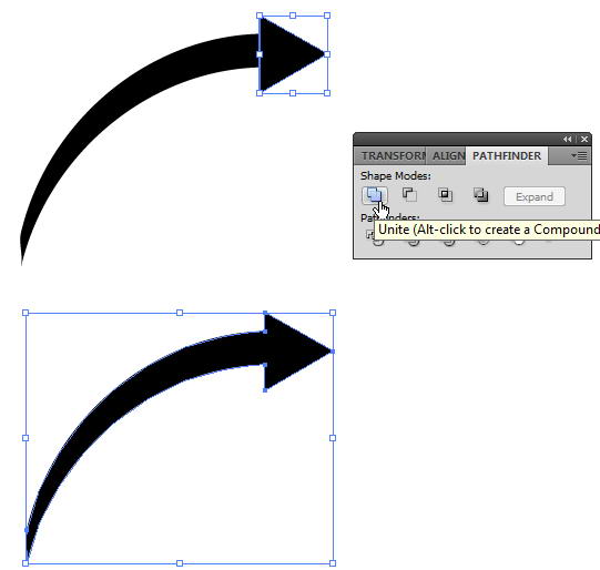
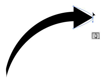
Draw a triangle using polygon tool. To change its side, you need to click once to open polygon dialog box and use 3 for the sides. Place the triangle on end of the ring and select Unite to combine both shapes into an arrow.
Step 44
Paste it onto Photoshop with white color.
Step 45
Draw two black rectangles on top and bottom of the screen. Set its opacity to 50%.
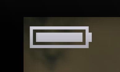
Step 46: Draw Battery Icon
In Photoshop, draw a simple battery made from some rectangles. Add Gradient Overlay to make it shiny.
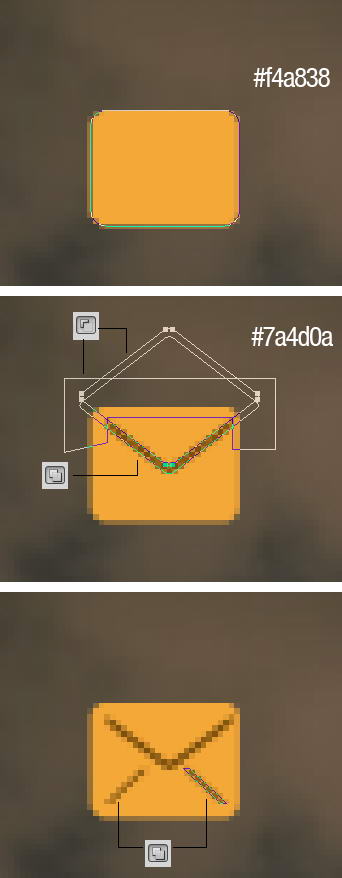
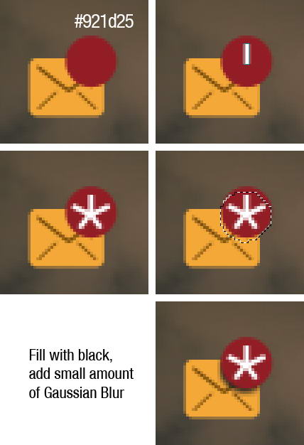
Step 47: Mail Icon
Draw a rounded rectangle. On top of it draw two overlapping rounded rectangles. Cut them using shape drawn with pen tool. Draw another line using rectangle tool.
Step 48
On top right corner, draw some white rectangles. Create new layer under red circle shape. Cmd/Ctrl-click red shape to create selection based on its shape. Move the selection a few pixels down and fill it with black. Delete unneeded shadow outside the mail.
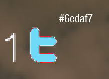
Step 49: Twitter Icon
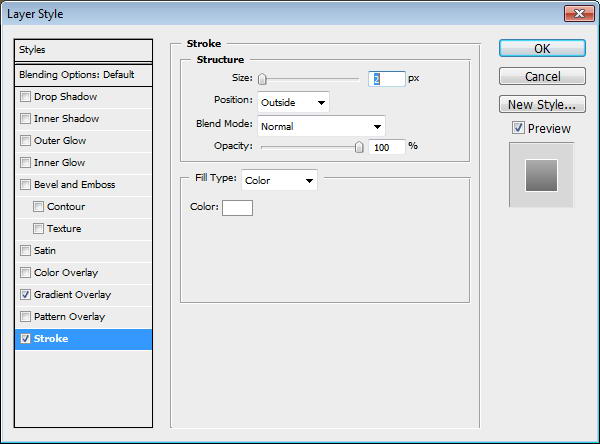
Copy Twitter logo, then trace its shape manually using pen tool. Paste the twitter shape as a layer shape and use light blue for its color. Add Gradient Overlay and white Stroke.
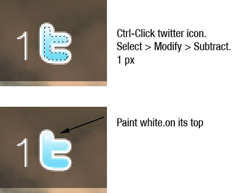
Step 50
Cmd/Ctrl-click twitter icon to create selection based on its shape. Click Select > Modify > Subtract, 1px. Paint white on top of the logo.
Step 51: Facebook Icon
Create a rectangle shape and this Gradient Overlay. Inside the rectangle add an f.
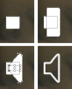
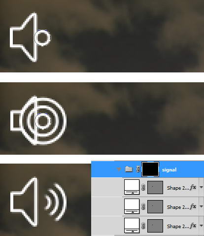
Step 52: Speaker Icon
Draw a rounded rectangle. On top of it, add another rounded rectangle them transform it. See picture below for reference. Set fill layer to 0% and add layer style Stroke.
Step 53
Next to the speaker, draw some circle shapes. Each in different layers with layer style stroke. Put them into a folder group, add layer mask, and paint some part of it with black.
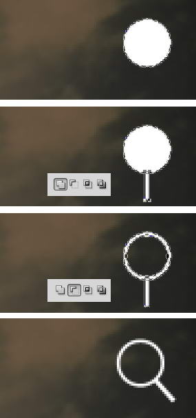
Step 54: Magnify Icon
Draw a circle. Inside it draw smaller circle and select subtract. Add a rectangle for its handle then rotate the layer.
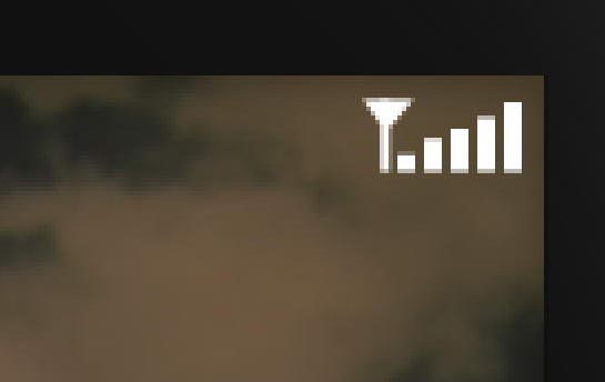
Step 55: Signal Icon
To draw a signal icon you just need some rectangles and a triangle.
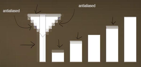
Step 56
When we zoom in, you can see that there is some unneeded anti-aliasing going on. We will need to fix this.
Step 57
To fix this, we need to select the points with direct selection tool and nudge them by pressing the arrow keys. Do this until the transparent pixels disappear.
Step 58
You can see the result below, much sharper now!
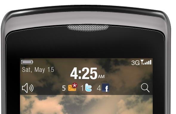
Step 59
Add text for date, time, and other info.
Step 60: Message Icon
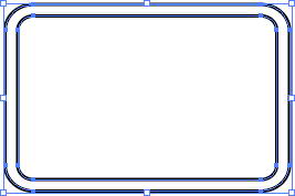
Let’s return to Illustrator again. Draw a rounded rectangle. Click Object > Path > Offset Path.
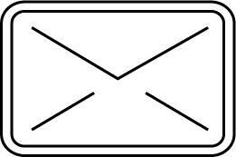
Step 61
Using pen tool draw some lines until we have basic mail shape. Set its fill to none and stroke to black. From Stroke panel choose bigger weight and select round cap and round join.
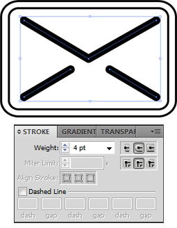
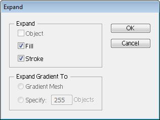
Step 62
Select lines and click Object > Expand. This will convert lines into shapes. Set its fill to none and stroke to black.
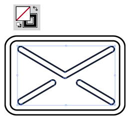
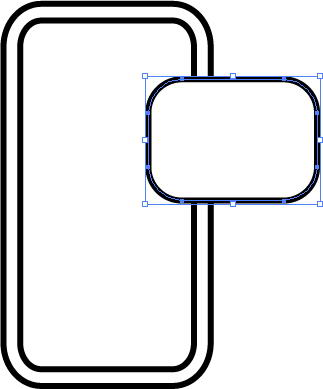
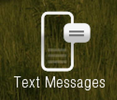
Step 63: Text Messages Icon
Create a ring rounded rectangle shape, just like previous shape. On top of it draw another rounded rectangle.
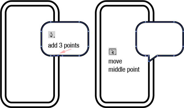
Step 64
Add 3 points on lower side of the rounded rectangle. See picture below for its position. Move middle point until we have a speech bubble.
Step 65
Paste both shapes into Photoshop. Add this Gradient Overlay.
Step 66
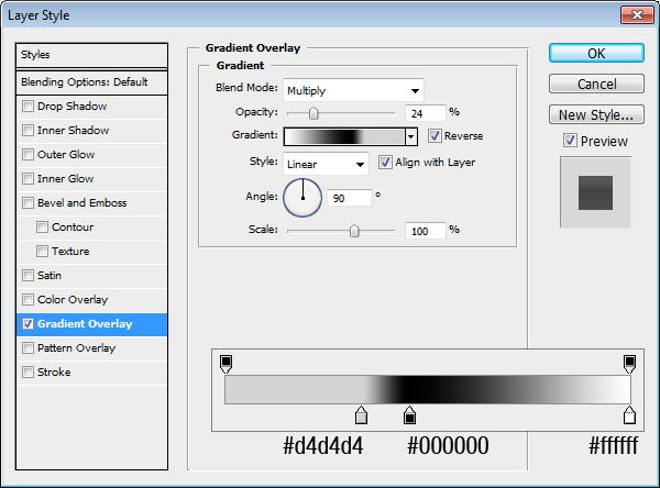
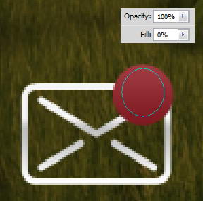
On the top right corner of the mail icon, add a red circle. Give it a Gradient Overlay.
Step 67
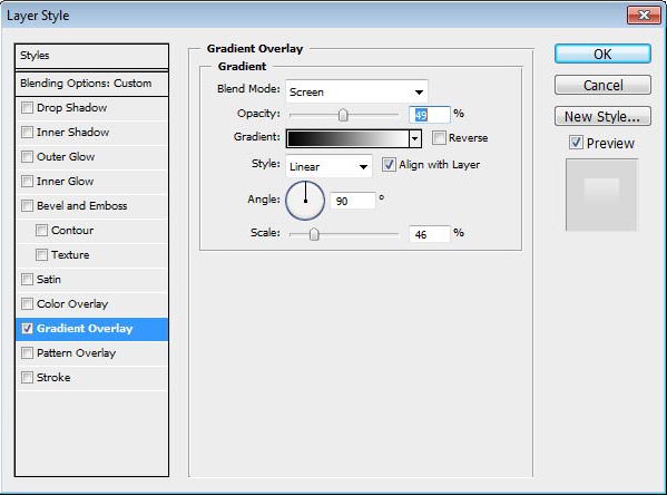
On top of it, draw an ellipse shape with fill 0%. Add a Gradient Overlay from black to white with blend mode Screen.
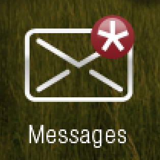
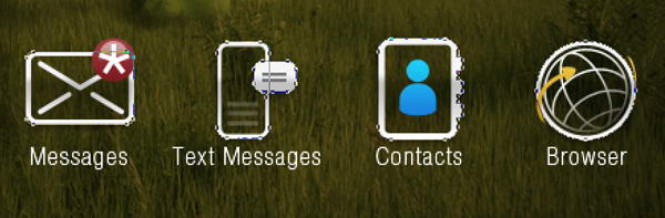
Step 68
Add a star made of five thin rectangles. Under it, add text "Messages".
Step 69
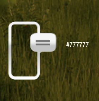
On top of speech bubble, draw two rectangular shapes with color #777777.
Step 70
Inside it, draw a low opacity gray rectangle shape. Add text under the icon.
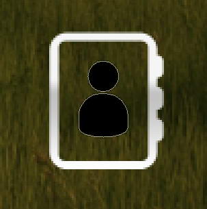
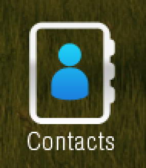
Step 71: Contacts Icon
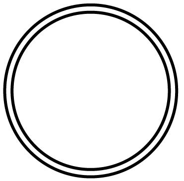
Again, return to Illustrator. Draw a ring shape rounded rectangle.
Step 72
On its right side, draw three smaller rounded rectangles. Select all shapes and click Unite.
Step 73
Paste the shape into Photoshop. Add Gradient Overlay.
Step 74
In Illustrator, draw a circle and a rounded rectangle. Modify lower points on rounded rectangle to get a person shape.
Step 75
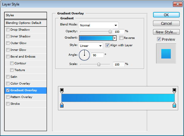
Paste the shape to Photoshop and put inside our previous shape. Add Gradient Overlay with setting seen below and add text Contact under it.
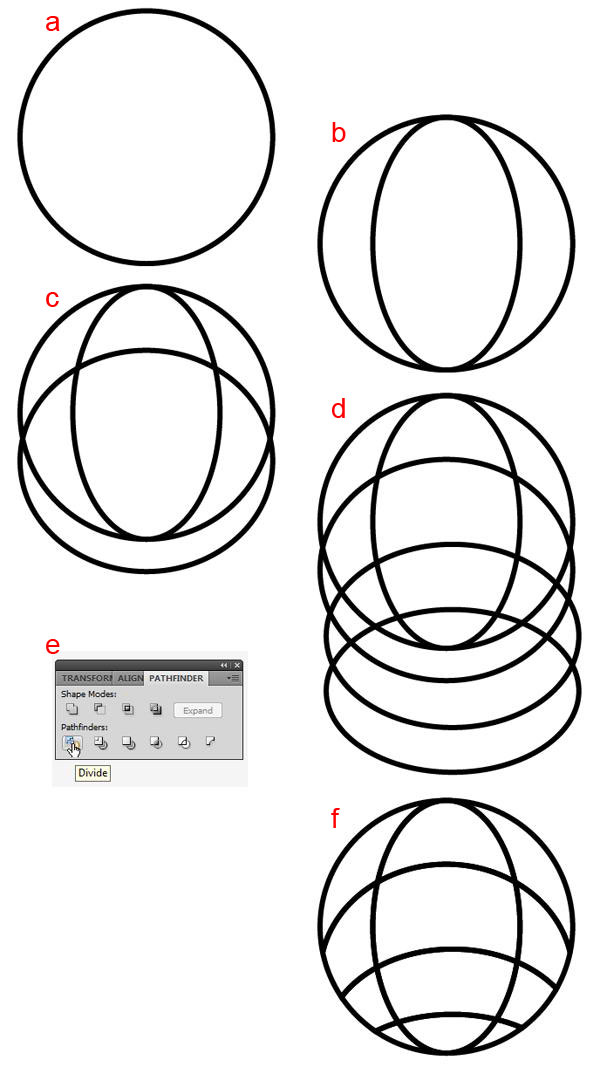
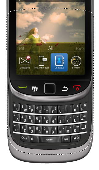
Step 76: Globe Icon
Draw a donut shape in Illustrator. Paste it to Photoshop. Add Gradient Overlay.
Step 77
Return to Illustrator. A) Draw a circle B) Inside it draw another circle and transform it. C) Draw circle across it. D) Draw more circles. E) Select all shapes and click Divide. F) Select and delete unwanted shapes.
Step 78
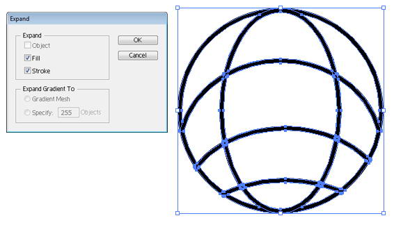
Select all shapes and click Object > Expand.
Step 79
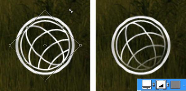
Paste the globe into Photoshop and place it inside the previous circle shape. Slightly rotate the globe. Add layer mask and add gradient to hide lower right part of the globe.
Step 80
Return to Illustrator. Create a short curved line. From brushes panel select brush type that add weight onto the lines. Click Object > Expand to covert line into shape.
Step 81
Add a triangle on its end. Select both shape and click Unite to combine into one shape.
Step 82
Use pen tool and drag arrow’s end to make it curvy.
Step 83
Draw one more line.
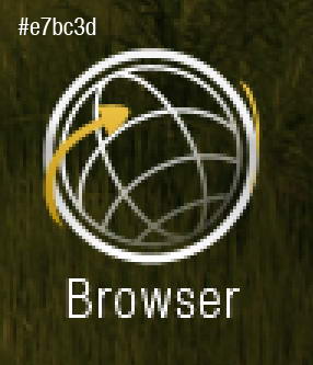
Step 84
Paste both shapes into Photoshop. Use #e7bc3d as its color.
Step 85: Add Glossy and Depth
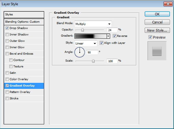
Copy all icons’ base path and paste it onto new shape layer. Place it under al layers. Set fill layer to 0%, add Drop Shadow and Gradient Overlay.
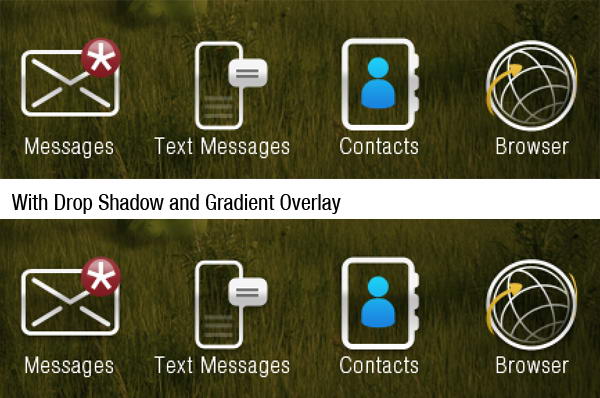
Step 86
Our last step is just a subtle change. You may not notice it, but if you compared them, you’ll see that we have one nice glossy effect with depth.
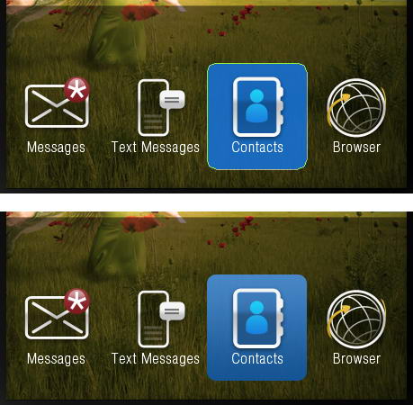
Step 87: Active Icon Background
Create a blue rounded rectangle and put it behind one of the icon. Add Gradient Overlay.
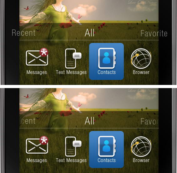
Step 88: Add Menu Text
Above all the icons, write Recent, All, and Favorite. Add layer mask and paint part of the text that is outside the screen.
Step 89: Add 3D Effect on Keyboard Area
Select base path created earlier in first step, duplicate it twice. Move one of the pathes three pixels up and set it to subtract. Add Gradient Overlay, dark gray to white.
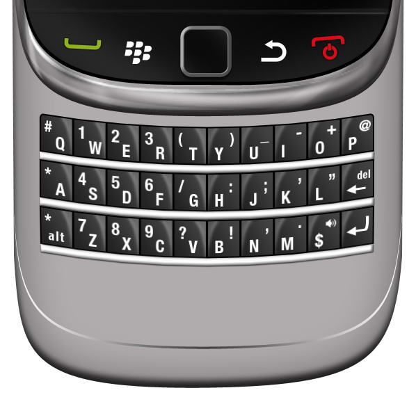
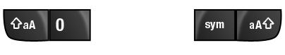
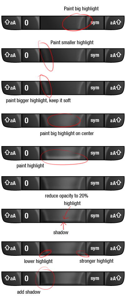
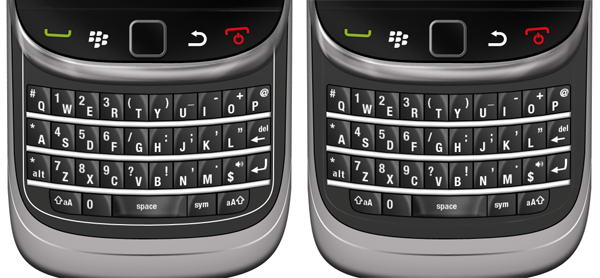
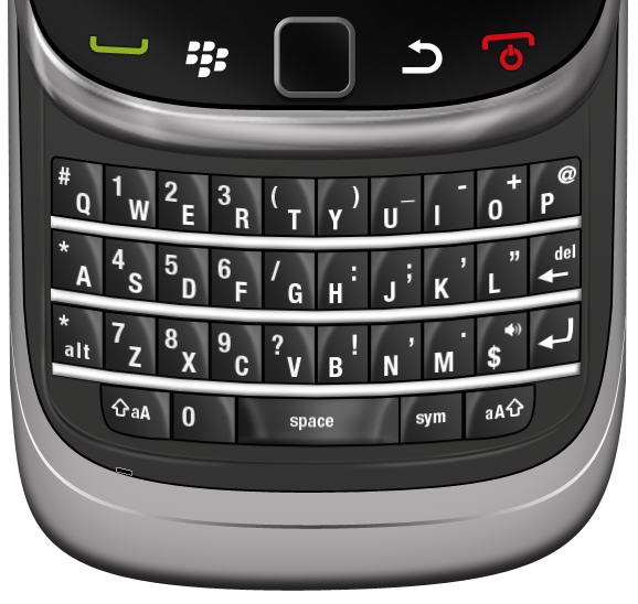
Step 90: Keypad
Draw a dark gray rectangle. Add Gradient Overlay and Stroke.
Step 91
Create a new layer above the keypad and convert it to Clipping Mask. Use soft brush to paint some highlights.
Step 92
Image below shows the layer I used on a black canvas.
Step 93
Add character to the keypad.
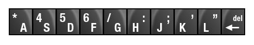
Step 94
Duplicate the keypad five times and change its characters.
Step 95
Duplicate all five keypads and flip it horizontally. Change its characters.
Step 96
Create a rectangle under the keypads. Add Drop Shadow, Inner Glow, and Bevel and Emboss.
Step 97
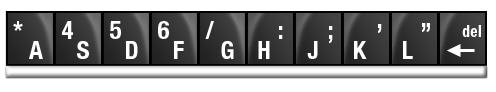
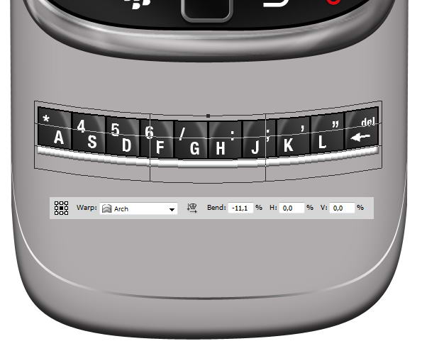
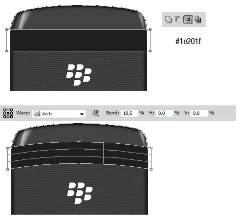
Select all keypad layers and hit Cmd/Ctrl + G to put it in a group. Right click group and choose Convert to Smart Object. Hit Cmd/Ctrl + T, right click and choose Warp. In option bar select Arch and change Bend size, see picture below for reference.
Step 98
Duplicate previous keypad by right clicking it and choose New Smart Object via Copy. Don not use Cmd/Ctrl + J or Layer > New > Layer via Copy. We want a new smart object not its child. If you use Cmd/Ctrl + J, the duplicated smart object is basically the same object to the one you copy. If you edit it, all of its instances will also change.
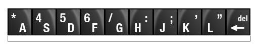
Move the duplicated smart objects until we have a full set of keyboards. Then, double click all the smart objects to change each character.
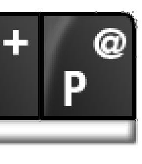
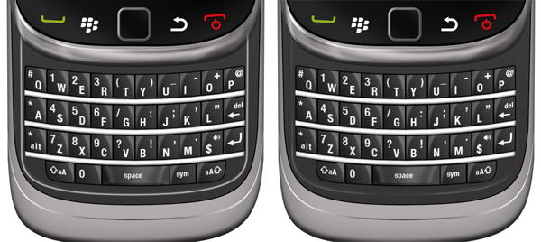
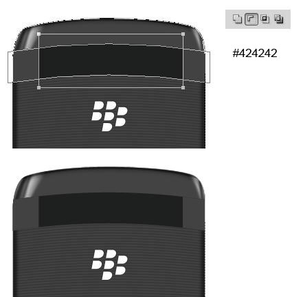
Step 99
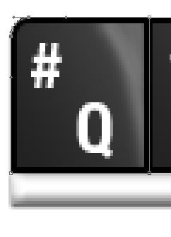
We need special treatment to keypad on top corner, Q and P. Modify its corner until it’s rounded.
Step 100
Repeat step 89 to create the remaining keypad.
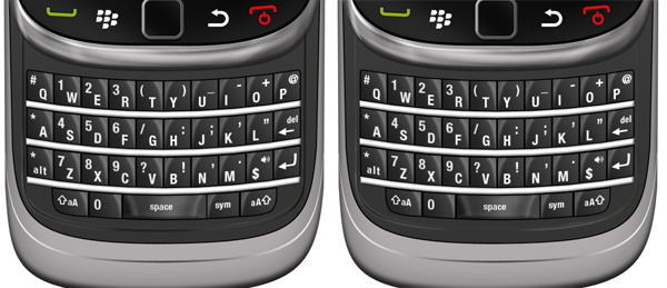
Step 101
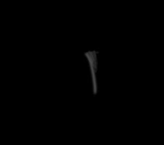
To draw a space, we need to use more complex steps. You can see steps I did in picture below. As usual, every stroke of brush in made in different layer.
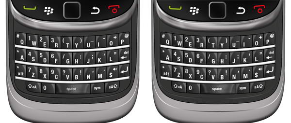
Step 102
Here you can see set of layers I used to draw highlight on space key.
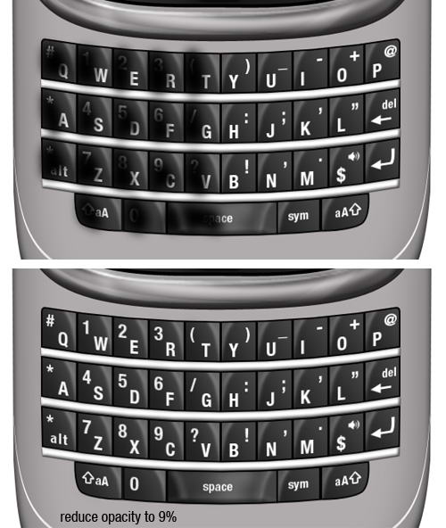
Step 103
Our keypad here is too similar, they have same highlight, same shadow, same lighting. To add realism, let’s paint black on half of the keypads so they are darker than the rest. Set its opacity to 9%. Just a subtle effect but add a bit more realism.
Step 104: Keyboard Base
Draw this shape manually using pen tool. Use black for its color.
Step 105
Duplicate shape and change its color to dark gray. Hit Cmd/Ctrl T and resize it to 99%. A black shape behind it added more depth to its appearance.
Step 106: Inset Lines
Create a rounded rectangle path covering keypads. Convert it to selection by pressing Cmd/Ctrl + Enter. Click Edit > Stroke, use 2px with white color. Add layer mask and paint some parts of the line to hide it.
Step 107
Repeat previous step, this time use slightly bigger rounded rectangle and add Gaussian Blur to make the lines softer.
Step 108
Just as previous step, create a line. This time use black.
Step 109
Again, repeat the same process.
Step 110
What we did in step 104-107 is adding an inset lines. We use lots of black and white lines because in real life shadow and highlight is always bouncing. This process replicate that effect.
Step 111: Add reflection
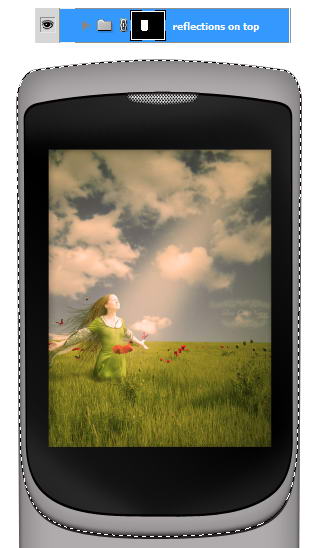
Select inner part of the phone. We are going to add some reflections inside it. Create group layer and click Add Layer Mask icon.
Step 112
The process is similar to what we have already done in Step 13. Draw a shape using pen tool, covert it to selection, fill with white for highlight, black for shadow, add Gaussian Blur, reduce its opacity.
Step 113
Draw some shadows on lower part of the phone.
Step 114: Add Shadow
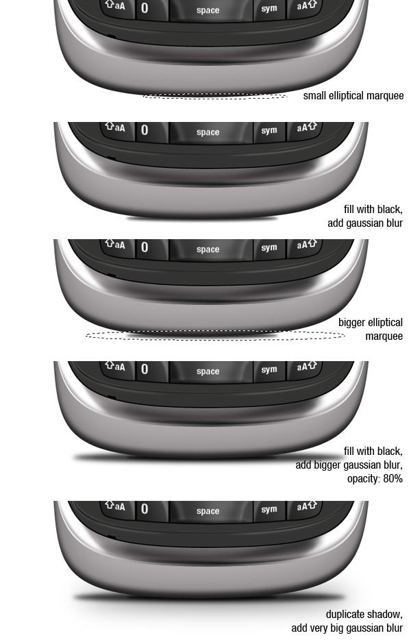
Create new layer and place it beneath all layers. Create a small elliptical marquee and fill it with black. Add Gaussian Blur to soften it. Next create new layer, add bigger selection, fill it with black, add Gaussian Blur, and reduce its opacity to 80%. Finally, duplicate previous shadow and add a very Gaussian Blur to get a very soft cast shadow on the floor.
Step 115
We’re done with this one.
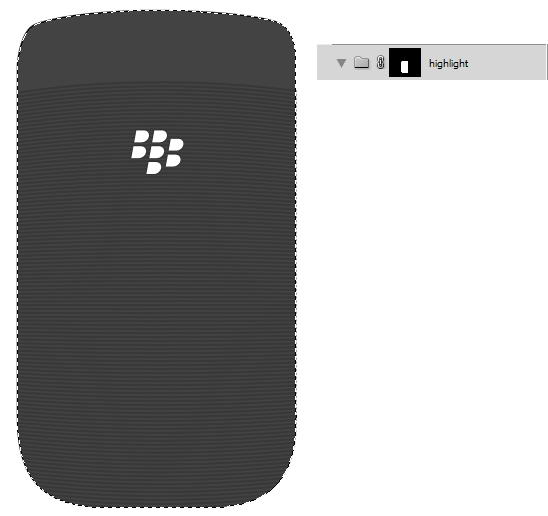
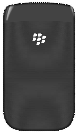
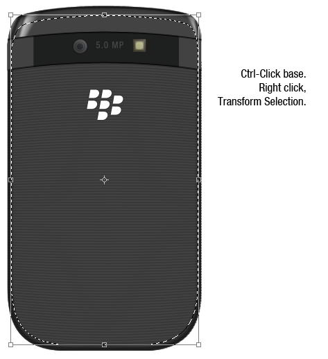
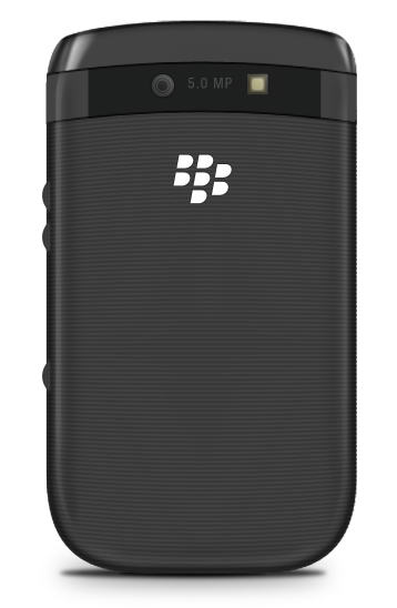
Step 116: Blackberry Viewed From Back
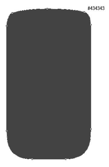
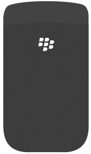
I hope you’re still with me. This time we’ll draw back side of the phone. Create this shape with color #434343.
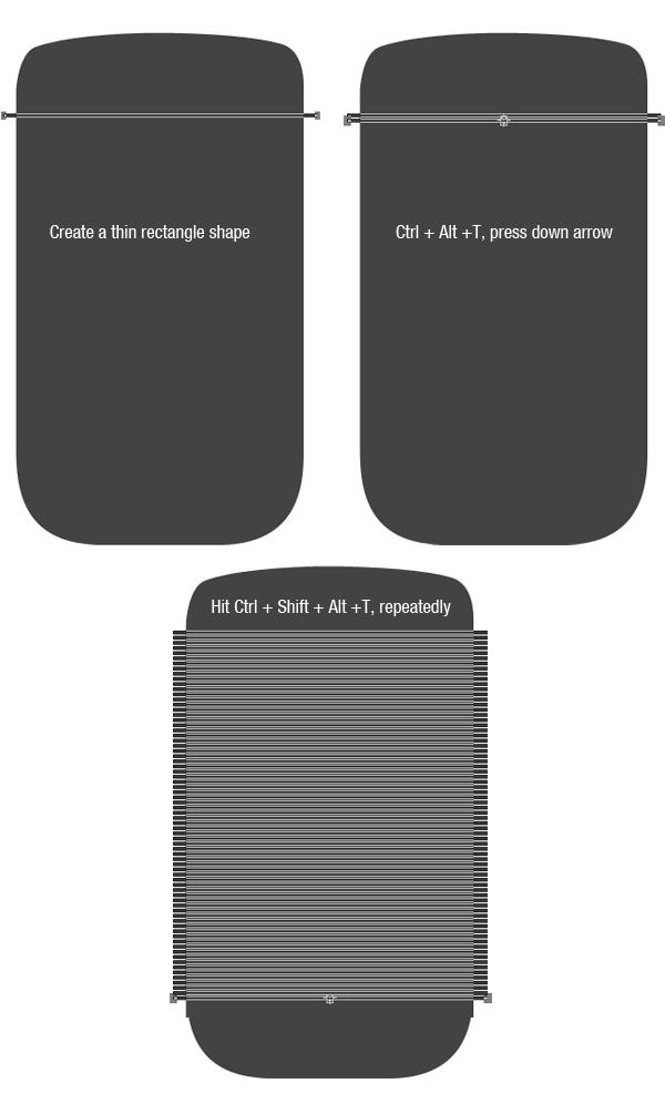
Step 117: Add Rectangle Shapes
Create a long thin rectangle shape. Hit Cmd/Ctrl + Alt + T to transform and duplicate the shape. Hit down arrow few times to move it. Repeat this transformation process by pressing Cmd/Ctrl + Shift + Alt + T repeatedly.
Step 118
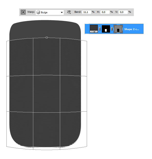
Cmd/Ctrl-click body shape and click Add layer Mask icon to isolate all shapes inside the phone’s body.
Make sure you have selected the vector mask. Hit Cmd/Ctrl + T, right click and choose Warp. Select Bulge in option bar and change its blend setting.
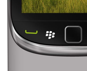
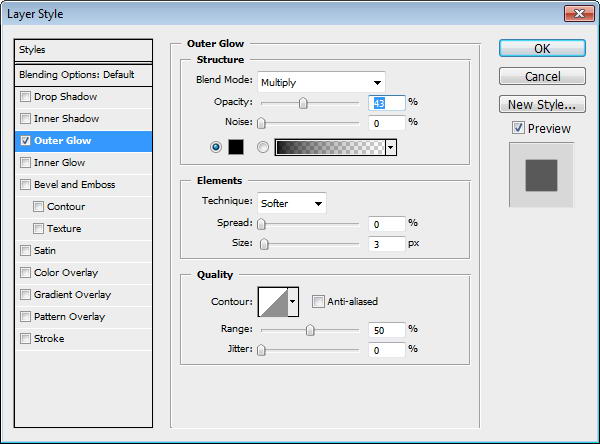
Step 119: Add Logo
Place Blackberry logo on back of the phone. Add black Outer Glow.
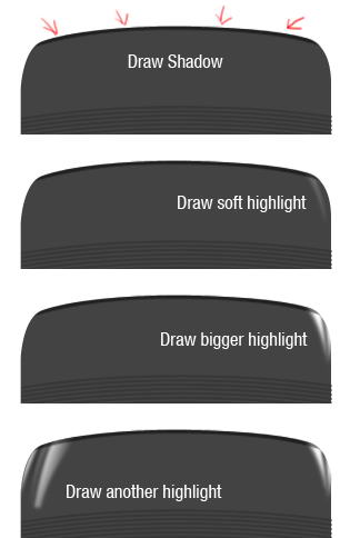
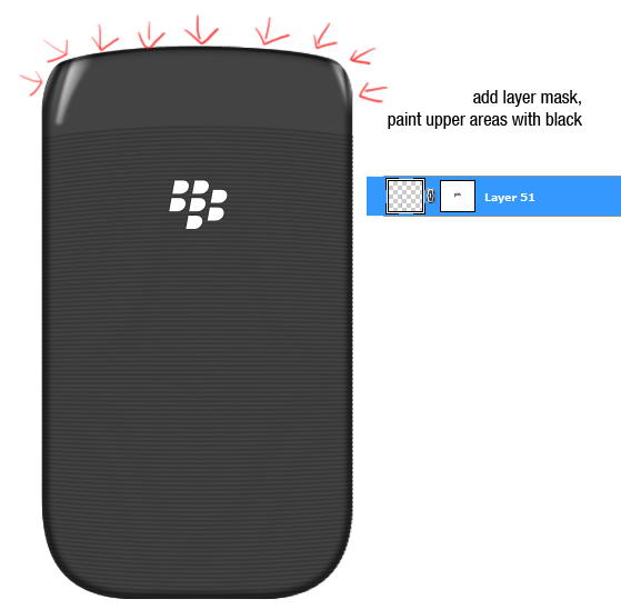
Step 120: Highlight and Shadow
Cmd/Ctrl-click phone’s basic shape. Create a new group layer, click Add Layer Mask icon.
Step 121
Paint some shadows and highlights. You can see what I did in picture below. Each painting is made in separate layers.
Step 122
Create a new layer. Cmd/Ctrl-click phone’s basic shape. Click Edit > Stroke. Add Gaussian Blur.
Step 123
Add layer mask. Paint upper part of the stroke with black to hide it.
Step 124
Duplicate path from phone’s basic shape. Add rectangle and set to intersect. Hit Cmd/Ctrl + T, right click and select Warp.
Step 125
Duplicate the shape. In its middle add a rectangle and choose subtract.
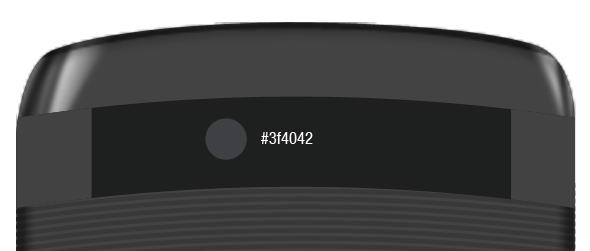
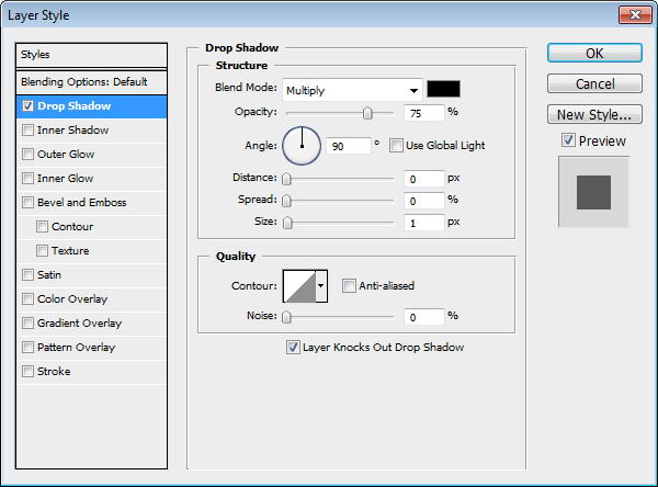
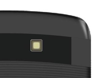
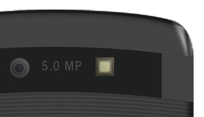
Step 126: Camera
Draw a circle shape and add a slight Drop Shadow.
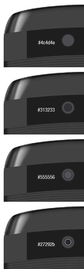
Step 127
Camera is actually made from some small circles shape in different size. See the color of each circle in picture below.
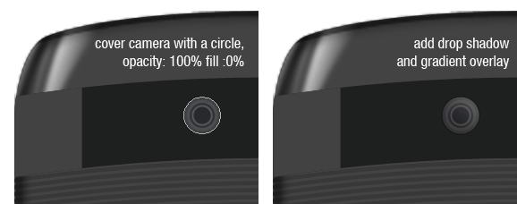
Step 128
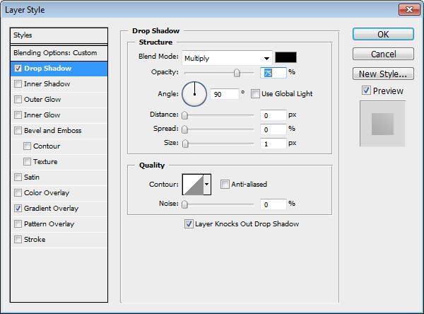
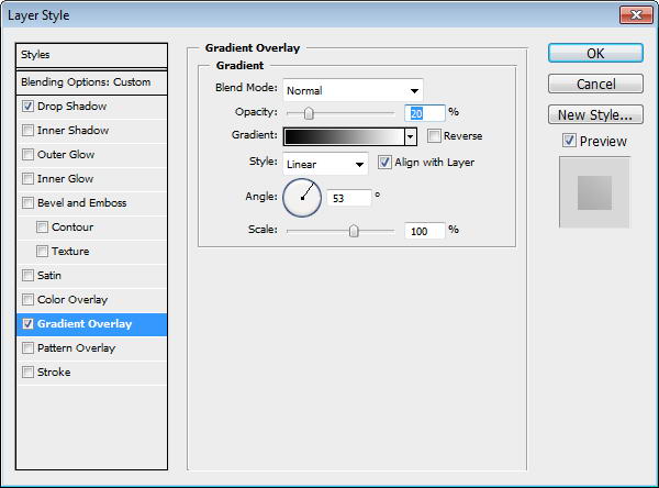
Duplicate the biggest circle and move onto top of other circles. Set Fill to 0%, add Drop Shadow and Gradient Overlay.
Step 129: Flash
The same process goes while creating flashlight. It’s made from some rounded rectangles.
Step 130
Add Outer Glow to the smallest rounded rectangle.
Step 131
Duplicate biggest rounded rectangle and place on top. Add Drop Shadow and Gradient Overlay.
Step 132
Add some text for information on its Mega Pixel size.
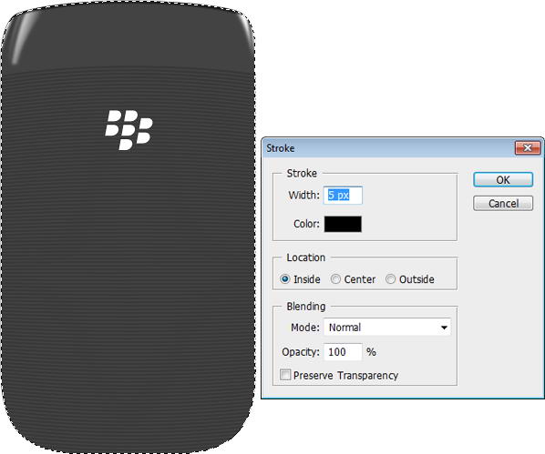
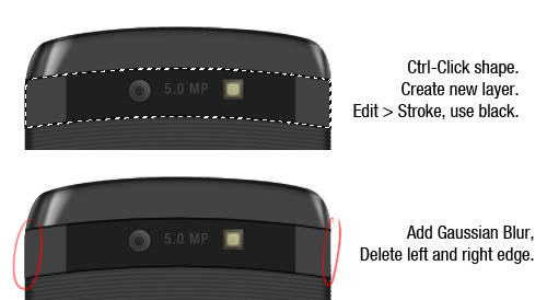
Step 133: Draw Highlights and Shadows
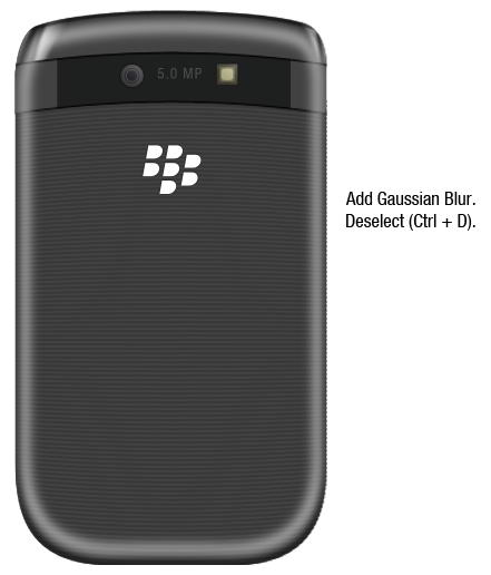
Cmd/Ctrl-click shape. Create new layer. Edit > Stroke, use black for the color. Add Gaussian Blur and erase left and right edge using soft eraser tool.
Step 134
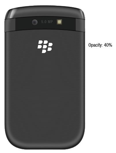
Cmd/Ctrl-click phone’s basic shape. Right click and choose transform selection. Make it smaller. Click Edit > Stroke, use white for its color. Add Gaussian Blur, deselect, then reduce layer’s opacity to 40%.
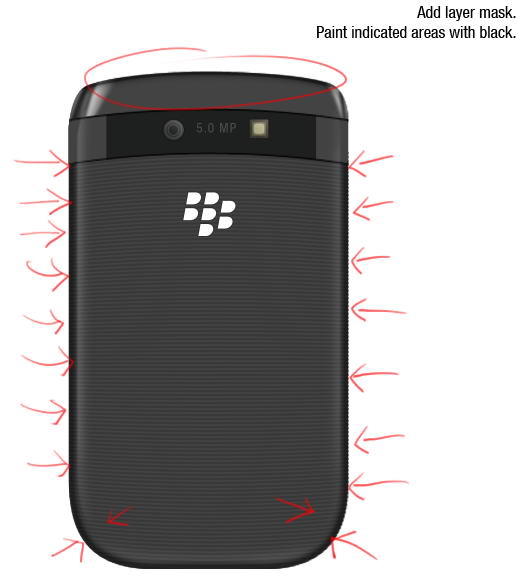
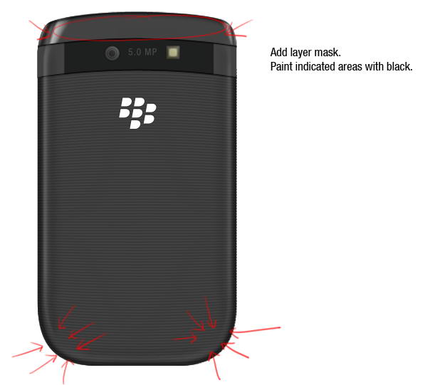
Step 135
Add layer mask Paint indicated areas with black, we don’t want any highlight there.
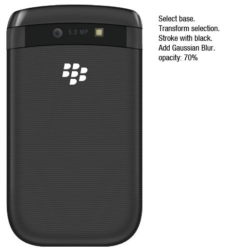
Step 136
Repeat previous process, but this time use black for its color and resize it more.
Step 137
Add layer mask and paint areas on top and bottom corner with black.
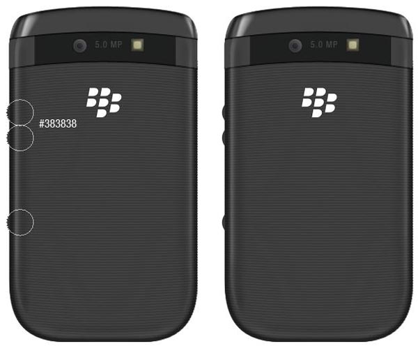
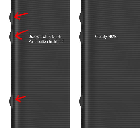
Step 138: Side Buttons
Draw three circles and place them behind all layers.
Step 139
Use soft brush and paint white to add button’s highlight on the phone.
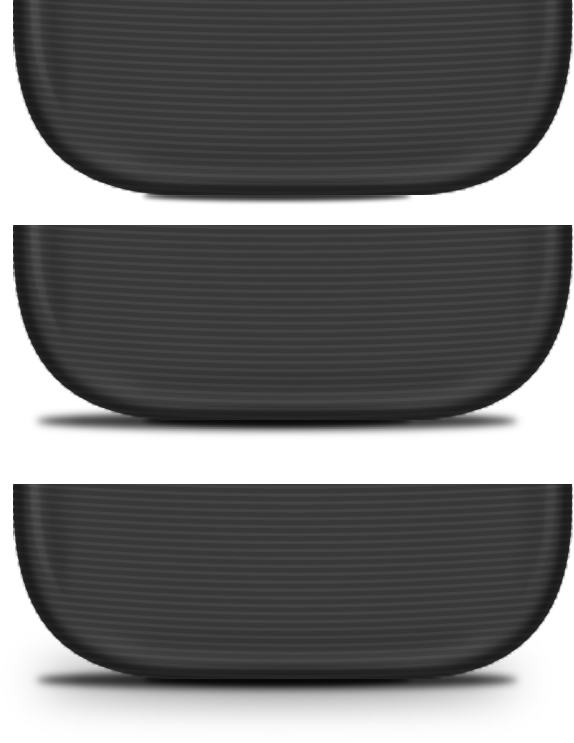
Step 140: Draw Phone’s Shadow
Create small elliptical selection right under the phone. Fill it with black and Add Gaussian Blur. Create slightly bigger selection, fill it with black, add Gaussian Blur, reduce its opacity. Create cast shadow by duplicating previous Shadow and give it a very big Gaussian Blur.
Step 141
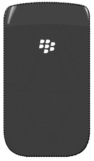
Finally, we’re done with backside of the phone.
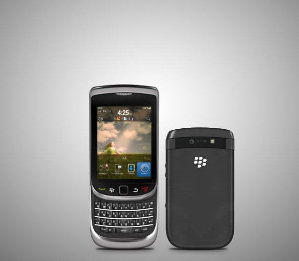
Step 142
Let’s put both phones in one place. Create new layer above Background layer. Draw a radial gradient from black to white. Duplicate layer, hit Cmd/Ctrl + T then pull the new layer down.
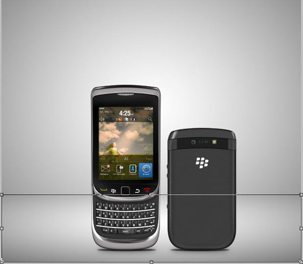
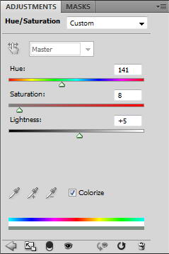
Step 143: Add Background
To add some color, click Add Adjustment Layer icon and select Hue/Saturation. Activate Colorize and change its settings.
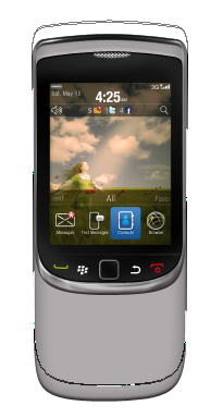
Final Image
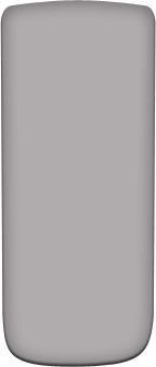
That’s it. I hope you like the final result and learned one or two new techniques from this long tutorial. In picture below I also added the phone with its keyboard closed.