Turning Co-Working Into Money: Networking with Co-Workers

It isn’t always easy to find the sort of connections you need to keep growing your business: if you take an idea that could make a great online business to a traditional networking event, you can spend more time explaining the technology behind your idea than actually networking. There is plenty of networking that can be done online, of course, but face-to-face opportunities can turn into something more. Co-working can give you the type of face-to-face interaction that you need.

Highly Motivated Audiences

The type of folks who work regularly at a co-working center are a cut above the typical entrepreneur in several ways. You’ll typically find a crowd that is more familiar with technology — a co-working space typically relies on online networks to spread the news about availability, after all. Most co-working spaces have a higher number of members with some sort of technical background — while that may range from simply working with technology companies to actually creating a technology startup — that anyone with even a moderately technical project will find good connections.

You’ll also find that many co-workers are more focused on success: they’re already doing well enough that they can afford to pay for at least a little workspace outside of their home. There are many dedicated entrepreneurs and small business owners out there and you certainly won’t meet all of them at a co-working space, but of the people who are at a co-working spaces, you’ll find a higher number that are motivated to move their businesses forward than you might find at more run-of-the-mill networking events.

In short, the people you’ll get a chance to meet in the typical co-working space are ideal networking candidates. Each co-working space is different, of course, but it’s worth it to explore the opportunities in your area.

You’re There to Work But Also to Network

The point of most co-working spaces is to actually get some work done. You need to keep that in mind as you introduce yourself to the other people in the space — interrupting their work is not a way to endear yourself. But everyone has points throughout the day where they need to get up, stretch and take their minds off of work. That’s when you can get more information on what they do and how you might be able to work together.

The types of opportunities you may find vary, based first and foremost on what you do. If your business is focused around providing services, you may find takers at your co-working space. You can also get valuable introductions from your new connections.

Your co-working space can also be an incredible place to find partners for projects. You can get a chance to see a potential partner in action and see how they work before ever bringing up the idea of a partnership. Although the internet does make it easier to work with team members around the world, there are still some benefits to being able to sit down with a partner and hash out the details in person.

The First Step

When it comes to networking with co-workers, the first step has to be co-working. Becoming a part of the community at your local co-working space is a good first step. Even if there isn’t an official space, you can find jellies and other informal co-working groups in most areas. Getting involved is important: the other co-workers in a given space will be more interested in working with you after you’ve been involved with the space for a little while. It’s just like most networking efforts — you only rarely will walk away from a first meeting with a project in hand. Instead, it takes time to build up to opportunities.

Fraise: A Free, Simple Text Editor for Your Mac

An essential tool for both web and software developers is a text editor. Text editors streamline the process of working with code, and save time by providing shortcuts for repetitive tasks. Text editors are also useful for other web users – for example, they are very handy for tidying up text that has been copied online, before pasting it into a blog or word document.

Fraise is an app that sits at the ‘basic’ end of the market for text editors, and performs these basic (and some more advanced) tasks well.

Our 5 Minute Screencast Overview

We’ve produced a quick five-minute screencast overview as a companion to this review, just to give you an idea for how the application looks and feels. You’ll receive far more insight from the full review below, but this might be a helpful look at how the application works. Hope you enjoy it!

Getting Started

Fraise makes it easy to clean up text and edit code in a very simple and easy to use interface. Fraise prides itself on being “designed to neither confuse newcomers nor disappoint advanced users.” This is a fair assessment of a text editor that will come in handy for a range of users.

Fraise is developed for Mac OS 10.6 (Snow Leopard) and is based on the open-source text editor, Smultron. Development on Smultron has ceased, but Fraise is faithfully continuing the legacy – the help manual for Fraise even refers to ‘Fraise’ as ‘Smultron’ (with the Fraise logo)!

In Depth

In terms of design and inteface, Fraise is clean and simple, and will be a familiar sight to Mac users. It uses the standard Mac layout and controls, all executed in a clutter-free fashion:

The Fraise Interface

The Fraise Interface

Fraise incorporates Quick Look icons in the left-hand menu, which is a nice touch when flipping through different pages and documents:

Quick Look for Icons

Quick Look for Icons

The functionality of Fraise is well demonstrated by what’s available in the toolbar. This resembles that of a basic word processing application, with similar options to customise the menu bar as required:

A Simple Toolbar

A Simple Toolbar

It’s a simple observation, but an important one – the basic toolbar is surprisingly comforting to see when you open up Fraise. Compared with some of the more advanced text editing apps (e.g. TextMate) that don’t even provide a toolbar, the Fraise toolbar helps newer users know where to begin!

Some of the other useful functions of Fraise include:

  • Split the document into two windows (or open in a new window)
  • Easily view all of the functions in use in your document
  • Access code snippets to speed up repetitive tasks
  • Save all of the open documents as a project
  • Manage the colors of syntax in use in the document
Preferences & Syntax Colouring

Preferences & Syntax Colouring

Fraise also includes a handy ‘find and replace’ function – with the ability to find a term in the current document, the current project, or all documents, and replace it with another term.

Find and Replace

Find and Replace

One of the areas where Fraise stands out is its localisation – Fraise is available for in 13 different languages (including two Chinese localiations), making it a tool of universal appeal.

The only (very minor) frustration when using Fraise was the inability to rename documents from the left-hand menu. This functionality has become so commonplace in apps with similar menu set-ups, that it was surprising not to be able to do this with Fraise.

At 9.6MB, Fraise isn’t going to take a dent out of your hard-drive, and its small frame enables it to zip along and perform its role at speed.

Comparison to Other Apps

The text editor marketplace is reasonably busy, and there are several quality apps competing for attention. Starting at the bottom, TextEdit comes standard with every Mac, and is the most basic text editing application (suitable for not much more than cleaning text).

Fraise would sit on the next level of functionality, with others, such as TextMate and TextWrangler in a similar, though more advanced league. Some of these more advanced apps contain functionality that is absent in Fraise – for example the ability to see the differences between two files, and merge the two to incorporate the differences, as well as larger libraries of snippets – to name a few. However, the primary consideration isn’t necessarily which app has the most functions, but which app has the functions that you need.

For example, BBEdit has been on the scene for years and is a highly respected text editor (many would say the best in market), but it comes at a price – US$125 for an individual licence. In part, this is because it includes functionality that you may not require in a text editor – such as its advanced software development tools.

Pricing

Fraise is available at my favourite price – free! In comparison, TextWrangler is also free, while TextMate is available for US$53.

Conclusion

Fraise is a little bit more than a bare-bones solution, at a bare-bones price. When an app is free (as Fraise is), you can’t complain!

If you need a text editor, give Fraise a go for yourself – for a free application, it’s surprisingly nimble and suitable for the needs of many people looking for a text editor. It won’t let you program a web application or edit a novel, but it’s great for basic requirements.


Wake Up to Your Mac: 10 Alarm Clock Apps

There are two things that you probably hate: being late, and your boring alarm clock. And there’s also one thing that you most likely love: Your Mac. Well then why not use your Mac as your own alarm clock, and wake up to your newest iTunes acquisitions?

Whether you want to wake up to the most recent episode of your favorite podcast, or you are simply looking for something to replace your old boring alarm clock, we have something for you.

Alarm Clock Pro

Alarm Clock Pro

Alarm Clock Pro

Alarm Clock Pro is an alarm app with a lot of features that go from emailing you to performing an Apple script once an alarm is set off. Although it’s a bit expensive, its price is justified by a stopwatch, time zone tool and a calendar to see all your active alarms.

Price: $19.95
Requires: Mac OS X 10.5 or later
Developer: Koingo Software

iTunes Alarm

iTunes Alarm

iTunes Alarm

This is a free and simple app, though not as polished aesthetically. It can have multiple alarms that use music from iTunes through various options like shuffle, playlists and DJ. It also has an option to put your Mac to sleep on a timer.

Price: Free
Requires: Mac OS X 10.4 or later
Developer: Johnna Run

Alarm Clock

Alarm Clock

Alarm Clock

Alarm Clock is a simple free app that runs discretely in the menu bar  from where you can see your active alarms and set new ones or even use its included Stopwatch and Timer. When an alarm is set off it displays a neat window with the time and the buttons.

Price: Free
Requires: Mac OS X 10.4 or later
Developer: Robbie Hanson

iClock

iClock

iClock

iClock is a heavy app that replaces the Time and Date sections of the menu bar and allows you to set alarms and add tasks to the calendar from the menu bar. Although it is full of customizable features, it is far from simple and it can be confusing. Unlike most other alarm apps, this one comes with a bunch of preselected alarm sounds to choose from.

Price: $20
Requires: Mac OS X 10.5 or later
Developer: Plum Amazing

TinyAlarm

TinyAlarm

TinyAlarm

TinyAlarm is a very simple app that sits in your menu bar, where you can easily set up alarms. TinyAlarm does not let you use any sounds other than the ones that come with the app. It has Growl integration that pops up when an alarm is set off and where you can snooze it or stop it. It probably won’t wake you up, but it’s good for reminders.

Price: Free
Requires: Mac OS X 10.4 or later
Developer: Pixelated Software

Timer

Timer

Apimac Timer

Like some of the other alarm apps available, Timer triples as a Stopwatch, Alarm Clock and Countdown clock.  Timer has a number of options that you can set up for when your alarm goes off, although some of these options are locked to the free users. It can even speak to you!

Price: Free version or Pro version for $24
Requires: Mac OS X 10.4 or later
Developer: Apimac

Aurora

Aurora

Aurora

Aurora is probably the prettiest of all the alarm apps, but it’s also one of the most expensive. It’s graphical interface makes it easy to use and understand, and it uses iTunes playlists to wake you up. It can also put you to sleep (and your Mac) with it’s timer.

Price: $20
Requires: Mac OS X 10.5 or later
Developer: Metaquark

Awaken

Awaken

Awaken

Awaken is seemingly a very simple app, but it has enough features to make even the most specific users happy. Although it doesn’t bring anything new, it does plenty and it does it well. It can wake you up to your iTunes music, its own sounds or launch whatever you tell it to launch. Awaken is probably the most convenient and complete app of its kind.

Price: $10 CAD – ~$10 USD
Requires: Mac OS X 10.4 or later
Developer: EmbraceWare

Minutes

Minutes

Minutes

Minutes is the only one of these apps that works as a widget, and it does it very well! Its interface is almost entirely graphical, but it’s very easy to understand and work with. It can also launch files and use iTunes music, as well as its own sounds. The only real inconvenience with Minutes is the lack of a snooze button, and repeated alarms.

Price: Free
Requires: Mac OS X 10.4 or later
Developer: Nitram Nunca

iRooster

iRooster

iRooster

iRooster is a simple app that let’s you set up alarms to iTunes playlists, however, it is the same price as Awaken, and compared to it, iRooster lacks a lot of functionality, like the ability to launch applications, put your Mac to sleep or run full screen.

Price: $9.95
Requires: Mac OS X 10.4 or later
Developer: Chimp Software

Conclusion

There are a lot of options that can suit your needs when it comes to alarm clock applications; there are plenty of free apps that would satisfy most people, but if you need features that are more specific then you’ll need to spend a few bucks.

Awaken is a very simple, yet functional app and it isn’t very expensive, but the free version of Timer is also very good and has a lot of useful features. Luckily, most of the paid apps have free trials that you can use to determine whether you need the extra features that they offer or not.

Have fun trying them out, and let us know which you prefer in the comments!


What’s New in the Alfred Powerpack?

It’s been over six months since we first took a look at Alfred, a fantastic application launcher for the Mac. Since then, I’ve heard about many of you switching to this system from Quicksilver, Google Quick Search Box, and various other launchers.

I’ve become a devoted fan of Alfred, and it’s probably now one of the most oft-used apps on my Mac. A recent update to the app comes in the form of the Alfred Powerpack, bringing a set of fantastic new features and significantly broadening the scope of what Alfred is capable of. He’s turning into a pretty handy butler!

I’ll be taking a look at some of these new “Powerpack features” after the break.

File System Navigation

Filesystem Navigation

Filesystem Navigation

Taking Alfred to the next level, this feature removes the limitation of acting as a simple “launcher”, and makes Alfred far more useful for actually browsing your Mac’s filesystem. It’s incredibly fast, looks great, offers file previews, and is generally pretty fantastic all-round!

I never really fell in love with Quicksilver, finding that it took a little too much time to become familiar with. A good application shouldn’t have a learning curve, or else it’s audience is limited only to those who have the time to tinker, explore, and generally geek out over how everything works. Alfred is a tool for the rest of us, who simply want to hit a shortcut key and get to work!

Result Actions

Actions

Actions

Once you’ve found that file you were looking for, you can – of course – launch it. But what if you want to do something more? Maybe it needs to be copied, deleted, emailed, moved, or something else altogether? Thankfully, Alfred has added “Result Actions” letting you do just this.

It’s fairly self explanatory, and works just as you would expect. Frill-free, and beautifully designed to appeal to those with something of an interface obsession.

iTunes Integration

iTunes Integration

iTunes Integration

The final new “headline feature” provided through the Powerpack is integration with iTunes. This allows you to ditch another menu bar or desktop app for quickly interacting with iTunes, and adds another string to Alfred’s bow. You can search your library, rate tracks, and quickly see what’s currently playing.

More to Come

The Alfred team have plenty more in the pipeline – address book integration, AppleScript actions, third party app integration, clipboard history, and plenty more!

I’m a fan of the pricing model that Alfred have taken here. £12 isn’t a great deal to ask for these extra features, and you’re guaranteed to reap the benefit of the new additions as and when they become available. Application launchers are undervalued. We’ve all become accustomed to using Quicksilver and similar tools for free, but I would be more than happy to pay for a tool that saves me so much time every day!

Head over to the Alfred Powerpack page for more information, and to get your license code.

What do you think? Is the new Powerpack worth the money, or are you happy with just the basic features?


Construct a Cute Character Driven Scene – Vector Premium Tutorial


We have another great Vector Premium tutorial available for Premium members today. If you want to learn how to create an illustration filled with super happy characters, then this tutorial is for you. The workflow shows how to compose the initial sketch, plan the illustration, work through the vector build process, apply the colors, and finalize this compelling scene with opacity and shading details.

Continue reading “Construct a Cute Character Driven Scene – Vector Premium Tutorial”

Quick Tip: Create an Airport Time Table Type Effect


Typographic elements are ideal to create in vector as you can scale and copy them as you like and change the colors to suit your designs. In the following Quick Tip tutorial you will learn how to use various shapes and gradient effects to create an airport timetable text effect that’s perfect for websites, poster designs or even logos.

Continue reading “Quick Tip: Create an Airport Time Table Type Effect”

Stay On Pulse Creating A Shape-Driven Electrocardiogram

You can find EKGs made with After Effects everywhere. The good thing about this one is that it just uses shape layers and mattes to create a realistic effect.
This tutorial will teach you how to create the basic shape of the line and how to make it appear over the screen.


Adapting what you learn here, you can move on to create the whole piece, such as this complete EKG for sale at VideoHive.

Tutorial

Download Tutorial .flv

File size 100MB

Additional Aetuts+ Resources


Workshop #123: Globetrotter by TOBOT

At Audiotuts+ we regularly put up a reader track for workshopping and critique (find out how to submit a track). This is how it works: you upload your song, and every week or so we’ll publish one here and step away from the podium. The floor is yours to talk about the track and how the artist can fix problems in and improve upon the mix and the song.

This track has been submitted for your friendly, constructive criticism. They have put their track (and their heart and soul) in your hands to learn and get useful feedback.

  • Do you enjoy the song or track itself? Does it have potential?
  • Can the arrangement be improved?
  • How did you find the mix? What would you do differently?
  • What do you enjoy about the rhythm track? What can be done to improve it?
  • Is the choice of instruments relevant and effective for the style/song?
  • Are the lyrics (if any) effective? Does the style, arrangement and genre of the song suit them?
  • Can you suggest any specific techniques that might improve the track?
  • Do you have any other constructive feedback?

Globetrotter by TOBOT

Artist’s website: soundcloud.com/tobot

Description of the track:

Made in Logic during the last two weeks. First I spent a lot of time tweaking the synth sounds until I was satisfied. I used the “strip silence” function on some of the synths, which I first bounced together in different groups. Spent much of the time trying to get the beat sound cool and tight by using eq, compression, and parallel compression. I also used side chain compression on some of the effects. I would love to discuss it and get feedback from others. Best regards, Tobias Niemann Brix aka. TOBOT, Copenhagen, Denmark

TOBOT – Globetrotter by TOBOT

Terms of Use: Users can stream the track for the purposes of giving feedback but cannot download or redistribute it.

Have a listen to the track and offer your constructive criticism for this Workshop in the comments section.


Submit Your Tracks for Workshopping

Need constructive criticism on your own tracks? Submit them using this form.


Creative Mastering: Interview with Michael Romanowski

Mastering is the voodo magic of audio production. Everybody knows of it but few hazard themselves into the subject, leaving mastering up to the professionals. Michael Romanowski is one such professional. He’s been mastering in the Bay area for almost 20 years, doing work with clients such as Norton Buffalo, The Radiators and Dredg to name a few.

I had the opportunity to discuss the creative aspect of mastering, the quality of analog as well as the evolution of the home studio. Due to amount of insight Michael shared with me during our conversation I’ve edited it into two parts, first of which can be read below.

How did your career in audio engineering start?

I played in bands when I was younger, and went to a lot of concerts. After a while I started noticing the sound engineer that was working in the back of the room. I knew he was obviously affecting the sound. And so I started hanging out, and I asked him all sorts of questions. At the same time, the band I was in was trying to do some recording. I started to realize that there were some similarities between the live sound and the recording process.

I kept going and hanging out and asking this live sound guy questions. After bugging him for several months, one night he said, "Hey, I’m going to go take a break. You want to run it for a little bit?" And so I did that a few times. After a little while he said, "I’m taking the night off. Do you want to be the sound guy for the night?" And I said, "Okay, great." Finally he said, "I quit. Do you want to be the house sound guy?" And that’s how I started.

As I started doing live sound, I was also starting in the studio and saw that there were a lot of similarities. I was always the one in the band paying attention to what was going on. Where the mics were being placed, gear and stuff like that.

Create a Photo Realistic iPhone in Photoshop

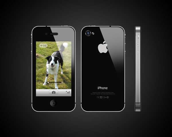
This tutorial will show you how to create a photo realistic image of Apple’s newly released iPhone4. Hopefully, by the end of it you will have something extremely close to the real thing, which for the few who don’t own the iPhone4 (like me), may be as close as we’ll ever get. Before we get started it might be a good idea to pull up a reference image from the web just so you know where everything goes and the size of some of the features. But otherwise, Enjoy!


Step 1

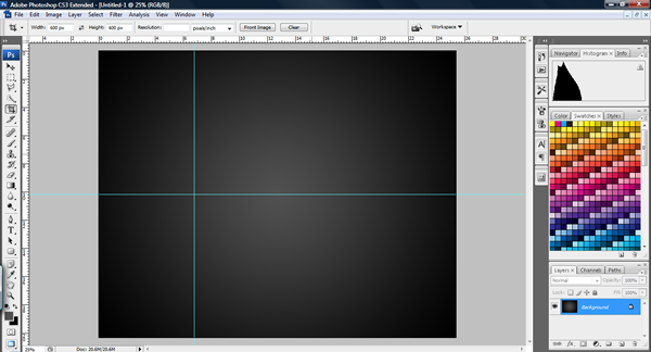
To start, create a new document of a suitable size (I used a 10 inch x 8 inch photo size at 300dpi because it fits nicely as a high quality wallpaper).

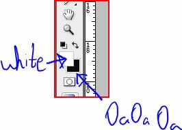
To create the background, set your foreground color to #505050 and then use the gradient tool and select the radial setting. Drag from the centre outwards to get a soft glow in the middle of the image.


Step 2

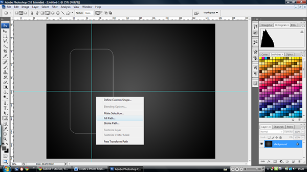
Press (Cmd/Ctrl + R) to get the rulers up, drag some guides from the rulers towards the centre of where you want your iPhone to be.


Step 3

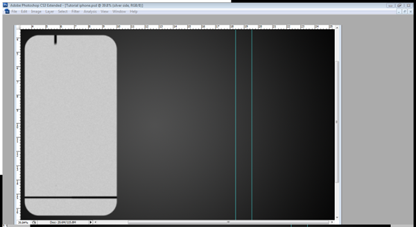
On a new layer; call it "silver side", select the rounded rectangle tool (U) and set it to paths. Make sure its radius is 1cm and then drag from the centre of the guidelines, making sure to hold ‘Alt’ when you drag it. Try and get a realistic shape (If you’re not sure then pull up a reference image from the web).

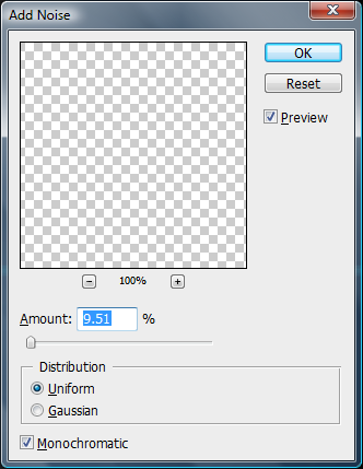
Right-click and select fill paths. Fill it with #C9C9C9. Then choose Filters > Noise > Add Noise. Choose something around 9.51 (just enough to make it look more realistic and lose it’s hardness) in the monochromatic and uniform setting. Press the ‘Escape’ button twice to remove the path. Draw the brush strokes as shown and then go to filters > Blur > Gaussian blur > 2.8 pixels.


Step 4

Create a new layer and call it "main body." ‘Cmd/Ctrl – Click’ the "silver side" layer and then choose ‘Select > Modify > Contract > 10 pixels.’

Set your background color to #0A0A0A, then to fill the selection press ‘Cmd/Ctrl + Backspace.’ (This automatically fills the selection with the background color).


Step 5

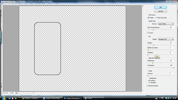
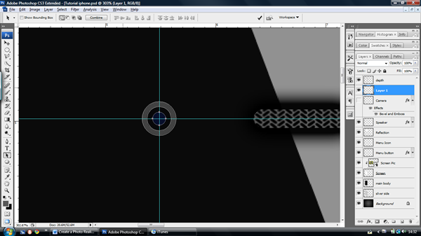
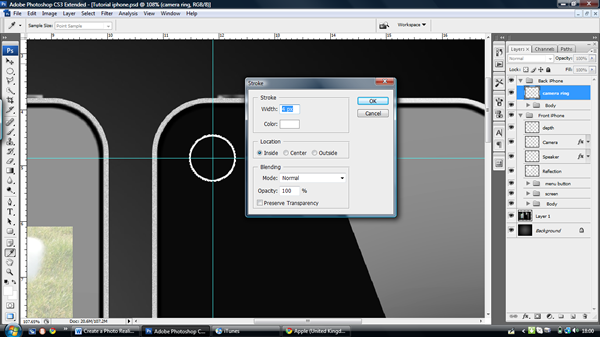
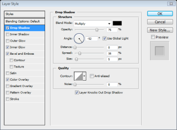
Create a new layer and call it "depth": this is just a line around the inside of the body where the iPhone curves and refracts the light away from the camera. To create the line ‘Cmd/Ctrl – Click’ the "main body" layer, Then go to ‘Edit > Stroke’ WIDTH – 10 pixels, COLOR – #000000, LOCATION – Inside.

Then go to ‘Filters > Blur > Lens Blur’ and apply the settings below. Make sure that this layer is always on top of all other layers.


Step 6

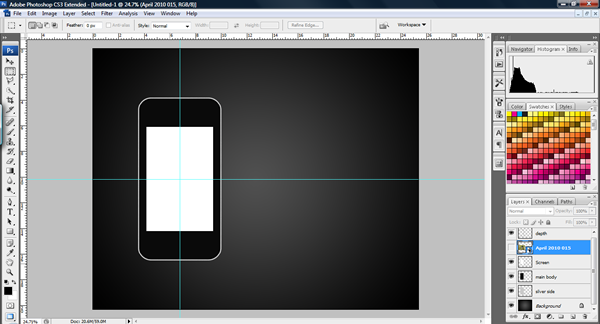
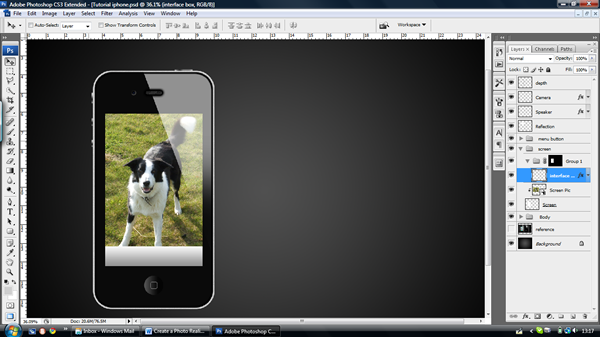
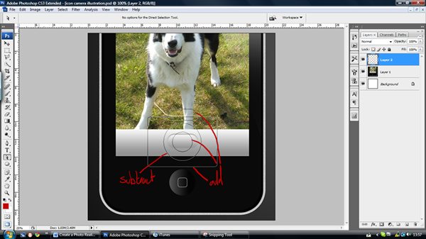
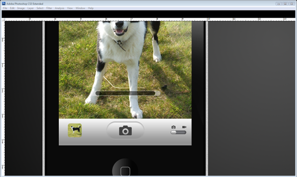
Create a new layer underneath called "Screen." Select the Rectangle marquee tool (M) and then draw from the centre of the guidelines, hold the ‘Alt’ once you have started dragging to make the rectangle expand from the centre. Make the rectangle a nice shape for the screen leaving space for the menu button, speaker and camera. When you are satisfied with the shape of your screen, fill it with any colour and then create a new layer above the "Screen" layer; don’t worry about naming it yet.
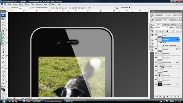
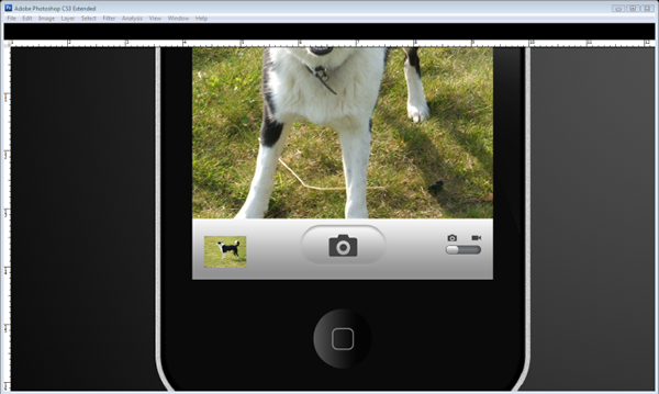

Step 7

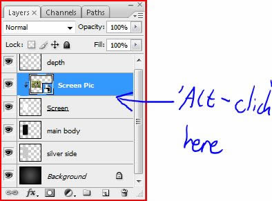
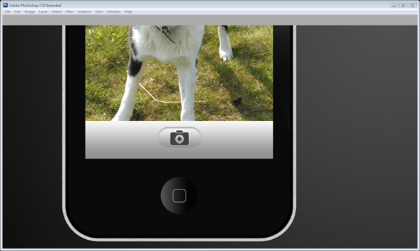
When you are satisfied with the shape of your screen; in your new layer choose ‘File > Place’ and choose a picture of your choice (I’ve chosen my dog – isn’t he cute!) Then resize, move, or rotate the image or do whatever you please to make it look good. Make sure that the image is over the screen when you are finished, you can then rename the layer "Screen Pic." Now, press ‘Alt – Click’ between the "Screen" and "Screen Pic" Layer to make it a clipping layer. This means that it crops to the layer below it and it allows you to edit or change the image underneath with ease.
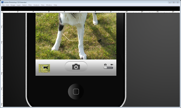

Step 8

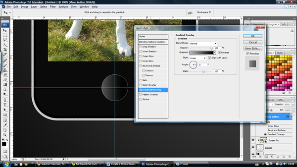
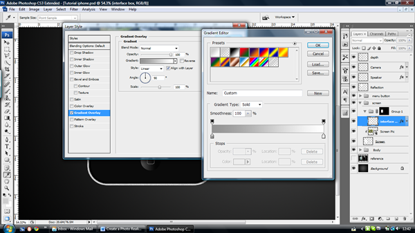
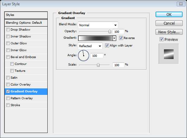
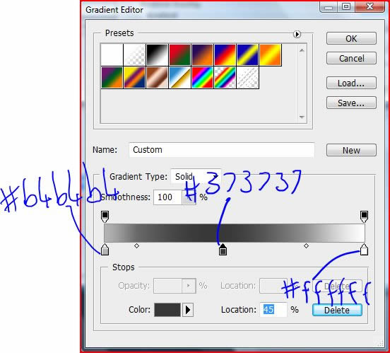
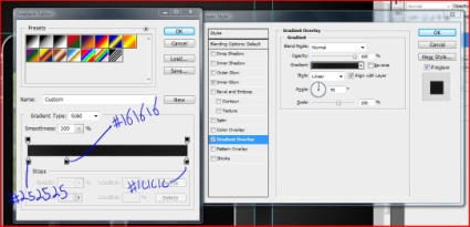
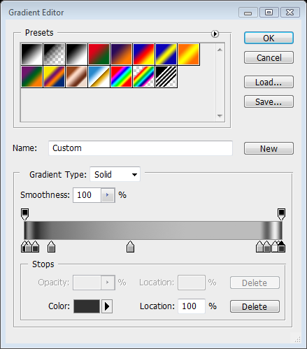
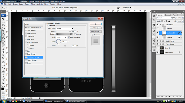
Now we will start on the menu button. Create a new layer and call it "Menu Button", make the opacity 60%. Bring another guideline down to where the button will be and then use the Ellipse tool from the centre of the guidelines holding ‘Alt.’ When you have the desired size, fill it with white then open the layer effects menu by Double-clicking next to the layer, then use the gradient overlay option with #AEAEAE to #000000 as shown below. Remove the path.
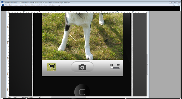

Step 9

Create a new layer and call it "Menu Icon", use the rounded rectangle tool (U) with a radius of 10 pixels and pull the square out from the centre, before we add a stroke to it, make your foreground colour #979797, then select the brush tool (B) and make the brush 3 pixels wide and 90% hardness. Then go back to the rounded rectangle tool and then ‘right-click > Stroke path > Brush > OK.’
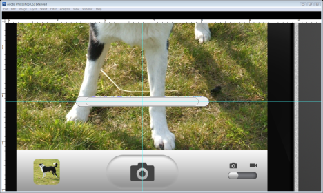

Step 10

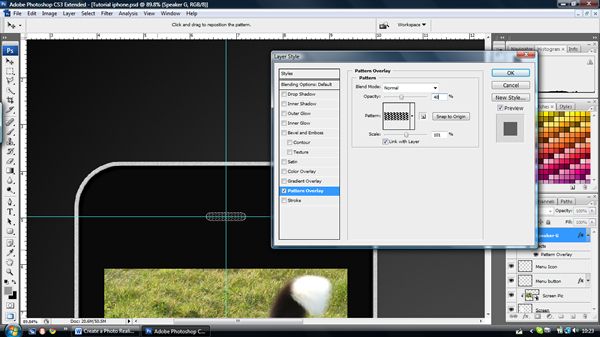
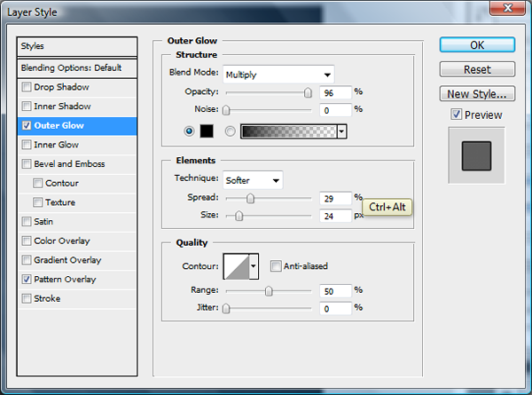
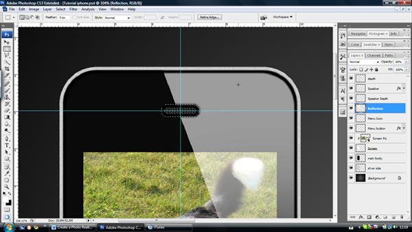
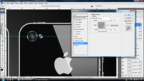
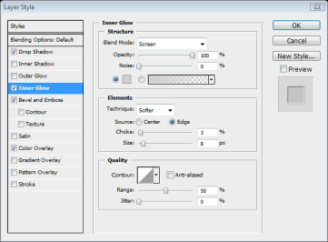
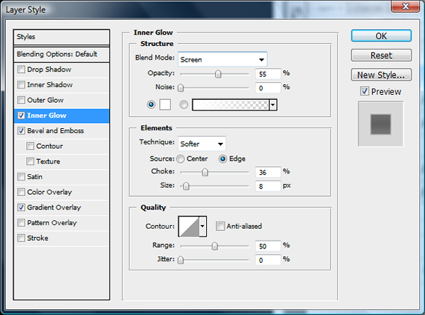
Now to create the speaker, move a horizontal guideline to above the screen, both the speaker and the camera will be centred along this line. Make a new layer called "Speaker" then use the rounded rectangle tool (U) to make the speaker grill. Set the radius to 1cm just to make a rounded edge, and then pull out the shape to the size shown in the pictures below. With the same tool, right click, choose ‘Fill Path’ and fill it with black. Then view the layer effects and choose ‘Pattern Overlay’ and ‘Outer glow’ and use the settings shown.


Step 11

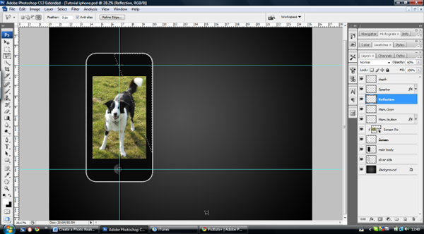
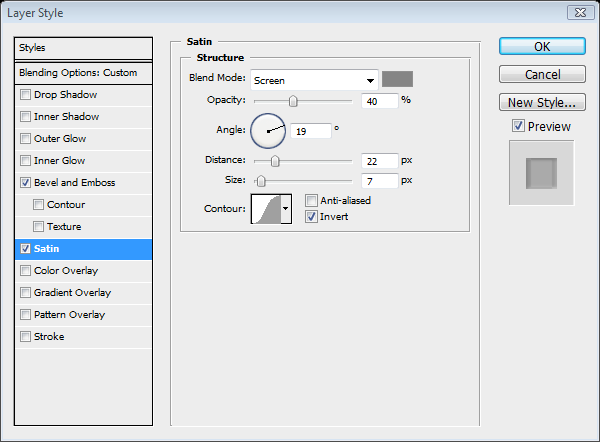
Now we will make the reflection I mentioned earlier. So create a new layer called "Reflection" underneath the "Speaker" layer. ‘Cmd/Ctrl – Click’ the "Main Body" layer and then select the Polygonal Lasso tool (L), select the intersect mode and then make a triangle across the right side of the iPhone as shown. Fill it with white. Then bring the layer opacity to 55%.
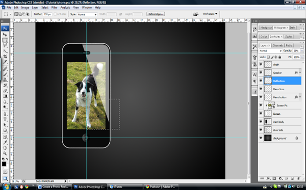

Step 12

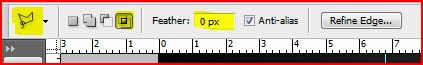
Select the Rectangle marquee tool (M) and set the feather to 150 pixels. Select the bottom third of the reflection and press the Delete key a few times until you can’t see the tip of the reflection.


Step 13

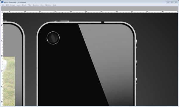
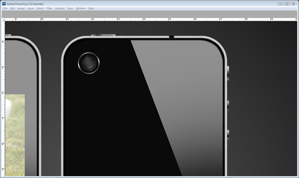
Now we can start on the camera, pull out a guideline to where you want the centre of the camera to be, create a new layer called "camera." Select the Ellipse tool (U) and make three small circles inside one another from the centre of the guidelines. Fill the outside ring with #424242, middle ring #080809 and the centre ring #080F2B.
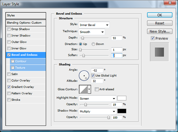
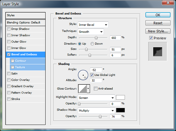
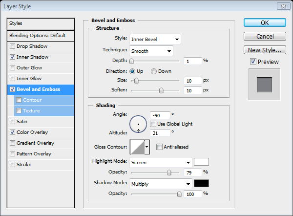
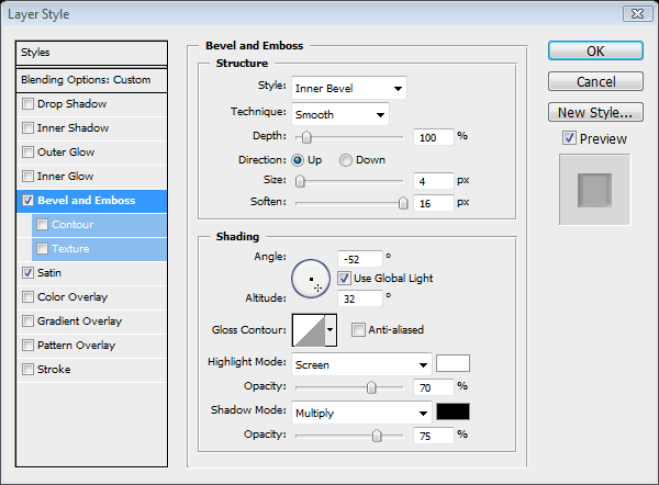

Step 14

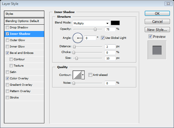
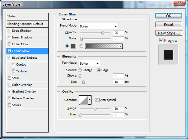
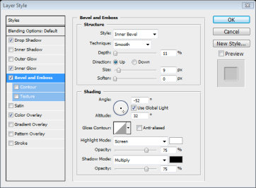
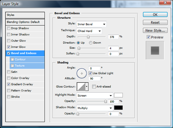
Now go to the layer effects menu and use the bevel and emboss settings below to make the camera look more set into the iPhone. Then go to Filter > Blur > Gaussian Blur > 0.9pixels.


Step 15

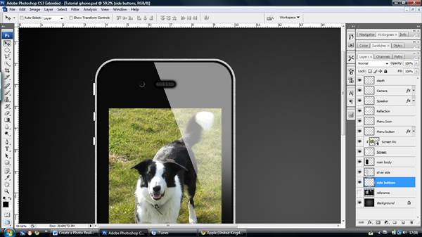
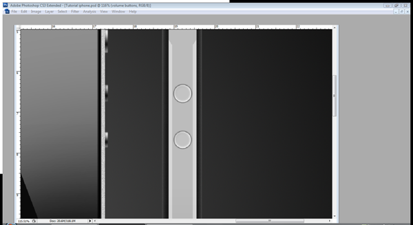
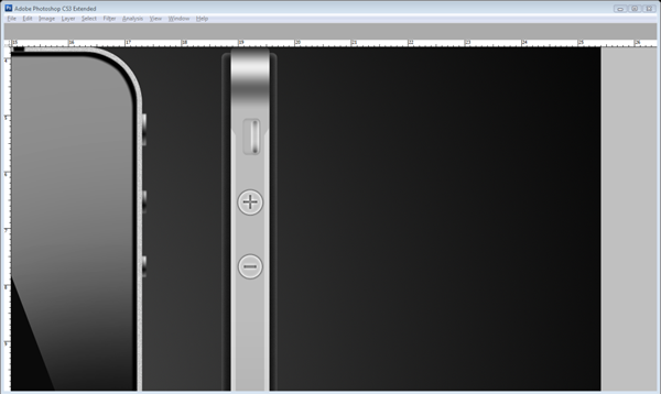
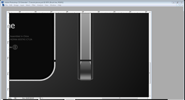
Now that we have completed the camera we can finally move onto the finishing touches for the front view of the iPhone; first we will do the side buttons. Create three new layers underneath the "Silver side" layer (name them Button 1, 2 and 3.) Draw three paths with the rounded rectangle tool (U) with a 1pixel radius along the left side of the iPhone. We are doing the two volume buttons and the mute slider and you can see where they go in the image underneath. Once you have drawn them, fill the paths white, one at a time on each layer. Then apply the settings below on the layer effects menu. When you have applied these to each layer go to Filter > Blur > Gaussian Blur > 1.


Step 16

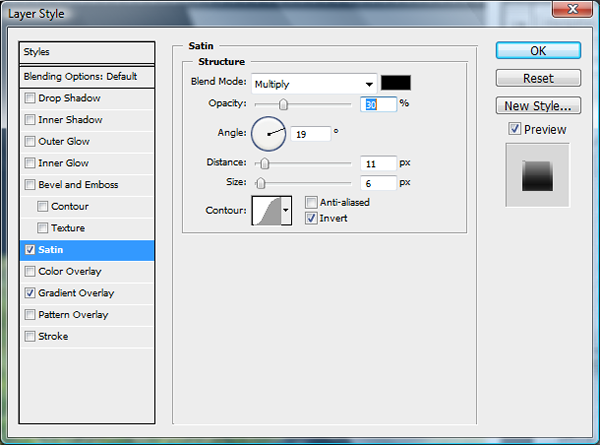
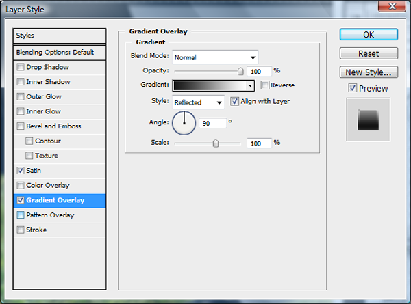
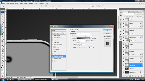
Create another new layer and call it "top button." Create another path with the rounded rectangle tool (U) at the top right hand corner of the iPhone. Fill it with white and add the settings below.

You may have to move the gradient into the correct place by using the move tool (V) and dragging it along the screen. Press Cmd/Ctrl + F to repeat the last filter effect (Gaussian Blur in this case).


Step 17

Before we move on I suggest group the layers you have used so far into Layer Groups if you have not already done so by pressing the folder icon in the layers bar.

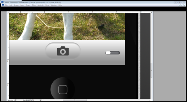
Now the iPhone body is out of the way we can get a move on with the interface before we move onto the back and side views of the iPhone. To start, Make a new layer group and call it "interface", Cmd/Ctrl – Click the "Screen" layer and then press the ‘Add Layer Mask’ button. This will make everything made in the group crop to the Screen.

Make a new layer and select the rectangular marquee tool (M) and select an area in the bottom part of the screen as shown and fill it with white.

Apply the settings below. Then go to Layer > Layer Style > Copy layer style.
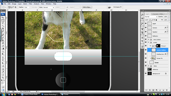

Step 18

Drag two guidelines to the centre of the box and then create a new layer called "Camera button." Use the ‘Rounded rectangle tool’ (U) with a radius of 1cm to create the button. Press Cmd/Ctrl + Enter to turn the path into a selection, and then fill the selection. Go to Layer > Layer Style > Paste layer style. (This will paste the same layer effects setting from the copied layer onto this one).

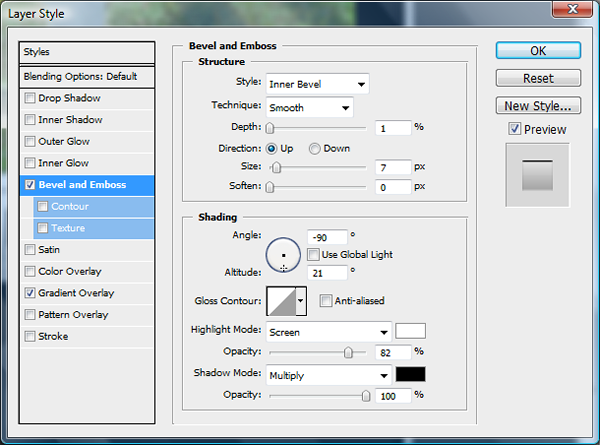
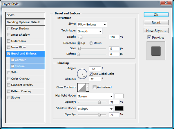
Add the bevel and emboss settings as shown below.
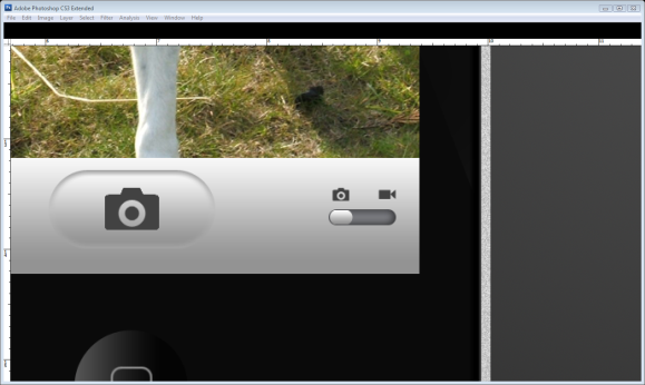

Step 20

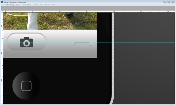
Now we will create the camera icon for the button, create a new layer and call it "Camera icon." Using the Rounded rectangle tool (U) with a radius of 20 pixels, draw a large-scale camera and use the direct path selection tool to move the top corners of the top box towards each other. Press Cmd/Ctrl + T to transform the icon; resize it to make it fit inside the camera button. Select the Rounded rectangle tool (U) and Right-click the path, click fill path and fill it with #424242.


Step 21

Create a new layer called "slider box" and use the rounded rectangle tool (U) for the box in the bottom right-hand corner of the screen. Using the same radius, draw a box where the top touches the guideline as shown below. Fill it with white and then apply these layer effects.


Step 22

Make a new layer called slider and then again using the rounded rectangle tool (U) make a small slider inside the slider box, put it on the left side. Press Cmd/Ctrl + Enter then Cmd/Ctrl + Backspace to make it a selection and fill it with your background colour. Go to Layer > Layer style > Copy layer style.

Go to the "Camera icon" layer and press Cmd/Ctrl + J to duplicate the camera icon layer, press Cmd/Ctrl + T to transform it, make it smaller and move it above the slider. Then draw a film camera icon using the rounded rectangle tool (U) and the Pen tool (P), transform it and move it over the slider.


Step 23

Import a different image by going to File > Place and selecting your image. Press Cmd/Ctrl + T and reduce the size of the image so it can fit snuggly in the bottom left-hand corner.

Then use the rounded rectangle tool (U) with a 10-pixel radius to create a box over the picture. Press Cmd/Ctrl + Enter to create a selection, and then press the ‘add layer mask’ icon in the layers bar. This will crop the image to the selection.


Step 24

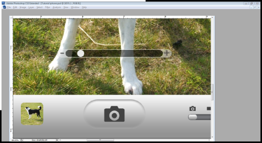
Now we move onto the zoom bar! On a new layer called "Zoom bar", use the rounded rectangle tool (U) with a 30-pixel radius and draw a thin bar across the bottom of the screen. Then change the tool to subtract and draw another bar within the previous bar. Using the path selection tool (A), select and right-click the outer path, choose fill sub path, and then fill it with #EAEAEA.

Use the path selection tool (A) again and select the centre path. Change the settings from subtract to add and then fill the path with Black. Press 5 on your keyboard to reduce the opacity to 50%.

Make a new layer and draw a circular slider with the ellipse tool (U), fill it with white and then press 9 to reduce the opacity to 90%.


Step 25

Select the text tool (T) and put a Black + and – symbol on either side of the zoom bar, the font is Veranda and size 8 for the – sign and size 6 for the plus sign. Bring the opacity to 50%.


Step 26

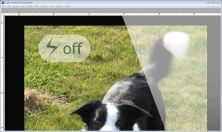
Now we move onto the flash display. Use the rounded rectangle tool (U) at radius 1cm to draw rectangle in the top left-hand corner, fill it with white and bring the opacity to 50%. Use the Veranda font in black and size 12 to write the word ‘Off’ and then bring the opacity to 50% again. Using the Pen tool (P) draw a lightning icon and fill it with #000000. Bring the opacity to 50%.


Step 27

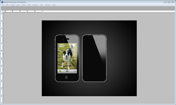
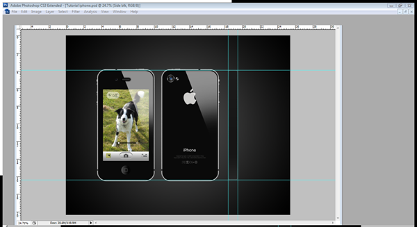
Now we have completely finished with the main view of the iPhone (pat yourself on your back if you like) and if you want to go on further just keep on following the tutorial as we move onto the back of the iPhone and then the side. Before we start, just put the front iPhone into one big folder.

This step will be easier for those which have organised your layers into folders, I have put all my button layers and body layers into one folder which I can just copy and flip for the back of my iPhone. Otherwise, Cmd/Ctrl + Click the "Main body", "silver side", "mute slider", "Top button", "Reflection", "depth" and the volume button layers, Right-click and press duplicate layer, press OK and then put the layers into a new folder called "Back iPhone.

Select the "Back iPhone" folder, then use the move tool (V) to move the back iPhone next to the front iPhone. Open the folder and select every layer excluding the "reflection layer", Then Choose Edit > Transform > Flip Horizontal.


Step 28

Now we move onto the back camera. Create a "camera ring" layer, bring two guides to where you would like your camera to be, and then use the elliptical marquee tool (M), hold down Alt + Shift ONLY when you have started dragging from the centre of the guidelines. Then choose Edit > Stroke > 4 pixels > OK. Then apply the gradient settings below.


Step 29

Create a new layer called "greys" and create another circle using the elliptical marquee tool (M) inside the camera ring and fill it with #282828. Choose Filters > Noise > add noise and choose 16.57. Then choose Filters > Blur > Gaussian Blur > 2.2 pixels. Add these layer effects. Turn the layer opacity to 50%.


Step 30

Create another layer called "grey underlay" and underneath the "grey" layer use the elliptical marquee tool (M) and create another circle underneath, fill it and add the layer effects below.

Finally draw another circle for the lens and fill it with #013274 then apply these effects.
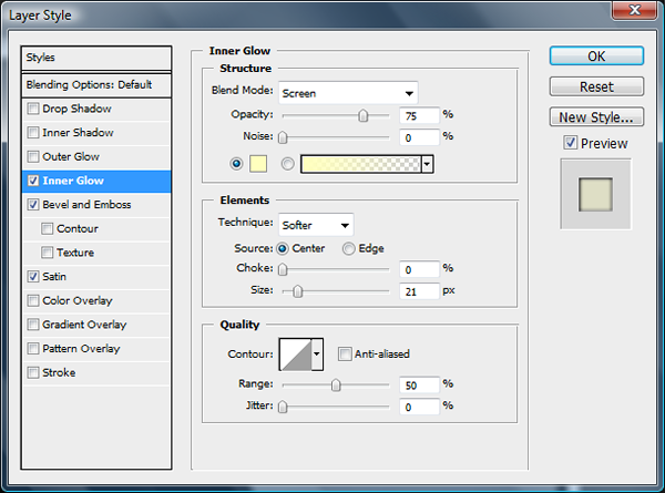
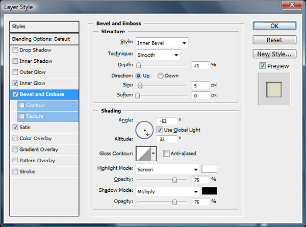
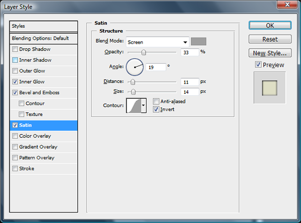
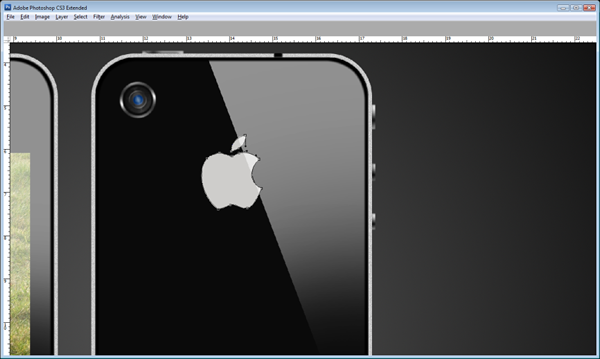

Step 31

Create a new layer underneath the "reflection copy" layer and call it "apple logo." Get an image of the apple logo and trace it or just draw it from memory using the pen tool (P) fill it with #CECDCB.


Step 32

For the flash just use the elliptical marquee tool (M) and fill it with white on a new layer, use the guidelines to keep it in line with the camera. Then go to the layer effects and apply the pattern overlay below.


Step 33

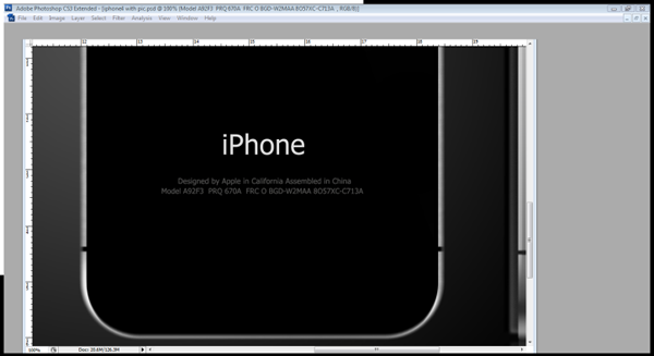
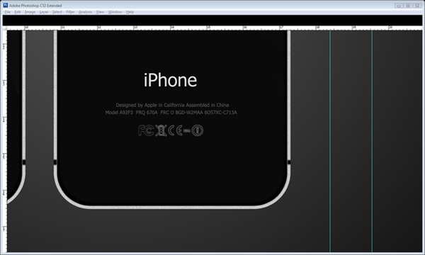
Select the text tool (T) with the Tahoma font, size 14 and write iPhone towards the bottom. Then use the same font but at size 3.7 for the product code and information underneath the brand name. The colour is #545453.


Step 34

Start to draw the safety and quality symbols with the Pen tool (P), have some fun and make some of your own or just keep to the originals like I’ve done so below. Again keep the colour #545453.


Step 35

Now that the Back is finished then we can finally finish off with the side. Create a new layer group called "side iPhone" and in that group create a layer called "side blk." I’ve dragged some guidelines to outline the basis of my side iPhone. Draw a box with the rounded rectangle tool (U) with a radius of 10 pixels. Fill it and then open the layer styles and apply these settings.


Step 36

Now with the same tool (U) on a new layer called "Silver" draw a thinner but longer box than the "Side Blk." Its length should mean that it only just protrudes the edge of the other box. Then add the gradient underneath.

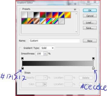
From left to right this gradient goes: #202020, #919191, #2E2E2E, #737373, #ADADAD, #BCBCBC, #616161, #EDEDED, #303030.


Step 37

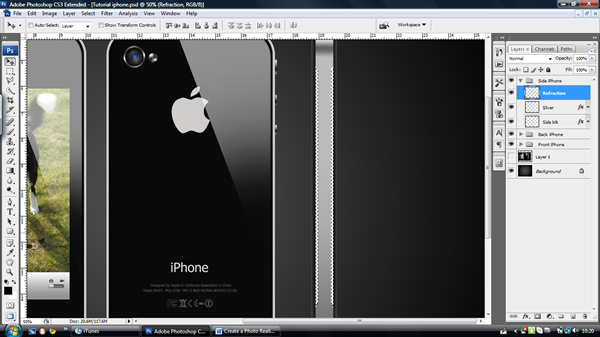
Create a new layer called "Refraction" and then Cmd/Ctrl – Click the "Silver" layer and use the polygonal lasso tool (L) to select two areas on the sides of the iPhone as shown below. Fill it with white and then move the opacity to 40%.


Step 38

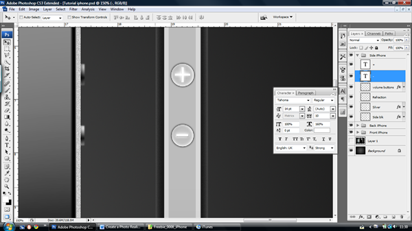
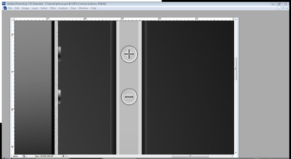
Create a new layer called "volume buttons" and use the elliptical path tool (P) to create two circles the size of the volume button, fill it and apply the settings below. I have used guidelines to make sure that they line up with my side iPhone view buttons.


Step 39

Use the text tool (T) and type a plus and a minus in the buttons, use the Tahoma font at size 14. Make the minus sign wider by increasing the width to 160%. Go to Layer > Rasterize > type (do this to both text layers). Then Cmd/Ctrl – Click the plus and minus layers then go on to the "volume buttons" layer and press delete.


Step 40

For our final step use the rounded rectangle tool (U) with a radius of 8 pixels and draw a rectangle on a new layer called "Slider Back." Fill it with #b7b7b7 and add the inner shadow below.

Create a new layer called "slider" and draw another box with the rounded rectangle tool (U) inside the previous box, just this time with a 7-pixel radius. Then apply these settings to it.


Step 41

Just to finish off, select the brush tool (B) at size 13 and hardness 50% with the colour #1E1E1E, Cmd/Ctrl – Click the "silver" layer and then at the bottom draw a brush line by dragging and holding Shift. Make sure it’s in line with the other lines from the back and front view. (Use a guideline if you like.)


Final Image

You have now completed your iPhone 4. I really hope you enjoyed this tutorial and are satisfied with what you have ended up with. Hopefully you have learned something new and have had an enjoyable experience.

Open Mike: Prefixes

To underscore, or not to underscore? This is Open Mike, a series of discussion posts to throw the cat amongst the pigeons. These posts are all about you — we want to hear your opinions, ideas, and thoughts. Due to popular demand, this Open Mike includes a poll to help us analyze opinion, so let’s hear what you have to say about prefixes.


Do You Put Underscores Before Variables?

AS3 developers often use underscores as prefixes for private or protected variables in a class:

private var _playerID:String;

Some coders find this a useful way to tell at a glance whether the var is available to other classes; others deride it as useless and ugly. Whose side are you on?

Do you put underscores before variables?customer surveys


How About Method Arguments and Interfaces? What Else?

Other common prefixes are a_ for method arguments (or p_ for parameters), and I for interfaces.

public function takeDamage(a_damage:Number):void
{
	_damage-=a_damage;
}
package
{
	public interface IPlayerCharacter
	{
		function takeDamage(a_damage:Number):void;
	}
}

The “I for interface” prefix is pretty common, but argument prefixes are rarer.

Do you use a prefix for function parameters?online surveys

Do you use a prefix for interface names?online surveys

Any others you use often? Let us know in the comments.


Hungarian Notation: Yea or Nay?

If those didn’t bring out strong opinions, I’ve got two words for you: Hungarian notation.

No, I’m not talking about Systems Hungarian, where the data type of the object is encoded into a prefix of the name:

var intCounter:int = 0;
var boolBestScore:Boolean = false;
var nHeight:Number = 120;
var btnOK:SimpleButton = new Button();

No-one’s still using that, are they? With a decent IDE you can tell the data type of any variable easily; there’s little need to have that information in the name of the variable.

I’m talking about Apps Hungarian, where the purpose of the object is encoded into a prefix of the name:

var dHeight:Number = newHeight - oldHeight;	//d for 'difference'
var cChildren:int;	//c for 'count'
var degAngle:Number;	//deg for 'degrees'
var radAngle:Number;	//rad for 'radians'

(Check out Joel Spolsky’s excellent article Making Wrong Code Look Wrong for more information on this.)

Do you use any form of Hungarian notation, or is it completely unnecessary in an OOP language like AS3?

What do you think about Hungarian notation?online surveys

Quick Tip: Easy Text Transitions with TextAnim Maker

Discover the power of TextAnim Maker and create awesome text transitions. Read on to find out more in this Quick Tip!


Step 1: What is TextAnim Maker?

TextAnim Maker is a Flash based Text Animation tool that creates stunning text animations right in your browser and displays the code you need to use to perform the animation in your project.

It works using its own class called TextAnim, developed by the people of flupie.net.


Step 2: How it Works

TextAnim Maker presents a clean interface showing the different options, controls and panels to customize your text effect.

It also shows a preview of the animation created and the resulting code of the transition.


Step 3: Options

The editor features a series of options (which are properties and methods in the class) which can be edited to modify the final effect, let’s take a closer look at those options:

  • Mode: The animation will start from the option selected here.
  • Split: Splits the text into chars, words or lines.
  • AnchorX, AnchorY: Uses the option as the registration point to animate.
  • Text: The text to animate, it can contain HTML.
  • Interval: Interval between the chars, words or lines animation.
  • Delay: Time to wait before start.
  • Blocks Visible: A block is the part of TextAnim that contains a text slice, hides them or shows them.

Step 4: Class and Documentation

You can download the TextAnim class from GoogleCode and read the documentation online at the developers’ website.


Step 5: Example Animation

This is an example animation created in the editor, here is the code I used:

import flupie.textanim.*;

var txtanim:TextAnim = new TextAnim(myTextField);
txtanim.mode = TextAnimMode.EDGES_CENTER;
txtanim.anchorX = TextAnimAnchor.RIGHT;
txtanim.anchorY = TextAnimAnchor.BOTTOM;
txtanim.interval = 15;
txtanim.blocksVisible = false;
txtanim.effects = myEffect;
txtanim.start();

import caurina.transitions.*;

function myEffect(block:TextAnimBlock):void {
    block.scaleX = block.scaleY = 0;
    block.rotation = -120;
    Tweener.addTween(block, {rotation:0, scaleX:1, scaleY:1, time:.5, transition:"easeoutback"});
}

Conclusion

TextAnim Maker is a great way to create your animations dynamically and quickly. Try it!

Thanks for reading!

‘The Lantern’ – A 3Ds Max Project – UVing

3Ds Max author Ben Tate is back once again with this exclusive 3-part tutorial series covering all of the processes involved in creating ‘The Lantern’. After modelling the lantern in the first part, today Ben walks us through his UV unwrapping techniques using the tools contained within the Unwrap UVW Modifier. Let’s get started!

This tutorial is Day 2 in a series – Go to Day 1 now to see the modelling process.


In this tutorial we’ll go through the entire process of modelling, uvmapping, texturing, lighting and rendering an old lantern in 3d Studio Max. In the first part of the tutorial, we used poly modelling techniques for the majority of the model, but also took a look at how to use splines to create the more complex pieces.

With the modelling completed, we’ll now move on to the UV mapping – all of which will be done inside of 3ds Max using the many tools contained in the Unwrap UVW modifier, such as Flatten and Pelt Mapping. We’ll also discuss tips and tricks for UV mapping sub-divided geometry. With the mapping completed, we’ll scale the uv islands to the correct proportions and clean up our objects.

Finally we’ll pack and finalize our UV’s into a single layout, before moving into Photoshop to create the Diffuse, Bump and Specular Maps in the final part of the tutorial. We’ll also create procedural materials for the candle and flame inside Max, and finalize our scene lighting for the final render.


Video 1

Download

Note: click the ‘Monitor’ icon to view tutorial in full-screen HD.


Video 2

Download

Note: click the ‘Monitor’ icon to view tutorial in full-screen HD.


Video 3

Download

Note: click the ‘Monitor’ icon to view tutorial in full-screen HD.


Video 4

Download

Note: click the ‘Monitor’ icon to view tutorial in full-screen HD.


Video 5

Download

Note: click the ‘Monitor’ icon to view tutorial in full-screen HD.


This tutorial is Day 2 in a series – Go to Day 1 now to see the modelling process.


Don’t miss more CG tutorials and guides, published daily – subscribe to Cgtuts+ by RSS.

Fun Links: Unmotivational Posters, Dilbert, The Oatmeal

There are times when we need to a take a little break to be more productive, but some of us feel guilty straying too far from our work. But sometimes taking a break to check out that latest Garfield cartoon ends up being just the thing that gets us back on track.

Here are some links that you can dive into that will hopefully ease your guilt – thanks to their work “related-ish” subject matter.  They may just put a smile on your face, too.

The Oatmeal

The Oatmeal is a really cool cartoon blog about everyday life and beyond. One of the recent posts is on working from home, while another literally discusses the use of the word literally. Definitely check it out.

Chief Happiness Officer

This site is all about making working life less miserable, to the point of trying actually to be happy at work!  It is run by Alexander Kjerulf, a Dane who is an employee happiness speaker and consultant and who also wrote “Happy Hour is 9 to 5,” which is available for purchase and for reading online for free.

The Fun Theory

The Fun Theory tries out ideas that make everyday things more fun with the aim of changing people’s behavior for the better.  Here you can watch videos of people using the inventions.  Makes you wonder, what would you do to make your everyday chores fun?

Despair.com

Despair.com has some unmotivational posters that for some reason are more motivating than real motivational posters found in the HR office – if you have a sense of humor.  One of my favorite demotivational posters is:

“Failure: When your best just isn’t good enough.”

Dilbert

Possibly your ultimate office life comic.  Dilbert can give a fun start to a day…though at times its truthfulness can be a little sobering.

What links do you check out to give yourself a break – or even inspiration – during your workday? Let us know in the comments.

Blindwriting: A Freer Approach to Freewriting

Writing is hard when you try to create and criticize at the same time. But while composing that first draft, it’s difficult to resist the urge to edit too early. You reread the previous sentence and notice something – a dangling modifier, a weak verb, a careless typo – then it’s too late. You’re criticizing what you’ve written. And when the inner critic takes over, the writer is blocked.

To help writers escape the inner critic, writing gurus have preached the power of freewriting. The idea is that if you write fast enough, you won’t have time to look back and criticize what you’ve written.

So why risk it? Why not remove the option of looking back altogether? While drafting, you should hide what you’ve written from yourself – and your inner critic – so that you can focus on creation. This is the essence of blindwriting.

How to do a blindwriting exercise

Since blindwriting is a variation of freewriting, the guidelines are similar:

  1. Pick a short, non-intimidating timebox duration, say 5 to 15 minutes.
  2. During this period, force yourself to write whatever comes to mind, continuously, recording even digressions and comments about your confusion (“I don’t know what to say.”)
  3. Write without judgment or restraint, ignoring the need for quality or correctness – in grammar and usage, spelling and style.
  4. Make sure you don’t see the words while you’re writing.

You can fulfill the fourth guideline in several ways:

  1. Use a leadless pencil, barbecue stick, or stylus to write on a sheet of paper with carbon paper behind it, imprinting what you write on the page behind the carbon paper.
  2. While on your computer, dim the brightness of your monitor or turn it off altogether.
  3. Change the font color so that it matches the background color.
  4. Whether you’re writing longhand or typing, just close your eyes.

The fourth method is easiest for touch typists, but its additional benefits make it worth the effort to learn to touch type (I recommend learning Dvorak keyboard layout). But first, regardless of whether you have your eyes closed, here are:

The benefits of blindwriting

  1. You starve your inner critic of material to criticize. This is different from trying to ignore the critic, as with regular freewriting. It’s the difference between a dieter refusing to raid the fridge, and a dieter having no fridge to raid in the first place.
  2. You can write at full speed. When you’re not trying to avoid typos, you can write closest to the speed of your thought. And you don’t have to worry about typos. The letters and words you did type correctly are more than enough to reconstruct what it was you were trying to say.
  3. Others can’t see what you’re writing. The privacy blindwriting brings is liberating. When someone hovers near my writing space – in the office, in a café – I become defensive, paranoid. And this shows in my writing. Blindwriting lets you write bravely, completely safe from your critics – internal or external.

Now for some benefits you can get from closing your eyes while you write:

  1. You can play a movie in your mind. If a picture is worth a thousand words, then why settle for seeing just letters? If you’re trying to describe a place or process, why not imagine what you’re trying to explain while you’re writing about it? Even when you’re writing something that’s not inherently visual – such as an argumentative essay – your mind can feed you with visual metaphors, sparking ideas and connections you would’ve missed with your eyes open. But blindwriting is probably most beneficial to fiction writers. Without external distractions, you can make up every aspect of the scene in your mind’s eye: watching the hero defeat the villain through the eyes of the sidekick, recording every detail and emotion as it unfolds.
  2. You can talk face-to-face with your audience. Audience is one of the most important considerations for any writer. What better way to write for an audience than to imagine that person or group before you as you write? With your ideal audience clearly in your mind, you can tell them exactly what they need to hear. You can imagine them bored, and adjust your writing to be more entertaining, you can imagine them puzzled, and clarify some bit you just talked about. And from time to time, when you think you deserve it, you can imagine them smiling or laughing – or giving you a standing ovation.

Of course, blindwriting is just a part of the writing process. Once you have created enough material, you’ll have to criticize your work, rereading and rewriting – again and again – until you get it just right. But when you have something to edit that is raw, fresh, and creative, the editing process becomes more fun – and will ultimately produce better prose. Your inner critic will thank you.