
Category: Tutorials
Tutorials,freelance,projects,joomla,php,mysql,wordpress,blancer.com
Google’s Family Link parental controls now include per-app time limits

Apple TV+ offers peek at kids shows ‘Ghostwriter’ and ‘Helpsters’

Instagram will restrict posts on cosmetic surgery and diet products

Facebook contractors are listening to Portal voice commands again

BBC’s smart keyboard helps kids live healthy digital lives

20+ Best Event Sponsorship Proposal Templates (Example Downloads 2019)
Have an upcoming event where you need financial or non-financial help from sponsors? It can be challenging to attract sponsors for your events ?— and it all starts with the right event sponsorship proposal.
If you’re unsure how to write a proposal for an event, using an event proposal template will help you to win the hearts of potential sponsors.

The key ingredients of an effective event sponsorship proposal are:
- persuasive content
- easy-to-follow structure
- visually captivating designs
Don’t know where to begin?
Learn how to write a proposal for an event with simple steps from real-life practices of some of the best event proposals out there. In this article, you’ll learn the fundamentals in writing effective event proposals with practical formats to stick to.
We’ve also included some of the best event proposal examples to draw inspiration from. You can easily edit these event proposal samples to better suit your event needs and communicate your event as worth sponsoring.
Best Event Proposal Templates on Envato Elements (With Unlimited Use)
Envato Elements curates some of the most effective event proposal templates today. You’ll only need one subscription. With Elements you won’t just get access to event sponsorship proposal templates. You’ll also enjoy thousands of digital assets that are included with your subscription.

While you may be tempted to download an event sponsorship proposal template for free online, keep in mind that you get what you pay for. High quality premium proposal templates, such as those available through Envato Elements and GraphicRiver, offer more choice and better design options that event sponsorship proposal templates you find for free.

Not yet convinced? Envato Elements understands the importance of branding to winning an event sponsorship proposal. These templates are customizable so you can easily make each event proposal unique.
5 Examples of Event Proposal Templates From Envato Elements
To get you started here’s our latest list of the 2019 best event planning request for proposal templates available on Envato Elements with just a single subscription:
1. Event Proposal Template

This sharp and professional-looking template will get the right sponsors for your next event. It’s completely editable in Adobe InDesign and Microsoft Word so you can brand it according to your needs.
2. Event Page

This straightforward and clean event sponsorship template is perfect for your next product launch, digital marketing event, startup convention, and any other business-related events.
3. Event Proposal

Get your sponsors lined up using this event proposal template with a modern and minimalist finish. It comes with 16 custom pages document, so you’ll have plenty of inspiration to choose from.
4. Client Proposal Template

This ready-to-print event proposal example contains 25 templates with A4 Size perfect for any type of event and other business purposes.
5. Guvana: Event, Seminar, Conference PowerPoint Proposal

If you fancy something bolder and more exciting, this event proposal format is within your taste. With 50 unique and editable presentation proposal slide designs, you’ll get a visual style that’ll surely captivate your potential sponsors.
Envato Elements (Design Without Limits)
Envato Elements has a single compelling (all inclusive) offer:
Sign up for Envato Elements and you get access to thousands of graphics and templates (with unlimited use), from creative website themes to event proposal templates, and more—all for one low price.

That’s right! Download as many professional proposal templates and graphics as you want, then customize them to fit any of your project needs.
Or, if you only need a single event proposal template, you can download it from Envato’s pay-as-you go template marketplace, GraphicRiver.
15 Event Proposal Examples from GraphicRiver
Envato Elements is such a steal for anyone who wants to get unlimited downloads and access to digital assets, but if you just require one event proposal template for now, then GraphicRiver could be the best alternative.

To help you find the right template, here are some of highly editable and visually stunning event proposal templates on GraphicRiver this 2019:
1. Festive Sponsorship Proposal

Designed perfectly for event managers and organizers, you can get the right sponsors using this bold and engaging event proposal template. This is highly recommended for music events, award shows, cultural festivals, and other celebrations because of its festive graphics.
2. Proposal Fashion Show

Have an upcoming fashion show to organize? This event proposal format is modern and clean so you can showcase more photographs of your clothes and models.
3. Clean Media Sponsorship Proposal Template

With 36 proposal pages, this event sponsorship proposal template gives you a variety of design options to choose from. The finish is professional and modern so you can get the right sponsors in no time.
4. Web Design Proposal

With a modern and corporate look, you can secure a big-time sponsor with this event proposal template made for digital and web design events.
5. Content Marketing Proposal

Available in 10 modern color designs, you can surely get the attention of the perfect sponsor for any kind of event. It’s easy to modify from colors, dimensions up to content.
6. Yoga Flyer Template

This template is for any event where health and wellness are promoted like yoga and other related activities. It uses vibrant colors with bold typography.
7. Landscape Auto Car Brochure

Planning an automobile show or a car dealership event? This template is made perfectly for events where cars are the main star of the show.
8. Sponsorship Proposal

This event proposal template is designed for any kind of project or events. It showcases essential information and combined with modern illustrations.
9. Project Proposal

Get that project secured with this proposal template for any kind of event or project. You can easily modify colors, change dimensions, or have different design combinations to match the feel of your event.
10. Sponsorship Proposal

If you need visually striking graphics, this event sponsorship template will do the job. It comes with a huge option of 32 pages, so you’ll have plenty of designs and formats to choose from.
11. Simple Landscape Proposal Templates

For more reserved and traditional companies, this event proposal template has the right balance of modern and professional look.
12. E-Commerce Business Proposal

With 20 page designs, you can showcase your eCommerce store event more effectively. It’s got outstanding future-forward graphics perfect for online businesses.
13. Travel Proposal

Travel companies, hotels, booking sites, and other hospitality-centric services can use this event proposal template because of its tourism-focused look and feel.
14. Catering Proposal

Anyone in the food business will surely match this event proposal template because you can conveniently showcase your food and menu options so easily.
15. Sponsorship Prospectus

If you’re looking for a more futuristic look, this event proposal template is the perfect cut. It’s unique, sleek, and a visual breath taker.
How to Write a Proposal for an Event
You may be wondering how to write a proposal for an event. To save you time, we’ve outlined the right ways to write, design, and format your event proposal.
Step 1. Briefly Introduce Your Organization, Event, & Goals
The first step is to let your potential sponsors know about your organization. Even if you’re a well-known organization, it’s good to start with a bit of introduction about who and what you are as a company.
Then, go ahead and tell about the event you’re going to launch. Answer these must-know questions:
- What’s the event all about?
- Why are you doing the event?
- What are the goals you want to achieve?
- How does this event correlate with your company?
Your potential sponsors must be able to understand why you’re creating an event. This shouldn’t be too long. The more concise and brief you are, the better.

Step 2. Explain How Your Potential Sponsors Will Benefit
This part is very crucial. What’s in it for them?
The idea is sponsorship is a two-way relationship. You benefit from their financial or non-financial support and in return, your sponsors get something too. It’s good to note what benefits they can get before, during, and after the event.
What are you offering to them? What makes the event sponsorship so tempting? There are many ways you can present the benefits of sponsoring your event. Here are a few well-rounded justifications:
- Get potential leads. They’ll get the opportunity to generate potential customers.
- Network with other businesses. Aside from exposure to new audiences and customers, sponsors can also find new business partnerships.
- Add to their corporate social responsibility. If your event benefits a charity or for a good cause, potential sponsors will get a positive brand image.
Step 3. Offer Sponsorship Levels
In event sponsorship, it’s common that sponsors are offered different sponsorship levels. This leveling often comes with a package where price has already been set and the inclusive benefits attached to it.
You can use tiering to divide the sponsorship levels. Some use package names such as platinum, gold, silver, or bronze package. You can get creative at this point. Make sure that you clearly define the inclusions and the distinctions for each sponsorship level.
Step 4. Lay Out Your Terms & Conditions
Every event sponsorship proposal must include the terms and conditions of the proposed partnerships. To ensure that sponsors won’t take advantage of you, clearly define the limitations of the sponsorship clearly.
Also, this section should also include your negotiation terms. Of course, there will be sponsors who will ask for discounts or additional perks on top of the inclusive benefits. You want to appear as open as possible so that potential sponsors won’t be put off easily.

Step 5. Close With a Persuasive Call-To-Action
Finally, your event sponsorship proposal must include an action step from your sponsors. Don’t let them get away easily. Make sure that you’re closing your event proposal with an urgent call-to-action.
One way to do this is to add a deadline to your event proposal. This way, your potential sponsors know when they must decide. But, to make it more effective, you can add a time-sensitive offer to your call to action. For example, add a huge early bird discount or savings to the first five sponsors.
To learn more compelling strategies and practical tips to close any business deals, read the following tutorial:

Find More Consulting Proposal Templates
Aside from event sponsorship proposals, you’ll find yourself dealing with other business negotiations. From making project proposals, getting more clients, or simply closing any type of business deals, you’ve got to always plan accordingly.
To help you with your business proposal needs, here are some great roundup posts that you can read and win your business proposal any time of the year:
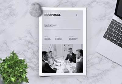 Proposals25 Professional Business Project Proposal Templates for 2019Laura Spencer
 Proposals30+ Best Business Proposal Templates: Ideas For New Client Projects in 2019Marc Schenker
 Templates20 MS Word Business Proposal Templates to Make Deals in 2019Brenda Barron
Download the Best Event Sponsorship Proposal Templates Today
As you write your event sponsorship proposal, remember to keep your sponsors in mind. Write your content according to your potential sponsors’ point of view. This way, they can easily understand what you’re trying to relay. At the end of the day, sponsors want to know what’s in it for them.
To design and format your event proposal, get inspired by the best event proposal templates from Envato Elements made for various industries. You can also check out highly customizable event proposal examples on GraphicRiver for any business needs.
Remember: the key to designing a successful event proposal is always making sure you’re unique, visually captivating, and benefits-driven.

{excerpt}
Read More
25 Unique Resume Templates With Interesting Resume Ideas
If you’re looking for a job and don’t know where to start with your resume, keep reading. It’s a tough job market, and you want to make your resume unique.
With a unique resume template, you’ll grab the hiring manager’s attention. And, when you use a premium resume template, your resume will look both professional and unique.

As you look at these interesting resume templates, you may be thinking I don’t even know how to create a unique resume. We can help by providing exactly the right templates to help you express your creativity and still look professional.
In this article, you’ll discover some of the best professional and unique resume templates from both Elements and GraphicRiver. You’ll also find five tips on how to create a unique resume.
Best Unique Resume Templates on Envato Elements
Envato Elements has hundreds of innovative resume templates. After paying a low monthly fee, download as many interesting resume templates (and other graphic design assets) as you want.
Here are some unique resume templates to set you apart from other job candidates.

All you need to do is add your information to the professional and creative resume templates to impress the hiring manager and create a lasting impression.
5 of the Best Unique Resume Templates From Envato Elements
Here’s a curated list of some of the best unique Envato Elements templates:
1. Creative Resume

This interesting resume idea has bold colors. In this innovative resume template, there’s a timeline so that your experience can really stand out. The whole template is fully customizable, so make the template fit your needs. This modern resume template will present you as a creative individual who is serious about their job search.
2. Ferns Resume and Cover Letter

Ferns is a unique resume template that features a border of ferns. If you love nature, you can still look for a job and show off your love for nature while remaining professional. With this resume template, you get a title page, cover letter, and two resume pages. This template is fully editable and print-ready to help you finish your resume quickly.
3. Unique Resume

This innovative resume template will stand out with its sleek design. Here are some key features:
- comes with a cover page
- black background to make a great initial impression
- well-organized
-
picture section
Download this resume today to make a lasting impression. The black background sets this apart from all the resumes with a white background. This resume also lets your future employer know that you’re not like everyone else.
4. Resume

This innovative resume uses different shades of pink. Whether or not pink is your favorite color, this resume will attract attention in the stack of plain white resumes. This pink resume is also perfect when applying for a position with an organization whose company colors are pink. Plus, this resume template has a skill section to highlight your skills.
5. Creative Resume Template

If you’re looking for an innovative resume template, look no further. This blue and white template has a modern design. Here are some key features:
- timeline to showcase your experience
- fully customizable
- social media section to link to your social media
-
interests section
Show off your unique qualities to create a positive impression on your future employer. This template lets you highlight your interests to show the hiring manager that your interests align with the position you’re seeking.
20 Unique Resume Templates From GraphicRiver
With GraphicRiver, you only pay for the templates you use. Purchase unique resume templates one at a time. This is the ideal solution if you only need a single template for a one-time use.

Here are some of our top unique resume templates from GraphicRiver:
1. GD Professional Resume Set 01

With three sets of resume templates and matching cover letters, GD Professional Resume Set 01 gives you the best bang for your back. Each set comes in a black-and-white version as well as color variants. Vector icons are also included. As a bonus, you get a guide on how to choose and write a resume and tips and tricks for a better resume.
2. Simple Unique Resume/CV & Cover Letter

If you’re looking for creative resume ideas, then look no further. This is a template for both a resume and cover letter, with two different layouts. You can use each for a two-page resume. The files are in both US letter and A4 sizes and are compatible with Adobe InDesign and Photoshop. A Help File is also included.
3. Unique Single Page Resume

Looking for a creative way to present your professional details all on one page? Then the Unique Single Page Resume template is for you. The letter-sized template comes in both light and dark color versions. However, if you prefer to change the color scheme, you can do so with one click. You can edit this template in Adobe InDesign and Photoshop.
4. Minimal Resume Booklet and Cover Letter

This outstanding resume is perfect for artists, designers, and anyone else who wants to show off their work to future employers. You get eight different pages to show off your unique style. With this resume booklet, you get plenty of room to showcase what you’ve created in the past. You can easily customize this template to show off your personal style.
5. Political Resume Template

Are you looking for a job in politics or maybe you just love politics? This political resume is a unique way to show off your love for politics. This template comes with a cover letter template and a resume page. There are six alternate color schemes to choose from. Make your own political campaign with this template. The hiring manager will be impressed with your ability to promote yourself.
6. Standout Resume Vol 1

Here’s a resume that’s truly different. If you want to get your resume noticed, this unique resume template is perfect for you. This resume design lets everyone who sees it know that you’re a creative individual. With this template, show off your skills in a fun way. You can quickly change the photo, and there are many color options to choose from. Show your future employer how creative you can be.
7. World Resume

Have you traveled a lot and want to show it off? Alternatively, maybe you’re applying for a job that includes travel or is in a travel-related business? Here are some highlights of this resume template:
- comes with resume page, cover letter page, map page
- references section
- four color scheme options
-
print-ready
This unique resume will make a lasting impression on your hiring manager. You’ll be able to showcase all the interesting places you’ve traveled to. This resume will let your experience stand out.
8. Creative Resume

This outstanding resume will separate your resume from other resumes. There are two different color schemes for you to choose from: a bold black and green option or a white and green option. With this template, you get cover letter page and resume page. This template is easily editable so that you can show off your personality.
9. Creative Resume and CV Template

This resume is simple but it’s also a unique CV/resume. The skills section allows you to show off what your top skills are. The proficiency section displays your skills and how skilled you are at each one. When the hiring manager sees this professional, unique template, they’ll be impressed. Download this template if you want to showcase your skills.
10. Clean Resume

Are you looking for a more straightforward resume that’s a bit different? Look no further than this minimalist resume. Here are some key features of this resume:
- five color schemes
- comes with matching business card template
- resume page and cover letter page included
- timeline section
-
skills section
With this resume’s clean lines and simplicity, there’s no distraction from what you want to focus on. This print ready resume and business card will help you look professional and impress the hiring manager.
11. Ultra-Simple Booklet

This resume booklet has unique icons that come with the template. When you download the booklet, you get templates for the following:
- cover letter
- about Me page
- education page
- history page
- portfolio page
- skills page
- contact page
This template is easily customizable and print-ready. The simplicity of this booklet allows the hiring manager to skim your resume quickly.
12. Infographic Resume Template

This resume template has infographics to make your information really unique. There’s an Interests section so that you can showcase what interests you. This template also comes with a map, so you if you’ve traveled you can show where you went. This template even has a language section to list the different languages you speak and to show how proficient you are in each of them.
13. Retro Style Resume

Do love vintage things? This vintage style resume shows your love for the classics while allowing you to remain professional. Here are some highlights of the retro style resume:
- five color scheme options
- easily editable
- to change pictures, drag and drop them into place
- comes with three pages
14. Unique Clean Single Page Resume

Have you been looking for a one-page resume template? This is an excellent template for you. This one-page resume template has enough room for you to say everything you need to say without it being crowded and confusing. The use of infographics helps draw the eye to important details that you want to emphasize. This template is fully editable so you can make the template say what you want.
15. Sleek Resume

This unique resume comes with a resume page and cover letter template. You can easily customize this resume template to make it your own. To showcase your skills and your proficiency in those skills, then choose this template. With the unique circle design, your experience is visible at a glance. There’s also a references section and an awards section. Show off your creativity with this sleek design.
16. Professional Resume Templates

Do you love color, but don’t want to sacrifice that love of color to be professional? The unique resume template lets you express your love of color. Here are some highlights of this resume template:
- three color schemes
- easily editable
- comes with icons
- comes with three layouts
This resume comes with two versions, a color version and a white version. This print-ready colorful resume template will be sure to catch the attention of a hiring manager.
17. Facebook Timeline Creative Resume

Are you going into a social media-related job? This unique resume is a perfect way to emphasize your love of social media. This template comes with two different styles and eight color combinations. Also, you get a free font and free icons with this template. Customize this unique template with your details quickly and easily.
18. Stylish Resume

This stylish and colorful resume lets you show off your personal style. This template comes with a resume page, cover letter page, and reference page. There are two different designs to choose from and four color schemes to choose from. You can easily edit the color, text, font, and design to customize the template how you want.
19. Marketer Resume

The Marketer Resume stands out because of its clean, sophisticated design. Choose from one of three sets: one-page, two-page, or three-page resume layouts. A cover letter template is also included. Each set comes with six color presets. This template is compatible with InDesign and Microsoft Word.
20. Resumaker Photoshop Panel

The Resumaker is another one of those unique resume templates with a modern, streamlined design. Created especially for Photoshop, it’s extremely easy to personalize. Type in your own information then select a color scheme from the three premade palettes. Now, you’re ready to print your resume. Of course, if you want to make changes to the design itself, you can do so, too.
How to Use Unique Resume Templates to Build Your Resume Quickly
These premium resume templates are built to be easy to personalize, even by the non-designer. Before downloading a template, make sure you’ve got the software that it’s compatible with.
In this example, I’ll be working on this three-page resume template compatible with Adobe InDesign and Microsoft Word. I edited the Word file to create the unique resume you’ll see later.
Here’s what the template looks like without any customizations:

Replace the information with your own data. You may have to add new sections or delete any unnecessary ones.
This may include the photograph, which is usually not encouraged. You can use your personal logo instead of a photo (more on this in the tips section).

When the information is filled in, you can make other customizations on the resume template. For instance, you can change the color scheme, fonts, and icons (if you’re using them). Even small changes can make your resume unique.
Here’s what the customized resume looks like now:

5 Tips to Create Unique Resumes That Work
As you design your innovative resume, here are some interesting resume ideas that can help:
1. When Choosing a Color, Keep in Mind the Hiring Company
If you’re applying to a company whose branding colors are black and white, then you probably want to stick with darker color schemes. However, if the company you’re applying to has bright colors, then you can use any color scheme that you like, or even match their branding colors.
Find more creative resume ideas here:
2. Make Your Resume Easy to Skim
Hiring managers get many resumes, and they end up skimming resumes to find someone who fits the job. So, make your resume easy to scan by emphasizing important information that’ll help you get hired.
Here are some more tips to create a skimmable resume:
- Use columns to present as much information as you want without overcrowding the resume. Columns also help your resume to be more visually appealing, which could mean a higher chance of it being read.
- Use a heading and subheadings, this helps the person skimming your resume quickly find what they’re looking for. Headings and subheadings break up your text.

3. Use Your Resume to Show Off Your Personal Brand
Consider creating your own logo that reflects who you are to use in your resume. When building a brand for your resume make sure you stay consistent; otherwise it could get confusing.
When considering a font that reflects your brand remember to keep your font sizes consistent throughout. It’s also important to consider whether the font you’ve chosen is easy to read.
Also, when creating your personal branded resume be careful not to add so many fun design elements that it becomes cluttered. You don’t want the design elements to distract from your qualifications.

4. Consider What Your Resume Looks Like When Printed
Even though you may submit your resume as a PDF file, the recruiting team will most likely print it out and will do so in monochrome (black ink). This is a good reason to go easy on the number and kinds of colors you use. Make a print-out of your resume before submitting it, so you know what it looks like. Check to make sure everything is clear and legible.
5. Be Extremely Picky With Fonts
Fonts convey personality and tone. Some are traditional and conservative. Others are fun. Still others are elegant and sophisticated. Be intentional about what identity you want your resume to have. Choose fonts that help you achieve that goal.

Learn More about How to Create a Unique Resume
If you need more information on how to create a unique resume here are some articles that’ll help:
 ResumesHow to Make a Great Professional Resume (For Top Jobs in 2019)Laura Spencer
 ResumesHow to Make a Pro Resume on Word With Creative Template DesignsAndrew Childress
 CareersThe Secret to Writing a Simple Resume That Works (+Best Tips for 2019)David Masters
Find Even More Innovative Resume Templates
Are you still looking for the right resume template for you? Browse interesting resume templates to get creative resume ideas. Here are some more innovative resume templates to consider:
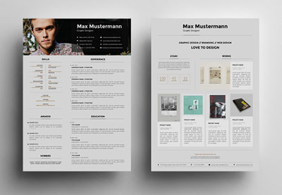 Resumes30 Creative Resume Templates: To Land a New Job in StyleSean Hodge
 Resumes11 Creative Resume Design/CV Tips (With Template Examples for 2019)Grace Fussell
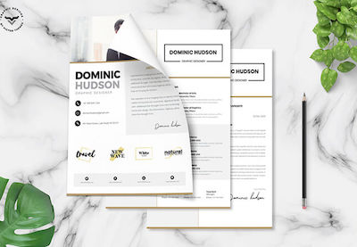 Minimalist22+ Free Minimalist Resume Templates (Word, Indesign, & More CV Designs)Brenda Barron
Download Your Unique Resume Template Today
Now that you’ve seen 20+ unique resume templates and gotten creative resume ideas on how to make your resume unique, it’s time to build a resume that really showcases how different you are.
Head on over to Envato Elements or GraphicRiver to find the right unique resume template for you.
Editorial Note: Our staff updates this post regularly—adding great new innovative resume template designs that you can use to make your next resume stand out.

{excerpt}
Read More
How to Create an Underwater Text Effect in Photoshop

Water can make for such beautiful, inspiring visuals! In this tutorial, we’ll take some text and visually “place it” underwater—creating a wavy text effect, looking down and into the water, with the text visually beneath.
What You’ll Need
The followings assets are used within this tutorial:
Now, let’s dig right in and start experimenting with some type!
1. How to Add Text and Texture to a Document
Step 1
Start with a New Document—any size here will do!
Keep the scope of your project in mind: are you hoping to create something print ready or something for use online? I’m going to work at 850 x 650 for this example, but you might want to work at a higher resolution, if you’d like to print your work.
Once you’re happy with your settings, click OK.

Step 2
Next, Paste your watery background image into your document. In this case, we’ll be using this Water Stock Photo from Envato Elements, but you could use any image you like!
This is going to be the water that we’ll base our text on.

Step 3
Now, let’s add the text. Simply type out whatever text you’d like, using the Text Tool, in your font of choice. In the case of this example, I’ll be using the font Fibre Vintage.
Don’t worry about effects or positioning or anything, at this point—just put down the text you’d like first!
I decided to make two different Text Layers. You can make as many as you like. Make the text a dark gray color.

Step 4
Next, make your Text Layer (or Layers) into a Smart Object.
To do so, select the applicable Layers, Right-Click (on PC) or Control-Click (on Mac) and select Create Smart Object from the drop-down menu.
We’ll be applying effects to this Smart Object. We’ll be able to more easily preserve and alter the original text this way, if needed.

Step 5
Rotate and position the text however you’d like it, against the water. I opted to rotate it a little, so the shot feels a little more natural.

Step 6
Now, set this layer’s Blending Mode to Overlay. You’ll notice that this changes the text’s appearance on the water.

2. How to Create an Underwater Effect
Step 1
One of the major goals here is to have the text appear to be affected by the water. We could do this in a number of ways—like using the Warp Tools, Distort Filters… there are plenty of options! However, in this case, let’s try out the Displace Filter.
First, select the layer with the water background in it. Click on the thumbnail on the layer to select the content (or press Command-A (on Mac) or Control-A (on PC).
Now, Create a New Document. Paste this image and Save this document. I called my document “displace.psd”, but you are welcome to call yours whatever you prefer.

Step 2
Now, let’s go back to our original document.
Select the layer with our Smart Object. Then, select Filter > Distort > Displace.

Step 3
Then, you’ll see this popup dialog box. I went with a Horizontal and Vertical Scale of 10, but I would encourage you to experiment with this! I also chose Stretch to Fit, as I’d like the area to be similar to the original background image we’ve used here.
When you’re happy with your settings, click OK. Remember, if you don’t like the result, you can always Undo (Control-Z on PC, Command-Z on Mac) and try out different values. I often like to experiment a few times.
Select your displace.psd file created earlier as the file that the Displace Filter will use to create this effect.

Step 4
And here’s what the text looks like with this effect applied. It’s getting closer to what we want, but it still looks kind of clear, doesn’t it? We’d expect to see some blur here, as the water is between us and the water on the ground.
Let’s apply a Gaussian Blur to this Smart Object. Go to Filter > Blur > Gaussian Blur.

Step 5
I went with 2.0 on the radius here, but you may prefer more or less. I’d recommend something that gives it a little bit of a blur, but also stays legible. A lot of blur might look good, but if we can’t read the text well, that might defeat our purpose.
Click OK when you’re happy with the value you’ve chosen. Remember, you can also undo and try again, if you change your mind.

3. How to Add the Finishing Touches
Step 1
So, we’ve got the beginnings of what we’d like to do here—but let’s push it forward and do some more with it.
Personally, I’d like the text to be darker. We have a few options here.
I Duplicated the Smart Object Layer twice, leaving the Blending Mode on each set to Overlay. The result was just what I was looking for.

Step 2
However, because we put this type into a Smart Object, we can go back and change it any time we like. Double-click on the thumbnail to open up the Smart Object.
You’ll notice that it contains the text as we originally had it in our document. You can make changes here—like the text color or the text itself. Then, when you save it, this will be reflected in our document.

Step 3
On a side note, keep in mind that these changes might have to be accounted for! For example, changing the color might affect the blending modes—if I make the text light pink, I need to adjust for that (since we worked with a color with a dark value originally).
In that scenario, I’d just drop my extra Overlay layers and set the Smart Object Layer to Color Burn, Opacity 75%. Voila, we have a similar effect.

Step 4
Made any changes that you don’t want to keep? Simply undo! Within the Smart Object, make sure to save any changes.
To wrap up, I’m going back to the original color and Blending Modes we were working with earlier.

Step 5
Finally, I wanted to do a little adjustment here. I copied the water Background Layer and brought it to the front of my Layers. Then, I set the Blending Mode to Screen, Opacity 20%. I just wanted to lighten things up a little.
However, I recommend experimenting with Blending Modes—check out how it looks with Color Dodge or Color Burn! Experimenting with Blending Modes is a great way to get more familiar with them.

And Now Our Text Is Underwater!
I hope you enjoyed walking through this text effect with me—and I hope you have a lot of fun experimenting with it and making your own underwater text effect Photoshop creations! Again, there are a lot of different ways to distort your text—want to know how to warp text in Photoshop even further? If you’d like to make even more adjustments, I’d recommend taking a look at Edit > Transform > Warp!
Thanks for following along with me! Good luck with your creative projects!

Love text effects and want to check out more you can experiment with—right now? Check out these other text effects that are ready made and ready to go.
Vintage Text Effects Vol.3
Check out this collection of Vintage Text Effects! There are so many colorful, whimsical, and interesting options to choose from here, perfect for a variety of potential projects.

80s Text Effects Vol.1
I don’t know about you, but I love the 80s—and I love these awesome 80s text effects! Check out all the saturated colors, the glam, and the sleek, retro style! I’m already thinking about all the cool things I’d love to try out with these.

Metal Layer Styles – Photoshop Gold Text Effect
These text effects are awesome—and they don’t just come in gold. There’s chrome, bronze, steel… plenty to choose from in these easy-to-use Layer Styles.

3D Text Effects Vol.3
There are so many fun effects to choose from in this third volume of 3D Text Effects! Easily replace the text with Smart Objects—a snap, right? Check out Volume 1 and Volume 2 for even more effects to try out!

100 Photoshop Layer Styles Bundle – Text Effect
This is a giant collection of Photoshop text effects—plenty to play and experiment with! From textured effects and slimy text effects to fire text effects, this one contains a little bit of everything! What an awesome addition to any collection!

If you enjoyed this tutorial, check out these others! Happy creating!
 Text EffectsHow to Create a Cartoon Rainbow Text Effect in PhotoshopDaisy Ein
 Text EffectsQuick Tip: How to Create a Metallic Text Effect Using Layer Styles in PhotoshopEnrique Eliçabe
 Text EffectsHow to Create a Quick Broken Glass Text Effect in Adobe PhotoshopRose
 3D Text50 Amazing 3D Text Tutorials for Photoshop and Illustrator (Beginner to Advanced)Melody Nieves
 Adobe PhotoshopHow to Create a Realistic Embroidery Text Effect in Adobe PhotoshopJohn Negoita

{excerpt}
Read More
How to Add Realistic Falling Snow to a Photo in Photoshop

Falling snowflakes are a great way to make your winter photography much more interesting. Sometimes the weather doesn’t cooperate, however, and you have to turn to Photoshop to get the job done. In this tutorial, I will explain how to create a realistic falling snow effect in Photoshop and show you how to apply it to your images.
Tutorial Assets
You will need the following photo to complete this tutorial.
1. Change the Sky
Step 1
Open your base image in Photoshop. The first step in your editing process should be to create a backup of your base layer so you can always go back to it if something happens.
To do this, double-click the layer to unlock it and name it Backup. Then duplicate it by pressing Command/Control-J (or you can always go to Layer > Duplicate Layer) and name the new layer Background. Finally, create a Fill Layer by going to Layer > New Fill Layer. Pick a dark gray color and place it between the two layers.


Step 2
One problem with pictures taken during winter is that they often end up having a dull gray sky. In order to have a more interesting result, and to make our snow more visible, we will first have to replace our current sky. Feel free to skip this step if you are working on your own photo and already have visually interesting sky.
First, select the Magic Wand Tool (W) and, while holding Shift, create a rough selection of the sky. Click on various places in the sky to create a rough selection of the sky. Then, go to Layer > Layer Mask > Hide Selection to create your mask.


With your layer selected, open the Properties panel and click on Mask Edge (please note you need Photoshop CS6 or higher to access this option). With the Refine Mask window now open, you can brush on the image to refine the mask. Before doing anything, you will most likely need to adjust your brush size in the upper panel. You can also click on View Mode and set it to black so you have a better preview of what you are working on.


Then, you can brush over the trees and the horizon in order to soften and refine the mask. Once you are done, you can play with the settings in the window in order to further refine your mask.


Finally, you can reduce the brush size, zoom in on your image, and carefully paint over the borders of your selection to paint out the white fringe.

Step 3
Once the mask is done, we can add the new background sky. In this case, we will use a gradient to create a clear sky, but you can always use stock photos of clouds if you want to.
First, create a Gradient Fill layer by going to the options located in the lower right corner of the Layers panel and selecting Gradient. Make sure the gradient is set to 90° and double-click on the gradient image to edit it. Set the colors as shown in the example below and press OK.


We will add a few layers to help blend our new sky with the background. First, create a new layer (Command/Control-Shift-N). Select the Brush Tool (B), pick a dark blue color (#303850) and paint over the trees. Name the layer Hue, and set its Blending Mode to Hue and its Opacity to 35%.


Next, we’ll add a little bit of haze to further blend our trees with the sky. Create a new layer, pick the Brush Tool (B) and, while holding Shift, paint a straight line over the horizon. Duplicate your layer twice, hit Command/Control-T to enter the Free Transform mode, and scale both layers up vertically.

Set all three layers to 20% Opacity and name them Haze.

Since the haze is in the background, it shouldn’t cover the women’s legs. To correct this, select the Haze and the Hue layers, and hit Command/Control-G to group them together. Then, give the group a mask by going to Layer > Layer Mask > Reveal All. Then, with a hard black brush, paint over the man in order to remove the haze.


2. Generate the Snowflakes
Step 1
The usual method to generate snow is to combine the Add Noise and Gaussian Blur filter. Start by creating a new layer (Command/Control-Shift-N). Then fill it with black (D, then Alt-Backspace), and go to Filter > Noise > Add Noise. Then go to Filter > Blur > Gaussian Blur and apply the filter. Please note that the higher you set the blur’s radius, the bigger the snowflakes will be.

Once you are done, hit Command/Control-M to bring up the Curves adjustment window. In this window, you will see a gray pyramid-shaped area.

You can now adjust the contrast of your layer to make it look like snow. To do so, bring the left handle to the lower left corner of the pyramid and the right handle toward the middle of the area. Then, click in the middle of the line to create a new handle, and drag it downward. You should get the following effect.


Name your layer Snow and set its Blending Mode to Screen to blend it with your scene.


Now, depending on the size of the image you are working on, you might need to adjust the size of your layer so the snowflakes fit the scene. In this case, I doubled my layer size using Free Transform mode (Command/Control-T).

To make the snowflakes more realistic, we will give our layer a small Motion Blur. To do so, go to Layer > Blur > Motion Blur and input the following settings. Be careful not to set the distance to high, otherwise the result will look like rain instead of snow.

You should get the following result.

Step 2
Now, we could end the tutorial there, but the result is a little bit dull and unrealistic. This is because all of our snowflakes are the same size and going in the same direction, which is never the case in real life. In fact, the key to getting a more interesting result is randomness. To do so, we’ll repeat the effect we just did a few more times, each time varying our Gaussian Blur’s radius and the size of our layer.


It is also important to give your layers various Motion Blur settings. As you can see, in this case, I decreased the Angle and increased the Distance of the pixels.


Below, you can see the four different layers I created, and the result obtained when they are combined.


Step 3
The problem with combining multiple layers is that you end up with a lot of snow. If you are looking to create a snowstorm, this is great, but otherwise you will need to soften the effect a little bit. To do so, give your Snow layer a mask. Make sure the mask is selected, and go to Filter > Render > Clouds. Hit Command/Control-M to bring up the Curves adjustment window and give it an S-shaped curve to increase the contrast.


Another advantage of using masks is that you get a much more random result when applied to multiple layers.

It is also possible to manually paint out some areas using the mask. In this case, one of our layers has some very small snowflakes. Since these are meant to look as if they are far away, they shouldn’t appear in front of the man. I corrected this by painting them out in the layer’s mask. This step would also be useful if, for instance, you have some big snowflakes covering important parts of your picture like a person’s eyes.

Step 4
We can also create a bokeh effect to simulate snowflakes that would have landed on the camera’s lens, or simply for a stylistic purpose. To do so, create a new layer and paint a really big bright dot in the middle of your scene. Then, select the Move Tool (V) and place it in one of the corners of your image so it doesn’t hide your subject.

Repeat the process a couple of times until you are satisfied. Then, give each of your layers a soft Gaussian Blur, and set them to 10% Opacity.


Name these layers Bokeh and place everything into a new group named Snow.

3. Color Correction
Step 1
Once we are done with the snow, we can add a few color corrections in order to make our picture more interesting and bring everything together. The first step would be to add a blue tint to make it feel cooler. Go to the options located at the bottom right of your Layers panel, and create a Gradient Map. In the editor, select a dark and a bright blue color and press OK.


Duplicate the layer three times and set the blending modes to Hue, Color, and Soft Light respectively. Set all layers to 10% Opacity more or less.

You can also add a Curves adjustment layer to increase the contrast a little bit.


Step 2
In this step, we’ll add a vignette effect to make our subject stand out a little bit more.
First, create a new layer. Pick the Rectangular Marquee Tool (M) and draw a selection in the center of your image. Then, hit Command/Control-Shift-I to invert the selection, and go to Edit > Fill to fill the selection with a dark blue color (#222838). Then, add a large Gaussian Blur, and play with the layer’s size until you are happy with the result.


Name your layer Vignette, setting it to Multiply and 50% Opacity.


Step 3
In the end, place everything together in a group named Adjustments.

Step 4
Our image is done, but we can add a few more things to make it pop out even more.
First, if you have Photoshop CS6 or higher, you can add an Iris Blur effect. To do so, you first need to select all of your layers, hit Command/Control-J to duplicate them, and go to Layer > Merge Layers to merge them together. Then, go to Filter > Blur > Iris Blur and play with the handles and the blur amount to get a nice blurry effect.

On the same layer, we can also add a Sharpen adjustment by going to Filter > Sharpen > Smart Sharpen. Since I am working on a large image, I used a 4 px radius, but you should set it lower if you are working on a smaller image. The key here is subtlety.

In case you missed anything, here is how your Layers panel should look.

You can also bring back your Backup layer and compare it to your final result to see the difference.

Snow Effect Photoshop Actions
Winter Photoshop Actions

Snow Animation Photoshop Action

Real Snow Photoshop Action

Snow Effect Photoshop Action

20 Snow Overlay Textures

Conclusion
In this tutorial, I showed you how to add realistic falling snow to an image using Photoshop’s Noise and Gaussian Blur effects. I hope that you learned something from this tutorial and can use these techniques to add realistic snow to images of your own.
 Photo EffectsAdd Dramatic Rain to a Photo in PhotoshopTony Aube
 Adobe PhotoshopHow to Create a Rain Photo Effect Action in Adobe PhotoshopMarko Kožokar
 Photo ManipulationHow to Create a Surreal Dance Scene in the Rain in Affinity PhotoAbbey Esparza
 Photoshop ActionsHow to Create a Rock Blast Effect Action in Adobe PhotoshopMarko Kožokar
 Photo ManipulationHow to Create a Dark Surreal Photo Manipulation in Adobe PhotoshopJenny Le


{excerpt}
Read More
iPhone 11 vs iPhone X – Should You Upgrade?
Here is a complete iPhone 11 vs iPhone X comparison. If you own iPhone X and wants to know the major difference between both then you are at the right place. Apple has announced iPhone 11, iPhone 11…
[[ This is a content summary only. Visit my website for full links, other content, and more! ]]
iPhone 11 vs iPhone X – Should You Upgrade?
Here is a complete iPhone 11 vs iPhone X comparison. If you own iPhone X and wants to know the major difference between both then you are at the right place. Apple has announced iPhone 11, iPhone 11…
[[ This is a content summary only. Visit my website for full links, other content, and more! ]]
15 Best Royalty-Free Children’s Music Tracks of 2019
We all remember the classic nursery rhymes from our childhood. Using children’s music evokes positive emotions in people of all ages, not just children.
If an next audiovisual project needs a playful and fun, go through the list below of 15 of the best selling royalty free children’s music tracks from AudioJungle.
1. Happy Kids
‘Happy Kids’ is a cheerful music track which contains an upbeat ukulele, bells, live rock drums, and a groovy bassline.
2. Happy Acoustic Spring
This royalty-free children’s music track brings images of Spring and positive feelings. Featuring ukulele, bells, and piano, this track has the perfect sound for commercials, YouTube videos, corporate videos, children’s projects, and more.
3. The Finger Family
‘The Finger Family’ was originally a classic Mother Goose nursery rhyme. This royalty-free song is a sing-along song that works great for children YouTube videos.
4. Uplifting Acoustic Fun Kids
‘Uplifting Acoustic Fun Kids’ is a happy and lighthearted track featuring a piano, a childlike guitar, and a celesta. This track is great for any children’s video or an advertising video that you want to add a bit of quirkiness to.
5. Playground Fun
This is a fun and carefree track. You will find acoustic guitars, drums, a whistled melody, and brass in this royalty-free children’s music track. This track is ideal for adding a joyful, up-tempo vibe for your next audiovisual project.
6. Marching Band Fun
This fun and cheerful royalty-free children’s track features catchy melodies and a fun and unique drum beat. This song will be a great fit for any kids project, funny commercials, or anything that needs a fun and unconventional vibe.
7. Five Little Monkeys
‘Five Little Monkeys’ is a fun and cheerful version of the classic nursery rhyme. This royalty-free children’s song will work great for any children’s video or game.

8. Johny Johny Yes Papa
This royalty-free children’s track is another popular nursery rhyme that has catchy lyrics and a playful vibe to it. Click the play button on this one.
9. Finger Family Colors
The ‘Finger Family Colors’ track is a sing-along type tune that is great for explaining the different colors to children. You can use this song in videos, shows, animations, playground & toys presentations, and much more.
10. Funny Kids
While the title of the track is ‘Funny Kids,’ the song may be used for a range of multimedia projects wanting a summertime and joyful mood. This track starts with a bouncy jingle and builds into a cheerful and carefree ensemble.
11. Cute Bugs
This royalty-free children’s song is a happy and funny “cartoony” type song. The track features a childish melody with woodwinds, trumpet, bells, xylophone, and fun effects.
12. The Wheels on the Bus
This classical childhood rhyme is a must-have for a children’s multimedia project. This rhyme is an iconic song that children will absolutely love, so download it now.
13. Colors
Here’s another children’s song that is used to help children learn their colors. The track is a sing along song that features bells, brass, strings, and a basic drum beat.
14. A Cheerful World
This royalty-free song has a happy whistling, a guitar melody, and a catchy drum beat. It’s not only great for children’s multimedia projects but for YouTube videos, commercials, websites and any project that needs a cheery vibe.
15. Who Rhode My Game
This track features a bouncy bass, electronic drums, and a tropical sounding marimba melody. If you are looking to add a bit of fun and excitement to your next project, choose ‘Who Rhode My Game.’
Conclusion
AudioJungle has no shortage of children’s tracks for your next multimedia project.
The most popular tracks from the royalty-free children’s library are listed above.
If none of these tracks quite fit your needs, you can always search through AudioJungle’s comprehensive library and find one that does.

{excerpt}
Read More
How to Create a Typographic Album Cover

In this article, we’ll analyze some album cover design examples that have an emphasis on typography. Then, we’ll take some of these album cover ideas and experiment with them in a sample typographic album cover. Whether your focus is on CD album covers, a cover for your podcast, or creating and preparing a design for print, these guidelines should help point you in the right direction—especially if a focus on typography is your jam.
Tutorial Assets
We’ll use the following assets in our album cover:
- Amithen Brush Font
- Fibre Vintage Font
- Watercolor Texture Blue
- Crumpled Paper Halftone Textures
- The Old Town of Dresden after Sunset (Photo)
However, if you’re looking to jump right in and experiment with your own album cover right now, consider giving Placeit a look! Not only is it super user friendly—it’s also super fun to just dig in and experiment with layouts! If you’re looking for an album cover maker, look no further.

Now, let’s look at some cool album covers!
Typographic album covers are unique in that they have to hold their own—there’s typically minimal (or supplemental) imagery there to create interest or drive a message home. The type is the star of the show. For this reason, I would suggest that extra attention, even more than usual, should potentially be devoted to the expressive nature of the type.
Remember, I’m talking about how the text communicates visually.

For example, check out this album cover for No Doubt’s “Rock Steady”. It’s all type. Certain parts are highlighted in red—notice how this commands our attention, while the black type stays more supplemental.
It has a rather excited flow to it, doesn’t it? The strokes feel intense and heavy hitting.
Imagine this concept with different type—something really very different, like Times New Roman.
It would be really different, right? We would probably lose that energetic vibe. The original has rather organic-looking brush strokes, but a more uniform serif could look considerably more stiff. The idea here is not that “Times New Roman is boring”—but rather that the type, itself, as a visual element, has communicative properties.
Let’s illustrate this idea further with a basic example.
We’ll work with a test album cover to explore this premise, an imaginary album (and an imaginary band) called “The Album” by Example Band.

The above example is pretty bland. It’s black text on a white background. It’s been set with a rather unassuming typeface. It looks unfinished, doesn’t it? It looks bland, boring… there’s really nothing to note here, and the focal point isn’t all that strong.
Observe how the visual appearance of the typeface itself potentially changes how it communicates.

These three examples are very different, even though the layouts themselves are quite similar.
On the left, we have bold, ornate type (Braton Composer Font). The title of the album is in all caps and it’s so large. It’s really “screaming” to the viewer. Notice how scale here (one of the principles of design) really helps reinforce that the title is large and loud; the band’s name is much smaller in comparison.
In the center, the type looks handwritten (Brittany Signature Script Font). There is a human factor to it that feels rather personal and organic—the letters are imperfect. What kind of music does this make you think about?
On the right, the type is rather geometric and uniform (Voyager Font). How does this visually communicate to you, in comparison to the other two?

We can push this idea even further when we start incorporating other elements of art and principles of design. For example, color is very communicative, as is proximity and the visual relationships the different parts of your composition share.
Let’s take this idea and look at some more examples.

Here’s the cover of Blood, Sweat, and Tears’ Greatest Hits. It incorporates woodblock type to spell out the name of the band. This is supplemented with white text in a sans serif typeface; notice how this type is supplemental to the larger type. Why? There are several reasons: it’s smaller and it’s less decorative, to name a couple.
But how does this visually communicate? I would argue that it implies age. These letters have been printed on before; they’ve been around the block, and they’ve seen some action. It visually communicates the idea of “blood, sweat, and tears”—a phrase often associated with putting in hard work and dedication.

Here’s an interesting cover—it’s Duran Duran’s “Big Thing”. Notice how the “I” isn’t actually “there”; it’s created via the negative space in the composition. The words themselves are separated and disjointed. They’re also “stuffed” into square spaces.
This design is from 1988, and it shows—notice the color choices, the aesthetic. Being aware of and playing into trends can work to a design’s advantage; it can up its visual appeal.
In regards to communication, notice how “big” the letters are here. They are generally large and loud, with added emphasis on “big”. It’s also interesting to note that there was a dedication to Andy Warhol, who had died the year prior. Warhol’s work often featured a similar, blocky direction, with saturated colors—perhaps this was an intentional reference.

Beyoncé is a powerful force in popular culture, and this is an interesting cover, isn’t it? It’s quite minimal, but that’s not a bad thing. Personally, I find minimalism to be potentially very successful—but it can also be a challenging direction to pull off successfully.
In this case, we have a bold, strong typeface on black. It’s a name, isolated in this space, in a muted, pink color. It has a lot of contrast against the background, so it really commands our attention. I would argue that it communicates being “larger than life” or “needing no introduction”. It’s a confident design.
Imagine, for example, this same design but in a muted, dark gray—lower contrast, maybe even a hand-written typeface. It would feel more like an informal whisper and less like a strong, powerful statement.

This cover, “Brothers” by The Black Keys, is an interesting one to analyze after Beyoncé’s. They both take an approach with text on a black background—but notice how they communicate differently.
This one is considerably more casual, maybe even conversational. We see that not only in the appearance of the type but what the type itself says. Emphasis is created with scale and contrast—we see it in the band’s title.
I find that this one comes off as personal; we’re being introduced in an informal, maybe even biographical way. It rather reads like a story. These are my interpretations—what do you think?

Pink Floyd’s “The Wall” visually communicates in multiple ways. First, we literally see the text on the wall—this is an obvious association, and the imagery plays a strong, supplemental role.
However, look at the text itself. It has a rough, organic quality to it—like spray paint. Imagine, for example, that this text was set in something like Times New Roman or Helvetica. It might look more like a sign than a handwritten message—how do you think that might change its communicative qualities?
Let’s Create a Cover
Step 1
So let’s take these ideas and come up with an example cover of our own. Our goal is to make the typography the emphasis, but we’ll work with some supplemental imagery, as well.
I’m going to create an album cover for a single titled “I Can’t Forget You”, by Example Band. We’re going to work with type as the composition’s focal point, although we’ll work in some imagery as supplemental elements, to push our concept further.
First, start by creating a New Document. I’ll be working in Adobe Photoshop.
When creating your album cover, remember to consult the specifications of your project, as it might vary! I’m going to be working at a 1:1 aspect ratio, since album covers tend to be square. When in doubt, I typically work larger than I think I’ll need; that way, I can always resize without losing quality.
For this example, I’ll be working at 10.5″ x 10.5″, at 300 dpi.

Step 2
I’m going to create some simple guides here, so my composition is Full Bleed.
To create guides, go to View > New Guide Layout.

Step 3
We don’t need to create Columns or Rows; let’s just go straight for Margins. Set each to 0.25″. This way, we have a nice 0.25″ border around our entire composition, to ensure the Bleed is accommodated.
Note, again, check with your printer, publisher, or other source for your specific project guidelines! Your sizes and specs might differ!

Step 4
Next, let’s think about what we want to communicate here. Is it an upbeat song? Slow and melancholy? Maybe there’s something genre specific we need to consider too—like a trendy aesthetic or something relevant to the musician.
In this case, I’m going to approach this with a goal of communicating the haunting nature of not being able to forget someone. A great next step could be creating a mood board—a collection of relevant imagery, type, textures, colors, or anything that makes you think of the concepts you’re trying to target.
Lay out your required type and don’t be afraid to experiment. I started out by placing the essential type: the name of the album/song and the name of the band. Then, you can rearrange and think about how your work visually communicates.
Use the Text Tool to add text to your document.

Step 5
I decided to put emphasis on the word “forget” since it’s the essence of the song—that the subject can’t forget someone. It’s haunting them. I pushed the idea further by duplicating this text and making it slowly fade away, by lowering the opacity for each consecutive instance.
I decided on a type with a handwritten aesthetic so it would feel personal and emotional, but I wanted “forget” to be more bold and command attention.
You’ll notice, below, that I separated the text into different layers, so I could more easily control them independently.

Pushing the Type Further
Step 1
In pushing this further, I thought it might be interesting to associate the type with a place, so I added a background image. I lowered its opacity, because I wanted it to remain supplemental.
I put each of the fading “Forget” Text Layers into their own Folder (or Group), just to help keep my Layers organized.

Step 2
However, I wanted the background to be visible within the type itself, too—clearer, at 100%—I wanted to, again, visually communicate the idea of hazy, haunting memories.
To do this, I copied the Background and pasted it on top of each Text Layer. Then, Right Click (on PC) or Command Click (on Mac) and select Create Clipping Mask. Now, the background will be isolated within the type.
This is where those folders come in handy as, again, I did this for each Text Layer.

Step 3
The nice thing about this is that I can move the type around now, and the background image is going to stay put. Give it a try! The text color will appear to correspond to the background (unless you move the clipping mask).
That said, I thought it might be a good idea to strengthen the visual association between the text and the background. I selected the Type Layers (you can select multiple layers at once by holding down Shift and then selecting them), and then rotated them slightly.
Now, they visually associate with the water’s edge.

Step 4
I decided to tweak the colors here a little. Add a New Layer, and using the Gradient Tool, add some color—I used a transition from blue to purple. Set the Layer Blending Mode to Overlay, at Opacity 30%.

Step 5
We need to add this same color tweak to our Text Layers too—Duplicate your Gradient Layer and place them over your Text Layers. Remember to make them Clipping Masks!
I put the rest of my text into another folder. This is optional; I just like to keep my work organized!
Since our goal is to keep the text as the emphasis, let’s set the Layer Blending Mode to Color Dodge, at 46% Opacity. This is going to stand out more, while still drawing on those same colors.
No need to do so for the “disappearing forget” type—we want those to quietly disappear anyway.

Step 6
I also associate memories with writing, so I thought it might be a fun idea to experiment with some texture.
I added some watercolor texture here (Watercolor Texture Blue if you’re following along), Duplicated on two New Layers. The first has a Blending Mode set to Color Dodge, Opacity 25%. The second (on top) is set to Overlay, 50%.
I aligned the variation in the watercolor texture with the word “can’t”. I also thought it was an interesting visual association with the buildings in the background. These were just my design decisions—don’t be afraid to experiment in your own way. However, general recommendation here: visual associations can often help unify a composition.

Step 7
To push the paper aesthetic further, I decided to try out some folded paper with a halftone pattern (Crumpled Paper Halftone Textures if you’re following along).
Simply Create a New Layer, adding this texture to it. Set the Blending Mode to Hard Light, and the Opacity to 20%.
I tried to align the folds so they radiate outwards from the word “Forget”, in an attempt to add more emphasis to it. I really want this part of the text to be the focal point.

Adding Finishing Touches
Step 1
Let’s not forget the band’s name!
This is going to be a supplemental part of the composition—we don’t want or need it to compete with the focal point. So I’d recommend making it smaller, with less contrast.
In this case, I decided to use the same typeface as “forget” (Fibre Vintage)—just because we want it to be supplemental doesn’t mean it shouldn’t visually associate.

Step 2
I decided to use cool grays for this text, as again, I don’t want it to fight for attention. For style’s sake, I thought it might be fun to omit spaces between the words, and instead, differentiate between them with a value change (i.e. “Example” is darker than the other two words).
I set this Text Layer’s Opacity to 33% and the Blending Mode to Multiply.

Step 3
But what if we’ve got some extra text we need to include here? Something like an edition or some other type of information? I decided to stick an example up in the upper right-hand corner. It’s a simple Text Layer with the Blending Mode set to Multiply, Opacity 65%.
Keep your Margins in mind—I want to give a little extra space here, because my Margins represent my Bleed right now.
To further visually imply that this is a supplemental element, again, I used the same typeface as the band name. However, I made this type even smaller, to try to push the hierarchy further (i.e. using scale to help promote “importance”).

Step 4
But what if the extras we need to include are a symbol, mark, or logo? Again, let’s keep this supplemental.
On a New Layer, create a small, white rectangle in the upper left-hand corner of your composition (I used the Rectangular Marquee Tool and the Paint Bucket Tool, but you can do this any way you like—for example, with the Shape Tool). I’ll use this as an isolated space for my mark.
This technique could also work well for things like price tags, barcodes, ratings, or even for indicating where you might like a sticker to go—since it’s on its own layer, you can toggle it on and off as needed.
For example purposes, I grabbed a logo over at Envato Elements (Vintage Logo and Badge No. 35) for this part of my mockup—there are lots to choose from!

And That’s a Rap (Pun Intended)!
I hope you’ve enjoyed exploring how to make an album cover, as well as what makes them “tick”, with me! There are endless possibilities here—and endless ways to reach a strong solution! I’d say the best album covers are the ones that engage the viewer in a way that resonates with the album itself.

Feeling overwhelmed? Maybe you just need a little jump start on your next project—or maybe even a full album cover art maker. Check out these designs and others on Placeit. It’s such a fun tool—and a great source of inspiration, too!

If you enjoyed this tutorial, here are some others you might enjoy, too!
 Album CoverHow to Make a Rap Album Cover Art (Using an Album Cover Maker)Nona Blackman
 Graphic Design27 Album Cover Art Templates Using an Album Cover MakerNona Blackman
 TrendsTrend Watch: DuotonesMelody Nieves
 Photoshop Actions20+ Best Colorful Sparkle & Lighting Photo Effects for PhotoshopMelody Nieves
 Adobe Photoshop10 Amazing Photoshop Templates That Every Designer Should OwnGrace Fussell

{excerpt}
Read More
How to Create a Display Video from a Powerpoint Slideshow
{excerpt}
Read More