Category: Tutorials
Tutorials,freelance,projects,joomla,php,mysql,wordpress,blancer.com
Art for All: Celebrate Diversity in Design—Volume 28

Hello, and welcome back to yet another edition of Diversity in Design, a series here at Envato Tuts+! This is an ongoing exploration and collection of designers, illustrators, and other creative professionals—each of them with a different focus, from different disciplines, cultures, and backgrounds.
Celebrating and observing the unique creative voice of our peers can be very rewarding; there’s so much we can share and learn from one another! Not to mention, it can be super inspiring to listen in and take a look at what other creative folks are up to!
Let’s take a look and a listen, together.
4 Artists You Should Know: Diversity in Design
So, without further ado, let’s check out this month’s featured creators—some of their inspiring works, as well as their insights, perspective, and thoughts on content creation.
Tim Gichuru (Bénir)
I’m Tim Gichuru, a self-taught digital artist and graphic designer born and bred in Nairobi, Kenya with a bachelors degree in business information technology.

I started out with the name Bénir which means bless because no matter what project I do, I’d like to dedicate it to the audience who are challenged in one way or another.
To me, life doesn’t have a straight path, we’re kind of pushed to run through this hurdles and bumps to reach where we want to be.

I always aim to bring stories to life through my work and kind of twist realism to the unimaginable.
My creative process [starts] with a scribble to kind of visualize the idea that I have. I usually have a lot of ideas and I have to capture them in a note book. After this, I start the design process.

What I would tell other creatives is: persistence is key to everything. I started out digital art and most of my friends were wondering why I’m doing this and I wont have any lucrative advantage in the end.

But believe me, everything works out. I’ve been able to achieve so many things that I never thought I’d have.
You can check out more of Bénir’s wonderful work here:
Jace “Kiwi” M.
My name is Jace (but I also go by “Kiwi” online). I’m a Canadian background painter for animation, illustrator, and sequential artist living in Halifax, Nova Scotia. I make colourful illustrations and my work often focuses on LGBTQ+ themes, identity and magic. I’m currently working on a webcomic, Summertime Girlfriends, that is about a young woman who falls in love with a mermaid.

I want to create work that is fun and full of love, while also exploring how we move through life and create bonds with one another. I have a deep attachment to stories that explore vulnerability in a brave way and I aspire to work on stories like that.
My goals include creating and boosting LGBTQ+ stories and artwork, as well as doing whatever I can to help other artists and creatives. I think it’s important to put as much support as you can back into the industry you belong to so you can make space and boost new voices within it.

I would describe my creative process as a cross between perseverance, passion and continuous learning. I’m so inspired by work that is being created today by my peers. With increasing access to professional grade tools and information online, there is this wonderful boom of beautiful work in indie comics and illustration that I find awe-inspiring. There’s something about seeing all of this incredibly raw and vulnerable art that makes me think, “Yes! I want to be a part of this!”

Make what you love and the rest will follow. Meet and make friends with your peers in the industry. Be excited to grow your work together and support each other. There is no “correct” way to enter the industry (which can be frustrating), but please know that there is space for you and your work. You’ve got this!
Check out more of Kiwi’s inspiring work here:
Feonix Amadeus
I’m Feonix! I’m a self taught non-binary Canadian embroiderer. My personal work tends to focus on clothing. I use old clothes I’ve thrifted and work with them to make artworks you wouldn’t usually expect from the medium. I almost always stick to line work for large pieces, with heavy contrast and bright colours.

It all started as a form of self-expression. The end goal is just to look cool, really. To decorate myself with things that I like, and that make me happy. I never had a goal of doing this professionally, since it just started as a hobby, but then people took notice and got interested. A lot of people started wanting my work on their own things. Which still blows my mind a bit, making things specifically that I liked and didn’t expect anyone else to take notice in, and then having people want to identify with it to the world too.

The brunt of my inspiration comes from music I love. I’m a musician myself, and I’m completely entrenched in it. In the beginning I started with just band logos on my clothes, and then over time it developed into artworks based around songs or lyrics that just got bigger and grander.

It usually starts with me wanting to do something based off a specific artist or song, picking a lyric to work off, and then seeing where my heart takes me from there. I heavily lean towards the brightest colours I can find, contrasting them with black and white. A lot of the finishing touches are also based in geometry – I have a bit of a secret love for geometric shapes.

Stick with [your creative pursuits]. Try to do something a little bit out of your comfort zone with each project, and see how it turns out- mistakes are vital when it comes to improving.
You can check out more of Feonix’s wonderful work right here:
Anton Aladzhov
Although I do mostly UI / UX design, I often describe myself as a “Pixel Pusher”. The reason being that I’ve worked in startups for the last 5-6 years. And I worked for a long time as their only designer in the team. Which often meant I needed to work on the actual digital product / app but in addition: landing pages, marketing materials, prints, explanation videos, illustrations, infographics, and more.

And I’m a firm believer that a designer can do a lot of stuff. So you are not just a logo designer, landing page designer, children illustrator etc. The process is fairly similar – 1. understand the fundamentals; 2. Do the research; 3. Sketch and iterate somehow; 4. Come up with a good-enough design.
I’d like to make my clients and their users happy. I love the external validation – which is probably not a good thing, but for me when a client says “I love it” or returns to me with another project down the road – THIS IS GOLD.

My creative goals are to expand beyond visual design – maybe storytelling, blogging etc. And in my personal life I have different financial goals, fitness goals, travel goals, family goals etc. I think it’s important to have different buckets for stuff that are important to you and at least have a direction for each.
I’m really not the best example of a good process. Although, I spoke at a design event here in Sofia, Bulgaria and I asked who has a similar chaotic process to mine. I was pleasantly surprised that I’m not alone – most of the room raised their hands. If I need to break it down I have 3 phases:

Pre-Create – Getting into the right mindset & being inspired – Browsing Dribbble, Behance, Pinterest and other galleries get my interest and juices going. Then I do research on the particular thing I need to design and gather references, usually in the same places I mentioned.
Create – It’s all chaos. First I drop in all the content and start pushing it, moulding it, figuring out a layout right there on the canvas. I think of it more like sculpture than traditional “step by step” process. Granted – sometimes I do sketches and wireframes first.
Adjust – Once I have something I’m okay with I do a “History Snapshot” if I’m in Photoshop or duplicate the canvas if I’m somewhere else and do adjustments / iterations.

Since I’m a co-host of a Design Podcast a few things come up fairly often. Here are some:
Freelance or Business growth – Be friendly and network often… online or in person.
Most of my early work came from people around me that knew what I did. And Jordan Peterson says something like “If you know 100 people, you are one person away from knowing 100 000 people because each of them knows 100, too”. So make sure everybody knows what you do and don’t reject work if you have none.
In terms of design skills – Learn the fundamentals & your software.
Design fundamentals have been written centuries ago – learn them. Things like composition, layout, contrast, gestalt principles for design, color theory etc. And when you open the software of choice it should feel like home. You should know where everything is all the necessary shortcuts, you should feel comfortable moving stuff around quickly, testing different layouts, not being scared etc.
Check out more of Anton’s work right here:
- Anton’s Personal Website
- MostlyVisual.com (Infographics Portfolio)
- Behance | @AntonAladzhov
- Design of Things Podcast
Do You Know an Artist We Should Know About?
I’d like to extend a big, heartfelt thank you to Bénir, Kiwi, Feonix, and Anton for sharing their wonderful work, their insights, and their thoughts with us today! It’s so inspiring to take a look at the work of other creatives and listen in on their process and inspiration. You are so inspiring! Thank you!
Again, you can check out more of their work here:
Do you know of an artist or designer that you think we should feature? Let us know down below in the comments, or use the hashtags #tutsplusdesign and #artforall on Instagram and Twitter!
Check out some of the previous entries in this series:
 InspirationArt for All: Celebrate Diversity in Design—Volume 27Daisy Ein
 Global InfluencesArt for All: Celebrate Diversity in Design—Volume 26Daisy Ein
 DiversityArt for All: Celebrate Diversity in Design—Volume 25Melody Nieves
 ArtArt for All: Celebrate Diversity in Design—Volume 24Melody Nieves
 IllustrationArt for All: Celebrate Diversity in Design—Volume 23Melody Nieves
{excerpt}
Read More
Vudu now allows you to cancel rentals within 30 minutes of watching
‘The Outer Worlds’ DLC is coming next year
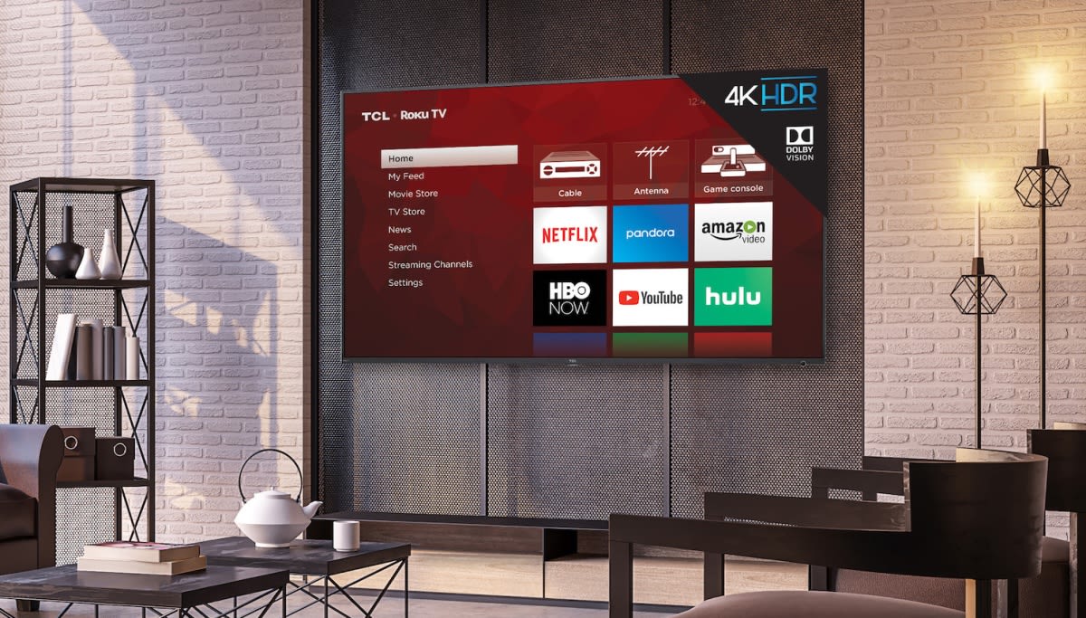
TCL’s 2018 65-inch 6-Series 4K TV drops to $500
How to Add Plugins to WordPress
{excerpt}
Read More
How to Create a Cyberpunk Photoshop Effect Action

In this tutorial, you will learn how to create a cyberpunk Photoshop effect action to add amazing photo effects to your photos. I will explain everything in so much detail that everyone can create the effect, even those who have just opened Photoshop for the first time.
The effect shown above is the one I will show you how to create in this tutorial. If you would like to create the even more advanced cyberpunk Photoshop effect shown below, using just a single click and in only a few minutes, then check out my Cyberpunk Photoshop Action.

What You’ll Need
To recreate the design above, you will need the following resources:
1. How to Start Creating an Action
Step 1
First, open the photo that you want to work with. To open your photo, go to File > Open, choose your photo, and click Open. Now, before we get started, just check a couple of things:
- Your photo should be in RGB Color mode, 8 Bits/Channel. To check this, go to Image > Mode.
- For best results, your photo size should be 2000–4500 px wide/high. To check this, go to Image > Image Size.
- Your photo should be the Background layer. If it is not, go to Layer > New > Background from Layer.

Step 2
Now go to Window > Actions, and in the Actions panel, click on the menu icon in the top right-hand corner, choose New Set to create a new set, and name it Cyberpunk. Then, click on the same menu icon again, choose New Action to create a new action, and name it Cyberpunk.

2. How to Create the Color Look
Step 1
In this section, we are going to create the color look. Go to Layer > New Adjustment Layer > Gradient Map to create a new gradient map adjustment layer and name it Color_Look_1.

Step 2
Now Double-click on this layer thumbnail, and then in the Properties panel, click on the gradient to open up the Gradient Editor panel and enter the settings below:

Step 3
Change the Blending Mode of this layer to Soft Light and set the Opacity to 70%.

Step 4
Now select the Background layer, go to Layer > New Adjustment Layer > Hue/Saturation to create a new hue/saturation adjustment layer, and name it Color_Look_2.

Step 5
Double-click on this layer thumbnail and enter the settings below in the Properties panel:

Step 6
Now select the Background layer, go to Layer > New Adjustment Layer > Photo Filter to create a new photo filter adjustment layer, and name
it Color_Look_3.

Step 7
Double-click on this layer thumbnail and, in the Properties panel, set Filter to Cooling Filter (80), Density to 25%, and check the Preserve Luminosity option.

3. How to Make the Final Adjustments
Step 1
In this section, we are going to make some final adjustments to the design. Select the Color_Look_1 layer and press D on your keyboard to reset the swatches. Then, go to Layer > New Adjustment Layer > Gradient Map to create a new gradient map adjustment layer and name it Overall Contrast.

Step 2
Now change the Blending Mode of this layer to Luminosity and set the Opacity to 80%.

Step 3
Go to Layer > New Adjustment Layer > Vibrance to create a new vibrance adjustment layer and name it Overall Vibrance/Saturation.

Step 4
Now Double-click on this layer thumbnail and, in the Properties panel, set the Vibrance to +25 and Saturation to +10.

Step 5
Go to Layer > New Adjustment Layer > Levels to create a new levels adjustment layer, and name it Overall Brightness.

Step 6
Now Double-click on this layer thumbnail and, in the Properties panel, enter the settings below:

Step 7
Press Control-Alt-Shift-E on your keyboard to make a screenshot, and then press Control-Shift-U to desaturate this layer. Then, go to Filter > Other > High Pass and set the Radius to 2 px.

Step 8
Change the Blending Mode of this layer to Hard Light and set the Opacity to 80%. Name this layer Overall Sharpening.

You Made It!
Congratulations, you have succeeded! You have now learned how to create cool photo effects in Photoshop. Here is our final result:

If you would like to create the even more advanced cyberpunk Photoshop effect
shown below, using just a single click and in only a few minutes, then
check out my Cyberpunk Photoshop Action.
Using this action, you can create amazing cyberpunk photo effects
from your photos with no work at all! Simply open your photo and just play the action. It’s really that simple! The action
will do all the work for you, giving you fully layered and customizable results that you can further modify. Finally you can create cyberpunk color effects for pictures using a single click and in seconds with the first ever cyberpunk photo effects action.
The action comes with a detailed video tutorial that demonstrates how to use the action and customize the results to get the most out of the effect.
If you want to add some cyberpunk style text effect, check out Cyberpunk – 80s Retro Text Effects.
Do you like Photoshop actions? Then you may also like:
-

How to Add Lights to a Tree With a Photoshop Action
In this beginner’s tutorial, you will learn how to create an amazing sparkling light effect in Adobe Photoshop. -

How to Create a Sketch Effect Action in Adobe Photoshop
In this tutorial, I’m going to teach you how to create a Photoshop sketch effect. You will learn how to turn your photos into amazing, advanced sketches. I… -

How to Create a Fog Effect Photoshop Action
In this tutorial, you will learn how to create an action in Photoshop. We are going to create a fog effect Photoshop action to add amazing fog photo effects… -

How to Create a Photo to Watercolor Photoshop Action
Learn how to create an amazing watercolor photo effect in Adobe Photoshop. Everything’s explained in so much detail that anyone can create it, even those who…
{excerpt}
Read More
10 Ways to Get Experimental in Editorial Design

In this article, I’ll show you ten ways to get out of the box and break some traditional design rules in page layout design.
Magazines have been rising in popularity these past few years. When we thought they were going out of style, they resurged with more interesting and experimental layouts. Traditional magazines are a thing of the past, but designers have been thinking out of the box in order to create interesting and creative layouts. Keeping the reader interested and offering a surprise with each spread is one way to do so. While it is important to keep consistency in the design of a publication, it is also important to make the articles stand out. So how can we create something new and exciting that isn’t repetitive?
Try things like changing margins, adding new elements, and considering the article you are working with. Get inspired by it and reach for unconventional materials that can emphasize the layout. The main question we should ask ourselves as designers is: why not? There’s a right time and place to experiment with editorial design, so make sure the publication is aligned and open to that.
In this article, I’ll highlight ten ways you can take your editorial design spreads and page layout design to the next level. By using a few images and some text, I’ll show you how each experimental point can help you create something unique and unexpected.
Looking to learn more? Check out my course on Creative Magazine Layout Design:
1. Play With Font Size
While there are specific typographic hierarchy rules when it comes to editorial design, it’s good to break them every now and then. If you’ve learned and mastered the rules, now it’s time to go a step further. Playing with font size should still be part of a typographic structure.
For instance, if you are looking to highlight the title of an article, there’s no easier way than making it big. Using large scale type will create a higher contrast on the page, drawing attention and setting the article apart from the rest of the magazine. Don’t do it mindlessly—pay close attention to the details. Where is the type falling? Is it moving to the next page?
Large type can do many things to a page. It can create balance or imbalance, and at some point, the large text will become a graphic element instead of just text. This will allow you to experiment with letterforms, making the spread your playground. From here, you can also play with the font weight. Bold fonts can turn too heavy at a large scale, so maybe you could change this to a normal weight or even thin to balance the opposite page.

2. Cross Borders
As a young designer, I was always told to keep images inside the page. We’ve seen so many progressive designs in the last few years that challenge this view. Depending on the publication or topic you are working with, bleeding images not only off the page but crossing over the gutter has become normal. There’s a tasteful way to do it, and many designers like to challenge the “norm.” The same goes for text that overlaps images—once it was considered a “no-no”, but more recently it’s seen as experimental, and it can convey certain ideas that support a magazine, article, or idea.
For instance, an image tends to be more powerful than words. If you happen to use an image that you consider worth displaying on a spread, why not? If you are not feeling too experimental, you could push the edge by using the image on the left page and bleed it off towards the right page. Consider the pacing of a magazine. Imagine your reader flipping through the pages and suddenly coming across an image that occupies almost a whole spread. Bleeding off images can bring a dramatic impact because it tends to be unexpected, so treat it as eye candy for the reader.

3. Change Directions
Typography has taken on a new graphic role that challenges legibility and strongly conveys new ideas. Changing the direction of type can help your layout achieve exactly that direction. It helps the viewer direct their eyes towards the focal point on the layout.
Changing the direction of type can also create contrast against horizontal lines that are created by copy text. Vertical lines will break horizontal lines and spice up the design. It’ll add visual variety that will stop the page from feeling static and bland.
Ungroup the text and treat individual letterforms to rearrange or rotate each letter. Play with the placement of the characters and make sure the text is still legible. We are graphic designers, after all. Try to reach a good balance between experimental type and legibility.

4. Negative Space
This concept is a fundamental part of the principles of design. It’s quite easy to understand when we see Saul Bass’s posters, but how can it be applied in the present? Negative space or white space is the area of the layout which is left empty, the breathing room. Negative space can enhance the visual hierarchy in your design, reducing distraction and adding style.
For instance, playing with shapes to achieve a relationship between positive and negative spaces in your design can result in a highly textural layout. By hiding and showing different parts of an image or text, you can highlight important elements that can further convey a message.
The play on the spaces can also lend depth to your design. Graphic design tends to be very two-dimensional, and there’s nothing wrong with that, but many designers want to include a tactile feel that isn’t exactly a texture.

5. Use Highlighters
Using bold colors in your design can add an extra layer of eye candy. It can help you balance elements on the page while creating a spotlight on certain elements. Having a color palette for a magazine is essential, but sometimes keeping it simple is the best way to go. Use custom Pantone inks if there’s the budget to splurge. If not, select one or two colors and add a third color that is a complete surprise.
Highlight certain elements in the design. For instance, set the drop cap to be a completely different color so the reader knows where to start. Photo captions tend to be pretty quiet on a page, so why not accentuate them by using a different color or adding a color box? Bold and large page numbers will add a dramatic effect to the page. This tip is also useful if you are trying to spice up a layout—small details like adding a strip of color can make a difference.

6. Apply Textures
Using textures in your layout can create a physical illusion and evoke certain sensations from the reader. You can add texture in many ways: one would be by adding an organic image like plants and combining it with text on top. To add depth, weave text through the image so it feels as if both elements belong together.
Another way to add texture in editorial design is by paying attention to text boxes. When you look at a spread, you’ll notice there’s a hierarchy which also translates into visual texture and contrast. If columns of text are viewed as graphics, these would also be considered texture. In this case, we can add small elements to enhance the texture of the page.
Texture can also be added by layering elements as long it achieves a sense of depth. Graphic design is two-dimensional, so try to make your design feel three-dimensional by overlapping elements when it makes sense.

7. Experiment With Images
Giving images a new flair will completely change the level of design on your layout. Photoshop is a great tool not only for correcting images but also for experimenting. Photographers always work hard to capture the best images, so make sure they are OK with you experimenting with their work.
You don’t necessarily have to use Photoshop in order to experiment. You could repeat an image several times in your layout, highlighting different parts of it. This is great if you are short on images and need more graphic elements in the design. Try to take images to extremes—what if they are overly dark? What happens if you bump up the contrast and create more texture?
Let the text inspire how you experiment with images. Layer images to achieve metaphors or surrealism, or apply effects or colors that can visually enhance the layout. If you are feeling extra experimental, you could always print physical images and give collaging a try.

8. Layer It Up
If you are stuck in the two-dimensional world and want to add something intriguing to your layout, layering elements is an awesome and easy way to do it. Layering elements will add depth and texture to your design. You can layer images and text for visual texture. Not only that, but you can also layer text on text as long as it is still legible. Play with an image’s opacity, or close-crop an image to see where it can take you.
Layering needs to have the right elements. For instance, if an image is too busy, it might not work that well. The good thing is that this is all about experimenting, so try different images and different font weights to make your text as legible as possible.

9. Take Advantage of a Scanner
If there’s one thing I love more than typography itself, it’s experimenting with a scanner. Digital software has made it easy for all kinds of layouts to look extremely similar. Experimenting with analog tools will result in more unique visuals. For instance, a scanner can be used in many ways to experiment with typography for unpredictable results. You can elongate graphics, glitch them, and in return, you’ll get lots of texture that you can further experiment with.
The effect below I created by printing the title of the article. Then I scanned the page while dragging it to create an elongated effect. Each scan will be different, so try a few times to see if you can achieve what you are looking for.

10. Use Analog Materials
With the help of a scanner, we can go on to use many other analog materials. Use scissors, tape, a correction pen, and any materials you can find around you. Experiment by cutting and pasting letters and trying out what works and what doesn’t. With the help of a scanner or even a camera, transfer the analog piece to your computer.
For the piece below, I printed the title of the article and used scissors to cut individual characters to fit as I wanted. Using transparent tape, I went over a few of the characters to achieve a grunge texture. That same tape I placed over the letters “TH” to add even more texture. Using a correction pen and correction tape, I painted over a few characters to break up the edges. Lastly, I placed a couple of random elements I found lying around on my desk. Items like barcodes can help create balance or randomness in your design.
Analog materials allow you to really get out of the box and create something custom and unique that you won’t be able to make with digital tools. Embrace the imperfections in the design.

Now It’s Your Turn!
In this article, I showed you ten different ways to experiment with your layout design. Getting out of the norm and breaking the rules can be daunting as there isn’t a right or wrong. Use your intuition and knowledge to see what works and what doesn’t in your layout. Here’s a recap of how you can experiment with your layout:
- Play with font size: don’t be afraid to go extremely big or the complete opposite way to add a surprise in your layout.
- Cross borders: margins and gutter can be restrictive, so break the rules by crossing over to the next page.
- Change directions: vertical and angled type can add direction to your design and break the horizontal pattern created by body copy.
- Negative space: consider the empty spaces of your design to amplify the impact of an image.
- Use highlighters: if the budget allows, use a Pantone or special color to brighten your layout.
- Apply textures: use textures over images to enhance a message.
- Experiment with images: try mixing and collaging images or play with different blending modes to achieve something out of this world.
- Layer it up: layer multiple elements in your layout to achieve depth and add texture. This is an unconventional way of designing but can result in some interesting shapes.
- Take advantage of a scanner: play with a scanner and typography to get unusual shapes out of simple characters.
- Use analog materials: last but not least, work with your hands. Get inspired by your surroundings and copy and paste the real way. You’ll get something unique that no one will be able to recreate.
If you liked this article, you might like these:
 TypographyThe Ultimate Guide to Basic TypographyLaura Keung
 Photo CollageHow to Create a Colorful Collage in Adobe Photoshop & LightroomKaylan Michael
 FontsA Brief History of Display FontsLaura Keung
 FontsHow to Combine Fonts, How Not To, and the Best Font CombinationsLaura Keung
 Typography10 Typefaces That Changed the WorldGrace Fussell
 Design TheoryThe Basic Elements of DesignLaura Keung
{excerpt}
Read More
AT&T’s real 5G for wireless customers is live in 10 cities

Birmingham, Ala.
Indian…
Green Day is in ‘Beat Saber’
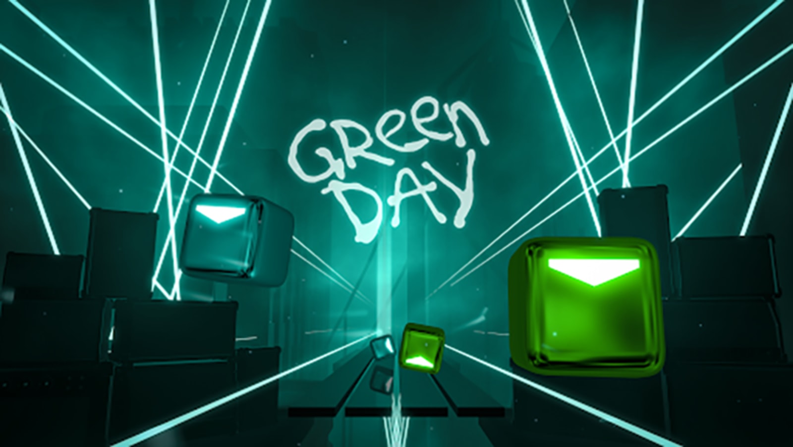
"American Idiot"
"Boulevard of Broken Dreams"
"Father of All…"
"Fire, Ready, Aim"
"Holiday"
"Minority"
Green…
The new ‘Control’ game mode is live right now
Amazon’s supernatural colonialism MMO ‘New World’ lands in May 2020
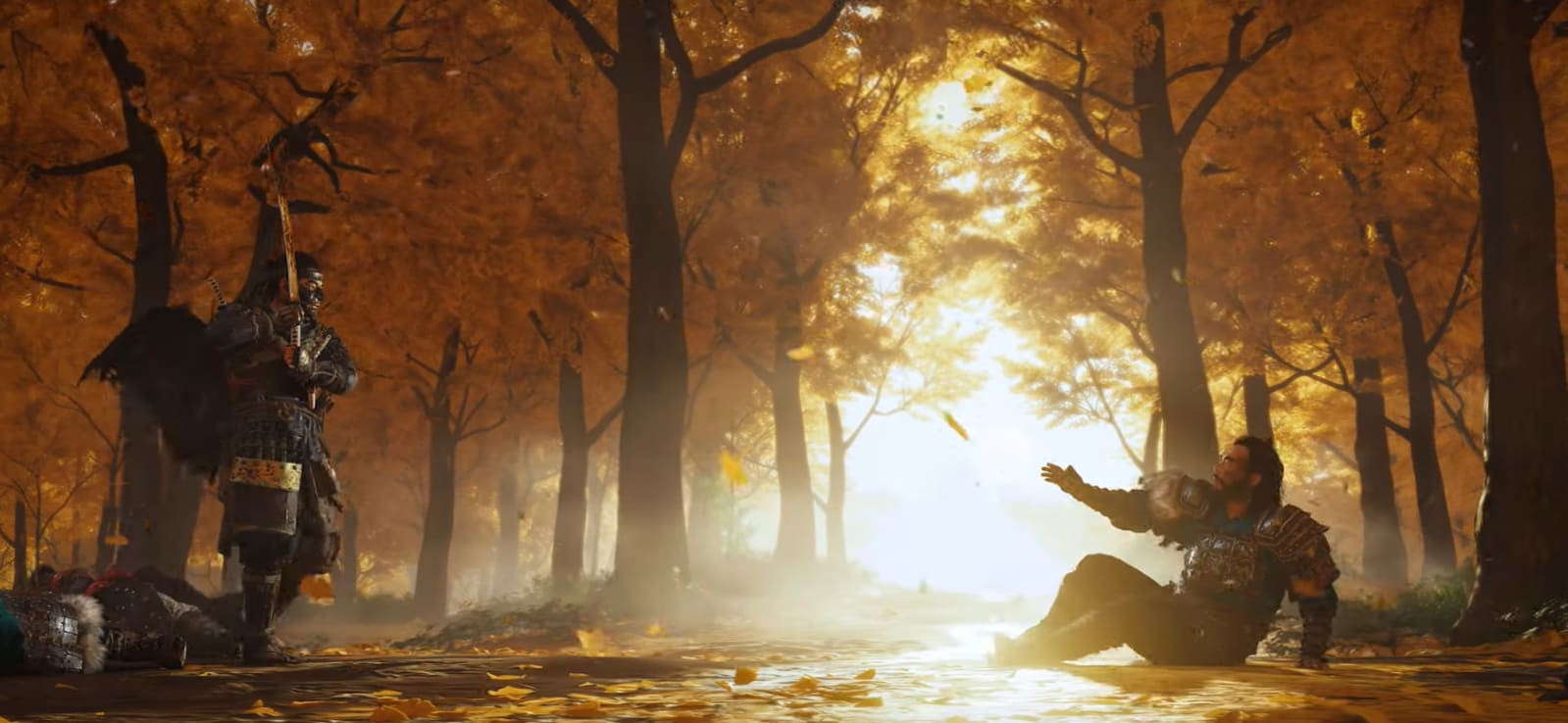
‘Ghost of Tsushima’ hits PS4 in summer 2020
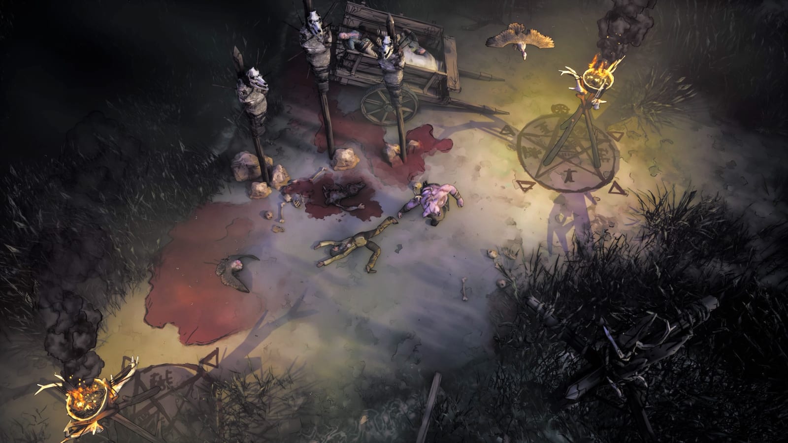
‘Dishonored’ and ‘Prey’ co-creators reveal ‘Weird West’
‘Cyberpunk 2077’ soundtrack features Run the Jewels, Grimes and more