
Photoshop is, without a doubt, one of the best photo editors that have ever been made, making it easy to see why it’s also one of the most popular. It’s been the industry leader in innovation for the past 30 years, with no sign of stopping anytime soon!

So let’s celebrate 30 years of Photoshop by looking at 30 tips and tricks that all Photoshop users should know!
30 Tips & Tricks All Photoshop Users Should Know
1. Select Colors From Anywhere
Stop screenshotting things just to grab colors from them! Simply select the Eye Dropper tool, minimize Photoshop, click the dropper onto your canvas, and then drag anywhere outside of Photoshop!


2. Install Custom Photoshop Brushes
Don’t feel tied to using just the brushes that come pre-installed in Photoshop. Try installing one of the thousands of brushes the internet has to offer by going into your bushes, clicking the Gear icon, and choosing Import Brushes.

 BrushesHow to Install Brushes in PhotoshopMelody Nieves
 WatercolorHow to Create Realistic Watercolor Photoshop Brushes From ScratchIvan Gromov
3. How to Create a Rain Texture
Falling raindrops are a great way to add some drama to your photography, but sometimes nature doesn’t agree with your plans. Make it rain yourself by creating a new layer filled with black, adding some Noise, then a slanted Motion Blur, and finally set the layer to Screen! Add some contrast, and you have instant rain.

 Photo EffectsHow to Add Realistic Falling Snow to a Photo in PhotoshopTony Aube
 Photo EffectsAdd Dramatic Rain to a Photo in PhotoshopTony Aube
4. Create a Quick Light Bleed Effect
Add a subtle light bleed to help blend any image by creating a new layer, and painting white towards the top of your image using a big fluffy white brush. Finish it off by lowering the opacity of the layer!


5. How to Use Blend If
Use Blend If to blend anything onto everything by double-clicking the layer you’d like to blend, going down to Blend If, and while holding Shift, playing with the sliders! The topmost layer will start blending into the layers below.

 Tattoo DesignUse a Tattoo Font to Add a Realistic Tattoo to a Photo in PhotoshopMonika Zagrobelna
 Blend IfHow to Use Blend If in Adobe Photoshop in 60 SecondsHarry Guinness
6. How to Copy Layer Styles Quickly
Have a layer style you need to apply to several other layers? Hold down the Alt key and drag the FX icon from the original layer to the target layers. The layer styles will be applied instantly—no need to fiddle with settings!

 Text EffectsHow to Create a Realistic Chrome Text Effect in Adobe PhotoshopRose
 Text EffectsHow to Make a 3D Text Effect Action With Layer Styles in PhotoshopJan Stverak
7. How to Create Multiple Stroke Effects on Text
Why have one line stroke when you could have two? Double-click the text layer to apply a Stroke layer effect. Press the Plus icon to add another Stroke. Add as many as you’d like!

 Text EffectsHow to Create a Cartoon Gradient Text Effect in Adobe PhotoshopPavlo Manachyn
 Layer StylesIntroduction to Photoshop Layer StylesJohn Shaver
8. Make a Trendy Double Exposure Effect
Create an easy double exposure effect by getting one high contrast black and white image, and then clipping a second image into it. Set the second image to Screen. The real magic is in the clever composition.

 Photo ManipulationMake a Trendy Double Exposure Effect in Adobe PhotoshopYulia Sokolova
 Graphic DesignNew Course: Create Double Exposure Effects in Adobe PhotoshopAndrew Blackman
9. How to Merge Shapes
Create quick custom shapes using the shapes you’ve already created by selecting your shape layers and then Right-Click > Merge Shapes. Bam! Now multiple shapes have become one!


10. How to Use Motion Blur
Use Motion Blur to give some speed to any object by creating a feathered selection around the edges of an object and then adding a subtle Filter > Blur > Motion Blur.

 Photo ManipulationHow to Create a Dramatic Angel Photo Manipulation in PhotoshopAbbey Esparza
 Book CoverHow to Design a Romance Book CoverMonika Zagrobelna
11. How to Create Instagram Photo Filters
Want the Instagram filter without having to log in to Instagram? Create a mustard-yellow Color Fill layer and then set it to Multiply. Instant vintage effect! Add some red on a layer set to Screen for added faded glory.

 Photo EffectsHow to Create Instagram Photo Filters in PhotoshopMarko Kožokar
 Photoshop Actions20 Vintage Photo Effect Photoshop Actions & Old Retro StylesMelody Nieves
12. How to Create an Animation in Photoshop
Did you think Photoshop is just for image editing? Think again! Go to Window > Timeline and click on the Create Video Timeline icon to create GIFs and other simple animations!


13. How to Warp Text in Photoshop
With your text layer selected and the Type Tool active, look towards the top-right of the Type Tool’s toolbar. You will see an icon of a “T” with a curved line underneath. Hit that icon to see a slew of built-in text arcs and bends!


14. How to Change a Brush’s Flow Rate
Having trouble blending your shadows? Select the Brush, look up to the top toolbar, and lower the brush’s Flow. Now, each pass of the brush will slowly build up color, perfect for shading and lighting!

15. How to Paint Makeup
Forgot to hire a makeup artist for your shoot? No worries! Create a new layer, set it to Soft Light, and paint in the eyeshadow yourself! The Soft Light and Overlayer layer modes will turn you into a post-production makeup artist pro.

16. How to Make a Frequency Separation Photoshop Action
Do you ever wonder how photographers get that perfect high-fashion skin? It’s called frequency separation! Split your image into two layers, one with a Gaussian Blur and the other with a High Pass filter. Set to Linear Light. Use the blurred layer to fix the color and skin tone and the high pass layer to fix the texture!


17. How to Use the Blur Gallery
Add more depth to your photos by blurring the background. Duplicate your image, and then go to Filter > Blur Gallery > Field Blur. Set your blur, and then mask out your subject, so that they are no longer blurred, but their background is. Instant depth!


18. How to Create Chromatic Aberration
Miss the old days of broken VHS tapes or glitchy 90s computer monitors? Duplicate your layer, double-click the layer, uncheck the R channel, and then move the layer over by 3-5 pixels. Finally, grab your 3D glasses!

 Adobe PhotoshopHow to Create a Cool Glitch Photo Effect in Adobe PhotoshopMelody Nieves
 Photoshop Actions20 Glitch & VHS Photo Effects With Digital Photoshop Art StylesMelody Nieves
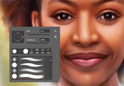
19. How to Quickly Change Brush Size and Hardness
Did you know that you can use the square bracket keys [ and ] to change the size of your brush? You can also hold down Shift while tapping the bracket keys to change the hardness of the brush! All without having to visit the Brush panel!
20. How to Create a Smart Object
Layers automatically become Smart Objects when brought into Photoshop, but did you know you can turn any layer into a Smart Object? Start using this non-destructive editing powerhouse by right-clicking the layer and choosing Convert to Smart Object.

 Product MockupHow to Insert a Photo Into a Product Mock-Up in Adobe PhotoshopKirk Nelson
 Photo ManipulationHow to Create a Futuristic Fashion Portrait in Adobe PhotoshopAbbey Esparza
21. Hide Layers Quickly
Want to focus on one layer, but the others are in your way? Hold down the Alt key and click on the Eyeball icon of the layer you want to isolate. When you Alt-click again, the other layers will switch right back on.

22. What Is a Color Lookup Layer?
Want to add an instant color grade to your image? Use Photoshop’s lesser-known Color Lookup adjustment layers! With dozens of presets to choose from, they make a great starting point for any color grade.


23. How to Create Guides in Photoshop
Did you know you can create a guide in Photoshop just by clicking and dragging on the side rulers? If you don’t see the rulers, bring them in by hitting Control-R!

 ResumesHow to Make a Photoshop Resume Template (Free Resume Download)Laura Keung
 Resumes11 Creative Resume Design/CV Tips (With Template Examples for 2019)Grace Fussell
24. How to Get Rid of Color Banding in Photoshop
Having trouble with color banding? Banish that banding away by creating a new layer, filling it with black, adding a subtle Noise filter, and then setting the layer to screen! This will help disperse the colors and ease the banding.

25. How to Turn on Pressure-Sensitivity
Did you know that as long as you have a tablet, all brushes can use pressure sensitivity? Turn it on by going into the Brush Settings, Shape Dynamics, and then setting Control to Pen Pressure and Minimum Diameter to 0%.

 Adobe PhotoshopPhotoshop in 60 Seconds: Using a Pressure-Sensitive TabletKirk Nelson
 Digital PaintingHow to Draw & Paint a Beautiful Mermaid in Adobe PhotoshopDaisy Ein
26. How to Organize Your Brushes
Long gone are the days of unorganized, chaotic brushes! Go into your Brush panel and Right-Click > Create Group to tidy up and sort your brushes.


27. Give Yourself More Undos
Ever wish you could just have one more undo? Well, you can actually have up to 1,000! Go to Edit > Prefences > Performance to set your History States. I’d keep them around 75 or lower, however.


28. How to Create a Photoshop Brush
Did you know that you can turn any black and white image into a custom brush? Once your image or object is greyscaled, crop it down as small as you can and then go to Edit > Define Brush Preset.

 Adobe PhotoshopHow to Create a Japanese Brush Font Text Effect in PhotoshopAbbey Esparza
 Adobe PhotoshopHow to Create a Light Particles Photoshop BrushJonathan Lam
29. How to Use a Layer Style on an Empty Layer
Want the layer style but not the layer? Add a layer style to your layer, and then bring the layer’s Fill down to 0%!

 Photo ManipulationHow to Create a Dramatic Mermaid Photo Manipulation in PhotoshopAbbey Esparza
-
Text EffectsHow to Create a Realistic Chrome Text Effect in Adobe PhotoshopRose
30. How to Use Refine Edge in Photoshop
Is the Quick Selection tool not doing it for you, but you don’t have time to extract everything by hand? Once you have a quick selection around your subject, add a Layer Mask, and double-click it. Choose Select and Mask. Here you will find the Refine Edge Brush. Check the Smart Radius box and then get to brushing. Photoshop will refine the edge to near perfection!

 Album CoverHow to Make a Cool Photo Effect Album Cover Design in PhotoshopAbbey Esparza
 Photo ManipulationHow to Create a Honey Bee Themed Photo Manipulation in PhotoshopAbbey Esparza
More Tips, Tricks, & Tutorials
And there you have it! 30 tips, tricks, and tutorials to celebrate 30 years of image editing innovation. Happy birthday, Photoshop! We all look forward to 30 more.
Learn more about Photoshop by trying out our Adobe Photoshop for Beginners video course:
Still have the Photoshop bug, and can’t get enough? Check out even more tutorials below!
 Photo ManipulationHow to Create a Wrapped Ribbon Photo Manipulation in PhotoshopAbbey Esparza
-
Adobe PhotoshopHow to Create a Light Particles Photoshop BrushJonathan Lam
 Adobe PhotoshopHow to Create a Haunted Portrait Effect in PhotoshopAbbey Esparza
 Digital ScrapbookingThe Ultimate Guide to Digital ScrapbookingDaisy Ein
 Adobe PhotoshopHow to Create a Typographic Album CoverDaisy Ein
 Photo ManipulationHow to Create a Dreamy Glow Effect Photo Manipulation in PhotoshopMonika Zagrobelna
{excerpt}
Read More


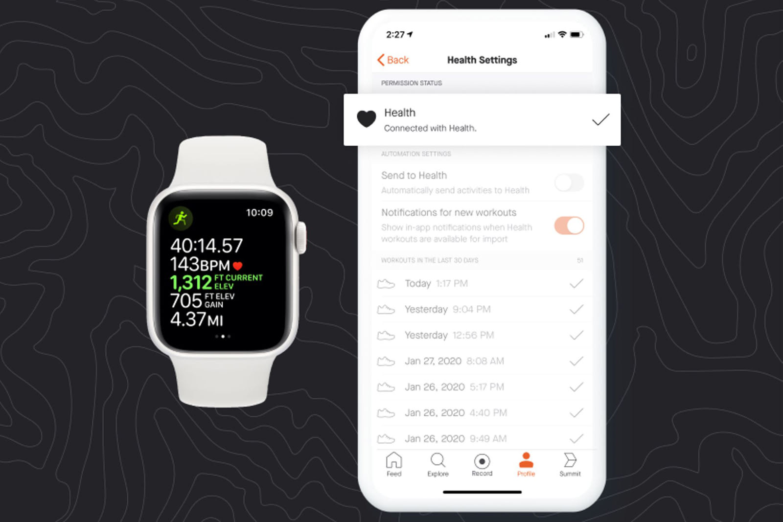 If you use Strava to track your workouts on an iPhone, you've probably wondered why you couldn't sync your Apple Health data with it. While there is a Strava app for the Apple Watch, there's not as much of an incentive to get the wearable if it your…
 Ring has said that camera footage sent to police can help reduce burglaries and catch criminals, but how effective is it, really? It might not be as helpful as you might think. NBC News has conducted an investigation suggesting that Ring's video do…
 One of the biggest mobile games today, PUBG Mobile, has kicked off an esports tournament for pro-level players, showing just how much the category has grown in recent years. Mobile games accounted for 33 percent of all app downloads in 2019. And acco…
 No, the OurMine group isn't done defacing high-profile sites. Twitter has confirmed reports that OurMine hijacked accounts for both the Olympics and FC Barcelona on February 15th, using the opportunity to make a less-than-sincere offer to "improve y…
 Smart speakers and other microphone-equipped devices aren't supposed to listen all the time, but there might be a solution if you aren't willing to take any chances. University of Chicago researchers have built an experimental bracelet that uses ult…
 The SpaceX Crew Dragon, which is slated to be the first spacecraft to carry humans to orbit from American soil since 2011, has arrived at its Cape Canaveral launch site. NASA and SpaceX are already preparing the vehicle for its first flight manned te…
 I'll admit it, when Samsung teased the Galaxy Fold at its Developer Conference in 2018, I wasn't sold on the concept. Sure, the technology was impressive, but it just seemed gimmicky to me. The only benefit I could think of for folding displays would…
 It's not uncommon to troll your Fortnite enemies with a victory dance, but the latest one might be particularly insidious. Epic Games has added a purchasable "Never Gonna" emote to the battle royale brawler that, as the name implies, Rickrolls your…