
Category: Tutorials
Tutorials,freelance,projects,joomla,php,mysql,wordpress,blancer.com
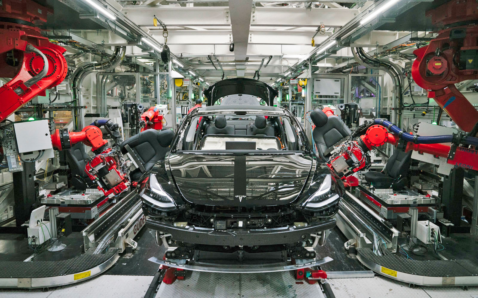
Tesla reportedly orders factory workers to show up despite shelter orders (updated)
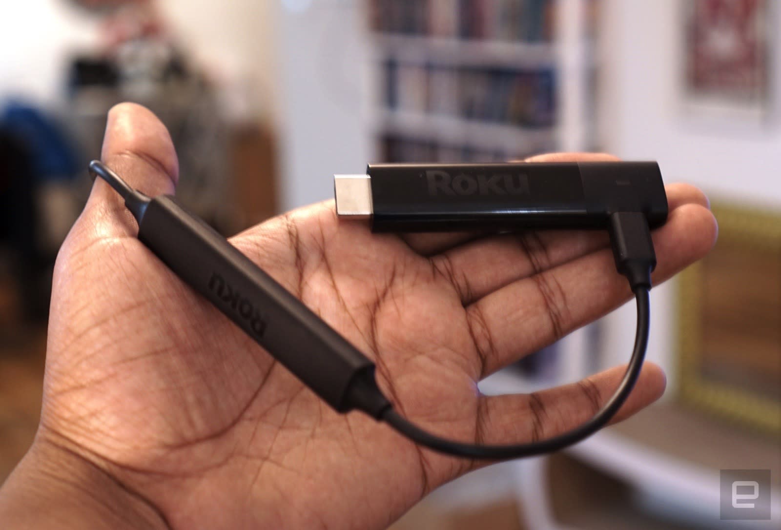
Amazon is holding a well-timed sale on Roku and Fire TV streaming sticks
Bandcamp will waive its fees to help musicians affected by coronavirus
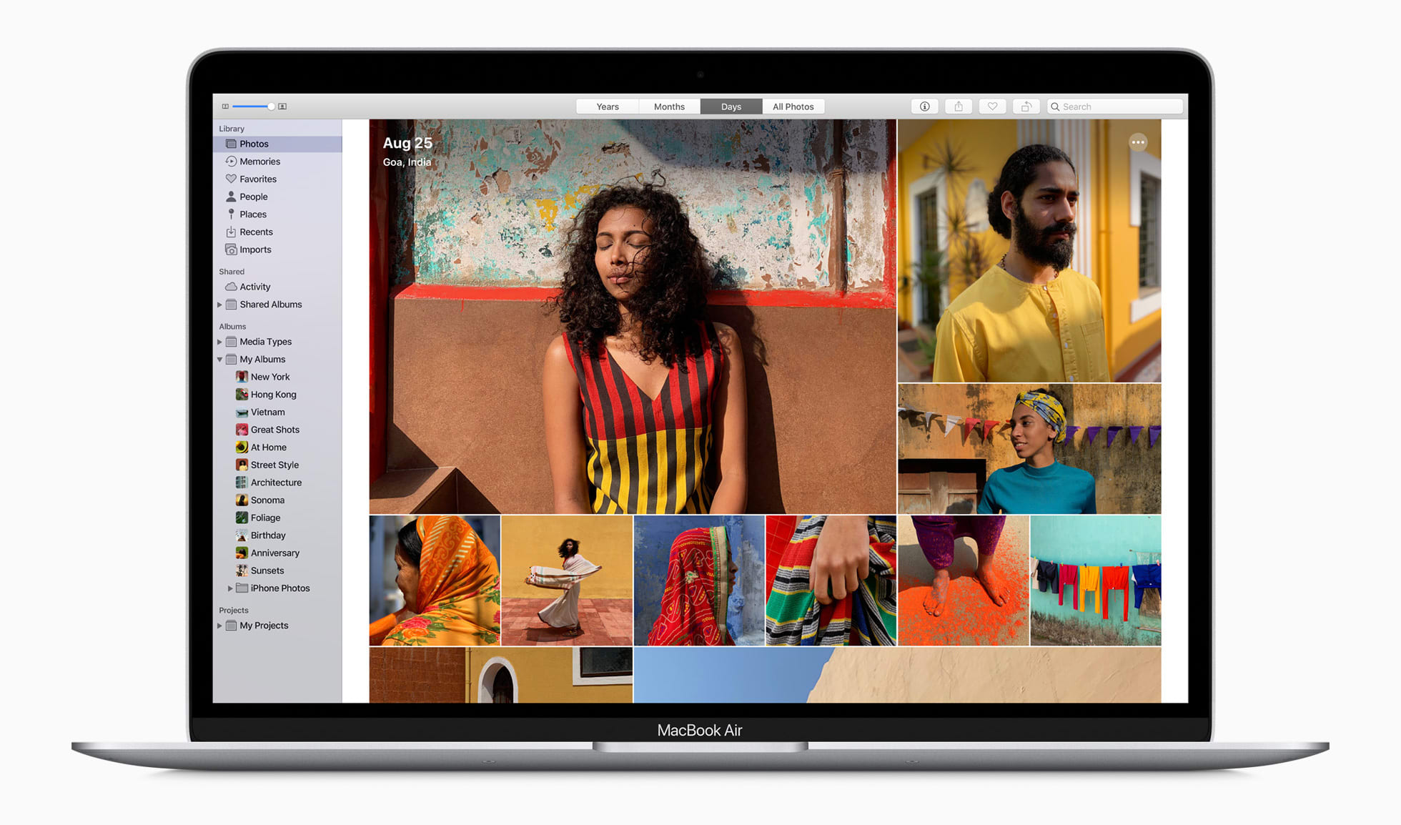
Apple’s new Air could be the MacBook for everyone
‘Half-Life: Alyx’ is proof Valve answers to no one

Facebook bug marked legitimate coronavirus info as spam

The PlayStation 5 vs. the Xbox Series X: Which is more powerful?
Facebook reveals launch dates for latest Oculus games

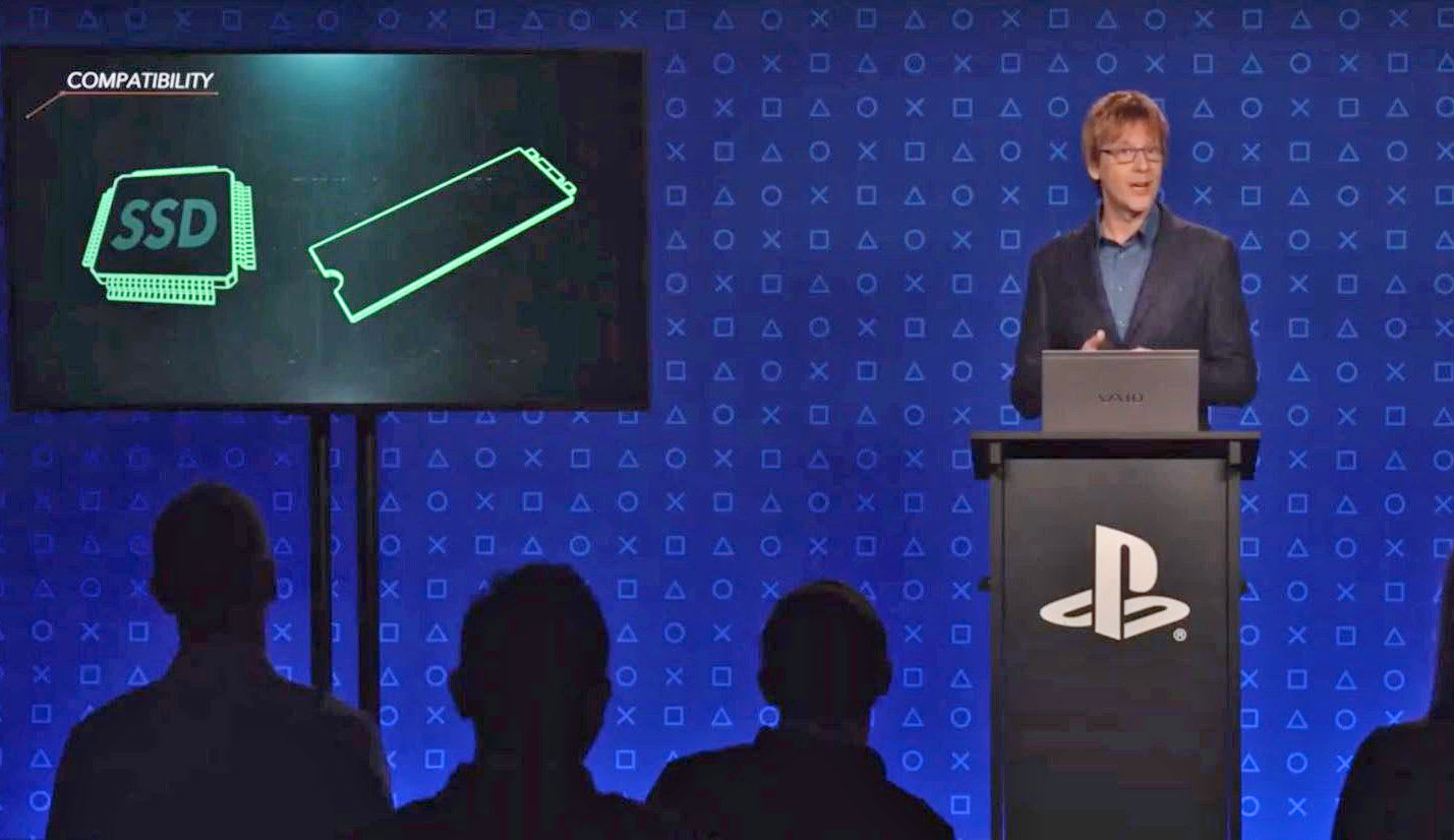
PlayStation 5 will feature a 10.2-teraflop GPU and a speedy custom SSD

It's been almost a year since Sony started talking about the PlayStation 5 in an uncharacteristically revealing Wired interview. We learned the next-generation console will be powered by AMD's third-generation Ryzen CPU and a custom Radeon Navi G…
How to Use the Wind Blast Effect in Adobe Photoshop

In this tutorial, we will learn how to use the popular wind blast effect to create a neoclassic style poster template in Adobe Photoshop.
What you will learn in this poster template tutorial:
- How to set up Guides in Photoshop
- How to crop an image using Layer Masks in Photoshop
- How to create a wind blast effect in Photoshop
What You Will Need
You’ll need access to Adobe Photoshop; if you don’t have the software, you can download a trial from the Adobe website. You’ll also need these resources:
Download the image and install the font, and you are ready to start!
1. Setting Up a New Photoshop File
Step 1
In Photoshop, go to File > New. Name the document Melodias Poster. Set the Width to 1270 px and Height to 1600 px. Set the Resolution to 72 Pixels/Inch. Click OK.

Step 2
Press Command-R to bring up the rules around the document. Head over to View > New Guide. On the New Guide window option, select Horizontal and set the guide to 70 px. Click OK.
Do the same for the other sides of the document by subtracting 70 px from the final size. To activate and deactivate the guides, press Command-;.

Step 3
On the Layers panel, click on the Create a new Fill or Adjustment Layer > Solid Color. Select a black color and click OK.

2. How to Create a Soft, Blended Background
Step 1
To create a colored background, we need to create a new layer and create color stamps. Press Shift-Command-N. Name the layer Background. Click OK.
Select the Brush Tool (B) from the toolbar. Right-click on the document to change the settings. Set the Size to 600 px and the Hardness to 0%.

Step 2
Click on the foreground color and set the color to #af00d0. Click OK.
Stamp over the document, trying to concentrate on the outer edges of the page. Repeat this step using these other two colors: #00e4f4 and #0d43ff.

Step 3
While selecting the Background layer on the Layer panel, head over to Filter > Blur > Motion Blur. On the Motion Blur option window, set the Angle to 90 and the Distance to 1625. Click OK.
We want the background to be soft. On the layer panel, lower the Opacity to 50%.

3. How to Close-Crop an Image Using Layer Masks
Step 1
Drag the Greek God image into the Photoshop document. When dragging an image into a document in Photoshop, it should automatically fit the document. If it doesn’t fit, press Command-T to Transform. Head over to the Options bar and set the Width and Height to 23.82%. Press Enter.

Step 2
On the Layers panel, make sure you have the Greek God layer selected. Head over to the bottom of the panel and add a Layer Mask. The Layer Mask should be selected automatically; if not, make sure you are working on the Layer Mask.
Layer Masks allow us to hide and reveal parts of an image instead of completely deleting them. You will notice in the next steps that parts of the thumbnail will change from white to black and vice versa. The black represents hidden parts, and the white parts are the revealed sections. You can change this on the foreground/background color.
Learn more about Layer Masks by checking our tutorial on How to Create Layer Masks in Photoshop.

Step 3
Select the Magic Wand Tool (W) from the toolbar. The Magic Wand Tool is a useful tool when there’s a strong contrast between the foreground and background of the image. For instance, this image has a strong bokeh, which makes it easy to select. Select the green parts of the image by clicking on the document. If you need to add more sections to the selection, hold down Shift and click to select. Press Command-I to Invert the Layer Mask or hide the selection, followed by Command-D to Deselect.
Don’t worry if the Magic Wand Tool (W) selects part of the foreground, in this case the statue. We will be using the Brush Tool (B) in the next step to work on the details.

Step 4
Select the Brush Tool (B) from the toolbar. Right-click on the document and set the brush Size to 150 px and the Hardness to 100%.
For this tutorial, we will be using only the head of the statue and the beard. Using the Brush Tool (B), start brushing off the chest and neck areas.

Step 5
If the Magic Wand Tool (W) selected parts of the foreground, this is the step to fix it. While selecting the Brush Tool (W), press the X key. This shortcut will change the foreground color from black to white.
Brush over the areas that are hidden to reveal them. Use the X key to go back and forth to switch the foreground colors.

4. How to Create the Wind Blast Effect
Step 1
Duplicate the Greek God layer by pressing Command-J. Hide the original layer by clicking on the eye icon. We will be working on the duplicated layer. Make sure that you are selecting the Smart Object thumbnail and not the Layer Mask.
To create the wind blast effect, we need to rotate the image. Press Command-T and rotate the image to a 90-degree angle. Press Shift as you rotate for an even rotation. Press Enter to apply.
We need to rotate the layer because the direction of the Wind effect goes only from side to side and not from top to bottom.

Step 2
Head over to Filter > Stylize > Wind > Stagger. In the Wind option window, set the Method to Stagger and the Direction to From the Right. Click OK.
We need to apply this effect several times. We can do so by pressing Command-F, which will repeat the last effect. You can repeat the effect as many times you like—I repeated it 10 times.

Step 3
Before rotating the layer back to its original place, we need to rasterize the layer and the smart filters. If we neglect this part, the filter will be reapplied on the image in its original place. Right-click on the layer and select Rasterize Layer.
Press Command-T and hold down Shift to rotate the image back to its original place. Press Enter to apply.

Step 4
Activate the original Greek God layer. Select the Brush Tool (B) from the toolbar. Right-click on the document to set the brush. Select the Oil Pastel Large brush. I’ve found this is the best brush to use to reveal and hide the Wind effect.

Step 5
Select the Layer Mask on the duplicate Greek God layer. Using the Brush Tool (B), start revealing parts of the image. In this case, let’s start by working on the left side of the image.
Use the following shortcuts to make this step easier. Use X to change the foreground color, to reveal and hide parts of the image. To adjust the size of the brush, press [ to decrease and [ to increase the size.

Step 6
In my case, I want to reveal only a few parts of the effect over the original Greek God layer. There is no right or wrong in this step—feel free to put your own spin on the design!
Below, you can take a look at the final composition I have. On the right side, I’ve shown you the Wind effect layer alone so you can see how much of it I hid and revealed.

Step 7
To neutralize the color of the image, we will add an Adjustment Layer. Head over to the Layers panel, and select Adjustment Layer > Black & White.
We want the Adjustment Layer to only be applied to the statue. Select both Greek God layers and drag them towards the Group button. Right-click on the Black and White Adjustment Layer and select Create Clipping Mask.
Use the Properties panel to tweak the colors. I tweaked the Reds to 300 and the Yellows to -50 to add contrast. Feel free to do your own version!

5. How to Create a Colorful Stroke
Step 1
Create a new layer by pressing Shift-Command-N. Name the layer Stroke. Click OK. Move the layer under the grouped Greek God layers.

Step 2
On the toolbar, select the Brush Tool (B). Right-click and change the brush to a circular brush. Set the brush Size to 500 and the Hardness to 0.
Use the following color codes to brush over the layer: #f7af08, #f502fe, #35b5f0, #8566fb, and #1be5e9. I am hiding the Greek God layers so you can see the result. It doesn’t to be exact—put your own spin on it!

Step 3
Head over to Filter > Blur > Gaussian Blur. In the Gaussian Blur option window, set the Radius to 150 pixels. Click OK.

Step 4
Reveal the grids we created at the beginning of this tutorial by pressing Command-;.
On the toolbar, select the Rectangle Tool (U). Draw a rectangle to fit inside the grid. Head over to the Options bar, and set the Stroke to 50 pt.

Step 5
Head over to the Layers panel. Right-click on the Rectangle layer and select Rasterize Layer. Press down Command and click on the rectangle thumbnail. This will create a selection of the object. Select the Stroke layer and click on the Add Layer Mask button. Delete the Rectangle layer.

Step 6
Now we can resize the stroke. Press Command-T to Transform. Hold down Option-Shift while you resize to evenly resize the rectangle while using the center as the main point. Alternatively, you can head over to the Options bar and set the Width and Height to 60%. Feel free to set it to a different size. Press Enter.

Step 7
Remember you can always tweak the colors and brightness by adding an Adjustment Layer in the Layers panel. For instance, below I added a Brightness/Contrast, and I changed the Contrast value to 100. I also added a Hue/Saturation and set the Hue value to 125.
If you want these layers applied only to the Stroke layer, right-click > Create Clipping Mask.

6. How to Use the Text Tool
Step 1
On the Tools panel, select the Text Tool (T). I used white text to contrast with the background. The typeface I used is US Bill.
Bring up the Tools panel by going to Type > Panels > Character Panel. Below are the details I added with the type size and specific font weight on separate layers.
LA LIGA PRESENTA:
MELODIAS
NEOCLÁSICAS
(US Bill, Slant and ExtraBold Slant, Size: 46 pt and 140 pt, Tracking: 50 pt, Leading for the second line is 120 pt and for the third line is 150 pt. I encourage you to play with the leading as it is a great exercise to understand legibility. Select a text line and press Option-Up arrow or Option-Down arrow to add or decrease the leading).
+
MEXICO
GUADALAJARA
ECATEPEC
GUADALAJARA
PUEBLA
JUÁREZ
TIJUANA
LEÓN
ZAPOPAN
MONTERREY
(US Bill, Slant, Size: 21 pt, Tracking: 50 pt, Leading: Auto).
+
FIESTA DE
LANZAMIENTO
EN VIVO
09.02
—28.02
2019
(US Bill, Slant, Size: 45 pt,Tracking: 50 pt, Leading: 38 pt).
I’ve placed the three text blurbs opposite each other. You will notice that they create a triangle, this is important to make the viewer’s eyes jump from one point of information to the other. We are not only creating tension but also visual balance.

Step 2
The title is placed over the stroke and the image. You will notice that this portion of the poster template seems busy and too mixed up. Let’s make the text jump out. Right-click on the title layer and select Blending Options.
Select the Drop Shadow style. Set the Blending Mode to Multiply, the Opacity to 40%, the Angle to 120, the Distance to 13 px, the Spread to 6%, and the Size to 38 px. Under Quality, set the Contour to Half Round. Click OK.

7. How to Save a File for Web
Head over to File > Save and save the file as you would normally.
To save a JPEG for web file, head over to File > Save for Web or Shift-Option-Command-S. Select the file type you want to save the document in—I am choosing JPEG—and set 100 for Quality. Under Image size, you can change the pixel size of the image if you have any size constraints.
On the bottom left-hand side, you can see a preview of the size of the file. This is useful when there are size constraints on a website and you need to lower the quality or the size of the image.
Click on Save… to choose the location in the new window, and click on Save again.

Congratulations! You’ve Finished This Tutorial!
In this tutorial, we’ve learned to use the Wind Blast effect in Photoshop to create a visually interesting poster design with a spin. The results will vary slightly, so be sure to post yours in the comments below! Today we’ve learned to:
- Use the Blur effect to create a soft, blended background.
- Close-crop images using Layer Masks.
- Apply Adjustment Layers and Clipping Masks to edit images.
- Use the Wind effect to create a slightly pixelated look.
- Understand text placement and composition.

If you liked this tutorial, you might like these:
 Photoshop ActionsHow to Create a Shatter Photoshop Effect ActionMarko Kožokar
 Photoshop Actions35 Best New Photoshop Actions & Photo Effects for 2019 (Updated for 2020)Melody Nieves
 Text EffectsHow to Create a Sketch Text Effect Action in Adobe PhotoshopAnderson Luiz
 Photoshop ActionsHow to Create an Enchanted Photoshop ActionMarko Kožokar
 Text EffectsHow to Create an Ink Cloud Typography Text Effect Using Adobe PhotoshopLaura Keung
{excerpt}
Read More
How to Create a Glow Effect Text Effect in Illustrator

In this tutorial, you will learn how to create a glow effect text effect in Adobe Illustrator, using the Appearance panel and glow effects.
What you will learn in this vector text effect tutorial:
- How to start a new document in Illustrator
- How to apply multiple fills in the Appearance panel
- How to create a neon glow effect in Illustrator
Tutorial Assets
To complete the tutorial you will need the following font:
1. How to Open a New Document
Launch Adobe Illustrator and go to File > New to open a blank document. Type a name for your file, set up the dimensions and then select Pixels as Units and RGB as Color Mode.
Next, go to Edit > Preferences > General, set the Keyboard Increment to 1 px and, while there, go to Units to make sure they are set as in the following image. I usually work with these settings, and they will help you throughout the drawing process.

2. How to Create the Background
Take the Rectangle Tool (M) and simply click on your artboard to open the Rectangle window. Set the Width to 870 px and the Height to 470 px, and then click OK to create the background rectangle. Color it with the radial gradient shown.
With the rectangle still selected, go to the Align panel (Window > Align) and first, make sure to select the Align to Artboard option under the Align to button. Now, click on Horizontal Align Center and Vertical Align Center in order to perfectly center it and cover the entire artboard because it is slightly bigger.

3. How to Create the Text
Take the Type Tool (T), click on your artboard, and write “Toxico” using the Gendarwo Font, size of 170 pt. Under Set the tracking for the selected characters, choose 25 in order to spread the letters a little.
Keep the text selected and press Horizontal Align Center and Vertical Align Center in the Align panel to position it exactly in the center of the artboard.

4. How to Create the Appearance of the Text
Step 1
With the text still selected, remove the existing fill color in the toolbar. It will make the text invisible, but this is exactly what we want.
To obtain the glow effect, Illustrator has the option to add multiple appearances on the same piece of text, along with effects, blending modes, gradients, and transparencies. By the end, you will also be able to save all these appearances in the Graphic Styles panel and easily use this style again.

Step 2
Make sure that the invisible text is still selected and press Add New Fill at the bottom of the Appearance panel. Use the linear gradient shown to color it.
This is the first Fill attribute in the Appearance panel, and we will continue to build the glow effect.

Step 3
While the text is still selected, press Add New Fill again to add a second Fill attribute above the first. Use the linear gradient shown to color it (1).
Next, go to Effect > Sketch > Bas Relief and apply the settings indicated. Set the Detail to 1 (minimum), the Smoothness to 15 (maximum) and the Light to Top Left. This will add some dimension to the text and create shading towards the end of it (2).

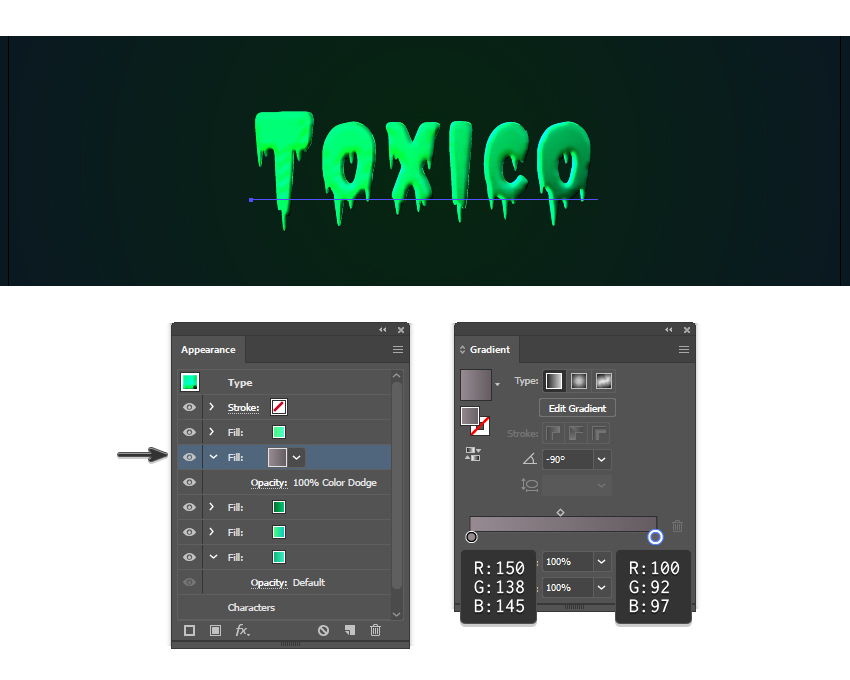
Step 4
While the text is still selected, press Add New Fill again to add a third Fill attribute at the top of the Appearance panel. Use a green to light green linear gradient and set the Angle to -90 degrees. Change the Blending Mode to Overlay; this will make the text look more green. The toxic look is starting to come together.

Step 5
Keep the text selected, and let’s add another fill above the rest by pressing the Add New Fill button again. Use the linear gradient shown to color it.
Make sure that this Fill attribute is selected, and then go to Effect > Sketch > Chrome. Set the Detail to 0 (minimum) and the Smoothness to 10 (maximum), and hit OK. As a result, we will get a bit of texture on the text.

Step 6
While the text and the last Fill attribute are still selected, go to Effect > Sketch > Bas Relief to apply this effect. Set the Detail to 1 (minimum) and the Smoothness to 15 (maximum), as before, but set the Light to Top this time.
Together with the Chrome effect, this will create surface variations and give a more fluid look to the toxic effect. We will also get a highlight at the top of the letters and shading at the bottom.

Step 7
Make sure that the text is selected, and change the Blending Mode of the last Fill attribute to Soft Light. The two effects applied will blend with the fill color underneath and create a more realistic Illustrator effect.

Step 8
While the text stays selected, press Add New Fill again to add a fifth fill in the Appearance panel. Use a gray to darker gray linear gradient and set the Angle to -90 degrees. Move this Fill between the third and the fourth Fill attributes created earlier, so it is under the Chrome and Bas Relief effects applied. Set the Blending Mode to Color Dodge, and this will give us that neon glow effect as something very toxic should be.
Step 9
It’s time to add the shadow. Keep the text selected, and press Add New Fill again to add another Fill attribute at the bottom of the Appearance panel. Use the linear gradient shown; then go to Effect > Stylize > Drop Shadow and apply the settings in the image below.

Step 10
We can’t have a toxic effect without a glow effect around it, right?
Add another Fill attribute at the bottom of the Appearance panel and use the same gradient from the previous step. Next, go to Effect > Stylize > Outer Glow and apply the settings shown using a bright green color. This will create a discreet glow effect around the text as the Blur is only 4 px, but we are not done yet.

Step 11
While the text and the last Fill attribute stay selected, go back to Effect > Stylize > Outer Glow and apply this effect one more time. The settings and the color are different this time, and the Blur is much bigger.
When you use this glow effect, Illustrator will automatically create that neon glow around the text, and this will enhance the style and make all the difference, especially when applied twice.

5. How to Create the Toxic Particles Around the Text
Step 1
At this point, the Illustrator glow effect is complete, but we can add a few extra details.
Take the Ellipse Tool (L), click on your artboard and draw an 80 x 80 px circle. The fill color is not important at the moment.
While the circle stays selected, go to Object > Create Gradient Mesh. Enter 3 Rows and 3 Columns, and then hit OK. Now, you can select the individual mesh points and color them as shown in the image below, using the three shades of green indicated.

Step 2
Make copies of different sizes of the circle obtained in the previous step and arrange them randomly on the text and around the text as toxic glowing particles. Add as many as you want until you are happy with the result.

Step 3
Group (Control-G) all the glowing particles; then go to Effect > Stylize > Drop Shadow and apply the settings shown. This will add a small shadow under each circle, just like for the glow text effect.

Step 4
Keep the group of particles selected and go to Effect > Stylize > Outer Glow. Apply the settings shown, and we will obtain a glow effect around each circle, just like the text. This way, things are consistent throughout the entire text design.

Congratulation! You’re Done
Here is the final image of the glow effect. Now you know how to create fully editable text effects in Adobe Illustrator, and you can apply these techniques in your future projects.
If you need more inspiration and resources to improve your drawing skills, make sure to head over to GraphicRiver where you will find more Illustrator styles, a multitude of fonts to use, and vectors ready to personalize your final text effect.

Expand Your Text Effect Designing Skills!
Keep drawing and learning with these recommended tutorials, which will explain plenty of other useful techniques.
-

How to Create a Cool Bubble Font Text Effect
In the following steps, you will learn how to create a bubble text design using a bubble letter font in Adobe Illustrator. -

How to Create a Multi-Layered Text Effect in Adobe Illustrator
In the following steps, you will learn how to create a fully editable, multi-layered text effect in Adobe Illustrator. -

How to Create a Bones Text Effect in Adobe Illustrator
In the following steps you will learn how to create a simple bones text effect in Adobe Illustrator. -

How to Create a Retro Chrome Text Effect in Adobe Illustrator
In the following steps you will learn how to create a retro chrome text effect in Adobe Illustrator. -

How to Create a Wrapped Ribbon Text Effect in Adobe Illustrator
In the following steps you will learn how to create a wrapped ribbon text effect in Adobe Illustrator. -

How to Create a Coconut Text Effect in Adobe Illustrator
Learn to create a fun coconut text effect that will make you dream of a tropical vacation. -

How to Create a Half-Blurred Text Effect in Adobe Illustrator
In the following steps, you will learn how to create a half-blurred text effect in Adobe Illustrator. -

How to Create a Western Text Effect in Adobe Illustrator
In the following steps, you will learn how to create a simple Western text effect in Adobe Illustrator.
{excerpt}
Read More
Advanced Glow Effects

In this tutorial, we’re going to create some really sharp-looking glow effects using a combination of layer styles, the Pen Tool, and Color Blending. The end effect is quite stunning, and hopefully you’ll pick up some tips you didn’t know before.
Create more awesome glow effects with Layer Styles from Envato Market.
Follow along with us over on our Envato Tuts+ YouTube channel:
1. How to Create the Background
Step 1
As with pretty much every tutorial I’ve ever written, we begin with a Radial Gradient. This one is pretty harsh and goes from a reddish brown color to black. Here are the exact color codes:
- Foreground color:
#922f00 - Background color:
#000000

Step 2
In this tutorial, we actually need a pretty intense center, so what we’ll do is duplicate the layer we just made and set the one above to a Blending Mode of Color Dodge. There are a few types of blending modes: darkening ones, lightening ones, colorizing ones, and inverting ones. Color Dodge is probably the strongest of the lightening ones. As you can see in the screenshot, it produces a pretty full-on center.

Step 3
Now, in our glow effect, it helps to have a nice textured background. So we are going to create a sort of smoky haze. To do this, create a new layer, and then make sure you have white (#ffffff) and black (#000000) selected as your background and foreground colors.
Then go to Filter > Render > Clouds. This will give you the same random cloud pattern as above.
Now give the clouds a blur by going to Filter > Blur > Gaussian Blur. Set it to 20.

Step 4
Now set the Opacity of your layer to Overlay and 30% transparency. In some instances this would be enough, but for our needs we want it even smokier looking!
So go to Filter > Filter Gallery > Sketch > Chrome and use default settings of 4 and 7 for the detail and smoothness respectively. Actually you can probably mess around with those if you want, but the defaults seem to be fine.
When you’re done, the result should look a lot smokier (once its Overlayed at 30% transparency, that is). You can see the result in the background of the next screenshot.

2. How to Create Glowing Lines
Step 1
Now, before we can start making glows, we need to have something to glow. Here’s where we break out the Pen Tool. If you have used the Pen Tool much, I suggest playing around with it a little. There are some tricky things you can do with shortcuts, but for this tutorial you don’t need those.
In fact, all we want to achieve are some nice curves. Fortunately, this isn’t too hard. I find the trick is not to use too many points. Instead, rely on the Pen Tool’s natural curving and drag the mouse out for each point so you get a big angle. In the S-curve shown below, I’ve only used three points: the starting point, the end point, and one in between to give it the bend.

Step 2
Once you have a nice curve, create a new layer. Then click on the Paintbrush Tool (B) and choose a very thin, hard brush. As you know, soft brushes are the blurry ones, and hard brushes are more solid. In this case, I suggest using a thickness of 5.
Note that you can have any color selected as your brush color because we’ll go over it with a layer style shortly.

Step 3
Now switch back to the Pen Tool. You must switch tools in order to do this next bit.
Then right-click and select Stroke Path. A little dialog box will appear, as in the screenshot. Choose Brush and make sure there is a tick next to Simulate Pressure. This is important as it will give your curve tapered ends, which will make it rock!
Next, right-click again and select Delete Path.

Step 4
You should now have something like below. Just a thin, cool, swishy thing.

Step 5
Now we add some glows. The easiest way to make our glows is to use layer styles.
In a nutshell, I’ve added two sets of glows. To do this, I first use Outer Glow and then, because I want a second glow, I change the Drop Shadow settings so that it becomes a glow (you can do this by reducing the Distance and changing the Blend Mode to something like Color Dodge).
Oh, and also I’ve used a Color Overlay to make the item white so that it’s like the center of an intense glow.

Step 6
So now you have the same line, but with a cool glow coming off it. The beauty of using a layer style is that you can copy and paste it to other layers. To do this, you just right-click the layer and select Copy Layer Style, and then create a new layer and right-click and choose Paste Layer Style.

Step 7
So now repeat the same process a couple of times to make more squiggly lines.
In this instance, I made one a little thicker by changing the brush size before I did the Stroke Path bit of the process. I also made a third line and erased part of it and sorta made it join the other two to look like a cool triangular shape.

3. How to Add Glowing Text
Step 1
Here I’ve added some text in and applied the same Layer Style to the text layers.
It’s important to pay lots of care and attention to your text. When you’re first starting out, use simple fonts and play with sizes and the spacing between letters and words. You can achieve a lot with just some small tricks. Here, I’ve contrasted the three words by making Glow a lot larger and in regular casing, then made Advanced and FX much smaller, with greater space between the letters and all caps.
You can control spacing with text using the Character window. If it isn’t already open, go to Window > Character, and it should appear. Mess about with the different settings until you learn what each controls.

Step 2
Now we add some particles. To do this, create a New Layer and select a tiny paint brush (Size 3) and just paint some dots on. It helps if they are clustered towards the center of the glow so that it looks as if they are emanating from there.
You can make some of the central ones larger by doubling over on them with a second paintbrush dab.
Then paste our Glow Layer Style onto that layer too!

4. How to Add the Final Details
Step 1
Now that’s looking pretty cool, but it will look even cooler if we give it some subtle coloring instead of this super gaudy red.
So create a new layer, and using a Radial Gradient, draw a blue to white gradient as shown.

Step 2
Then set that layer to a blending mode of Color and change the Opacity to 50%.
You’ll see that it turns the image kind of bluish. I think that’s looking much cooler already, but just to go that extra step, I also created a couple of extra layers: one with some faint yellow and one with faint purple. You can see them in the screenshot above.
I set each layer to Blending Mode of Color and thin opacities so that they all fade together.

Step 3
And there you have it: advanced glow effects, with a cool color blend and subtle smoky background, make for a pretty great effect.
Just remember to experiment with the settings and try applying the glow to different things to see how it turns out. And try different color combinations: some surprising combinations turn out really beautiful. Good luck!

Premium Layer Styles From Envato Market
Short on time? Create this effect even faster with premium layer styles from Envato Market. Check out some of our favorites below!
5 Fire and Glow Layer Styles
Make your typography burst into a fiery glow with this pack of Photoshop layer styles. This pack includes five awesome glow styles featuring different intensities and colors. Add a fiery element to your designs with just the click of a button!

Gif Animated Luminance Photoshop Action
Love glow effects and want to take them even further? Check out this amazing Photoshop action. Not only does it create this engaging Photoshop glow effect, it creates an animated gif too! Click the link to check it out in motion.

Radiant Photoshop Action
This non-destructive Photoshop action is user-friendly and an easy way to experiment with even more glow-inspired Photoshop effects. Use it to add implied motion or to bring a little magic to your favorite photos.

Lightum – Light Effects Photoshop Action
Now this is a Photoshop glow effect. Check out these amazing lights! It has ten different color presets to choose from, and the content is fully editable. It’s easy to jump in and start creating amazing effects. And if you get stuck? There’s a help file for that, too.

Glow in the Dark Photoshop Actions
We’ve created Photoshop glow effects and looked at some cool ones too, but how about glowing in the dark? These glow-in-the-dark Photoshop effects are really easy to use, and they could be an interesting combination with what we learned in this tutorial. Give it a shot!

 Adobe Photoshop26 Best Glow Effects in Photoshop (Actions and Text Effects)Melody Nieves
 Text EffectsHow to Create a Neon Glow in the Dark Text Effect in Adobe PhotoshopLaura Keung
 Photoshop ActionsHow to Add a Glowing Photo Effect to a Portrait in PhotoshopMonika Zagrobelna
 Text EffectsHow to Create a Realistic Neon Light Text Effect in Adobe PhotoshopRose
 Photoshop ActionsHow to Create a Stylish, Glowing Outline Text Effect in PhotoshopAnderson Luiz
{excerpt}
Read More
How to Get Free T-Shirt Mockups & More on Placeit
If you’re looking for free mockups, designs, logos, and other resources, Placeit is a good place to find terrific digital resources.

Today we’ll introduce you to Placeit, showing you how to use it and how to get FREE resources when you need them.
What Is Placeit?

Placeit is an affordable online design generator that makes professional branding, promotion and marketing tools accessible to everyone. It does this by providing design novices as well as those with more experience with high-quality designs, logos, videos and mockups that they can customise online and download in a matter of seconds.
This means that you can design all your branding and marketing materials directly from your browser, without needing complicated software.
How to Use Placeit
What’s more, Placeit is designed to suit a range of budgets. If you regularly need mockups, logos, and various designs, you can sign up for a low monthly or yearly plan. This gives you access to unlimited downloads of any and all the digital assets available at Placeit.
You heard that right. One low monthly/yearly fee = unlimited access to the best logos, mockups, designs and videos available on the internet today. But that’s not all.

If you’re on a budget and can only afford to buy one digital resource at a time, you have another option. Rather than taking advantage of that low monthly/yearly fee, you can create the resource you want and pay a small fee to download just that resource. How cool is that?
What’s more, Placeit is super easy to use. But before I show you how, let’s talk about how to find FREE mockups and designs on Placeit.
How to Find Free Mockups and Designs on Placeit
By now, you know how awesome Placeit is, and you’re raring to get started with this amazing service, but hold your horses—we’ve got a surprise for you (not much of a surprise, granted, since we promised it to you in the headline).
Not only does Placeit offer premium resources at bargain prices, but it also gives away tons of awesome FREE resources every month.
Okay, so how do you get the free stuff? Well, there are two ways to find free resources on Placeit.
Option 1
The easiest and most obvious way is just to type FREE in the search bar at the top of Placeit and, voila, free stuff appears. When you search this way, though, you will find premium resources mixed in as well, so be sure to look for the banner in the left corner of an item to know if it is free.

Option 2
Option two is the inside scoop, so pay attention. Go to the Placeit site and scroll all the way to the bottom of the page. In the left-hand column you will see Free Placeit Templates. Click it, and Hey Presto!

Pages of FREE items available on Placeit at the time of your visit. You can create and download free T-shirt mockups, free iPhone mockups, free gaming logos, free sports logos, free whatever else is available at the time. Pretty awesome, right?

Take Your Free Mockups and Designs for a Spin
So that’s it for our introduction to the wonderful world of Placeit and how you can get free resources when you need them. Why not try one out and show us how you’ve used it in the comments below?
Now, let me show you how easy it is to use your free designs and mockups once you’ve found them.
How to Create a Logo Quickly and Easily at Placeit
Let’s say you want to make a logo for your local volleyball team. Follow these five steps to create a logo in seconds using the Placeit Logo generator.
1. Go to Placeit. Select Logos. Select Sports Teams

2. Write the Details of Your Team in the Top Bar

Here you can enter the name of your team, select your sport from the dropdown menu, and select your team colours using the colour picker.
In the final selection, you can choose a team graphic that best represents your team or have the generator surprise you.
3. Look Through the Logos. Click on Your Favourite.

4. Customise Your Logo
When you click on your favourite logo, it opens up in the logo generator. You can now customise your logo template as much or as little as you like.
Starting with the controls on the left, you can add text and change the font style and colour to match your brand.

Now moving to the controls on the right, you can change the graphics used in the design as well as their colour. You can also change the background colour and resize or move around the graphics and text.

5. Download Your Logo
When you are happy with your sports logo design, you can download it for a small fee.

Bonus
That’s not all, though. If you want to see how your logo would look on a sports mockup, then below the logo generator you can see the logo you just created on a variety of mockups. To open the mockup generator, just click on your favourite image.
Next, we will show you how to make a mockup from scratch if that’s what you’ve come to Placeit to do.

How to Create a Mockup Quickly and Easily
1. Go to Placeit. Select Mockups. Select Sports Jersey

In the sidebar to the left, you will see tons of filters you can choose to select the type of sports or the type of model you are interested in.
When you find a mockup you like, click it and it will open the Mockup Generator.
2. Customise Your Sports Jersey Mockup
Now upload the logo you just created and dowloaded by using the Upload Image button on the left. You can also use the Add Text button above the Upload Image button to add text to your mockup if you like.

Now move to the controls on the right. You can change the colour of the number on the jersey. Change the colour of the jersey, the shorts the player is wearing, and the colour of the ball.

3. Download Your Sports Jersey Mockup
When you’re happy with your sports jersey mockup, download it for a small fee, and you have a terrific mockup ready to promote your team.

Unlimited Premium Mockups, Logos, Designs, and Videos
Now let’s take a look at some of the amazing premium mockups, logos, designs, and videos you have at your fingertips at Placeit.
Placeit Mockups
Product mockups are costly and time-consuming to create. If you’re looking for an easy way to create mockups of T-shirts, tote bags, hats, mugs, etc., Placeit’s got you covered. Here’s a taste of the quality mockups you can expect at Placeit.
Mockup of a Man with Sunglasses Wearing a Customizable T-Shirt Against a Painted Wall

If you need a gorgeous T-shirt mockup, Placeit has hundreds of professional mockups to choose from. Just follow the three steps outlined above, and you will have a T-shirt mockup ready to go in seconds.
Woman Uses HTC and PC Laptop While Working at Dining Table

Looking for a laptop mockup or a mobile phone mockup? Well, Placeit to the rescue. It has hundreds of PC and MacBook mockups as well as Android and iPhone mockups that will show off your website, web app, social media account etc. to the very best advantage.
Placeit Designs
Whether you need to design Facebook covers, business cards, banner ads, flyers, or something else entirely, you can rely on Placeit for cutting-edge designs that will get your products the attention they deserve every time. Here are just a few of the designs you can create at Placeit.
Twitch Offline Banner Maker for a Minimalist Twitch Account

Twitch masters will be pleased with the range of Twitch banners available at Placeit. For example, if your taste tends towards simplicity, this minimalist banner may appeal to you. It features clean, bold text, striking lines and circles at the top and bottom of the design, and a solid background—which you can change to any colour that suits your needs.
Travel-Themed Pinterest Pin Maker with Canada Tourist Spots

Here’s another wonderful design—this time, it’s an Instagram template for travel enthusiasts, bloggers, and agencies. You can customise it by uploading your favourite photo (or using the photo provided) for the background image and then adding your text.
Placeit Logos
Placeit has a special category just for Logos, Logos, Logos. Here are some examples of the cool designs you can find there.
Logo Design Template for Architect Group

Check out this awesome logo for architects, which embodies all the features of the best logo designs. The logo symbol is a building rendered in strong, clean lines and simple shapes. There’s a minimalist approach to the use of colour, and the text is sans serif and bold.
Bakery Logo Maker with Cupcake Theme

And here’s another great example of a terrific logo. This logo example is a classic take on bakery logo design with beautifully hand-drawn graphics. This one uses star anise and cinnamon, ingredients commonly used in baking, and combines these symbols with an equally classic font and soft, earthy tones.
Placeit Videos
Last but certainly not least, if the world of video is your playground, then Placeit has all the toys you need to create eye-catching intros, outros, transitions, and more.
Video Maker for a Facebook Cover with Animated Squares

Feast your eyes on this ever so cool video intro. What a way to get and hold your viewer’s attention. All you have to do is add your own images and text, and Placeit takes care of the rest.
Instagram Slideshow Maker for a Product Video with Modern Motion Graphics

Don’t let your account get lost in the noise of the Instagram feed. Placeit videos are a great way to keep your audience entertained and coming back for more. Add your images, add your text, and let Placeit work its magic for you.
Get Your Premium Digital Resources From Placeit Today
If you like the resources featured here but haven’t seen quite what you’re looking for, there are plenty more terrific mockups, designs, logos, and videos at Placeit, so head on over there to check them out, and let me know in the comments if you’ve found a new favourite mockup or design you’ll be using for some time to come.
Meanwhile, take a look at these articles for more suggestions on terrific mockups and designs you can find at Placeit:
 Designing24 Best New Crew Neck Sweatshirt Mockup TemplatesNona Blackman
 Poster Design13 Best Movie Poster TemplatesNona Blackman
 Product MockupHow to Create a T-Shirt Mockup Using a T-Shirt Mockup GeneratorNona Blackman
 Banner Ads20+ Online Ad Banner (Maker) Template Designs to Customise NowNona Blackman
 Product Mockup24 Best Shopping Bag Mockups (Paper and Kraft Bag Mockups)Nona Blackman
 Album CoverHow to Make a Rap Album Cover Art (Using an Album Cover Maker)Nona Blackman
{excerpt}
Read More
3 Top Mother’s Day Video Templates for After Effects
{excerpt}
Read More