Apple’s most recent iPad Air is about a year and a half old, which means it’s just old enough for the company to replace. The company revealed the 2020 iPad Air at today’s “Time Flies” event, and as expected it has a lot in common with the iPad Pro —…
Along with its Watch Series 6, Apple is launching Fitness+, its latest attempt to get even more involved in your health — and yet another subscription. The new Fitness+ platform is centered around your Watch. It brings 10 different workout types to y…
The rumors were true. At its September event today, Apple officially announced its “Apple One” subscription bundle: a combination of Apple Arcade, Apple Music, Apple TV+ and iCloud (50GB) for $14.95 (£14.95) a month. That’s the individual plan, but t…
Alongside the Watch Series 6 that we all knew was coming, Apple also unveiled a more affordable alternative at its “Time Flies” event today. The Apple Watch SE is a $279 smartwatch for those who can’t or don’t want to splurge on the flagship wearable…
One of the new features coming to the Apple Watch this year is a tool for measuring your blood oxygen level. The Apple Watch Series 6 features a new sensor on the underside of the wearable’s casing that uses both red and infrared light to measure the…
How do you follow an already excellent product like the Apple Watch Series 5? By offering a wide variety of new colors, and implementing a new health sensor that’ll deliver blood oxygen monitoring. The $399 Apple Watch Series 6, announced today durin…
Twitter recently introduced a new election misinformation policy that allows it to take more aggressive action on tweets that could undermine election results. Now, the company is taking new steps to promote official election information to its users…
Branding is an important part of doing business. It affects how others perceive your business. It also affects your bottom line since people choose to do business with you based on their perception of you.
A strong brand identity is important whether you’re starting a business or changing your branding strategy. Branding is also important when you send out a design project proposal.
The right graphic design proposal templates can help you grow your own brand since they let you to incorporate branding elements right into your design proposal. Fortunately, there are plenty of branding proposal templates that’ll help you strengthen your brand.
In this article, we’ll explore over 25 design proposal templates from Envato Elements and GraphicRiver to give you some proposal design inspiration and help you build your own brand. These templates will also help you land design clients. We’ll also share five project proposal design ideas and tips in this article to help you create the best creative proposals for your needs.
What Is a Design Proposal? & Where to Find the Best on Envato Elements?
A design proposal is used by a freelance designer, design agency, or other design business. It’s sent out to prospective design clients to provide details on design and branding work.
A design project proposal needs to be crisp and professional since it represents the business that sends it out. It also needs to be consistent with the organization’s own branding. For more information on branding, review this tutorial:
If you’re looking for a design proposal template, Envato Elements is an awesome resource to check out. There are thousands of proposal templates to check out. Easily search and narrow your results based on your preferred software.
Better yet, Envato Elements includes unlimited downloads. This means you can test out all the design project proposal template designs you’d like—with unlimited downloads, it’s all included. Save time, save money, and get your project proposal design completed in a snap.
Whether you’re looking for proposal design inspiration or the best branding project proposal templates, Envato Elements has it all.
Here’s a curated selection of some of the top graphic design proposal templates from Envato Elements. The great part about Envato Elements is that you don’t have to choose a single template. With the all-access subscription, you’ve got a complete free pass to everything in the Elements library. That includes stunning proposal of work templates and complementary files like fonts, stock images, and more.
One of my favorite parts of using Elements is how simple the licensing model is. While you’re a part of Elements, you can download and lock in usage for any file you want. Even if you stop subscribing to Elements, continue to use the files that you downloaded for the purpose you downloaded them for.
Browse through these branding project proposal templates to find the right one to download for your next project, all included in Envato Elements:
This 16-page proposal template is a great find if you’re looking for a proposal with a clean, attractive look. There are two different proposal cover page designs. INDD and IDML files are included. Plus, it’s fully editable and easy for you to add your own information!
Whether you’re an agency or a solo creative, the Apps Design proposal example has a clean, modern look that you’re going to love. This 24-page design project template supports both A4 and US Letter-sizes. The images, text, and objects are all on different layers–making it easy for you to edit. Plus, there’s an auto page numbering option!
Impress your clients with the clean, modern look of this creative branding proposal template. You may even find this ideal for building your corporate identity. Some of the user-friendly features include:
With 14 templates, this proposal package has everything you need to make a pitch. You’ll find templates for a cover letter and resume as well as templates for project proposals and design quotes or estimates. There’s even a matching invoice for billing.
The template’s easy to use and customize. Plus, change the colors in the proposal to match your own unique branding.
With a unique landscape format, this professional proposal is bound to catch your client’s eye. The fully editable graphic design proposal PDF template file includes 30 professionally designed pages. There’s also a professionally designed front and back proposal cover page design to further enhance your brand. And you’ll get a file with help and instruction text to make using the template even easier.
The bold design of this creative design proposal template is bound to impress. The template comes with 24 pages, but you can add more pages by duplicating existing page layouts. Personalize the colors in this template using the one-click color panel. A documentation file is included for your convenience.
The clean design of this modern graphic designer proposal is good design project template choice for creatives. It’s also great for anyone else who needs their proposal to have a clean, professional look. The portrait proposal template design is 26 pages long and based on free fonts. Plus, you’ll find:
The professional design of this creative proposal template is sure to please. It’s got a master page for layout consistency. Customize the fonts and colors to reflect your company’s branding.
The template is 18 pages long, but it’s easy to add more pages as needed. Plus, there’s an invoice template included to help keep your project branding consistent.
Envato Elements (Design Without Limits)
Envato Elements has a single compelling (all-inclusive) offer:
Sign up for Envato Elements and you get unlimited access to over 1.3 million graphics and templates. Choose from web themes to branding proposal design templates, and more—all for one low price.
Get unlimited access and download over 1.3 million creative assets for your projects.
Is this real? There’s no trick!
Download as many professional templates and graphics as you want, customize them to fit any of your project needs and thank us later.
While Envato Elements is a powerful option, if you prefer to buy new branding proposal templates one at a time (instead of getting unlimited access to thousands of designs), check out the selection from our GraphicRiver marketplace below.
While Elements is an all-you-can-download service, you can also buy graphic design templates on GraphicRiver one at a time. These proposal of work templates are just as good as what’s available on Elements, but you only pay for what you use. Purchase and download these files for a low-cost, easy to build proposal of work template build process.
Looking for a sophisticated and versatile design template? This one’s got so much potential. Use the 24 included page layouts to customize this template to meet your professional goals.
This proposal design template comes in two convenient sizes and includes 36 different pages to mix and match. Easily customize the colors, content, and more. You’ll find you’ve got yourself a finished proposal in a snap. Save yourself time and money with this professionally designed template. It could be a great fit for a branding design proposal pdf or a printed project, too.
Make your life easier with this modern and professional-looking business-oriented branding design proposal. The template includes project proposal, business card design, DVD case, envelope, fax, letterhead, folder, mug, notepad and even wallpapers for desktop and mobile.
Another professional and modern proposal template for web design business or any kind of creative business use. Created in Adobe InDesign, it’s fully editable. Easily replace your own images, fonts, and change pages without loss of quality, only free fonts included.
This proposal pack with beautiful pastel color scheme offers all the necessary pages including project description, work examples, project timeline, vision & mission statements and much more. Compatible with Adobe InDesign, Microsoft Word and PowerPoint. It comes in international A4, US Letter, and A5 landscape sizes.
Choose between four different design templates with cover letter and table of contents. Use the free fonts and choose between three different color combinations.
Keeping your branding consistent for all your communication needs is easy with this bundle. The template set also includes business card templates and a Facebook timeline template as well as some high-resolution background textures.
This full business proposal template design is a great choice for your branding proposals. From start to finish, this professional proposal leaves a powerful impression. It’s perfect for agencies and other creative professionals.
Start by choosing one of three eye-catching different proposal cover page designs. Then take advantage of some of the unique features such as a milestone schedule, portfolio section, and pricing plans. The proposal template even includes a section for terms and conditions and a contract.
This well-organized proposal template makes it easy for your design project proposals to look good. It’s been separated into five layers to make it easy for you to work with. Plus, the template includes a help text file.
Customers love this one. Here’s just some of what they say:
“This is really
good work!”
“With this design the project is already a
success! =) Great Work!”
This gorgeous creative proposal template is designed to meet the needs of creative professionals. With this template you’ll find lots of agency-friendly features such as:
No discussion of branding guidelines would be complete without a look at this brand logo document. If you do a lot of banding work, you’ll want this to use with your own clients. The beautiful design is based on a document grid. Use it for both print and web guideline documents. You’ll find this design project template has titled master pages with real text.
The image your branding project proposal projects is important. This professional-looking template is great for branding and other creative projects. Plus, it’s full of features to help you succeed.
Choose from two layout sizes and customize the colors to match your company’s brand. The bonus invoice template includes the Autosum feature.
The flexible format of the Kinney Proposal template makes it perfect for use by an agency or creative professional. The design is aligned to a 12-column grid. Images, text, and background are all separate layers to make it easy for you to edit. Plus, you’ll get a help file.
Here’s what customers say about this popular proposal template:
Take full advantage of the way this design proposal template bundle uses color to help your proposal stand out. Use this proposal template with A4 or and US letter-size pages. Here are some of the other powerful features that make this creative proposal template work:
This print-ready project proposal is great for creatives or anyone who needs to make a good impression. It’s easy to customize–add your own colors with the palette.
The template’s based on free fonts. Plus, all the graphics are included with the template. The design project template files include a PDF preview file and a help file.
This comprehensive, easy-to-edit branding proposal is a great template choice for many reasons. It’s based on a 12-column grid. It includes clearly labeled layers as well as paragraph and character styles. Plus, it’s got editable tables.
It’s no wonder that customers said this about this template:
Striking colors, clean structure and various graphic elements make this brochure bundle (includes proposal estimation, brand manual and design portfolio templates) a great option for your next winning proposal. Compatible with InDesign, Microsoft Word and Apple Pages.
A massive collection of minimal and professional proposal brochures and pitch pack templates for creative businesses, created in various file types including InDesign, Photoshop, Illustrator, Microsoft Word and Apple Pages in international A4 and US Letter format.
There’s 28 pages included in this impressive branding proposal example. If you fancy bold pops of color, this is a wonderful fit. Customize it with the colors that best resonate with your professional brand.
This elegantly designed proposal template is as versatile as it’s stylish. Add your photos and push the aesthetic in the direction that best serves your brand. How will you customize this template to meet your project’s goals?
How to Make Design Project Proposal in InDesign for 2020
So, let’s say you’ve found the perfect project proposal template? What’s next?
Whether you’re working on a branding design proposal pdf, looking for proposal design ideas, or you’re ready to dig into the perfect creative proposal template, knowing how to navigate your content is crucial.
Let’s look at some tips to help you make your proposal. We’ll use graphic design proposal example below in this brief walk through. You’re welcome to download it and follow along.
Many templates will use fonts that might not be installed locally on your computer. For the template to look as it should, you’ll need to install those fonts—but no worries, it’s common for the template itself to let you know what you’ll need to install.
In this case, I’m working with an example project proposal template from Envato Elements. This template uses the free front Montserrat, so I’d need to download and install that font before editing my template.
Not sure to how to install a font? Check out these free tutorials:
But let’s say you aren’t sure what fonts need to be installed or what fonts the template uses. Check out all the fonts used within your template (or any InDesign document) by going to Type > Find Font. This opens the Find Font window, shown below, where you can see all the fonts in use within your document.
2. Guides Can Be Toggled On and Off
When you first open your InDesign template, you may find yourself a little overwhelmed—there might be guides, for example, on top of the layout. While they’re very handy, we might not need to see them all the time.
In the case of the example file, shown below, note all the colored lines on the layout. These are guides—and they’re meant to help the user align content in their layout design.
Go to View > Grids and Guides > Hide Guides if you’d like to hide them from view. This will make your preview look much more like a printed preview. You can always turn the guides back on by going to View > Grids and Guides > Show Guides.
3. Use Overprint Preview
But even with our Guides hidden, we’ll still see “boxes” that contain the different parts of our layout. That’s where Overprint Preview comes in. Go to View > Overprint Preview to hide these extras and activate a truer to print preview of your work.
Again, you can toggle this view mode off by going to View > Overprint Preview.
4. Edit Your Text
Now that we’re in InDesign, our fonts are installed, and we understand different ways we can view the template content. Let’s make some customizations.
Use the Text Tool, located in your Tools Panel to make edits to the text in your layout. Simply select the Text Tool and then click on any text box within the layout to make edits.
5. Working With Pages
In the case of a proposal template, we’re typically working with multiple pages. Go to Window > Pages to open your Pages Panel. This allows us to easily scroll through our pages and select which one we’d like to edit.
You can also click and drag to rearrange pages from this panel.
Right click on any page to open a menu of extra options—such as duplicating or deleting pages.
6. Insert Your Images
You’ll likely want to insert images into your proposal design template too.
Navigate to a placeholder where you’d like to insert your image. Then, go to File > Place and select the image on your computer that you’d like to insert into your document.
After you click okay, your image is inserted into the placeholder, like the example below.
Note: You don’t need placeholders to insert images—you can add extra images. Simply click and drag to place your image in a new rectangular frame.
How to Write a Design Proposal for a Project (5 Easy Tips)
Curious about how to write design proposal content? If you’re writing a proposal for design services and need some help, here are some tips to help you create a more effective proposal as well as some design proposal example projects.
1. Solve a Problem
One of the most common professional proposal mistakes is a failure to think of the customer’s needs. No matter how wonderful your product or service is, your customer won’t purchase unless they believe they need it. One good way to show need is to explain how your product or service solves a customer problem. This is a key part of knowing how to write a design proposal.
2. Be Sure to Show Benefits
Solving a customer problem is great (and a benefit in itself), but many customers want more than that. They want something that’ll give their business an edge. If you can explain how your product or service does that in your proposal, you’ve got a better chance of closing the deal.
The Design Proposal 009 Template option has a table of contents that can show all your benefits in the proposal at one time.
3. Use Powerful Design Elements
I can’t say it enough. Appearances count. This is especially true when it comes to creative and design proposals. Think about it. Even if we figure out how to write a design proposal, our work will be lost if it’s not visually professional and engaging.
One good way to ensure your proposal looks good is to use a professional proposal template. You can find professional proposal templates at Envato Elements and GraphicRiver.
Use powerful design elements like this one in Apps Proposal to show the timeline and deliverable schedule.
4. Name a Price
To make the decision to buy, your customer needs to know whether they can afford your product or services. The best way to let them know that your proposal is within their budget is to clearly state cost. Don’t be afraid to offer several different pricing options for varying levels of service.
5. Ask for the Business
Make it easy for your customer to make a purchase. Ask for their business and tell them exactly what they need to do to accept your proposal. This call to action is usually found in the conclusion of a professional design proposal.
At the end of a presentation, it’s not the time for modesty—use the final slides to leave contact details and ask for the business.
5 Quick Design Tips for Better Graphic Design Proposals
Once you know what you’re selling it’s important to present it in a clean and professional manner. While there’s no solution for all types of proposals, there are some foundational design principles you can use to make sure you design a winning branding project proposal.
Here are the tips:
1. Stay Consistent
If your brand has brand guidelines, follow it. It’s important to stay consistent with your brand across different communication channels. Whether it’s your email, newsletter, social media profile or proposal, you want to be recognized.
2. Use Visuals
Visuals work like magic. Thanks to the human brain that processes visual faster than anything else you can use it to your advantage. Use icons, graphs, photos and graphic elements to draw a clear picture and make your prospect dream about having it.
This Brand Proposal Template is using various visual elements to better explain the idea and sell the solution.
3. Use Easy to Read Typography
Have you been to a presentation where someone drops a slide with hundreds of words on it in the smallest font possible? You know how it feels to have to try and read that. What a shame. Make sure you choose easy to read typeface and use enough white space and structure to make it easy to skim through.
4. Explain Details
You should never have hidden fees or things you haven’t discussed with your potential client. Make sure to explain all the details in your proposal so you come across as a transparent and trustworthy professional.
This proposal design template includes various pages including the detailed timeline page helping you to set clear project delivery expectations.
5. Establish Visual Hierarchy and Follow It
Humans evolved with multiple social hierarchies. Visual hierarchy is similar. Without it, everything turns into chaos and no one knows what’s what. Have one size for headlines, another for sub-headlines, another for body copy, another for call-to-actions and stick to the hierarchy.
5 Top Graphic Design Project Proposal Trends for 2020
Whether you’re working on a branding design proposal PDF for digital delivery or a graphic design project proposal, you want your design proposal to look stylish. Check out this collection of branding design proposal tips and trends to inspire your design choices:
1. Bold and Consistent Use of Color
Color is such an engaging and communicative element of art and design. Use it to your advantage in your graphic design proposal, like we see in this design proposal example, below. Trendy project proposal design often pulls from the branding’s established colors. But this doesn’t mean your branding proposal should look boring or even necessarily strictly uniformed.
New to branding? Check out this free tutorial, where you can grab some tips and tricks for creating branding for your own professional ventures:
Check out all the cool ways that this graphic design proposal sample, below, incorporates color. While there are consistent design elements, there’s also a lot of playful, interesting ways that color and shape are incorporated in this design proposal template.
Notice that the colors themselves are consistent. This helps keep the branding proposal looking related, page by page. If, for example, the pages had different colors and different visual approaches on each page, things might look too disconnected.
Find balance between variation and consistency, like in this colorful premium graphic designer proposal.
2. Engaging and Continuous Two Page Spreads
In this next graphic design proposal example, we see some beautifully designed two page spreads. When thinking about how to design a proposal, it’s important to consider the format. Two pages, presented together, are visually connected. They should work together. Now, this can mean two independent pages that visually relate. That can make for a great project proposal design. But we can mix up our design proposal with a stylish, continuous two page spread design too.
Push beyond consistency and try something continuous, like we see in this graphic design proposal sample, below. Notice, in this project proposal design, that the two pages act as one composition, rather than as independently designed pages.
Try a continuous layout that spans both pages in your two page spread, like in this premium brand proposal.
3. Get Personal With Your Audience
Our goal with a graphic design proposal is to hook our audience on the concept at hand. A project is more than goals. It’s people too. A lot of well-designed design project proposal template designs feature spaces for introducing yourself and/or your team. There’s a reason why this is on trend: a behind the scenes look, like this, can help give your project heart, personality, and humanity.
This graphic design proposal example, below, shares some profile images and a little info about each team member. Additions like this can help humanize your project and introduce the heart of the project: your team. Consider using shapes and color to present photographs or avatars in your graphic design proposal in a visually interesting way.
Remember when we talked about how to write design proposal content? Writing is great, but if it’s not well organized, we can lose our audience. Working with a visual grid can help keep things organized—and we can use it to inspire some of our design decisions too.
Never heard of this design concept? Check out this free tutorial:
Check out this graphic design proposal example, below. Notice how the boxes all “match” the margins. There’s an invisible grid of sorts at work here. Think of it like following the margins like a universal guideline and building off of it. This blocky aesthetic is both trendy and easy to push in many directions.
A well-organized graphic design proposal template is timeless. Push this concept further by reinforcing your grid in creative ways.
5. Use Icons and Visuals to Push Your Narrative
If you’re looking for proposal design ideas to help make your content more visual interesting, try turning to icons and other visual elements. This graphic designer proposal is a great example of how simple visuals can help organize and reinforce content in a stylish way.
If your content is too samey (like a large block of text with no visual “break”), you run the risk of losing your audience. Check out the green tags in this brand proposal that help illustrate and highlight each step of the project. There’s also bullet points and other icons in this branding proposal to help keep things visually interesting.
Ever considered making your own icons to use in your graphic design proposal? We’ve got a free tutorial for that:
Simple visuals can go a long way, when considering how to design a proposal—and they’re plenty on trend, too.
Try using simple visual elements to add organization and interest to your branding design proposal concept.
Even More Graphic Design Proposal Templates
Looking for more proposal design ideas? Check out these collections of graphic design proposal template designs. There are so many design project proposal template ideas to check out and explore. Or pick up some tips and tricks for your next graphic design project proposal project:
Where to Find the Best Graphic Design Proposal Templates in 2020 (Envato Elements vs GraphicRiver)
Both Envato Elements and GraphicRiver have great design proposals with creative proposal templates. They lead the pack in 2020. But should you use GraphicRiver or Envato Elements? And what are the key benefits of each?
1. Key Benefits of Envato Elements
Envato Elements is a premium subscription service that gives you unlimited creative template downloads for a single monthly fee. That’s a powerful offer.
Best proposal design templates on Envato Elements (2020)
2. Key Benefits of GraphicRiver (& Envato Market)
GraphicRiver is the leading digital marketplace for purchasing single-use graphics and visual assets. It’s part of the Envato Market suite of online marketplaces that cater to many creative digital asset needs.
Best proposal design templates on GraphicRiver (2020)
Your Choice (What’s Right for You?)
If you’re a serial entrepreneur launching new brands regularly, a digital marketer with many projects to promote, or a graphic or web designer with lots of clients to serve, then Envato Elements offers a great bang for your buck. Sign up for Envato Elements now.
Or, if you need a single proposal template or another file type to download right now, then head over to GraphicRiver (or another Envato Market site) to find what you need.
Learn More About Making Great Project Proposals in 2020
There’s a lot to do and see in Adobe InDesign—this is just the tip of the iceberg. But there’s a whole host of free Adobe InDesign tutorials on Envato Tuts+. Check these out:
Start Building Your Graphic Design (Branding) Project Proposal Today
Get started by downloading a professional design proposal template. Browse through the templates to find the perfect graphic design (branding) project proposal template. You can find a ton of great proposal templates on Envato Elements or GraphicRiver. Add your own ideas and branding to quickly create a powerful professional project proposal.
Editorial Note: Our staff updates this post regularly—adding the best proposal design templates with creative and professional designs.
Back when using MS Word was an actual skill my high school
computer teacher tasked us to create a resume.
In most cases you won’t want to include references on your resume. But if you do this resume template from Envato Elements includes references.
He gave us a list of things to include in our resume:
Name and contact information
Career objective
Education
Work history
Skills
References
We were free to use the fonts, formatting
and other effects we liked on the resume as long as we included everything
in that list. He wanted us to learn the different features of the word
processor, after all.
As a high-schooler with limited work history, the resume references
my classmates and I had were mostly our teachers. It felt silly, but we listed
them anyway—mainly because our computer teacher prompted us to do so.
Back then references were common in resumes, as was the
phrase “References available upon
request.” Now, when I ask recruiters and the career coaches I know about
including references on resumes, the general consensus is a big “NO.”
When to Include References
Some job listings include instructions for applicants to
include references when sending their application. If that’s the case, you
should follow their instructions.
In most cases though, references shouldn’t be included in
your resume because employers won’t need them until they’ve narrowed down the
selection to two or three candidates. So, you’re better off using the extra
space to highlight job-related skills and achievements, as these will be more useful
compared to a bunch of names and numbers at the preliminary stage of the
application.
For most readers, this should answer your question on when
it’s acceptable to include references in a resume. But if you’re still not
sure—or convinced—on what course of action to take, below is a list of pros and
cons on including references so you can decide for yourself.
Pros of including resume
references
A reference from a well-known
company or manager in your industry may look impressive to potential employers.
Providing references upfront shows employers that you’re confident of getting a positive recommendation from
your previous colleagues and managers.
It gives employers an idea of who
you were accountable to, which is important for senior and executive level
roles, as this allows them to check whether your previous organization’s corporate
structure is similar to theirs.
Disadvantages
of including references on your resume
It takes up space on your resume,
which could have been allotted for achievements and experience that’ll convince
recruiters of your suitability for a position.
The people you chose as references
may get unexpected calls from recruiters, advertising agents and other third
parties not directly associated with the company you’re applying for. This can
happen if you apply for roles through massive job boards or upload your resume
in online resume banks where people are free to browse resumes.
Reference checks may be done
without your knowledge. If your referee isn’t expecting a call, he or she may
not be prepared to talk about your suitability for the role and your strengths
as a candidate. You may end up getting a mediocre or vague recommendation if
your referee is in a hurry.
You might change your mind about
who to include as a reference later on, and it’ll look suspicious if you say
you want someone else.
How to Add a References to a Resume
Here’s a
complete guide on how to list references on a resume the right way.
1. Choose the Right References
Choose people who can talk at length about your skills and
achievements in your previous job, such as previous managers or teammates with
first-hand knowledge of your abilities at work.
For fresh or recent graduates, you can choose from your
professors, coaches, and advisers. Don’t list your family members though, even
if you helped run the family business.
Ask yourself these
questions when selecting people for your references:
Which of these people work in the
same industry that I want to work in?
Which of these potential
references has the most knowledge of the skills and experience I possess that’s
also relevant for my target job?
Which of my references has the
most influence within the industry? Who holds the highest position?
When possible, create a diverse group of referees, not just
direct supervisors, to give the background checkers a holistic idea of who you
are as a candidate. Include managers from other departments, clients, liaisons
from other companies, and anyone you reported to that didn’t directly supervise
you.
2. How to Ask Someone to be Your Professional Reference
The more options you’ve got, the easier it’ll be to provide
a targeted list of references during your application process. Don’t just list the
names of everyone you think of though. You might end up getting a so-so
recommendation if someone in your list gets a surprise background check call
about you.
Call or email each potential reference to get their
permission first. Remind them of how you worked together and catch up about
your current career paths, before politely asking if they can serve as your
professional reference.
Frame your request in a way that’ll allow the person to
easily decline your request. For instance, you can say “Would you mind serving as a reference in my current job search? I would
happily serve as your reference as well the next time you need a new job.”
If you need help writing an email that’ll convince someone to be your professional reference, check out the guides for writing email messages below:
Write your references on a separate page attached at the end
of your resume. Here’s all the information you need to include for every person
on your list:
Complete name
Job title
Your previous working relationship
to the reference, including their previous job title if they’ve since been
promoted
Name of employer
Company address
Reference’s phone number
Work email address of reference
If your reference prefers to receive calls only at a certain
time, you should also include that information on your list.
Don’t include your referee’s personal address. Your referee
may not appreciate you sharing all their personal information, and the
background checker isn’t likely to contact them via snail mail anyway.
4. How to Format References on a Resume
Your
references page should be formatted
in the same way as your resume and cover letter. Follow the same style orientation and
formatting as your other job search documents. Here’s a resume references page created from an Envato Elements resume references template:
A template for the resume references page pictured here is available through Envato Elements.
You can find more great resume reference page templates on GraphicRiver. Does your resume, cover letter, and references page have no clear format or design? Check out more easy-to-format design templates here:
Now you might be wondering, how many references on a resume?
Because HR or whoever does the background check will have a
limited time to conduct background checks for each candidate, it’s advisable
that you only put three to five strategically chosen people in your list.
It’s likely that only three people in your list will be
contacted, but it’s better to include five so the person conducting the
background check will have other options in case the first three are
unreachable or unavailable for whatever reason.
Tips on Writing a Resume References Page
Once you’ve gathered your information, you’re ready to start writing. Here’s some tips on how to write a reference page for a resume:
1. Don’t Use the Phrase “References
Available Upon Request”
This is obvious to recruiters and a complete waste of space
in your resume. Use the allotted space for one more achievement-oriented bullet
point or skill instead.
2. List Your Best References at the Top
Not everyone on your references page will be contacted, so
it makes sense to arrange your list to prioritize your “fans” first. Of course, you should make sure that everyone in your
list can give a positive recommendation but if you’re being honest, I’m sure
you can pick which one of your references is most likely to give you an
impressive recommendation.
3. Prepare Your References for the Call
Prepare your contacts for the background check call as soon
as they give you permission to include them as your professional reference.
Give them information about the job you’re applying for to help them, such as
the job’s duties and the experience required. This will help them come up with stories that
connect your previous work and skills to those required in your target job.
Here’s an example email you can send to your references:
“Hi John,
Thank you again for agreeing to be one of my
professional references for my job search. As you know, I’m applying for a [Job
Title] at [Company Name]. Here is the link to their job ad: [URL].
Below are the main skills and job responsibilities required
for this position:
[Copy and paste the skills and experience required,
based on the job posting].
I’ve given your work phone number and email address to
the recruiter, so please expect them to contact you [estimate day given by
recruiter].
I really appreciate your help with my job search. If
there’s anything I can do for you in return, please don’t hesitate to ask.
Regards,
Kara”
If it’s been a while since you’ve worked with your reference,
you may attach a copy of your resume with the email to remind them of your
work history.
4. Always List New References
Don’t list your boss from eight years ago. The HR manager might
wonder why you don’t have anyone who can give you a positive recommendation
now. Of course, if you’re still in the same company working under the same
person, then listing them is okay. But if you’ve moved on, find someone else to be
your reference.
Make sure the contact information
of all your references are updated, so your background check doesn’t get
delayed because one of your references can’t be reached.
5. Bring a List of References to the Interview
Bring an extra copy of your resume
and a list of your references to the interview, so you can hand it to the
interviewer in case they ask for it. It’s better to have it than to be caught
unprepared.
6. Create a List of Trusted References for Confidential Job Searches
They say the best time to look for a job is when you already
have one, and there’s truth in this because you’re not pressured about where your
next paycheck will come from. Unfortunately, you can’t use your current
co-workers and manager for your references.
This is where having a back-up list of references comes in. These are people you’ve worked with in the recent past, but who’ve got no ties to your
current employer.
Thank Your References
Even if it looks like a solitary task, the job search is a give-and-take process that relies on a number of people. Your
recruiter contacts, your network, previous colleagues, and references all play
a part in this process.
So when you get a job, always send a thank you note to your
references to show how much you appreciate their efforts in helping you land a
job. While they didn’t go to the interview or write your resume for you, they did
have a hand in establishing your credibility with the employers. Very few people
send thank you notes, so it goes a long way in strengthening your professional
relationships.
Why Not Create a Reference Page for Your Resume Today?
Now that you’ve learned some tips about how to make a reference page for a resume, why not get started today? As I’ve shown you above, a resume references template can give you a great head start on a professional-looking document. You can find some eye-catching resume reference page designs on GraphicRiver and Envato Elements.
Editorial Note: This content was originally published on September 7, 2018. We’re sharing it again because our editors have determined that this information is still accurate and relevant.
One of the best ways to describe a business process is with a flowchart. Flowcharts graphically illustrate a complex series of steps or procedures in a way that most readers can grasp quickly.
Using a PowerPoint chart template saves you time when you want to add a flowchart to your PowerPoint presentation.
Arcama is a great PowerPoint presentation with built-in flowcharts that you can grab from Envato Elements.
With a PowerPoint process map template, you’ll start with a professionally designed flowchart design. Quickly add your own elements and information to convey your message. Then, move on to creating the rest of your presentation without spending hours designing your flowcharts.
In this article I share 35 curated examples of the top Microsoft PowerPoint flowcharts. Any of these would be a great place for you to start creating your own flowchart. Plus, I’ll share some handy tips to help you make the most of your PowerPoint chart templates.
Find the Best PowerPoint Templates On Envato (With Unlimited Use)
Browse through hundreds of infographic flowchart templates with an Envato Elements membership. It’s a great offer. For one low price download as many as you want.
You’ll find some of the best PowerPoint flowchart templates available anywhere on Envato Elements. Plus, each is designed by a professional designer, so your presentation is sure to impress. Also, each great flowchart design is easy to work with so that you can customize it for your own business processes and procedures.
5 Top PowerPoint Flowchart Templates (From Envato Elements)
The flow chart templates designed for PowerPoint available through Envato Elements are the perfect way to illustrate any processes you might have in your business. Here’s a hand-curated selection of some of the top flowchart templates for PowerPoint from Envato Elements:
This modern process flow PPT template comes with light and dark template versions. It’s fully editable and based on free fonts for your convenience. Best of all, it contains lots of charts and diagrams—including many that can be used as org charts or flowcharts. Documentation is included with the download to give you a head start. It’s hard to find a PPT flow chart template that’s free and has this level of care.
This contemporary PowerPoint template design includes flowchart elements you can customize. Arcama is beautifully crafted. It’ll leave an impression PowerPoint flowchart templates for free download can’t. It’s also full of other impressive features such as:
A premium PowerPoint design has features that a PPT flow chart template that’s free often lack. This multipurpose process flow diagram template PPT is fully animated to catch your audience’s attention. Customize over 1400 different slides, including plenty of charts and infographics, to create your business process flowcharts.
There are also 100 pre-designed theme colors. Updates are free for this one!
If you need a flowchart for PowerPoint to illustrate a process, these flow chart infographic templates for PowerPoint are some of the best I’ve seen. The template includes 20 different cycle process diagrams—all of which are easy to use. This PowerPoint template is easy to edit and use for widescreen or standard size presentations. Plus, it comes with documentation.
Here’s another great PowerPoint template with diagrams that can be used as PowerPoint flowchart templates. In fact, this slide presentation contains 38 different templates that you can edit from within PowerPoint. It’s also Retina-ready and ready-to-print. Don’t overlook these eye-catching charts and diagrams.
Envato Elements has a single compelling (all inclusive) offer:
Sign up for Envato Elements and you get access to thousands of unlimited use graphics and templates (with unlimited use). Get great web themes, infographic flowchart templates, and more—all for one low price.
Get unlimited downloads from a massive digital warehouse of creative assets.
That’s right! Download as many PowerPoint process map templates and graphics as you want, then customize them to fit any of your project needs.
While Envato Elements is a powerful option, if you prefer to buy unique PowerPoint templates one at a time (instead of getting unlimited access to hundreds of creative designs), check out the selection from our GraphicRiver marketplace below.
30 Top Flowchart PowerPoint Templates From GraphicRiver (2020)
These process flow PPT templates are great for any type of presentation you may have including: sales presentations, educational presentations, solo professional presentations, and more. They often have features you can’t find in PowerPoint flowchart templates available for free download.
The Simplicity template for PowerPoint has a simple and minimalistic design. It includes 550+ unique slides that are easy to customize. Easily showcase the data and information with custom charts and graphs. The template also includes sections for team members, services, portfolio, and more.
The Press template is a popular and modern PowerPoint template that’s got a colorful design. Easily customize the pre-made color schemes with your own. Unlike a PPT flow chart template that’s free, you can also edit the data using Excel. The template comes with stunning animations so you can make your presentation even more engaging.
This massive bundle is true to its name. It includes over 1300 unique slides with various infographic and flowchart elements. So, you can create a stunning PowerPoint presentation.
This is a great option if you like choice and want a high-quality alternative to a PPT flow chart template that’s free.
Try the Space PowerPoint template if you’re looking for a clean design. The process flow diagram template PPT comes with 10 pre-made color schemes and 150 unique slides. Easily edit the master slides, which are also included, and the data can easily be changed through Excel.
The Imperial PowerPoint process map template comes with an impressive number of slides and icons to use in your presentation design. You’ll find pre-made color schemes as well as several infographic and flowchart slides to present your data in a visually engaging way.
The popular starter pack is just filled with elements that’ll make creating PowerPoint chart templates easier. There are actually three different templates inside. So, you can create three different looks for your presentation.
Charts and diagrams include cycle process diagrams, puzzle diagrams, infographics, and more! You’ll love the features of this pack and be happy you chose it over the many PowerPoint flowchart templates for a free download.
This versatile and flexible workflow chart template for PowerPoint gives you a multitude of choices. For starters, choose between 15 color themes with light and dark backgrounds. You can also choose between over 300 different icons.
Plus, there are many charts and diagrams including a PowerPoint flowchart, a timeline, a mind map, and others. Customize this process flow diagram template PPT to make it your own.
Here’s another popular multi-purpose process flow diagram template PPT with lots of choices. There are a variety of PowerPoint chart templates as well as many color themes and icons. Here’s just some of what customers say:
“Just awesome. Been looking for years for
something as good as this.”
“An awesome, incredibly flexible deck that
will display any message in an attention-grabbing professional manner.”
“The large number graphics and design
allows unlimited ways to customize your presentation.”
This popular PowerPoint template pack gives you the flexibility to create exactly the presentation you need including many PowerPoint flowchart templates. There are cycle process diagrams, puzzle diagrams, PowerPoint flowcharts, and many other types of infographics. The template is easy to edit, and unlike PowerPoint flowchart templates for free download, it includes full support.
This easy-to-edit modern PowerPoint template comes with everything you could want to create an impressive slideshow. Easily replace images placeholders with your own information using drag-and-drop. Choose between 22 color options. Plus, the many charts and diagrams include flow chart infographics, map infographics, and more!
This eye-catching professionally designed slideshow workflow chart template for PowerPoint is filled with helpful features, including:
data charts you can update through Excel
over 3000 vector icons
world maps
flow chart infographics
animation
based on free fonts
and more!
If you need a professional PPT design, then a premium PowerPoint template is a must. It’s packed with features that PowerPoint flowchart templates for free download often lack.
This clean, colorful process flow PPT template contains a wide variety of easy-to-edit charts and diagrams. If you need to describe a process or create a PowerPoint flowchart, this could be the right template package for you. Plus, all the graphics can easily be edited and resized. The slide designs are based on Master Slides for consistency.
This powerful presentation template is sure to make a lasting impression on your audience. Use the professionally designed templates to create your own PowerPoint flowcharts, process diagrams, timelines, and so on. Each element is fully editable and drag -and-drop ready. Plus, there are 12 pre-made color schemes.
The Zembra multipurpose PowerPoint template includes over 600 different slides. This flexible template gives you 40 color themes to work with, and each color theme has a light and dark version. One of the first things you’ll notice about this template design is the huge number editable charts, diagrams, and infographics.
This modern PowerPoint template has a bold, but professional, look. The eye-catching animation and attractive elements are sure to leave your listeners with a positive impression. Plus, this template is super-easy to update. Use one of the many professionally designed charts or process diagrams to create your PowerPoint flowcharts.
You’ll love this colorful contemporary PowerPoint template. It comes with over 40 pre-made color themes. Each theme is available in a light or dark version.
This is perfect if you use a lot of charts in your slideshows. The template includes a wide varied of charts including a SWOT diagram, mind map, and PowerPoint flowchart templates.
With five-star rating, this template bundle is a customer favorite. Here’s what customers said about this awesome package:
“Super high quality, lots of value, very responsive developer!”
“Great product and customer service, highly recommend.”
“High quality work this template – excellent slides, components,
transitions, icons. The user instructions are easy to follow and I could start
using the template immediately. Great value!!”
When you need to make a professional PowerPoint presentation, then a premium design is a must. It’s packed with tons of features that free PowerPoint flowchart templates are often missing.
The Marketofy PowerPoint template contains dozens of professionally designed charts and graphs. There are many infographics such as PowerPoint flowcharts, tree diagrams, and puzzle diagrams. There are even data-driven infographic diagrams. You’ll even find a wide selection of maps. Plus, each chart template is easy to edit.
This PowerPoint template will work well for both creative and professional presentations. Plus, it’s got a good selection of easy-to-edit charts and infographics. To replace an image holder simply drag and drop your image into place. Choose between a good selection of process diagram infographics as well as flowcharts and mind maps.
You’ll flip over this minimal design PowerPoint template. It’s got everything you’d want in an eye-catching professional template design, including animation. Plus, there’s a wide variety of infographics, diagrams (including data-driven diagrams), charts, and flow charts. Each element of the template is easy to edit and customize.
Just because you use a minimal template doesn’t equate to avoiding flowcharts in PowerPoint. Verzus does a great job balancing the two design concepts by bringing minimal process flowcharts in a clean template.
i9 calls itself a template design system, and that term really speaks to just how much flexibility there is in this download. Use a process flowchart template for PowerPoint in i9 to create your next illustrative presentation, chock full of infographics.
If you’re looking for the deepest selection of PowerPoint flowcharts, this might be just the template you had in mind. Thanks to the vector shapes in this process flow PPT template, you can scale up your flowchart and process charts to any size.
PowerPoint flowcharts can be bright and colorful. This presentation template is the perfect showcase of that principle. Use any of the 130+ slides (including flowchart animations) in this process flow PPT template to show off your process easily.
Stampede is one of the most flexible process flowchart templates for PowerPoint. With dozens of color schemes and slide design combinations, the possibilities are limitless. Use a flowchart infographic template from Stampede to craft your story in less time than ever.
The Simplitch PPT flowchart template has a simple and clean design. It comes with more than 100 unique slides and color schemes, which serve as an excellent starting point for your flowchart design. The charts are easy to edit via Excel and you can easily include all the relevant information for your presentation.
This E Bundle template has a modern and corporate design with over 46 unique slides. You’ll also find master slides for easy editing and image placeholders that’ll make importing your own images easy. Edit the charts through Excel and then customize the design according to your brand’s guidelines.
The Winsome PowerPoint flow diagram template has a modern and clean design. You’ll find over 114 unique slides along with several pre-made color schemes. On top of flowchart slides that are easy to customize, you’ll also find slides to present your team, share your services, and more.
MaxPoint is a versatile PowerPoint template with plenty of flowchart and other infographic elements to present your data in a meaningful way. The template has more than 100 unique slides and over 100 color schemes that are easy to customize.
The Massive X PowerPoint flow diagram template has everything you need to create a powerful presentation and present your data in a visually appealing way. The template comes with more than 800 slides. It includes charts, flowcharts for PowerPoint, graphs, and other slides necessary to present your ideas and your company.
How to Create a Flowchart PowerPoint Slide From PPT Templates
Once you’ve gone through our flowchart PowerPoint templates and found the one you’d like to use, it’s time to customize and create your own flowchart. Luckily, that’s easy to do since the hard work of creating a flowchart has already been done. Here’s how to customize a PowerPoint flowchart template in four easy steps.
The Arcama Template from Envato Elements contains scalable vector infographics.
1. Replace Content With Your Own
The first step in customizing your chosen PowerPoint template is to replace the demo content with your own. To do this, simply click in any text area. Select the text by pressing CTRL+A. Then start entering your own information like I’ve done on slide #9 in the Arcama template.
2. Edit Process Maps
To customize a process map, select the slide that matches your desired chart style the most. For this tutorial, I’ve chosen the slide #87, which shows a process map. To edit the colors, all you’ve got to do is right-click on the shape and select Format Shape. From there, adjust the color as well as the text by clicking Text Options.
3. Customize the Charts
In a similar fashion, customize the charts and infographic elements. For example, I’ve chosen to edit the slide #136. By clicking on one of the charts, I can easily access the data by selecting the Edit Data With Excel option under Chart Design.
4. Replace the Images
The last step is to customize the images with your own. For example, on slide #21, I can easily insert a picture instead of the colored shape simply by changing the fill type to Picture instead of Color.
Want to learn more about making PowerPoint flowcharts? Take a look at our tutorial about using flowchart templates for PowerPoint:
5 Quick (+Useful) Tips for Making Great Flowcharts in PowerPoint
If you’re using a Microsoft PowerPoint flowchart template, you’ll want to get the most from it. Here are five tips to help you do just that:
1. Don’t Overcrowd Your PowerPoint Flowchart Slide
Just as with any other slide in a slideshow, too much information on a slide can make it confusing. For that reason, try to document high-level processes in your flowchart. Rare exceptions to your process can be discussed without being illustrated. Separate out subprocesses and use a separate slide if you need to.
2. Be Careful With Color
Color is a good way to make your flowchart design stand out. At the same time, you don’t want to overdo it with too many colors or clashing colors. This is one area where pre-built color themes in a premium PowerPoint template can help. Also, you may wish to color-code the shapes in your flowchart.
Arcama does a great job using complementary color schemes across a variety of slides to keep it consistent.
3. Keep the Look Consistent
Your listener needs to understand your PowerPoint template with a glance, so be consistent with shapes and their meanings. Use the same shapes to represent processes, decisions, connectors, and other common flow chart elements. Make a symbol key to make your flowchart for PowerPoint even easier to understand.
4. Make Sure Your Fonts Are Legible
The fonts you use on your slides can make the difference in whether your slides get read or not. First, you want to use a good clear font (usually a sans serif font). Next, you need to make sure that font is large enough that all your audience members can read it—even if they’re at the back of the room.
Clear fonts like the ones in the PowerPoint v2 deck helps you tell stories sharply.
5. Use a Professionally Designed PowerPoint Flowchart Template
One of the best ways to save time and still create an eye-catching flowchart design is to give yourself a head start. The best way to get a head start is to start with our professionally designed infographic templates created just for PowerPoint. Find flowchart templates for PPT on Envato Elements or GraphicRiver.
5 Infographic PowerPoint Slide Design Trends for 2020
These tips for your infographic flowchart template will help you create an awesome PowerPoint presentation. If you want an extra edge, then take a look at these infographic PowerPoint design trends:
1. Line Art Style
In the past, infographics and flowcharts have been known to be visually busy and almost over the top. This trend pushes back on this idea by toning the design down with line art. Using this trend will still create interesting flowcharts that have a minimal, modern look.
I’ve mentioned in the tips section that you should be careful with the colors you use. Luckily, this trend follows this advice. If you want to use monochrome colors, head to this color wheel from Adobe and find the look that works with your content and tone.
3. Illustrated Characters
Adding illustrations to an infographic and process flow PPT template continues to be a trend in 2020. While it may sound distracting, this trend actually does a great job of connecting pieces of data and building a narrative.
Speaking of data, adding a bit of dynamism is a popular infographic flowchart template trend this year. The movement in your flowchart is visually interesting. It also does a great job of making certain data points stand out.
5. Custom Typography
Legible fonts are important, but no one says the typeface used in your process flow diagram template PPT has to be boring. There are plenty of bold, eye-catching fonts in PowerPoint. If you want a special, creative font, check out the ones from Envato Elements.
More Excellent PowerPoint Templates for Your Presentations (2020)
The world of presentation themes is larger than just PowerPoint flow diagram templates. Our Envato Tuts+ team has made many roundups like this one to help you find great templates you can use. Whether you’ve got a presentation coming up or are just curious, we’ve got some great PowerPoint themes you should check out:
Just because PowerPoint is a popular program for making presentations, that doesn’t mean you won’t have questions. Instead of guessing, I’ve gathered a few common questions you might have about PowerPoint in 2020:
1. How Do I Share My PowerPoint Presentation on Zoom?
Sharing your presentation on Zoom is easier than you think. Open your presentation, then open Zoom, and start a meeting. Click on Share Screen towards the bottom, then select the window you want to share.
Learn how to present on Zoom and see your notes at the same time with this great tutorial:
2. Can I Embed YouTube Videos in My PowerPoint Process Map Template?
Embedding videos in your workflow chart template for PowerPoint takes a couple of clicks. From the Insert tab, click on Video in the Media group. Click Online Video… and insert the YouTube link from the popup and click Insert.
To create a Gantt chart in PowerPoint, you’ll need to click Chart, found in the Illustrations group of the Insert tab. From the popup, click on Bar, then Stacked Bar, then OK.
This method is time-consuming. If you’d like a faster method, check out this tutorial:
There isn’t a neat way to embed a PDF file in your process flow diagram template PPT. Take screenshots of your PDF and insert them into your presentation. Or use this guide and find a program that can convert your file into a PPT presentation:
5. Is It Possible to Make My Presentation a Video?
From the File menu, choose the Export option. From there, click on Create a Video. Here, set slide timings, resolution, and other useful settings. Whether you’re making a display video or slideshow, these tutorials will help you create a PPT video:
More Terrific PowerPoint Resources on Envato Tuts+
Would you like to learn more about flowcharts or using PowerPoint templates? We’ve got plenty of resources on Envato Tuts+ to help. Check out our guide to PowerPoint or one of our many PowerPoint tutorials. Here are just a few that you may find helpful:
Download Our eBook on Making Great Presentations (Free PDF)
Need more help with your PowerPoint presentations? We’ve got a helpful resource that’ll walk you through the complete presentation process. Learn how to write your presentation, design it like a pro, and prepare it to present powerfully.
Create Your Own Flow Chart With a Template for PowerPoint
We’ve just explored the top Microsoft PowerPoint flowchart templates. I’ve also provided you with some great tips to help you make your flowchart slides. The next step is up to you. Why not download a PowerPoint template and start creating your PowerPoint flowchart designs today?
Editorial Note: Our staff updates this post regularly—adding new, interesting flowchart templates for PPT with the best, trending graphic designs. That way, you can find the design you need to make awesome flowcharts.
Are you pitching your startup idea or raising more money for your business? The experience of presenting a startup pitch deck can be very nerve-wracking, even traumatic. Imagine exposing yourself in front of a group of strangers who either know a little or not at all about your company.
The Pitch Werk PPT Template is just one of hundreds of PowerPoint pitch deck designs you’ll find on Envato Elements. The professional pitch deck design will help you succeed.
Aside from introducing yourself and your company, you also need to present a lot of things. The problem is—you don’t have enough time when you’re presenting a pitch. That’s why you need the best pitch deck design that’ll help you explain even the most complex topics.
While quantity of slides is important, you also want a PPT deck design that presents your pitch with clarity and features your info well. These investor decks are not only presented in person to investors, but are also often emailed before, or as follow-ups to your pitch to VC’s after. So, the right design is critical. With the right PPT pitch deck design, you’ll be able to:
Explain your most complex ideas
Show investors how your brand will become a leader in the industry
Share the story of how your company came to be
Let’s explore some pitch deck examples that’ll help you find the right pitch deck for your needs.
Save Time With the Best Pitch Deck Templates
Before we get into discussing our pitch deck examples, it’s important to consider the benefits of using a pitch deck template.
If you’re starting to create a pitch deck, you could spend hours designing it yourself. Or use one of the beautifully designed templates available on Envato Elements. With a single monthly fee, you get access to thousands of Keynote and PPT presentation templates that may land you the next investment round.
Here’s another example of an excellent template for creating a pitch deck:
Now let’s move on to looking at our startup pitch deck examples.
23 of the Best Startup Pitch Deck Examples (To Learn From for 2020)
If you don’t know where to start, we’ll teach you how to create a pitch deck, share the essential elements, and give you investor deck examples of the most successful startup decks.
Here we go!
1. Concord Business Plans
Concord Business Plans specializes in designing business plans and pitch decks that have raised more than $2.5 Billion for their clients. Each slide features a branded color scheme, icons, and white space that make the slides easy to understand and read.
Key Takeaway: Use clean, uncluttered slides with plenty of white space.
2. SEOmoz Pitch Deck
SEOmoz Pitch Deck makes excellent use of charts and graphs to illustrate data. To make things even better, their charts use different colors for each statistic. On top of color, they also use illustrations throughout the deck. That’s one example of using color and illustration to make even the best pitch decks more interesting and less intimidating.
3. Facebook Pitch Deck
We all know that Mark Zuckerberg and Eduardo Saverin created Facebook as a social network for universities. When they first tried to pitch the idea to potential investors, they didn’t have a clear business plan. So, what they used were the facts and numbers they already had, which included their customer base, user engagement, and growth metrics.
4. Airbnb Pitch Deck
The Airbnb pitch deck is also one of the most searched for. Not only because it’s become one of the biggest companies out there today, but also because they’ve created a new niche in the travel/hotel industry.
Looking at the Airbnb pitch deck, you can learn a lot from it. But one of the principles that stands out is their use of the rule of three. You can see it in how they present the problem, the solution, the facts, the business model, and more:
Why the rule of three?
It’s simple, memorable and clean.
5. Uber Pitch Deck
Uber’s pitch deck was far from impressive, but what caught the investor’s fancy was the solution they provided. They were able to articulate the problem in a few short sentences using everyday words. After presenting the pain point, they presented their no-nonsense solution. Although Uber has found itself in hot water many times, the solution they provided at that time on their pitch deck was nothing but awesome.
6. Mint Pitch Deck
Mint, a personal financial services tool, has a simple pitch deck but the investors were drawn to it. First of all, it presented what value it can give to their users and partners. Second, they also understand that by putting their money in, each investor is exposed to different levels of risk.
They put their investors’ minds to rest by creating some exit mechanisms to their investments.
Key Takeaway: Add a slide that reassures potential investors and shows them some ways to mitigate that risk.
7. Buffer Pitch Deck
Buffer is one of the top social media scheduling platforms. It allows you to schedule your content on Twitter, Pinterest, Facebook, and LinkedIn. What makes this pitch deck popular is the presentation of solid facts and numbers. It also includes the milestones they’ve accomplished including the number of users they have, the annual revenue, and the app integrations.
This allowed investors to see that they’re not investing in a company that’s losing, but rather one that’s growing steadily over the years.
8. Front Pitch Deck
Presenting the problem and solution as succinctly as possible in your pitch deck is vital if you want to catch your potential investors’ eyes. Front not only did that, but they were able to create a simple visual without overloading the information.
They were able to distill each problem into a single phrase making it catchy and memorable. They also used the same strategy when they presented their solution and value proposition.
9. Sequoia Capital Pitch Deck Template
Sequoia Capital is one of the leading VC firms in Silicon Valley. Looking at the pitch deck they recommend, it gives a clue to any startup what they’re looking for. They recommend going straight to the point:
what your company is all about
the problem you see and the solution you offer
your competition
your product
your business model
Including all this information in your pitch deck sends a message that you’ve indeed done your homework and you’re serious about success.
10. Copper Cow Coffee Pitch Deck
Copper Cow Coffee is a startup that offers specialty Vietnamese coffee using 100% biodegradable pour over technology. What makes their pitch deck eye-catching is that they were able to present relevant information using a few words. They were able to articulate not only the business potential, but also the expansion opportunities of the company.
Copper Cow Coffee does a good job of conveying expansion opportunities.
Key Takeaway: make sure to include expansion opportunities so your investors are more likely to take you seriously.
11. Kickfolio Pitch Deck
Showing the growth and metrics of your company is something to be proud of. Thus, it makes sense if you highlight them to show your prospective investors how much you’ve grown. Kickfolio understood this so instead of using small graphs; it presented charts and numbers in each slide. Why hide your metrics when you all worked hard to achieve what your company has?
12. Reflect Pitch Deck
Reflect, a mental health startup, has nailed what a killer pitch deck looks like—minimal yet all the information is there. Aiming to be a leader in mental healthcare that uses data-driven matching, they were able to reflect that by using facts and data in their pitch. The data presented was straightforward and easy to follow.
13. Lexop Pitch Deck
Lexop is a startup that provides a certified email that can be tracked in real-time and has an instant legal proof-of-delivery. In their pitch deck, they started with the most critical information and closed by presenting the team behind the company. By knowing who the managing team and the advisors are, they convey not only transparency, but it also offers authority.
14. Mixpanel Pitch Deck
Mixpanel’s approach is simple. They’ve got a very clear understanding of who their target audience is, what they need, and presented a practical solution. Their target is people who have no clue what their analytics are.
15. Yalochat Pitch Deck
Pitch decks are, in one way or another, like infographics—present facts and figures and pair them with graphic icons. The result is an engaging and informative piece of content. Yalochat used this approach, and the result is a fancy startup pitch deck, but the value is still there. Plus, the color palette they used has made the figures and information even more interesting.
Yalochat pitch deck presents data visually very well.
Key Takeaway: Color plays a huge role in any design and your pitch deck is no exception.
16. Crema Pitch Deck
Whether you’re creating a design or offering your service, being consistent is gives you a huge advantage. The design team behind Crema’s pitch deck understood this. They’ve created a solid and consistent background in their presentation. Even though they used different images, they were all connected and had the same message and feel. Even the color and pattern all add to the cohesiveness of their theme resulting in a killer pitch deck you can’t easily ignore.
17. Mattermark Pitch Deck
Any effective product, service, and even a pitch deck always understands what their target audience wants. Mattermark knew that and used the very problem their prospect is experiencing in how they created the layout for their pitch deck. The problem they presented was how unorganized SaaS reporting is, and they used screenshots to illustrate that. After that, they offered their solution by bringing all the data in one place.
18. Dwolla Pitch Deck
Dwolla’s pitch deck banked on stories. They understood the power of stories and how they could move emotions.
Here, they tell the story of how Dwolla started allowing the audience to feel that the people behind the company identifies with their pain point. It also shows that the product was created to help them solve their problem the way it helped the developer.
19. Foursquare Pitch Deck
Foursquare was one of the first businesses to use gamification and it shines in their pitch deck. Even though pitch is text heavy, it uses graphics and illustrations to show how their points and badges hook people and never let go.
20. Intercom Pitch Deck
Intercom focused on their strong team, early traction made it very clear what they needed. Also, you may notice that their deck was simple but nicely designed. This gave them an advantage compared to all the standard looking presentations investors receive every day.
Key Takeaway: Pay attention to the design of your pitch deck. Use your brand’s colors and fonts and incorporate plenty of white space into each slide.
21. BuzzFeed
BuzzFeed is a great example of a pitch deck that makes use of bold colors and bullet point lists to make the content easily digestible. The end slide also has an effective call to action that’s easy to remember.
22. iCrowdU Pitch Deck
iCrowdU has a simple design with plenty of charts, screenshots, and other visuals to back up the data presented. They use a branded color scheme and bullet points to make the text easy to read.
23. Ooomf Pitch Deck
Ooomf may have an unusual name but their pitch deck helped them secure 2 million dollars in funding. The deck itself has a simple and clean design that lets your audience focus on your presentation.
The Ooomf pitch deck offers a simple and clean design.
Key Takeaway: Simple and uncluttered design can do wonders for the success of your pitch deck presentation.
5 Best Pitch Deck Templates From Envato Elements – (For 2020)
To save time while creating your pitch deck and make sure it’s got a standout design, start with a professionally designed template. Take a look at some of the best pitch deck PowerPoint templates available on Envato Elements:
The first template on our list has a simple and minimal design. You’ll find plenty of infographic elements as well as charts and slides to present important data about your company. The deck contains 40 unique slides designed in standard and widescreen resolution.
This pitch deck presentation comes with image placeholders. So, you can easily replace and add your own. The template has a modern design and comes with 50 slides designed in widescreen format. It’s also easy to customize thanks to premade color schemes.
If you’re looking for a more colorful design, this pitch deck PPT template will come in handy. It comes in a light and dark version and contains 150 unique slides based on master slides. You’ll also find plenty of infographic elements to add more visual appeal to your pitch presentation.
This pitch deck template comes with 120 creative slides and 30 icon slides to add extra visual appeal to your pitch presentation. The template was designed in widescreen format. It also includes 50 premade color schemes for easy customization.
If you like a more minimalist and simple style, this presentation template is a great choice. It’s got 30 unique slides in full HD resolution. The template is fully customizable. It also comes with plenty of icons, charts, and infographic elements.
5 Quick Tips to Making Great Pitch Decks for 2020
Creating your business pitch deck doesn’t have to be stressful. These tips will help take your worries away and help you focus on what you’ll put inside your pitch deck. Take a look at these five tips and win your audience with an awesome PPT pitch deck.
1. Include Your Vision and Value Proposition
An effective pitch deck starts with your company’s vision and the value you can add to your prospective customers. It doesn’t have to be a complex explanation, but more like a short tweet or a one-sentence overview. Make it short and sweet.
You can also add your value proposition to show your uniqueness in comparison to other companies. For example, Uber presented their value proposition as the “NetJets of Car Services.”
2. Present the Problem
We’ve said it earlier in the article, and we’ll say it again—a successful product always solves a problem. Thus, you shouldn’t fail to mention that on your pitch deck. Aside from talking about the problem, you should also talk about who has that kind of problem. Back your claims with facts and figures. You can also follow what Dwolla did by sharing their story of how their company was created to solve a problem the founder was experiencing at that time. The more you make the problem more relatable, the more you’ll attract investors to your pitch.
3. Offer a Solution
If you pinpoint the problem but can’t present a viable solution, your pitch deck is nothing. You’ve got to articulate your solution in your pitch. You can use the solution as a continuation of your story. Talk about your product and how it can solve the problem you mentioned. Your product is the hero that’ll save the day and solve the problem at hand, just like what Mattermark did in our earlier example.
4. Explain Your Business Model
So, you’ve got a product that’ll solve a particular problem, but how can it make money? Who pays the bills? Aside from mentioning these points, you can also use this section to talk about how your pricing compares with similar offerings that are already in the market.
5. Showcase Your Team
Just like the Buzzfeed pitch deck presented above, featuring the people behind your company will give more weight and authority to your pitch. Include their skills, experiences, successes, and expertise. It shows investors what each of the members contribute and why they’re a critical part of the company.
Learn More About Making Great Pitch Decks for 2020
There are a lot of other elements you can add to make your pitch deck engaging and interesting. Check out these resources:
Get a Powerful, Professional PPT Design for Your Startup Pitch Deck Now
Aside from the elements we mentioned, make your pitch deck stand out even more by creating a story. It makes your pitch deck not only powerful, but cohesive from start to finish.
Designing interfaces is a lot of hard work. Crafting all the little components from scratch can take up a lot of your time that you could have been spending working on other important aspects of your project. Luckily, a lot of amazing designers have done all the heavy lifting for you, creating flexible UI kits for you to use in your own projects.
To help you, we’ve compiled a list of the best Adobe XD UI kits for your next project, that you can find on Envato Elements.
Bear in mind that UI kits are often compatible with Figma, Sketch, Adobe Illustrator as well as Adobe XD, so if you use a different application you can still take a look!
Find Beautiful Adobe XD UI Kits on Envato Elements
If you’re looking for professionally designed Adobe XD UI Kits for your next project, Envato Elements should be your first stop. Envato Elements is a subscription-based marketplace that offers thousands of UI Kits for download.
UI kits (compatible with Adobe XD) on Envato Elements
Best Adobe XD UI Kits for Your Next Project
Below, you’ll find the best Adobe XD UI kits on Envato Elements.
First on our list of the best Adobe XD UI kits is Hngry, which comes with 240+ unique screens, Figma, Sketch & Adobe XD Files, and 500+ Components.
It’s the perfect UI Kit for the modern food delivery business thanks to the high quality of the visual design and style, so go ahead and give it a look.
Nuzie is one of the best dashboard UI kits for courses, webinars, and teachers. It comes with a modern design, purposeful pages, and all the dashboard components you’d ever need.
So be ready to have a design that is stunning and useful for your education business needs.
The Chatty Mobile UI Kit will help you create apps in seconds, but not just any apps; you’ll be creating beautiful and stunning applications that will keep your users coming back.
So go ahead, and try the Chatty Mobile UI Kit because you’ll love it.
Up next, we have the Web UI Kit, which is a fantastic Kit for all of your web design needs. This UI kit is one of the best you can get thanks to its 40+ highly customizable blocks in 15 popular categories for any web project especially for travel, tour, and trip-related website.
This tool is perfect for your web design needs, and if you’re not sold yet, it comes with these amazing features:
Marnie is an elegant, beautiful, and modern clothing store app UI kit designed and built to be as customizable as you need it to be.
This UI Kit comes with more than +21 beautifully designed screens in total that are well layered and organized files and compatible with Sketch, Photoshop, XD, and Figma.
Blogger is another great iOS UI kit for you to consider. Although it sets the groundwork for a blogging platform, it can be easily customized to fit your needs.
As well as the great design Blogger provides, you’ll be getting these amazing features as well:
4 iOS Premium Templates for 11 Pro Max, 11 Pro, 11, Xs Max, Xr, X, Xs, 8, SE iPhones
Prisma is a fairly minimalist eCommerce UI kit for Adobe XD. The visual design of this kit features plenty of space, beautiful components, and fantastic typography.
The kit includes 70+ design elements, and each screen is pixel-perfect and easily customizable for any project.
Here, we have Baixo, which is another modern, simple, and clean website UI kit for Adobe XD. It’s an amazing option because it comes with over 40 files, well-organized layers, and pixel-perfect design.
This Kit can also be used in various types of websites such as frameworks, business websites, prototypes, and application websites.
Onboarding features a modern and clean design and comes with 15 screens in total, a highly customizable layout, and pixel perfect UI elements.
If you’re looking for a pixel perfect design, organized and well-layered UI kit, and a constantly updated template, then I believe that Onboarding is the one for you.
This UI kit consists of 15 high-quality templates that will help you build a wallet and cashless payment mobile app. Not only is the design amazing, but it’s also very modern and elegant
The Wallet UI KIT comes with these amazing features:
The Rootline Wireframe UI Kit has an incredibly huge library of pre-made, beautiful modules for your projects, and prototypes, not to mention that it comes with 19 different categories to give you everything you need.
Take a look at these features, and you’ll see how impressive Rootline is:
If you’re looking to create a book reading mobile app, then Pustak is the one for you. It’s crafted with a modern and stylish look and built with the utmost care and attention to details,
Have we mentioned that this UI kit comes with over 21 screens? Well, it does! And all of them are beautiful.
WeDot is one of the best UI kits out there because it comes equipped with over 170 ready to use layouts, and not just any layouts, each one of them is extremely beautiful and elegant.
These layouts have a modern and clean design that can make your wireframes a lot more interesting and professional. It’s also worth noting that these 170 layouts are divided into 17 popular categories.
Before we wrap up this Adobe XD UI Kit list, there’s one more wireframe UI kit you should check out.
Fiananza should be the go-to UI Kit for anyone interested in a clean, minimal design, with a focus on UX. It comes with 15 iOS template, the ability to fully customize it, and these files included:
Sketch File
Figma File
SVG File
XD File
Why Should You Use a UI Kit?
Now that you’ve seen some of the best Adobe XD UI Kits, let’s go over why you should be using them instead of creating your own.
1. Saving Time
You’ll be saving valuable time that you can use to work on other important parts of your project.
2. Improving Design Quality
These Adobe XD UI Kits are very high quality, and as such, you can rest assured that your project will look professional and beautiful.
Top quality: Omega – Landing UI Kit
3. Potential Expansion
Why not take the UI elements you’ve downloaded and expand on them? Build out a design you like and use it for future projects as well, vastly improving your productivity.
How to Choose a High-Quality UI Kit?
Every UI Kit is unique in its way, but what makes one stand out from the rest are a few specific aspects that you need to keep in mind while shopping for one.
1. Number of Components
You shouldn’t be limited by the few components the designer has created, and as such, it’s always better to choose a UI Kit that has multiple options.
2. Well Organized
Make sure that the files you get once you buy your UI kit are well-named and the different elements within the files well-organized and identified.
3. Emphasis on UX
UI and UX are two faces of the same coin, and although having a great User Interface is very important, you should make sure that the UI Kit you choose pays attention to User Experience.
Get Started With a Premium UI Kit for Adobe XD
This list featured some fantastic, high-quality UI kits to choose from. These UI kits are perfect for projects on a budget, and any of them will be a great choice if you need to get started quickly. Take a look at these other collections of UI kits if you’re still in need of inspiration!
There’s no denying, calligraphy swashes or fonts with tails bring a certain pizazz to your text. If you’re looking for the best fonts with swashes, here’s a collection from Envato Elements and GraphicRiver that will make you swoon.
Best Fonts With Swashes at Envato Elements (Unlimited Downloads)
If you’re looking for the best swash fonts to be found on the internet, you’ve got to check out Envato Elements.
Elements offers thousands of stunning swashes for fonts, created by a slew of talented designers from around the world, and the best part is that you can download as many as you want, as often as you want, for one flat monthly fee.
And what’s more, that monthly fee also allows you to access thousands of premium digital assets like logos, graphic templates, mockups, photos, various templates, and so much more. Let’s take a look at some of the best fonts with swashes you can find at Elements.
Let’s kick things off with Mattosa Script Font, a stunning font that mimics natural handwriting and would work well on posters, wedding stationery and invitations, apparel, logo design, etc. The set includes beautiful beginning and ending swashes for fonts, as well as other special ligatures to make your text pop.
Serif fonts with swashes make up the vast majority of swash fonts, but you can also find the occasional sans serif font with swashes, like the wonderful Basaro Swash Font With Long Tails. Basaro includes regular, bold, and slant styles, and it’s a great font choice when you need a display font with a bit of flair.
Looking for a beautiful calligraphic font with plenty of swashes that you can use to create your own unique look? Then check out Melyana Calligraphy Font With Swashes. It includes the usual upper and lowercase characters, numerals, and punctuation, 15 ligatures, a whopping 66 alternatives, and beginning and ending swashes for all characters.
Check out this brush script font with tails, which will make your text stand apart from the rest. The text is handcrafted with a brush pen and offers a full range of uppercase, lowercase, numerals, punctuation, and stylistic alternates. All uppercase and lowercase letters have a beginning swash and ending swash.
When you need a great display font with swash flourishes, the Raya Vintage Swash Flourish Font is the font for you. The font comes in two versions—regular and inline—and includes four swashes for fonts for you to personalise your text.
Married Cursive Font With Tails is a contemporary handwritten calligraphy font with swashes that will make your text look beautiful. No matter what the project, this full set of uppercase and lowercase letters, numerals, punctuation and ligatures will allow you to create realistic, stylish, and highly personalised handwritten text.
Evelyn is a script font with tails galore that you can use on your invitations, posters, signage, logos, and branding when you need a bit of glamour. The font contains 392 glyphs, which is more than enough for you to have a bit of fun and create something uniquely yours.
Looking for cursive fonts with long tails? Sophia may be just what you need. The font offers a full set of upper and lowercase characters, punctuation, and numbers, as well as swash alternates, ligatures, and more.
This brush script font with tails is perfect for many projects, from invitations to logotypes, apparel, and more. The collection includes the usual upper and lowercase characters as well as a great collection of swashes for fonts.
When you need a super elegant font for that special project, choose Metinoline Script Font. The script comes with 641 glyphs divided into swash, stylistic sets, stylistic alternates, and ligatures, and it offers support for most European languages.
Menttion is another gorgeous script font with swashes that is designed for fashion, makeup, and e-commerce brands that need a chic and stylish-looking font. The script includes 382 glyphs, which include support for multiple languages, swashes, and stylistic alternates that will help you create a look that’s uniquely yours.
This beautiful script with tails is handprinted to give it that wonderful watercolour look that’s so popular today. With its dancing baseline and various swashes that can be applied to the beginning and ends of all lowercase letters, Fabulous Script more than lives up to its name.
Can’t you imagine this serif font with swashes on your logo, branding, packaging, and more? Devilion Rough includes uppercase, lowercase, punctuation, symbols, and numerals, as well as stylistic sets, alternates, ligatures, and multilingual support.
Harness the genius of Einstein when you use this quirky and beautiful font of the same name. The collection comes with OTF, TTF, and Webfont files, and it includes upper and lowercase characters with swashes for all fonts at the beginning and ending of a word, full punctuation, and international language support.
When you need a distinct display font that’s both elegant and unique, choose Oston Handwriting Font With Calligraphy Swashes. This gorgeous font would look terrific on magazine covers, branding materials, posters, and more. It includes swashes and ligatures, stylistic and contextual sets, and alternates. Download and have fun.
This Torino Serif Font may be tame compared to many of the fonts featured here, but its restraint is part of its strength. Use it when text clarity is important, but not so important that you’re willing to give in to boring. Use the swashes judiciously with one or two letters in each word when you want to add a touch of interest.
In many ways, Alocasia Calligraphy Font is the opposite of Torino above, but in this case that’s exactly where its power lies. Alocasia offers three styles: brush, sans, and serif. Use the swashes included to make the text as exciting and complex as you want it to be.
A serif font with swashes that has a distinctly vintage feel, House of Glory offers upper and lowercase characters, contextual alternates, swashes, and ligatures. It’s perfect for those times when you want to harness that gothic vibe.
Go with the flow when you use Vapetla Cursive Font With Long Tails. The font is perfect for creating personal logos, wedding stationery, and fashion apparel branding. The upper and lowercase characters provide enough swashes for font characters to keep you happy.
Melinda Brush Script Font offers tails long enough to satisfy the most drama inclined designs. Use it for your logos, headers, posters, fashion, and more.
Hipster Style Script Font With Swashes includes upper and lowercase characters, punctuation, numbers, stylistic alternates, ligatures, and swashes, and comes in 12 different font styles.
Mattea Cursive Font With Long Tails is a fun and gorgeous font that every designer should have in their toolbox to pull out when special projects call for the extraordinary. Use this stylish signature font for apparel branding, logos, invitations, and more.
How cool is Gimttsa? Use it for greeting cards, stationery, fashion, branding, and more. Gimttsa comes with upper and lowercase characters, punctuation, numerals, and tons of swashes, ligatures, and alternates.
Talk about a distinctive font. Hatthira Cursive Font is not a font for every occasion, but it will make an impression when used in the right projects. Think signage, apparel design, stationery, and branding.
Rita Carollina Calligraphy Font is elegance personified. Use it for your branding needs, as well as stationery, wedding invitations, fashion, beauty, etc.
Kiramba Swash Flourish Font, like Rita Carollina, is a great display font for branding, stationery, wedding invitations, fashion, beauty, etc. The font includes upper and lowercase characters, numbers, punctuation, and a healthy collection of swashes for font use.
When style is more important than strict legibility, choose Elmah Script Font With Tails. This flowing contemporary font is creative, elegant, and perfect for branding projects.
Aletta Martta Font With Calligraphy Swashes is a wonderful calligraphic font with a distinctly contemporary twist, which makes it perfect for posters, fashion, branding, and more. The font includes upper and lowercase characters and foreign language support.
How lovely is Margreta Cursive Font With Tails? A terrific signature font that can be used for signage, branding, beauty, fashion, and stationery, this awesome font includes upper and lowercase characters, punctuation, numerals, and loads of swashes.
Belgedes is a lovely brush script font with tails, and it includes a full set of Latin characters, stylistic sets, alternate characters, swashes, and ligatures. Use it when you want to create unique, hand-crafted text.
If you like fonts with long tails, you’re going to love Pathigla. This modern signature script features a bouncing baseline and beautiful flowing tails that you can attach to any letters you please.
One of our most elegant calligraphy font with swashes, Gurati is cool, modern, and distinct. It offers a fun complement of Latin characters and punctuation, as well as enough swashes to keep you experimenting for hours.
Best Fonts With Swashes From GraphicRiver (Buy One at a Time)
GraphicRiver is another site that offers thousands of incredible swashes fonts, but it functions a bit differently from Envato Elements.
While Elements is the best source when you want to buy many fonts and other resources, GraphicRiver is best for those who are on a budget and only want to buy one font at a time.
So if you’re interested in purchasing just one font instead of experimenting with several, then GraphicRiver may be a better choice for you because you can download a single font for one-time use for a low fee. Nowwe’ll take a look at some of the premium offerings from GraphicRiver.
Wellfare Script Font is a sophisticated signature-style font with gorgeous curves and flowing lines. The font offers tons of glyphs and ligatures and is a perfect choice for branding projects, social media, invitations, watermarks, and more.
Kitahara Brush Script Font With Tails is everything you need when you want to create a one-of-a-kind stand-out font for display or branding. The font includes upper and lowercase alphabet, numbers, punctuation, multilingual support, alternate styles, swashes, and ligatures.
Qalistha Swash Flourish Font includes upper and lowercase alphabet, numbers, punctuation, multilingual support, swashes, alternate styles, and ligatures. This elegant and readable script can be used in a wide variety of projects.
If you’re just in love with fonts with long tails, you will love Daytonia. This font, which contains full Latin characters, numbers, and symbols, also offers a healthy selection of swashes, alternatives, and ligatures. Use this beautiful script in your branding projects, logos, and more.
The whimsical and stylish Magtina Script Font will bring a touch of the magical to your projects. The font offers the usual set of characters and includes beautiful stylistic sets, alternates, ligatures, etc. It also includes 68 beautiful coral illustrations.
Ayudisha Cursive Font With Tails is a terrific signature font for creating your own personal signatures when needed. With over 400 glyphs, it offers you tons of ways to create a look that is uniquely yours.
Khansa Script With Calligraphy Swashes may not be the most legible text, but it more than makes up for this in style. With its dancing baseline, Khansa is great across a number of applications. The font contains uppercase and lowercase characters, numbers, and punctuation, as well as a selection of swashes, alternatives, and ligatures.
Payland Monoline Script Font With Swashes may not be the most exciting of the fonts featured here, but it gets the job done. The font contains two styles—regular and rough—plus 11 stylistic alternates.
Warsini Font With Long Tails will certainly make your text stand out. With its full set of Latin upper and lowercase characters, numbers, and punctuation, it can be used for a wide variety of projects.
How about Ceylonia Calligraphy Font With Swashes, a lovely display font with outline lettering which comes in six stylistic sets that are perfect for use in a number of combinations.
Romantics at heart will love Lathi Cursive Font. This wonderful, modern, handwritten font features cute hearts in its swashes that are bound to bring a smile to even the most cynical.
Choose Your Favourite Swash Font Today
Envato Elements is an excellent resource for the best swash fonts on the internet. If you regularly need mockups, icons, and other design resources, Elements offers unlimited downloads for one low monthly fee.
Alternatively, if you just want to buy a single swash font, GraphicRiver is an excellent source for high-quality fonts. Head over to either site today to choose your favourite font.
And finally, if you want more information on other awesome font styles, check out these really helpful articles below:
In today’s tutorial, we’ll be looking at how to create a reusable Photoshop grid template with just a few clicks! The end result will be great for Instagram grid templates and other 9-box grid templates.
What You’ll Learn in This Adobe Photoshop Tutorial
Let’s start with some simple guides at the center of the canvas by putting 2 Columns and 2 Rows, and making sure Center Columns is Checked.
Step 3
Turn this guide into a guide template by going to Preset > Save Preset and naming your guide.
2. How to Create Grid Template Columns
Now, let’s take a look at how to create a 12-column guide template.
Step 1
Again let’s go to View > New Guide Layout.
Step 2
Now, let’s do our settings. You can change any of these settings to suit your needs! Our settings today will be:
Rows: Unchecked
Columns: Checked
Number: 12
Width: 70 px
Gutter (the space between the columns): 30 px
Center Columns: Checked
Step 3
Let’s go ahead and turn this guide into a guide template as well, by going to Preset > Save Preset and naming it.
3. How to Create an Instagram Grid Template
Let’s finish up by looking at how to create an Instagram or nine-box grid template.
Step 1
Let’s go to View > New Guide Layout.
Step 2
The settings will depend on the width of your images, whether or not you want space between your images, or if you even require a margin on top.
For our settings today, let’s go with:
Rows: Checked
Columns: Checked
Number: 3
Width: 1200 px
Height: 1200 px
Gutter: 50 px
Margin: Top 400 px (optional)
Center Columns: Checked
Step 3
Drag and drop your images onto your grid! Everything will snap into space, perfectly aligned. No guessing or wondering here!
That’s It!
And that’s all there is to creating a reusable Photoshop grid template in Photoshop! Save yourself some time by creating your very own set of Photoshop grid templates today.
Can’t get enough? Check out even more tutorials below!


.jpg)
.jpg)
.jpg)
.jpg)
.jpg)
.jpg)
.jpg)
.jpg)
.jpg)
.jpg)


.jpg)
.jpg)
.jpg)
.jpg)
.jpg)
.jpg)
.jpg)
.jpg)
.jpg)
.jpg)


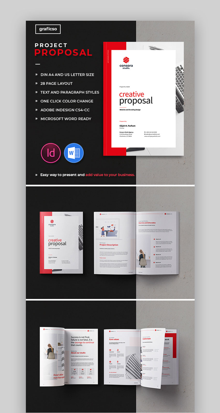


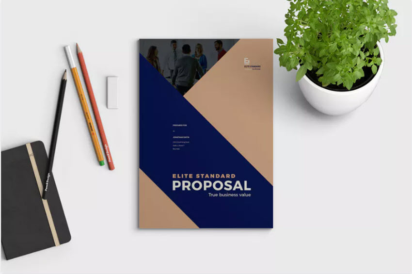


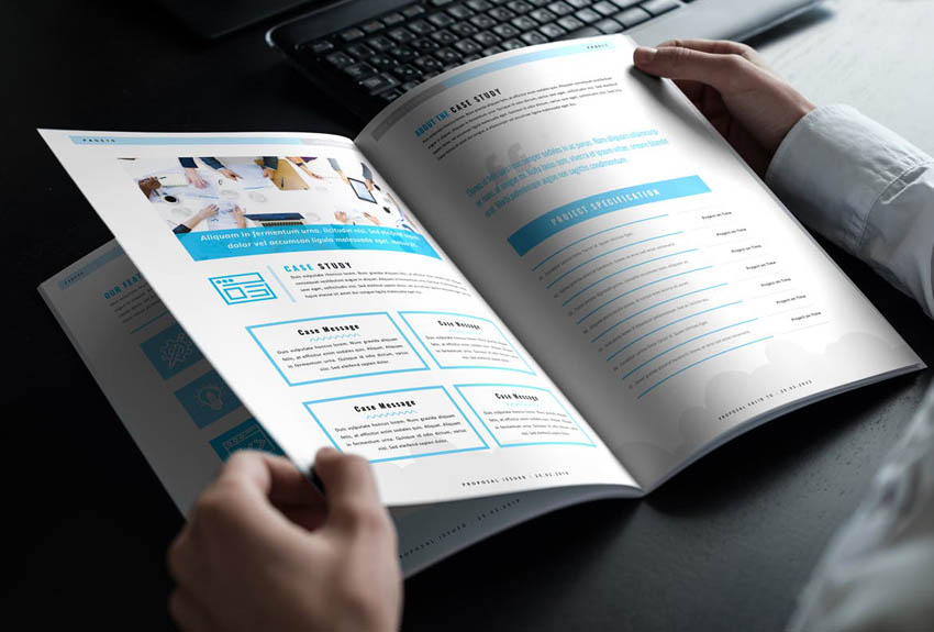


 Brochure25 Best Pamphlet Templates (Tri-Fold Brochures, Bi-Fold, and More!)Melody Nieves
 Branding25 Best Company Marketing & Sales Brochure Templates (Design Examples 2020)Tomas Laurinavicius
 Branding20+ Corporate Brand Identity Packages With Creative Designs for 2020Sean Hodge


 TemplatesHow to Make an InDesign Presentation TemplateLaura Keung
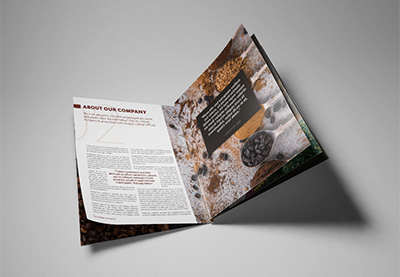 InDesign TemplatesHow to Make a Booklet in InDesignLaura Keung
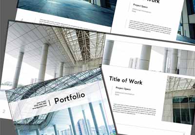 Adobe InDesignHow to Make an Architecture Portfolio Template in InDesignDaisy Ein
 EmailHow to Write an Effective Follow-Up Email After No ResponseLaura Spencer
 EmailHow to Properly Write a Formal Email (That Gets Results)Laura Spencer
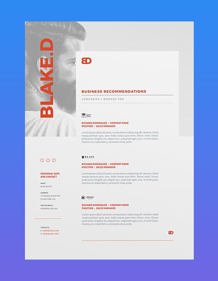


.jpg)
.jpg)
.jpg)
.jpg)
.jpg)


.jpg)
.jpg)
.jpg)
.jpg)
.jpg)
.jpg)
.jpg)
.jpg)
.jpg)
.jpg)
.jpg)
.jpg)
.jpg)
.jpg)
.jpg)


.jpg)


 Project Management25 Great PowerPoint Templates to Use for Change Management Models in PowerPointSarah Joy
 Microsoft PowerPoint25+ Best Free Cartoon PowerPoint Templates With Cute Characters 2020Barni Rajah
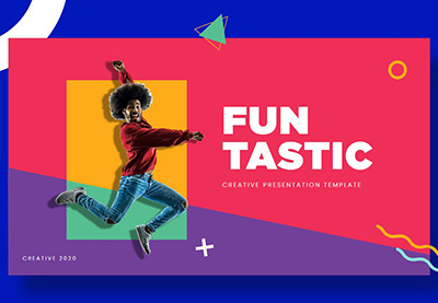


 VideoHow to Create a Display Video from a Powerpoint SlideshowAndrew Childress
 VideoHow to Create a Slideshow Video From a PowerPoint PresentationAndrew Childress
 Microsoft PowerPointHow to Make Infographics in PowerPoint Using Infographic Templates for PowerPointAndrew Childress
 Microsoft PowerPointHow to Work With Images in PowerPoint (Complete PPT Picture Guide)Andrew Childress
 Microsoft PowerPointHow to Make Great PPT Charts & Graphs in Microsoft PowerPointAndrew Childress
.jpg)


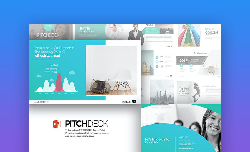


 PitchingThe 10+ PPT Slides Every Investor (Startup) Pitch Deck NeedsAndrew Childress
 Microsoft PowerPointHow to Make Winning Pitch Decks in 2020 (With PowerPoint Templates)Andrew Childress
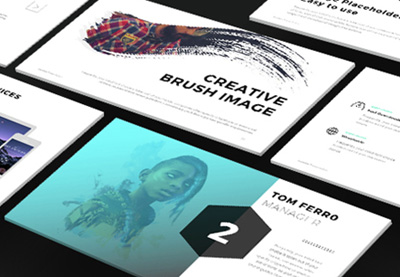 Presentations10 Presentation Design Tips (To Make the Best Pitch Deck in 2020)Sven Lenaerts


 WireframingUX/UI Kits to Speed Up Your Design ProcessEric Karkovack
 Figma21+ Best Premium UI Kits for Adobe XD and FigmaPaula Borowska
 Wireframing17 Must-Have Wireframe Templates and UI Kits for Your Design LibraryBrittany Jezouit
 UI DesignBest-Selling UX and UI Kits for Sketch, Photoshop, Illustrator, XD, and FigmaIan Yates
 FigmaThe Best Free Figma Resources: Templates, Icons, UI Kits, and MoreTomas Laurinavicius


 Fonts20+ Best Free Elegant Fonts (Stylish Fonts to Download)Nona Blackman
 Fonts36 Best Handwriting Fonts (Fonts That Look Like Handwriting)Nona Blackman
 FontsThe Must-Have Fonts for Graphic Designers and Font LoversMary Winkler
 FontsVintage Trend: Best Mid-Century FontsLaura Keung
 Fonts35 Best Calligraphy FontsMelody Nieves
 Fonts29 Best Handwritten FontsMelody Nieves
 Fonts30 Best Stylish Cursive FontsMelody Nieves
 Fonts28 Best Art Deco FontsNona Blackman


 Book CoverHow to Design a Vintage Book CoverGrace Fussell
 Adobe PhotoshopHow to Draw a Line in PhotoshopMonika Zagrobelna
 Photo EffectsHow to Remove a Background in PhotoshopMonika Zagrobelna
 Adobe Photoshop30 Tips & Tricks All Photoshop Users Should KnowAbbey Esparza
 Graphic Design50 Totally Free Lessons in Graphic Design TheoryDanny Outlaw
 Adobe PhotoshopHow to Make Gradients in Photoshop (And More!)Jonathan Lam