Twitter’s Expanded Photo Timeline Comes To The Mac App Along With Refreshed Design

Screen Shot 2013-12-12 at 12.38.48 PM

Twitter’s Mac app, once thought dead and gone, got an update today to bring it in line with the web and mobile apps in a few ways. The new expanded photo timeline makes an appearance, as does a new tweet detail view, refreshed profiles and an overall design bump.

The photo timeline will be the most immediately evident change in the new Twitter for Mac, though there have been design updates throughout the app. Any photos using Twitter’s own photo sharing service will show up in large preview form, just like they do on mobile. This actually works quite a bit better on desktop than it does on mobile, as there is more screen real-estate to play with. The photos jump out at you, and do still reduce information density — but that’s probably just fine for the majority of Twitter users that likely don’t use it as a personal news ticker.

You can toggle the expanded images off in the Mac app, just as you can with the iOS app. This option does not exist on the web client.

The new Twitter for Mac also gets a refreshed icon, which was much needed as the old one was a point-of-least-resistance update of the old one.

Screen Shot 2013-12-12 at 12.12.55 PM

The updated iconography continues throughout the app, with the new DM icon making an appearance as well. There’s a new profile view which displays photo headers now, too. Twitter for Mac also gains support for viewing, though not creating custom timelines. Alas, there is no support for photos in DMs, a feature Twitter just rolled out this week.

The tweet detail view now has a numerical representation of retweets and favorites, as well as a visual representation of the avatars that interacted with it. You’ll also get the conversation happening around a tweet in this new view.

Screen Shot 2013-12-12 at 12.17.12 PM

The detail view is fairly information rich, which is good, but when you enter a conversation, the view presents the last tweet you clicked on as the top one, with no indicator that there might be some above it. I get that this is an attempt to place you at the point in the conversation where you’re ‘reading’, but it makes it hard to see that there is more to it, especially if you’re reading a reply sent hours after the conversation.

Screen Shot 2013-12-12 at 12.24.33 PM

The web view, for instance, places it in the center of a reply stream, with size indicating that it’s the current tweet. As it stands, the convo view loads fairly slowly, and makes you scroll immediately to reveal the full discussion. As we’re on a desktop, I’d love to see all of the white space used to present you with the whole conversation at once.

There also seems to be something weird going on with the scrolling physics in Twitter for Mac. It doesn’t accelerate or coast as long as it should and it feels a bit too resistant.

Other than that, the update looks to be a nice one that continues to give users of the Mac something to be thankful for. There was plenty of reason to think that Twitter would not continue to update its native app for the Mac, and instead rely on the web version completely. That wasn’t true, thankfully, and we’re seeing Twitter continue to iterate on it — which is great. I’d hate to see them forgo the desktop completely, and today’s update looks like a pretty nice indication that they’re not doing that yet.

Image Credit: Garrett Heath

Google-Backed Email Privacy Petition Gets 100K Signatures, But Will It Work?

we_the_people

Google put its significant digital soapbox behind an official White House petition on privacy, reaching the difficult 100,000 signature threshold today. Google, along with a host of civil liberty groups, hopes it will pressure the administration into back legislation to require a warrant for email spying (“ECPA reform“).

Given the White House’s history addressing tech-related issues on its petition platform, there’s a decent chance it could actually influence law. Or, as the White House often does, completely ignore the request.

Here’s how both scenarios could shake out.

Oh, You Got Me Signatures. That…Was…So, Um…Nice

4200769247_4b3969d0fa_z

It’s helpful to think of WeThePeople, the official White House Petition platform, as an extension of the press corps. With enough signatures (currently 100K), the unwashed masses get to ask officials a question in public. Just like a question from the press, it can be completely dodged, but, on occasion, could lead to meaningful reform.

So, for instance, when a bazillion netizens successfully gathered enough petitions for their time-honored goal of legalizing pot, the administration pretty much parroted Obama’s response to the same question: “Thanks young people for electing me, but no, I’m not legalizing pot.” Or, more officially, they cut and pasted Obama’s answer from a Barbara Walters interview.

In fact, in the beginning, administrators dodged petition requests so often, it eventually had to respond to this gem with the following: ”Actually take these petitions seriously instead of just using them as an excuse to pretend you are listening.”

The White House often treats its signature process like an ugly Christmas sweater — a completely uninvited gift that is reluctantly acknowledged and then promptly buried in a back closet somewhere.

The Petition Process Has Given Geeks Great Power

WeThePeople is a deliciously subversive tool in one regard: it gives the administration cover when it actually wants to change a law. For instance, it’s unlikely that a high-profile, politics-obsessed White House press corps reporter would use his opportunity to ask President Obama about a ban on unlocking cellphones.

Turns out, however, the issue is super popular among America’s geeks, both inside and outside the White House. So, when a successful WeThePeople petition on the topic came across the administration’s desk, it declared, for the first time, its support for changing a regulation to allow consumers to take their cellphones across different wireless carriers. Thanks to the petition, the Federal Communications Commission will likely legalize cellphone unlocking today.

The wonderfully geeky coup was repeated when the administration announced a whopping $100 million for opening public access to federally funded science research.

Perhaps many of these geek changes were never made because it’s never been popular with the mainstream press. In fact, the White House press corps is so tech-averse, it didn’t even bother to ask Obama any questions about National Security Agency spying, at a conference specifically for NSA questions.

WeThePeople gives geeks a voice.

To ECPA Or Not To ECPA

Electronic Communications Privacy Act reform is a borderline geeky issue: it relates to changing a 1986 law, which was written before email was stored in the cloud. The issue was given a shot of public pressure adrenaline after the FBI spied on General David Petraeus’ saucy email messages to his mistress.

Attorney General Eric Holder has already tentatively agreed to support requiring a warrant to spy on emails, so there’s a convenient stew of public press and official support brewing for change.

There’s no timeline when the administration has to answer the petition. In all likelihood, it will wait until President Obama’s task force on NSA surveillance gives its recommendations. Then, just maybe, Obama will stand atop the Google-backed WeThePeople petition to announce his support for email spying reform.

[Ugly sweater image via Flickr.]

Ad Tech Startup TellApart Hits $100 Million Revenue Run Rate

tellapart

TellApart may not be a household name, but if you spend time shopping (or window shopping) online, you have probably come across its technology. The Burlingame, California-based startup helps online retailers precisely target relevant ads to customers based on in-depth user data — so if you’ve ever clicked on an ad for a pair of shoes that seem like they were made for you, TellApart may very well have been responsible.

TellApart, which drove nearly 1 percent of all Cyber Monday e-commerce in the United States this year, is powered by some serious technology. And it turns out that it has also been making some serious money in the process.

TellApart is now operating at a revenue run rate of $100 million per year, according to CEO and co-founder Josh McFarland. The company, which was founded back in 2009, now has 50 employees and has comfortably profitable operations. In fact, TellApart hasn’t raised outside funding since its $11 million Series B round back in June 2011.

It’s an impressive performance, particularly at a time when it sometimes seems like the words “startup” and “revenue-generating” hardly ever appear together — let alone “profit.” So it was a pleasure to have McFarland stop by TechCrunch headquarters to talk about hitting this milestone and the lessons learned along the way. He was accompanied by James Slavet, the Greylock partner who has worked with TellApart since McFarland and his co-founder Mark Ayzenshtat started working on the concept as Greylock entrepreneurs-in-residence.

Watch the video embedded above to hear about how TellApart’s technology sets it apart from others in the field, how McFarland avoided the trap of becoming an “entrepreneur-in-reticence” in the early days of TellApart, the importance of the VC-founder relationship, and more.

Contextual Lockscreen Cover Hits Google Play Boasting Less Battery Drain And 100 More Upgrades

Cover_AvailableOnGooglePlay

Cover is bringing its situation-aware lockscreen to more Android users today after its beta test launch six weeks ago. It’s now available in the Google Play store to Android 4.1+ users in the US, Canada, and Europe. Cover’s 100 new improvements include cutting down battery drain and being better at detecting if you’re in your car, at home or at work so it puts the right apps on your lockscreen.

“The big question I had personally was whether users would understand the concept of the lockscreen” Cover founder Todd Jackson tells me about what he’s learned from its thousands of beta testers since October. “Turns out they do. We were specifically focused on building a lockscreen rather than a launcher. They like the flexibility of being able to use Cover with other launchers.”

Steamrolling over a user’s existing customization was sticking point that hurt Facebook Home’s early adoption. By acting as an interaction layer that floats on top of a user’s Android homescreen, Cover has found people more willing to adapt to how it radically alters their lockscreen.

horizontal_graphic

Covering The Bases

Check out my launch story on Cover for the full-rundown of how it works.

To recap, though, Cover can recognize when you’re at home, work, or in you car, and shows you the apps that fit that situation. The suggestions are based on crowdsourced data at first, like that people often use Dropbox at work and Netflix at home, but Cover learns what you use in these situations too and adapts its lockscreen shortcuts. Cover’s Peek feature lets you quickly look inside your apps, and its fast-app switching drop-down menu makes it a breeze to bounce back and forth between maps, messaging, or what have you.

You can watch our quick Cover demo and my interview with Jackson in the video player below.

To get people to surrender the most visible part of their phone to Cover, it had to make some improvements. “Cover is a different app than most apps. Most you just forget about” Jackson tells me, noting there’s little risk to one more download. “Cover? You either love it, or you hate it and you uninstall it. When you’re building an app that replaces a core aspect of their phone, the quality bar is really high” says Jackson.

That’s why Cover used the Android’s beta system. Jackson admits it wasn’t perfect, as it created friction to downloading Cover on its big launch day. Some users griped about having to use Google+, or never visited their G+ profile so they missed their invitation to download Cover once it was their turn. But the app just wouldn’t have been ready for prime time without the detailed feedback and bug reports the Android beta testers offered.

App Switch TutorialCover discovered that the number #1 thing people cared about was battery life. Jackson explains, “The beta helped us learn what are people’s thresholds. For most people, if Cover is responsible for more than 5% of their battery usage, they’ll uninstall it, so we worked really hard to get it under 5%.”

Other improvements include more accurate motion sensing algorithms for detecting you’re in your car, KitKat compatability, more stable app peeking and switch, new tutorials for how to use app switching and operate Cover with pincode security turned on, more customization, and the ability to share your Cover set up to Facebook/Twitter/Google+.

Another frequently requested feature was the recommendations of apps other people use at home, work, in the car, or with their headphones plugged in. That validates a big potential business model for Cover in app discovery. It could potentially charge other developers to have Cover suggest their app. That could create a route for Cover to make good on the $1.7 million it raised from investors including First Round Capital courtesy of Josh Kopelman, Harrison Metal, Capital, Max Levchin, and Keith Rabois.

Plenty Of Android Pie To Go Around

Now that it’s publicly available, Cover can test its might versus other lockscreens like Aviate, Facebook Home, Widdit, and more. With time, it might take on a whole additional weightclass of competitors. Jackson says “A lot of users are actually asking us to build a launcher” which would pit Cover against GO Launcher, Nova LauncherEverything.me, and others.

But Jackson is convinced there will be enough users for everyone. “It will be an interesting space to watch the next few years as Android gets better and the phones get better, appealing to a higher market. The Android pie itself is growing really huge. People are just starting to realize they can customize their phone. I think a handful of the startups you mention are all going to do really well.”

Cover and many of these launchers and lockscreens are shockingly different interfaces than people are used to. People fear what they don’t understand, creating a barrier to adoption. But we all need to come to grips with the fact that screen after screen of app folders may not be the best way to organize a phone.

There’s a swirling sea of apps out there. The next wave of mobile won’t be about adding more, but using context to help us navigate between them.

Download Cover for free from Google Play

Lifesum Is Taking Its Playbook Straight From Spotify — And A Few Of Its Executives

lifesum

Swedish health and fitness app ShapeUp Club has been quietly building its user base over the last couple of years. Indeed, it’s almost as if it has been taking its playbook from that other noted Swedish success story of recent years: Spotify. By concentrating on the local Nordic markets it knows well, the startup has been able to build its product largely outside of a bigger market like the U.S., just as Spotify did, prior to its U.S. launch. Then again, this is perhaps not unexpected – it’s rapidly amassing a battle group of former Spotify executives, for one. But this week its vision is to become more fully realised with a name change to Lifesum and a restated vision to take on the world of ‘wellbeing’ apps which aim to do more than simply help you lose weight.

Founded under the name ShapeUp Club in 2008, the health app and platform has achieved over 4.8 million registered downloads and 500,000 monthly active users in Scandinavia, Germany, Austria, and Switzerland.

As Tove Westlund and Martin Wählby, founders of Lifesum, said in an email to users: “Earlier this summer we felt that we needed a fresh name to reflect our ambition – to support and encourage you in every aspect of your wellbeing – being so much more than just a weight-loss app. Also, as more users across Europe join in using the app, we wanted there to be no confusion about what it does.”

They say current active members are shedding an average of 13lbs (6 kilograms) in 3 months. And the startup has also been on a hiring spree.

Susanne Stage, previously lead product designer at Spotify, has joined as lead designer; Björn Fant, marketing director, joins from Videoplaza; Phillipe Casorla Sagot becomes lead iOS developer from Saborstudio in Costa Rica; Tome Cvitan is now senior software engineer.

In May 2013 Henrik Torstensson, former Head of Premium Sales with Spotify, and Marcus Gners, former Vice President of Business Development at Stardoll, joined as CEO and Deputy CEO respectively.

What we have here then is a fast growing startup that has gone from 5 to 19 people in a year without external financing, which suggests that their paid-for business model – where pay to access premium features of the app – may well be working.

No More Private Foursquare Check-ins? No Problem. Pins For iPhone Lets You Save & Share Your Favorite Places

pins-app

Foursquare did away with private check-ins this week, finally ending support for what had been, for a long time, one of the service’s most-neglected features: the ability to privately track places you’ve visited for personal use. Today, a new iOS app simply called Pins is offering an alternative with the debut of a service that lets you collect, organize and optionally share lists of places you want to remember.

This is not the first time something like this has been tried, which means even for a small app like Pins, it faces a lot of competition. Everplaces, PinDrop, Drawer, and even to some extent Pinterest, with its new “Place” pins, have been working to make collections of places easy to create, track and share.

But Pins has a few features that make it stand out. For starters, when you build your collections of places in its app – like, “favorite sushi spots,” “best art galleries,” “date night go-to’s,” “restaurants to try,” etc. – you can hashtag each pin, which allows you to add the venue to multiple lists on the fly. For instance, a great Italian place might get an “Italian” hashtag, while it’s also added to another list of favorite downtown restaurants.

Your friends can then follow these color-coded hashtags, unless you’ve made your pins private. In addition, you can allow anyone to follow your lists by making your pins public, instead of just friends-only.

The app also offers a nifty trick with Pins’ support for “picture pins.” This process makes it easier to create pins, by importing photos from your iPhone’s Camera Roll. Another option pulls in your check-ins from Facebook. You can now view a venue’s Yelp page, check-in on Facebook from a pin, and soon, check-in on Foursquare, too.

The app has a clever interface which is easy to understand and use, but we did encounter some bugs in testing – it would crash upon loading up large contact lists, for example, so you may not want to switch on the friend matching function just yet. (For what it’s worth, LinkedIn’s Contacts app has never been able to process my contacts list, either. I should probably clean it up.) The syncing process involving Pins’ Facebook integration was slow as well. And until all these background functions complete you can’t jump into using Pins, which is a problem.

In other words, your mileage may vary here.

Pins was created by fellow ShopKeep employees. CEO Jonathan Bensamoun has since left the POS maker, while Pins’ CTO is, um, still there.

Though the app is live on the iOS App Store, they’re staging the rollout to help them manage server load. TechCrunch readers can use the link http://pinsapp.co/techcrunch to move the head of the line.

The company has a small amount of get-off-the-ground angel funding from Yair Goldfinger (ICQ) and Adam Neumann (WeWork).

Yahoo’s Bad Week Continues: Flickr Crashed Today, Too

flickr-down1

Wow, Yahoo just can’t catch a break. Yahoo’s photo-sharing service Flickr went down this morning, in a brief outage that appears to have started around 11 AM ET, lasting for over an hour. The first report of the site’s issues were posted to Twitter around 11 AM ET, but the velocity of tweets kicked in just after noon, which indicates the site may not have been fully down for everyone.

It seems that Flickr.com had been failing to load for users. The message that was returned was “inactivity timeout.” The text on the site read: “Description: Too much time has passed without sending any data for document.”

Screen Shot 2013-12-12 at 12.40.25 PM

Other users are reporting seeing a cuter error message with a picture of a Panda on a leash. One “flickr down” report came in just a few minutes ago (12:52 PM ET), sharing this photo, so it’s unclear if the outage is only partially resolved. And another showed up at 1:11 PM ET.

(Didn’t Yahoo acqui-hire a bunch of engineers to fix things like this?)

The site has come back up, at least for some, but it’s unknown what caused the problem, how widespread it was, or whether it’s been fully resolved for all affected users.

This has been a bad week for Yahoo. Yesterday we reported on Yahoo Mail’s ongoing outages, and its overwhelmed customer service staff dealing with the numerous requests to reactivate websites that small business owners never wanted shut down. Yahoo’s public response has been minimal. No big mea culpa from Yahoo, and finally after press reports detailing the issues, a few basic tweets and posts which acknowledged the issue and that fixes were in the works.

A reblogged post on Marissa Mayer’s Tumblr falsely claimed “Yahoo Mail Restored.” That is not the case, as the Yahoo Mail Status page still reads:

“Some users may still have trouble accessing their accounts but we are working through the night on this and will post again in the morning Pacific Time with the latest updates.”

As for what’s going on with Flickr, we’ve reached out to Yahoo for more information. Though notably, the company declined to respond to our inquires from yesterday, only posting tweets and posts for us to interpret instead.

Teaching api handling with Flickr api while Flicker is down is not a lot of fun

— ntlk.gif (@ntlk) December 12, 2013

More here on Storify.

Update: A slight glitch – Yahoo didn’t see our email inquiries today because they were sent to deprecated email addresses for press/PR. (Which don’t bounce but don’t route correctly, apparently). We’ve since resent them to the proper main Yahoo account, as of 2:10 PM ET. We will wait for Yahoo’s response and update when and if provided

Drink Discovery App Elixr Scores Investment From David Karp, Gets Fresh Redesign And Android App

Screen Shot 2013-12-12 at 9.39.10 AM

The social drink finding and collection app Elixr gets a fresh redesign for iOS 7 today, launches and Android version and adds a bunch of features to an already very fun app. The app and service also score an investment from Tumblr founder David Karp.

I’ve been an Elixr user for some time and find it enjoyable and engaging. It’s essentially a mashup of Foursquare and Instagram, with a focus on detailed images and impressions of alcoholic drinks and beers at a given location. You’re encouraged to snap a photo and then rate your drink and give some details about the establishment. When I originally spoke to Jeff Rock and Marc LaFountain of Mobelux about the app earlier this year, they said that the guiding question behind the app’s creation was ‘why can’t I just open an app that tells me where to get a good drink?’

Today’s release marks the first major redesign of the app, with a full on iOS 7 look, and a bunch of new features. The new design is fresh and crisp, with a very nice little image editor blended into the capture process, along with the standard filter set. IMG_3991

The overall interface of the app has now been massaged to make Elixr a much more social affair, with interlinking sections like a list of drink ‘to-do’s’ that you can add by simply tapping a button as you scroll through your timeline.  You’ve also now got a section to enter the bartender that made your drink, as well as rating the quality and enjoyment of the drink. Elixr now pairs the fun of sharing an image of a drink — and getting the associated ‘likes’ and comments — with a truly useful network for those that like to enjoy a good tipple.

IMG_3080

Even if you don’t follow anyone, the search feature of the app will now pinpoint great drinks and venues for you based on the checkins of others. This is what I found so interesting about Foursquare’s ‘pivot’ of sorts earlier this year when it refocused on becoming a discovery network instead of a check-in game. With this update, Elixr becomes a good resource for drink fans, not just a place to tip others off to what you’re enjoying.

Other new features include private check-ins — something Foursquare itself is pulling back from, but still allows via its API — member notifications and a better nearby view that will show you watering holes where you are.

IMG_3079

Jeff Rock of Mobelux says that focusing on discovery, search and utility in this release was part of their primary goal of helping people find stuff at local venues.

“It’s much easier to find the best venues nearby fast, including what they’re good at. We analyze the drink menus of those bars and restaurants that were created by user check-ins and give them a rating of ‘good’ or great’,” Rock told us. “That way if you love beer and your friend likes wine you could find a place that’s “good for wine, great for beer” in the Nearby tab. There was also a lot of work in making Elixr all-around more useful with a built-in to-do list, better chronological check-in history and an easier to use interface.”

IMG_3076The app also launches on Android today, as well as the refreshed iOS 7 update, so you can get your cross-platform sip on. As a part of this launch, Elixr is also firing up the Discovery Series, which talks to drink makers in various towns about their menus and techniques. One more way to build out the sense of community in the app.

I spoke to LaFountain, who was previously VP of support at Tumblr, about how the Karp investment came about and he gave us the backstory.

“It was my first visit with the Tumblr crew since I left Tumblr in October of 2012. It was great to see everyone. The first night of my visit, I met David and his girlfriend Rachel for dinner at a restaurant near their home.”

The restaurant was Auroroa, which LaFountain recommends. This was just as Karp was coming out of the Yahoo acquisition of Tumblr news cycle, but he still showed interest in what the pair’s plans were for Elixr. He quizzed LaFountain about the app and offered some insights, and then volunteered an offer to invest.

“David explained that he wanted to use his good fortune with Tumblr to help some of the people that he knows achieve their dreams,” LaFountain says. “That’s so David! A group of us then went on the roof of his apartment building to fly a remote-controlled drone around Williamsburg and the East River. It was my first drone experience and it was pretty fascinating to watch.”

Karp ended up keeping his word and making the investment and has offered product input. LaFountain says that it’s nice to continue to ‘work with him in a way.’

Kik Hits 100M Users, Adding New Ones At A Rate Of 200K Per Day

kik

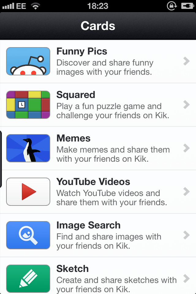
The messaging wars are in full swing, and Waterloo-based Kik is still seeing tremendous positive growth despite trailing its rival WhatsApp in terms of total userbase size. The company revealed today that it has just passed 100 million registered users, having added 70 million of those since this time last year. The startup also launched Cards, its HTML5-based in-app content sharing system this time last year, and engagement on those apps-within-an-app has been promising, too, according to Kik founder and CEO Ted Livingston.

“For us, growth gets a really big bump over Thanksgiving, which is a combination of new devices and people being in a new social sphere and sharing their passion for Kik,” he explained, pointing to factors that have helped them reach this milestone. “It’s hard to know what exactly is prompting growth. I wouldn’t say there’s anyone coming to Kik just for Cards and not for the messaging platform, but what it does do is provide a way for people to look at it and say ‘Look at all the fun things I can do with Kik that I can’t do with any other messaging apps.”

As for Cards, they’ve seen around 145 million installs on peoples’ devices, and over 85 percent of those come from shares, meaning that people are installing Cards because they’ve received them from friends and found them interesting. One Card, called Costume Party, managed to reach 1 million users in just 22 hours, so you start to see how this could become a platform for message-based networking in the same way that Facebook evolved over time as a development target.

Cards are a strong component of Kik’s continued success, but there are still a lot of challenges on the horizon. For instance, Twitter appears to be doing more with Direct Messages on its platform, and now allows people to send photos using it. It seems like it could be only a matter of time before they make their own cards available via their private messaging network, too, which would end up being remarkably similar to Kik’s Cards. Kik’s implementation is much more like full-fledged apps, however, and Livingston says the most surprising thing about it has been that people often note how seamless the Cards are, and how they feel like native experiences, instead of web apps.

WhatsApp has 350 million monthly users, as of October, so Kik still has a long way to go to catch up. But with Cards, it’s investing heavily in its platform play, and that appears to be paying dividends.

Highlight Raises $4 Million From DFJ, Releases Version 2.0 Of Its Location-Based Social Networking App

highlight 20

Location-based social startup Highlight has just released a new version of its app, aimed at being smarter about the connections it shows, while also giving users more context about what those connections have been up to. The company also has raised $4 million in new funding led by Draper Fisher Jurvetson.

Highlight was founded around the time of the social-local-mobile (SoLoMo) boom of early 2012. Along with startups like Sonar and Glancee, the company promised to “highlight” interesting people nearby, thanks to a combination of GPS location data, and persistent identity through Facebook connect, and the ability to know a whole lot about your interests and relationships you share on social networks.

That boom went bust, and Highlight is more or less the last player standing in what used to be a pretty crowded market. Not only is it still around, but the company is growing thanks to a new $4 million Series A Round led by DFJ, with participation from existing investors Benchmark and Crunchfund, along with new investors such as Greycroft, Semil Shah, and Dave Morin’s Slow Ventures.

highlight profile

As part of the funding, new DFJ managing director Bubba Murarka will join Highlight’s board. It’s notable in part because this is the first investment for Murarka, who was head of Facebook’s Android team and led the development of Facebook Home. So he knows a thing or two about mobile.

Highight 2.0

Anyway, along with the funding, Highlight is also releasing version 2.0 of its app. The really big news is that Highlight has a new icon, one that’s not as likely to blind you if you happen to glance at it the wrong way. Beyond that, though, it’s also done a lot of work to make the app more visually appealing, and a lot more powerful under the hood.

What’s most notable when you open up Highlight is that it has a new, two-column layout with staggered images to showcase the people who happen to be nearby. That’s a big departure from the text-heavy Highlight from days of yore.

The app also has been re-architected to be smarter about the connections that it shows or notifies you about. CEO Paul Davison admits that the early app needed to reduce the number of connections it highlighted, in part because mutual connections wandering by happens far more often than most people expect.

Now, based on the location information that it has about users, it can pinpoint interesting connections that you’re unlikely to know about. For instance, when traveling, it’ll let you know when a friend happens to be in the same city. Or, it can alert users when a couple of friends are hanging out together nearby on a Saturday.

Understanding that some connections are stronger than others, and that different times of day and different places matter, is just part of how Highlight is doing a better job of filtering out weak signals that people don’t really care about.

The app has also gotten smarter about knowing what you’re doing and where you are. It knows, for instance, if users are walking, biking, or traveling in a car, based on how fast they’re moving. One of the cool — if a little bit creepy — features that it added this time around is a map which plots connections nearby and allows you to even see your connections moving, and which direction they’re going.

Another creepy but cool thing it can show you is what music your connections are listening to on their headphones, either through iTunes or Facebook-connected services like Spotify or Rdio.

With the latest update to the app, Highlight has also enabled users to see updates from those that they haven’t connected with in a while. Those updates are brought in from moments shared in Highlight, as well as those that users have posted on other networks, like Twitter and Instagram.

highlight map

That will allow you to catch up on what people have been up to, before you catch up with them in person. According to Davison, this could give users something to talk about or catch up on. Updates appear over a users profile image, and can be clicked directly into from the home screen.

The other big area of focus was battery life, something which Highlight has been slammed on in the past. To deal with this, the company has worked hard to optimize the amount of drain the app causes when it’s not actively being used.

According to the company, the new app is five times more energy efficient than the earlier version. On average, it uses less than 1 percent of battery life per hour when a phone is in standby mode.

The Future Is Now?

Will that ultimately lead to more adoption?

If nothing else, Davison has been steadfast in his belief that all of the location and personal information that our phones know about us will one day lead to some sort of egalitarian utopia where they’ll let us know when there’s someone to have an interesting conversation with nearby.

From the moment I met him almost two years ago until now, he’s maintained faith that the future is coming and that Highlight is just the earliest implementation of what that future will be like.

In fact, given the wide array of new sensors and gadgets that have popped up since then — including a growing number of quantified self devices and smarter technology like Apple’s M7 chip in existing devices — Davison imagines a world where apps like Highlight will have even more data to draw on.

In other words, the future is here. It might just take us some time to catch up to it.

IFTTT Launches iOS Location Channel With Integrations For Foursquare, Twitter, Instagram And Facebook

ifttt-location

Today, IFTTT announces the addition of an iOS Location channel to its ‘Internet glue’ service. The channel will allow users to specify an ‘area’ that will allow them to trigger actions and recipes based on when they enter or leave that area.

Think, for instance, of setting up an IFTTT recipe that allows you to send a DM automatically to your loved one when you arrive at at a travel destination. Or one that allows you to zip a circle around your neighborhood and alert you when one of your friends checks in on Foursquare nearby.

I spoke with IFTTT CEO Linden Tibbets and Director of Mobile Devin Foley about the updates to the app. Foley mentions that he set up a ‘dance party’ recipe to trigger his Phillips Hue lights to color cycle when he gets close to his house, a fun way to let his son know that dad is home. Tibbets notes a recent wedding that he attended where he set up an area alert that pulled in all public Instagram photos shot during the event and dropped them into his Dropbox — creating a photographic archive of the event that he could then share with the group.

IMG_3025

The new location channel can be built on directly, or can be accessed via the Instagram, Facebook, Foursquare or Twitter channels. These are the initial offerings, but location will be built into more channels as time goes on. You can create an area of interest with a clever zoom-able interface that improves on Apple’s geo-fencing tool in my opinion. You can then choose to make the recipe trigger on entrance, on exit or both from that area.

This initial location release is all about these definable ‘areas’, rather than pinpoint locations, though that could come in the future.

IFTTT Recipe: Post On Facebook When You Get Home

Obviously, location is one of the big pillars of iOS signals. Along with the previously announced Photos, Contacts and Reminders channels, you can now trigger and complete recipes based on many core iOS services. IFTTT is essentially an easy to use programming guide that lets you do things with your phone that Apple will likely never enable, or that companies with a vested interest in protecting their graph will never allow.

There are a few other updates in this release of IFTTT as well. You can now tap the heart icon on any Recipe page to add it to your favorites. Other users will be able to see this list of favorites to see which recipes you like. You can set up your profile in the app as well as on the web and share recipes on mobile too. These updates are designed, says Tibbets, to foster a sense of community inside IFTTT, and to encourage people to create and share recipes. If you’re seeing feedback from other users that are getting value out of your recipes, you’re more likely to want to create more.

IFTTT has also launched a new search feature that allows you to find Channels by name, which is good because the list is getting pretty extensive and it’s getting tougher to find just the one you need in a big scrollable list.

In other good news, IFTTT is also finally ready to talk about an Android version of its app. Basically, just to say that work on it is officially underway. They’re not giving any ETAs but at least we know it’s on its way now.

One other thing that IFTTT is working on, but not ready to announce is the platform that we talked about when Twitter triggers came back to the service in August. This will allow apps and services to construct their own channels, instead of IFTTT making them all themselves. It’s a super smart idea, because it lets outsiders build the building blocks that are then in turn used to build recipes. So we’ll keep our eyes peeled for that to arrive as well.

IFTTT also tells us that it’s got someone dedicated to building out its hardware channels, which have multiplied to encompass the Jawbone Up, a bunch of Wemo hardware and, of course, the Phillips Hue. The way in which IFTTT could serve as the glue to connect things like Hue, Lockitron, Nest, Wemo and other personal choices into a true connected home is intriguing. Tibbets notes that people tend to purchase these kinds of devices by taste, rather than by holistic system — so making a way to connect and control them all seems like a good thing.

IFTTT is a service that allows users to define a trigger (a new RSS feed item, a new Instagram photo) and an action (tweet it for me, put it in my Dropbox) to form a recipe that can be used and shared. Tibbets says that they’re “building a general tool that you get value out of when you use it with, other services,” and I think that’s an apt description. Being a neutral third party places IFTTT in an interesting and potentially very powerful position that could let it be a communication layer that sits between the various siloes of data and services hoarded by the major Internet companies.

LinkedIn Refreshes Its Inbox With Message Previews And A Simpler Interface To Keep Users Around Longer

linkedin-inbox-details-view

LinkedIn, the social network for the professional world, has been going through a overhaul of every aspect of its platform. Today, it’s the turn of the inbox, which is picking up new features such as better navigation and better preview information. In a way, it’s LinkedIn’s personal contribution to this week’s trend among social platforms like Twitter and Instagram to revisit their messaging services.

LinkedIn says the new inbox is getting rolled out globally starting today.

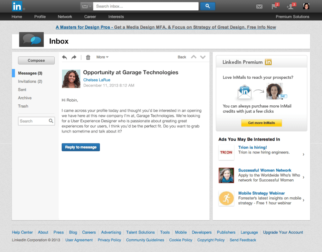
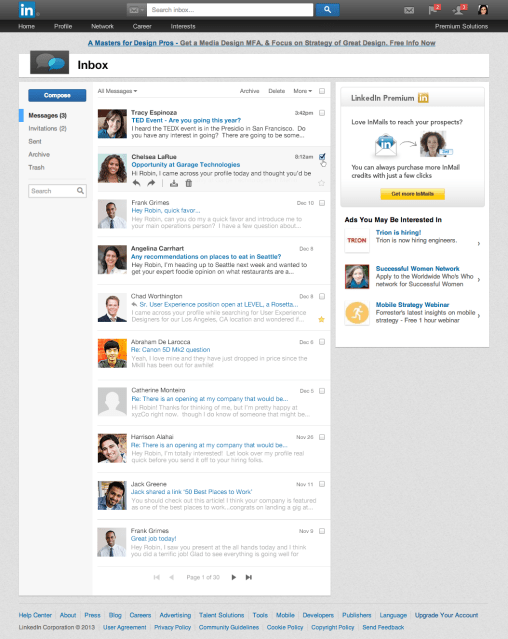
linkedin-inbox-list-viewMost importantly, the new inbox will give users previews — both of messages themselves and of the people who are sending them: when you hover over someone’s name in a list, their basic details pop up, along with an option to connect if you are not already in a common network. That string of information is carried through to when you open a message: you get more biographical context now about who is reaching out to you — especially important if it’s a “cold email” from someone who is not in your network already.

The other very key difference is that inbox navigation tabs have been pared down by quite a bit: you now get a condensed list on the left side of the panel with messages, invitations, sent, archive and trash folders. In the past, messages and invitations were split with tabs both at the top of the column and on the left, meaning you had two sets of navigation buttons along the X- and Y- axes. The right side and top banner, as with other LinkedIn pages, are reserved for advertisements. LinkedIn tells me that it has no plans to expand those ads for the moment.

Here’s what the page looked like before today’s changes:

LinkedIn Inbox_before

As with many of the updates that LinkedIn has made to its homepage, mobile app and other services, the changes to the inbox are well overdue, and in some regards table stakes for LinkedIn specifically.

They come at a time when all social networks are zeroing in on better capabilities for people to speak directly to each other, and not just on wide-open platforms. LinkedIn was built with direct messaging from the start; and in a way, you could argue that its focus on professional users and specific requests (for example, around jobs and work) means that channel is even more necessary than it is in a consumer network.

The end result of improving the inbox experience are two-fold. The first is that it will mean that users potentially use it more, and potentially for more than just short follow ups but deeper conversations. (That’s a parallel ambition shared by other social networks like Facebook, with its own messaging platform.) You can see how, if people did use it more, then LinkedIn could start to potentially charge for certain aspects of its messaging service — similar to how it does for other parts of LinkedIn.

The other potential benefit is that more time spent in the inbox will contribute to the bigger effort that LinkedIn is making to boost engagement — time spent on the site is a crucial aspect of how it will be able to grow its ad revenues. (Remember that there are ads in the inbox, and in messages you open while you are there.)

G-Whiz

G-Whiz

Like a lot of other smartphones announced in 2013, the Moto G is technologically boring. But dismissing Motorola’s latest handset for its lack of headline-grabbing features would be a mistake — particularly given its truly awesome price.


Tick Toq

Tick Toq

Wearables are supposed to be the next frontier for mobile. But as far as smartwatches go, that future is definitely not here yet. And that’s OK. At least Qualcomm, the latest entrant to the space, isn’t deluded enough to think its latest offering, the Toq, is a mass market device.