Social Store – Pay with Action in Social Network (Social Networking)

With “Social Store” has a store of digital products that can be purchased with actions in different social networks.

You’ll be able to create categories to better organize products.

You can see a demo online in: http://www.koyllur.com/socialstore/demo

The Administrator Area in: http://www.koyllur.com/socialstore/demo/ss-admin

User: [email protected]

Password: 123456

Download Social Store – Pay with Action in Social Network (Social Networking)

23 Sliders – Mega Pack (Sliders)

23 Sliders – Mega Pack contains 23 different sliders build with latest CSS3 techniques, some plugins are ready for mobile with swipe support, very flexible, easy to setup and extremely customizable.

Top Features:

  • Fixed & Responsive Sliders
  • Full Screen Sliders
  • Video Support
  • Google Maps
  • Swipe Support
  • Animation Effects
  • Next & Previous Buttons
  • 3D Effects
  • Clean Code & Well Organized
  • Easy To Customize
  • Extensive Documentation
  • 24/7 Support
  • And Much More…

3D Slider:

\

It is a slider with 3D effects. It also has captions at the bottom in which you can put the description about your slide or any custom message you want. The captions can be removed if the user doesn’t want them. 3D slider has 2 ways for navigation you can navigate to any slide using the bottom navigation and you can slide through the next and previous slides using the navigation provided on the left and right side of slider.

Animated Sliders:

\

Animated Bottom Caption Slider

It is a simple slider which contains a Caption at the bottom of every slide. There are different transition effects on this slides. All the slides can have the same transition effects or if you want every slide to have a different transition effect then it is also possible.

Product Slider

It is an animated slider that can be used to display both the image and content on the same slide with sliding animations. This is a responsive slider and it will work seamlessly on any mobile or tablet device. This slider can display custom shape thumbnails which can be used for navigation. It also has the standard left and right arrows for navigation.

Responsive Layer Slider

It is a slider which can have animated layers in a single slide. The angle and transitions of the layers can be customized and there can be many layers in a single slide. This slider is responsive and the animations work flawlessly on any device. The navigation on the left and right side of the screen can also be customized according to the user requirements.

Text Animated Slider

It is a slider with text animations over the images. The slider has navigation at the bottom right corner but this can be changed to any position as per user needs. The slider can only have images in background and text can be animated over it. The position and the speed of the text transitions can be modified to fit the user needs.

Touch Slider

It is a multi-content slider with bottom navigation, you can also use swipe to slide through slides. This slider works on the user touch and is very ideal for mobile and responsive websites. The Shape and size of the slider can be customized to meet the user requirements. This is a multi-content slider and it can be used to display images, text, videos, etc.

Bottom Thumbnail Slider:

\

Bottom Thumbnail Slider

It is a slider with thumbnails at the bottom of the slider for navigation. User can navigate by clicking on the thumbnails If they want or navigation arrows are also provided at left and right side. The Navigation and the size of the thumbnails can be customized as per the user requirements.

Bottom Thumbnail with Caption Slider

It is a simple slider with Bottom Thumbnails for navigation but the unique thing about this slider is that the bottom thumbnails has captions on it. This captions on the bottom thumbnail have bouncy transition effects. The slider and the bottom thumbnail has different navigation arrows and the slider also has a thumbnail navigation. The icons of the navigation can be customized to meet the user requirement.

Unique Shape Slider

It is a slider which has a unique shape. This shape of the slider can be changed to other different shapes like oval, circle, octagon, etc. This slider will only be compatible in browsers that support CSS3. Old browser compatibility is not there. It has bottom thumbnails for navigation and the size of this can be changed. Navigation arrows can also be provided on the left and right side if required.

Bottom Tooltip Navigation Slider:

\

Bottom Tool tip Slider

It is an animated image and text slider with navigation at the bottom. The unique thing about this slider is that the bottom navigation has a tool tip which displays the thumbnail of the slide. Size of the navigation icons can be customized according to the user needs.

Multi Content Slider with Tool Tip Navigation

It is a multi content slider with bottom tool tip navigation. As it is a multi content slider you can have text, images, videos, etc. in this slider. The size and color of the slider can be customized to meet the user requirements. The number of the slides can also be customized. It also has a loading animation at the top right corner. The transition time of the slides can also be increased or decreased.

Vertical Slider with Bottom Tooltip

It is an image and text slider but the navigation and slide transition is vertical. It also has a bottom navigation with thumbnail tool tips. The size of this tool tips can be customized. The bottom navigation can also be removed if the user doesn’t require that. The top and bottom navigation can also be customized according to the user requirements.

Grid Slider:

It is a trendy slider which is similar to the latest Metro UI of Windows. This slider can be used to display multiple items at the same time and on user click or hover the state of the displayed item can be changed. This is a multi-content slider and can be used to display text, videos, images, maps, etc. The size of the tiles and their orientation can be customized according to the user requirements.

Image Slider:

Fullscreen Background Slider

It is a Fullscreen Slider that works at in the background of your website. If you want to have a image slide show in your website at the background then this slider is perfect for you. It has navigation at the center bottom of the website but this can be customized or removed as per the user request.

Multi Image Slider

It is a simple image slider that can be used to display multiple images at the same time. It is a responsive slider so it will adapt to the screen size of the device automatically. The slider displays fixed number of images at any time and then user can slide across the other images using the navigation arrows present on the left and right sides. We can also provide hover effects on this images.

Multi Image Vertical Slider

It is a vertical image slider that can be used to display multiple images at the same time. It is a responsive slider so it will adapt to the screen size of the device automatically. The slider displays fixed number of images at any time and then user can slide across the other images using the navigation arrows present on the top and bottom.

Responsive Image Slider with Bottom Navigation

It is an image slider which has navigation at the bottom center of the slider. The slider can be navigated from the bottom navigation and from the left and right arrows. It is a responsive slider so it will adapt to the screen size of the device. The bottom navigation and navigation arrows can be customized according to the user requirements.

Simple Image Slider with Navigation

It is a general purpose image slider which can be used only for images. Images of any size and dimension can be used. The navigation is present on the left and right sides. The size of the slider can be customized to fit the user requirements. You can place it on any part of your website. This slider can also be re-sized to be placed in a sidebar or as a footer widget.

Simple Tab Slider:

Horizontal Tab Slider

It is a horizontal slider with tabs for navigation. Horizontal Tab Slider is a auto play slider so the slides keep on rotating automatically. The navigation is on the hover effects of the tabs and it can be changed to user click also. It is a multi-content slider and any type of content like text, videos, images, etc can be used. The speed of the auto rotation and size of the tabs can be increased or decreased according to the user requirement.

Tab Slider with Navigation

It is a simple slider with Captions for every slide displayed as Tabs. This slider has two way navigation, you can easily navigate through slides by clicking on the tabs. This slider also has navigation arrows on the left and right side using which the user can navigate in that direction. It is a multi-content slider which can support any type of content like text, images, videos, etc. The orientation of the tabs can also be customized according to the user requirements.

Vertical Tab Slider

It is a vertical slider with tabs for navigation. Vertical Tab slider is a auto play slider so the slides keep on rotating automatically. The navigation is on the hover effects of the tabs and it can be changed to user click also. It is a multi-content slider and any type of content like text, videos, images, etc can be used. The speed of the auto rotation and tab sizes can be increased or decreased according to the user requirement.

Top Thumbnail Slider:

Top Thumbnail Image slider

It is an image slider with thumbnail of images at the top. The navigation is based on the thumbnails and displays the picture when a thumbnail is clicked. This can also be customized to auto play the images. This is a responsive slider and it will adapt to the screen size of the device it is displayed on.

Top Thumbnail Image slider with Navigation

It is an image slider with thumbnail of images at the top for navigation. It has a two way navigation, one is on the thumbnails which on click displays the picture and the second is the navigation arrows present on the left and right side. This is a responsive slider and it will adapt to the screen size of the device it is displayed on.

Please Note: Demo Pages & Images are just used for Preview Purpose Only they are not part of the plugin and NOT included in the final purchase files.

Documentation / Support

The item documentation is extensive and the source code is properly commented and formatted, so you should not have any problem working with this item.

If you need support, please send me an email using this contact form. Please include the plugin name, plugin URL and detailed information about your problem. I usually respond to support requests within 24 hours on weekdays, depending on the number of requests in queue.

Download 23 Sliders – Mega Pack (Sliders)

WP Bundle Flash Video Players – YouTube/Vimeo/MP4 (Media)

\

\
\


It contains 3 different flash video players with YouTube/VIMEO/Self-Hosted videos (FLV/MP4) and even MP3 support

THE BUNDLE INCLUDES:

\ Video Player WordPress Plugin – YouTube/FLV/H264 (it has both right-side and bottom playlist)- $25 value
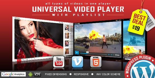
 find out more

\ Vimeo Video Player WordPress Plugin with Playlist – $19 value find out more


DON’T MISS THE NEW HTML5 UNIVERSAL PLAYER

\

Download WP Bundle Flash Video Players – YouTube/Vimeo/MP4 (Media)

Responsive Bootstrap Unified Photo Gallery Pro (Images and Media)

READY TO USE RESPONSIVE UNIFIED GALLERY PLUGIN

JUST A PLUGIN EASY TO USE AND CONFIGURE

FEATURES

  • Ready to use on bootstrap/non-bootstrap website
  • Fully Responsive on all screens; Desktop, Tablet, Mobile
  • One Code for all devices and platforms
  • Horizontal/Vertical Gallery
  • Change number of divisions
  • Add any event to the gallery
  • Configure Look 100%. Configure it to as you want.
  • More Features will be added soon. Enjoy Free Updates after buying

Searching for new feature. Please make us know we will update it.

Initial Release

Download Responsive Bootstrap Unified Photo Gallery Pro (Images and Media)

Advanced Animated Portfolio LayersWP Extension (Add-ons)

Advanced Animated Portfolio LayersWP Extension

Advanced Animated Portfolio LayersWP Extension is a WordPress plugin that can be used to create stylish and different types of portfolios within the layersWP framework. This layersWP extension is clubbed with handy features that bring your wordpress complications to the easiest levels. Let’s take a look at its impeccable features!

IMPORTANT: To use this plugin you must have a Layers Theme (or Layers Child Theme) installed on your WordPress site!

Few more cool features:
  • Attractive interface of your portfolio
  • Classy appeal to entire layers wp framework
  • Grid, Masonry, Carousel and more for layouts
  • 5 Hover Effects, 16 types of Pop-Ups
  • Give your style to fonts, paragraph and text color
  • Column Options – 1 to 6 columns to pick up from
  • Boost Portfolio with Widgeted Display
Sources & Credits:

Download Advanced Animated Portfolio LayersWP Extension (Add-ons)

Floating Stickies (Full Applications)

Ideal app to create sticky notes and reminders!!

Floating Stickies allow you to create quick sticky notes. These sticky notes are visible on the screen while using another app. Simple to use and reminds your important tasks or notes.

A sticky note is the best solution to manage important notes and reminders. When you get a new thought or new important task, you can quickly add it using “Floating Stickies” and it will remind you always about that task.

Floating Stickies is a very easy and useful app that lets you keep notes of the things that you keep on forgetting or things that you want to remember. Using “Floating Stickies” you can easily add notes, resize it, minimize it or delete it very easily

Download APK

Features

  • Sticky notes are visible over other apps
  • You can drag sticky notes anywhere on the screen
  • You can resize the note size
  • Can minimize the notes
  • You can edit sticky notes by touching text inside
  • Easily delete the notes when necessary
  • Simple to use
  • Android Studio Compatible

What you get

  • Full Android Source Code With Library
  • Full Document with Screen Shot – It includes detail explanation about rebranding an app and adding new images/category.

Download Floating Stickies (Full Applications)

EF Tabs (Navigation)

EF Tabs is a user-friendly, fully customizable, responsive jQuery tabs plugin to take any HTML content, including images, videos and display it in a clean organised and responsive tabbed navigation. It is easy, flexible, powerful to create professional looking tabs. This plugin features plenty of layouts, powerfull API, CSS transitions and animations, 14 tab styles, 30+ animations, 20 skins, 70+ templates and much more.

EF Tabs

Features

  • 14 Tab Styles
    Effective and Attractive tabs styles.Totally diffrent tab styles with new effects.
  • 20 Color Schemes
    Each color scheme has it’s own css file, that can be easily modified for creation your own colors.
  • 30+ animations
    Smooth and beautiful effects based on CSS3: flip, scale, fade, rotate and 8 slide effects.
  • Responsive Design
    A fully responsive layout that adapts perfectly for all device resolutions like mobiles, tablets and desktops.
  • Any Content
    You can use any HTML elements inside tabs content: text, images, video, forms, map etc.
  • Steps
    Allows you to disable regular tabs and use them like steps or wizard.
  • Typography Set
    Includes headings, paragraphs, images, unordered and ordered lists.
  • Grid System
    Fully responsive, utilizes 12 fluid columns and supports offsets.
  • 360+ Icons
    Includes beautiful iconic font Font Awesome, created by Dave Gandy.
  • 70+ Useful Examples
    You can use these examples as a base for creation your own tabs simple and fast.
  • Retina Support
    Optimized to support the high quality and crisp graphics on retina screens.
  • HTML5 and CSS3
    Take full advantage of modern web technologies. Semantic HTML markup and standards compliant CSS.
  • Cross-Browser
    Tested on Windows (Chrome, Firefox, Opera, IE10), Mac (Safari, Chrome, Firefox, Opera), iOS (iPhone, iPad) and Android.
  • Documentation
    Extensive step-by-step guide to help you with usage and customization.
  • Lifetime Support
    To get support please send me an email through the contact form on our profile page.
  • Free Updates
    Products get maintained with improvements and bug fixes.
  • Unique Design
    Tabs design is unique and follows the latest trends.

Icon and font Credits

Image Credits

Demo preview images are from pixabay. Live preview images are NOT included in the pack.

JQuery plugin

Tab Inspiration

Note: Live preview images are NOT included in the pack.

Download EF Tabs (Navigation)

MD AweContent – Page Builder for Drupal (Drupal)

Proudly presented by Megadrupal, MD AWEcontent is the most powerful and complete drag-and-drop page builder tool that offers responsive layout. MD AWEcontent features a set of tools for creating advanced layouts with rows and columns, building content and managing your content with front-end content creator. Easily build pages with any theme and without touching a line of code. Break the boundary and explore the imagination of making stunning websites in the smartest way possible ever.

Check out demo here with user demo, pass demo

Awecontent - Drupal page builder

Drag and Drop builder

Intuitive page creation interface with drag and drop objects capabilities for easy organization, no coding skills needed.

Design Any Layout in Minutes

Building complex and custom layout for any pages without coding knowledge.

15 Objects available

No more weird errors with shortcodes. AweContent will take care of that. 15 built-in objects so you can easily create amazing pages within few minutes.

Custom appear animate

AweContent uses Built-in animated effects (expand in, fade in, fly in, spin in and turn in)

Support Drupal blocks

All available Drupal blocks (in Structure > Blocks) are included such as: Recent comment, Search form, User login, Syndicate, Who’s new, etc

Save time with Section/Page template

Saving sections and templates to use for the next time without spending time creating again

Work with any content type

Yes, you can create nodes for any content types with MD Awecontent even custom content types

Use with any themes

You are building a Blog theme, a Portfolio or an Ecommerce site, etc. Don’t worry MD AWEcontent works with any themes.

Responsive design options

Fully responsive layout that scales to fit any screen size from a narrow smartphone to a large desktop screen

Full width and height section

Just one click to enable fullsreen section option.

Parallax Background

Enable a parallax scrolling effect with your background image, it means more interesting effects in the browser.

Video background

Fullcover youtube or vimeo video loop in the background of any section to draw attention for website visitors

Support image style

Different image styles with different thumbnail sizes are available so that you can pick up the most suitable one.

Build your own objects

Add your own objects (shortcodes) easily with built-in import and export tools.

Build your own skins

Roll your own color with built in color picker and even change opacity

Control user permission

Giving additional permissions to individual users who are allowed to use the module functions.

Use Google webfont

600+ Google webfonts are supported to help you to change each and every font on your site

SEO Friendly

Your site will be easily found by search engines because AweContent is fully compatible with all SEO modules.

Download MD AweContent – Page Builder for Drupal (Drupal)

Gym & Fitness HTML 5 Banners – 7 Sizes (Ad Templates)

Seven HTML5 Web banners. Editable with Google web designer. (NF-CC-004)

Very easy to edit and detailed help file is included. Google fonts used.

All the files are included with the download file. ( Icons, Shapes)

This set includes the following 7 sizes

-160×600 -180×150 – 300×250 -300×600 -320×50 -336×280 -728×90

Download Gym & Fitness HTML 5 Banners – 7 Sizes (Ad Templates)

Kazpost shipping method for WooCommerce (Shipping)

This Kazpost shipping method for WooCommerce provides integration with Kazpost and your WooCommerce website. The plugin allows you to set the price by weight. Also, it provides up-to-date package information from Kazpost Tracking service.

Features

  • Easy installation
  • Tracking service
  • Easy to use

Download Kazpost shipping method for WooCommerce (Shipping)

Business & Marketing HTML 5 Banners (Ad Templates)

HTML 5 banners for business & marketing. (NF-CC-003)

Very easy to edit and detailed help file is included. Google fonts used.

All the files are included with the download file. ( Icons, Shapes)

This set includes the following 7 sizes

-160×600 -180×150 – 300×250 -300×600 -320×50 -336×280 -728×90

Download Business & Marketing HTML 5 Banners (Ad Templates)

Multi Purpose HTML5 Banners – Google Web Designer (Ad Templates)

Multi Purpose HTML 5 Banners. (NF-CC-002)

Very easy to edit and detailed help file is included. Google fonts used. PSD Files also included.

All the files are included with the download file. ( Icons, Shapes)

This set includes the following 7 sizes

-160×600 -180×150 – 300×250 -300×600 -320×50 -336×280 -728×90

Download Multi Purpose HTML5 Banners – Google Web Designer (Ad Templates)

Multipurpose Meter – Show Your Availability (Miscellaneous)

Introduction of Multipurpose Meter – Show Your Availability With Update

Admin Access: http://bit.ly/1HI9zpk

Online Documentation: http://bit.ly/1HIa2b9

100% responsive frontend to show your availability with update to your customers. In availability meter you can set the working hours, working days, yearly closing days, timezone and many more. It includes the 2 themes so you can choose any one from backend. You can also change the text as per your business.

Multipurpose Meter - Show Your Availability With Update

Comprehensive Features of Multipurpose Meter – Show Your Availability With Update PHP Script:

  1. 100% Responsive Frontend
  2. Built With PHP
  3. Attractive Countdown Timer
  4. Light Weight
  5. No need to have programming skills to configure script
  6. Calendar to set Closing Dates
  7. ZERO Database Required
  8. Data Stored In XML file
  9. Easy to integrate

Updates:

Version 1.0.0 – 17 August 15

- Published on codecanyon

Customer Appreciations  :) It means a lot:

Awesome Friendly Support

If you have any questions related to this email marketing template, Feel free to email us at [email protected] or via our ThemeForest.com user page contact form to get further information.


Download Multipurpose Meter – Show Your Availability (Miscellaneous)

Responsive Accordion (Navigation)

“Responsive Accordion” is a component ready to use on mobile devices and desktop devices. It’s a fluid component and easy to use. It provides various skins, options and features for data organization. Ready for the Bootstrap Framework.

Responsive Design
“Responsive Accordion” is fluid and is ready for use in desktops, tablets and mobile devices

7 Skins
Is included 7 skins for different behaviors of “Responsive Accordion”. Each skin has his own visual behavior

Cross browser
Support for all major browsers, including touchscreen devices, mobile and desktop devices

Configurable delays
You can easily set the delay time and the time of appearance of accordion’s content

Icons
“Responsive Accordion” supports icons from Font-Awesome. There are over 440 icons available.

jQuery/HTML5
“Responsive Accordion” works pretty good with HTML5 and uses jQuery for extensive compatibility

Bootstrap compatible
“Responsive Accordion” is compatible with the Bootstrap most recent versions

Fully customizable
“Responsive Accordion” is easy to customize, including the skins and color schemes

FREE updates
Updates, bug fixes and improvements without additional cost

Download Responsive Accordion (Navigation)