This article is part of a series on going iPad-only.
If you’re a maker of iPad apps that my readers would be interested in, you can sponsor this site for a week.
I’m going to be quite brief here, because I’m busy, but I wanted to share this with you. One of the most promising aspects of the iPad’s physical form-factor is that it can potentially replace much-loved paper notebooks, which I’ve long used for planning, note-taking, design sketches, and so on.
Previously, the problem with this idea was a lack of stylus input precision, and also the lag that plagues digital drawing tools. Apple Pencil and the iPad Pro solved that part, and so I started to consider whether I could finally go entirely paperless. As it turns out, I can — and I have.
In short, I’m using GoodNotes with an Apple Pencil. You can readily go and learn about the app yourself; my purpose today is just to highlight the features that distinguish it from some of the competition. I’ll state up front that if you require audio capture (including, for example, browsing your notes in sync with recorded audio), you’ll want to try Notability first; GoodNotes doesn’t do audio. That’s not something I need, and I find GoodNotes superior otherwise.
I can’t draw, but pen and paper have always been my tools of choice to assist my thinking process and get away from a computer-like constrained mindset. As it turns out, it wasn’t the digital aspect, but rather just technological limitations that were holding me back. Those limitations are apparently gone now. These days, I honestly prefer using the iPad, Pencil, and GoodNotes for the sort of planning and analysis work I need to do in the course of writing novels.
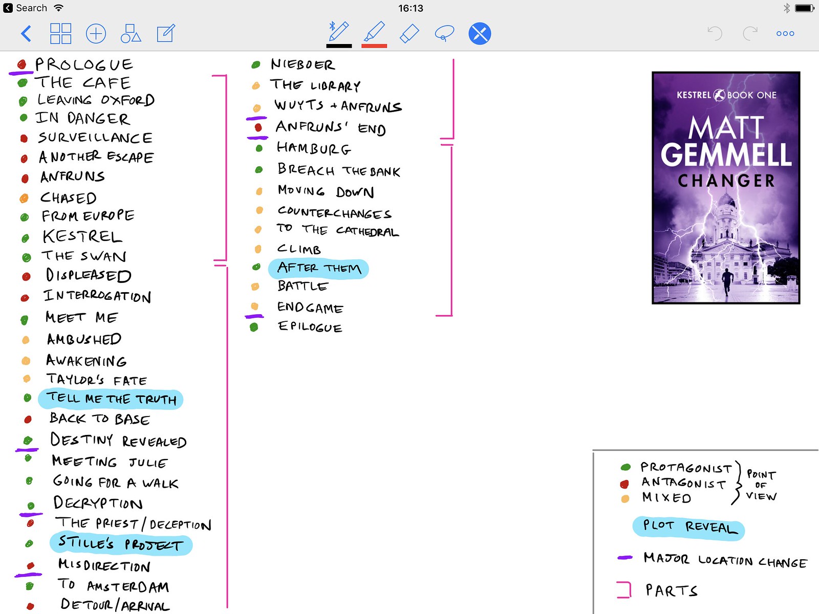
Here’s a quick list of the GoodNotes features I find most powerful. They’re not all unique, but their combination within a single, paper-like app that works well with the Pencil is extremely compelling.
Handwriting recognition
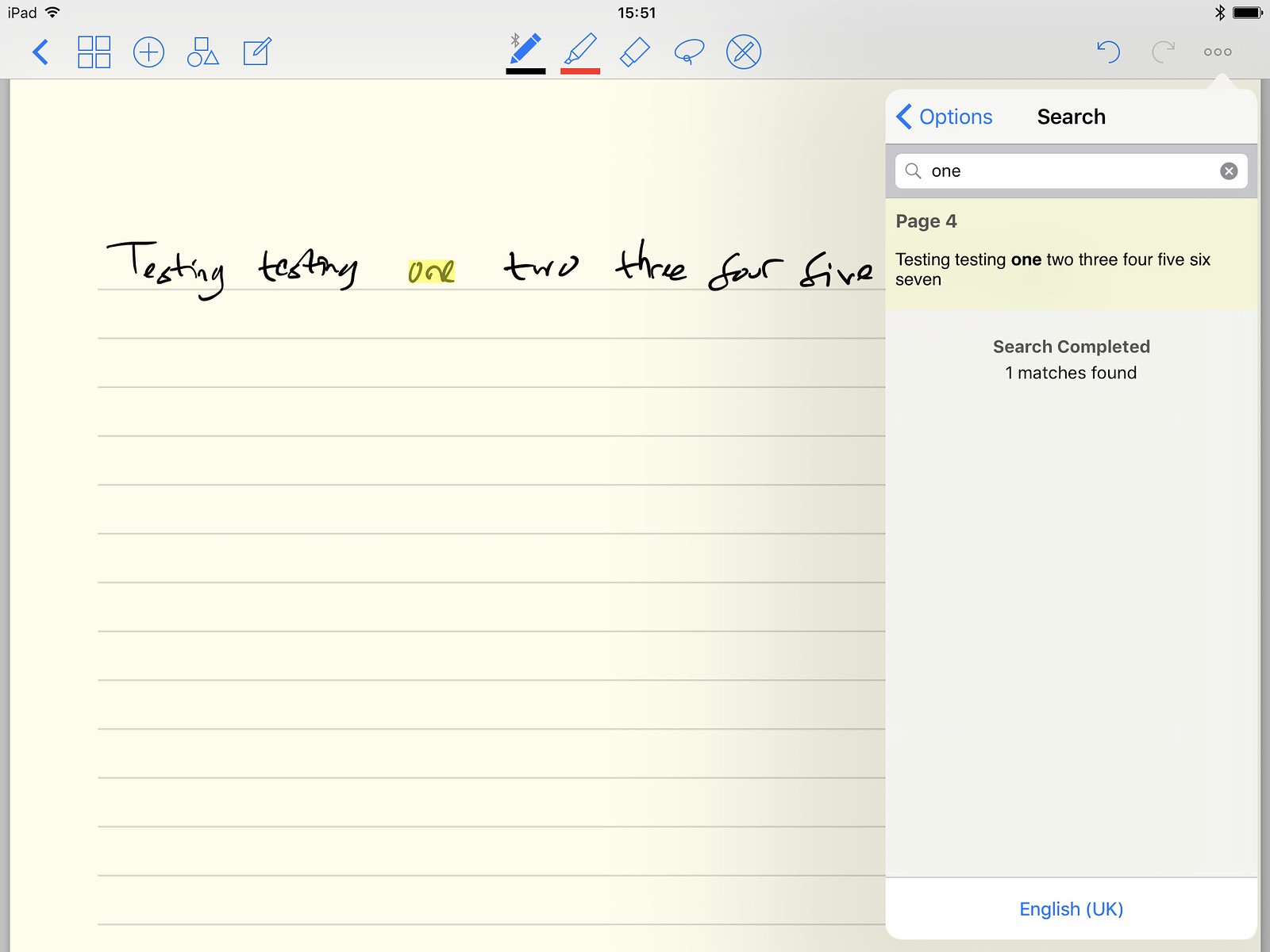
GoodNotes does an alarmingly capable job of recognising handwriting. It also does it in a very unfussy way: you don’t have to tell it to do anything; it just recognises handwriting all the time, and updates its recognised text whenever you edit pages. There’s no separate view or special interface. You just write stuff, and then you can search for it later, complete with on-page highlighting. When you export a PDF, you also get the recognised text embedded in it, so it’s searchable and highlightable there too.
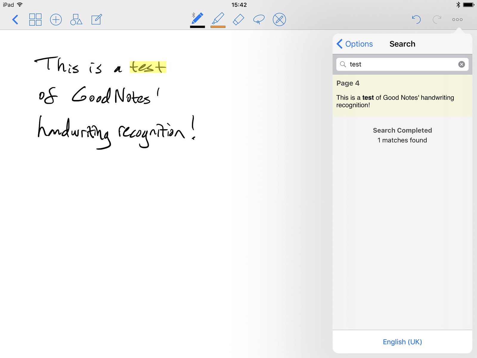
My handwriting is crud, and GoodNotes still manages really well — to the point that I don’t bother entering text via the keyboard at all (which you can readily do, if you prefer, in as many text boxes as you like). I just write, and trust the thing. It’s hard to put a price on that.
Shape snapping
You can toggle a mode (in the main toolbar, anytime) where GoodNotes will turn your wobbly scribbles into straight lines, properly round circles, and regular polygons, just like ClarisWorks used to. It’s great for drawing dividers, boxes, and rules on pages, and it obviates the need for a ruler — software or otherwise. It’s the fourth button from the left on the toolbar; the square/circle/triangle one.
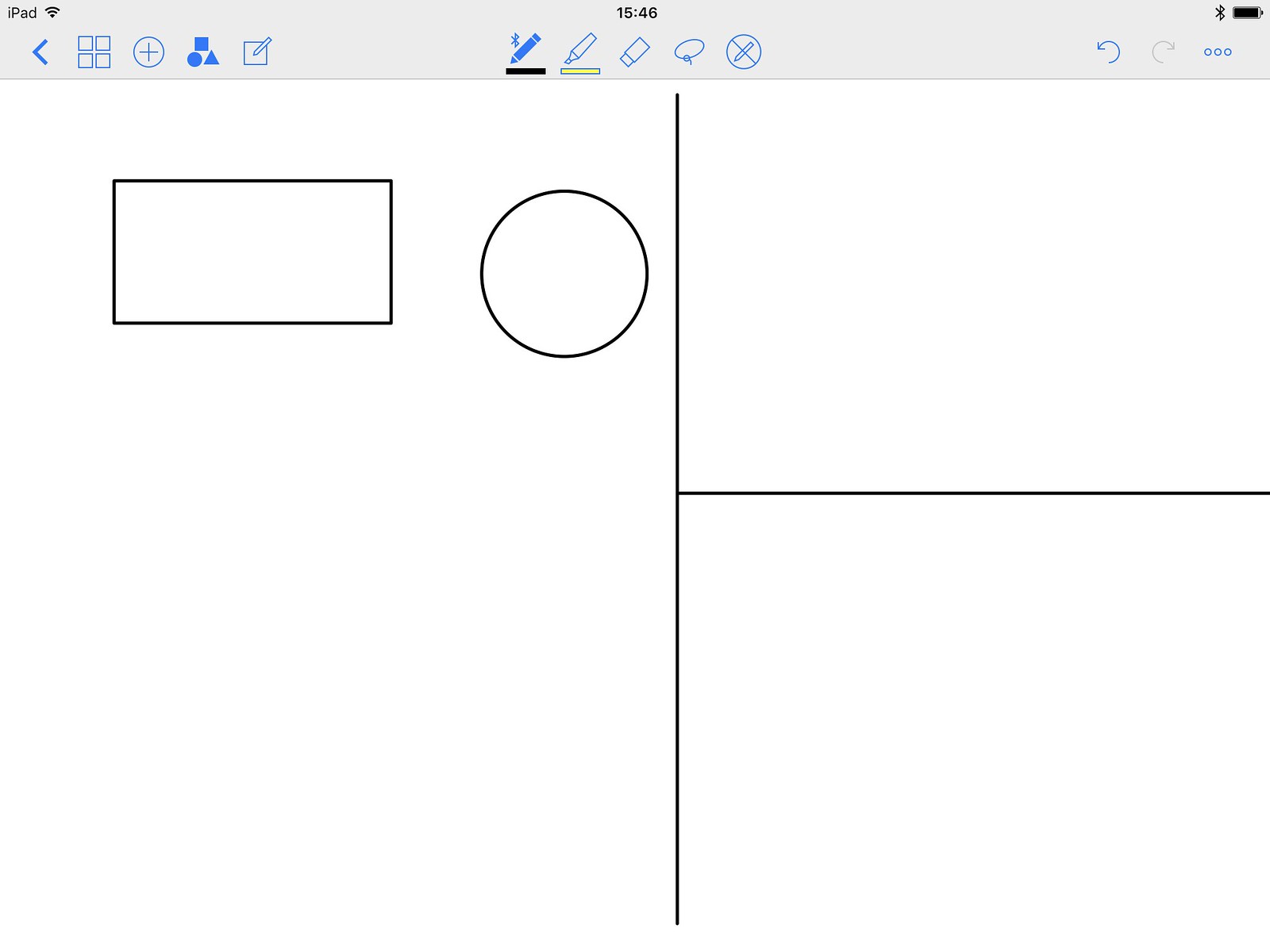
Don’t forget to turn it off again before you start writing or highlighting, otherwise it’ll try to polygon-ify that stuff too.
Whole-stroke erase
GoodNotes has an eraser tool, and you can change the size and shape of it, which is normal enough. The thing, though, is that the app remembers your actual strokes and renders them, rather than laying down pixels in a big flat image. This allows for an incredibly useful feature that makes editing and fixing mistakes a lot easier and faster: optionally erasing entire strokes.
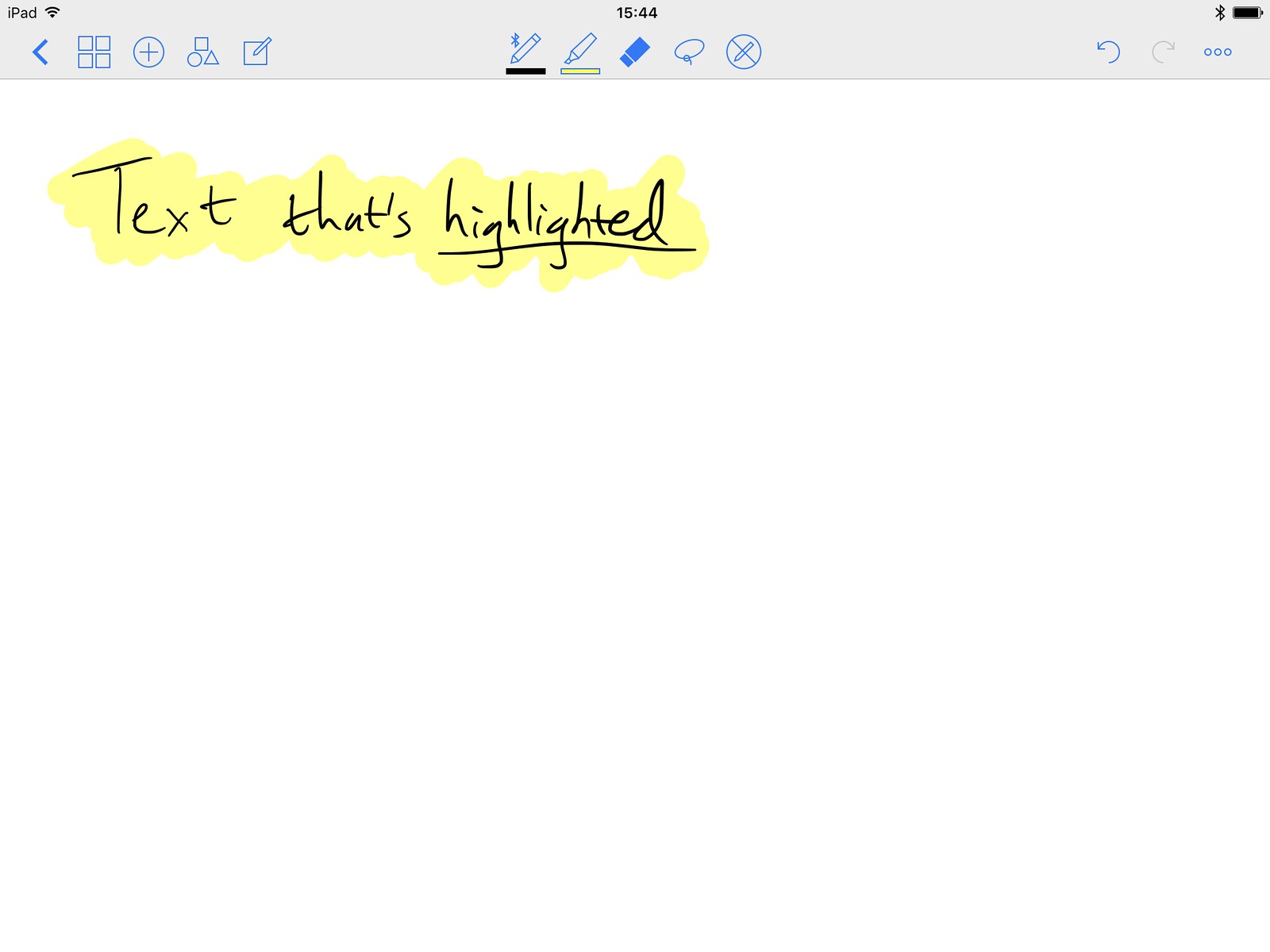
Here’s an example. Say we start with this document, where I’ve written some text and then highlighted it in yellow (GoodNotes puts highlighter behind text, even if you draw it over the top, which is what you’d want).
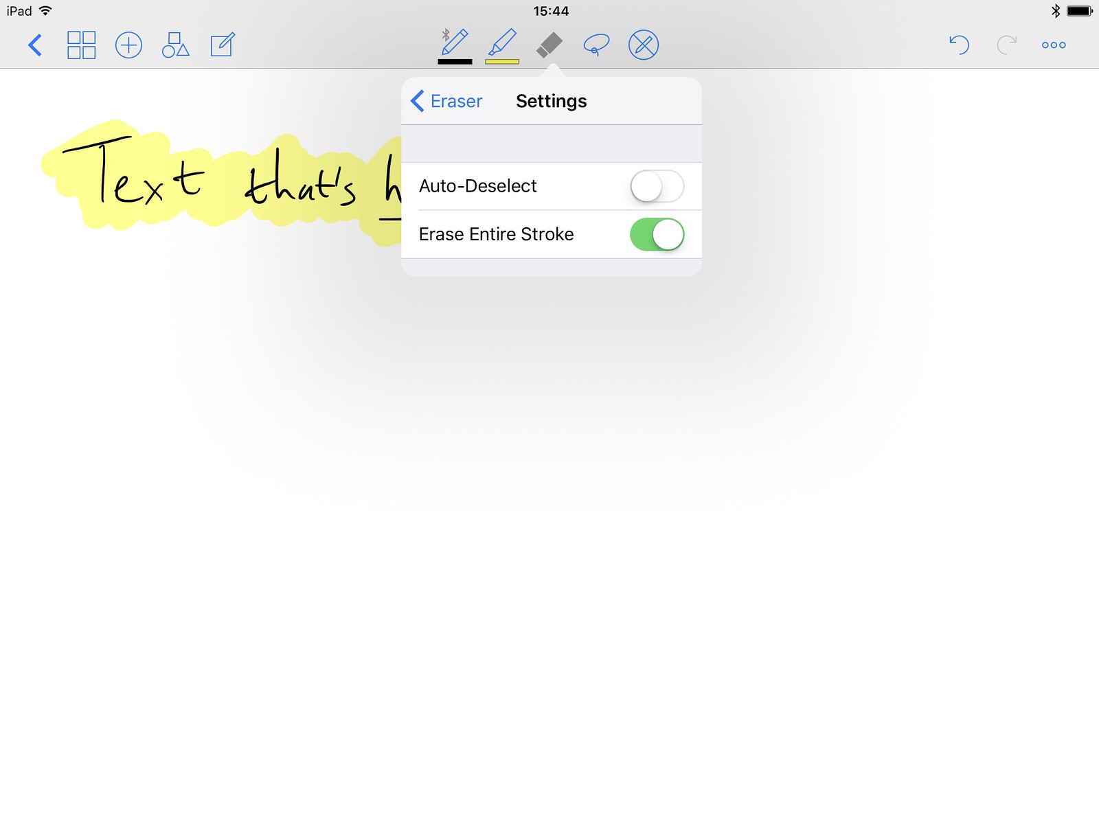
Now let’s say I regret the highlighting. There’s undo and redo support, but say it was a while ago and I don’t want to undo back through everything I’ve done since then. No problem. I can enable the eraser’s optional Erase Entire Stroke mode, shown below.
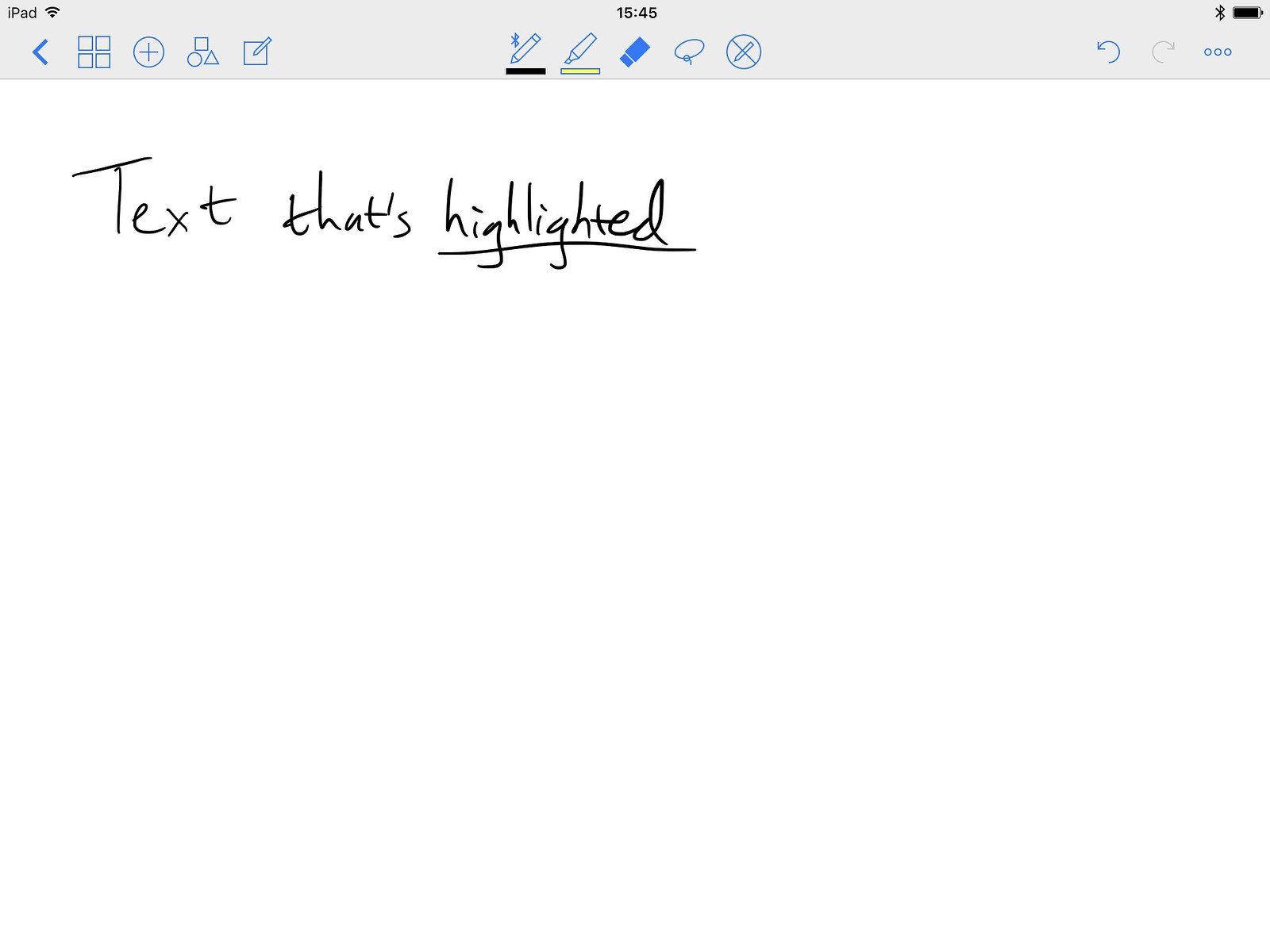
Now, with the eraser tool selected, I can just touch anywhere on the yellow highlight, and (since I drew it in a single stroke), it vanishes without harming the handwritten text that I want to keep. If I’d drawn in multiple strokes, that’s fine too; big chunks would vanish as I touched, and I could just eat away at the highlight tap by tap until it’s gone.
It’s a simple concept, made possible by documents being stroke-based, but it keeps things surprisingly editable while remaining true to the idea of a digital-paper notebook, without any fussy abstractions like layers. It gives me confidence to scribble away, knowing I can tweak things later without needing to just white-out and recreate whole chunks of my work.
Paper templates
In GoodNotes, the primary entity is a notebook, and within each one you have pages. You can open multiple notebooks in tabs, if you like. Each notebook has a cover page which is mostly for cute display purposes in the notebooks browser, and as many content pages as you like — and each page can be different.
You can mix up portrait and landscape, plain and ruled and graph, different colours, planners, meeting minutes, diary templates; whatever. So if you need some lined pages and then a sheet of graph paper, then a plain page, then an A5 writing page, no problem. GoodNotes doesn’t care. The recurrent theme is that it’s a paper notebook, but it doesn’t hesitate to throw away unnecessary limitations of its real-world analogue.
Here are some covers:

And the categories of content-page papers I have at the moment:
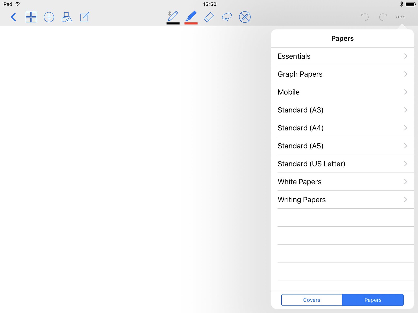
The app includes various cover and content page templates, and there are plenty more you can add yourself from the company’s Dropbox repository (you can do this right on an iPad or iPhone, via your own Dropbox or other document provider). People have also blogged about templates they’ve made, so search the web for those.
You can also make your own paper templates, to fit arbitrary needs. Schematics and blueprints, bullet journals, or anything else you want.
The Zoom Window
As far as I know, this is unique to GoodNotes. You can zoom a page by pinching just as you’d expect, but if your goal is precision of input and editing, you don’t actually need to.
I use a 9.7” iPad Pro rather than the bigger tea-tray version, and even an Apple Pencil isn’t as precise as an actual writing implement, so you’d think I’d struggle to get-looking pages with any kind of visual density. Not so! GoodNotes has an ingenious way of bridging the gulf of precision and paper-size: a piece of user interface and functionality called the Zoom Window.
You can find more info if you scroll down a bit on this page of the GoodNotes user guide, complete with animated GIFs of it in action, but the Zoom Window is essentially a big panel that shows a zoomed view of a given portion of your page. The portion that it corresponds to is up to you; you can move and resize the loupe whenever you wish (which means you have variable zoom factors too). You can also resize and move the Zoom Window itself, giving yourself a big palm rest if you want — though you won’t need it, because GoodNotes’ palm rejection is nigh-perfect in my experience, at least with a Pencil. Here’s how the Zoom Window looks.
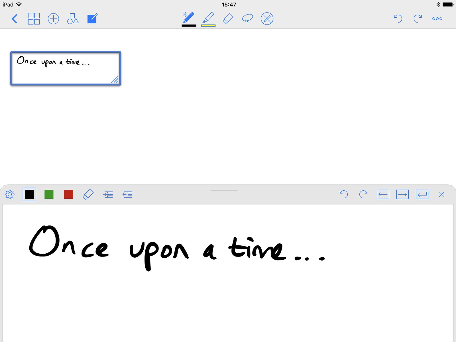
It’s the big pane taking up the lower 45% or so of the screen, just because that’s how I’ve set it up. It’s zoomed into the smaller portion of the page that has a rectangular loupe around it above, as you can hopefully see. It also has duplicates of useful tools from the main toolbar, to keep them within easy reach. You can resize it and/or its loupe to your heart’s content — thus letting you input and edit with arbitrary precision, regardless of the physical size of the iPad’s screen, or the final size that the ink ends up on your page. Pretty damned clever. Oh, and if you’re mirroring GoodNotes to a projector or external screen (it can do that too), all the UI is hidden, so you can draw away in comfort and your audience will just see the page itself.
So far, so fab — but it does another thing that’s really clever too: the Zoom Window can optionally work kind of like a typewriter carriage. As you write in the Zoom Window, it can auto-advance the loupe on the page, even wrapping to new lines when necessary (GoodNotes’ paper templates can specify a line-height, which is how it knows how to do this). You basically just write across the leftmost 75% of the Zoom Window, and it shows a blue wraparound box on the left, then you lift your finger or stylus and move back to the left and just keep writing. GoodNotes takes care of putting the ink onto the page in continuous lines. This lets you write large amounts of text on lines, while zoomed, without ever having to pan around manually. Have a think about that.
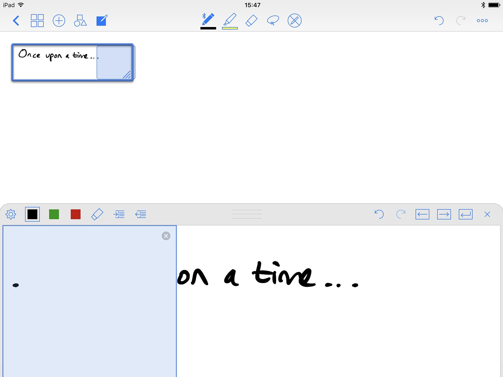
In the image above, the blue box within the Zoom Window is the wrapped-around area; it means that I can continue writing in the blue area of the Zoom Window, and the ink will go into the blue area of the loupe above. It’ll continuously track where I am, and let me just keep writing across the same left-to-right portion of the Zoom Window, without ever scrolling or panning, and my input will magically proceed across lines and then down the page to the next line, and so forth. Fancy.
Bye, paper
GoodNotes does a hell of a lot more than the stuff I’ve listed above, but those are the features that grab me most, and make me most grateful for the app. It’s magic notebook tech, and turns the iPad into the big Moleskine that trees couldn’t provide.
If you love pen and paper but would really like to go fully digital, or just want a reason to buy an Apple Pencil, you should probably check it out.