Earlier this week, Apple announced and previewed iOS 7. As widely expected, it sports a new interface aesthetic characterised by strong, simple lines, areas filled with flat or gradient colours, and a lack of ornamentation.
I’d like to discuss some aspects of the new UI style here, in comparison to iOS 6.
The only surprise for me was that others were surprised. This is an aesthetic change that has been on its way for quite some time; I even wrote about it more than a year ago, where I described it as Augmented Paper.
Whilst much of the rest of the industry has moved to a less embellished UI style (admittedly partly just for differentiation’s sake), iOS remained firmly rooted in the practice of clearly delineating sections of each screen, using pseudo-3D visual effects like gloss and shadows, and mimicking physical affordances.
The thing is, we’ve grown up. We don’t require hand-holding to tell us what to click or tap. Interactivity is a matter of invitation, and physical cues are only one specific type. iOS 7 is an iOS for a more mature consumer, who understands that digital surfaces are interactive, and who doesn’t want anything getting in the way of their content.
The basic functionality hasn’t changed. You still use iOS in the same way, and almost everything is where you expect it to be. The same gestures work. There are a few differences here and there – it’s a major new version of the OS, after all – but the changes are mostly aesthetic. You won’t be confused by iOS 7 if you’re accustomed to a previous version.
You will, however, probably find that it feels more fluid, responsive and modern.
Colours vs borders
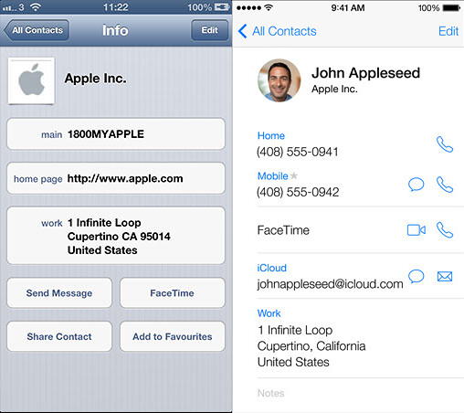
iOS 7 may work the same way, but it looks very different. The changes are summarised effectively by comparing the Contacts app in iOS 6 and 7, when viewing a contact’s information.
iOS 7 forgoes borders, instead relying on colour to indicate interactivity, and dividers to organise information. Controls are implicit, based on labels or icons, positioning, and having visual ‘energy’ via a theme colour (which differs from app to app: it’s blue in Contacts and most other apps, red in Music, and yellow in Notes). Icons are elemental and presented as outlines, and there seems to be a trend towards omitting headings from screens within a hierarchy.
Legibility and calmness is the order of the day, seemingly heavily inspired by Windows Phone, which is like a foreground-to-background colour-swap of iOS 7. Some people are complaining about the slender default typeface (you can thicken it if you choose, and even boost the point-size globally for apps that support the feature), but Retina Displays ensure that everything is sharp and readable.
Clarity, of course, can’t be added – it must be the result of removal. For iOS 7, the vestigial appendage was faux depth.
Flatness
iOS 7 isn’t flat. There are subtle shadows, lighting effects, gradients, and even new (rather gratuitous and distracting, in my opinion – and thankfully optional) parallax effects. It’s more flat, certainly, but not two-dimensional.
Apple doesn’t design things by having a goal like “let’s make it flat”. That’s a bizarre concept, because flatness in itself doesn’t have a corresponding rationale regarding user experience. Flatness may be a visual treatment that provides a certain desirable quality, but it’s not an end in itself.
The relevant goal in this case was an emphasis on content rather than medium, which I wrote about in issue 2 of The Loop Magazine. In iOS 7, apps are aesthetically and conceptually just content, with functional and informational adornments where necessary. Tables aren’t so obviously controls, but rather lists of things. The focus is on function rather than form.
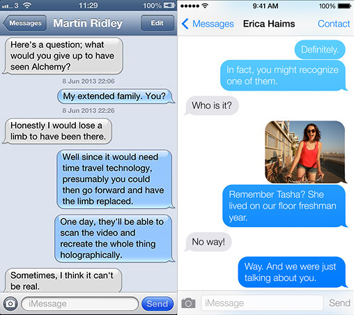
Consider how Messages looks now, compared to its iOS 6 counterpart.
We can quibble about colour choices, but when viewed against the new style, the sheer weight and gimmickry of the bubbles and bevels and shine becomes very apparent. The navigation bar at the top hangs there like a lintel, frowning away. It’s a pretty Photoshop job, but to my eye it now looks chunky and theme-y, like a skin for jailbroken devices.
The shift in style is even more apparent when you receive a phone call.
Bevels, grip-handles, embossing, shadows, gloss, inner-glows and acres of hard button-borders. The chrome on the iOS 6 screen eats away 60% of the display, and very much has the appearance of an alert. The newer version not only lets you see more of the caller’s photo, but is a quieter presentation. It’s not a fetishistic encrusting of widgets, but rather just content – with a few options hanging around if you wish to use them.
There’s another aspect of the change that’s important too: someone finally opened the blinds.
Light
iOS 7 is much, much lighter – in the colour sense, and consequently also in visual weight. Breathable whitespace is everywhere, and is used to unify and homogenise previously disparate interface styles.
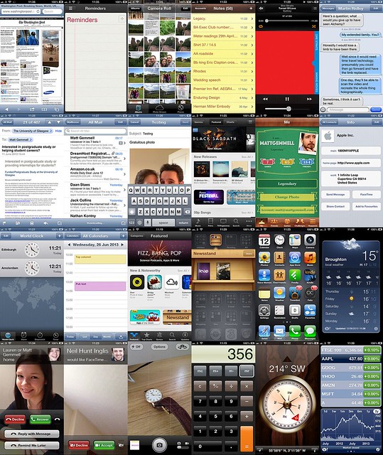
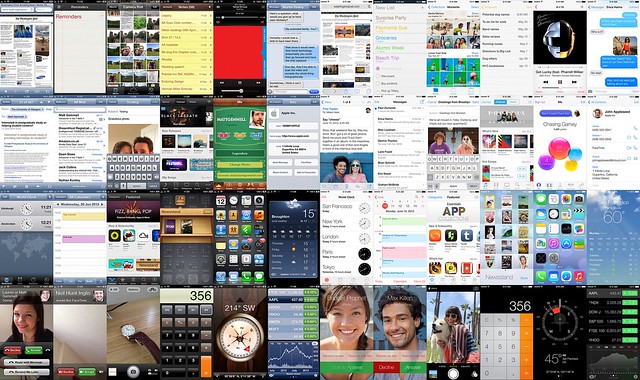
The overall impression is of brightness and openness. The extent of the change (and its consistency of application) only becomes obvious when considered in aggregate. Here’s a grid collage of iOS 6 stock apps:
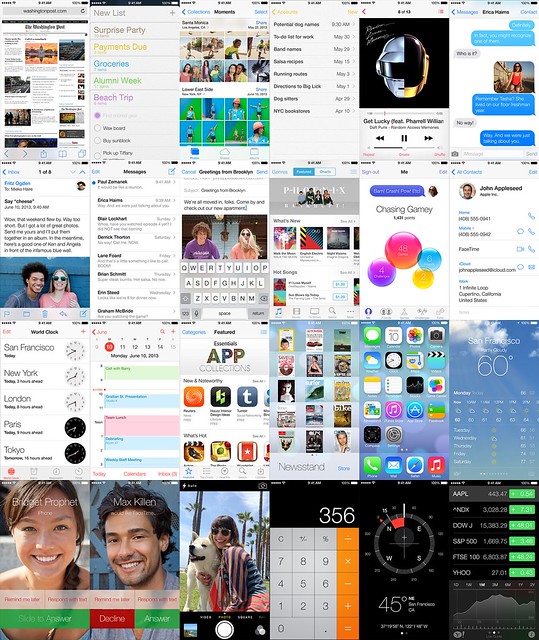
And here’s a corresponding grid of iOS 7 stock apps, showing the same screens where possible. These are all publicly-released iOS 7 screenshots from Apple, of course.
You should have some sense of a brightening in the second set, compared to the first. It’s more apparent if we put the grids side by side.
The change becomes especially striking if we reduce the complexity of colour by pixellating:
The smear of murky tones across the lower-right half of the iOS 6 grid is replaced with whites and a few light blues on iOS 7. Similarly, iOS 6’s handful of different visual styles (and several eccentric outliers) have become essentially two main themes on iOS 7: the paper-like, bright style in about 75% of apps, and the dark utility style for the remainder.
Press coverage is disproportionally focusing on the Home screen (about which more in a moment), but the reality of day to day usage is that you’ll spend time in apps. Where there were previously gloomy cubbyholes and low ceilings, there are now floor-to-ceiling windows, skylights, and clean surfaces.
I think it’s an enormous improvement, and a typically opinionated move.
Home
The area of most contention seems to be the Home Screen, particularly its new icons. It’s a very visible part of the OS and device, but ‘Home’ is of course a misnomer: it’s more like a launcher, rather than a place you spend any significant time. You’ll visit it very frequently, but you won’t be staring at it.
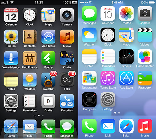
The Home Screen, and stock icon design, is much brighter and simpler than before. Although it’s not obvious from screenshots, the spacing of icons is different now, and the icons themselves are each a few pixels larger.
The top margin below the status bar has been reassigned to make more room for icons, label text is larger, and the dock area is now simply a frosted panel. The sacrifice of boundary in exchange for legibility can also be seen in the icons themselves: their content is bigger in comparison to their total area than on iOS 6. The glyphs and designs are more recognisable for it.
I feel that there are some specific design issues (the corner radius, content weight in a few places, some inconsistent gradient directions, background contrast, and a couple of icons – like Notes and Reminders – that are overly abstract and empty), but those are both fixable and also subjective. I saw a mockup which addresses some of those issues (mockup on left, iOS 7 on right), albeit introducing a few of its own, but it’s hard to determine whether I like it because it’s more familiar or because it’s actually better in any functional sense.
The new icons are distinct and identifiable, and not fussy. I believe that we’ll see some changes before the final release, and I have a sense that it’s the part that has received the least sustained attention, but its character is in spirit with the evolution of the rest of iOS 7.
Content first
A month ago, I wrote about my impression of Jony Ive’s approach to design, and why the skeuomorphism backlash is misdirected. Reading the piece again now, it’s remarkably prescient.
iOS 7 is a decluttering of the most exciting, profitable, desirable mobile operating system available. It’s a shift away from artefact, and back to essence. It indicates a clarity of vision, and a continued willingness to pursue simplicity ruthlessly.
Gone are embellishments like gloss and bevelled edges, shadows and borders. Visually dead areas that provoke tension rather than inspiring relaxation. Weight that suffocates, rather than open air to breathe.
The new iOS is designed for a different environment, and a different maturity of mobile user: one who recognises simplicity for what Jony Ive believes it is. Not something as pedestrian as familiarity or consistency for its own sake, but rather focus and clarity.
In the field of user experience, there’s a huge and unhelpful overemphasis on similarity, familiarity, and the ability to formally reason about interfaces. People are more nuanced. We respond based not only on experience or reason, but also on emotion and intuition.
Too many interfaces run immediately to the well-worn toolbox of simulation and explicitness, imposing a cognitive straitjacket not only on the user, but also the designer. We too easily forget that the only thing that matters to people are their goals: their own tasks, and content. With limited attention, we want to devote our focus to what’s important, rather than distractions and artifice masquerading as design traditions.
Apple’s philosophy – and particular genius – has always been in sieving the demands of users, technologies and the cultural zeitgeist, and finding the right hundred things to remove for every one thing to keep. I care about what my devices can help me do, and how they can enhance my life. I don’t care about patting a designer on the head, or being distracted from what truly matters.
iOS 7 is an interface’s coming of age, acknowledging that its users – and our industry – are now all grown up.
