The Yahoo User Interface Library is a rather extensive set of JavaScript tools for developers. Often left unnoticed are a few other useful components of the library that will speed up your coding: some CSS libraries. Today, I’d like to give you a tour of the YUI Grids CSS library.
Why?
Why should you even consider using the YUI Grids CSS library (hereafter referred to a “YUI grids”)? What makes it stand out? I haven’t looked extensively at other grids libraries, but I find these things compelling:
-
Good naming conventions
YUI grids uses easy-to-remember ids and classes, and clean markup; once you learn it, you could come back to your code in a month and know which parts are from YUI and what each piece does.
-
Free file hosting
This reduces your load twice: no need to host the file on your server, as well as faster page loading if the client has the file cached.
-
Compatibility with common ad sizes
Yahoo has baked in sidebar widths that correspond with the Interactive Advertising Bureau’s ad guidelines.
-
Many layout options
With multiple templates and the ability to nest page regions, Yahoo claims to offer over 1000 layout combination . . . all in less than 5kb.
Of course, YUI grids isn’t perfect. It’s a bit limiting when it comes to the pre-baked sidebar widths; however, if they suits your needs, you’ll save plenty of time, coding, and headaches when laying out your site.
Resources
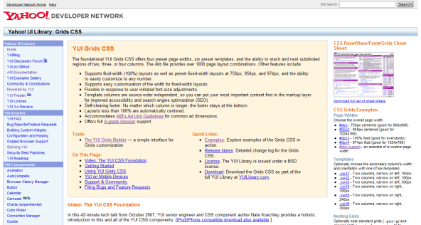
As we begin, here are a few resources that will be of help.
- The YUI Grids CSS home page : the place to go after you read this article
- The Grids Builder : a tool that let’s you build your page with a few clicks—great help in getting the the hang of YUI grids quickly!
- The cheat sheet : a single-page PDF with all the YUI grids conventions
Building Blocks
Before we get into the nitty griddy, let’s look at the building blocks of YUI grids. There are five different structures that you will work with to develop your layout; each of these structures is defined by either an id or a class (usually a class). They are as follows:
- Document
- Template
- Blocks
- Grids
- Units
Document

Obviously, your whole HTML file is the document, but in our case, it’s also the div immediately inside the body — the div that holds it all. This is where you define the width of your site. YUI grids gives you 4 width options: 750px, 950px, 100%, or 974px. These widths aren’t actually hardcoded pixels; they’re ems, so the page will adjust fluidly when your user adjusts their font size. If these don’t cut it, Yahoo has made defining a custom width a breeze. Here’s the code to create a document 800px wide:
#custom-doc
{
	margin:auto;     /* these two values are required, as  */
	text-align:left; /* they help YUI grids center the page */
	width: 61.54em; /* 800px / 13 = em-value for most browsers */
	*width: 60.00em; /* 800px / 13.333 = em-value for IE */
	min-width: 800px; /* optional, but recommended*/
}
To set the width, simply use id of doc, doc2, doc3, or doc4, respective to the values given above.
Template

There are seven templates to choose from. The first six define a two column layout; each one has a different width or orientation for the sidebar, with the main content column taking up the rest of the width of the doc. The templates are 1) 160px on the left, 2) 180px on the left, 3) 300px on the left, 4) 180px on the right, 5) 240px on the right, and 6) 300px on the right. To get the template of your desiring, simple add a class of yui-t# to the same div that you defined your doc on (replace the # with the numbers above). As I mentioned above, these sidebars are standard web-ad widths, so any advertising should fit comfortably inside them.
The seventh template—yui-t7—isn’t as well documented (oddly, it’s not on the cheat sheet I linked to above, but it is on this older version). It subtracts the sidebar, simply giving you one full width column (which can be divided into columns later).
Blocks
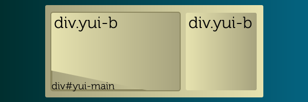
The blocks are the actual manifestation of the columns you defined in the template. They’re simply two divs within the doc div, both classed with yui-b. Happily, they don’t have to be immediate children of the main div; Yahoo gives this example:
<body>
  <div id="doc" class="yui-t1">
    <div id="hd">
      <-- Header Content -->
    </div>
    <div id="bd">
      <div id="yui-main">
        <div class="yui-b">
          <-- Main Content -->
        </div>
      </div>
      <div class="yui-b">
        <-- Sidebar Content -->
      </div>
    </div>
    <div id="ft">
      <-- Footer Content -->
    </div>
  </div>
</body>
You can see from the example that you don’t need to put the blocks directly inside the root div. This allows you to have a full-width header and footer, which is generally a nice idea. You’ll notice that the main content block is inside a div with an id of yui-main; YUI grids does this to give you the ability to have either your sidebar or your main column first in your code, which can be an advantage when you’re considering SEO or accessibility.
Grids & Units

I’ve grouped grids and units together because they’re really quite similar; both are divs. A grid (defined with class yui-g) basically tells 2 children (usually units) to split its width evenly. A unit (class yui-u) should always be the child of a grid and the parent of your content.
So, what’s the difference between a block and a grid?
- Blocks
- Are only used to define overall page columns
- Are only used if you use templates 1 – 6
- Are only used once (so you should never have more than 2 divs.yui-b on one page)
- Grids
- Are used to divide areas (such as your main block, or another grid) into columns
- Are used on any template
- Are nestable
Also, whenever you have multiple grids or units within a grid, it’s necessary to give the first one a class of first. This is because not every browser offers the pseudo-class :first-child.
But what if you want to divide a grid unevenly? Life isn’t always fair, is it? Fortunately, YUI offers a number of alternative choices to the yui-g class. Here’s a list of the others:
- yui-gb : Takes 3 units and divides equally
- yui-gc : Takes 2 units and divides as 2/3 and 1/3
- yui-gd : Takes 2 units and divides as 1/3 and 2/3
- yui-ge : Takes 2 units and divides as 3/4 and 1/4
- yui-gf : Takes 2 units and divides as 1/4 and 3/4
That’s all of them; just slap 2 or 3 units in each of the above grids, and you’ll have unequal columns.
Basic Example
Well, now that you know the ropes, let’s go over a basic example. Let’s say we want the standard site layout—you know, main content column with a sidebar on the right—with a bit of a twist: we’ll divide the main column into two smaller ones, and divide one of those further into two.
As I mentioned, Yahoo offers hosting for this framework, and it’s usually a good idea to take advantage of that. Also, Yahoo recommend the HTML 4.01 strict Doctype, so that’s what I’ve put in. Here’s what we start with:
<!DOCTYPE HTML PUBLIC "-//W3C//DTD HTML 4.01//EN"
  "http://www.w3.org/TR/html4/strict.dtd">
  <html>
    <head>
      <title>A Simple YUI Grids CSS Example</title>
      <link rel="stylesheet" type="text/css" href="http://yui.yahooapis.com/2.7.0/build/grids/grids-min.css">
    </head>
    <body>
    </body>
  </head>
</html>
Step 1 : Docs and Blocks
The first step is to set up our document div and blocks. We can stick with the first doc width (750px), and go with template 6, which gives us a 300px right sidebar.
<body>
  <div id="doc" class="yui-t6">
  </div>
</body>
For the two blocks of content, we need to add two divs.yui-b. We’ll make the top one the larger column, by wrapping it with div#yui-main.
<div id="doc" class="yui-t6">
  <div id="yui-main">
    <div class="yui-b">
      MY MAIN CONTENT DIV
    </div>
  </div>
  <div class="yui-b">
    MY SIDEBAR DIV
  </div>
</div>
Super! So, here’s what we have so far: I’ve taken the liberty of styling it a bit, so you can see what’s going on.

Step 2 : Grids and Units
It’s not too impressive yet, but we’ll get there. Now let’s divide the larger column into two. We can achieve this by putting a div.yui-g (that’s parenting two units) inside it:
<div id="yui-main">
  <div class="yui-b">
    <div class="yui-g">
      <div class="yui-u first">
        First sub-column
      </div>
      <div class="yui-u">
        Second sub-column
      </div>
    </div>
  </div>
</div>
This gives us two columns on the left; not bad; let’s divide the second of those columns into two. To do this, we have to change it to a grid, and put two units into it.
<div class="yui-u first">
  First sub-column
</div>
<div class="yui-g">
  <div class="yui-u first">
    First sub-sub-column
  </div>
  <div class="yui-u">
    Second sub-sub-column
  </div>
</div>

This is a great example of the fact that grids and units are of equal rank and can stand side by side: they only differ in usage.
A Gotcha
This brings me to a padding gotcha (which will segue to a big benefit of YUI grids). First, look at the code we’ve written so far, with some filler text:
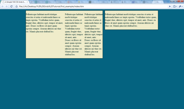
Your good taste should notice the lack of padding around the edges of our columns. But that can be easily fixed with some padding—say, 0.5em—on .yui-u, right?
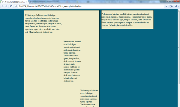
Yikes! YUI grids has set the widths for these divs, and because padding adds to the width of div, we’ve got an overflow problem. An easy solution to this is to add the padding to the immediate children of the .yui-u.
To keep our columns in line and easily readable, we’ll put the padding on the paragraphs within the .yui-u. But I don’t have to show you an image of that for you to figure out that our narrow columns just got narrower. This is where we can take advantage of a strong point of YUI grids. Let’s change the id on our root div from doc to doc2. Here’s a before and after:
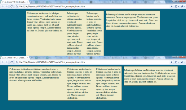
By adding one character to our HTML, we can easily experiment with a wider layout; that’s the beauty of YUI grids. #doc2 is 200px wider than #doc, so now our narrow paragraphs are a comfortable width.
Complex Example
That’s a pretty simple example; let’s look at a more complex one . . . that’s really not any harder to create. We’ll start with the seventh template—a single column—with a 750px wide document (#doc) and slice it differently over multiple rows. Here’s what we begin with:
<!DOCTYPE HTML PUBLIC "-//W3C//DTD HTML 4.01//EN"
  "http://www.w3.org/TR/html4/strict.dtd">
<html>
  <head>
    <title>A Complex YUI Grids CSS Example</title>
    <link rel="stylesheet" type="text/css" href="http://yui.yahooapis.com/2.7.0/build/grids/grids-min.css">
  </head>
  <body>
    <div id="doc" class="yui-t7">
    </div>
  </body>
</html>
Because we are not using templates 1 – 6 (which have sidebars), we don’t need to have any divs.yui-b. We can start right in with a few divs.yui-g; we’ll add 4:
<div id="doc" class="yui-t7">
  <class="yui-g">
  </div>
  <class="yui-g">
  </div>
  <class="yui-g">
  </div>
  <class="yui-g">
  </div>
</div>
Row 1
Let’s divide the top grid into three parts; to achieve this, we’ll need to change the class to .yui-gb. Then, we simply put three divs.yui-u inside, and give the first one the first class.
<class="yui-gb">
  <class="yui-u first">
  </div>
  <class="yui-u">
  </div>
  <class="yui-u">
  </div>
</div>
A quick preview at what we’ve got so far (again, I’ve applied minimal styling for clarity and thrown in some filler text):

Row 2
For the second row, we can try the .yui-gc, which gives us two columns; one will take up 2/3 and the other 1/3.
<class="yui-gc">
  <class="yui-u first">
  </div>
  <class="yui-u">
  </div>
</div>
The minimal styling on this shows a small flaw in the system: the second row doesn’t line up with the first row perfectly; In my opinion, this is a worthwhile trade-off, since a misalignment this tiny would be relatively easy to mask.

Row 3
For grid 3, we’ll do something a bit more advanced: four columns. This requires nesting two grids within a grid, like so:
<div class="yui-g">
  <div class="yui-g first">
    <div class="yui-u first">
    </div>
    <div class="yui-u">
    </div>
  </div>
  <div class="yui-g">
    <div class="yui-u first">
    </div>
    <div class="yui-u">
    </div>
  </div>
</div>
Notice that we still follow the “.first to the first” rule, on both the second-level grid and the third-level units. That’s really the only rule you have to remember; even this “advanced” work is pretty simple. Here’s what we’ve got so far.
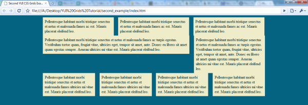
For the final grid, we’ll do a simple split: two columns.
<div class="yui-g">
  <div class="yui-u first">
  </div>
  <div class="yui-u">
  </div>
</div>
And that’s it! For the final shot, I’ll add a bit of margin between rows.
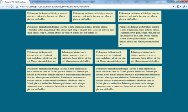
It’s obvious that this isn’t entirely pretty, but the potential for it should be just as obvious: I haven’t had to write any layout styling. With the YUI Grids CSS framework, it’s easy to quickly layout your websites and be confident that they’ll be consistent across all major browsers.
Used YUI grids in a project and have an opinion about it? Prefer a different grids library? Let me know in the comment!
This article was originally posted on the ThemeForest blog. We are currently porting over some of the more popular articles to Nettuts+.