In this quick and simple tutorial, you’ll learn how to create a professional magazine layout in Adobe InDesign, complete with a print-ready spread, stylish typography, and an eye-catching image.
This is a great introductory tutorial to creating a magazine layout design—you’ll pick up essential techniques for creating effective magazine templates and magazine page layouts.
Looking for more magazine templates? You can find more stylish InDesign magazine templates on Envato Elements and GraphicRiver.
Short on Time?
If you’re looking for a quick fix, a magazine template is a great option for getting started on your magazine layout design with confidence.
You can find a huge collection of stylish magazine layout templates on Envato Elements.
-

30 Magazine Templates With Creative Print Layout Designs
Print marketing can be highly effective in complementing a content-marketing campaign. Our magazine templates offer high-quality, attractive designs for… -

24 New Magazine Templates for 2019 (PSD & InDesign Templates)
Get started on your own magazine with a creative template. Check out this list of magazine templates from Envato Market and Envato Elements.
With a diverse range of layouts and more design assets available to download for a single, affordable monthly fee, it’s a great way to quickly get started on your project. Discover a few of our favourites below.
Skip ahead for the full magazine layout tutorial.
1. Fashion Magazine Template

2. Minimal Magazine Template

3. Architecture Magazine Template

4. Universal Magazine Template

5. Elegant Magazine Template

Tutorial: How to Create a Magazine Layout in InDesign
In this quick tutorial, we’ll put together a simple magazine page layout in InDesign. Easily adaptable to your own images and text content, this is a great all-round introduction to magazine design for beginners.

What You’ll Need to Create Your Magazine Layout
As well as access to Adobe InDesign, you’ll also need a high-resolution image to use in your design. The image used in the design as pictured is this one, but you can find a range of alternative images on the Envato Elements photo library.
You’ll also need some stylish fonts to use on your magazine layout. Minimal sans serif styles are particularly effective in magazine design. Look to this selection of sans serif fonts to find your perfect font match.
-

Design in 60 Seconds: Serif vs. Sans Serif Fonts
In this quick video, instructor Melody Nieves will go over the difference between serif and sans serif fonts. -

The Best Alternatives to the 10 Most Popular Fonts
We see them on a daily basis—these popular fonts are everywhere! Check out this article to find hand-picked alternatives to some popular fonts.
Once you have an image to hand and have installed the font files on your computer, you’re ready to get started!
1. How to Set Up Your Magazine Layout in InDesign
Step 1
Open InDesign and go to File > New > Document.
We’ll be using a standard A4 size document for this tutorial. Start by setting the number of Pages to 8, the Bleed to 2 mm so we have some space for images to overlap, the Top and Bottom Margins to 10 mm, the Inside Margin to 13 mm, and the Outside Margin to 20 mm*.
Then click OK or Create.
* The reason for these different margins is that in a spread with two facing pages, a slightly larger margin on the outside of the page looks better and provides more space to hold the printed version. It is also useful for the page grid in the next step.

Step 2
Pro tip: A grid is used to promote consistency across the page layout and provide a framework for positioning content. A well-applied grid is the first thing you need to give your layout a professional look.
To set up the page grid, go to the “A-master spread” and choose Layout > Create Guides.
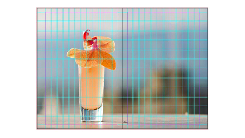
For this tutorial, we’re going to use a 12 rows by 12 columns grid with 3 mm spacing. Choose Fit Guides to Margins to create a grid with a column width of 12 mm*.
* Why? Our page width is 210 mm, with 20 mm outside and 13 mm inside margins, so we have 177 mm left for 12 columns and 11 gutters. 12 columns of 12 mm plus 11 gutters of 3 mm is 177 mm.

2. How to Place an Image on Your Magazine Layout
When creating a magazine layout, you’ll want to keep a good balance between the white space, images, and text. A good technique is to use an image with a lot of ’empty’ (‘white’) space; space around the subject has the same function as white space.
I’m using a photograph called Summertime Sunshine—it has a nicely blurred background that we can place our text on top of.
Go to Pages 2–3 of your document and use the Rectangle Frame Tool (F) to create an image frame across the whole spread, extending the edges up to the bleed on all sides.
File > Place your chosen image into the frame and allow it to fill the whole frame. You can double-click inside the frame to directly select the photograph and move the image so that the subject is within the margin of the first page and the top of the cocktail glass is at the edge of a grid row.

3. How to Add Body Text and Create a Grid on Your Layout
Step 1
Use the Type Tool (T) to create a text frame that is placed at the same vertical and horizontal position as the cocktail on the other page, here in the third row and fifth column of the grid.
This creates an imaginary line that connects the image with the text. If you don’t have text content for your body text frame yet, head up to Type > Fill with Placeholder Text.
I’m going to use the title of the photograph, ‘Summertime Sunshine’, as the heading, which you can place into a separate text frame above the body text frame.

Step 2
To make our text look really professional, we need to set up a baseline grid. Go to Preferences > Grids and set the Increment Every value to 8 pt.
In this tutorial, we’ll be using a text size of 12 pt and leading of 16 pt. A baseline grid of 8 pt, which is half of the leading value, provides flexibility because we can also use it for smaller text sizes.

4. How to Format the Typography on Your Magazine Layout
Step 1
Go to Window > Styles > Paragraph Styles. Double-click on the default Basic Paragraph style in the panel to open the Paragraph Style Options.
For the Font, I’ve chosen FF Meta Book Roman with a Size of 12 pt and Leading of 16 pt. You could also choose to leave the Leading at its default setting because our baseline grid will make sure all the text is nicely aligned.

Step 2
Click on Indents and Spacing in the window’s left-hand menu.
Set the Alignment to Left Justify. In digital design, professional-looking justified text is almost impossible to achieve, but InDesign makes it very easy to do.
Change the Align to Grid setting to All Lines, and add 16 pt in the Space After box. This is not essential, and you can also use First Line Indent to separate the paragraphs.

Step 3
Pro tip: Hyphenation is very important when working with justified text. Hyphenation breaks up long words at the end of a column so that the column has a straight edge instead of containing a large number of gaps. The default hyphenation settings in InDesign need a little adjusting to improve the look of our body text.
Click on Hyphenation in the window’s left-hand menu.
I’m changing the settings to use hyphenation only for words with at least six letters, and after the first and before the last three letters. For Words with at Least, enter a value of 6, and for After First, type in 3.
The Hyphen Limit sets how many lines in a row can have a hyphen on the end. I think 3 is too many. Type in 1.
Finally, uncheck the boxes for Capitalized Words and Last Word.

Step 4
By default, the justification settings are a little too loose, so let’s adjust these by clicking on Justification in the left-hand menu.
Set the Word Spacing to a Minimum of 85% and a Maximum of 105%. This ensures that the words won’t have too large or too small gaps between them.
For the Letter Spacing, set the minimum to -2% and the maximum to 2%. This will significantly improve the look of the justification. You can experiment with the Glyph Scaling settings as well, if required.

Step 5
Click on Character Color in the window’s left-hand menu.
I’m using [Paper] for the Character Color to allow the text to contrast against the dark background of the photo. Choose what you think looks best given your own choice of image—aim to keep the text contrasting and highly legible.
Click OK to exit the Paragraph Style Options window.

Step 6
On the body text frame, Right-Click > Text Frame Options. Change the Number of Columns to 2 and add a 3 mm Gutter. This ensures that the line length is reduced and the readability will be improved.

Step 7
Select the heading text frame on your magazine layout. Then double-click on the default Basic Paragraph style in the Paragraph Style panel to open the Paragraph Style Options.
Adjust the Font to your preference, and set the text to a generous size. Here, I’ve opted for Meta Medium Roman, Size 42 pt, and applied a negative Tracking value of -50 to decrease the spacing between the letters.
Because they are highly visible, headlines can often benefit from tracking adjustment.

Step 8
From InDesign versions CS5 onwards, it is possible to make a paragraph span across columns.
We’re going to use that function here to make the heading span across both columns of the text frame. Click on Span Columns in the window’s left-hand menu. Set the Paragraph Layout to Span Columns and Span to All.

Step 9
Because we have adjusted the tracking to a negative value, the letters “r” and “t” in the heading are now touching each other. This is something you want to avoid in general.
To solve this, I set my Type Tool cursor between the two letters and, from the top Controls panel, adjust the Kerning to 75. This creates just enough space to separate them.

Step 10
Pro Tip: A small and subtle adjustment, called optical margin alignment, can give the typography in your magazine layout a final polished and professional look. This pushes any outlying hyphens, quotation marks and wide ligatures such as the arms of a ‘W’ or ‘A’ outside of the text frame, creating a more streamlined, pleasing look to the whole block of text.
Go to Window > Type & Tables > Story.
Click to select the body text frame, before checking the Optical Margin Alignment option in the Story panel. Set the value below to match the Font Size of your body text.

Conclusion: Your Finished Magazine Template
Your magazine layout design is finished—great work! You’ve created a simple and well-balanced spread, complete with professional typography and effective use of white space.

You now have a foundation for expanding your design into a complete magazine template, using this first spread to create a consistent style across other pages. Simply Edit > Copy and Edit > Paste in Place the elements you’ve created in this spread onto others.
In this tutorial, we’ve covered a wide range of print design techniques for creating a stylish and effective magazine layout. You now know how to:
- Set up a magazine layout in InDesign, and apply a grid, columns, and margins.
- Place an image into your magazine layout design.
- Format body text and headers to a high standard.
- Apply sophisticated typographic techniques to your magazine layout design, including optical margin alignment.
Looking for a time-saving solution for creating your own unique magazine design? Make sure to check out the huge range of easy-to-adapt magazine templates over on Envato Elements and GraphicRiver.
Discover more magazine design tutorials to keep developing your print design and typography skills:
-

10 Tips for Designing High-Impact Magazines
From designing striking covers to putting together contents pages that pack a punch, we share 10 fantastic tips for breathing life into your magazine… -

How to Create a Magazine Cover Template in InDesign
Thinking of starting your own publication? Learn how to make a magazine cover in just a few simple steps! -

19 Best Magazine Cover Designs You Can Personalise (With a Magazine Generator)
If you want to know how to make a magazine cover from scratch, this article will give you plenty of magazine cover ideas and show you how you can make your… -

How to Make Your Own Sports Magazine Cover (With a Magazine Cover Maker)
Creating a sports magazine cover can prove to be a difficult task, especially if you don’t have the required tools or skills. But what if I told you that… -

How to Create Your Own Magazines: A Step-by-Step Guide
This back-to-school guide will show you how to get started designing your own magazines, from adapting templates to creating your own contents pages. You’ll… -

20+ Top Magazine PSD Mockup Templates (Spread & Cover Designs)
Imagine your design on the covers of magazine. Check out this list of premium magazine templates from Envato Market and Envato Elements. -

28 Best Magazine Cover Templates (InDesign & Photoshop PSD)
Spice up the local grocery store with an inspiring magazine cover. Check out this list of creative magazine covers from Envato Market and Envato Elements. -

How to Put Your Face on a Glamorous Magazine Cover
Learn how to easily put your face on a magazine cover with an online magazine cover generator.
{excerpt}
Read More