
Are you hunting for that dream role at a creative company? You’ll need to dust off your old resume and give it a modern refresh.
But how can you make sure that—out of all the applicants—it’s your resume that catches your future employer’s eye?
Today we take a look at eleven resume design tips for overhauling the format, layout, and structure of your resume. We also share creative resume examples and templates throughout the post, visually demonstrating these resume design tips in action so you can readily put them to work for you.

When you’re ready to create your own resume, check out this tutorial on designing a creative resume in Adobe InDesign. You can also browse the full selection of creative CV examples at Envato Elements and creative resume templates at GraphicRiver to get even more inspiration.
Tip 1. Use Columns to Maximize on Space
One thing that is an absolute nightmare for employers tasked with trawling through resumes by the bucketload is encountering resumes that are more than one page long.
Sure, you might want to go into detail about that part-time training course you took seven years ago, but, frankly, all your future employer wants to know is how that qualification is relevant to the job you’re applying for.
The best advice for how to design a resume? Keep it short and sweet. Edit out qualifications and details that are irrelevant to the role. You’ll find that editing your text down to fill just one page can be tricky, but it’s well worth it—you’ll appear concise, organized and you’ll also be highlighting only the most important, and best, information about yourself. This is going to make your resume easy-to-digest and a doddle to print (you’re welcome, environment).
But how can you even begin to fit all your wonderful achievements on just one sheet of paper?
There are some design techniques you can employ to maximize the space on your one page, without forcing the layout to feel overcrowded. One tip is to try splitting your resume layout into two sections, with a narrow column running down the left- or right-side of the page, as shown below

Place shorter sections of information, like a brief bio, skills, software competencies, languages and contact details in the column, along with a photo in the same column. Switch up the background color of the column to keep it visually distinctive.
Placing more detailed chunks of information, such as your job experience, education and qualifications, in the other wider column will help maximize the limited space available in your creative resume layout.
Tip 2. Resume Layout Structure Is All-Important
Though it may be dull, organization is the key to a successfully-designed resume. You want the design of your creative resume format to be well planned and organized.
Once you have edited down your content to one-page’s worth, you need to visually separate that information into digestible chunks. Imagine you’ve been sitting at your desk looking at resumes all day—you sure aren’t going to linger long over someone’s essay-long summary of the internship they did last summer.
Don’t lump all your information together. Use a grid structure for your layout, with columns and rows, visual dividers and white space to section out all the data you’re presenting to the reader. This will also make it much easier for them to refer to individual items of information in conversation with a colleague or during an interview.
You want to make your creative resume a pleasure to read, not a chore, and keeping your information visually organized is going to help you achieve this.
Take a look at this simple-yet-striking resume template, and particularly at how the information is sectioned up.
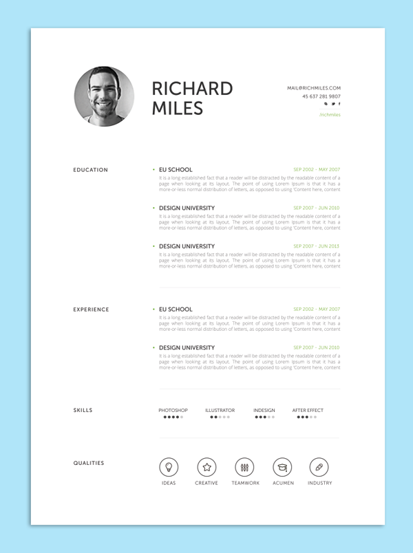
This creative resume layout is based on a simple grid structure with two columns, and plenty of white space, the different sections are clearly marked out and divided from each other with subheadings and lines.

It may seem a “well, duh!” sort of tip, but you’d be amazed at how many people crowd their resumes with waffle. Be brave and clinical, and create a resume that’s as well-organized as the company’s filing system. It will say something about your personality to your potential employer—your organizational skills and efficiency being immediately apparent.
Tip 3. Put the Impressive Stuff Above the Fold
The term above the fold comes from the world of newspapers and refers to the top half of a folded newspaper, the area that people see first before. This top half is prime real estate and so the most important news items are placed there.
The same principle applies when approaching how to design a resume as well. The top half is the area your potential employer will see and focus on first so don’t waste space with huge headers for your name and contact details across the top of the page.

This creative resume format uses a personalized header but consigned it to the left column, so that the summary, work experience fit above the fold.
Tip 4. Catch the Eye With Resume Infographics
Infographic design details are a great way of introducing a more unique look to your resume, while looking data-driven and professional.
How to achieve the infographic look? First, divide your resume layout up into a grid with two columns and four or five rows. Focus on placing one section of ‘data’ into each square of the grid, whether that’s your list of awards and certificates, or your educational history.
.jpg)
Transform each section of data into its own individual infographic.

Try transforming your list of past jobs into an experience timeline, ordered chronologically. Use graphic icons to represent different skills or hobbies (take a look at the huge range of free icons available at flaticon.com if you don’t fancy creating your own from scratch).
Use the shape tools in your design software of choice to create simple charts and graphs to represent your language skills or software experience.

Check out this simple tutorial on creating your own infographic elements in Adobe InDesign, and use them to embellish your resume layout.
One final tip for infographic styles—keep your colors pared-back, neutral and minimal. With all those graphic elements going on, you’ll want to keep the design looking ultra-professional.
Tip 5. Make a Nod to Your Profession
Odds are, you’ll be looking for a particular role, which will make good use of your particular skillset. If this is the case, you can fine-tune the design of your resume to make a nod to your chosen profession.
For example, if you’re a publishing designer, make your resume look a little bookish. Use classic typefaces like Caslon and Baskerville, and structure the layout to mimic a beautifully typeset book page.
If you’re a web designer, take inspiration from this digital-inspired resume template and give your layout a digital-inspired design with neon pops of color, data-like icons and bars, and a precise, clean-cut layout. Just like a beautifully-designed web page, right?

Use your creative resume as an opportunity to show off your design skills in practice. This will make the look of your resume a great talking point at the interview stage, and will showcase your enthusiasm for your career of choice.
Tip 6. Know When to Keep it Simple
So I’ve encouraged you so far to get creative with grids, infographics and colors on your resume, but there’s also a time and a place for minimal, simple design.
Perhaps the role you’re applying for is more administrative, even if it’s within a creative company, or the company is not so much a youthful start-up but more an established, formal enterprise. Applying for a role at an architecture firm or marketing company? Perhaps a more stripped-back resume design would be more fitting.
This means no photos (or at the very least, no colorful cropped images from Facebook…but I’m trusting you wouldn’t subject any future employer to those anyway), no graphics, and no colors that will give a CEO a headache.
Take a lesson from this wonderfully minimal resume template:
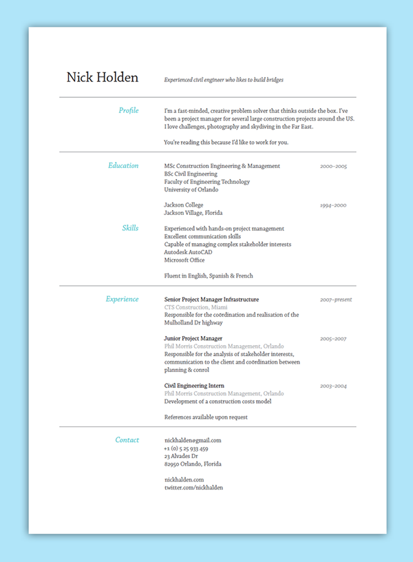
Choose a classic sans serif typeface, and keep the structure of your minimal resume conventional. Flush type to align left, to keep your text traditional in style. Allow for white space to make the whole design appear serene and professional. Use simple, thin lines (look to the Stroke Tools in Adobe software) to divide sections of content into manageable chunks, and use color sparingly—as a little pop of blue to mark out subheadings catches the eye without being overbearing.
Tip 7. Create a Personal Brand
If you’re sending a portfolio, resume, and cover letter to apply for your dream creative role, think about how you can make all the elements of your application look more unified and professional. Treating your job application as an exercise in branding is a great way to both elevate your application to the next level and prove to your future employer that you can be creative while working within a set of brand rules.
Before you begin creating your portfolio, resume, and cover letter, you need to lay down some simple rules for your personal brand.
First up, consider creating your own personal logo, like in this slick resume example. Try designing a simple icon using your initials and a simple shape or border. Apply the logo to the cover page of all your application documents.

Secondly, you need to think about being consistent with your choice of typeface and how you format your text.
Choose a simple, legible sans serif for jobs in digital-related fields (take Aller for a spin), or go for a serif (you can’t go wrong with Caslon or Garamond) if the role is more traditional.
Set rules for how you format headers, sub-headings and body text; as well as applying consistent text sizing and alignment throughout all your documents.
Finally, a brand is really pulled together by a consistent use of color. Take a look at this colorful resume and portfolio template, which features a bold, four-color palette that is applied consistently across all the pages, with geometric shapes used to tie together the elements and create unusual grid sections for placing text and images.

Create a complementary color palette in your software of choice (in Adobe programs, expand the Swatches panel and create new CMYK swatches, before saving them as a Swatch Library), and stick to it!
To take your branding exercise to the next level, design your portfolio website to match your brand look, so that the impressive unified effect isn’t lost when the employer checks you out online.
Tip 8. Match the Company’s Colors
Another strategy, and one that is the complete opposite to step 8 above, is to have your resume match the brand of the company you’re applying to. This may seem counter-intuitive but by applying the company’s fonts, colors, style, etc. to your own resume. It shows you did your research and are passionate about the company and about working for it. This is how to design a resume that stands apart from the competition. It’s the kind of creative, out of the box thinking that will get you noticed.

Tip 9. Make it Personal
It’s one challenge to make your resume look presentable, but how are you going to make it memorable?
What’s going to give the reader a lasting impression of your personality without you being physically present? After all, you won’t even get to the interview stage if your resume is instantly forgettable.
To make it unforgettable, you need to think of ways to inject personality into your resume. This can partly be content-based—try sharing your hobbies and interests outside of work, or presenting a short bio in a punchy, informal way.
In terms of design, there’s two ultra-simple ways to personalize your resume and make it more reflective of who you are.
The first is to add your personal signature to the design.
Signing your name is personal and intimate, and makes a nice nod to tradition in this overwhelmingly digital age. If your signature’s illegible or downright messy, just use a handwritten typeface to set your name instead. Try out Harabara Hand or Jimmy Script.

Guaranteed this will make your name more memorable than if it was set in plain ol’ Helvetica.
The other thing you can do to personalize your resume is to include a photo.
A word of caution—don’t just pop in any old photo and hope that will cut the mustard.
Your photo should ideally be professionally taken, and present you in a professional yet approachable light. A warm smile is great, but avoid manic laughter. Equally, a stony-faced, serious photo could be off-putting to an employer looking for a team-player. A professional photographer will put you at ease and produce photos that look natural.
Adjusting color photos to black-and-white (apply a Black & White Adjustment Layer to your color photo in Adobe Photoshop), like in this clean resume template, also adds an extra-professional touch.

Tip 10. Want to Be Really Creative? Go Digital!
Print resumes have an old-fashioned charm and many companies will take it as a given that your application will be in a printable format. Sometimes, however, you really need to push the boundaries.
If you’ve been eyeing up a designer role at that ultra-creative start-up, you’re going to need to show your employer that you can think outside of the box. Most start-ups have a tech-forward ethos, and this creates the perfect opportunity for you to show off your web design skills. Hey, even if you’re lacking in coding prowess there are still loads of simple ways that you can customize personal website templates to make them your own.
Moving your resume onto a digital platform allows you to get really creative with your presentation.
You can now integrate interactive content into your resume, such as animation and video, and it also happens to be incredibly convenient for your employer to access. No fiddly email attachments or postal application, just click and go. Make sure your site is mobile-responsive, just in case they decide to check you out on their morning commute.
This uber-professional resume portfolio theme is a fantastic example of integrating a resume, cover letter and portfolio into one slick web page:
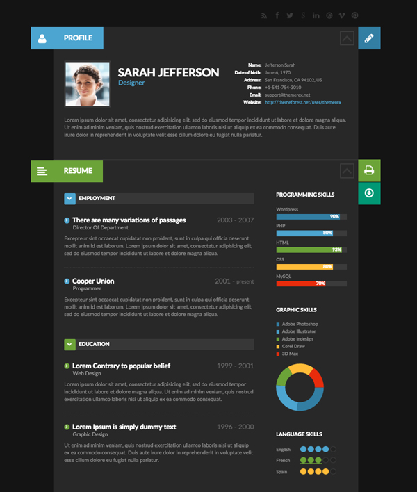

The dark background and minimal design keeps the page from looking overly gimmicky or geeky. (We’re looking at you, Robby Leonardi. Who am I kidding, his video game-inspired resume is awesome!)
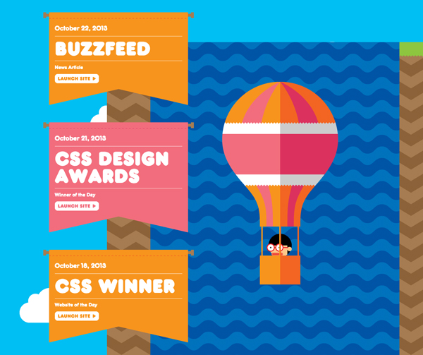
If you’re trying to convince your future boss of your technical skills, moving your resume onto a digital platform (or even better, creating both a hard and soft copy of your application—you’ll have no complaints) is the perfect way of showcasing your digital skill set, before you’ve even got to the interview!
Tip 11. Balance Creativity and Professionalism
In this article I’ve shared with you a few tips for how you can give your resume a modern refresh, and how to make your application memorable and impressive.
A final—and arguably most important—tip is to strike a fine-tuned balance between creativity and professionalism in your resume design.
Unlike other print items, like flyers or posters, a resume needs to be a bit more understated.

Before they’ve even met you in person an employer will make judgments about your personality and professional capabilities based on the look of your resume alone. So you want to make sure those first impressions are as positive as possible, which will improve your chances of getting to the interview stage (where you will, of course, wow the interviewer with your sparkling personality).
Choosing an elegant, legible typeface and setting it nicely on the page will have more positive impact than a layout weighed down with gradients, eyesore colors and novelty fonts. You can show off your creative side in a subtle way, by proving that you know when there’s a time and a place for being ultra-experimental…and for a number of jobs you may apply for a professional resume is not the place to do it.
Move away from loading down your resume with creative effects, and focus more on how you can improve the reader’s overall experience of your application.

Structuring the content of your resume, developing a personal brand, or moving your resume onto a digital platform will prove to potential employers that you’re able to problem-solve, and present information in a memorable, skillful way.
Balance creative presentation ideas with a professional design and you can’t go wrong!
More Tutorials: Learn How to Make a Great Resume
Whether you want to learn how to make a resume in Photoshop or MS Word, or learn more about creative resume formats, these articles will help you learn how to make a great resume and take your creations from blah to WOW!
 Resumes50+ Professional Resume & CV TemplatesGrace Fussell
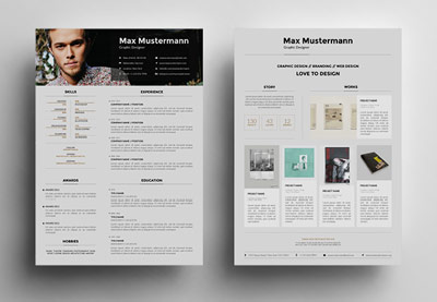 Resumes25+ Creative Resume Templates: To Land a New Job in StyleSean Hodge
 Resumes25+ Professional MS Word Resume Templates With Simple Designs For 2019Marc Schenker
Download a Creative Resume Design Today
Have you been looking to refresh your resume recently? Have you landed a dream job off the back of your resume design? We’d love to know! Feel free to share your experiences, comments and tips below.
Ready to create your own resume from scratch? Check out this tutorial on creating a unique, versatile resume. Or browse the full range of creative resume templates available at Envato Elements or on GraphicRiver. Why not start creating your updated resume today?
Editorial Note: This post was originally published in 2016. It has been comprehensively revised to make it current, accurate, and up to date by our staff—with special assistance from Nona Blackman.
{excerpt}
Read More