When it comes to print design, gig posters are one of the most fun projects to create. Music is one of those things that enhance creativity. When designing a gig poster, we have the band’s music for inspiration and can set our imagination free to do something out of the box.
The style of the poster needs to be one that matches the band or the artists. The end result should be attractive and impactful as the end viewer will be looking at the artwork quickly. The poster’s goal is to communicate important information in a clear and effective way. We need to find a creative way to convey a message while finding balance and having an attractive finished artwork.
Today, I’ve gathered five design tips for designing a gig poster, using some great templates as examples. Let’s get started!
1. Use the Old as Inspiration for the New
Design is all about reimagining, reinventing, and adding our own flair. Explore the past, taking elements from another decade’s music style and repurposing them to create something new.
Whether we are trying to achieve a minimal style or a full illustration, taking widely known components works really well to convey a message in a matter of seconds. Here are a couple of examples in different styles that work really well when exploring the past.
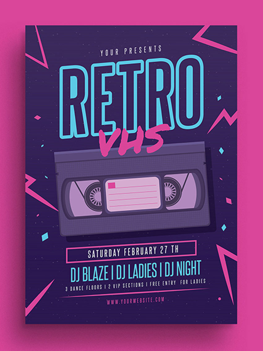
- Traditional illustration: Iconic elements that represent a specific era like a cassette (or, as in this example, a VHS tape) mixed in with a cool illustration style create something fun and new. The 80s were the beginning of the digital generation. These colours are distinct to computer graphics, and they complement the illustration style, making the poster bright, whimsical, and nostalgic.

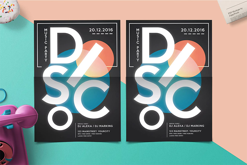
- Minimalist approach: Taking inspiration from the flashing spotlights that throbbed to the beat of the music back in the 70s, this poster does a great job at communicating the style of the event. While some might say that the circles are very simple, the subtle gradient on the smaller element makes the poster that much more meaningful.
The type treatment also took inspiration from the freestyle dancing of the 70s, adding a whole new layer of meaning to the artwork.

2. Typography Matters
While sometimes imagery plays a much more important role in creating a gig poster, typography shouldn’t be left behind at all. This element is just as important to create a successful poster. When designing, try to take your time composing and customizing the typography to harmonize with the rest of the elements.
- Sans Serif: Most of the time, gig posters will be looked at from afar, and sans serif typefaces are the easiest to read when the viewer only has seconds to take in information. While this is not your traditional sans serif, this font has the right personality for the type of event. In this case, the graphics work around the text to give it prominence.

- Display: Out-of-the-box typefaces usually fall within this category. Display typefaces tend to evoke a certain type of feeling and announce very important information. In this gig poster, we see it as the name of the DJ and the date. A sans-serif typeface is on the secondary information to harmonize the main text.

3. Try New Image Techniques
Always wanted to try collage but never had the chance? What about that new Photoshop trick you’ve been waiting to pull out of your pocket?
Experimenting with new techniques is a great way to capture the essence of the music you are creating the poster for. The results can be staggering and will undoubtedly be something visually fresh.
- Double Exposure: Superimposing multiple exposures to create a single image can be a technical trick, but when it comes to music it is not. Music and lyrics can be poetic, and this technique can convey many messages in a surreal way.

- Collage: Experimenting with collage is a fun way to translate musical emotions into visual art. This technique can bring never-thought-of imagery to create an out-of-this-world poster that evokes a wide range of feelings.

4. Let the Colour Speak
Colour is important to catch the viewer’s attention. I’ve said that music is poetry, but another way to invoke emotion is through colour. Consider the emotions that the music and lyrics make you feel and how we can translate this into colour.
There are websites like Adobe Color CC that help with finding colour combinations. Alternatively, colour theory readings are a practical guide to mixing colours and how to be subjective in evoking specific feelings.
- Black and white: These are the strongest of neutral colours. While they are both in opposite colour spectrums, they are both associated with sleekness, minimalism, and cleanliness. When mixed together, they create high contrast with resounding simplicity. Below is a classical music poster, which is pure and traditional, but the colours mixed in with the imagery make it evocative and strong.

- Colour: Jazz is a major musical expression that requires improvisation on the spot. This musical style is full of rhythm and harmony. The blue in this poster is energising and refreshing. The red is a beautiful and powerful accent colour that just brings the poster to life. Both cool and warm tone colours in harmony create a pleasing balance.

5. Texture Is Key
One of the most understated elements in creating a gig poster is texture. This element can be applied in many forms, such as brushes in Photoshop or screen/halftones. Textures can bring a basic flat poster to life by adding a visual-tactile feel that you didn’t know you needed.
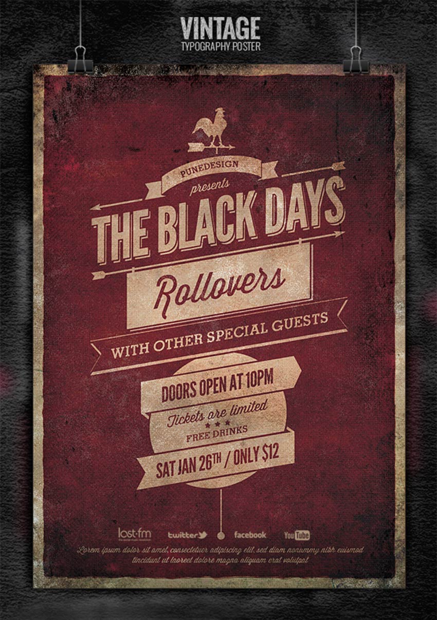
- Stippled Brush: By adding texture, you can bring depth to what could be a flat design. Below, a grunge stippled brush is used around the edges to further emphasize the information placed in the centre of the poster. Adding this type of roughness to a poster can also evoke a certain emotion that goes hand in hand with the type of music we are trying to promote.

- Halftone: This technique is applied specifically to convey a vintage feel. Screen printing was widely used in the past and is making a comeback. Unfortunately, printing costs can be high to achieve the look, but Photoshop comes to the rescue! With a simple filter, halftones will go a long way towards giving your poster a classic effect.

Gig Poster Checklist
Whenever you are tasked with creating a flyer, you can refer to this checklist and you’ll be sure to create something amazing every time:
- Reinventing the old. Use a new visual style and mix it with well-known elements from the past to create a contemporary poster.
- Typography is important. Use appropriate typography for the music and the poster you are creating. If you can’t find the right font, get your hands dirty and create custom type—it can be fun!
- Try new techniques. Music and lyrics are poetic, and sometimes it’s difficult to find specific imagery. Don’t be afraid of experimenting with new styles and techniques!
- Let the colour speak. Research what colours mean in different cultures, and know when to tone it down or go all out!
- Textures can make or break the poster. Try adding grunge textures to add depth to a poster that seems too flat. It makes the poster instantly cooler and edgier.
I’ve covered a number of helpful tips to get you started with creating a gig poster. If you are feeling a bit lost, take a look at the templates I featured above and see if any of these are perfect for your event. You can also browse thousands of our designs at Envato Market and Envato Elements. Now that you are inspired, I can’t wait to see the results!
{excerpt}
Read More