
Are you a coffee
lover with a passion for beautiful fonts and hand-lettering? Follow this tutorial
to create a beautiful retro-style coffee-inspired poster that you can print
and hang on a wall in your kitchen! We’ll be using simple shapes, free fonts and some
drawing tools of Adobe Illustrator to create a balanced composition with a coffee
cup, whimsical text, and intricate hand-lettering. Then we’ll finish up by adding a
gentle textured touch to our poster.
By the end of this
tutorial, you’ll have discovered some useful tips and tricks that will help you to
create digital hand-lettering from scratch, modify ready-made fonts, and create your own hand-drawn lettering. You’ll be able to use these
techniques for your future artworks, creating new interesting lettering posters, cards and compositions!
There are not so
many great free fonts on the web, so I highly recommend getting some great fonts from Envato Market. They can serve you either as a reference or as a
full-fledged element of your composition, which you can easily modify and
recolor. Also, don’t forget to check these hand-written scripts and hand-lettered illustrations for inspiration! And let’s get started!
1. Think About the
Composition and Make a Rough Sketch
Step 1
First of all, there should be a certain
idea of the lettering poster that we’ll be creating. One morning I was
drinking my coffee with cinnamon and thought of a great start of the day. A
picture of a coffee lettering poster appeared in my head immediately, so I grabbed a piece of paper and made a very rough and fast sketch. You can see it
below.

Sometimes we need some more time to get
inspired, to make up a concept and the overall idea of the poster, to think over the composition, and to try different options. We can even
put our sketch away for a couple of days and then return to it with a fresh
eye.
Your image doesn’t have to be perfect at
this step; it is just a guideline that will help you to keep the right
proportions of the objects. In fact, it will be much easier to create straight
lines and even geometric shapes, using the tools and functions of the program.
Step 2
Start by making a New Document of 600 x 800 px
size and create a shape of the same size, using the Rectangle Tool (M) and filling it with chocolate-brown color. You
can Lock it in the Layers panel in order not to move it
while drawing.

2. Draw a Coffee Cup
Step 1
Create a New Layer and let’s start forming the cup from its top. Take the Ellipse Tool (L) and make a 160 x 20 px dark-beige oval. Switch to
the Rectangle Tool (M) and make a
light-beige shape of 160 x 100 px.
The shapes are of the same width, so we can
combine them together, as shown in the image below.
Switch to the Direct Selection Tool (A) and select the bottom anchor points of
the rectangle. Use the Live Corners
feature to make the bottom of the cup smooth and rounded by pulling the circle
corner markers up.

Step 2
We can use the Align panel to make the shapes perfectly aligned. Select both
shapes and click the ellipse once again to make it a Key Object. Use the Horizontal
Align Center function to align the shapes.

Step 3
Select the top oval shape, Copy it and Paste in Front
(Control-C > Control-F). Hold Alt-Shift
and shrink the top copy using the Selection
Tool (M) to make it smaller. Fill the shape with dark-brown color for the
coffee.
Let’s add the bottom part to the cup. Make a 60 x 12 px dark-beige rectangle and use the Direct Selection Tool (A) to make its
corners fully rounded. You can also adjust the Corner Radius from the control panel on top, while the shape is
selected with the Direct Selection Tool
(A).
Send
the shape to
Back (Shift-Control-[), beneath the cup.

Step 4
Now let’s add a handle to the cup. Make a 35 x 50 px rectangle on the right side of
the cup. Create a smaller rectangle on top and Send both shapes to Back
(Shift-Control-[). Use the Minus
Front function of Pathfinder
to cut the smaller rectangle out. Make the right side of the handle rounded with
the help of the Live Corners feature.

Step 5
Now we’ll create a saucer. Start by making a
200 x 40 px ellipse and Send to Back (Shift-Control-[), beneath
the cup. Make a smaller oval on top of the saucer, set its Fill to none, and apply a dark-beige color to the Stroke. Head to the Stroke panel, set the Weight to 2 pt and change the Profile
to Width Profile 2 at the bottom of
the Stroke panel.

Step 6
Let’s add a bright highlight on top of the
cup. Duplicate the base of the cup twice (Control-C > Control-F >
Control-F). Move the top copy to the right a bit by holding Shift and pressing the Right Arrow key a few times.
Select the two copies and use the Minus Front function of the Pathfinder to cut the shapes, leaving
only a narrow stripe. Detach the stripe from the edge of the cup, making it a
bit smaller and moving it to the right. Use the Eraser Tool
(Shift-E) to erase a part of the highlight.

Step 7
Let’s finish up our cup by adding a
small oval on top of the dark-brown coffee shape. Set the Stroke color to lighter brown and set the Weight to 2 pt in the Stroke panel or from the control panel
on top.

3. Create Whimsical Lettering
Step 1
Let’s start making the first word by
transforming the font. I’m using Bevan free font to type the word “Good”,
setting the Font Size to 75 pt in the Character panel (Control-T).
Go to
Object > Expand, turning our text into curves. Select the word and go to
Object > Path > Offset Path,
setting the Offset value to -3 px to create a smaller object inside
each letter.
Apply Offset
Path to the smaller shapes with -4
px Offset value.

Step 2
Let’s apply a texture to the inner shapes.
Select the shapes and head to the Swatches
panel. Open the Swatch Libraries Menu
and go to Patterns > Basic Graphics
> Basic Graphics_Lines. Select and apply the 6 lpi 50% swatch.
Finally, double-click the Scale Tool (S) to open the Scale options
panel. Set the Uniform Scale to 30% and uncheck the Transform Object box in order to scale
only the pattern itself, making the stripes much thinner.

Step 3
Apply a black 1 pt Stroke to the shapes, setting the Cap and Corner to middle
positions in the Stroke panel.

Step 4
Now we’ll work on the colors to make the
letters more three-dimensional. Select the bottom shapes of the letters and fill them with vertical
linear gradient from dark brown to light brown, forming a thick
outline.
Then select the middle shapes and apply a
vertical linear gradient from beige at the bottom to white on top.
Now let’s change the color of the line pattern as
well. In order to do that, first of all we need to Object > Expand Appearance of the textured shapes. You will see
a bunch of lines, hidden inside the Clipping Masks. Now we can select these
shapes and apply a dark-brown vertical gradient, making the lines shiny.

Step 5
Let’s transform the word to make
it slightly arched. Go to Effect > Warp >
Arc and set the Horizontal Bend
value to 15%. Click OK and Object > Expand Appearance to apply the effect.

Step 6
Now that our first word is ready, let’s
move on to the second one. This time, we’ll do some hand-lettering with the help of the Pencil Tool (N). You can adjust the settings by double-clicking the Pencil Tool (N) and setting the
Fidelity slider closer to the Smooth side in order to make the lines flowing.

Step 7
I’m using the Pencil Tool (N) with 3 pt
Stoke Weight to trace the letters of my sketch. As you saw at the very
beginning, the sketch is very quirky, so I’m using it only as a rough guide
image. As you can see, the final letters are larger than those on the sketch.
They look clean and even.
If you don’t feel confident with your handwriting
yet, try finding any whimsical font of your liking and practice tracing the
letters, using the font as a reference, until you get the desired result.
Practice makes perfect.

Step 8
When you’re happy with your letters, Object > Expand to turn our strokes
into objects. And now we can apply a gentle linear gradient from beige to
white, giving our text a shiny metallic effect.

Step 9
Let’s move on to the next word. For this
one, I’ll be using the Amatic free font. It already looks hand-inked and a
bit quirky, just what we need! The only detail we’re going to add here is an
intricate swirl on the left. Use the Pencil
Tool (N) and attach the swirl to the letter “S”.

Step 10
Now we can Object > Expand our text and fill it with a vertical linear gradient.
This time I want to make a distinct line in the center of the gradient, adding
more contrast between the colors. As you can see in the image below, I add two
contrast colors right in the center of the gradient bar, placing the sliders
very close to each other.

Step 11
Let’s move on and add the word “with…”, using
a typewriter style font, like Inconsolata or Courier New. It looks too
straight and geometric, so we’ll use the Blob
Brush Tool (B) to give it a hand-drawn look. You can double-click the Blob Brush
Tool (B) and adjust the settings to make the lines accurate or smooth. I’m
setting the Fidelity slider to the middle position and selecting the smallest Size of the brush.
Trace the letters, making them look a bit
more quirky.

Step 12
Before we add the last word, let’s create
an additional element: a simple, elegant ribbon. Start with a 310 x 70 px rectangle, setting its Fill color to light-beige and its Stroke color to dark brown with 3 pt Stroke Weight.
Go to
Effect > Warp > Arc and set the Horizontal
Bend value to -20%.
Object > Expand Appearance to apply the effect.

Step 13
Let’s add folded tips to our ribbon.
Make a 55 x 55 px square with the Rectangle Tool (M). Grab the Add Anchor Point Tool (+) and place an
anchor point in the middle of the right edge. Use the Direct Selection Tool (A) to drag the point to the left.
Rotate the shape and attach it to the right
side of our ribbon, Sending it to Back (Shift-Control-[).
Double-click the Reflect Tool (O) and
flip the shape over the Vertical Axis. Click
Copy to create a mirrored copy for
the opposite side of the ribbon.

Step 14
Let’s create the word “Coffee”, using the
Limelight free font, and place it over the ribbon. Go to Effect > Warp > Arc and set the Horizontal Bend value to -20%.
Adjust the Text Size and the Tracking of
the letters (the spacing between the letters) in the Character panel (Control-T) to make the text fit the ribbon.

Step 15
Now we can Object > Expand Appearance to apply the effect, turning the text
into curves. Let’s apply a vertical linear gradient from dark brown to
lighter brown, making the letters more intricate.

Step 16
That’s how it looks all together.

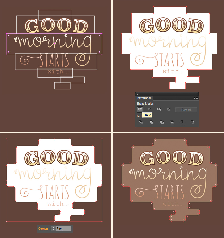
4. Add Hand-Drawn Elements to the Poster
Step 1
Let’s make a stylized cloud around the
text. Use the Rectangle Tool (M) to
make a set of rectangles of different sizes to fit each word.
Unite all the rectangles in the Pathfinder and select the shape with
the Direct Selection Tool (A). Head
to the control panel on top and set the Corner
Radius to 7 px, making the shape
a bit smoother. Set the fill color to light coffee-brown.
Step 2
Now let’s arm ourselves with the Pencil Tool (N), setting the Stroke
color to light-brown, the Stroke
Weight to 1 pt, and the Cap and Corner to middle positions.
Start making shorter and longer strokes around the objects, outlining and
underlining them. This way we start filling the blank spaces of our poster.
Move on by adding flowing swirls in the
bottom part of the composition.

Step 3
Let’s make a simple branch. Use the Arc Tool (you can find it in the same
drop-down menu as the Line Segment Tool
(\)) to make an arched line for the stem. Use the Pencil Tool (N) to make a drop-like shape for the leaf and attach
it on top of the stem. Hold Alt-Shift
and drag to copy the leaf. Make several pairs of leaves on both sides of the
stem and arrange them as shown in the image below.

Step 4
Copy the created branch and make a
variation by making the copy smaller, applying a lighter-brown color, and
switching the leaves from Fill
to Stroke.
Place the created branches on both sides of
the cup.

Step 5
Now let’s create another element by
combining two arched lines and placing small circles on top of each tip. Fill the blank areas next to the cup and to
the ribbon by placing the created elements there.

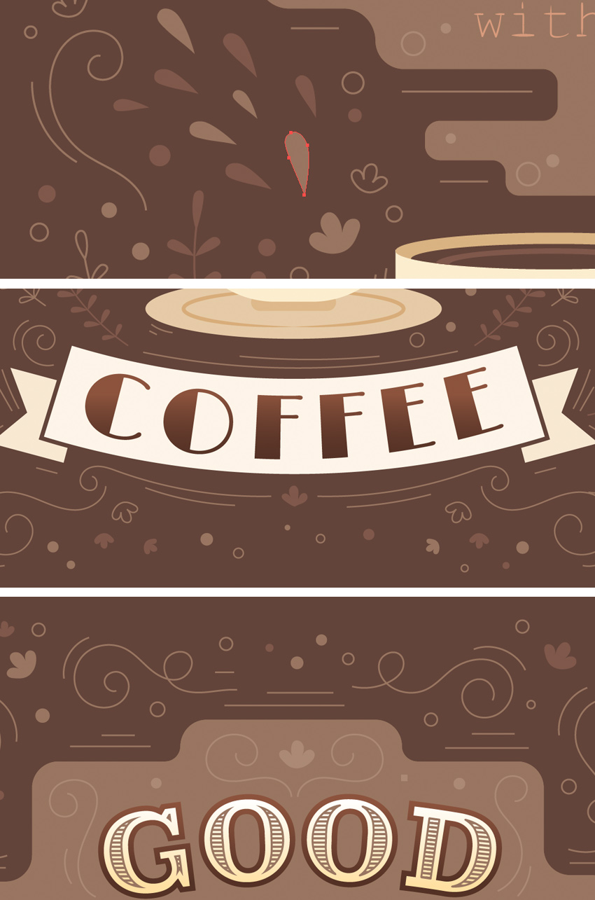
Step 6
Continue filling up all the blank spaces of
the poster, moving from the bottom of our image up to its top. Use the simple
lines, swirls and branches that we created and add variety by adding some other
small objects: circles, leaves, drops, and tiny flower blossoms.
Here are some close-up fragments for you
to see those small generic elements. Nothing really complicated and yet it
helps us to create a proper look with a warm coffee atmosphere.
5. Add Texture to Your Lettering Poster
This section is optional. Our poster is already completed, but we can still improve it a little.
Now that
the poster is ready and you’re happy with it, you can proceed to export and
just leave it as it is. However, I’d recommend adding a touch of texture, which
will make our lettering more unique, giving it a certain retro look.
Let’s see how we can do it!
Step 1
First of all, we need to create a large
rectangle and fill it with a vertical linear gradient from black to white.
Go to Effect
> Texture > Grain. In the effect options window, select the Stippled Grain Type and adjust the Intensity and Contrast by moving the sliders and checking the preview. I’ve set
the Intensity to 50 and Contrast to 30.
Click OK
as soon as you’re satisfied with the result.

Step 2
Now we need to turn this effect into a
vector object! Object > Expand
Appearance of the shape, turning it into a bitmap image, and head
straight to the control panel on top, to the Image Trace panel. Select the High
Fidelity Photo preset from the drop-down menu to trace the image.
Right after that, you will see the Image Trace Panel button appear in the
control panel on top, which allows us to adjust the settings of the traced
image. You can see my settings in the screenshot below.

Step 3
Finish up by clicking the Expand button in
the control panel on top, to apply the tracing result and turn our image
into a vector. If there is a set of white shapes left after tracing, use the Magic Wand Tool (Y) to select and
delete them.
Select all the remaining black shapes, Unite them in the Pathfinder and go to Object
> Compound Path > Make (Control-8), turning all separate pieces into
a single object.

Step 4
Now that we have this textured grungy
shape, let’s apply it to the cup. Place the shape across the cup. Duplicate (Control-C > Control-F)
the base of the cup and Bring the
copy to Front (Shift-Control-]),
above the texture.
Select both the texture and the cup copy,
click the right mouse button and Make Clipping Mask. This way we hid the texture inside the cup.
Now let’s adjust the color!

Step 5
Now we can select our texture inside the Clipping Mask in the Layers panel and apply a gentle linear
gradient from white to beige. Switch the Blending
Mode to Multiply in the Transparency panel, making the shape
semi-transparent.
Use the same technique to add a grungy
texture to other elements as well, such as the ribbon and the text cloud.

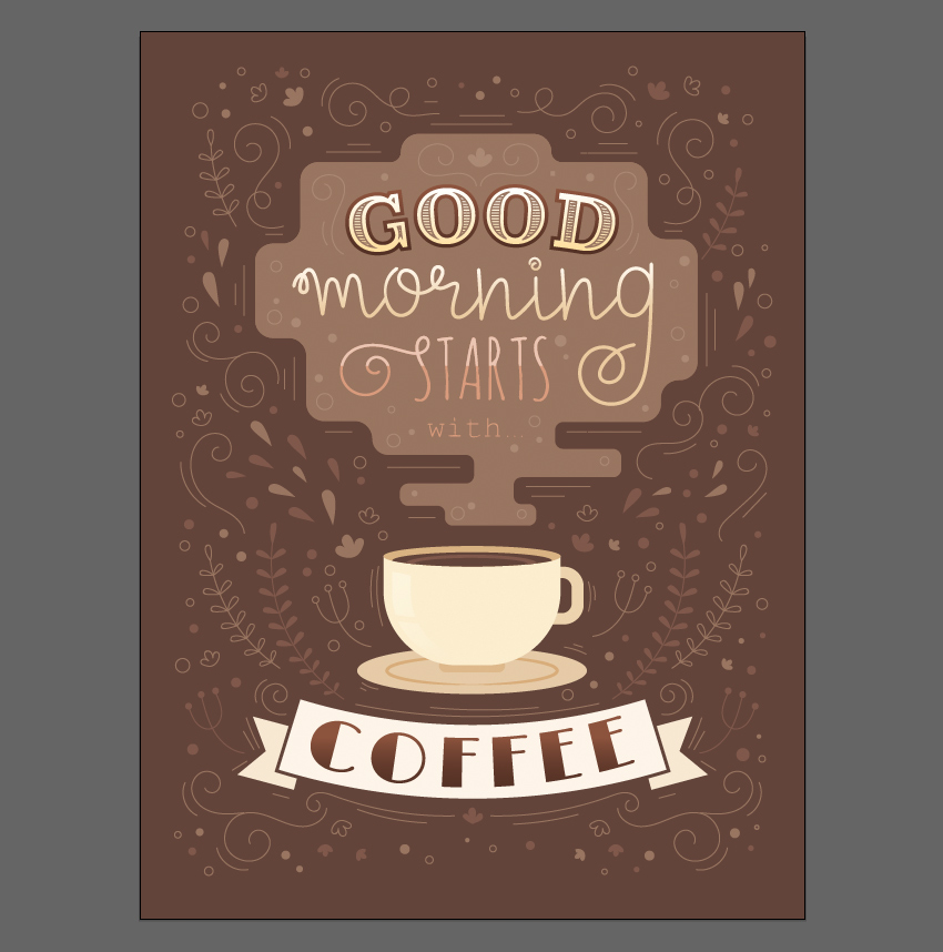
That’s All, Folks! Time for a Coffee Break!
Great job, my friends! Our coffee lettering
poster is finished. I hope you’ve enjoyed following this tutorial and
discovered some new tips and tricks that will inspire you to create more lettering
posters on different topics, for example a nautical poster or a card with a motivational quote.
If you like to try out a few more
techniques on creating digital lettering, go ahead and check out these
tutorials as well:
 Hand LetteringHow to Design a “Love” Lettering Card in Adobe IllustratorYulia Sokolova
 VectorDesign a Crazy Retro Poster with Quirky Lettering in Adobe IllustratorYulia Sokolova

{excerpt}
Read More