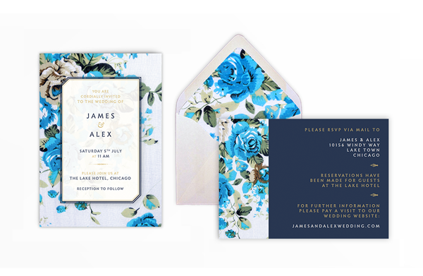
If you’ve ever wanted to DIY your wedding invitations, this tutorial is for you!

Here, we’ll be creating a two-sided wedding invitation with a rustic, floral design that’s really simple to customize and make your own. You’ll also learn how to design your own envelope to match, which has a beautiful floral lining.

You’ll need access to Adobe InDesign and Adobe Illustrator for this tutorial, and you can print the invites either professionally or at home.
Discover even more beautiful invitation templates over on Envato Market.
1. Create Your Envelope Die Line
One thing that many people forget about when they are trying to design their own wedding invitations is the envelopes! Envelopes come in a variety of standard sizes, whereas invites can vary drastically in size, so it’s always a good idea to pin down your envelope size first, before you size your invitation.
Here, we’ll be creating a template for a standard size envelope with a pointed flap, called ‘6 Baronial’ in the trade. This will create an envelope 4.75 in by 6.5 in when folded and closed.
Step 1
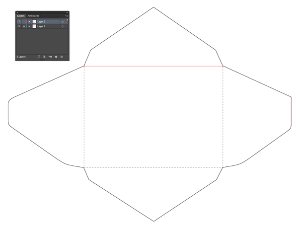
To begin, Right-Click (Windows) or Control-Click (Mac) and Save the image below to your computer.

Open up Adobe Illustrator and go to File > New to create a new document. File > Place the saved image onto your artboard.
Lock the layer from the Layers panel (Window > Layers) and click on the Create New Layer button.
Now it’s time to get tracing! Use the Pen Tool (P) to trace around the straight edges of the template around the outside.

Click and drag the Pen Tool to create curves to trace the more rounded edges of the template, or switch to the Arc Tool if you find that easier to use.

Work your way around the whole outside of the outline—don’t tackle the dashed lines yet—and then drag your mouse across the page to select your whole outline. Right-Click (Windows) or Control-Click (Mac) > Join.
Then use the Pen Tool (P), and hold down Shift while you do, to trace the four dashed lines in the middle of the template. Set the stroke to a dashed stroke to mimic the original image, and show that these are fold lines, not cut lines.

Drag your mouse over the entire vector, to select everything you’ve created and Right-Click (Windows) or Control-Click (Mac) > Group.
Then head up to Edit > Copy.
Save your template as ‘Envelope Die Line.ai’ and you can leave Illustrator for now.
Step 2
Open up Adobe InDesign and go to File > New > Document.
Keep the Intent set to Print, and set the Number of Pages to 2. Deselect Facing Pages.
When folded, our envelope will measure 154 mm by 109 mm (4.75 in by 6.5 in), but to create the template we will need to allow for the dimensions of the envelope when fully extended.
So, let’s set the Width to 337 mm and the Height to 255.5 mm.
Keep the Margins and Bleed to their default values, and add a Slug of 100 mm on all sides. This just gives us a bit of extra space to play with.

Click OK to create the new document.

Step 3
Expand the Layers panel (Window > Layers) and double-click on the default Layer 1 name. Rename the layer as Instructions and click OK.
Click the Create New Layer button at the bottom of the panel. Rename the new layer Envelope Color and click OK.
Create a further two new layers, called Envelope Lining and, finally, on the top of the pile a layer called DIE LINE – DO NOT PRINT.

Lock all the layers except the top layer, DIE LINE – DO NOT PRINT. Click on the layer to activate it.

Step 4
Expand or open the Swatches panel (Window > Color > Swatches).
Choose New Color Swatch from the panel’s drop-down menu.
Name the swatch ‘Spot Magenta’ and set the Color Type to Spot.
Choose CMYK for the Color Mode. Move all the sliders to 0, except Magenta—slide this up to the full 100%.

Click Add and then OK to create the swatch.
Step 5
Go to Edit > Paste to paste your vector die line onto the layer. Hold Shift while you resize the vector, so that it fits perfectly on the page, as shown below.
Set the Stroke Color of the vector (which you can see will now be editable from the Swatches panel) to Spot Magenta.
With the vector still selected with your cursor, go to Window > Output > Attributes.
Check the box that reads Overprint Stroke. This will prepare your die line for professional die cutting.

Select the vector and Edit > Copy. Scroll down to Page 2 of the document and Edit > Paste in Place.

Step 6
Return to the Layers panel and lock the DIE LINE – DO NOT PRINT layer. Unlock the bottom layer, Instructions.
Using the Type Tool (T), create a few text frames to explain that Page 1 is the Outside of the Envelope and that Page 2 is the Inside.
Add a To Cut and To Fold key onto both pages as well, as shown, using the Line Tool (\) and Stroke panel (Window > Stroke) to create a solid and dashed line to indicate cut and fold respectively.

These instructions will be printed, but they will be cut off during the post-print process.
2. Add Color to Your Envelope
Step 1
Return to the Layers panel and lock the Instructions layer. Unlock both the DIE LINE – DO NOT PRINT and Envelope Color layers.

Select the vector die line on Page 1 of the document, and Edit > Paste.
Go to Edit > Paste in Place to create a second copy of the die line on the same layer.
From the DIE LINE – DO NOT PRINT layer, click on the arrow next to the layer’s name in the panel to reveal both elements that are sitting on the layer, each called <group>.

Drag one of the <group> items down, dropping it onto the Envelope Color layer below.

Lock the DIE LINE – DO NOT PRINT layer, and click on the Envelope Color layer to activate it.
Step 2
Select the die line on the Envelope Color layer and, from the Attributes window, deselect the Overprint Stroke check box.
Return to the Swatches panel and create a new CMYK swatch, choosing Process for Color Type and setting the values to C=0 M=1 Y=4 K=0. Name the swatch ‘Cream’.

Right-Click (Windows) or Control-Click (Mac OS) > Ungroup the vector outline, and select and delete the dashed fold lines, so just the solid outline remains.
Set the Stroke Color of the envelope outline to [None]. Apply the Cream swatch to the Fill Color of the outline, to fill the whole envelope outline with color.

Copy and Paste in Place the cream envelope onto Page 2 to create an identical colored background.

3. Create a Lining for Your Envelope
Step 1
Stay on Page 2 of your document. This is the inside of your envelope, which is where we want our decorative lining to appear.
Select the cream envelope and Edit > Copy. Edit > Paste in Place. Unlock the Envelope Lining layer.
Drag the pasted <group> up from the Envelope Color background so that it sits on the Envelope Lining layer.
Lock the Envelope Color layer, so that you’re just working on the Envelope Lining layer.
Adjust the Fill Color of the envelope outline to [None] and, for now, set the Stroke Color to [Black].
It might be clearer to see what you’re doing with your outline if you drag it onto the pasteboard, so do that if you like.
Take the Scissors Tool (C) and snip at the two points where the top triangular section of the envelope meets the central part of the envelope. Select and delete this top triangular section.

Step 2
Now you have just this section of the envelope outline. Stick with me!

Next, you need to take the Pen Tool (P) and create two straight lines that meet in the very center of the envelope, creating a simple triangle shape as shown.
These lines need to be parallel to the outline of the envelope shown in cream. It might be easier to take the outline back over to the page, and lay it over the top to get the lines looking parallel. I’ve found that a 98.85 mm Length for each line works pretty well.

Take your mouse and select both of the new lines you’ve just created. Go to Object > Paths > Join.

Then select the joined lines and the remaining black outline of the envelope and again go to Object > Paths > Join.
You now have a unified black outline.

Step 3
Move your outline over to the page and lay it on top of the background color, so that it aligns perfectly.
You can select an image to line your envelope, and you can match this to your preferred wedding theme or color scheme. Floral designs look really lovely, and make a very romantic choice of lining.
I’ve gone for this floral photograph with a vintage look, from over on Envato Market.

Download your image and save it to your chosen project folder.
Back in your InDesign document, with the envelope outline selected, go to File > Place. Choose the image and select Open, and scale and arrange the image in the frame you’ve created.

Great work! Your envelope artwork is finished, and it’s looking fantastic. All you need to do now is export it for printing…
Step 4
First up, File > Save As your InDesign file and call it ‘Envelope.indd’.
Then go to File > Export. Select Adobe PDF (Print) from the Format drop-down menu.
Click Save to open the PDF Settings dialog box. From the Adobe PDF Presets drop-down menu choose [PDF/X-1a:2001].

Simply click Export to create a ready-to-print PDF. You can now send the PDF to be printed and die cut professionally. Ask your printer to fold and glue the envelopes too—the final result will be much nicer!

4. Design Your Wedding Invite
Now you have your bespoke envelopes designed, you can size your invite and get started with putting the invitation itself together.

Let’s get started!
Step 1
First up, you need to decide how big your invitation is going to be. Ideally, invitations should have a 1/8 to 1/4 inch margin of free space between the edge and the inside edge of the envelope.
The ideal size for our invite is therefore going to look like this highlighted area:

We’ll be creating our invitation in Adobe InDesign. Go to File > New > Document.
Set the Number of Pages to 2 and deselect Facing Pages.
From the Page Size drop-down menu select Custom… to open up the Custom Page Size window. Type in ‘Rustic Wedding Invitation’ for the Name and set the Width to 109 mm and Height to 154 mm. Click Add and OK.

Back in the New Document window, set the Margins on all sides to 10 mm and add a Bleed of 3 mm all the way around.

Click OK to create your invitation document.

Step 2
Scroll down to Page 2 of the document. Select the Page Tool (Shift-P) and click on the page to select it.
From the control panel at the top of the workspace, click on the Landscape Orientation button to twist the page around to a landscape format.


Step 3
Expand the Layers panel (Window > Layers) and rename the default Layer 1 as Background Color.
Create a further three new layers—Flowers, Overlay and, finally, Typography.

Lock all layers except the bottom layer, Background Color.

Step 4
Expand the Swatches panel (Window > Color > Swatches) and create a new CMYK swatch.
Name the swatch Midnight Blue and set the values to C=87 M=75 Y=41 K=40. Click Add and OK.

Create two more new CMYK swatches with the following names and values:
- Cream – C=0 M=1 Y=4 K=0

- Gold – C=16 M=24 Y=65 K=3

Step 5
Take the Rectangle Tool (M) and drag across the whole of Page 2 to create a rectangle that extends up to the edges of the bleed.
Set the Fill Color of the rectangle to Midnight Blue.

Step 6
Return to the Layers panel and lock the Background Color layer. Unlock the next layer up, Flowers.
Take the Rectangle Frame Tool (F) and create an image frame 48 mm in Width and 115 mm in Height. Position on the far left of Page 2, resting the left edge against the left edge of the bleed.
File > Place the same floral image you used for the lining of the envelope.

Hop up to Page 1 of the document and create another image frame using the Rectangle Frame Tool (F); this time one that stretches across the whole page, up to the bleed edge.
File > Place the same floral image again.

Step 7
Lock the Flowers layer and unlock the next layer up, Overlay.
Take the Rectangle Tool (M) and drag onto the page to create a rectangle 68.5 mm in Width and 108.5 mm in Height. Position centrally on Page 1.
With the rectangle selected, go to Object > Corner Options. Click on the broken chain button in the center of the window to allow you to enter different values for each corner.
Set the top right and bottom left corners to 6 mm in Size and with a Bevel Corner Shape. Click OK.

Expand the Stroke panel (Window > Stroke) and set the Weight of the rectangle’s stroke to 3 mm. Choose to Align Stroke to Inside from the Align Stroke options. Set the Type to Thin – Thin.

Finally, give the rectangle a [None] Fill Color and a Gold Stroke Color.

Step 8
Select the rectangle and Edit > Copy, Edit > Paste in Place.
Set the Fill to Cream and adjust the Stroke Color to Midnight Blue.
From the Stroke panel, set the stroke to Align Stroke to Outside, and switch the Type to Thick – Thick.

Step 9
Select the cream rectangle and go to Object > Effects > Transparency. Reduce the Opacity to 95%.

From the window’s left-hand menu, check the box next to Drop Shadow.
Under the Drop Shadow options, set the Mode to Multiply and the Opacity to 33%.
Set the Distance to 1 mm, Angle to 135 Degrees, Size to 5 mm and Spread to 4%. Click OK to apply the effects to the shape.

Step 10
Now you’re ready to start adding some text to your invitation! Return to the Layers panel and lock the Overlay layer. Unlock the top layer, Typography.
I’ve used three typefaces for the design here—Adobe Caslon Pro (which will be included with your default InDesign font menu), the free-to-download Infini, which is a lovely modern take on the humanist sans serif style, and Davys for glyphs.
Download and install Infini and Davys and you’re ready to go!
Create new text frames with the Type Tool (T) and set each section of information in a new frame—this makes it much easier to edit and move around.
Try setting the names in Infini, Midnight Blue and set the central ampersand (&) in Adobe Caslon Pro Italic, Gold.


Step 11
Build up the rest of the text on Page 1, setting text in Infini and varying the colors between Midnight Blue and Gold.

Use the Glyphs panel (Window > Type & Tables > Glyphs) to scroll through the selection of glyphs available in Davys, and use some of these to create ornate, decorative dividers.

On Page 2, set the text to Align Right, and position the text frames against the right-hand margin.
Again, use the Davys glyphs to create unique dividers to help separate chunks of information.

Try setting important contact details in a Cream or [Paper] (white) color to help them stand out.

Step 12
Once you’re happy with your text, all that’s left to do now is export your invitation ready for printing.
Go to File > Export and choose Adobe PDF (Print) from the Format drop-down menu.
In the Export PDF window, choose [Press Quality] from the Adobe PDF Preset drop-down menu.

Under the Marks and Bleeds options, check the box next to All Printer’s Marks and check the box reading Use Document Bleed Settings.

Click Export to create your PDF. This is now ready for sending straight off to the printers!

Your Completed Invitation and Envelope
Your invitation and envelope are now finished, and ready for sending off to the printers! Fantastic work!

In this DIY wedding invitation tutorial you’ve picked up some widely applicable skills for creating print-ready artwork that looks super-stylish. You now know how to:
- Create a vector die line in Adobe Illustrator
- Set up an envelope template in Adobe InDesign
- Apply a background color and decorative lining to your envelope
- Export your envelope ready for printing and die cutting
- Create an appropriately-sized invitation template in Adobe InDesign
- Apply colors, images, shape and typography to your invitation to create a stylish rustic look
- Export your invitation as a press-quality PDF ready for professional printing
Phew! That’s a lot to learn, so great work! Feel free to share your invitation designs in the comments below.
If you’re still looking for the perfect invitation for your big day, check out the huge range of stylish templates over on Envato Market.
{excerpt}
Read More