
In the following steps you will learn how to create a simple map design in Adobe Illustrator.
For starters you will create the main map shapes using a free SVG file and basic vector shape-building techniques. Next, using the Pen Tool, stroke tricks and graphic styles, you will create a set of paths.
Moving on, you will create three icons using simple shapes and paths along with the Warp and Offset effects. Finally, you will learn some neat tricks on how to make your work easier using text, the Appearance panel and some effects.
If you’re looking to skip the process or if you’re looking for a different type of design, you can find a variety of map designs and infographic designs on Envato Market.
1. Create a New Document and Set Up a Grid
Hit Control-N to create a new document. Select Pixels from the Units drop-down menu, enter 600 in the Width box and 780 in the Height box, and then click the Advanced button. Select RGB, Screen (72ppi) and make sure that the Align New Objects to Pixel Grid box is unchecked before you click OK.
Enable the Grid (View > Show Grid) and the Snap to Grid (View > Snap to Grid). For starters, you will need a grid every 5 px, so simply go to Edit > Preferences > Guides > Grid, and enter 5 in the Gridline every box and 1 in the Subdivisions box. Try not to get discouraged by all that grid—it will make your work easier, and keep in mind that you can easily enable or disable it using the Control-“ keyboard shortcut.
You can learn more about Illustrator’s grid system and how it can make your work easier in this short tutorial from Andrei Stefan: Understanding Adobe Illustrator’s Grid System
You should also open the Info panel (Window > Info) for a live preview with the size and position of your shapes. Don’t forget to set the unit of measurement to pixels from Edit > Preferences > Units > General. All these options will significantly increase your work speed.

2. Add the Map and Create a Shape for each Continent
Step 1
For these first steps you can disable the grid and the Snap to Grid feature, and don’t forget that you can quickly do it using the Control-“ and the Shift-Control-” keyboard shortcuts. First of all you will need this free SVG file. Download it and open it in Illustrator. Select that entire black map and hit Control-C to copy it.
Return to your document, hit Control-V to paste the map and then simply hit Shift-Control-G to Ungroup those shapes. Now make sure that your map shape stays selected and place it roughly in the center of the artboard as shown in the second image.

Step 2
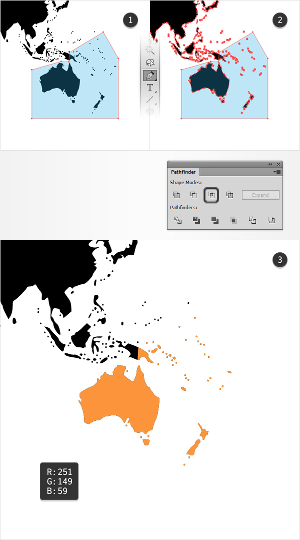
Make sure that your map shape is still selected and make a copy in front using the Control-C > Control-F keyboard shortcuts. Using the Pen Tool (P), create a simple path around the area that makes up the Australia continent.
Once you’re done, select this new shape along with the copy made a few moment ago, open the Pathfinder panel (Window > Pathfinder) and click the Intersect button. Make sure that all the resulting shapes remain selected and turn them into a compound path using the Control-8 keyboard shortcut or by going to Object > Compound Path > Make.
With this compound path still selected, focus on the Toolbar, double click on the existing fill color and simply replace the black with R=251 G=149 B=59.
Step 3
Reselect your entire map shape and make a copy in front (Control-C > Control-F). Move to the part of the map that makes up the African continent and create a simple shape around it using that same Pen Tool (P).
Select this new shape along with the copy made a few moments ago and click the Intersect button from the Pathfinder panel. Turn the resulting group of shapes into a new compound path (Control-8), make sure that it stays selected, and replace the existing fill color with R=255 G=200 B=0.

Step 4
Repeat the techniques used when you created the African and the Australian continents to create the European and American continents, and then use the fill color shown in the following images.

Step 5
Select the five coloured compound paths made so far and duplicate them (Control-C > Control-F). Select all these copies, click the Unite button from the Pathfinder panel and then turn the resulting group of shapes into one compound path (Control-8). Fill this new shape with R=140 G=98 B=57.

Step 6
Reselect your black compound path and make a new copy in front (Control-C > Control-F). Select this copy along with the brown shape and click the Minus Front button from the Pathfinder panel. Turn the resulting group of shapes into one last compound path (Control-8) and set its color to R=255 G=123 B=172.

Step 7
Focus on the Layers panel and open the existing layer. Select that black compound path and move to the Appearance panel (Window > Appearance).
Select the stroke, set the color to black and then click that “Stroke” piece of text to open the Stroke fly-out panel. Make sure that the Weight is set to 1 px and then check the Round Join and Align Stroke to Outside buttons.
Keep focusing on the Appearance panel, click the little arrow icon that stands for your stroke to expand it, and then click that “Opacity” piece of text to open the Transparency fly-out panel. Simply lower the Opacity to 10%.

3. Create the First Pointer and the Text Fields
Step 1
Enable the Grid (Control-“) and the Snap to Grid (Shift-Control-“).
Using the Pen Tool (P), create a simple path roughly as shown in the first image. Make sure that it stays selected and focus on the Appearance panel.
Be sure that there’s no color set for the fill, and then select the stroke. Set its color to R=84 G=28 B=176 and then open the Stroke fly-out panel. Make sure that the Weight is set to 1 px and then move to the bottom of the panel. Open the left Arrowhead drop-down menu and select “Arrow 22” from that list, and then focus on the left Scale box and decrease the amount to 50%. If that small square is positioned at the wrong end of the path, you can easily move it to the right spot using the Swap button that lies next to the Arrowhead menus.
In the end, your purple path should look like in the second image. With this path still selected, open the Graphic Styles panel (Window > Graphic Styles) and simply click the New Graphic Style button.

Step 2
Focus on the top end of your purple path and pick the Rectangle Tool (C). Create an 85 x 20 px shape, fill it with R=84 G=28 B=176 and place it as shown in the first image.
Using the same tool, create three 125 x 20 px shapes, fill these new rectangles with R=146 G=84 B=212 and then place them as shown in the second image.
Continue with the same tool and create three 20 px squares. Fill these shapes with R=115 G=56 B=194 and then place them as shown in the third image.

4. Create the Area Icon
Step 1
For this step you will need a grid every 1 px, so go to Edit > Preferences > Guides & Grid and enter 1 in the Gridline every box.
Using the Rectangle Tool (M), create a 12 px square, select it and focus on the Appearance panel. Make sure that there’s no color set for the fill, and then select the stroke. Pick a random orange for the color, be sure that the Weight is set to 1 px, and check Align Stroke to Inside from the Stroke fly-out panel.
Switch to the Pen Tool (P) and draw an oblique path exactly as shown in the second image—the grid and the Snap to Grid will make this easier. Add a 1 px stroke for this path, and don’t bother to add a color similar to the one used for the square.

Step 2
Using the Rectangle Tool (M), add the pairs of 1 x 3 px and 3 x 1 px shapes shown in the following images. Again, the fill color used for these new shapes is not important.

Step 3
Reselect that tiny square along with the oblique path and go to Object > Path > Outline Stroke. Select the resulting shapes along with the four rectangles that make up this icon and click the Unite button from the Pathfinder panel.
Make sure that the resulting shapes are selected, and turn them into a compound path (Control-8). This will be your area icon.

Step 4
Make sure that your area icon is still selected, place it as shown in the following image, and replace the existing fill color with white.

5. Create the Population Icon
Step 1
Using the Rectangle Tool (M), create a 6 x 3 px shape and fill it with a random orange.
Make sure that this new rectangle stays selected and go to Effect > Warp > Arc Upper. Enter the attributes shown in the following image, click the OK button and then go to Effect > Stylize > Rounded Corners. Enter a 1 px Radius, click the OK button and then go to Object > Expand Appearance.

Step 2
Using the Ellipse Tool (L), create a 4 px circle and place it exactly as shown in the first image. Make sure that this circle stays selected and go to Object > Path > Offset Path. Enter a 1 px Offset and then click the OK button.
Select the resulting shape along with the other orange shape and click the Minus Front button from the Pathfinder panel. Once you’re done, select the remaining orange shapes and turn them into one compound path (Control-8).

Step 3
Make sure that your orange compound path is still selected, make a copy in front (Control-C > Control-F) and then move it 1 px down and 3 px to the right.
With this copy selected, go to Object > Path > Offset Path. Enter a 1 px Offset and then click the OK button. Select the resulting shape along with the orange compound path on the left, and click the Minus Front button from the Pathfinder panel. Select the remaining orange shapes and turn them into a new compound path (Control-8). This will be your population icon.

Step 4
Make sure that your population icon is still selected, place it as shown in the following image, and don’t forget to replace the existing fill color with white.

6. Create the GDP Icon and Add the Text
Step 1
Open the Character panel (Window > Type > Character), pick the Type Tool (T) and simply click on your artboard.
Add the dollar sign, make it white and use the Cooper Black font with the size set to 12 px. This will be your GDP icon.

Step 2
Now, let’s add some text. Keep the Character panel opened and use that same Type Tool (T) to add the “NORTH AMERICA” text as shown in the following image.
Make it white, and this time use the SamsungImaginationBold font with the size set to 10 px. Make sure that this new piece of text stays selected and go to Effect > Stylize > Drop Shadow. Enter the attributes shown in the following image and then click the OK button.

Step 3
Using the same tools and attributes, add the numbers shown in the following image. For the percentage sign, lower the size attribute to 5 px.
Make sure that these new pieces of text are selected and simply hit Shift-Control-E (or go to Effect > Apply Same Effect) to quickly add the same Drop Shadow effect used for the other piece of text.

Step 4
Again, use the same tools and attributes to add the text shown in the following image. Once you’re done, don’t forget to add that Drop Shadow effect (Shift-Control-E).

Step 5
Select the rectangles, the three icons and the pieces of text highlighted in the following image and then Group them using the Control-G keyboard shortcut.
Move to the Layers panel, double click on your newly made group and rename it “Data“.

7. Create the Other Five Pointers and Add the Data
Step 1
Return to gridline every 5 px, so simply go to Edit > Preferences > Guides & Grid and enter 5 in the Gridline every box.
Using the Pen Tool (P), add another five paths roughly as shown in the following image, and use your graphic style to quickly add that square at the end of your path. Select these paths one by one and replace the existing stroke color with the colors shown in the following image.

Step 2
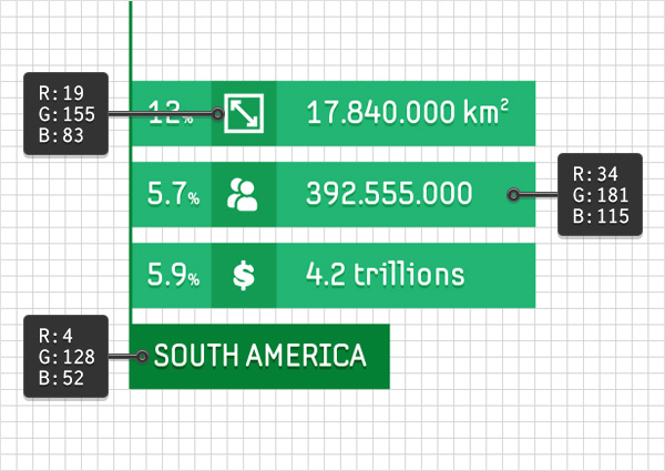
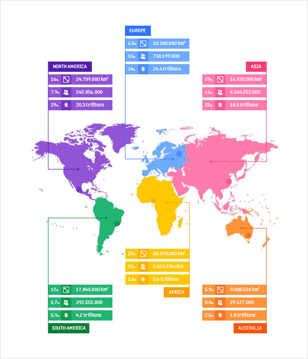
Now you need to multiply your “Data” group and place the copies at the ends of the new paths. Replace the colors used for those rectangles with the ones shown in the following images, edit the text (if you wish) and in some cases adjust the size or the position of the darkest rectangle that lies below the name of the continent.


8. Create the Round Indicators
Step 1
Using the Ellipse Tool (L), create a 10 px circle and place it roughly as shown in the following image. Make sure that this new shape stays selected and focus on the Appearance panel.
Select the fill, set its color to R=4 G=128 B=52 and go to Effect > Path > Offset Path. Enter a -3 px Offset, click the OK button and then return to the Appearance panel. Select the stroke, add the same color used for the fill, make sure that the Weight is set to 1 px and check the Align Stroke to Inside button from the Stroke fly-out panel.

Step 2
Make five copies of the circle added in the previous step and place them roughly as shown in the following image. Select these new shapes one by one and replace the color used for fill and stroke with the colors used for the paths that connect the continent shapes with the “Data” groups.
9. Create the Text Indicators
Step 1
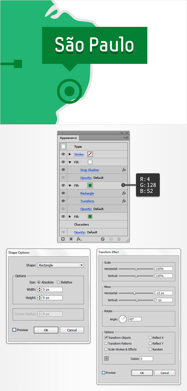
Focus on that green circle and pick the Type Tool (T). Add the “Sao Paulo” piece of text, pick a random color and use the SamsungImaginationBold font with the size set to 8 px.

Step 2
Make sure that your newest piece of text is still selected, get rid of the existing color and then focus on the Appearance panel.
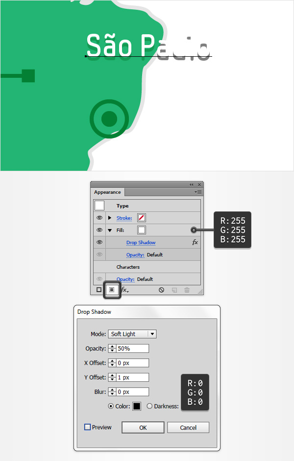
Add a new fill using the Add New Fill button, select it, set the color to white and then go to Effect > Stylize > Drop Shadow. Enter the attributes shown in the following image and then click the OK button.
Step 3
Make sure that your newest piece of text stays selected, keep focusing on the Appearance panel and add a second fill using that same Add New Fill button.
Drag this new fill below the existing one, make sure that it stays selected, set the color to R=4 G=128 B=52 and then go to Effect > Convert to Shape > Rectangle. Check the Relative box, enter 5 px in the Extra Width box and 3 px in the Extra Height box and then click the OK button.

Step 4
Make sure that your newest piece of text stays selected, keep focusing on the Appearance panel, add a third fill and be sure that it lies below the white one.
Select this new fill, set its color to R=4 G=128 B=52 and then go to Effect > Convert to Shape > Rectangle. Check the Absolute box, enter 5 px in both the Width and Height boxes, click the OK button and then go to Effect > Distort & Transform > Transform. Drag the Move-Horizontal slider to -10 px and the Move-Vertical slider to 7 px, set the Angle to 45 degrees and then click the OK button.
Step 5
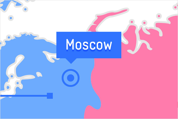
Duplicate your “Sao Paulo” piece of text and select the copy. Simply replace the existing text with “Mexico City” and then focus on the Appearance panel. Select the green fills and replace the existing color with the color used for that tiny circle.

Use the same tools and techniques to add the four pieces of text shown in the following images.


10. Add a Dark Background
Finally, let’s add a simple background.
Using the Rectangle Tool (M), create a shape the size of your artboard, fill it with R=51 G=51 B=51 and send it to back using the Shift-Control-[ keyboard shortcut.

Congratulations! You’re Done!
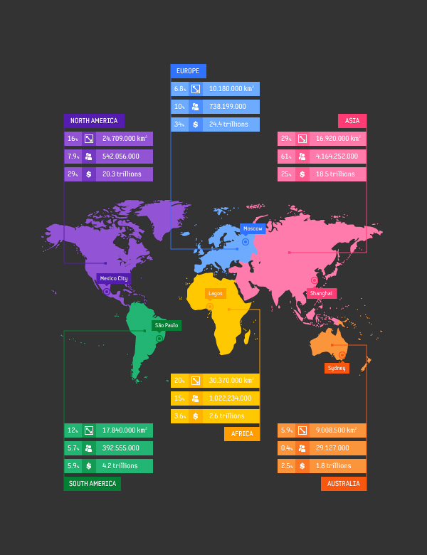
Here is how it should look. I hope you’ve enjoyed this tutorial and can apply these techniques in your future projects.
Feel free to adjust the final design and make it your own. You might find some great sources of inspiration on Envato Market with interesting solutions to improve your design.
{excerpt}
Read More