Hi there fellow icon lovers, today’s quick tip sheds light on the process of creating convincing icons in Adobe Illustrator. As a subject for our little case study, I’ve chosen a fruit, more precisely a strawberry, which we will have dipped in chocolate.
I chose the reference image from PhotoDune’s large library of images and it can be found on this page.
1. Do Your Research
As with any other
project, the first thing you should do when you need to create something is
learn about the subject. Research images and definitions, and find out what makes the
subject tick.
Skeuomorphism is
based on determining the characteristics that the design must take on in order
for the object to depict its physical counterpart as accurately as possible.
For our case study, we must strip down a strawberry
and learn about its basic structure and components.
Color
Say the word
strawberry and I bet that almost everybody on this planet will think of the
color red. But wait, strawberries aren’t completely red! They have green
leaves, and dozens of gold seeded little achenes.
Quick tip: Look up different images on
the internet, and save the ones that you think have the most attractive tints
of red, as we can use Illustrator’s Eyedropper
Tool to borrow and apply those colors to our artwork.

Shape
When I think of
the actual shape that defines a strawberry, one particular contour comes to my
mind: a heart. No, not one of those boomboxes we carry in our chest, but rather
the symbol we associate with caring, and loving, which is probably why
strawberries are so deeply associated with love, and passion (remember
Valentine’s Day).
At first, you might think that the subject’s
shape isn’t important, but when you start looking at how light bounces on and
off it, you realize that knowing and having the ability to visualize and
reproduce that in your design is probably the most difficult thing to do.

Anatomy
From an anatomical point of view, the strawberry
is composed of a main fleshy body (the receptacle) that houses the little
seeds (achenes). At the top we find the leaves (calyx) and the peduncle.
Because our icon will be based on a rounded rectangle shape, the only things we
need to represent are the receptacle, the achenes and the calyx.

2. Bigger Is
Better
When working on an icon, whether it’s a
strawberry one or something completely different, always try and start from the
biggest size possible (most of the time that’s the market/store icon – 1024 x
1024 px for iOS and 512 x 512 px on Android).
Why? Well, when you go down to
smaller and smaller icon sizes, you might find that some parts of the artwork
need to be either adjusted or removed completely, due to the fact that cramping
in all that information onto a very limited space might impact the viewer’s
understanding of the subject depicted in the representation.
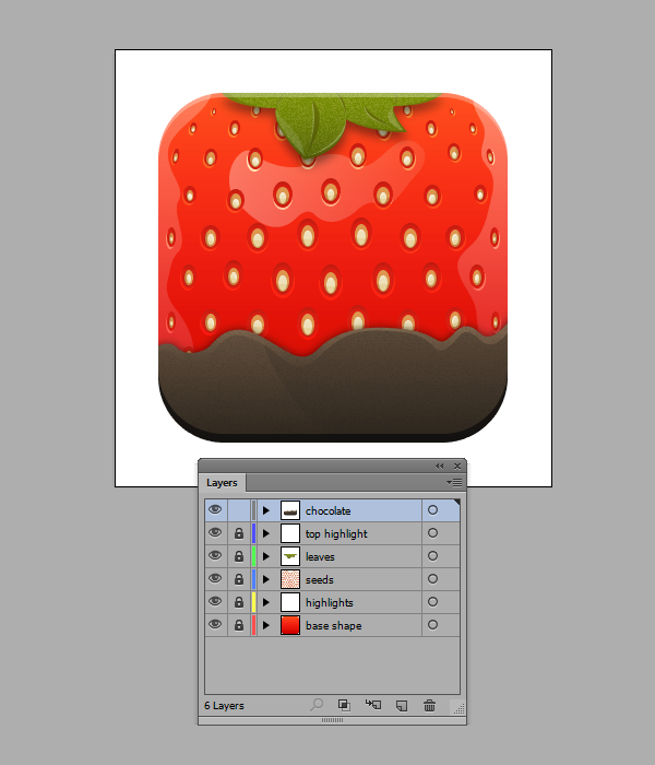
3. Layer Your Artwork
If you want things to go smoothly, and want to have
complete control over every single element on your Artboard, you should always
create layers for each and every section of the design.
If you take a look at
my layers, you can see that I’ve separated my icon’s base shape from the
reflections, the seeds from the body, etc., so that at any given time I know
where my elements are. Also, most importantly, if I need to get something out of
the way to have a better glimpse at a section underneath, I can do that simply
by hiding that layer, without having to fear that somehow I accidentally
deleted or moved parts of the illustration along the way.
4. Start From
Simple Shapes
When you start creating any project, you must
understand that building an intricate piece of artwork starts with basic
building blocks. Such is the case for our icon, where you start out by laying down the basic shape and color of the strawberry. These will act as our foundation, onto which we will add details one layer at a time.
Step 1
Create a 512 x 512 rounded rectangle with a Corner Radius of 96 px. Color it using #F01A08 and then make sure to center it both
vertically and horizontally to the Artboard using the Align panel.

Step 2
Create a base seed by using the Ellipse Tool (L) and drawing an 80 x 120 px shape that will act as the
inner pocket holding the seed. Color it using a darker red tint (#DB1808). Create a couple of duplicates and then, moving the one on the top towards the
bottom, create two sections by selecting and then using Pathfinder’s Minus Front
option.
Color the resulting shapes using darker shades of red. Then create two
inner ellipses that will act as our actual seed. Color them using #DF984D for
the larger section and #E7D5A0 for the smaller, inner one. Add some shadows and
highlights and then group all the elements together.

Step 3
Once you start working on the icon’s seeds, you
should create a bunch of variations, as you will need to add larger ones to the
center and smaller ones towards the extremities so that you can give your
design a sense of dimension and volume. Also, try and rotate some of the smaller
outer seeds towards the inside.

Step 4
Using the Pen
Tool (P), start tracing four leaves, making sure to draw the bigger ones
towards the inside and the smaller ones towards the edges. Once you’ve created
the base shape, start adding some veins, and endings, and then finish the
basic leaf by adding a couple of highlights.

Step 5
Still using the Pen Tool (P), draw a wave-like line and
finish it into a shape that will act as our chocolate section. You should know
that you can go outside the strawberry’s base shape, and mask the parts that
you don’t need using a Clipping Mask.
Apply a linear Gradient to the resulting shape, having the left color set to #69533F
and the right one to a slightly darker #211B13. Change the angle of the Gradient to -90 and you’re good to go.

5. Play With
Gradients and Blending Modes
Gradients are
a fundamental tool in creating realistic-looking icons. Try and play
around with different colors, settings, Opacity
levels and most importantly Blending
Modes to get the best out of your design.
I for example built the base of the strawberry
by leaving the main red shape alone, and applying two white to black gradients
with the Blending Mode set on Overlay and the Opacity levels lowered to about 54% for the second one, while I left the first at 100%. The transitions might not be that
noticeable, but the end result is clearly there.

6. Use Hard
Highlights in Combination With Soft Ones
Use hard highlights for the seed’s bottom
section, the chocolate’s top section and the leaves, while applying softer linear
fading ones to the strawberry’s body. In order to get that softer look, simply
select the highlight, add a linear Gradient
with white for both colors, and then simply adjust the Opacity levels for each one.

7. Use Drop
Shadows
Wherever you need to cast a shadow from one part
of the icon to another, always use the Drop
Shadow effect (Effect > Stylize
> Drop Shadow) giving it, depending on your taste, a harder or softer
feel.

8. Add Subtle
Textures
Apply subtle-looking grain textures to parts of
the design that look too flat, such as the leaves and the chocolate. You can
find the effect under Effect >
Texture > Grain. Play around with its different settings until you find
something that you like.

It’s a Wrap
That’s about it! If you keep mind all these
little things, you should be able to create a darn good strawberry icon, but
most importantly adapt some of the tricks to other projects.
{excerpt}
Read More