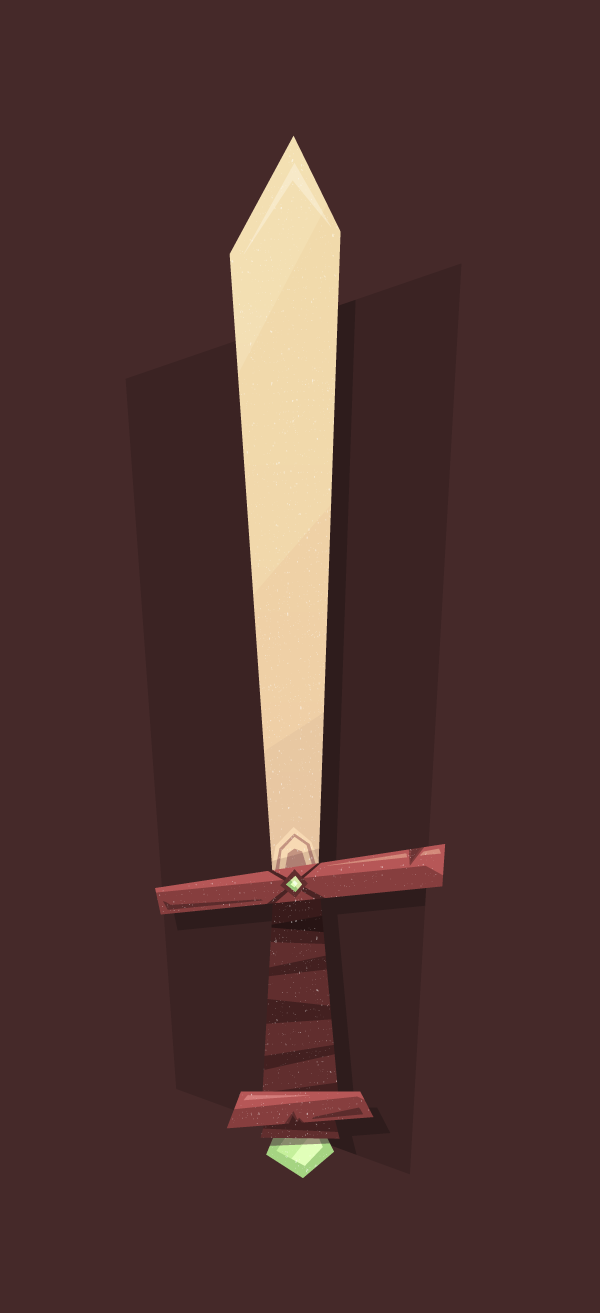
In this tutorial I’m going to show you how to create your own cartoon-like Elemental Sword that might come in handy in future projects.
The tutorial will mostly rely on the use of the Pen Tool and some other easy functions that Adobe Illustrator has to offer. So let’s get started!
1. Setting Up Our Document
Open up Adobe Illustrator, and create a new document either by using the Control?N shortcut or by going to File > New.
Once the pop-up window appears, set up your document as follows:

- Number of Artboards: 1 (as we will only create one illustration)
- Width: 640 px
- Height: 1400 px
- Units: pixels (as we will be creating for the digital medium)
And from the Advanced tab:
- Color Mode: RGB (digital screens)
- Raster Effects: Screen (72 ppi)
- Align New Objects to Pixel Grid: checked (as we want
everything to look pixel crisp)
Quick tip: raster
effects control the way drop shadows,
textures and other effects display
on different media. If you start creating for digital but at the end of the
project you decide you want to print the design on paper, you will
need to make sure that the Raster Effects are set to a minimum 300 ppi value.
The quickest way to do so is to go to Effect > Document
Raster Effects Settings and from the Resolution
section change it to 300.
2. Layering Our Document
As with any
detail-oriented illustration, I really like to layer the parts that make
it up, so that I can easily access and edit the sections I need.
Assuming you have some basic knowledge on how
layers work, go ahead and create eight layers and name them as follows:

- background
- sketch
- shadow
- sword handle
- blade
- hand guard
- gradient overlay
- texture
You might have noticed that some of the labeled
layers seem to be inversed from a logical perspective (the blade and hand guard), but that’s only because we will need the blade
to be positioned under the hand guard
layer.
3. Sketching Out Some Rough Lines
Once we have our
document set up and layered properly, it’s time to start drawing some rough
lines that will help us build up the actual illustration. If you have a tablet
or you’re really skilled with the mouse, you can start drawing straight into
Illustrator using the Blob Brush Tool (Shift-B). On the other hand, if you prefer using the traditional pen and paper
combination, you can easily scan and import the sketch into Illustrator afterwards.
It’s all up to you.
In my case, I
will go fully digital, and start laying the outline of the sword straight onto
the sketch layer.
Before we begin, I would like to point out that
your lines (both the sketched and the traced ones) don’t need to be perfect. As
you can see, the illustration follows a more cartoony style, with lines that
break the natural, realistic form factor, and by doing so create something that
looks as if it came out of a children’s book.

4. Defining Our Basic Shapes
Step 1
Once we’re finished with the sketching part,
it’s time to define the three base shapes
that will compose our sword. We will do so starting with the handle, so go to
the sword handle layer and start tracing with the
Pen Tool (P), using the
sketch as a guide.

Quick tip: Make sure
the shapes overlap by securing the anchor points go just a few pixels towards
the inner portion of the nearest shape, so that no unwanted white spaces might
appear.

Use the Arrange
function (right-click > Arrange) to position the
shapes under or on top of one another, so that each form can be clearly viewed.
As you can see,
we will color the main form using a dark brown tone (#633B3B), and the bottom segment using a slightly lighter one (#875050). For the gem stone, we will
use #A6E0A6 for the outer section
and #C6F4C6 for the inner one.
Now it’s a good time to check if our anchor
points are properly snapped to the pixel grid so that our design will look
pixel crisp. First we need to switch to Pixel
Preview (View > Pixel Preview) and
make sure that Snap to Pixel is on.
Where you
encounter anchors that did not snap to the grid, just grab the Direct Selection Tool (A) and force-snap them by simply clicking and dragging them. I recommend either repeating
the process as you go along or leaving it for the end as a retouching stage.
Step 2
Once you’re done
with the lower part of the illustration, move up to the hand guard and do the same simple tracing of the sketched outline
as before. For colors, we will use the lighter brown (#875050) on the main shape, and the darker tone (#633B3B) for the middle portion
holding the green stone.
Use #9BD19B
for the stone’s background form and #E1FFE1
for the inner, lighter section.

Step 3
Finish up the basic sword by tracing the blade
and coloring it #EFD5D5.

Once you’ve finished working on the simple
shapes, you can hide the sketch layer, as our illustration is slowly taking form.
5. Adding Small Details to the Sword’s Handle
At this stage of
our process we will work on each layer at a time and refine the look of our
illustration using simple forms created with the Pen Tool.
Step 1
The first thing we need to do is add a grip to our handle. Grab the Pen Tool (P) and create five rectangles at different angles and
sizes, and color them using #452929.

Group them (Control-G) and then create a clipping mask by copying (Control-C) and pasting (Control-F) the handle section on top of
them. With both the group and handle selected, right-click > Make Clipping Mask.
Next, select both the grip and the handle and
send them back so that the delimiter can show through.

Step 2
Using my image as a reference model, draw two shapes and color the underneath one using #633B3B
and the one on top using #452929.
As with the grip, copy and place the shape underneath and create a clipping
mask so that the crack won’t go all the way out.

Step 3
Grab the Pen
Tool (P), set the fill color to white (#FFFFFF), and then draw a shape that has the bottom margin almost parallel with the
direction of the bottom handle delimiter. You can go as angular as you want to
with the lines, but always make sure they go all the way outside the shape
underneath. We want them to be that way so that the clipping mask can give them
the shape of the object underneath, instead of trying to accomplish the same
thing using the Pen Tool (P).

As you can see, we now need to mask the newly
created shape and make some little adjustments to its opacity and blending
mode. First let’s mask it so that it will fit the segment underneath it. Simply
copy (Control-C) and paste (Control-F) the brown delimiter on top
of the white object and then, with both of them selected, right-click > Make Clipping Mask.

Using the Direct
Selection Tool (A), select the white object and then using the Transparency panel, set its Blending Mode to Overlay and its Opacity to
40%.

Draw another object, using the same color settings
as before, and position it towards the top-left side of the handle delimiter.

Now it’s time to add a little shine to the gem
stone. Use the same technique as above, but this time create a diagonal at a
different angle, as shown below.

Step 4
We’re almost done with the handle layer; all we need to add are the shadows. Grab the Pen Tool (P) and start drawing a new
shape, coloring it black (#000000). Change its Blending Mode to Multiply and its Opacity to 40%.

Copy the shadow (Control-C) and then double-click on one of the rectangles forming
the grip to enter Isolation Mode.
Once in isolation, simply paste (Control-F) the shadow on top of the
rest of the objects. By doing so, you will eliminate the need for a secondary
clipping mask.

We will create similar shadows for the lower
sections of the handle, so that in the end you will have something similar to
this.

I’ve selected
the objects so that you’ll notice that they each use different clipping masks formed by the objects that are underneath them.
As with the highlights, we will add a secondary
shadow segment that will add to the cartoon-like effect. Select the Pen Tool (P) and create a short
segment, color it #5E3838, and position it towards the lower right side of
the handle delimiter.

Since we’re done with this layer, we’ll move up
to the next one and repeat many of the actions we applied above.
6. Adding Details to the Sword’s Hand Guard
Step 1
The first thing
we will be creating on this layer is the string that keeps the smaller gem in place. Starting from the outer
region of the sword’s guard, draw two diagonal objects with different widths, and
color them using a darker brown value of #4D2E2E.

As you can see, the objects need to be masked so
that they don’t go outside of the guard’s surface. Simply copy the object
underneath on top, and right-click > Make
Clipping Mask.

Once the clipping
is made, the string will be positioned on top of the gem. To correct this,
simply select the gem, and then right-click > Arrange > Bring to Front.
Step 2
Draw a simple pair of triangles and color them
using #804C4C as the base color, and #6E4242 for the triangle on
top. With both of the objects selected, use Control?G to group them, and then copy them into the clipping mask used on the string, so
that the edges that protrude outside get masked.

Step 3
In order to add some pop to the guard, we will create a somewhat choppy
highlight that will go across almost half of its surface. We will use the same Blending Mode (Overlay) and Opacity value
(40%) as we did before. The only key difference will be in the fact that
the wood chip and the string will need to be positioned on
top of the highlight rectangle as follows.

We also need to add a highlight to the gem itself. Try to vary the lines by creating a diagonal that opposes the one
created for the bottom gem. Set the Blending Mode to Overlay and lower the
Opacity to about 60%.

Make sure you mask the highlight by copying the
darker piece of the gem on top and creating a small clipping mask.

Step 4
To finish up
this part of the illustration, we will add a short piece of shadow on the
bottom-left side of the sword’s guard.
Using the Pen
Tool (P), draw a long, pointy object, and color it using #5E3838.

7. Adding Details to the Sword’s Blade
Step 1
To create the shoulder of the blade, we need to
draw a rectangle that has a pointy top anchor, and color it in a lighter shade (#F7DFDF), as it would normally be closer to the eye, and any actual sun light.

As you can see, due to the fact that the blade is positioned on a layer
which sits underneath the guard’s layer, the bottom section of the shoulder will end up being hidden. Even so, we still
need to create a clipping mask so that the shape won’t go outside of the blade.
Next, try to add a center section and a ring, color
them using #C4A5A5, and make sure
they are inside the same clipping mask we
created for the shoulder.

Step 2
As with the gem stones, the blade’s highlights will be angled slightly
more, each section overlaying and emphasising the one underneath.
The first highlight should start at just about
the middle of the blade and go slightly outside it.

Copy the newly created object into the same clipping mask as the shoulder, and make
sure to change the Blending Mode to Overlay and lower the Opacity to 14%.

Create a second highlight, this time at an even
stronger angle. Set the same Blending Mode and Opacity, and then copy
it on top of the first one.

The last highlight we need to add is right
towards the top of the blade. Try and draw an arched segment, then change its Blending Mode to Overlay and lower the Opacity to 30%. Make sure the new object is
on top of everything else and then copy it next to the rest of the highlights.

Step 3
The first shadow we’ll add will be about a quarter of the way up from the blade’s
base. It will follow almost the same angle as the highlight above it, but we
will need to color it using a darker tint than the one of the blade (#E8CFCF).
The second and last shadow will go above just about half of the shoulder segment,
and will use black (#000000) as the color, with the Blending Mode set on Multiply and the
Opacity lowered to 10%.

At this point, the illustration is almost done, so all we need to do now is add a background, some texture, and a few other little
things to make it shine.

8. Color Adjusting
You might wonder why the color scheme used until now is almost completely
different from the one of the final image. Well that’s due to the gradient that
I have overlayed on the final design as a way to enhance some of the colors.
Step 1
First, we need to copy the base forms of the
sword (the ones we created at the beginning: the blade, the guard and the
handle) and paste them onto the gradient
overlay layer.

With all of the objects selected (Control-A) use Pathfinder’s Unite function to create one single shape.

Step 2
Next, select the newly created shape and turn it
into a Linear gradient with the
following values:
- Angle: –90
- Left Gradient Slider color:
#FCEE21/ Location: 0% / Opacity: 100% - Right Gradient Slider color:
#F15A24/ Location: 100% / Opacity: 100%

Step 3
Now, all we need to do is change the Blending Mode to Color Burn and lower the Opacity to 22%, and we should have an
interesting shift in colors.

9. Adding Texture
To add more details to the illustration, simply
copy the attached texture file (you can find the download link in the sidebar), put it onto the texture layer, and change its color to white (#FFFFFF). Also, make sure to
vertically and centrally align it using the Align panel.

Quick tip: always check how the alignment is made by looking at the Align To dropdown. If, for example, you
want to align elements to one another, use the Align to Selection option, and if you want to align to the actual
artboard, well I think you get the idea.
10. Adding a Background
We will be drawing two different shapes for the background. I found that using a rectangle with similar angles and distortions to the sword
would create a more interesting feeling to the illustration.
Step 1
So, using the Pen Tool (P), draw a shape that seems to open up more
towards the top side. Color it using #3B2323 and make sure to place it on the background
layer.

Step 2
Because leaving the rest of the surrounding space white might give it an unfinished look, we’ll grab the Rectangle Tool (M) and create a full document width and height shape (640 x 1400px) color it using #452929, and then send it to the back of the Artboard (right-click > Arrange > Send to Back).

11. Adding a Background Shadow
To finish up our illustration, we will create an inner shadow confined to the boundaries of the smaller background segment. To do so, simply duplicate
the shape from the gradient overlay
layer to the shadow layer and
change its color to #2E1C1C. Move it
a few pixels towards the lower right corner of the artboard and then, using the background shape as a mask, hide any
parts that go outside of it.

That’s It!
You should now have a cool illustration that you
can use however you like, and most importantly learned some useful stuff along
the way.
{excerpt}
Read More