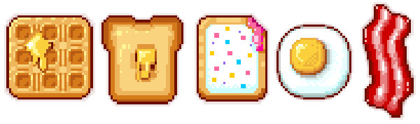
Start your day off great with some breakfast themed pixel art! Drawn in Adobe Photoshop, these sweet creations serve as desktop icons, avatars, or game icons. Learn the basics of shape creation, anti-aliasing, and choosing colors.
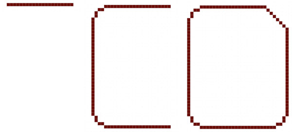
1. Toast It!
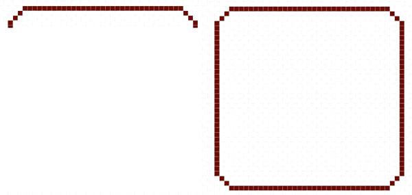
Step 1
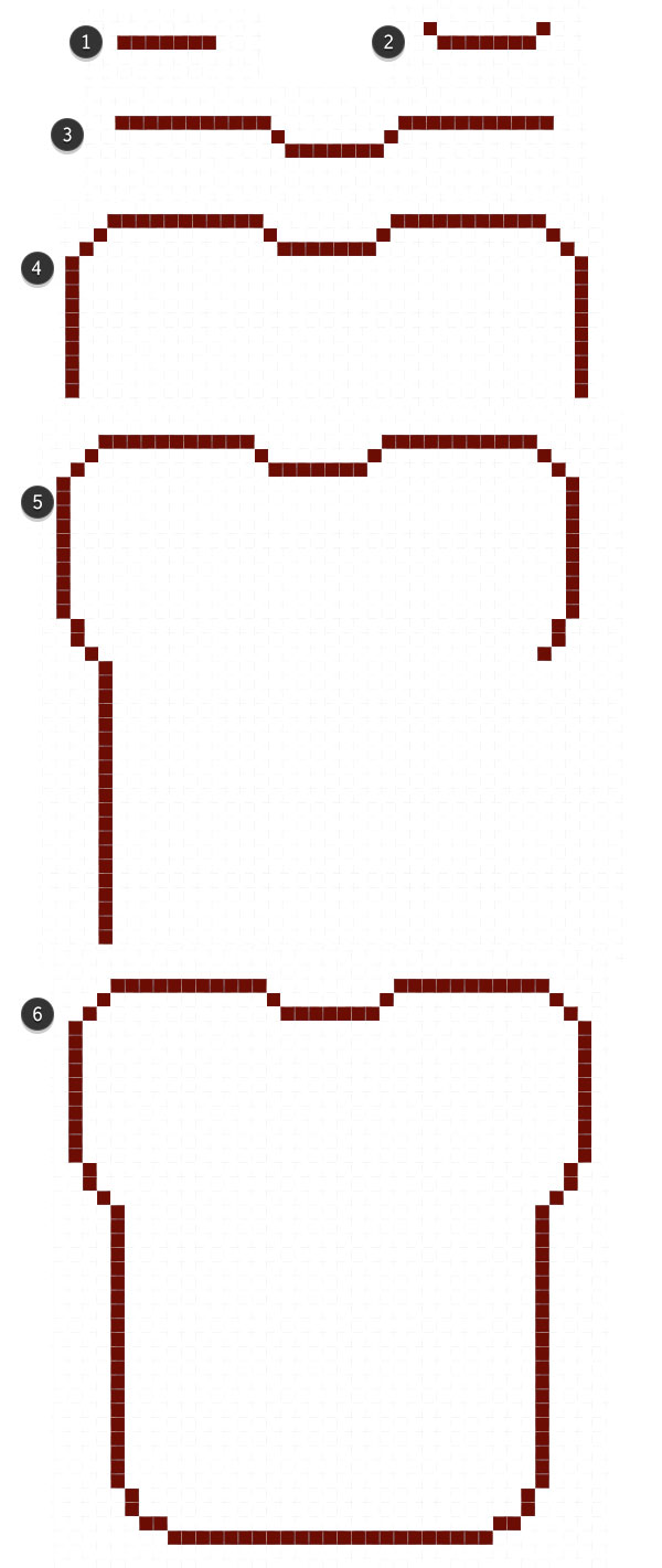
We’ll start off simple and slow, with the basic outline of the toast shape. Create a New Document in Adobe Photoshop. I tend to work up pixel art designs in a 200 x 200 space, with the background set to Transparent. Use the Pencil Tool (B) set at 1 pixel and start drawing the following:
- Seven pixels across.
- One up on either side, diagonally.
- 11 pixels, on either side, form the rest of the top edge. Round out the corners with two diagonal pixels on each side. Ten down on each side before we get into the base of the bread shape.
- Two down, one diagonally, and 20 down on either side.
- Two down and two across in order to round out the bottom.
- Fill in the rest of the space with 23 across.
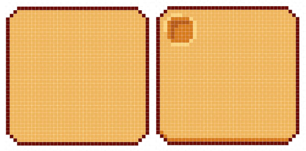
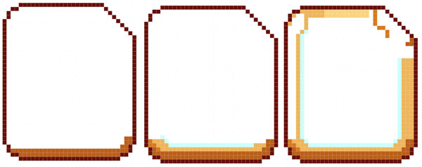
Step 2
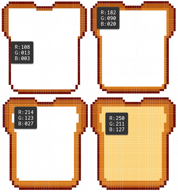
There’s four colors used in the bread’s basic design:
- Dark Brown for the outlines: R: 108 G: 013 B: 003.
- Medium Brown for the outside of the crust: R: 182 G: 090 B: 020.
- Brown for rest of the crust: R: 214 G: 123 B: 027.
- Tan for the inside of the bread: R: 250 G: 211 B: 127.
Place the Medium Brown around the edges of the toast. Brown will further fill in the crust’s boundaries. At this point, use the Paint Bucket Tool (G) to fill in the bread piece with Tan.
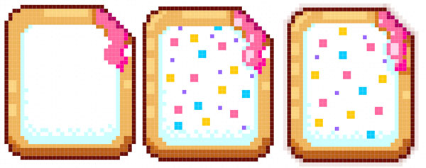
Step 3
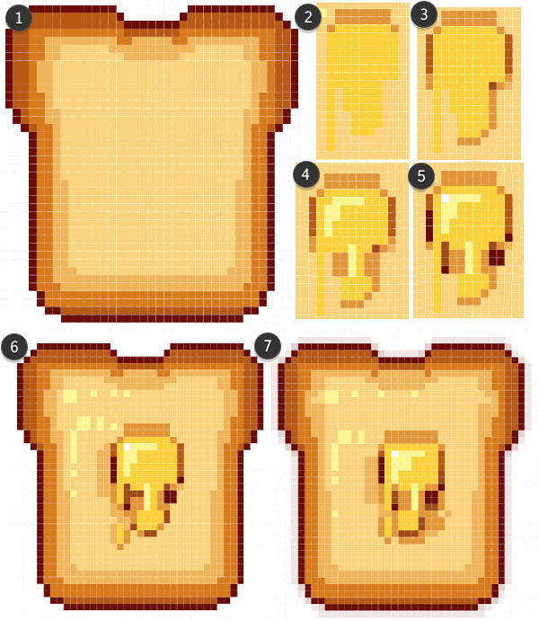
- This bread just won’t be complete without a melting butter pat. Make a New Layer, in the Layers panel, before drawing your butter.
- Use a bright, buttercup Yellow to draw the melted butter’s shape with the Pencil Tool.
- Unlike the toast, its edges are to be defined with the browns used in the last step.
- Notice how the darkest colors are added around the corners and vertical edges.
- Place the butter in the center of the toast.
- White and light cream are used for highlights on the butter and bread.
- Select Dark Brown for your pencil color, and reduce the opacity to 30-50%. Outline the toast, with darker colors placed in the corners of the pixel shape, in order to soften up the stark edge.
2. I’m Makin’ Waffles!
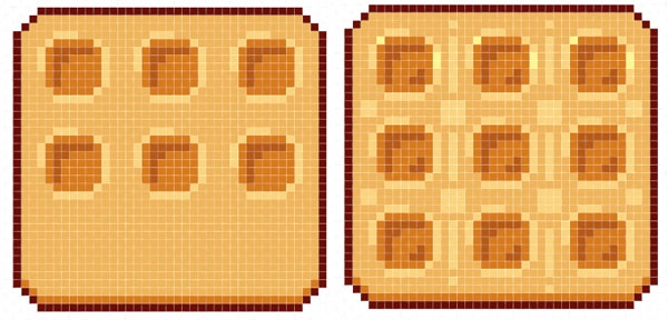
Step 1
The waffle’s shape is fairly simple: A rounded square. Initially, I chose to keep the corners at two diagonal pixels so the waffle kept a very square shape. Later, I changed it to two horizontal, one diagonal, and two vertical pixels for the corners.
Step 2
For the waffle’s fill color, I chose R: 241 G: 180 B: 99. The shadow colors are Brown and Medium Brown from Section 1, Step 2. In the Layers panel, make a New Layer and draw small six by six squares, with the corner pixel deleted, in order to form the waffle pattern.
Step 3
I find it easiest, in a design like this, to Copy (Control-C) and Paste (Control-V) the square shapes in a grid around the waffle base. Use Tan to highlight around the pattern, and Medium Brown to indicate depth.
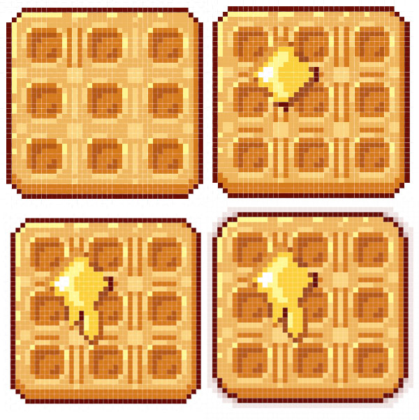
Step 4
The butter pat drawing method and anti-aliasing the outer edge of the waffle are the same as those done to the toast in Section 1, Step 3.
3. Toast This Pastry
The toaster pastry design is fairly simple as well: a rounded rectangle (note the two down, two across corners) with the upper right corner made up of six diagonal pixels that will form a “bite” out of the pastry.
Step 2
Much like the toast design, this toaster pastry will start with the outer edges in Brown and Tan. I began outlining to the “bite” in Brown as well in order to make sure the area is defined as well as create a shadow area for the soon to be dripping “jelly” filling.
Step 3
The frosting is white, so the shadows on the frosting are a very light blue. Note how some of the lines are “dithered”. Dithering, in pixel art, is a technique of creating a pattern (noise-like) in order to shade or highlight an area without increasing the color count.
The sprinkles are just four by four boxes of color or single pixels scattered around. Don’t forget to fill in the entire frosting area with white in case you save the graphic as a transparent file later.
The “jelly” filling is bright pink, with dark pink and hot pink accents.Don’t forget to outline your pastry in dark brown at 30-50% Opacity in order to let the corners blend more easily.
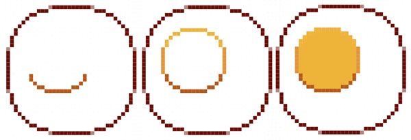
4. Eggs, Sunnyside Up!
Step 1
The egg icon shape is a compromise between a proper fried egg (which would be all over the place) and a perfect circle (which seems too artificial, even for these little pixel designs). The pixel count is as follows:
- Ten pixels across.
- Skip a pixel, and place three on either side on the next line down.
- Two pixels diagonally from the last three, and one more diagonally.
- At this point, you’ll be repeating what has already been done. First, though, place four pixels at 50% Opacity in the missing corners (see below). Complete the circle.
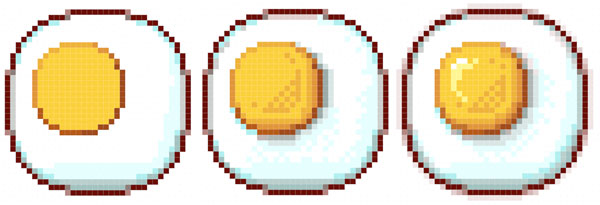
Step 2
Let’s start easy with the yolk, as there’s a lot that goes into rendering the egg compared to the other icons drawn thus far. Three colors make up the yolk design.
- Medium Brown on the bottom half: R: 182 G: 090 B: 020.
- Yellow Ochre on the sides: R: 255 G: 150 B: 57.
- Yellow for the rest: R: 251 G: 208 B: 59.
Step 3
The images below may seem more complicated than they really are. I used the same light blue from the toaster pastry in Section 3, but varied its opacity while shading and dithering. The same goes for Dark Brown, which ranges in Opacity from 20%-50% and is layered over White or Blue (on the bottom of the egg). I continued lightening up the egg with Yellow, cream, and white.
The anti-aliasing around the outer edges of the egg are done in three steps: corners are 50% Opacity, a couple pixels next to each corner is 30% Opacity, and the rest is 10-20% Opacity.
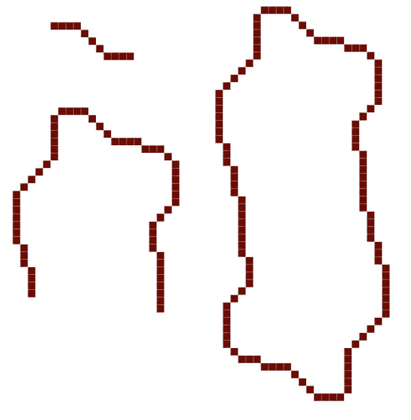
5. Fry Up Some Bacon
Step 1
I opted for a thick, short cut of bacon, rather than something more realistic. While this icon is thinner and taller than the other icons as it is, I didn’t want to make that disparity more extreme when they are gathered together.
Use the Pencil Tool to draw four pixels, then three down and to the right on the diagonal, and four pixels again.
The left corner is abrupt at six pixels down, four diagonal to the left, seven pixels down, three down, and finally, four down.
The right side is three to the right, one on the diagonal, six down, two on the diagonal to the left, four down, and eight down to the right.
Copy and Paste this top section, go to Edit > Transform > Flip Vertical to flip it around, and connect it to the top half. Merge Down (Control-E) the copied layer into the original layer and let’s get to rendering the bacon icon.
Step 2
Use the Paint Bucket Tool to fill in the bacon with Brick Red (R:204 G:0 B:0). Draw wiggley stripes with white at 50% Opacity. Shade the edges of the bacon with Dark Brown at 50% Opacity.
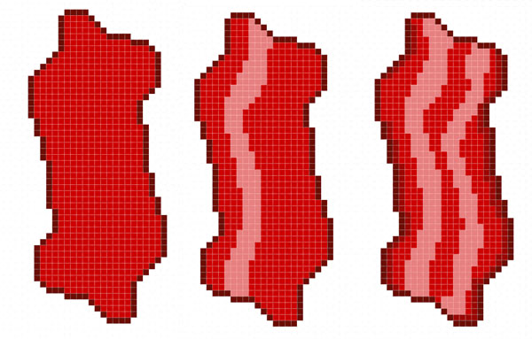
Step 3
Add highlights to the stripes with White at 30%, 20%, and 100% Opacity. For little shiny bits to the bacon, add a few pixels around the edges at 80% Opacity.
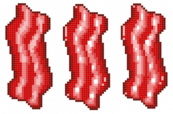
Step 4
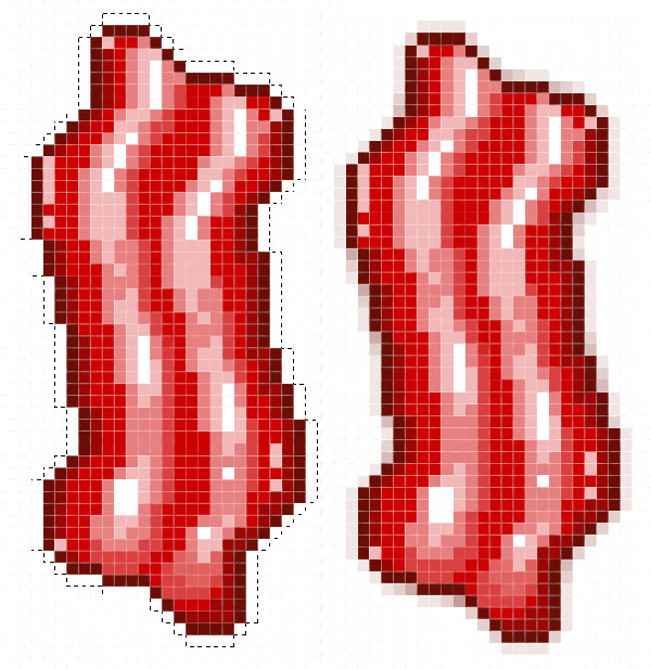
For an easier way to add an outline, use the Magic Wand Tool (W) to select outside of the bacon icon. Go to Select > Modify > Contract and enter 1 pixel. Invert the Selection (Shift-Control-I). Create a New Layer below the bacon layer, in the Layers panel and fill your selection with Dark Brown at 30% Opacity. Stack translucent brown pixels in the corners to soften the edges of the bacon icon. When satisfied, Merge (Control-E) selected bacon layers, in the Layers panel.
Good Morning, You’re Done!
Expand on your breakfast icons with fruit, coffee, juice, and more. This set is skewed towards American breakfast foods, so if you’re outside of the US, or your life has been influenced by other cultures (whether your own or others), I challenge you to make little icons of those delicious dishes. Take it all a step further and make icons of every food item in your kitchen. Happy pixeling, readers!

{excerpt}
Read More