I recently had the opportunity to chat with Benoit Challand, a French artist that specializes in 3D typography. I have been a long-time admirer of Challand’s work and wanted to learn a bit more about his workflow and inspiration. In this interview, we talk a bit about those two topics as well as a bit more about a few of his specific works. Let’s take a look!
Hi Benoit, thanks so much for taking the time to chat with me today. Can you begin by telling us a bit about your background? Where are you from? How did you get your start in the industry?
I grew up in a small village in the south of France, but moved to Lyon at the age of 18. After that, I moved to Paris where I freelanced a bit, and then worked in-house at Publicis and We Are Anonymous.
Two years ago, after much thought, I chose to leave everything in France, and move to Madrid to work for Serial Cut. It was there that I discovered what I really wanted to do. I recently moved back to France and am currently working as a freelancer.
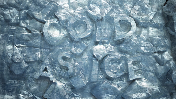
Just about all of your work includes heavy use of 3D tools and effects. As an artist and designer, why are you drawn to 3D software and art?
I have always been attracted to CGI. When I was young, I was obsessed with movies like Tron, Star Wars, Fifth Element, Jurassic Park, etc.. I grew up with sci-fi, which all make heavy use of CGI. When I create my work, I suppose there is always a part of me that references that early inspiration.
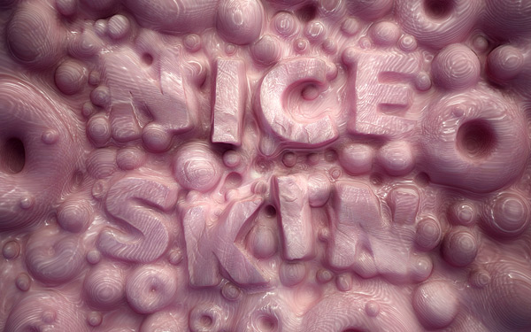
Q. What software do you use? Are there any applications or tools that you could not do your work without?
A. I use C4D for the majority of the work that I create. It is the application that I learned on, and as the years went by, the software got better and better. I also love working with VRay.
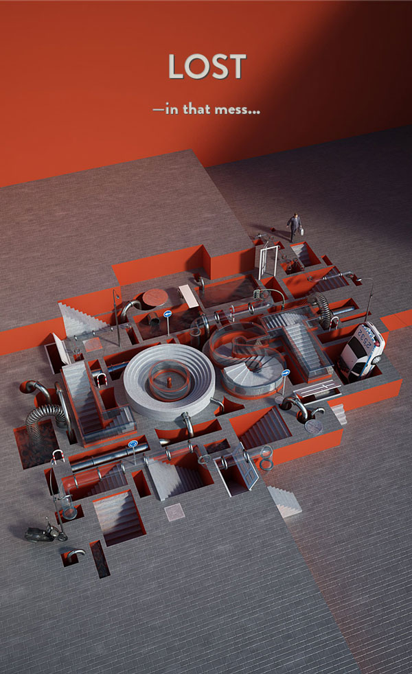
While you use a lot of 3D effects in your work. Can you tell us a bit about how you incorporate Photoshop into your workflow?
Photoshop is the tool that I mainly use to make all my 3D illustrations really pop! I start just about every project in Photoshop, where I make all my sketches. Then, I use it to make textures, and finally to composite and retouch the final image. It’s an application that I just can’t live without!
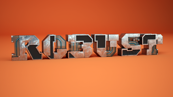
What inspires your work? Can you tell us three things that you do to help keep your creative juices flowing?
I don’t really have three methods to keep my “creative juices” flowing. I’m inspired by lots of things. Words inspire me quite a bit. I will often develop concepts based on a combination of words. Phrases like “Pen Orchestra” or “Fancy Wood” help me to generate ideas that I can then start sketching and compositing into final works.
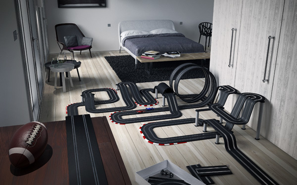
Can you tell us a bit about your “ENJOY – Racing Car Track” piece? How did this idea develop? Did you have a similar toy racecar track when you were young? One thing that I noticed about this piece is that it is set in a modern apartment and not a child’s playroom. Why did you choose this type of environment to set your scene? Is the target audience for this ad some one a bit older?
Yah, this is definitely a toy that I had when I was young. This image is a bit of a fantasy for me. It’s something that I would love to have but can’t, that is why it is set in an adult room. I came up with the idea by first creating the 3D interior, testing the lighting, etc.. Then, I tried to think up something unexpected to place into the scene, something that looks real and not something crazy like dinosaurs or floating water. That’s when I came up with the idea for the toy racetrack.
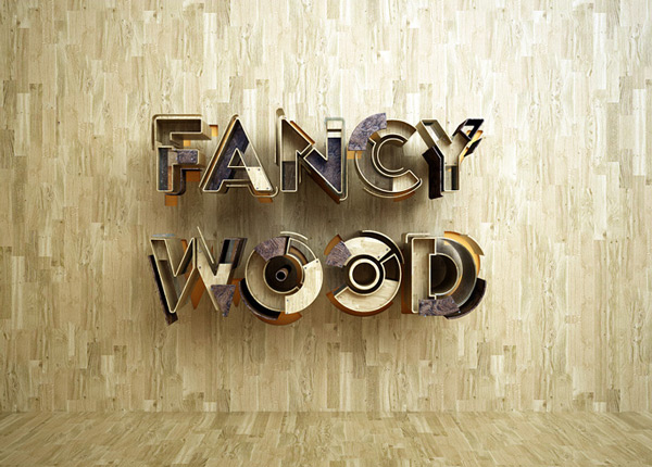
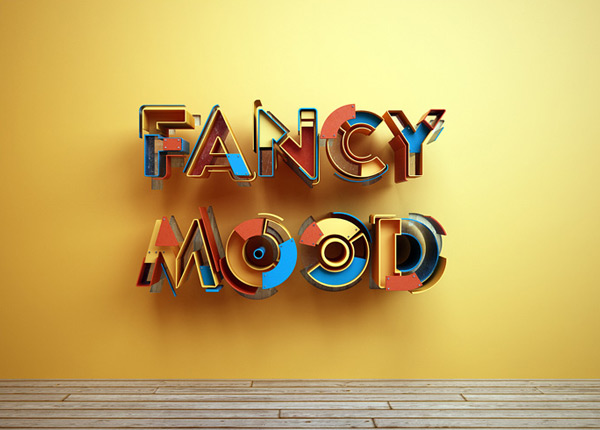
Your “Fancy Wood is a Fancy Mood” piece uses different colors and textures to decorate pretty much the same text. Can you tell us about how this idea developed? What tools did you use to create it?
In this piece, I didn’t really have an “aha” moment. The idea developed quite naturally, to be honest. I came up with the phrase, and then began to put the artwork together. It was all fairly organic in the way it was designed, and I think it turned out quite nice.
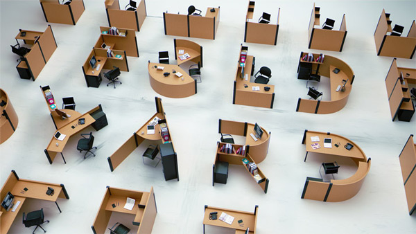
In your Fold Yard piece, you turned office desks and cubicles into beautifully crafted 3D typography. Can you walk us through the process of creating this artwork? How did the idea develop? What tools did you use to create it?
This piece developed out of my love of both typography and architecture. If you look through my portfolio, you can see that most of my work is inspired by these two subjects. The main inspiration for this piece came from the work of Richard Sapper, who worked a few years ago on furniture and open space appliance design. When I saw the work of Sapper, I immediately thought about how lettering could be built out of office furniture.
Thanks so much for taking the time to chat with me today. Do you have any final words for any of our readers looking to learn more about creating typography?
I would love for your readers to take a look at my new website. I just released it and am interested to know what your readers think.
Benoit Challand on the Web
{excerpt}
Read More