The following tutorial will show you how to create a subtle multi-tone noise texture in Adobe Illustrator. Similar to a filter or effect you would use in photography, this method is 100% vector and can be scaled and edited as much you like.
Step 1
Start by opening a new document.
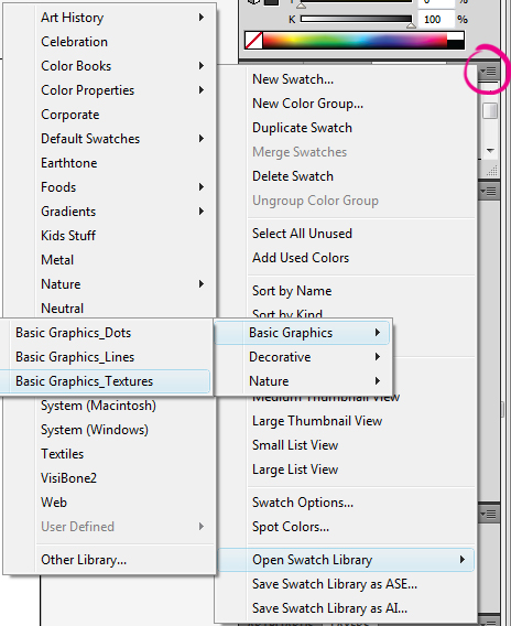
Go into your Swatch palette and click on the options button and go to Open Swatch Library > Patterns > Basic Graphics > Basic Textures. This will open up a window with a selection of patterns. The one we’re wanting to use here is called "USGS 17 Sandy Dry Lake". You can find out the name of the texture by pausing over each pattern for the tool tip to appear. Click on it to add it to your Swatch and then exit out of the pattern window which has been opened. Drag and drop the newly selected pattern any where onto your canvas. This is the original pattern we’re going to be modifying to create our vector noise.The next two stages will make modifying the pattern easier at a later stage.
Step 2
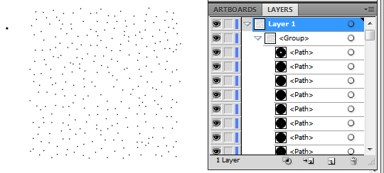
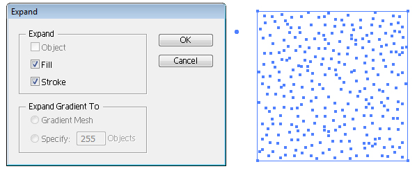
Our first step is to expand all shapes. This is done by first selecting the group (or Control + A, since it is the only thing on your canvas) and going to Object > Expand. You’ll get a dialog box as shown below, click OK.
Step 3
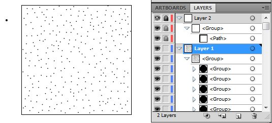
The pattern itself doesn’t have clear boundaries, so to make it easier to work with we will need to give it a rough guide outline. If you look in your layer palette, within the group you will see that the pattern is created by a group of dots. If you scroll right down to the bottom of this group, you will notice there is a square path with no fill or stroke color. We want to copy this shape (Control + C) and paste it in its own Layer folder. So click on Create New Layer and paste the shape on top of your pattern into the new layer. I find it easiest to Control + C the shape and then lock the original layer (or "Layer 1" on your palette) and then select your new layer ("Layer 2" in this case) and Control + F. Double click on "Layer 2" and un-tick Preview, tick Lock and click on OK. This should leave you with something similar to the following image.
Step 4
You’ll find it a lot easier to do the next sections of this tutorial if you’re zoomed in to about 1000%. As you may notice on my examples, there is a rogue dot. By using the Direct Selection Tool (A), select the center of the shape and press delete on your keyboard.
The four colors we’re going to be working with are the famous CMYK which are within the standard swatch palette. So cyan (C=100, M=0, Y=0, K=0), magenta (C=0, M=100, Y=0, K=0), yellow (C=0, M=0, Y=100, K=0) and black aka key (C=0, M=0, Y=0, K=100). You could essentially do this pattern with whichever colors you wish, but using CMYK gives a good even use of color, as it would in photography filters.
First thing to do is select the whole group you have in "Layer 1" and copy and paste behind (Control + C then Control + B). While the new copy is still selected, go to Object > Transform > Rotate and rotate 90 degrees and click on Ok. Color the group cyan. This will also color the square boundary at the bottom of the group. Select the square and deselect the fill color so both the fill and stroke colors have no color present/null.
You should then have something similar to the following image.
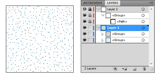
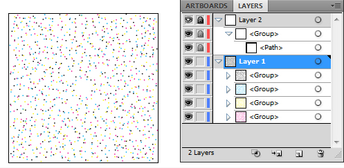
We’re going to repeat this process by selecting the cyan group, copy and paste it behind, rotate it by 90 degrees and then color it magenta. Remembering to reset the fill and stroke colors of the square to no color present/null. Then repeat the process again with the magenta group and color it yellow. Once you’ve got your four groups you should have something similar to the following image.
Step 5
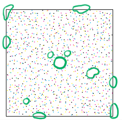
Although it looks ready to use, it’s recommended to tidy up your dots to make it look cleaner when using it as a texture on your vector. At 1000% magnification you can see that some dots are overlapping each other due to rotating the pattern, there are also obvious gaps without dots as shown below:
By using the Direct Selection Tool (A), click on the center of an overlapping dot. Then drag the dot into a space/gap. The square in "Layer 2" now has a purpose as you are able to see the boundaries of what you are working within for moving the dots. Take your time moving the dots within the boundaries.
Tip: Sometimes you might accidentally click on an anchor point of the dot shape and end up dragging a corner of your shape. Don’t panic, just Control + Z to undo and reselect the dot to move the entire shape. Try zooming in further to make it easier for you to grab the center of your dots and prevent you grabbing the dot corners.
Step 6
Now that you’ve modified the pattern you will need to make this pattern useable for any vector. You will first need to select all the groups (Control + A) and then go to Object > Group. Select the group and drag it into your Swatch palette. What I would recommend doing is to keep your file all organized and delete the other items in your Swatch so you’re left with your pattern. This will just make it less confusing to access at a later date. Now save your file as a standard .AI file and Save it in your pattern preset folder which can be found on a PC at C: Drive > Program Files > Adobe > Adobe Illustrator > Presets > … > Swatches > Patterns – Create a new folder and call it whatever you’d like, in my case "Noise". Close your canvas.
Step 7
This is where you get to see your hard work pay off! Open a vector illustration you’ve been working on and create a new layer on top of your illustration. Like in Step 1, go into your Swatch palette and click on the options button and go to Open Swatch Library > Patterns > Noise and select the file you saved your noise pattern as. A window will come up and there should be your noise pattern. Click on it and this will add it to your current swatch. Close the window.
Using the Rectangle Tool (M), set the fill color. as your noise pattern and the stroke as null/no color present. Draw a rectangle over your entire illustration. Go into your Transparency options and change the Blending Mode. In the example below I have used Overlay 100% Opacity. However with different illustrations you may find the other blend modes and opacities work better for you.

Conclusion
Enjoy your new pattern/effect in the knowledge you can create a noise effect which is 100% vector. This effect is particularly useful when making Mac style icons and interface designs, enjoy.