All of the major stock image sites, including GraphicRiver, require that vector files be submitted in the EPS10 or earlier format. This ensures compatibility with the various software applications used by the people who download your work. But what is EPS10? And how do you make your vector files EPS compatible? What should you pay attention to in Adobe Illustrator? Here’s how to ensure your files meet the technical requirements of EPS (Encapsulated PostScript), and are fully editable by the buyers who download them.
History
Adobe introduced transparency to Adobe Illustrator in 2000, with version 9. It was a huge deal, because for the first time, Illustrator users had full vector transparency. In addition, Illustrator 9 shipped with other desirable features such as drop shadows, glow effects and opacity masks. In order to make transparency work, however, Adobe had to change the language it used to create Illustrator documents. Before version 9, Illustrator was based on PostScript (EPS stands for Encapsulated PostScript). In version 9, Adobe began using the PDF language.
Initially, transparency and the new file format caused a lot of problems for designers and printers. While everybody was happily using transparency in their documents, they didn’t always understand the underlying technology involved in printing them. Transparency has to be "flattened" in order to print correctly, and the printers of the day (both human and machine) often lacked the knowledge or processing power to handle it correctly. As a result, lots of print jobs were messed up (yes, I have been using Illustrator long enough to remember this!).
You couldn’t blame the designers entirely. Adobe did such a seamless job of maintaining the user experience on top of all that changing technology, that most people didn’t notice anything different, and didn’t realize that there could be problems with their transparency effects.
Which brings us to the topic at hand: Understanding transparency and recognizing potential problems. Not everybody has the latest software versions and the fastest computers and printers. The people who download your files from GraphicRiver run the gamut form professional designers to the church volunteer who’s putting together this week’s bulletin. For this reason, you must make your files backwards compatible so they can be used by just about anybody. This doesn’t mean you have to "dumb down" your files, or change your working habits. It does mean that you have to be aware of what works and what doesn’t with EPS10.
Understanding Flattening
The problems that arise with transparency only occur when you export/save the file to a format that doesn’t understand transparency, or when someone tries to print your vector artwork.
As you recall from a few paragraphs ago, Adobe had to change the underlying language from PostScript to PDF once transparency came along, in version 9. So, for example, if you save an Illustrator file back to version 8, or if you export it to WMF, it’s like you’re speaking a language from the future — those formats can’t understand it.
Similarly, printers, image setters and other devices use the PostScript language to render the final output, and therefore cannot understand transparency.
So when saving to an earlier version, or when printing, the transparent objects undergo a process called "flattening." Simply put, flattening eliminates the transparency, while preserving the look of the artwork. (Note that this is not quite the same thing as flattening in Adobe Photoshop.)
Let’s look at some examples:
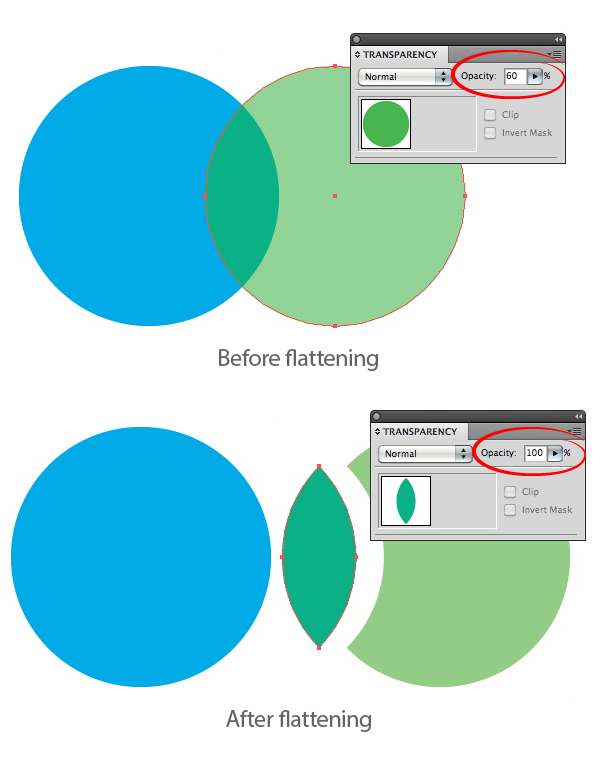
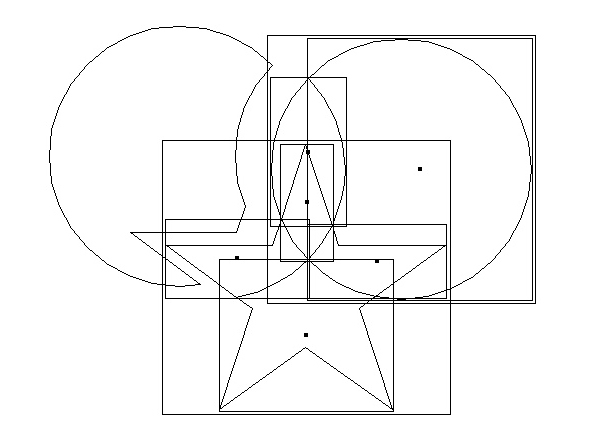
In the image below, the green circle is transparent, and overlaps the blue circle. If this file were to be printed or saved to version 8, the flattening process would essentially break up the transparent shape into two, non-transparent shapes.
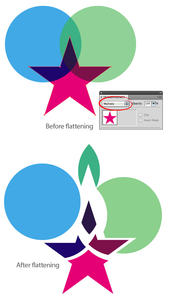
In this example, the star has a Multiply Blending Mode applied to it, which is a form of transparency. The artwork is a little more complex, but Illustrator still manages to remove the transparency by creating separate, non-transparent objects.
Things start to get tricky when transparent effects are in use. In the example below, the blue circle is filled with a radial gradient, the green circle has a Feather effect applied to it, and the star has an Inner Glow effect.
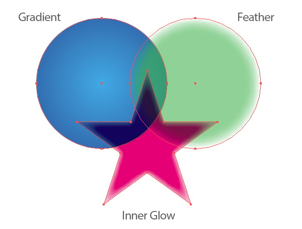
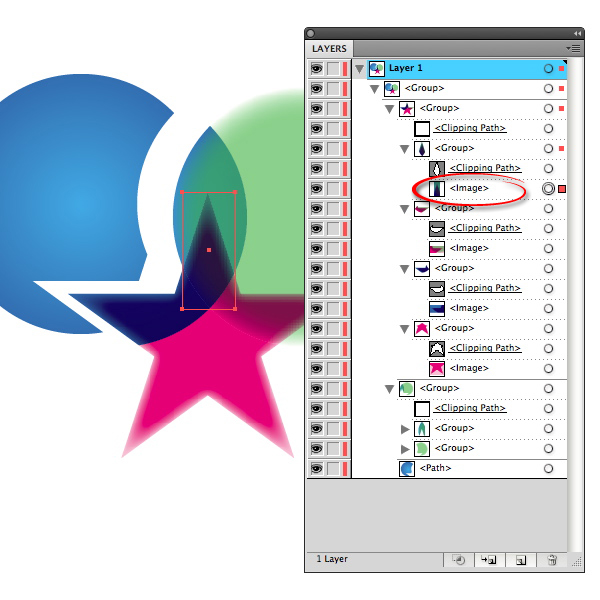
When flattened, there is no way to replicate the look of these effects with pure vector objects, so Illustrator must resort to rasterizing some areas — i.e., turning them into pixel-based images — to maintain the original appearance. If you look at the Layers panel, you can see a series of pixel images and Clipping Masks. A pretty impressive feat, when you think about it, but obviously, the file is no longer editable as a vector illustration.
If you view this image in Outline mode, you can see the many raster images more clearly.
What does this have to do with EPS10?
You may be thinking, since version 10 supports transparency, what’s the big deal and why do I have to worry about it? It’s true that if you were to save the above examples as EPS10, the transparency and effects would be maintained, and no flattening would occur.
But there are other effects and features that just don’t translate well to the older EPS10 format. In these cases, Illustrator is forced to rasterize some areas of the illustration. And image pixels — rasterized areas — are not vector, and thus are not allowed in vector files for upload as stock.
Generally, these problem effects are things that have been introduced to the software since version 10. Again, it’s like going back in time and using new words. If you time-traveled back to 2000 and talked about your "iPod," you’d get some funny looks.
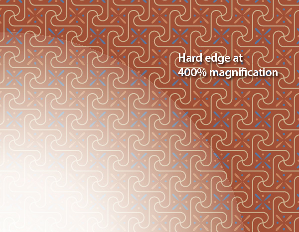
For instance, transparent gradients were introduced in Illustrator CS4. In the example below , the circle is filled with a radial gradient in which two of the stops contain transparency.
When saved back to version 10, Illustrator tries to preserve the look of that soft transparent gradient by creating an Opacity Mask.
It’s a clever attempt, but it comes up short. When viewed at a higher magnification, you can see a hard edge.
Transparent nodes in a Gradient Mesh are also a recent feature (CS5), so they suffer a similar fate when down-saved.
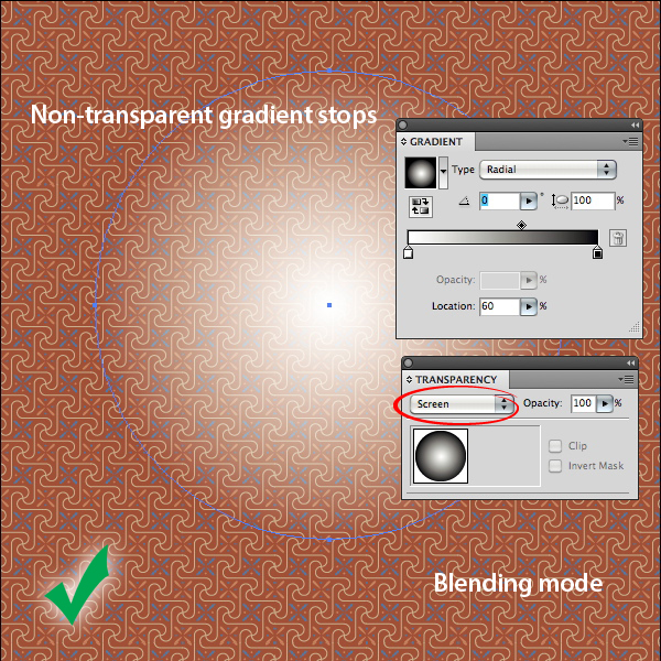
NOTE: An opaque gradient object, that is, one without transparent stops, can then have an overall transparency effect applied to it. In the example below, the circle is filled with a normal radial gradient, then the Screen Blending Mode is used on the circle itself. This can achieve the same look as using transparent gradient stops, and can be rendered without flattening problems.
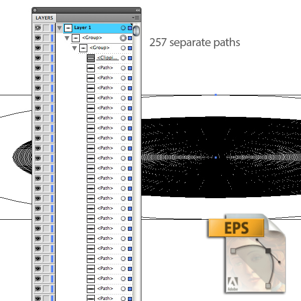
Radial gradients that have an aspect ratio applied to them can also be a problem, as this feature was introduced later. In the first image below, an aspect ratio of 20 degrees has been applied in the Gradient panel.
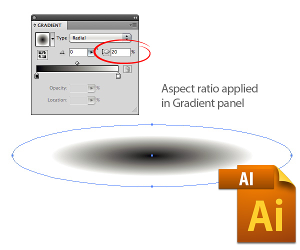
When flattened, the gradient gets broken into 527 paths. Technically, it’s still 100% vector, but there’s no way you’d want to change the fill color of all of those paths.
What Should You be Looking for?
When an Illustrator file is printed, the flattening goes on behind the scenes, and the original file is not altered. Instead, the flattened information is sent to the printer as a PostScript file.
When a native Illustrator file (.AI) is saved down to version 10 EPS, some flattening can occur, and as we’ve seen, the editability is compromised. You can even end up with raster pixels in your vector file, and that’s a no-no.
You don’t have to eliminate transparency from your illustrations, you just have to pay special attention to the effects you use and they ways in which they interact with one another.
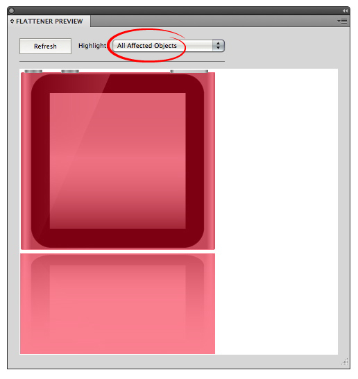
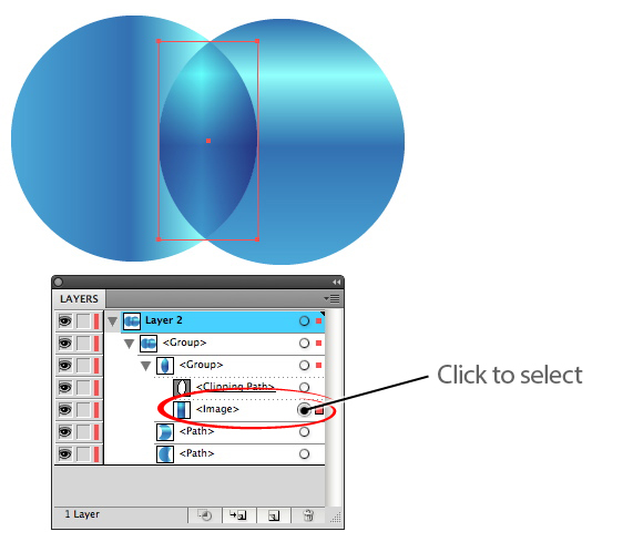
Be Aware of the Transparency in Your File.
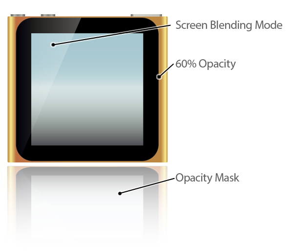
This iPod Nano illustration (which would be rejected for copyright reasons, but that’s a topic for another article) contains a Blending Mode, a simple transparent object, and an Opacity Mask.
If you go to Window > Flattener Preview, you can double-check where the transparency is in your file, and which other objects it might affect. Click the Refresh button, then select Transparent Objects in the pull-down menu. All the transparency will be highlighted in red.
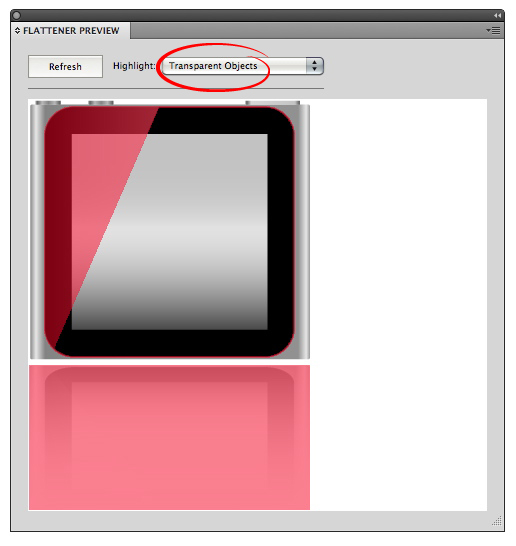
Select All Affected Objects, and you’ll see both the transparent objects, and those that are affected by, or interact with it. If nothing looks amiss, save the file in its native Illustrator format. It’s always good to have the original to go back to should you encounter any problems with the EPS.
Save As a EPS10 Format
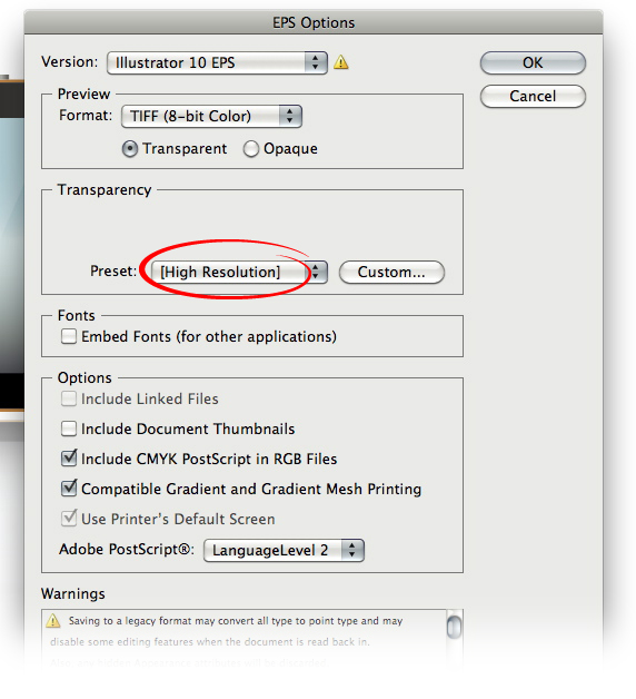
Of course, you’ll want to go through your usual checklist before saving your file for upload, such as checking for open paths, unexpanded fonts, etc. When you’re ready to save, just go to File > Save As. Choose Illustrator EPS as the format, and in the EPS Options dialog that appears, choose Illustrator 10. Make sure you have High Resolution selected in the Transparency section of the dialog (if there is no transparency on your file, this section will be grayed out). Click OK.
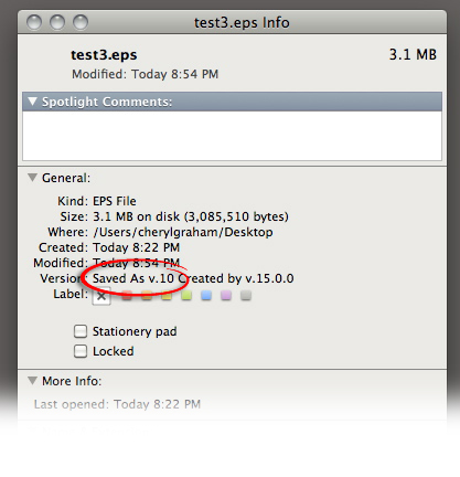
Even though you think you chose EPS 10 in the drop-down menu, you might have overlooked it. It’s easy to forget. If you want to make double-dog sure your file was saved as EPS 10, in MacOS, you can just select the file in the Finder, then press Command-I or choose "Get Info" from the File menu. Near the top of the window, you can see which version created thew file, and in which it was saved.
Close and Re-Open Your File
This is very important. If there has been any rasterization in your EPS, you won’t see it until you close and re-open the file. When you’ve re-opened it, first view it in Outline mode. If there are rasterized areas, they will show up as rectangles. Don’t completely trust your eyes, however. Open the Document Info panel from the Window menu. From the fly out menu, un-check Selection Only, and check Objects.
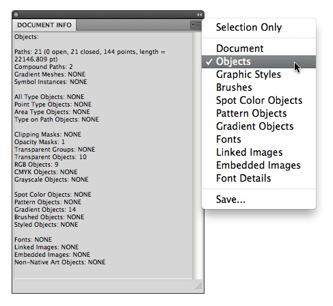
If there is any rasterization, it will be listed as an embedded image at the bottom of the panel.
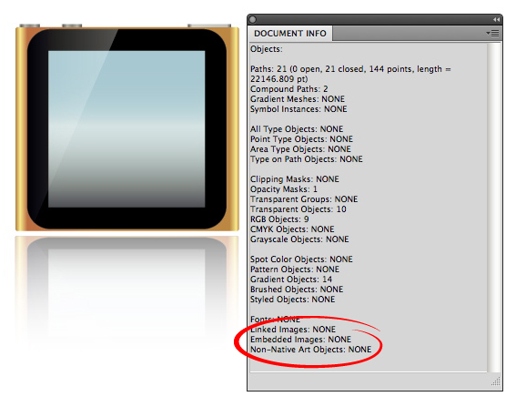
If you see any embedded images in the Document Info panel, you can open the Layers panel and look for them there, then go back to your AI file and troubleshoot the problem.
Do’s and Don’ts of EPS 10
Do not use gradients that use transparent color stops.
Do not use gradient mesh objects that contain transparent nodes.
These two features were introduced a few generations after transparency — EPS version 10 simply can’t translate them.
Avoid complex regions of transparency.
In the Flattener Preview, can choose to highlight Rasterized Complex Regions in the drop-down menu. As the name suggests, Illustrator is forced to rasterize some areas to maintain the appearance of the illustration. Rasters are a no-go.
Don’t flatten the transparency yourself.
Vector files are attractive to buyers because they’re easy to edit. If you were to flatten the transparency of the blue and green circles in the first example above, the person who downloads it can’t simply change the color of one of the circles to get a different color in the overlapping area. They’d have to edit all three shapes. And if they wanted to move one of the circles slightly, and still have it overlap, that too would be much more difficult with three distinct shapes.
Remember, transparency is OK, as long as it’s compatible with EPS10
Always keep the end-user in mind.
You never know who is going to download your file and what they’re going to use it for. And you don’t know their level of expertise. Always construct your files in a logical way that makes them easy to understand and edit.
{excerpt}
Read More