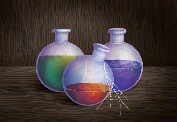
If you play a lot of fantasy video games, you’ll often come across potions… be it mana, health, strength etc… and it’s with this inspiration I’m going to show you how I created this trio of potion bottles. I’ll be using a mixture of tools including Gradients, Bristle Brush, 3D Revolve and the Blob Brush Tool. So let’s get started!
Step 1
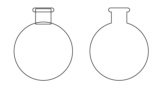
I’m going to create the basic fantasy bottle shape. This is going to be an orb/sphere like bottom created with the Ellipse Tool (L). Duplicate the circle for future use and then using the Rounded Rectangle and Rectangle (M) shape tools to create the neck of the bottle. Once created, use Pathfinder > Unite to combine them.
Step 2
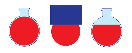
Use the Free Transform Tool (E) to reduce the scale of the duplicated circle within the bottle shape. Then used the Rectangle Tool (M) to draw a shape to Pathfinder > Minus Front from the circle. Note the outline of the bottle is here to make it easier to see in the screenshots, it wont be required.
Step 3
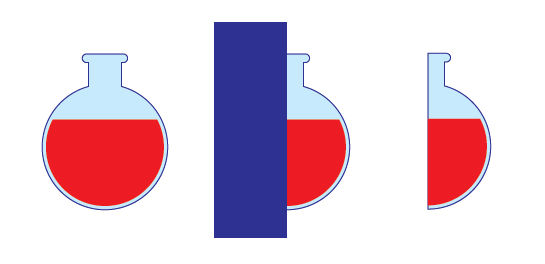
Use another Rectangle (M) to create a vertical shape over half the bottle and use Pathfinder > Minus Front again to remove from the bottle and the liquid within. You should be left with half of a bottle and potion.
Step 4
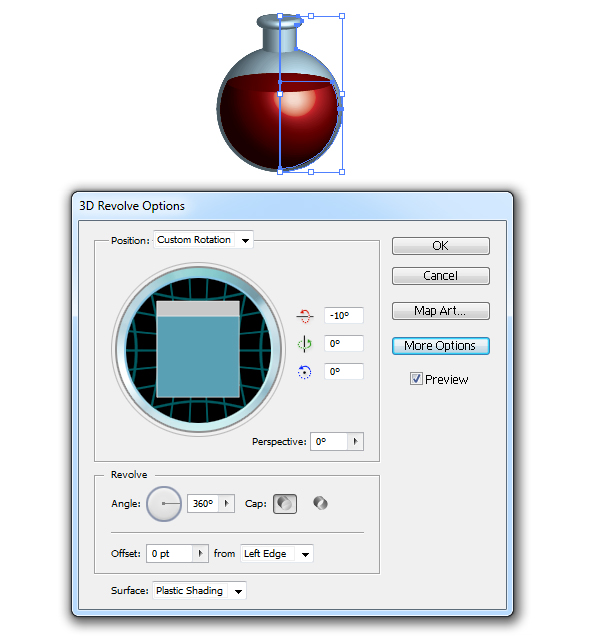
Group together your two shapes (Ctrl + G) and then go to Effects > 3D > Revolve. Use the below settings to get an upright bottle.
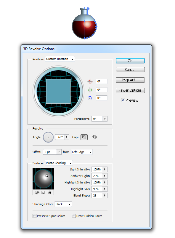
I’ve duplicated the original group and then modified the position of the bottle to give variety in the final illustration.
Step 5
When you begin rotating your bottle slightly to the side, if you apply 3D Revolve to your group it’s not telling your liquid to obey gravity. So to get around this, you’ll need to apply the 3D Revolve effect to the two shapes with only one modification. Once you’ve decided on your position for the bottle apply these settings to the liquid, however alter the Z Axis to 0 degrees so the liquid sits more naturally.
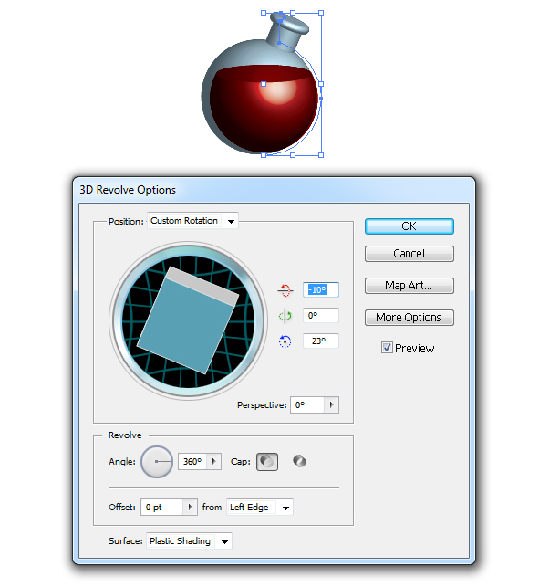
So here I have my trio of potions. I’ll be using these 3D renders as guides for my illustration, mainly for shape and lighting placements.

Step 6
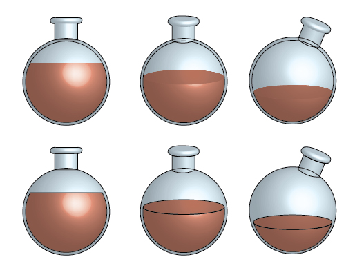
Use the Ellipse Tool (L) to draw the shapes for the bottle and liquid then the Pen Tool (P) for the neck of the bottle. I’ve duplicated the Ellipse (L) for the body of the bottle and used it for the liquid as before. For the two bottles which are tipped forward, I’ve used an Ellipse (L) for the top of the liquid and then used Pathfinder > Divide to split the shape up and deleted the parts not required. Don’t use Pathfinder > Unite with the neck elements and the body, as these will be treated differently. Each bottle should have two shapes for the neck and one for the body.
Step 7
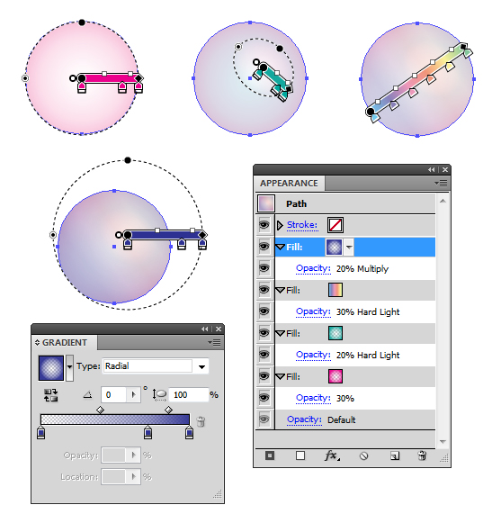
I’m going to create a Graphic Style for the glass of the bottle using transparent radial gradients and a light Spectrum gradient which can be found in the Swatch drill down menu > Open Swatch Library > Gradients > Spectrums.
Step 8
After saving the settings from the Appearance panel as a New Graphic Style, I’ve then applied it to each of the shapes for the bottle. Duplicate the three shapes for the bottle and use Pathfinder > Unite and apply the Graphic Style to this. Place the whole shape on top of the others as shown below with the center bottle.
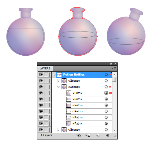
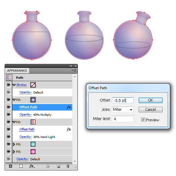
Go into the Appearance panel for the top shape and I’ve applied Offset Path to the top blue gradient to the value of -3.5pt and altered the Opacity from 20% to 40%. This maybe different for you depending how much you’ve re scaled your liquid. This is to give a subtle appearance of the thickness of the glass. I’ve also added the same Offset Path effect to the spectrum gradient.
Step 9
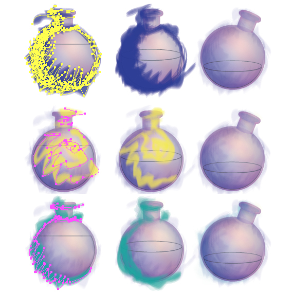
Time to use the Bristle Brush. If you’re using the Default CMYK template as I tend to do, you’ll have a default Bristle Brush in your Brush panel called "Filbert". You can also access this by going into the Brush drill down menu then Open Brush Library > Bristle Brush > Filbert. I’ve applied the following colors with placement as shown below with the Transparency settings: Dark Blue = Multiply 10%, Yellow/Green = Overlay 15%, Green/Blue = Color Burn, 15%. I’ve used the Paintbrush Tool (B) to "paint" the strokes on in the direction of the curve or with a jagged line for the yellow/green strokes.
Group together each of the color groups (Ctrl + G). I find this especially good when it comes to altering Opacities. You may apply more strokes or less strokes than I have, so you can always modify your shading via the groups.
Step 10
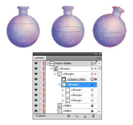
Duplicate the overall bottle shape and then use this to create a Clipping Mask (Ctrl + 7) to hide the overlapped strokes. The Clipping Mask group needs to be placed on top of all the shading, to give a painted look to the bottle and the liquid within.
Step 11
For the liquid, I’ve applied our previously created Graphic Style, however I’ve added a New Fill underneath the other fills with a deep red shade and then on top used a black vignette gradient set to Blending Mode Multiply, Opacity 25%. You can change the deep red later to which ever shade you wish, depending on the potion you want to create. I’m going for red for now as it reminds me of Health Potions in World of Warcraft.
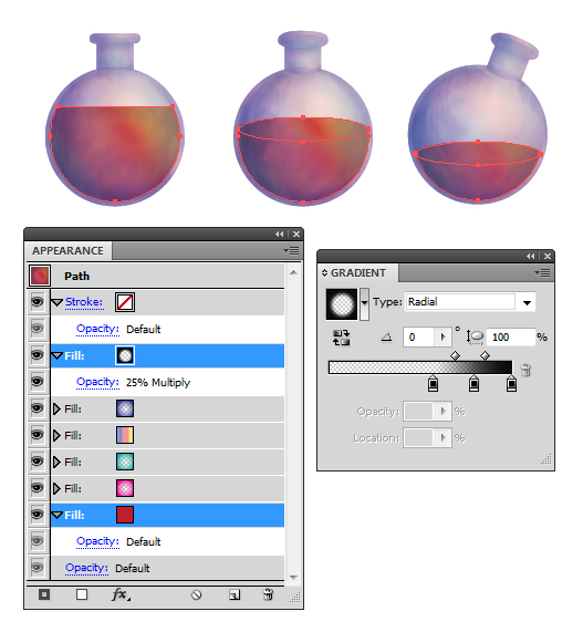
For the tops of the liquid, modify the shape and scale of the vignette with the Gradient Tool (G) so the light is shown to be catching the liquid to the right.
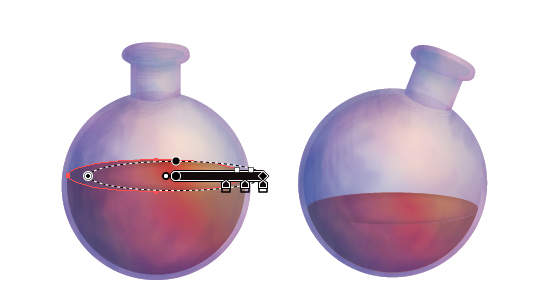
Step 12
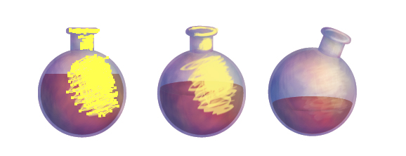
Using a light yellow stroke color set to 0.25pt Stroke Weight with the Filbert brush, I’ve added highlights to the body and neck as shown below. Then I’ve set the strokes to Blending Mode Color Dodge and Opacity 15%. Remember to place these in your Clipping Mask group once done.
Step 13
For the overall shape on the bottle, I’ve went in and modified the Graphic Style via the Appearance panel. I’ve changed the Opacity of the blue gradient from 40% to 60% and then the overall Blending Mode to Color Burn and Opacity to 70%. This helps increase the contract of the bottle.
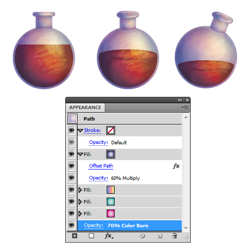
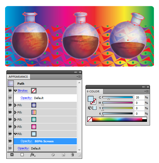
A good test for playing with transparent surfaces such as glass, is to apply a gradient and a pattern (any, it doesn’t matter) and testing how transparent the surface is and how it interacts with it. From testing, it was a bit too transparent. So for the three shapes for each bottle which make up the bottle, I’ve added a light blue fill at the bottom of the Appearance panel and set this to Blending Mode Screen, Opacity 80%.
Step 14
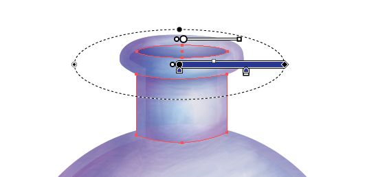
I’ve duplicated the neck of the bottle and applied a blue transparent radial gradient to it to create a slight shadow. Then drawn an Ellipse (L) for the opening of the bottle and used an inverted transparent radial gradient. Both shapes are set to Blending Mode Multiply, Opacity 50%.
Step 15
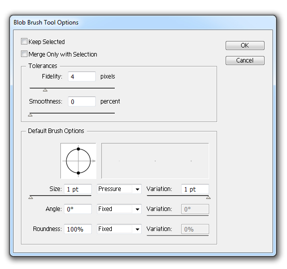
I’m going to be using the Blob Brush Tool (Shift + B) to add fantasy style lines to the bottles highlights. Double click on the icon in the Toolbar to access the Blob Brush Tool Options and I’ve changed the Size to 1pt, to be effected by Pressure and Variation to 1pt, then click on Ok.
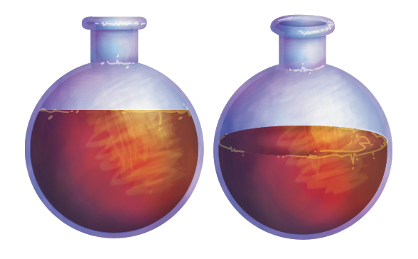
I’ve then added Lime Green scribbles and dots around the liquid edge, bottle neck seam and bottle opening. These strokes are set to Blending Mode Color Dodge, Opacity 60%.
Step 16
I’m going to create a basic shadow underneath the bottles with the Ellipse Tool (L) and filling it with a black transparent radial gradient. Use the Gradient Tool (G) to then shift the gradient source. I’ve then set these to Blending Mode Multiply.
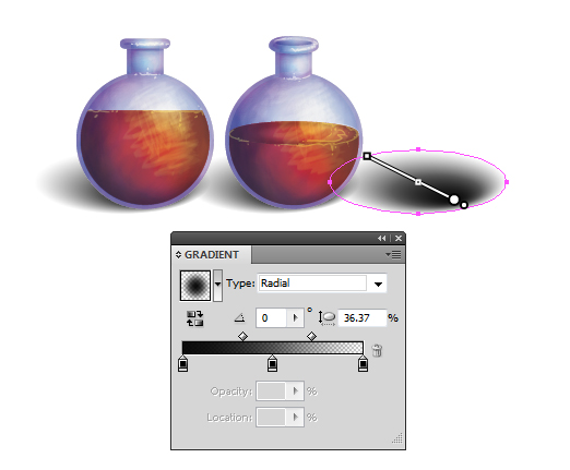
After arranging my bottles, I’ve added an additional gradient shadow onto one of the bottles, this time a dark blue transparent radial gradient set to Blending Mode Multiply. There would technically be a reflection from the bottle, however we’re using a bit artistic license and let’s imagine they have a dirty/dusty surface and it’s not as reflective as you may think.
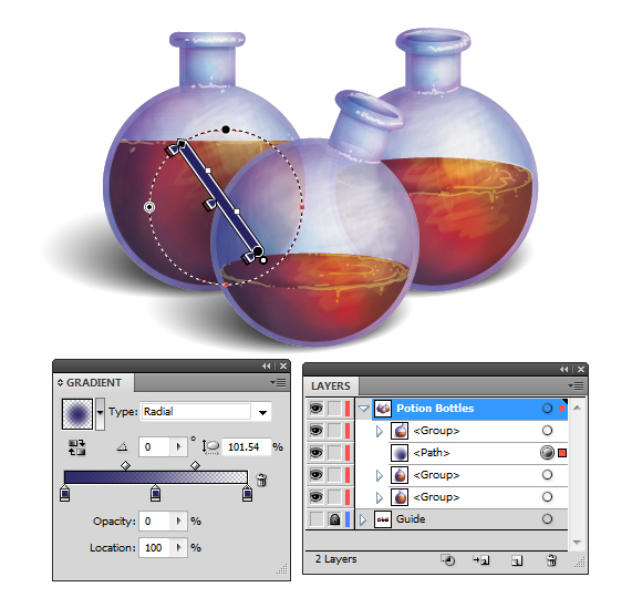
Step 17
I’m going to create a quick wooden surface using one of my seamless wood patterns and then apply the vignette gradient to it via the Appearance panel as shown below.
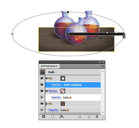
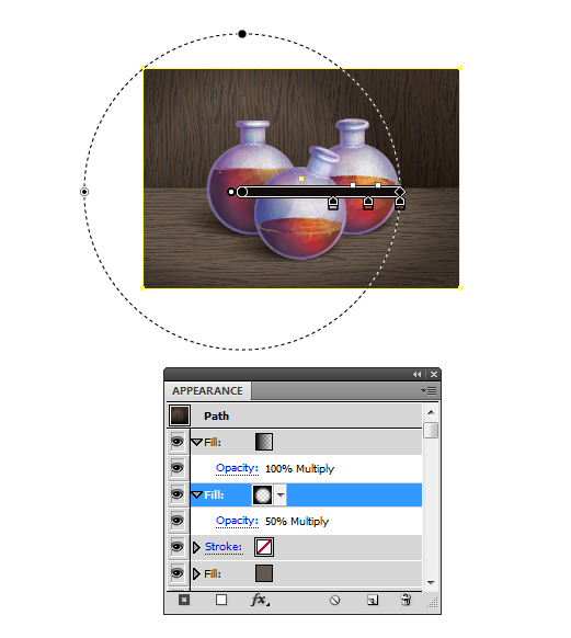
I’ve applied another to the background wood in a different direction. I’ve added the vignette gradient as well as a linear gradient from the bottom to top. This will help split the floor and background from one another.
Step 18
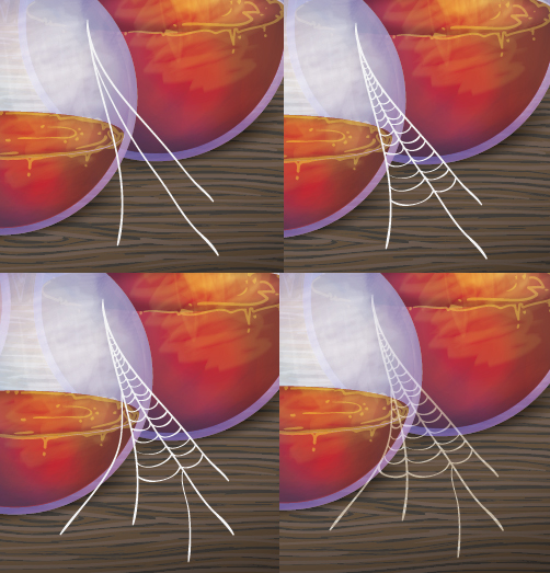
Using the Blob Brush Tool (Shift + B), I’ve added a small cobweb… if only to emphasis on our dirty, non reflective surface of course! I’m using a light grey/brown stroke color and setting it to Blending Mode Screen, Opacity 80%.
Step 19
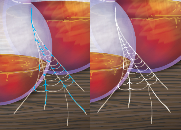
Additional strokes are added, mainly along the joins of the cobweb. This is with an off white/grey stroke color set to Blending Mode Screen.
Step 20
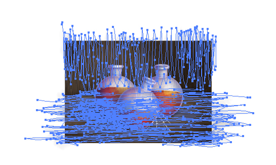
To keep a constant style to the background, I’ve used the Filbert Bristle Brush with a brown/grey stroke color along the grain of the wood. These strokes are applied with the Paintbrush Tool (B) and are set to Blending Mode Color Burn, Opacity 10%.
Step 21
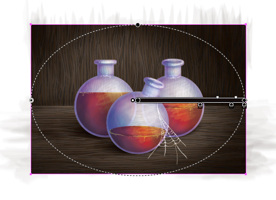
Finally, I’ve added a vignette over the top of the entire illustration, set to Blending Mode Multiply, Opacity 40%.
Conclusion
I’ve created a RGB color scheme for my potions in my end illustration by modifying the base fill color of the liquids Appearance panel. I hope you’ve enjoyed today’s fantasy illustration and it’s left you… spell bound *groan*.
{excerpt}
Read More