If you’re a big fan of playing video games, then you are probably aware of the release of Diablo III. The Diablo franchise has been a popular video game title for over a decade. In this tutorial, we will explain how to create a Diablo-inspired text effect in Photoshop. Let’s get started!
Tutorial Assets
The following assets were used during the production of this tutorial.
- SoilSand0016 (Image 2)
- ConcreteBare0129 (Image 2)
- ConcreteBare280 (Image 5)
- OrnamentsVarious0028 (Image 5)
- Crackles0014 (Image 17)
- Vector Tribal Tattoo
- Wing Tattoo Set
Step 1 — Setting up your scene
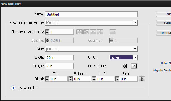
Before starting out in Photoshop, we’ll need to prepare our typography a little bit. Open a new document in illustrator, make it 20 x 7 inches.
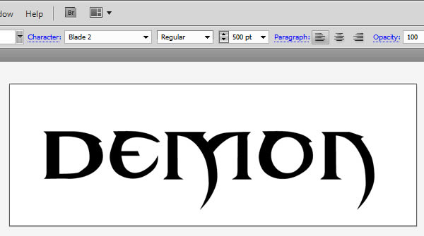
For the logotype, I’ll use a personally customized font. However, you can just use the Blade 2 free font witch is almost identical. Grab the Type Tool (T), set the type size to 500 pt, click on your canvas and type the title you want.
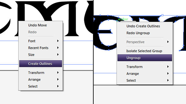
To edit the font, we will first need to vectorize it. This means that our font will become an editable vector shape, and will no longer be editable with the Type Tool. To do so, right-click on your font and select Create Outlines. Right-click again, and this time select ungroup.
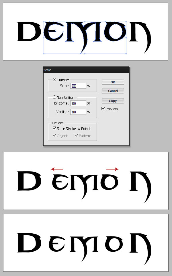
Select every letter between the first and the last one, and scale them down (Object > Transform > Scale). Once the letters are scaled down, use the Selection Tool (V) to replace the letters so they have an even space between each other’s.
Step 2 — Offsetting the letters
To create the final logotype, we’ll need three versions of our title: a regular one, a thinner version and a larger version.
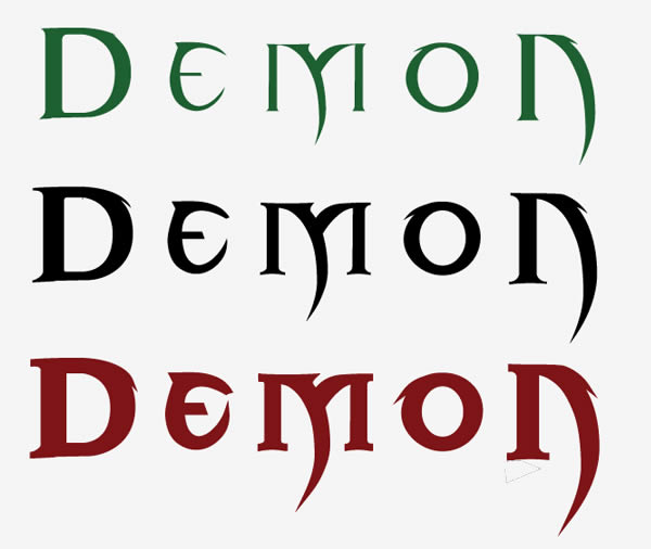
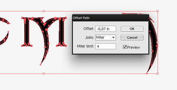
To make the thinner version, simply duplicate your title (you can simply copy and paste it, or drag it while holding Alt). Select the letters and go to Object > Path > Offset path and input the following values.
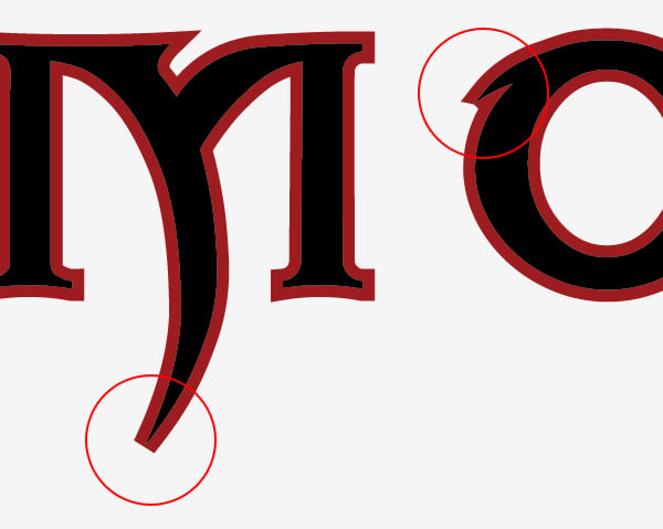
We could use the same process to create the larger version of the title. However, I find that the Offset Path method doesn’t work as good when expanding a path. As you can see in the following example, the tool tends to flatten the tips of the path.
A good way to avoid this is to use a stroke instead. Select your text, and in the Stroke Panel, input a weight of 10 pt.
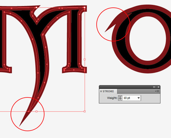
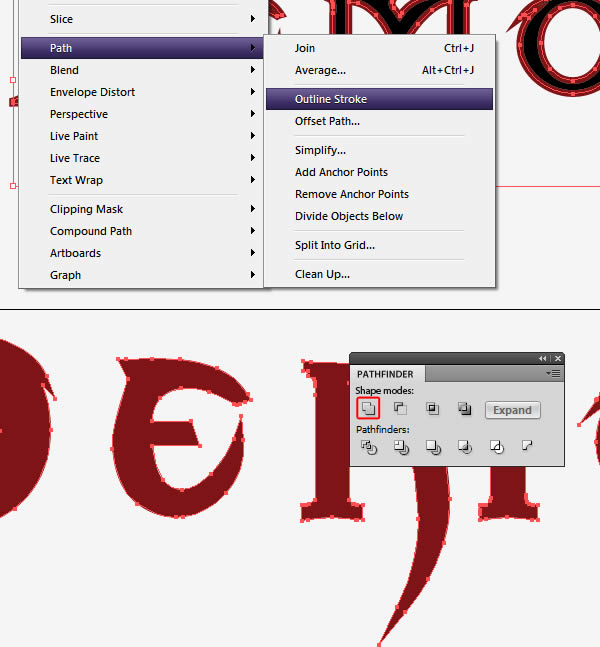
You can now vectorize the stroke (Object > Path > Outline Stroke) and use the Pathfinder’s Unite button to merge the Stroke path with the original text path.
Step 3 — Setting up the file in Photoshop
Now that we have the three versions of the title, open a new file in Photoshop, and give it the following settings.
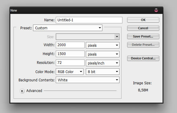
In your file, fill the background layer with black (Edit > Fill). Copy one of the version of the title we previously made in Illustrator, and paste it in Photoshop. When you paste, a window should pop-up asking you what kind of layer you want to paste your file. Select "Smart Object". Please note that it is really important to import them that way in order to complete the following steps. Once you are done with all of the three titles, align them properly.
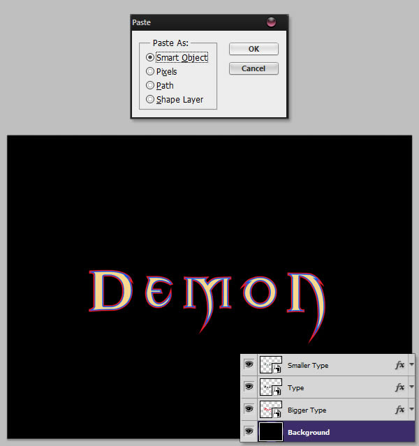
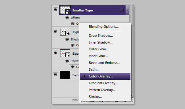
To distinguish the three layer, you can give them a particular color using the Layer Style. To do so, click on the little "FX" icon at the bottom of the Layer Palette and select Color Overlay. Take careful note where the Layer Style button is located, as we are going to use it a lot through this tutorial.
Step 4 — Creating the red shape
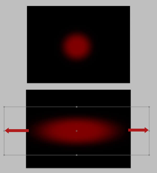
To make the red shape in the background, create a new layer (Command/Ctrl + Shift + N). Grab the Brush Tool (B), set the Hardness to 0%, select the color #6d0100 and paint a big red circle in the middle of your canvas. Hit Command/Ctrl + T to enter the Free Transform mode, and stretch the circle horizontally. Name the layer "Red Spot".
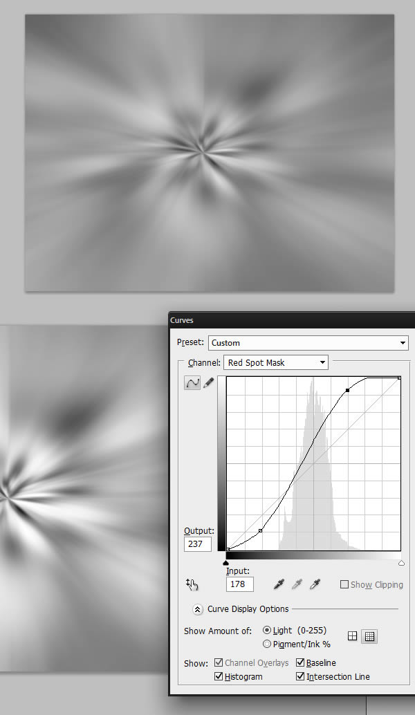
Give your layer a mask by clicking the Mask button next to the Layer Style button. In the Channel panel, be sure to select the Mask channel and hide the RGB, Red, Green and blue channel. Go to Filter > Render > Clouds. Then, go to Filter > Distort > Polar Coordinates and select Rectangular to Polar. Finally, go to Filter > Blur > Radial Blur, set the blur to Zoom with an amount around 80.

Press Command/Ctrl + F to repeat the Radial Blur effect a few times, and then Command/Ctrl + M to give it the following Curves adjustment.
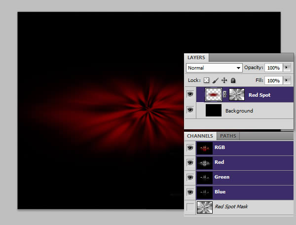
Once you are done, you can select your RGB channel and unhide it. You should have the following result.
Step 5 — More work on the red shape
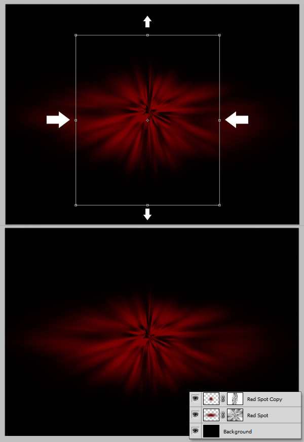
Duplicate the "Red Spot" layer and compress it horizontally, and scale it a little bit vertically.
Download SoilSand0016_2 and place it into your canvas. You might have to duplicate it and place the two layers so the texture fully cover the red shape. If you do so, make sure that you merge both layers before going on.
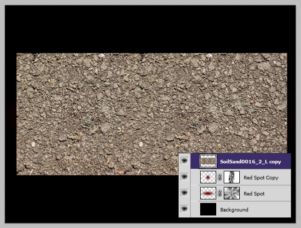
Give your "SoilSand" layer a mask, and draw a soft oval shape so the texture isn’t visible at the center of the red shape. Set the layer to Multiply.
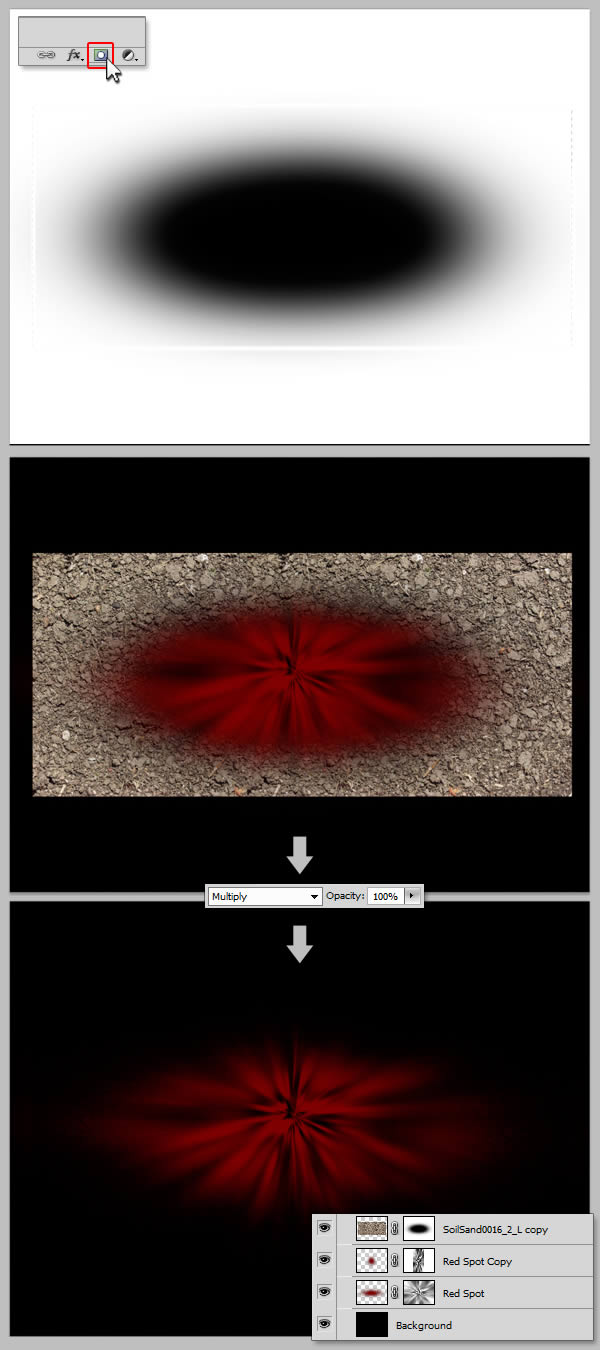
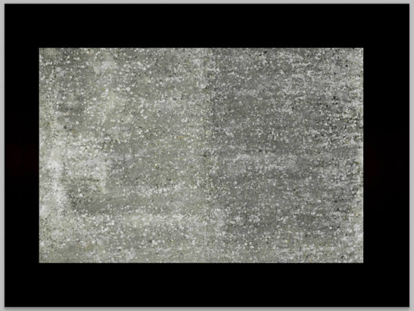
Let’s make our background even more grittier by adding another texture. Download and place ConcreteBare0129 into your canvas.
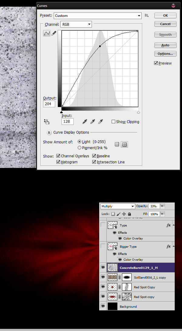
Press Command/Ctrl +I to invert the image. Then, press Command/Ctrl + M to bring up the Curves Adjustments, and give it the following curve. Once you are done, set the layer to Multiply and 33% opacity.
Step 6 — Ornament Pattern
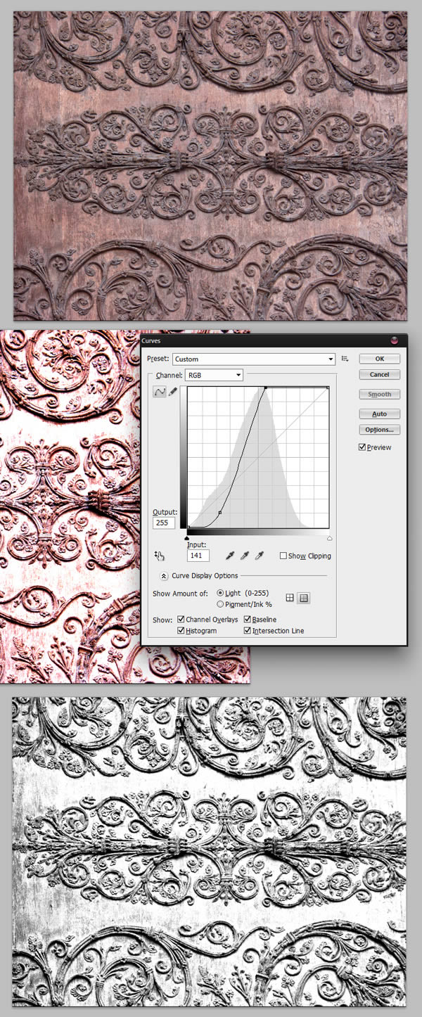
Download OrnamentsVarious0028 and open it in a new file. Increase the contrast with a Curves adjustment, and hit Command/Ctrl + Shift + U to desaturate the layer.
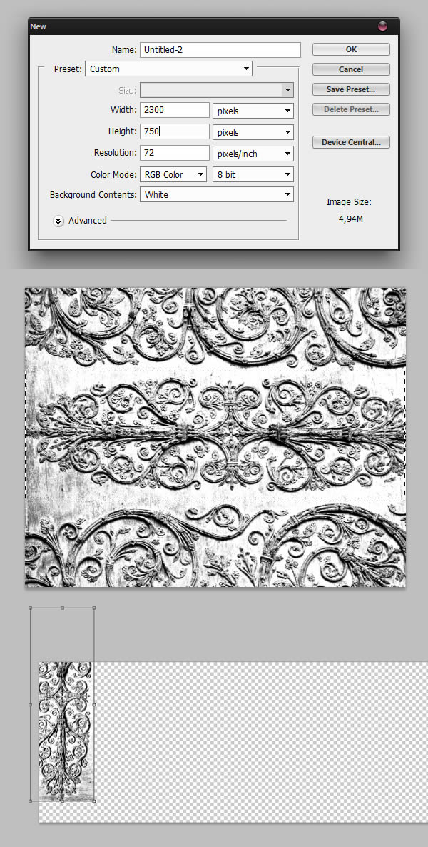
Create yet another new Photoshop file, and give it the following settings. Back to your pattern file, use the Rectangular Marquee Tool (M) to select part of the ornament, copy (Command/Ctrl + C) it and paste it into your newly created file.
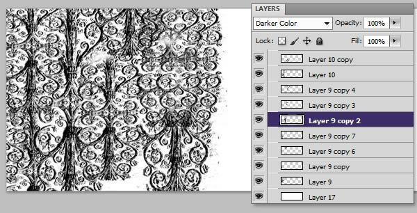
Repeat the process until you fill the canvas. You can use the Darker Color blending mode to help you. You might also want to use the Eraser Tool (E) to erase parts of some layers so they blend well together.
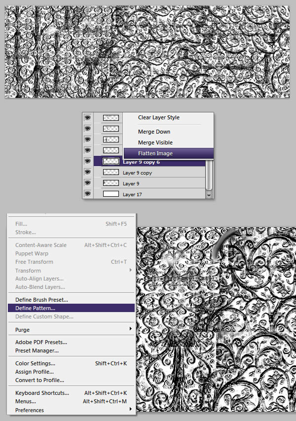
Once you are done, flatten your layers (Right-click on a layer > Flatten Image). Hit Command/Ctrl + A to select the whole image, and go to Edit > Define Pattern to create a new pattern. We’ll name this pattern "Ornament Pattern"’.
Step 7 — More Patterns
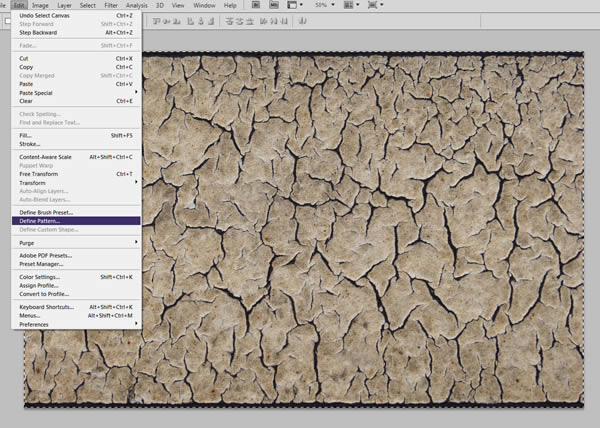
Next, we’ll give or medium sized text some Layers Style. However, before doing so, we’ll need to create yet another Pattern. Download and open Crackles0014 in a new file. Hit Command/Ctrl + A and go to Edit > Define Pattern. We’ll name this one "Cracks Pattern."
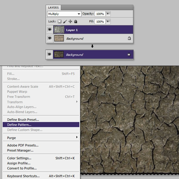
In the same file, place ConcreteBare0129 and set it to multiply. Flatten your image, and once again, create a pattern. We’ll name this one "Cracks Pattern 2."
Step 8 — Applying Layer Styles to the Text
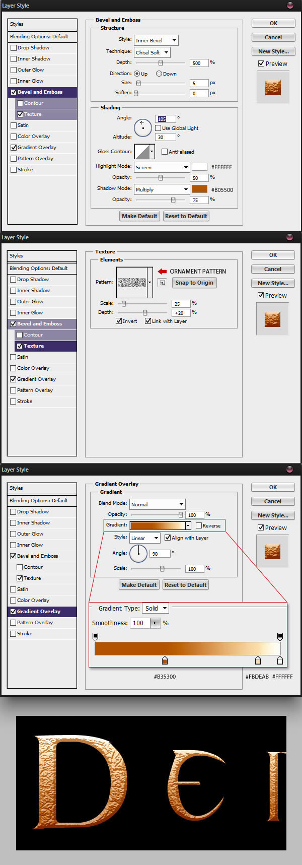
Back into your main Photoshop file, select the smaller text layer and give it the following Layer Style.
Give the medium sized text the following Layer Style.

Finally, give the following Layer Style to the larger text layer.
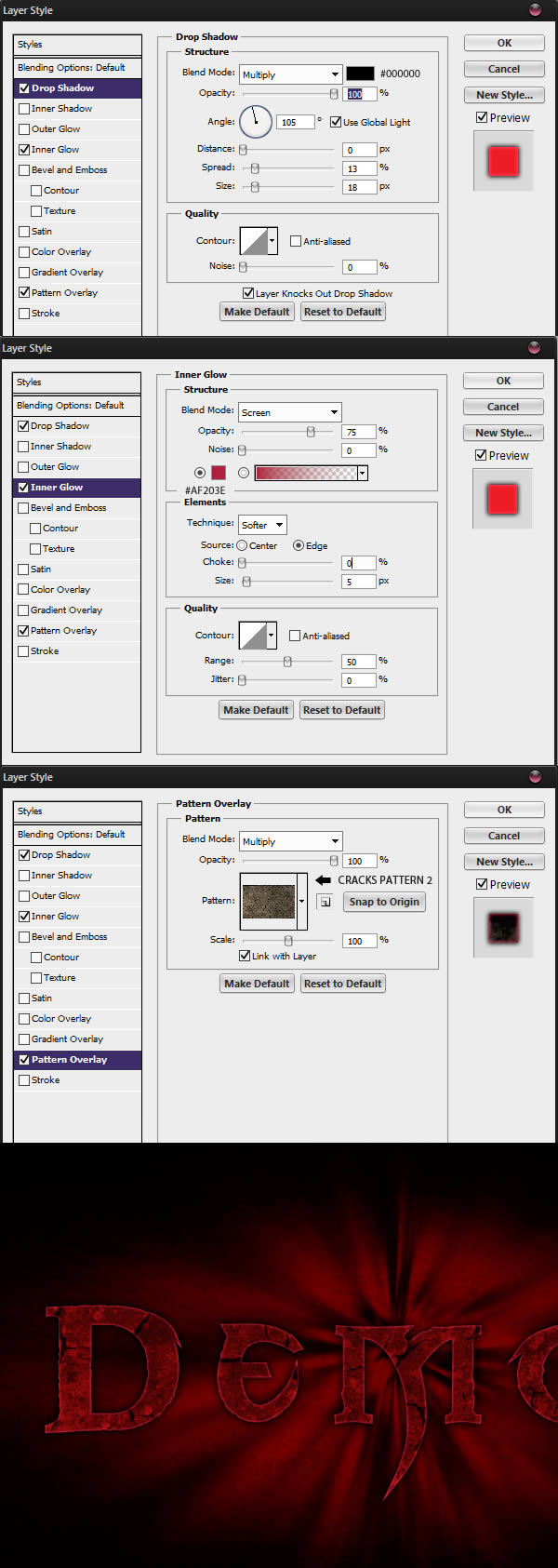
Unhide all the layers, you should have the following result.
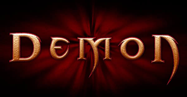
Step 9 — Eroding the text
We can also help make the text shape more to look more eroded by altering it a little bit in Illustrator. To do so, double-click on the larger text layer’s vignette to open it in Illustrator.
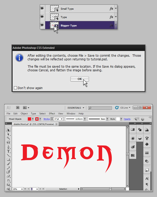
Select your text and add a few anchor points by going to Object > Path > Add Anchor Points. Select the Wrinkle Tool and draw on the text to add some wrinkles. You can double-click on the tool icon to adjust its options.
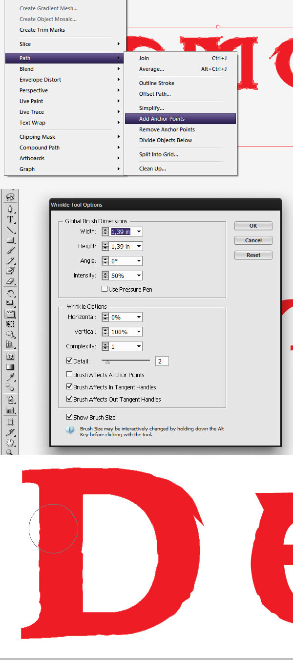
Hint: if the effect comes out too intense in some places, you can use the Delete Anchor Point Tool (-) to remove a few points.
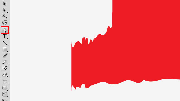
Once you are done, you can save and exit the Illustrator file. The shape should be updated in your Photoshop file.
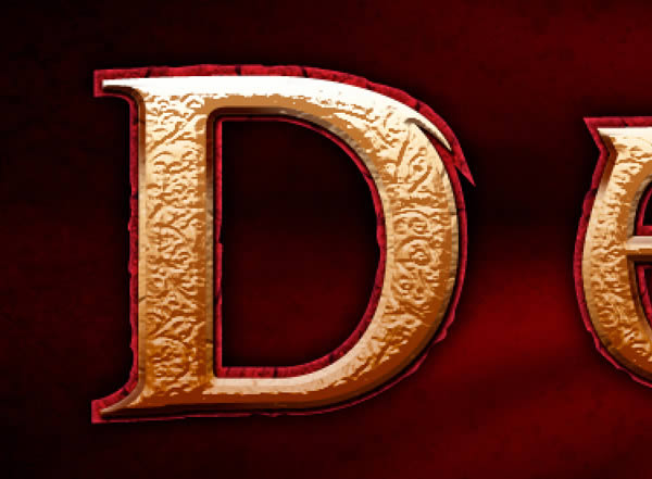
Step 10 — More Bevel Highlights and Shadows
In this step, I wasn’t quite satisfied with the bevel effect from the Layer Style. So I went ahead and created a new layer placed between the Smaller text and the Medium text layer. I retrieved a selection from the medium text layer and, while keeping the selection active, painted some highlights with a soft brush (B).
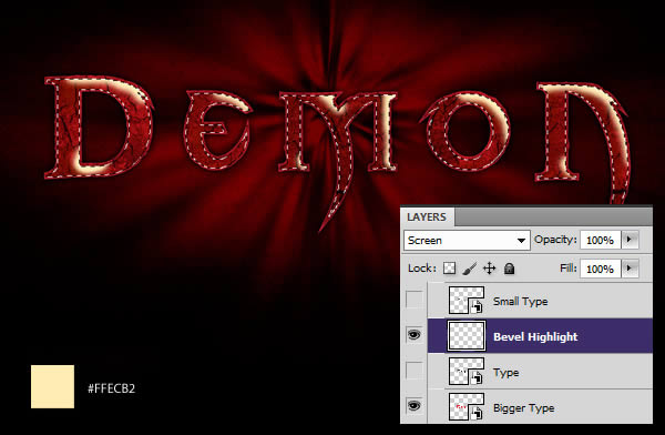
I then created another layer, and this time, using the same technique, painted some shadows. In this example, I filled the text in white so you can see where I painted the shadows.
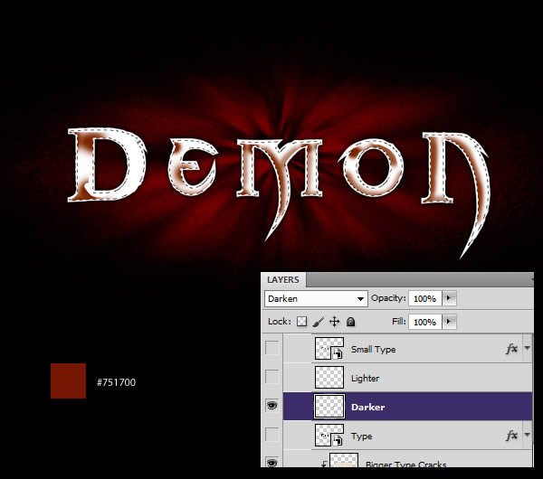
This step could have been done using Layer Style only. However, I tend to prefer painting things manually sometimes as it allow gives more liberty than the Layer Style. Unhide all of your layer, you should have this result:
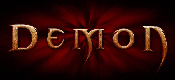
Step 11 — More Work on the Text
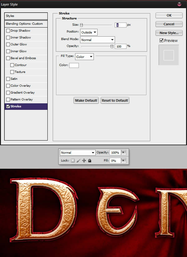
In this step, we’ll create a nice white outline in the highlights areas. Duplicate the "Small Text" layer (Command/Ctrl + J) and clear the layer style (Right-click > Clear Layer Style). Give the new layer the following Layer Style. Make sure that the layer Fill is set to 0%.
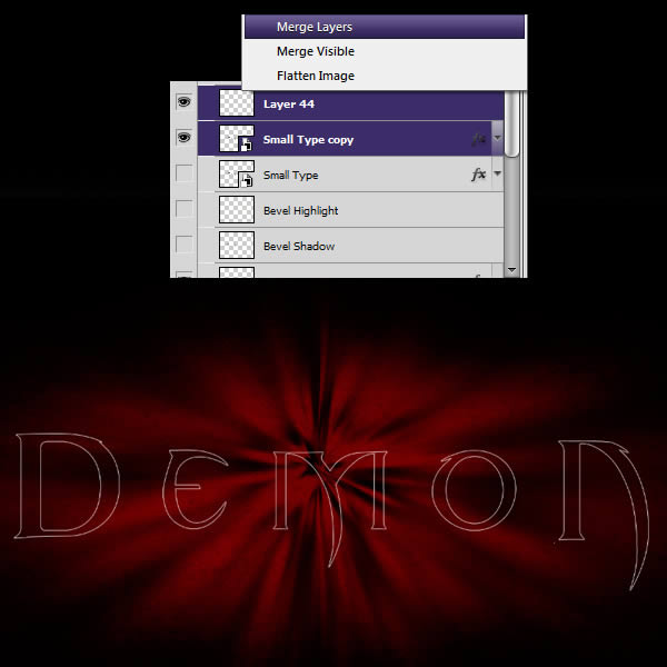
Create a new layer (Command/Ctrl + Shift + N) and merge it with the previous layer. This will apply the layer style leaving only the white stroke on the new layer.
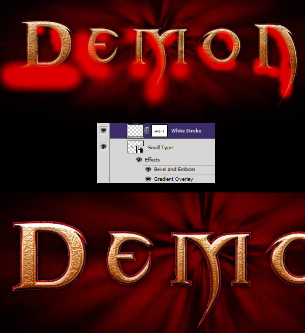
Name this layer "White Stroke" and give it a mask. In the mask, paint out the areas under the text that would be less exposed to the light.
Step 12 — More Texture
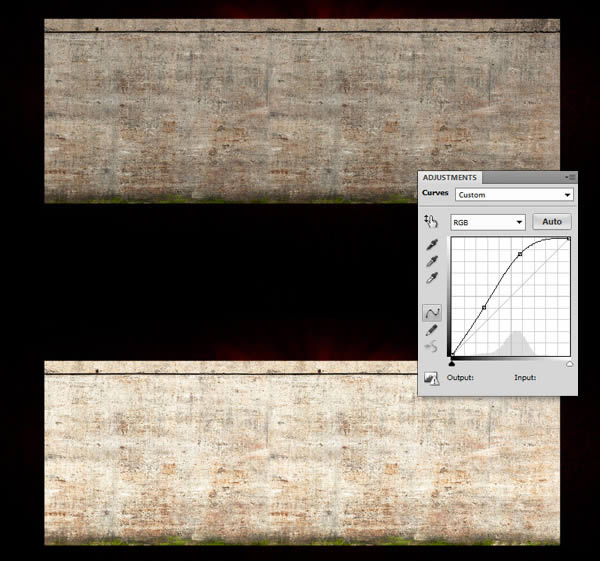
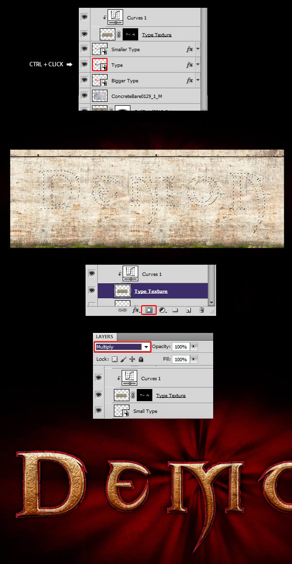
Let’s make our text even grittier with some textures. Download and open ConcreteBare0280_24. Once again, you might have to duplicate the layer to cover the whole text. Once you are done placing it, increase the layer’s highlights with a Curves adjustment.
Retrieve a selection from the medium sized text by Command/Ctrl + clicking on the layer’s vignette. Apply the selection as a mask to the new texture layer. Set the layer to multiply and make sure it is placed above your text layers.
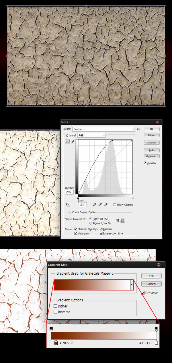
Place Crackles0014 in your canvas. Give it a nice Curves adjustment to boost the luminosity, and then a Gradient Map to colorize the cracks.
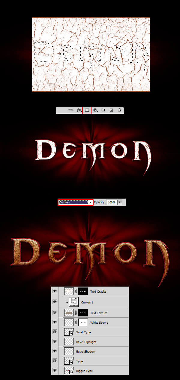
Retrieve a selection from your medium sized text layer, use it to mask the texture. Set the texture to Darken.
Step 13 — Final Adjustments on the Text
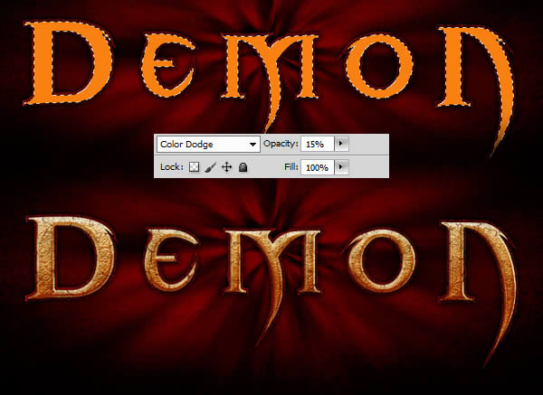
Due to all the textures we added, our text got a little bit desaturated. We’ll fix this problem in this step. Start by creating a new layer. Retrieve the selection from the medium sized text, and fill the layer with #F98111. Set the layer to color dodge and reduce the opacity to around 15%.
Create a Curves adjustment layer to darken the text. Once again retrieve the text selection to give the layer a mask. In the mask, paint out in black the top area of the text. This will allow our layer to only darken the bottom of the letters.
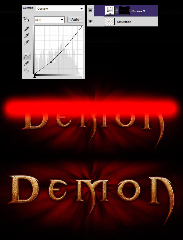
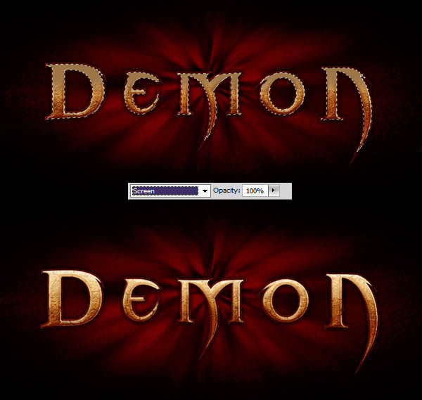
Create a new layer and retrieve the selection once again. With the selection still active, grab the Brush Tool (B), set it to 0% Hardness and paint the top of the letters with #92754C. Set the layer to Screen.
In case you missed anything, here is what your layers should look like.
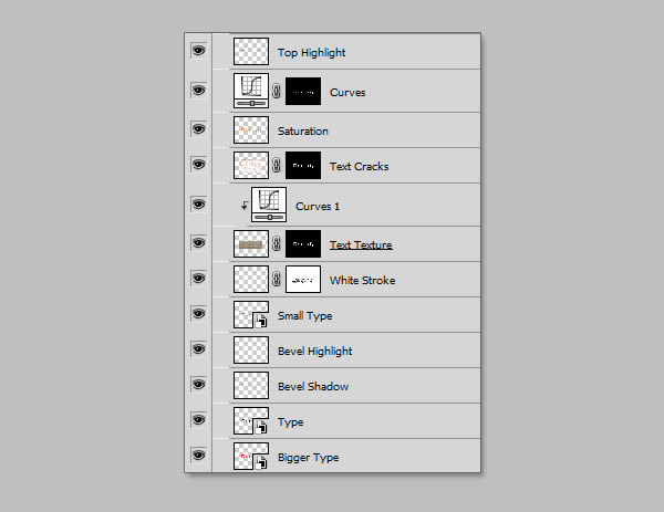
Once you are satisfied with everything, group every layer that are related to the text in a new folder (Command/Ctrl + G) and do the same for the background layers. This will help us stay organized as our file becomes more complex.

Step 14 — Creating the Pentagram
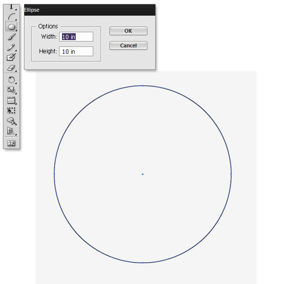
Back in illustrator, grab the Ellipse Tool (L) and do a single-click on your canvas. A window should pop-up. Input the following values and click OK.
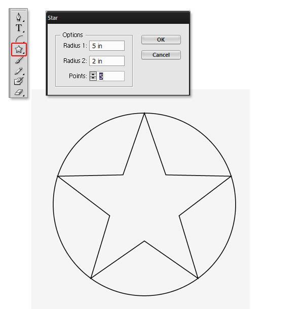
Select the Star Tool and repeat the same process. Place the star inside the circle.
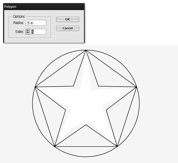
Once again, this time with the Polygon Tool.
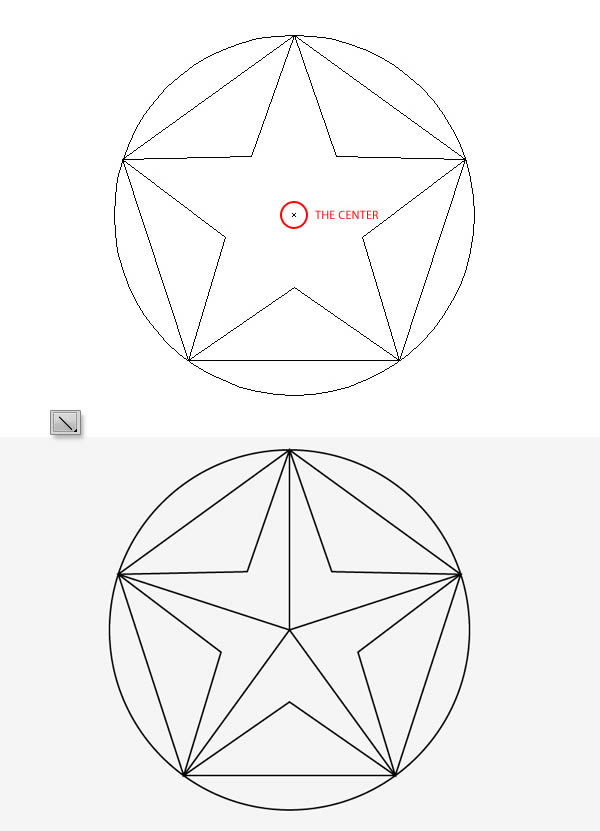
Grab the Line Segment Tool (\) and create lines starting from the center of the circle toward the tips of the star. To find the center, you can simply hit Command/Ctrl + Y to enter the Outline Mode. The center of the circle will show as a X.
Once you are done, select everything except the circle, copy and paste to duplicate them. Rotate them 180° and scale them down so the tips of the small pentagon fit the bigger star.
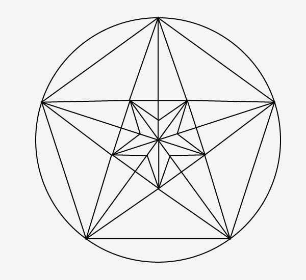
And finally, add another small pentagon inside the smallest star.
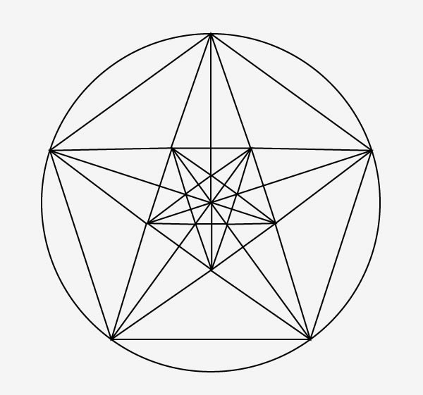
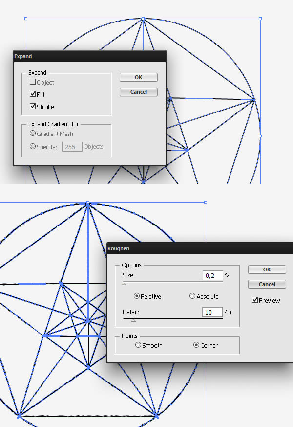
Once you are satisfied, select everything, go to Object > Expand. Make sure that the stroke is checked and click Ok. Then go to Effect > Distort & Transform > Roughen. This will give an eroded look to our strokes.
Step 15 — Back in Photoshop
Back in Photoshop, paste everything in a new layer. Duplicate the layer and flip it vertically (Edit > Transform > Flip Vertical).
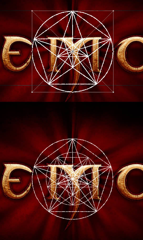
Make sure you place everything behind the text. Grab the Polygon Tool (U), set the number of sides to three and draw a triangle. Hit Command/Ctrl + T, rotate and stretch the triangle according to the example. Then, duplicate the layer three times and place the triangle to match the example.
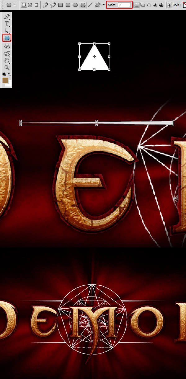
For the pattern, there is no magic trick. In my example, I used Vector Tribal tattoo and Wing Tattoo Set. If you do not want to buy stock vector, you can always take a look at the Tribal Brushes on Deviantart. Place your tribal pattern around the circle until you are satisfied with the result.
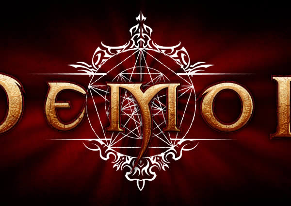
Once you are done, group every layer created in this step into a folder (Command/Ctrl + G). Duplicate the group and merge it. Keep the layer, we’ll need it in the next step.
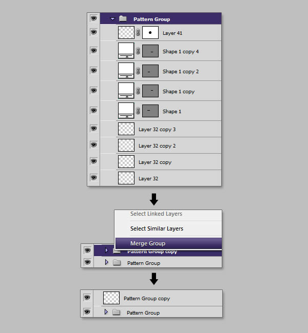
Step 16 — Merging the Pentagram
Create a new layer and fill it with white. Name the layer "Pattern". Retrieve the selection from our previously merged layer, and with the selection active, give the "Pattern" layer a mask.
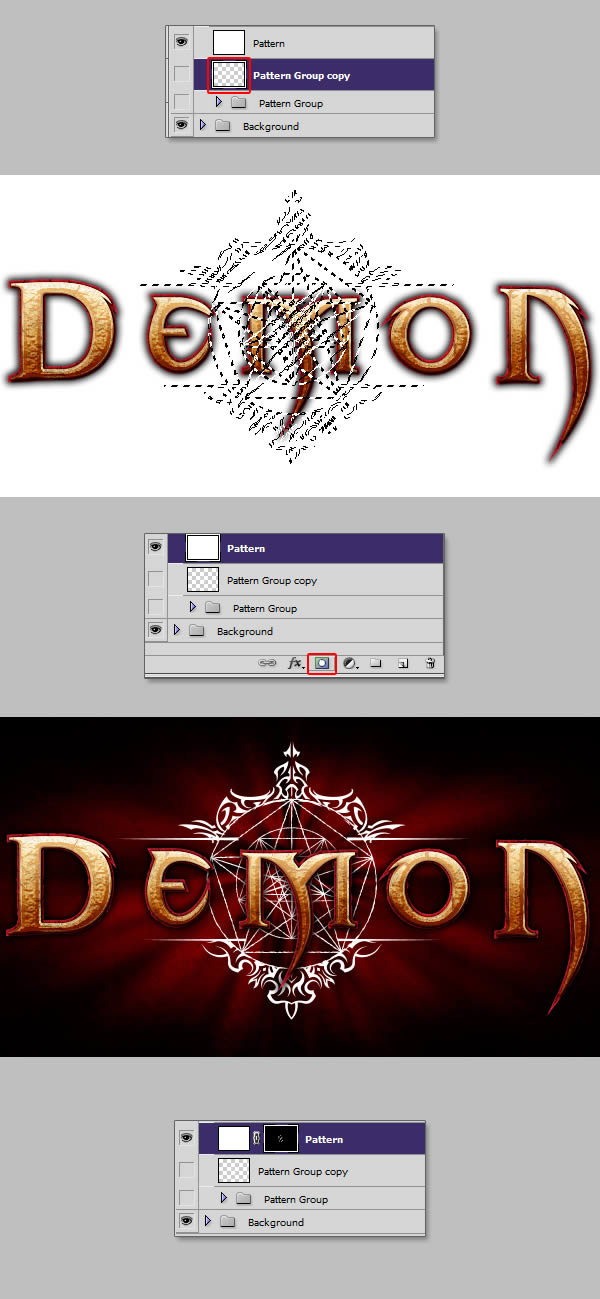
This setup will allow us to paint the color we want on our pattern. Grab a big soft brush, and paint the colors according to the example. Once again, this could be done using a Gradient Layer Style, but this method gives us more freedom than a simple linear gradient.
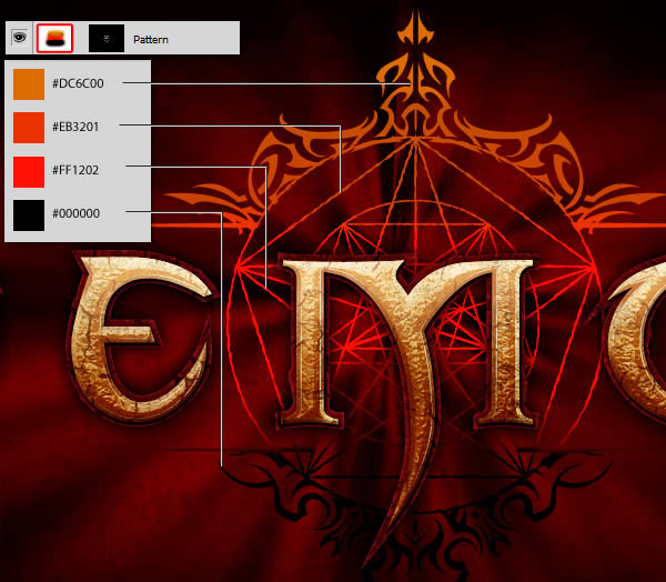
Step 17 — Finalizing the Pentagram
Group your "Pattern" layer, give it a mask and paint out the bottom area.
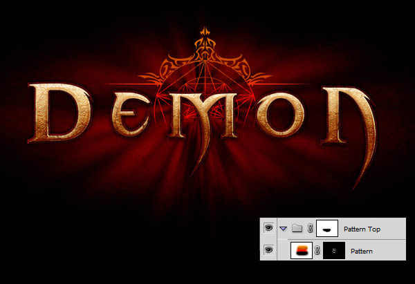
Give the "Pattern" layer the following Layer Style.

Duplicate the group, invert the mask (Command/Ctrl + I), clear the Layer Style and give it the following:
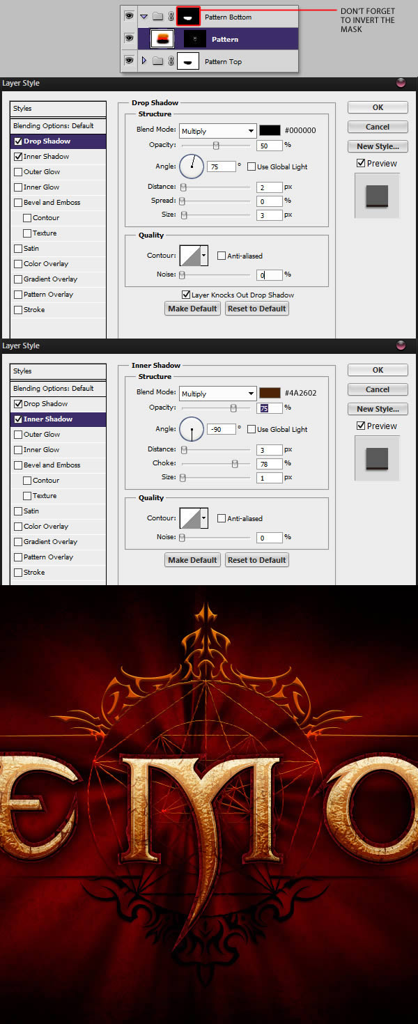
Once you are done, group everything and name the folder "Background Pattern."

Step 18 — Creating the Light Lines
On a new layer placed under the "Text" folder and above "Background Pattern" folder, draw three small lines with a 2px Brush. Quick tip: you can hold shift to draw straight lines.
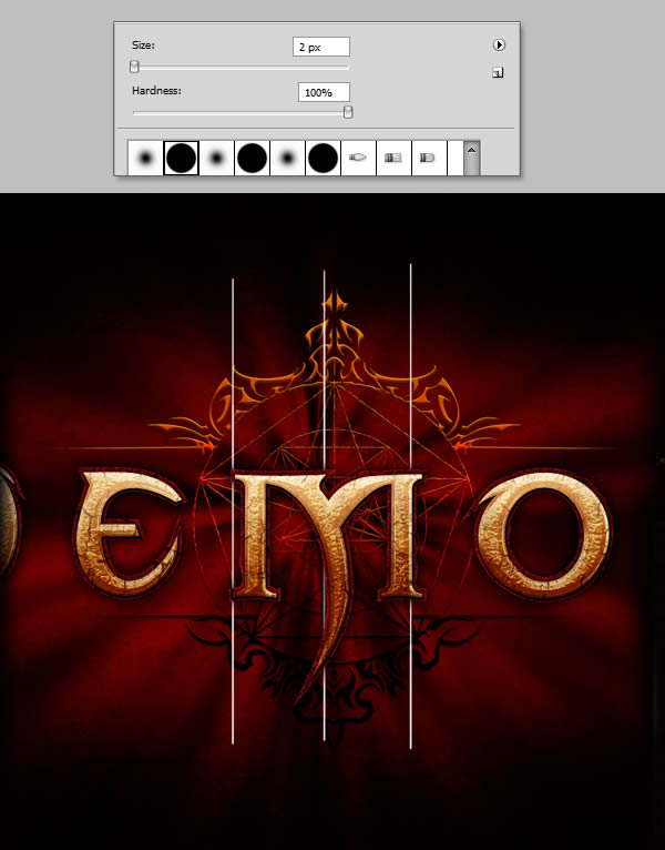
Keep drawing lines with black and white color until you achieve a result similar to the example. Then go to Filter > Blur > Motion Blur and apply a strong vertical motion blur.
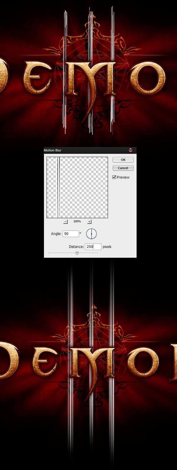
With the Eraser Tool (E) set to 0% Hardness, paint out parts of the light lines to achieve a symmetric effect where the middle line is a little bit taller.
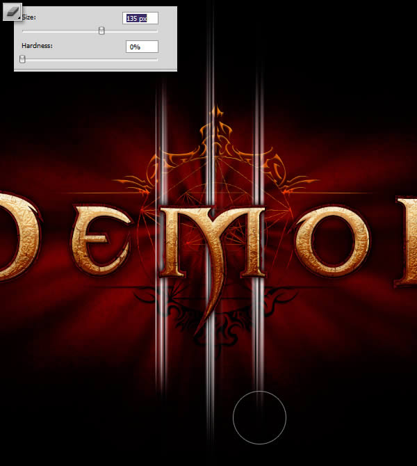
Step 19 — Coloring the Lines
Create a new layer and paint in the following colors. Then, clip the layer to the "Lines" layer we created in the previous step.
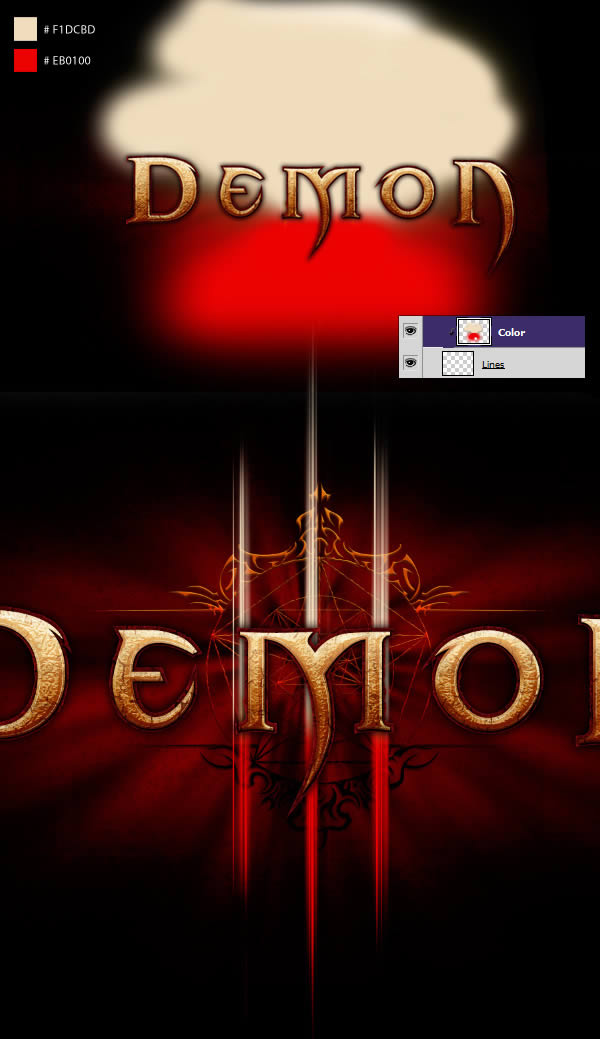
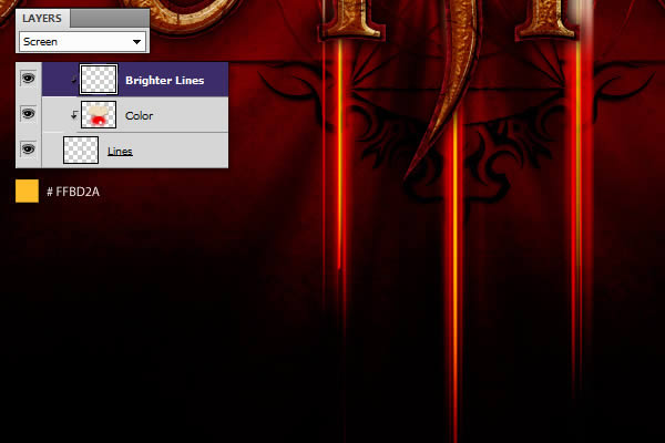
Create another layer and clip it on top of everything. With a 2px Brush, paint a bright yellow line inside each of the three lines. Set the layer to screen.
Step 20 — Blurred Light
Duplicate the "Lines" layer and scale it up.
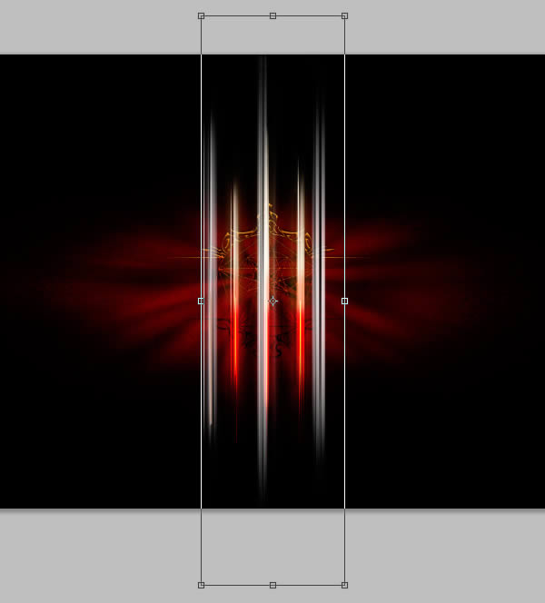
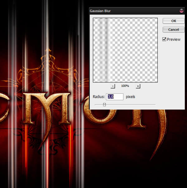
Go to Filter > Blur > Gaussian Blur and apply a three pixels blur to the layer.
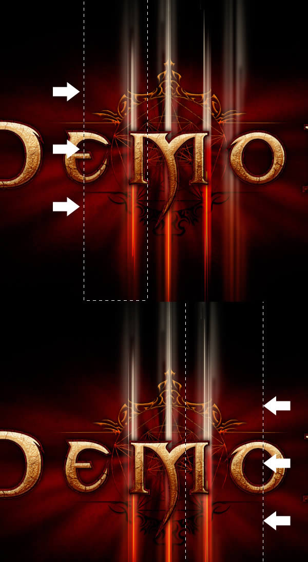
Using the Rectangular Marquee Tool (M), select the right and the left lines and bring them closer to the center so they fit the layer we created in the previous step,
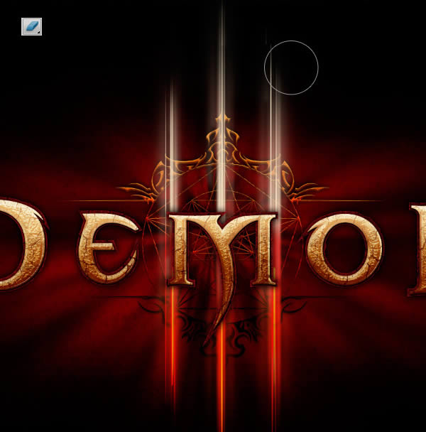
Finally, grab the Eraser Tool (E) and paint out the top and the bottom parts of the layer.
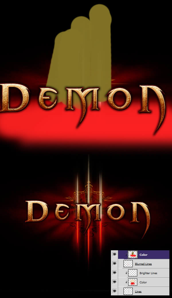
Create a new layer and fill it with the following colors. Clip the new layer to the "Blurred Lines" layer we just made.
Step 21 — Sharpening the Lines
We can make the lines even more interesting by giving them a little bit of sharpen. Group everything into a "Lines" folder and duplicate it. Create a new layer filled with black, and merge it with the "Line Copy" folder.
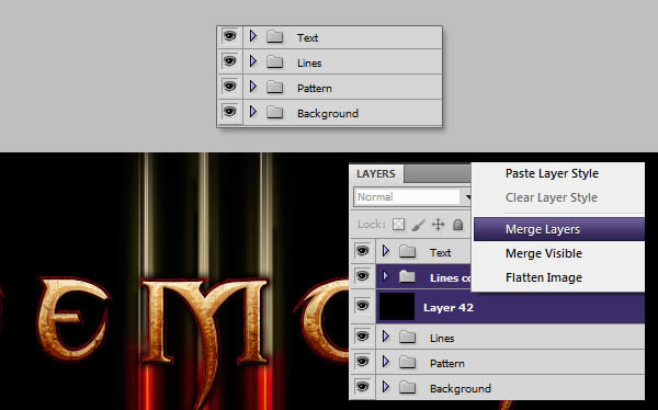
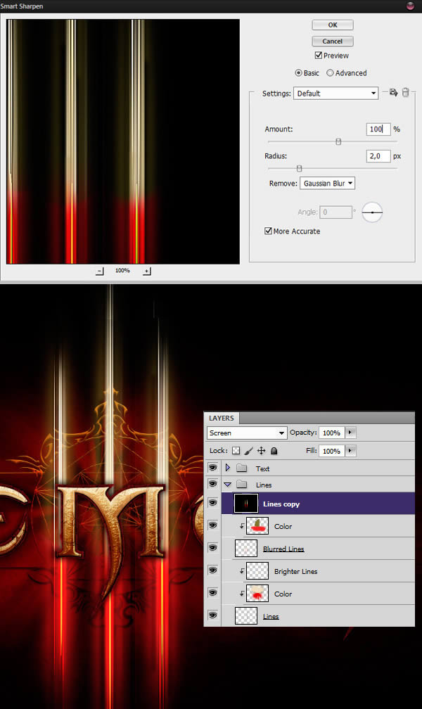
With the new layer selected, go to Filter > Sharpen > Smart Sharpen, and input the following values. Once you are done, set the layer to Screen.
Step 22 — The final touches
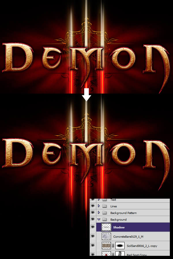
We’re almost there! In this step, we’ll add some final touches that will bring our image to completion. First, create a new layer named "Shadow" and place it above our background layers. On this layer, paint some black with a soft brush behind the text. This will help reduce the visual noise in the middle and the readability.
Next, we’ll add a little bit of shininess to our image. Create a new layer and fill it with black. Go to Filter > Render > Lens Flare and select the 105mm Prime. Hit Command/Ctrl + M to bring in more contrast, and then apply a Gaussian Blur.
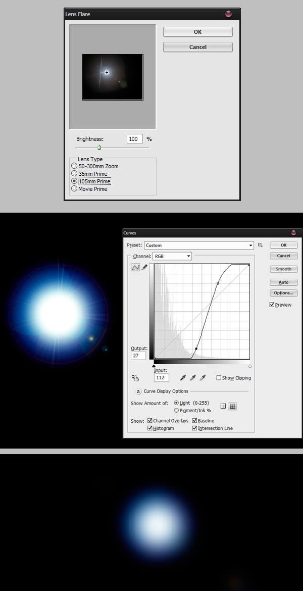
Hit Command/Ctrl + T to enter the Free Transform mode, scale down the layer and bring where the bright lines meet the letters. Set the layer to Color Dodge to have a night light refraction effect.
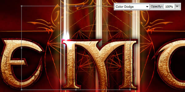
Repeat the process as much as you please. You can take a look at my example for reference. When you are done, place all those layer into a new folder named "Lens Flares".
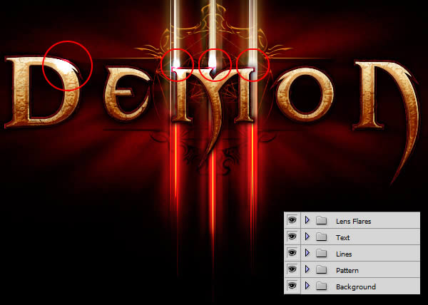
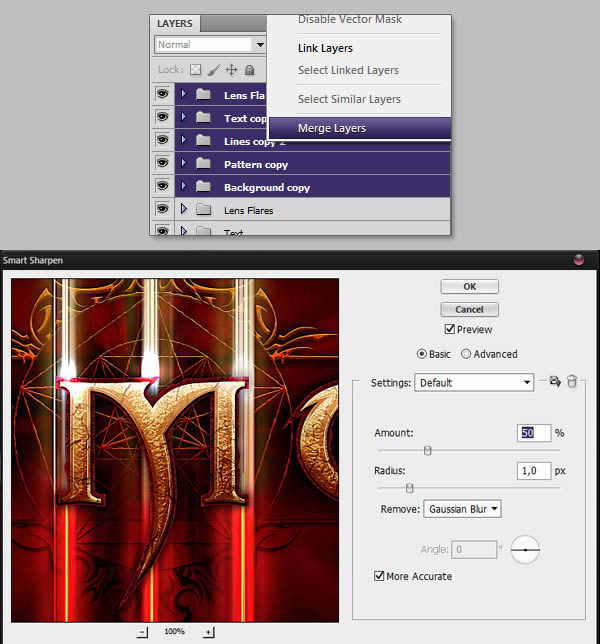
To finalize our image, let’s add a Smart Sharpen filter. To do so, duplicate and merge all folders together. With the new layer selected, go to Filter > Sharpen > Smart Sharpen and add the following values.
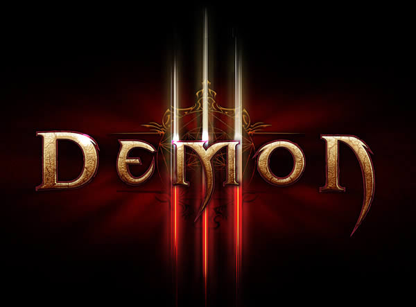
Final Image
{excerpt}
Read More