Photoshop CS6 is packed with new features and effects that you can use in your work. In this tutorial we will utilize Photoshop’s new 3D capabilities as well as its new content aware features to create a Micro Machines inspired composition. Let’s get started!
Tutorial Assets
The following assets were used during the production of this tutorial.
Step 1
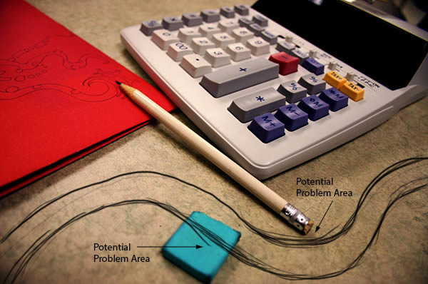
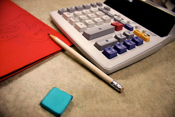
Open the image of the desktop. Since we are going to add a racetrack across the desktop, go ahead and sketch out the path of the road on a temporary layer. This will identify problematic areas up front.
Step 2
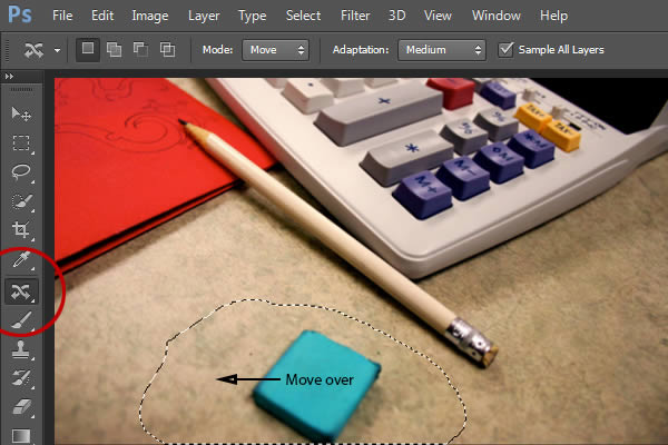
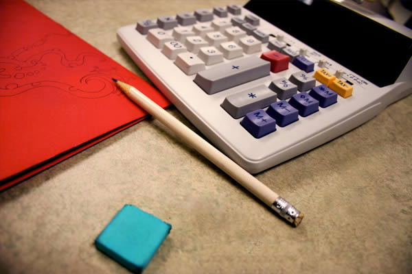
Use the Content-Aware Move Tool (J) to fix the problematic areas so that our road will have enough space. With the Tool activated, draw a selection around the eraser, then click and drag the selection to a new area on our screen. Allow Photoshop to calculate the change
Your results should appear similar to the following image:
Step 3
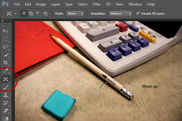
Use the Content-Aware Tool on the pencil as well.
Step 4
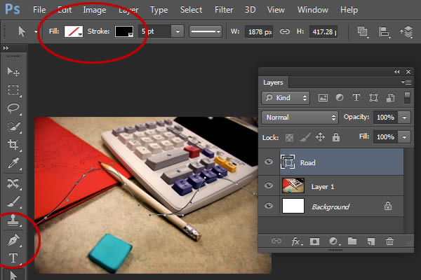
We are now going to create the road. Select the Pen Tool (P) and set the Mode to Shape. This will allow us to use the Fill and Stroke options. For now, set the fill to No Color and the Stroke to Black. Using the sketch as reference only, loosely draw a new path from a top-down view on a new layer named “Road.” Note: Do not draw this path in perspective of our scene, we will use the 3D mode later to match the perspective.
Step 5
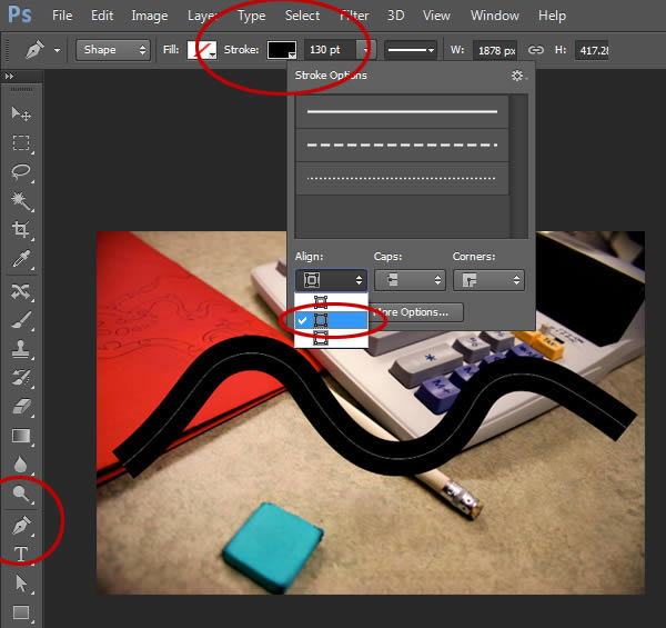
Set the Stroke Width to 130 pt. Also, open up the Stroke Options and set the Align to Center. Hide the “Background” Layer for now.
Step 6
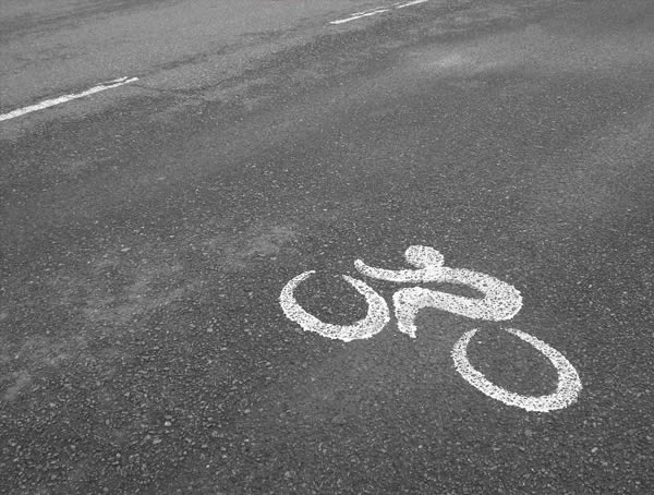
Our next step is to texture the “Road” layer. To start, we’ll need to open the picture of the Asphalt.
Step 7
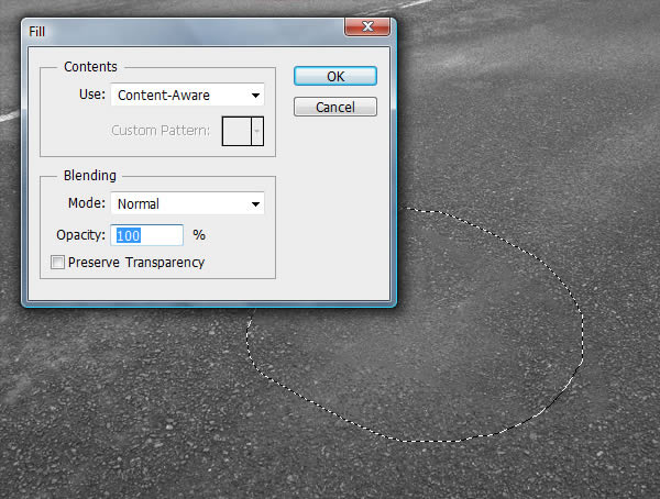
Use any of the Marquee Tools to select the Bike symbol and go to Edit > Fill. Make sure to set the Use to Content-Aware. If necessary, use the Patch Tool to clean up the image.
Step 8
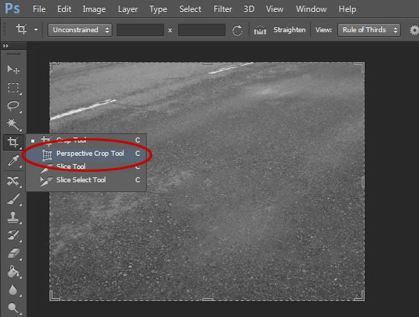
We need to correct the image’s perspective in order to properly sample the texture. Select the Perspective Crop Tool (C), which can be found by clicking and holding on the Crop Tool.
Step 9
With the Perspective Crop Tool selected, click four points of a rectangle that matches the perspective of our asphalt. Use can manipulate the handles to get a better match.
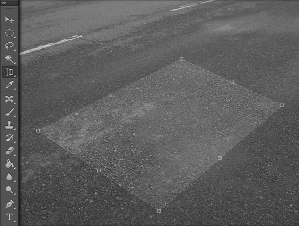
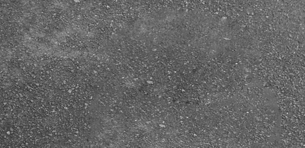
Press Enter or Return to commit to the crop.
Step 10
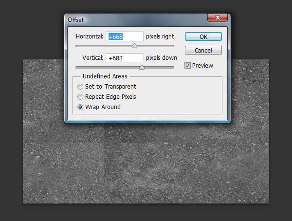
Now that we have a nice, clean texture, we need to make it seamless. Go to Filter > Other > Offset and adjust the sliders so that both seams are visible.
Step 11
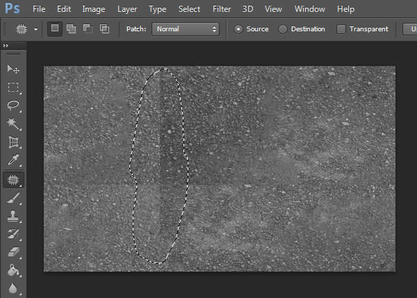
Using the Patch Tool, remove the seams. It may be necessary to use the Patch Tool multiple times
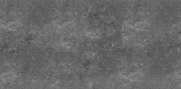
The results should resemble the image below:
Step 12
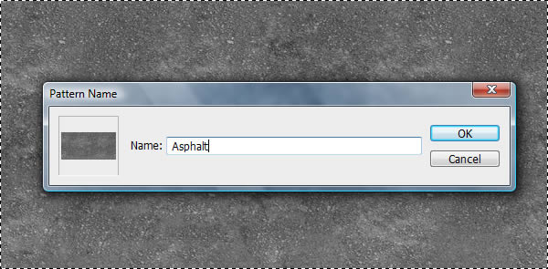
Press Command/Ctrl + A to select the entire image and go to Edit > Define Pattern. Name this pattern “Asphalt.” Lastly, with the selection still active, press Command/Ctrl + C to load this image to the clipboard. We will be pasting it in our scene in a later step.
Step 13
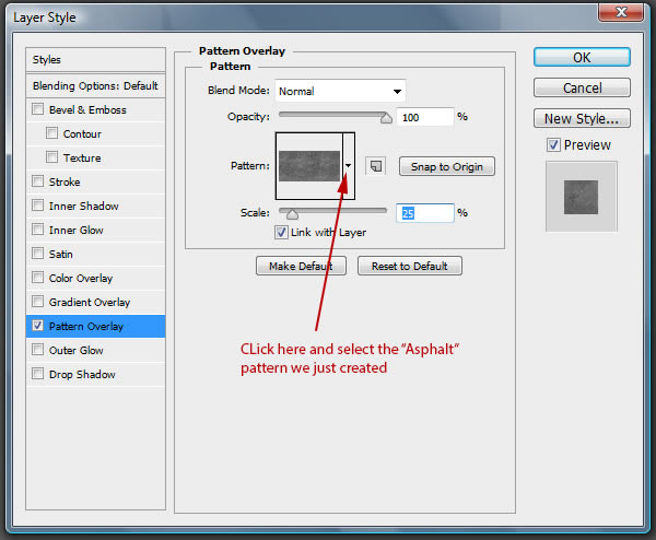
Go back to our original scene and double click the “Road” layer to access the Layer Styles. Apply the asphalt texture as a Pattern Overlay. Set the scale to 25%
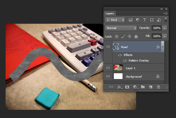
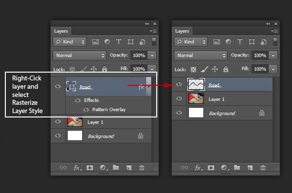
Right-click the layer and select Rasterize Layer Style.
Step 14
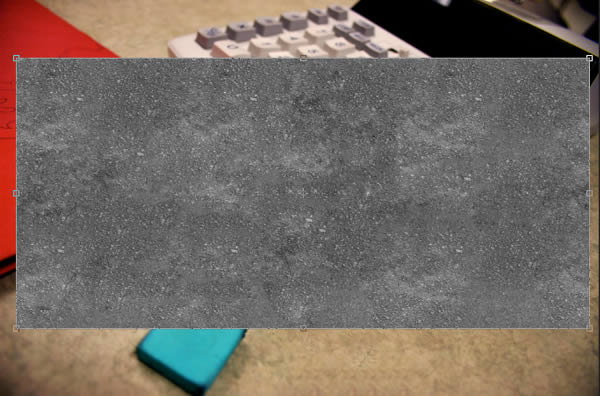
Create a new layer and press Command/Ctrl + V to Paste our image that we copied in Step 12. Resize the texture so that it covers the road.
Step 15
Rename the new layer to “Texture” and make into a Clipping Mask to the “Road” layer.
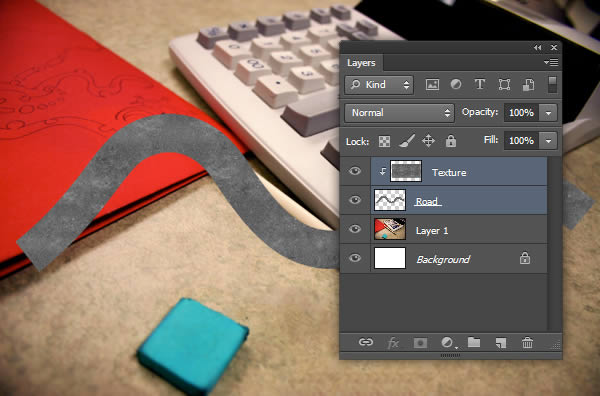
Using a larger, soft Eraser (E), erase the inside of the road so that the larger texture appears only on the edges of the road.
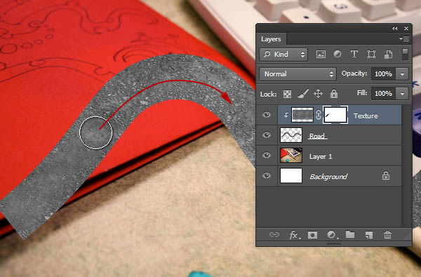
Set the Blending Mode to Overlay
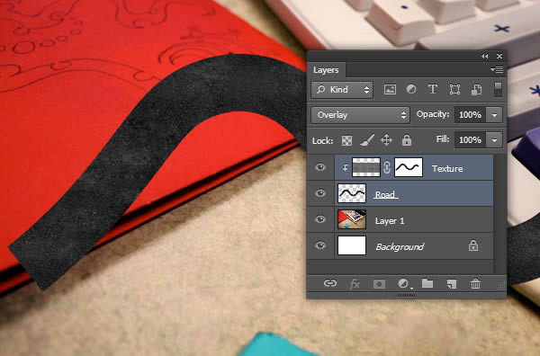
Step 16
Select both layers that make up our road and right-click and select Convert to Smart Object. Rename the Smart Object to “Road.”
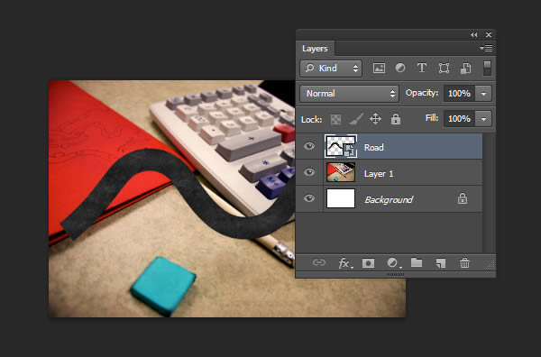
Step 17
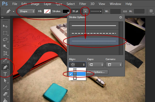
Now that we’ve created a top-down view of our road, we can start to create a top-down view of the construction cones. Create a new layer named “Cones.” Select the Pen Tool and change the settings as follows:
Step 18
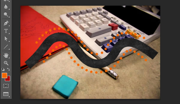
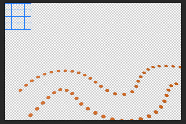
Set the Foreground Color to a nice construction orange and draw two paths that follow each side of the road. The resulting paths should resemble the following image:
Step 19
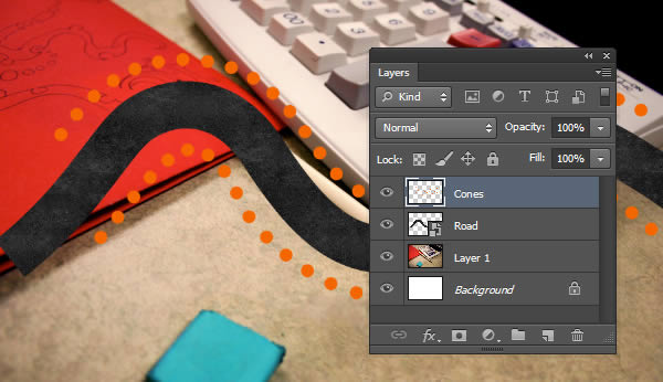
Right-click both shape layers and Rasterize Layer. Select both rasterized layers and Merge (Command/Ctrl + E). Rename to “Cones.”
Step 20
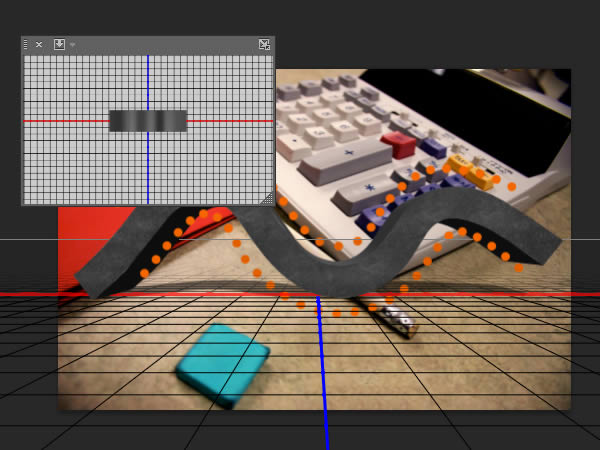
We can now start to make our 3D objects. To convert our “Road” Smart Object into 3D, select the layer and go to 3D > New 3D Extrusion from Selected Layer. This will automatically create an extruded 3D object, as well as open the 3D Panel.
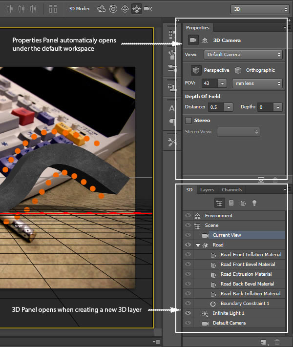
Step 21
In the 3D Panel, select the “Road” object layer (denoted with an extruded star icon) to access its properties. In the Properties Panel, make sure the Mesh section is activated and set the Extrusion Depth to 0.
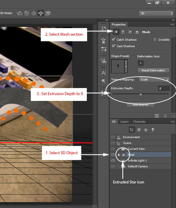
Step 22
Next, go to the Coordinates section and set the X-Angle to 90 degrees.
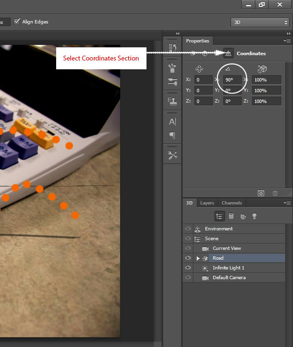
Step 23
Go back to the 3D Panel and click the fly-out menu for additional 3D options and select Snap Object to Ground Plane.
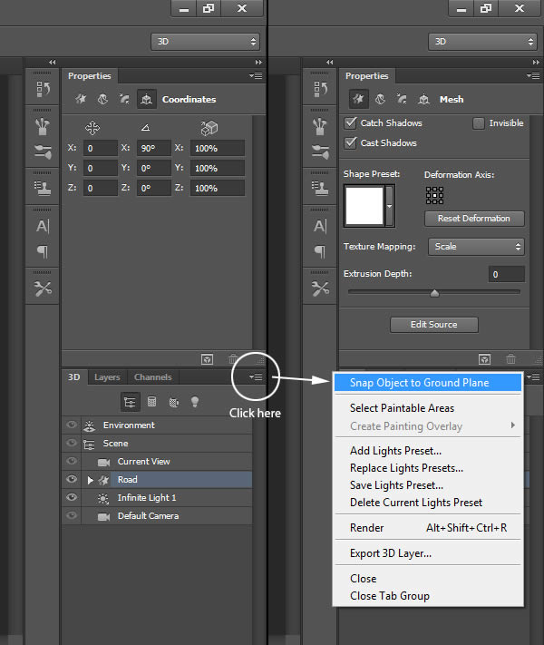
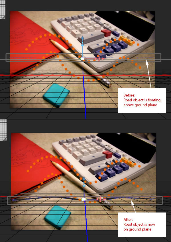
Step 24
Go back to the Layers Panel and hide the background image. This will make it easier for us to see the 3D objects. Next, right-click the “Cones” layer and select New 3D Extrusion from Selected Layer. Note that the “Cones” object is on a unique grid. We know this since there is only one object (the “Cones” object) in our scene. Photoshop has essentially created a separate 3D space for each object. We will combine both objects so that they are both in the same 3D space.
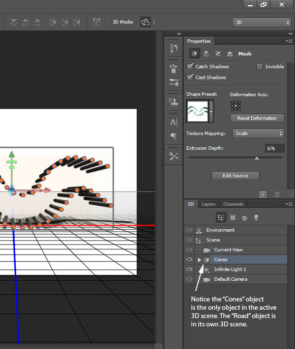
Go back to the Layers Panel and make sure the “Cones” layer is on top of the stack. Select both 3D layers and Merge (Command/Ctrl + E).
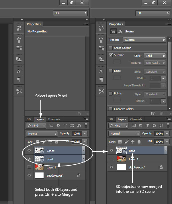
Since these are 3D layers, merging the layers just combines them into the same 3D space. We can check this by going back to the 3D Panel.
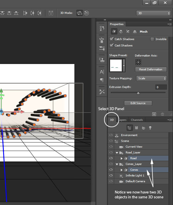
Step 25
Using the same methods as we did the road, set the extrusion depth to zero, change the X-Angle coordinate to 90 degrees and snap to the ground plane. The objects may not line up properly, we will move them into their final positions later.
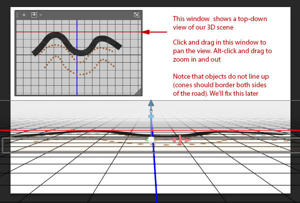
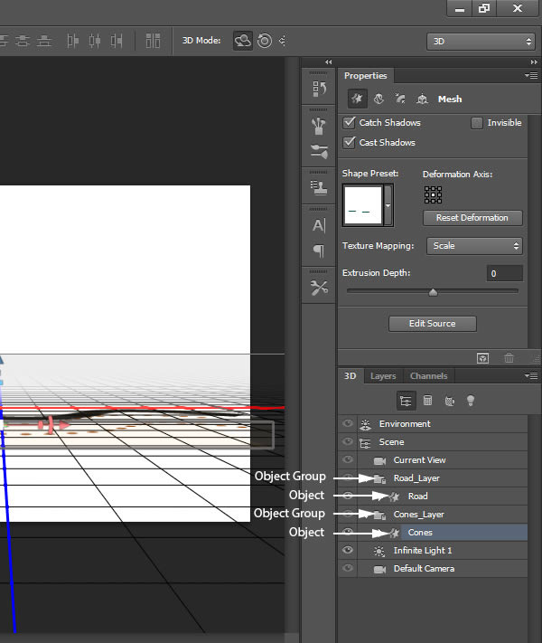
Also, it is important to note that since we have combined multiple 3D objects in one scene, the objects are contained within new groups (typically using the suffix “_layer”). Simply drill down to find the object layer (denoted with the extruded star icon).
Step 26
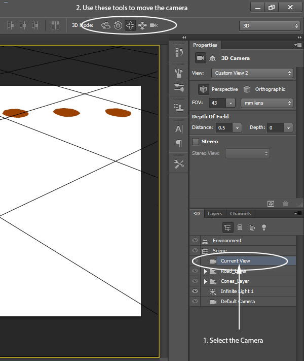
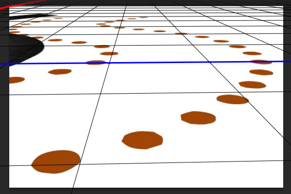
At this point, we are going to add a bevel to our “Cones” layer so they resemble construction cones. First, select the “Current View” camera and, using the navigational tools in the top menu, position the camera so it is close to the cones.
Step 27
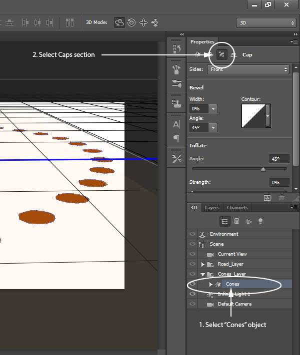
Select the “Cones” object layer and go to the Cap section in the Properties Panel.
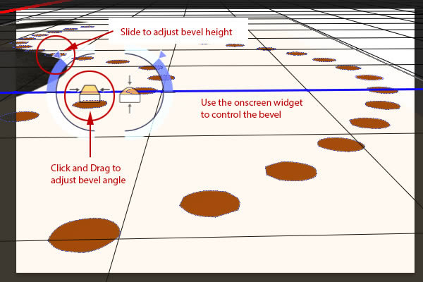
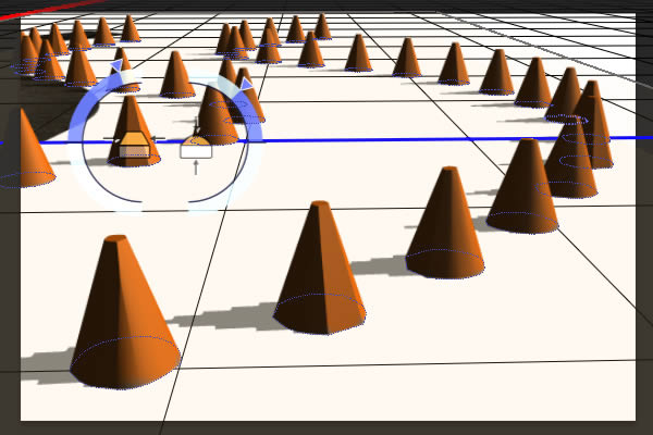
Use the onscreen widget to shape the cone.
Step 28
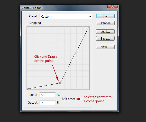
Next, in the Properties Panel, select the Contour Map to edit and add a custom contour as shown.
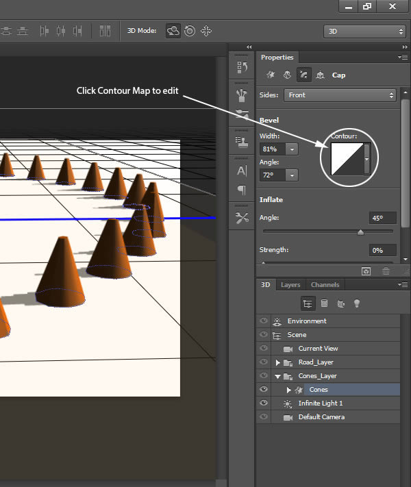
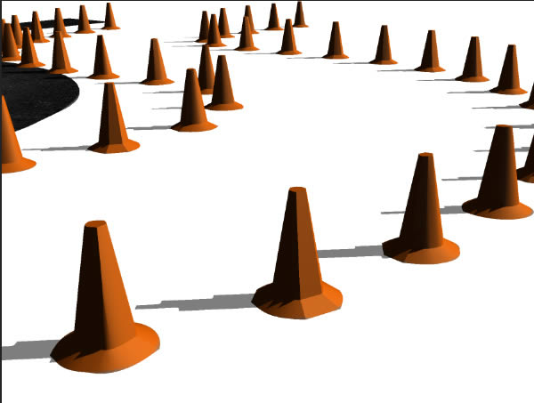
The results should resemble the following:
Step 29
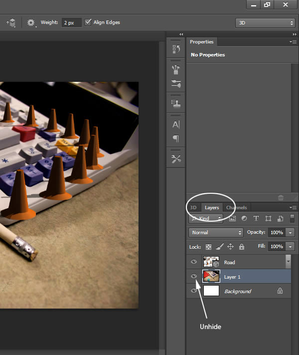
Now we can work to move the camera into position. We will use the grid on the ground plane to help us match the perspective of our scene. Go back into the Layers Panel and unhide the background image.
Step 30
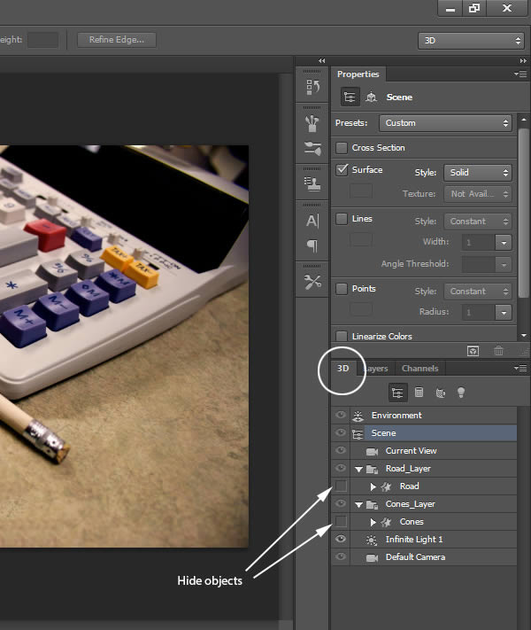
Go back to the 3D Panel and hide the “Road” and “Cones” layers. We don’t need this now.
Step 31
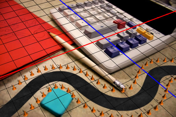
Select the “Current View” layer and, using the 3D tools in the top menu, Rotate, Drag, Slide, and Scale the grid so that it matches the perspective of the scene. It may require a lot of trial and error to get this right, although it does not need to be perfect. It helps to find some right angles that already exist in the scene such as the buttons on the calculator.
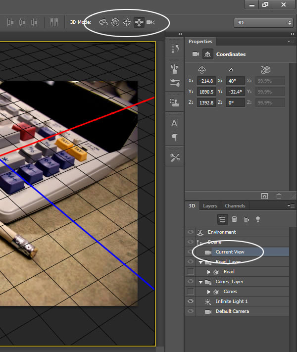
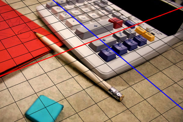
Step 32
Unhide the “Road” and “Cones” object layers. Select the “Road” object and click on the Mesh section in the Properties Panel.
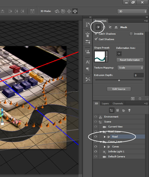
Use the widgets to manually move/rotate the road into a desired position.
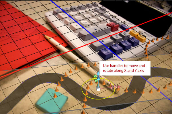
Do the same with the “Cones” object.
Step 33
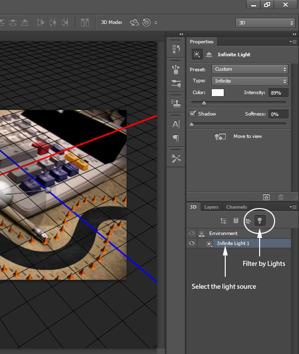
We are almost done with the 3D. The last part is to touch up the lighting. Currently, the shadows of our object do not match our scene. To fix this, click the Lights Filter in the 3D Panel and select the one light in our scene.
Step 34
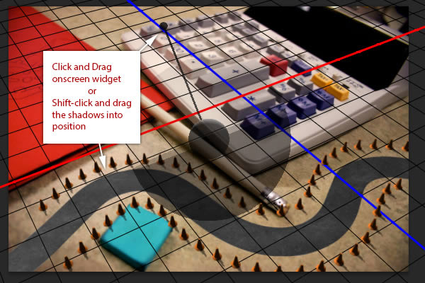
Holding shift, click and drag on the shadow in the scene to position it so that it matches the direction of the shadows in the original image.
Step 35
Let’s move on to rendering. We want to render each piece separately so we will need hide objects we aren’t rendering. In the 3D Panel, click the Filter by Mesh icon and hide the “Road” object. Also, make sure to unclick Cast Shadows for the “Cones” object.
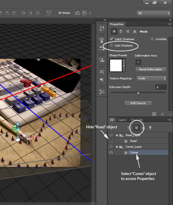
In order to render out our objects as transparent layers hide all our background layers as shown below:
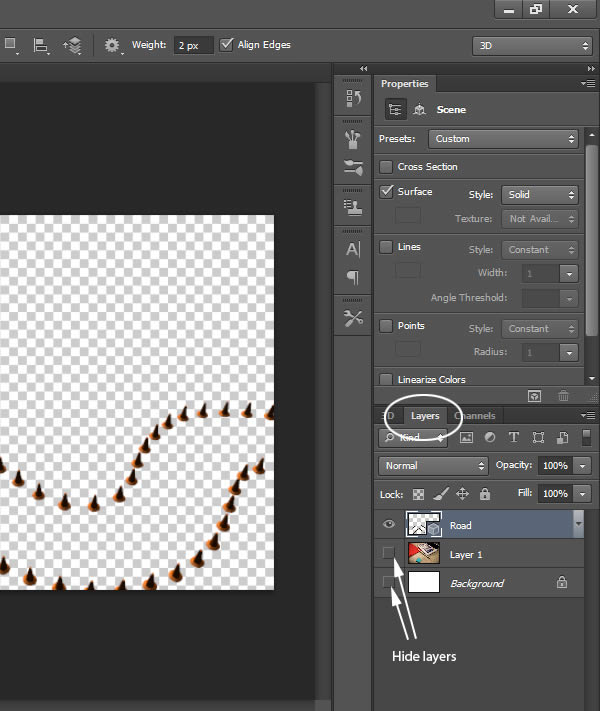
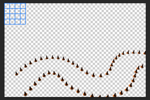
Go to 3D > Render (Command/Ctrl + Alt + Shift + R). Let Photoshop render a few passes, then press Enter to stop the rendering. Please note that if you are in the Layers Panel, the scene must be selected in order to initiate a render.
Step 36
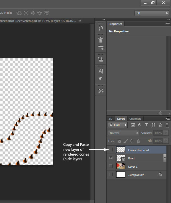
In the Layers Panel (the 3D layer should already be highlighted), Select All (Command/Ctrl + A), Copy (Ctl + C) and Paste (Command/Ctrl + V) the rendering onto a new layer. Name this layer “Cones Rendered.” Hide this layer for now.
Step 37
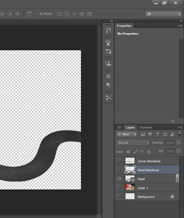
Repeat this process for the “Road” object.
Step 38
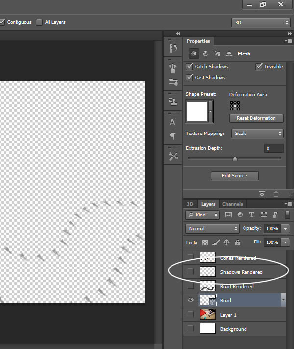
Now that the road and cones have been rendered out, we are going to make a few additional renders with the “Cones” object. Unhide the “Cones” object and hide the “Road” object. With the “Cones” object selected, go to the Mesh section of the Properties Panel and turn on Cast Shadows, turn on Invisible and turn off Catch Shadows.
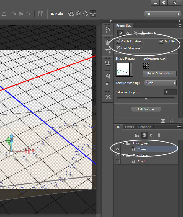
Render this out and copy it to a new layer just like we did in the earlier steps.
For the last render, turn off Invisible and Cast Shadows. Go to the Cap section and click Reset Deformation. This will result in flat discs.
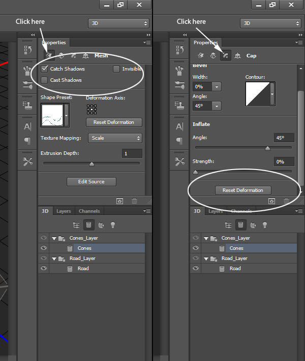
Again, Render (Command/Ctrl + Alt + Shift + R) out the scene and copy to a new layer.
Step 39
Name the three rendered files appropriately and hide the 3D layer. If necessary, reorder the layers so it appears correct in the image.
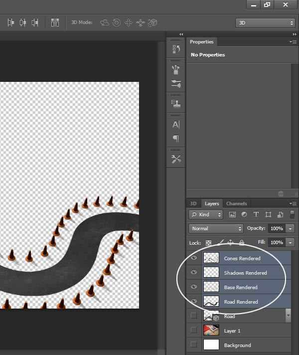
Step 40
Select the “Road Rendered” layer and add the following layer styles to make it appear as if the road is actually resting on the table.
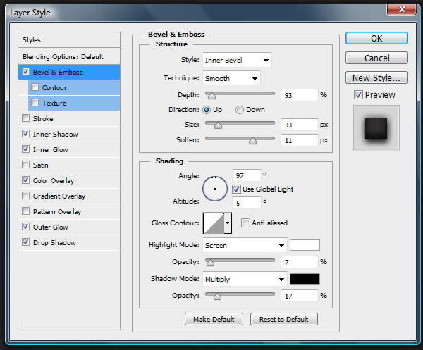
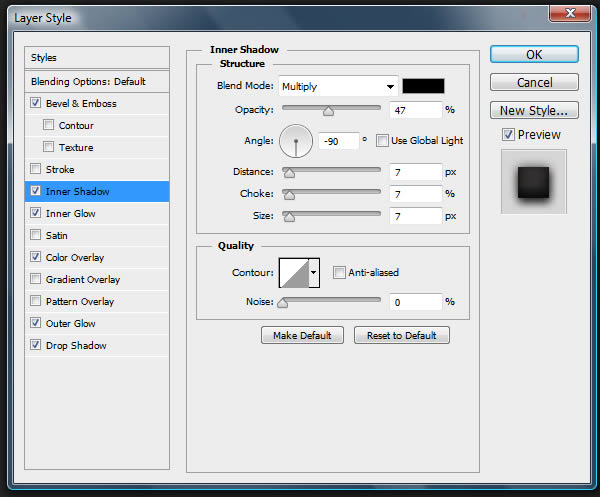
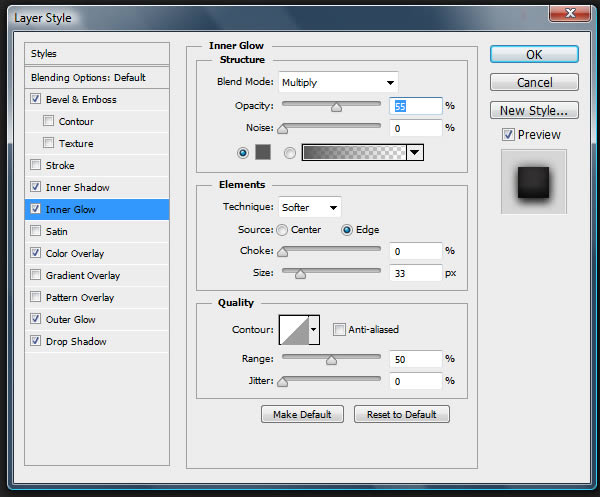
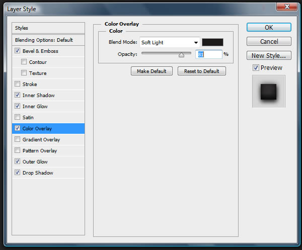
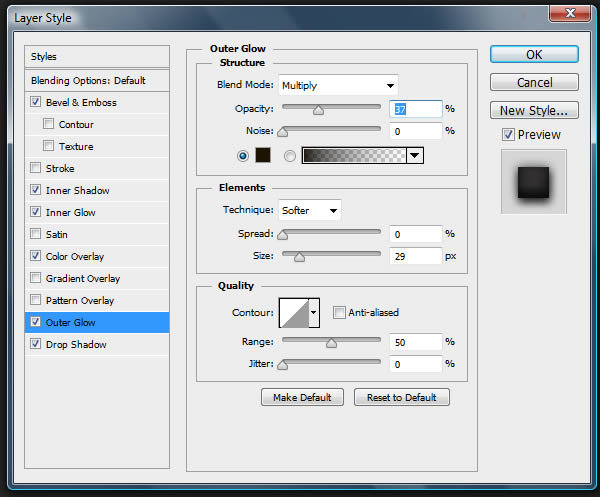
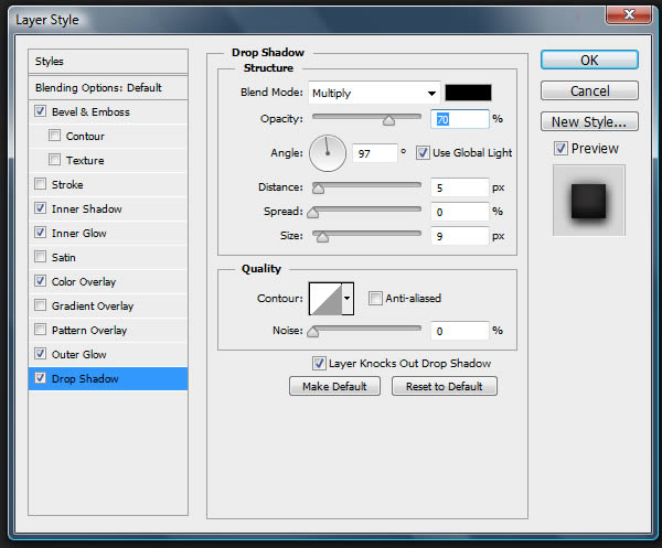
Step 41
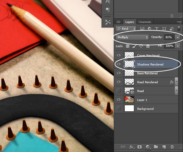
Select the “Shadows Rendered” layer and give it a Gaussian Blur (Filter > Blur > Gaussian Blur) of 4 px. Set the Blending Mode to Multiply and the Opacity to 4%.
Step 42
Select the “Base Render” layer and move it down so that it is barely visible under the cones. Adjust the Levels until the discs are pure black.
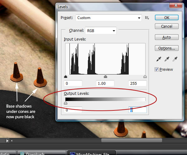
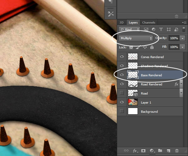
Give this a Gaussian Blur (Filter > Blur > Gaussian Blur) of 1.7 px and set the Blending Mode to Multiply
Step 43
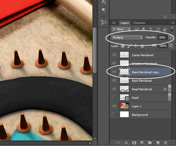
Make a copy of the “Base Rendered” layer and apply the Gaussian Blur filter again, but this time with a setting of 5.5 px. Set the Blending Mode to Multiply and the Opacity to 55 %
Step 44
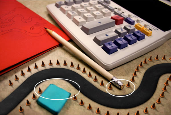
Group all of our cone layers together and add a Layer Mask to the group.
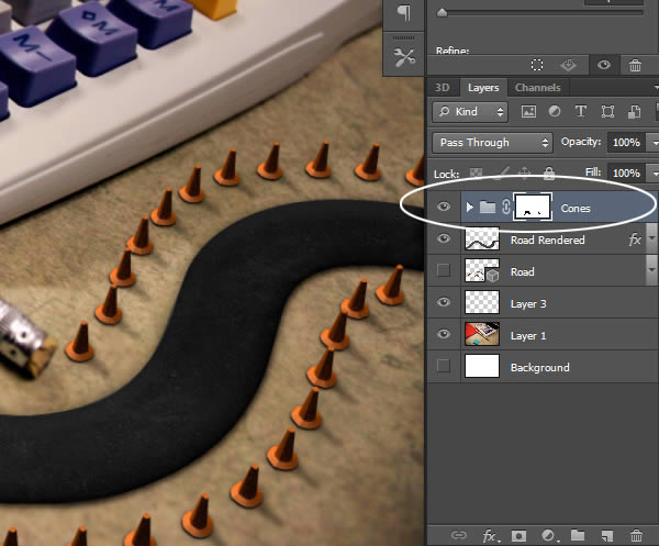
Use the mask to hide any cones that overlap the pencil and blue eraser.
Step 45
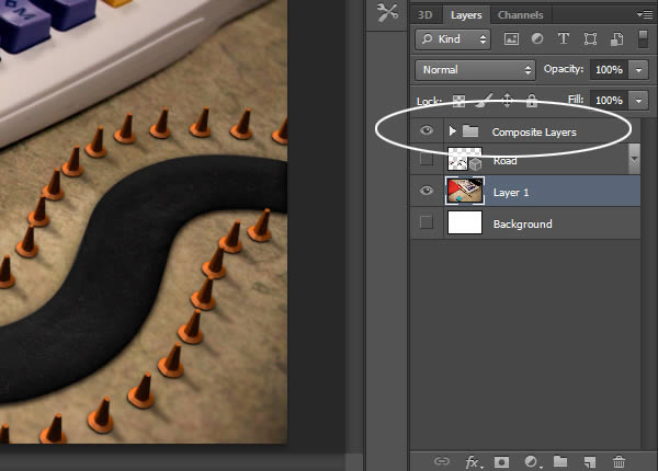
To organize our scene, go ahead and group all of our composite layers.
Step 46
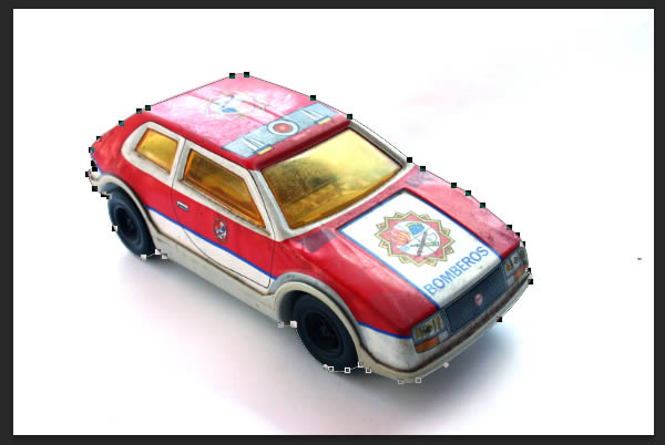
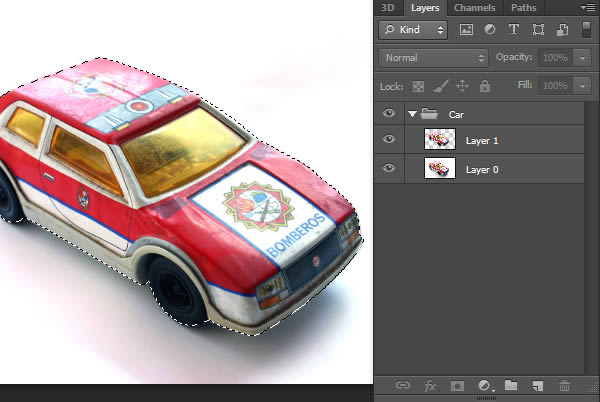
Our next step is to add a car to our scene. Open the car image and notice that it already has a nice shadow under it. We will try to utilize this shadow. Use the Pen Tool (with the Mode set to Path) to draw a path around the car.
Step 47
With the Pen Tool (P) still active, right-click the path and select Make Selection. Copy and Paste the car on to a new layer. The top layer will be the full color car, while the bottom layer will be used for its shadows.
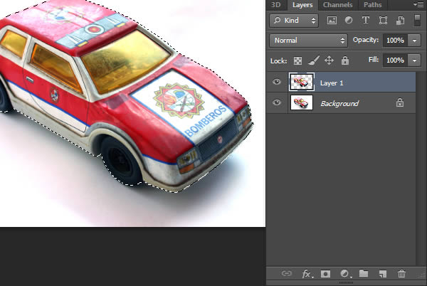
Group these two layers together. It may be necessary to double click the “Background” Layer to unlock it.
Step 48
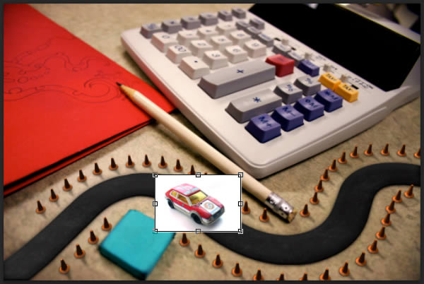
Drag the “Car” group into our scene and resize to fit.
Step 49
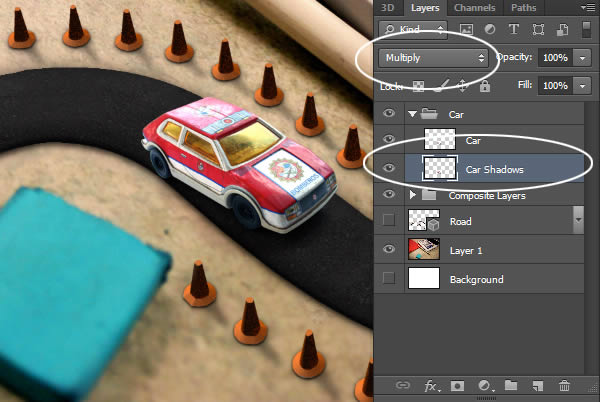
Inside the “Car” group, set the bottom layer to Multiply. Rename the layers as well. Notice that the perspective of the car does not match our scene. We will attempt to correct this in the next step.
Step 50
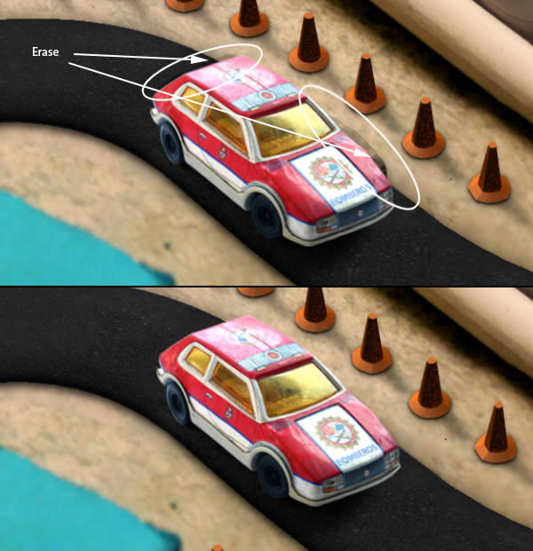
Select the “Car” layer and Transform (Command/Ctrl + T) the the car subtly to better match the perspective. Use the Warp Mode (activated by clicking the Warp Icon in the top menu bar) to fine-tune the transformations.
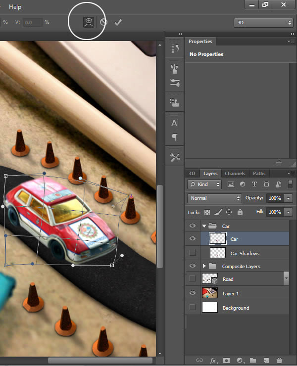
Notice that this causes unwanted parts of the “Car Shadows” layer to show through. Use the Eraser Tool (E) to remove.
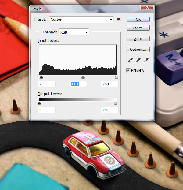
Step 51
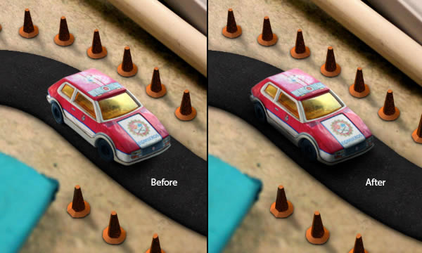
Use Levels (Command/Ctrl + L) to adjust the “Car” layer.
Step 52
Additionally, you can paint in more shadows as you see necessary
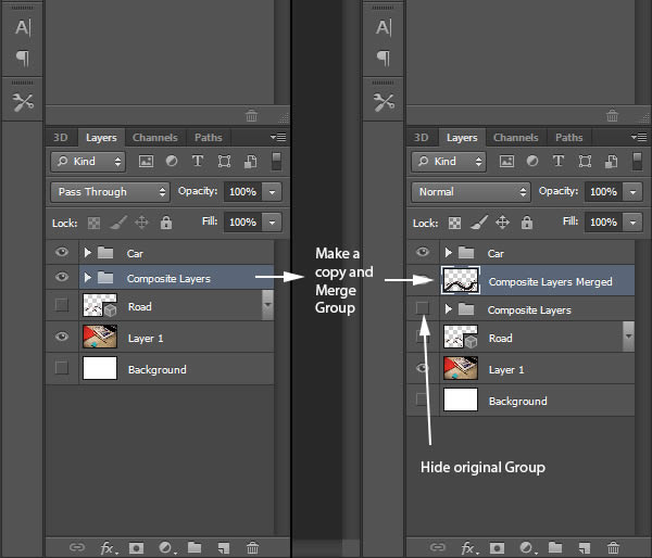
Step 53
The next step is to have our components match the depth-of-field in our original image. Start by merging the “Composite Layers” group to a new layer.
Step 54
Before we add a blur, use the Burn Tool to darken the corners of our new layer
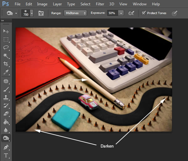
Step 55
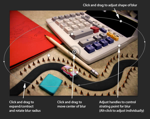
Now, add the Iris Blur (Filter > Blur > Iris Blur). Set the amount of Blur to 4 px and adjust the onscreen widget so the blurring matches the original image as closely as possible.
Step 56
Our image is technically done, but we can go a little further with it. Make a merged copy of all layers by pressing Command/Ctrl + Alt + Shift + E.
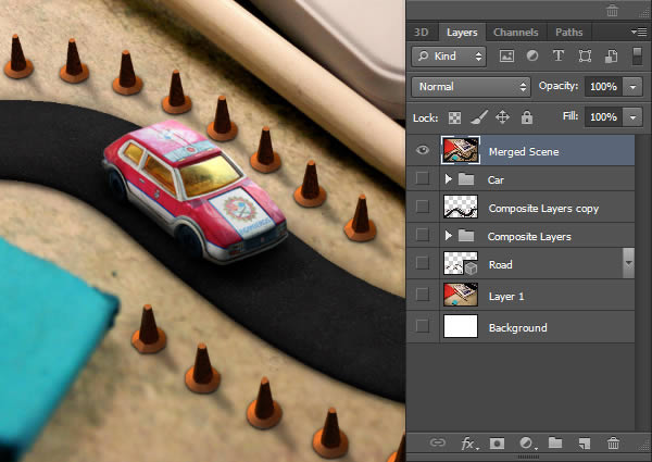
Use this new, merged layer to add additional corrections. In this case, I’ve added an additional blur using the Tilt-Shift blur (Filter > Blur > Tilt-Shift). This adds some more depth while blending the components better.
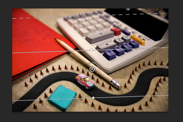
I’ve also added a Photo Filter. This will help blend the colors better.
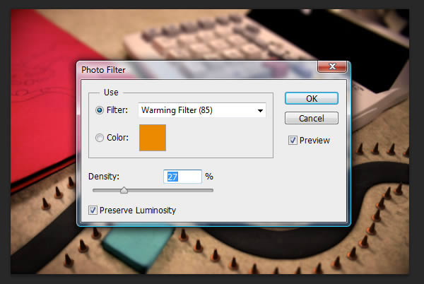
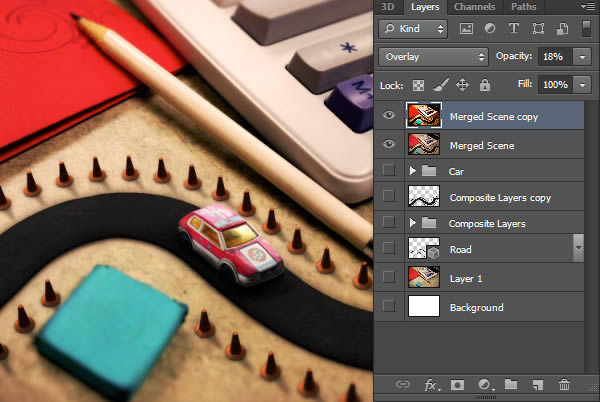
Lastly, I’ve added a softer appearance to the scene. This is done by copying the layer, increasing the Levels, and giving it a moderately high Gaussian Blur. Once this is done, set the Blending Mode to Soft Light, and adjust the Opacity to your preference.
Step 57
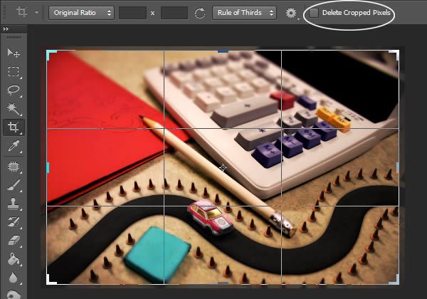
The last step is to use the Crop Tool (C) to crop the image down slightly. This will hide any Layer Styles that are visible around the edges of our image. Make sure to deselect Delete Cropped Pixels.
Final Image
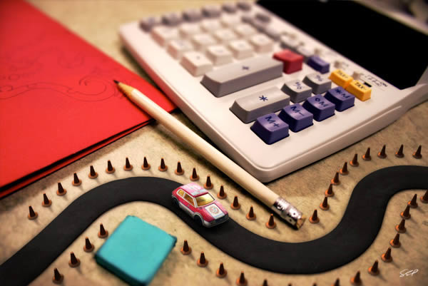
You’re Done. The final image should resemble the following.
{excerpt}
Read More