In the following tutorial you will learn how to create a glossy, colorful text design in Illustrator CS5. We’ll use an interesting font choice, opacity masks, shape building techniques, and more to create this text effect.
Step 1
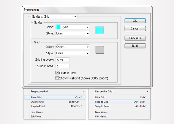
Create a 700 px by 200 px, RGB document. First, turn on the Grid (View > Show Grid) and the Snap to Grid (View > Snap to Grid). Next, you’ll need a grid every 5px. Go to Edit > Preferences > Guides > Grid, enter 5 in the Gridline every box and 1 in the Subdivisions box.
You can also open the Info panel (Window > Info) for a live preview with the size and position of your shapes. Do not forget to replace the unit of measurement to pixels from Edit > Preferences > Unit > General. All these options will significantly increase your work speed.
Step 2
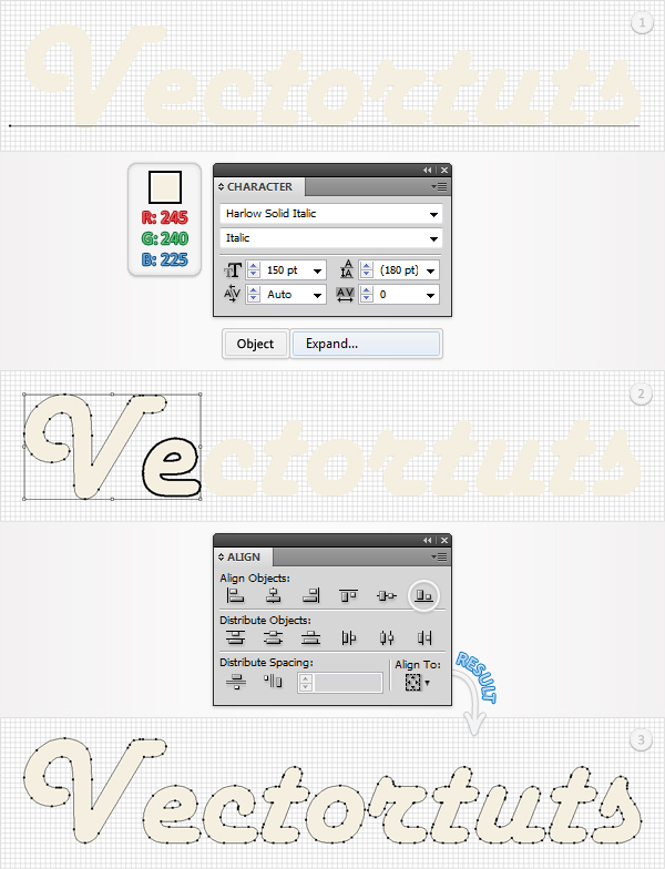
Pick the Type Tool (T), click on your artboard and add your text. Use the Harlow Solid Italic font with a size of 150pt. If you don’t have this font you can use one of these fonts: Pacifico, Deftone Stylus, Snickles, Marketing Script, Ballpark, Vanilla, Pusab, or any other font that you like.
See what you can come up with, the font isn’t that important. Set your text color at R=24,5 G=240, B=225. Now apply Object > Expand. Select the resulting group, ungroup it (Shift + Command + G), then open the Align panel (Window > Align).
In this text the only shape that is not aligned properly is the "V." Pick the Selection Tool (V). Select the "V" along with the next letter shape, click on the border of this second shape (it should get emphasized), then click on the Vertical Align Button from the Align panel. If you choose to use a different text, then make sure that your letter shapes are aligned.
Step 3
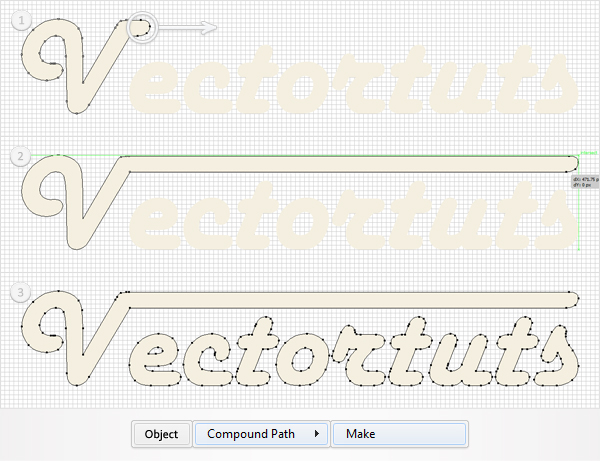
Disable the Snap to Grid and enable the Smart Guides (Command + U), then focus on the "V". Pick the Direct Selection Tool (A), select the four anchor points highlighted in the first image, and move them to the right, as shown in the second image.
Reselect all the shapes created so far and go to Object > Compound Path > Make. Go to the Layers panel, double-click on the newly created path and name it "Text". This will make it easier for you to find it when you need it during the tutorial.
Step 4
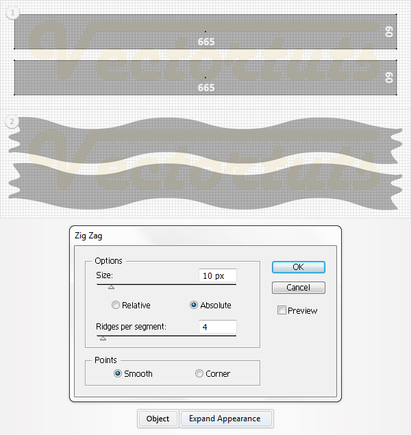
Disable the Smart Guides (Command + U) and re-enable the Snap to Grid, then pick the Rectangle Tool (M) and create two new shapes. Make them 665 px wide and 60 px tall, then place them as shown in the first image. Select both shapes and go to Effect > Distort & Transform > Zig Zag. Enter the data shown below, click OK, then apply Object > Expand Appearance.
Step 5
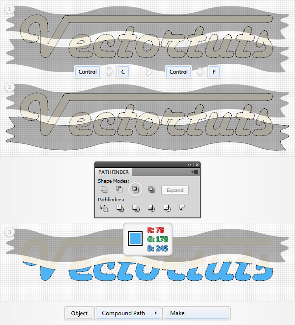
Select "Text" and make a copy in front (Command + C > Command + F). Select this copy, along with the bottom shape made in the previous step, and click on the Intersect button from the Pathfinder panel.
Select the resulting group of shapes and go to Object > Compound Path > Make. Now fill the resulting path with R=78, G=178, B=245. Go to the Layers panel, double-click on this new path, and name it "Blue".
Step 6
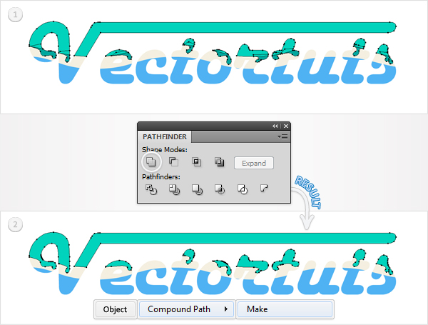
Again, select "Text" and make a copy in front (Command + C > Command + F). Select it, along with the remaining wavy shape, and click on the Intersect button from the Pathfinder panel.
Select the resulting group of shapes, and go to Object > Compound Path > Make, then fill the resulting path with R=0, G=212, B=189. Go to the Layers panel, double-click on this new path and name it "Green".
Step 7
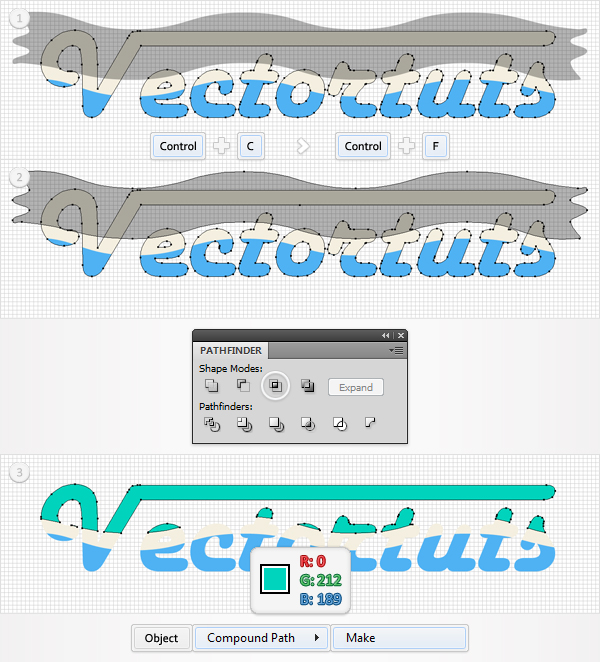
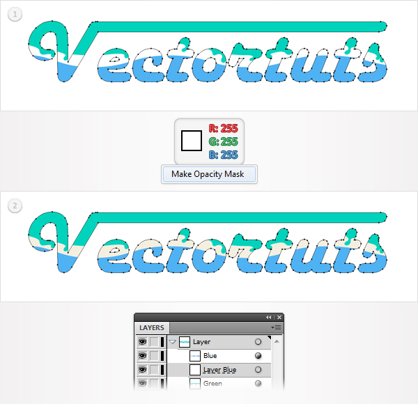
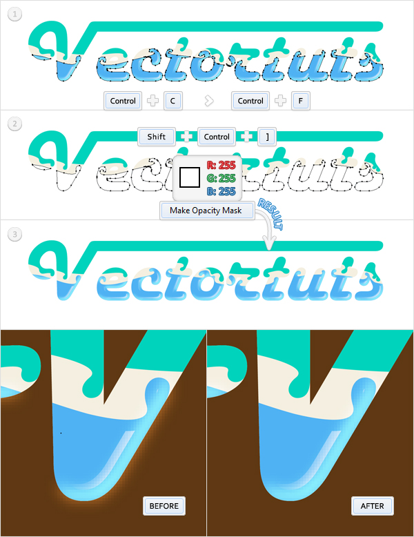
Disable the Grid (View > Hide Grid) and the Snap to Grid (View > Snap to Grid). Next, you need to create a simple sublayer and mask it. Go to the Layers panel and click on the Create New Sublayer icon from the bottom of the Layers panel. Obviously, this will add a new sublayer.
Move it below the "Green" shape, then double-click on it, and name it "Layer Green". Make a copy of "Text", fill it with white, and move it above this new sublayer. Now, select this white path, along with the sublayer, and go to the the Transparency panel (Window > Transparency).
Open the fly-out menu and click on Make Opacity Mask. You won’t notice any change in your text because you masked an empty layer. Only when you draw a shape inside that layer will you notice the effect. This is a nice trick that will come in handy in the following steps.
Step 8
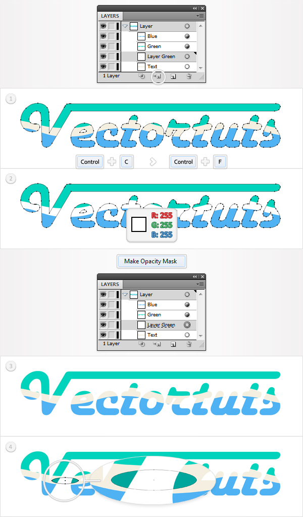
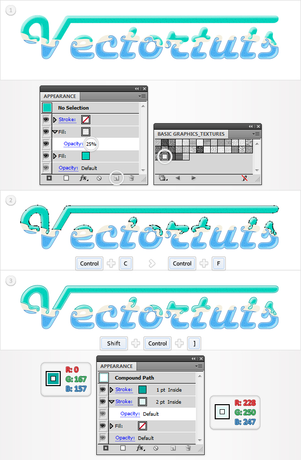
Make sure that you’re inside that masked sublayer, then pick the Pen Tool (P), and draw some curvy shapes, as shown in the following image. This might take some time, but it’s a good exercise and the masked sublayer will ease your work. Fill all these new paths with R=0, G=167, B=157, so that you can distinguish them easier from the rest of the shapes.
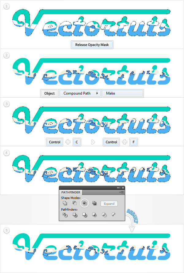
Step 9
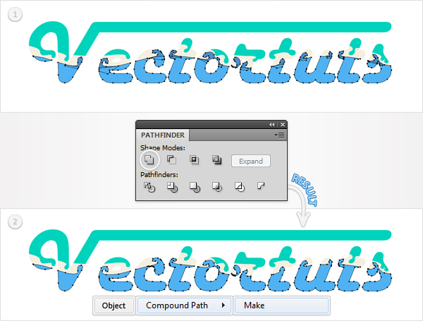
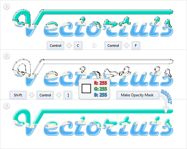
You won’t need the masked sublayer anymore. Select it and go to the Transparency panel. Open the fly-out menu and click on Release Opacity Mask, then delete the mask (the white shape). Move the remaining shapes out of the sublayer, turn them into a compound path (Object > Compound Path > Make), then delete the sublayer.
Make a new copy "Text". Select it along with the fresh compound path and click on the Intersect button from the Pathfinder panel. The resulting shapes should look like the last image shown below.
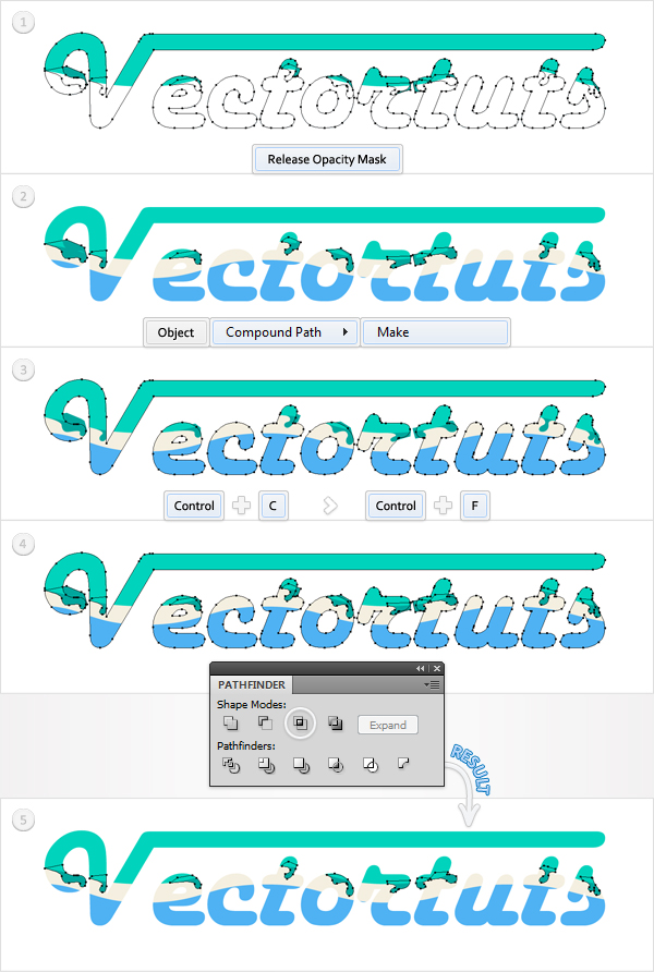
Step 10
Select all the shapes resulted from the previous step, along with "Green," and click on the Unite button from the Pathfinder panel. Turn the resulting shapes into a compound path and name it "Green".
Step 11
Make a new sublayer and name it "Layer Blue." Place it below "Blue," then mask it like you did with the previous sublayer.
Step 12
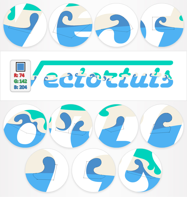
Make sure that you’re inside this new masked sublayer, then pick the Pen Tool (P), and draw some new curvy shapes as shown in the following image. Fill them with R=74, G=142, B=204.
Step 13
Again, you won’t need this new masked sublayer anymore. Select it and go to the Transparency panel, then open the fly-out menu, and click on Release Opacity Mask. Delete the mask and move the remaining shapes out of the sublayer. Turn them into a compound path (Object > Compound Path > Make) and delete the sublayer.
Make a new copy of "Text" and select it along with the fresh compound path, then click on the Intersect button from the Pathfinder panel. The resulting shapes should look like the last image below.
Step 14
Select all the shapes resulted from the previous step along with "Blue" and click on the Unite button from the Pathfinder panel. Turn the resulting shapes into a compound path and name it "Blue."
Step 15
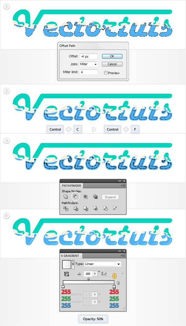
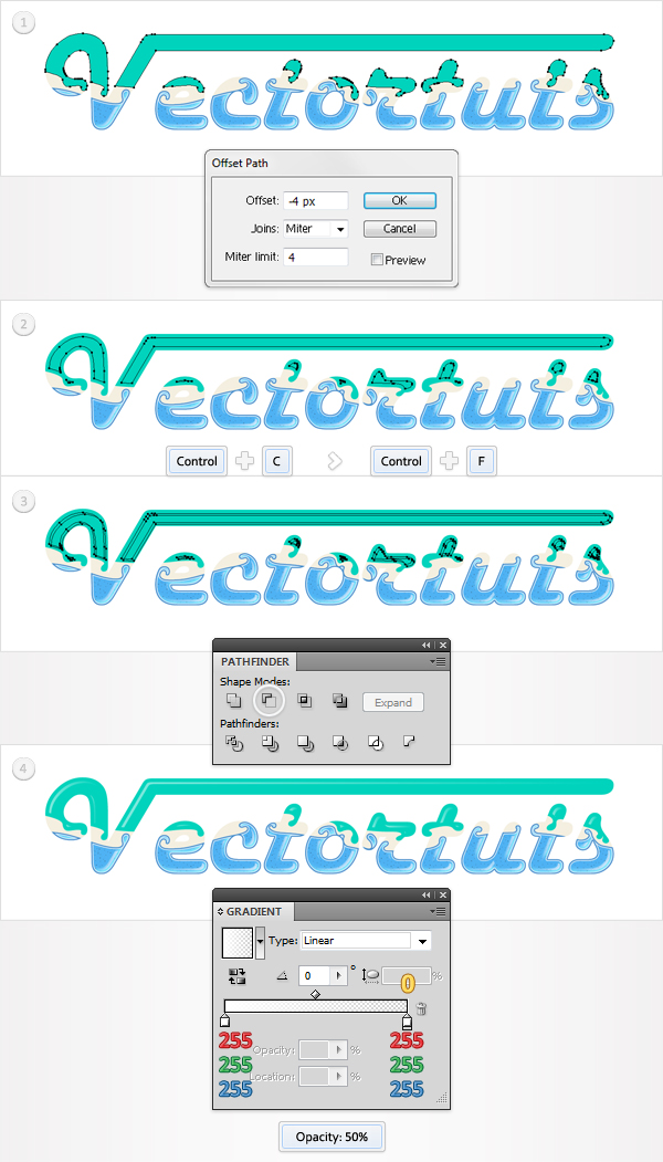
Let’s make a quick recap. In your Layers panel there should only be three compound paths named “Text,” “Green” and “Blue.” Now, let’s focus on "Blue." Select it and go to Object > Path > Offset Path. Enter a -4px Offset and click OK. Make a copy in front of this new path. Select it, then hit the left arrow and the up arrow twice.
Reselect these fresh, two paths and click on the Minus Front button from the Pathfinder panel. Fill the resulting shapes with the linear gradient shown below and lower their Opacity to 50%. The yellow zero from the gradient image stands for opacity percentage.
Step 16
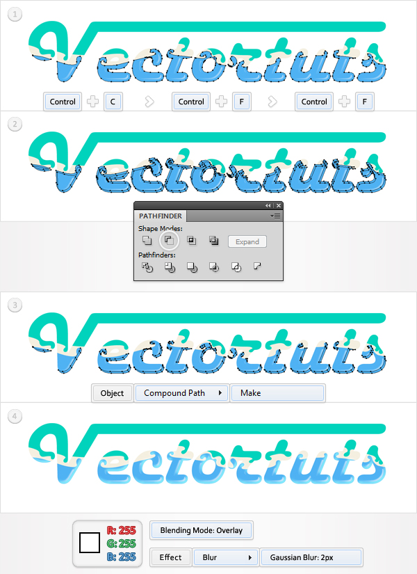
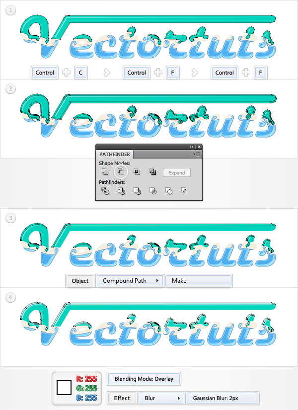
Reselect "Blue" and make two, new copies in front. Select the top copy, then hit the left arrow twice and the up arrow three times. Reselect both copies and click on the Minus Front button from the Pathfinder panel.
Turn the resulting group of shapes into a compound path. Fill it with white and change the blending mode to Overlay, then go to Effect > Blur > Gaussian Blur. Enter a 2px radius and click OK.
Step 17
Next you need to mask the shape made in the previous step. If you choose to use a darker background for your final text, you will notice that the gaussian blur effect continues outside of your text. You don’t want that so you will use an opacity mask.
Make a new copy of "Blue," fill it with white and bring it to front (Shift + Command + Right Bracket key). Select it, along with the blurred shape from the previous step, and go to the Transparency panel. Open the fly-out menu and click on Make Opacity Mask.
Step 18
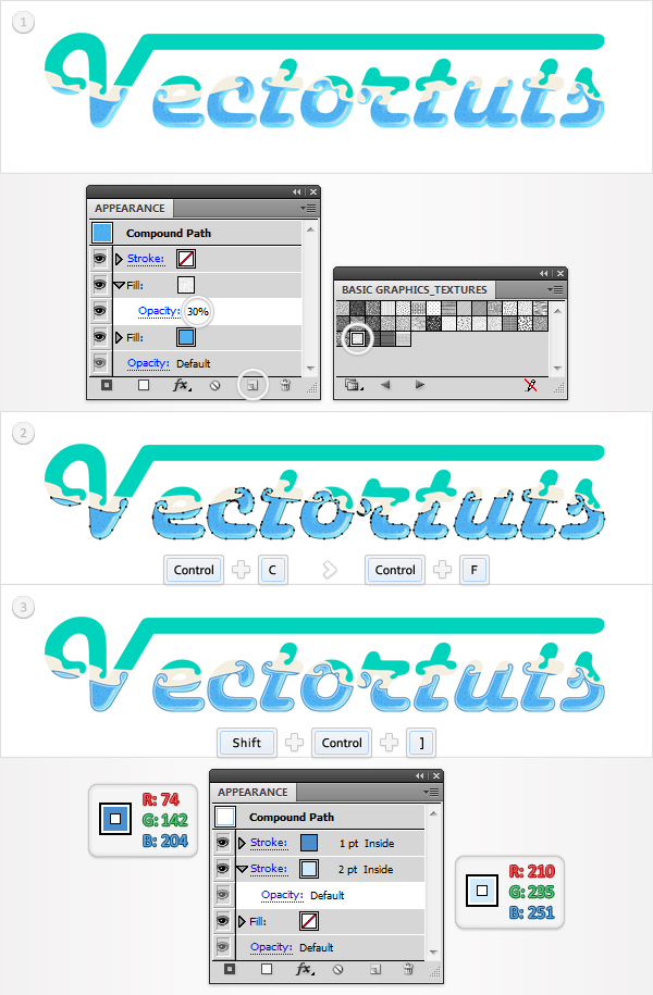
Reselect "Blue" and go to the Appearance panel. Select the existing fill and click on the Duplicate Selected Item icon from the bottom of the Appearance panel. Obviously, this will add a copy of the selected fill. You will need a nice pattern for this second fill.
Go to the Swatches panel, open the fly-out menu, and go to Open Swatch Library > Pattern > Basic Graphics > Basic Graphics_Textures. This will open a new window with some nice patterns. Reselect that new fill from the Appearance panel, and lower its Opacity to 30%, then use the USGS 22 Gravel Beach pattern. Make one last copy of "Blue" and bring it to front (Shift + Command + Right Bracket key).
Select it and go to the Appearance panel. Remove the two fills and add a stroke. Make it 2pt wide, align it to inside, and set its color at R=210, G=235, B=231. Now add a second stroke. Make it 1pt wide, align it to inside, and set its color at R=74, G=142, B=204.
Step 19
Let’s move the green shape. Select it and go to Object > Path > Offset Path. Enter a -4px Offset and click OK. Make a copy in front of this new path. Select it, then hit the right arrow, and the down arrow twice.
Reselect these fresh, two paths and click on the Minus Front button from the Pathfinder panel. Fill the resulting shapes with the linear gradient shown below and lower their Opacity to 50%.
Step 20
Reselect "Green" and make two, new copies in front. Select the top copy, then hit the right arrow twice, and the down arrow three times. Reselect both copies and click on the Minus Front button from the Pathfinder panel.
Turn the resulting group of shapes into a compound path. Fill it with white, change the blending mode to Overlay, then go to Effect > Blur > Gaussian Blur. Enter a 2px radius and click OK.
Step 21
Again, you need to mask the shape made in the previous step. Make a new copy of "Green," fill it with white and bring it to front (Shift + Command + Right Bracket key). Select it along with the blurred shape from the previous step and go to the Transparency panel. Open the fly-out menu and click on Make Opacity Mask.
Step 22
Reselect "Green" and go to the Appearance panel. Add a second fill, lower its Opacity to 30%, then use the USGS 22 Gravel Beach pattern. Make one last copy of "Green," and bring it to front (Shift + Command + Right Bracket key), then go the Appearance panel. Remove the two fills and add the two strokes, as shown in the last image below.
Step 23
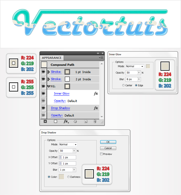
Let’s move to "Text." Select it and go to the Appearance panel. Select the existing fill and go to Effect > Stylize > Inner Glow. Enter the data shown below, click OK, then add a white stroke.
Make it 2pt wide, align it to inside, then add a second stroke. Make it 1pt wide and set its color at R=224, G=219, B=202. Now reselect the entire path and go to Effect > Stylize > Drop Shadow. Enter the data shown in the following image and click OK.
Step 24
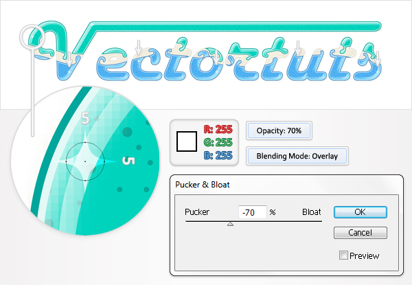
Finally, let’s add some small details for the text. Pick the Ellipse Tool (L) and click on your artboard. Enter 5 for both width and height then click OK. This will create a 5 px by 5 px shape.
Fill it with white, lower its Opacity to 70%, and change the blending mode to Overlay. Now go to Effect > Distort & Transform > Pucker & Bloat. Drag the slider to -70% and click OK. The resulting shape should look like the zoomed image shown. Make several copies of this shape and spread them along the text.
Step 25
For the following step you will need a grid every 1px. First, enable the Snap to Grid, then go to Edit > Preferences > Guides > Grid, and enter 1 in the Gridline every box. Next, pick the Ellipse Tool (L) and create some squeezed shapes below each letter shape.
All these shapes should be 2px tall and the Snap to Grid should ease your work. Fill them with R=147, G=149, B=152. Group them (Command + G) and go to Effect > Blur > Gaussian Blur. Enter a a 3px radius, click OK, then move the group into the bottom of the Layers panel (Shift + Command + Left Bracket key).
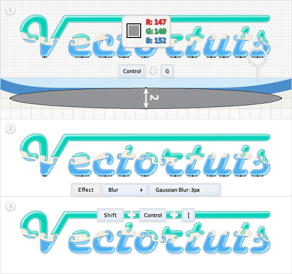
Step 26
Disable the Grid and the Snap to Grid and duplicate all the shapes created so far. Select these copies and group them. Now select the group and go to Object > Transform > Reflect. Check the Horizontal button and click OK. Now, your group should be flipped as shown in the second image. Reselect it and move it down as shown in the final image.
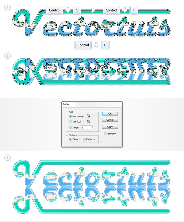
Step 27
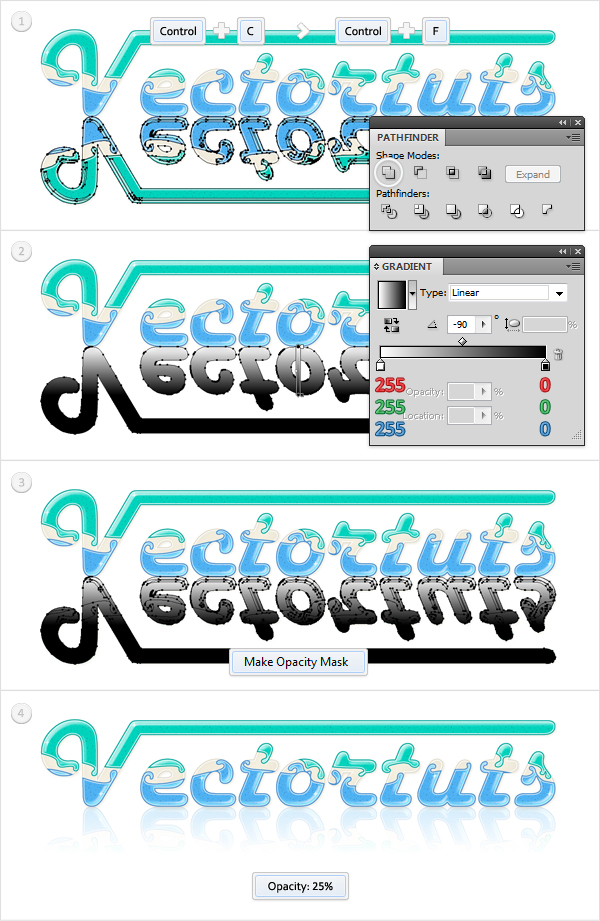
Duplicate the group flipped in the previous step. Select this group copy and click on the Unite button from the Pathfinder panel. Turn the resulting group of shapes into a compound path and fill it with the linear gradient (shown in the second image).
Select this fresh compound path, along with the remaining flipped group, and go to the Transparency panel. Open the fly-out menu and click on Make Opacity Mask. Finally, select this masked group and lower its Opacity to 25%.
Step 28
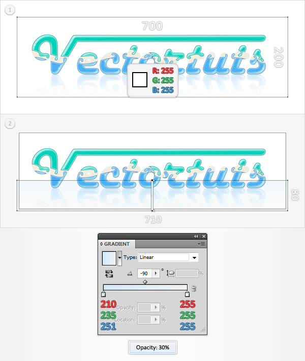
For the background start with a white rectangle, which is the size of your artboard. Send it to the bottom of the Layers panel, then reselect the Rectangle Tool (M), and create a second shape. Make it 710 px wide and 80 px tall, then place it as shown in the second image. Fill it with the linear gradient shown below and lower its Opacity to 30%. Make sure that you lowered the Opacity of the entire shape, not only the fill.
Conclusion
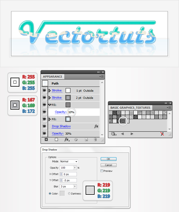
Reselect the smaller rectangle made in the previous step. Add a second fill, lower its Opacity to 10%, and use the USGS 8 Sawage Disposal pattern. Continue by adding a 2pt stroke. Align it to outside and set its color at R=167, G=169, B=172, then add a second stroke.
Make it 1pt wide, align it to inside, and set the color at R=255, G=255, B=255. Finally, reselect the entire path and go to Effect > Stylize > Drop Shadow. Enter the data shown below, click OK, and you’re done.
Conclusion
Now your work is done. Here is how the final image should look.

{excerpt}
Read More