I admire the complex, inspiring seamless patterns of several vector artists and have always wanted to attempt to create my own. In today’s tutorial I’m going to show you how to make a seamless bookshelf pattern in Adobe Illustrator.
Introduction
I’ve always admired the complex and inspiring seamless patterns of several vector artists and always wanted to attempt to create my own. In today’s tutorial I’m going to show you how to create a seamless bookshelf pattern. This can be used for backgrounds in illustrations or even as a quick wallpaper.
Due to your own trial and error playing with the books and the placement, this tutorial may take longer for some, rather than due to technical ability. Although, if you’re an organized person like me, you’ll be sure to enjoy playing a vector librarian!
Step 1
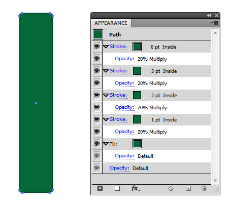
Using the Rounded Rectangle Tool, draw a long shape with a 1pt Stroke Weight Outline which is Aligned Inside the same color as the fill.
Go into the Appearance panel and modify the Opacity to 20% and Blending Mode to Multiply on the Stroke Appearance only. Select the Stroke and then drill down in the Appearance menu to “Duplicate Item.” This will add another Stroke to the shape. Change the Stroke Weight to 2pt and keep the remaining elements the same. Keep going until you have the below in the Appearance panel.
Step 2
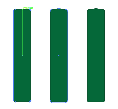
Select the shape, and using the Pen Tool (P) add an anchor point exactly in the middle of the top line. If you’ve got Smart Guides (Command + U) enabled, this will make it easier to achieve. Using the Direct Selection Tool (V), move this middle point upwards to give the look of a slight bulge in the book.
Step 3
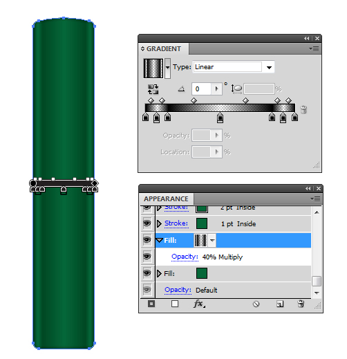
Going back into the Appearance panel, select the Fill and Duplicate Item. I’m going to fill it with a linear transparent gradient as shown below. This is to give the look of the spine of the book. Set the Opacity to 40% and Blending Mode to Multiply.
Step 4
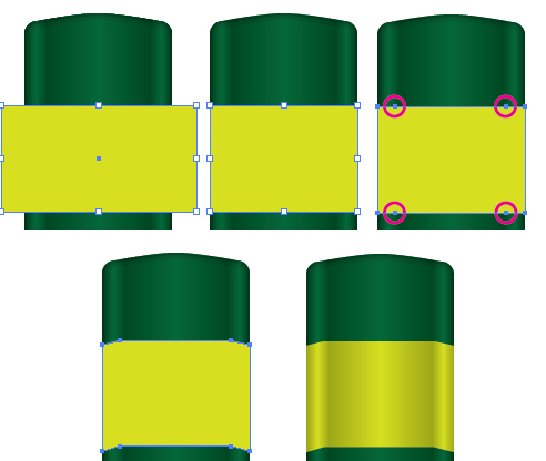
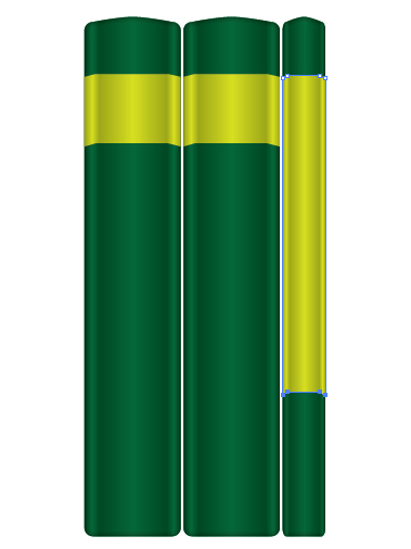
Now that we have the basic spine, we can begin to add labels and more unique elements to our books. The first is adding a label. Using the Rectangle Tool (M) draw a rectangle across the spine. Duplicate the shape used for the book and use Pathfinder > Intersect to get the exact shape.
Using the Pen Tool (P), add points where there would be a slight crease in the label due to the covers of the book, then nudge these points to give the impression of the label being curved around the spine.
Duplicate the label and fill with a linear transparent gradient as used before, set to Opacity to 40% and Blending Mode to Multiply.
Step 5
For each book completed, I will Group (Command + G) the elements up. You can use the Free Transform Tool (E) to make the books thinner, taller etc… When making the labels different, consider selecting the top or bottom points using the Direct Selection Tool (V) and moving the points manually. This is to prevent too much distortion on the label.
Step 6
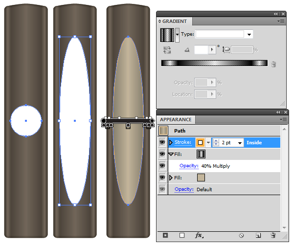
To vary the books again, you can add a rounded label by using the Ellipse Tool (L). Hold Alt + Shift to make an even circle within the boundary of the central spine. Then use the Free Transform Tool (E) to drag the top and bottom outwards along the spine.
Apply the colors you wish to the Fill and Stroke, however duplicate the fill to add the linear transparent gradient. Using the Gradient Tool (G), draw the gradient source and end point to the boundaries of the whole spine, otherwise the round label will not look right.
Step 7
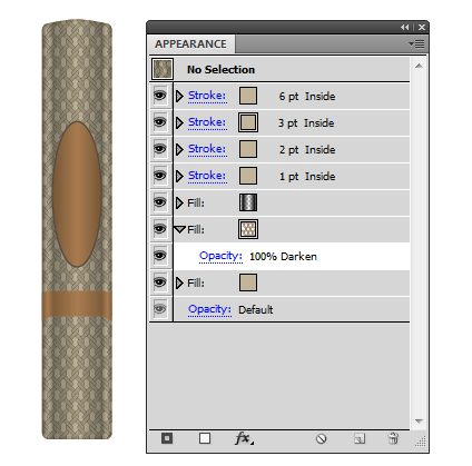
You could consider adding a pattern to a duplicated fill to add further difference to the books.
Step 8
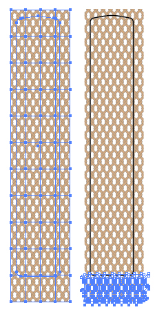
Should you choose to add a pattern to the fill, you may have to consider Object > Expanding the pattern until you see the individual paths…
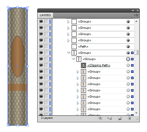
…then using the Direct Selection Tool (V) to remove the bottom (or top) elements of the pattern. The reason being some of the pattern (although it’s within a Clipping Mask) may go beyond the boundary of your bookshelf you’ll be creating. This may cause a gap between your pattern tiles and much frustration!
Step 9
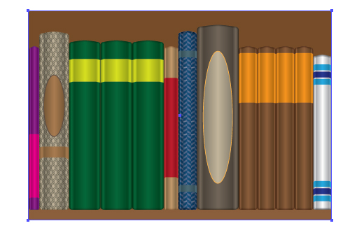
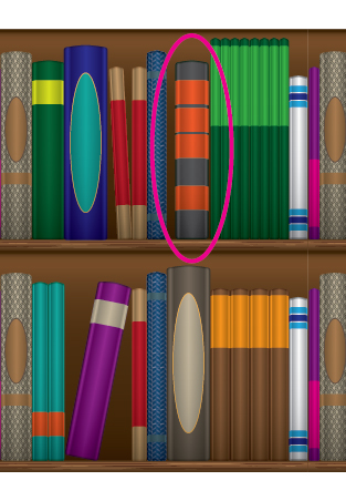
The time consuming element of this exercise is creating the different books for your pattern. Try to add some books together as if they are a series, play with colors and play with patterns to create some unique looking books. Line them up together as shown below.

Step 10
Using the Rectangle Tool (M), draw a brown, long, slim rectangle along the bottom of your books. Place this shape above all your books. Using Smart Guides, ensure the rectangle is in line with the first and last book on your shelf.

Duplicate this rectangle and drag it to the bottom of the books. Using the Free Transform Tool (E), increase the height of the duplicated rectangle to produce the background of the shelf.
Step 11
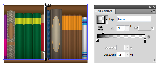
In the Appearance panel, duplicate the two rectangles and fill with the below transparent linear gradients. Set the Blending Mode to Multiply and Opacity to 100%.
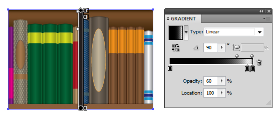
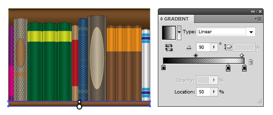
Now duplicate the background rectangle and move it on top of the books and add another transparent linear gradient. Set this to Blending Mode Multiply and Opacity 40%. This is to give a subtle impression of shadow cast at the bottom of the books.
Step 12
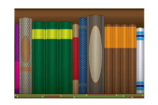
Now to add a subtle wood texture to the shelf. You’ll need to create the Width Profile 2 brush from this tutorial. I’ve used the same brown for the Stroke Color. I’ve set the lighter strokes to Blending Mode Screen with Opacity of 50%. The darker ones are set to Multiply 100%.


Step 13
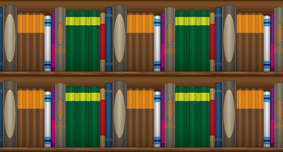
Group all the elements together (Command + G) and then drag and drop them into the Swatch palette to create a pattern. Using the Rectangle Tool (M) with my new pattern as the fill, draw a rectangle on the canvas to test out your pattern. The results are below. This will test out to see if you’ve removed enough from any of the patterns on the books and will also show if there are any gaps.
View the pattern via Save for Web & Devices, as the default view in the program may show gaps which aren’t actually there!
Step 14
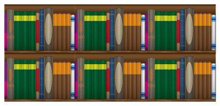
Now that I’m happy that the pattern will be seamless, I’m going to duplicate the groups into a 2 x 3 arrangement. I’m going to alter some of the books to make the pattern seem more random.
Step 15
The following steps are going to show you how I’ve altered some of the books and give you ideas on how to modify yours.
The first thing I’m going to do is reduce the width of some of the books that are duplicated together, then use the Free Transform Tool (E) to tilt one of the books.
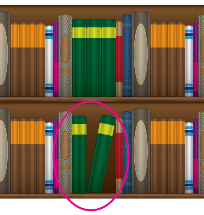
By moving the place of the labels, it can add a simple modification to the books.
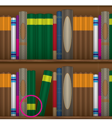
Then of course altering the color is the final step.
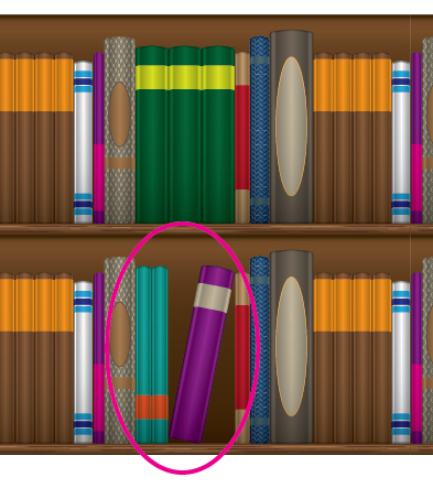
Step 16
In this step you can see I have changed the placing of the books, the width and removed some of the books to play with the arrangement of them. This can help make the pattern seem more random.

Then I have re-colored the books again.

Step 17
In this example, I’ve reduced the thickness of the books in a series and then duplicated them as well as increasing the height and label size.
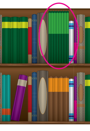
Step 18
In this example, I’ve added multiple labels to one book and altered the color to add some variety. I’ve also reduced the thickness and left a gap between the books.
Step 19
Looking at the pattern I have so far, I have modified the books from Groups 1, 2 and 5.
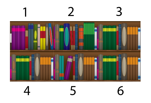
So in a library fashion, I’m going to reorganize them further by taking out the books from the shelves in some places that I want to alter or just mix around.
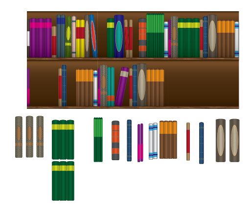
Step 20
From playing around with this pattern, I have one helpful tip for you to make this a lot easier to reorganize.
First select the linear gradient that overlaps your books for each shelf using the Direct Selection Tool (V) and then Group them (Command + G). This element will always be on top of your pattern, so just lock it for now.
Once you’ve pulled out the books, use the Direct Selection Tool (V) to select the books you have and then Cut (Command + X) and then Paste in Front (Command + F). This will make it easier to select the book(s) you wish to move around and place back into your shelves. Then drag and drop your linear gradient back on top of the books.
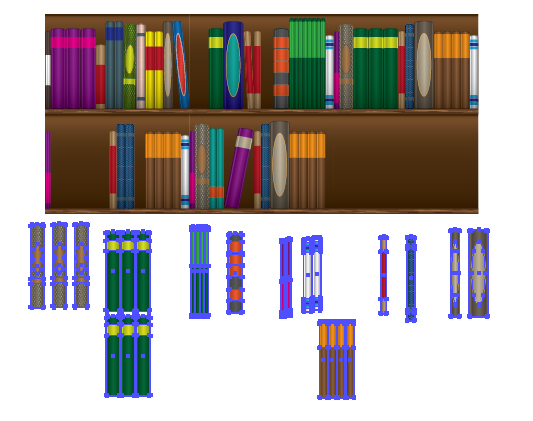
Step 21
After reorganizing your books, Group up all the elements (Command + G) and drag and drop into the Swatch palette to create your new seamless pattern!

Don’t forget to test it out again by using the Rectangle Tool (M) with your pattern as the fill.
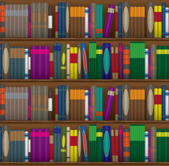
Step 22
After testing my pattern again, I realized I needed to move the green books around further! I find trial and error a great way to refine a pattern. So I switched around some of the green books with the brown.
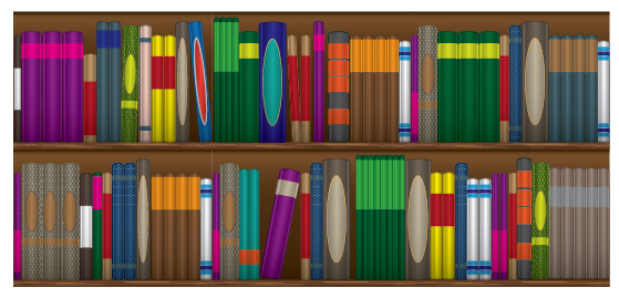
Conclusion
Finally, happy with my book shelves, I’ve been able to create a complex seamless pattern that has several uses. Due to how I want the pattern to be used (it’s now my desktop wallpaper!), I didn’t require further detail, however why not consider putting some small text on the spine? You could add your own logos or even that book title you’ve always wanted to write!
{excerpt}
Read More