A few weeks ago I pulled together an infographic to highlight some facts and figures regarding Envato’s Remote Staff. Let’s take a look at some of the decision making, workflow and techniques that went into making it.
I recently upped sticks and moved from Valencia in Spain, to Bordeaux in France – the luxury of freedom that working remotely affords. Being somewhere else got me wondering who my nearest Envato colleague was, which got me wondering about remote staff in general, which got me wondering: who is the most remote of all Envato remote staff?
Check out the final infographic on Envato Notes!
What Exactly is an Infographic?
I shouldn’t need to point out the origins of the word Infographic. But I will. It’s an amalgamation of information and graphic, quite literally information represented graphically. You might also hear the term data visualization, which again describes what we’re looking at here.
Infographics aim to take data, statistics, facts, snippets of knowledge and communicate them visually. In doing so, when executed properly, infographics present an idea clearly and effectively, which wouldn’t otherwise be achieved by the data in its raw state (ie: a heap of numbers).
Bima Arafah, in his article Huge Infographics Design Resources: Overview, Principles, Tips and Examples, identifies three stages to the infographics framework, three requisite elements to achieving infographic glory:
- Information Type: These being spatial, chronological and quantitive.
- Infographic Device: Diagrams, maps and charts being the most common.
- Communication Method: For example, static, motion and interactive.
These three stages break down into further subsections, but by tackling them in turn we’ll formulate our masterpiece in a logical manner.
Let’s look at designing an infographic, using the Envato Remote Staff graphic as a reference.
Step 1: What’s Your Message?
First and foremost, an infographic must have a reason for being. There must be a question you’re trying to answer, a little known fact you’re trying to highlight, a persuasive argument you’re trying to get across. In my case, I simply wanted to identify the remotest Envato staff member. Pin-pointing this individual would be my infographic’s essential role.
Step 2: We Need Data
Without data, we can’t answer our question, we have no message to communicate, so go and get some. In collecting remote staff data I needed a bit of co-operation from my teammates at Envato. Luckily, they’re a helpful bunch, so sending one or two impersonal batch emails was all I needed to get the ball rolling. Adam and Amanda both jumped in immediately, setting up a Google map where folk could add their locations and details. I just had to sit back and watch my scheme unfurl.
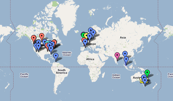
It was actually very interesting to see exactly where each staff member lives in relation to the rest. As a result, everyone was keen to dive in and contribute.
Once I had a load of info (there are still a large number of reviewers and support staff who missed the memo, but I couldn’t go chasing everyone individually), I used Google Maps’ handy vector tool to draw lines between the markers, in relation to each other and also H.Q. in Melbourne.
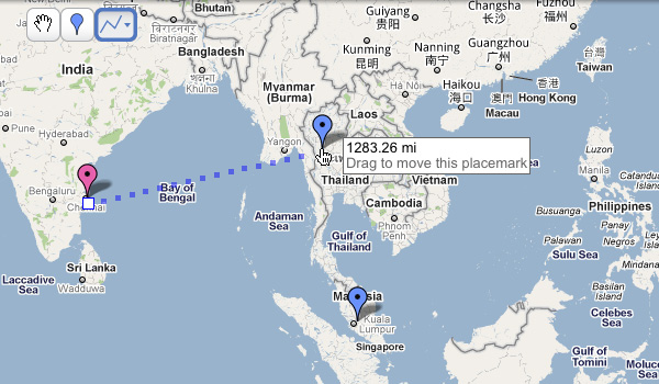
Well, this is Vectortuts+.
I then prepared a spreadsheet with all the figures I’d collected (33 members’ worth). Doing so was all the proof I needed that an infographic was called for!
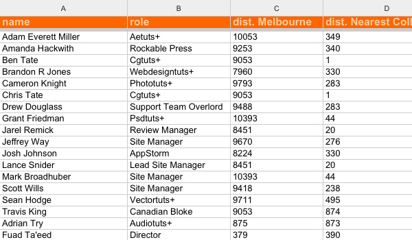
Not exactly easy to pin-point what was going on, but at least I could order the columns and quickly ascertain rankings. I was quite surprised to find that I was further away from Melbourne than anyone else! Viewed on a flat screen it certainly doesn’t appear to be the case, but Google’s vectors cunningly take the curvature of the earth into account. Not just a hat rack, my friend.
OK, so we’ve dealt with the first in our three stages. Having rounded up my facts and figures, it was clear that the information types were spatial and quantitive. I could then make an informed decision and determine stage two, my infographic device. I’d be looking at displaying maps and graphs to communicate my data, so now let’s look at narrowing down those device options.
Step 4: Approaching the Graphics
Collecting all possible information before even considering the graphics will help you immensely. Your aim is to communicate as effectively as possible the impact of your data. If you don’t yet know how big your numbers will be, you can’t properly judge the consequences of what you’re displaying.
Graph Types
How you design your graphs is an open-ended discussion, but there are guidelines regarding the type of graph you use to best display your data. There are 4 main recognizable types of graph:
- Bar graph: Use bars to visualize relationships within groups; ‘discontinuous’ data. Take age and hometown for example; the two don’t have a liner relationship, the results could be all over the place.
- Line graph (or Histogram): These illustrate time series and frequency distribution. As one variable (such as time) increases regularly the other (such as size) is compared.
- Pie chart: Everyone loves pie. Pie charts are used to compare components within a whole set; perfect if you’re trying to communicate proportions or percentages.
- Scatter plot: Use a scatter to compare two variables to see if they are related. Plotting the length against the weight of a badger, for example, would likely result in a diagonally rising scatter trend.
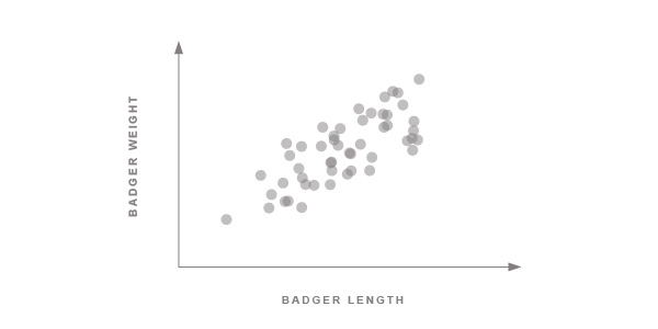
Just as I thought! Badgers tend to get longer as they get heavier.
Where was I..? Ah yes. If we look at our distances from Melbourne, the clearest way to display the information is on an individual basis. Cutting to the chase, we can assume that a bar chart is the best way to go. Whoever lives furthest away will have the longest bar, whoever’s closest will have the shortest.
Using a bar chart doesn’t sound very inspiring though, does it? Bar charts make me think of standing at the side of a road performing a traffic census for school. The beauty of designing an infographic is the freedom to play with the balance between form and function. We can’t allow our design work to get in the way of the message, but we can certainly employ a little flamboyance.
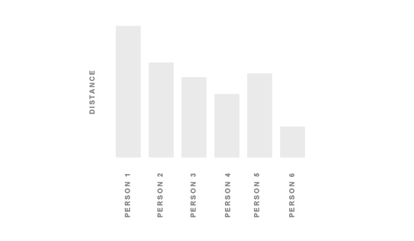
The image above shows a bar chart. It represents the information perfectly; each individual and their distance from whatever we’re measuring. It’s not hugely attractive and, more problematically, it would be enormous if we were to plot 33 people. It would actually then be pretty impractical, as comparing the person on the far right with the person on the far left would become increasingly difficult the more people we added. Let’s simplify things.
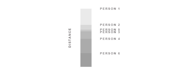
By condensing the whole lot into one bar (though it’s still a bar chart) we’ve achieved several things.
- We can now clearly see who’s furthest and who’s closest.
- Adding more data wouldn’t have to affect the size of the chart so we’ve also saved a massive amount of space.
- By making each bar transparent, we’re visualizing the density of people who live within certain distances.
- It’s prettier. Well, it’s getting there.
Let’s make use of our page width and simplify things further.
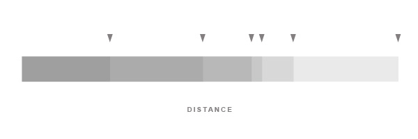
Our final bar makes the whole effect as simple as can be, focussing the viewer’s eyes on what’s important: the data. We needn’t identify each individual, but you can clearly make out the greatest distance, the shortest distance and the range and distribution of distances between. Mission accomplished!
Tip: Theory of Relativity
We’re aiming at communicating our message in the blink of an eye. Our readers aren’t likely to scrutinize the data, so we need to make sure that we don’t present things disproportionately. We wouldn’t want to be misleading now, would we..?
I came across the following situation in my infographic; two charts, both representing all members of staff and distances of some sort.

Not very clear, so obviously I wouldn’t leave it there. The top chart represents the distance each staff member is from Melbourne, as the crow flies. The bottom chart illustrates the distance each staff member is from his or her nearest other staff member.
What is clear in each chart is which of the markers holds the greatest distance. The rough distribution is also decipherable, but the actual distances aren’t clear. We need to label them.
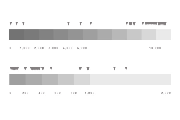
Better. Though, we’re still falling into a trap. We’ve used bars of a uniform width because, well, we’re designers, and we felt that they fitted our aesthetic better that way. Even though we’ve labeled the distances on them, they could still be confused as being precisely the same length, visually and symbolically. We need to make certain that the reader understands the crucial scale difference, otherwise we’re misrepresenting the data.
Let’s add an extra clue.
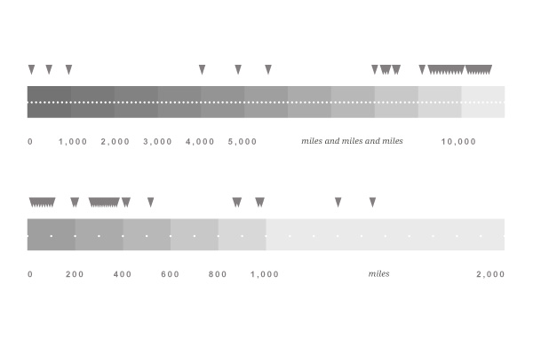
Better still. With our dotted lines we’ve suggested that there are more units of measurement in the uppermost chart. There’s no right or wrong way to overcome these details, but always bear in mind how you’re presenting each chunk of data relative to the rest.
Step 5: We Need Style
The time has come to decide what this infographic is going to look like. Two main factors played a part in my styling decisions: it was aimed at being posted on Notes, the Envato Community Blog, and it focusses on maps.
The Notes blog has a dark, textured header. Decision one taken care of! A dark, subtly noisy background would be perfect for displaying data.

The format of my graphic would also be dictated by the Notes blog; posts feature images no wider than 660px so, if I wanted the graphic displayed at full scale, that would be my limit. Long, narrow, infographics aren’t uncommon, and they lead the eye logically through the data in any case. We’re almost aiming to tell a story – just as with a comic strip we want control over what’s seen and in what order. An elongated graphic would allow me to place a concluding ‘something’ right at the bottom, wrapping up the story nicely.
The whole reason for my embarking on this infographic was to find out which member of staff lived most remotely in relation to the others. That would be my conclusion and all other data would lead the eye to that piece of information.
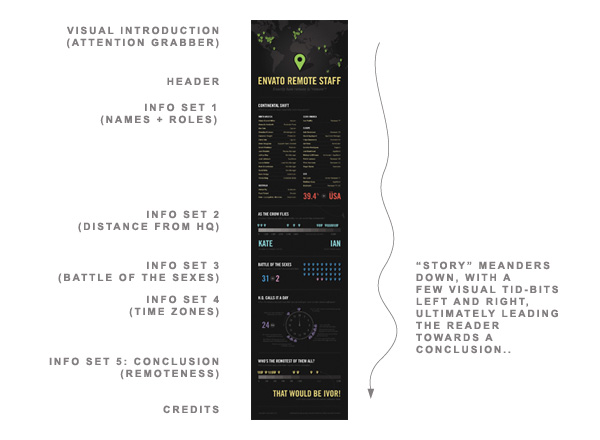
On to decision three. Maps have masses of visual elements all of their own; legends, scales, contours, to name a few. I was working with Google Maps to compile the data, so map markers played a big role. (I actually wanted to provide an informative paragraph about the origins of the Google map marker, but I can’t seem to find any information on it! If anyone has any decent resources explaining the initial design process then please leave links in the comments!)
Google’s map markers are an example of design brilliance. They’re simple, instantly recognizable, versatile (having changeable colors and content) and perform a crucial function perfectly; they pin-point a precise location whilst offering a large click area for users.

Google Map Marker by [ Mooi ], on Flickr.
I decided they’d be perfect for decorative purposes and (obviously) for identifying each member of staff. They’d be the perfect ‘data metaphor’; a way of illustrating my subject. I drew a small collection (which you’ll find within the source download).

The result was a dark, noisy background with a colorful range of tones thanks to the markers. An ideal starting point for the visuals.
I have a series of statistics to share; personal details of staff members, distance of each person (as the crow flies) to H.Q. in Melbourne, the relative number of male and female staff members, time zones and, finally, who the most remote member of staff is.
Each section needed definite segregation from the others, whilst remaining clearly linked. I’d use common elements within each one (title, brief description, graphic, additional stats) but I’d color each one differently. The colors of my map markers were perfect for separating each section, so I’d rely on them for the palette.
I needed a map on which to place my markers. A little bit of googling led me to http://english.freemap.jp where I was able to download a perfect vector map of the world.
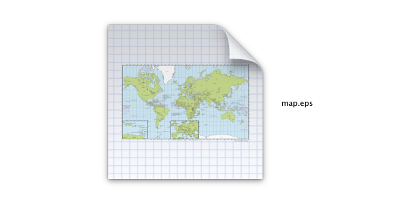
Clearly, I didn’t need the whole map in all its glorious detail, but it was presented perfectly in layers which I could remove. Armed with the pure land mass outlines, pasted into my document with 10% transparency, I was done.
Lastly, I needed to consider visual extras; details which I could carry throughout the graphic for added decoration and which would tie everything together. Dashed lines and arrows! The reliable old comrades of the infographic designer.

A dotted line here…
…another here…

…one there…
(While we’re looking at the clock, it’s worth mentioning that the circular image nicely broke up the horizontal and vertical nature of the the whole graphic.)
…and a final one here!
Not only do the lines visually link all the sections, but they direct the reader’s eye and give the impression of energy. If your infographic doesn’t look infographicky enough, stick some dotted lines in there.
OK, we’ve come to the end of the line. It’s time to make sure you’ve referenced your sources (after all the time you’ve spent making things look pretty, people need reassurance that you haven’t just pulled your data out of thin air). And you’re done!
I hope examining this workflow has inspired you to tackle your own infographic, it’s great fun with the right data!
Before I wrap things up, here are a couple of technical points which cropped up during the making of the Envato Remote Staff infographic. You may find them useful.
Tip: Counting Objects
On a couple of occasions I found myself looking at a blur of map markers – I couldn’t easily tell how many I’d placed on my charts. Try counting the markers below:
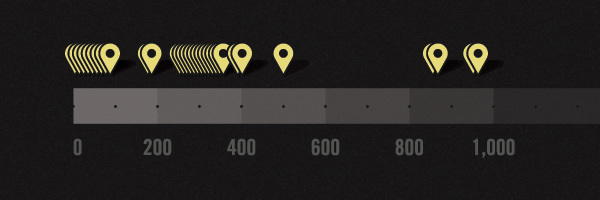
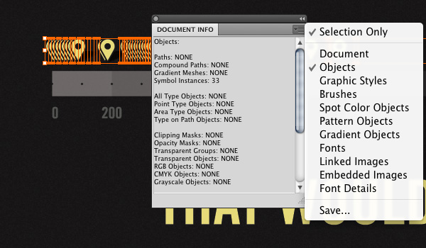
You see my point? To make sure you have the correct amount of objects in this sort of situation, let Illustrator do the work for you. Select all the objects you want to count, then go to Window > Document Info, check “Selection Only” and “Objects”.
Bingo! From the Document Info window you can see that I have 33 symbol instances selected. Just what I wanted.
Tip: Making Noise
Adding a bit of noise to the background softened things up and brought the graphic pleasantly inline with the Envato Notes blog. Realistically, there are two approaches to doing this.
- Use a few filters within Illustrator…
- …or lean on Photoshop.
Creating noise texture in Illustrator isn’t difficult at all, but if you Google the problem, a lot of people seem unaware of how it’s done. It’s simply a question of applying a grain texture to the appearance of your background object. We’re going to play with the idea slightly and apply the texture to a transparent object above our background color.
We begin with our flat color background object:

Then we place a white rectangle above it. To that rectangle we apply a filter by going Effect > Texture > Grain…
The options I used were 10% intensity, 50% contrast and “stippled” as the grain type. Play around here – there are loads of effects you can achieve. This is the result:
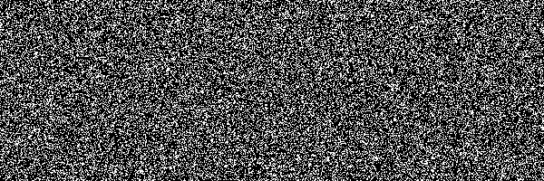
Give the object a Multiply transparency of 20% and it should create more-or-less what you’re after. You can further soften the effect by adding a gaussian blur to the object. This is what Illustrator came up with – the combined effects are visible in the Appearance panel:
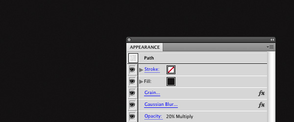
It’s subtle, I’ll agree.
So, job done.
Sadly, there’s an issue with approaching the noise challenge this way: file size and CPU. By giving the background object a bit of noise I’ve increased this file size from 5Mb to 45Mb – and performance has really suffered.
The alternative is making a bitmap in Photoshop. So, off you go, fill the background of a new document with a suitable color and add some noise by going Filter > Noise > Add Noise. Save at screen resolution and throw the file into Illustrator. Easy.

A bit of noise adds a warm, cuddly feeling to most flat areas.
So there you go – two approaches to adding noise. It’s entirely up to you which way you tackle it.
Tip: Use Symbols
The likelihood is that your infographic will use repeated visual elements, but don’t just copy and paste things all over the place, use symbols.
In my case I have map markers dotted around the artboard. We’re looking at hundreds of markers, but they’re repeated instances of just 6 symbols. Let’s quickly make the symbols, then we’ll discuss the advantages of this approach.
Begin with your complex object.

Drag it into your Symbols panel (Windows > Symbols), assign it a name and hit OK.
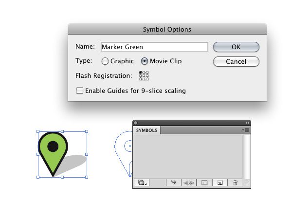
You’re the proud owner of a symbol! Now that you have the hang of it, make as many as you like; I needed a range of colors, so prepared seven markers.
Once you’ve built a collection of symbols, you may find it useful to save them as a library for future use. With the Symbol panel displaying your collection, click the “Symbol Libraries Menu” and select “Save Symbols…”. You’ll be prompted to save the library as an .ai file on your system (use a suitable file name so you’ll recognize it).
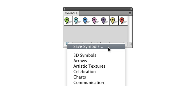
Once done, loading your library into any future document is as simple as opening up the Symbols panel, clicking on the “Symbol Libraries Menu”, scrolling down to “User Defined” and selecting your library.
To have a library automatically open when you start Illustrator, check “Persistent” from that library’s panel menu.
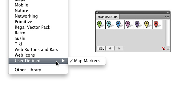
In order to use symbols in your document, drag them directly from the Symbols panel, or select one and click “Place Symbol Instance”. You can place as many as you like..
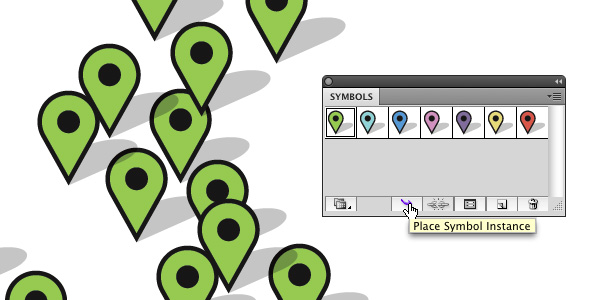
There are three distinct advantages to using symbols, let’s take a look at them.
Advantage 1: Editing
Perhaps you’ve placed all your markers, but then realized you need to change the way they look. You don’t want to replace each one manually, and that’s where the first benefit of using symbols comes in. Double-click on a symbol (either on your artboard or in the Symbols panel) and you’ll enter Isolation Mode. With that symbol isolated, you can edit away.
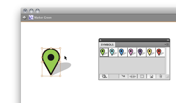
Isolation Mode
Any changes you make will affect every instance of that symbol in your document.

Google should definitely do this.
Advantage 2: Swapping
This is particularly handy in our case, because we’ve positioned markers in specific places; we don’t want them to move unnecessarily. We have a pile of green markers, but we want a couple of them to be red instead. Select the markers in question and make sure the Control Bar (Window > Control) is visible. You’ll see a little drop down panel called “Replace” – in it you’ll find all symbols currently in the Symbols panel. Click the red marker and your selected symbol instances will be swapped.
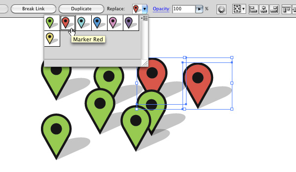
Advantage 3: File Size
Perhaps an obvious one, but if minimizing file size is important to you then symbols have your back. In the example below I saved two files, each with 700 markers on an artboard. One was made with instances of symbols, the other with complex objects – the difference is pretty clear..
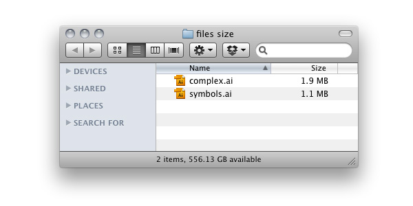
Conclusion
The final infographic (shown below) originally posted on Envato Notes!
That’s it! Thanks for reading and please share any further tips and advice in the comments!
{excerpt}
Read More
