Every now and then we all need a good dose of infographic goodness. Varied, emotive and often surprising, infographics help us absorb facts and figures in the most effective way possible: visually. Go on, grab a cappuccino and dive into this collection of infographic resources.
Blogs and Posts
-

Infographic of Infographics
Yes, this is exactly what you think it is! An amusing examination by designer Ivan Cash into the visual devices, informational elements and general trends found in modern day infographics. All wrapped up in the form of an infographic, naturally.
-

Simple Complexity
A blog which aims to make simple sense from complex data. An array of articles, visuals and discussion posts all promoting the effective communication of data. Simple Complexity also hosts a large visualization gallery which is home to hundreds of data visualization examples.
-
Well-Formed Data
The playground of Moritz Stefaner, information designer, author and speaker. Aside from being a solid source of visual inspiration, Moritz’s blog is also a great place to learn about forthcoming design events and conferences.
-

Information is Beautiful
Run by David McCandless, this blog looks at all kinds of designed information; facts, data, ideas, subjects, issues, statistics, questions – all with the minimum of words. David has also written a couple of books on the subject, which you will find below in the Miscellaneous Resources section.
-
Indexed
Hilarious blog by Jessica Hagy – tons of mini data visualizations which reflect on every day life. Go and check it out, and you will find a sketch which speaks to you personally.
-
Creative Review
Home to a plethora of design articles and resources (some being admittedly restricted to subscriber access only) CR has loads of insightful posts about infographics.
-

Interactive Visual Explainers – A Simple Classification
A cracking article (albeit a little dated, first published in 2003) by Maish Nichani and Venkat Rajamanickam. In it, they neatly define “visual representation of information”, particularly from the perspective of online journalism.
-

Huge Infographics Design Resources: Overview, Principles, Tips and Examples
A huge resource indeed – this article, by Bima Arafah, discusses what infographics are before diving into a load of inspirational examples and data visualization tools. Well worth checking out!
-

Wikipedia: Information Graphics
“Information graphics or infographics are graphic visual representations of information, data or knowledge.” Bang. Trust Wikipedia to word it properly. If you want to get a solid understanding of what infographics are, what they’re used for and where they came from, look no further than wikipedia.
-
Datavisualization.ch
Fresh out of Zürich, Switzerland, Datavisualization.ch is the premier news and knowledge resource for data visualization and infographics (their words, not mine, but none-the-less valid). With showcases, events, tools, opinions and data sets (very useful for the budding infographic designer) there really is a pile of stuff to browse through here.
-
iGraphics Explained
Clear and calm analysis of infographics used in the media. Folk love visually dramatized scenarios in the daily newspaper. In fact, media infographics were criticized in the Netherlands recently for glorifying the various conflicts going on at the moment! This blog is the self-proclaimed “wide-angled view of visual news”. Worth checking out.
-

Infographics News
Another blog focusing on infographics in the media. This one comes complete with a map of infographic journalists from around the globe – seriously geeky!
-
Statistics Netherlands
I lived for four years in the Netherlands so witnessed it first hand: if there’s one thing those crazy Dutch love more than bikes and poffertjes, it’s statistics and research. Statistics Netherlands gathers data from all aspects of life in the Netherlands, presenting it by means of brilliant interactive Flash charts and graphics. Go and have a play!
Showcases
-
GOOD Infographics
In their own words; GOOD is a collaboration of individuals, businesses, and nonprofits pushing the world forward. Since 2006 they’ve been making a magazine, videos, and events for people who give a damn. There’s a ton of brilliant content to browse and their Infographics gallery is stacked full of great examples. If you have to check out one site from this roundup, make sure it’s GOOD.
-
We Love Datavis
Curated by Datavisualization.ch, this is a tumblr showcase of inspirational charts, maps, graphs and diagrams. “Sometimes more eye candy than information visualization, but always awesome.” Couldn’t be clearer.
-
Daily Infographic
Run by the brothers Willingham, Daily Infographic is a showcasing blog which delivers exactly what you’d expect it to. Sign up for the mailing list and receive an infographic in your inbox every day!
-

flickr Group: Info Graphics
A flickr group, and therefore a showcase to which you can freely contribute. With currently just shy of 5,000 examples you can happily waste hours browsing this group.
-

Dribbble
Mmm, lovely Dribbble, of course stacked full of infographic pixels and sneaky previews. With too many examples to make selecting a thumbnail a fair task, I used the first visual snippet which caught my eye; part of an infographic illustration by Philipp Datz.
-

Cool Infographics
Curated by Randy Krum, Cool Infographics collects (relying on your submissions) examples of infographics from all over the web.
-
Submit Infographics
Submit Infographics is a user generated infographic gallery; submit your infographics and have them featured. The folk behind the site, Killer Infographics, are also designers of infographics themselves, plus they occasionally write blog posts on the subject. Plenty to dig into then.
-
The Infographics Showcase
A wealth of infographic goodness, though the content is paid for by those who want to promote their work, so reviews are favorable.
-

Chart Porn
Yes, Chart Porn. Data visualizations you just gotta love. This showcase is shameless indulgence in the world of infographics. SFW

-
Behance Network
As if I haven’t already given you enough browsing material to waste weeks of your life, here’s the Behance Network with its usual vast array of talented individuals, showing us what creative people do with data.
-
The Infographics Archive
“..a digital library offering links to the worlds best Infographics on the web.”
-

Vimeo (tag:infographic)
Over a thousand video demonstrations, illustrations, presentations and animations can be found under the ‘infographic’ tag on vimeo. A great way to browse data visualization.
Portfolios
-
Concept Maps
A means of presenting information to their clients, concept maps are the work of Dubberly Design Office. They’re a type of large-scale visual model,
to explore and learn about complex information spaces. And they make cool looking posters. -

Golden Section Graphics
This widely published Berlin-based studio employs luxurious and rich illustration within their infographics. Highly corporate, top-end level of execution and well worth checking out.
-

Interactive Things
A UX design studio and the folk behind datavisualization.ch. Producing quality graphic design of all manners, they’re also the brains behind some brilliant data visualization. Check out their piece on FreshBooks Economy and you’ll see what I mean..
-
Cartogrammar
The home of Andy Woodruff, cartographer and creator of interactive maps. Check out his blog and portfolio for some great examples.
-
Applied Works
London-based Applied Works have some great stuff in their portfolio, including some nifty interactive iPad graphics they completed for The Times. A lot of sport, a lot of finance, and it deservedly won them the Design Week Award for Digital Design – Information (2011).
-

Matt Kursmark
Cincinnati-based Matt prides himself in visual communication, be it print, web, multimedia, identity, motion graphics or whatever else you can throw at him. There are some great infographic examples in his portfolio.
Miscellaneous Resources
-
Beautiful Visualization
Looking at Data through the Eyes of Experts, by Julie Steele and Noah Iliinsky. A collaborative work with contributions from over 20 industry experts. This book explores why visualizations are beautiful in terms of their aesthetics and their function.
-
Information is Beautiful
Written by the previously mentioned David McCandless, this book is a visual candy shop and great for anyone who likes losing themselves in graphic information.
-
Beautiful Evidence
It seems that if you’re going to publish a book on information design, you need to include the word ‘Beautiful’ in the title. This is Edward Tufte’s 4th book on the subject and is highly acclaimed.
-
Designing Infographics
By Erik Meyer. Erik K. Meyer, that is. Not Erik A. Meyer who most of you will know as web-designing guru. A solid book, which doesn’t contain the word ‘Beautiful’ in the title.
-
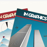
»IN GRAPHICS«
Published by the folk at Golden Section Graphics, this is a “Magazine for visual people”. A winner if you prefer the printed page to staring at a screen.
-

@MyInfographics
I love infographics and post infographic reviews at infographicsshowcase.com. Stop by and take a look. Please submit your infographics.
-

@flowingdata
Statistics PhD student with a background in eating and a book on the way. Man behind flowingdata.com.
-

Infografistas-Infographics News
This is a bilingual Facebook page of the blogs Infografistas and Infographics News Author: Chiqui Esteban.
-

Chart Porn
An addictive collection of beautiful charts, graphs, maps, and interactive data visualization toys – on topics from around the world.
{excerpt}
Read More