A few times a each month we revisit some of our reader’s favorite posts from throughout the history of Vectortuts+. This tutorial by Nancy Zonneveld was first published on February 26th 2010.
Make a unique character design of a European Goldfinch with paint splatters and textures. The techniques used will be Live Trace, Pathfinder, Transparency, Distort, Warp and Clipping Masks. We’ll give this character a unique look and fun personality.
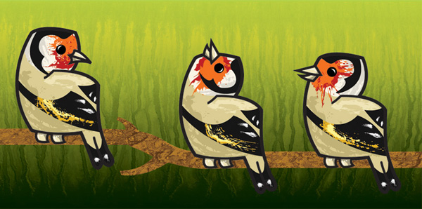
Final Image Preview
Below is the final image we will be working towards. Want access to the full Vector Source files and downloadable copies of every tutorial, including this one? Join Vector Plus for just 9$ a month.
Tutorial Details
- Program: Adobe Illustrator CS3
- Difficulty: Beginner
- Estimated Completion Time: 2 hours
Step 1
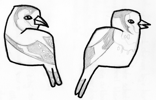
First I searched for different photos of the Goldfinch and made some realistic sketches. This way I get to know the subject and can experiment with different poses. Use simple shapes to form your character. We will add details later, first make sure the basics look right.
Try different kinds of shapes and pick the one that fits your character best. If you go for cute, then you probably need some kind of round shape. I chose to use two rectangles on top of each other, with round corners to keep it cute.
Step 2
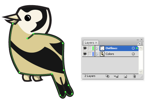
Import the sketch into Illustrator (File > Place) and trace the sketch with the Pen Tool. Use one layer for the outlines and one layer under it for the base colors. When you use separate layers for them you can make layers between them for the shading and highlights.
Use the least number of anchor points in your lines as possible for nice, clean outlines. I selected one line in green so you can see the amount of anchor points.
Step 3
To make the paint splatters I used photos of real paint splatters. You can make them yourself and scan them in or use stock photos. I used photos from
cgtextures.com, they have hundreds of splatter photos. The photo you choose doesn’t have to be perfect, you can change it later, but the better the shape is now, the less time you have to spend on changing it later.
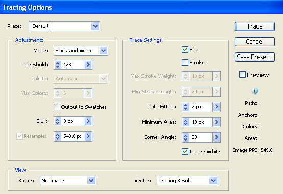
First we’ll make the splatters for the wings into vector shapes with the function Live Trace. Select the splatter photo and go to Object > Live Trace > Tracing Options. Use the settings shown. The most important settings are “Black and White” because we only need 1 color fills because we don’t need strokes. Ignore White is also important because we don’t need the white background to be a vector shape too.
Step 4
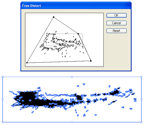
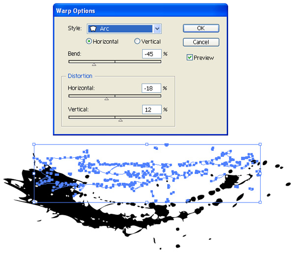
Select the splatters and go to Object > Expand, now your splatters are vector shapes. Probably the splatters aren’t the perfect shape yet, that’s no problem. There are two options to edit them. One option is to select the splatters and go to Filter > Distort > Free Distort. Move the four anchor points around to edit your splatters. You have a lot of possibilities this way, but for the wings it wasn’t enough. I wanted to bend the shape to follow the shape of the wings.
To bend the splatters apply Effect > Warp > Arc. Select Preview so you can see the changes directly on screen. The blue outlines are the original splatters and the black fills are what I made of it through changing some settings. Now it bends more, which is exactly what I want.
Step 5
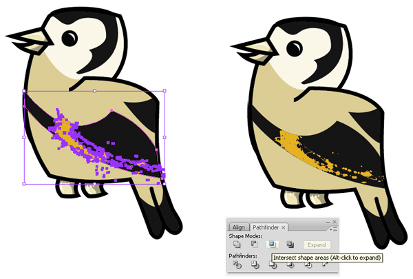
Give the splatters the color you want by selecting the splatters and then selecting a color in the toolbar. Move the splatters to the place you want them. In this case they are too big and are also on the belly and even outside the bird, while I only want them on the wings. You can delete some of the small splatters by selecting them and pressing Delete, or using the Eraser Tool, but you can also use the Pathfinder tools, which is much easier and more precise.
Open the pathfinder by going to Window > Pathfinder. You have to make a shape where you want the splatters to show up, in this case I already have that shape: the wing. I can’t use the wing itself or it will disappear after use, so I copy the wing (Command + C) and paste it in the exact same place (Command + F). Now select the copied wing and the splatters and click on Intersect Shape Areas in the pathfinder. You can see the result in the image below.
Step 6
Use the same techniques for all the other splatters. After I made the splatters I thought it looked a bit dull though, so I decided to add more color by making more splatters smaller than the existing ones. I used the same splatters, but scaled and rotated them a little so they look different. I also gave them a lighter color than the existing splatters to create a highlight/shading effect.
If your style is more detailed than this, then you can of course also use five different splatters with different colors and sizes to make the illusion of one splatter.
Step 7
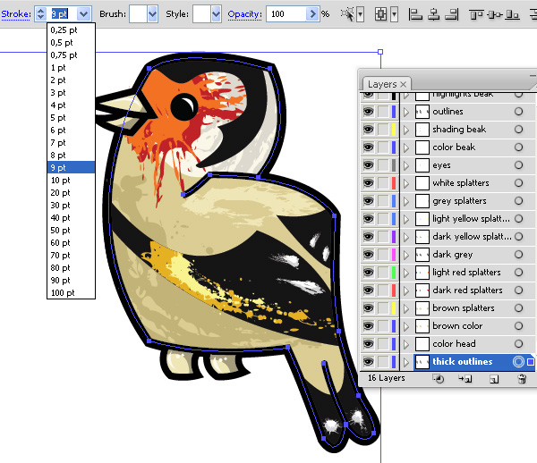
I always like to make a thick outline around my drawing to make it look more like a cartoon. To make a thick outline select all your current black outlines and copy them (Command + C) and make a new layer beneath all the other layers.
In this layer paste the outlines in place (Command + F). Keep the lines selected and give them a thicker stroke weight than the original lines. In this case the lines for the beak and the feet looked weird if I made them thicker, so I deleted them. Normally I make a thick outline around everything.
In this screenshot you can also see how my layers there are so far. I use a lot of different layers and also name them, this saves time searching through layers if I want to edit something.
Step 8
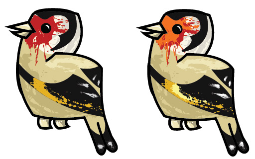
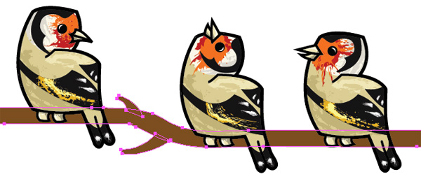
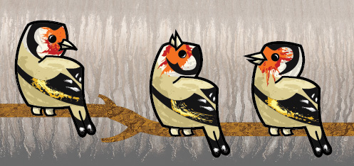
I used the same techniques to create the other two birds. I used the same outlines for them, not because I was lazy, but because I thought it was cool that I could use the same lines to create three different birds looking in three different directions. I only changed the positions of the beaks and recreated the yellow and orange splatters for the other two birds. I also drew a simple branch for the birds to sit on using the Pen Tool.
Step 9
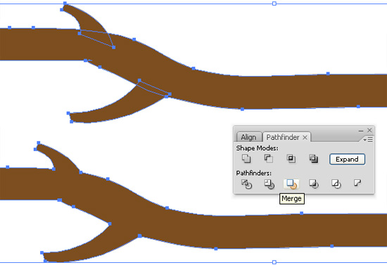
I used three different shapes to make the branch, to merge them select all three shapes and go to Window > Pathfinder > Merge. The result is that the whole branch is one shape. This is important for the other steps.
Step 10
To make the branch look more interesting, let’s give it a texture. This is a well-known technique for Photoshop users, but it’s not necessary to switch to Photoshop because Illustrator has layer options too. This is not a vector effect though because I used a photo which is pixels instead of vector.
Choose a photo with a nice effect, this doesn’t have to be a photo of a branch, often it’s even better to choose a picture of something completely different. I used a stock photo of rocks from cgtextures.com. I used the photo in black and white because I want to choose my own colors. You can also use a color photo for some nice effects.
Add the photo to your drawing (File > Place) and make a copy of the branch (Command + C). Make a new layer and paste the new branch in the same place (Command + F). We will use this new branch to edit the photo.
Step 11
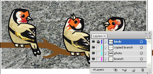
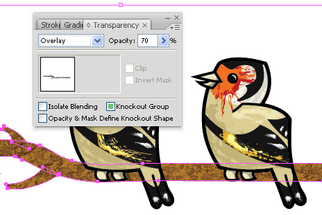
We’ll use a clipping mask to make the photo only visible on the branch and not the complete background. Select the copied branch and the photo, then apply Object > Clipping Mask > Make.
Make sure the branch is still selected and open the Transparency window (Window > Transparency) and where it says Normal change it to Overlay. Also, set the Opacity to 70%.
Step 12
For the background I used another stock photo from
cgtextures.com. I also changed this one to black and white with Photoshop because the original is brown and I don’t want to use that color.
Step 13
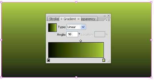
Create a rectangle with the Rectangle Tool (M) for the background in a layer beneath the background texture photo. Go to Window > Gradient to add a gradient to it. Select the rectangle and then select two colors in the Gradient window to make a gradient. Set the angle to 90 degrees to change it to a vertical gradient.
Step 14
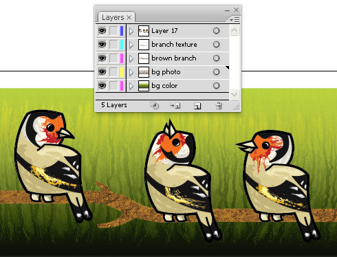
Select the background texture photo and go to Window > Transparency, set it to Overlay and the Opacity to 60%. Your layers should now look like this:
Final image
Have fun creating your own textured characters.
Subscribe to the Vectortuts+ RSS Feed to stay up to date with the latest vector tutorials and articles.
{excerpt}
Read More