Illustrator’s Blob Brush is an intuitive and versatile tool. When used with a graphics tablet, you can create loose, painterly images that venture far from the sharp, clean lines usually associated with vector graphics. These files retain all the benefits of vector files, however, allowing you to experiment and be flexible with scale, color and composition. Let’s get started!
Step 1
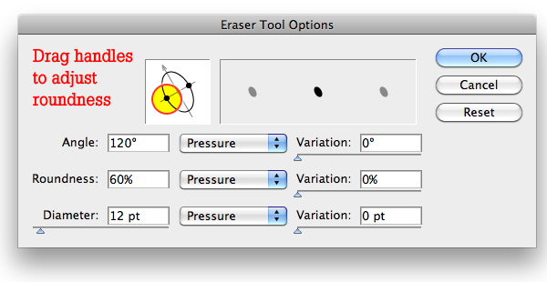
Double-click the Blob Brush Tool to bring up its options. We’ll just look at the bottom section for now, where you can adjust the Size, Angle and Roundness. Above those settings is a visual representation of the brush and its size range. So in this example, the brush size is set at 12 points, with a variation of 10 points. Thus, the size of the stroke can be 2 points, 22 points, or anything in between. Similarly, the Roundness is set at 60%, with a variation of 40%, which means it can go from 20% to 100%.
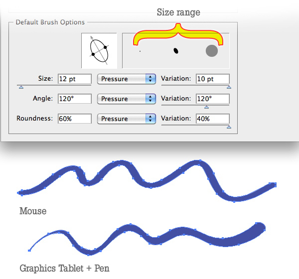
The pop-up list to the right of each option lets you further control variations in the brush. Note that these variations only work when using a graphics tablet, as a mouse does not respond to things like pressure and tilt.
These options are:
- Fixed — No variation in angle, roundness, or diameter.
- Random — Random variations in angle, roundness, or diameter.
- Pressure — Variation is based on the pressure when using a tablet and stylus. A greater pressure produces a thicker stroke, and a lighter pressure results in a thinner and more angular stroke.
- Stylus Wheel — Some airbrush pens have a stylus wheel on their barrels. That’s what this option is for.
- Tilt, Bearing, and Rotation — These are available only if you have a graphics pen that can detect these types of movement, such as the Wacom 6D.
Step 2
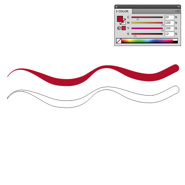
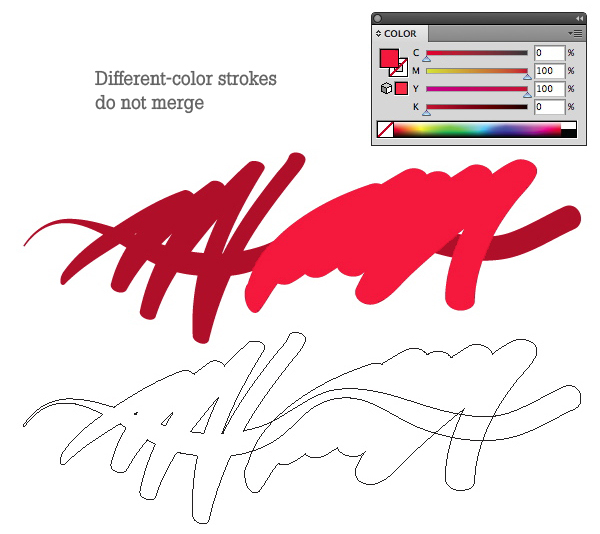
Get a feel for the Blob Brush by painting some strokes. Take a look at the Color panel. Since the Blob Brush is technically a brush, whatever stroke color you have selected will be the color the brush uses. Let’s say you’re using a red stroke and a blue fill. When you paint with the Blob Brush, a red stroke will result, but this “stroke” is actually a filled object. If you have only a fill color select in the Color panel, the Blob Brush will use that.
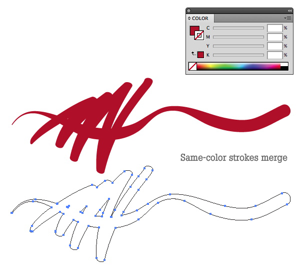
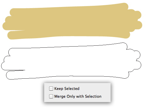
Paint another stroke that overlaps the first, and you’ll see that the new stroke merges with the first. In effect, Illustrator is performing a Pathfinder function as you draw — as long as you’re still using the same stroke color as before. Try painting with another color, even one that is slightly different, and you’ll see that the shapes do not merge.
v
Step 3
Open the Blob Brush Tool Options again by double-clicking on the tool. Take a look at the top half of the dialog box. Under Tolerances, you can adjust the Fidelity — how closely the brush conforms to your mouse or pen movement — and the Smoothness. Lower values will create tighter paths with more points, higher values result in looser, smoother objects.
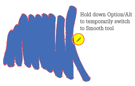
If you check the “Keep Selected” box, that’s exactly what it will do. Depending on your workflow and personal preference, you may want to have the last stroke you draw remain selected. For example, if you hold down the Alt key, the Blob Brush temporarily witches to the Smooth tool. Keeping the path selected will speed up the process of drawing then smoothing. You can also hold down the Command key to temporarily switch to the Selection tools and move or adjust the paths from there.
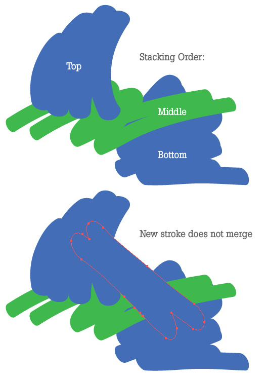
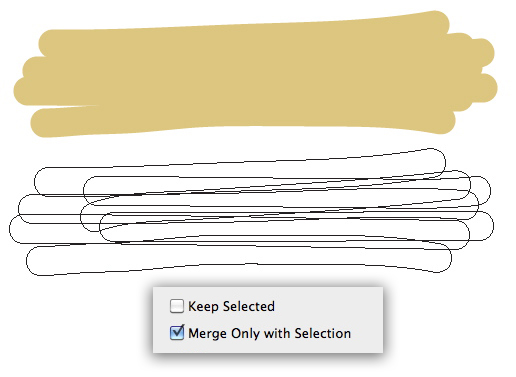
If you choose “Merge Only with Selection,” any new stroke you draw will merge only with a path that’s selected. The exception to this rule is if the merging would interfere with the stacking order of the objects.
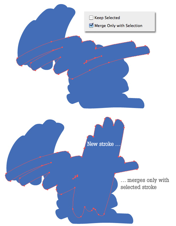
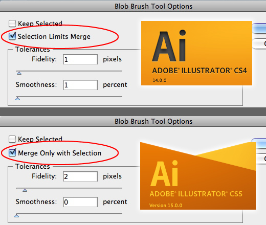
NOTE: “Merge Only with Selection” in CS5 is called “Selection Limits Merge” In CS4. The functions for each are the same.
Step 4
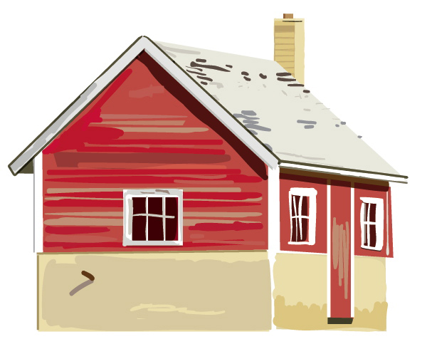
Choose a source image. It can be a photograph, a sketch or painting. You don’t need a source image at all, if you prefer to draw from your imagination, but for this tutorial we’re going to use a stock photograph.
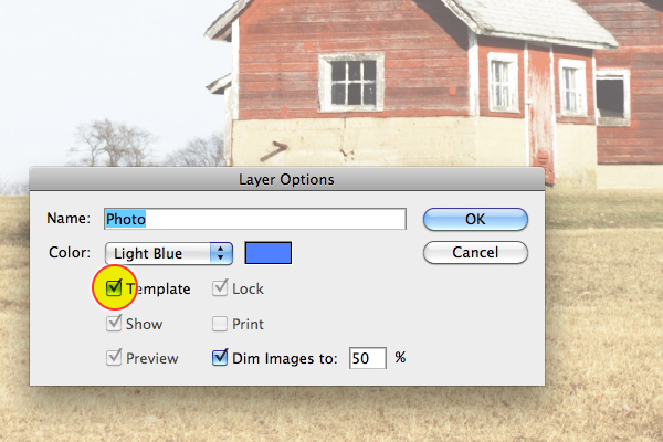
Place the photo in your document (File > Place). Double-click its layer in the Layers panel and check the Template box. By default, the layer will lock, and the image will be dimmed to 50%. You can adjust this percentage if you like.
Step 5
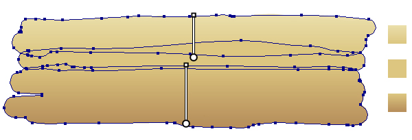
This photo has four elements, the tree, the foreground, the barn and the sky. Make a layer for the foreground. Choose a larger diameter in the Blob Brush settings, and paint a few broad stokes. Change color with each one so they don’t merge. Alternately, you can check “Merge Only with Selection” and uncheck “Keep Selected.” This is where your personal preference comes in. Regardless of your preferred method, you want to end up with three or four separate objects, which loosely conform to the slopes of the land.
Step 6
Recolor the shapes so that there is a subtle difference between them. You can use gradients or keep them solid.
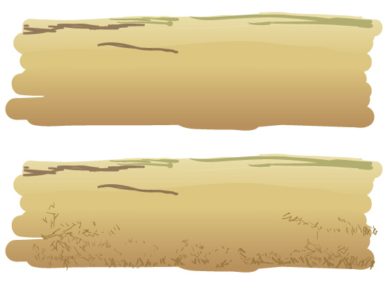
On top of these shapes, paint small tufts of grass. There’s no need to draw every blade of grass, just enough to give the suggestion of it. Work quickly so the shapes look more organic. Once you’re satisfied with the foreground, lock its layer and create a new one above it for the tree.
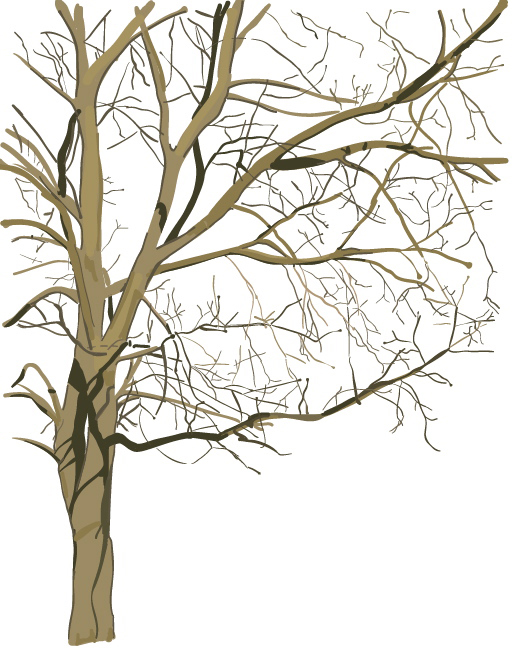
Step 7
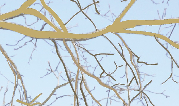
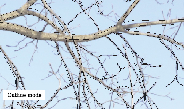
The tree is pretty complicated. Break it down by painting the larger shapes first. Decide where the color will be the same and merge those shapes if you like. Loosely trace each branch, varying the width by varying the pressure on your tablet. Don’t worry about being too precise — it’s a tree! As you work, you may check your progress by viewing the tree layer in Outline mode. The template photo will still show.
Step 8
Continue refining the tree branches. The basic structure can go fairly quickly. Use the right and left square bracket keys [ ] to increase and decrease the brush size as you work. Refer back to the photograph to add shadows and change color.
You can use the Eraser tool in conjunction with the Blob Brush. Its options are exactly like those of the Blob Brush. Most graphic pens have an “eraser” on their other end, and you can activate the eraser by flipping it over, just as you would with a real-world pencil.
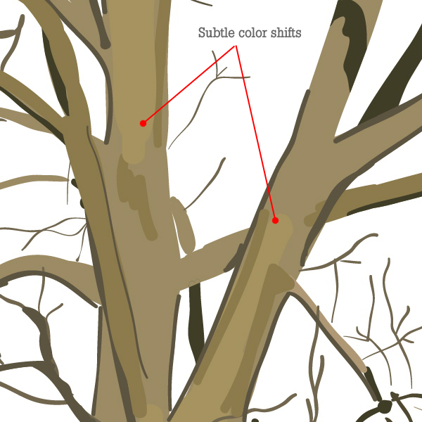
To bring out a more realistic, yet painterly quality, add areas of color that are only slightly different than the base color. These will give a subtle dimension to the shapes, while keeping a unified overall color.
Step 9
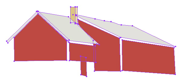
Lock the tree layer and create a new one for the barn. Since the barn is made up of mostly straight lines and angles, you can rough it in with the Pen tool and the Rectangle tools.
Step 10
As you did with the tree, add Blob Brush strokes to flesh out the barn and add texture. Here, I’ve used a combination of Blob Brush and Shape tools, and have used various blending modes and transparencies in order to achieve a cohesive color scheme.
Step 11
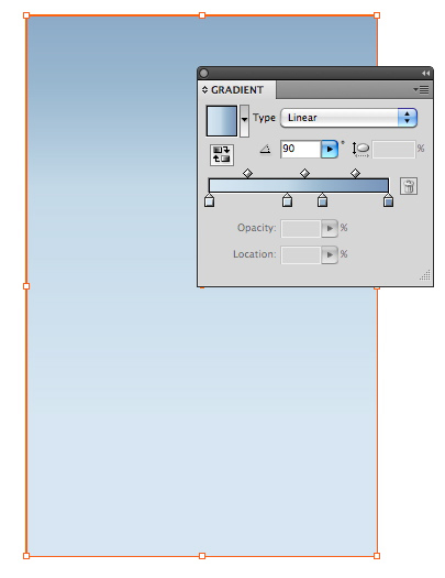
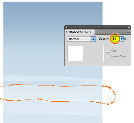
Create a sky layer below the others (but above the Template layer). Draw a rectangle for the sky and add a gradient fill to it. Alternately, you can paint a rectangular shape with the Blob Brush, then add the gradient (you cannot paint with a gradient). Add some wispy clouds by painting large Blobs across the sky and reducing their opacity.
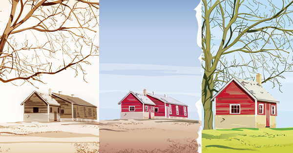
Conclusion
The Blob Brush allows you to stay loose, and frees you from tedious plotting with the Pen tool. Once you familiarize yourself with the tool’s options and set up your preferred workflow, you’ll be making painterly vectors in no time. The advantage of painting a landscape in Illustrator is its versatility. You can easily rearrange objects and change the scale, without degrading the image. You can also re-color the artwork to evoke a different season or mood. Below are just a few of the possibilities.